
250+
completed in various niches
5.0
on Clutch
$1B+
our partners

They understood our idea and gave us more feedback than expected. They did more than we asked them to do, which was excellent. I’d highly recommend them, Arounda produces excellent quality work.


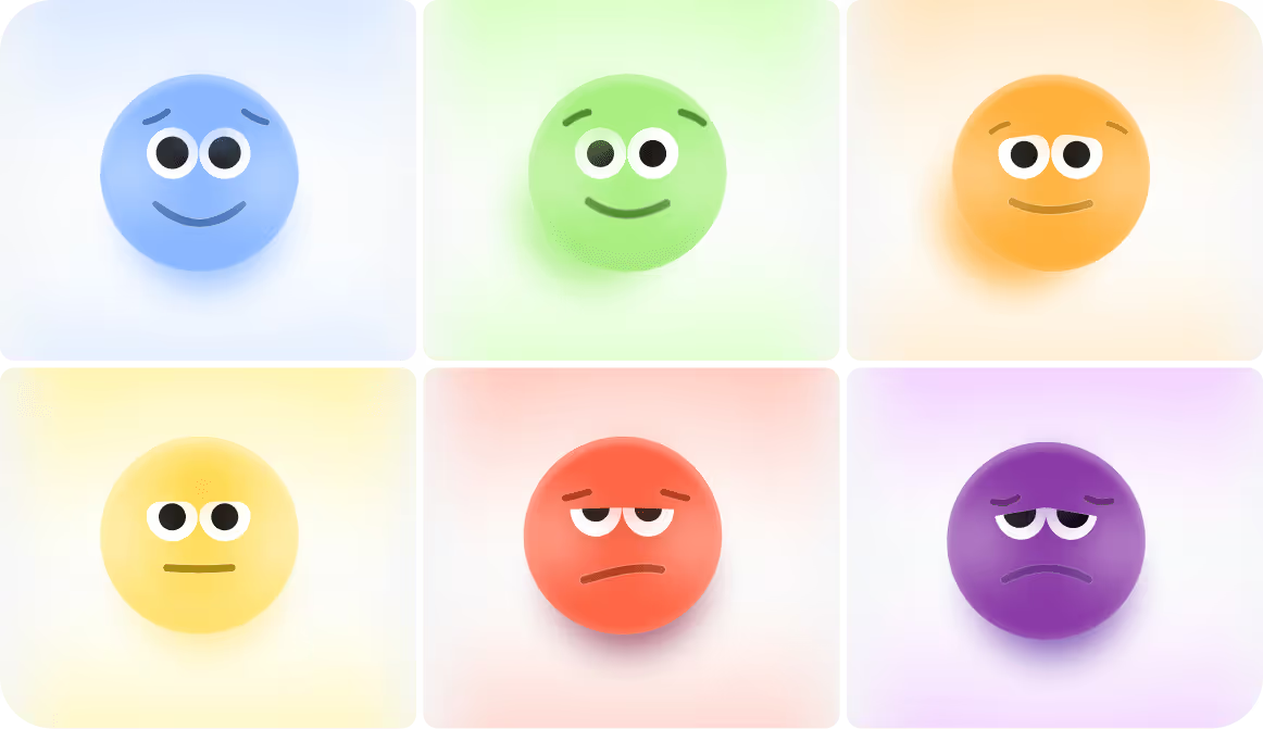
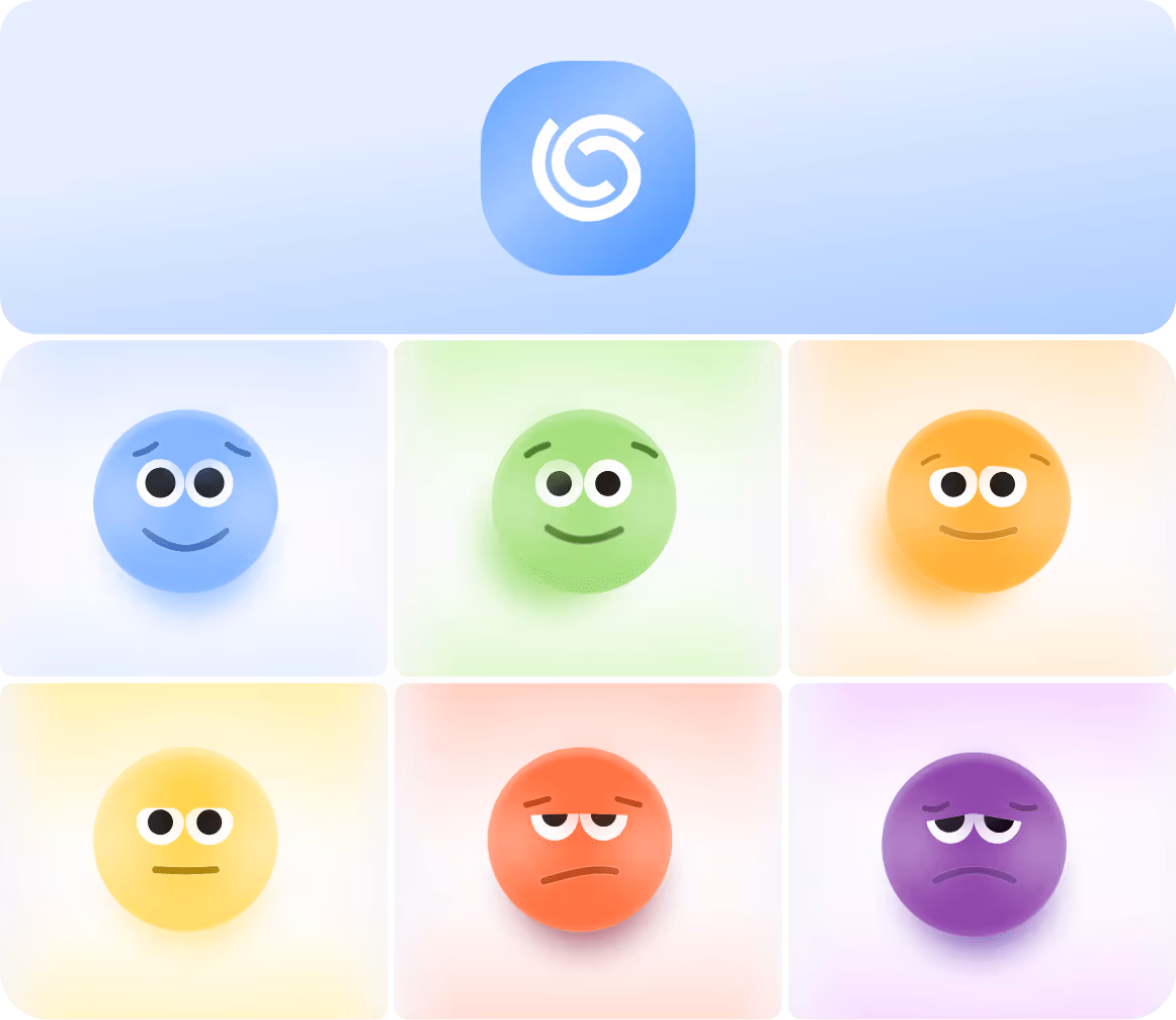
Empowering brands with creative graphic design services & works
We`ve helped many startups and companies build a memorable visual identity with our graphic design business services. Check the success stories of our clients below.


PayPossible, a fintech platform, needed visual clarity to explain a complex multi-lender financing model and build trust with enterprise audiences. Arounda team created custom illustrations, an improved visual system, and clear graphic cues. They simplified the process and guided users through key actions.
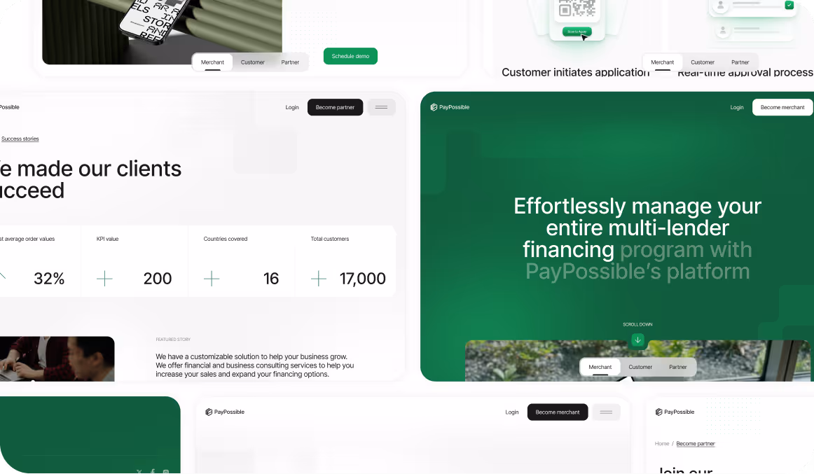

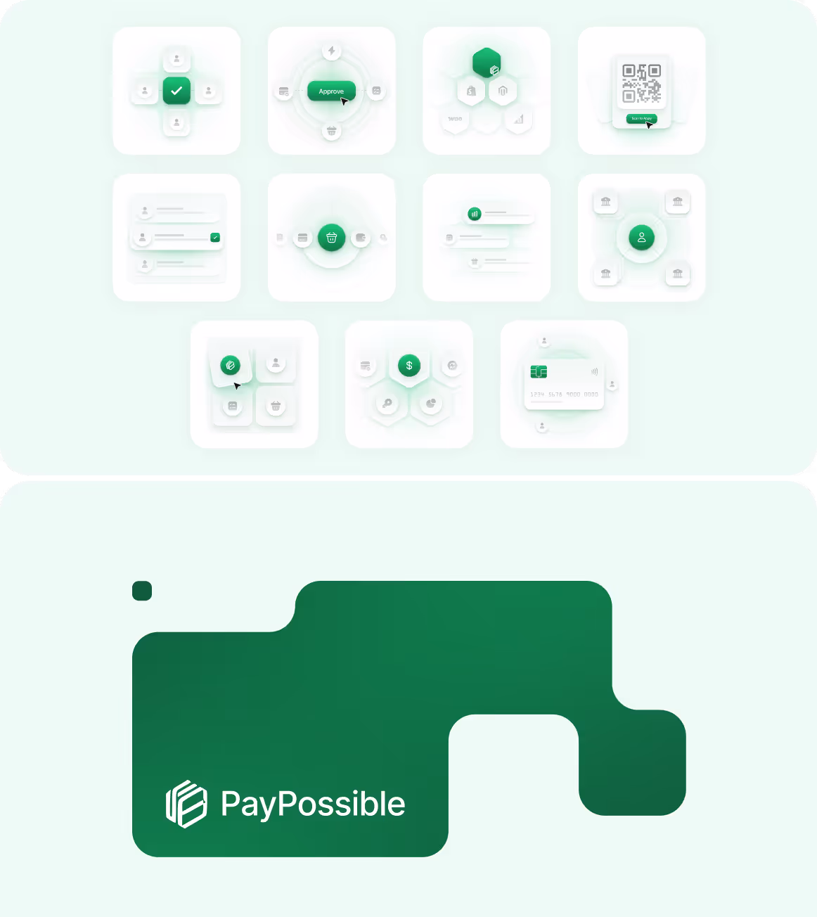
PayPossible, a fintech platform, needed visual clarity to explain a complex multi-lender financing model and build trust with enterprise audiences. Arounda team created custom illustrations, an improved visual system, and clear graphic cues. They simplified the process and guided users through key actions.


Discover how custom graphic design services can affect your product

Build trust & loyalty
Professional graphic design builds trust and loyalty among users, establishing a trustworthy brand image.

High brand awareness
Recognizable graphics will help your product to stay relevant and modern in the ever-changing digital space.

Strengthen your brand
A unique and memorable brand helps you to gain a competitive advantage and set your brand apart from competitors.
Our process wraps around your unique business needs
Our processes are flexible and adapt to your specific needs. We know how to enhance your brand awareness, maintain a consistent message, and make your brand resonate with the target audience.


Reflect your business principles, boost your socials and marketing with professional graphics
Social media
graphics

Stand out in the digital crowd! We create custom graphics that resonate with your audience. Outshine the competition with scroll-stopping designs for posts, stories, carousels, and more.
E-mail marketing
graphics

Transform your email campaigns into irresistible messages. With engaging, on-brand graphics tailored to your email chains, we’ll help you capture attention and drive action.
Presentation
design

Presentation isn’t just about slides. It’s the way your big ideas come to life. Pitching to investors or sharing insights, we ensure your message lands with impact and professionalism.
Web banners
illustrations

Turn clicks into conversions with web banners that stop the scroll. Our designs grab attention and strengthen your brand identity to drive traffic and engagement like never before.


While the growth of our clients is what matters most,
it`s nice to get awards

2025
Company 2025

UI/UX Company by Clutch
on Upwork

on Dribbble
by Clutch

by GoodFirms

Behance platform
by Clutch

by Webflow
by Clutch
by Clutch
by Clutch
UI/UX Company by Clutch
on Upwork
on Dribbble
by Clutch
by GoodFirms
Behance platform
by Clutch
by Webflow
by Clutch


Our partners find numerous reasons to love us

Our partners find numerous
reasons to love us


“They understood our idea and gave us more feedback than expected. They did more than we asked them to do, which was excellent. Arounda produces excellent quality work.”

“Their expertise and guidance were instrumental. They demonstrated their commitment to creating a product that resonated with our target audience, which led to improved user satisfaction.”

“The process was something to be admired, they have a great idea of how to turn an idea into a visual product. They would also immediately make changes to any improvements we mentioned.”

“We had a feeling that Arounda is not just a contract outsourcing team but part of our startup company. We had super close communication. ”

“Their UI/UX design skills were very impressive. Modern, creative, and best in class plus they were intuitive and 'got what we wanted' without any hand-holding and minimal direction.”

“Throughout the entire project all I saw was sheer will to keep pushing forward and adapting to whatever the next request was. Terrific job and we couldn't have done it without you.”

“They understood our idea and gave us more feedback than expected. They did more than we asked them to do, which was excellent. Arounda produces excellent quality work.”
“Their expertise and guidance were instrumental. They demonstrated their commitment to creating a product that resonated with our target audience, which led to improved user satisfaction.”
“The process was something to be admired, they have a great idea of how to turn an idea into a visual product. They would also immediately make changes to any improvements we mentioned.”
“We had a feeling that Arounda is not just a contract outsourcing team but part of our startup company. We had super close communication. ”
“Their UI/UX design skills were very impressive. Modern, creative, and best in class plus they were intuitive and 'got what we wanted' without any hand-holding and minimal direction.”
“Throughout the entire project all I saw was sheer will to keep pushing forward and adapting to whatever the next request was. Terrific job and we couldn't have done it without you.”


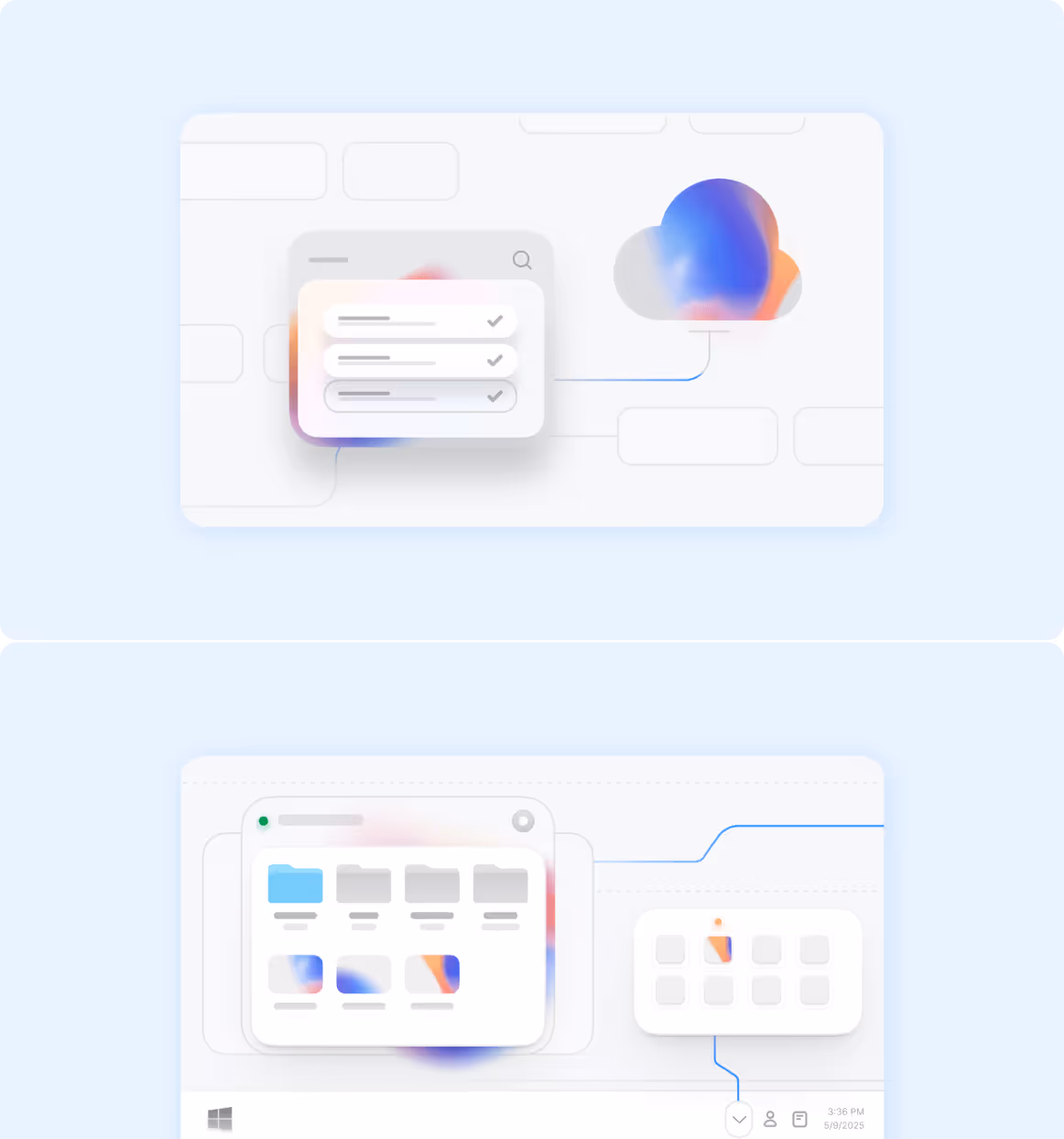
From custom illustrations to outstanding marketing materials — we`ve got you covered
Redesign your product and stand out
Get the user-friendly Mobile App Design
Empower your team with Team Extension
Design your first MVP product
Get the right style with UI Concept
Turning projects into trusting partnerships


We get things done with quality

Flexible collaboration
& fixed monthly rate

Guaranteed
on-time deliverables

Hiring system with
immediate start

Work directly with
the designer
Qualified graphic designers who know their business


+55
in Arounda team
+55
in Arounda team


Сheck our work in action
It is important for our graphic design company to create custom illustrations, graphics, and materials that would make your digital product attractive, catchy, and unique.


FAQ on Graphic Design services
What services can a graphic designer provide?
A graphic designer can provide the following services:
- Branding and identity (logo design, visual identity, brand guidelines)
- Marketing materials (social media graphics, email designs, brochures, flyers, and advertisements)
- Digital assets (website banners, illustrations, app graphics, and UX/UI components)
- Presentation design and professional slides for pitches
- Presentation design and professional slides for pitchesEbook and print design (covers, layouts, and print-ready materials)
Essentially, a skilled graphic designer can create any visual element that communicates your brand’s message.
What is graphic designing service?
Digital graphic design services is a creative and technical approach to crafting visual content to communicate messages, ideas, or branding effectively. They include branding, marketing, digital assets, presentation, ebook, and print design. Their main aim is to improve brand visibility, engage audiences, and convey information effectively.
How much should I pay a graphic designer?
The cost of hiring a graphic designer depends on experience, project scope, and location. Experienced graphic design service costs more, while simple logo designs may be less expensive. Take the simple step—contact us to discuss your project and get a customized quote.
Is it worth it to hire a graphic designer?
Undoubtedly, professional graphic design services are worth it for several reasons. They:
- Bring professionalism into your project
- Save your time
- Deliver quality results
- Ensure brand consistency
- Offer customization
- Provide creative and innovative solutions
- Increase your return on investment
- Improve KPIs
What is the best way to hire a graphic designer?
To hire the right graphic designer, we recommend defining your needs and budget, finding designers, reviewing case studies, and contacting them to discuss the project. Partnering with a specialized agency guarantees expertise, clear and transparent processes, successful results, and support.
