SaaS Design Services
Our team provides SaaS design services for system-first, category-defining web and mobile products with an enterprise-grade approach for product, engineering, and marketing teams.

“Arounda produced amazing work and delivered exactly what we imagined, making a successful partnership. ”



“They were very professional and responsive to our feedback and needs.”

“Their ability to understand the complexity of our product and business is impressive.”

“Arounda has excellent designers. The team has managed the project excellently and communicated remarkably. ”





Arounda is your trusted partner for SaaS UI/UX design
{1}
SaaS UI/UX design services aligned with SOC 2, GDPR, and enterprise security assessment standards.
{2}
Design systems and component libraries scale with rapidly expanding feature sets.
{3}
Data-dense dashboards, multi-tenant interfaces, and analytics UX remain useful as features increase.
20%



Reduced bounce rate
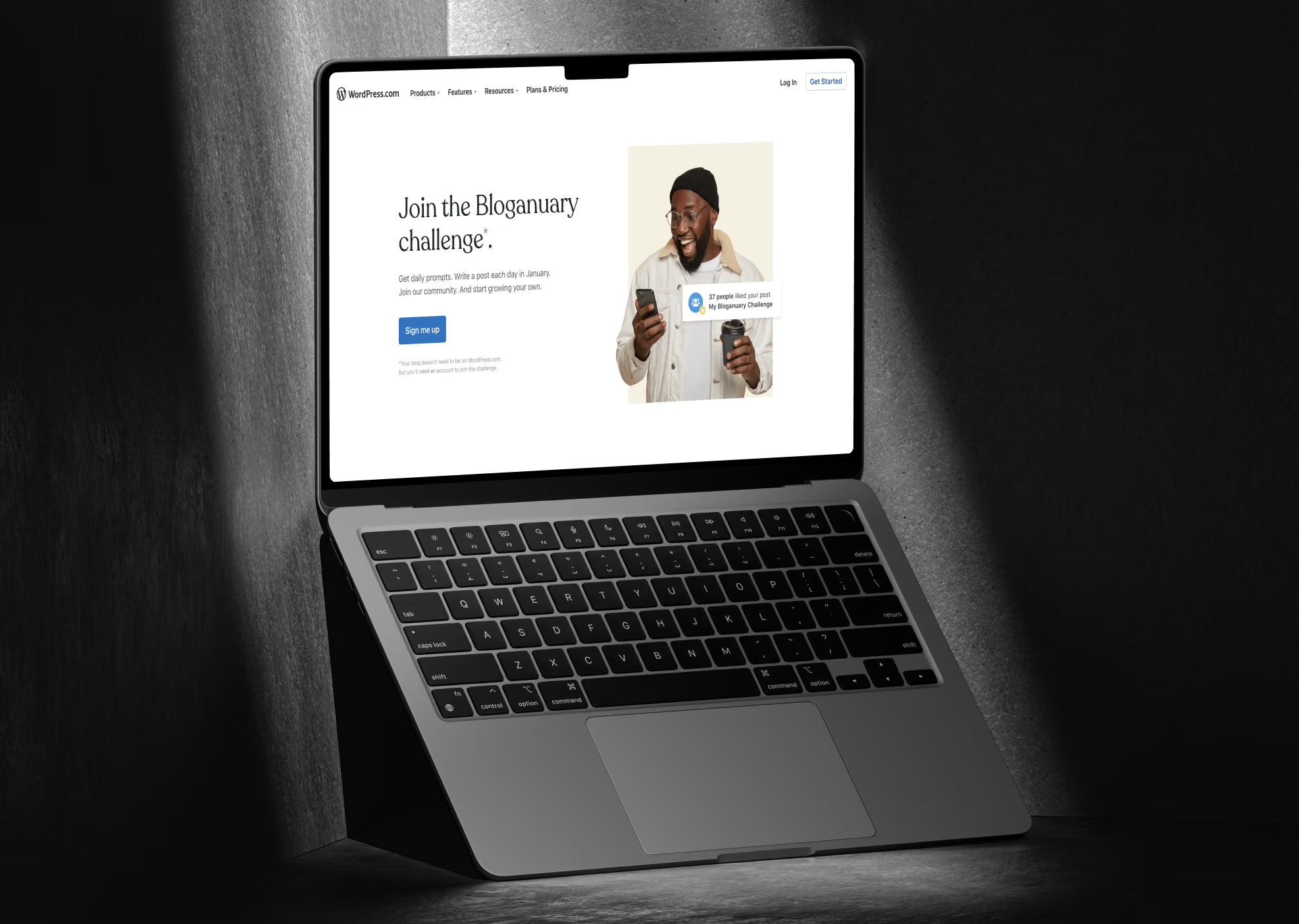
Our SaaS designers redesigned the website and branding for WordPress, an open-source SaaS website builder, cutting bounce rate by 20%.
x3,5



Traffic and engagement boost
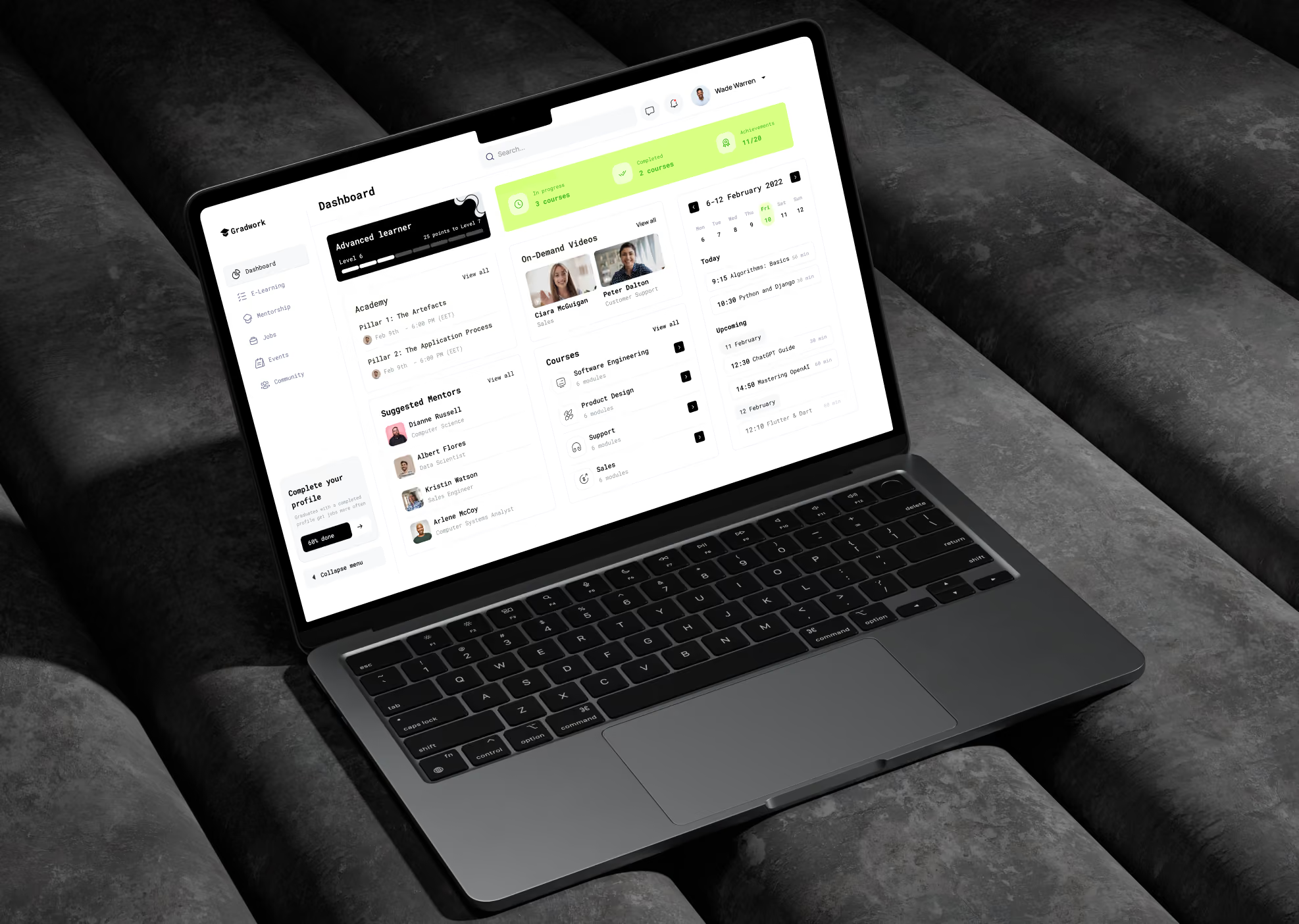
We designed the two-in-one SaaS platform for QTalent, Canada's largest HR recruitment community, growing traffic and engagement 3.5x.
+27%



Higher conversion rate
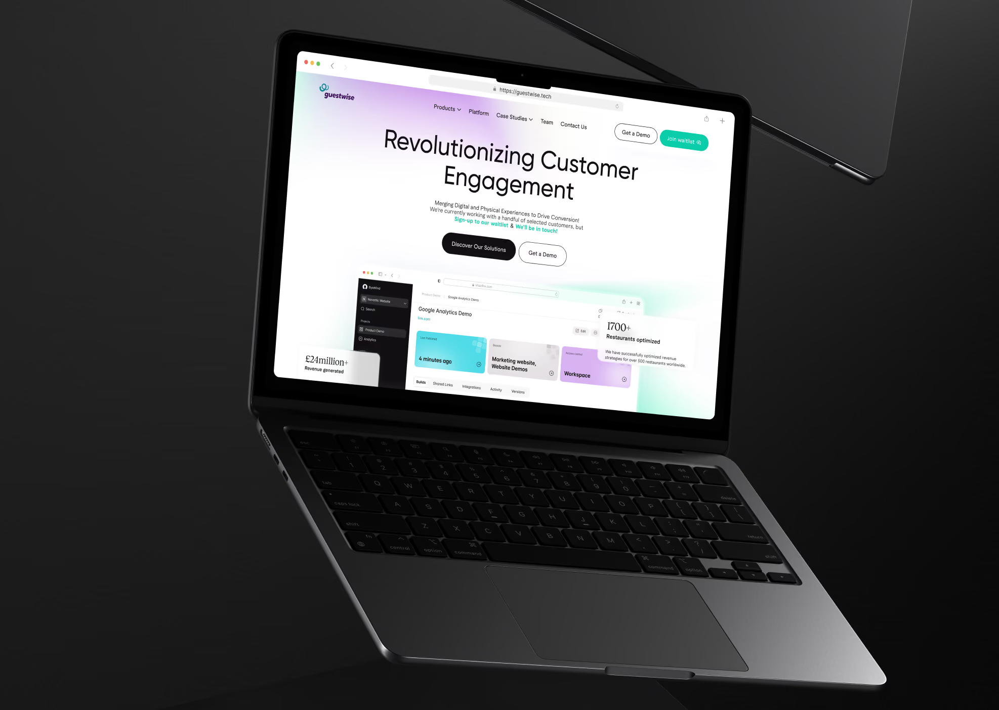
Arounda redesigned the UI/UX for GuestWise, an AI SaaS marketing platform for hospitality brands, increasing the conversion rate by 27%.



What SaaS leaders
say about us


"I was impressed with the high levels of detail and polish for all the features."

"Working with Arounda was like having our own in-house designers - we integrated well and communication was effortless."


"They brought our site and aesthetic to a new level that we couldn’t have achieved on our own."

"Highly adaptable, flexible, professional, best-practice guidance, modern approach, no drama. Just a great team committed to excellence in all areas."


"They were great people to work with. Great understanding of our needs and good delivery times."


"Their UI/UX design skills were very impressive. Modern, creative, and best in class, plus they were intuitive and 'got what we wanted' without any hand-holding and minimal direction."


"The process was something to be admired, they have a great idea of how to turn an idea into a visual product. They would also immediately make changes to any improvements we mentioned."

"They understood our idea and gave us more feedback than expected. They did more than we asked them to do, which was excellent. Arounda produces excellent quality work."

"They proactively brought forward improved suggestions, enhanced UI/UX flows, and thoughtful feature recommendations that strengthened our platform’s design system, making it more cohesive and elevating the overall user experience."



SaaS teams that trusted us with their product









What sets Arounda apart as a SaaS design partner







See our Saas design process in action
Our SaaS UX design company has a structured process, staged deliverables, and full visibility at every checkpoint to avoid scope creep, missed deadlines, and handoffs that can stall engineering.

SaaS products that we can create together

CRM & Sales Analytics Platforms
AI-Powered SaaS Tools
Workflow Automation Platforms
Marketing Automation Software
SaaS Websites & Landing Pages
SaaS Onboarding & Admin Panels
Team Collaboration & Productivity Tools
Customer Support & Helpdesk Platforms

How Arounda designs Saas product sand websites that convert

Retention-Focused UX Built on SaaS Usage Data
We base design decisions on data and testing insights. Our first step is to understand how your users behave in the product.

Cross-Platform UX That Stays Consistent as Your Product Scales
Our SaaS UX interface design keeps web, mobile, and API surfaces aligned as your product grows. Your users get the same experience no matter where they work.

Website Design That Increases Conversion
Our SaaS website design agency finds the exact points where visitors drop off, then rebuilds messaging and flow to convert them into sales-ready leads.

Expert Team Fluent in B2B, PLG, and Enterprise SaaS
Our designers have 10+ years of experience and match design patterns to your growth model: PLG, sales-led, or enterprise. We don’t work with templates.


89+ Reviews
on Clutch

Top Rated Plus Agency
on Upwork

Top 50 Trending team
on Dribbble

Projects are Featured on Behance platform

Latest articles on SaaS Design



.avif)



.avif)

FAQ
How do you design SaaS products for both new users and power users with different needs?
It’s two different mental models inside one product, but we don’t separate audiences to compromise between them.
New users require guiding. Therefore, our SaaS design agency develops progressive onboarding, contextual tooltips, and default views that hide sophisticated functionality until they are ready for it.Power users require speed. Therefore, we provide configurable dashboards, keyboard shortcuts, bulk actions, and stored views that eliminate repetitive steps from their workflow.
Our UI/UX designers do this through role-based interfaces and adaptable UI states, allowing the same screen to serve both a first-week user and a daily power user without either one fighting the interface. Every major feature comes with a simplified default view and an expert mode, making your product easier to use and faster to understand.
What's the difference between designing for product-led growth and sales-led SaaS?
Product-led growth design optimizes for self-serve. We design frictionless signup, fast time-to-value, and in-product prompts that convert free users to paid without a sales call.
Sales-led design optimizes for the demo and the buying committee. Our designers deliver polished admin views, permission controls, and dashboards that give a sales rep proof points to close enterprise deals. PLG interfaces hide complexity until users need it. Sales-led interfaces surface capability early, because a prospect judges maturity in a 30-minute call.
Our SaaS UX design agency starts every project by identifying which growth model drives revenue, because the two demand opposite design priorities. But we design each around how revenue gets generated and avoid a generic best-practice template.
How do you reduce feature bloat in a SaaS product without cutting functionality users rely on?
Information architecture is the key to resolving the issue. The data on usage shows us which features are used frequently and which ones aren't. Our UI/UX designer then reorganizes the menus to accommodate the new division rather than erasing any features. Functions with high usage rates remain in the main flow, whereas functions with low use rates that are still required are moved to secondary menus, settings, or views based on user roles. They are still easily accessible to users in need.
We also condense overlapping elements that handle the same problem in multiple ways, reducing visual clutter without sacrificing functionality. A product appears simpler on the surface while retaining every capability that power users and administrators rely on.
How do you design a SaaS product that scales from MVP to enterprise-ready without a full redesign?
We construct the design system before we build the screens. Every component begins as a reusable token. The same button, table, or form pattern applies whether there are 10 or 10,000 users.We also plan for permissions and multi-tenancy early on (even if you only require a single job at the MVP stage). Adding access control to an existing product requires most redesigns. Information design can accommodate more than just the current feature set, with space for future modules, admin views, and enterprise settings without disrupting existing navigation.
With our approach, your product gains enterprise capability in layers: SSO, granular permissions, and audit logs, instead of a rebuild that pulls engineering off the roadmap for months.
Can you improve conversion on our SaaS website without touching the product itself?
Yes. The website and the product are independent systems, and the majority of conversion loss occurs before a visitor even reaches the product.
Our SaaS web design agency begins with messaging clarity and determines whether the above-the-fold section clearly conveys what the product performs and who it is intended for in one glance. We also examine trust signals, security badges, customer logos, case studies, and pricing transparency, as these might reduce hesitancy without requiring a product modification.
Signup friction is another lever. Fewer form fields, more obvious CTAs, and a pricing page that addresses concerns before sales needs to. These modifications affect trial signups and demo requests, but don't touch the product.
How do you approach design for SaaS products with complex, data-heavy interfaces?
First, we rank the facts. There is a structure for each dashboard. The main view only shows the two or three metrics that are most important for making a choice. The rest are hidden behind filters, drill-downs, or secondary tabs. When we want to see a trend, we use a line chart, and when we want to see a comparison, we use a bar chart. Our team stays away from fancy graphics that make things harder to understand without giving us more information. We plan for speed from the start for interfaces that deal with big or changing datasets.
Our focus is also on customizable views, since a finance lead and an operations manager rarely need the same numbers on the same screen.
The clients get interfaces that show less by default and more on demand, without hiding the data users need.
What's your process for reducing churn through better onboarding and UX?
We start with facts and don't make assumptions. It's easy to see where users stop or give up thanks to session recordings, funnel analytics, and support tickets. It could be during signup, the first setup, or the third week, when using the product every day.
After that, we figure out the exact action that leads to long-term retention.
We replace upfront product tours with contextual advice that shows up when a feature is needed. This is because users remember instructions better when they see them in the right context than when they skip a walkthrough.We also plan for the weeks after training is over.
We offer habit-forming triggers, milestone prompts, and re-engagement flows that catch users before they stop using the app. We try every change on groups of people who stayed with the company, so we know it cuts down on both onboarding time and customer turnover.