
UI/UX Design for an AI Analytics Platform
UI/UX Design
Graphic Design
Design that makes AI insights explainable and trustworthy
About project
Auralis is an AI-powered copilot that delivers actionable insights with intelligent analysis, licensed expert knowledge, and long-term pattern tracking. The request was to design the mobile app UI/UX and admin panel in a natural and user-centric style.

.avif)

Challenges & Solutions
Problem
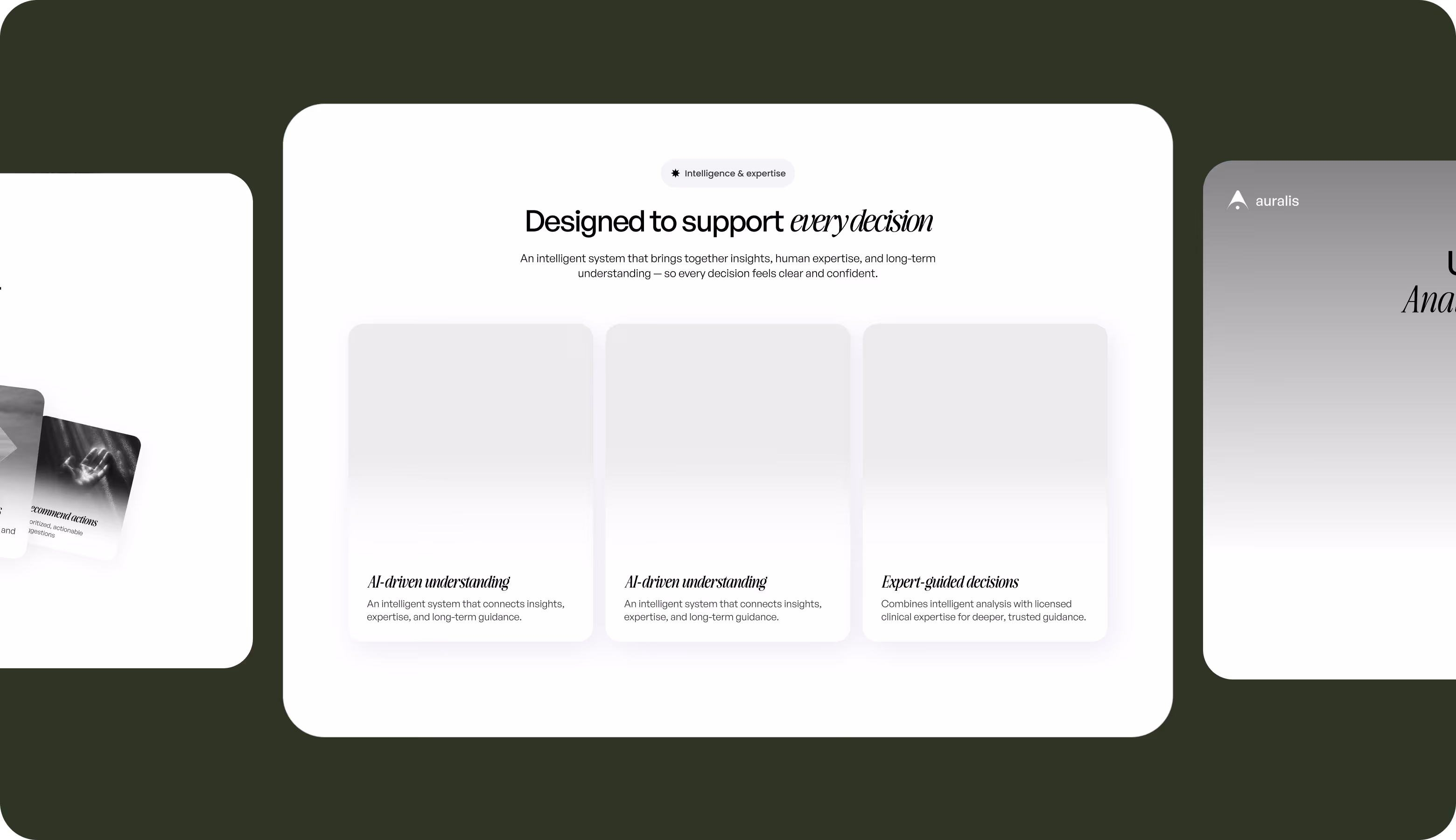
The core challenge was making automated insights explainable and trustworthy. Our design team needed to build a visual system that communicates intelligence hierarchically, supports long-term pattern tracking, and balances analytical depth with minimalism.
Solution
Arounda built a layered information architecture with high-level summaries first, expandable deep dives, and transparent AI reasoning at every level. The visual system separates AI-generated insights from expert-reviewed guidance. We used calm, structured design language that communicates trust.
Process
Briefing & onboarding
Competitor analysis
Metaphors
Logo Concept Creation
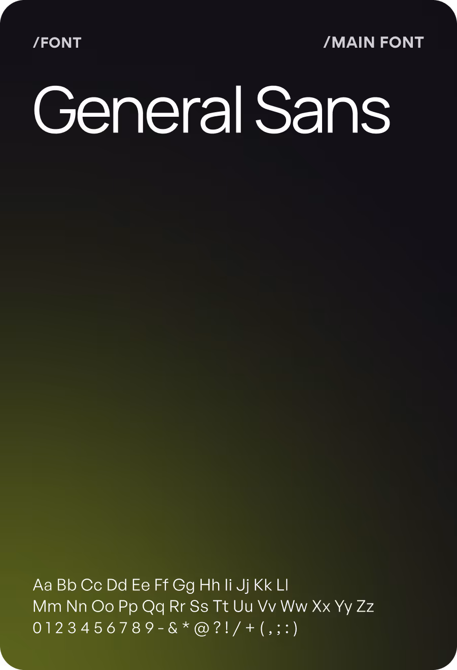
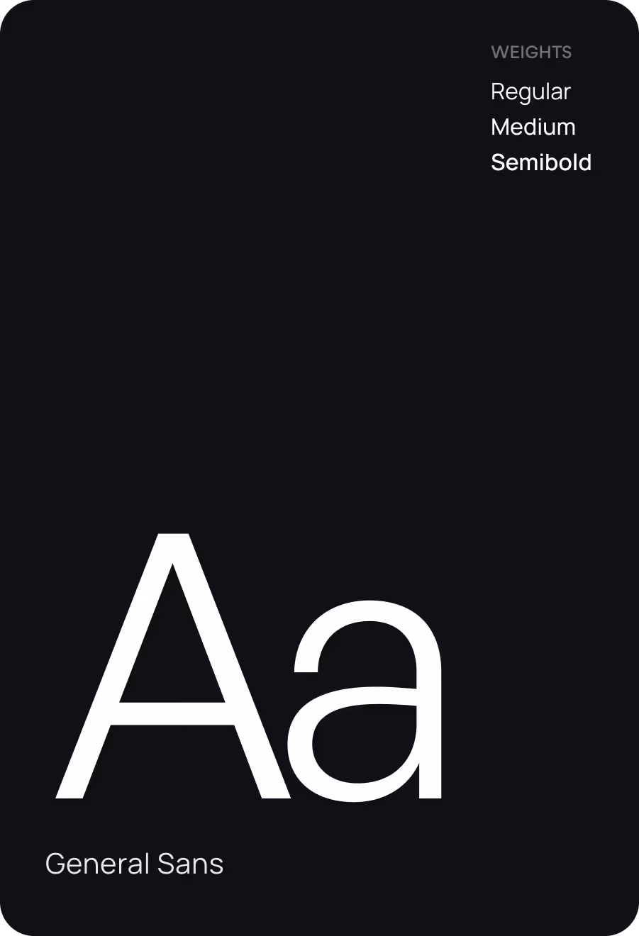
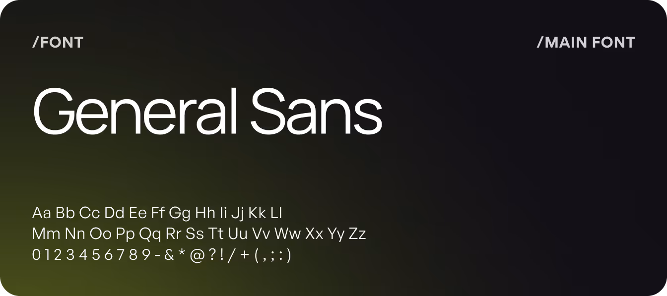
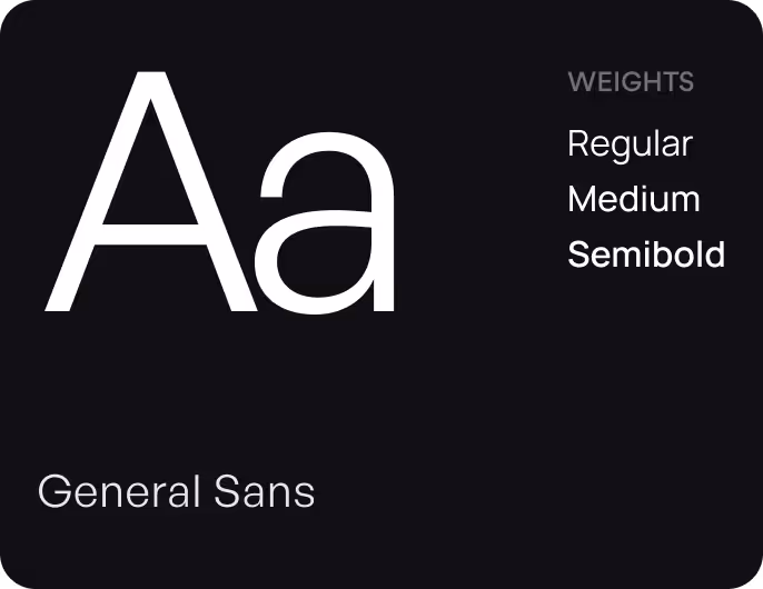
Typography
Lockup Logo
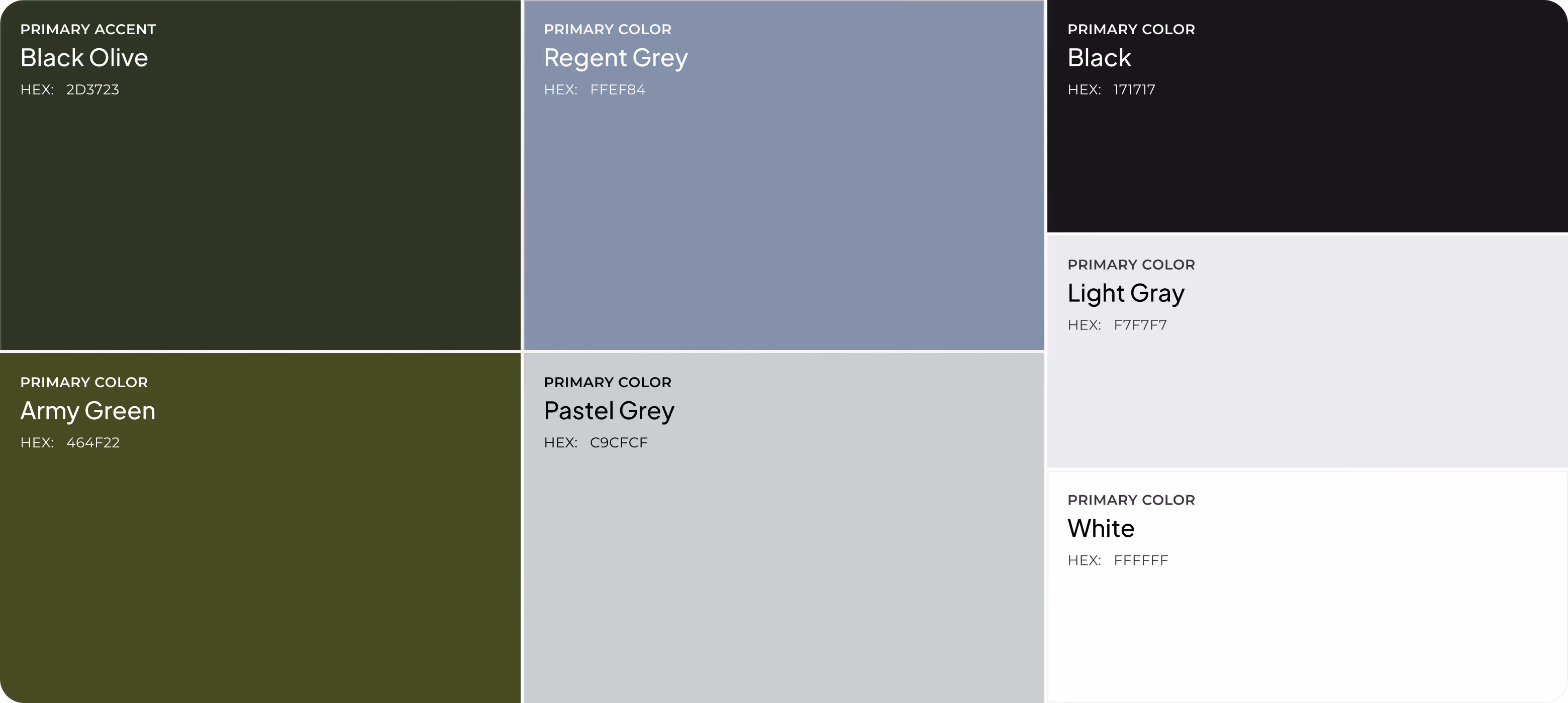
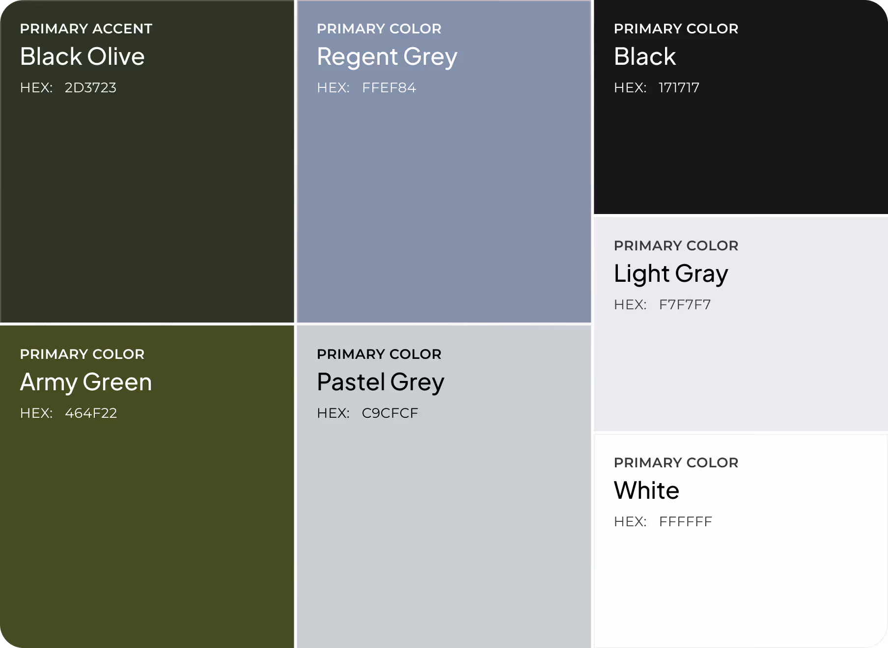
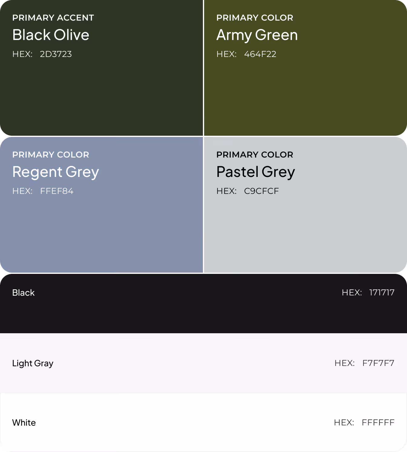
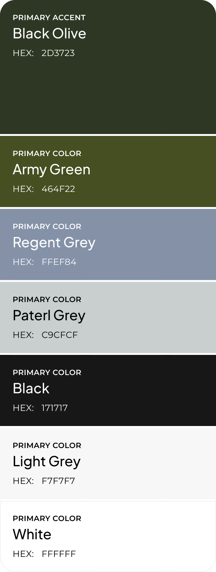
Color Palette (primary, secondary)
Color Palette (primary, secondary)
Discovery
Moodboard
UI Concept
UI Layouts
Wireframing
Firstly, we mapped the full insight hierarchy from summary to explanation to action. It was important to test information density, clarity of AI explanations, and placement of trend visualizations before visual design. Each screen received a defined structure with expandable logic blocks, recommendation modules, and pattern-tracking components. We balanced them to avoid cognitive load.
Logo Design
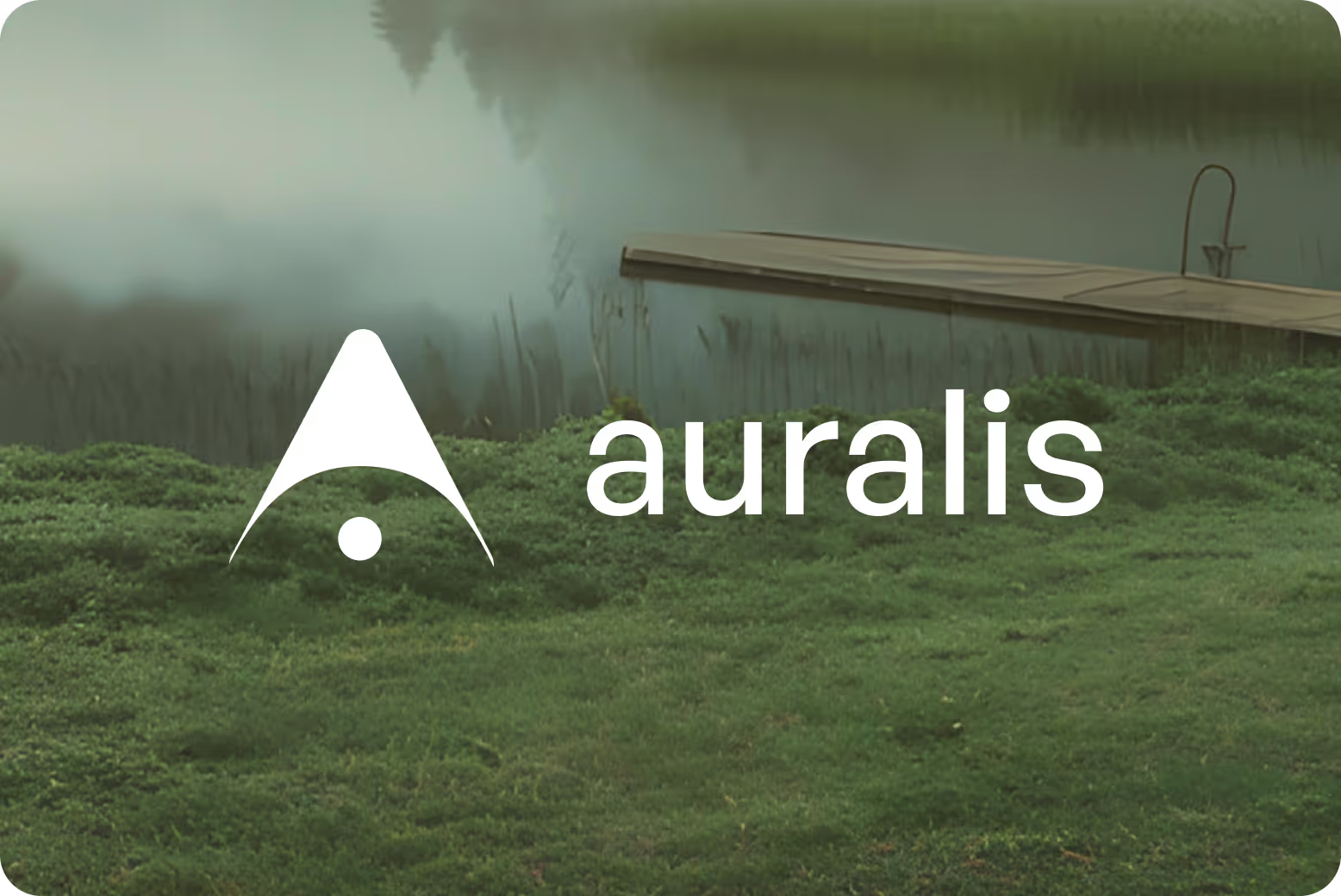
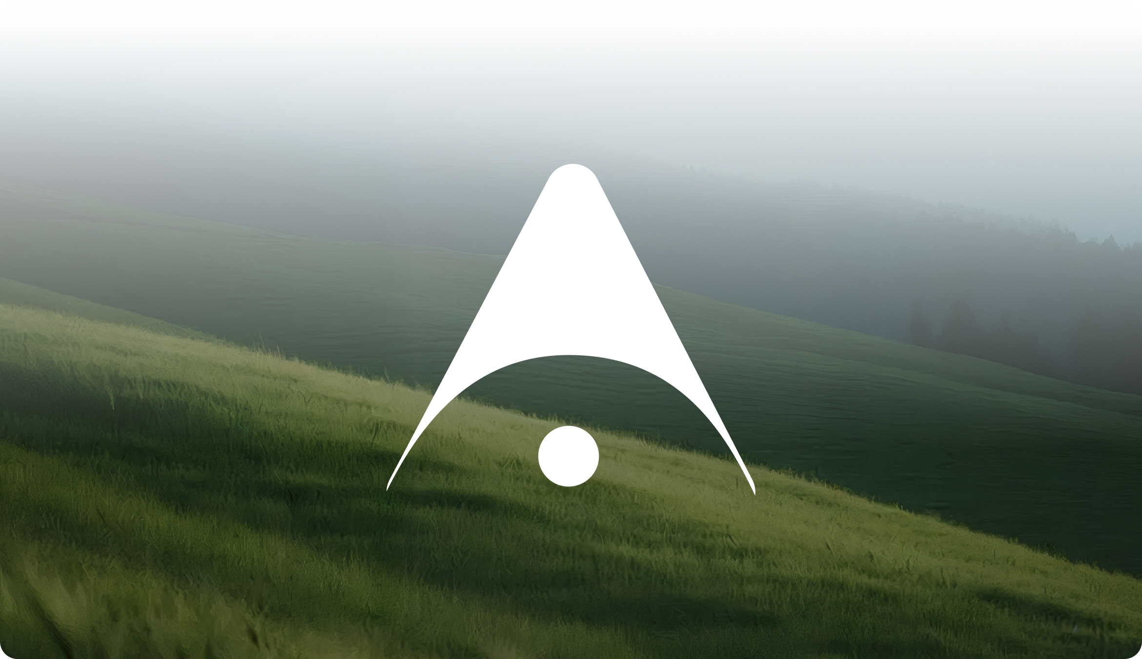
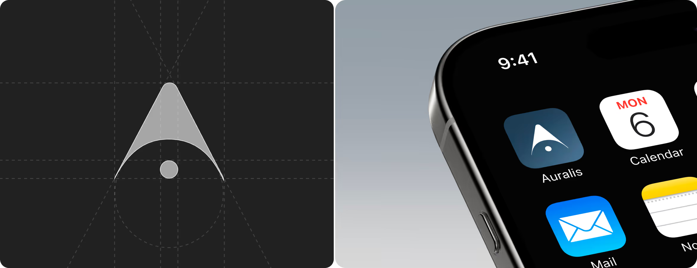
Our brand designer created the Auralis mark as a geometric arrow with a focal dot at the base. The upward form signals direction and decision. And the dot anchors attention on a single point of insight. The mark follows a strict grid construction, scales from app icon to full-screen placement, and strips detail to match how the product works.

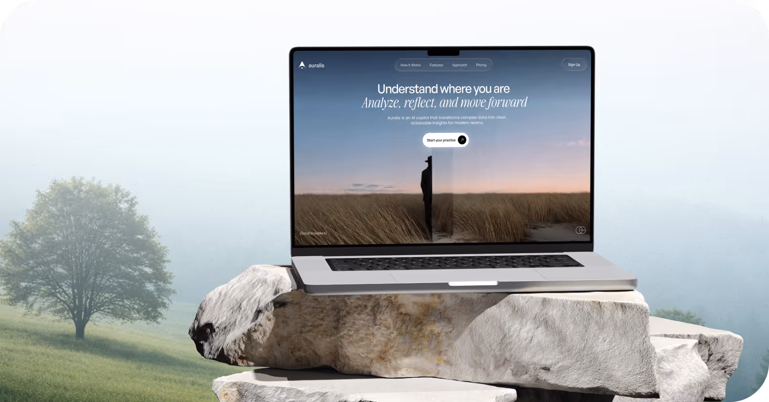
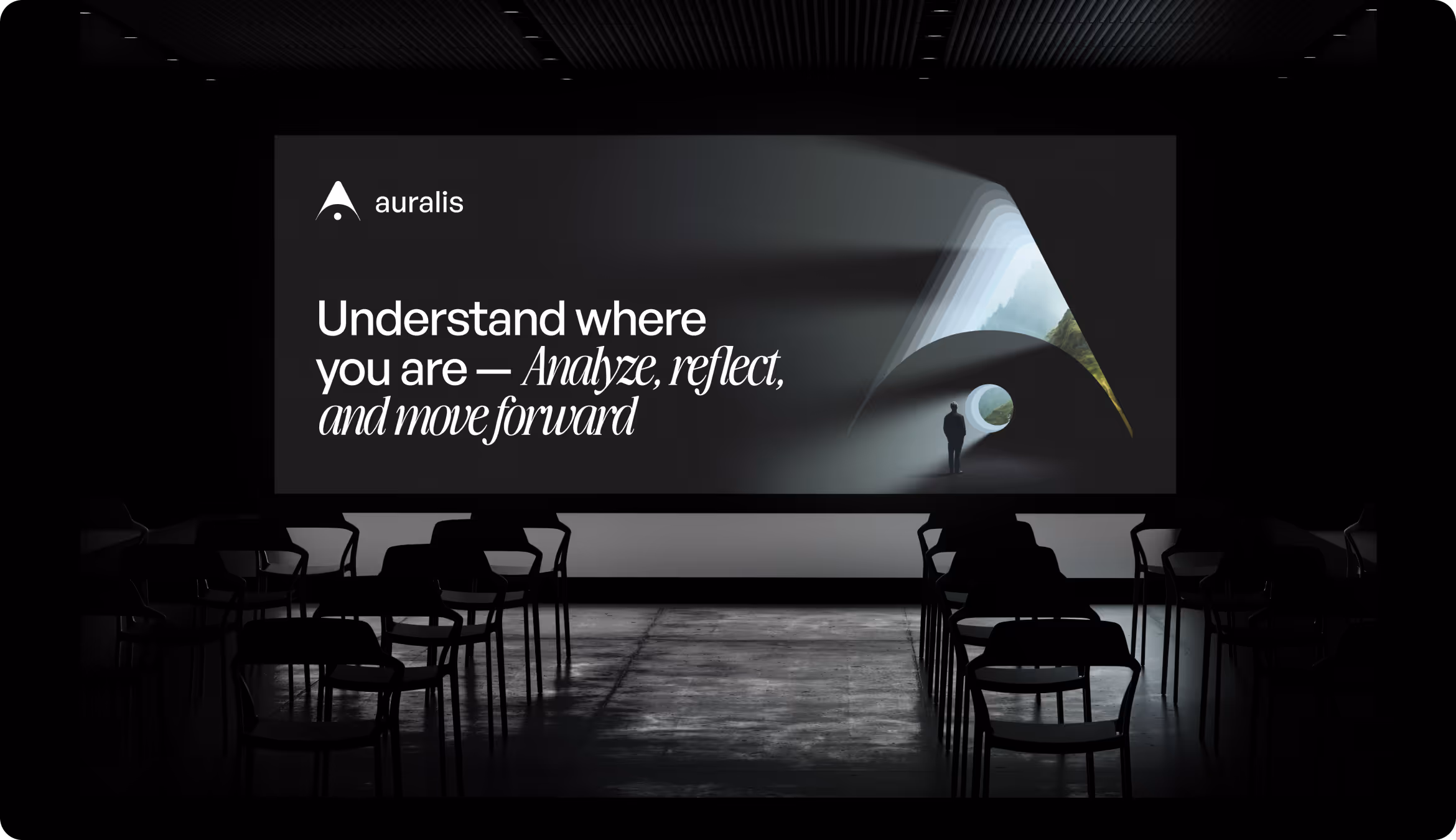
Landing Page Layouts
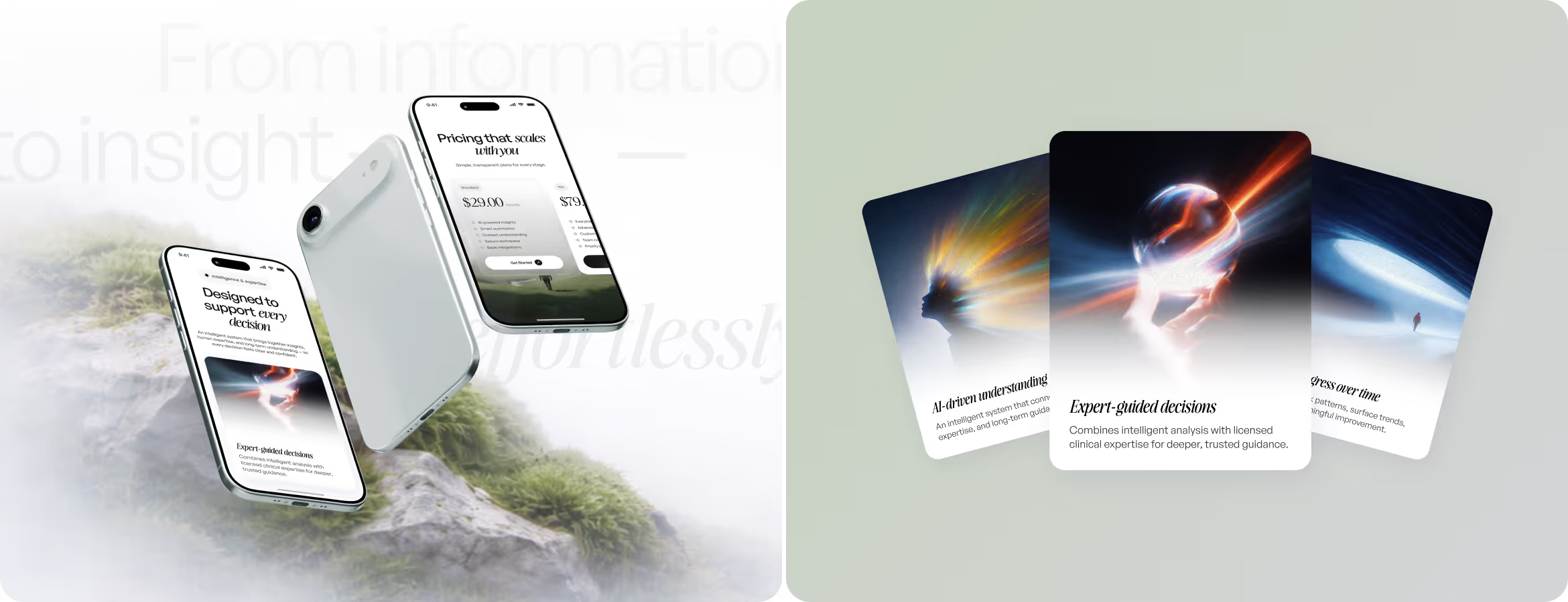
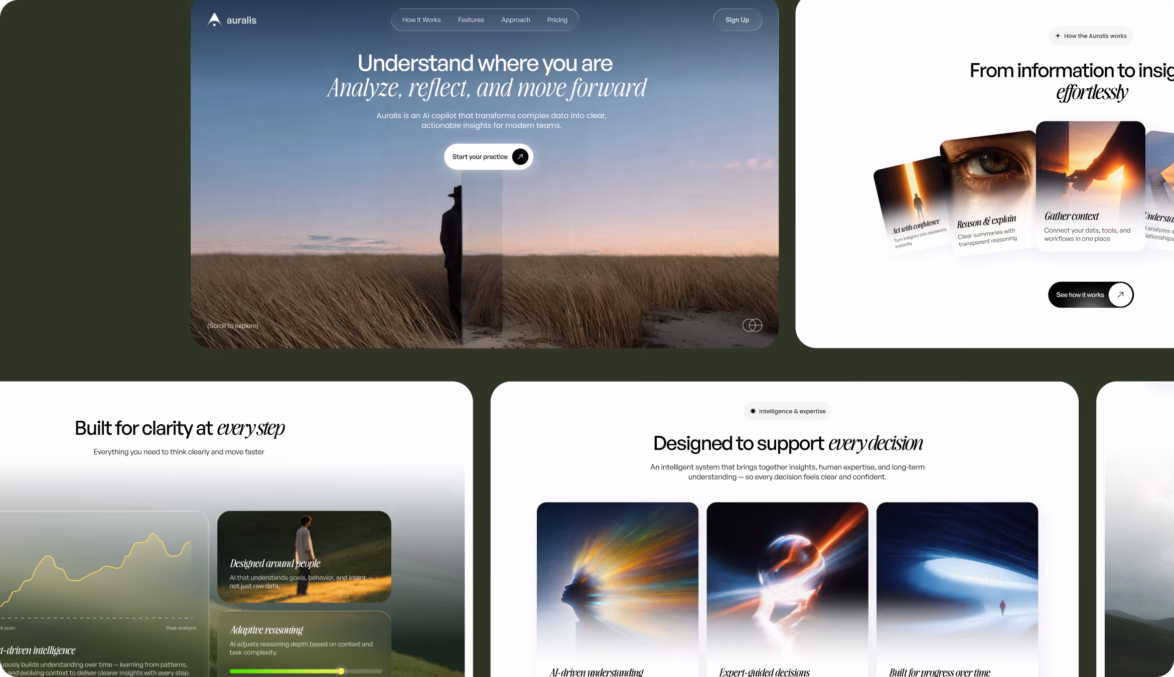
A UI/UX designer built the landing page with real photography, natural tones, and open space. This solution distanced Auralis from the dark and data-heavy aesthetics typical for AI products. The page follows a single conversion path: value statement, product logic, feature proof, pricing. Each section answers one question and advances the decision.


AI copilots often overwhelm or oversimplify. Arounda designed the one that explains and proves.
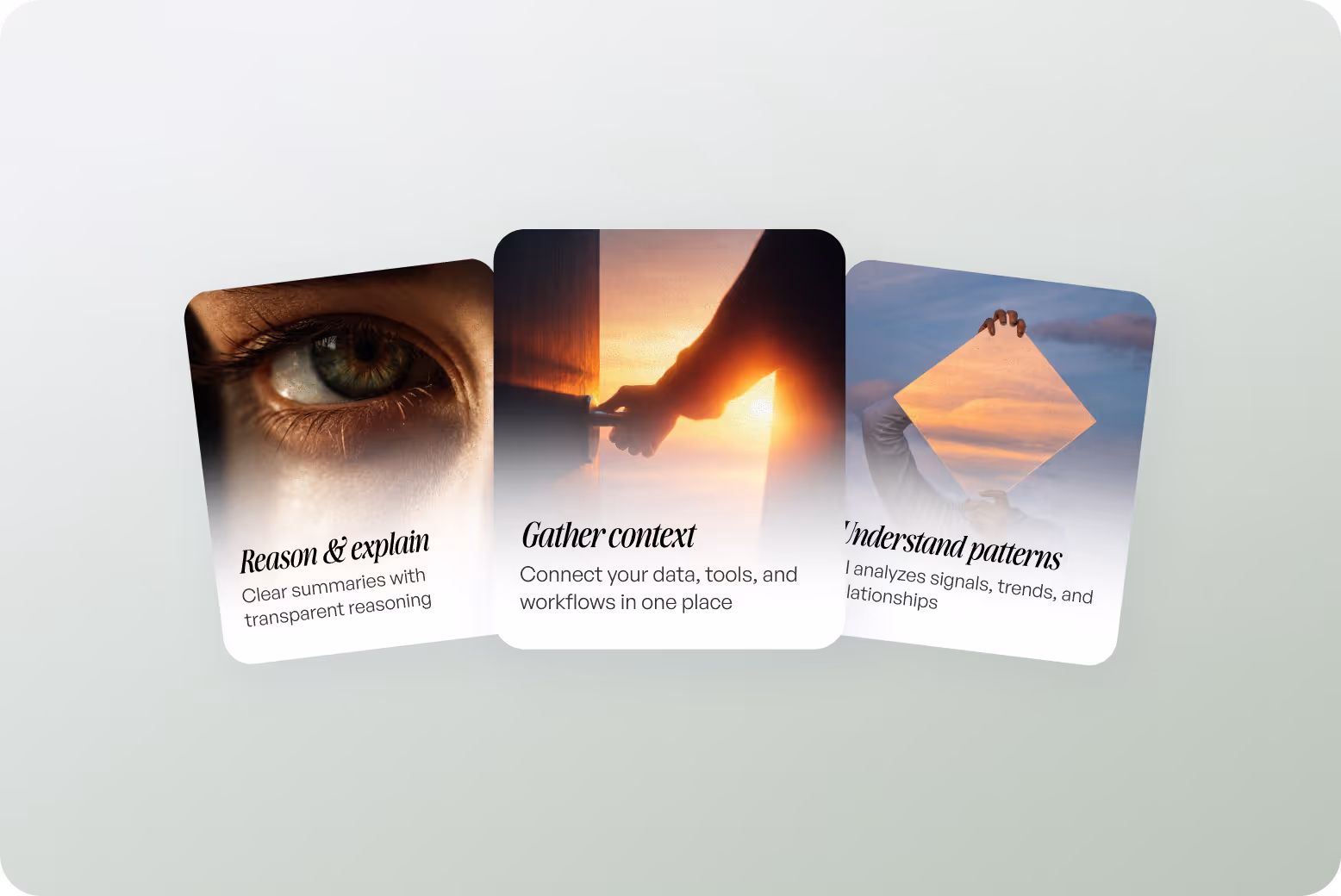
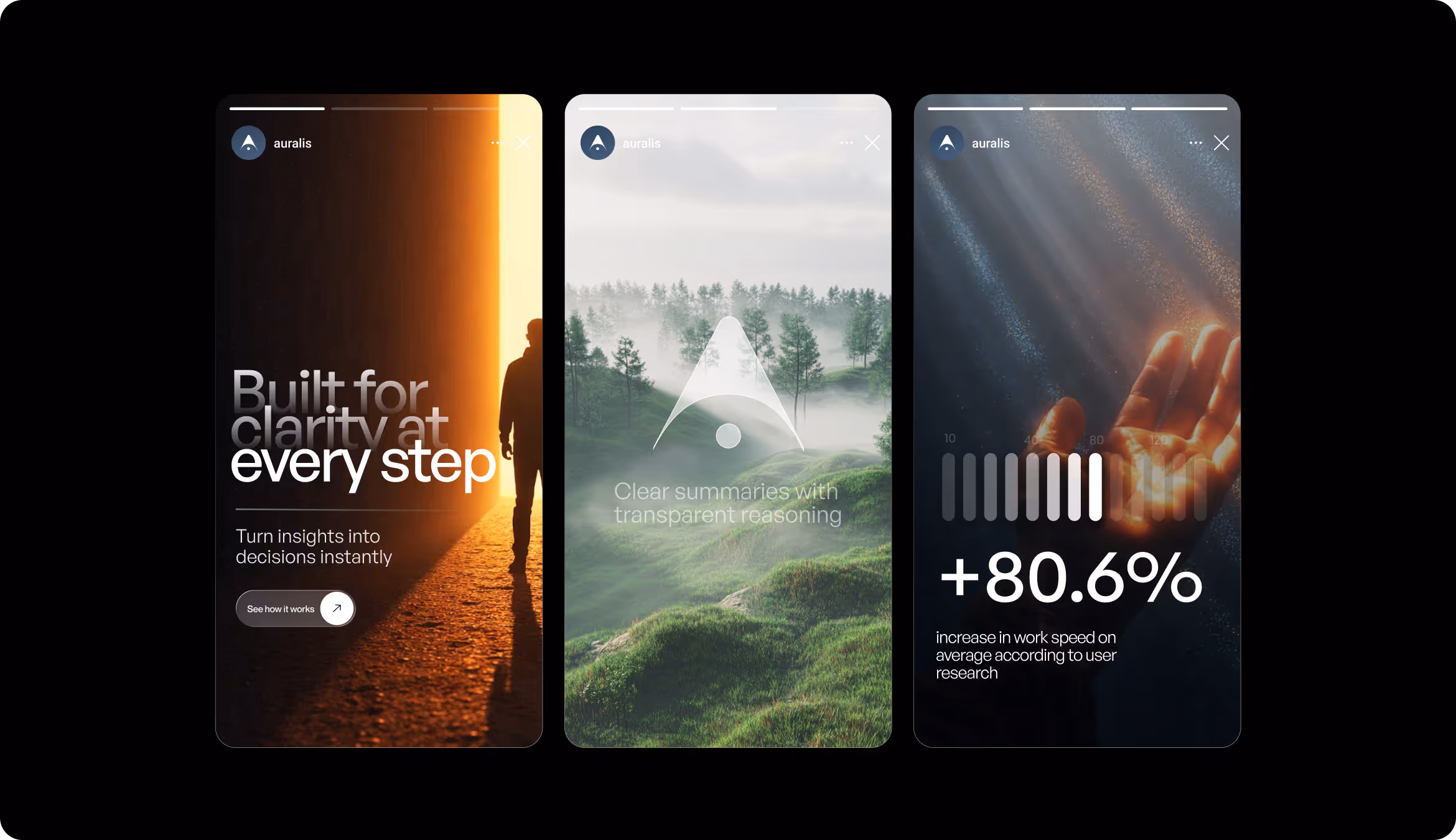
Social Materials
Our graphic designer developed unified social assets (stories, presentation screens, and branded visuals). They have full-bleed nature photography and human silhouettes instead of the interface screenshots and abstract gradients typical of competitor products. Each format carries one message, one metric, or one visual idea for clarity and recognition.
Design system
Results
+81%
Increase in work speed on average, according to user research.
Layered information architecture and progressive disclosure let users access key insights without navigating through unnecessary complexity.
87%
Of users reported higher confidence in AI-generated recommendations during usability testing.
Transparent reasoning, references, and visual separation of AI insights from expert guidance build trust in automated outputs.
-35%
Decrease in onboarding drop-off rate.
Clear visual guidance and reduced cognitive load help new users reach their first meaningful insight without abandoning the flow.
+45%
Increase in feature engagement.
Progressive disclosure and explainable AI outputs encourage users to explore deeper analysis instead of staying on surface-level summaries.
