
Medical Dashboard Design for High-Pressure Workflows
Design for faster action in critical patient care
About project
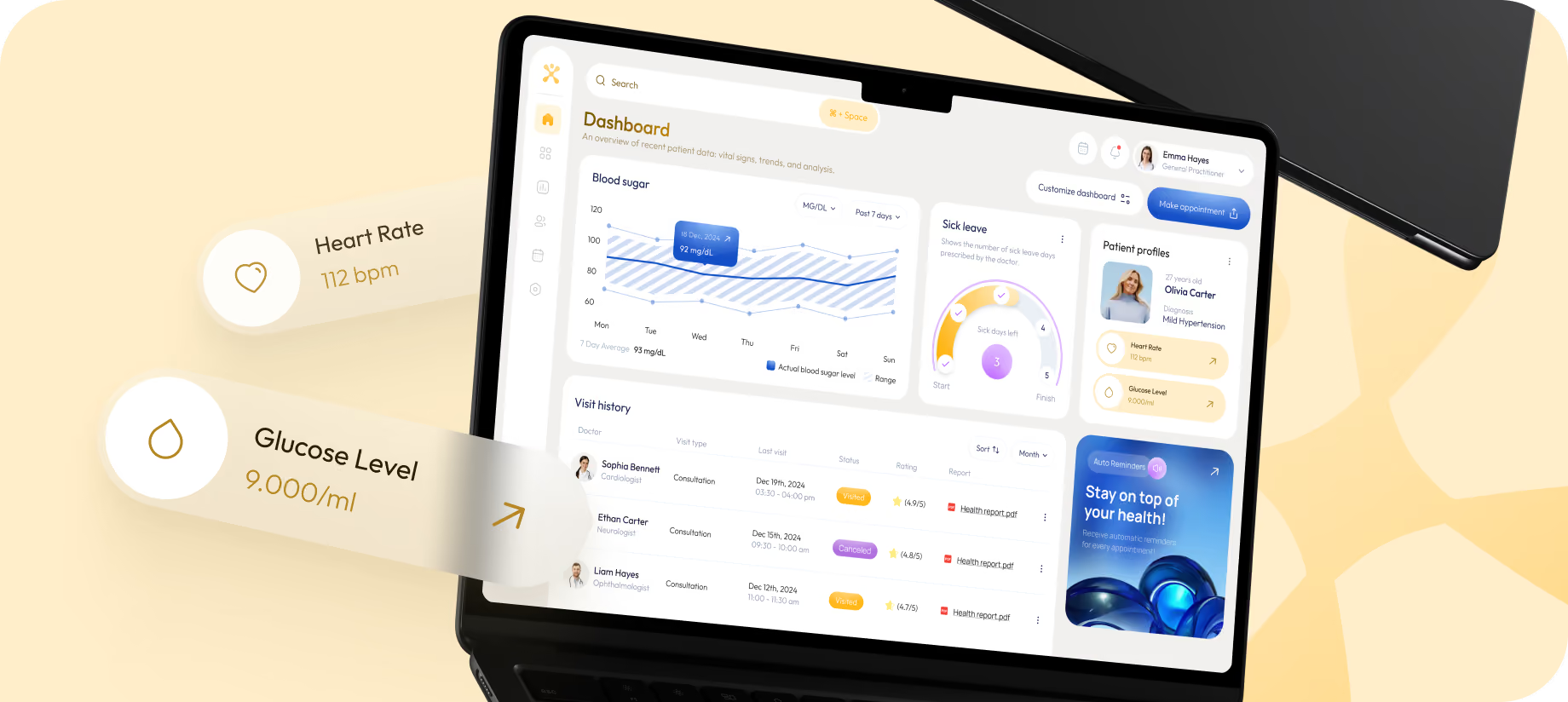
Cinex is a healthtech product for clinics and private practitioners who deal with patient data daily. The client needed an interface that works under limited time, constant context switching, and high responsibility for every decision. Our approach centered on one principle: the current patient state should become the clearest thing on the screen before users read any secondary data.


Challenges & Solutions
Problem
The most challenging aspect was eliminating any factors that slowed down the reading while maintaining an interface that was trustworthy enough for a medical application. Within seconds, the dashboard has to simplify patient data with a clear priority mechanism.
Solution
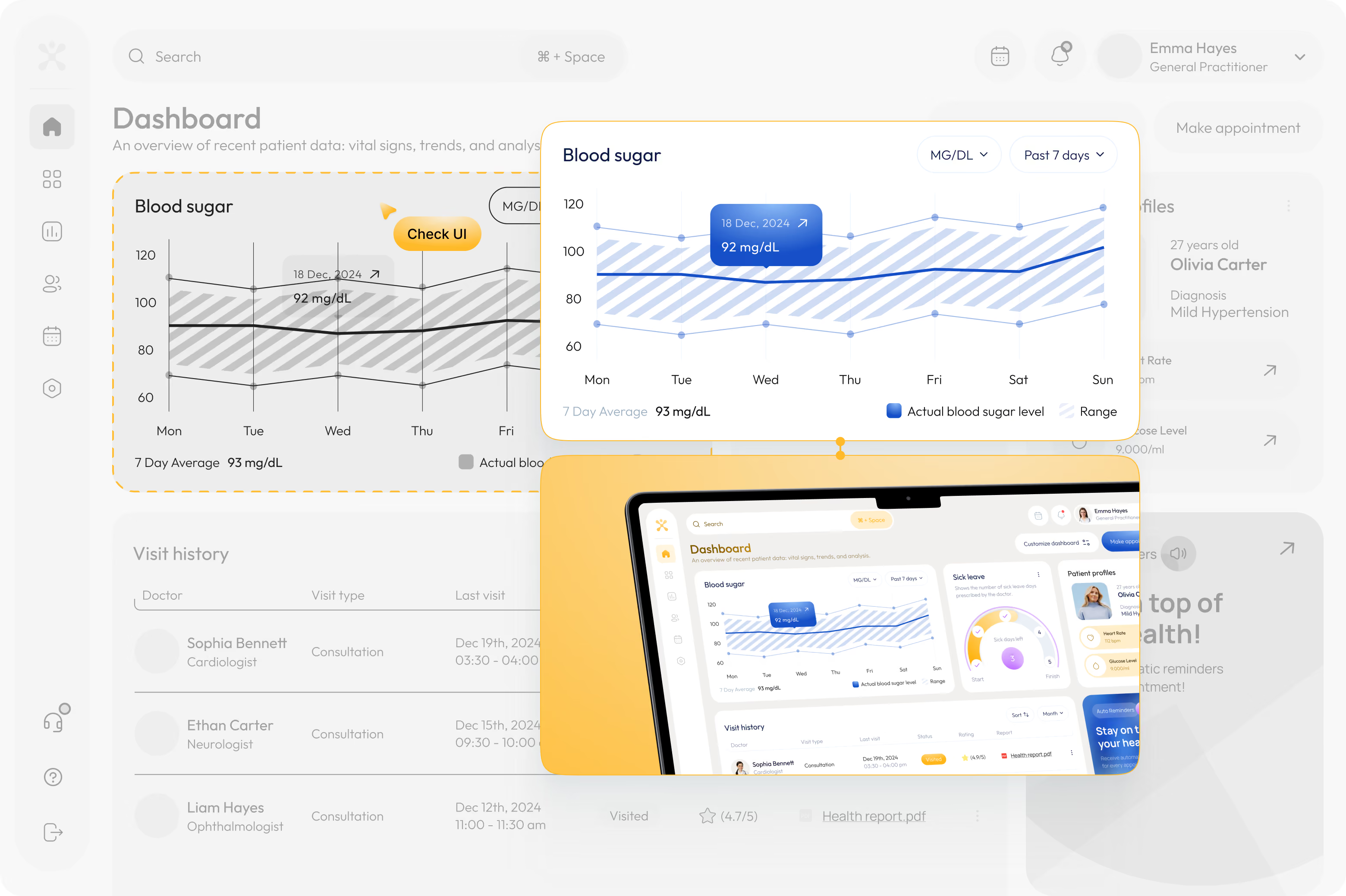
We centered the screen's design on the primary trend graph to display the initial read before the doctor evaluates any other data. Each card got one role, and we kept the visit history table format since doctors can scan the rows far more quickly than with any of the other layouts we tried.
Process
User Flow
As patient information can get lost in a sea of charts, tabs, and mismatched alerts, we reorganized the flow so that doctors could quickly estimate the state of a patient, dive into the details without losing the context, and take action right from the dashboard.

Wireframes
UI Layouts
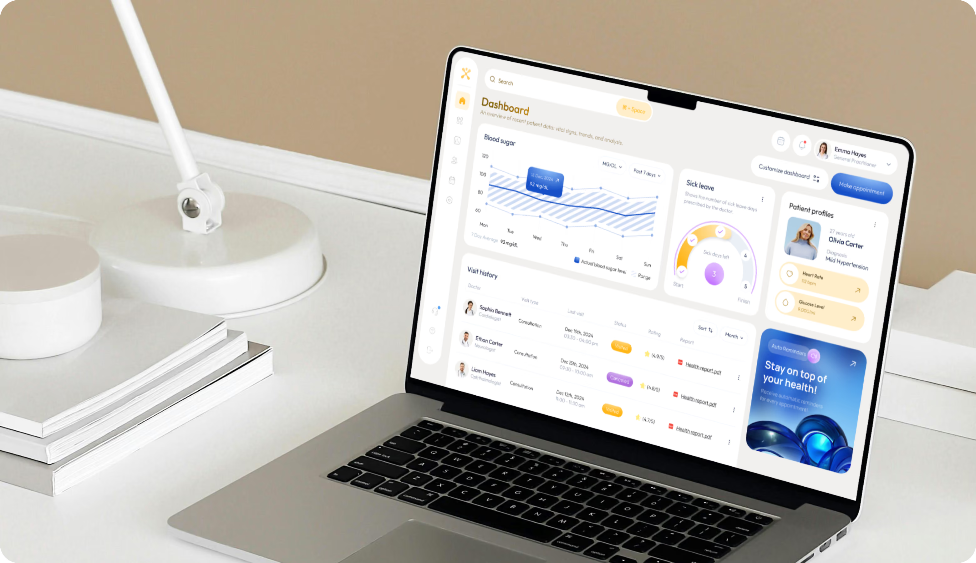
Cinex user interface designs have a minimalist card structure with a single, prominent section on each screen. As visual widgets are used for the “heavy lifting” of data moments, the mobile view keeps the patient profile, essential metrics, and appointment actiontogether. Gentle pops of color, rounded cards, and soft spacing create a medical-feeling interface that isn’t sterile.
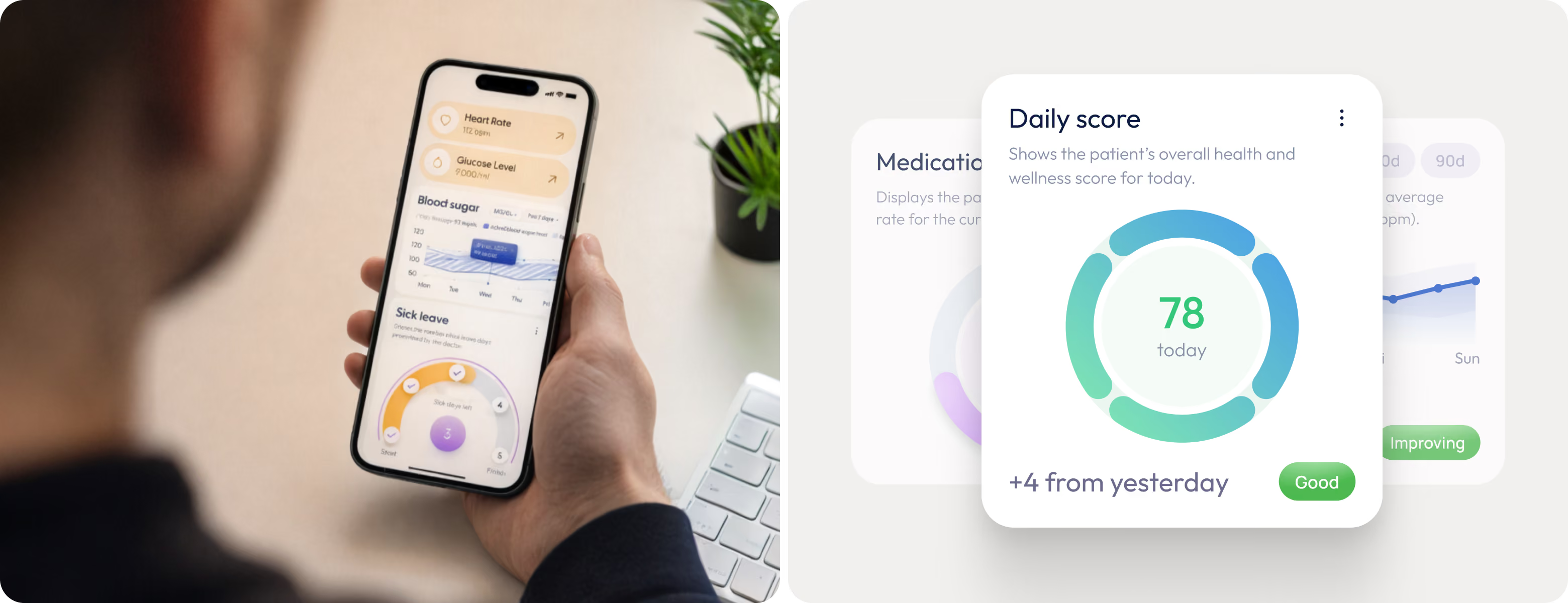
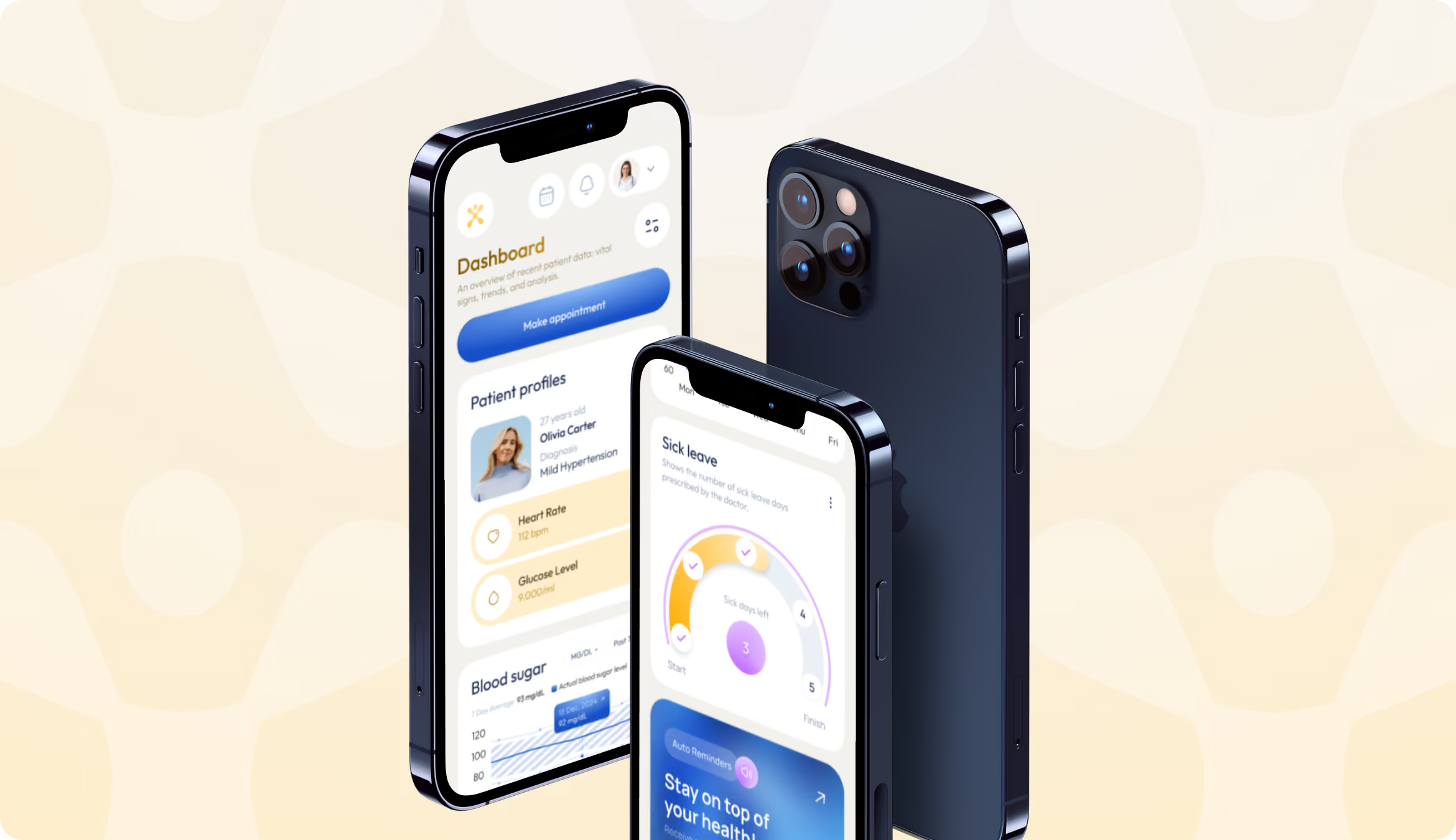

We turn patient dashboards into clear actions during critical care.
Social Media
When it came to marketing connections, social assets used the same product logic. Even on small devices, the large print made every statement legible. The graphics were still associated with Cinex without coming across as generic healthcare advertisements thanks to patient pictures, soft gradients, and cropped dashboard fragments.

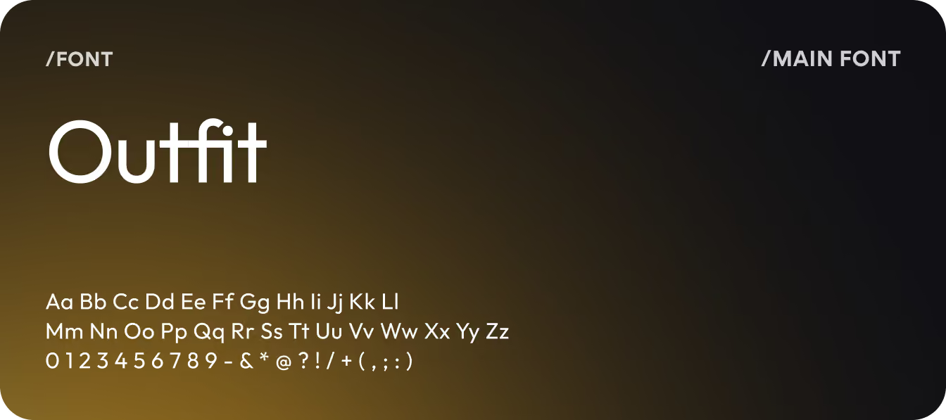
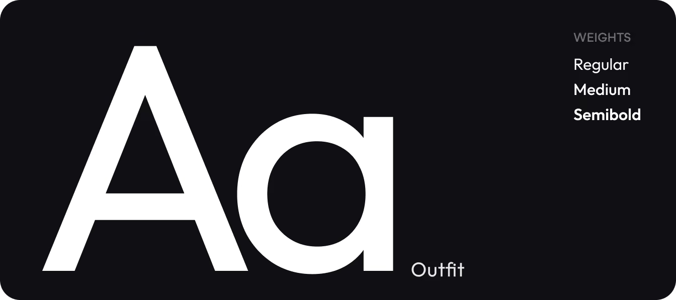
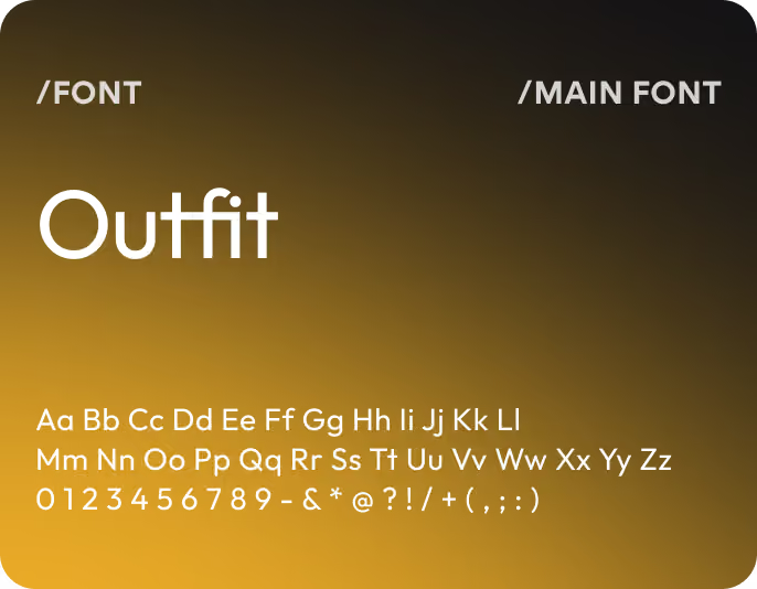
Design system












Results
x3
faster PATIENT STATE RECOGNITION
Doctors identified the current patient condition faster after the dashboard shifted from equal-weight metrics to one dominant clinical signal and contextual secondary data.
+42%
DAILY DASHBOARD ENGAGEMENT
Clinicians returned to the dashboard more frequently after key actions, patient overview, and scheduling became accessible from one uninterrupted workflow.
+28%
APPOINTMENT FLOW COMPLETION
Patients and clinic staff completed scheduling flows more consistently once the interface reduced navigation friction and surfaced actions earlier in the process.
-25%
METRIC INTERPRETATION ERRORS
Visual hierarchy and contextual indicators reduced moments when users can miss patient status updates or changes because they are hidden inside dense dashboard blocks.
