
Web App Design for an AI Cognitive Health Platform
UI/UX Design
Design built for instant understanding
About project
Cognify lets knowledge workers track their mental state by translating complex biometric changes into actionable insights, giving them early warnings of stress, before fatigue sets in. Neurolane Labs partnered with Arounda to design the high-fi web app experience.


Challenges & Solutions
Problem
Cognitive health systems have many charts and technical metrics that can be hard to understand. Cognify had to simplify complicated biometric data into understandable insights. Users needed a quick read on their status and the ability to act without decoding raw data.
Solution
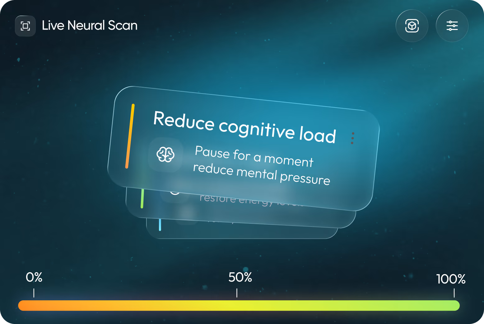
Our Arounda designers prioritized making health data easy to grasp while highlighting the most important insights. For each AI recommendation, we broke the data down into secondary perspectives and provided an explanation. In seconds, users could grasp the situation and choose their next move.
Process
User Flow
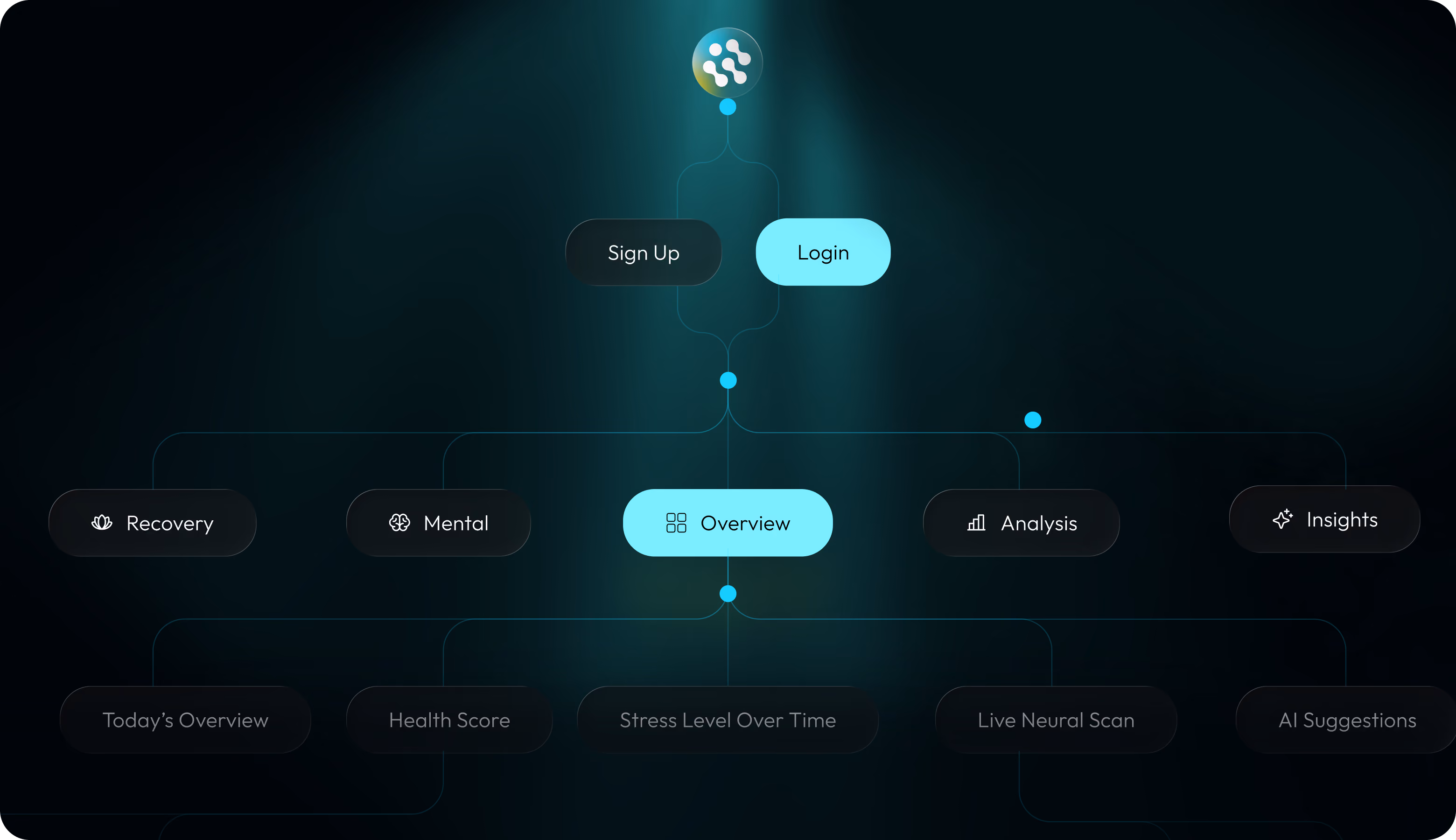
Wireframing
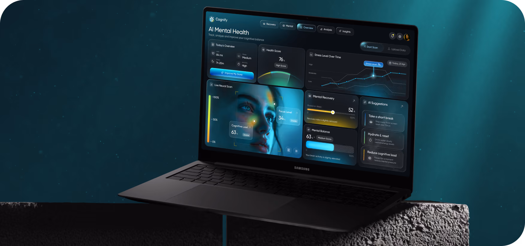
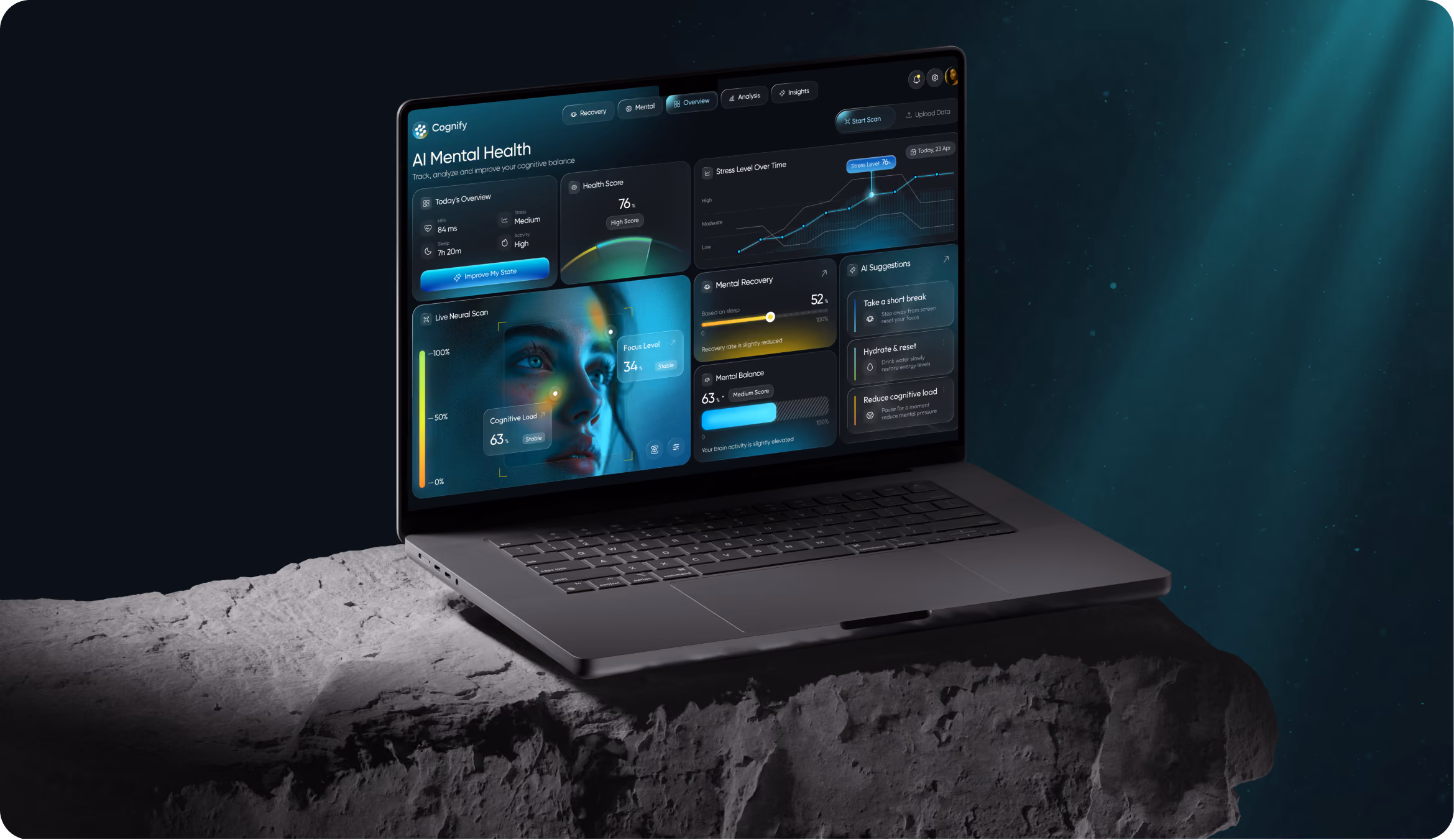
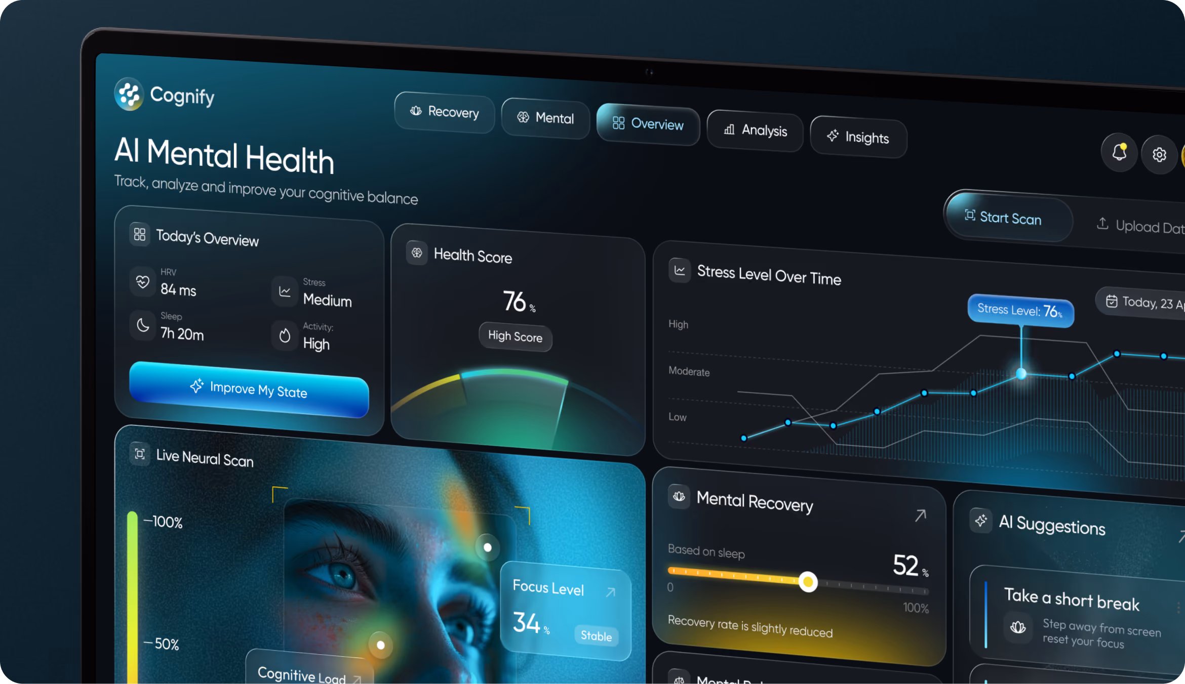
Here, information hierarchy was key. Quick decision-making was our focus as we streamlined dashboard interactions, made important information our top priority, and eliminated unnecessary complexity.
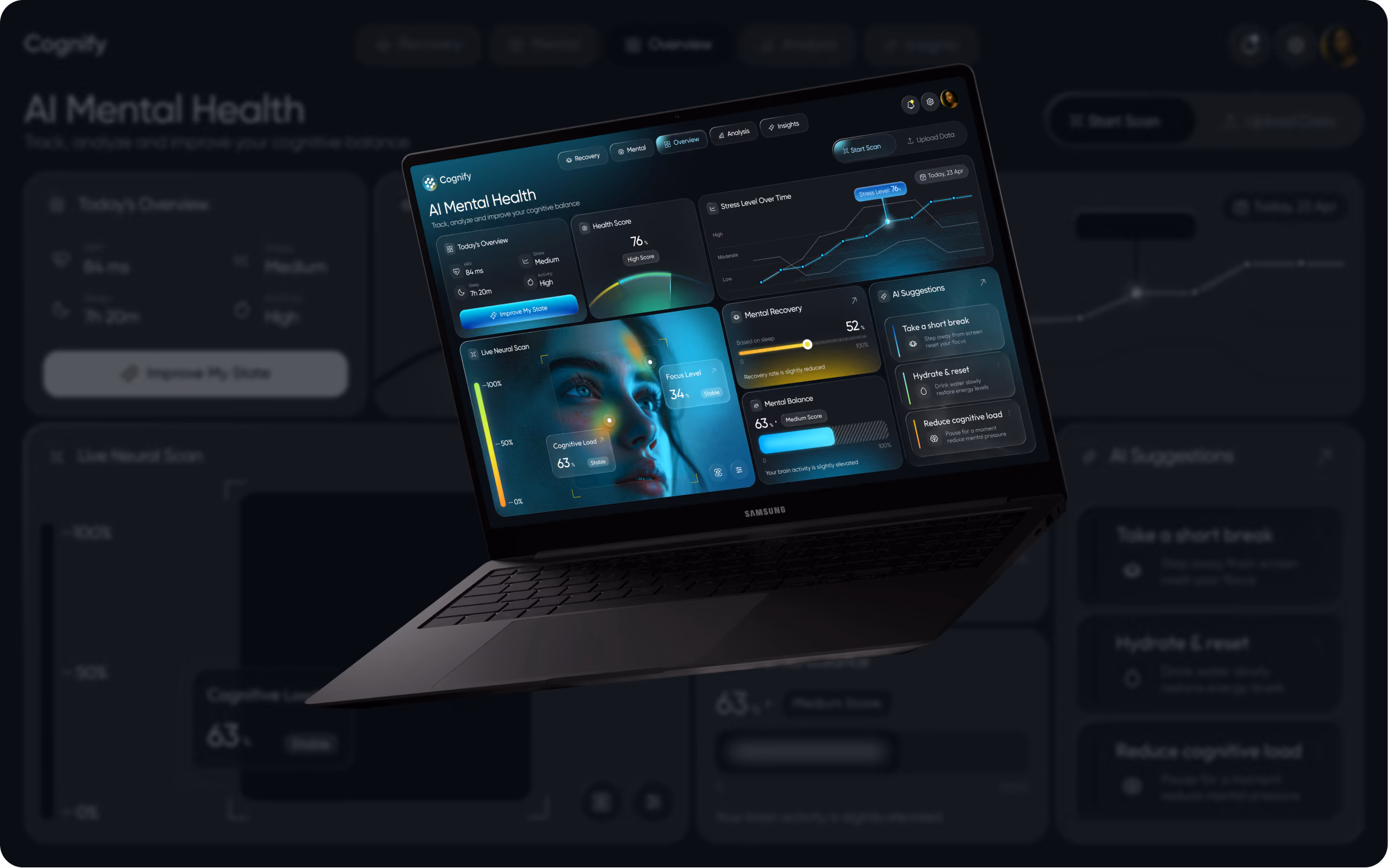
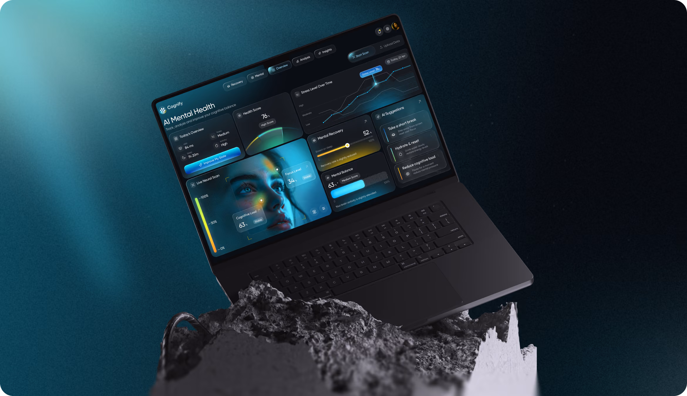
Web Application Design
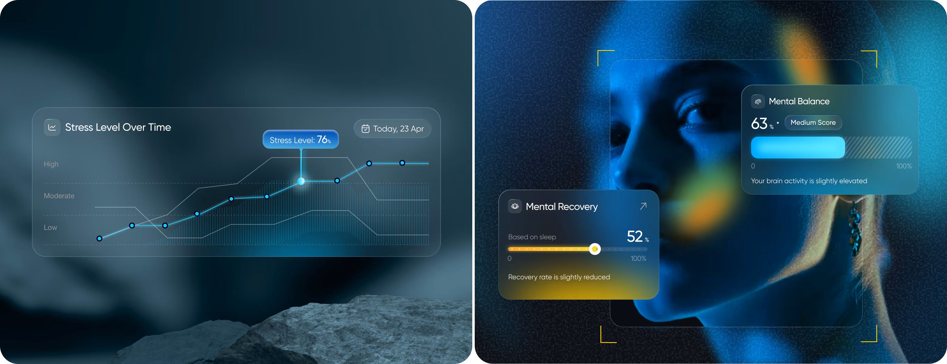
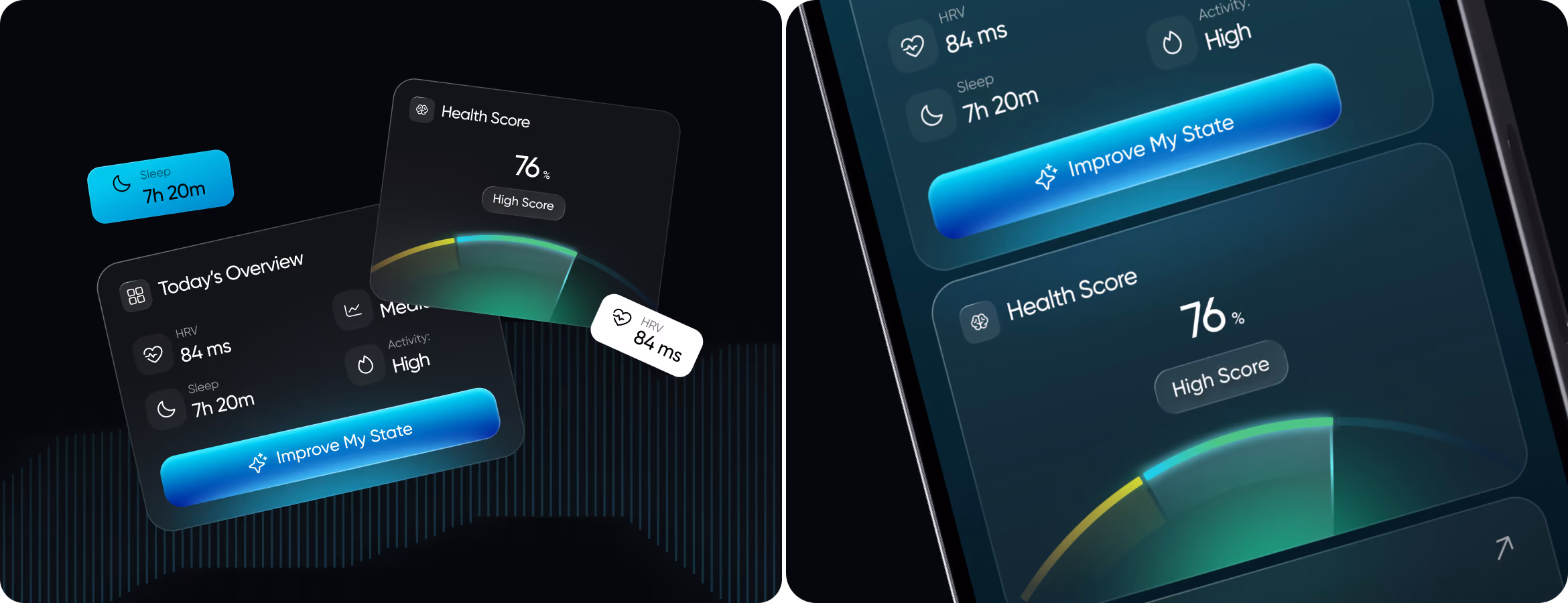
Our main design principle for Cognify: give users an answer before showing them the data behind it. To ensure that Health Score, stress trends, scan findings, and recommendations do not distract from one another, the Arounda team constructed the screen from multiple focused zones. An additional layer of deeper biomarker data ensures that the dashboard remains informative without becoming overloaded.

Create healthcare products that reduce mental load and improve focus.
Mobile Version
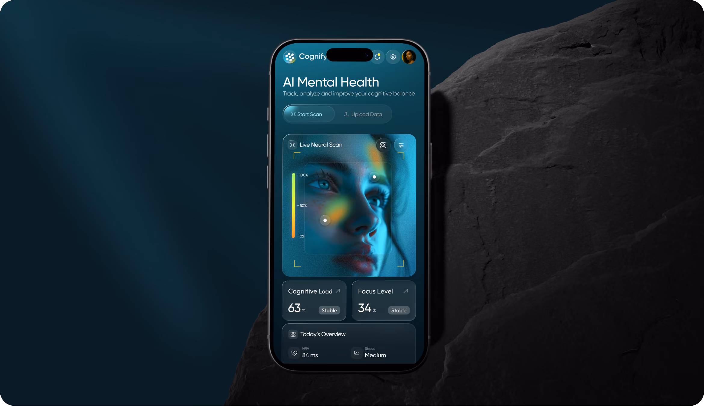
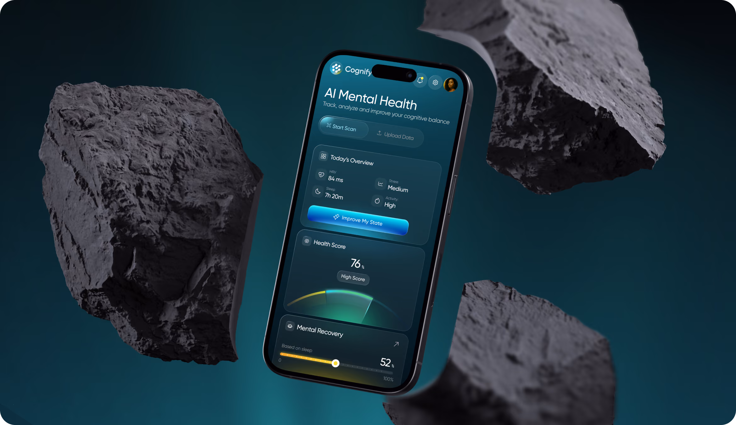
The goal was to allow users to quickly check in while on the go or in between meetings. We transformed the dashboard into a clear vertical flow and gave top priority to the most urgent insights. It's easier to use when you don't have a lot of time because the touch targets are bigger, the content blocks are shorter, and the scan states are simpler.
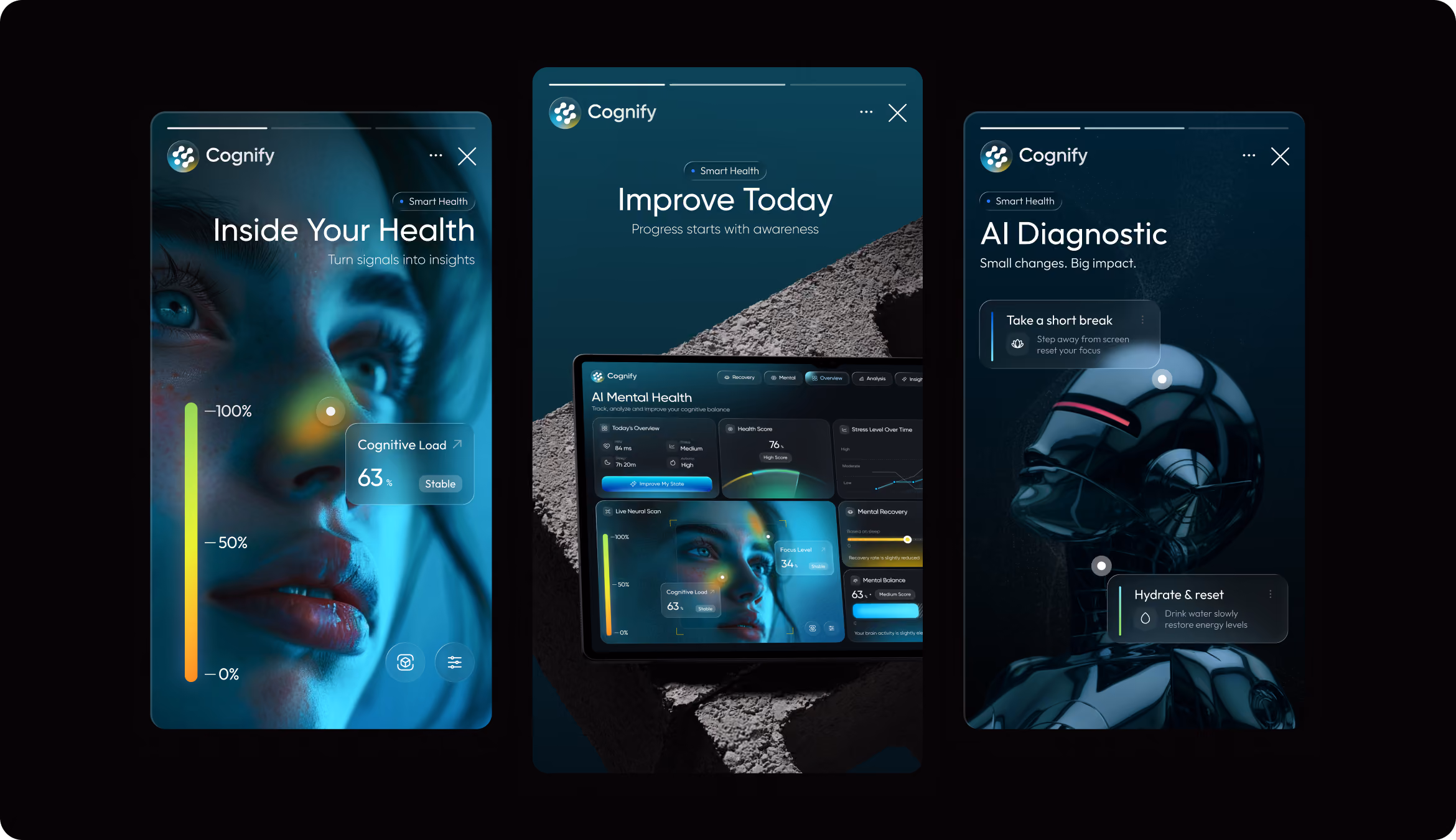
Instagram Layouts
Social visuals had to carry the same product logic. Using Cognify's dark interface language, our designers were able to simplify its complicated cognitive features into concise, easy-to-understand posts that maintained the platform's scientific integrity.
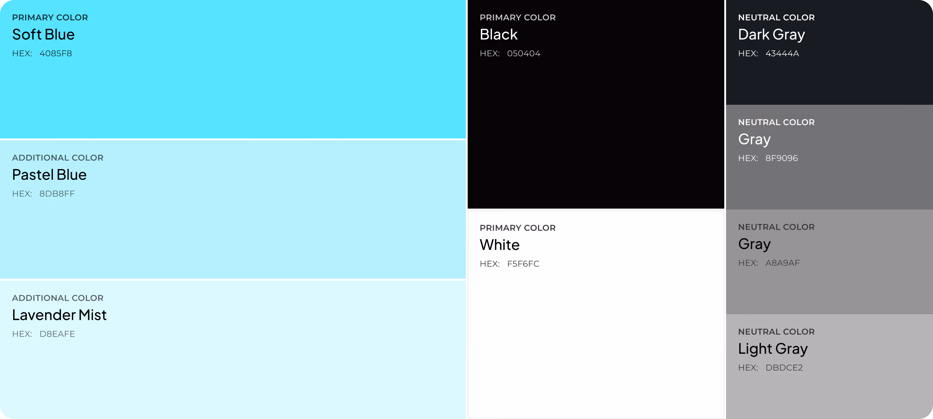
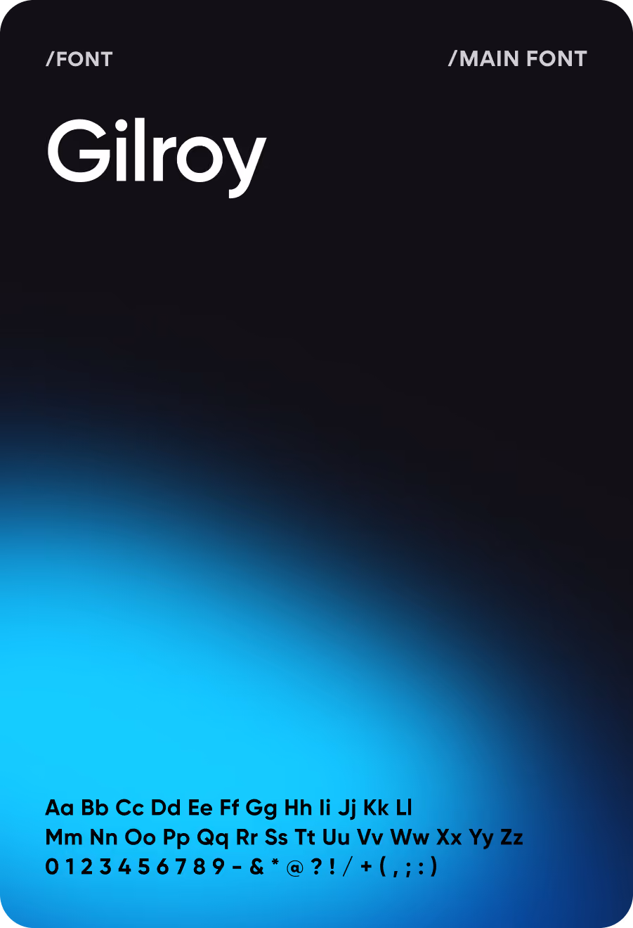
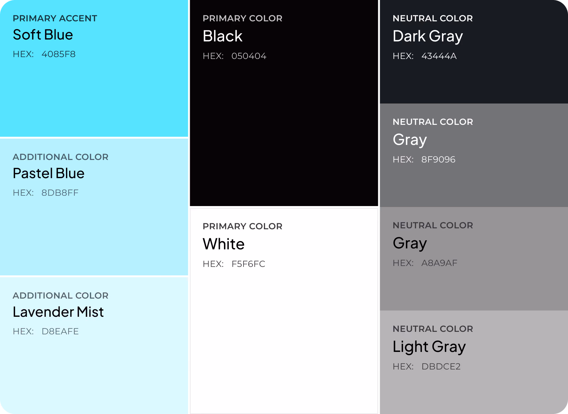
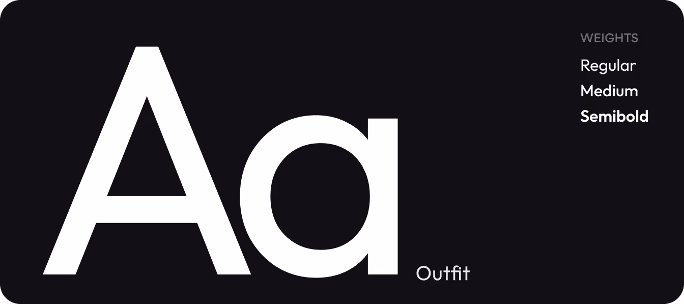
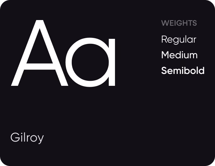
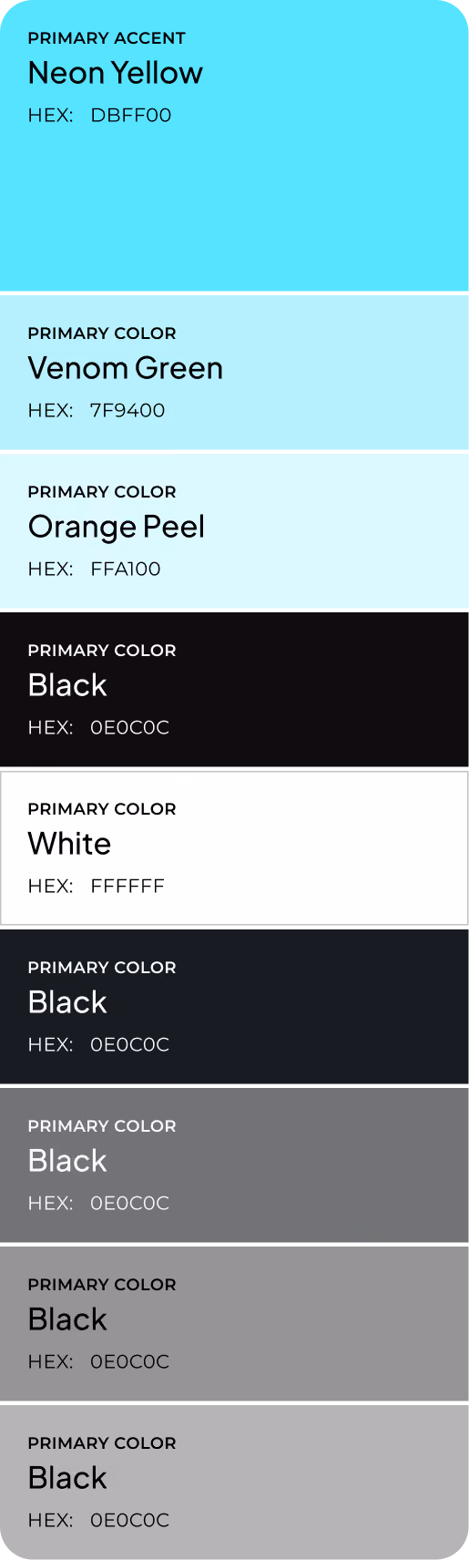
Design system
Results
2.4s
TIME TO COMPREHEND
Average time needed to understand the current cognitive state dropped from 14 seconds to 2.4 seconds.
71%
WEEK-4 ACTIVE USAGE
Users continued engaging with Cognify four weeks after onboarding, showing strong long-term adoption.
84%
DECISION CLARITY RATE
Most users reported knowing whether to continue working or take a break without additional analysis.
+67%
BREAK PROMPT RESPONSE RATE
Contextual prompts led to action when Cognify detected elevated stress or cognitive load.
