
Brand Identity and UI/UX Design for a prop trading platform
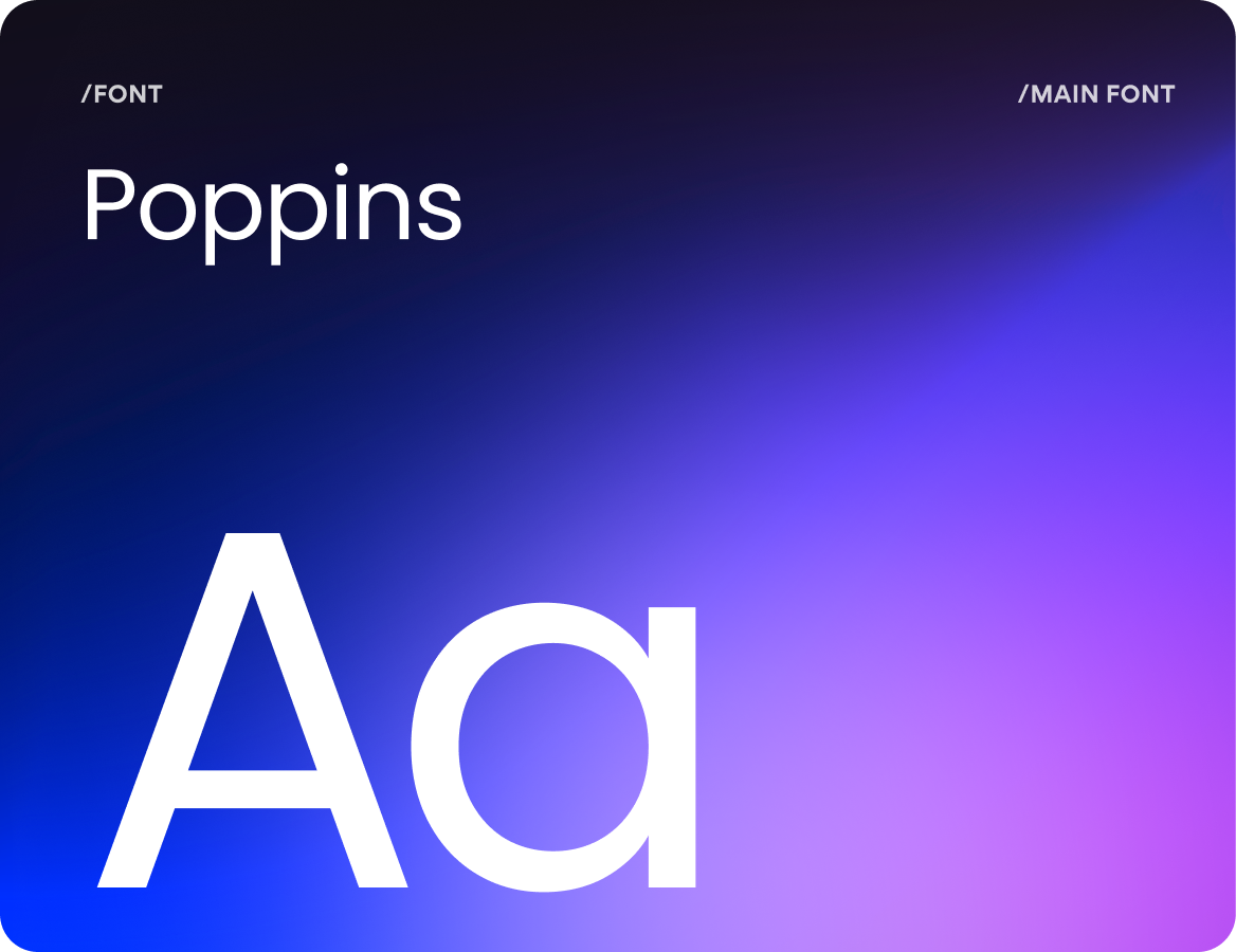
UI/UX Design
Branding
Graphic Design
One visual system across product, landing, social media, and print
About project
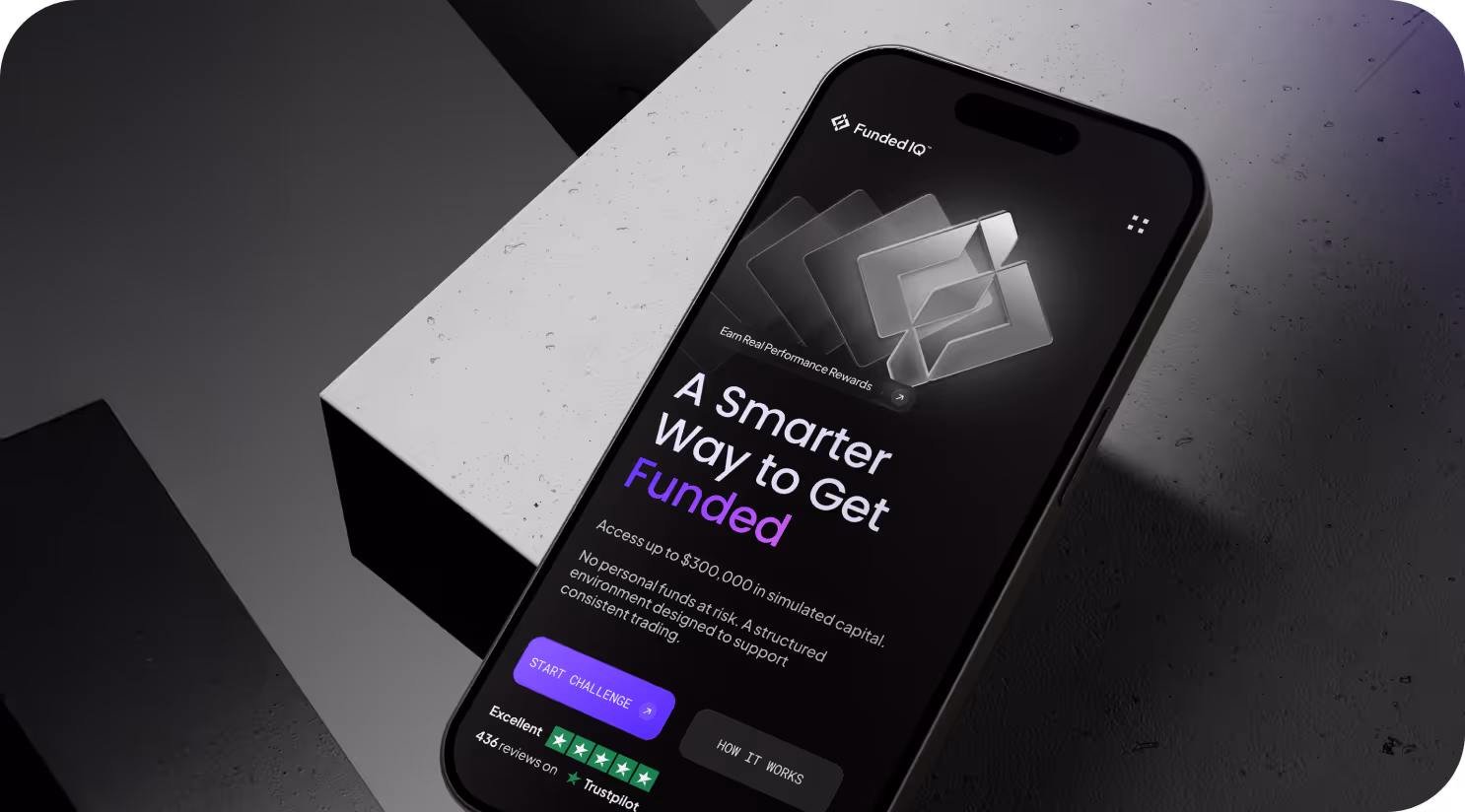
FundedIQ is a prop trading platform that rewards traders based on their proven skill. The platform assesses discipline, consistency, and strategy using assessment rules and performance statistics to award competence.

.avif)
Challenges & Solutions
Problem
No financial cliches, no aggressive promotion, no overloaded interfaces. Our team had to balance technological precision with approachability and communicate sophistication, trust, and analytical depth. Branding and UI/UX solutions had to reflect FundedIQ's values: clarity, discipline, and fairness.
Solution
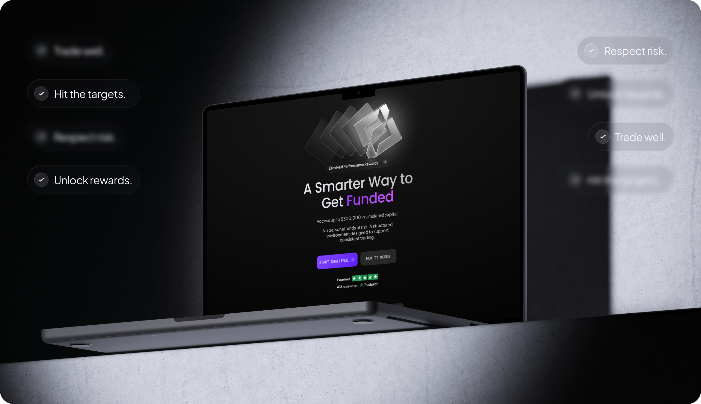
Clarity drives trust. Arounda delivered branding, graphic design, and UI/UX. We created a dark-toned visual system using glassmorphism and precise accents that carry through to the product. Structured grids and a clear hierarchy allow traders to focus on assessments and progress without confusion or complexity.
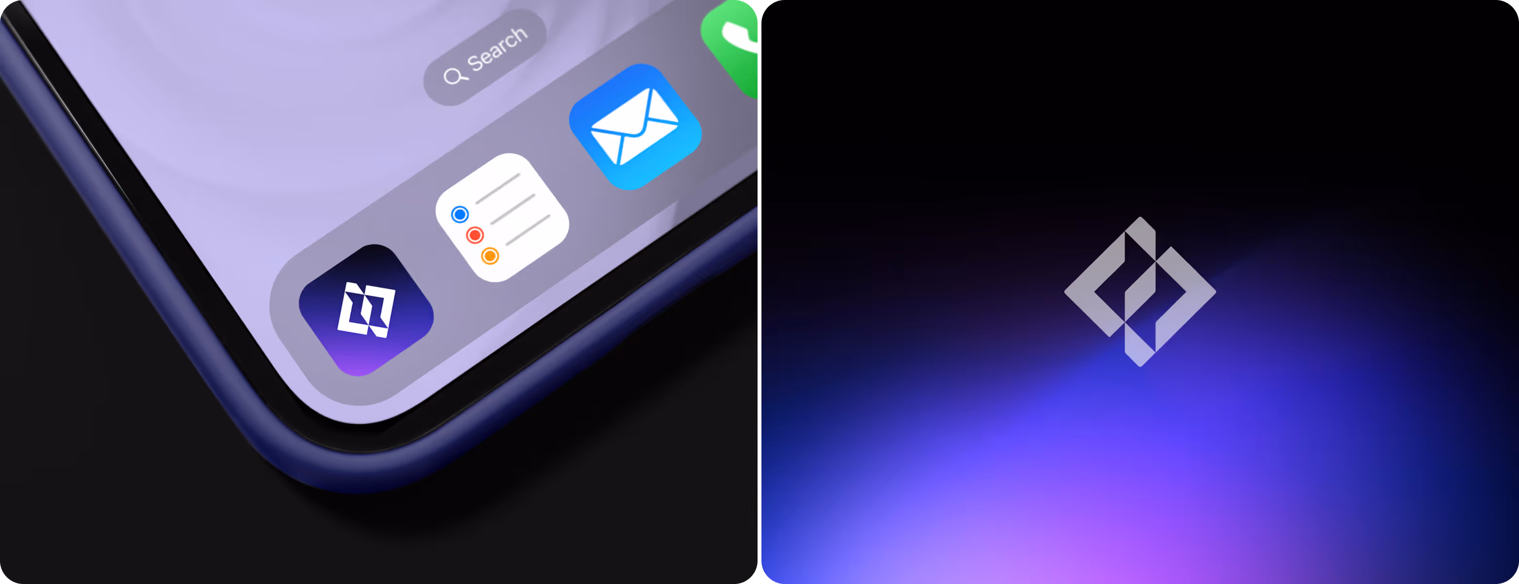
Logo Concept Design
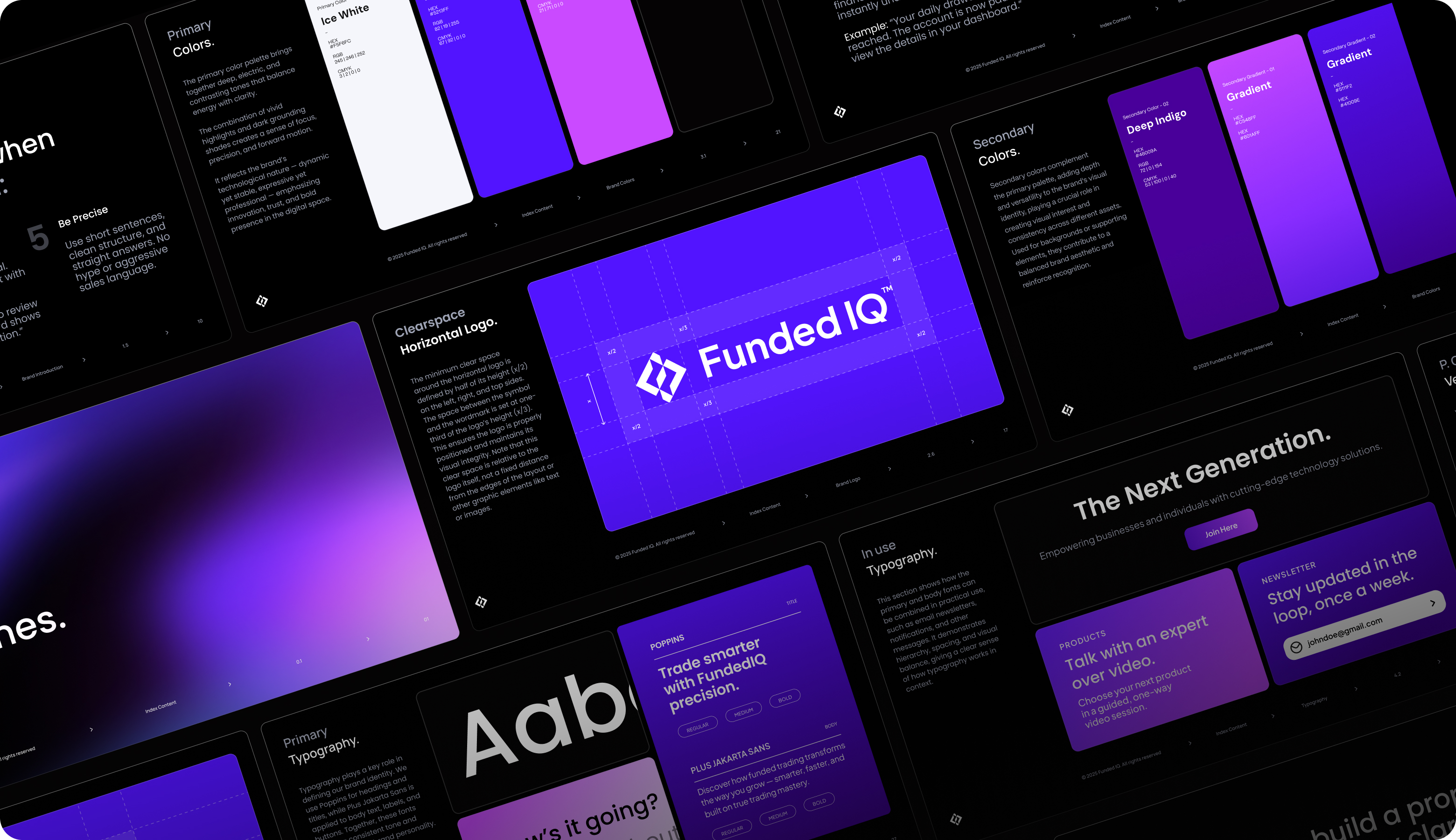
Our brand designer created the FundedIQ mark as two interlocking diamond shapes: a geometric reference to analytical thinking and layered evaluation. The construction follows a defined grid system with x/2 and x/3 proportional spacing. Our approach keeps the mark balanced and scalable from a 64px app icon to full-screen brand placements or print.
.avif)
Moodboard
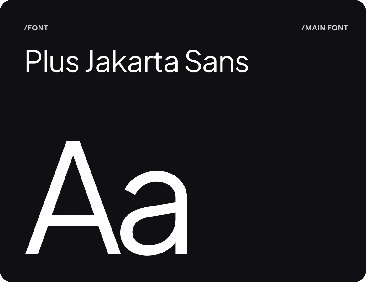
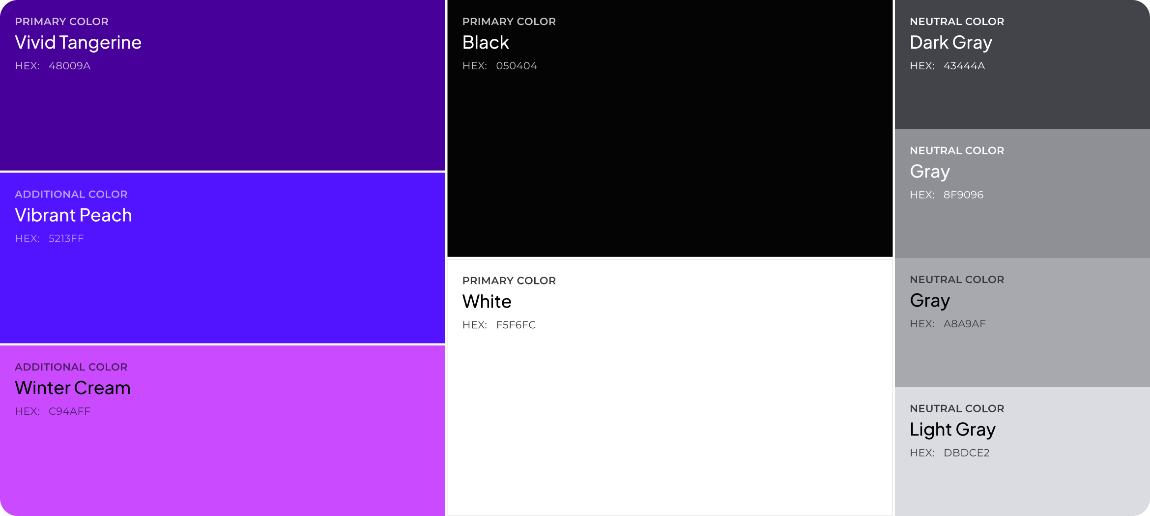
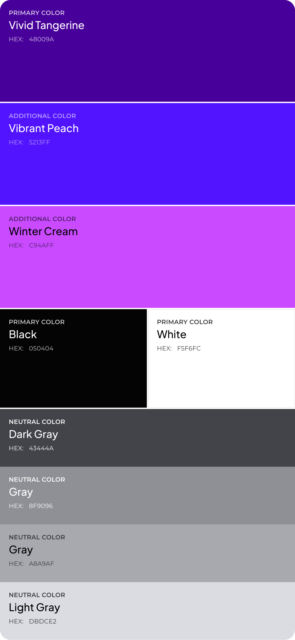
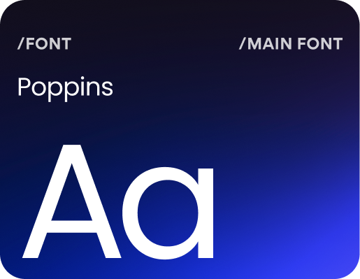
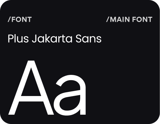
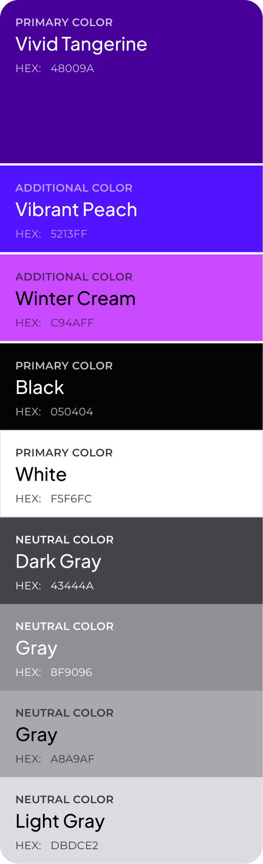
Brand Guidelines
Brand guidelines protect the identity from inconsistent execution. The document covers logo placement, color palette, typography hierarchy, and spacing standards. Internal teams and external partners now have a clear framework to maintain visual coherence as FundedIQ scales. This stage is important for every project, so we always include the brand guidelines in our design process.
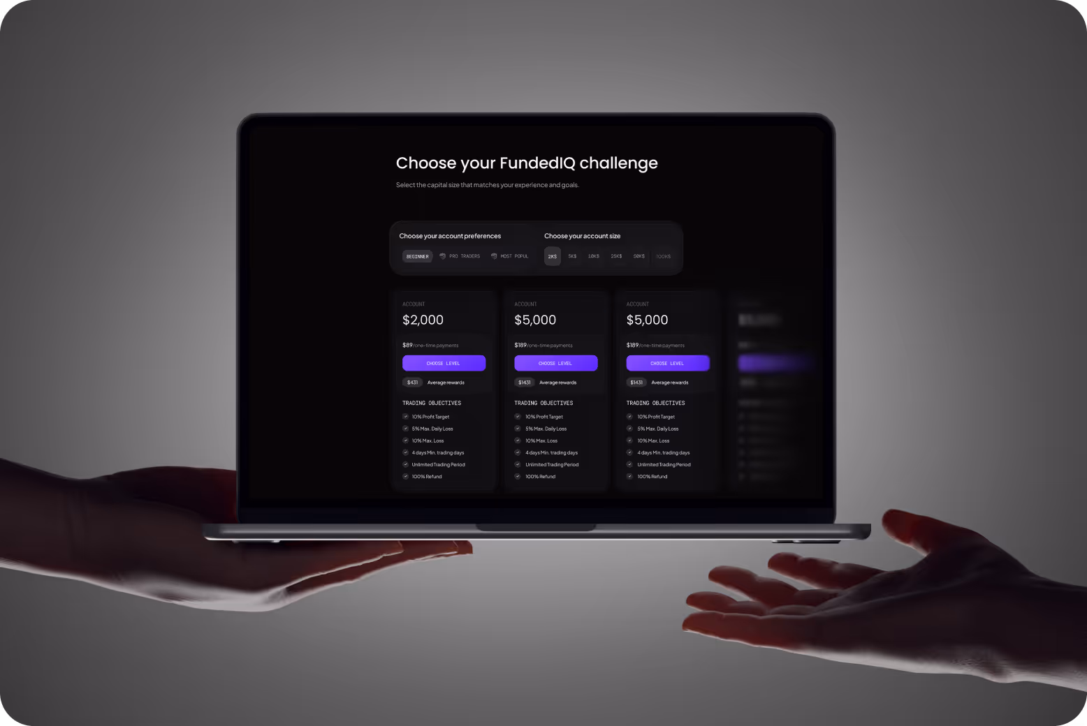
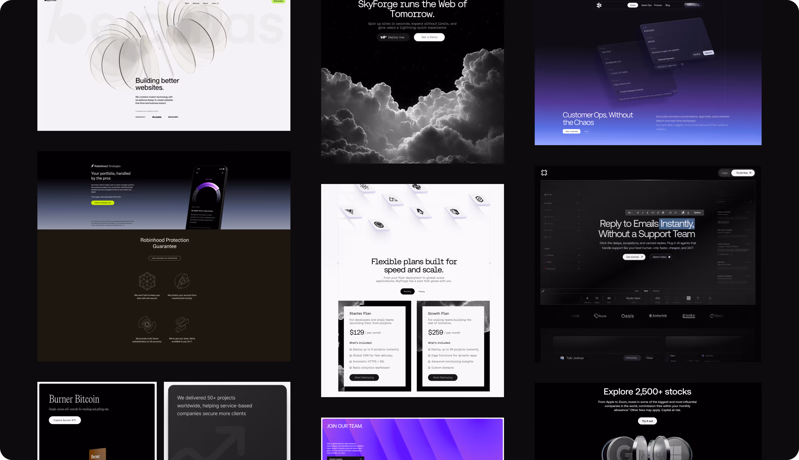
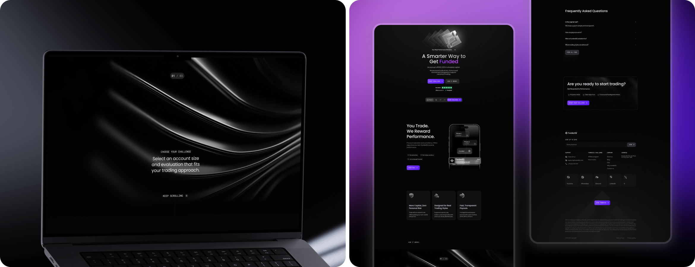
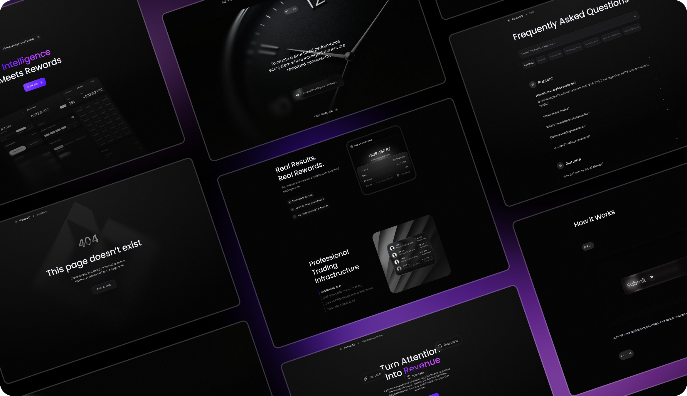
UI Layouts
Our UI/UX team delivered a complete web layout system with a landing page, product pages, challenge selection, FAQ, 404, and mobile-responsive views. The dark interface uses purple accent colors and structured content blocks to focus and guide traders step by step. Each page balances information density with visual breathing room.

Arounda helps trading platforms look as precise as the logic behind them.
Social Media
Social media in prop trading has to build trust and convert without looking like every other fintech ad. Arounda's designers built three content templates: educational content with UI mockups, announcements with real photos, and market-oriented leadership cards. Every format is visually related to the product, making the feed feel like a brand extension rather than a separate marketing channel.
.png)
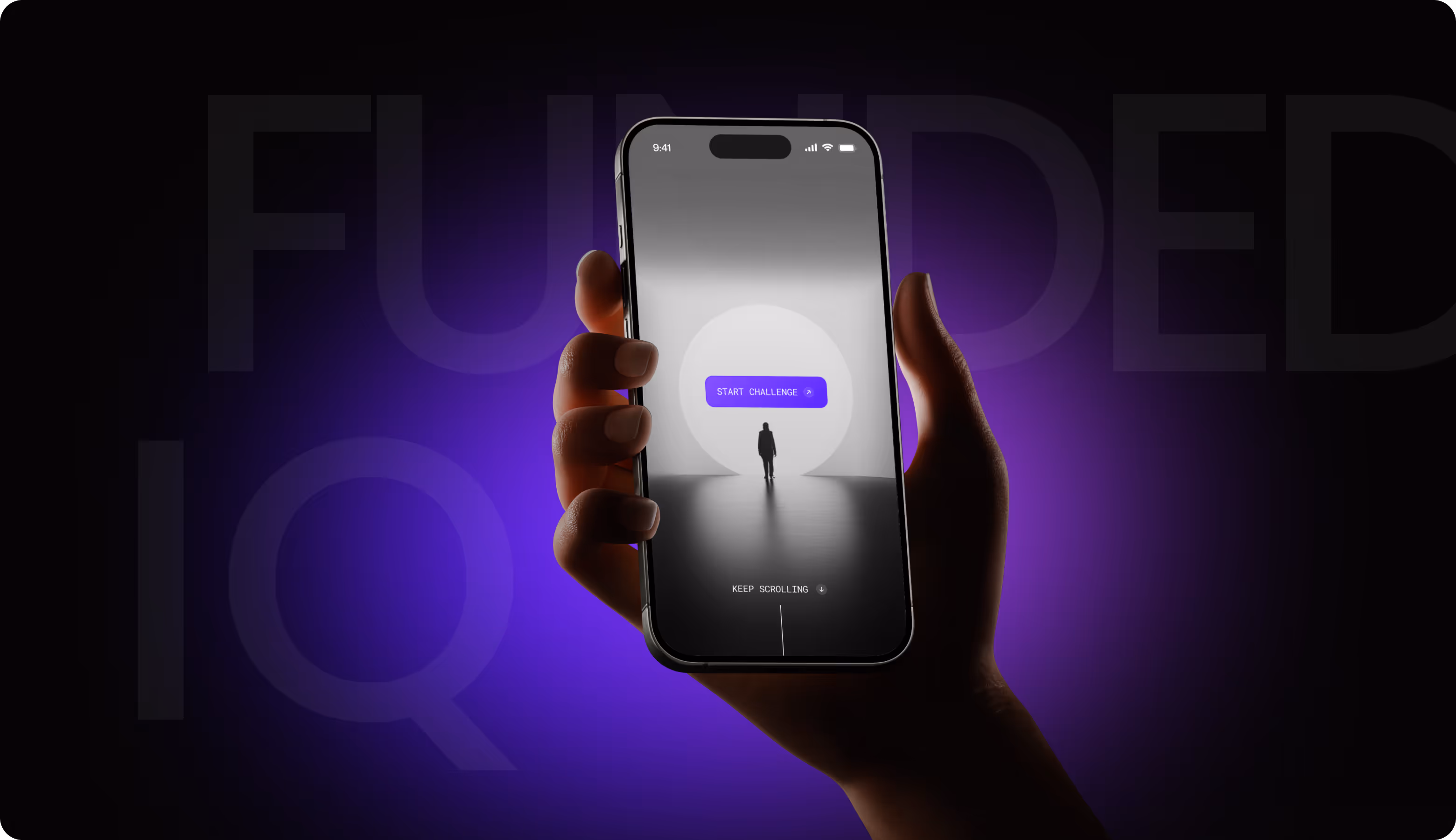
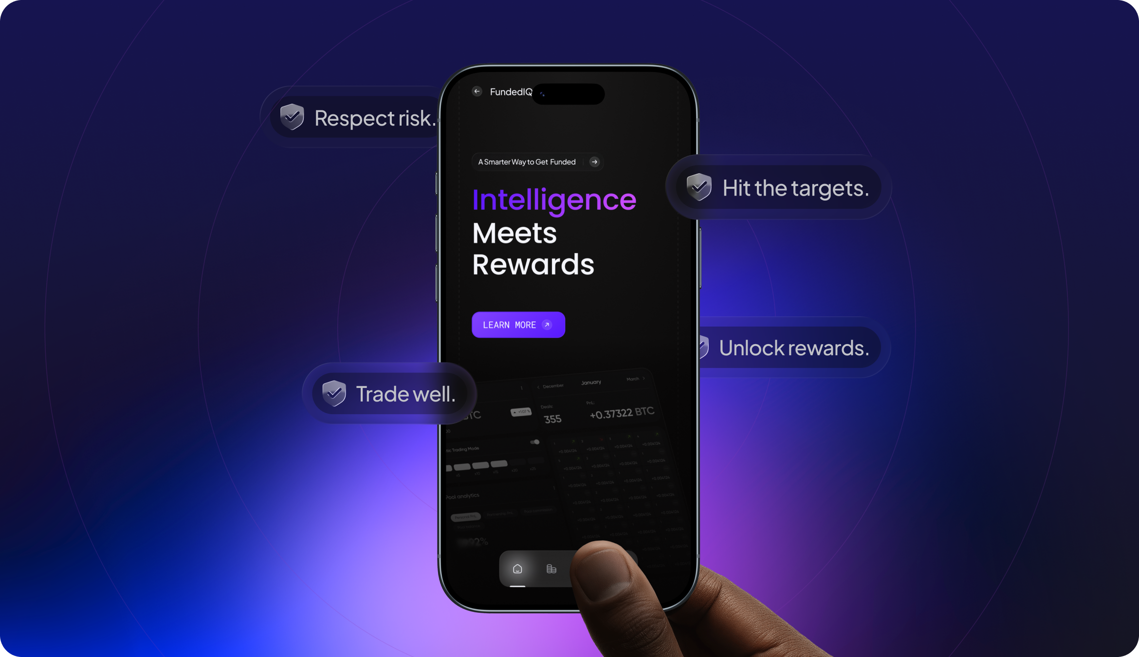
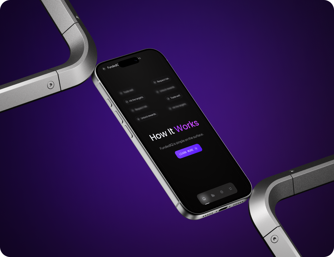
Mobile Application Design
Arounda adapted FundedIQ's web experience into a mobile-first design with the same dark hue, purple accents, and typographic hierarchy. The mobile interface focuses on vertical readability, one-handed navigation, and a single action per screen. We built a whole conversion path. Traders move from the value proposition to evaluation specifics to actual payoff data. Each section concludes with a clear next step.
.png)
.png)
Print Products
The key principle for offline materials we always follow: print should look like it belongs to the same product, not to a different marketing department. Our client received the outdoor banners with real photography and a scannable QR code. Because the conversion path must be short. Business cards use translucent material with the brand's purple gradient. They match the glassmorphism aesthetic from the UI.
.png)
.png)
Design system
Results
1.8 min
Average Time to First Action
Traders moved from landing page to challenge selection in under two minutes with no navigation dead ends.
-37%
Drop in Onboarding Abandonment
Simplified page structure and consistent visual hierarchy helped new traders complete registration without dropping off.
3x
Content Production Speed
Template-based social system allowed the marketing team to produce on-brand posts three times faster.
89%
Brand Recall Rate
Traders correctly identified FundedIQ's visual identity across channels without logo presence during blind testing.
