

Website Design for a Digital Pharmacy
UI/UX Design
Branding
Design that reduces friction and builds patient trust

client
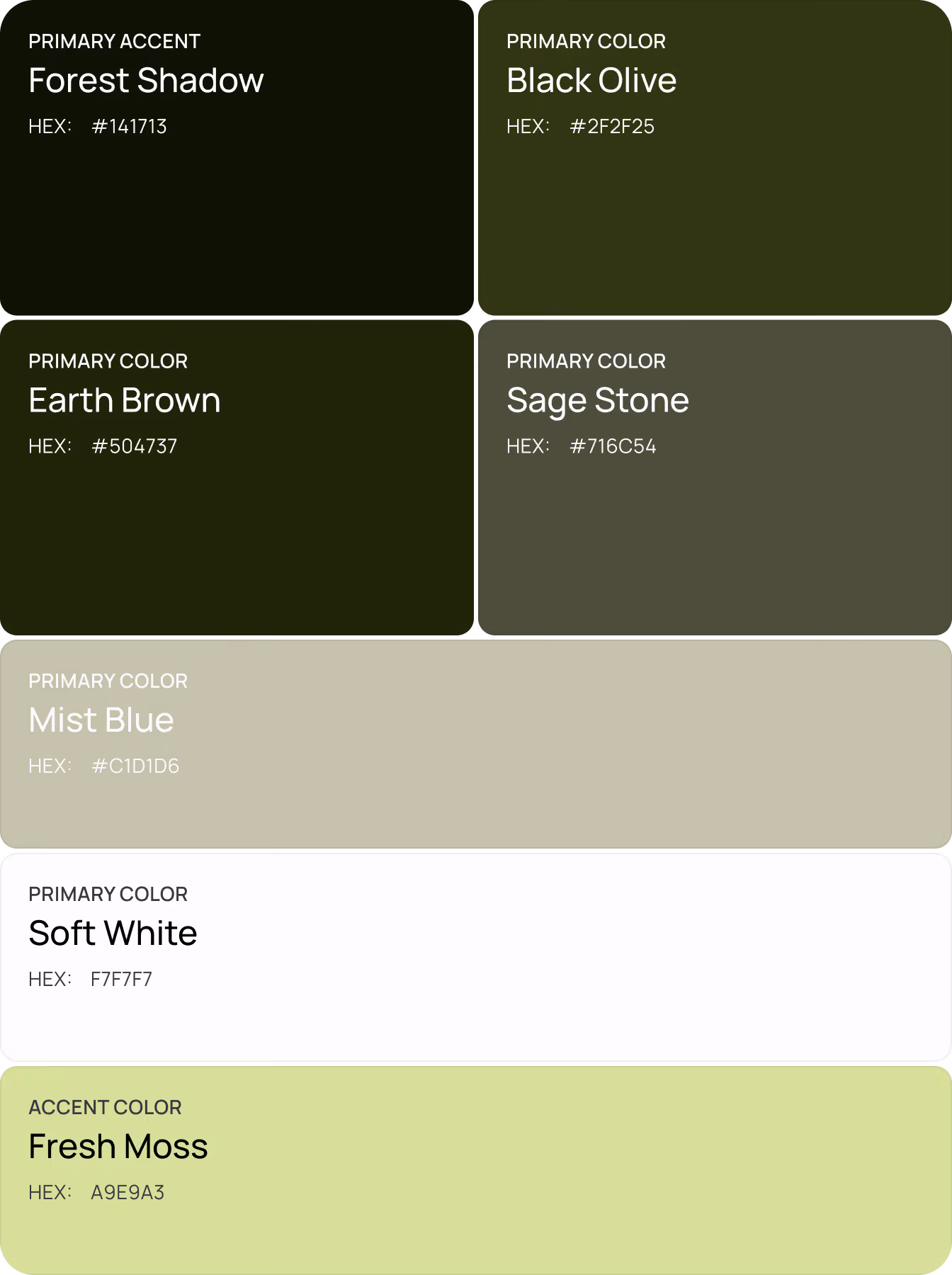
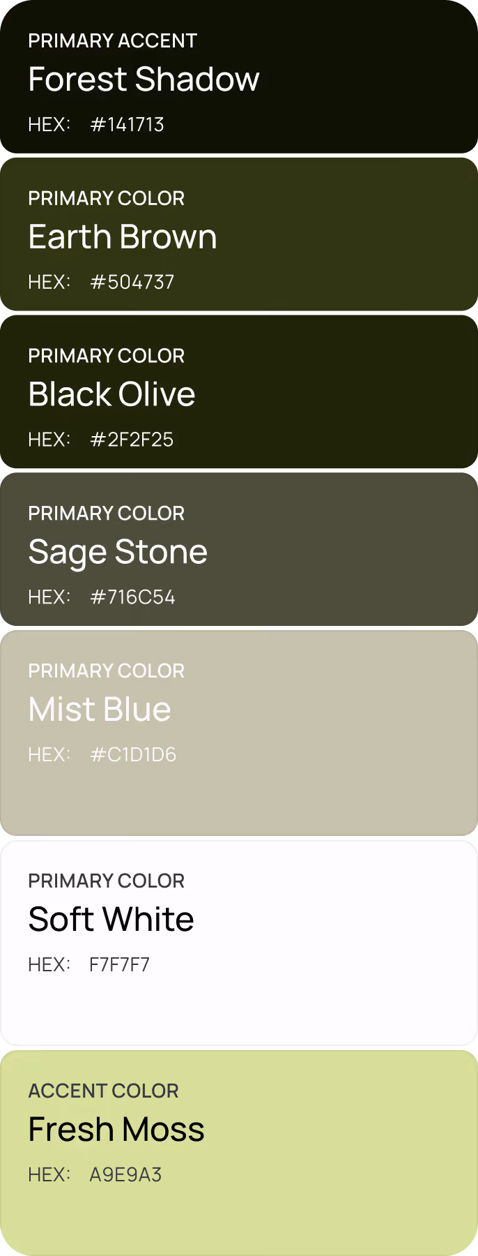
Healium
industry
Healthcare
headquarter
EU
service
UI/UX & Branding
About project
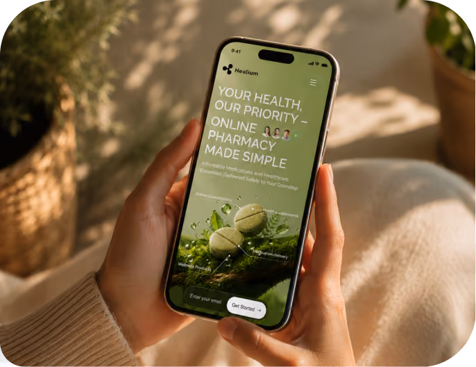
Healium is a digital pharmacy that lets users browse a curated medication catalog, upload prescriptions for AI-assisted verification, and arrange delivery. Arounda designed Healium's brand identity and website to shift the platform's public perception away from the clinical look.


{/}
Challenges & Solutions
Problem
Healium required a website that could provide customers with the medical credibility they need when making prescription decisions, as well as the warmth of a brand that does not make healthcare feel intimidating. The website needed to express functional complexity without making it apparent in the UI or visual language.
Solution
Arounda developed a visual identity and website based on the concept of combining nature and health. We replaced pharmaceutical cliches with botanical textures, natural hues, organic shapes, and soft gradients, giving the brand a wellness-oriented character. Complex information flows have a simple structure. Navigation is intuitive, while still revealing the platform’s depth.
Process
{/}
Briefing & onboarding
Market & competitor analysis
Moodboard exploration
Brand strategy & positioning
Logo design
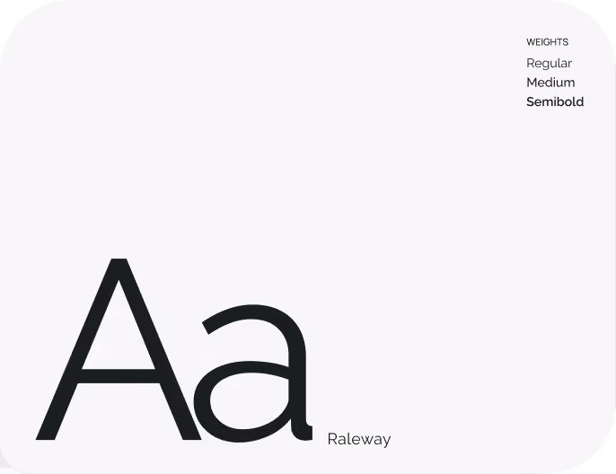
Typography & color system development
Brand language
Brand asset creation
Information architecture and user flows
Wireframing
Website UI design
Responsive adaptations
UI component library
Typography, spacing, and color principles
Interaction and layout standards
Brand guidelines
{/}
No items found.
{/}
{/}
No items found.
Sitemap
{/}
The Healium website has a structure that corresponds to how a first-time visitor establishes trust before committing to a healthcare platform. Each segment brings the user one step closer to conversion. People do not require navigation explanations or additional clicks to reach the decision point, from brand perception and product discovery to platform trust and social evidence.

{/}
Moodboard
Our team rejected standard pharmaceutical references of sterile lab environments, cold lighting, and generic medical imagery. We found inspiration in wellness aesthetics, editorial minimalism, and nature photography because this direction communicates healing and reassurance through visual atmosphere. Our goal was to make a distinctive brand foundation in the pharmacy space. Calm. Curative. Fresh.

{/}
Wireframing
The wireframes had to reduce cognitive load at every step of the healthcare journey. We avoided instructional copy that compensates for unclear layout decisions. Each screen gives users a visible next step, so the experience is guided. And the user can figure everything out independently.
{/}
LogoDesign
The Healium logo features an abstract mark composed of three rounded, petal-like shapes arranged in a circular formation. This form reads as a botanical element and a stylized medical cross, connecting the brand's two core territories of nature and healthcare. The mark carries enough visual simplicity to hold across small touchpoints. The earthy green palette reinforces the nature-meets-pharmacy direction without borrowing the cold blues and whites that dominate most pharmaceutical identities.
.avif)


Our healthcare design reduces anxiety, feels human, and increases conversion.
{/}
{/}
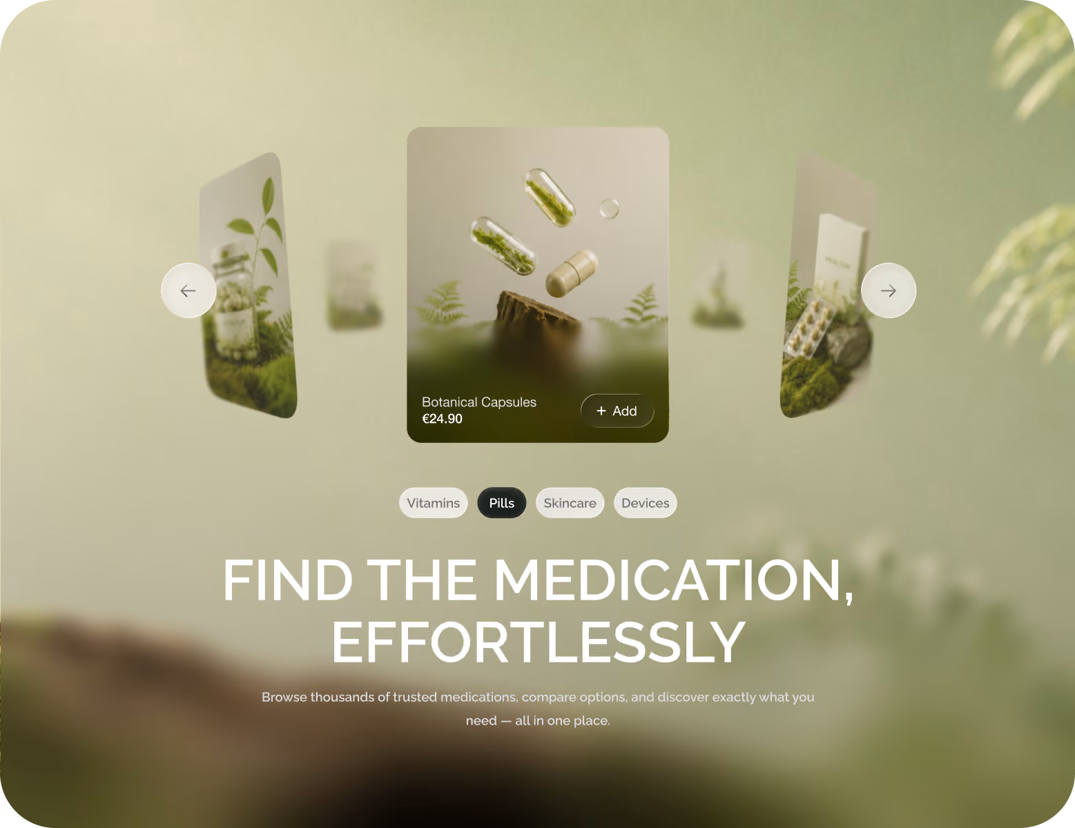
Website Design
The website displays the three-step prescription sequence on the homepage: upload, AI verification, and delivery. First-time visitors can comprehend the essential service without leaving the landing page. We included trust indicators in the hero section to establish trustworthiness at the initial impression. The catalog's nature-inspired product photography makes drug browsing feel more like a wellness experience than a clinical transaction.


No items found.
{/}
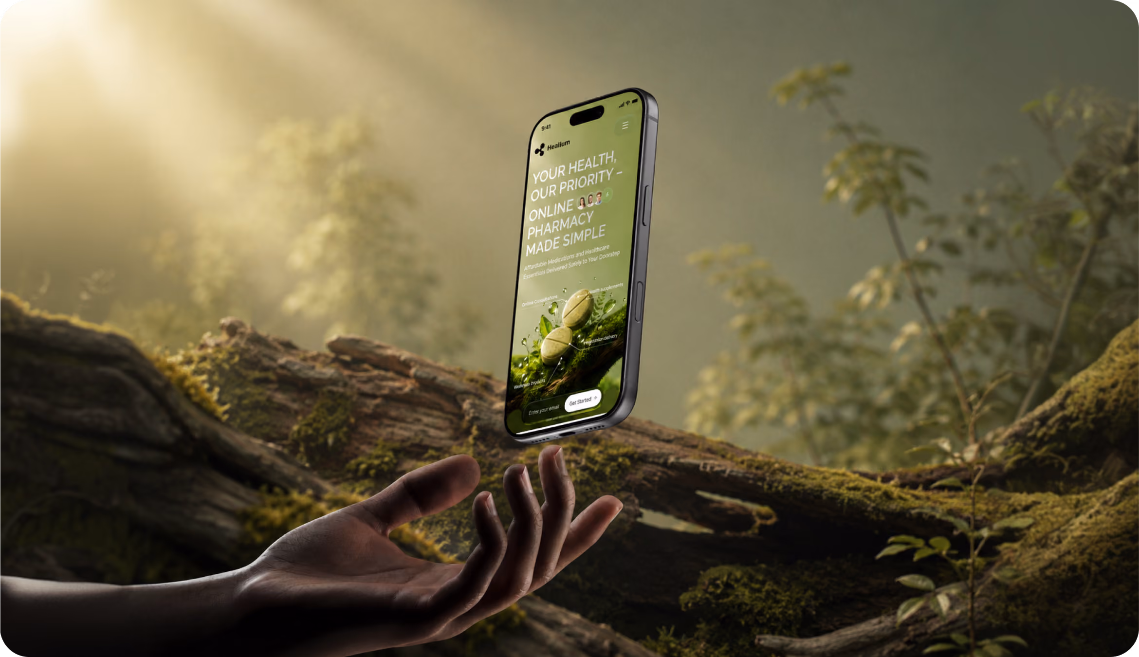
Mobile Adaptation
Our team prioritizes the prescription upload process and the product catalog above all else. These are the two interactions that most frequently occur on a mobile phone. Full-width images, large clickable elements, and a single-column layout ensure high-quality visual presentation even on small screens. Information about medications remains clear and reliable even on a 6-inch display.


{/}
No items found.
{/}
Social Media
We built a social media system around the same nature-inspired palette and editorial photography style as the website. So, the brand reads consistently across every touchpoint a potential customer encounters before visiting the site. The content direction balances healthcare information with lifestyle aesthetics to avoid the clinical tone that causes healthcare content to underperform on social platforms.
.avif)
{/}
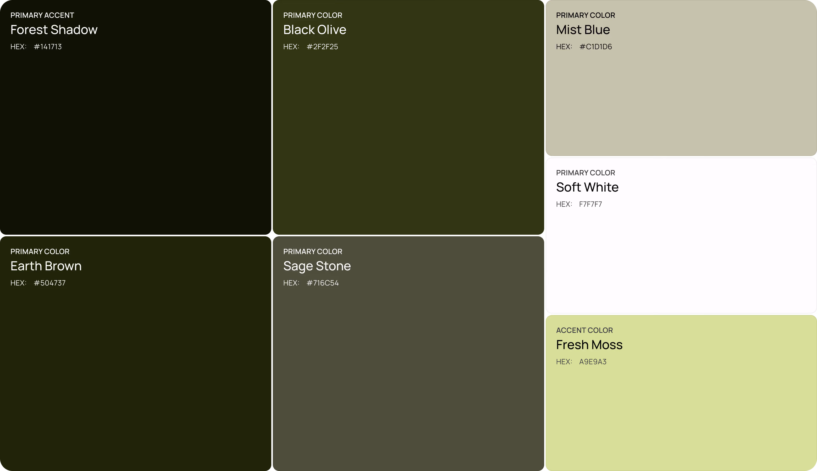
Design system


.avif)


.avif)
.avif)


.avif)
.avif)


{/}
Results
42%
Faster Service Understanding
Users understood how Healium works 42% faster than on comparable digital pharmacy websites, where key service information was spread across multiple sections.
30%
Fewer Navigation Errors
Healium's improved information design resulted in 30% fewer incorrect clicks during product discovery and prescription-related tasks compared to similar pharmacy websites.
26%
Higher Perceived Trust
Healium received 26% higher trust ratings than competitor pharmacy websites with more clinical and visually dense interfaces.
39%
Fewer Mobile Interaction Errors
Healium’s responsive design reduced missed taps, incorrect selections, and navigation reversals by 40% compared with desktop-first competitor websites tested on mobile.
