
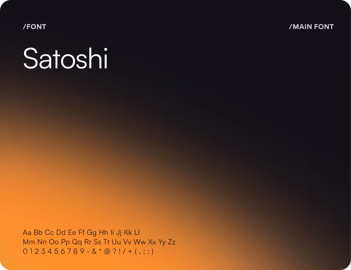
Mobile App Redesign for a Children's Health Tracking App
UI/UX Design
Monitoring your kid's health has now become really helpful
About project
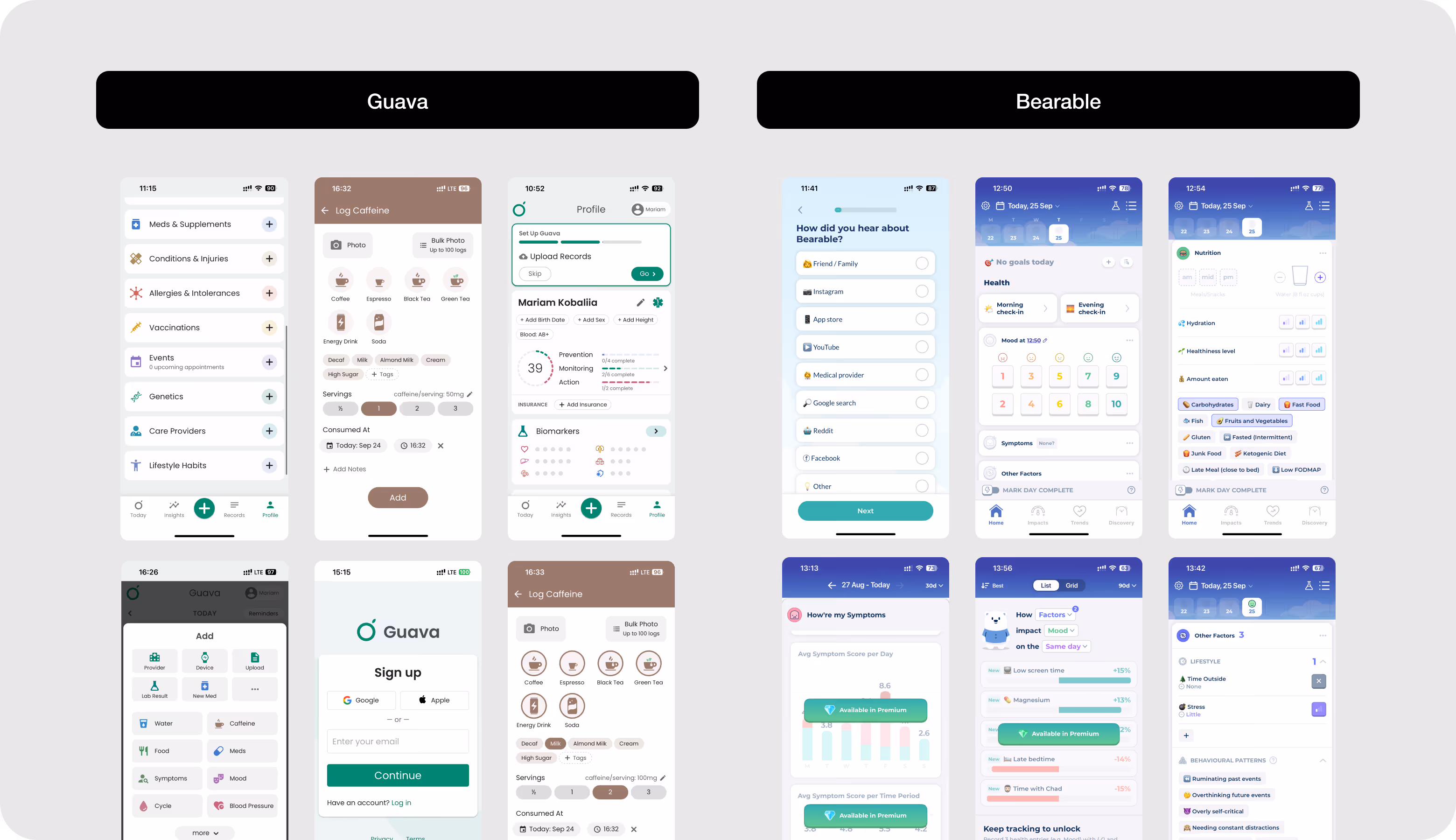
Health HQ is a child health-tracking platform that helps parents monitor nutrition, doctor appointments, symptoms, and condition-specific data in one place. The client requested a full-scale redesign of the app and the website.


Challenges & Solutions
Problem
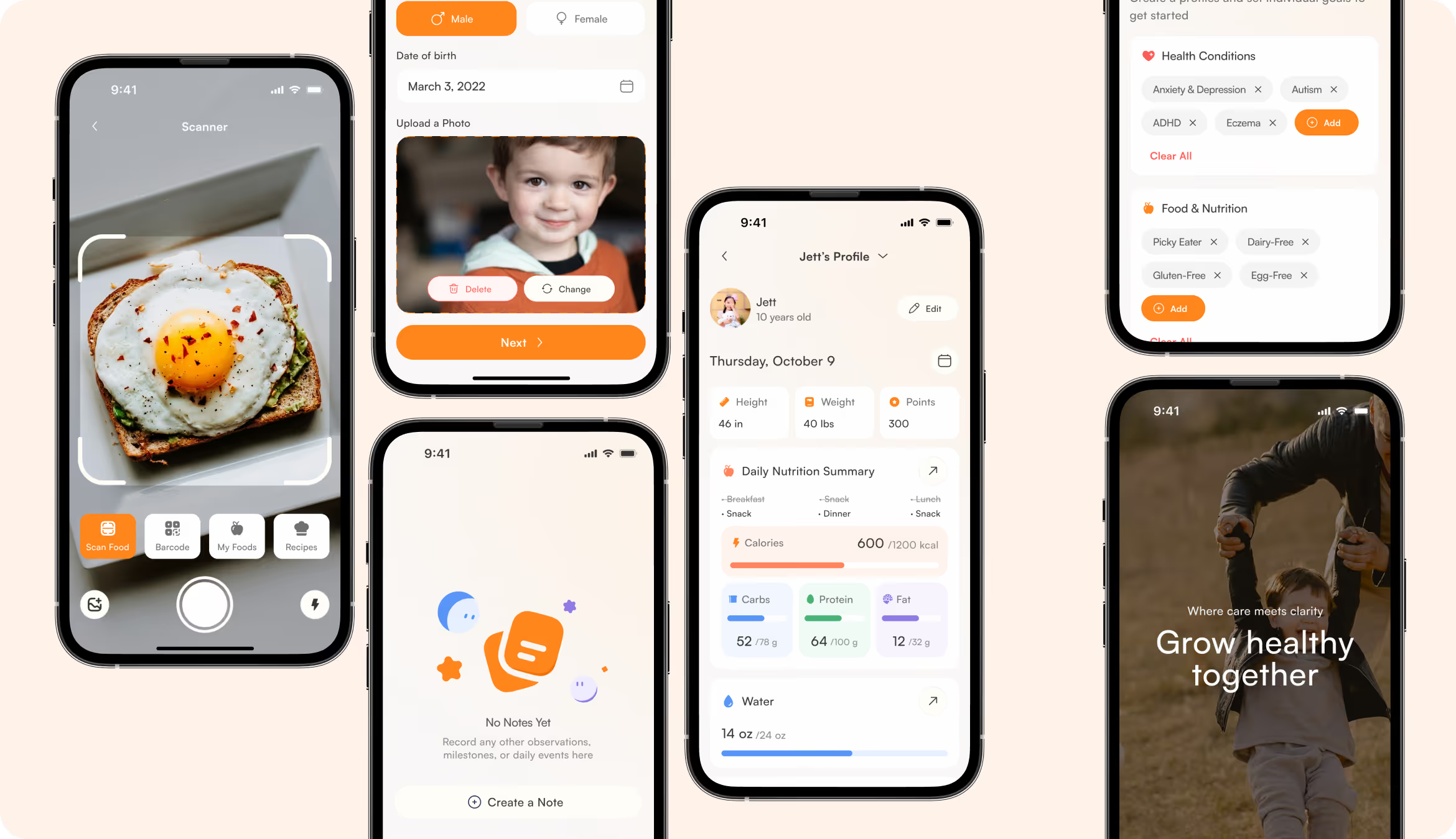
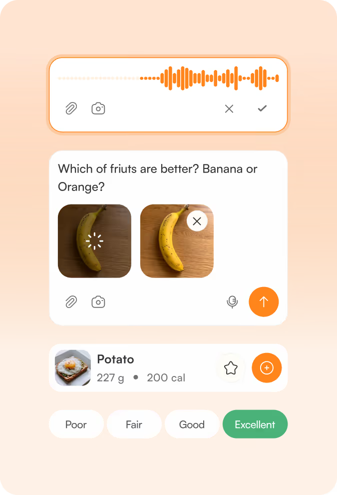
The old application had no clear structural foundation. User flows were fragmented, information was difficult to track, and the interface overwhelmed parents. The most complex challenge was untangling the meal logging flow and restructuring it into one intuitive experience, but with functional depth.
Solution
We led a full delivery from strategy to execution. Our team rebuilt the user journeys, restructured the information architecture, and added missing health-tracking components. The client got a scalable UI system that reduced cognitive load across the platform.
Process
Briefing & onboarding
Competitor analysis
UX Audit
Information Architecture
User Flow
Discovery
Moodboard
UI Concept
UI Layouts
Discovery
Wireframes
Landing page
Competitor analysis
Competitor analysis revealed the apps with too many entry points, inconsistent navigation, and clinical color palettes. Their interfaces didn't make the product a supportive daily companion. Our goal was to reduce interface complexity, prioritize the parent's daily workflow, and use a warmer, more approachable visual language.
Moodboard
.avif)
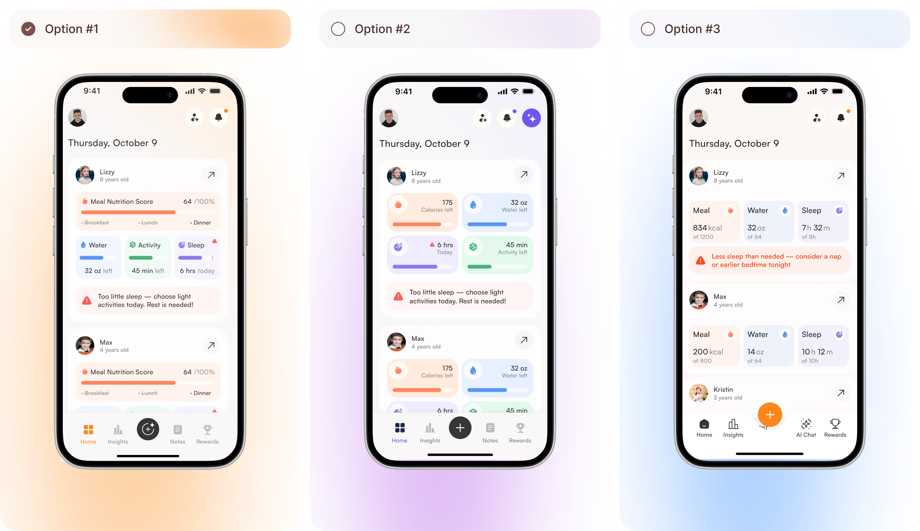
UI Concept Options
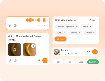
Arounda team presented three screen concepts, each built around per-child cards with health tracking. They differed in the amount of detail displayed at once. We offered compact progress bars, a tile-based card system, and a data view with inline health alerts and an AI Chat tab. The visual direction was the same, but the choice was between simplicity and depth.
UI Layouts
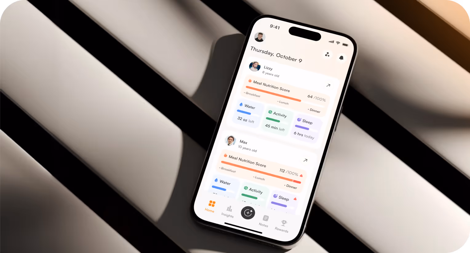
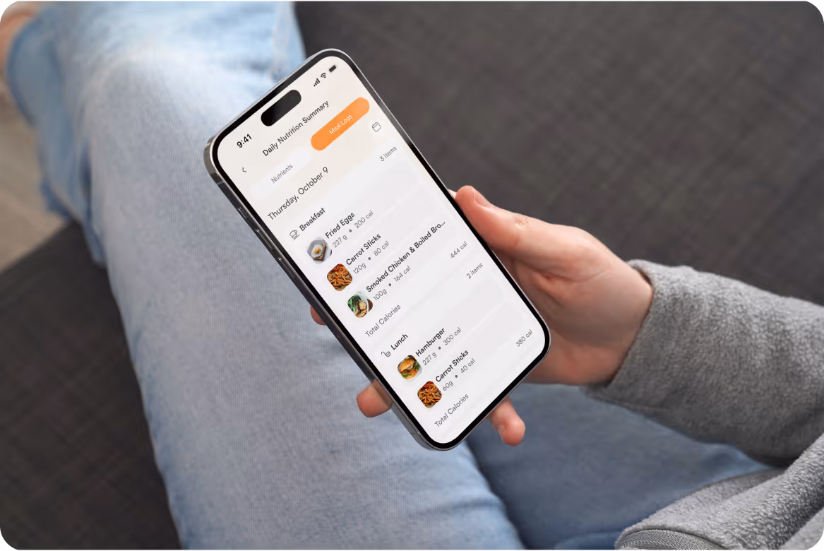
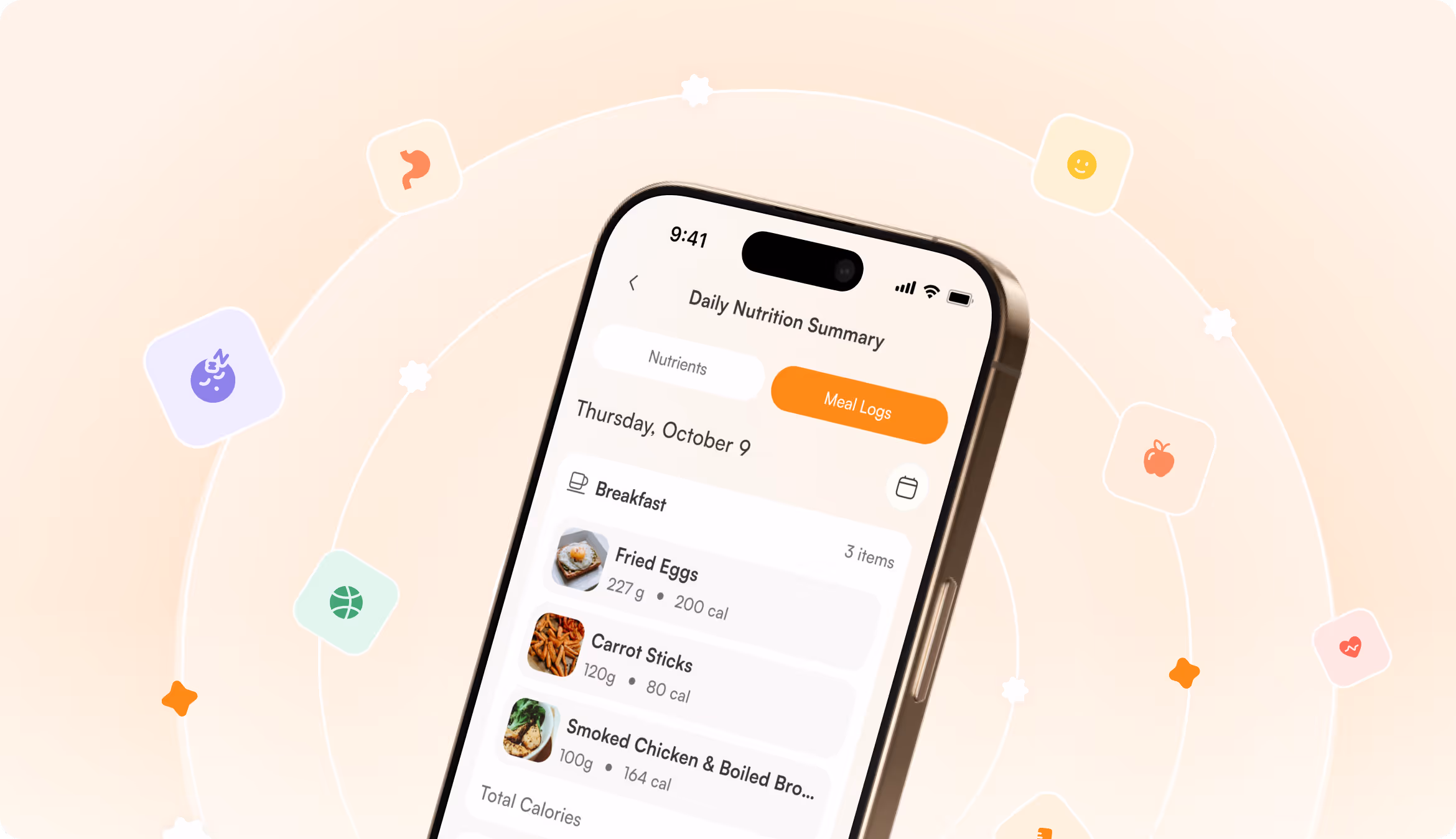
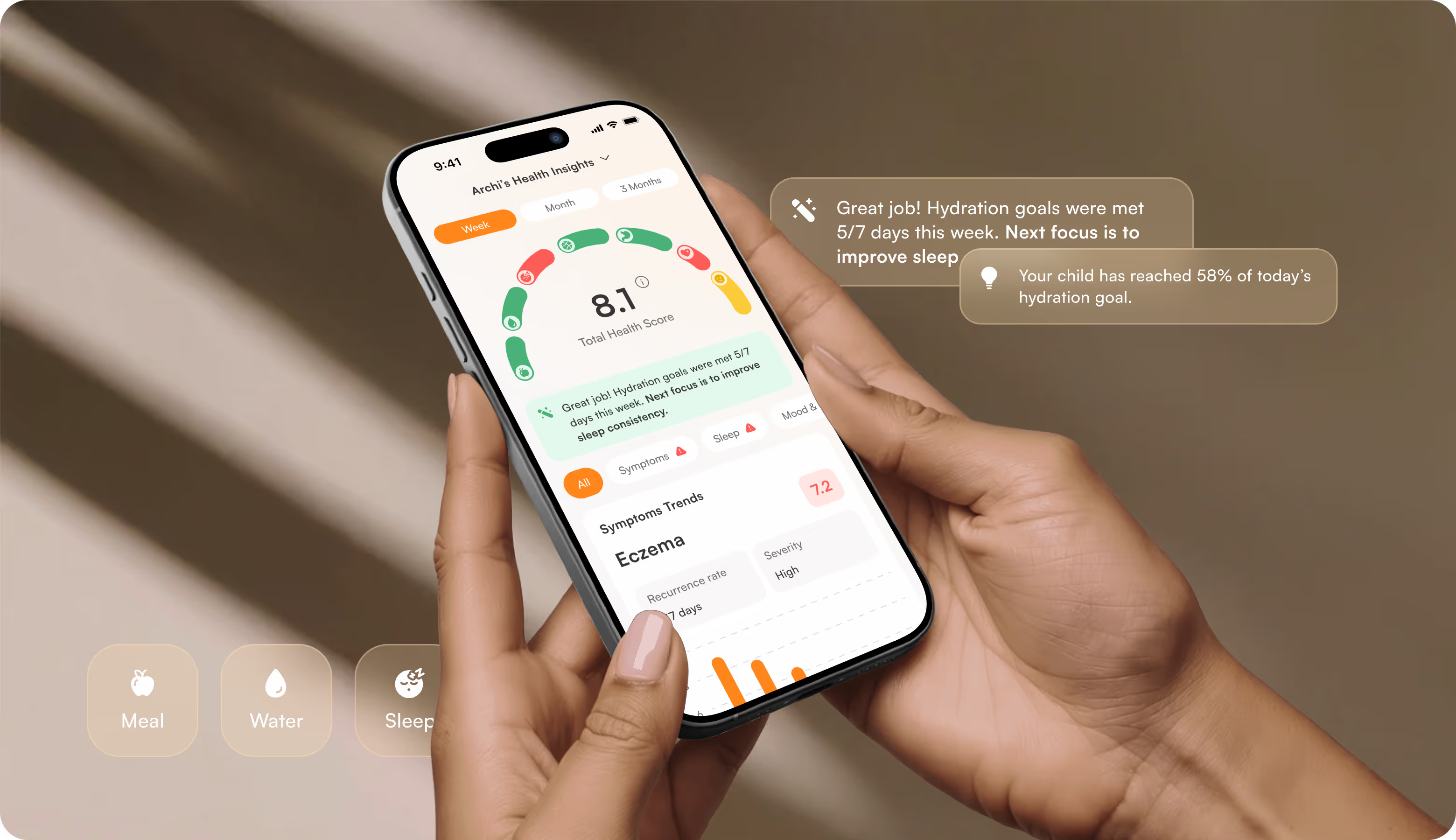
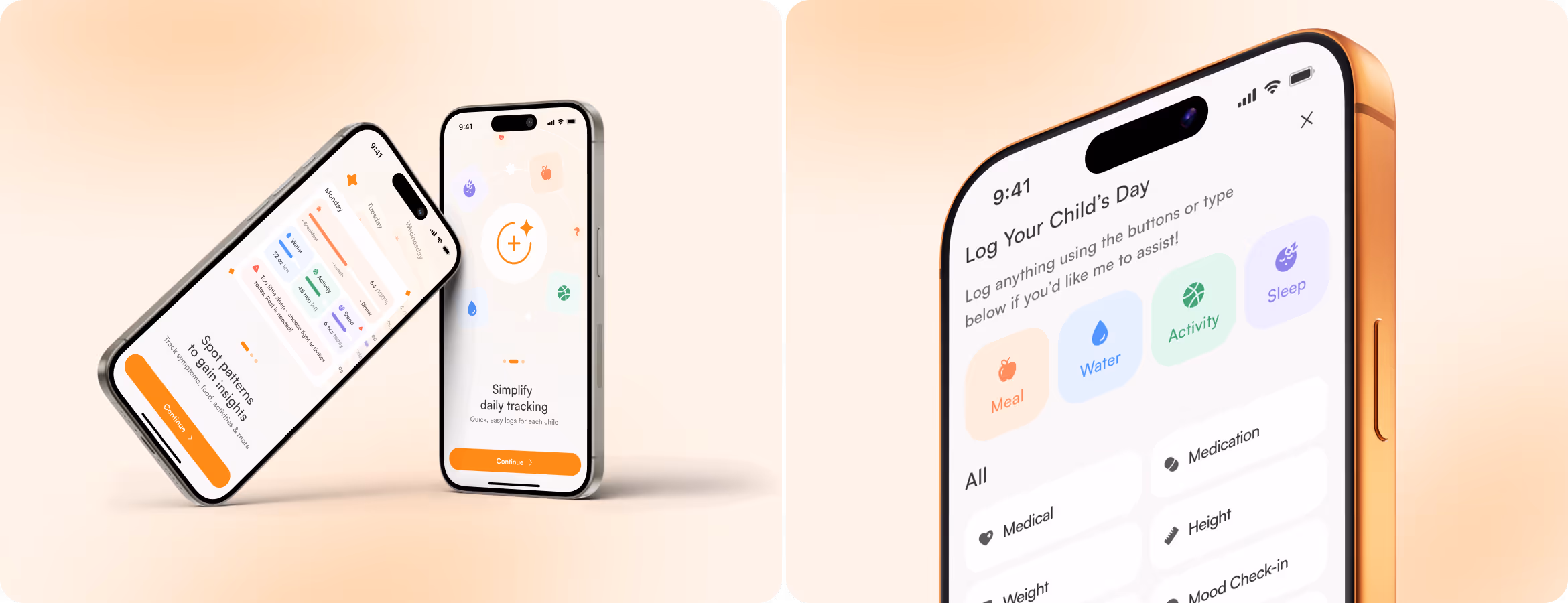
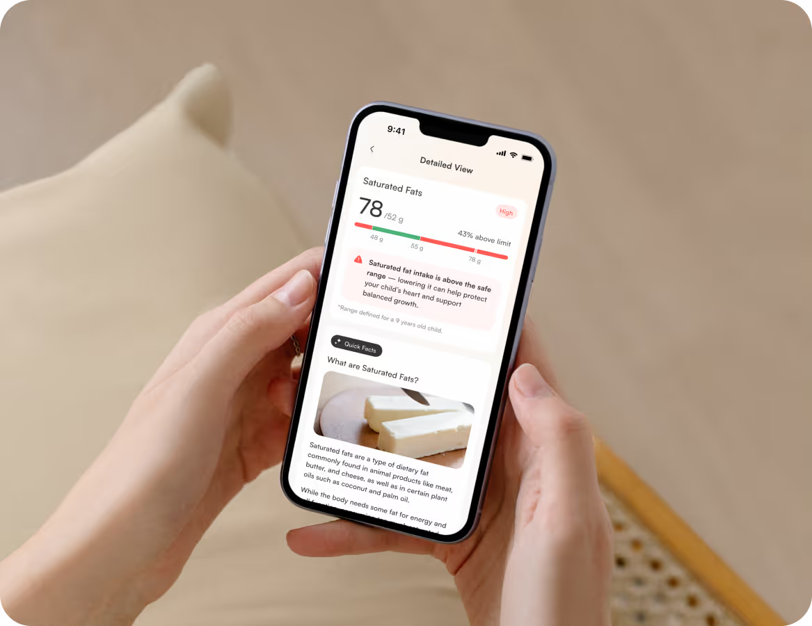
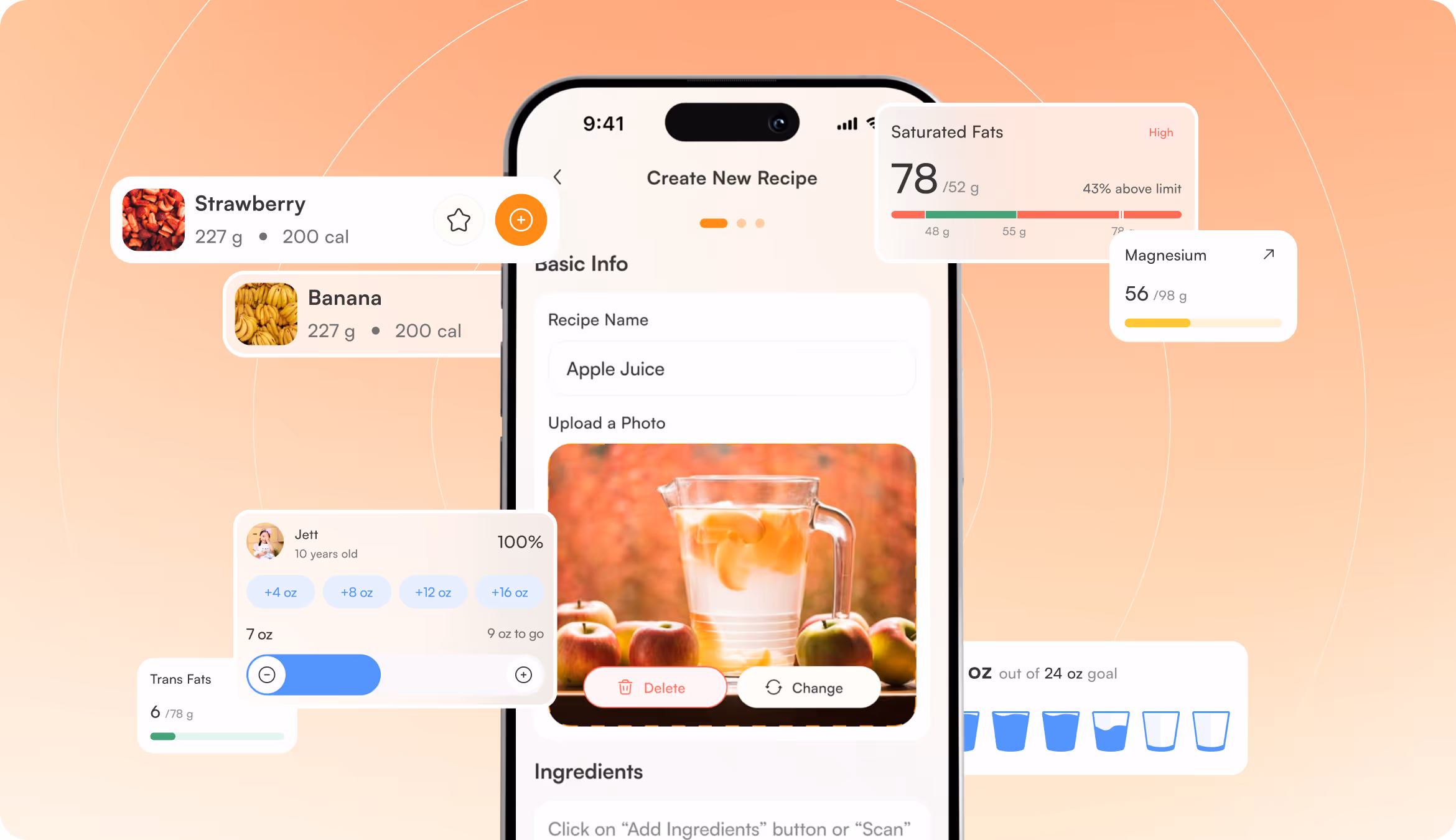
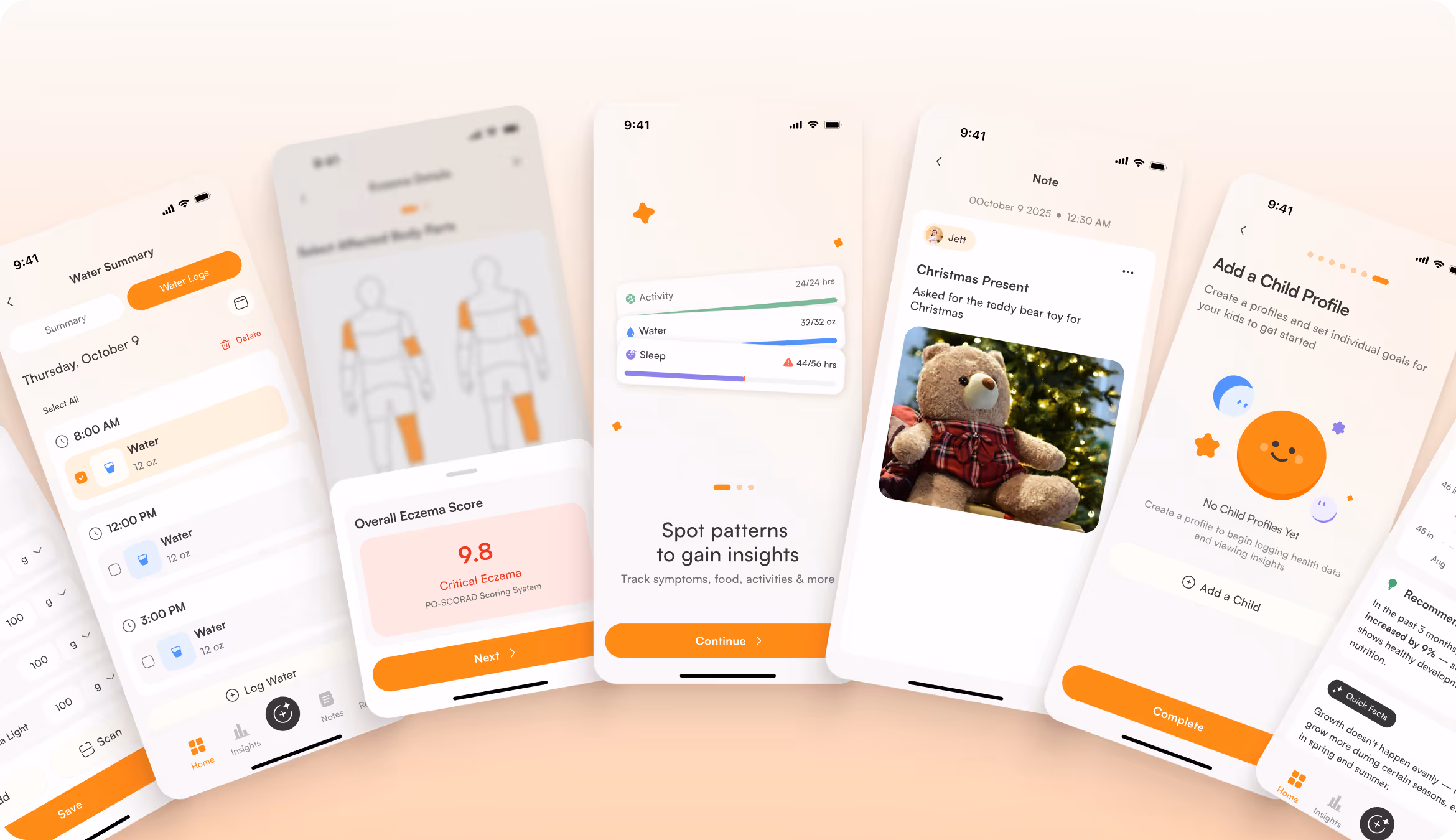
The UI now has a clear hierarchy, large spacing, and consistent navigation. Parents can log meals, water, activity, and symptoms without friction and access actionable insights without searching. Warm beige tones and subtle microinteractions replaced the clinical aesthetic of typical health tools.

.avif)

When your app touches a parent's deepest concern, Arounda builds the experience that brings clarity and trust.
Mobile Application Design
We understand the rhythm of a parent's day, so the design is mobile-first. It has unified typography and touch-optimized interactions that surface child health data without creating anxiety. A redesigned app is supportive and engaging enough to build a daily habit around. Parents can check in, understand what matters, and move on with confidence.

.avif)
Landing Page Layouts
Our designers created the landing page and App Store visuals to mirror the app's experience. Warm family photography added emotions and replaced the sterile health aesthetic. The product now feels human, close, and grounded in the daily reality of raising children.
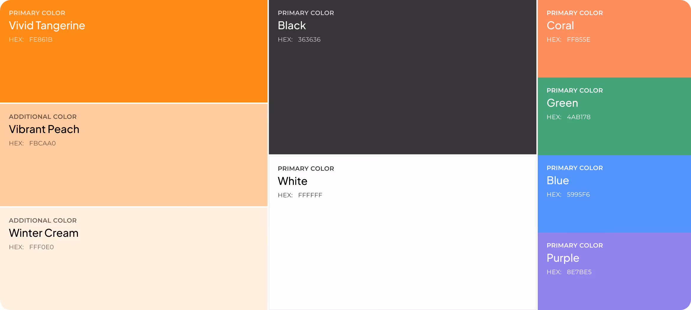
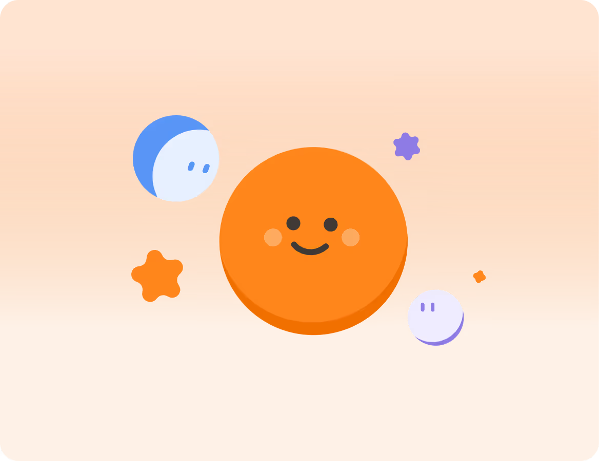
Design system
.avif)


.avif)

Results
+34%
Increase in average session duration.
A cleaner hierarchy and structured per-child cards gave parents more reason to explore insights, reducing the effort needed to understand their child's health data.
+29%
Improvement in feature engagement.
Simplified user flows and consistent navigation lowered the barrier to tracking meals, symptoms, and conditions (features that were previously buried or confusing to access).
-31%
Drop in onboarding drop-off rate.
Restructuring the information architecture and reducing cognitive load helped new users complete the setup and reach their first meaningful insight without abandoning the process.
91%
Of surveyed parents reported feeling more confident managing their child's health data.
Transparent data presentation, structured insights, AI assistance, and a clear visual language make the app pleasant to use every day.
