
Mobile Finance App for Daily Money Management
One screen for financial essentials
About project
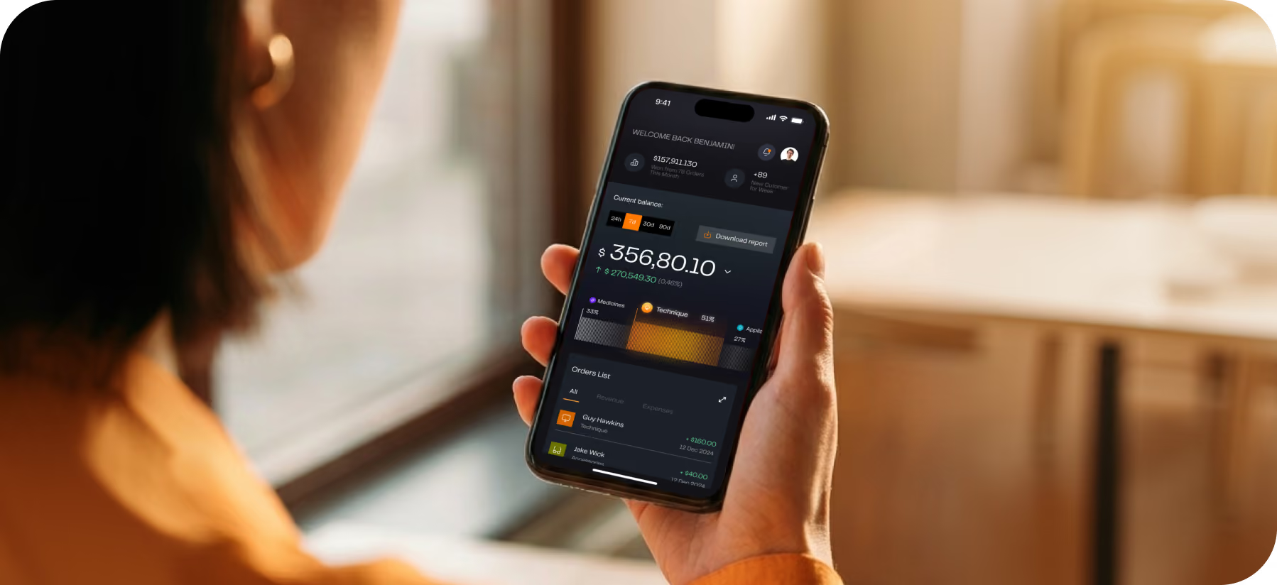
Kinves is a personal finance app centered on a single home screen, giving users immediate access to their balance and a direct path to everyday money tasks. The client wanted a product people could understand from the first interaction, with routine financial tasks simple enough to complete without a learning curve.



.avif)

Challenges & Solutions
Problem
When a user opens a financial app to look at a single number or do a single action, they have to process several metrics. Secondary data hides balance checks and transfers, making product adoption more difficult, leading to navigational mistakes and less reasons for users to come back.
Solution
Instead of using a single screen to display all of the metrics, we assigned each one an individual priority. The balance now answers the first question at a glance, and a shorter payment flow lets users act faster, creating a 31% decrease in navigation errors and 92% success in transfer task.
Process
User Flow
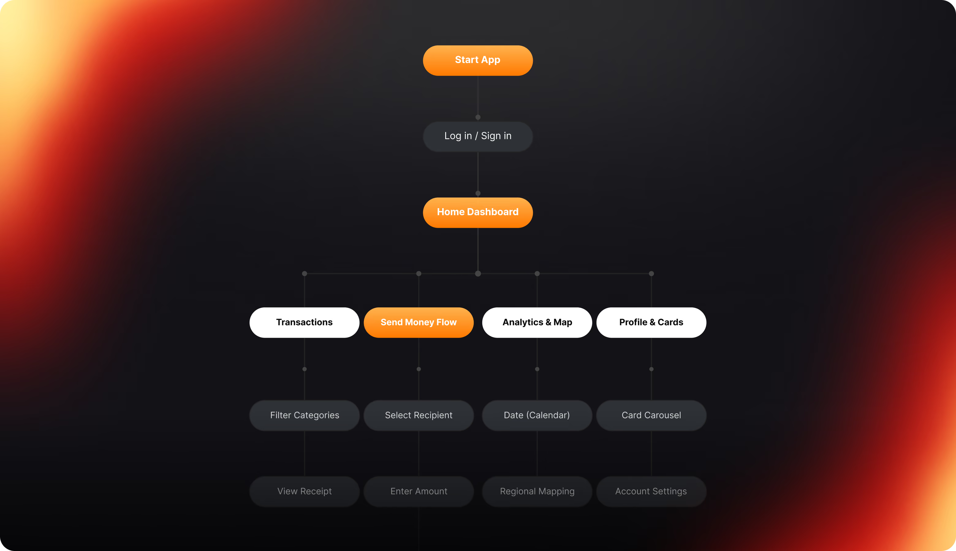
Wireframing
Before adding supporting content, wireframes assigned each screen a primary purpose. People who use a financial product should never have to stop to figure out which number is important or where the next step starts. That principle was the foundation of every layout.


Arounda makes complex finance feel natural on a mobile screen.
UI Layouts
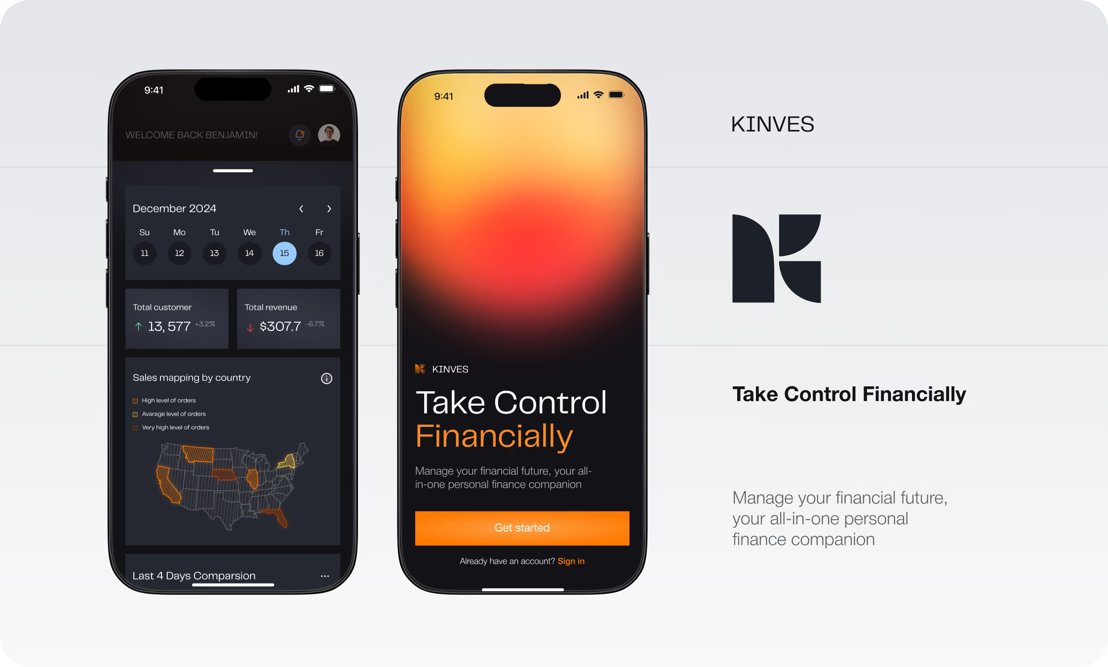
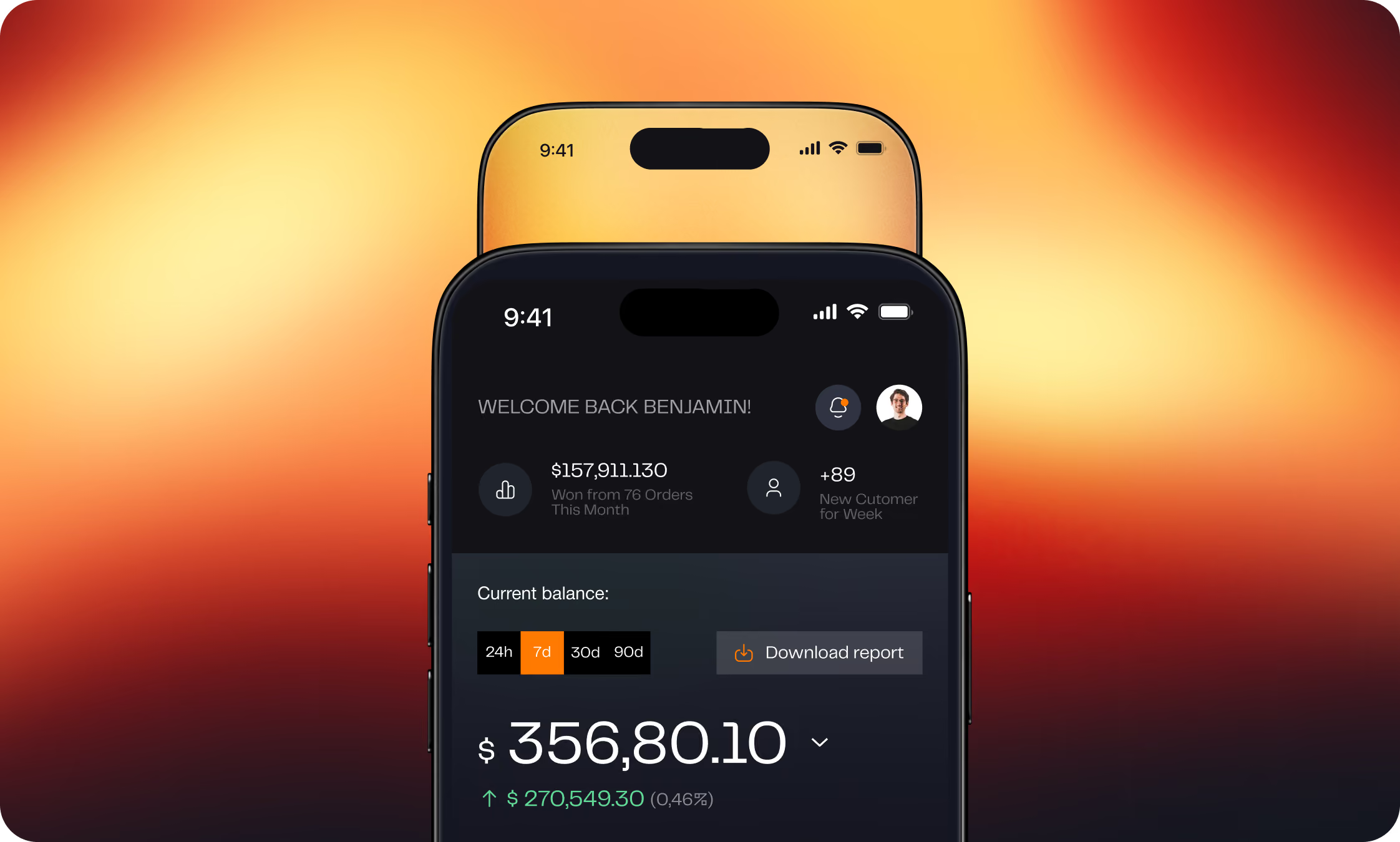
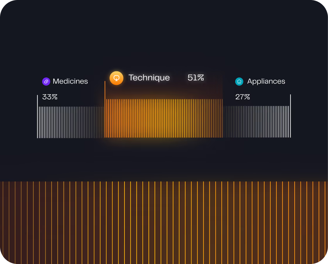
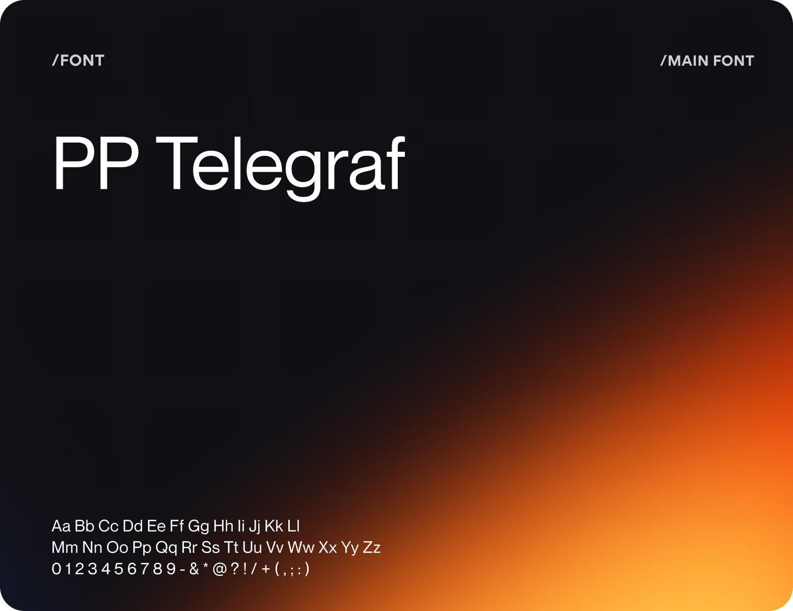
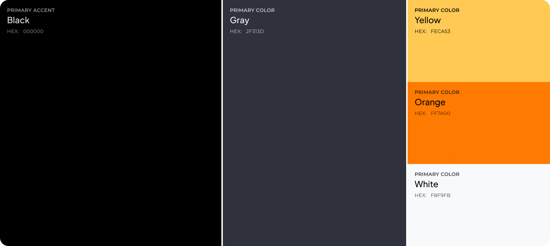
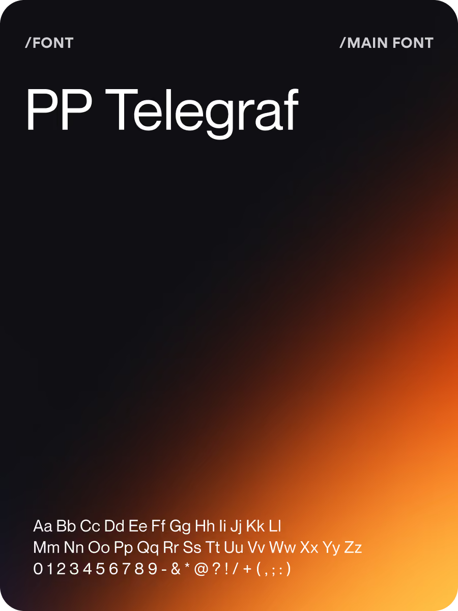
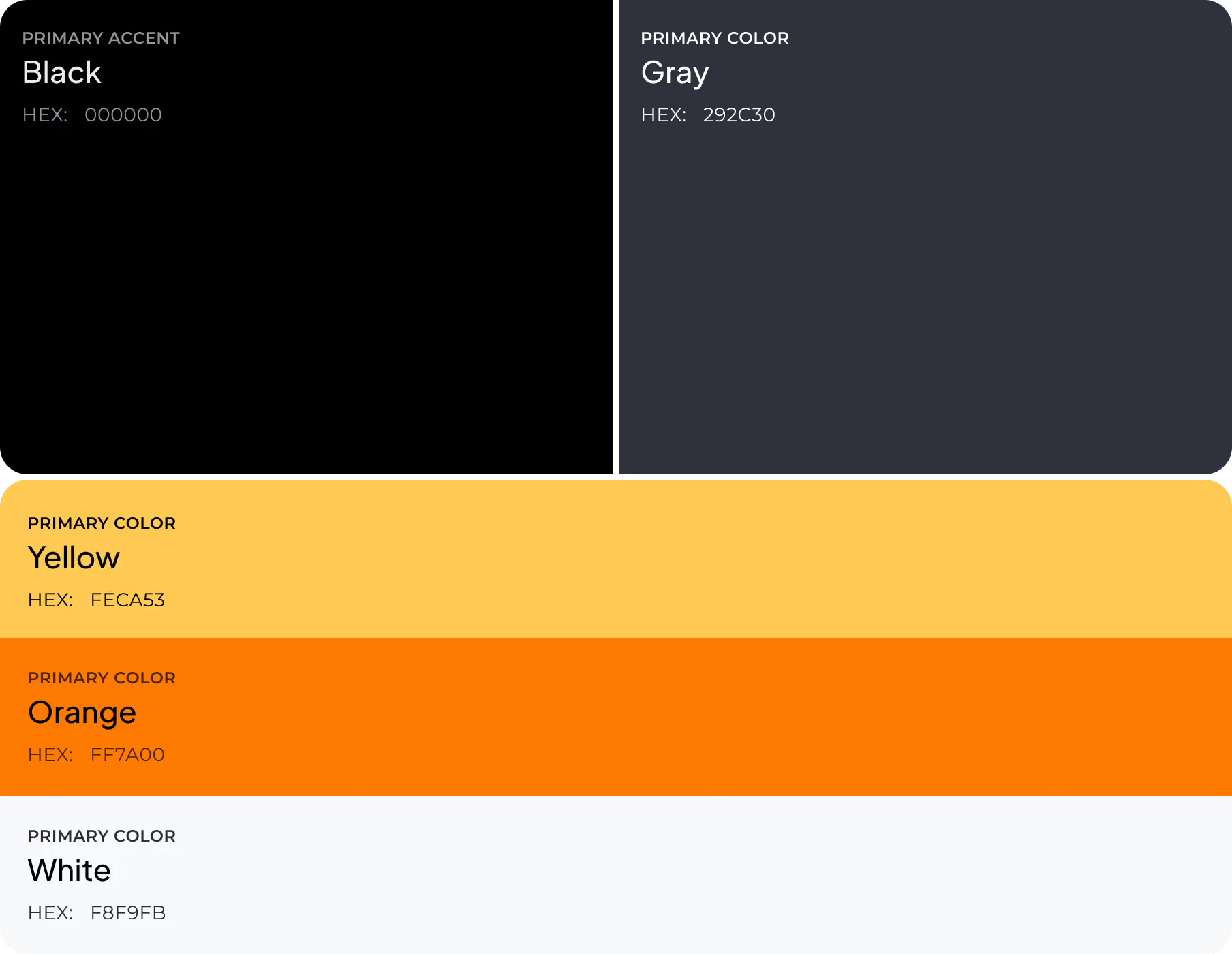
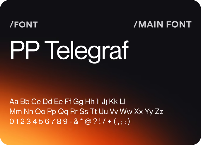
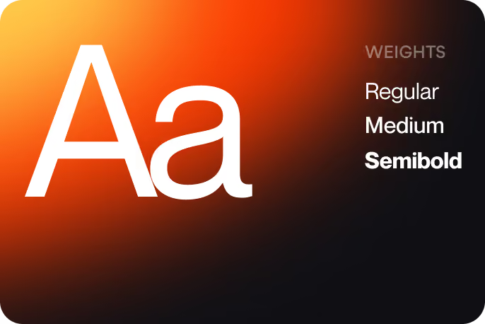
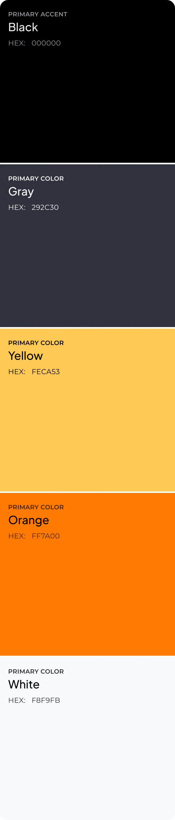
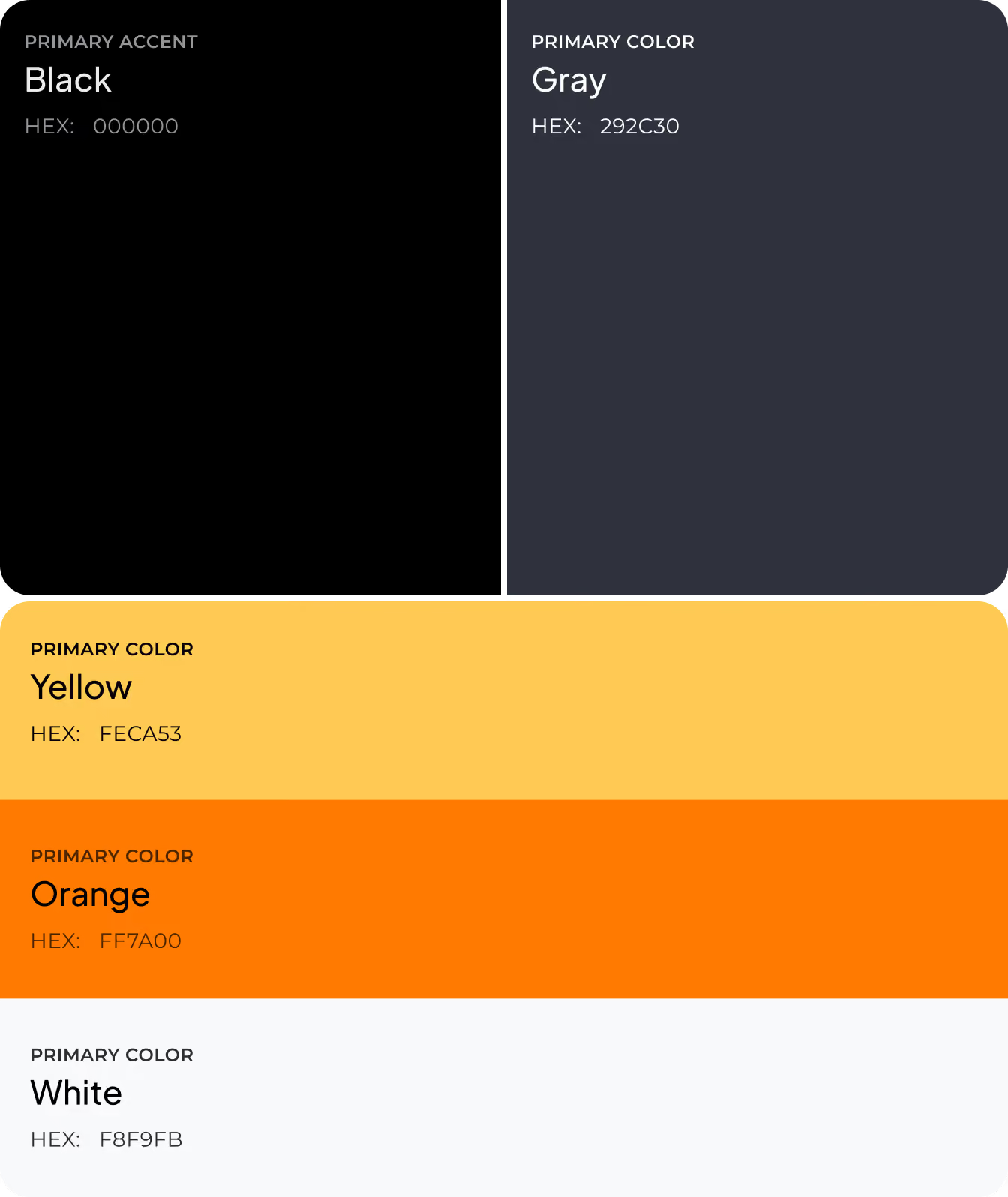
Our designers gave every element a defined role before deciding how it should look. Colors, typography, and emphasis all follow the same rule, so the interface stays consistent as the volume of financial data grows.

Social Media
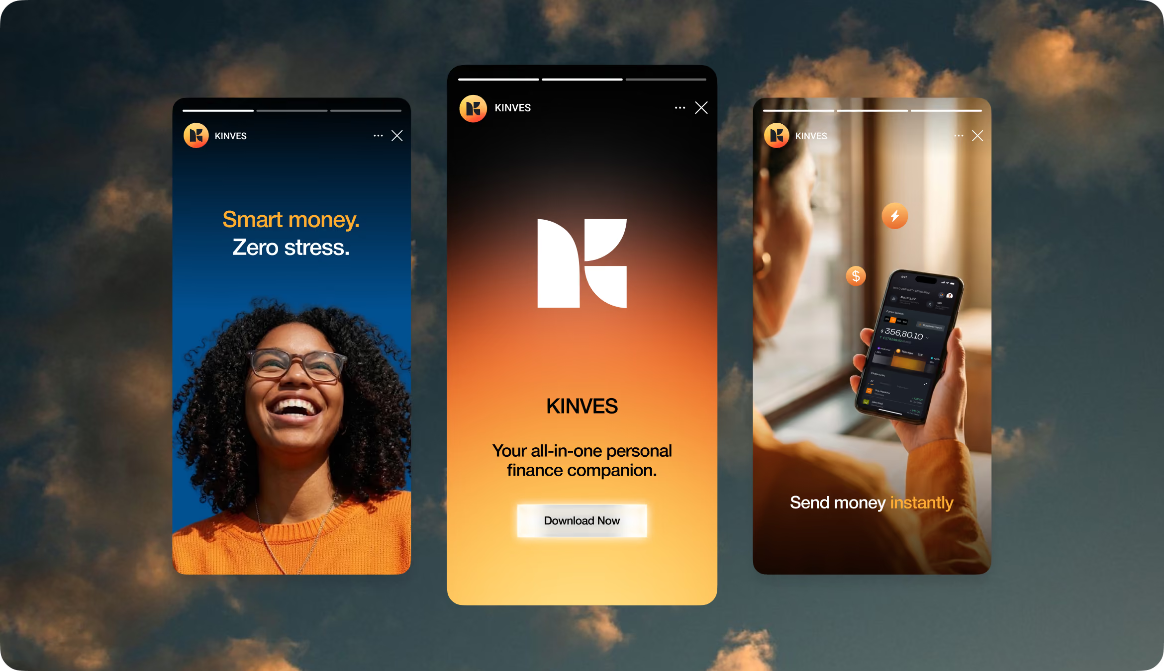
The design guidelines for marketing materials were the same as those for the product. Instead of having expectations reset every time the program starts, the visual language remains consistent both before and after installation, creating a consistent experience.
Design system




Results
-31%
Navigation Errors
Testing showed fewer wrong turns after primary actions received direct paths from the Home Dashboard.
18 sec
Average Transfer Time
On average, it took participants 18 seconds to go from selecting a recipient to confirming their choice.
92%
Transfer Task Success
During usability testing, participants completed the transfer flow without moderator support.
89%
First-Click Accuracy
Users selected the correct entry point for balance checks and transfers on their first attempt.
