
A dashboard design that lifted feature adoption by 37%UI/UX Design
UI/UX design for a personal finance app

About project
Knoot is a personal finance app that helps users track spending across multiple cards. The client asked Arounda to design a premium dashboard with understandable and accessible weekly and monthly spending visibility. It must be effective for people managing several cards and high transaction volume.




Problem & Solutions
Problem
During a competitor audit, we found that on the home screens, users had to scroll through 6–8 tabs before they could see their balance. Making a money transfer also required 6–8 taps. Reviews in app stores and our own testing showed that users got lost in the navigation and described the experience as too complicated due to an excessive amount of information. These obstacles led to task abandonment and negatively impacted user retention.
Solution
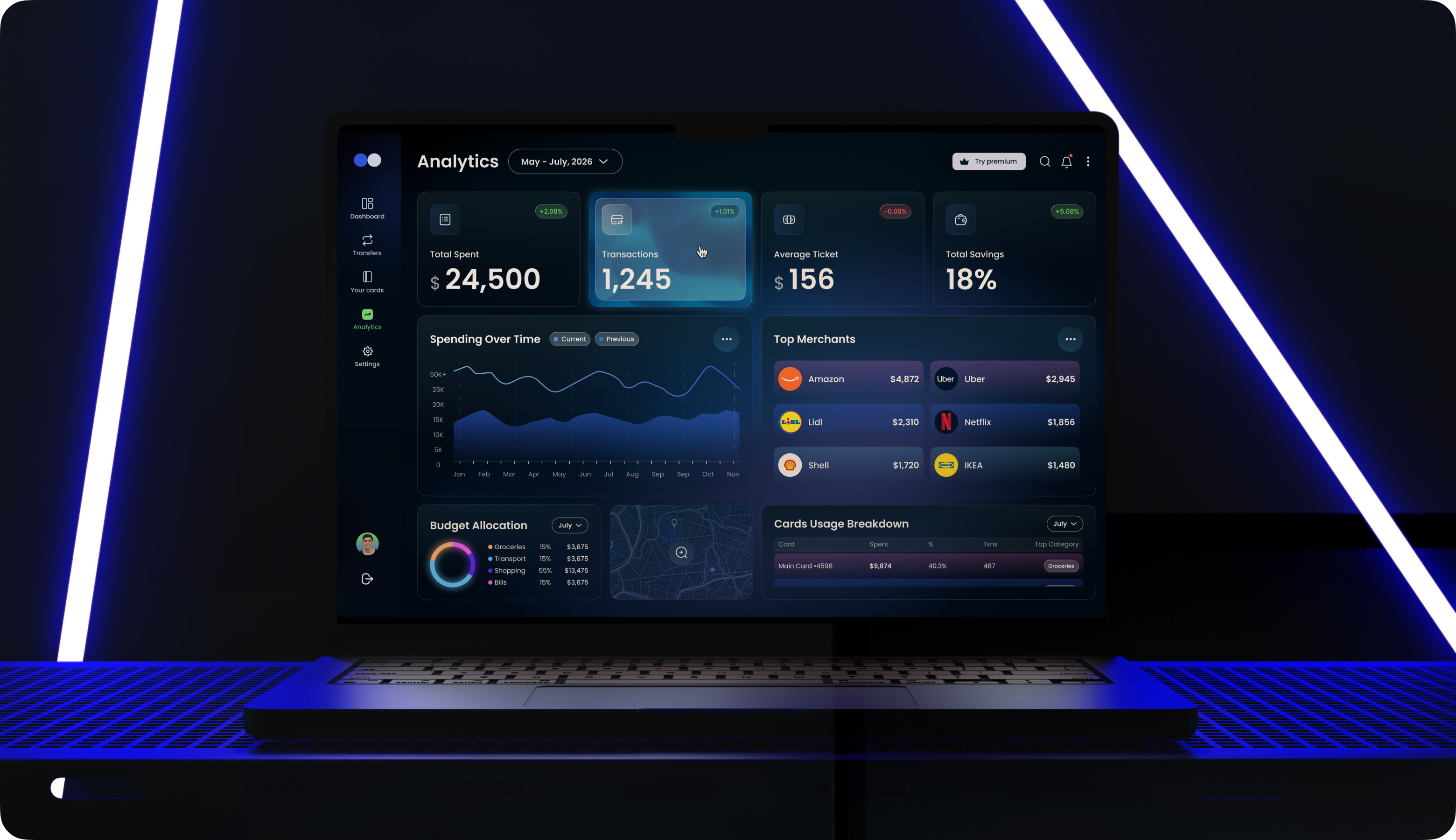
UI/UX designers created a focused Analytics dashboard with four key metric cards, a Spending Over Time chart, a customizable Cards screen, and a 3-step onboarding flow with QR code and biometric verification. We rejected denser layouts after testing showed they caused scanning fatigue. In the final design, users see the most-checked metrics first. Our design solutions cut cognitive load and support return visits.
User Flow
Wireframing
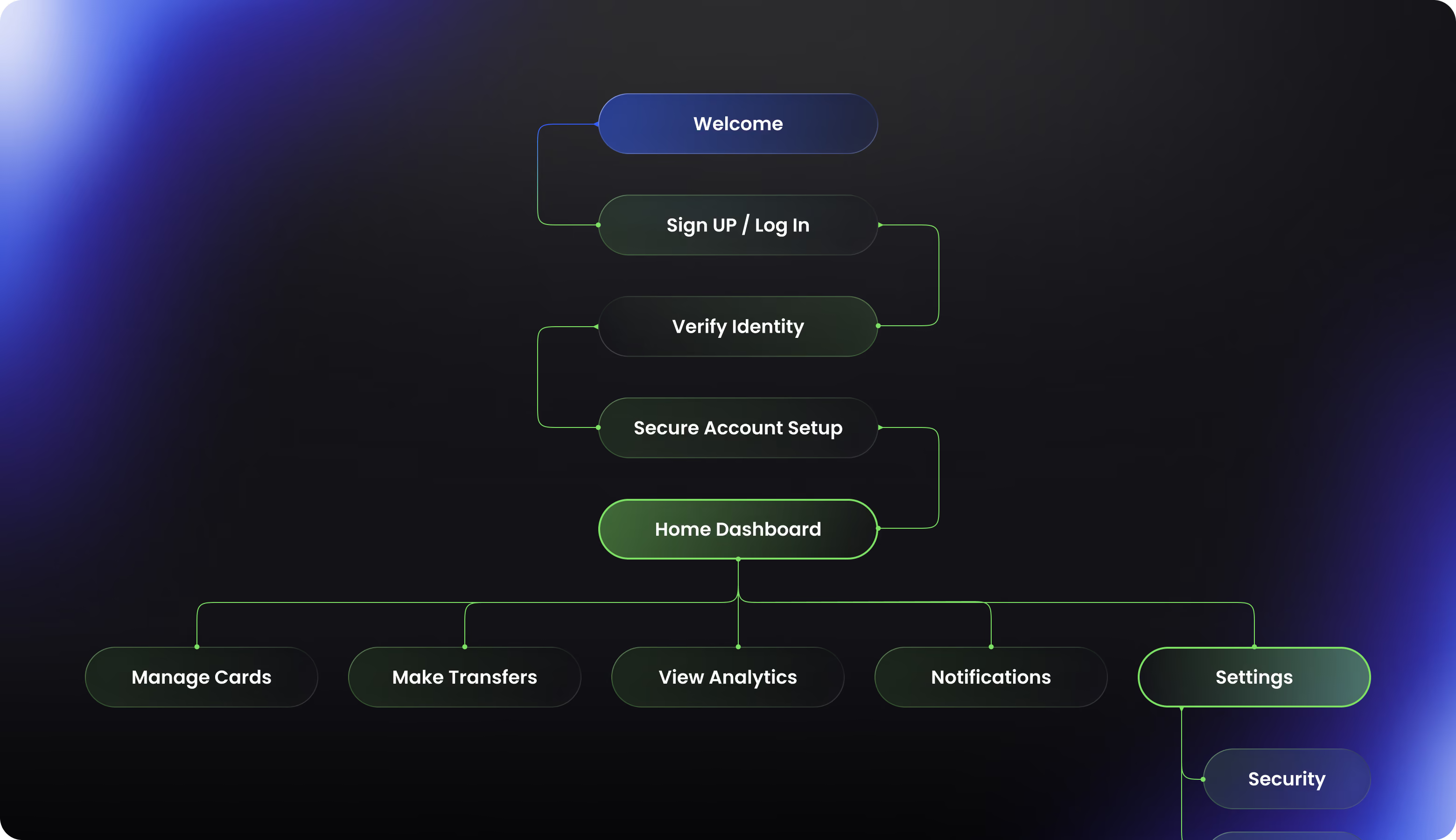
Our guiding principle was “decision-critical data first, with supporting details available on demand” to reduce the cognitive load from the high volume of transactions across various cards. In an early version of the analytical mockup, the home screen featured six cards with metrics and two charts. But low-fidelity testing revealed that users were overlooking or misinterpreting lower-priority cards. Therefore, we narrowed the list down to four key metrics. Our designers created 28 screen sketches and user flows before beginning work on the high-fidelity design, allowing us to validate the information architecture.
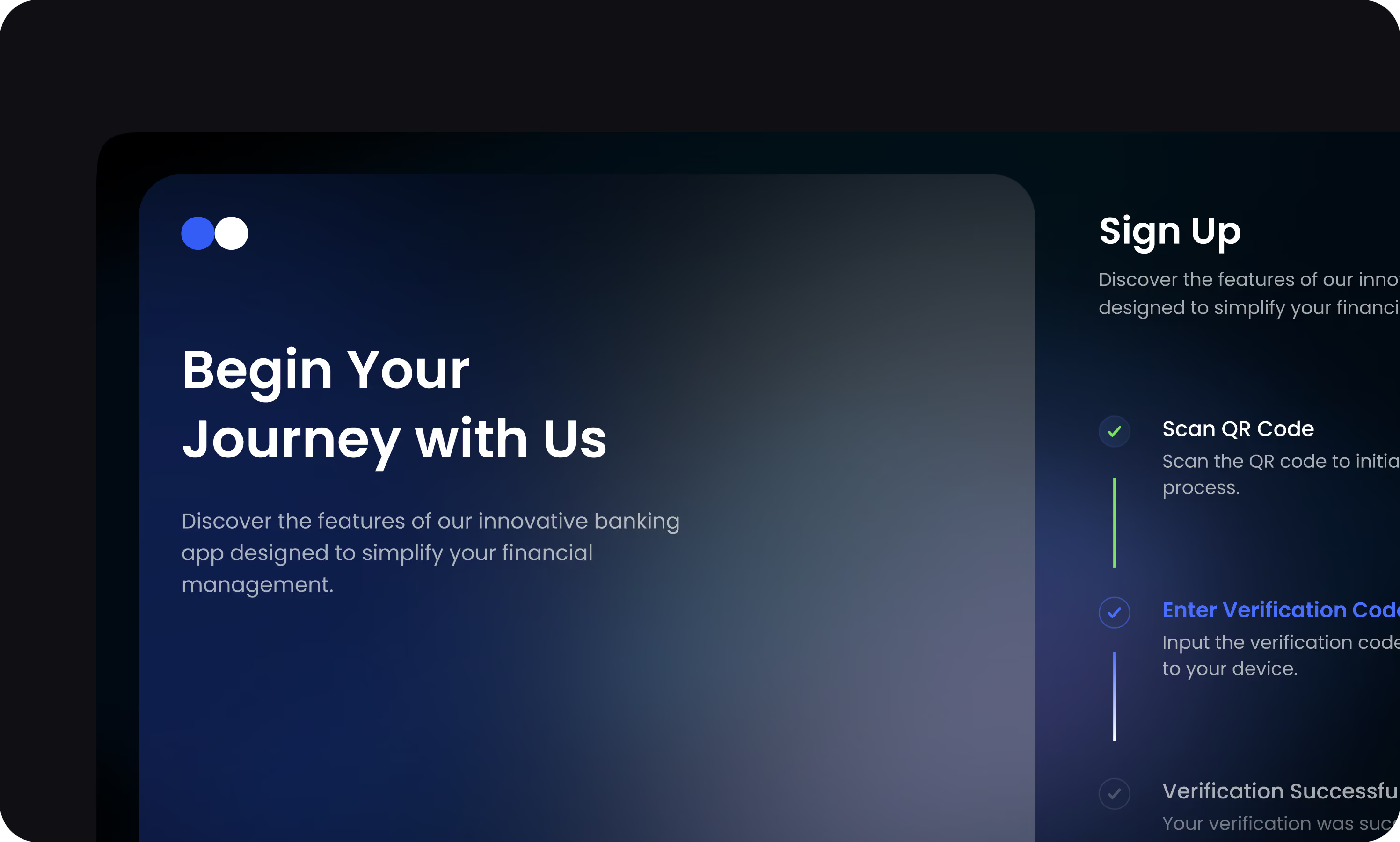
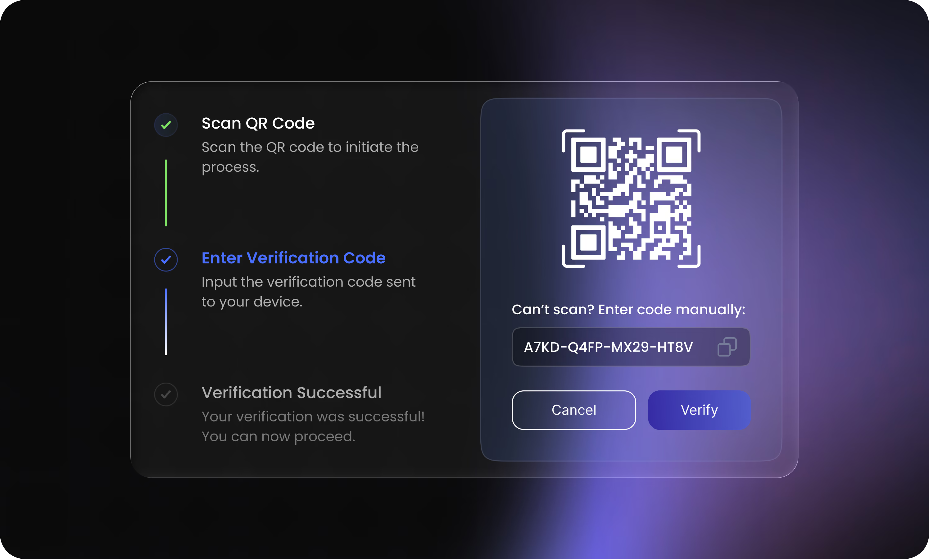
Sign up screen
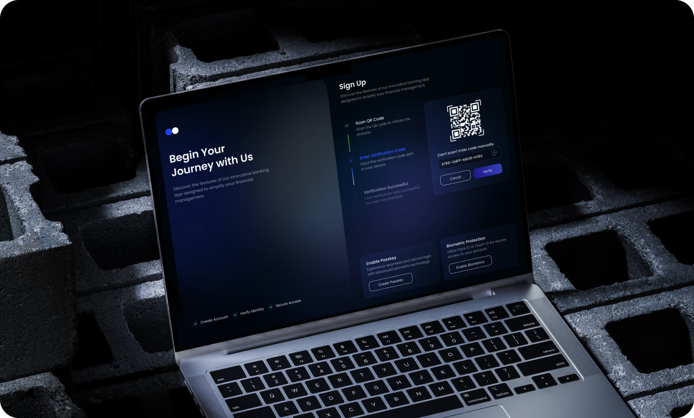
The registration screen guides users through three steps, where the primary method of data entry is a QR code scanner, with manual code entry serving as a fallback option. We displayed only a few options at each step to avoid overwhelming new users. Our team moved the advanced security settings from this screen to the process that takes place after registration is complete, as testing showed that their presence increased the number of drop-offs. Contrast ratios across the entire screen meet WCAG AA requirements, and the large font sizes and touch elements are designed for one-handed use on a mobile device.

Complex product, confused users? Arounda simplifies the architecture without cutting functionality.
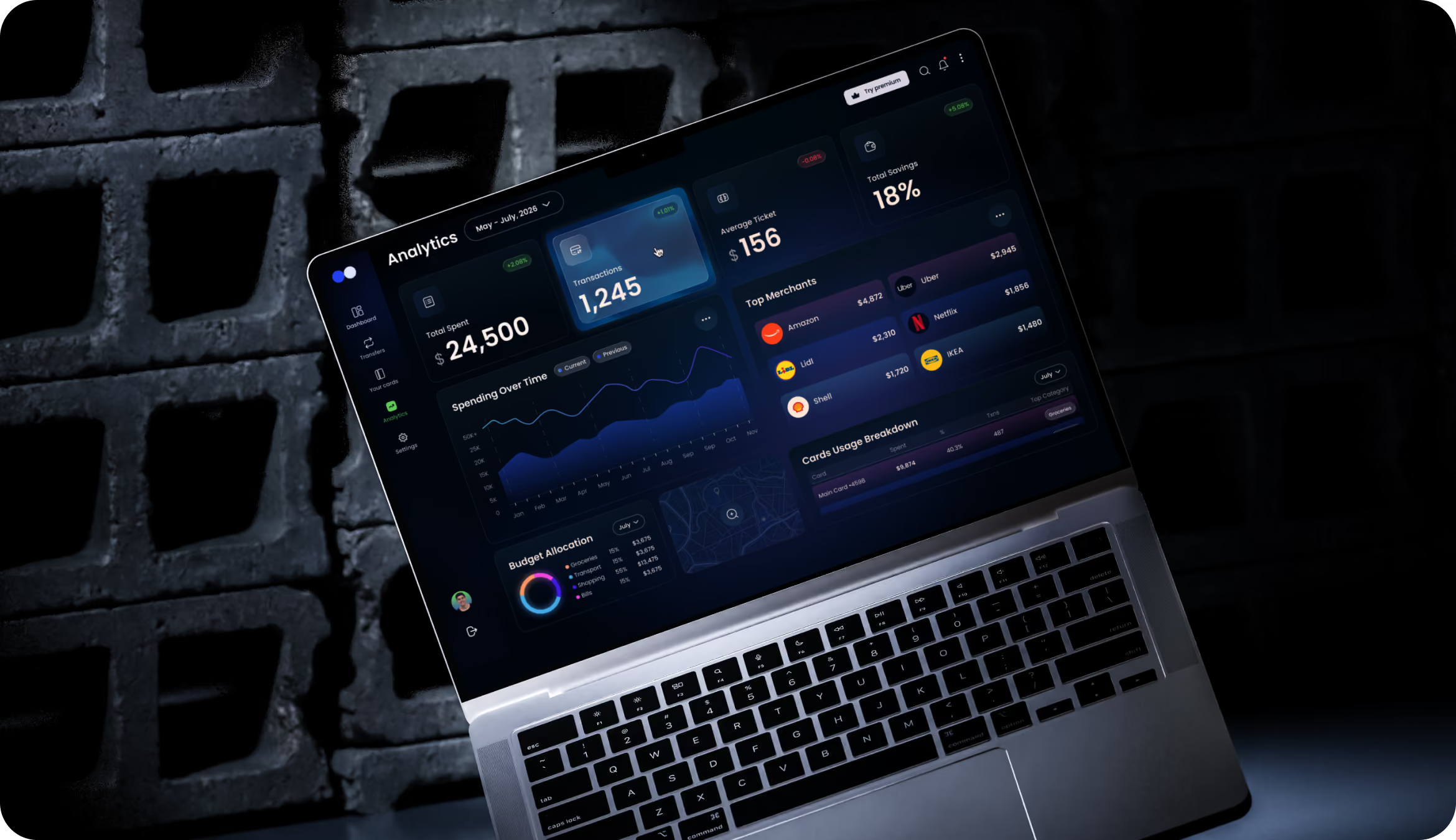
Analytics dashboard
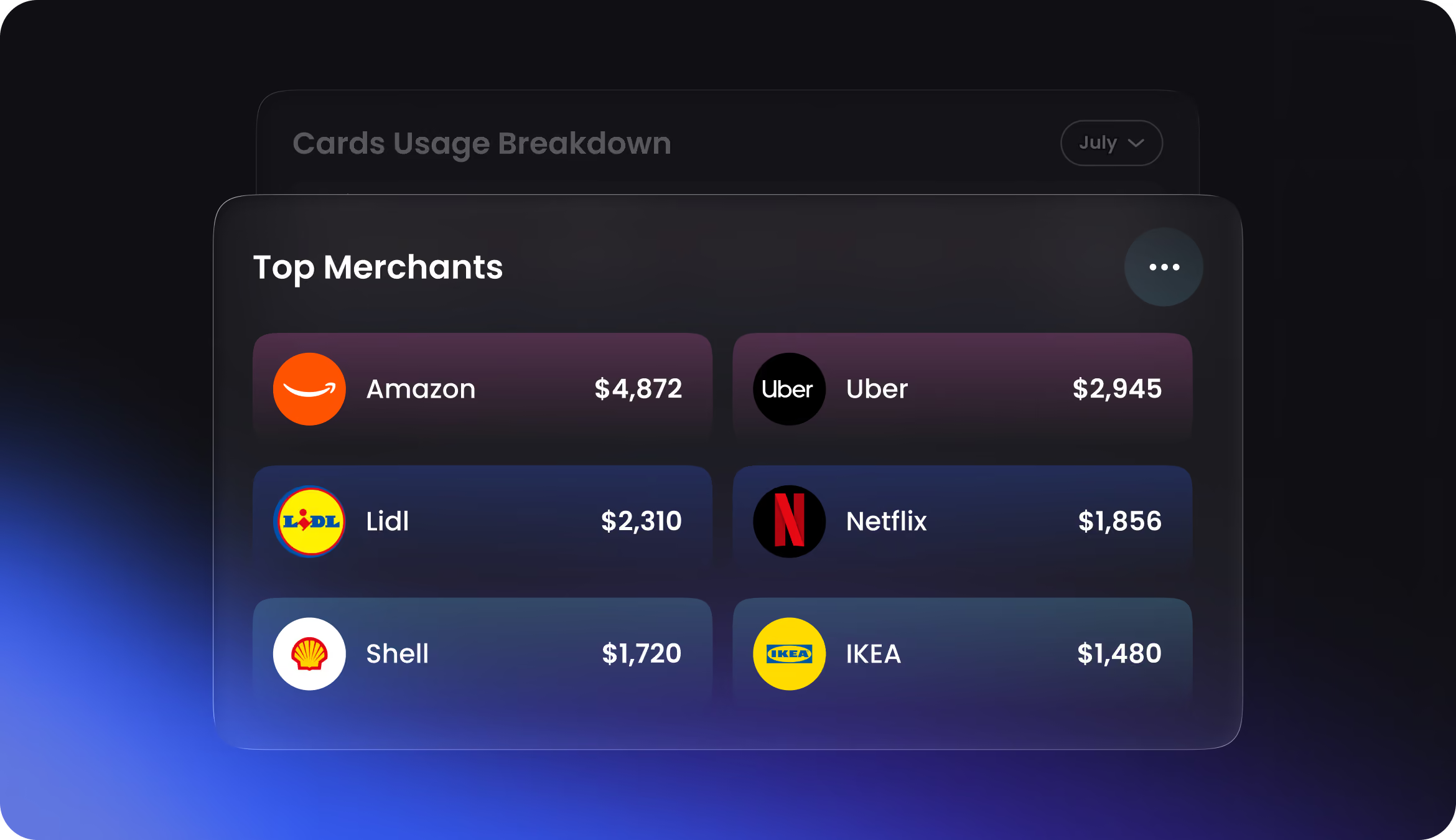
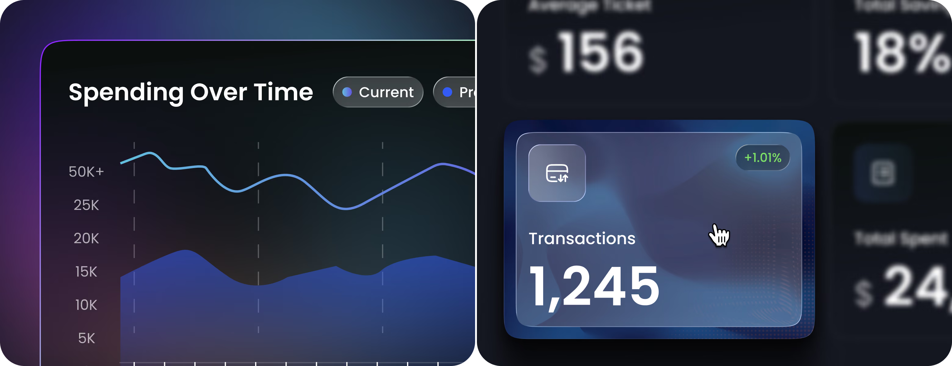
The analytics screen shows 4 equally weighted metric cards for an instant financial overview. A wide "Spending Over Time" area chart visualizes trends across months. Early designs planned two additional charts and several secondary metrics on this view, but testing revealed users ignored them once density got too high. So, we moved them behind filters and drill-downs. This tradeoff improved scan speed and made the main view easier to act on.
Cards Preview
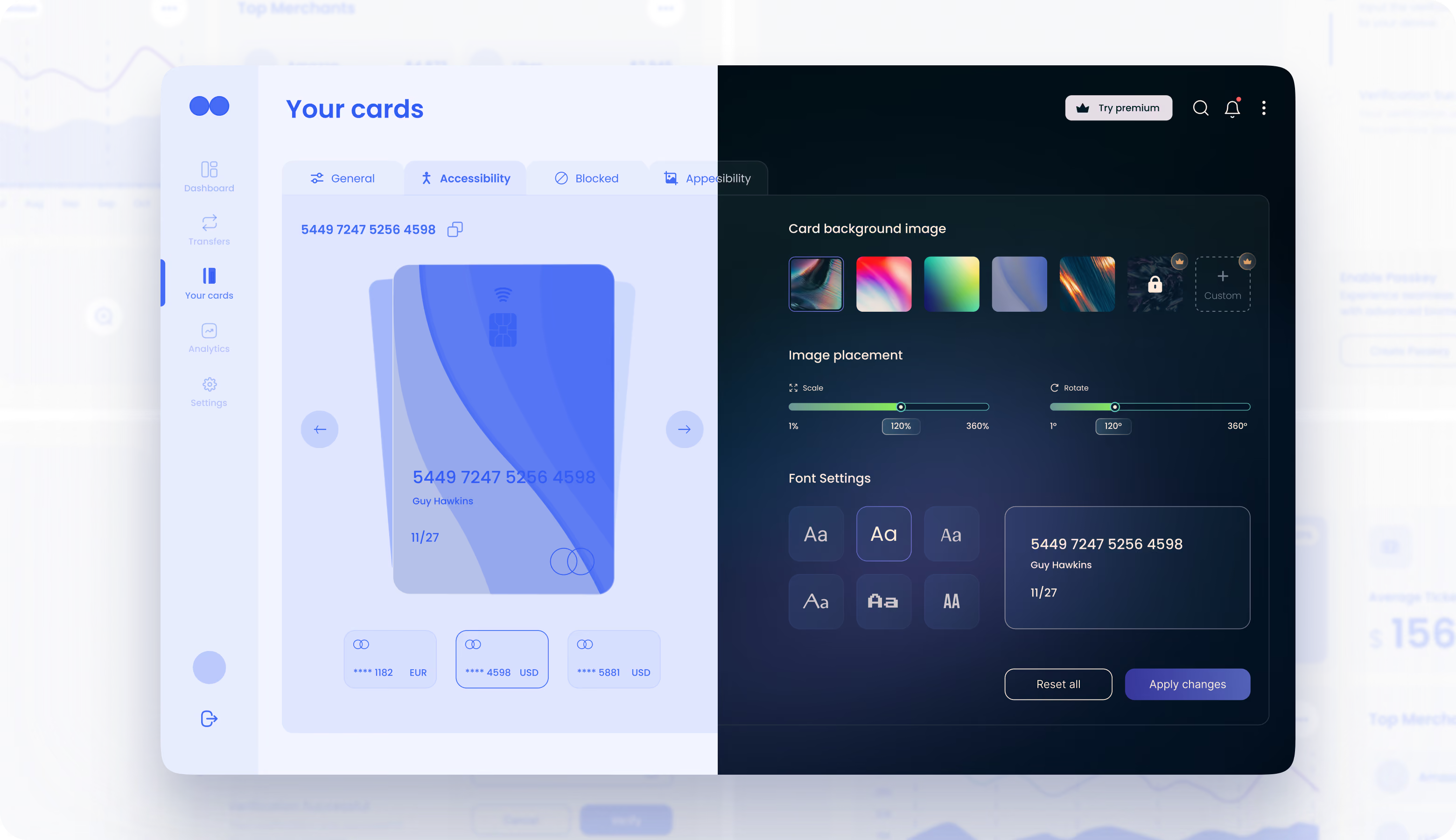
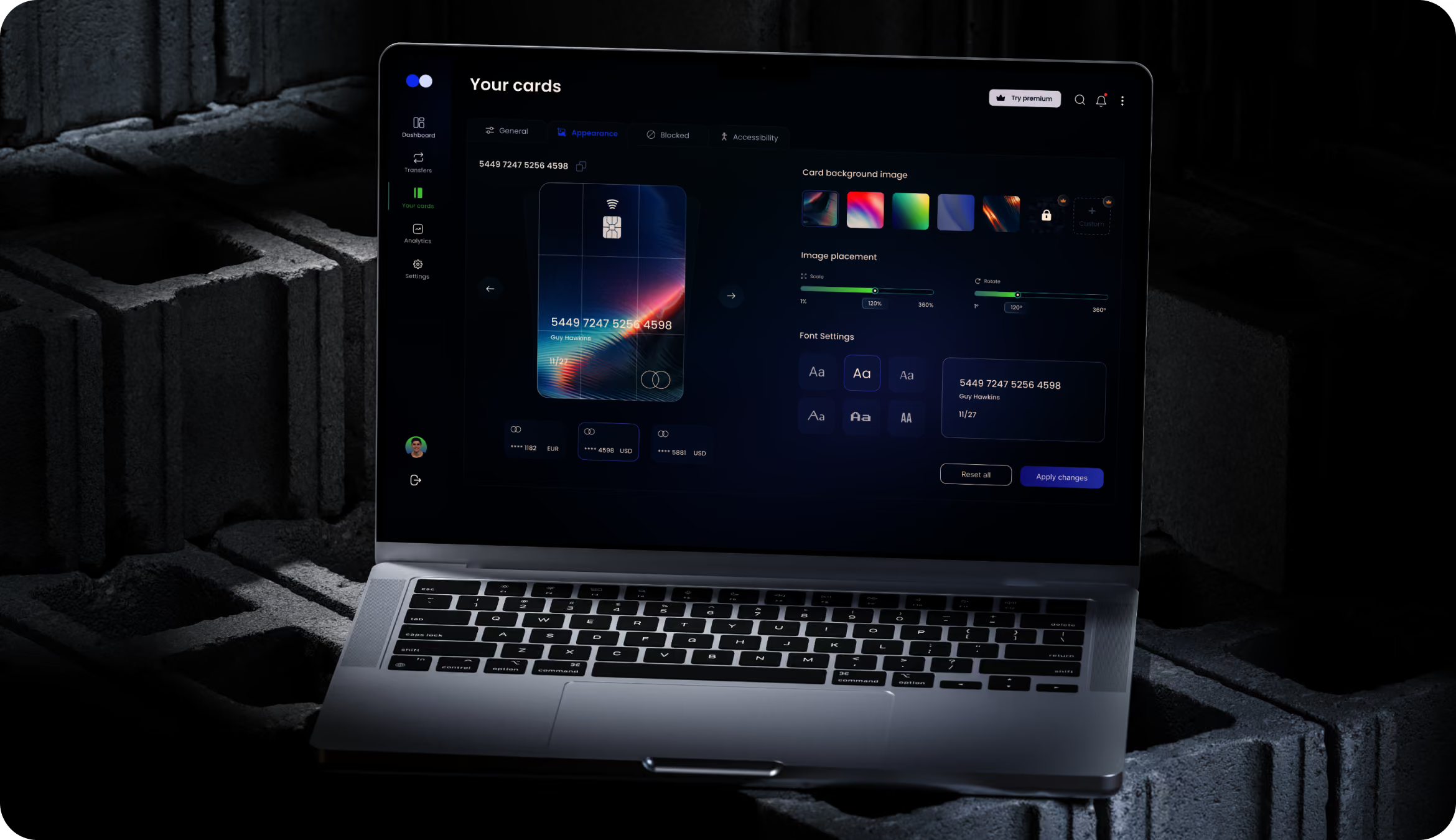
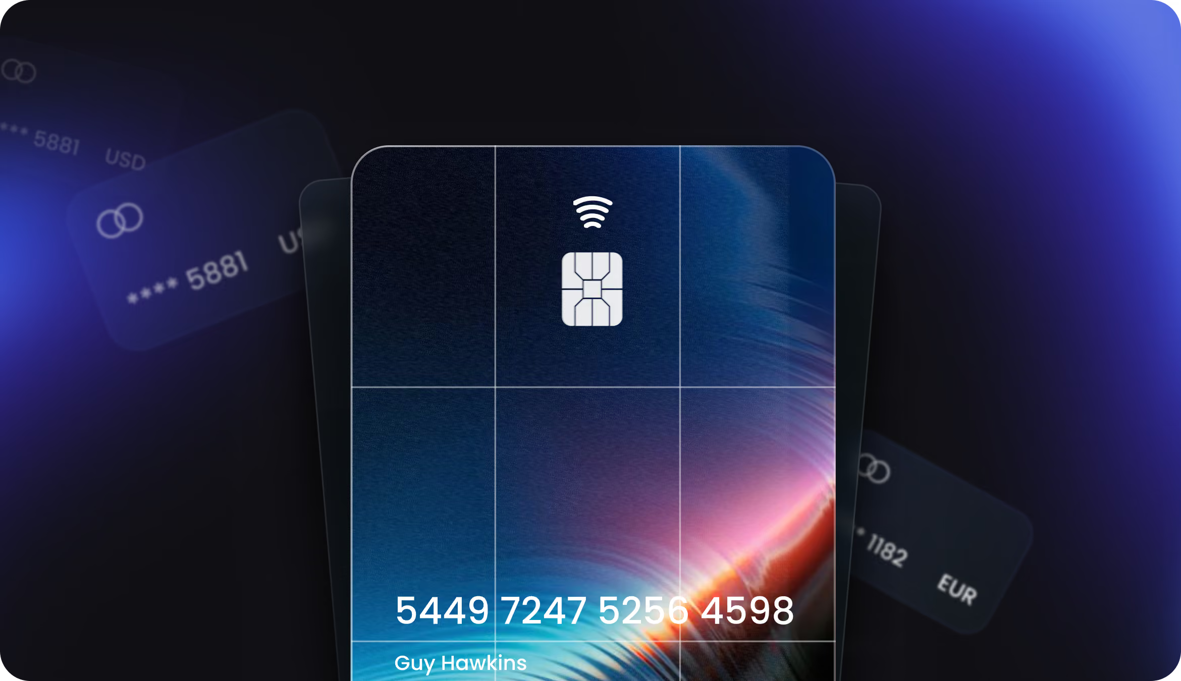
The cards screen displays a large card preview that updates in real time as users change the background, zoom level, rotation, and font using sliders and color swatches. The preview includes tabs for “General,” “Appearance,” “Locked,” and “Accessibility” settings. In earlier versions, this screen also displayed controls for layers and filters. However, testing showed that having too many options at once caused “choice paralysis,” so we moved them to a separate menu. Users still have full customization options; they just don’t see all of them at once.
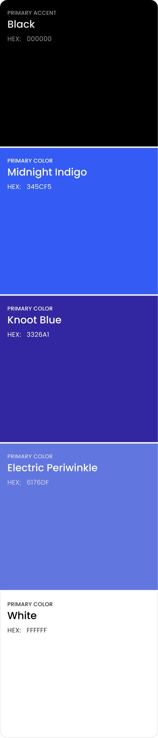
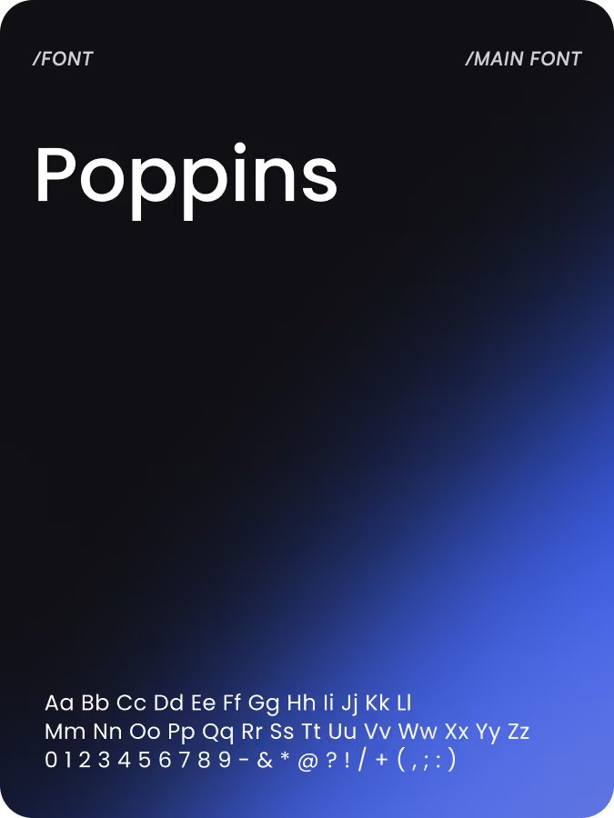
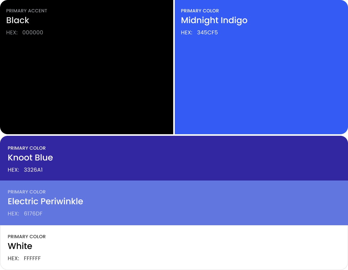
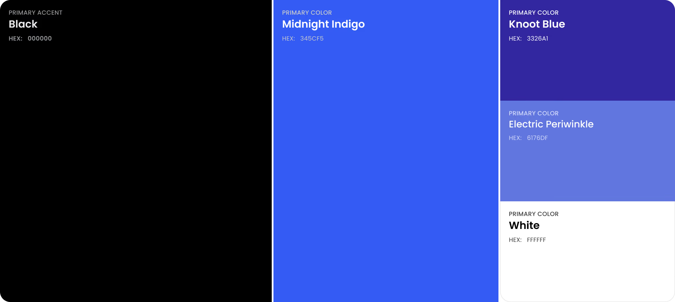
Design system



Results
96%
Task Completion Rate
Participants completed the main tasks during the testing session thanks to the four-card control panel and the elimination of deep submenus, which had previously led to high abandonment.
8 weeks
Design duration
Validating the information architecture across 28 wireframed screens before high-fidelity design enabled the team to resolve the structure early and avoid rework later.
3 taps
Task Efficiency
Flat navigation, providing one-tap access to the “Transfers,” “Cards,” “Analytics,” and “Settings” sections from the control panel, made the most common tasks easily accessible.
+37%
Feature Adoption Rate
Intelligent sequencing, placing key metrics, the spending chart, top merchants, and budget breakdown in that order, put the most-used insights where users saw them first.
