
Brand and Marketing Design for a Travel Platform
Branding
Graphic Design
Building brand identity forrecognition and growth
About project
Loca Travel is a digital travel platform that connects users with curated tours, local experiences, and personalized routes. Our Arounda team designed the full brand identity that reflects the platform's core values: curiosity, movement, and freedom.

.avif)

Challenges & Solutions
Problem
The client entered a market where dozens of travel platforms compete on the same visual cliches (sunsets, maps, and wanderlust typography). The key challenge was to make the product feel exciting and dynamic with strong usability and clarity.
Solution
Instead of reaching for the usual travel toolkit, we built the brand identity around a mascot, a palette nobody else in the category uses, and a friendly tone that feels more like a tip. Every marketing template carries the same visual logic: attractive, inspiring, conversion-focused.
Process
Briefing & onboarding
MVP Scope
Roadmap
Product/business goals
Competitors analysis
Moodboard
Concept design
Style guide creation
Social media
Printing materials
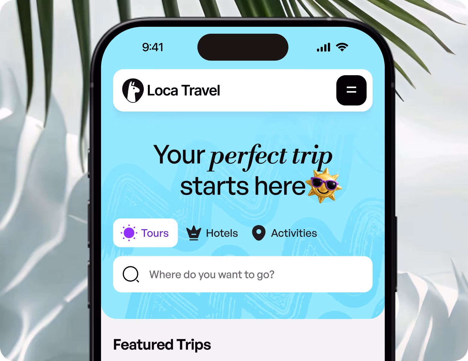
Digital products
Moodboard
.avif)
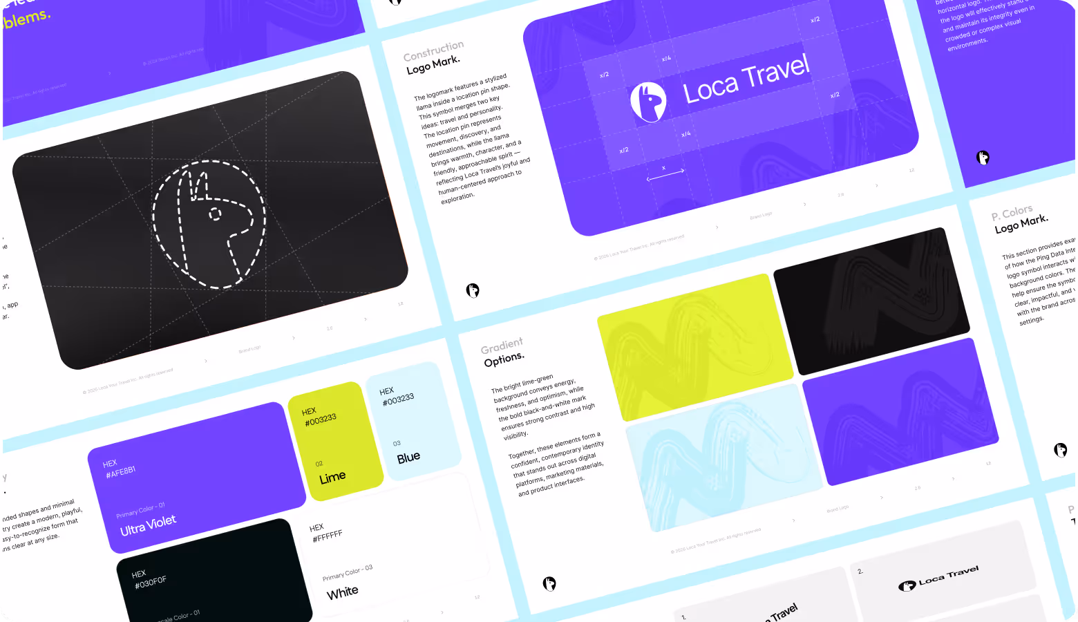
Logo Design
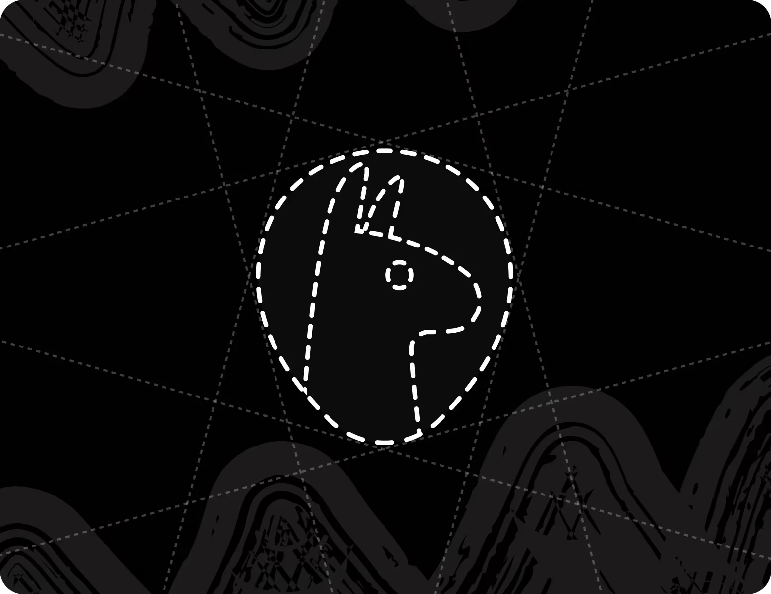
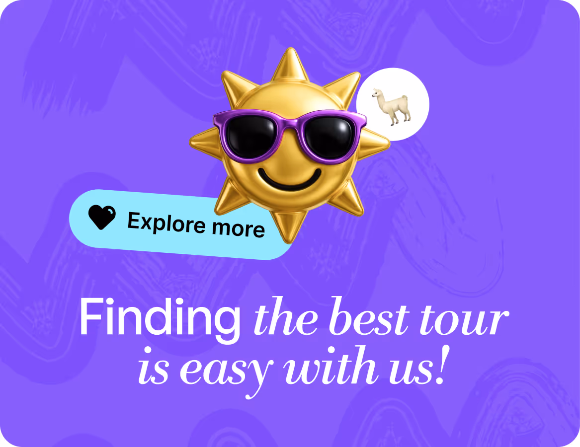
The client wanted a mascot-driven mark. It must be playful, animal-led, and deliberately far from the category defaults of mountains, compasses, and sunrise silhouettes. Our brand designer chose a llama image for its positive character and distinct personality, which also serves as a symbol of guidance. The client liked this idea very much, so we moved forward to the next stage.
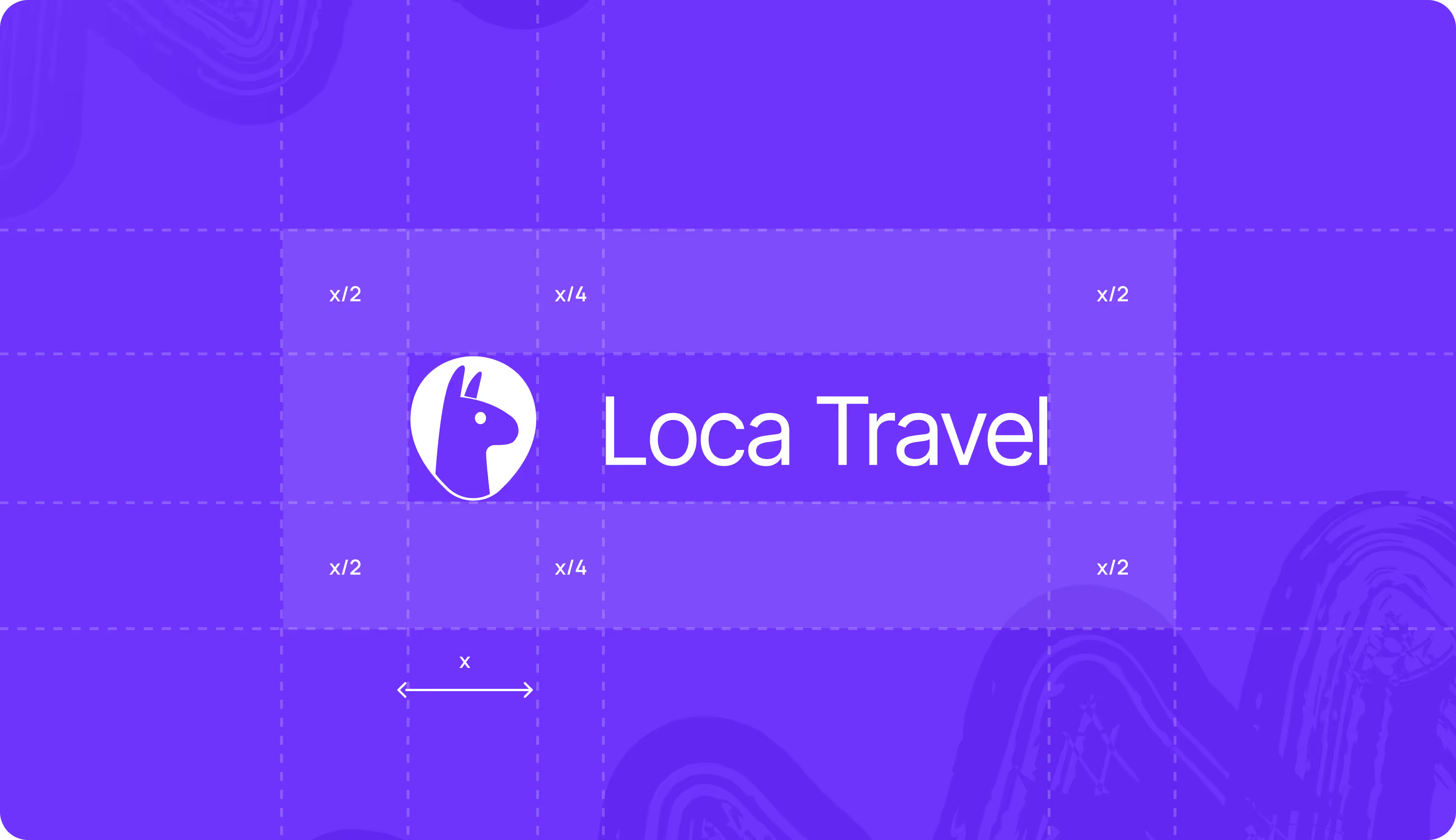
Brand Guidelines
Loca Travel's brand guidelines define exactly how every visual element behaves across digital and print contexts. So, the brand stays coherent whether it appears on a mobile screen, a billboard, or a social ad. Because inconsistency directly influences conversion and trust.


When your product needs to inspire and convert, Arounda finds exactly where those two things meet.
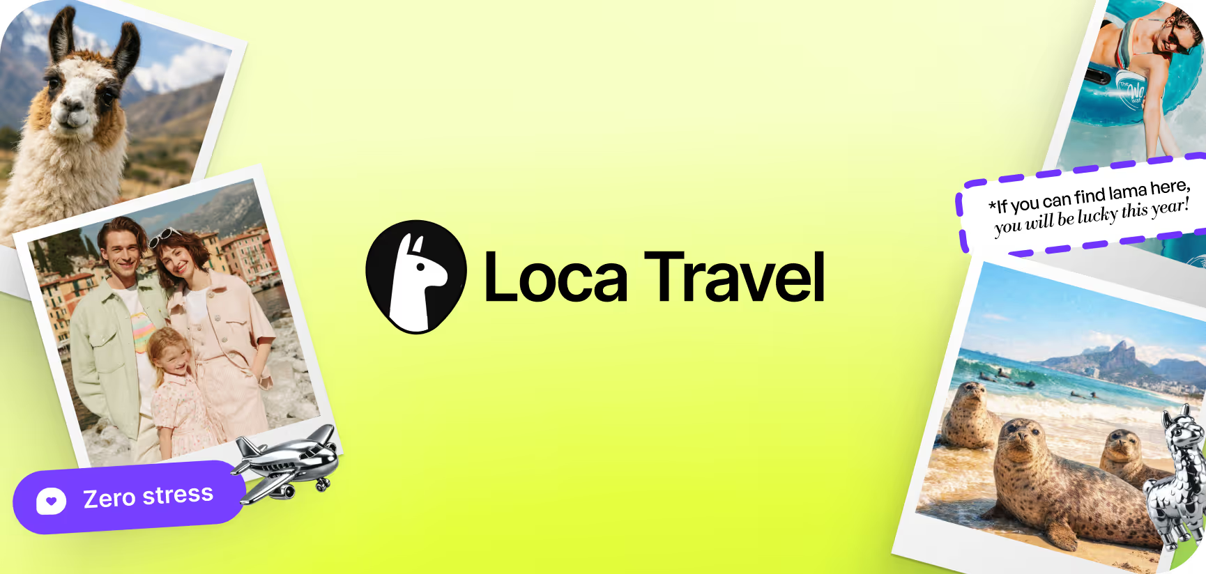
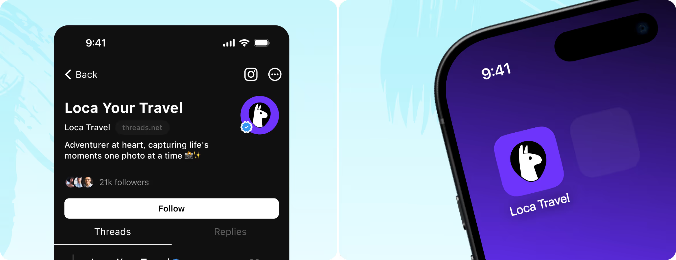
SocialMedia
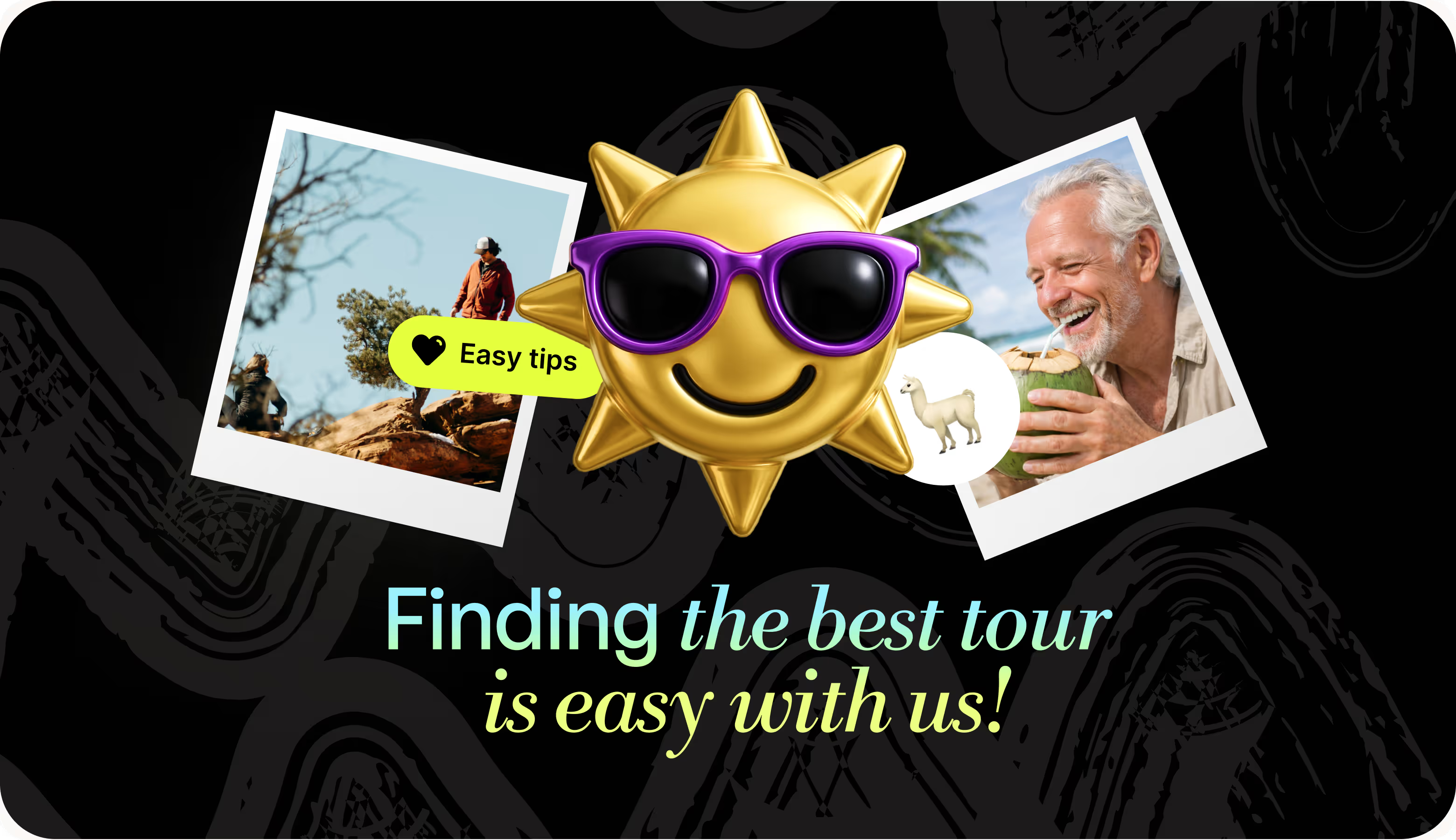
The social templates mix photography, 3D elements, and bold typography across purple, lime, and black. We offered three distinct background modes that keep the feed varied but in one brand style. Each format has a clear conversion action (a destination prompt, a booking CTA, or a direct app download) to pull users toward the next step (not only to attract with an inspiring picture).
.avif)
.avif)
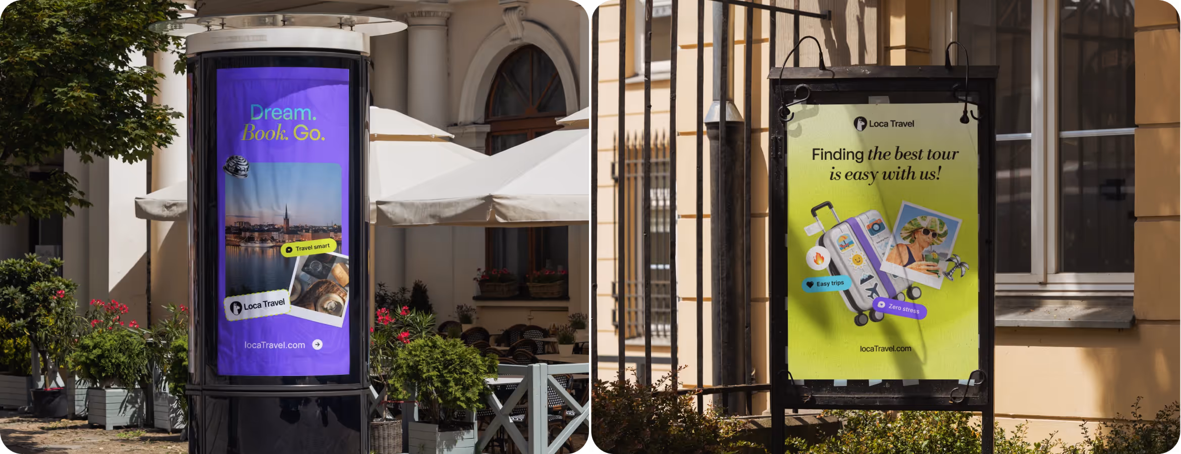
Printing
The outdoor formats use the same design system, so a user who sees a poster and later lands on the app gets instant visual recognition. Large-format pieces lead with a single message and pair with 3D compositions or polaroid-style photography. The brand inspires and stays playful and readable at a distance or speed.
.avif)
.avif)
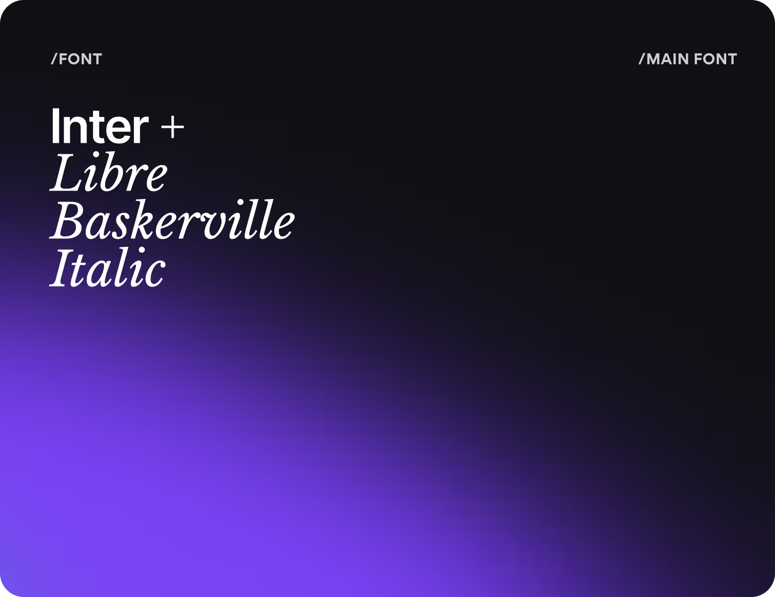
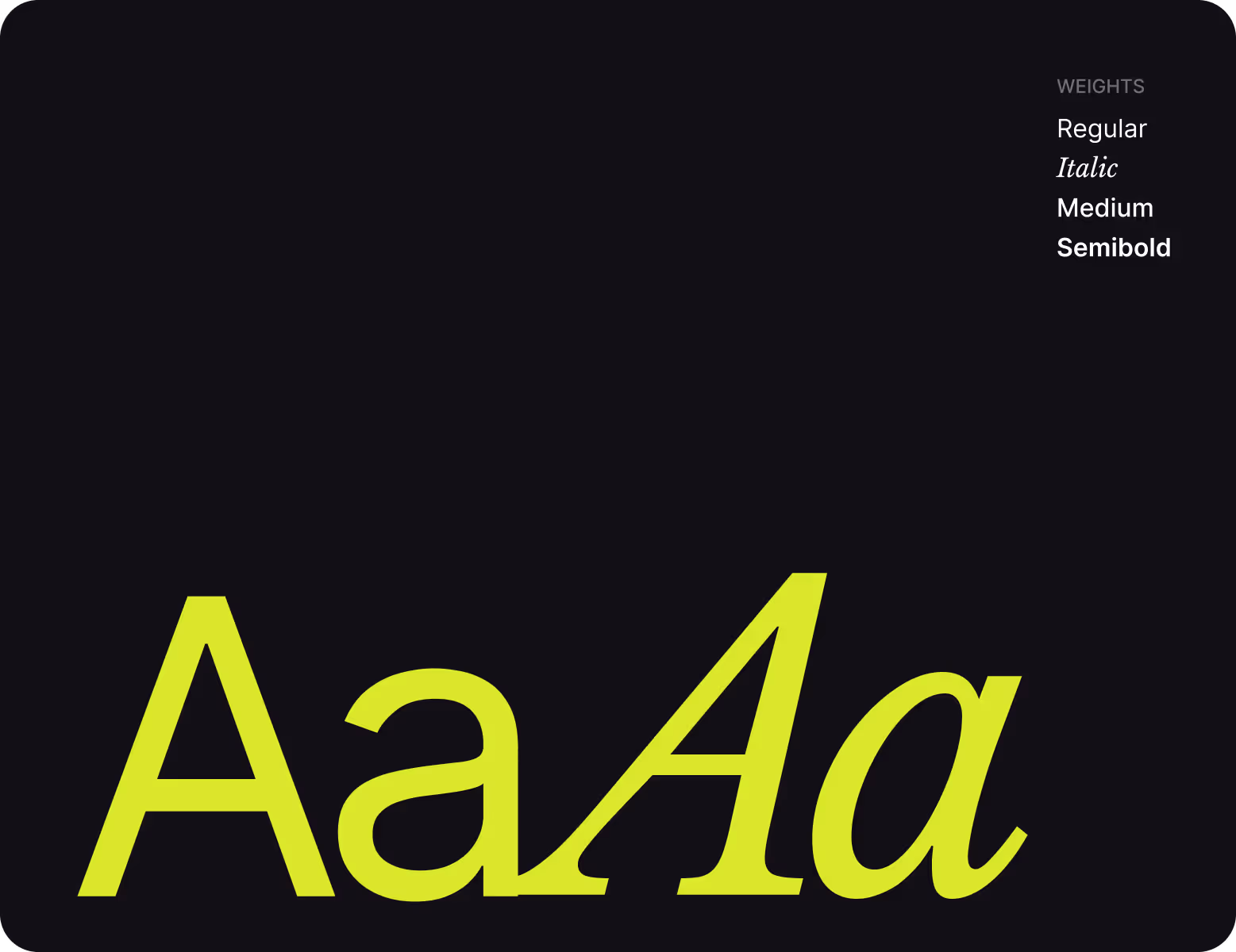
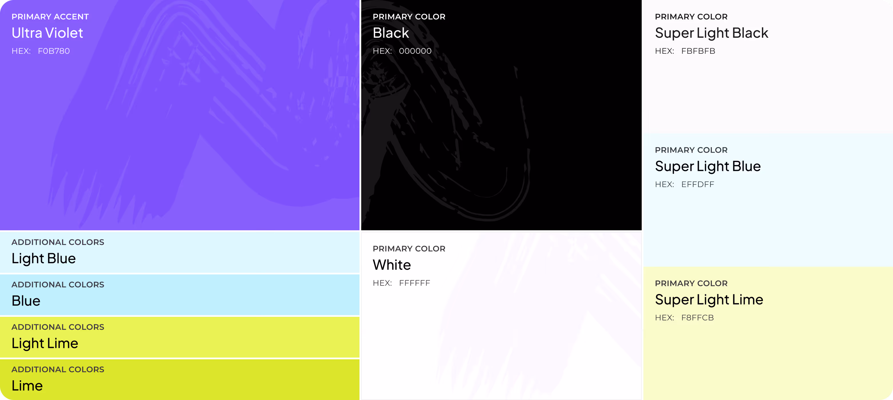
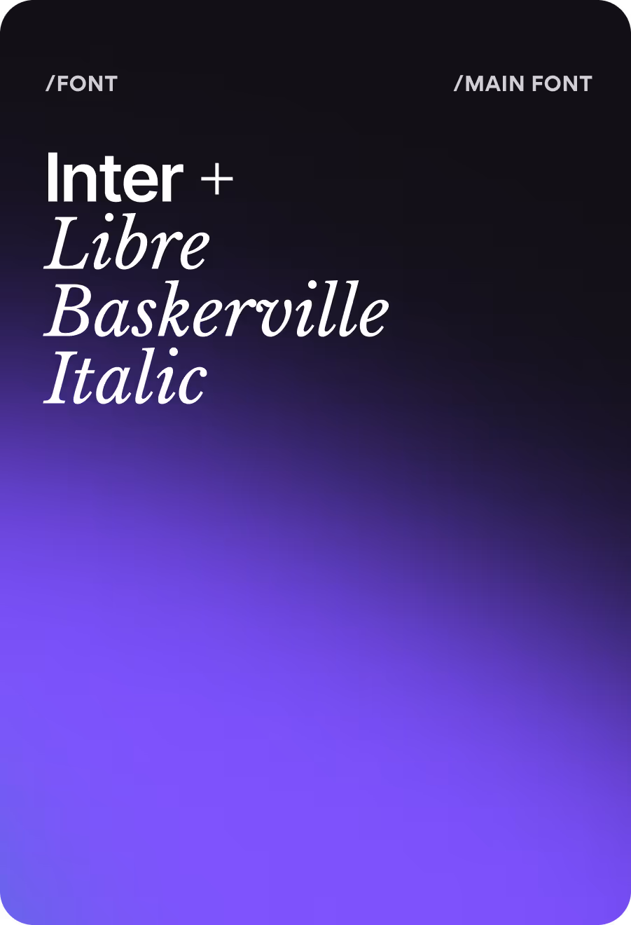
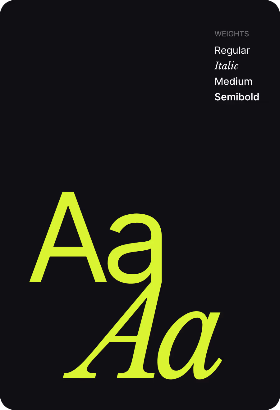
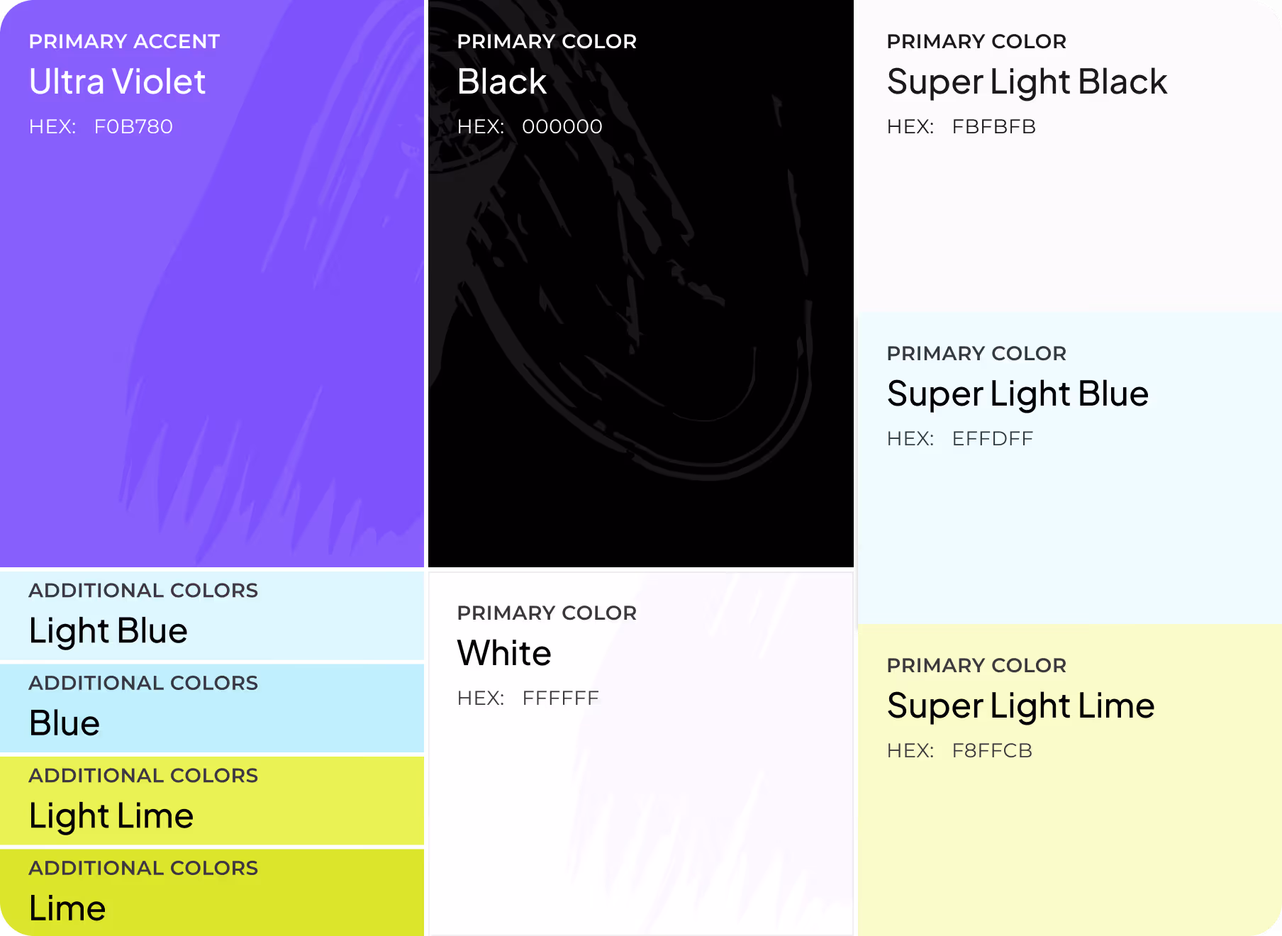
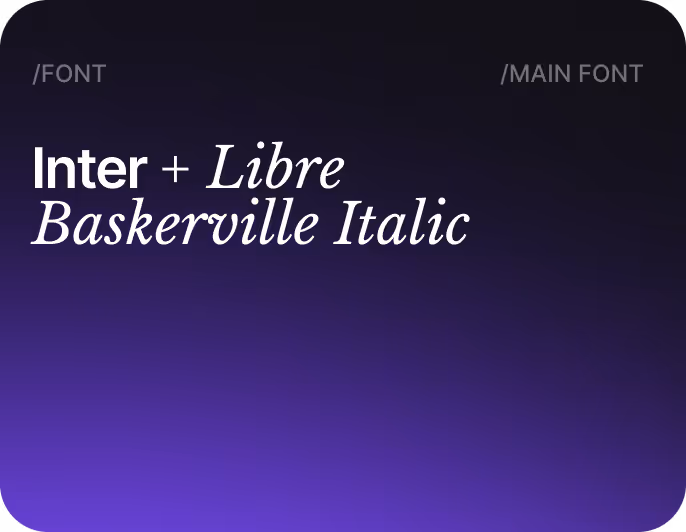
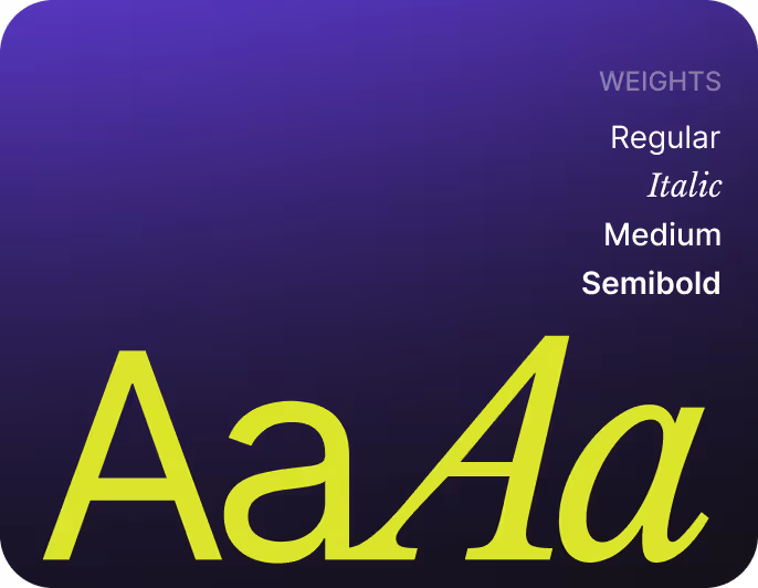
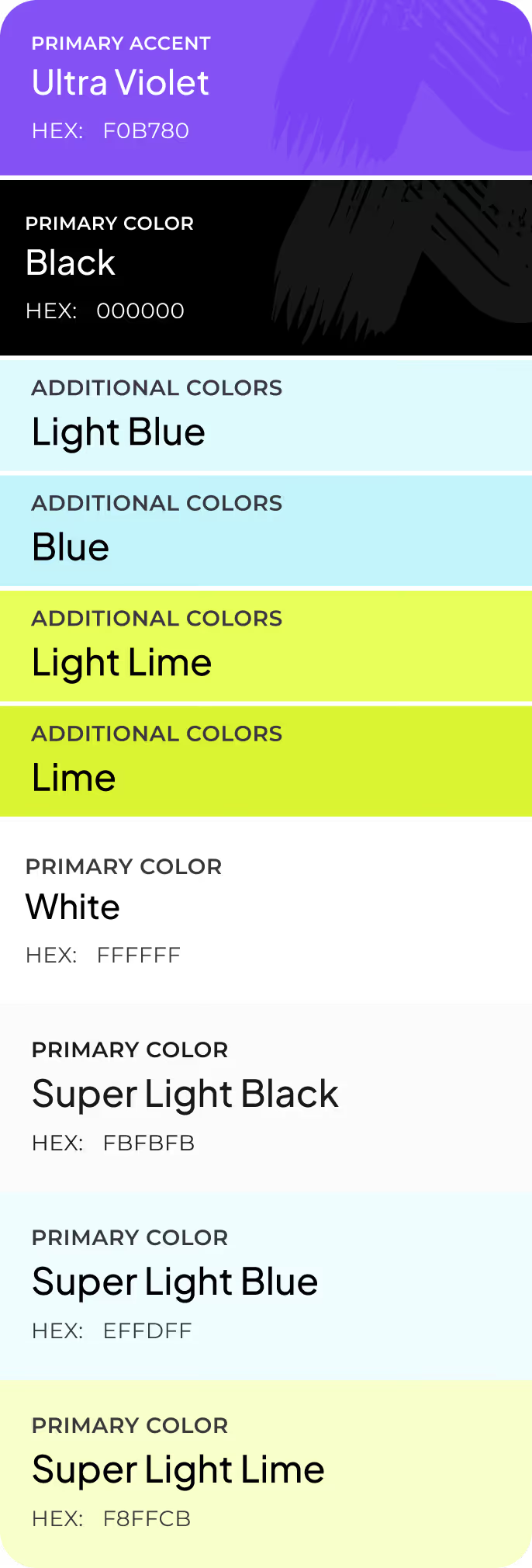
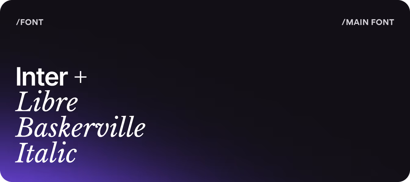
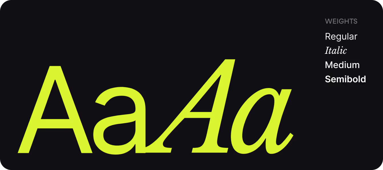
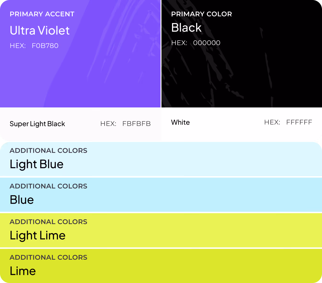
Colors &Typography
Results
+60%
Brand recall improvement in user testing.
A distinctive logo, color system, and ownable visual language made Loca Travel immediately recognizable against direct competitors.
3x
Faster marketing asset production.
The ready-to-use template system for social, OOH, and digital ads eliminated repetitive design work for the marketing team.
+29%
Increase in session depth.
Emotional photography paired with structured content cards kept users exploring past the first screen.
4 weeks
Brand identity and UI system.
Full brand identity and UI system delivered (logo, guidelines, UI framework, and marketing materials) in a single production cycle.
