
Mobile App Design for a Supplement Platform
Healthcare UI/UX design that forms daily habits and increases retention

About project
Luma is a mobile app for wellness and dietary supplement selection, developed by experts in clinical nutrition, behavioral sciences, and consumer software. Luma reached out to Arounda to increase user retention, reduce decision fatigue, and make it easier to stick to daily health routines.



{/}
Challenges & Solutions
Problem
We had to replace vague emotional impressions with evidence-based recommendations for supplement use. Because even two false assumptions can undermine user trust. The second was tonal. Clinical UI signals the wrong frame for daily wellness use. But over-softening undermines the credibility that supplement guidance needs.
Solution
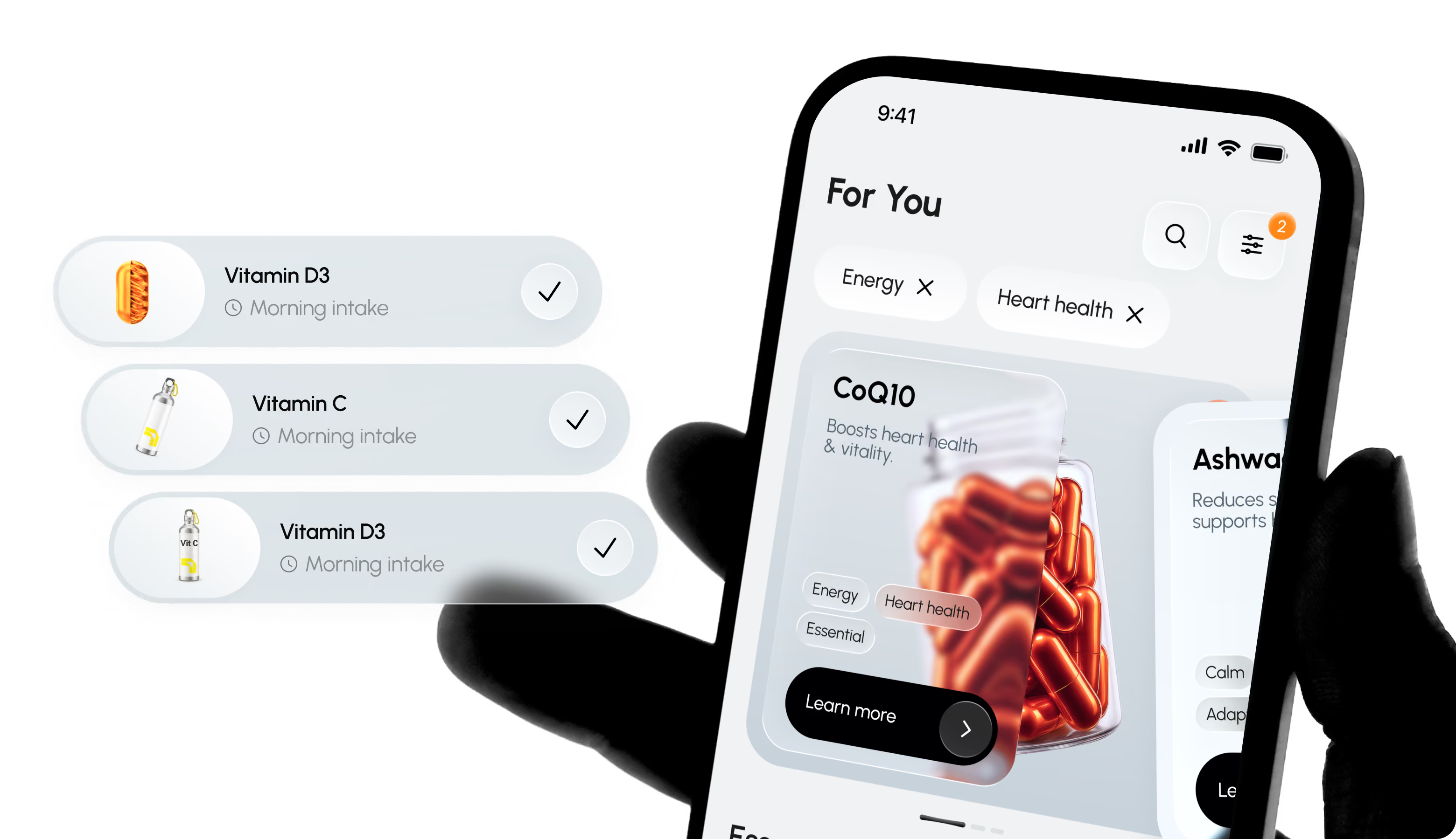
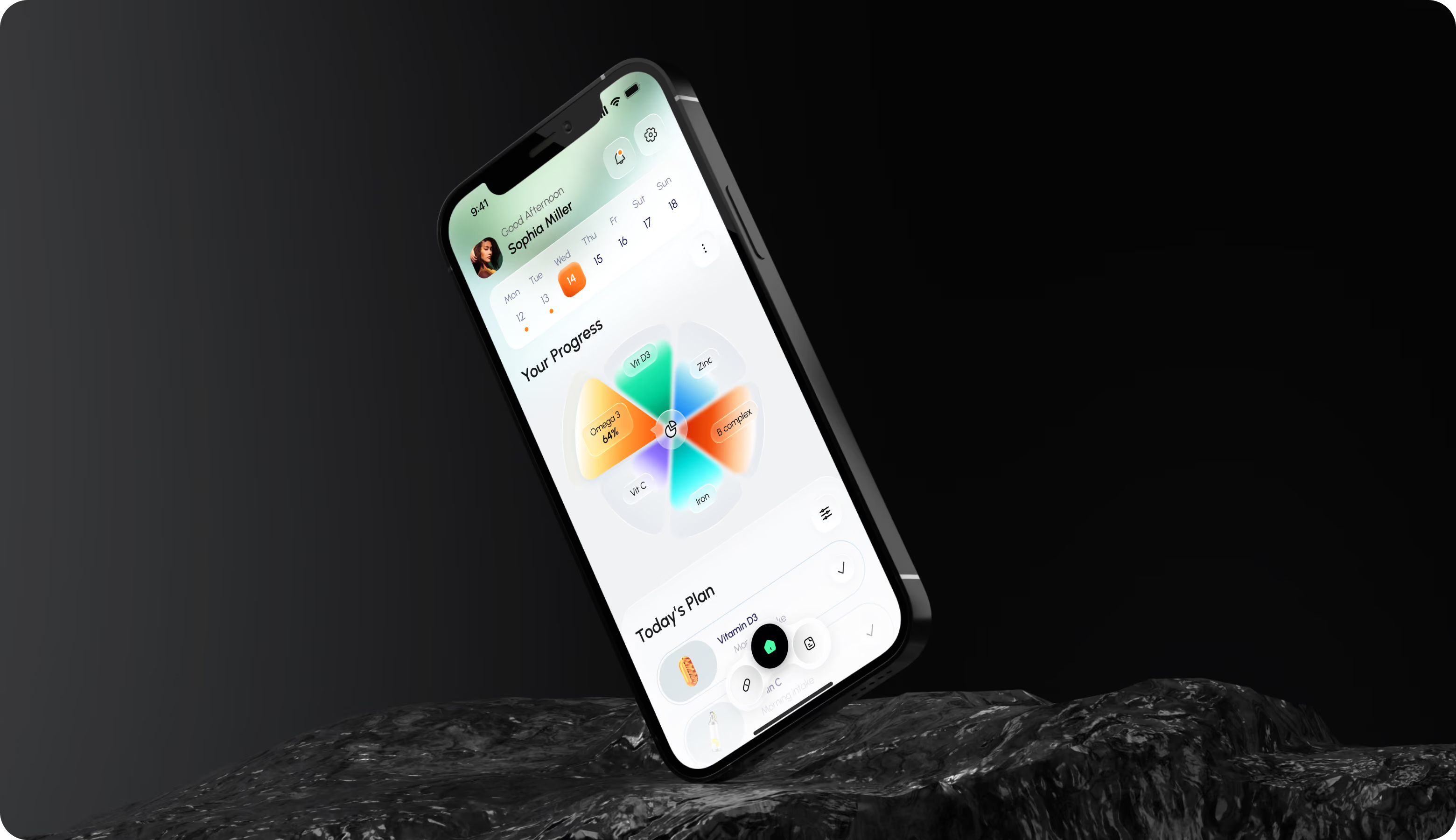
Our healthcare designers replaced the dashboard with a radial visual that shows balance in 1 sec. Users can describe emotions in plain words, and the system converts them into a clinical context. AI recommendation cards provide unambiguous next steps with context, action, and duration. And the daily plan combines supplements and tasks into one timeline.
{/}
No items found.
{/}
{/}
No items found.
Moodboard
{/}
The moodboard rejected the two most common visual languages in wellness app design: clinical wellness (white, blue, sans-serif, data-forward) and lifestyle wellness (terracotta, serif, lifestyle imagery). To provide information without hurry, we referenced meditation hardware (Muse and Apollo Neuro), as well as slow-living editorial. Color references included dawn and dusk gradients, soft violets, warm peaches, and translucent off-whites.

{/}
{/}
App Flow
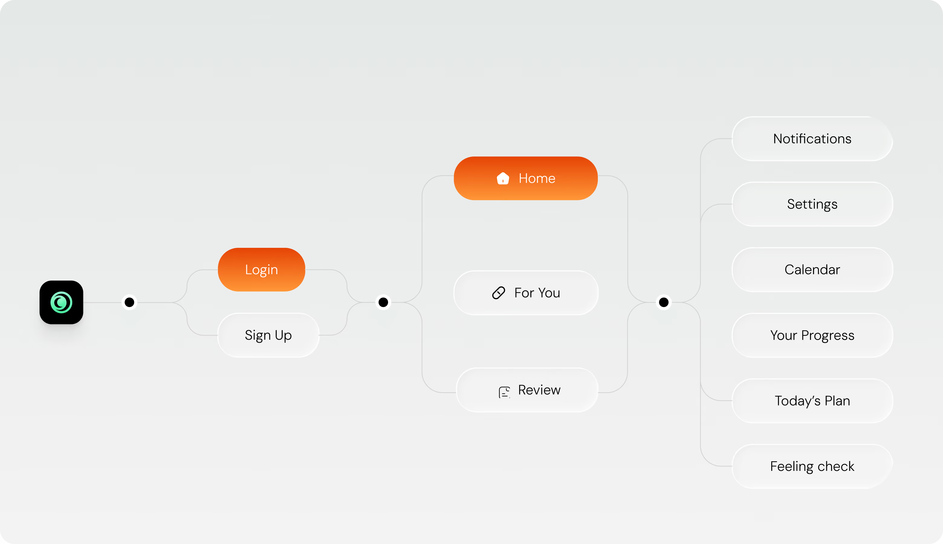
The healthcare app flow focuses on emotional check-ins. It interprets user states and recommends actions. Luma guides users step by step and only displays relevant information. Tired users don't have to read several metrics or navigate complicated menus. Every flow terminates with a specific next step (consider a supplement, a habit, or a simple action such as rest or hydration). The "For You" feed provides timely suggestions without requiring a search or setup.
{/}
Wireframing
The wireframes highlighted three main cycles: the morning cycle, the registration cycle, and the search cycle. At this stage, our team deliberately avoided any emotional language to test whether the structure alone could convey a sense of calm. The main goal was to define a structure that would help increase user retention, engagement, trust, and clarity.


Arounda designs healthcare apps where daily habits help retain users and generate recurring revenue.
{/}
Mobile Version
Our mobile app design solutions include glassmorphism, gentle gradients, and transparent layering to provide depth without adding weight. The UI feels like a friend. Whereas competitors use a lot of numbers, Luma employs language to communicate health conditions. To avoid a rushed impression, motion remains slower than the default (350-450ms). The home screen contains around 40% of the elements of a typical health data dashboard. The empty space gives a break for the fatigued user.





{/}
No items found.
{/}
{/}
No items found.
{/}
Instagram Layouts
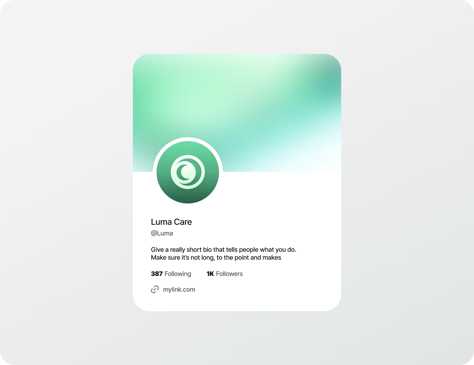
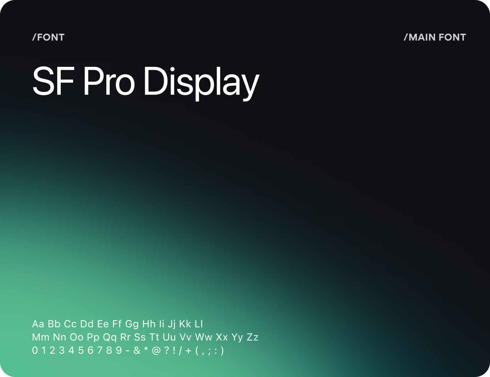
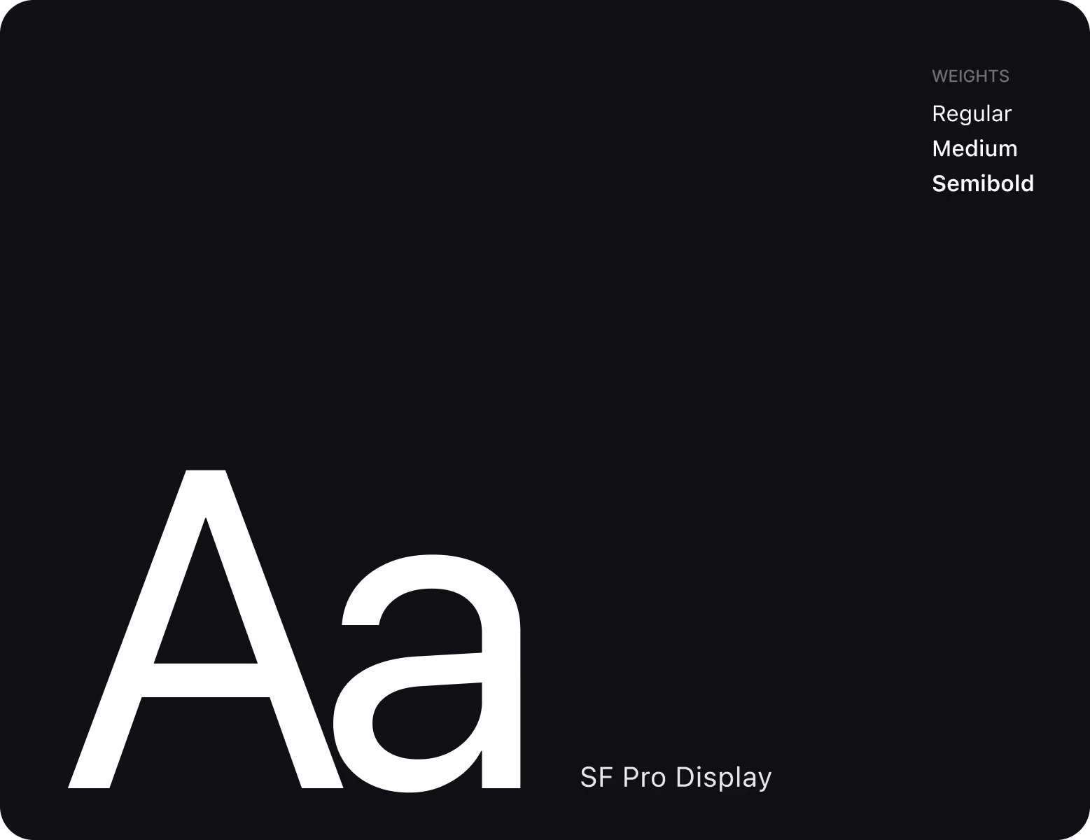
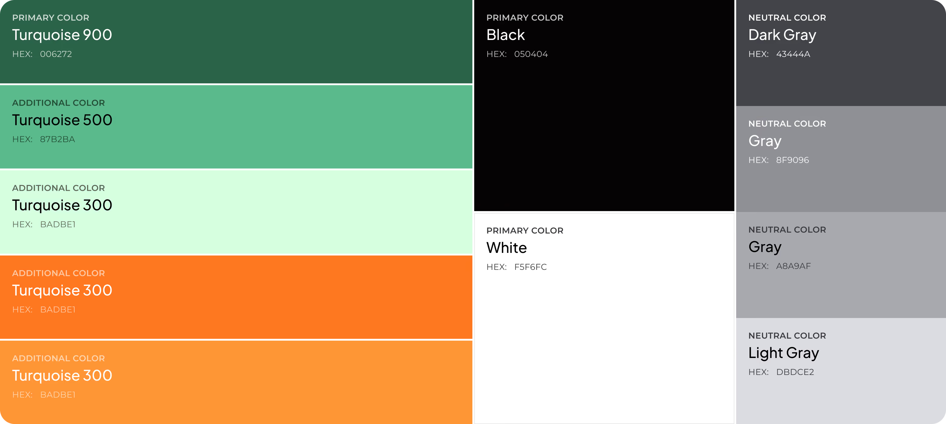
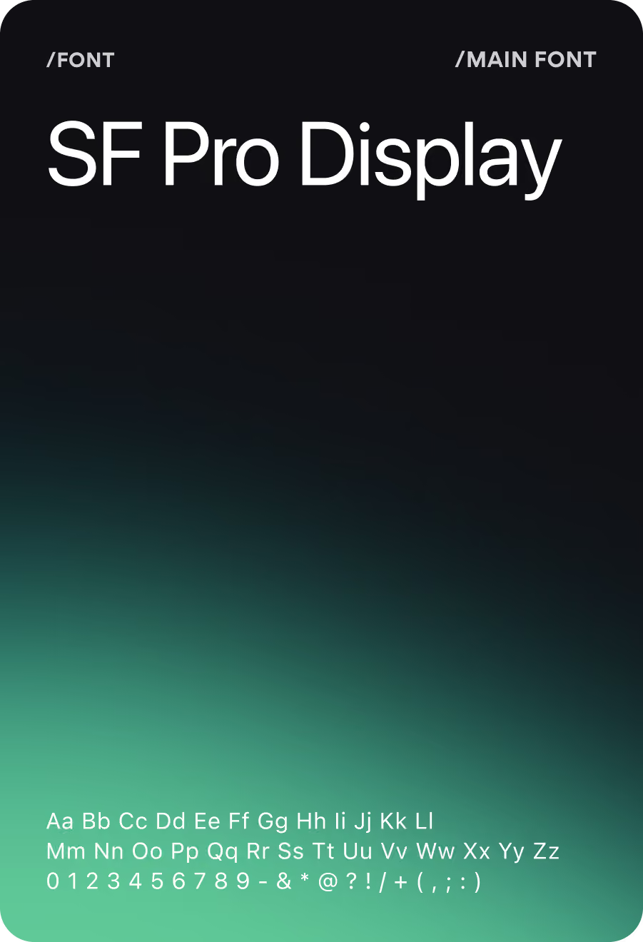
The Instagram layouts broaden brand reach and drive top-of-funnel traffic back to the product. Sage gradient, editorial typography, and 3D supplement graphics move to a native Stories format, so the feed reads like the product. Three layouts provide distinct functions. The daily strategy increases interest in tracking. The brand register improves recognition. The discovery layer's surfaces get complemented with tactile 3D models.

{/}

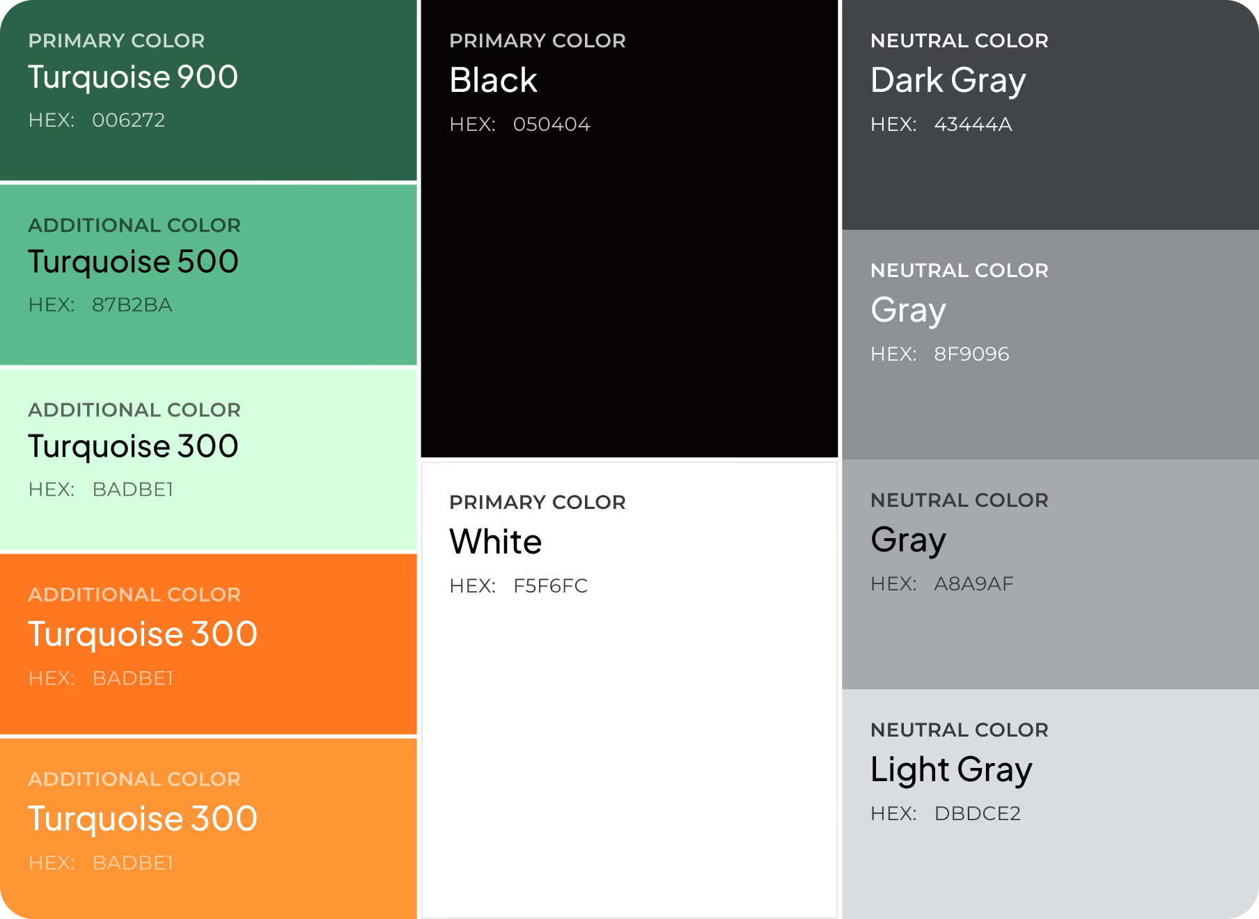

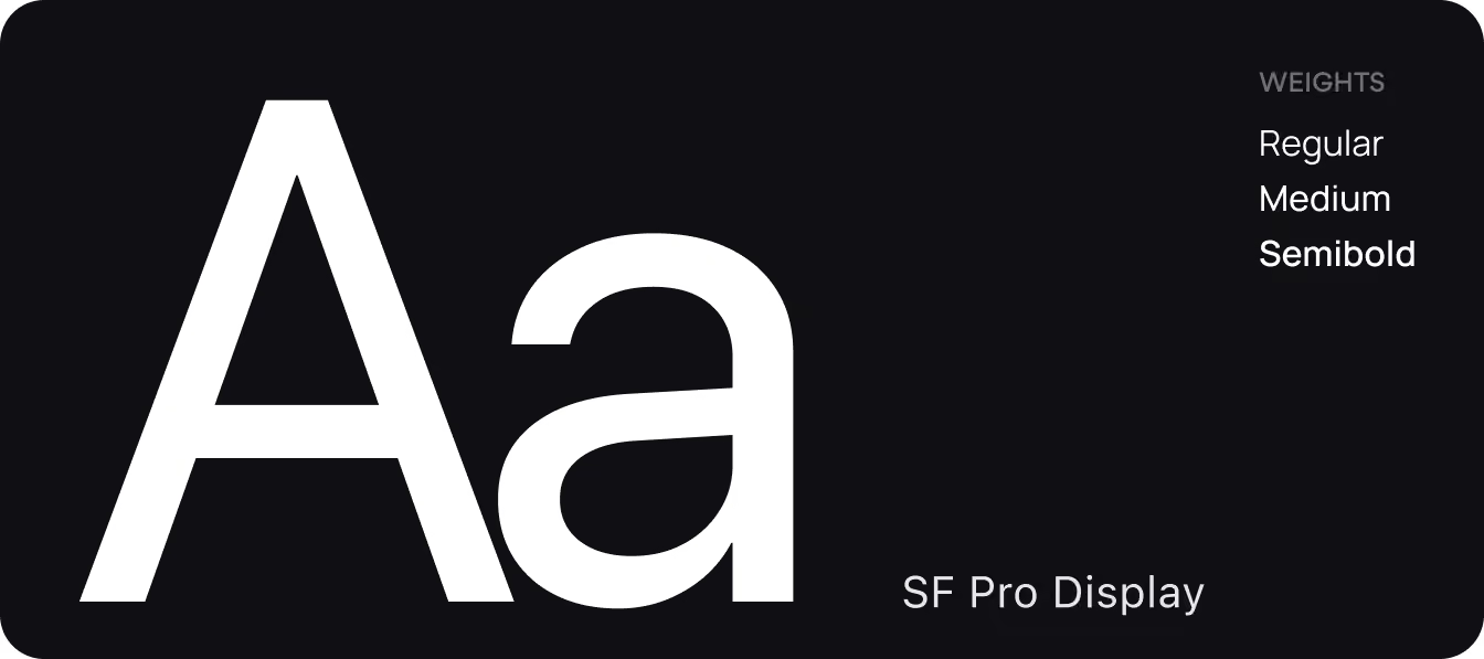
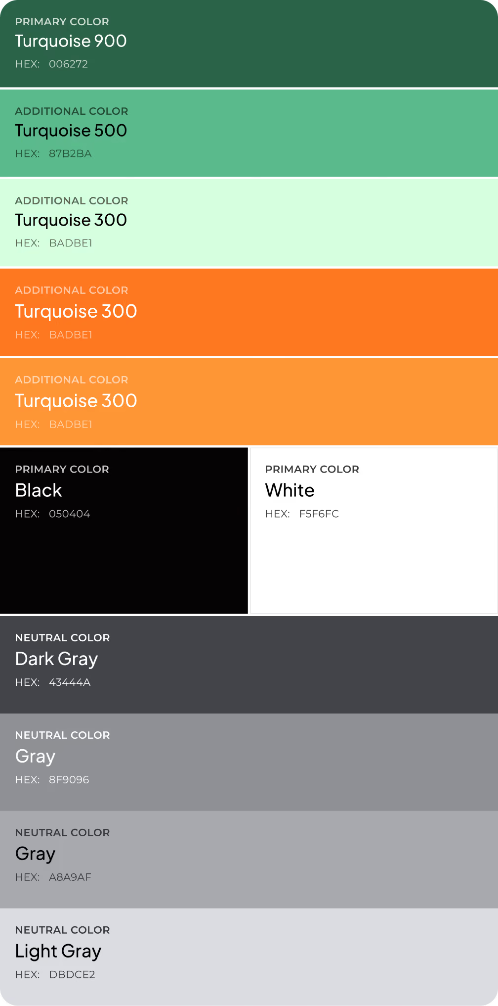
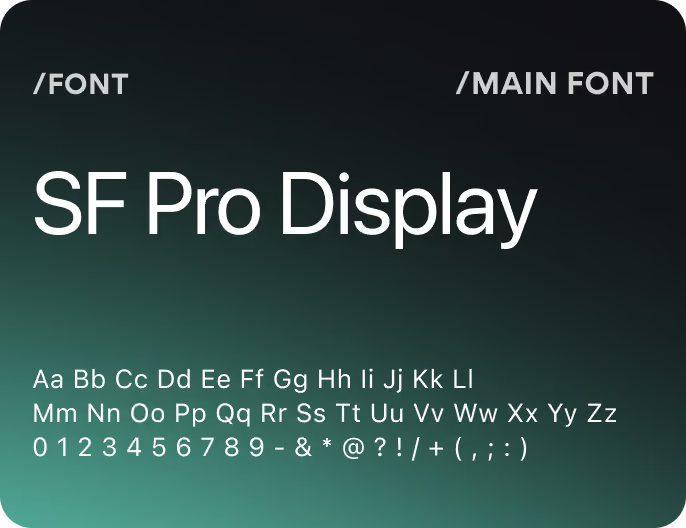

{/}
Results
78%
Onboarding completion
The three-question emotional check-in replaces the standard health audit. Users reach a helpful state in three taps without abandoning a lengthy intake form.
2x
Improving user retention
Sub-4-second activation, short interpretation, and no comparison or gamification layer reduce the cognitive load (the reason why users stop using services in this category after just two weeks).
3.1s
Time-to-first-action
The radial representation displays the state as a form rather than numbers. Users can read their health condition and take action without having to parse a dashboard.
64%
7-day plan adherence
Each day starts with an interpreted state and a single recommended action instead of a large menu or different numbers, so users follow the plan without deciding what to do first.
