
UI/UX Design for a Mental Wellness Platform
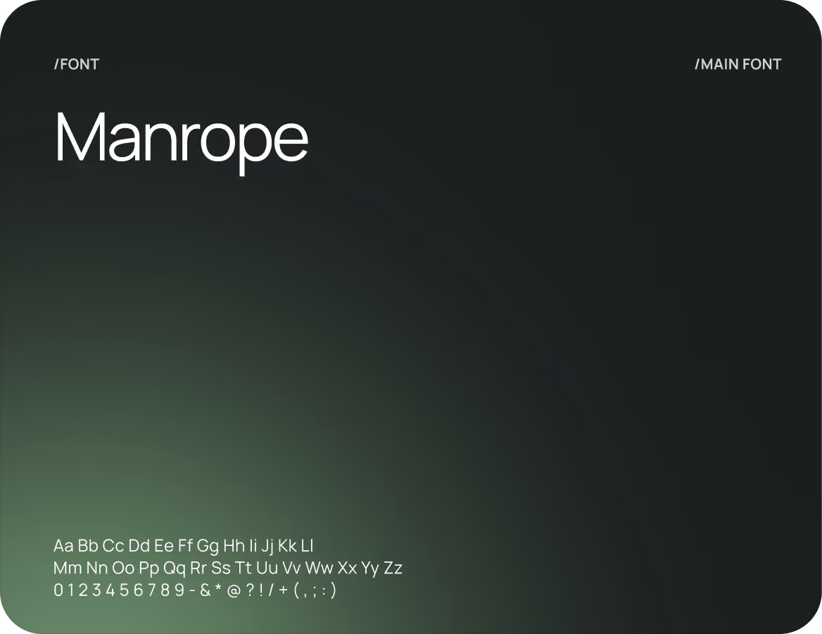
UI/UX Design
Branding
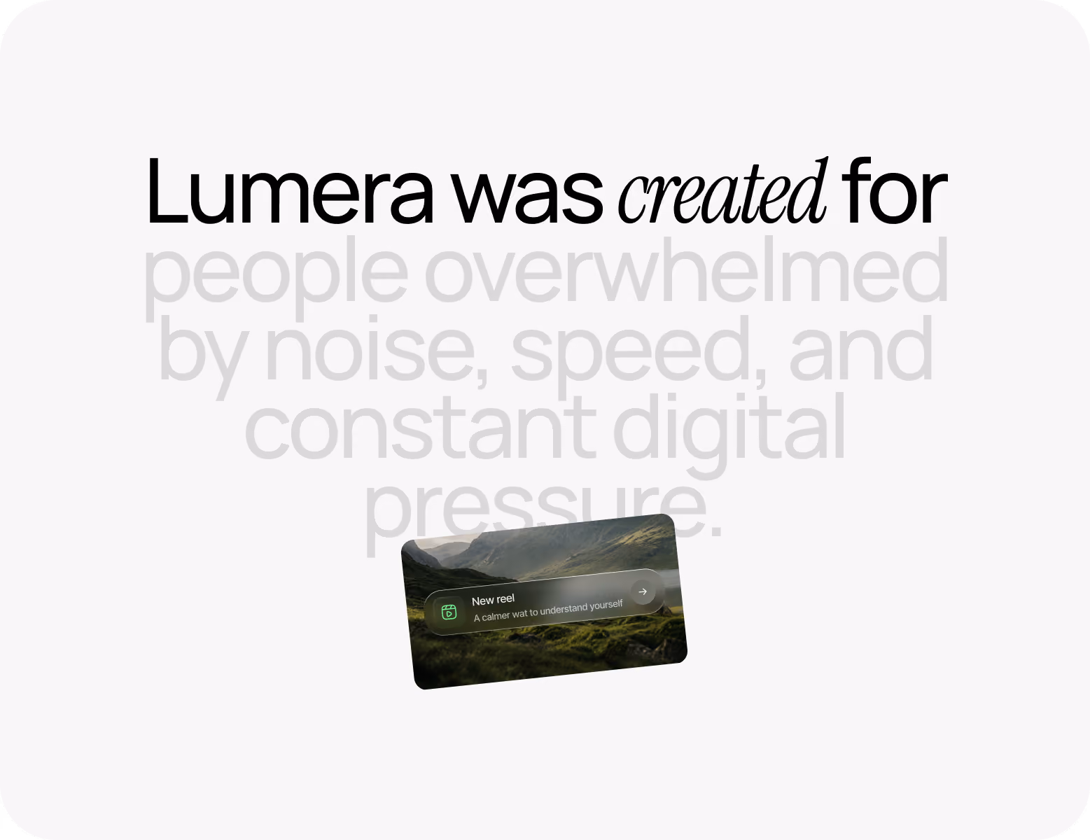
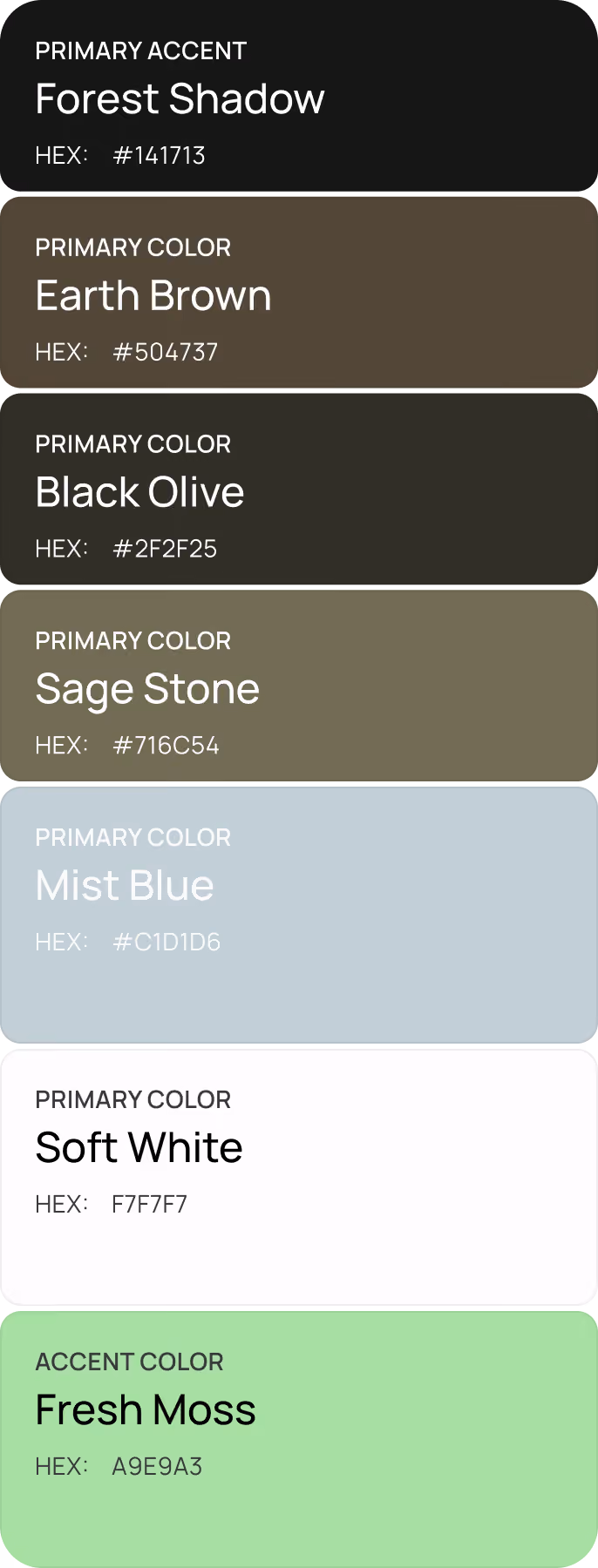
Created for people overwhelmed by digital noise
client
Lumera
industry
Mental Wellness
headquarter
UK
service
UI/UX & Branding
About project
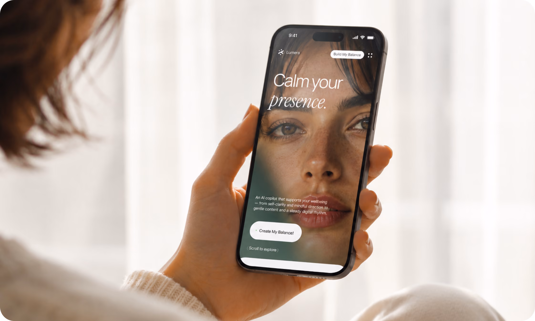
Lumera is an AI-powered mental wellness platform designed for people overwhelmed by constant noise. In order to assist people in slowing down and gaining insight into their emotional patterns, Arounda developed a soothing UI/UX design based on guided reflection.


{/}
Challenges & Solutions
Problem
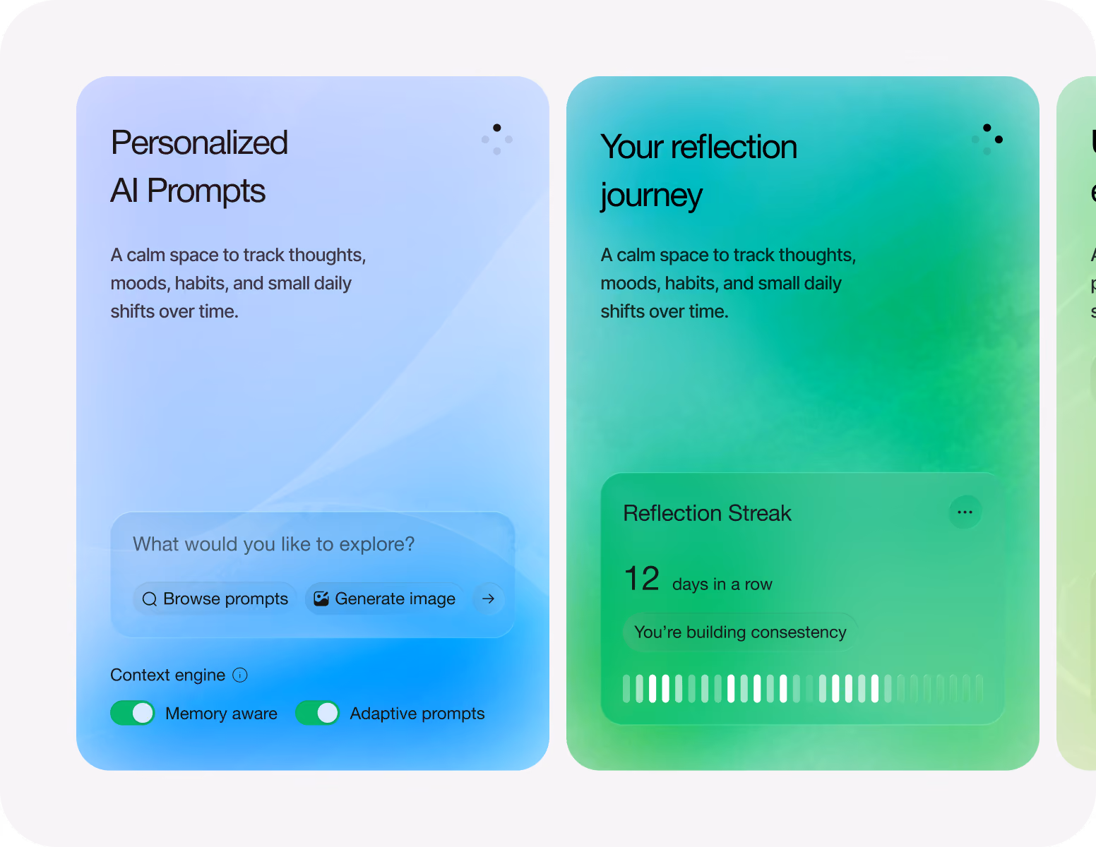
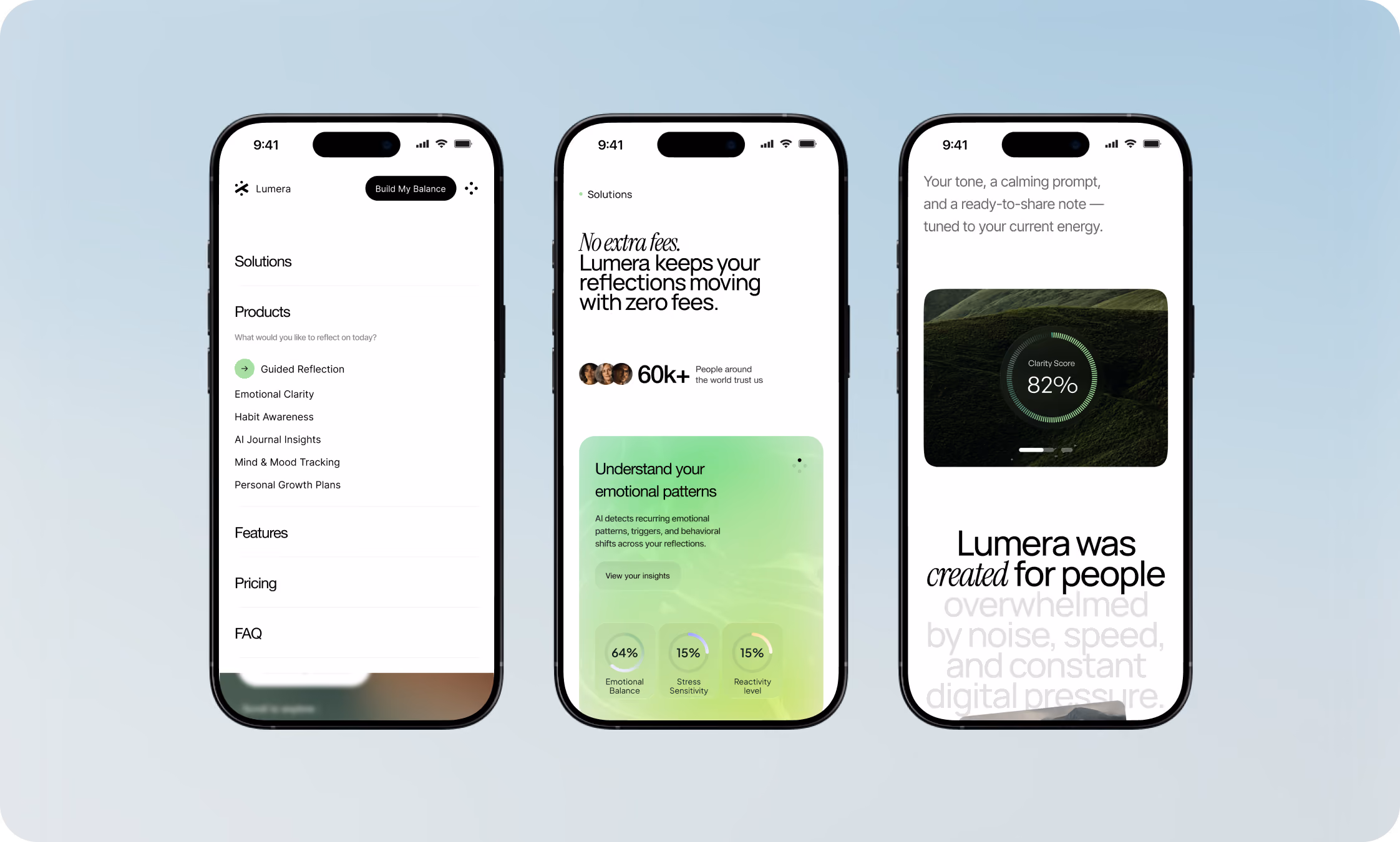
As a result of their users' chronic information overload, Lumera needed to find a way to transform complicated AI mood analytics into a relaxing UX journey. Keeping each insight clear without transforming reflection into another crowded dashboard was the challenging part.
Solution
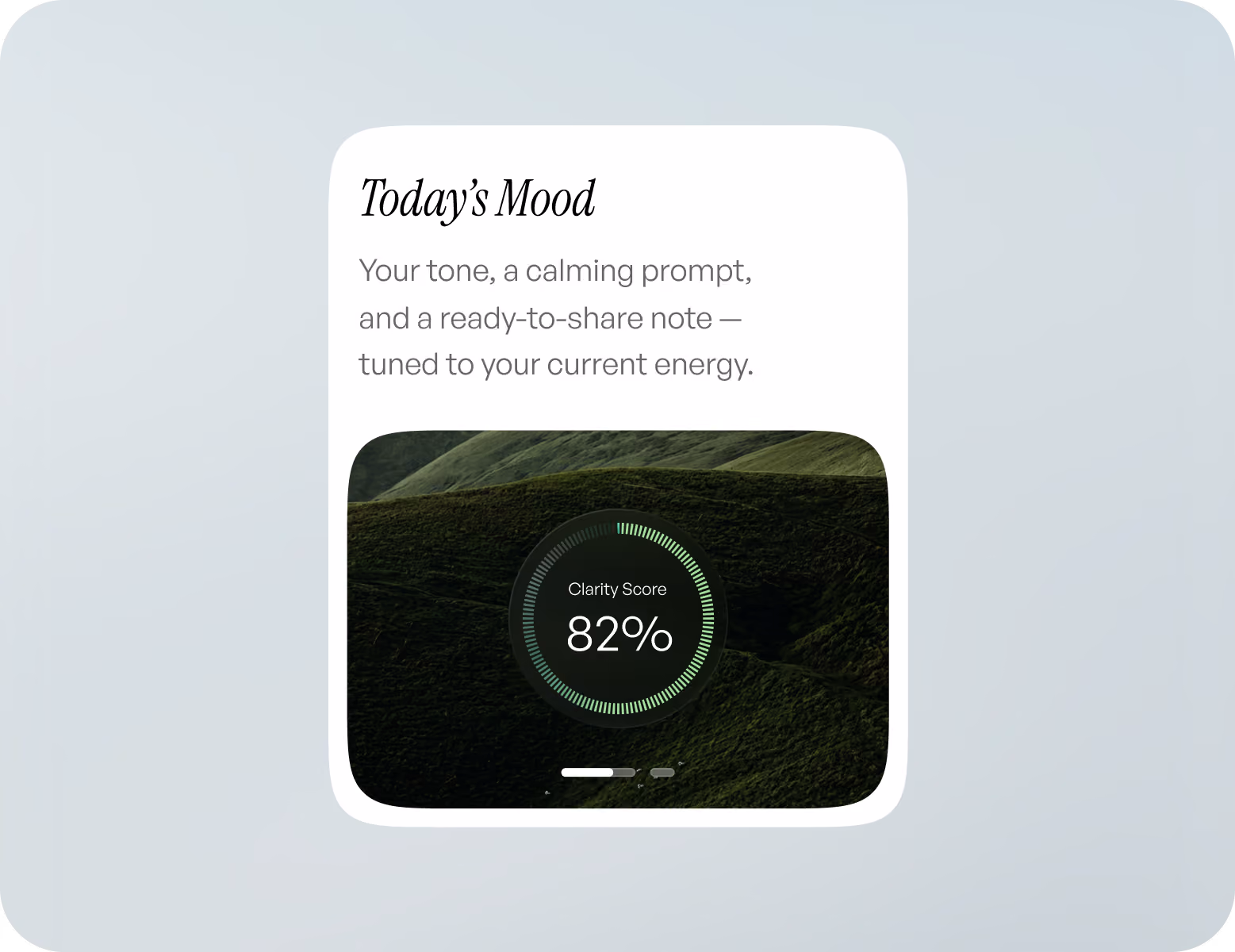
We distilled mood analytics to a simple editorial UI and purposefully eliminated traditional dashboard designs. Users are able to narrow their attention to a particular topic at a time, which promotes more thoughtful reflection and less information overload.
Process
{/}
We started with users’ emotional state flows instead of traditional wireframes. First, our designers sketched out important times of reflection, and then they created the interface components around those.
Briefing & onboarding
Product/business goals
MVP Scope
Roadmap
Briefing & onboarding
Product/business goals
MVP Scope
Roadmap
Briefing & onboarding
Product/business goals
MVP Scope
Roadmap
Briefing & onboarding
Product/business goals
MVP Scope
Roadmap
{/}
No items found.
{/}
{/}
No items found.
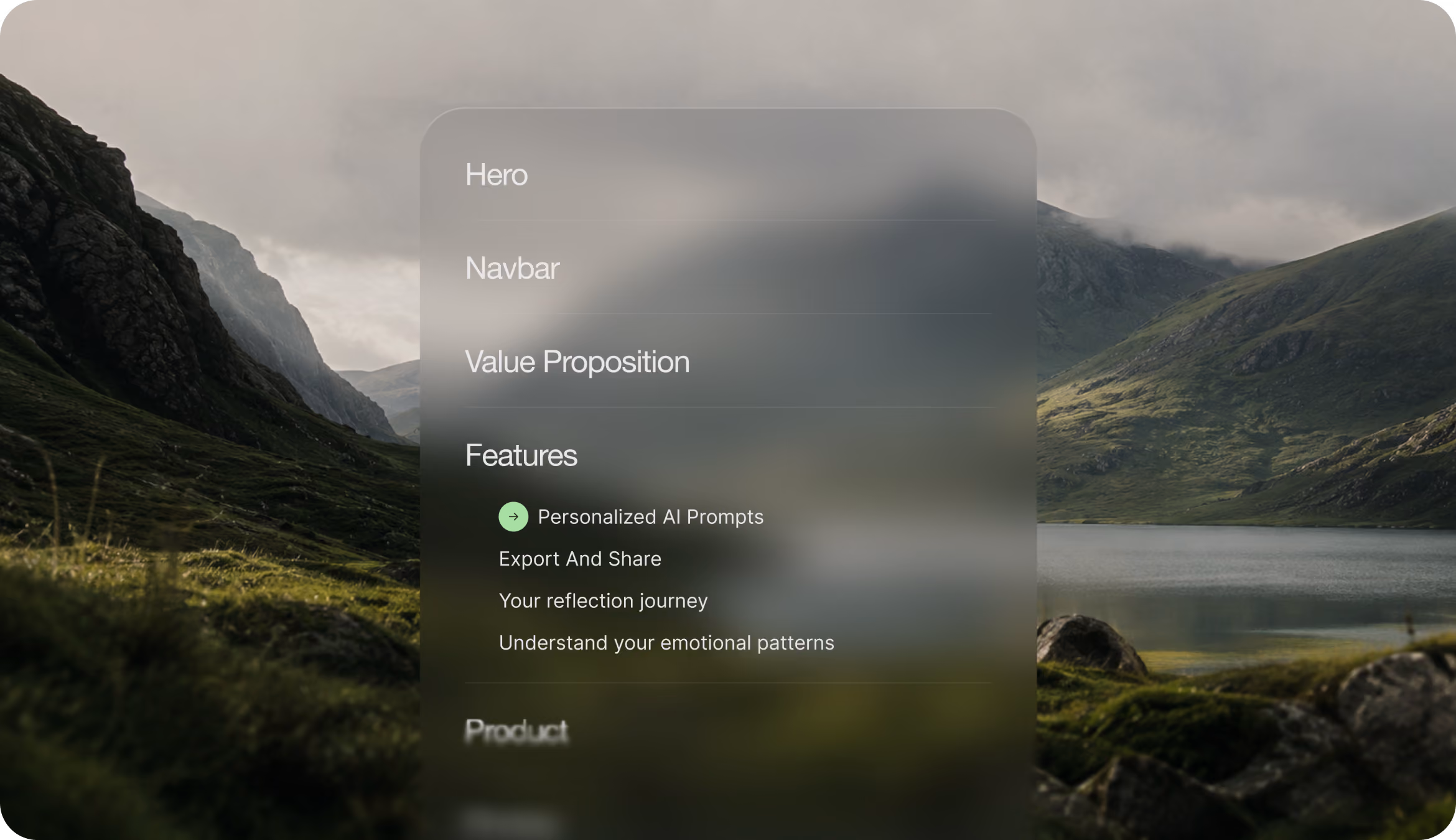
Sitemap
{/}
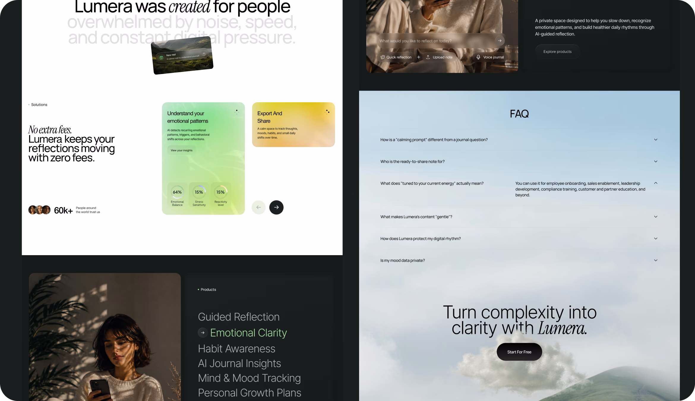
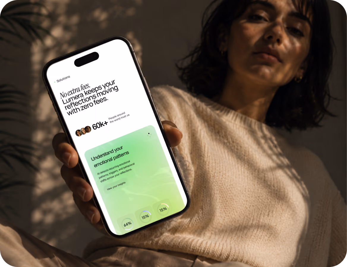
Arounda team created a flat information architecture that makes important areas easily accessible. Users get to explore the platform without any distractions or misunderstandings because products, pricing, and FAQs are accessible in just one click.
{/}
Moodboard
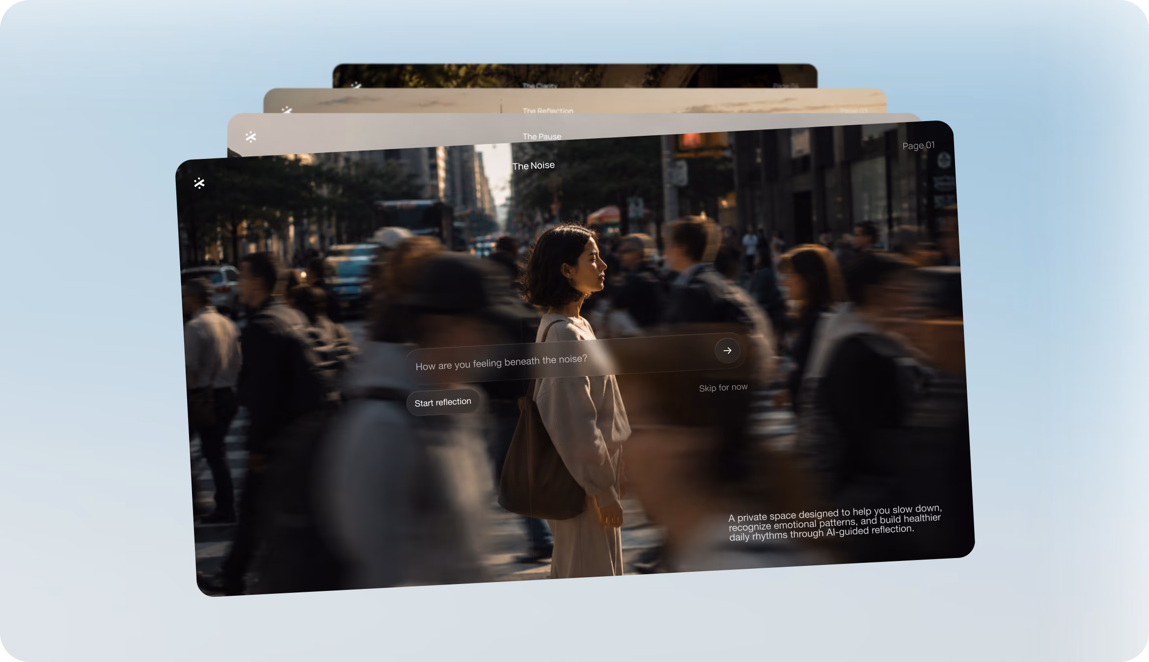
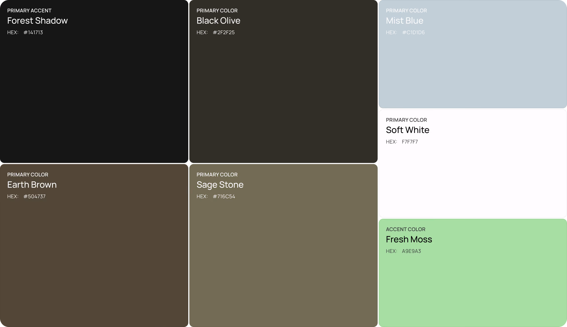
Our designers went beyond the usual design clichés for meditation apps. To achieve a more realistic and high-end aesthetic, the moodboard blended urban settings with muted colors and rich textures.
{/}
Wireframing
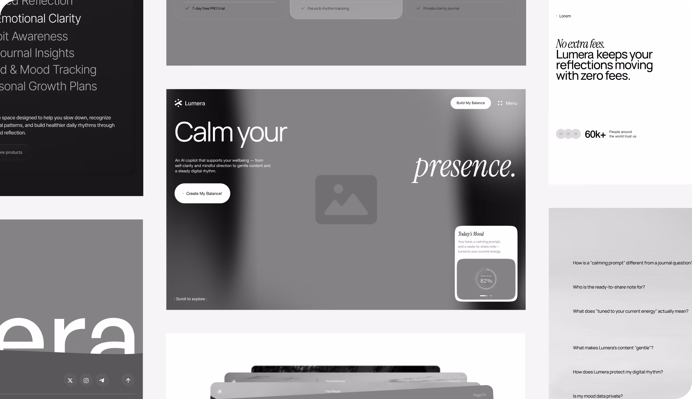
The "one screen, one thought" principle was the foundation around which our designers developed the wireframes. On desktop and mobile, the large content areas and generous spacing helped support a slower reading flow, and each layout focused attention on one primary idea at a time.
{/}
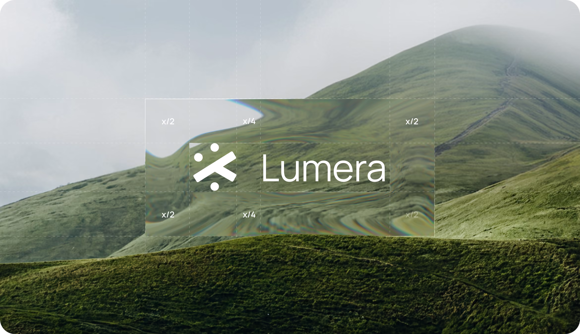
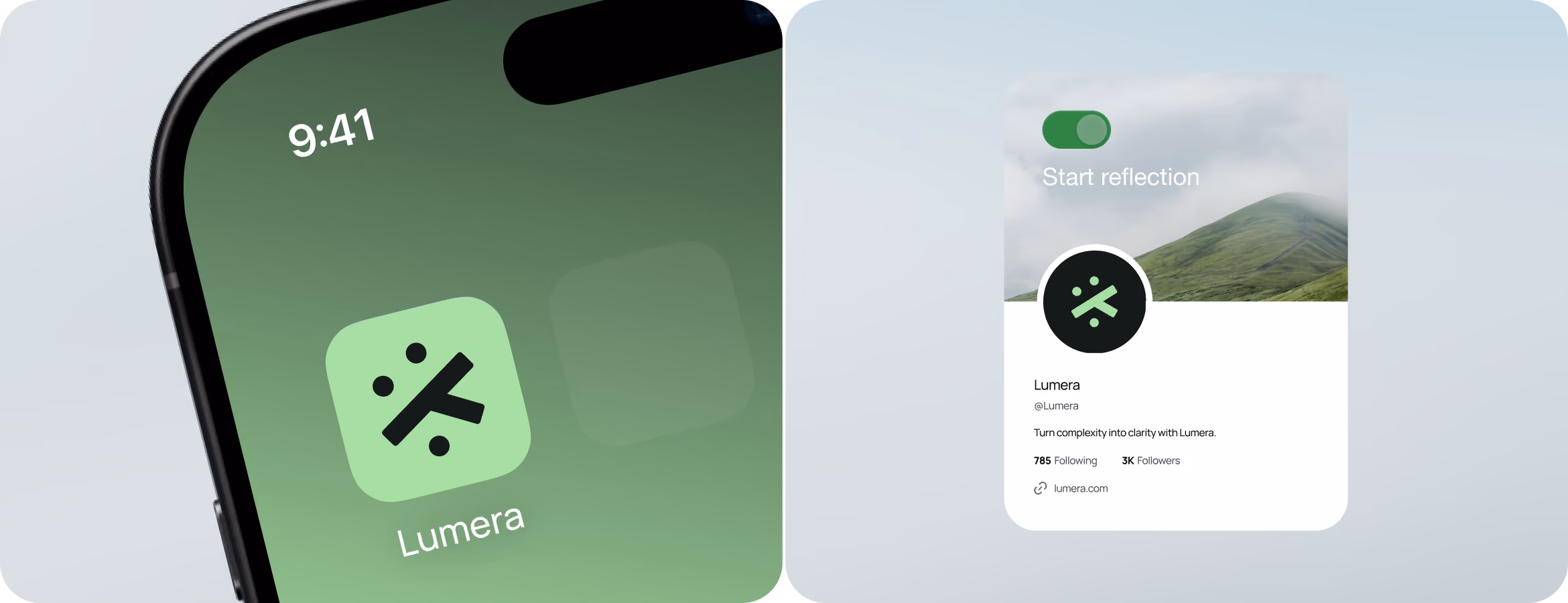
LogoDesign
The geometric logo that our designers made for Lumera represents the company's mission to simplify complexity. The use of rounded shapes in branding helps make the productseem more relatable and friendly.

Create products people return to without relying on dark patterns.
{/}
{/}
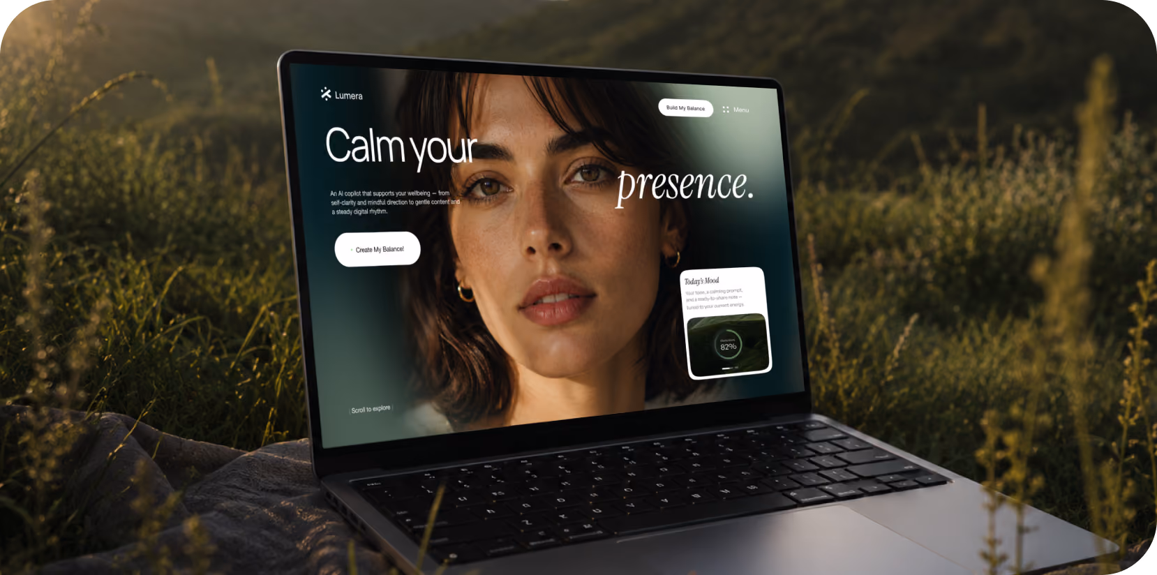
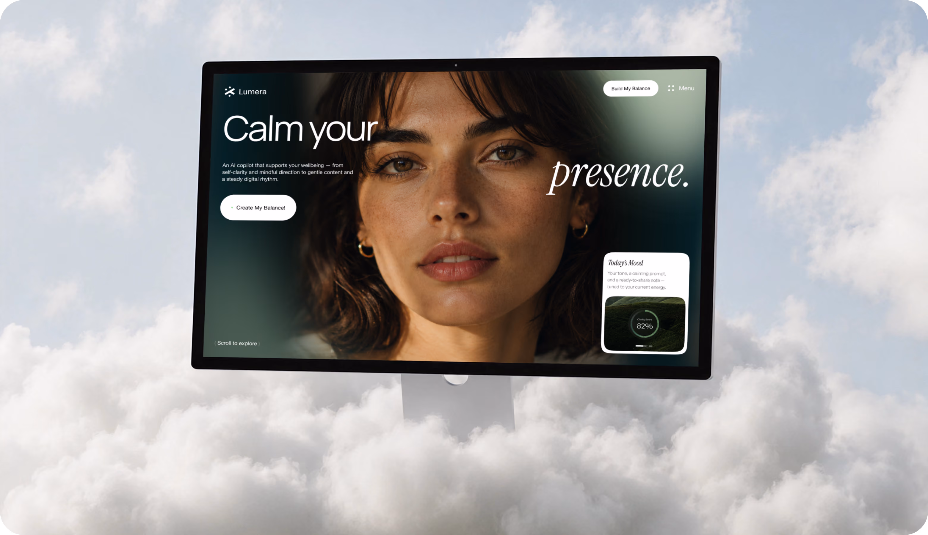
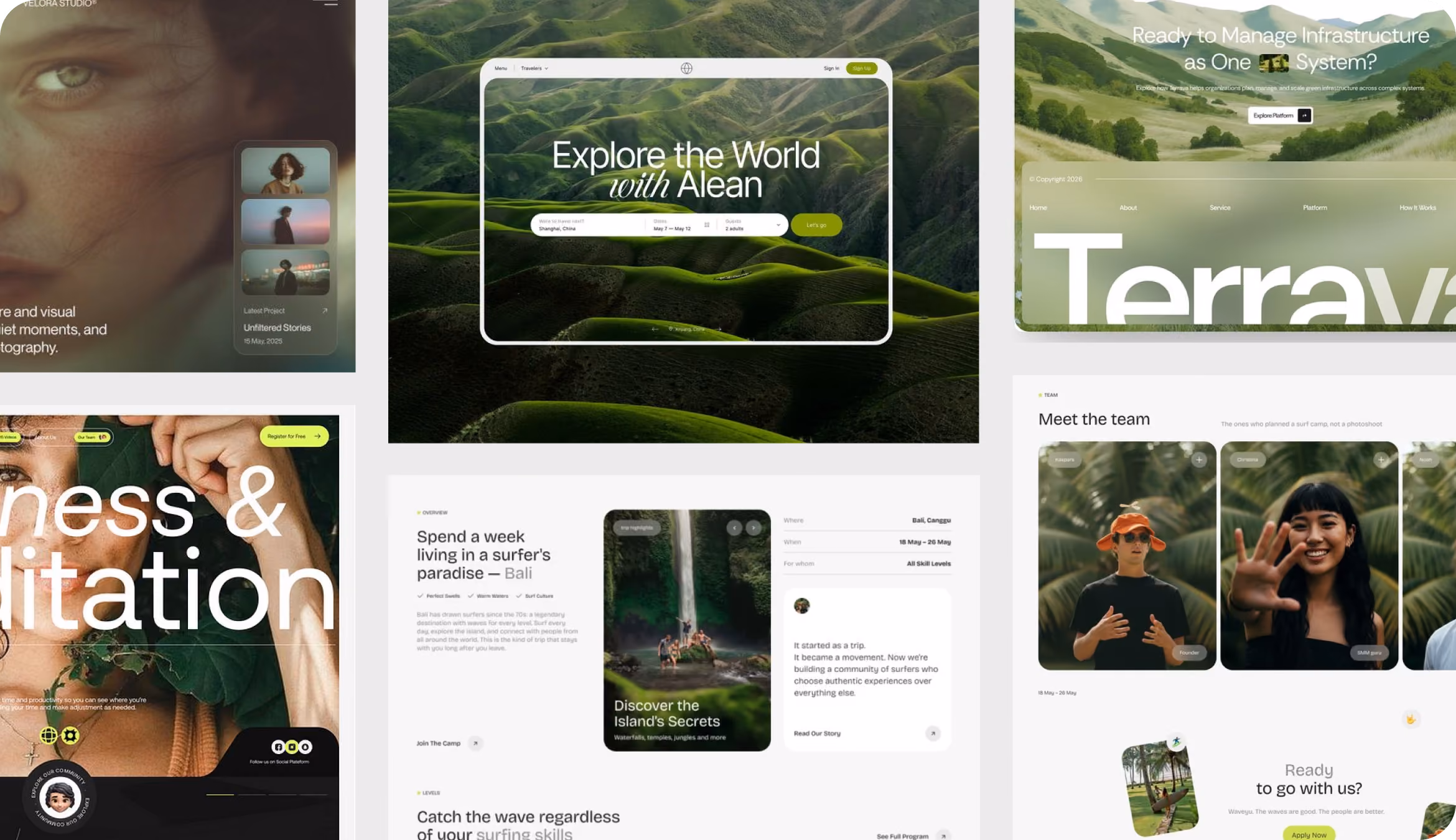
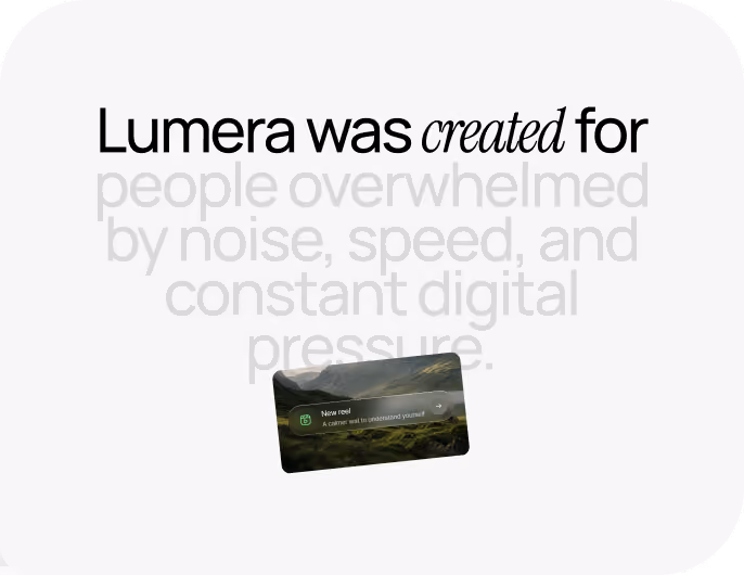
Website Design
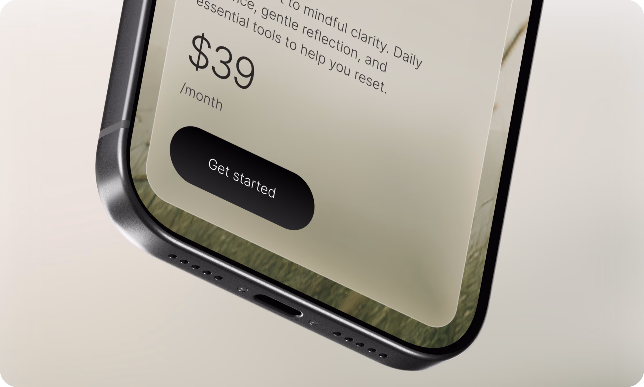
Website design became a question of pacing. We did not showcase all of Lumera's features at once, like an Emotional Timeline, AI Journal Insights, and the Habit Awareness tool. Every section provides sufficient background information for a single feature. Pricing and FAQ sections kept the same visual rhythm.
No items found.
{/}
Mobile Adaptation
There wasn't much space for Lumera's relaxing pace on mobile screens. With just one central idea and enough space surrounding it, our designers avoided making the layout too cluttered with stacked feature blocks.
{/}
No items found.
{/}
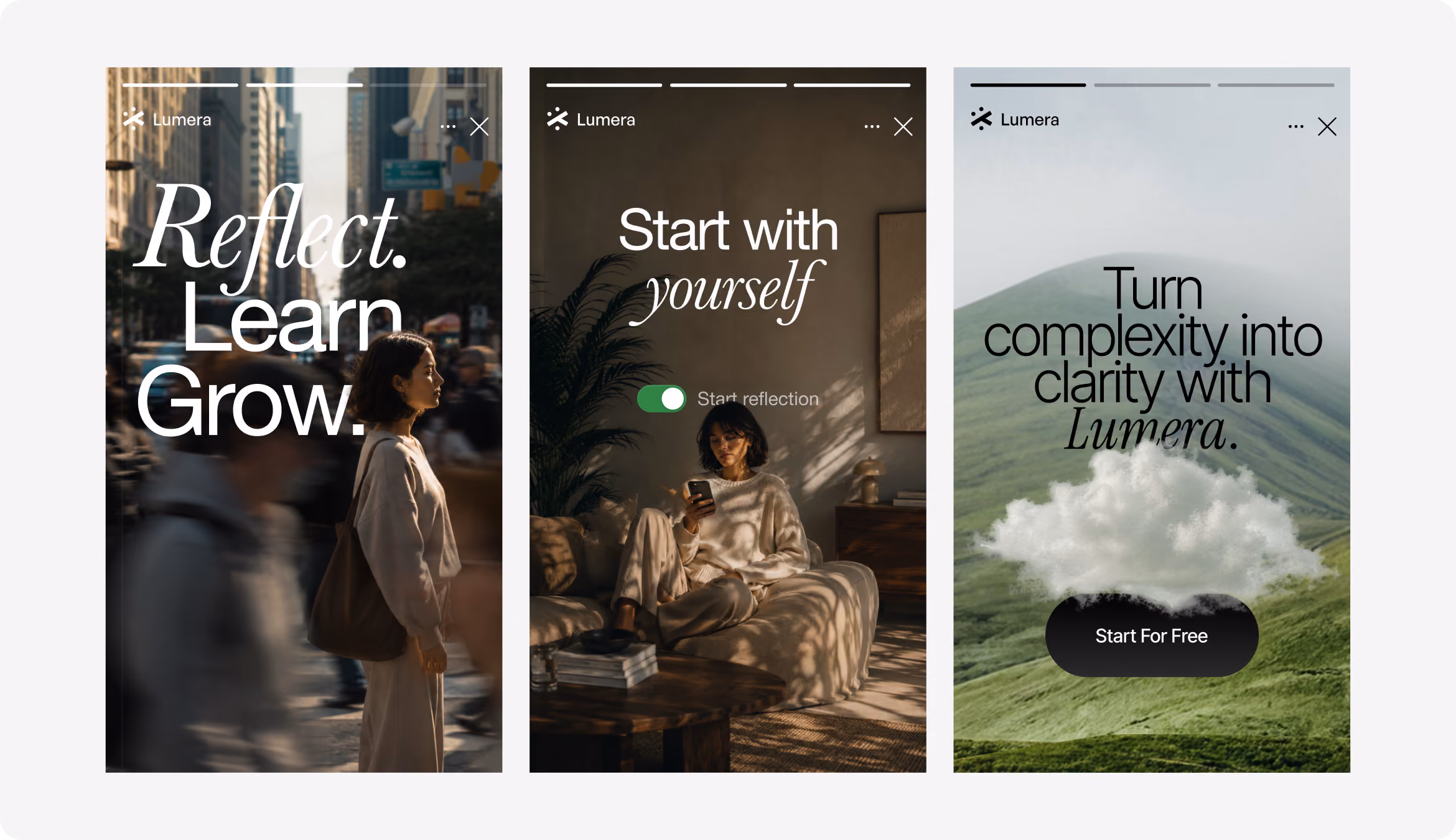
Social Media
Social media posed a different challenge. The Lumera website promotes a peaceful pace, in contrast to the social media platforms that value speed and continual stimulation. Our team kept the layouts simple so that the typography, images, and reflective questions could carry the message on their own.
{/}
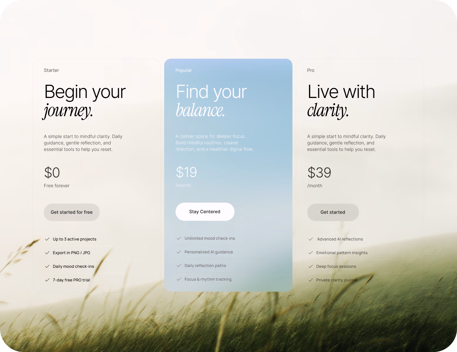
Design system

{/}
Results
+34%
TRIAL SIGNUPS
Clearer product storytelling encouraged more visitors to start Lumera’s free trial.
+27%
CTA CLICK RATE
Focused content blocks guided users toward key actions with less decision friction.
-22%
BOUNCE RATE
A calmer visual rhythm kept visitors engaged beyond the first website sections.
+36%
FEATURE DISCOVERY RATE
A clearer page flow helped users notice and explore more of Lumera’s core tools.
