
Mobile App and Dashboard Design for a Healthcare Platform
UI/UX Design
Branding
One design system for two different care experiences
client
MediFlow
industry
Healthcare
headquarter
USA
service
UI/UX & Branding
About project
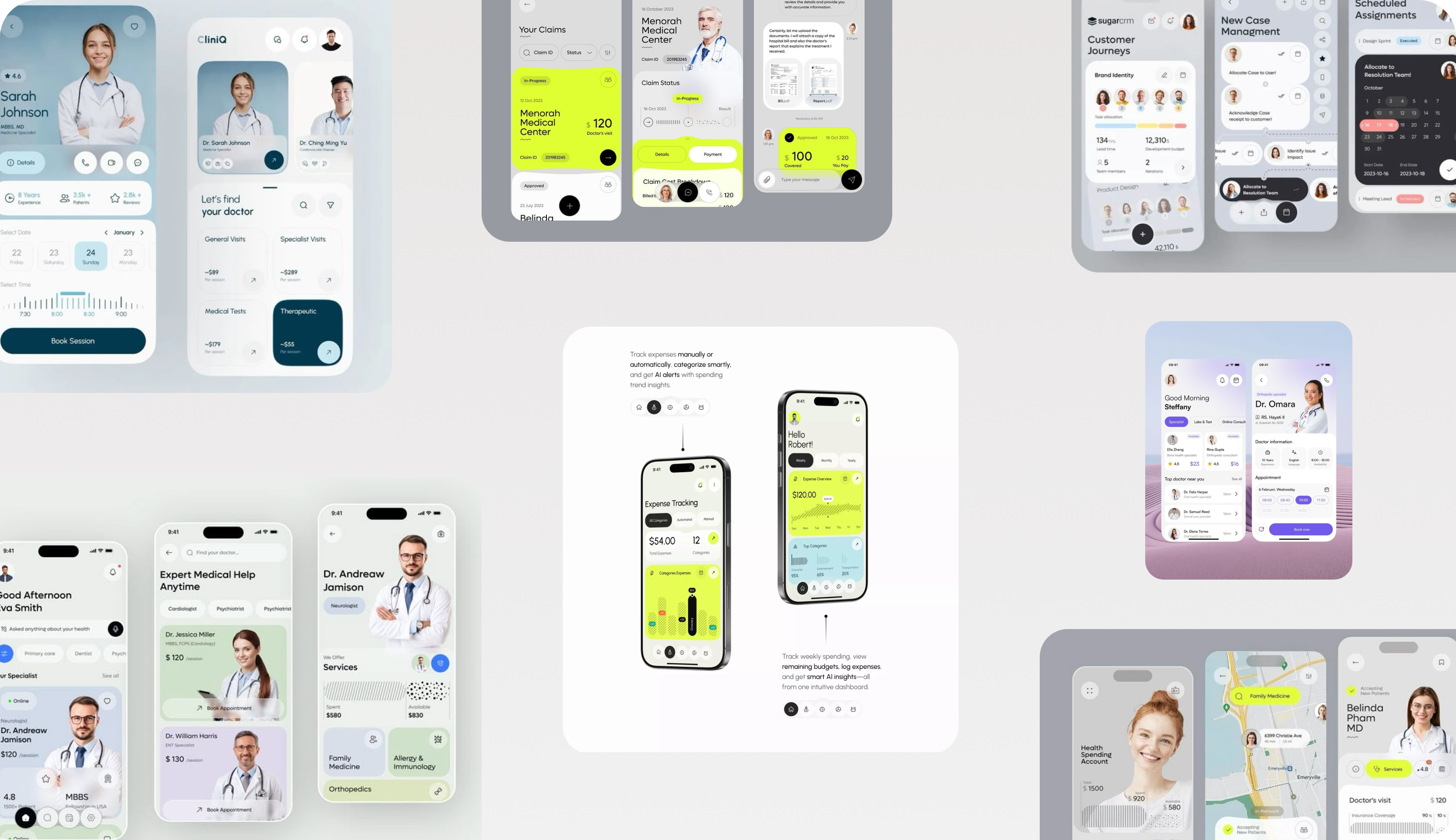
MediFlow is a digital healthcare platform that connects patients and healthcare providers through one integrated ecosystem. Arounda had to combine a patient mobile app with a dedicated provider dashboard. Two fundamentally different experiences live inside a single, cohesive product.

{/}
Challenges & Solutions
Problem
Designing a unified healthcare ecosystem for two opposite user groups was the core challenge. Patients needed a simple interface for managing appointments and health data without overload. Providers needed a dense but fast dashboard for reviewing patient summaries, monitoring trends, and prioritizing data during clinical decisions.
Solution
The patient app has clear navigation and simplified health information. The provider dashboard organizes patient metrics, appointment schedules, and trend visualizations into a structured hierarchy for faster decision-making. We delivered a shared design system that connects both products as one ecosystem but adapts to each audience's distinct workflow.
Process
{/}
Briefing & onboarding
User interviews
Competitor analysis
User personas & journey mapping
Information architecture
User flows for both experiences
Wireframing
Dashboard structure exploration
Patient mobile application design
Provider dashboard design
Responsive adaptations
Visual hierarchy design
Reusable component library
Typography and interaction patterns
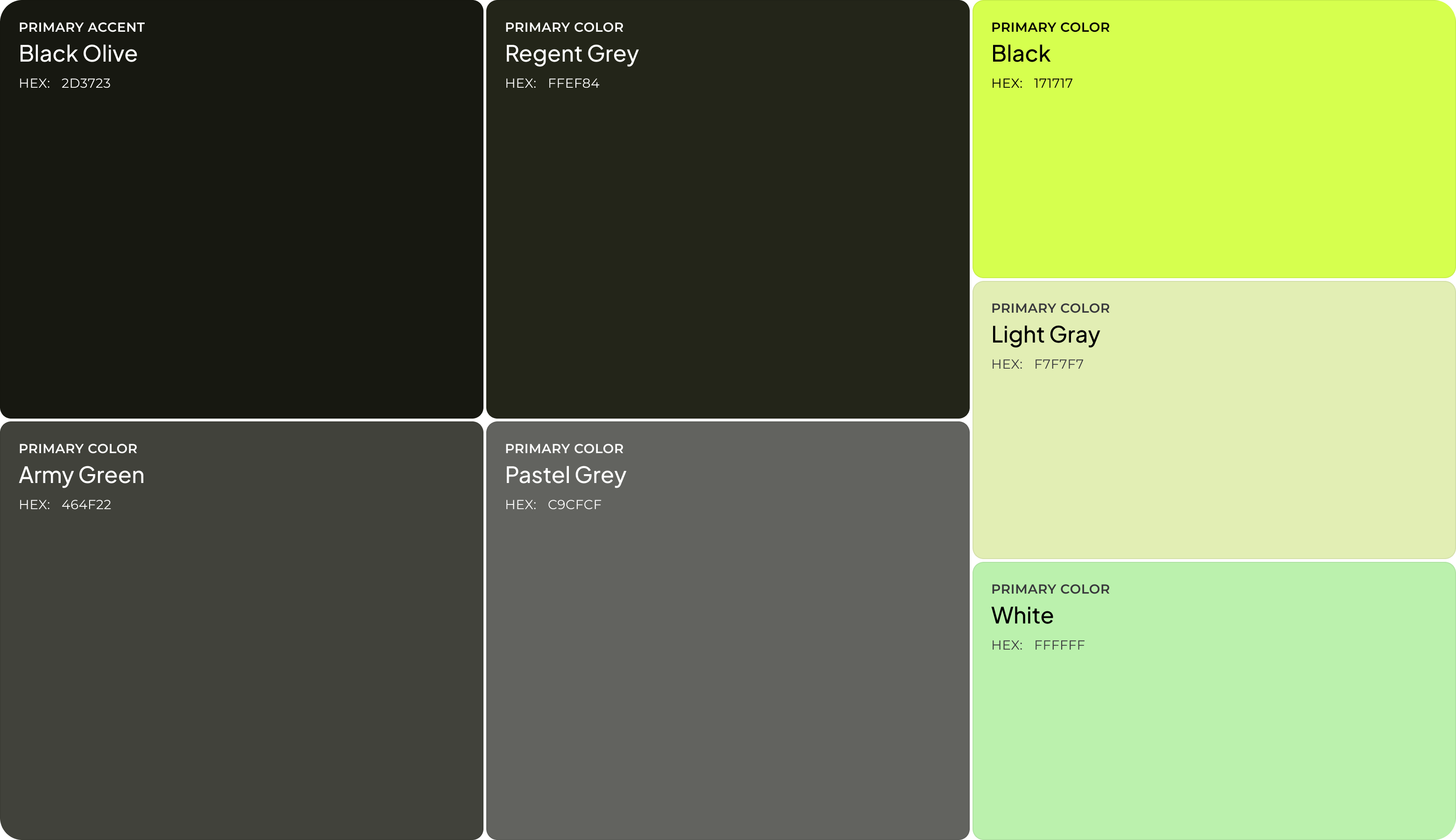
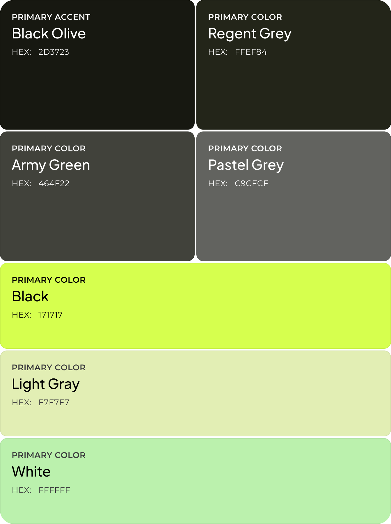
Shared color principles
Scalable structure for feature additions
{/}
No items found.
{/}
{/}
No items found.
App Flow
{/}
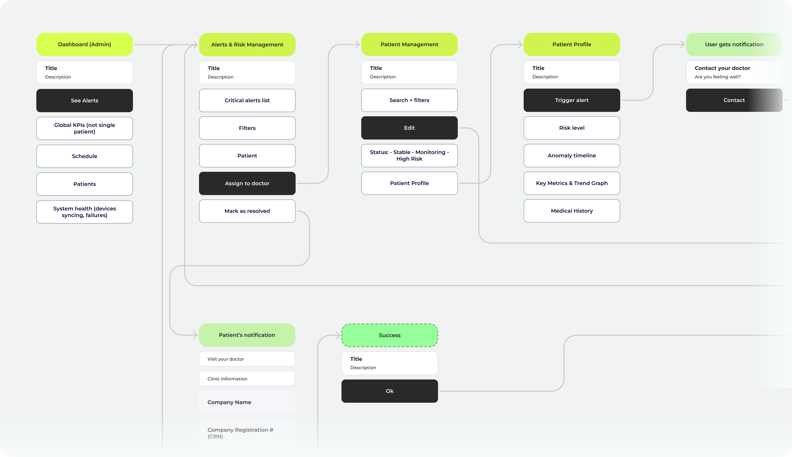
The patient flow guides users from onboarding through health tracking, appointments, and personalized health insights. Daily care management is in one continuous path. The provider flow moves from a dashboard overview into patient management, trend monitoring, and risk assessment. Our team structured clinical data for faster review.
{/}
Moodboard
We used soft neutral tones, subtle accent colors, and rounded forms for the patient app's moodboard to create a sense of reassurance. The provider dashboard has structured grids and data-focused typography to support precision. Our team took references from modern healthcare platforms, wellness apps, and clinical dashboards to define a visual language that is approachable for patients and credible for healthcare professionals.
{/}
Wireframing
Wireframing for the mobile app focused on making everyday interactions simple. Appointment management, health tracking, and access to key information have to be easy and accessible. For the provider dashboard, we explored multiple layout options to find the most efficient structure for reviewing patient data, monitoring trends, and prioritizing clinical tasks.
{/}
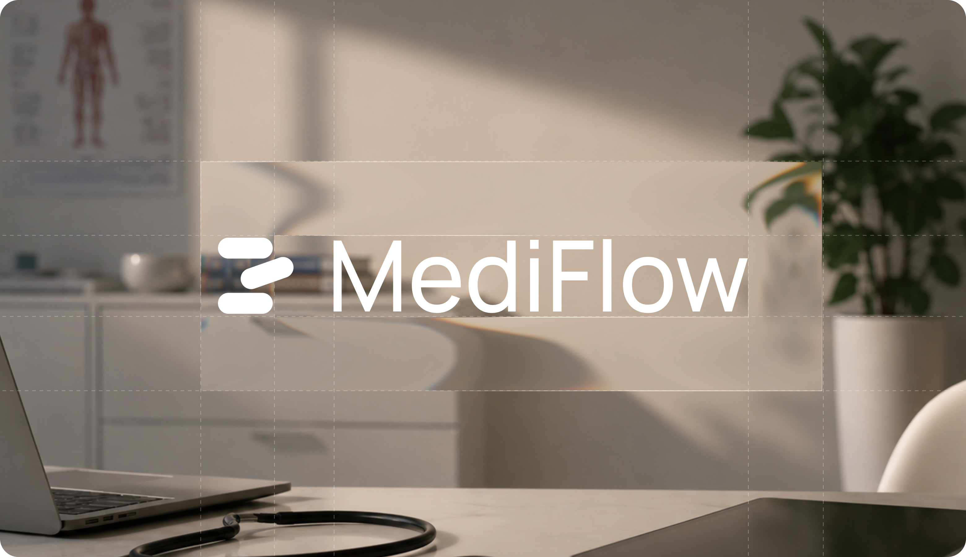
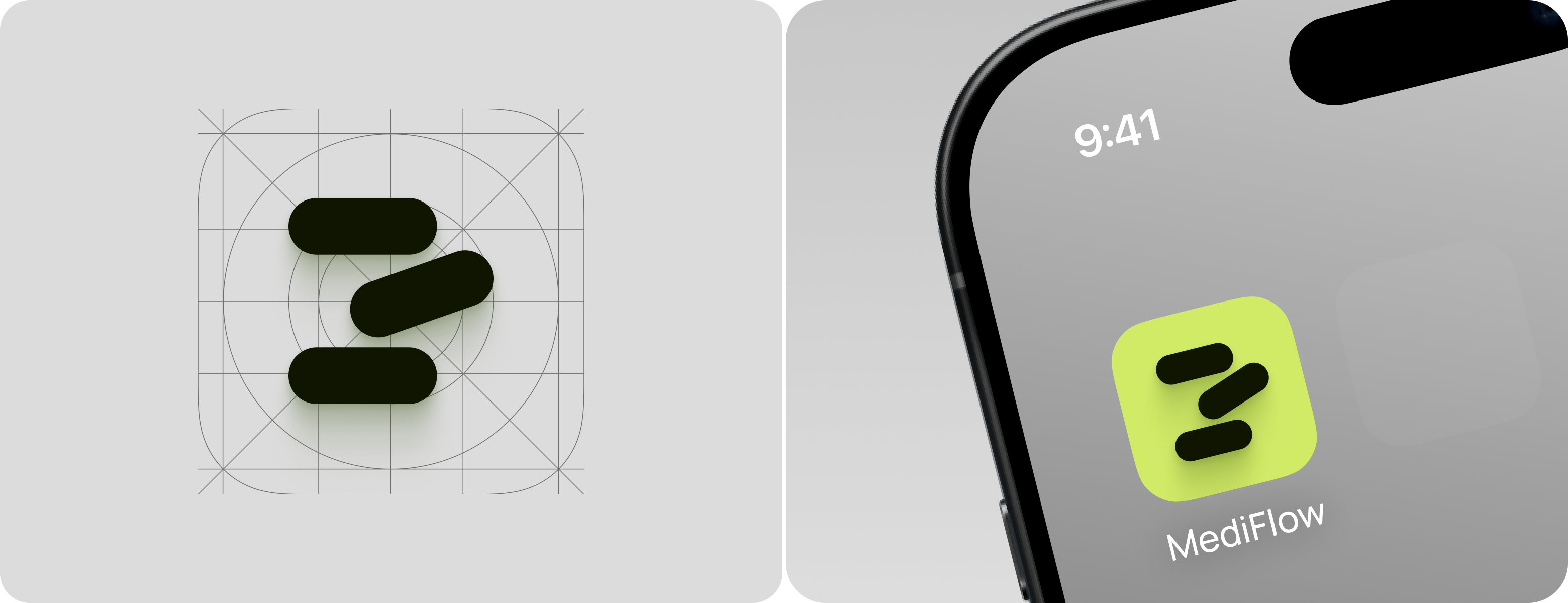
Logo Design
The MediFlow logo uses three rounded bars arranged to resemble pills. Our approach makes the app's healthcare purpose recognizable at a glance. The same mark functions as the app icon, set against a lime-green background that stands out on a crowded home screen, so even before opening the app, users know what MediFlow is for.

Arounda builds one design system that serves patient simplicity and provider speed at once.
{/}
{/}
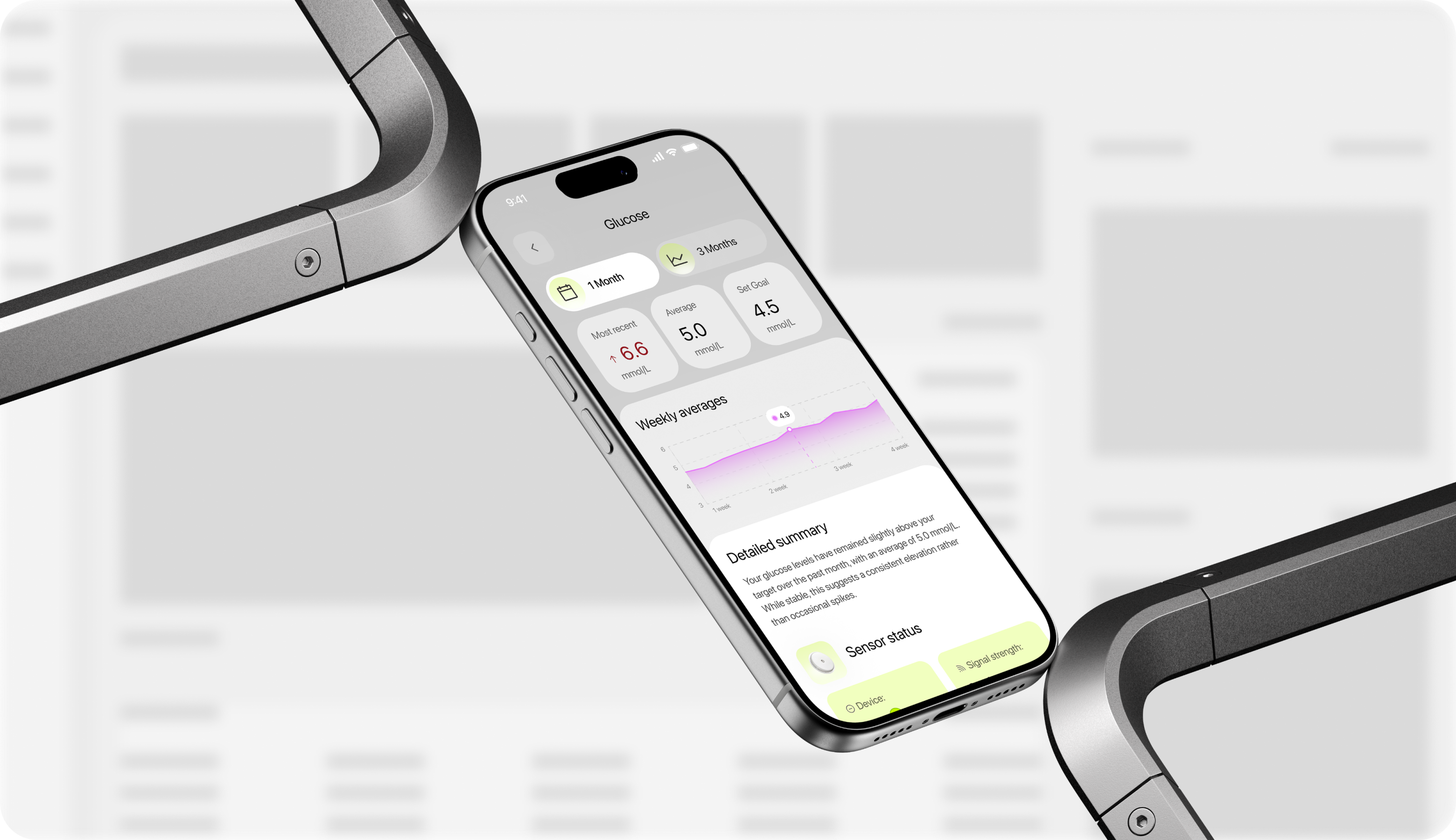
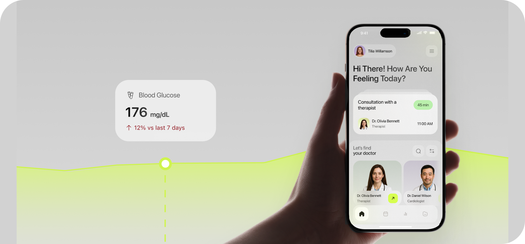
Mobile App Design
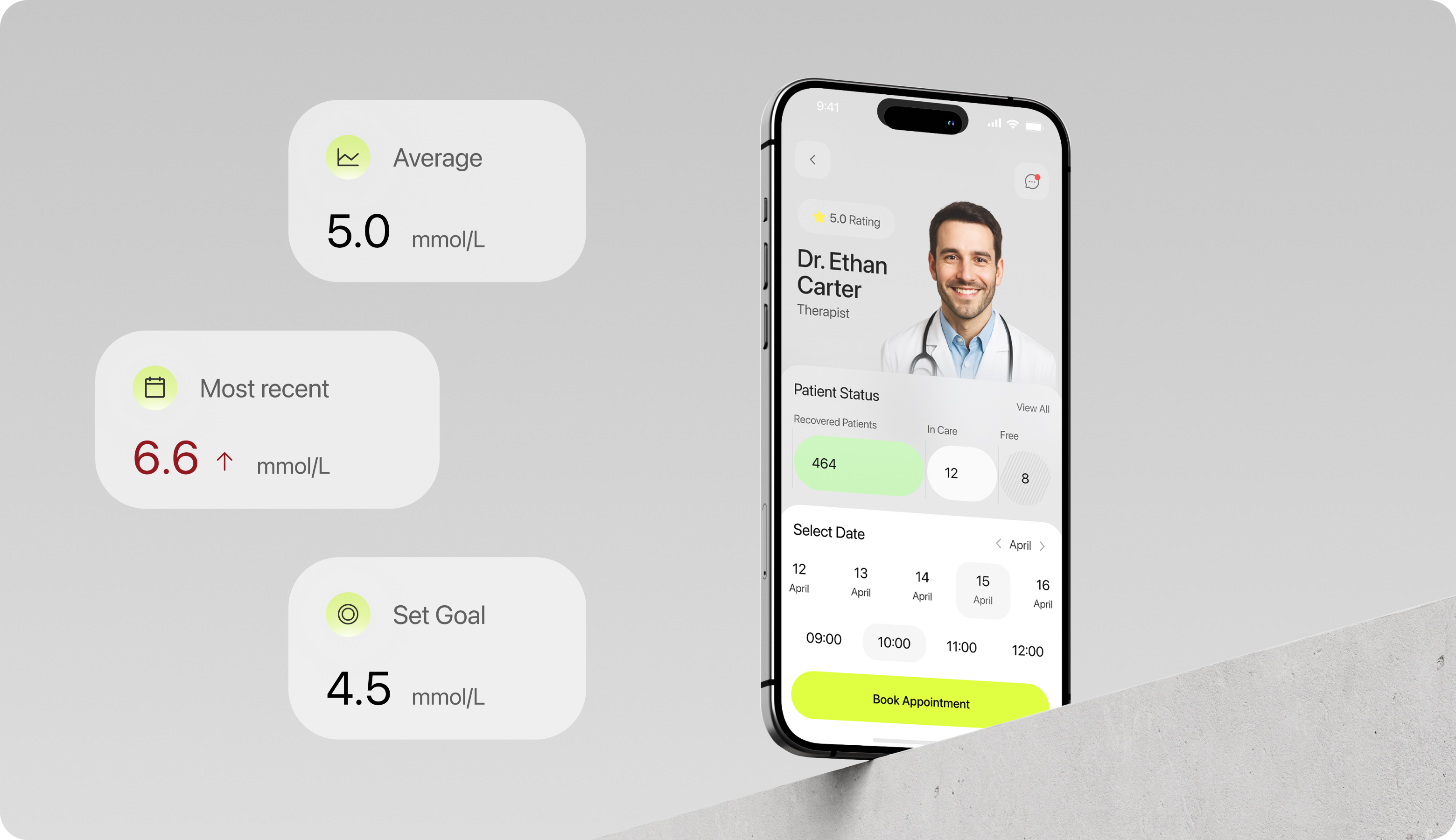
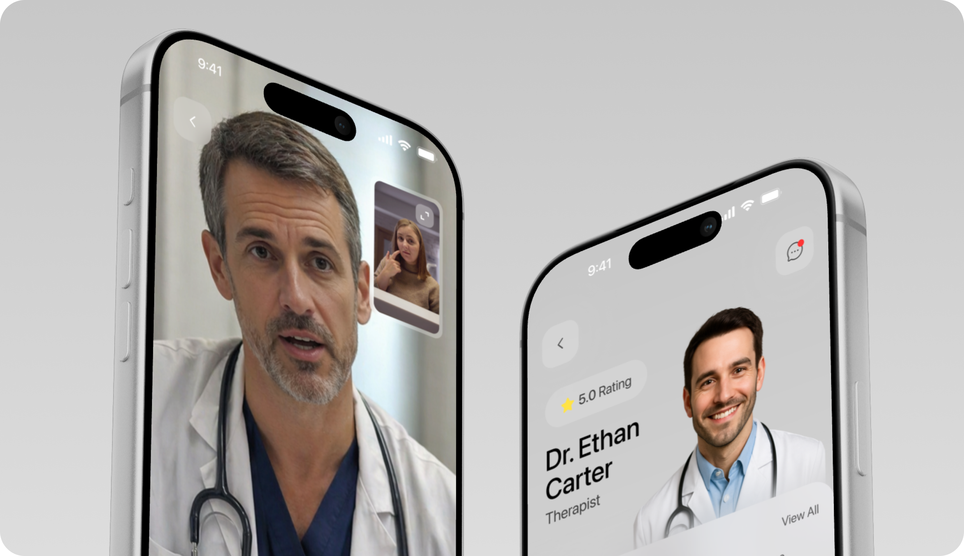
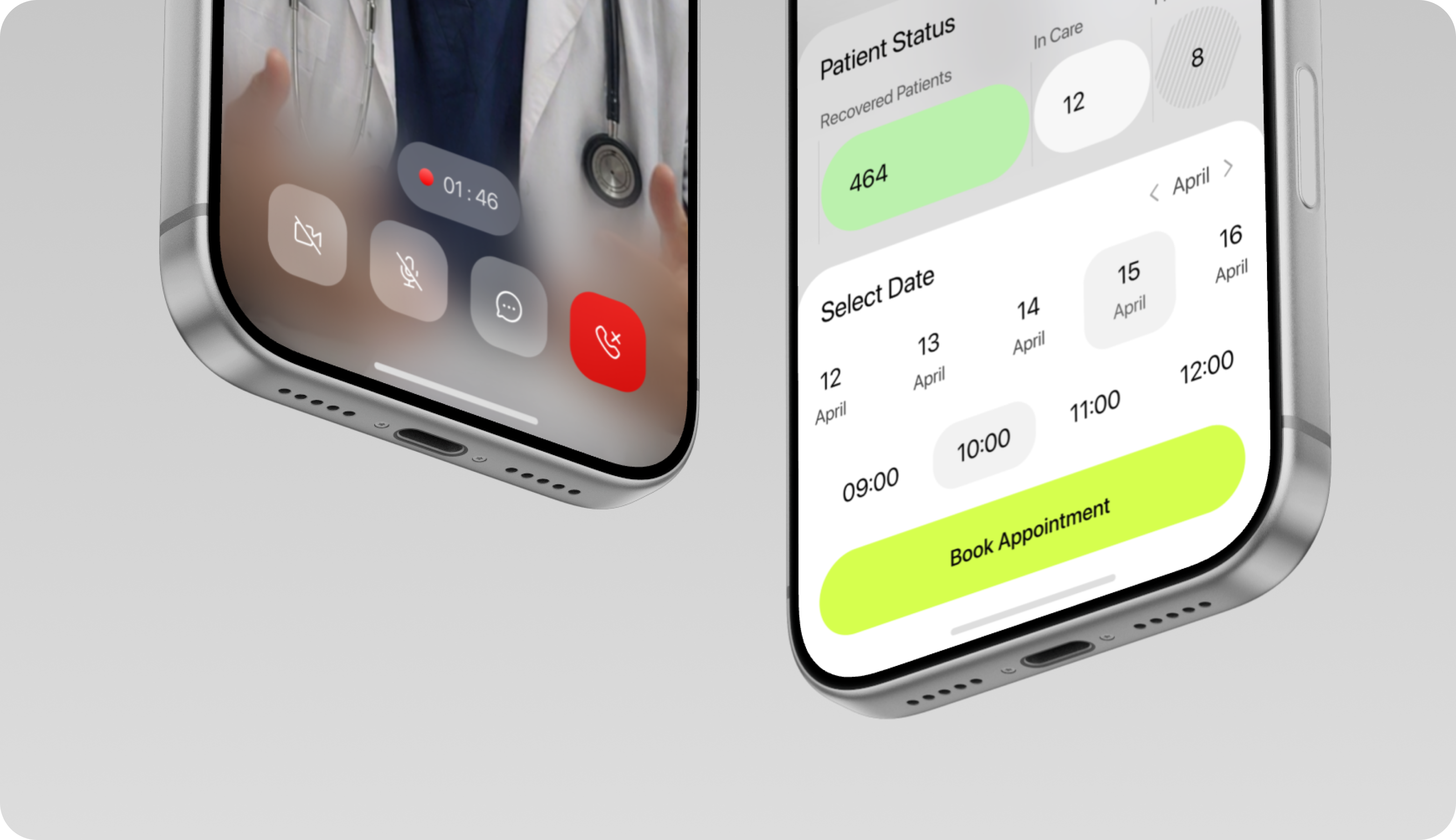
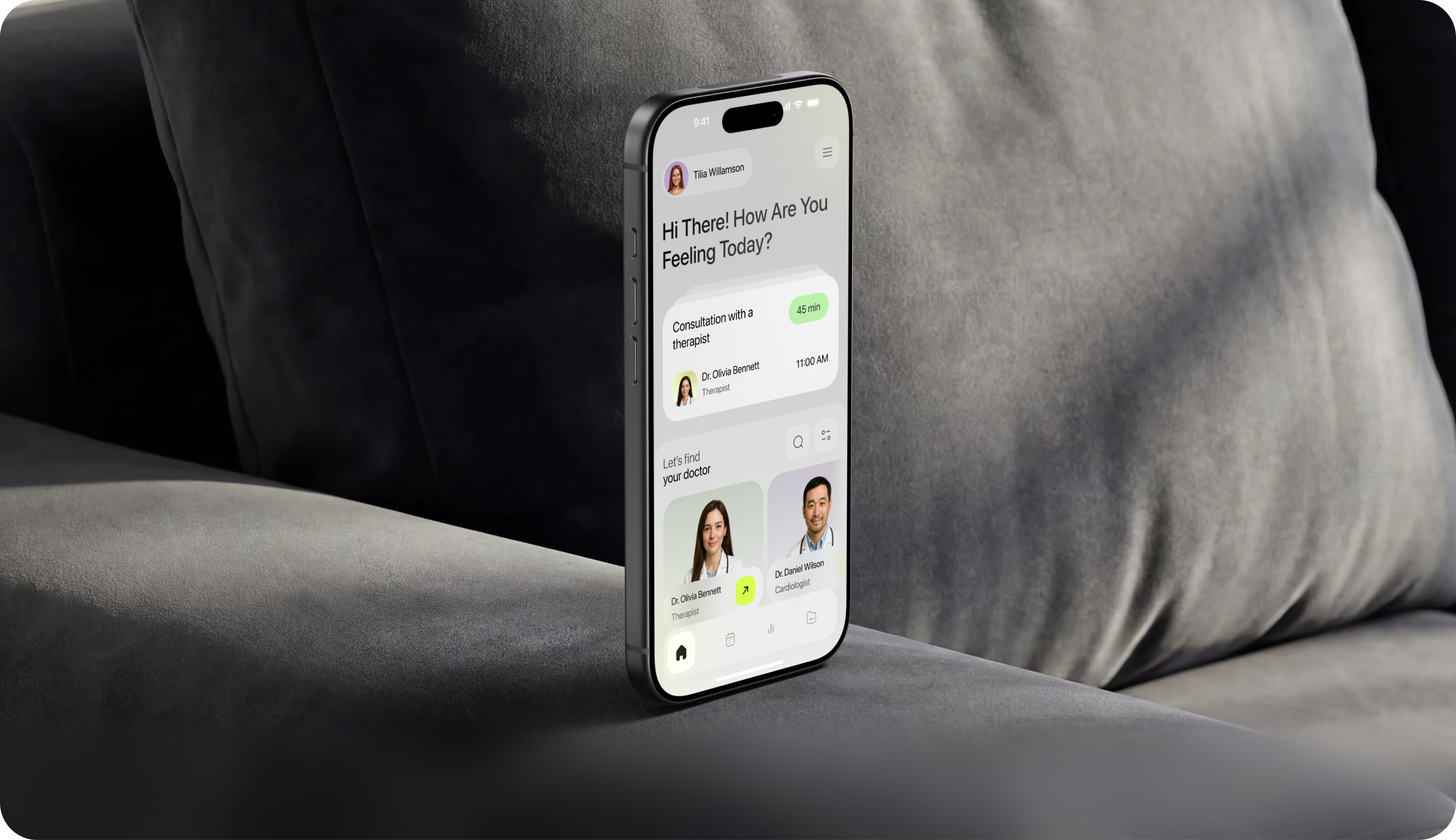
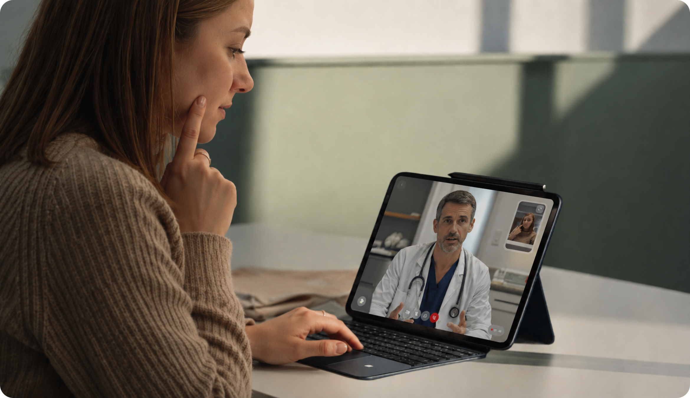
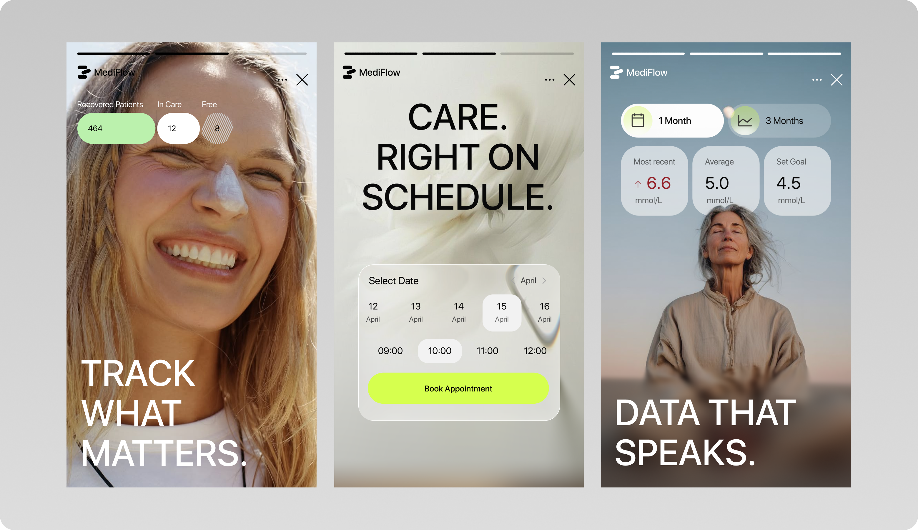
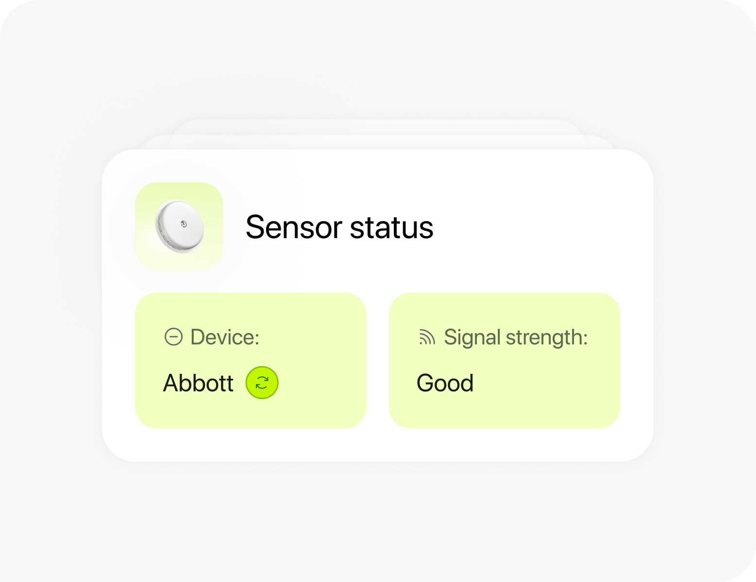
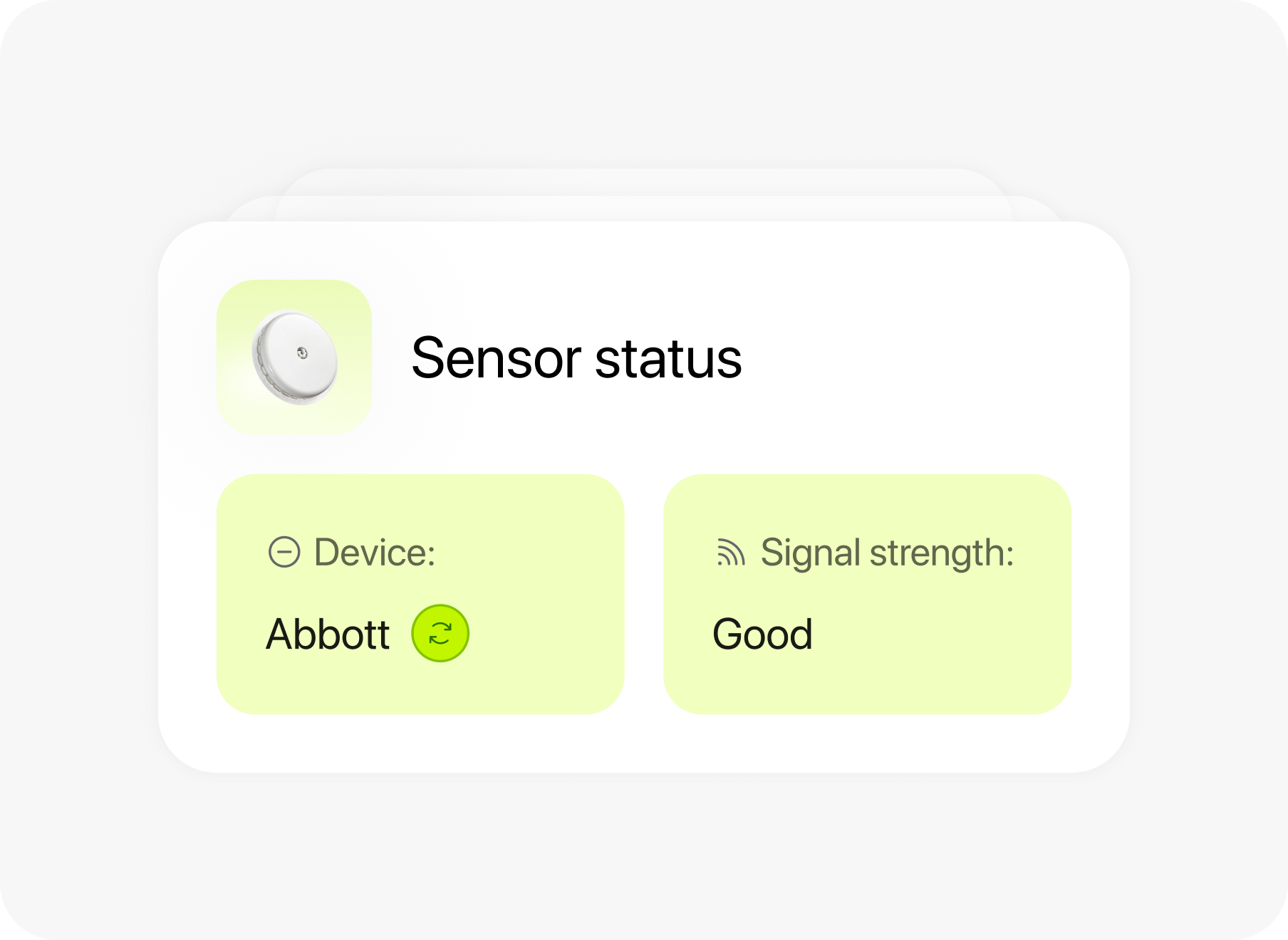
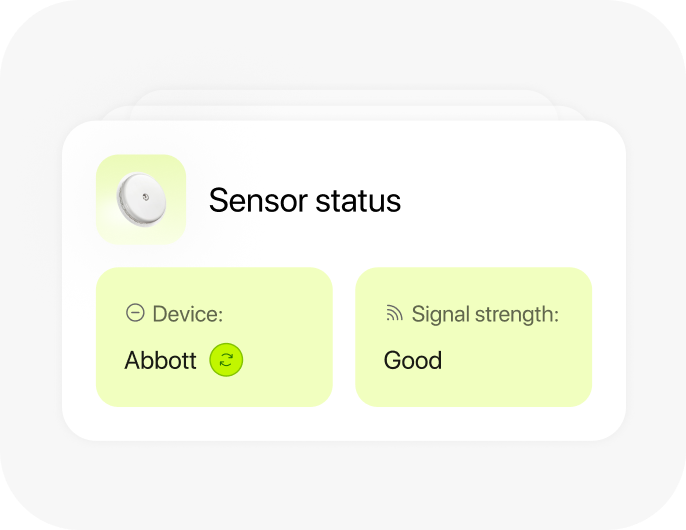
The mobile app for patients combines a one-step appointment booking process with a monitoring dashboard that displays current metrics compared to personal goals. Video consultations take place on a single screen, eliminating the need to switch between apps. Fewer steps during the booking, monitoring, and consultation phases reduce friction and encourage more consistent daily use of the app. Our goal was to empower patients to manage their own treatment without being held back by the interface.
No items found.
{/}
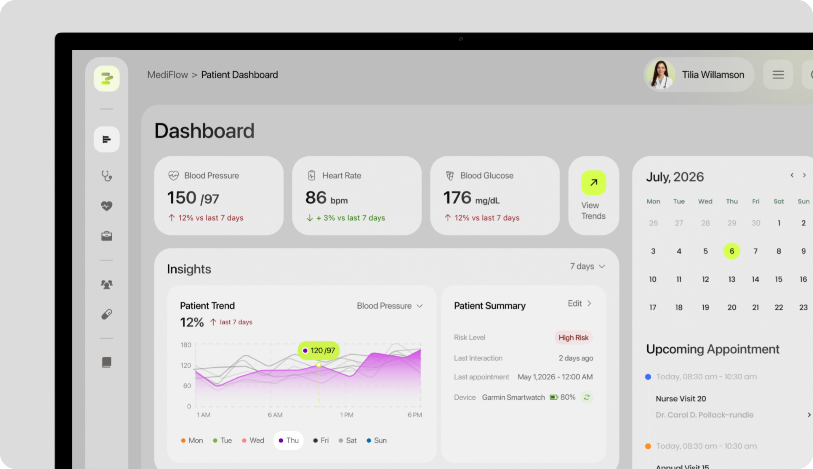
Web Application Design
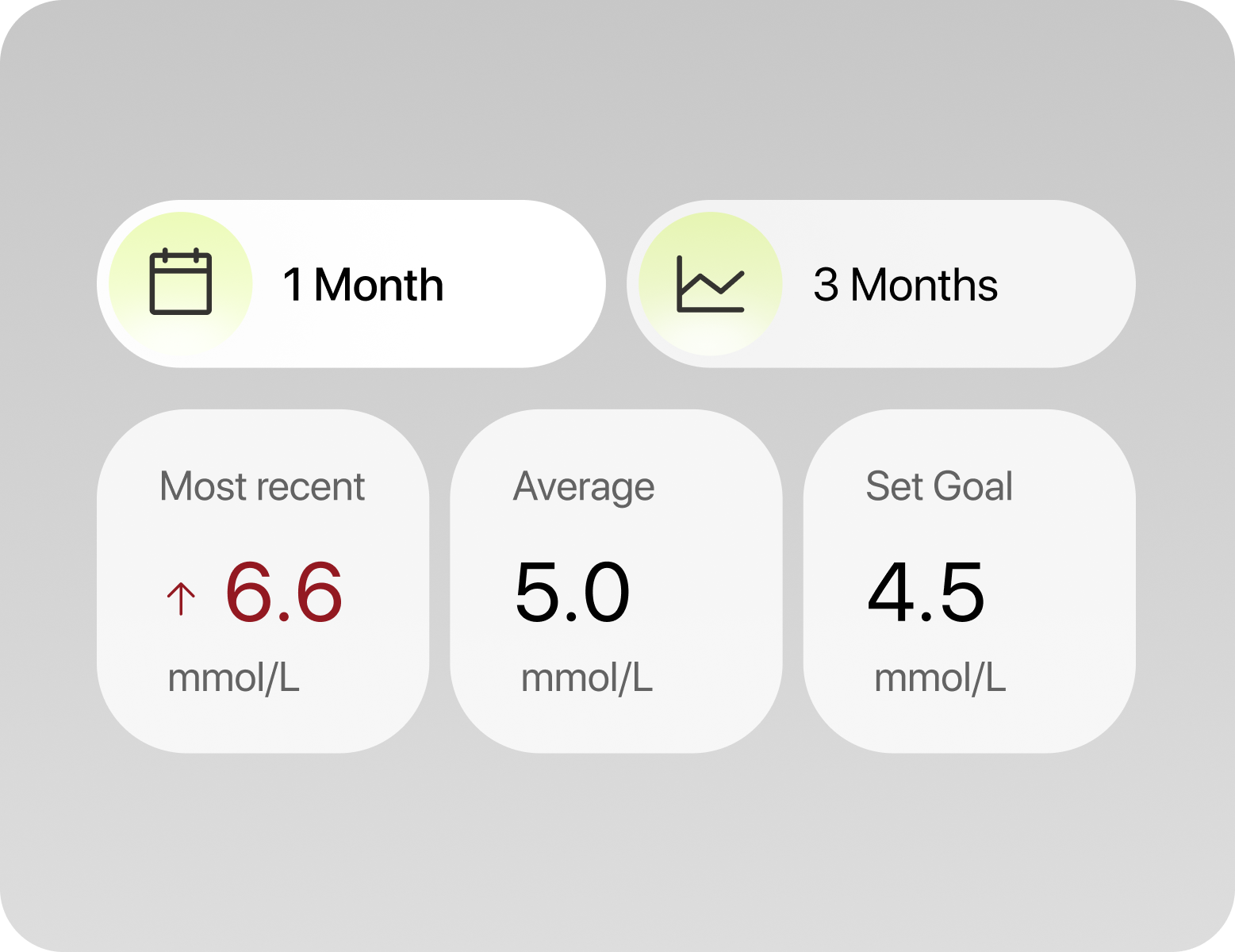
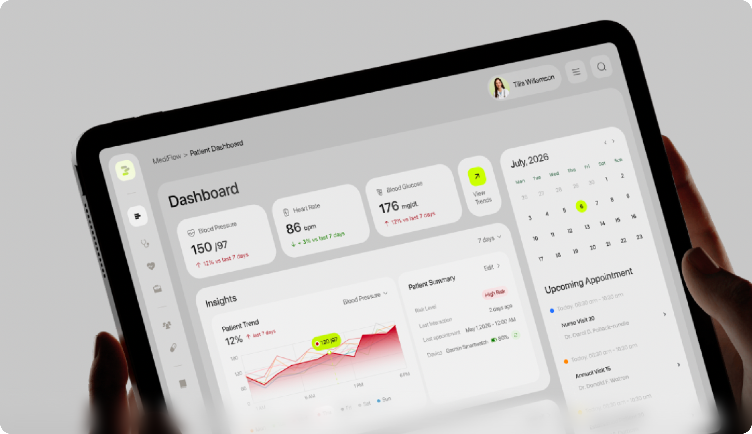
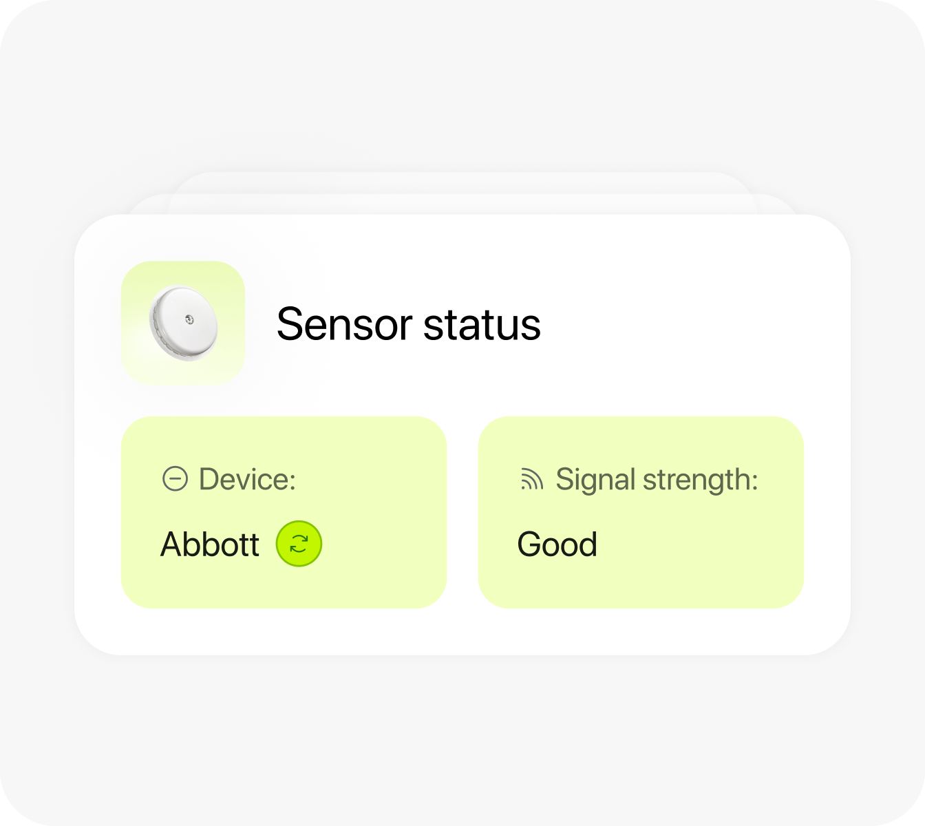
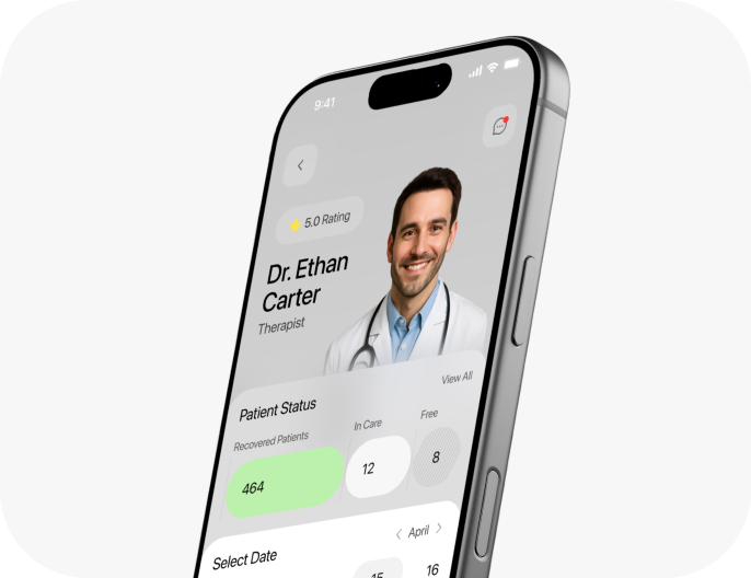
Our UI/UX designers surfaced risk level and trend direction together, ahead of the detailed chart, to shorten the time a provider needs to assess a patient's status and decide on next steps. Our solution supports the dashboard's goal of fast and organized decision support. The provider dashboard surfaces a patient's vitals as trend cards with week-over-week change. Doctors can see the direction of a patient's condition before opening any detailed view.
{/}
No items found.
{/}
Social Media
The social media assets combine short, direct headlines with visuals from the patient app. We created product features as individual story-format pieces. Each template keeps MediFlow's interface human, relaxing, welcoming, and trustworthy. The same screens that patients use in the app serve as the proof for the headline.
{/}
Design system


{/}
Results
91%
Positive Clarity Feedback
91% of usability test participants said the patient app made health tracking, appointments, and consultation access clear and understandable.
84/100
Usability Score
The patient app prototype reached an 84 SUS score, showing above-average usability for core healthcare tasks.
29%
Lower Cognitive Load for Providers
Healthcare professionals reported a 29% reduction in their effort when reviewing patient summaries and data compared to competitors’ dashboards, where key clinical data is often spread across multiple windows.
30%
Fewer Steps to Book a Visit
The process of scheduling a patient’s appointment required 30% fewer steps than in similar healthcare apps. Users move from selecting a doctor to confirming an appointment with less difficulty.
