
Fitness app branding built for lasting habits
Branding
UI/UX Design
Graphic Design
Branding that gets users moving

About project
MoveOn is a fitness and wellness app that focuses on daily movement and tracking progress. The project goal was to create a brand system and app experience that motivate users to return, stay active, and build routines.


Challenges & Solutions
Problem
A clear goal can get the first download of a fitness app. The more training becomes routine, the harder it is to retain users. MoveOn needed branding that would bring emotion into progress tracking and make the next session feel worthwhile enough to open the app again.
Solution
We have looked at the moment just before the first burst of motivation disappeared. The brand design had to make the app feel unlike any other physical tracker. So we made it warmer, more visual and easier to get back into training without forcing motivation on every screen.
Process
Briefing
Onboarding
Research
Concept research
Concept design
Design system creation
Branding creation
Logo Concept Design
When people download a fitness app, that icon gets lost among other apps. To make MoveOn's logo stand out, our team designed it to lean forward like a moving body. The rounded cut feels fast, friendly, and easy to see.


Brand Guidelines

Instagram layouts
Instagram is often the first place where users hear about a new app. The layouts had to have the energy of the product before the download, while the brand rules kept the future posts from breaking the style.


Our team creates brands people feel from the first tap, remember later and return to.
Print Products
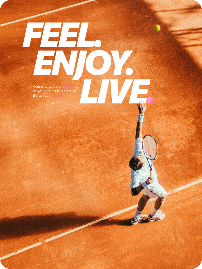
The brand also had to live offline, on a wall banner, a gym poster, or a small handout. Each of them had to be a fast read. We kept the app name, QR code, store badges, and short call to action close to the main visual, while tilted type and sports photography anchored each piece with a fitness cue.


Photo Collection
When every campaign features a different kind of athlete, a different light, or a different mood, you dilute your brand. This photo collection sets a strong visual bar for future shoots, product screens, social media content, and promo pieces in every brand channel.

Design system


Results
+12%
increase in STORE CONVERSION
After updating app icon, store visuals, and clearer first-screen messaging, the share of store visitors who moved to install increased.
+20%
SOCIAL ENGAGEMENT rate
Story layouts with one message per slide increased taps, saves, and link clicks during launch campaign testing.
2x
FASTER ASSET PRODUCTION
Brand guidelines helped the team prepare posts, banners, and promo layouts twice as fast with fewer design reviews.
+18%
QR SCAN GROWTH
Print layouts with a clearer app name, stronger CTA, and visible QR placement increased scans from offline materials.
