
UX/UI Design for a DeFi Analytics Dashboard
Reducing time-to-insight through a structured dashboard system
About project
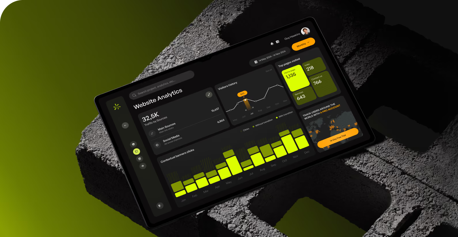
Nexora is a DeFi data platform that delivers real-time blockchain insights for quant funds, analysts, and AI-driven trading systems. The team needed a scalable dashboard system that explains dense financial data clearly. Structured visuals should not cut analytical depth.


Challenges & Solutions
Problem
Nexora's early interface showed accurate data, but analysts still had to hunt through dense screens to find important metrics. This process slows down decision-making in a market where every minute affects profitability. Every data point carried the same visual weight, which raised the risk of missing price shifts or protocol anomalies.
Solution
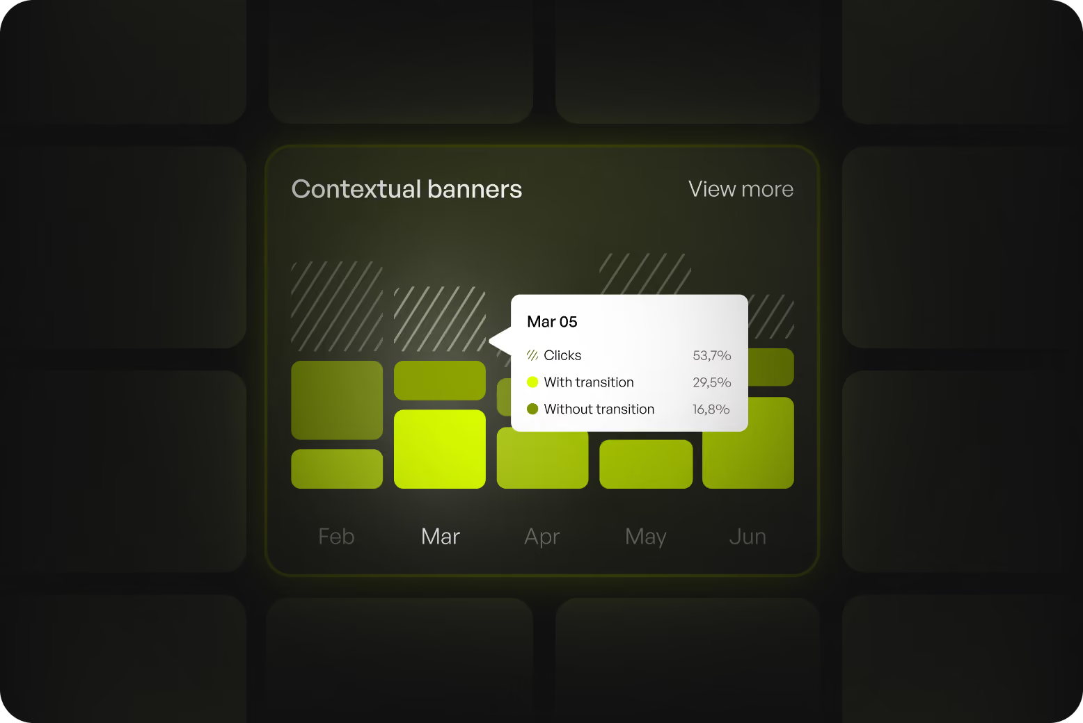
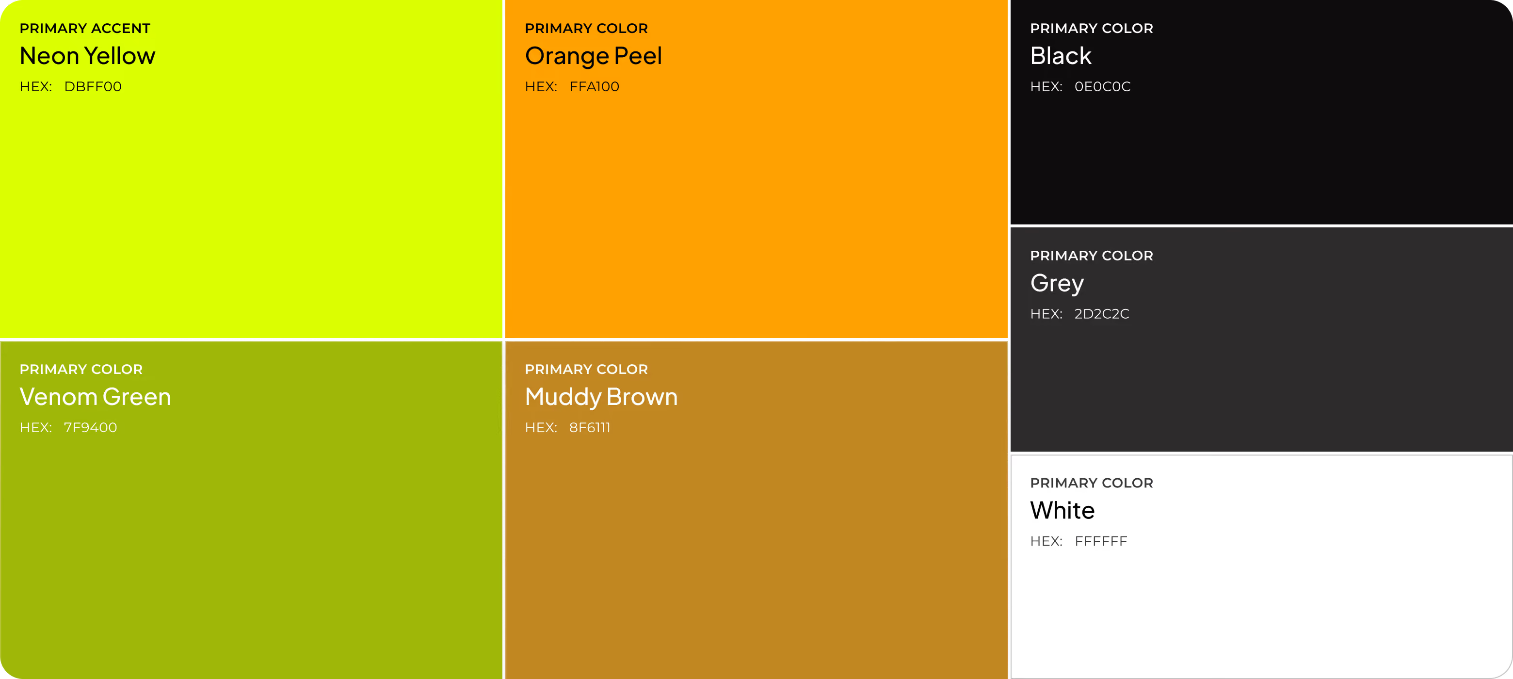
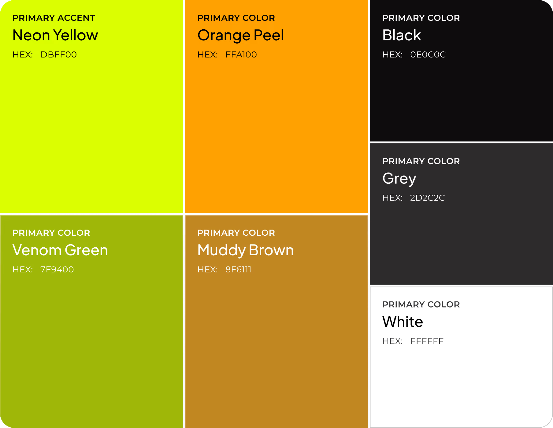
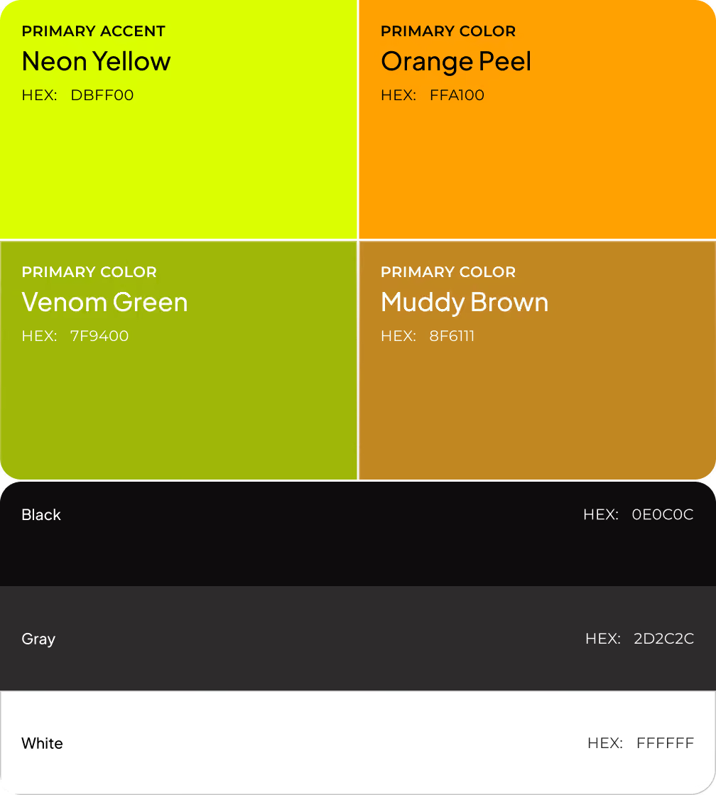
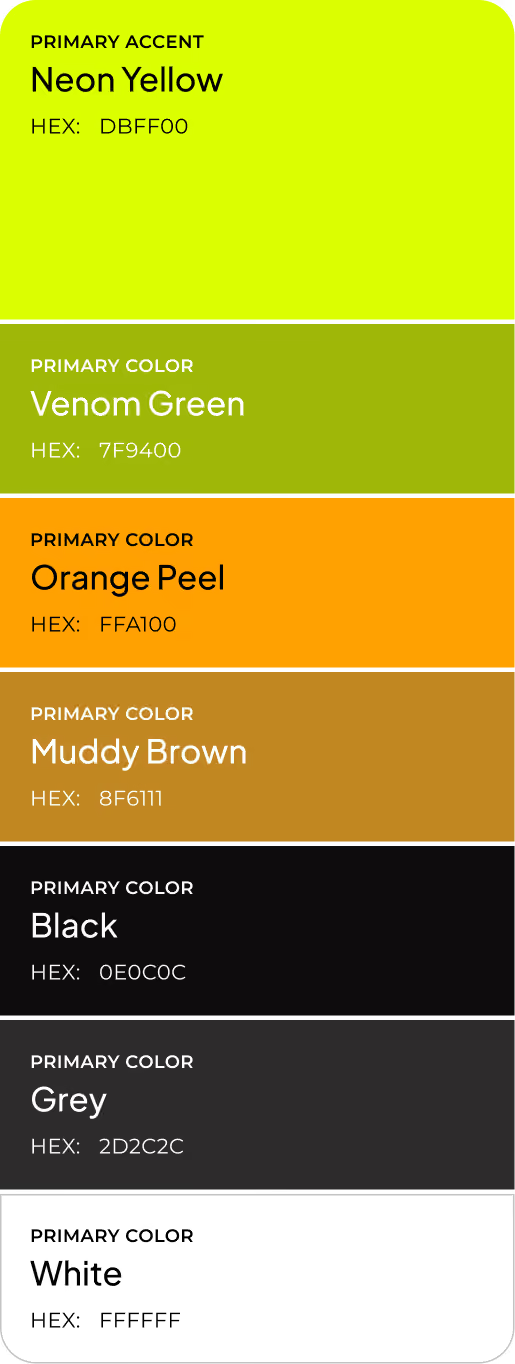
Arounda built a modular dashboard with clear hierarchy, so analysts spot priority signals without scanning entire screens. A structured component library, accent-color system, and scalable UI kit highlight key changes and let Nexora add new data types without rebuilding the interface. We shorten the path from data to decision for faster trade calls and fewer missed signals.
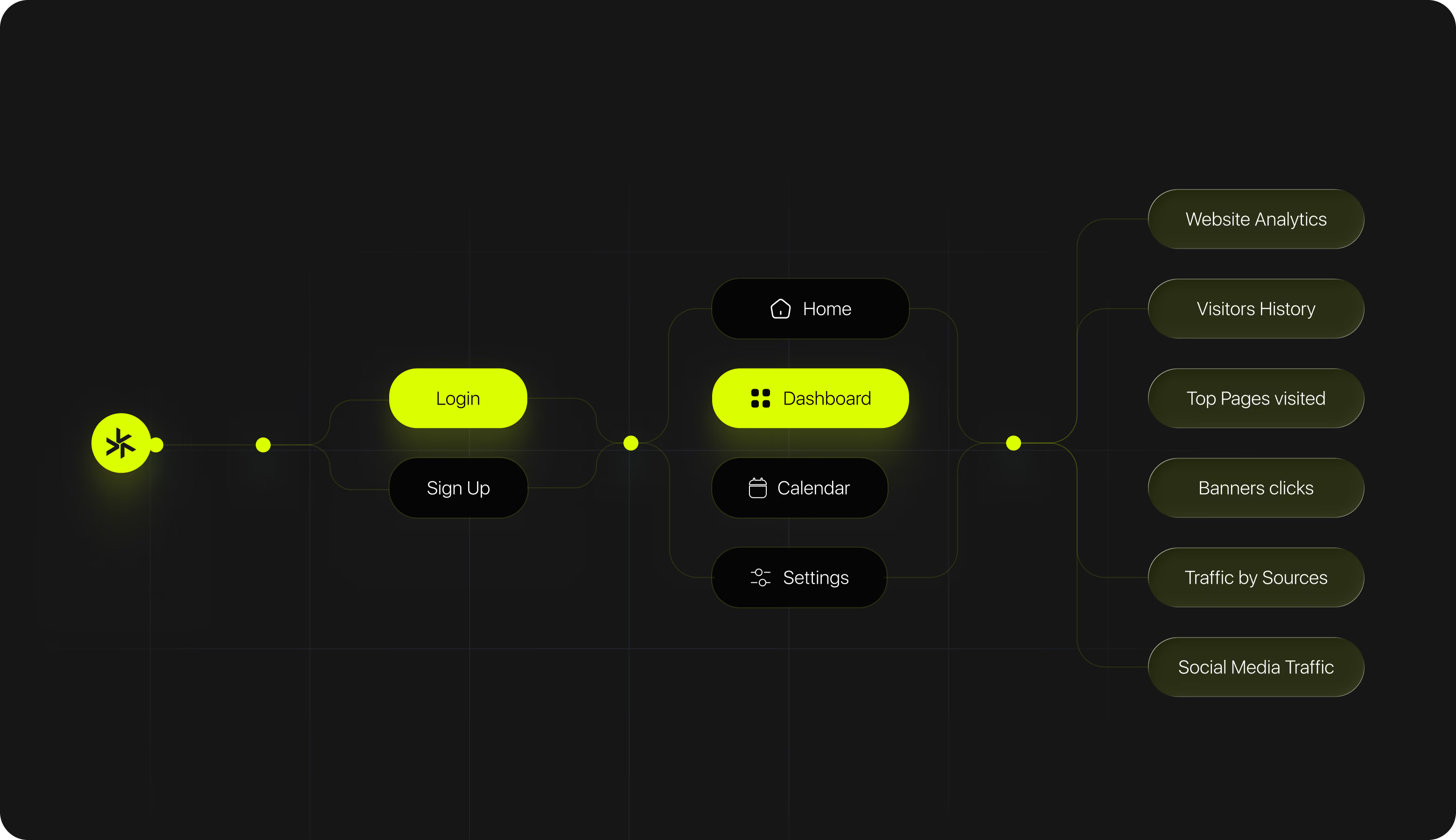
User Flow
LogoDesign
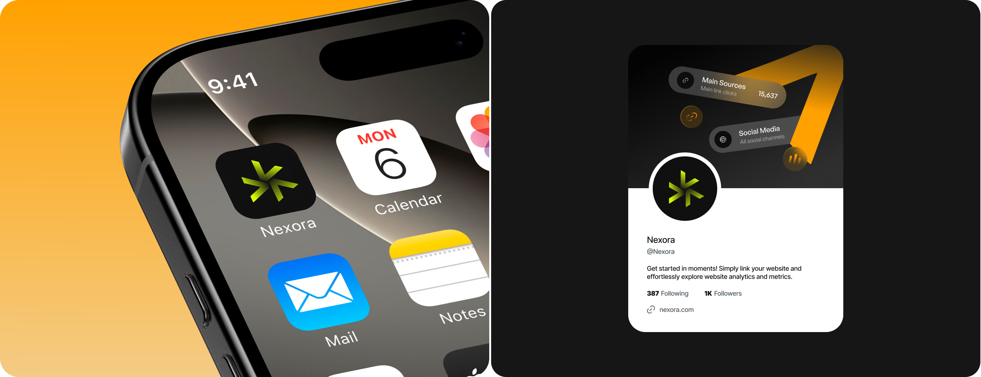
Our brand designer employed angular, star-like shards radiating from a single point to create a shape that resembles a compass and a forward arrow. This represents the platform's primary function of consolidating fragmented blockchain data into a single structured view and directing users to the next choice. The lime-on-dark hue conveys accuracy and attention. It fits the dashboard's dark UI and maintains identity consistency.

Arounda structures high-density data so the right insight reaches first and guides the decision.
Web Application Design
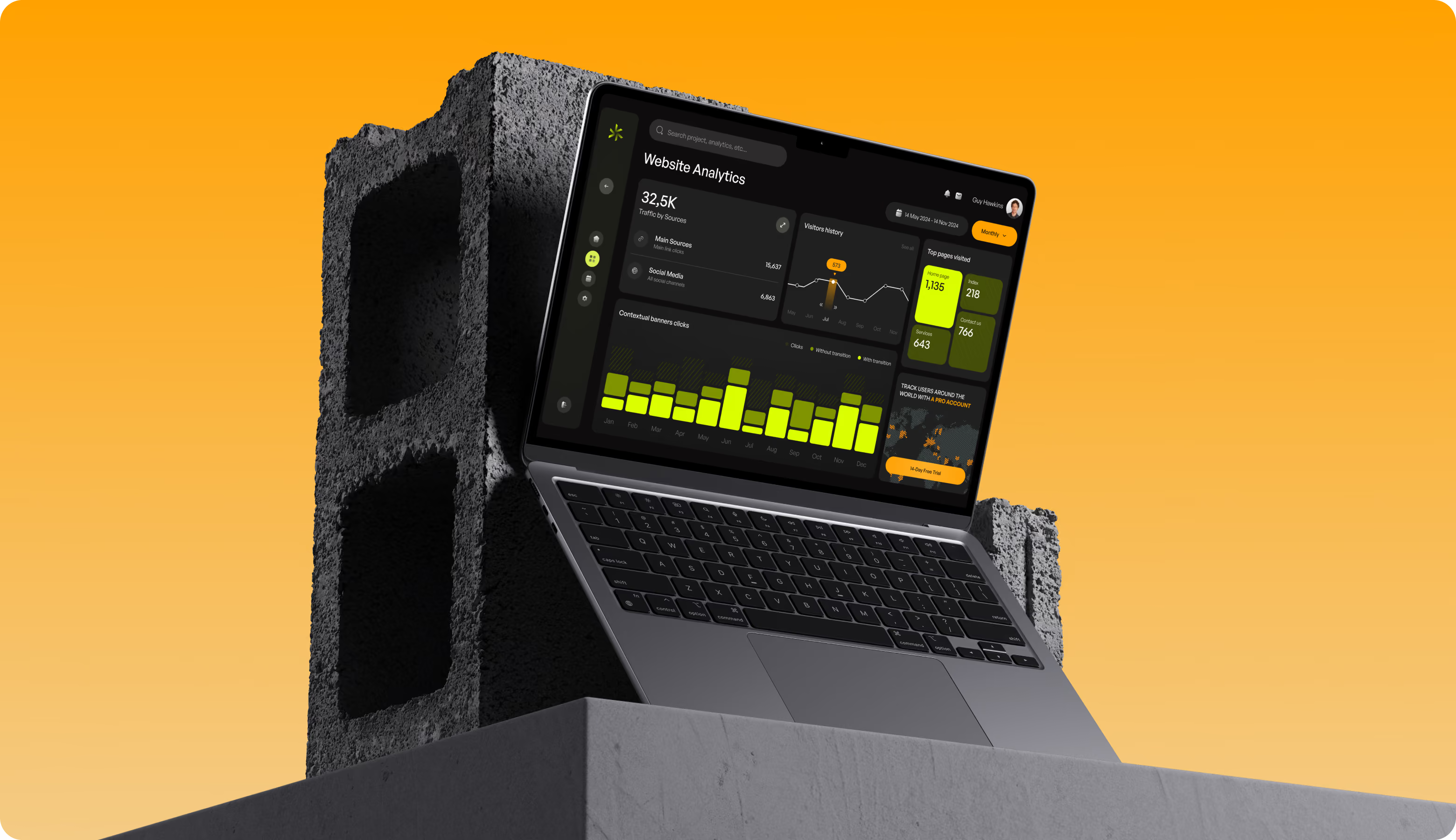
The dashboard combines progressive disclosure and a high-contrast UI to highlight essential metrics first. Our technique allows analysts to analyze big datasets without experiencing cognitive overload. Accent colors indicate significant changes. This architecture reduces time-to-insight and allows for longer, more accurate monitoring sessions for funds and analysts working with live DeFi data.
.avif)
Mobile Version
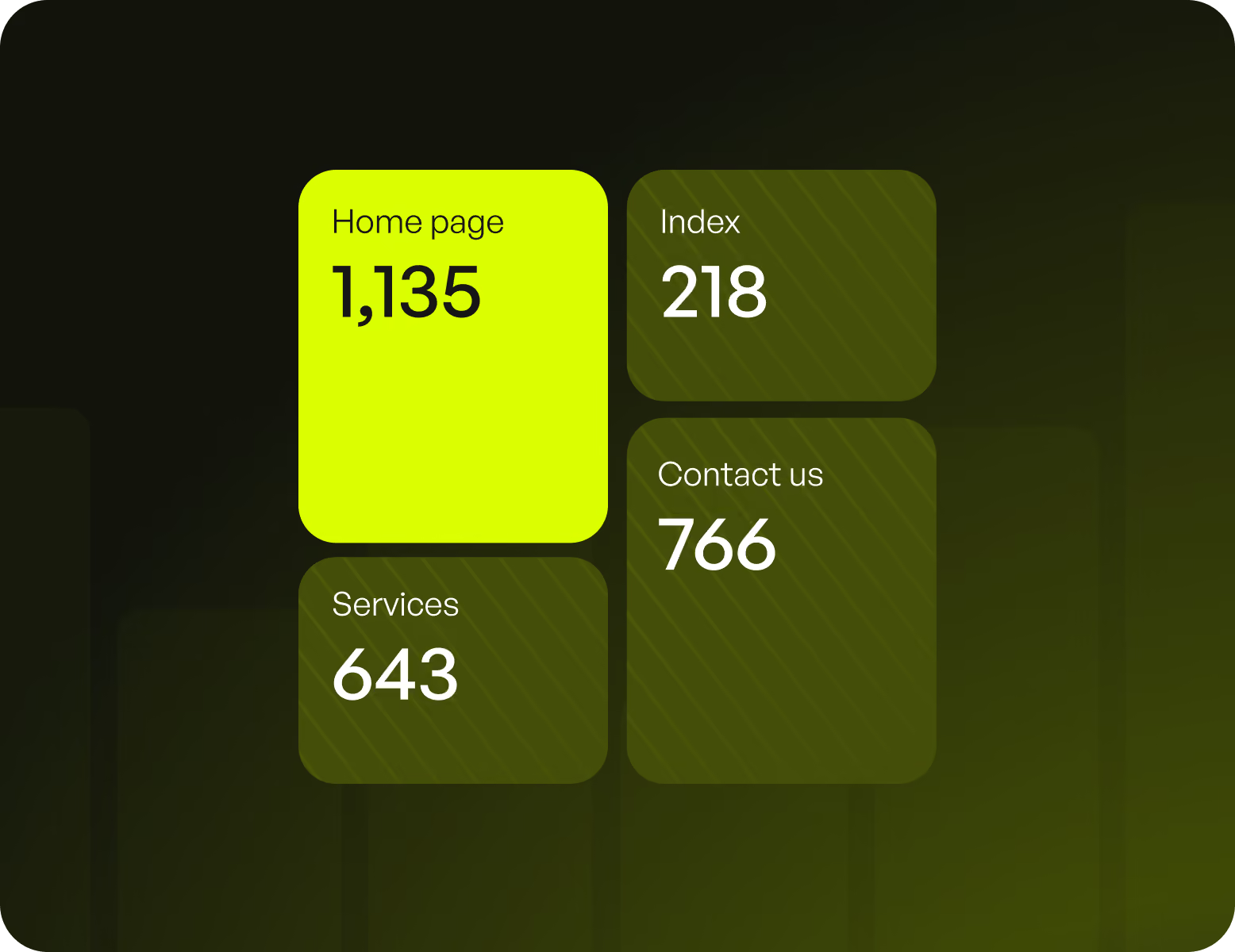
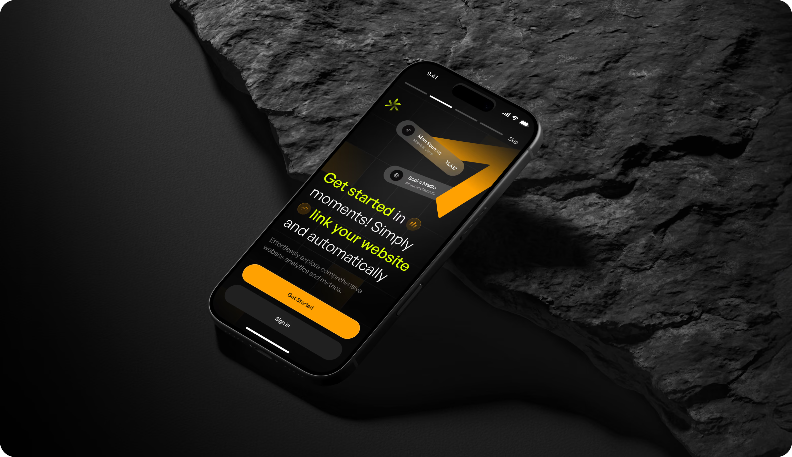
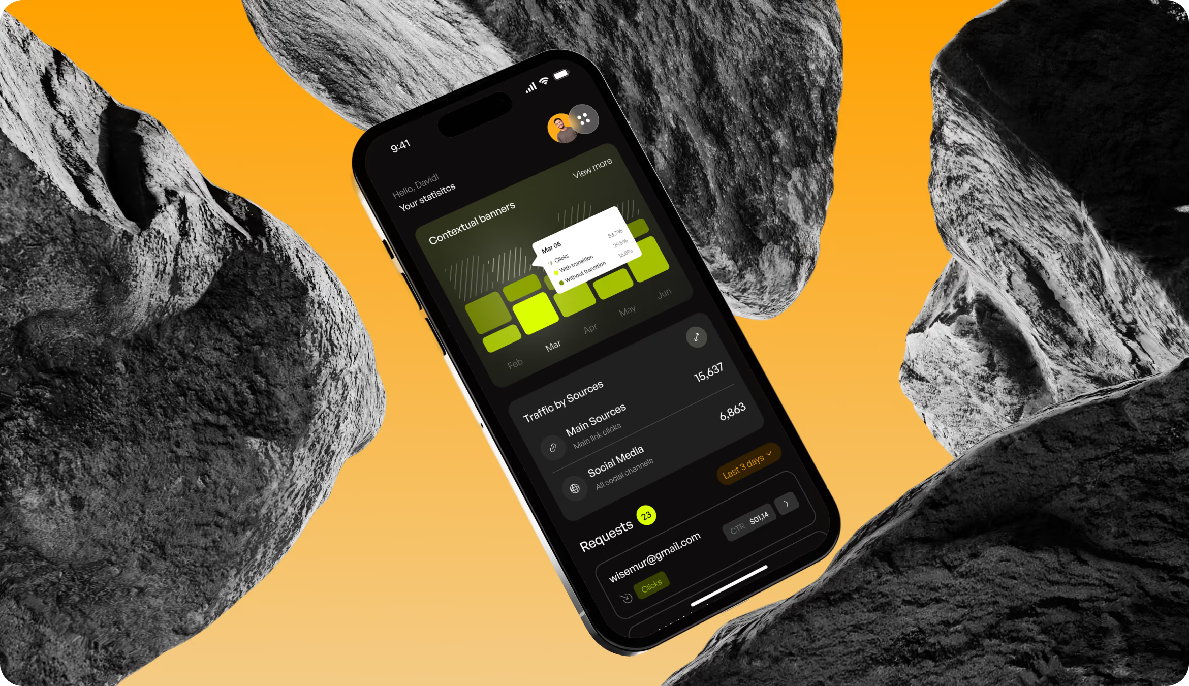
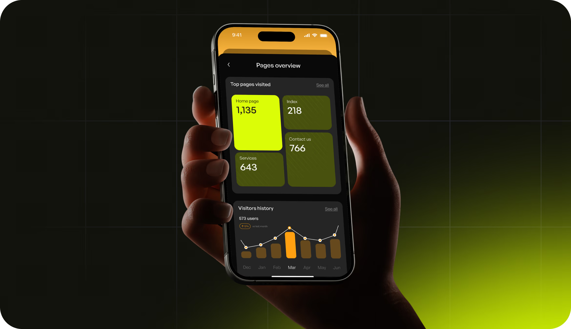
Analysts and fund managers must monitor markets beyond the desktop. Therefore, Nexora's mobile experience integrates real-time data monitoring and trend analysis into a compact, touch-friendly interface. The interface prioritizes the most important metrics and status indications first, allowing high-density financial data to be read on a smaller screen. Cross-platform consistency enables users to monitor live protocol performance and detect anomalies from any device, resulting in speedier response times and continuous decision-making.
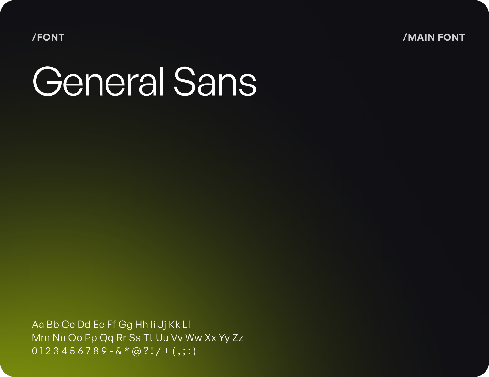
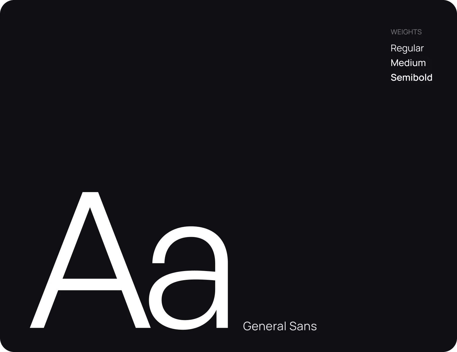
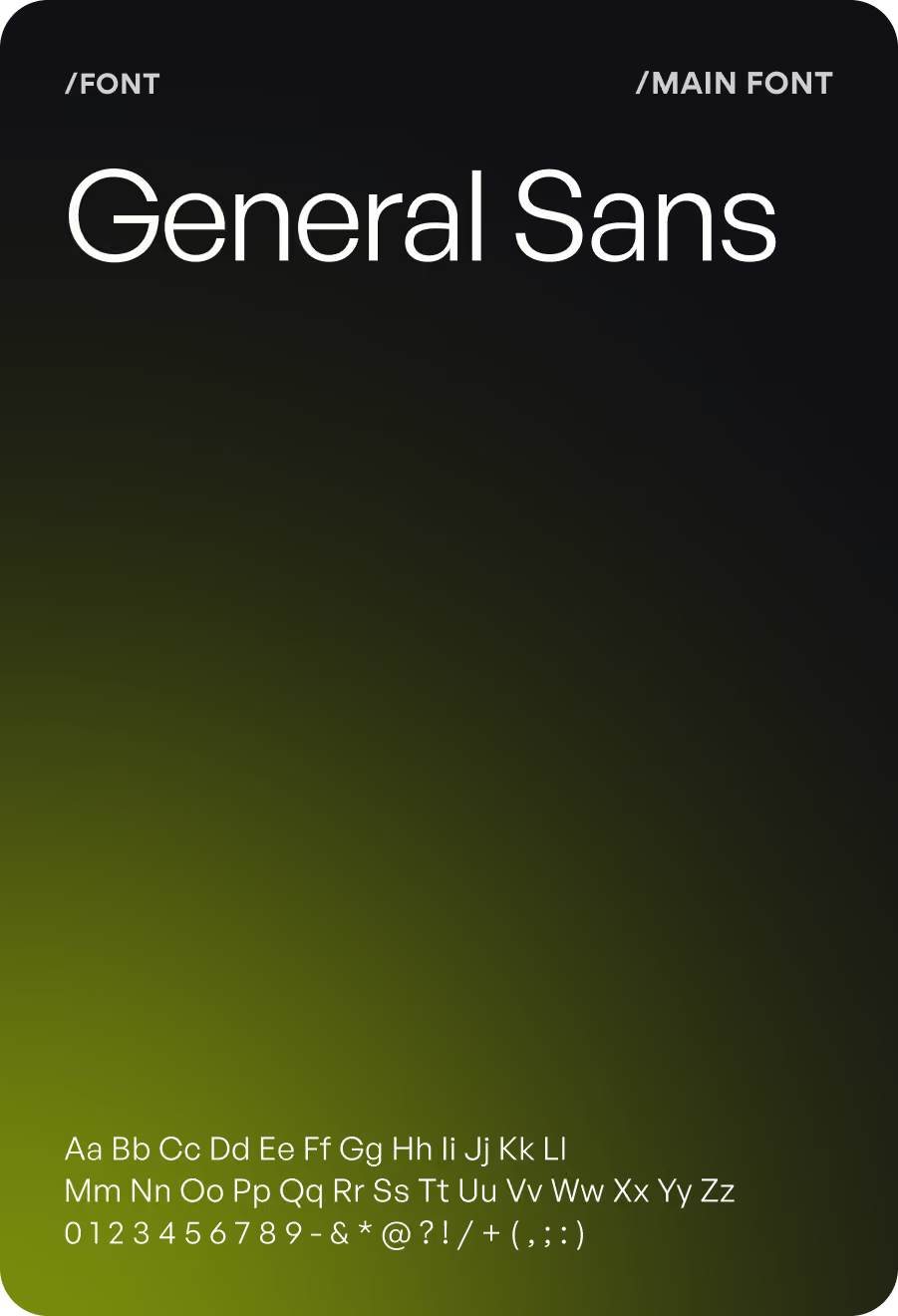
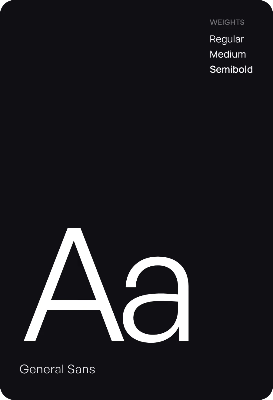
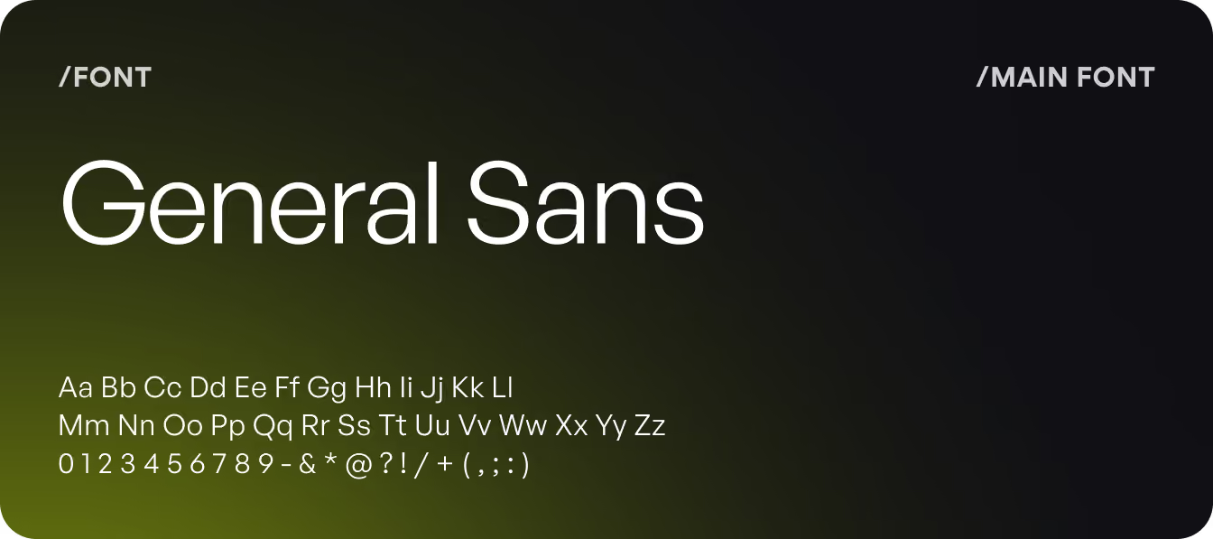
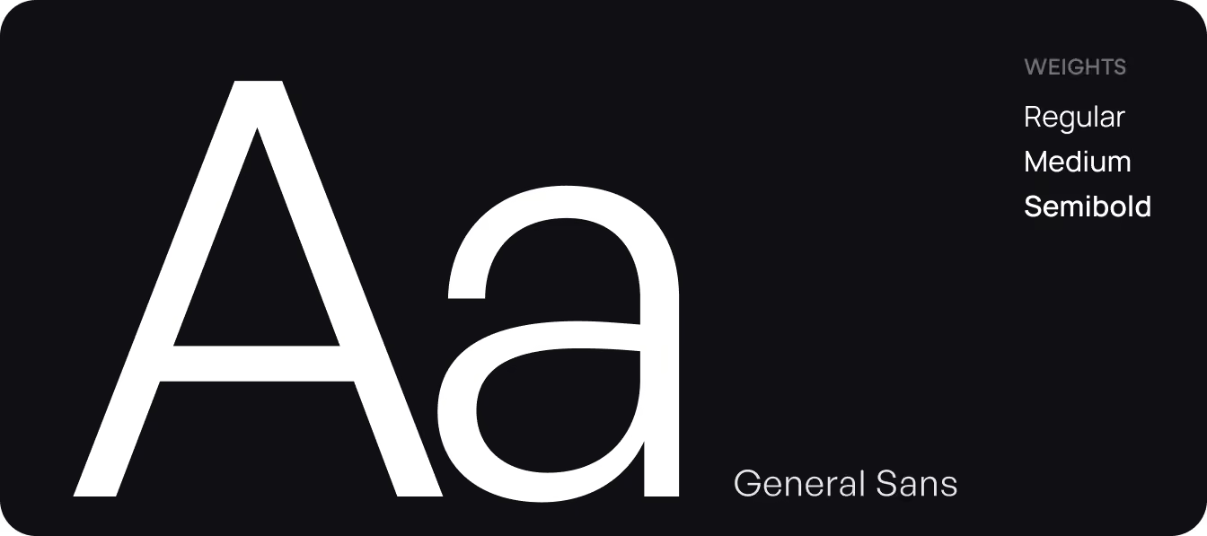
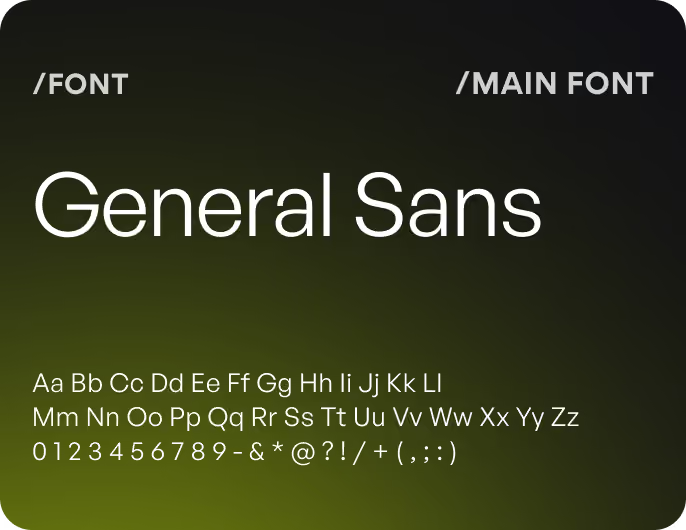
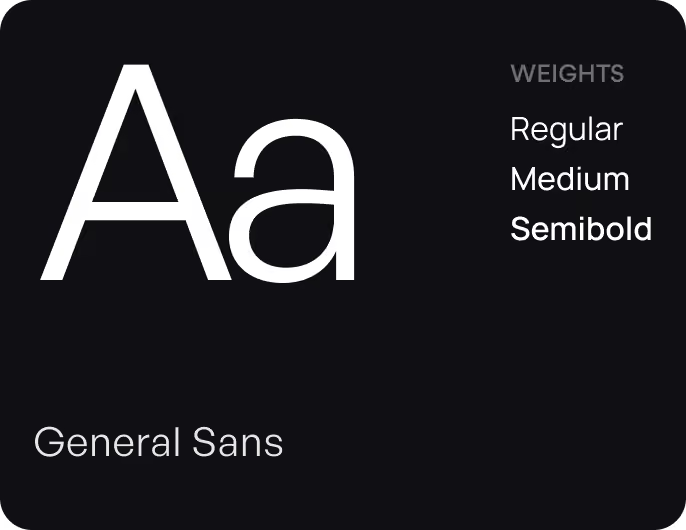
Design system
Results
43%
Faster Time to Insight
Users identified the metric needed for a trading decision faster in the redesigned dashboard during usability testing.
94%
Task Completion Rate
Most users executed key analytics activities, such as identifying protocol data and examining trends, without assistance.
32%
Fewer Navigation Steps
The revised user journey made it easier to get from login to decision-ready data for high-priority analytics jobs.
89%
Improved Data Clarity
Users said the redesigned dashboard made complex blockchain data easier to scan without losing analytical depth.
