

Brand and Web Redesign for DeNet
Fixing lost differentiation with a distinct visual identity
About project
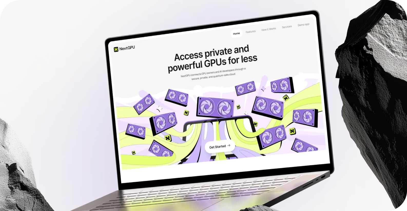
NextGPU runs a decentralized, quantum-safe network where AI/ML developers, gamers, and Web3 users rent GPU compute. Providers earn token rewards for sharing idle hardware. Its website looked like every other dark, symbol-heavy Web3 platform, so NextGPU asked Arounda for a website redesign, a new logo, and a lighter design direction.


{/}
Challenges & Solutions
Problem
NextGPU's site relied on the same generic tech symbols and futuristic visuals used across nearly every competing Web3 and AI platform. Developers and GPU providers had no clear reason to choose it over any other option. That lack of differentiation put sign-ups and onboarding at risk, so our client asked Arounda for a minimal and credible identity that could build trust without feeling cold or corporate.
Solution
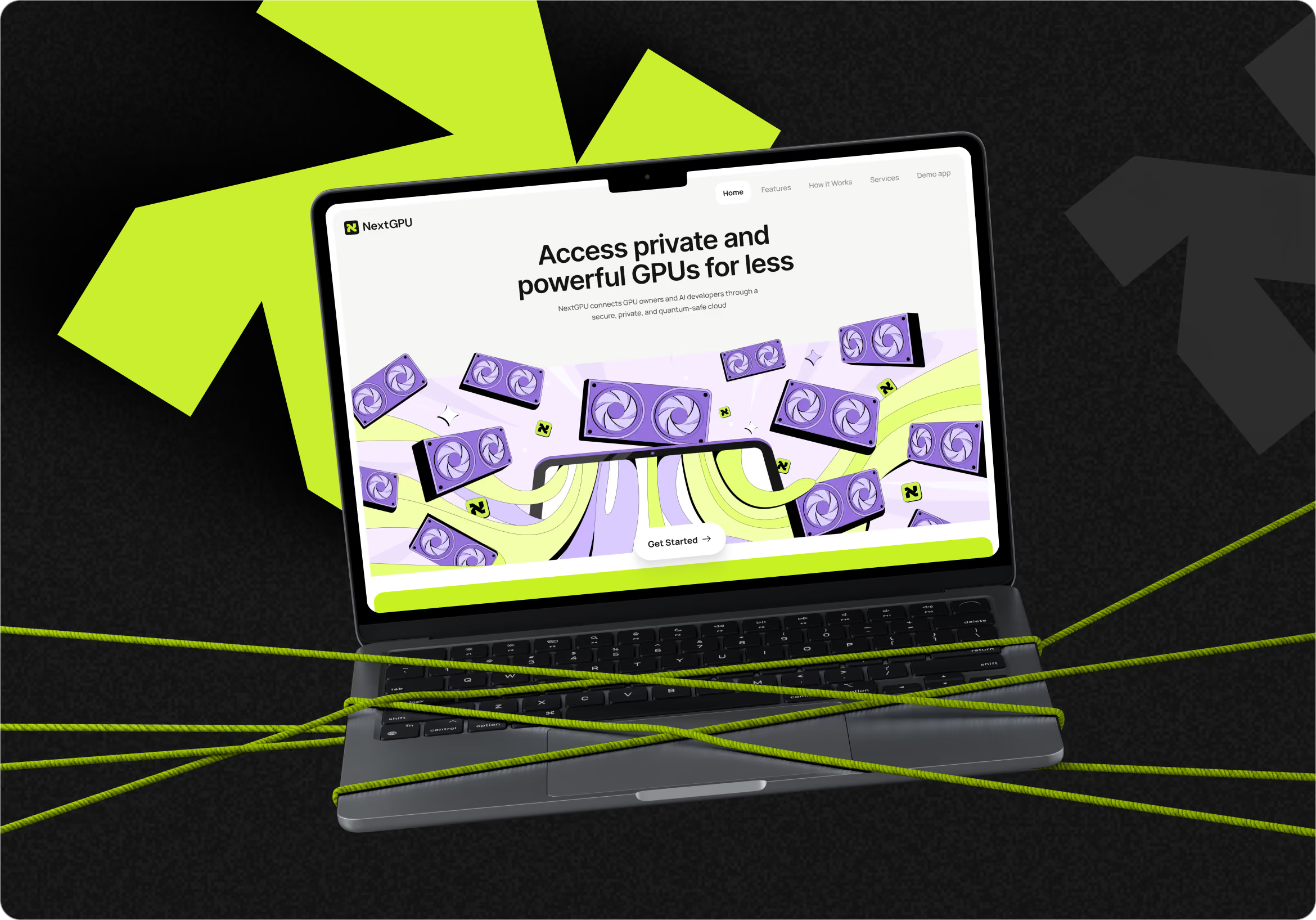
Arounda rebuilt the website around a clearer structure and a lighter visual system. The platform is easier to read, navigate, and understand. The logo distills the brand into a minimal, recognizable mark that stays consistent across every digital touchpoint. A new design direction based on accessibility principles and a decentralized technology style without added visual noise.
Process
{/}
Briefing & Onboarding
Competitors Research
Logo Moodboard
Color Palette Moodboard
Metaphors
Logo Concept Creation
Typography
Work with color
Illustrations
Discovery
Moodboard
UI Concept
UI Layouts
{/}
No items found.
{/}
{/}
No items found.
UI Concepts
{/}
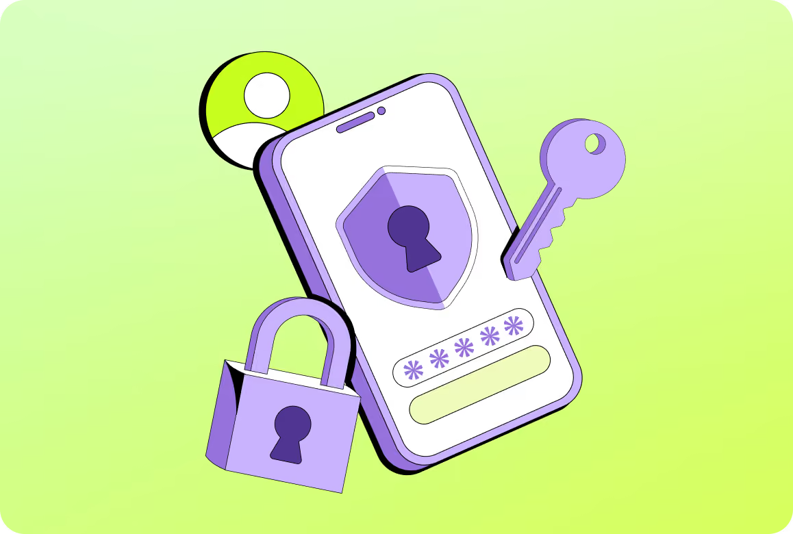
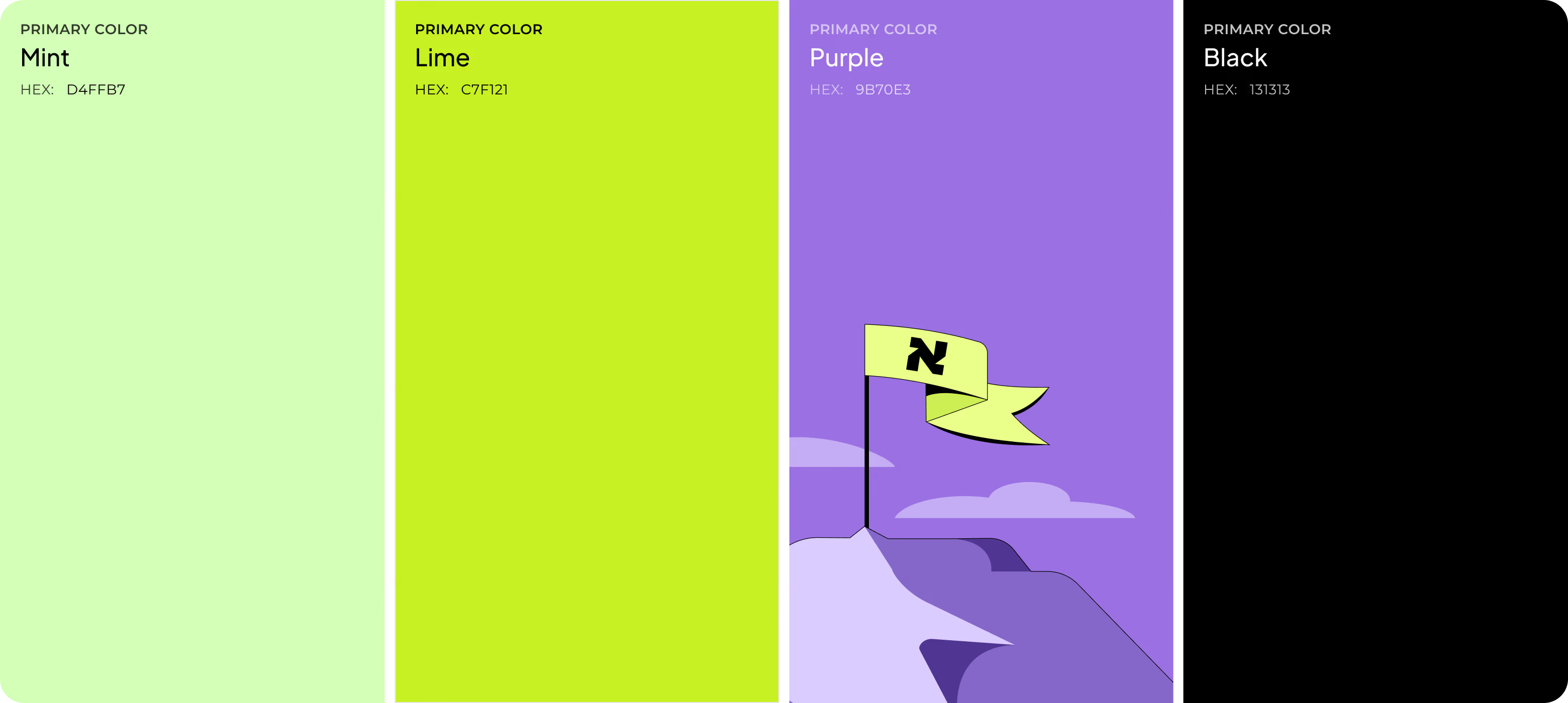
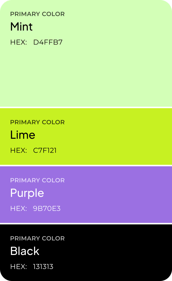
Competitor research showed that Web3 and AI platforms default to yellow and grayscale palettes, so Arounda built the interface around lime-green, black, and purple instead to attract the attention of the Gen Z audience. Custom illustrations of GPU hardware, encryption, and reward coins replace the industry's usual abstract tech icons and explain what NextGPU does. Trust signals sit directly in the hero section, so credibility is established before a visitor has to scroll or read further.

{/}
Logo Design
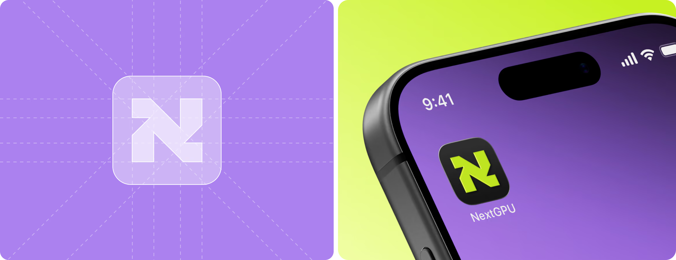
Our client requested a simple logo that conveys forward-thinking and community-driven values. Our brand team simplified the identification to a single "N", NextGPU's first letter. Its negative space is an arrow for GPU compute that moves between providers and developers. We kept the logo simple rather than using traditional Web3 iconography. The brand became lighter and more playful.

{/}
Brand Guidelines
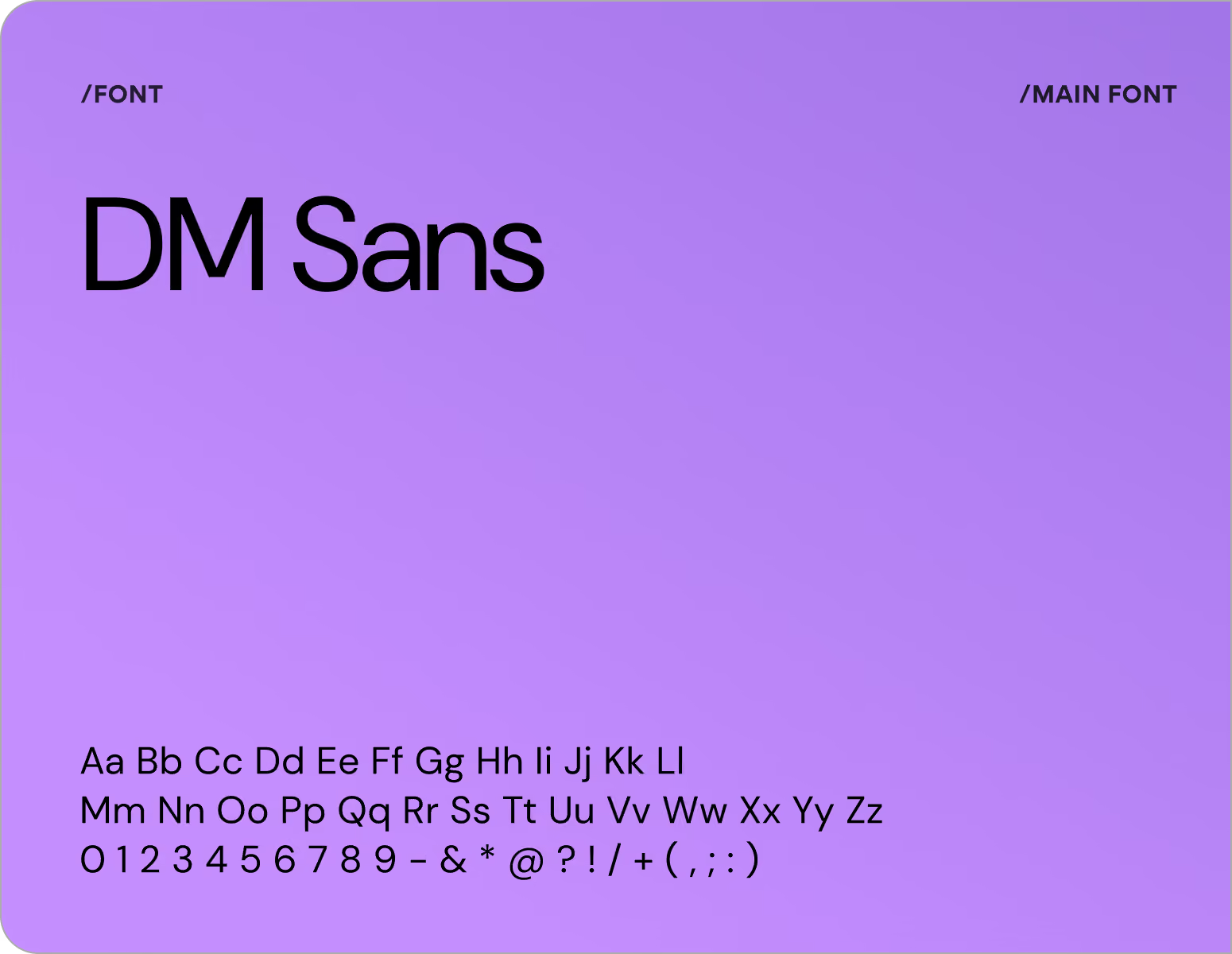
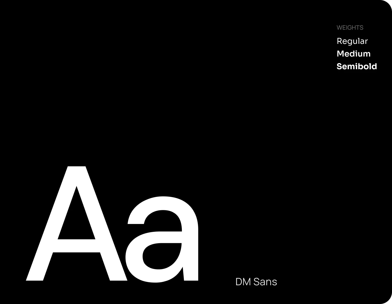
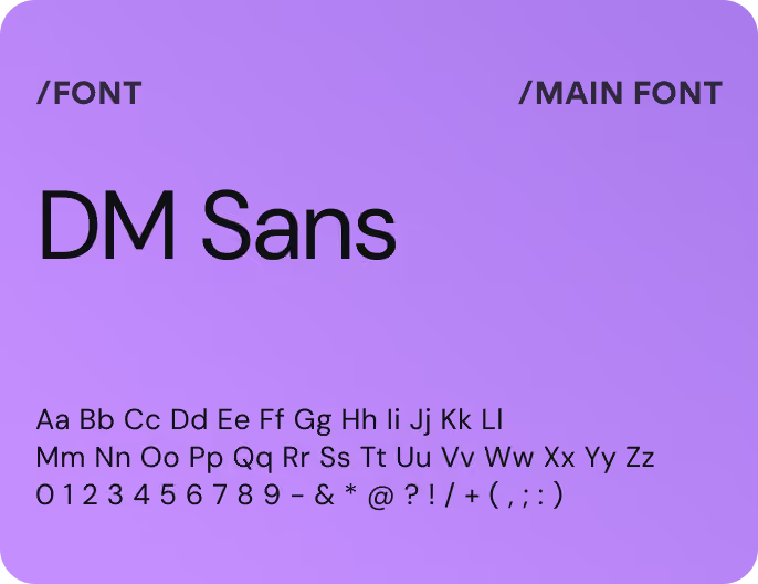
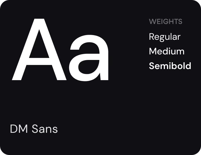
We've provided a brand guidelines document that includes specific color, typeface, space, and logo standards. Any asset remains on-brand without requiring design approval from Arounda each time. NextGPU's staff also has a quick reference for expanding the brand into various formats as the platform evolves.
{/}

Blending in with every competitor's site? Arounda will make your brand impossible to mistake for anyone else's.
{/}
Social Materials
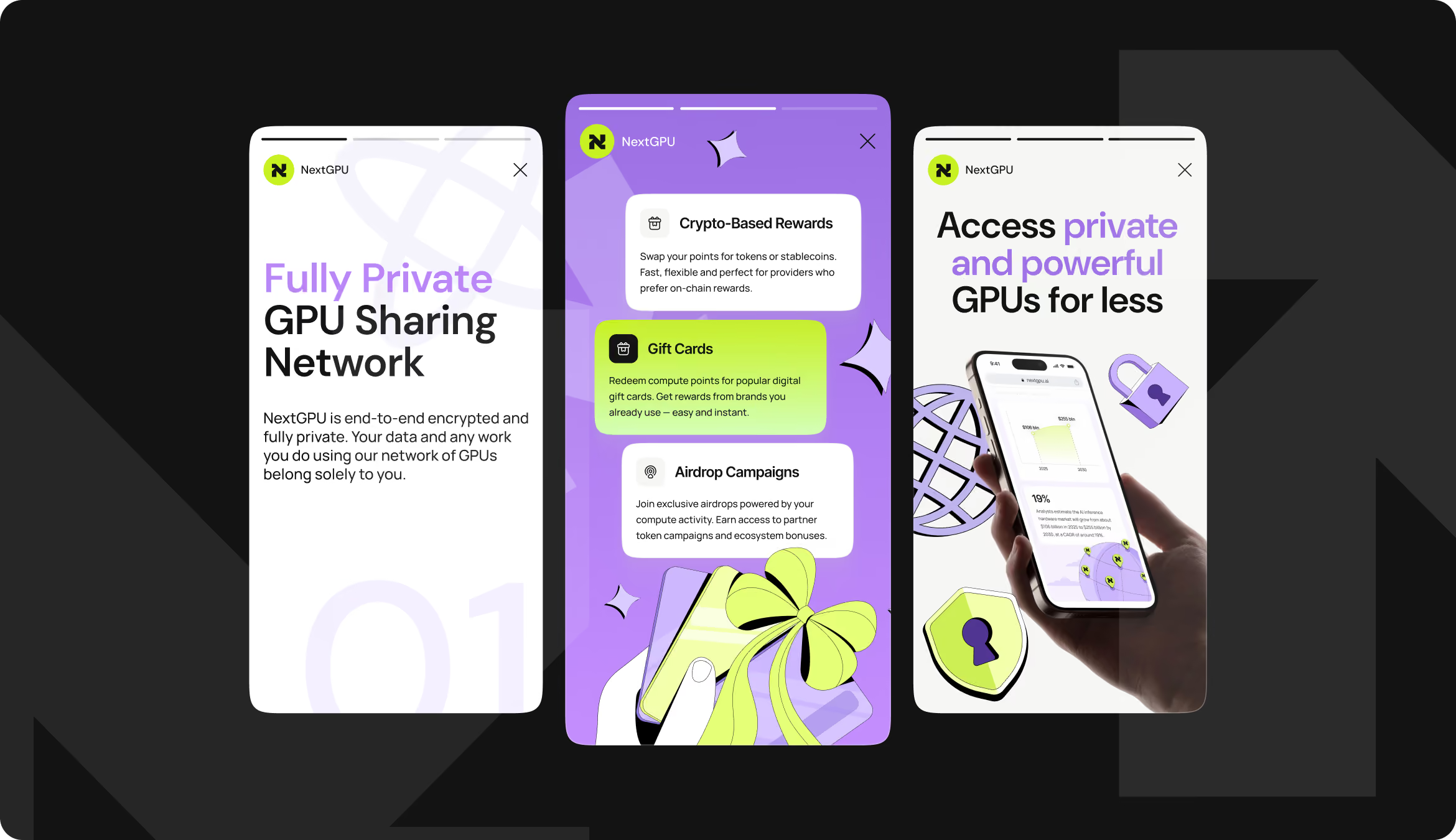
The same visual system carries into social content. That consistency turns social channels into a direct extension of the website's pitch, not a separate campaign to maintain. Core messages about full privacy, flexible crypto rewards, and cheaper GPU access have a scannable and engaging format to attract two different audiences at once (developers and providers).
{/}
No items found.
{/}
{/}
No items found.
{/}
Illustrations
Each illustration in the system explains a concept visually. We avoided unnecessary detail to maintain a minimalist style, so it wouldn't need a caption to explain it. That matters commercially. Visitors grasp what NextGPU offers before reading a copy, which shortens the path from landing on the site to understanding the product.

{/}
Colors &Typography
{/}
Results
92%
Clearer Value Proposition
The redesigned website made NextGPU's offering and provider-developer model more understandable.
88%
Stronger Brand Differentiation
People recognized the new brand as being visually different from traditional Web3 and decentralized infrastructure platforms.
94%
Core Navigation Success
Users can get critical information about renting GPU power, delivering hardware, and collecting rewards without assistance.
41%
Faster Product Understanding
Custom graphics and a more organized information hierarchy helped visitors understand NextGPU's primary offering faster than conventional Web3 visuals.
