
Mobile App Redesign for an AI Relationship Awareness Platform
UI/UX Design
Graphic Design
Visual language for emotional safety and user trust
About project
NoNarcissAI helps women identify early signs of emotional manipulation through AI-driven conversation analysis. The product needed a full visual redesign without changing its core functionality. Our project won the Behance award in the UI category.

Challenges & Solutions
Problem
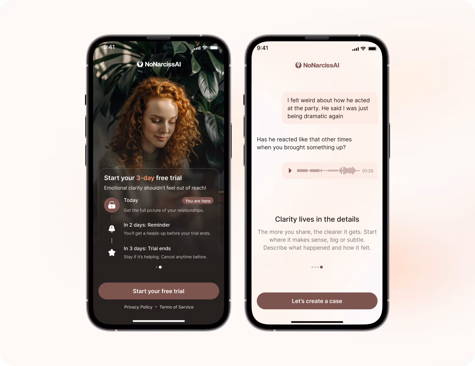
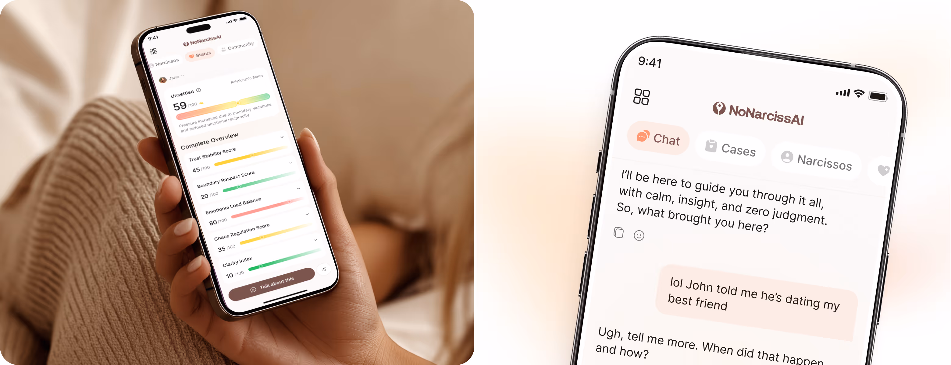
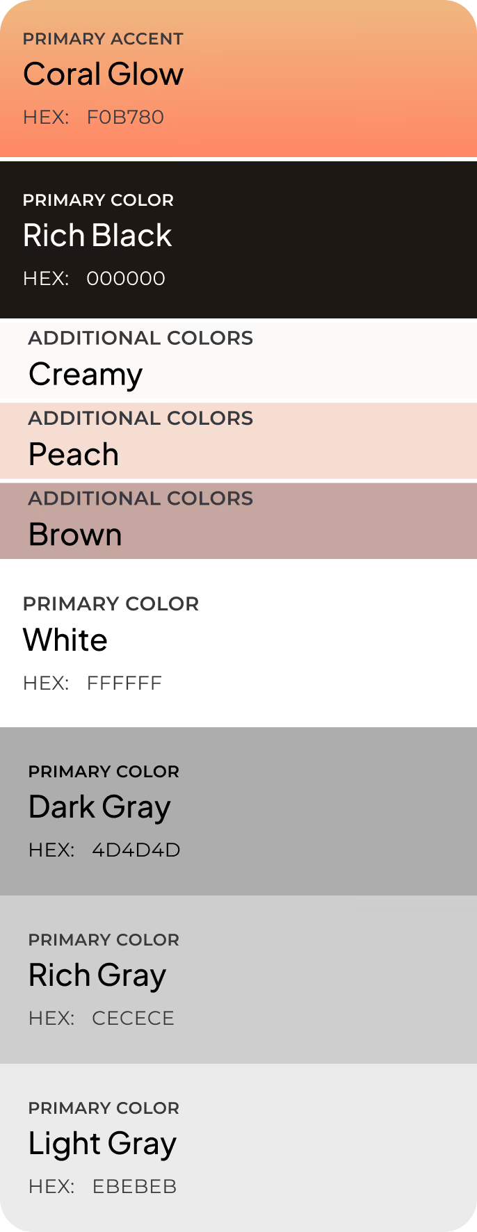
The old interface used a brown-and-beige palette. It felt heavy and visually flat, which was at odds with the emotional sensitivity the product needed to convey. Our team had to work within the client's strict color constraints but introduce accents to add warmth without breaking the brand's neutral identity.
Solution
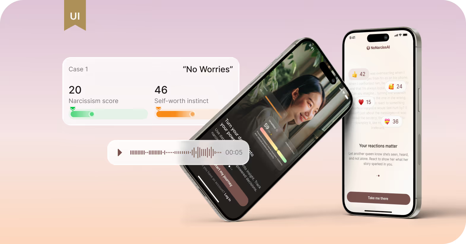
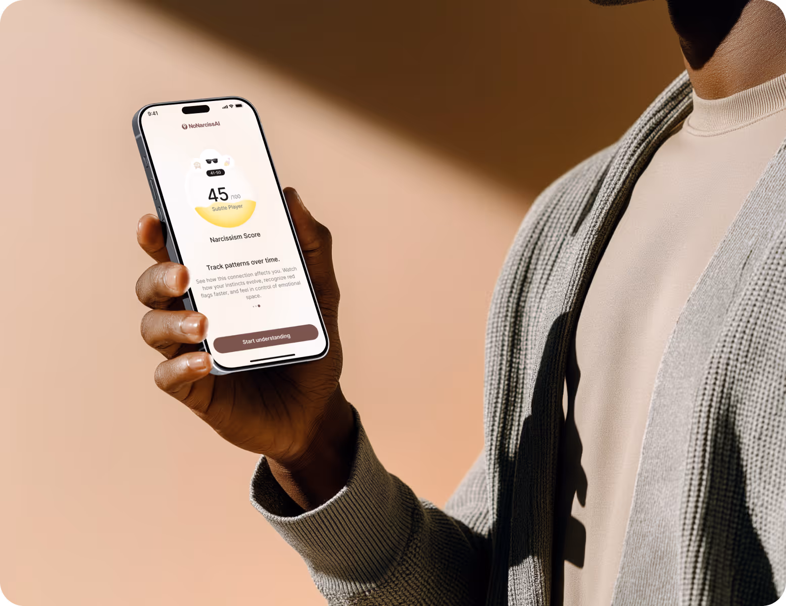
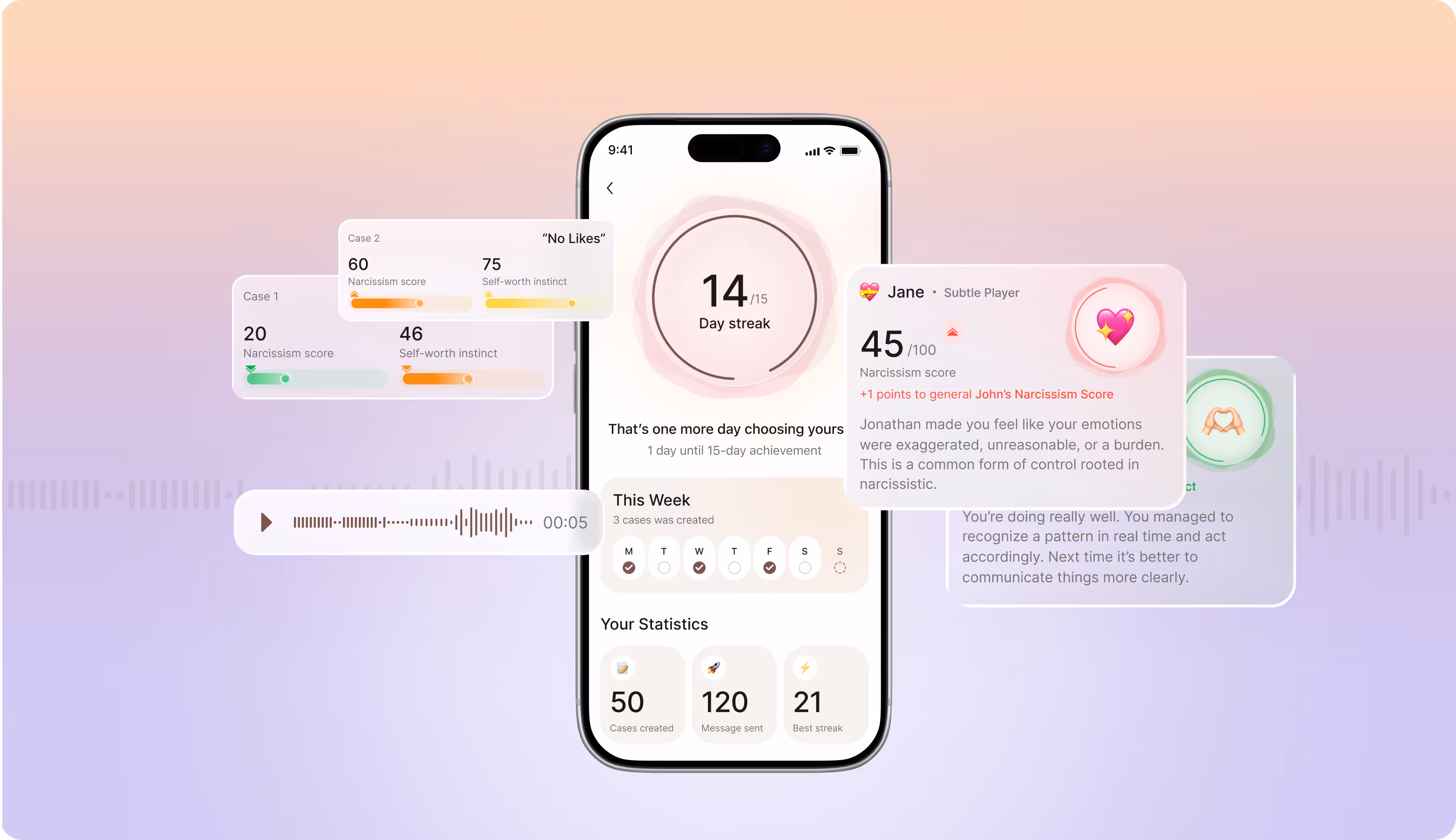
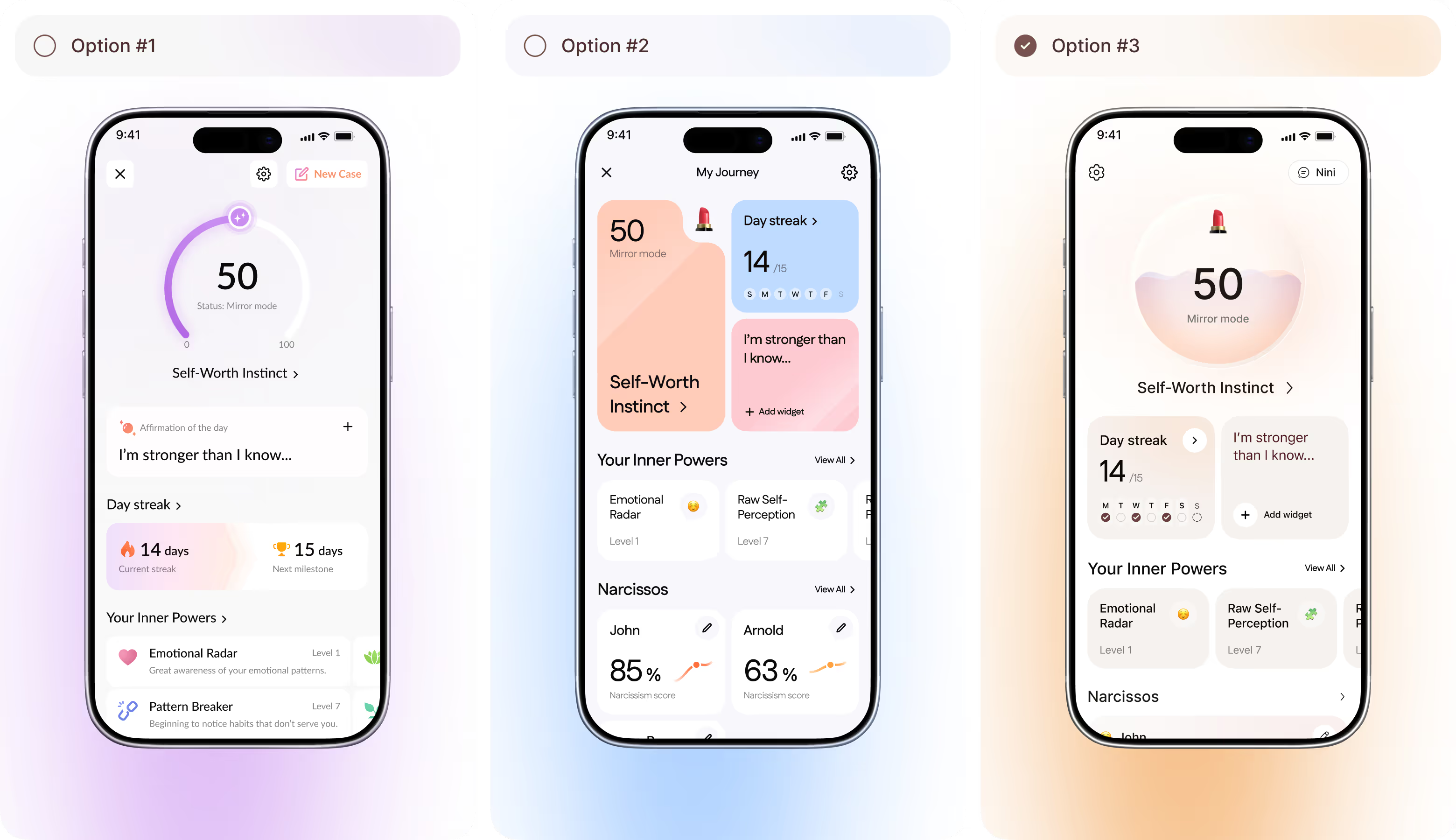
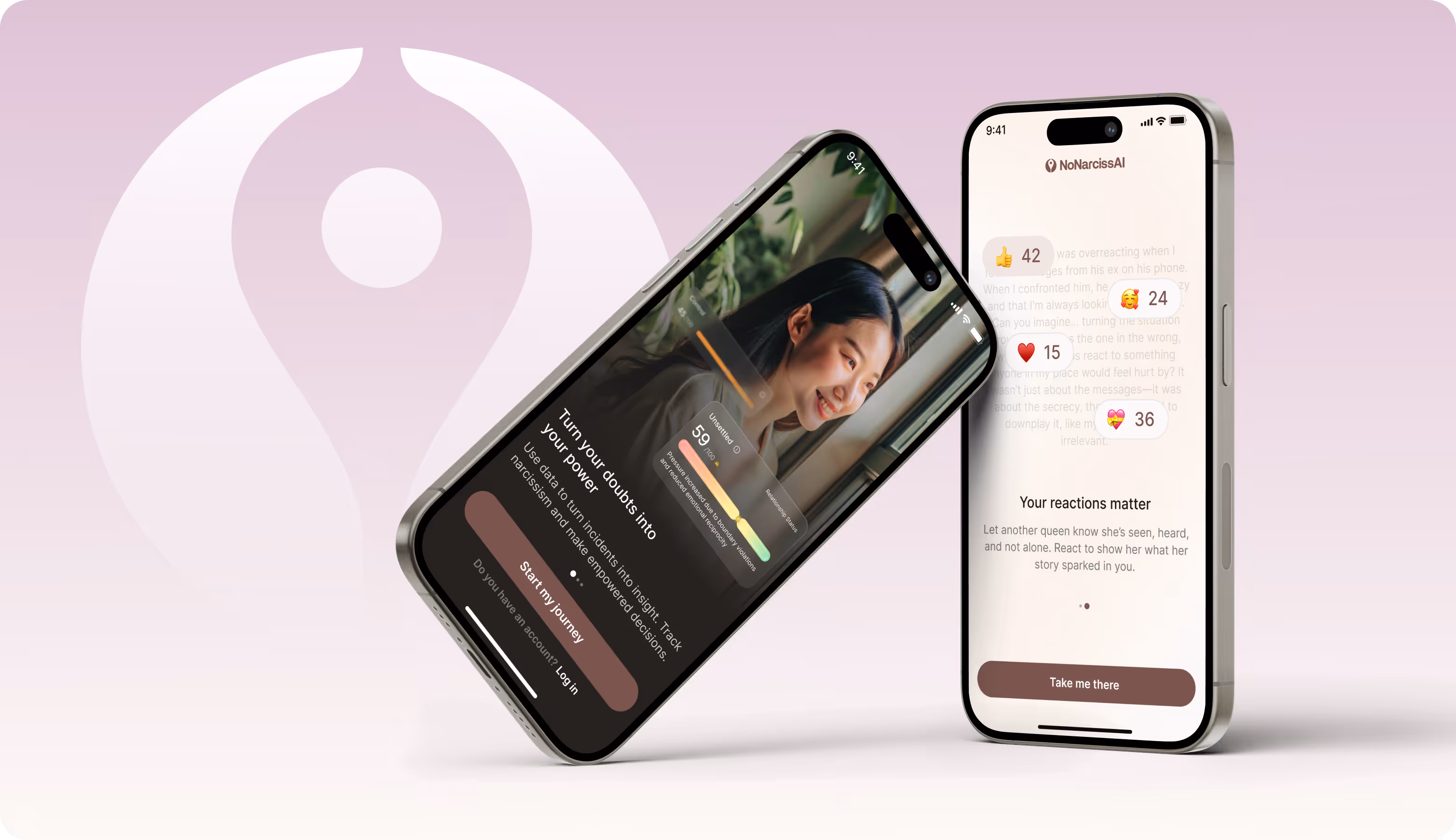
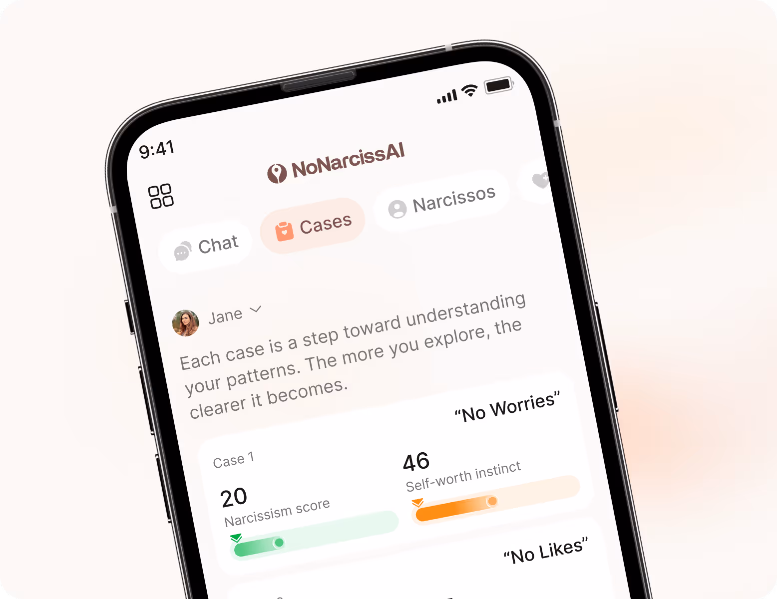
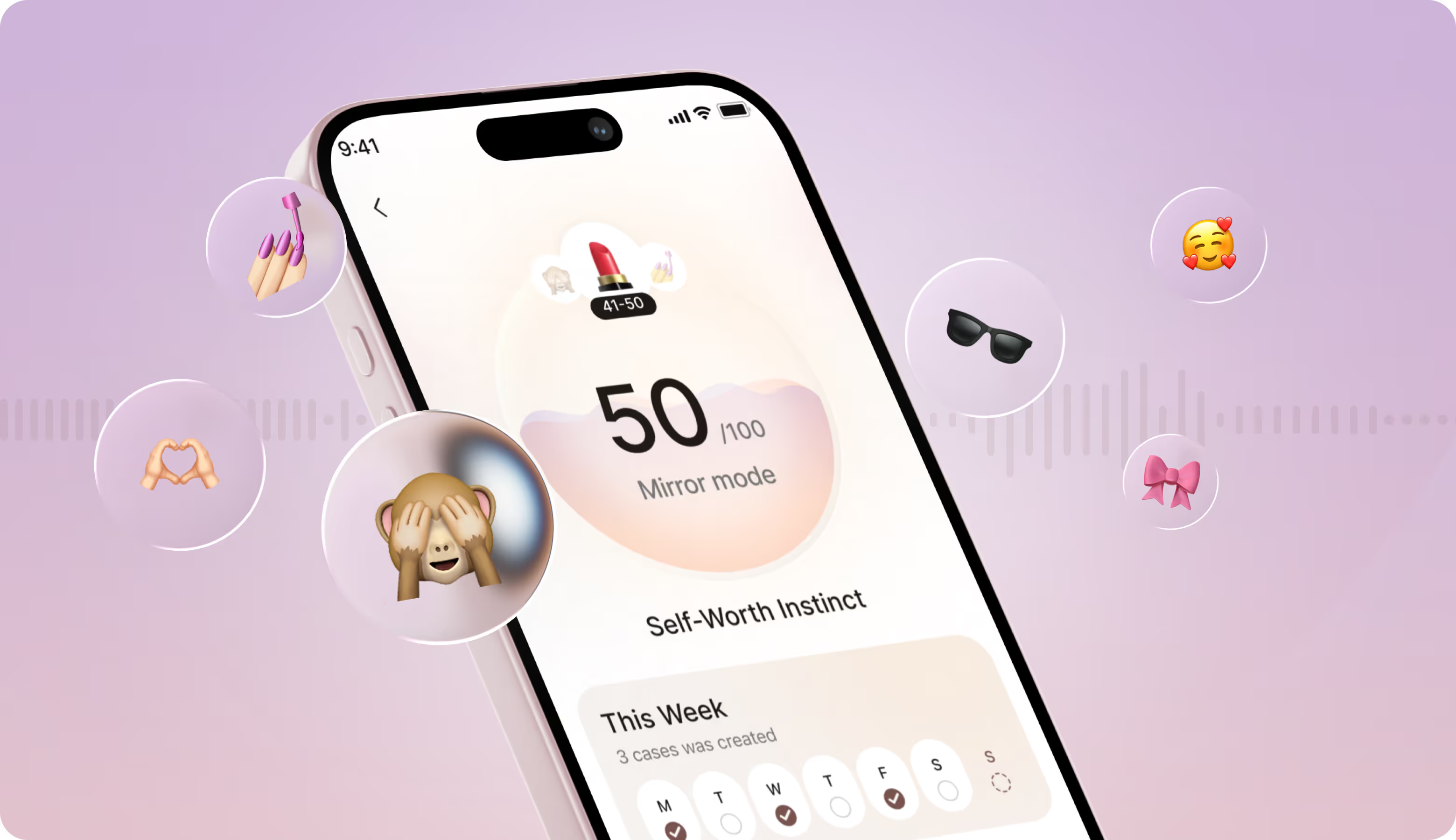
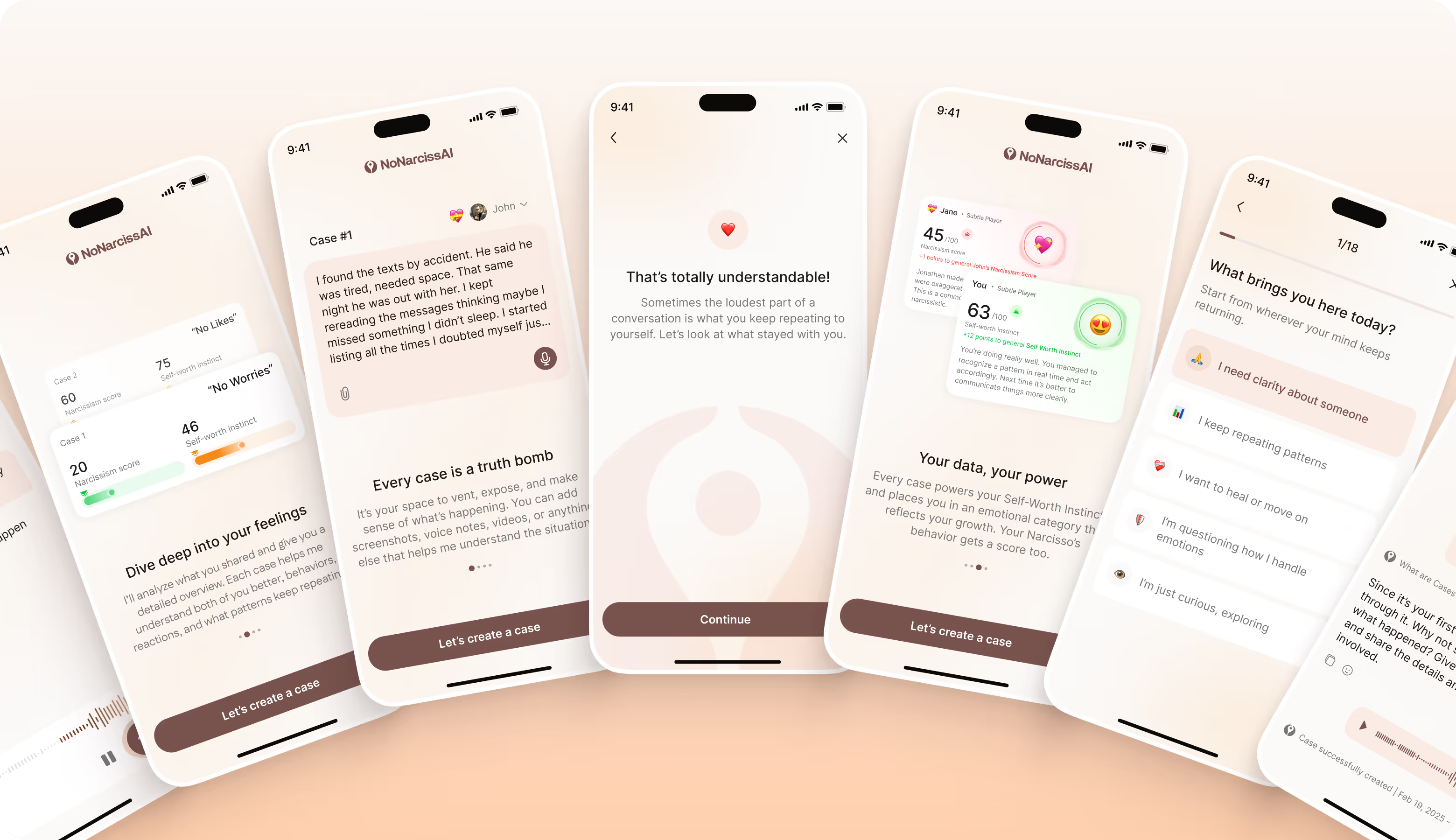
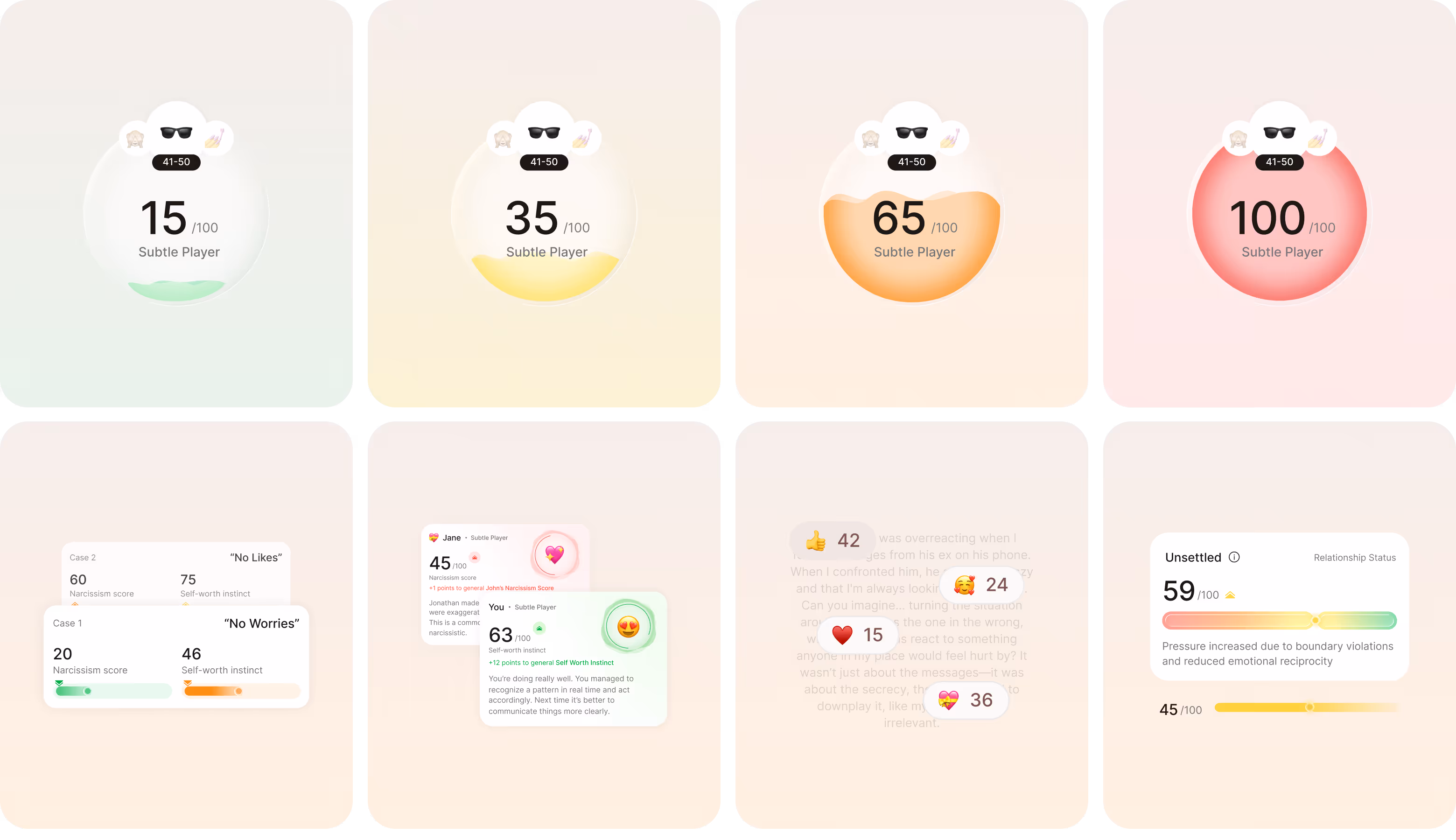
We introduced soft gradients, pink accents, and refined hierarchy to make the interface emotionally safe without heavy insights. The standout interaction is an animated Self-Worth bubble that fills like water to reflect the user's self-esteem score. It makes a complex psychological metric immediately readable.
Process
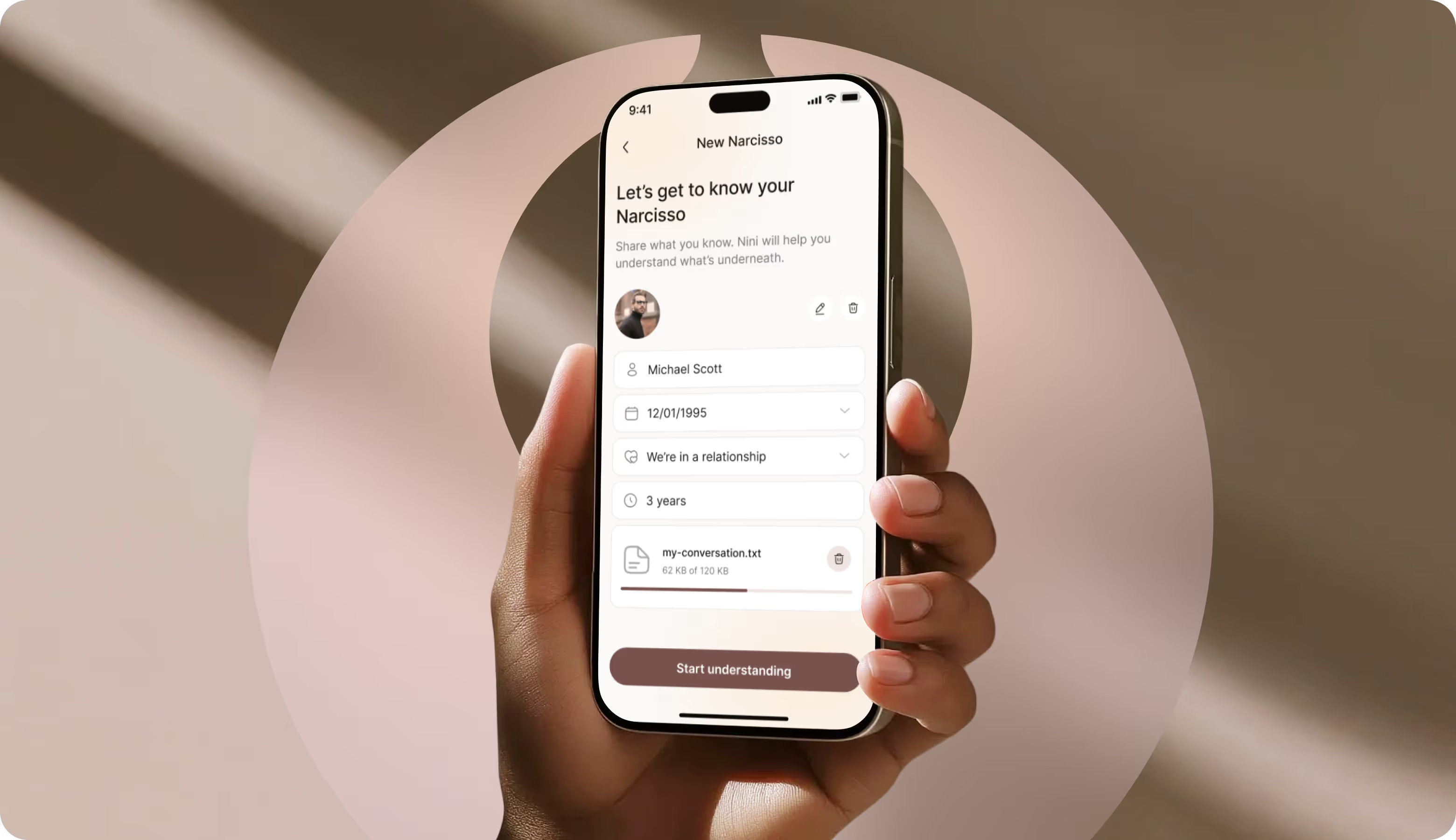
Briefing & onboarding
MVP Scope
Roadmap
Product/business goals
Competitors analysis
User flow
Wireframes
Moodboard
Concept design
Layouts design
Design system
Competitors analysis
Moodboard
Illustrations & iconography
Moodboard
The moodboard has soft, feminine aesthetics. It’s calm enough to feel safe, structured enough to guide users through insights. The defining element of the app is the glass-like bubble. We used it for the narcissism score and the Self-Worth indicator. Color shifts from red to green signaling risk levels. But it keeps the visual tone consistent and emotionally grounded.
UI Concept Options
.avif)
When your product carries emotional weight, Arounda builds the visual language that makes users feel supported.
UI Layouts
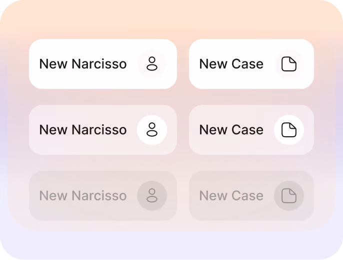
The interface has a clear hierarchy, generous spacing, and consistent navigation. So, users can focus on personal insights rather than competing visual elements. Soft gradients and micro-interactions added depth and responsiveness without visual noise.

Mobile Application Design
Users check the app in a private moment, so they shouldn't have to hunt for what matters. That’s why we designed generous touch areas, navigation that stays persistent, and a transition between the main score view and the dashboard summary that feels continuous. Every animation has a functional role and signals progress.
Illustrations
The narcissism score bubble shifts through four calm color states and communicates risk level without triggering an alarm. Users processing an abusive relationship don't need aggressive visuals amplifying that stress. So, emoji, indicators, background, and soft progress bars create a feeling of a safe digital space.
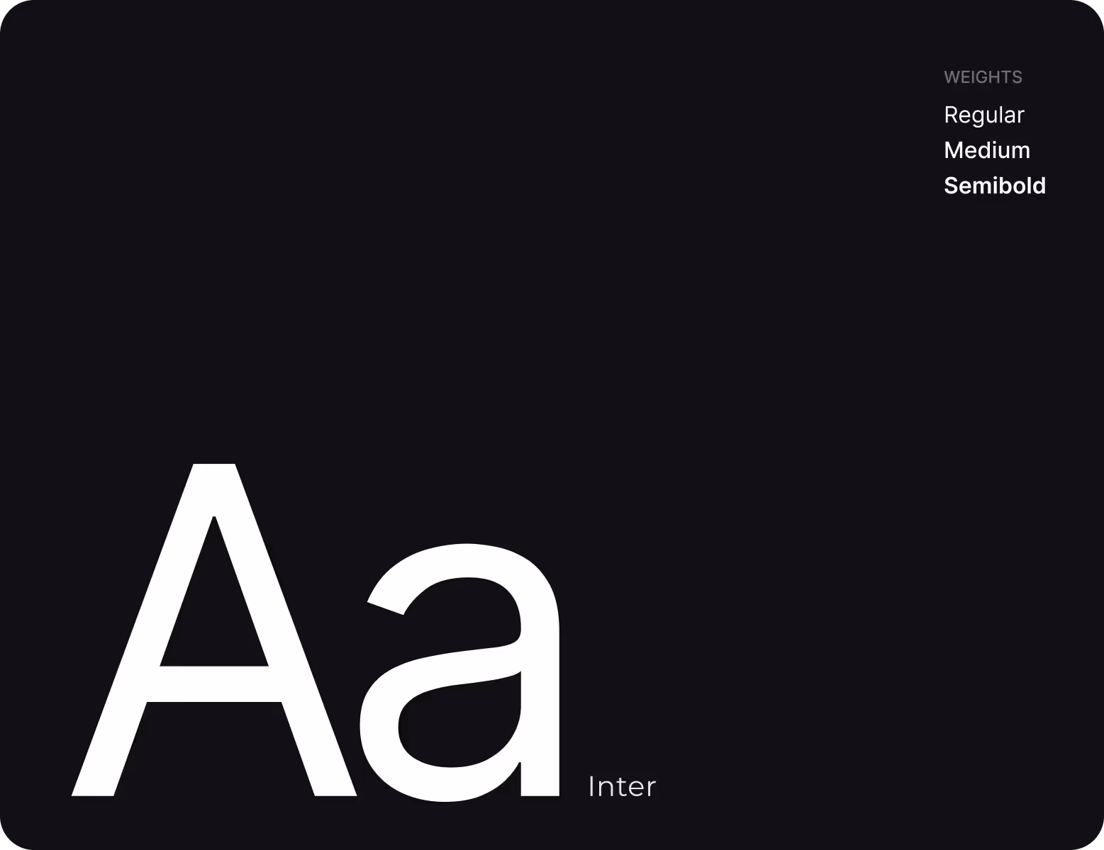
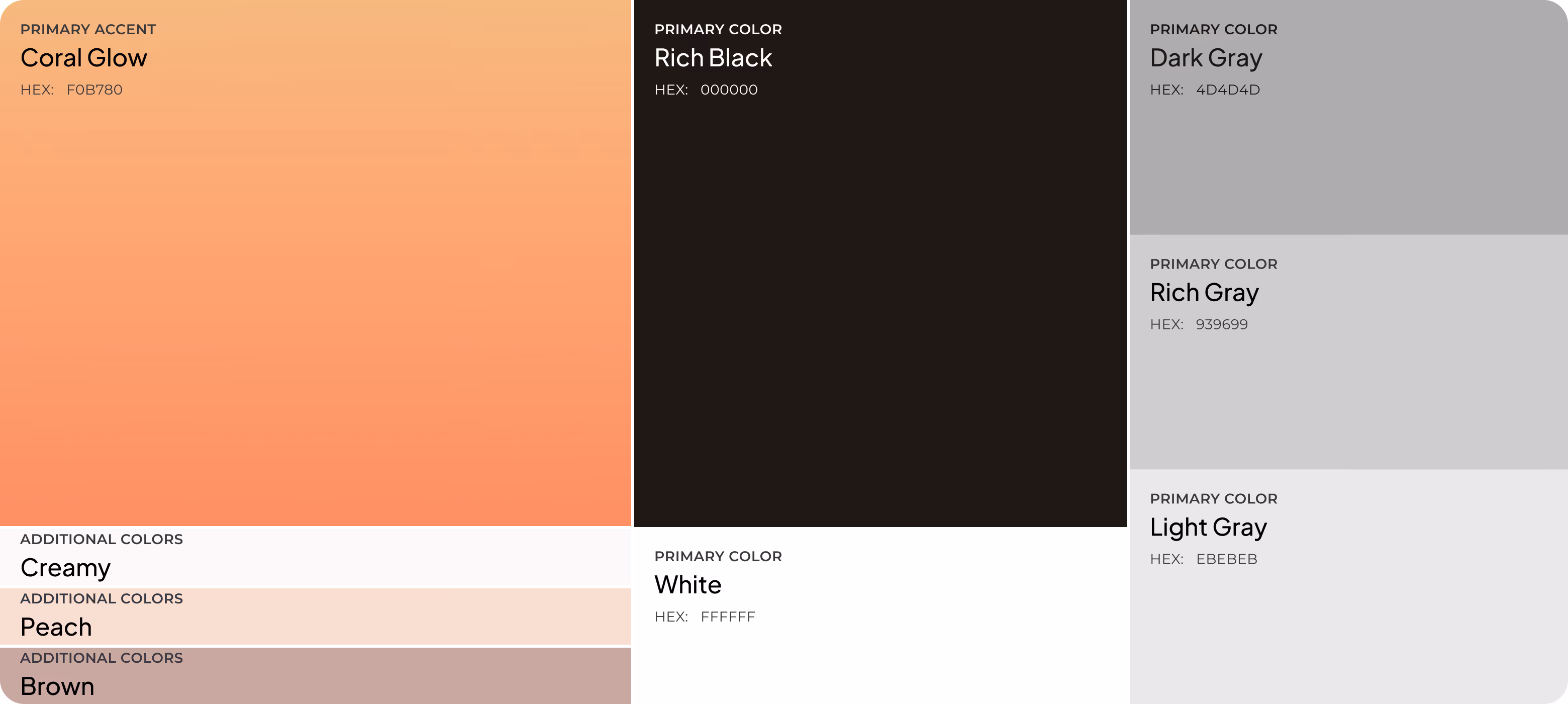
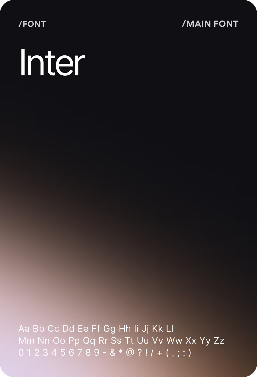
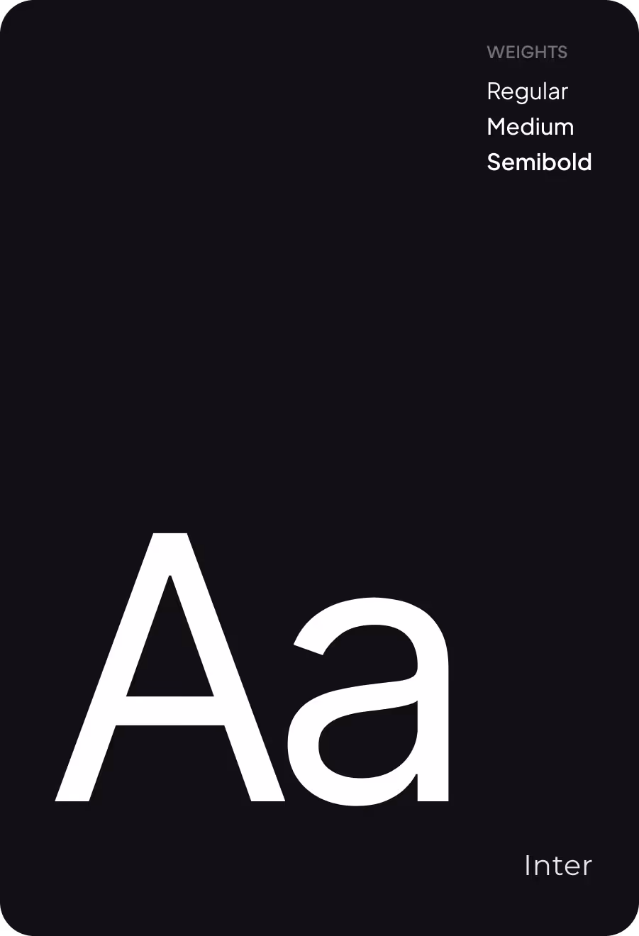
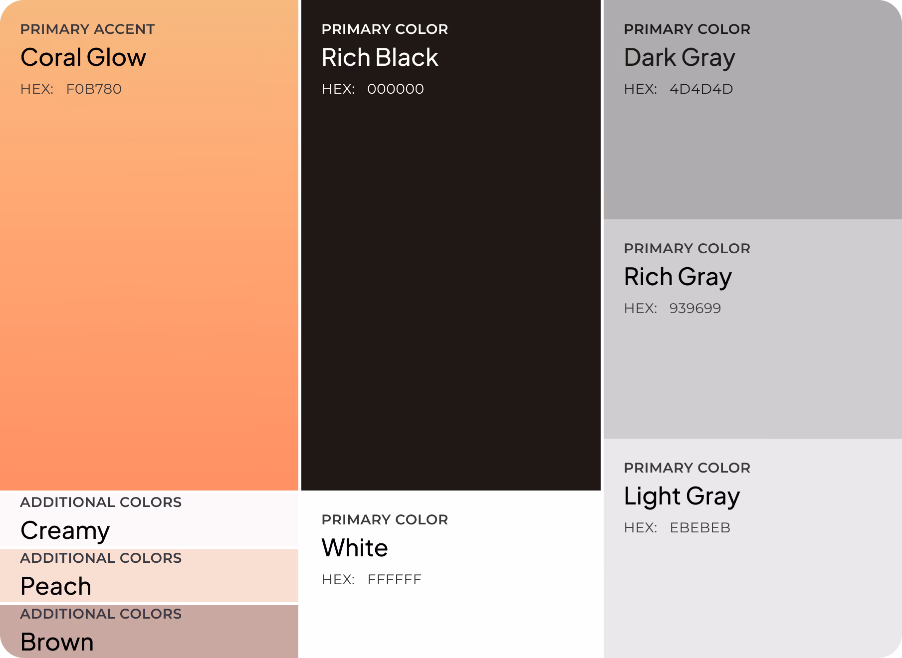
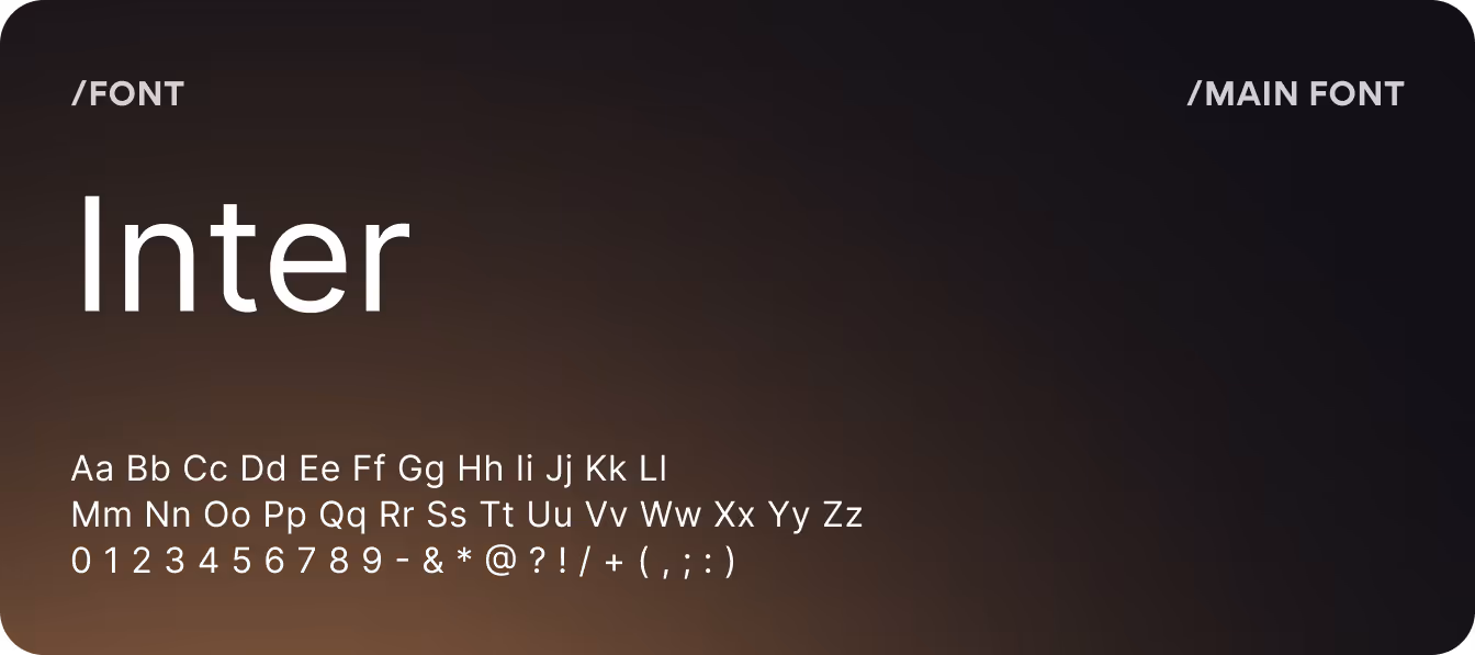
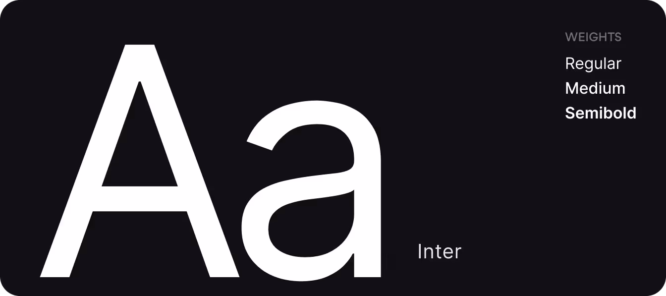
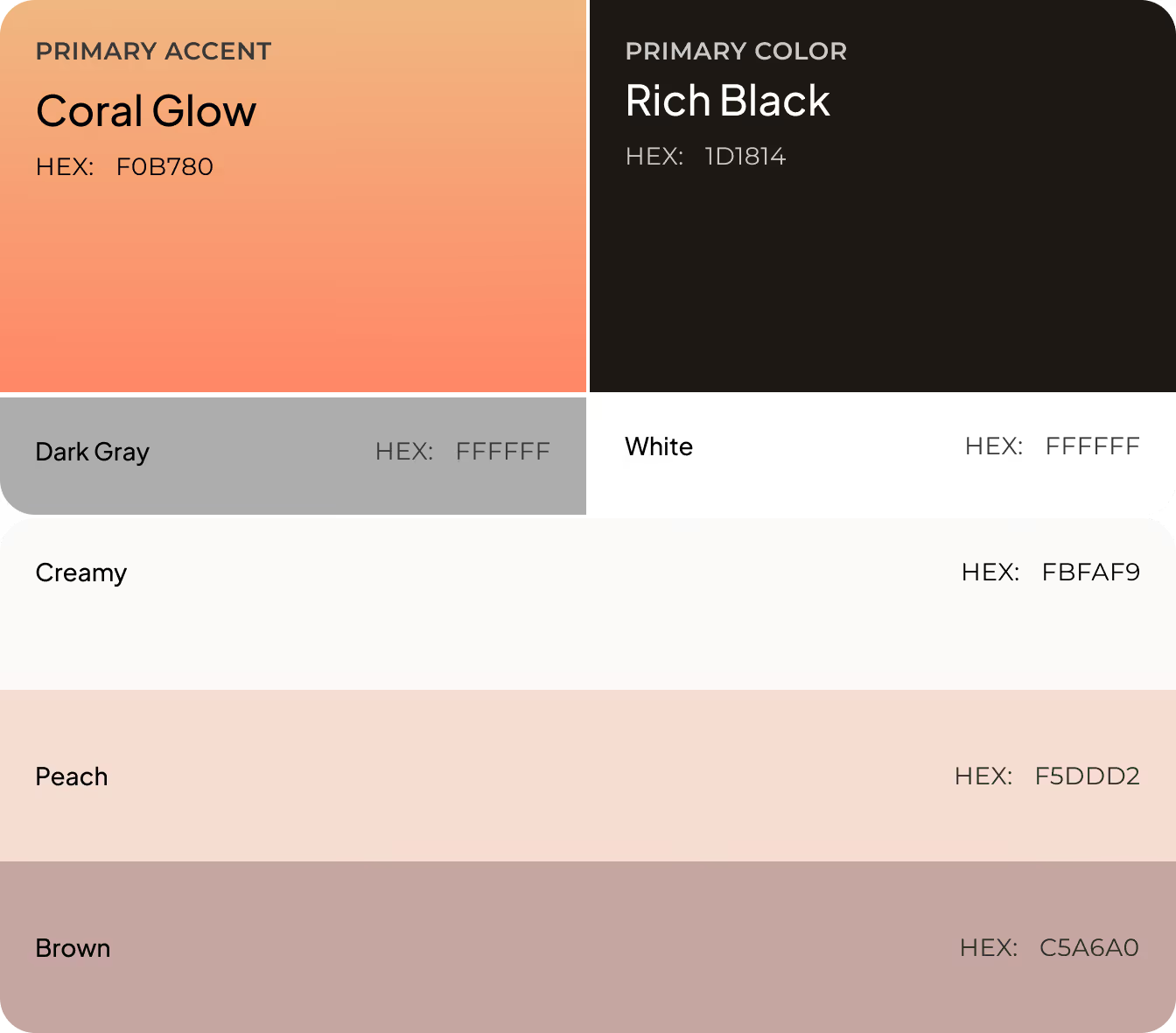
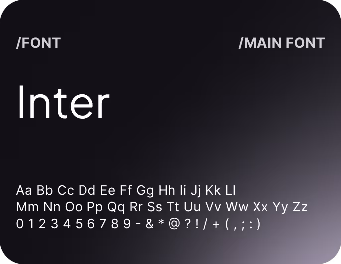
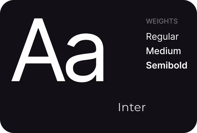
Colors &Typography
.avif)
.avif)
.avif)
.avif)
.avif)
.avif)
Results
+41%
Increase in average session duration.
A clearer hierarchy and the animated elements give users more reason to explore and drive deeper engagement with relationship insights.
+38%
Improvement in feature engagement.
Redesigned navigation and consistent visual language lowered the barrier to features and case tracking that users previously overlooked.
4.9★
Average user satisfaction score.
The redesigned interface matched the emotional sensitivity of the product's purpose and the expectations of its audience.
-27%
Drop in early-session exits.
Reduced visual noise and emotionally charged color states kept users in the app through content that, by nature, is uncomfortable to confront.
