
Dashboard Design for a Healthcare Monitoring Platform
UI/UX Design
Flexible interface for a data-heavy health product
About project
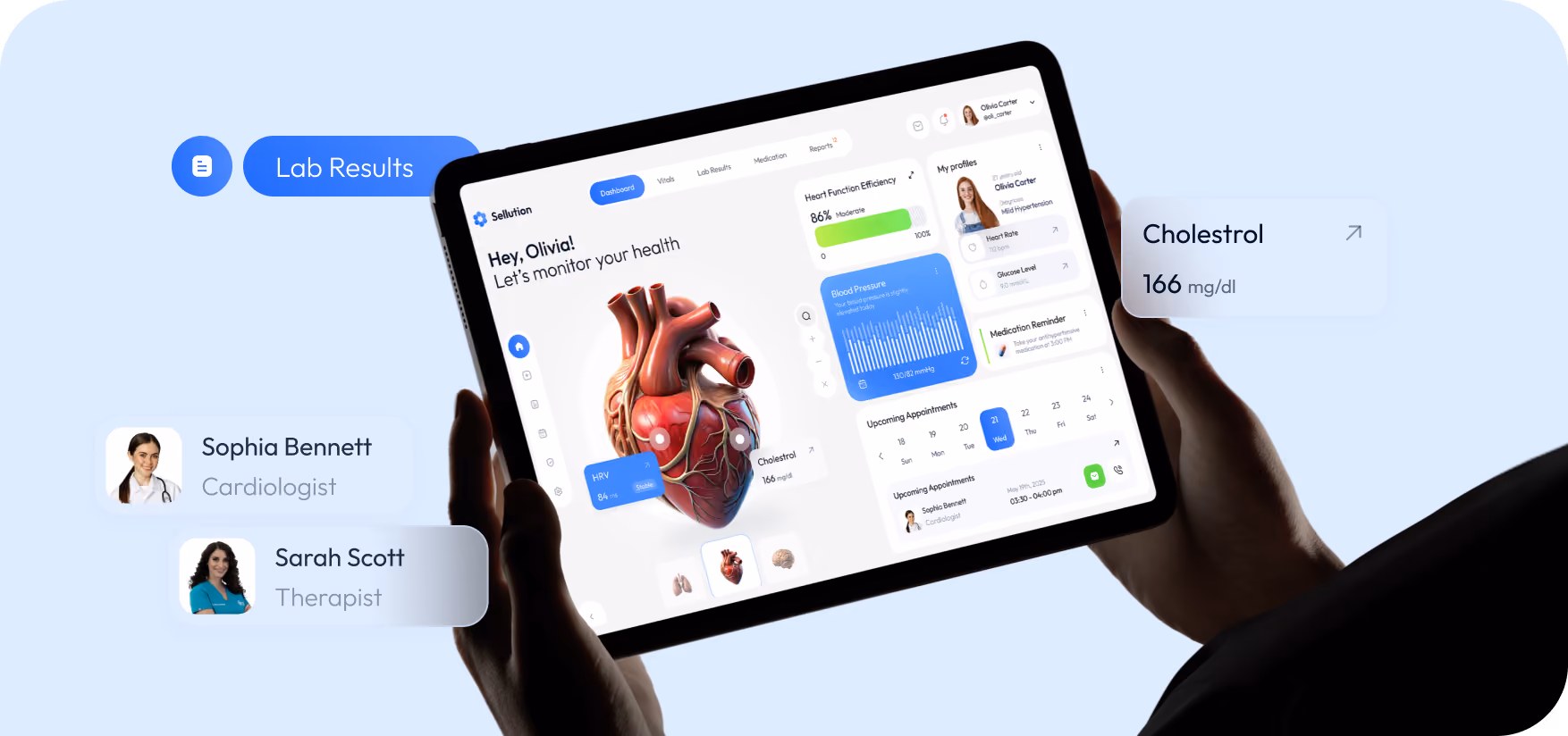
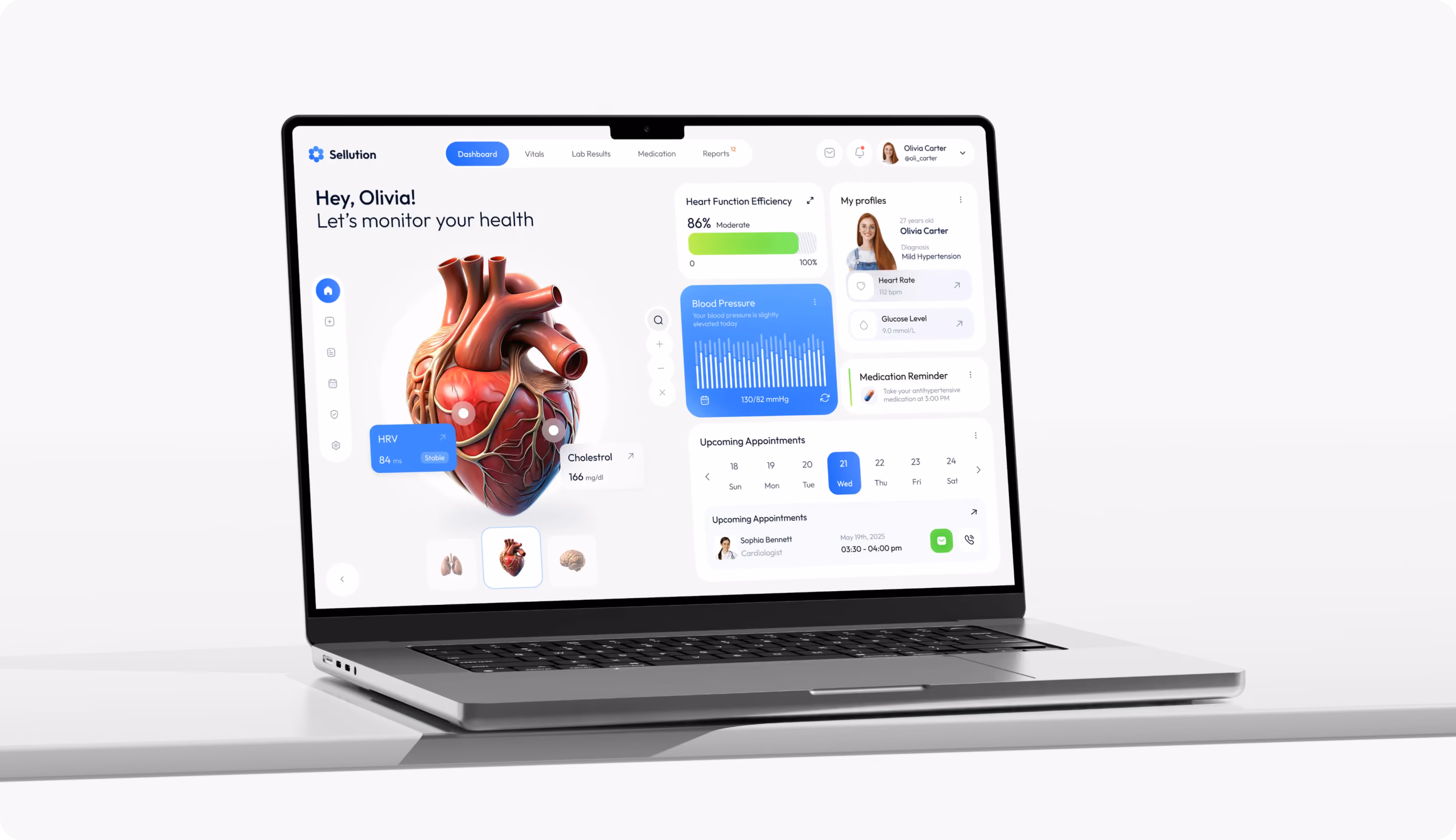
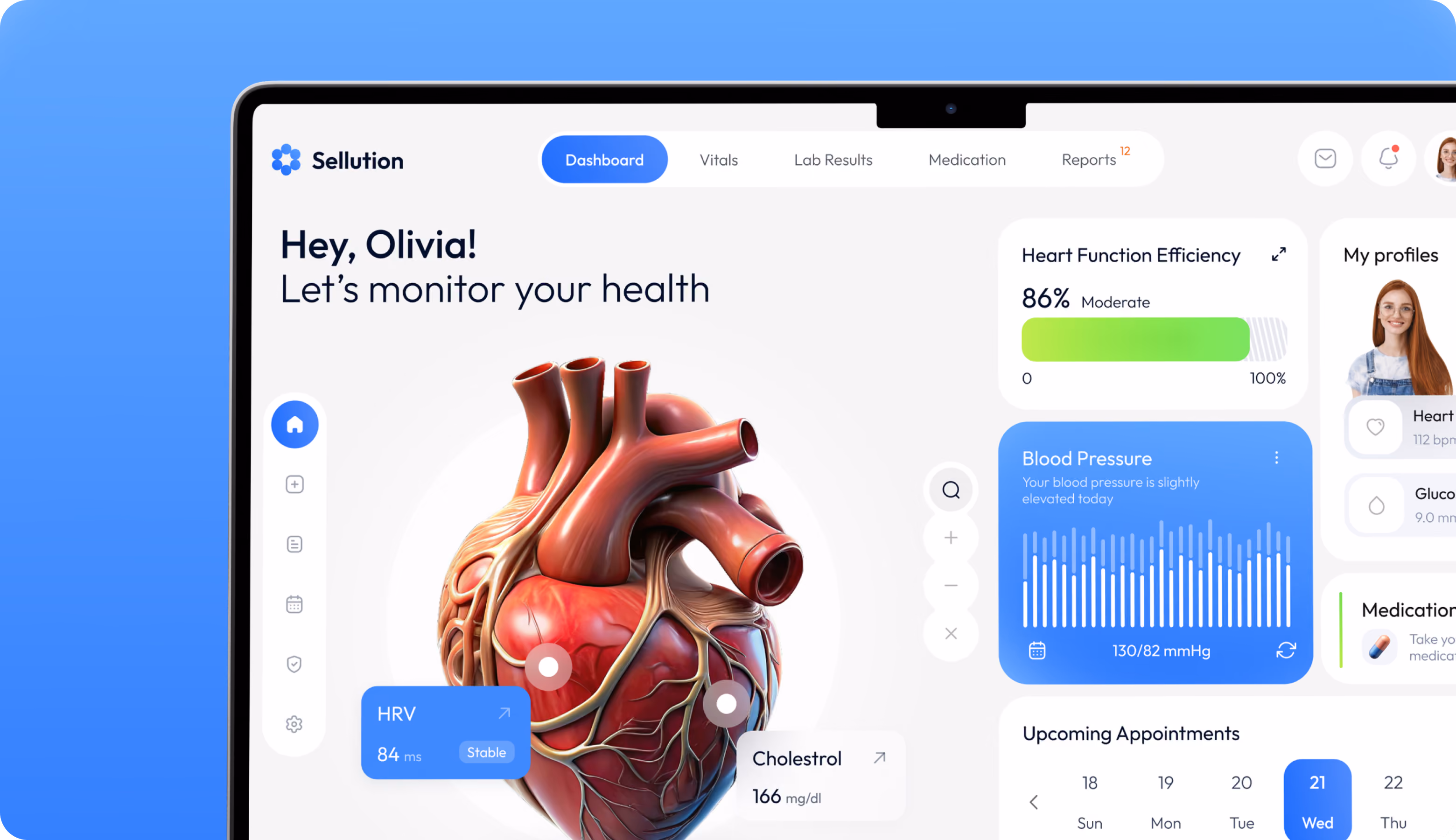
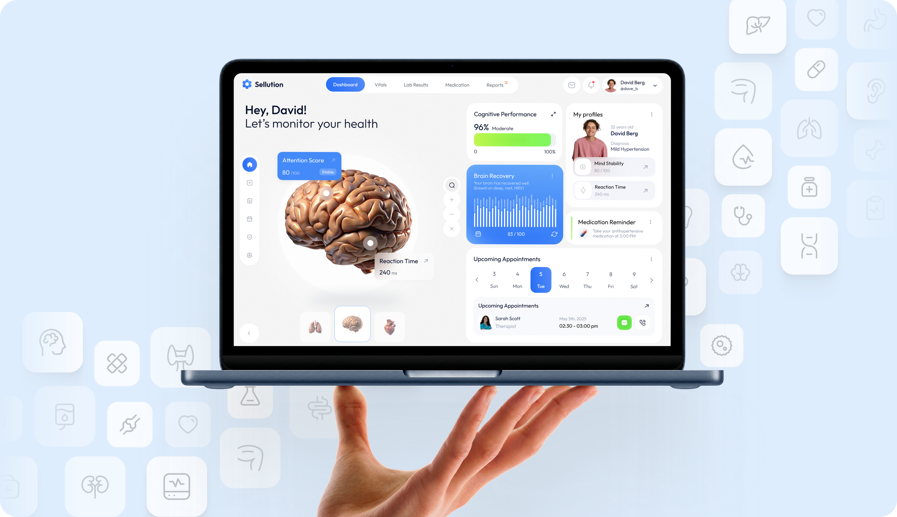
Sellution is a healthcare monitoring platform that tracks vitals like heart rate, blood pressure, HRV, and glucose in one place. Arounda designed the dashboard to present scattered clinical data as a clear daily overview, plus medication reminders and appointment tracking.


Challenges & Solutions
Problem
The aim was to arrange a large amount of medical data while maintaining a rigorous hierarchy between critical and secondary criteria. The most difficult thing was striking a balance between two opposing factors: a conservative sector that requires trust and a visually appealing product.
Solution
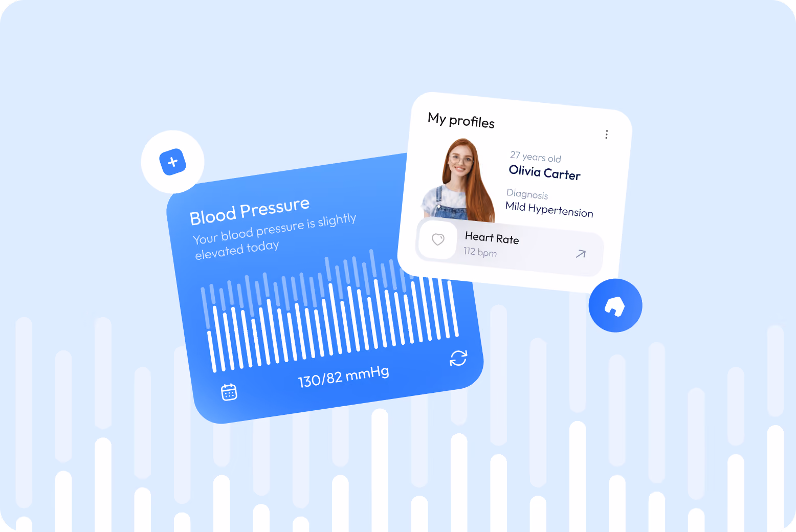
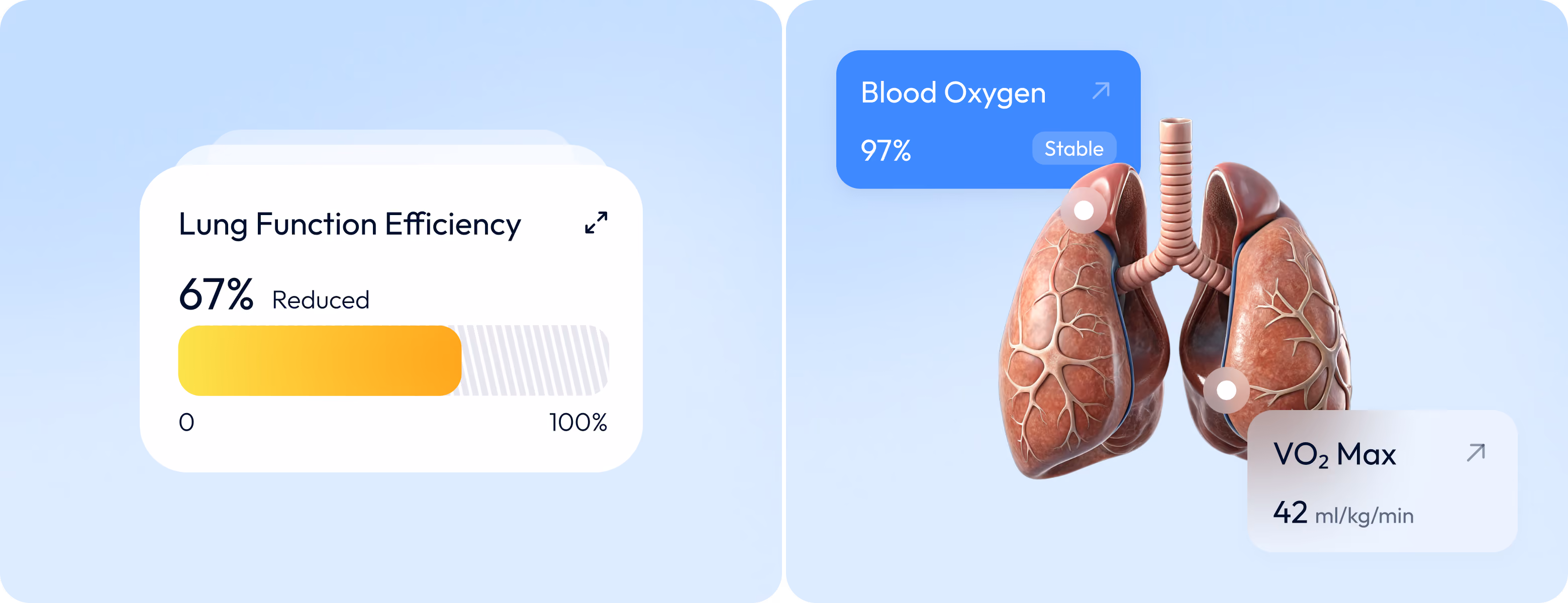
We built the dashboard to be modular, with a scalable component library. As a result, users can add new metrics and functionality without affecting the structure. Progress indicators, status labels, and reference ranges provide quick context for the numbers. 3D visualizations of anatomical models replace abstract diagrams, allowing people to visualize the structure of their bodies better.
App Flow
The information flow begins with vital signs on the health dashboard, where real-time metrics, information cards, and 3D organ models show users their current status. The next level consists of the Test Results, Medication Management, and Appointments sections. The user profile brings all these elements together and personalizes the dashboard display based on medical history and preferences.

Wireframing

Web Application Design
Every design decision addressed patients who need to know their health right away, and a company that grows via retention and trust. To reduce cognitive load, we used a user-centered design approach with a clear typographic scale, appropriate spacing, and high-contrast color. The idea was to encourage users to return to the dashboard out of habit. 3D elements with clear information provide Sellution a distinct identity that promotes brand recall and higher conversion rates than more clinical competitors.

Arounda designs healthtech products that drive daily use and retention.
Mobile Version
Most patients use Sellution on mobile devices. Every interaction happens in one hand and under a few seconds of attention. That's why we prioritized the screens users open most. The dashboard adapts to smaller viewports, summary cards stack vertically, and 3D visuals scale down without losing anatomical detail. The system stays responsive across screen sizes, and the experience feels native whether users check their heart rate during a workout or review lab results at home.


Instagram Layouts
Social design's job is to stop the scroll and communicate value before the user moves on. Our designers built the Instagram layouts around direct headlines and real product UI pulled from the app itself. Using the same visual system across posts and the product keeps Sellution recognizable in the feed. And each frame becomes a low-friction entry point for new users.

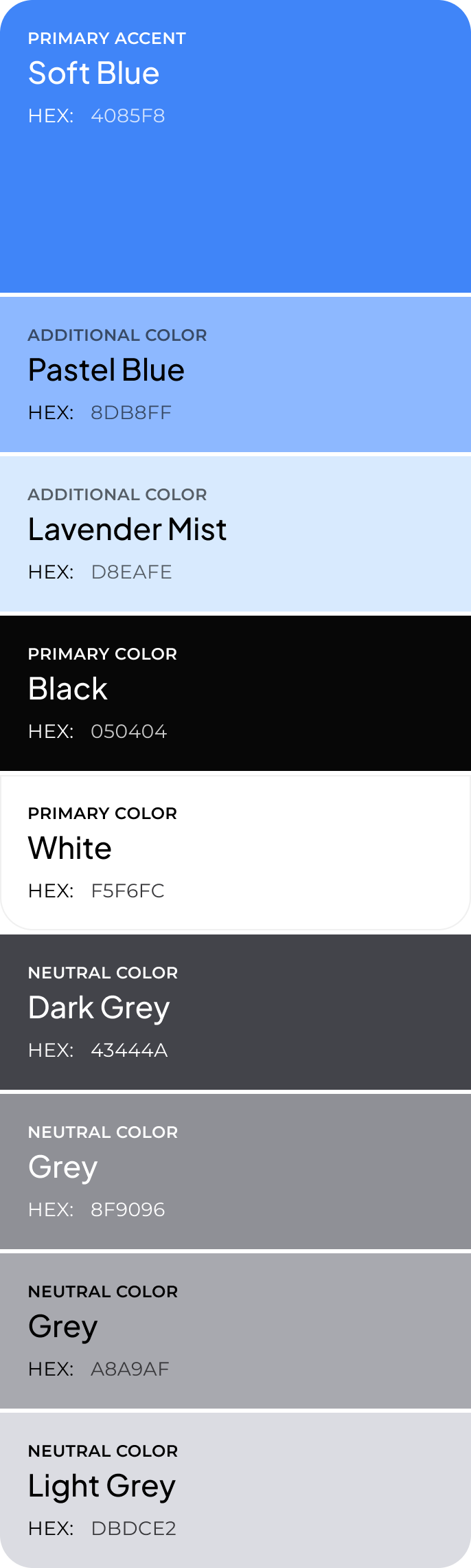
Design system


Results
62%
30-day retention rate
Reduced cognitive load and a habit-friendly dashboard turn first-time use into a daily routine and support long-term engagement.
3x faster
Time to interpret key health metrics
Progress indicators, status labels, and reference ranges replace raw numbers, so users understand their condition without a medical context.
0.8s
Average time to find primary vitals on the dashboard
The structure-first wireframing approach placed high-priority metrics in the user's first line of sight from the start.
120+
Reusable components in the design system
A flexible component library scales with new metrics, features, and user scenarios without breaking the overall structure.
