

About project
Solnex is a crypto-first platform that integrates digital assets with everyday balances in a single portfolio. Hidden fees and trader-led interfaces had already made people less trusting of the market the client was going into. Arounda designed the brand, website, app, and (out-of-home advertising) OOH system to make each amount visible early and keep the full asset picture within one flow.

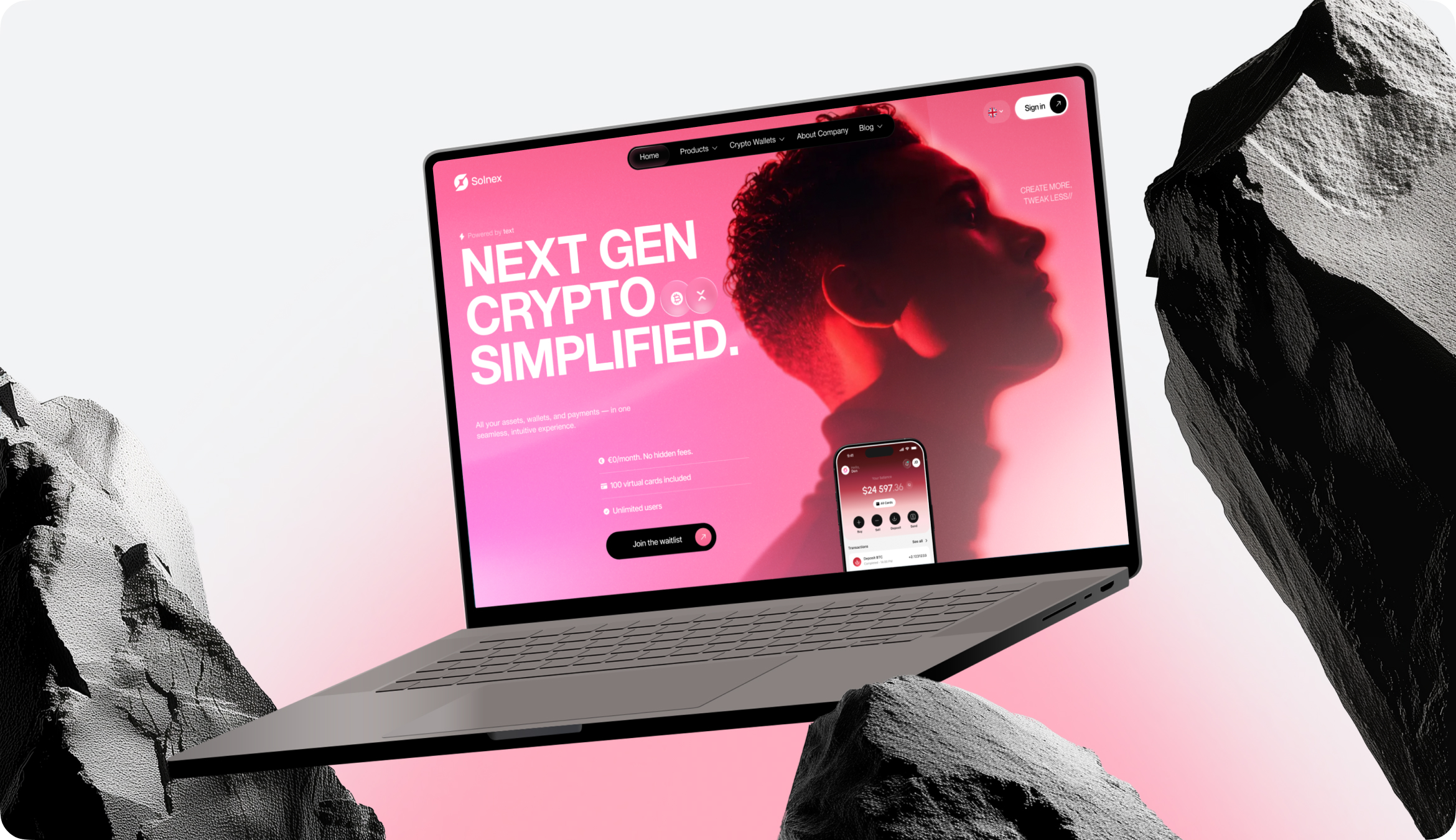

It became more difficult to trust simple transactions because of hidden fees, market-first home displays, and separate fiat and cryptocurrency balances. This could lengthen the learning curve for a new product and discourage consumers from returning after the first session.
We made financial visibility the product’s core logic. The users see all of their assets on the home screen when they first log in, and trade costs show up before approval. As a result, users are more likely to complete their first transaction and to return for future practical reasons.
Briefing & onboarding
Competitor analysis
Logo Concepts
Social Media
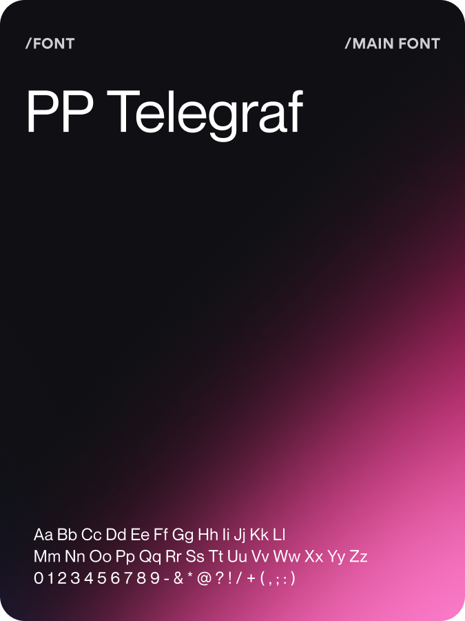
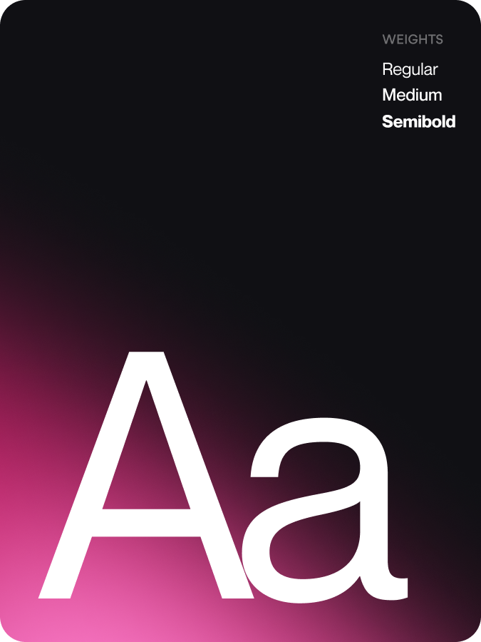
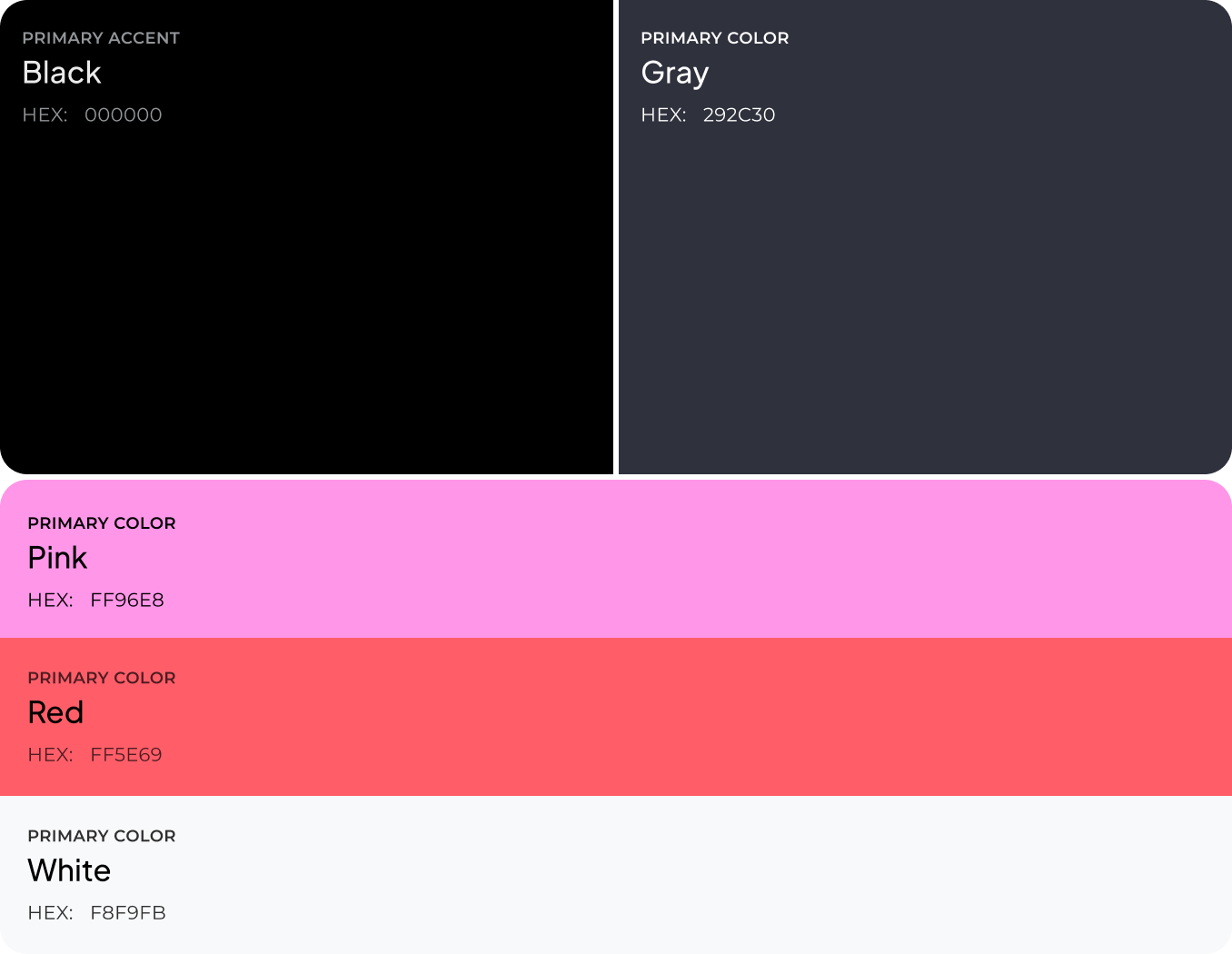
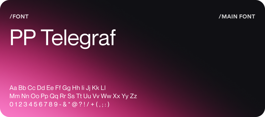
Brand Guidelines
Discovery
Wireframes
Moodboard
UI Concept
UI Kit
Discovery
App flow
UI Concept
UI Layouts
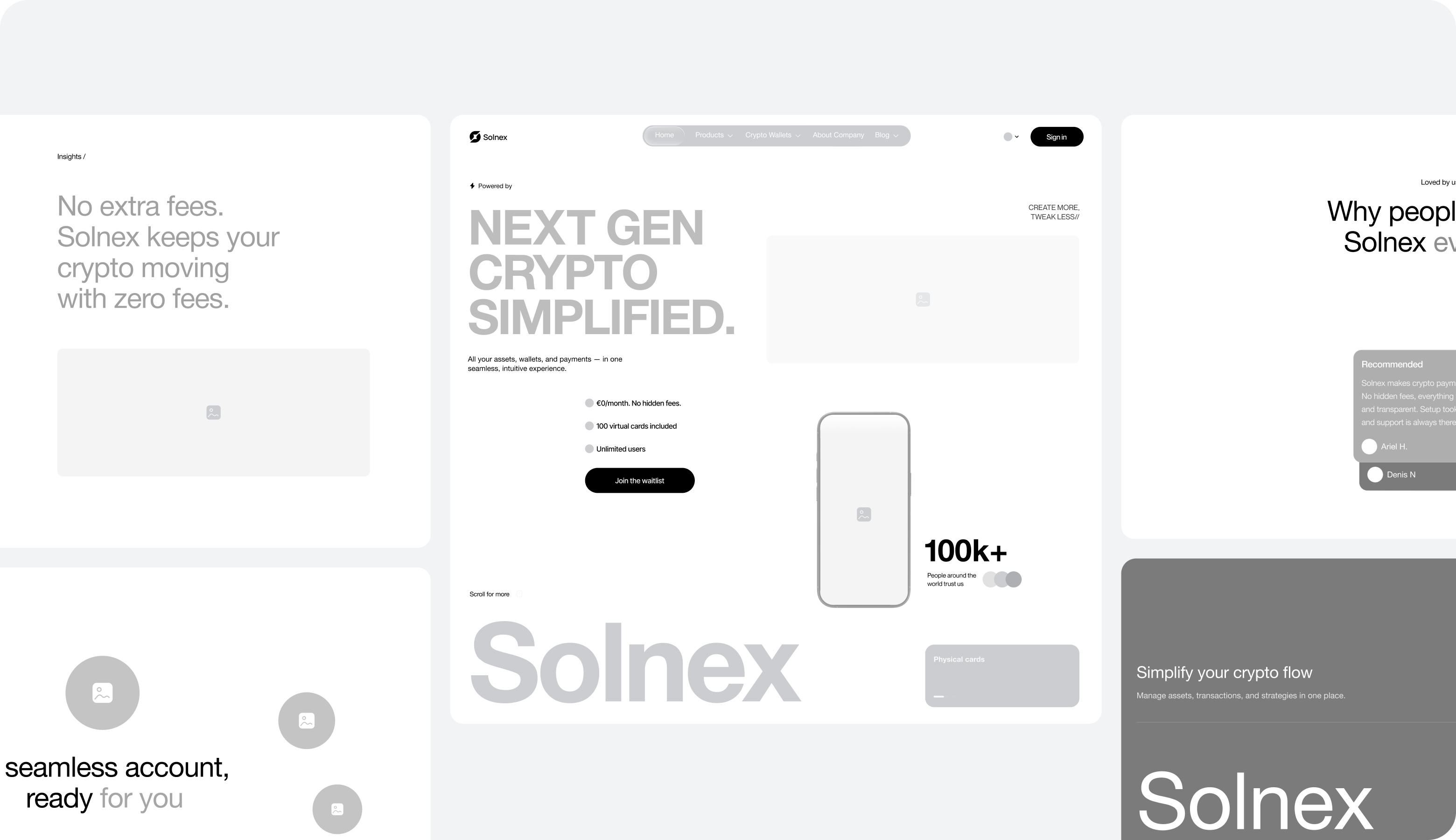
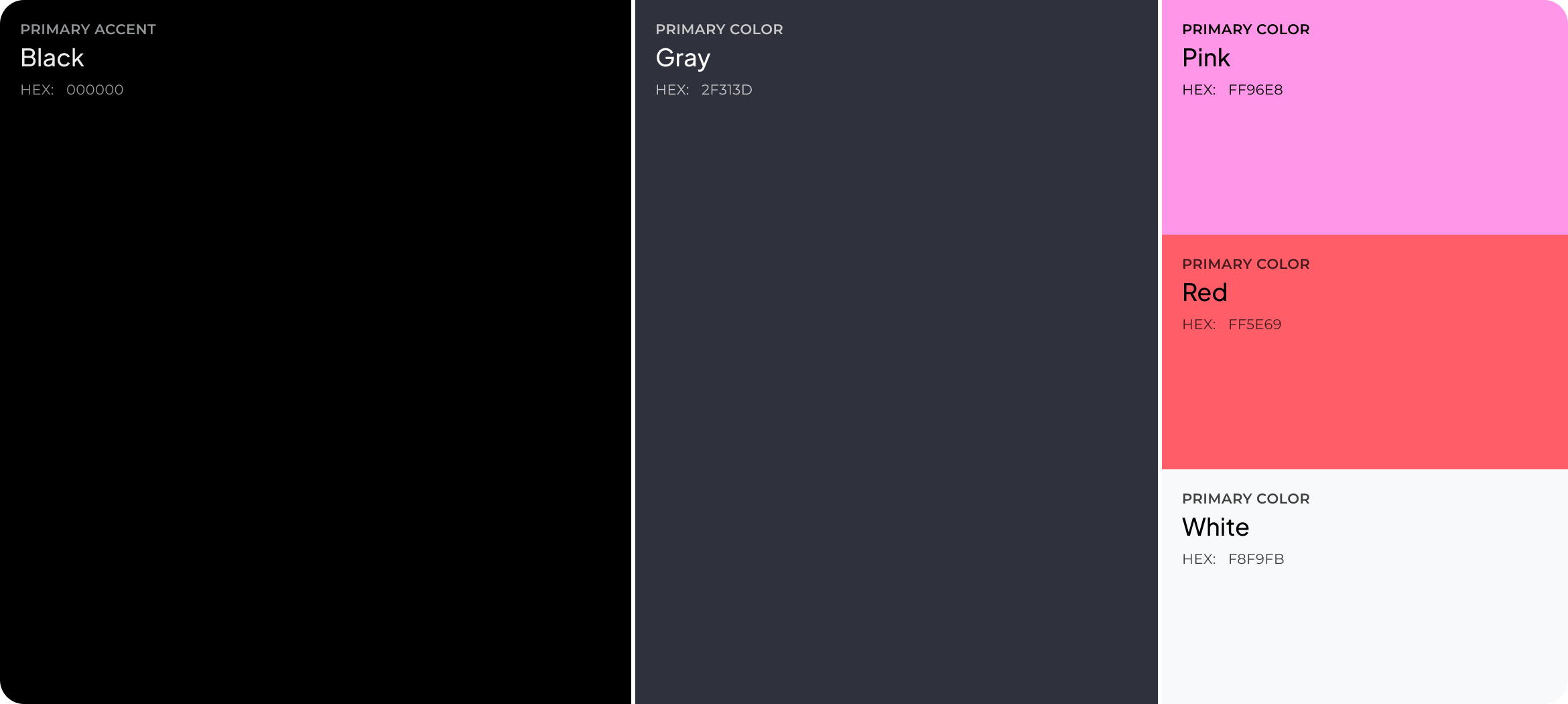
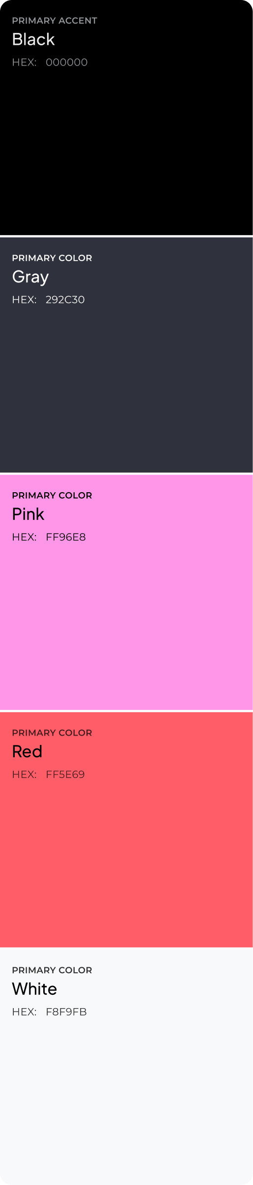
The designers at Arounda began by creating grayscale wireframes to test the page's structural integrity. Resolving concerns prior to enrollment ensured that each claim organically led into proof. So that visual impact wouldn't make up for poor logic, the team didn't use the black-and-magenta style until after that.
Our design team worked to craft an S-mark that, even at 24 pixels, retains its shape and is easily readable on a billboard. With one scalable form, there was no need for different logos, so the brand's identity stayed the same at launch.
Before asking users to sign up, Solnex had to demonstrate the product's functionality. So, the landing page starts with account statuses and numbers, allowing users to evaluate the platform by looking at the product. Even during onboarding, the consistent visual logic serves to minimize relearning and increase the number of users who are able to accomplish the first meaningful activity.


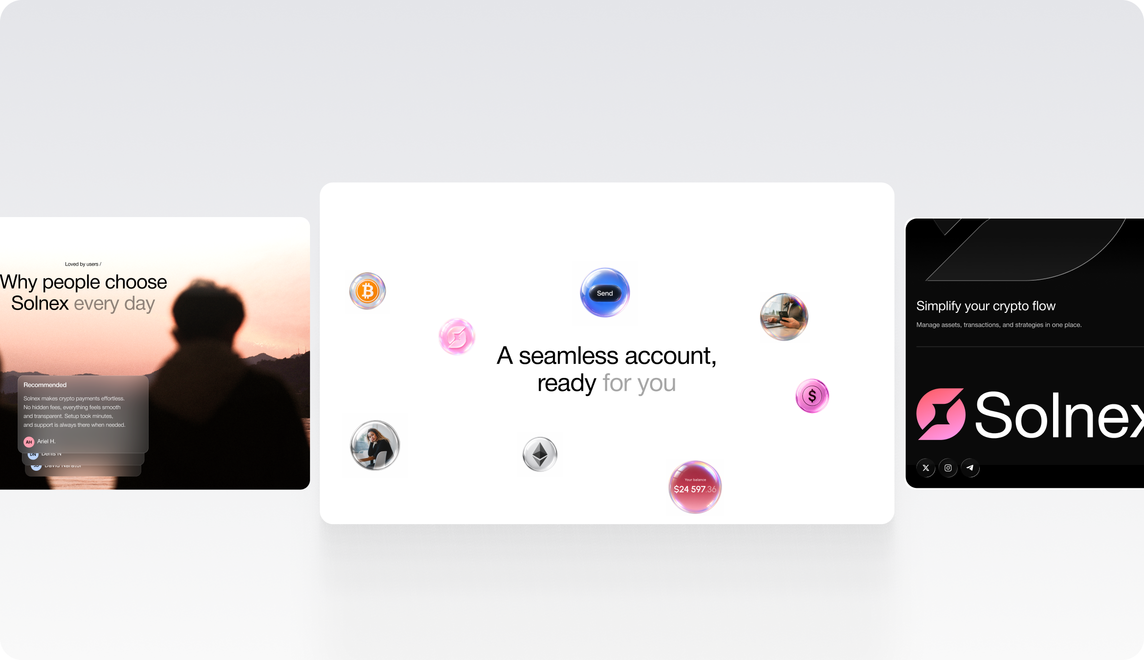
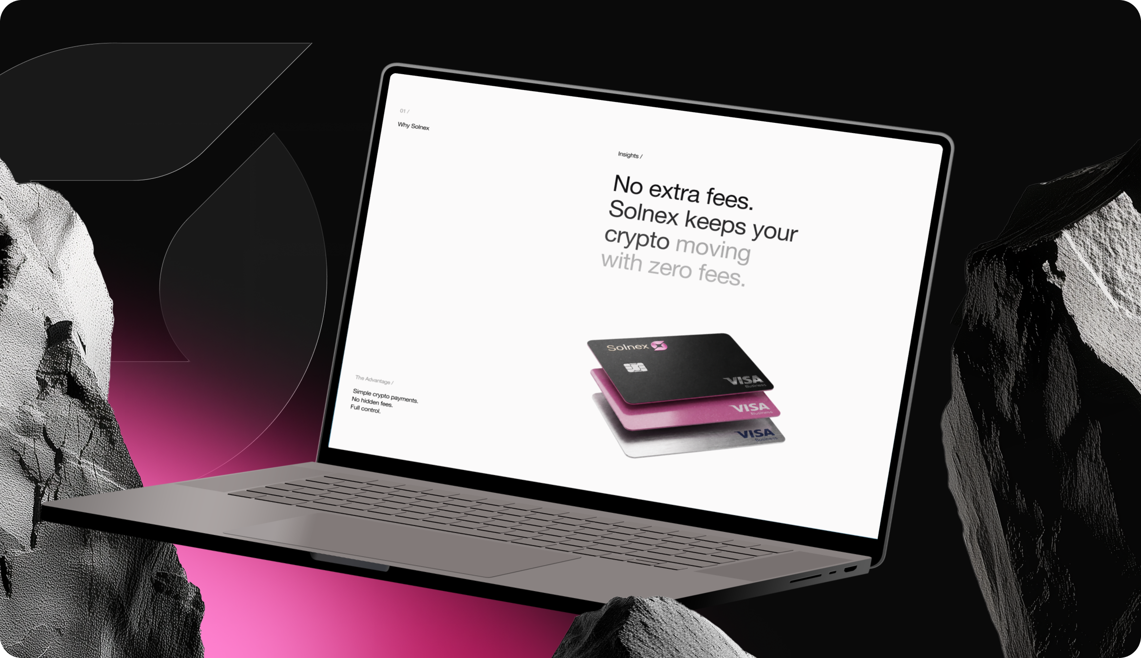

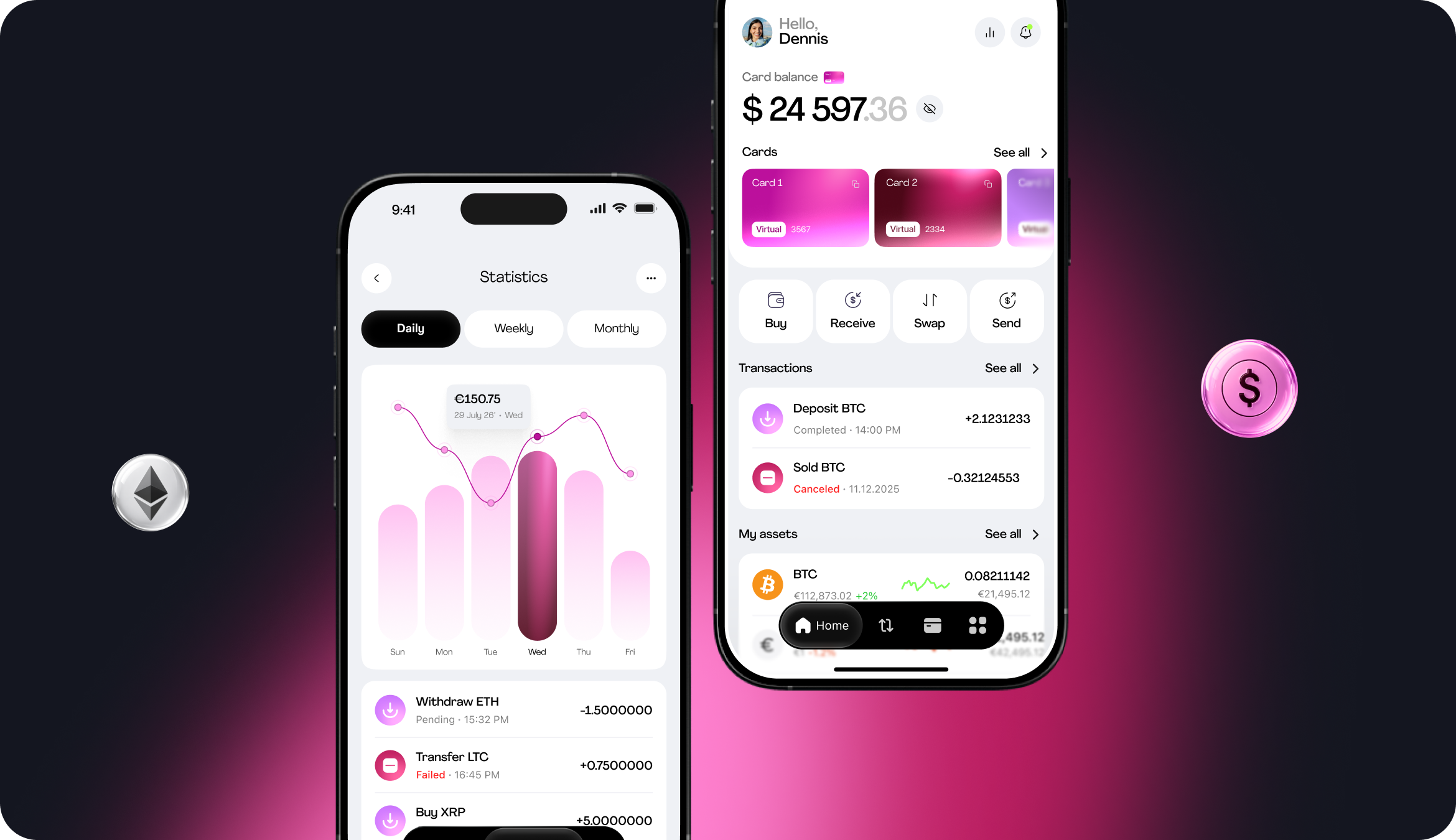
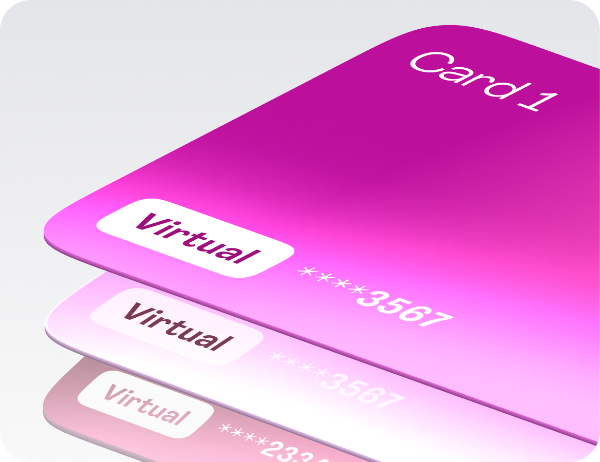
With the app's logic built into the product, users won't have to relearn anything once they've signed up. With a single dashboard that consolidates both daily balances and cryptocurrency, users can get to the important steps faster and come back with a clear goal in mind.
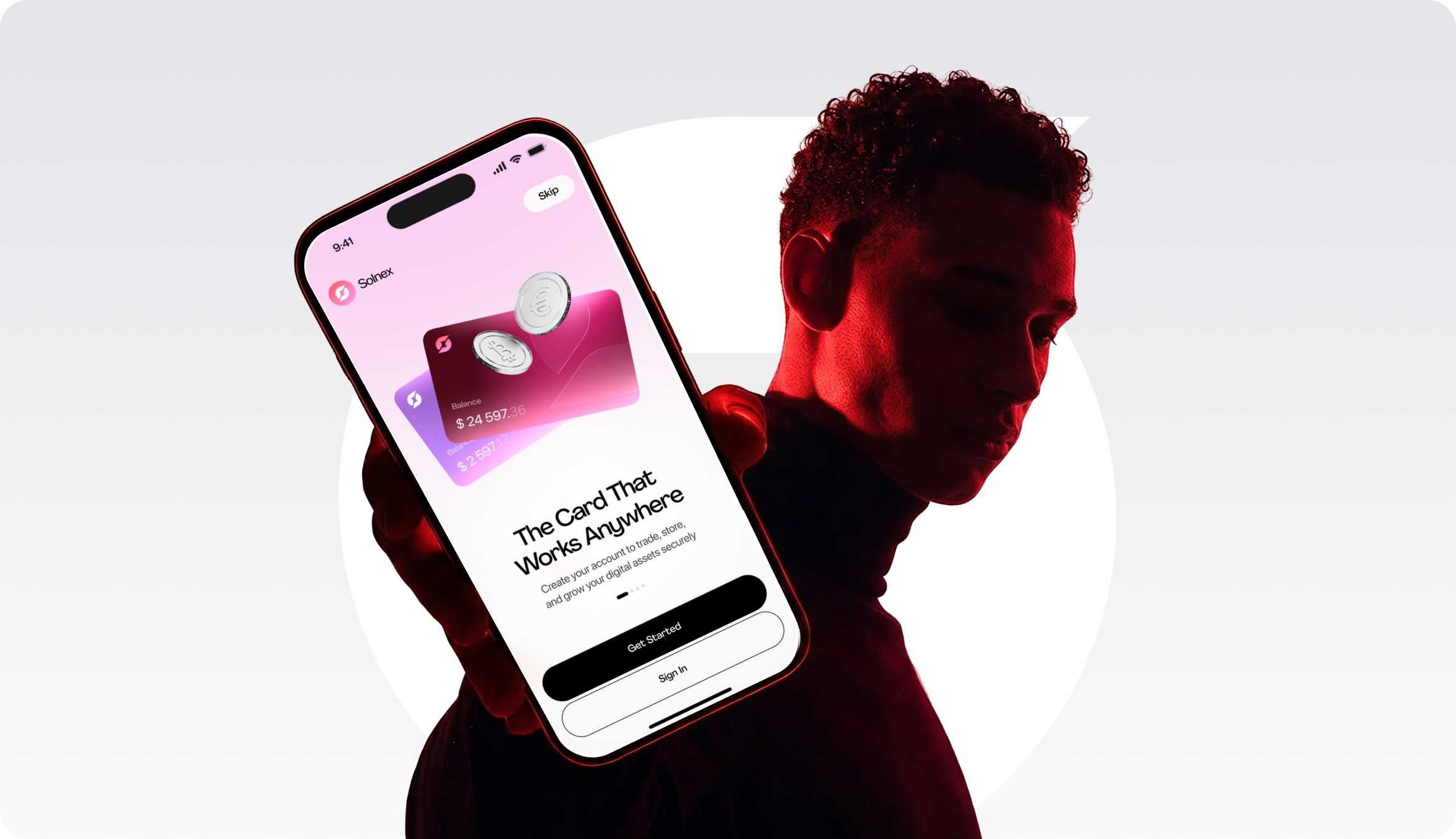

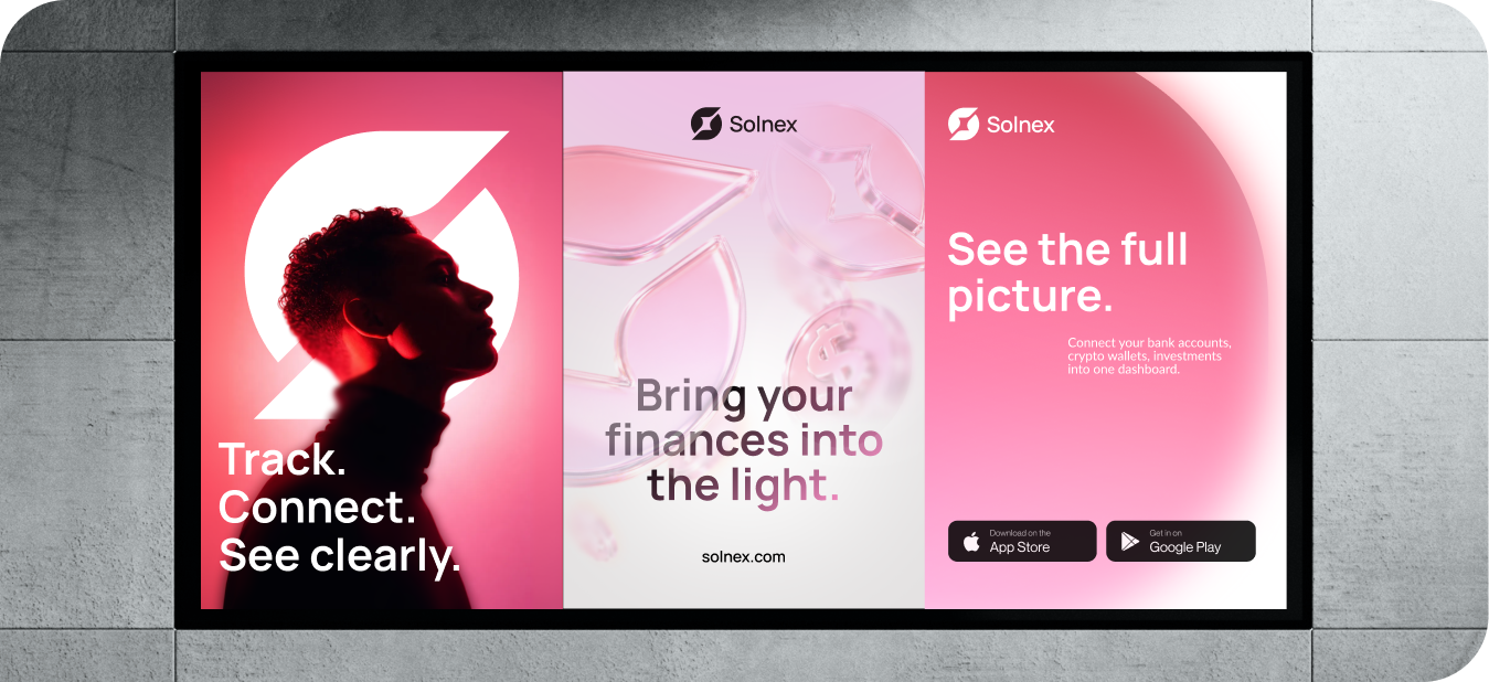
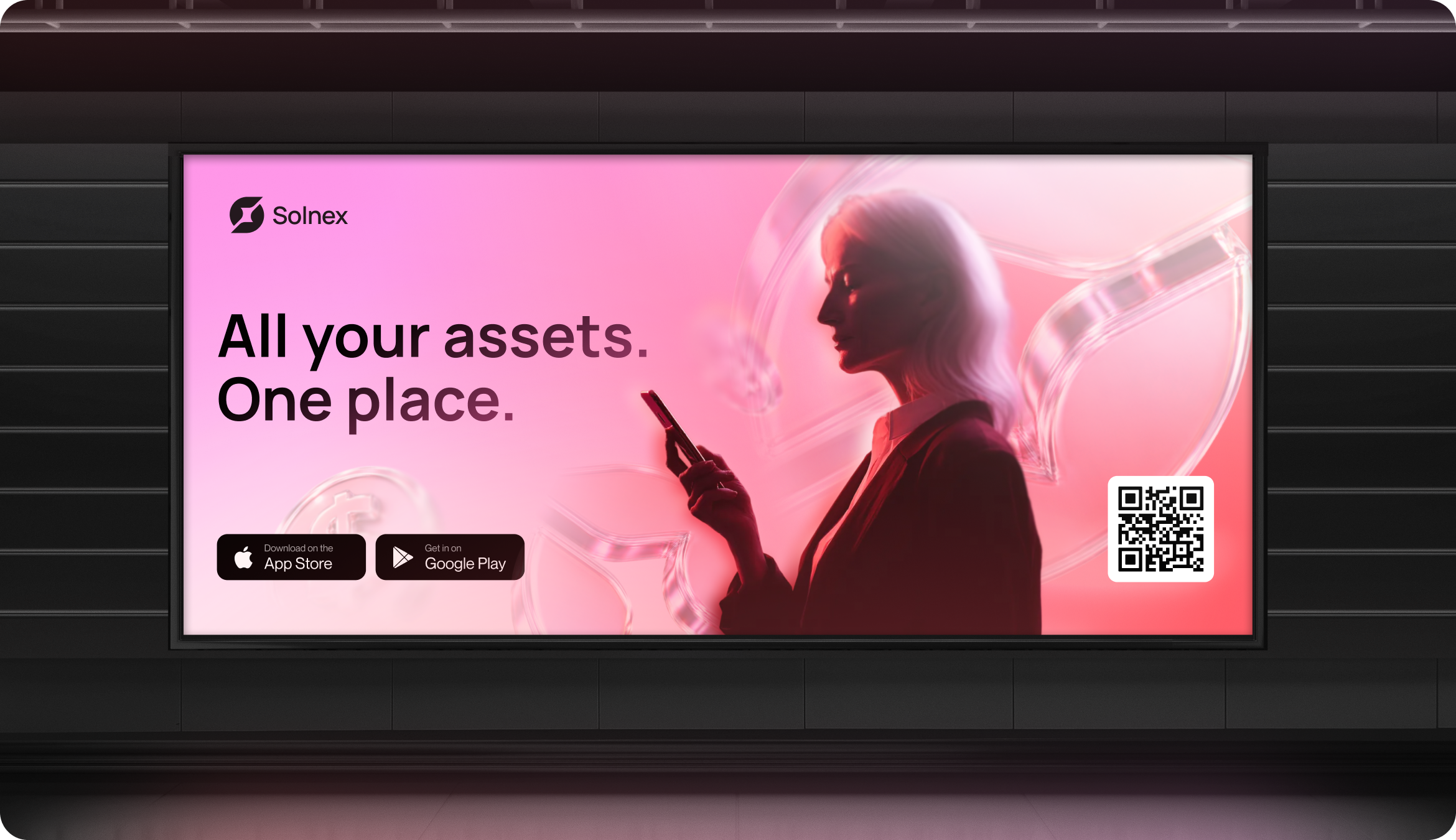
We considered out-of-home as an acquisition channel with a three-second dwell time. One message was used to explain Solnex's worth, and the QR code was left as the only next step. Because of it, people were able to grasp the product in a flash, remember the brand better, and go straight from offline reach to app installs.
The unified dashboard helped users understand their total balance twice as quickly by combining everyday money with crypto.
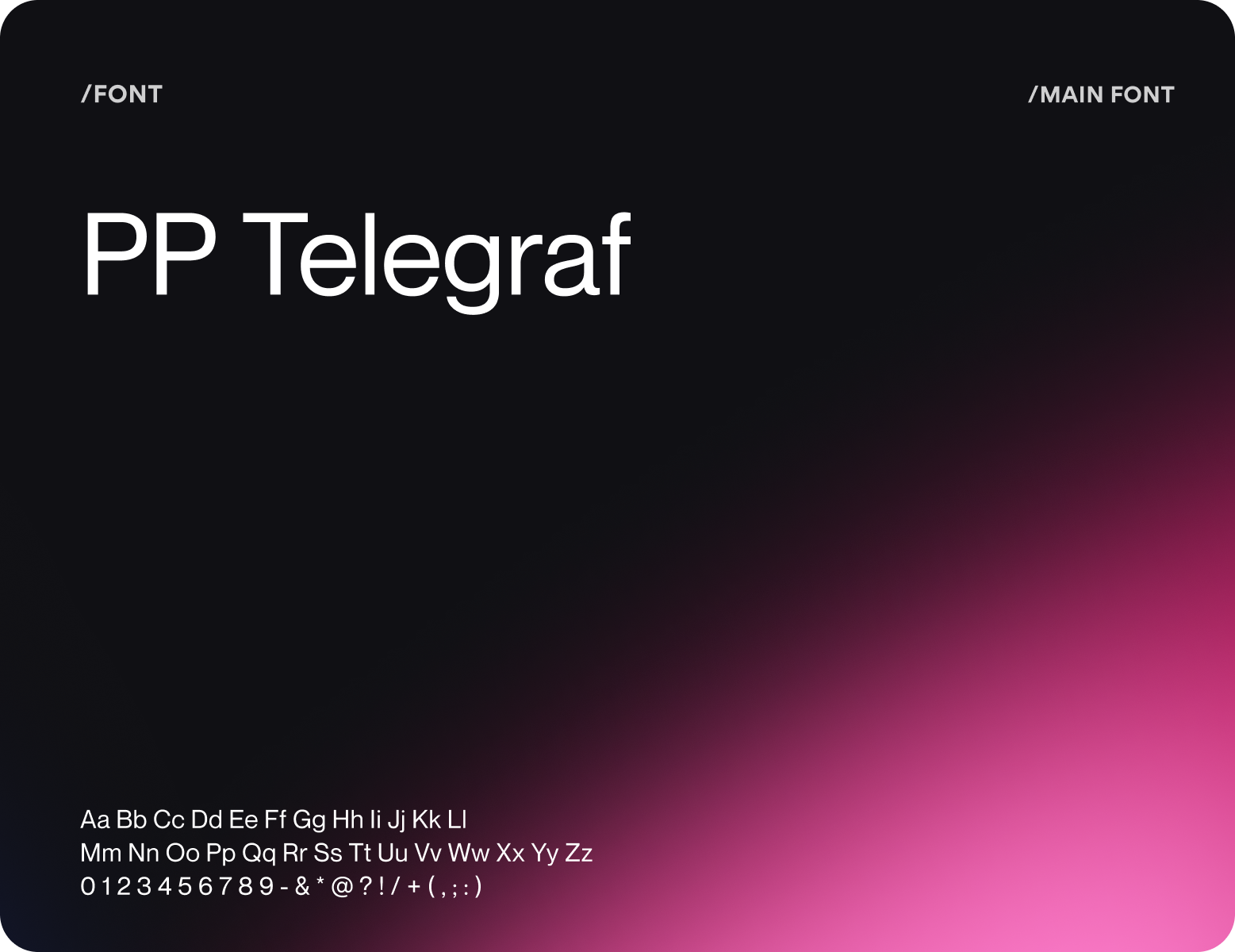
People were able to recognize and remember Solnex after just one short exposure thanks to the geometric S-mark and focused visual system.
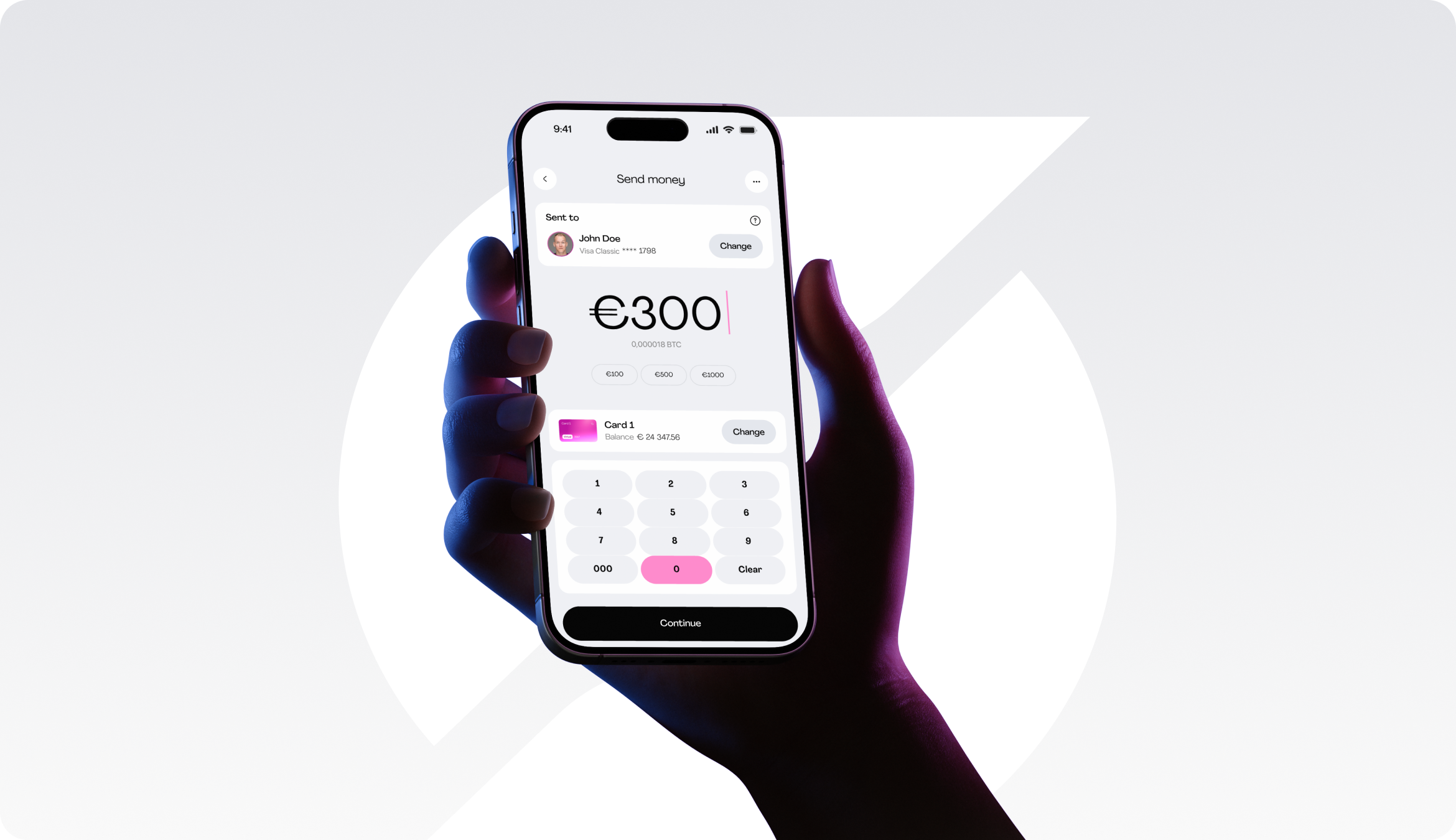
Showing costs before confirmation helped users understand the final transaction amount before committing their money.
The shorter flow helped more users complete their first crypto action without backtracking or leaving the process.
