.avif)


Branding
Graphic Design
About project
StockGate is a crypto investment platform that combines portfolio management, crypto exchange, and financial insights to help investors at every experience level manage digital assets. The client needed to launch with a brand that could compete on perception and support user confidence.


.avif)
Without a distinct visual identity, StockGate risked becoming just one of dozens of crypto platforms that look reliable enough to be simply ignored. Our Arounda team needed to create a branding system that would reduce the risk of user churn by clearly demonstrating the platform’s reliability. Our design solutions had to convey security, transparency, and financial confidence.
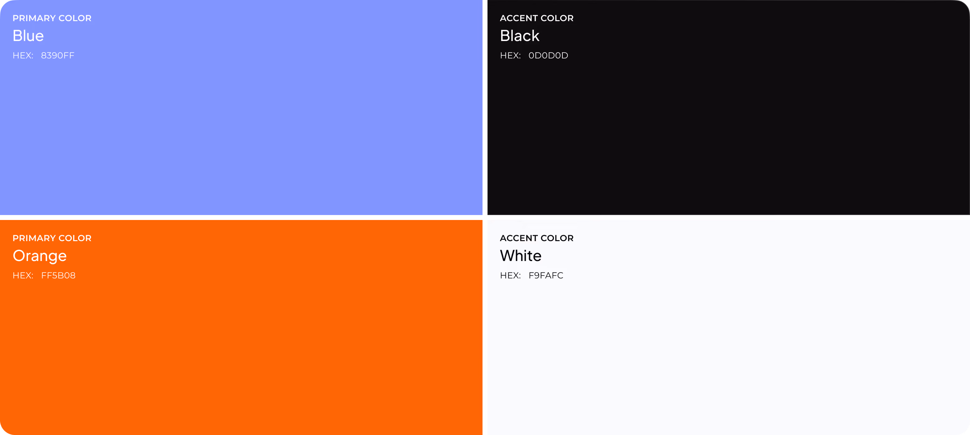
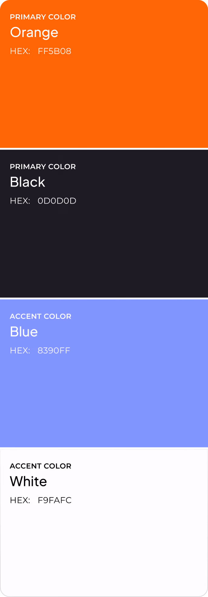
Our brand designer created a visual system that combines photographs of people, bold minimalism, and a palette of orange, blue, and black. This sets the platform apart from competitors, who tend to use cold and technical interfaces. The brand identity mitigates negative first impressions and gives the platform a trustworthy, recognizable identity that helps increase conversion rates.
Briefing & onboarding
Scope
Copywriting
AI Image generation
Moodboard
Concept design
Printing materials
.avif)
The StockGate logo has two offset geometric forms that lock together to suggest simultaneous movement and stability. It communicates the core promise of a crypto investment platform that keeps assets in motion and maintains structural control. The mark is readable at app icon scale without relying on fine detail or color. The full identity system holds in monochrome and across reversed backgrounds to scale consistently across product, marketing, and third-party placements.
.avif)
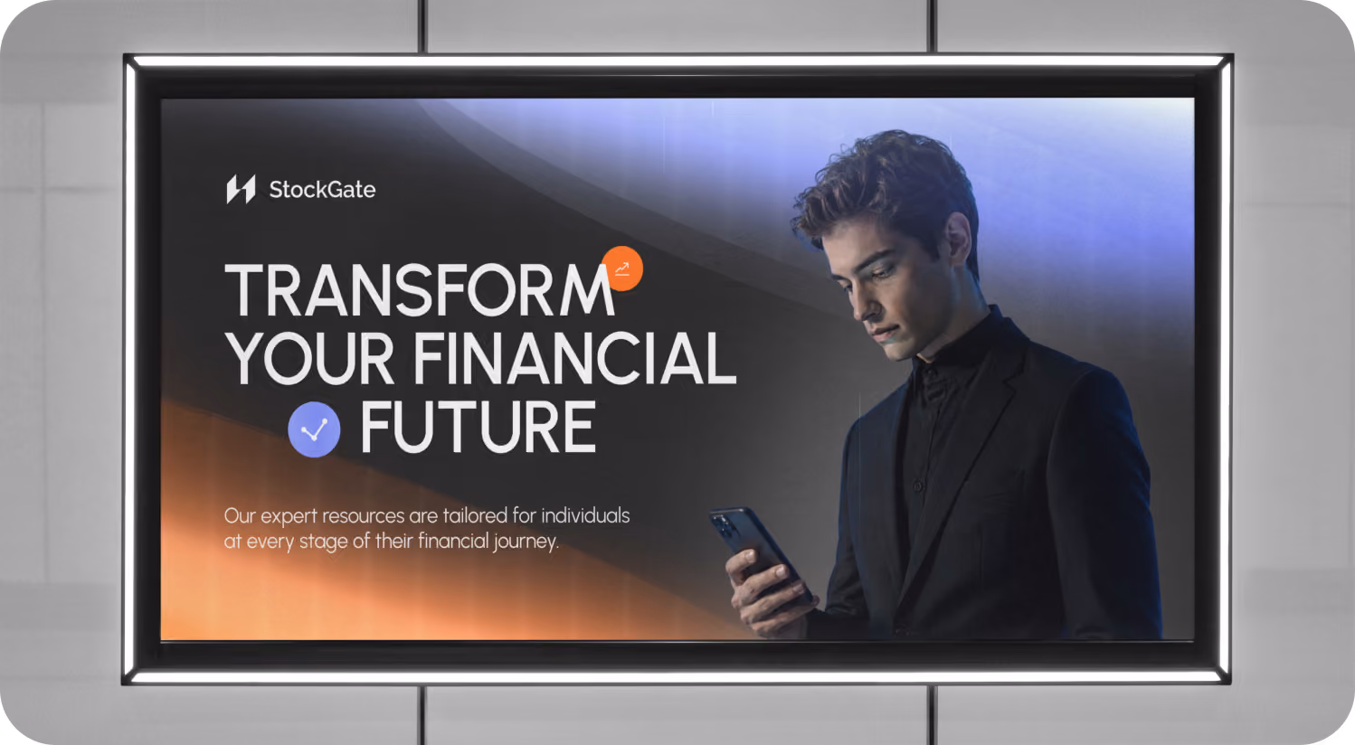
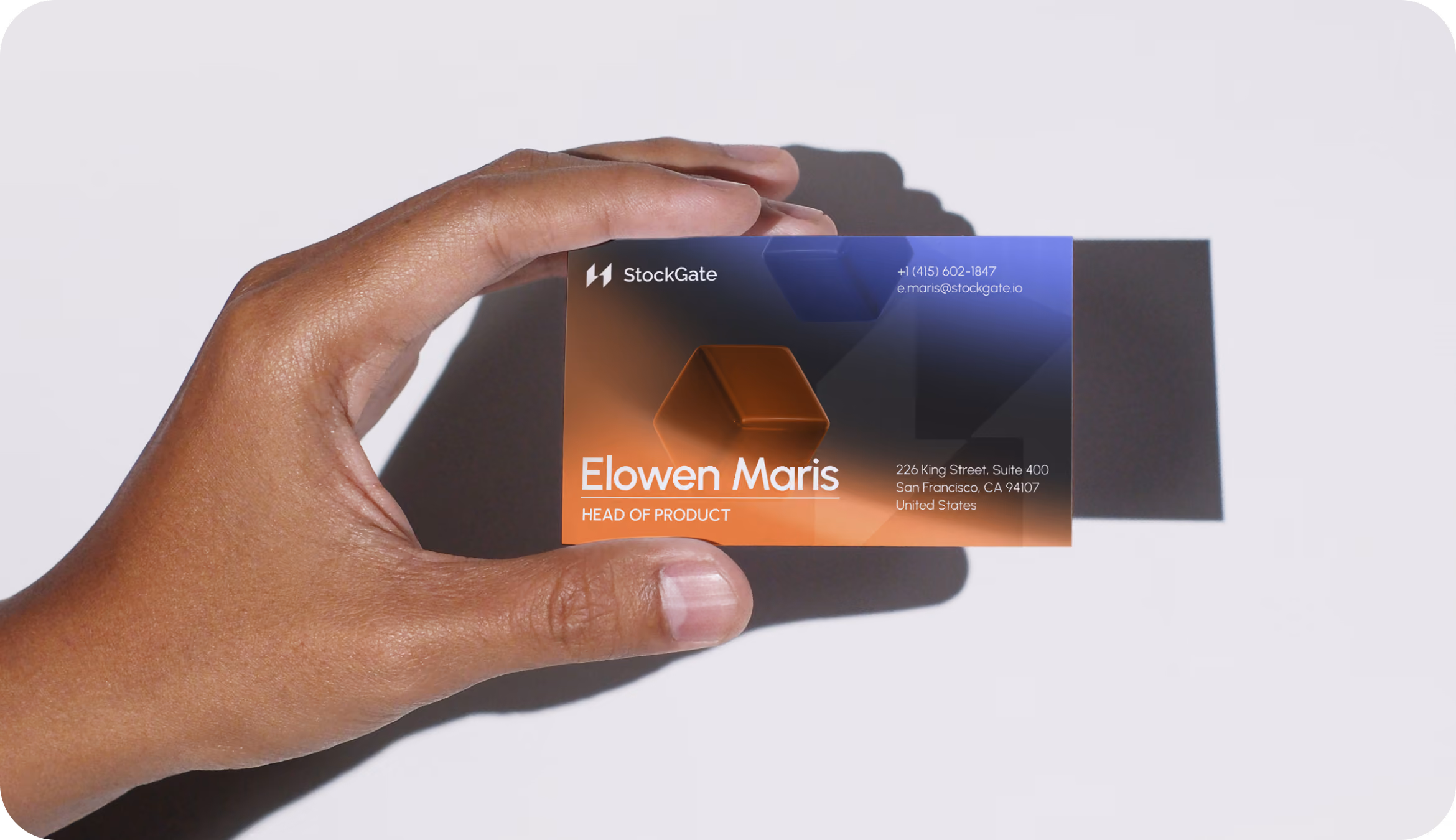
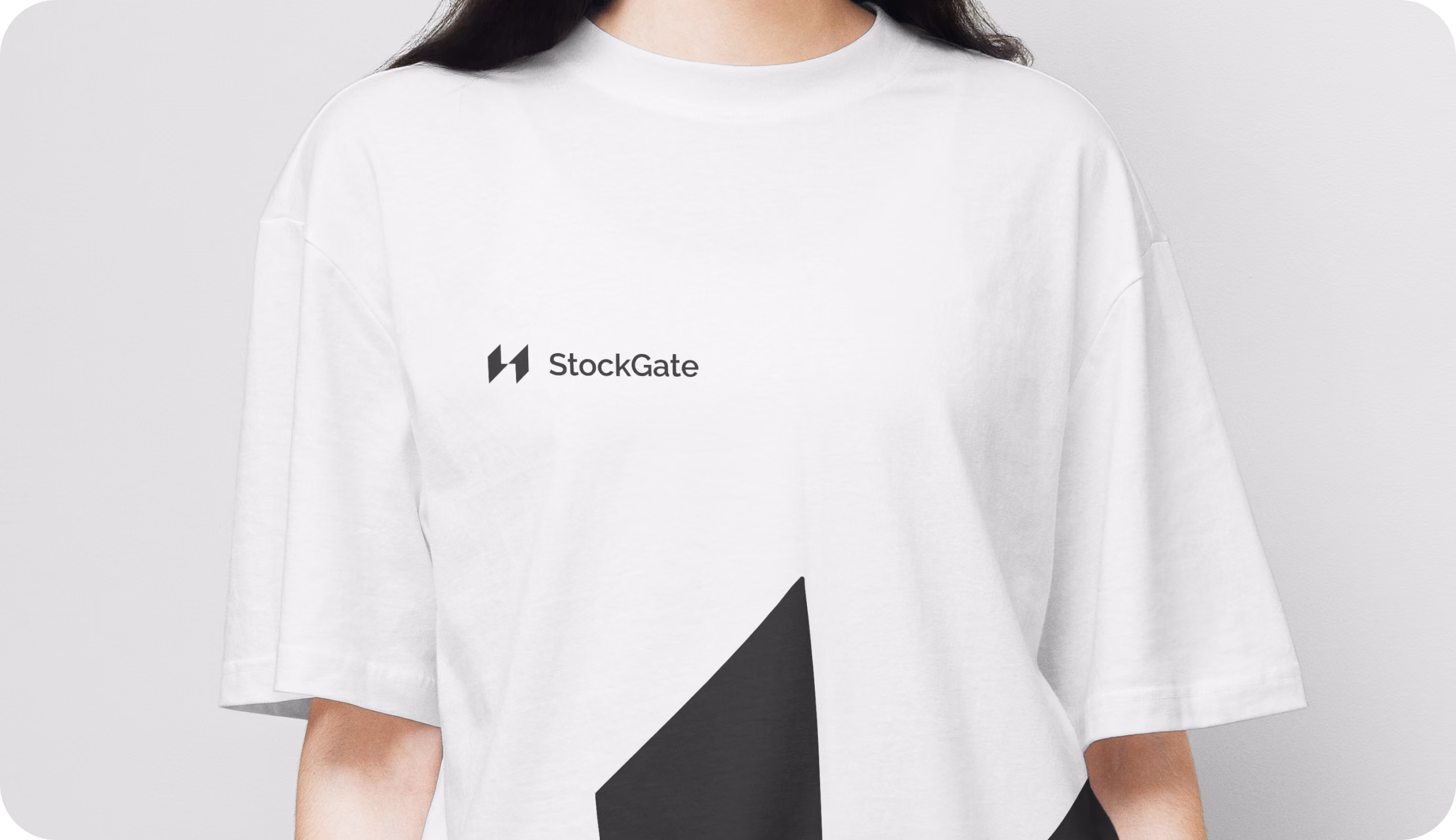
We extended the brand system across outdoor advertising, business cards, and branded merchandise. That cross-surface consistency supports StockGate's business goal of building institutional credibility. A brand that shows up with the same visual confidence offline as it does in the product is one that investors are more likely to trust before they open the app.
.avif)
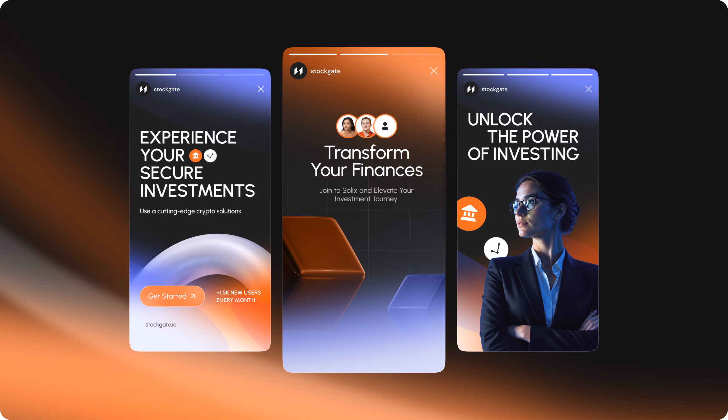
Our design goal was to stop a user in mid-scroll. We blend headline typography, human photos, and 3D brand elements to create a consistent visual structure that is instantly recognized across placements. Each banner helps StockGate reach its user acquisition objective by converting paid and organic social traffic into platform sign-ups.
.avif)
After seeing the branded landing, social assets, and offline materials, users were more likely to consider creating an account compared to competitors.
Users were able to distinguish StockGate from typical crypto platforms thanks to its warmer visual direction and human-centered design system.
Most tested users said the human-centered visuals, clear brand structure, and confident color system made the platform feel safer to explore.
Users rated the identity as more mature, credible, and investment-ready than competitors' common crypto brand visuals.
