
Mobile App Design for a Digital Banking
Reducing drop-off through information sequencing
About project
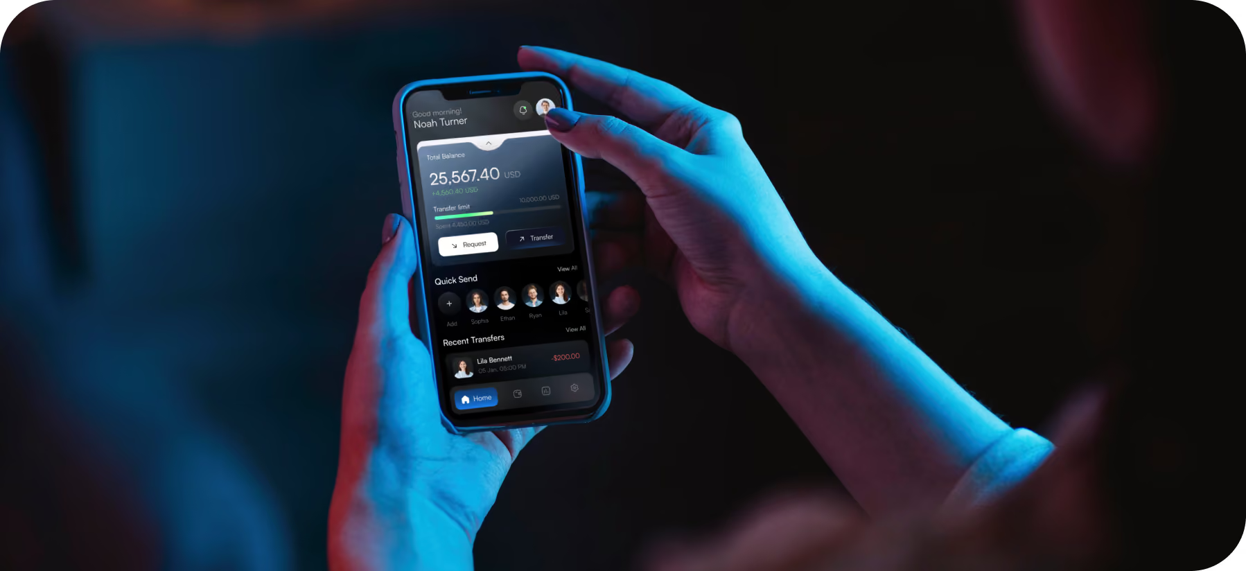
Vault is a mobile banking app built around four everyday tasks: real-time balance, spending-limit tracking, quick transfers, and monthly budget trends. The client requested to solve user drop-off in core banking flows and build trust with busy professionals and first-time digital banking users.



Problem & Solutions
Problem
Competitors’ financial apps have a long control panel with charts, limit indicators, transaction lists, and promotional offers. They force users to scroll through more than six tabs of metrics before finding their balance. Completing a money transfer required 5–8 taps. User reviews of the app, along with our own testing, confirmed users’ frustration with this cluttered interface. The issues we identified included slower app adoption, lower trust levels, and higher user churn.
Solution
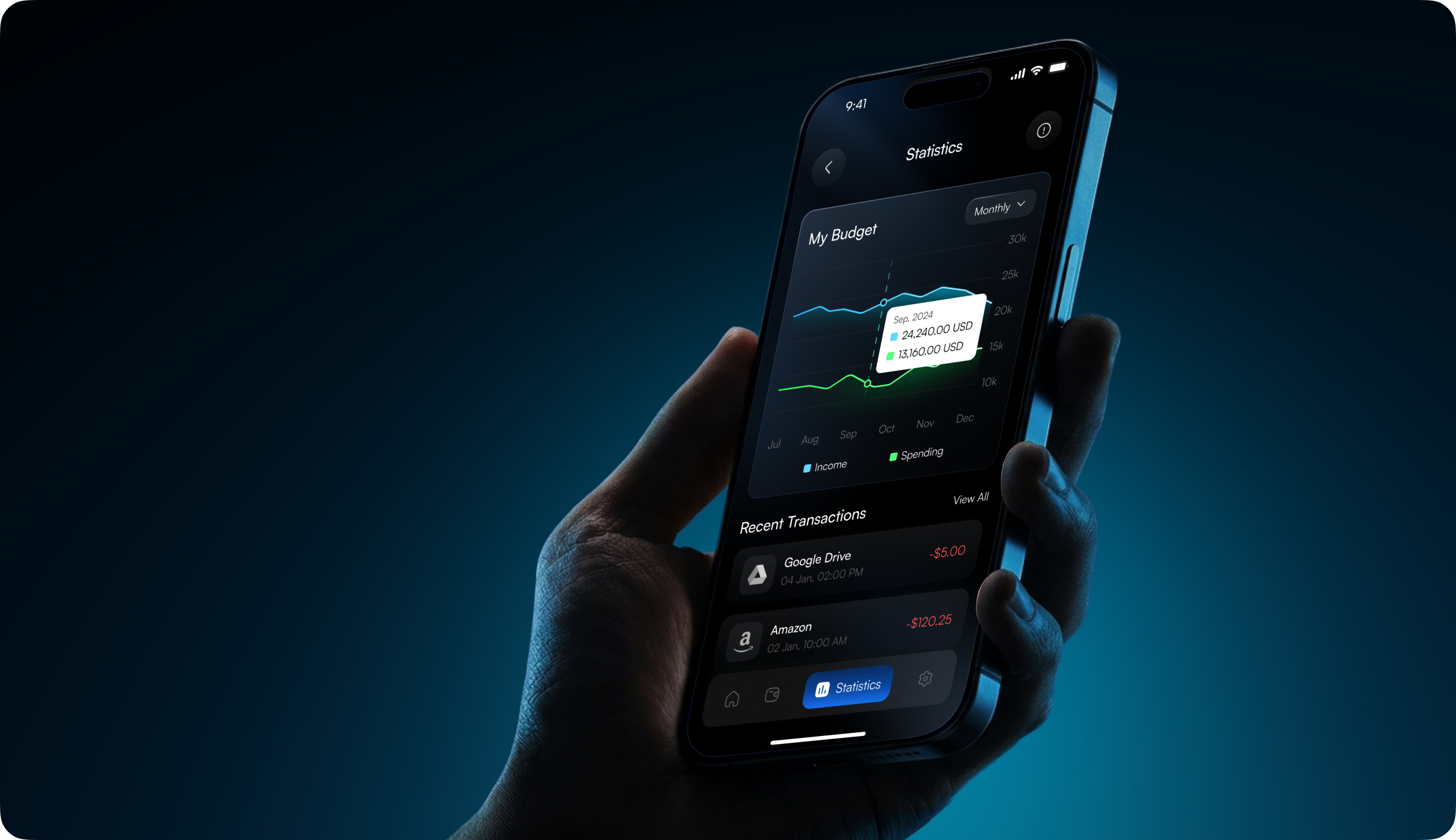
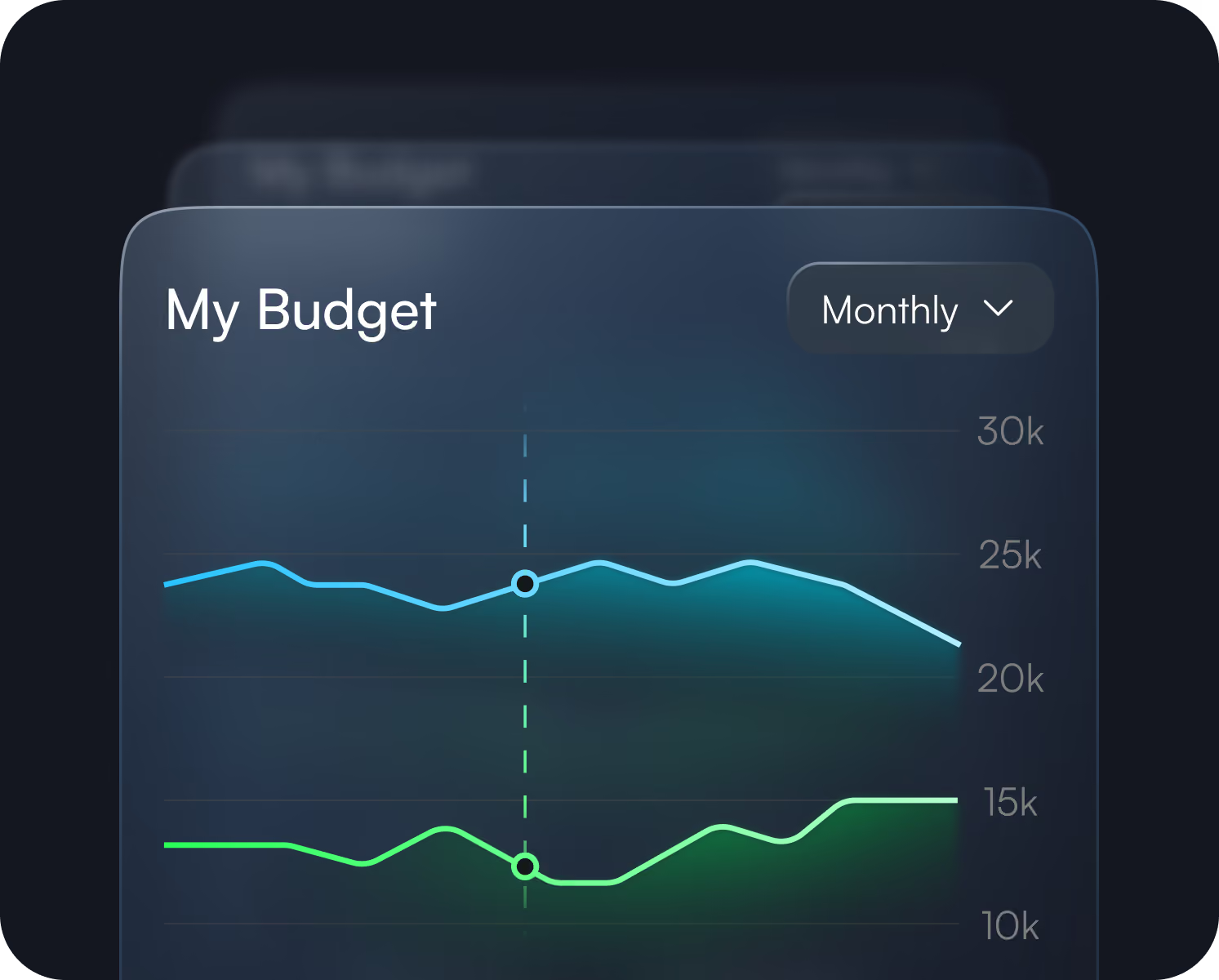
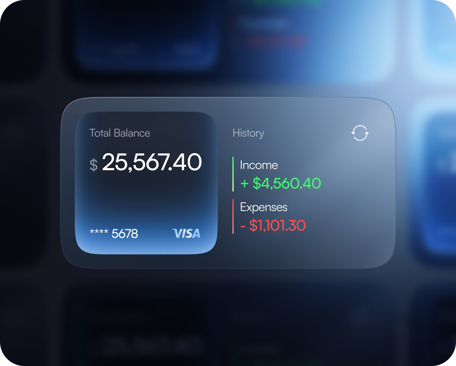
Arounda split Vault into a focused Home view with the main data and a separate Statistics view for income or spending trends. This sequencing, refined after testing, showed users misread combined metrics, cut scanning fatigue, and reduced transfer steps for repeat recipients. Fewer screens meant fewer reload risks on unstable connections and faster core-task completion.
User Flow
Wireframing
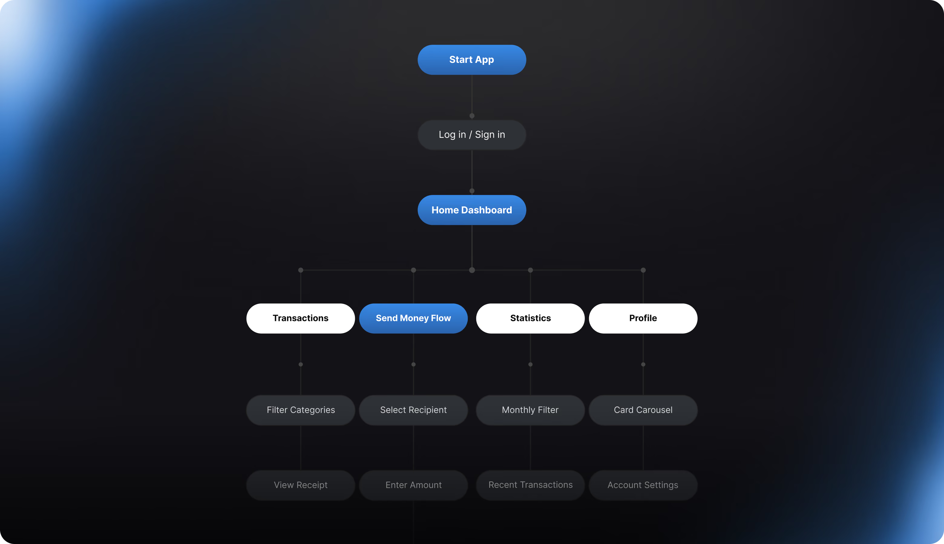
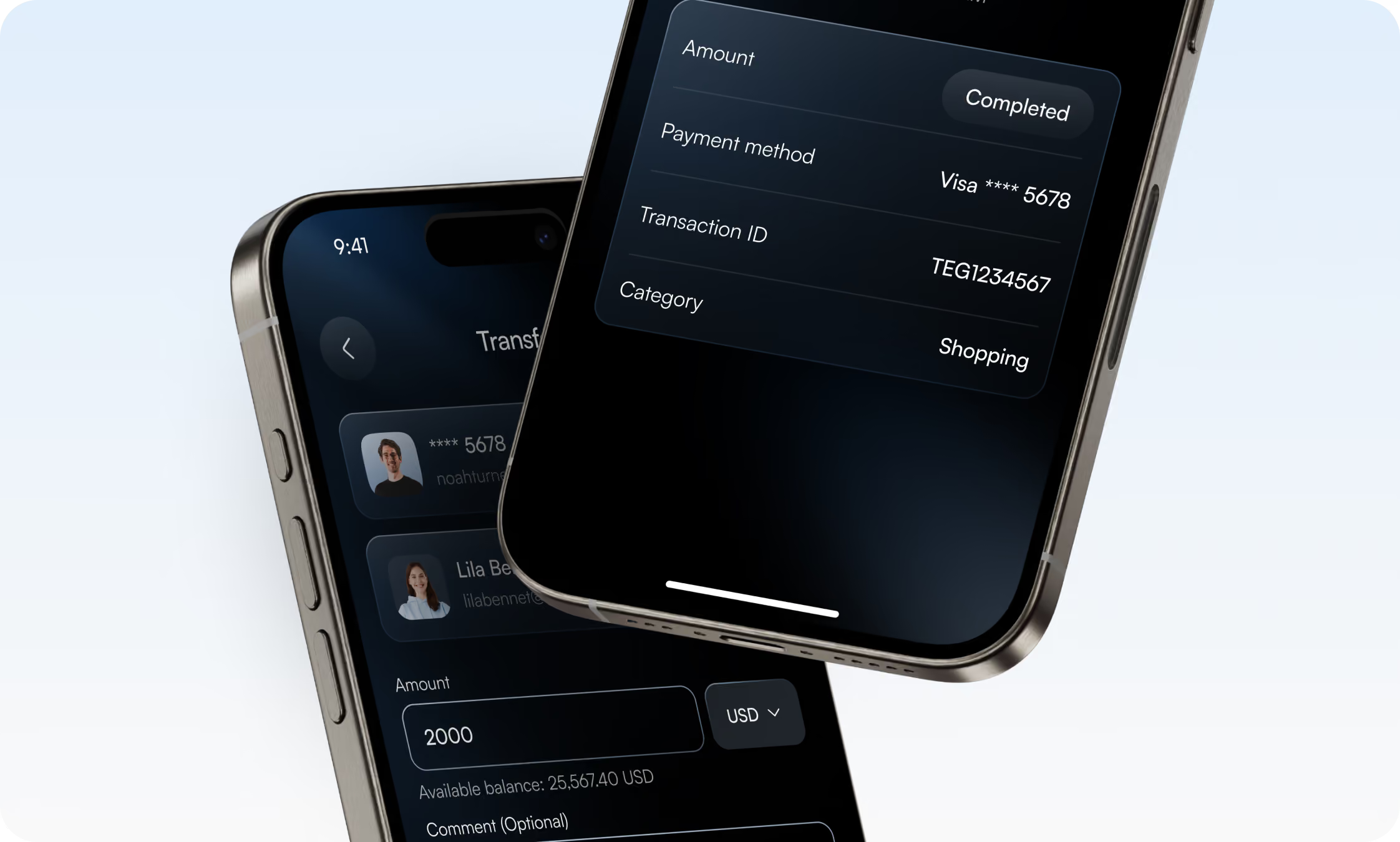
Our team adopted the "one screen, one thought" philosophy. We separated login, recipient selection, money entry, and confirmation into individual screens rather than one long merged form. Our technology decreases the danger of reloading due to bad connections and input errors for first-time digital banking users. Early wireframes stacked three cards on the dashboard, but consumers misinterpreted the combined balance/spending view, so we simplified it to a single dominating balance and shifted trends to Statistics.
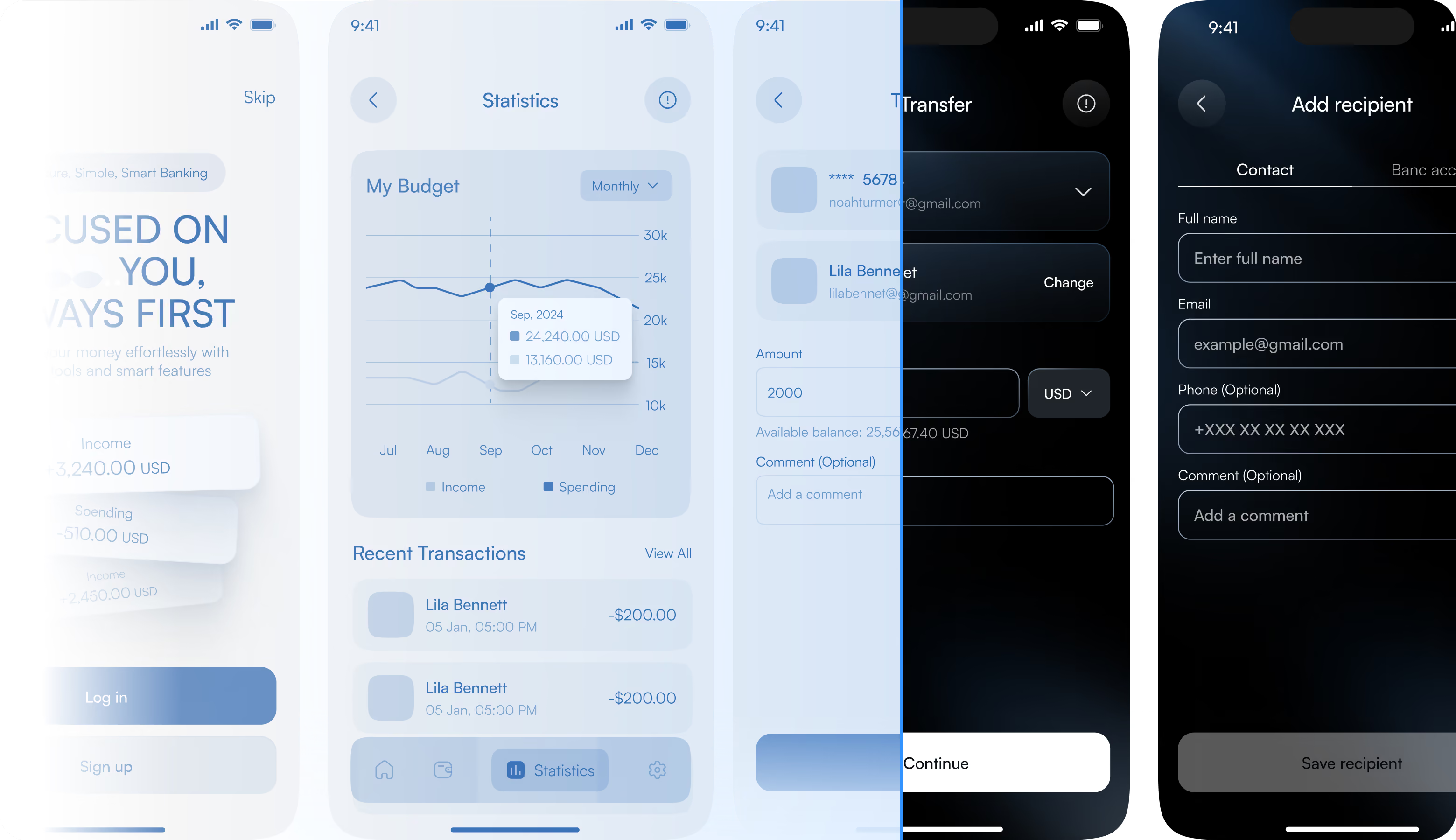

Facing drop-off in your core user flows? Arounda will find where and fix it.
UI Layouts
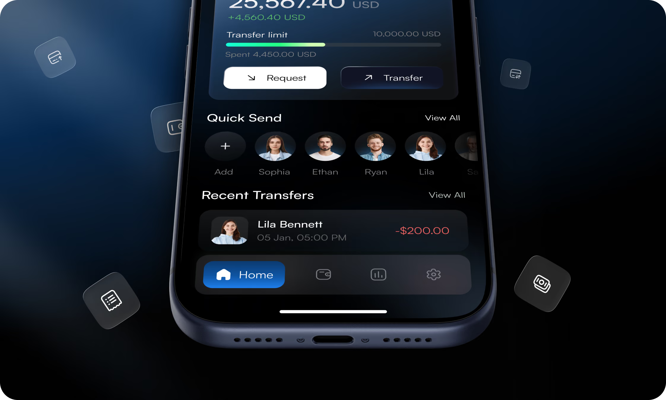
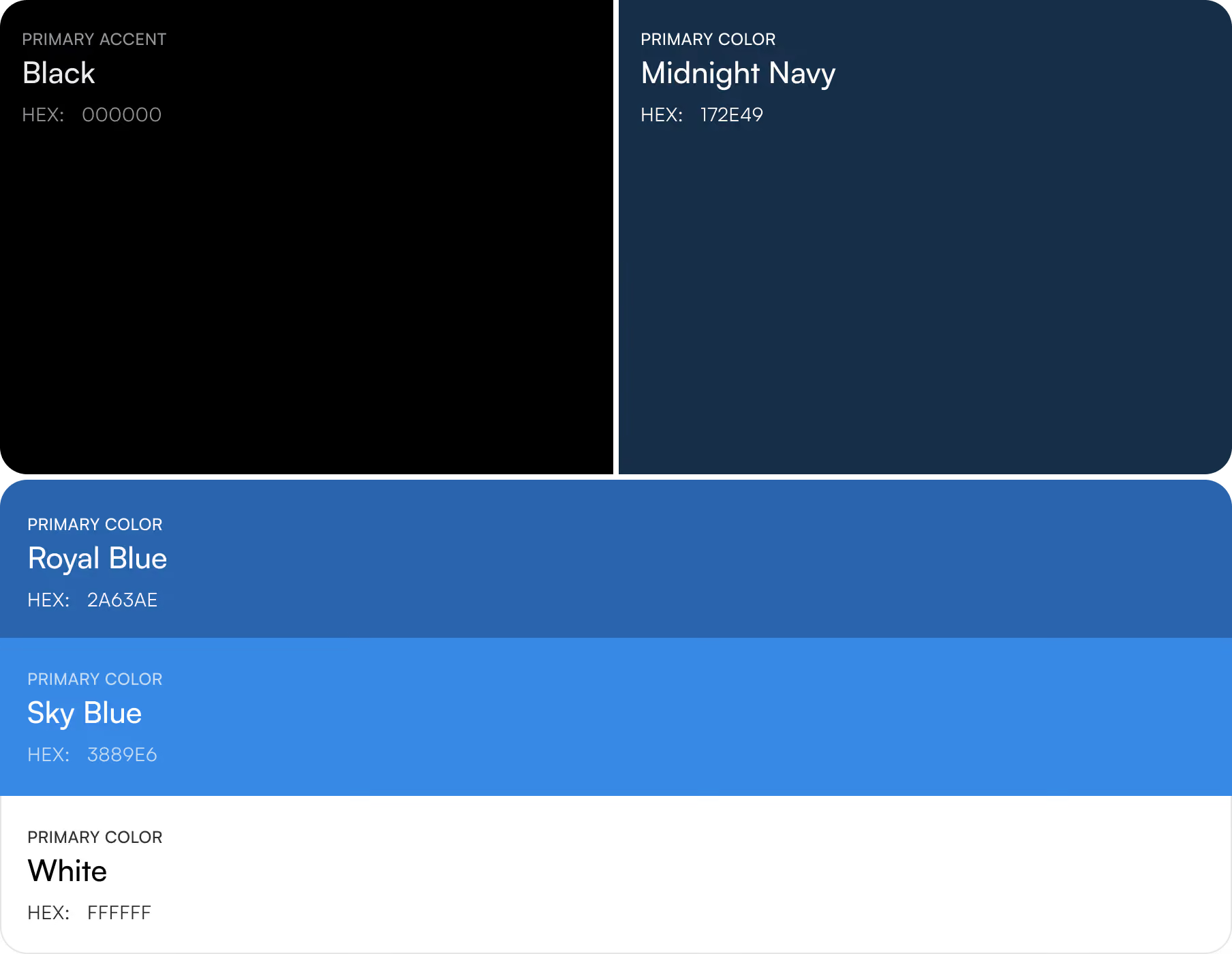
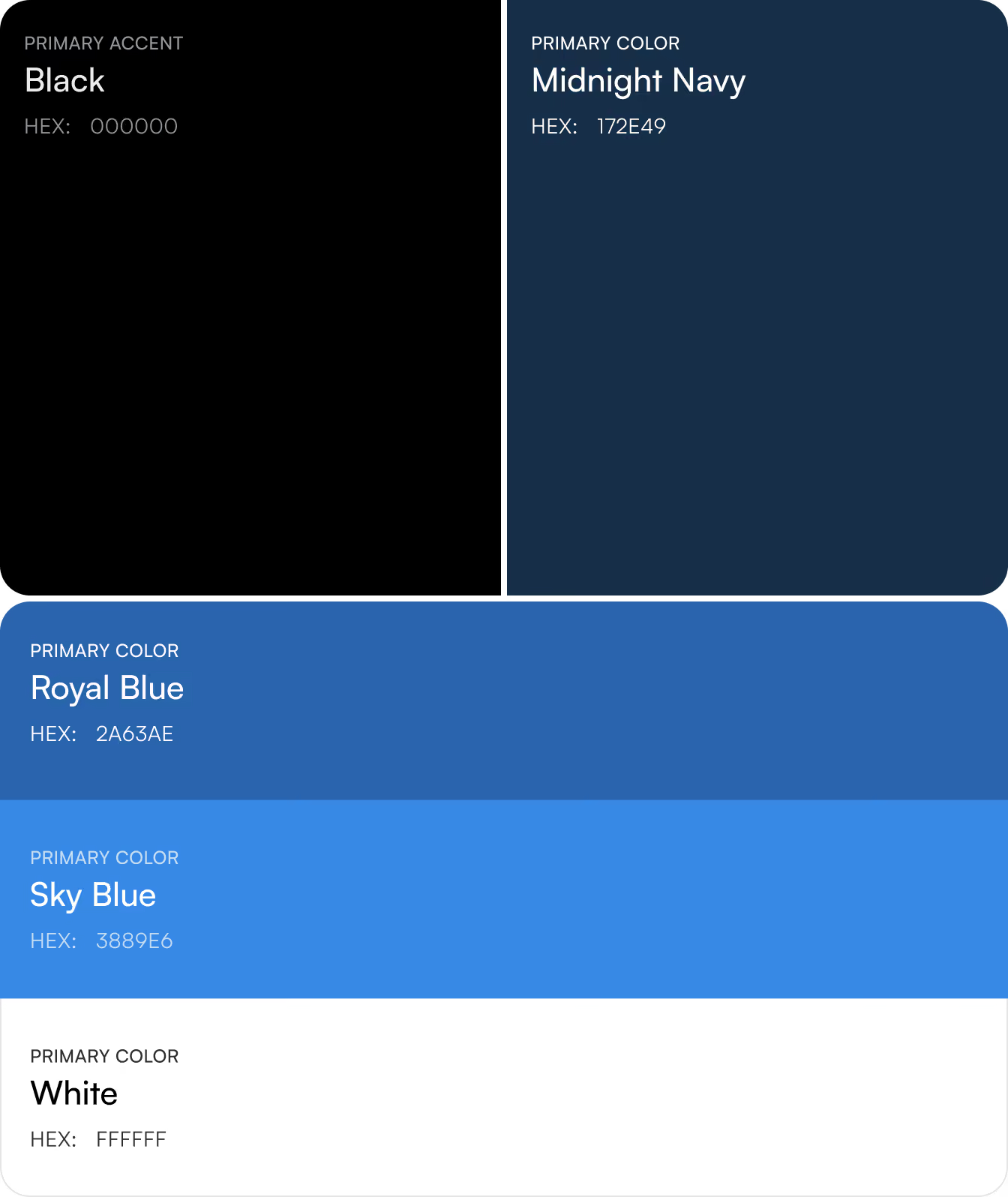
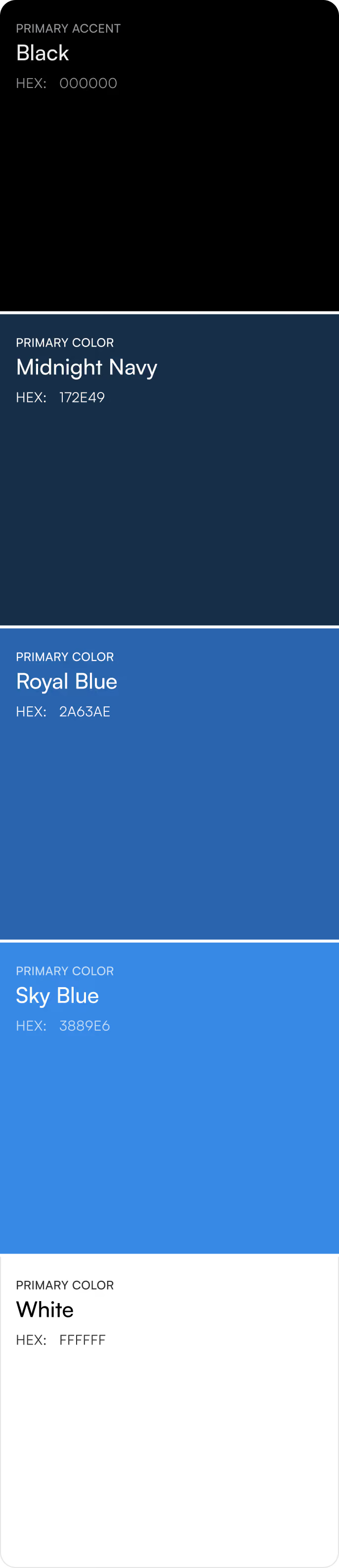
On the main control panel, the balance and main actions (Request, Transfer) appear in the top third of the screen so they can be reached with a thumb. The “Quick Send” icons show up right below them, allowing users to skip the usual recipient search. Our team used “royal blue” for key actions and positive data in combination with a dark interface to reduce eye strain and improve the readability of charts on the five main screens and 6–7 sub-screens. To ensure accessibility, we adhered to WCAG AA requirements for contrast ratios and created large touch elements.
Social Media
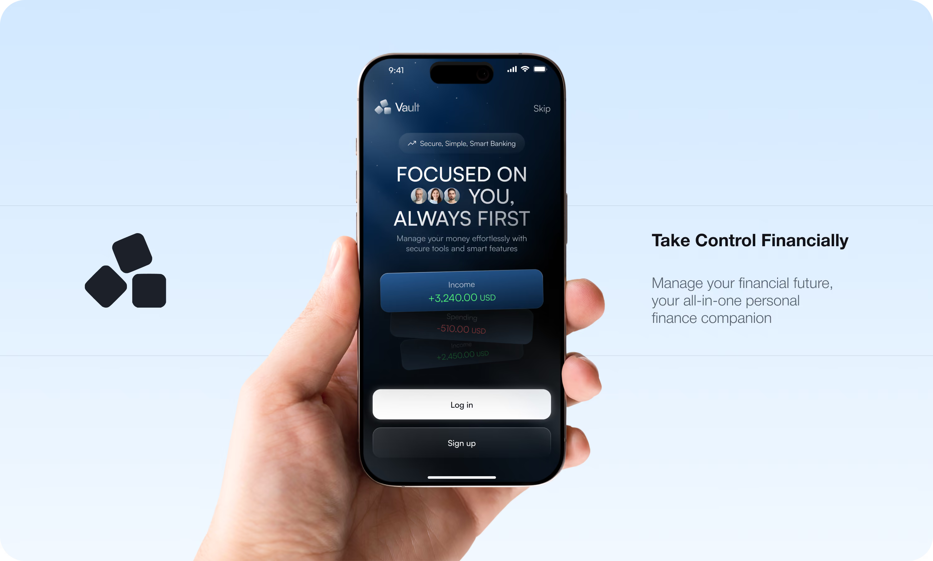
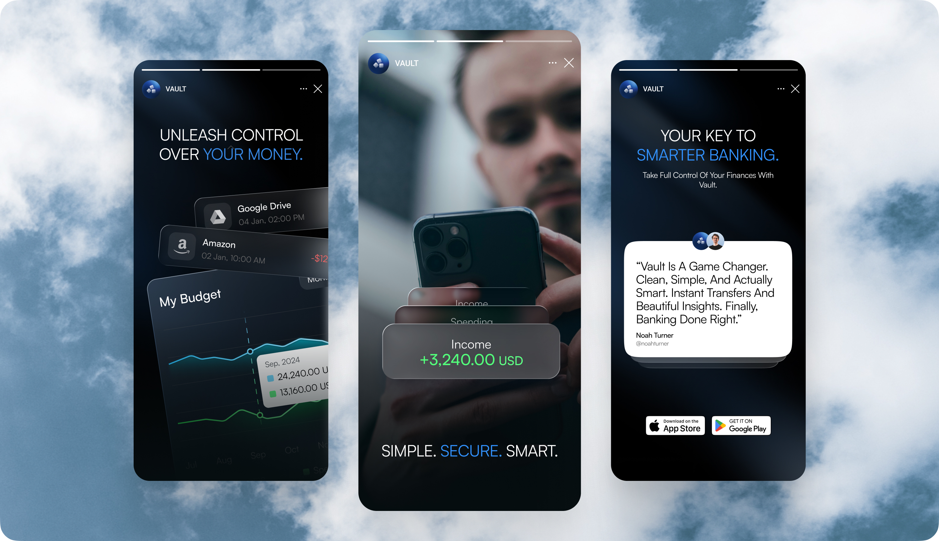
During our collaboration, the client asked our brand team to expand the design system into a marketing environment. The "Simple. Secure. Smart." tagline is consistent throughout Vault's marketing assets, including app stores and social media posts. Instead of lengthy feature lists, we created a focused set of stories and banners anchored by user-centric testimonials regarding rapid, reliable transfers.
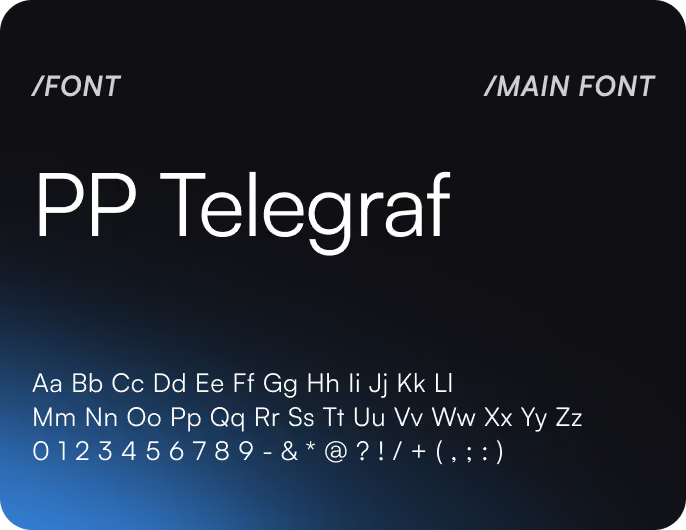
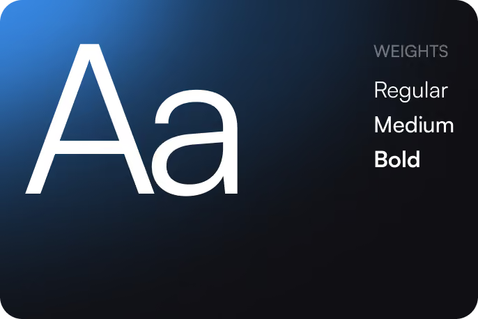
Design system
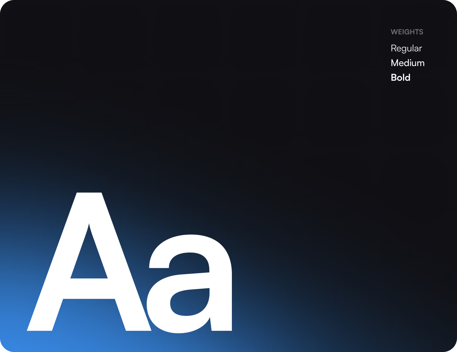
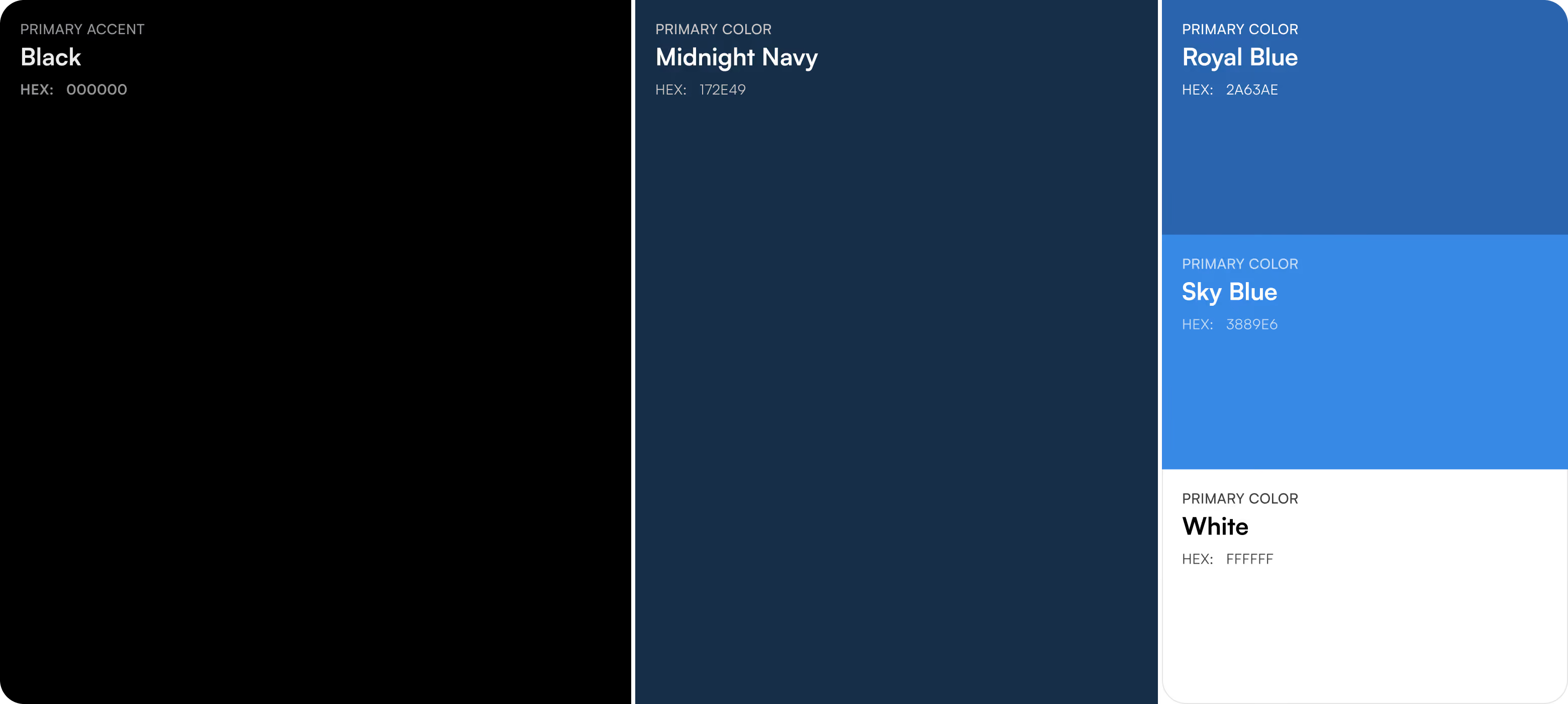
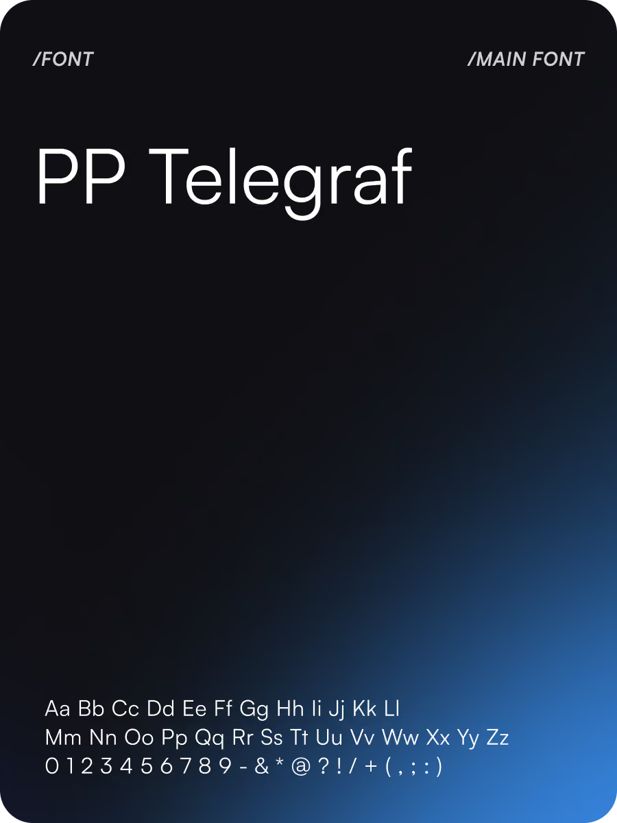
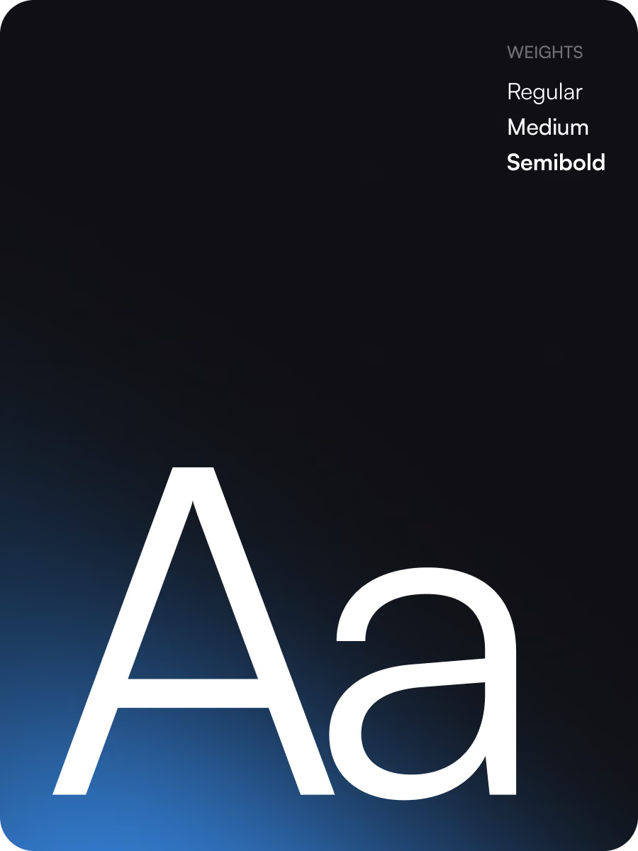
Results
96%
Transfer task completion
Most users completed the send-money flow without assistance during usability testing.
8 weeks
Design duration
Arounda scoped and completed the project in a tight two-month timeframe.
3 taps
Send Money flow
Reduced from the 5–6 taps typical of comparable banking apps to select recipient, enter amount, confirm.
+37%
Fewer flow errors
Separating recipient selection, amount entry, and confirmation helped to eliminate input and navigation errors during testing.
