Financial platform website redesign
UI/UX Design
Web Development
Modern web design that reflects premium expertise
About project
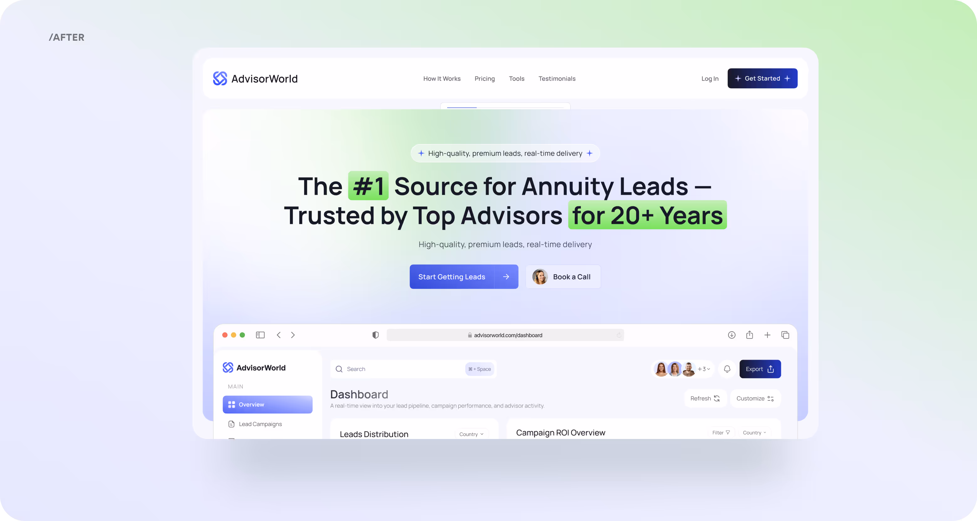
AdvisorWorld is a B2B platform for financial advisors and a leader in annuity lead generation for over 20 years. The company partnered with us to redesign its website into a modern, SaaS-style platform. Now, it builds trust, highlights premium positioning, and has a conversion UX.


Challenges & Solutions
Problem
Our team had to rebuild the platform with limited content, no cohesive brand identity, and only free licensed visuals. The main challenge was to create a trustworthy MVP that communicated value and professionalism within strict design constraints.
Solution
The client got a conversion-focused B2B platform. It directly addresses financial advisors with clear value messaging and a guided flow. A custom “How it works” section now walks users through the lead qualification process step by step without confusion.
Process
Discovery
Briefing & onboarding
Q&A
Competitors Research
UX Design
UX Audit
Wireframes
Site Map
UI Design
Moodboard + UI Concept
UI Layouts
UI KIT
Wireframing
At the wireframing stage, our goal was to design a structure that drives key actions of financial advisors. The main challenge was translating the client’s broad request “make it clean, professional, and modern” into a well-paced B2B flow with value emphasis. But for our team, it wasn’t a problem thanks to our research-driven approach. So, the client approved the first wireframe version with only minor tweaks, and we moved fast into the UI stage.

Moodboard

Redesign
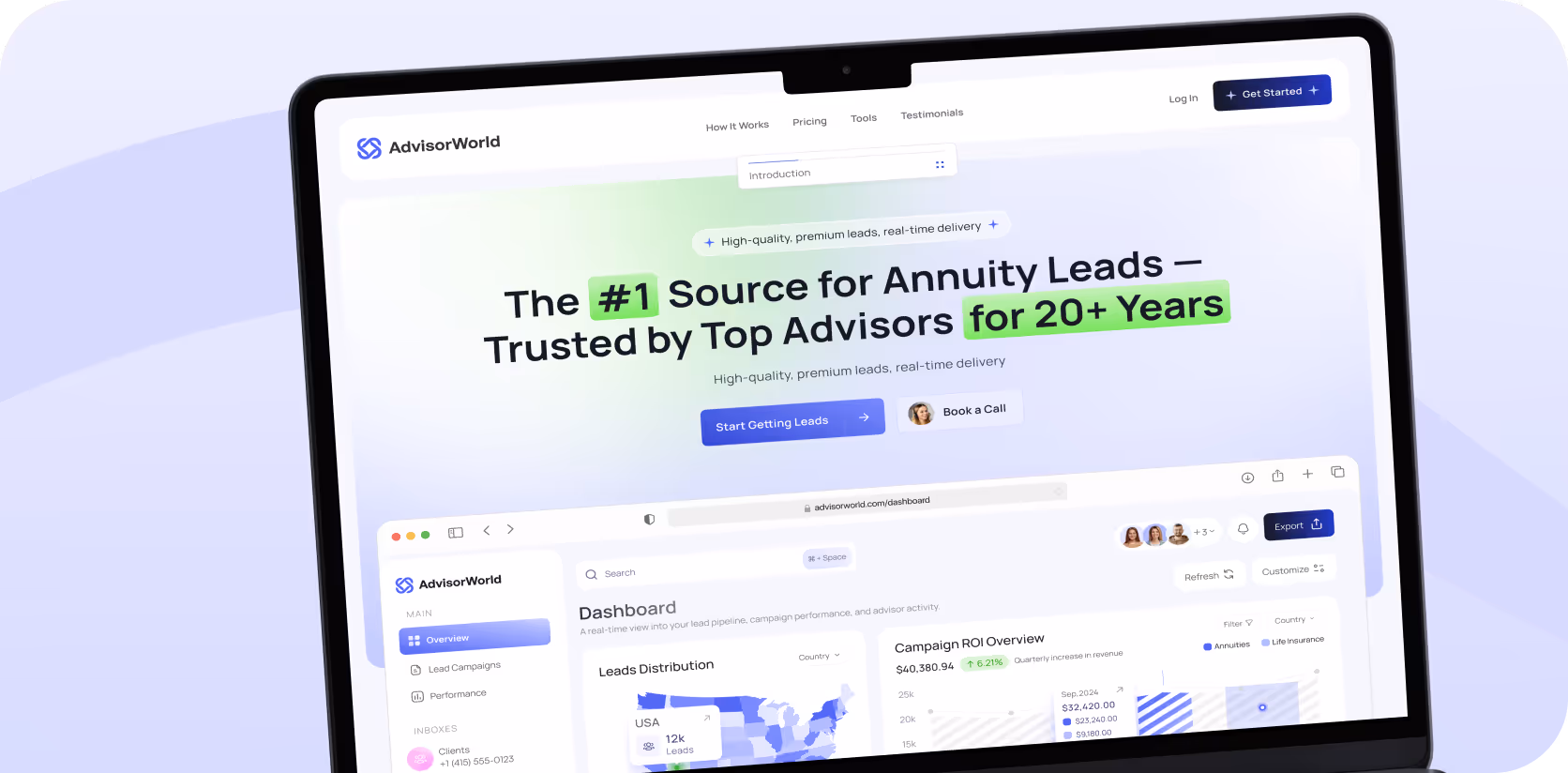
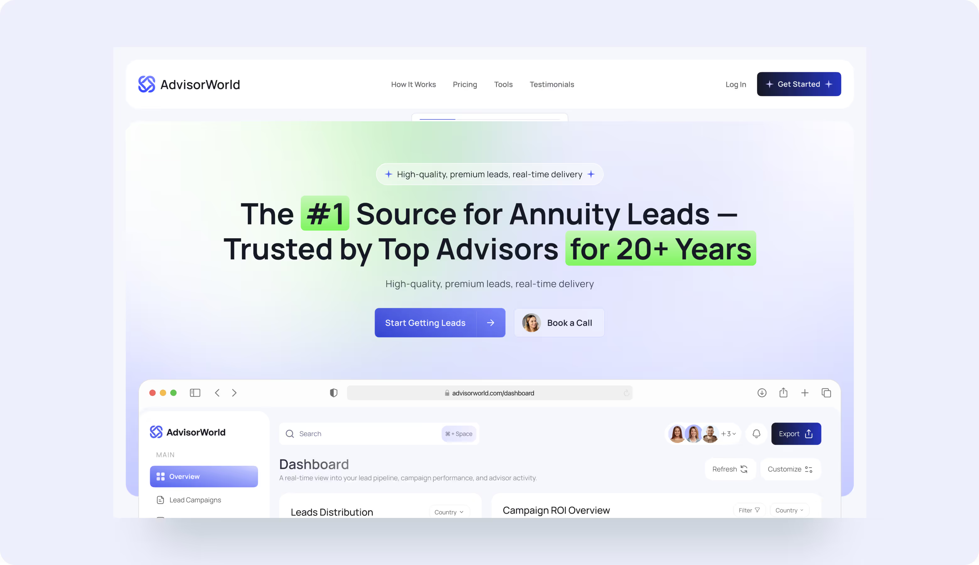
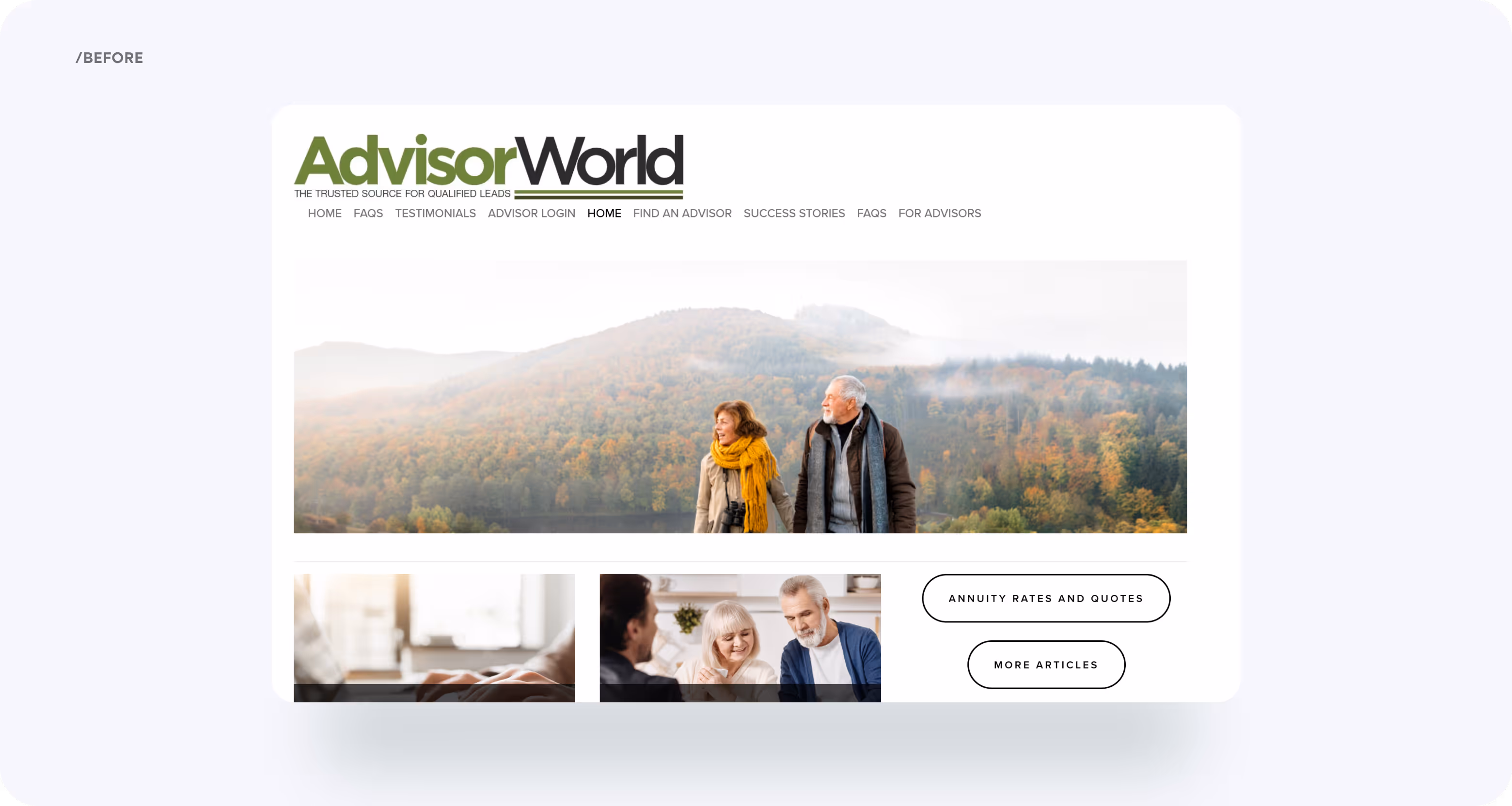
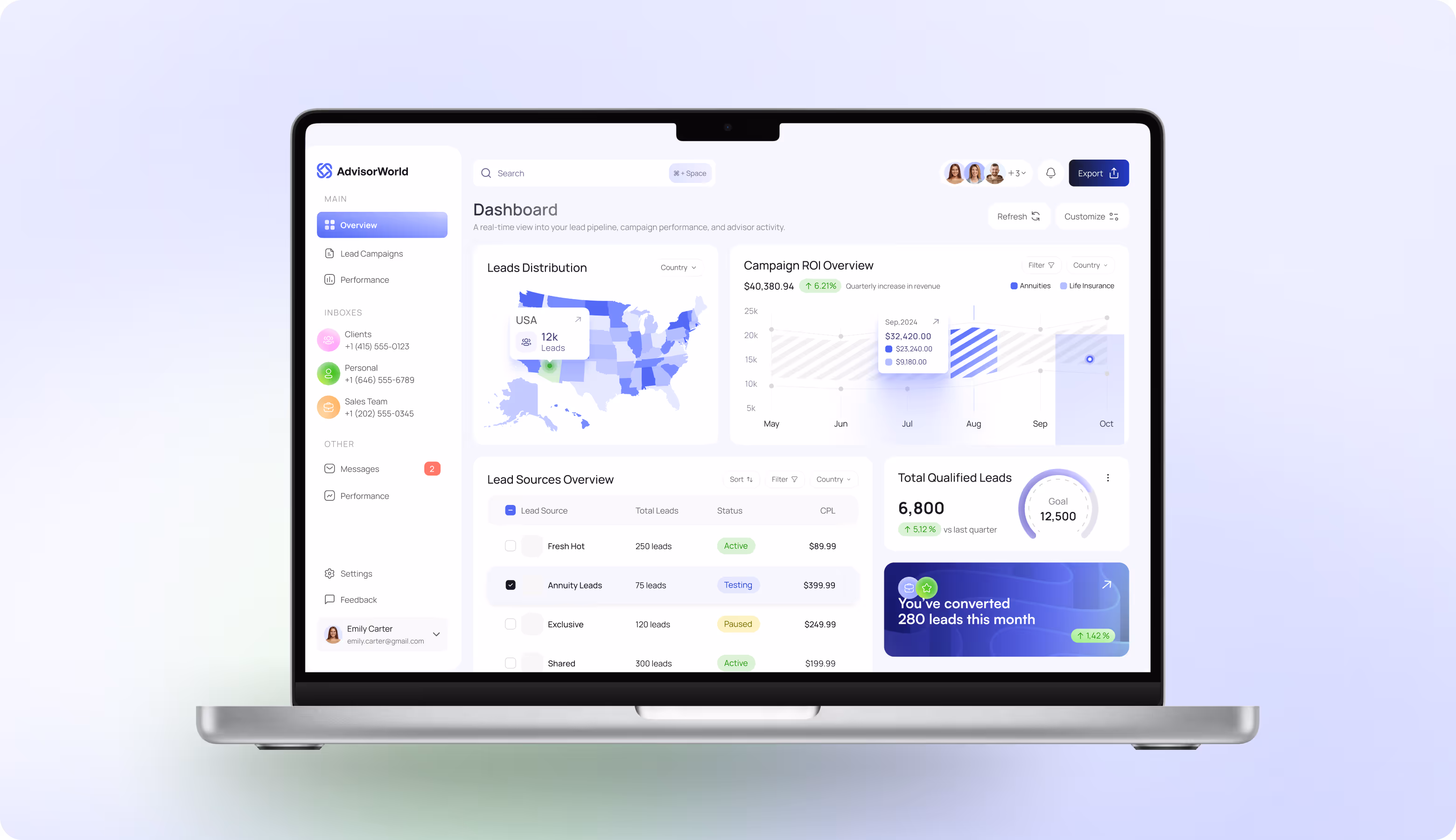
The redesign transformed AdvisorWorld’s digital presence from a dated, unclear site into a clean, structured platform with hierarchy, confident typography, and strong CTAs. The new design mirrors the product itself, builds credibility, highlights value, and guides users to act.
Web design
Our web designers followed a clarity-first approach. It means that every screen, interaction, and message should make things simple, trustworthy, and action-driven. We introduced a visual flow to explain the lead process step by step and kept CTAs always within reach (never distracting, always helpful). These solutions keep users oriented, confident, and ready to take the next step without hesitation.


.avif)
Request your conversion-ready, modern website that helps business grow.

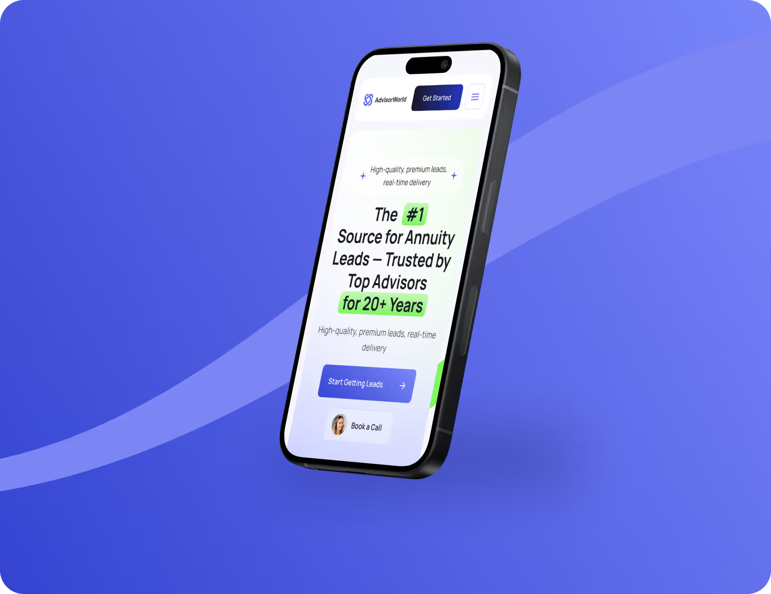
Responsive design
The layout adapts dynamically and preserves hierarchy, readability, and conversion flow on any device. Buttons stay thumb-friendly, text remains scannable, and visuals scale cleanly without losing detail. This consistency reduces drop-offs and gives a professional feel.
.avif)
.avif)
Design system
.avif)
.avif)

.avif)

.avif)
.avif)
Results
+62%
Higher lead conversion. Precise UX flow and persistent CTAs helped advisors instantly understand the value and take action.
2x
Growth in time on site. Users now stay on the site twice as long and explore services thanks to modern layouts, structured messaging, and improved hierarchy.
+45%
Stronger trust perception. We replaced stock visuals with a real, product-style design. It makes the brand more reliable and professional to the target audience.
-35%
Shorter onboarding time. With fewer clicks and a smoother flow, advisors can complete onboarding faster. It saves the support team time and reduces drop-offs.
