Responsive Web Design Services
One smart design = more conversions and less churn. Our responsive web design services keep users engaged and your brand consistent on every device.
250+
5.0
on Clutch
$1B+
our partners


Why Choose Arounda as Your Responsive Web Design Partner
Award-Winning Designers & Developers
Award-winning design isn’t a title for us, it’s proof that your product is in expert hands. With 350+ successful projects, our teams help you launch fast, reach your goals, and impress customers.
Design That Converts Visitors into Customers
Our responsive website design services make sure that traffic turns into growth, engagement, and revenue. Every layout, button, and flow guides your users toward actions and conversions.
Transparent Workflow & Agile Delivery
You'll have full visibility into every process, get feedback in real-time, and get a team ready to change direction when priorities shift.
Proven Track Record Across Industries and Niches
Arounda has delivered results for 340+ companies across various niches. You benefit from cross-sector insights that drive better UX and get a partner who understands your space, users, and goals.


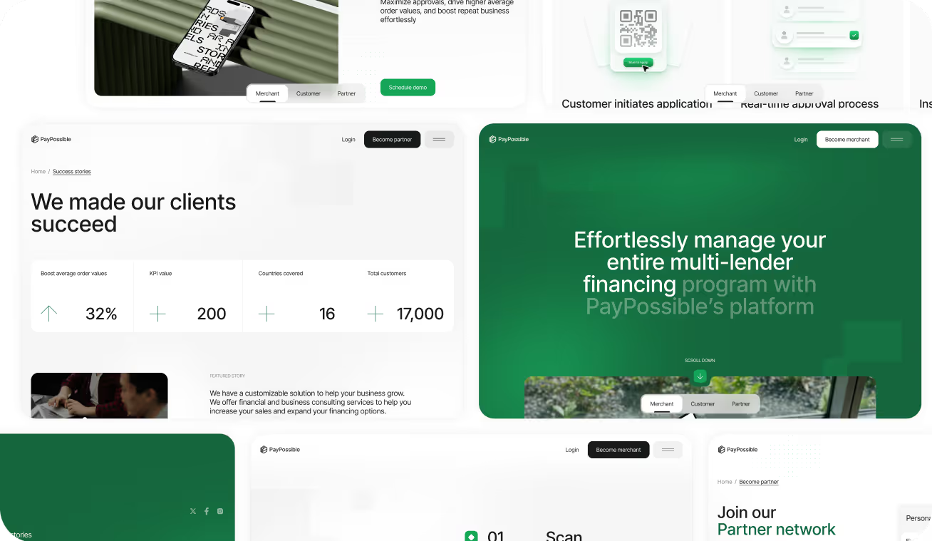
Our Responsive Design works prove themselves
More than 350 companies have trusted us with their websites to increase engagement, trust, and revenue through responsive design. Discover how exactly.
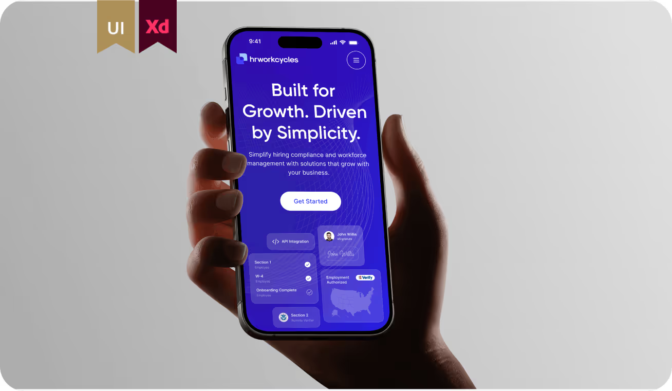
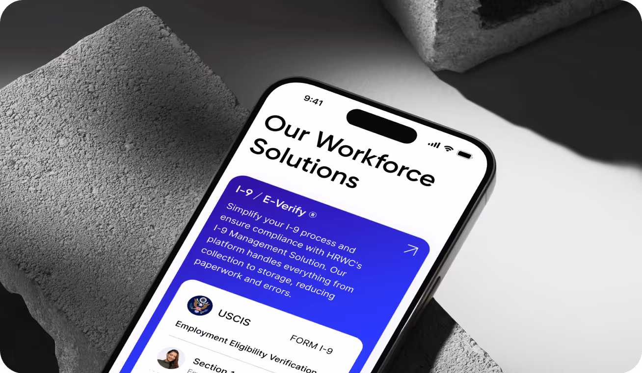
People-first HR experience
HRWorkCycles needed a responsive product that works across complex HR workflows and data-heavy screens. We designed adaptive layouts that preserve hierarchy, readability, and task flow on desktop, tablet, and mobile. The result is a scalable responsive foundation recognized with 2 awards in the UI and Experience Design categories.
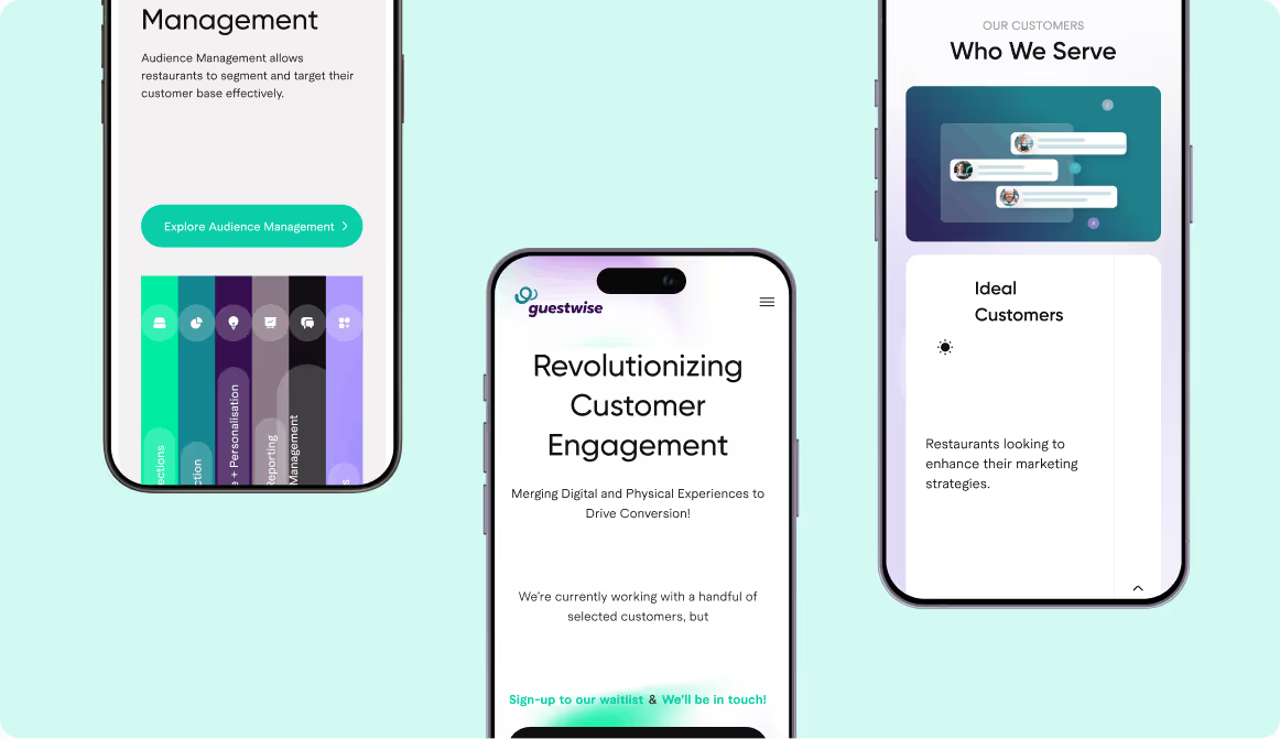
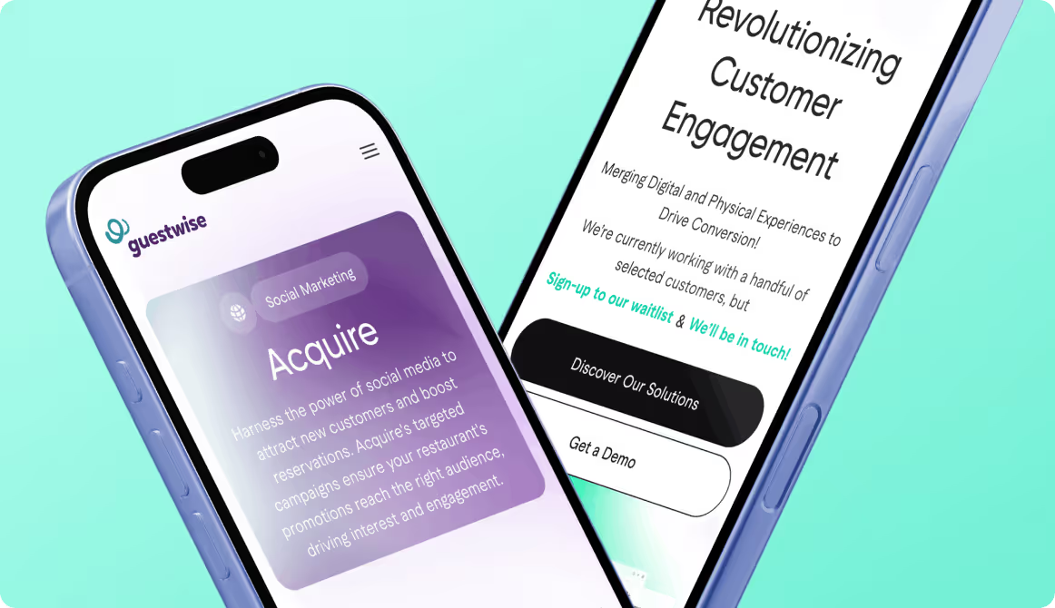
Marketing-led UX for hospitality
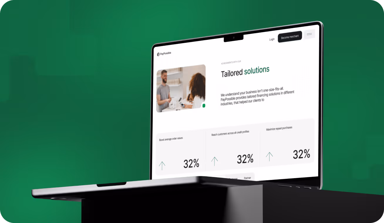
Enterprise-ready fintech experience
PayPossible needed a website that worked consistently across mobile, tablet, and desktop. Arounda designed the site with a mobile-first, responsive structure to simplify flows and actions on every screen. The result: 2× merchant signups, +40% financing applications, 88% user satisfaction, and a Behance UI award


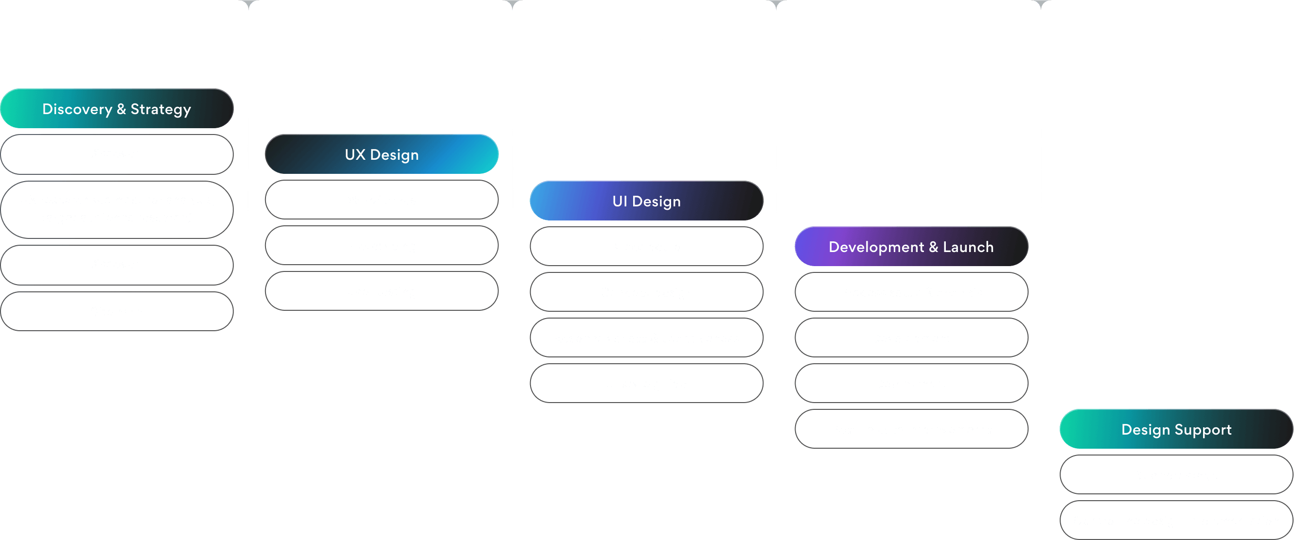
Our Responsive Web Design Services
Custom Responsive Web Design

Your users’ first impression usually happens on a small screen. Our responsive web design agency builds custom layouts that adapt to every device, boosts conversions by 35%, doubles session time, and cuts bounce rates by 40%.
 Mobile-first user interface
- Tailored layouts for all devices
- Conversion-focused UX
- Scalable design system
Mobile-First Web Design

70% of users say mobile-friendliness impacts their willingness to engage. Our web designers prioritize mobile from the ground up. They’ll help you capture attention fast, cut load times, reduce drop-offs, and increase engagement even when users are on the go.
- Mobile-optimized UX/UI
- Fast-loading, touch-friendly layouts
- Streamlined user flows
- High-performance design
Cross-Browser and Cross-Device Optimization

Your users open your site on different devices, browsers, and screen sizes. And they are expecting it to work. Our responsive web design service makes your site work consistently, functionally, and fast in Chrome, Safari, Firefox, or on any phone, tablet, or desktop.
- Browser compatibility testing
- Multi-device performance checks
- UI consistency adjustments
- Bug fixes across platforms
Ecommerce and B2B Website Design

2x higher checkout completion and 30% better lead quality → that’s our clients’ real results. Now, your turn! We design responsive ecommerce and B2B sites that turn visits into revenue, build trust across devices, and lead to more qualified buyers.
- Conversion-focused content mapping
- High-converting forms and CTA
- Responsive UX/UI design
- Scalable design systems
Responsive Landing Page Design

Arounda design team creates responsive pages that load fast, look attractive, and guide users toward quick decisions (no matter the device). Our approach drove up to 3x more CTA clicks and significantly improved campaign ROI for our client’s projects.
- Mobile-first layouts
- Conversion-optimized sections
- Fast-loading and scroll-friendly design
- Tailored for product launches or campaigns
Web App Interface Design

Clunky interfaces push users away. Reduce errors people make with a clear experience and a fully responsive web application interface. This step can help you cut onboarding time by up to 40% and increase retention.
- Responsive UI layouts
- Role-based user flows
- Modular UI components
- UI kit for development handoff
Accessibility (ADA/WCAG) Compliance

If you ignore accessibility, you turn away users and risk legal issues. We’ll audit and design your accessible responsive interfaces that meet ADA and WCAG standards. It expands access to more users, improves usability for everyone, and keeps you compliant.
- Accessibility audit and risk report
- Usability fixes across devices
- Dev handoff with alt text, labels, tab order
Responsive WordPress and CMS Themes
No more outdated templates! Our responsive web development services include custom WordPress and CMS themes optimized with SEO strategies, marketing stack integration, and convertible content layouts. Fast publishing and easy updates!
- Custom front-end design
- Clean, maintainable code
- Fully responsive layouts
- Simple admin panel setup


While the Growth Of Our Clients is what matters most, it`s nice
to get awards

by Clutch

2025
by Clutch

UI/UX Company by Clutch

on Upwork

on Dribbble
by Clutch

by GoodFirms

Behance platform
by Clutch

by Webflow


Driving success through professional Responsive Website Design services
Boost conversions by 35%, lower bounce rates by 40%, and offer users seamless experiences across every screen. That’s what strategic responsive design can do.
X5
Engagement rate boost

For the Swift Web3 platform, we delivered a high-performing enterprise web design with improved navigation, UX clarity, and interactive flows.

15%
New user increase
The upgraded website redesign helped Myso increase the flow of new visitors and attract more organic traffic.
85%
User satisfaction rate
GT Protocol achieved an 85% satisfaction rate by addressing usability pain points and delivering an intuitive interface.
Well-tried solutions that cover your needs
Redesign your product and stand out
Get the user-friendly Web Design
Empower your team with Team Extension
Design your first MVP product
Get the right style with UI Concept
Turning projects into trusting partnerships


We get things done With Quality

Flexible collaboration
& fixed monthly rate

Guaranteed
on-time deliverables

Hiring system with
immediate start

Work directly with
the designer
Qualified web designers who know their business


+55
in Arounda team
+55
in Arounda team


FAQ
What is the difference between responsive and mobile-friendly design?
Mobile-friendly design means your website works on a mobile device, but often as a simplified or separate version. It may involve a fixed-width layout, larger buttons, or hiding some desktop features to fit smaller screens. The experience is functional, but limited.
Mobile-friendly design features to consider:
- Usually does not adjust to all screen sizes
- Offers basic mobile support
- Is not future-ready for new devices (only limited adaptability)
Responsive design is smarter and more dynamic. It works perfectly on mobile and easily adapts to any screen size. Elements on the page automatically adjust and reposition based on the user’s device, resolution, and orientation. You don’t need to request a design for multiple versions of your site.
Responsive design features to consider:
- Adjusts to all screen sizes
- Offers a fully adaptive UX
- Designed for scalability
- Has stronger ranking signals
Our Arounda expert team recommends creating a responsive website, as it can reduce bounce rates by up to 40%, improve engagement by 3x, and increase conversions across all devices. Plus, it’s more cost-effective in the long run because you don’t need to separate mobile and desktop versions.
How long does it take to build a responsive website?
In short, it depends on your project’s complexity and can last from 4 weeks to 12+ weeks.
What affects timelines:
- How ready your content and brand assets are
- The number of screens or pages
- Website complexity (based on your requirements and industry specifics)
- Custom vs. template-based approach
- Speed of feedback and approvals
- Third-party integrations (CRMs, APIs, CMS, etc.)
For a simple site or landing page, a responsive design can take 4 weeks.
For a mid-sized website, the process takes from 4 to 8 weeks.
For complex web apps, our responsive web design company needs 8 to 12+ weeks.
Will my responsive site rank better on Google?
Yes. Google officially recommends not avoiding responsive website development services because they offer a single, consistent experience across all devices.
Google algorithms analyze adaptivity to every screen size, fast or slow performance, clear UX or not, and engagement signals.
Here’s how a responsive website helps your SEO:
- Improved mobile experience means lower bounce rates
- Faster load times influence Core Web Vitals
- Single URL for all devices = easier to crawl and index
- Higher engagement metrics are better user signals for ranking
- Consistent content across devices is a stronger keyword relevance
From our experience: sites that switched to responsive design got 20–30% more organic traffic within the first few months. That’s because users stay longer, engage more, and share more.
Do I need a responsive redesign or just optimization?
That depends on your current website’s foundation and your growth goals.
If your site is already responsive but underperforming, you need optimization. In this case, we’ll improve load speed on mobile, fix layout shifts, enhance touch targets (buttons and menus), or tweak user flows that don’t convert well on smaller screens.
You need optimization if you have these signs:
- Layout breaks on some screens
- Minor UX issues on mobile
- Bounce rate is high, but traffic is fine
- Pages are responsive, but load slowly
But if your site isn’t responsive at all, or if it relies on outdated templates or patchwork fixes, a full redesign is usually the smartest investment. Why? Because trying to “optimize” an old, rigid layout for modern devices often creates more issues than it solves. You’ll likely spend more time and money fixing workarounds.
You need optimization if you have these signs:
- Layout fails across most devices
- Poor mobile experience overall
- Traffic drops from mobile and SEO
- Slow, outdated codebase
- You rebrand or launch new features
What’s included in responsive QA testing?
Responsive quality assurance testing is the final step that checks if your website works perfectly across all devices, screen sizes, and browsers. Our team conducts stress tests under real-world conditions to make sure it functions consistently everywhere your users show up.
Arounda QA testing includes:
- Device and screen size testing with different resolutions and zoom levels to catch layout bugs and broken elements.
- Cross-browser testing to see if layout, typography, animation, and performance are consistent everywhere.
- Breakpoint and layout validation when we manually and automatically test these transitions to make sure the design adapts as intended (with no content cutoffs, overlap, or visual glitches).
- Touch and interaction testing (button sizes, tap targets, hover states for devices that don’t support hover, and swipe interactions).
- Performance checks on mobile and desktop to uncover unoptimized mobile images, unnecessary scripts, and layout shifts that affect Core Web Vitals.
Can you convert my existing website to a responsive one?
Yes, we can absolutely make your existing site responsive. This is one of the services our responsive web development offers. It includes reworking your layout, structure, and front-end code so that it adapts to all screen sizes.
Our process:
- Audit and code review
- Rebuilding layout grids
- CSS media queries
- Flexible content blocks
- Navigation redesign
- Cross-device testing
But not every site is a good candidate for a quick conversion! The process depends heavily on your site’s current architecture, how it was built, how clean the code is, and how outdated the design or UX might be. Sometimes a smart rebuild brings better ROI than a surface-level fix.
If you face these issues:
- Slow performance
- Outdated design
- Hard-to-manage CMS
- Poor UX and high bounce rates
...then a full redesign might be more cost-effective long-term than trying to “patch” a broken site.
What screen breakpoints do you typically design for?
We design for today’s most common screens, but we also prepare your site for tomorrow’s.
The most common screen breakpoints we design for:
- Mobile (small) 320px – 480px
- Mobile (large) 481px – 767px
- Tablet (portrait) 768px – 991px
- Tablet (landscape) 992px – 1024px
- Small laptop 1025px – 1280px
- Desktop (standard) 1281px – 1440px
- Large desktop 1441px – 1920px+
We use flexible grids, scalable components, and smart spacing that flows naturally between screen sizes. Your product will look and work great even on weird in-between sizes like a foldable phone or an ultrawide monitor.
Can you redesign just part of my website?
Of course, redesigning just a part of your website is often a low-risk move when you want fast improvements without a full rebuild.
When partial redesigns make sense:
- You want to test new ideas on high-traffic pages without disrupting the whole site
- Your site works fine overall, but one section has low conversions
- You’ve rebranded, and need key pages updated to match
- Your dev team needs a better design handoff for new screens or features
A targeted redesign can improve engagement, reduce bounce rates, or increase conversion rates. It’s also an easier option for A/B tests.
Will I be able to update content easily after the redesign?
Absolutely! Your internal team can easily update content without dev help. Content structure will be intuitive, flexible, and easy to manage.
Our Arounda team makes content updates simple:
1. With a user-friendly CMS setup. You’ll get a clear backend structure with labeled fields, content blocks, and reusable components.
2. With a modular content system. We design your pages in sections (hero, features, testimonials…), so you can update or rearrange content without breaking layouts.
3. With documentation and training. You’ll get CMS guides and walkthroughs tailored to your platform.
Most CMS platforms we work with support mobile or in-app editing, so you and your team can update content even on the go. But if you prefer a hands-off approach, we can also offer ongoing support or content management options as part of your service plan.
Can a responsive website improve conversion rates?
Yes, a responsive website can significantly improve your conversion rates (especially if a large portion of your users come from mobile devices).
From our experience, businesses that switched to a responsive design got:
- Up to 35% increase in mobile conversions
- 2x higher engagement on key landing pages
- 40% drop in bounce rates on small screens
How responsive design drives conversions:
- Improved mobile UX means that users can easily navigate, read, and act
- Faster load times make Core Web Vitals better and lower bounce rates
- Clear CTAs across devices = no confusion, no friction
- Better readability and form usability increase engagement and form completion
- Consistent branding builds trust
Even small layout fixes can make a huge difference. Understand your users, what devices they use most, and make your website responsive to turn more visits into revenue. Our responsive web development company is always ready to help you with these tasks.
Clients Thoughts
Arounda excels with meticulous attention to detail, commitment to excellence, and creative problem-solving. Their inventive solutions captivate visually and significantly enhance the user experience.

Aetienne Sardon