
Trust-Focused UI/UX Design for a Dating Platform
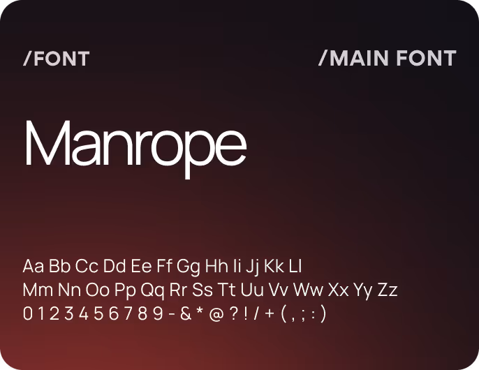
UI/UX Design
Web Development
Branding
Graphic Design
Conversion-focused design for emotionally sensitive products
About project
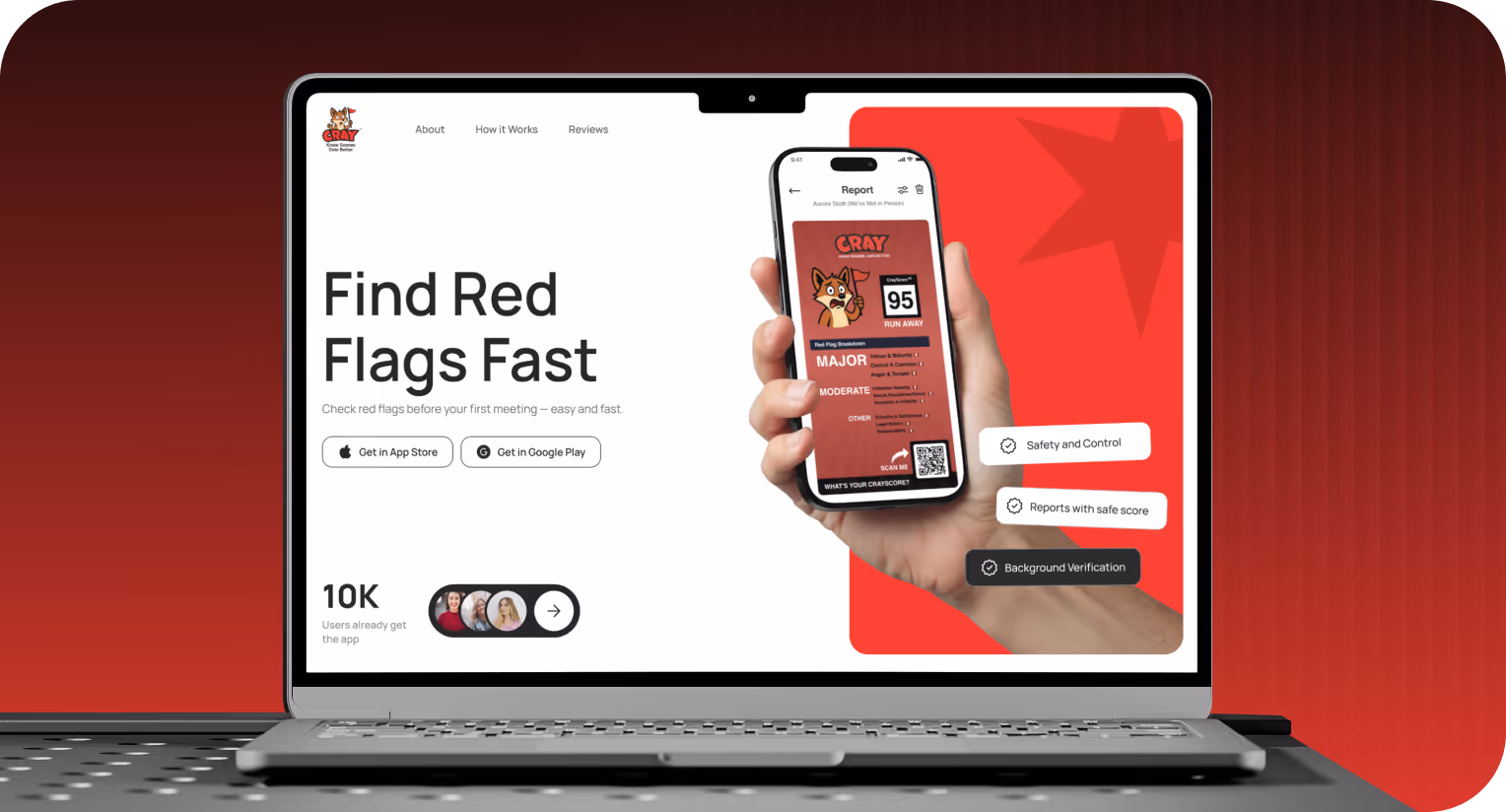
Cray is a psychology-driven dating platform that helps users build relationships confidently. Our team had to create a strong landing page that communicates value instantly and guides visitors into the app experience with an emotionally engaging interface.


Challenges & Solutions
Problem
The main challenge was balancing emotional sensitivity with product clarity. We had to establish credibility instantly, differentiate the brand, and communicate depth with minimal cognitive load because users approach relationship-focused products with caution.
Solution
We designed the landing page as a direct extension of the product. Our UI/UX designers aligned structure, visual language, and tone with the in-app experience. A conversion-focused flow is clear and guides users from curiosity to understanding and action, with trust and authenticity at every step.
Process
Briefing & onboarding
Competitor analysis
Discovery
Wireframes
Moodboard and UI Concept
UI Design
UI Kit
Adaptives Design
UI Kit
Social Media Posts
Wireframing
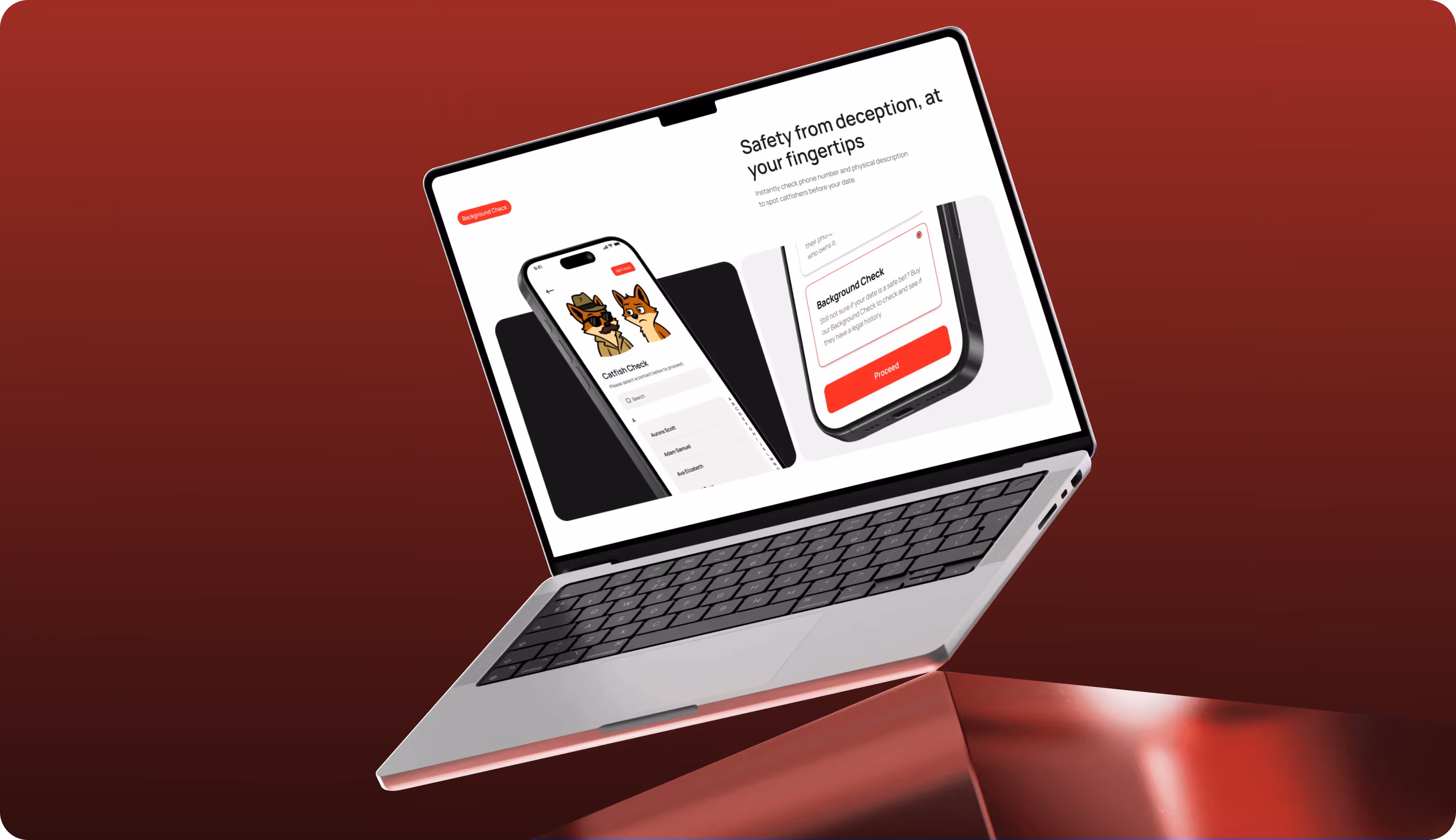
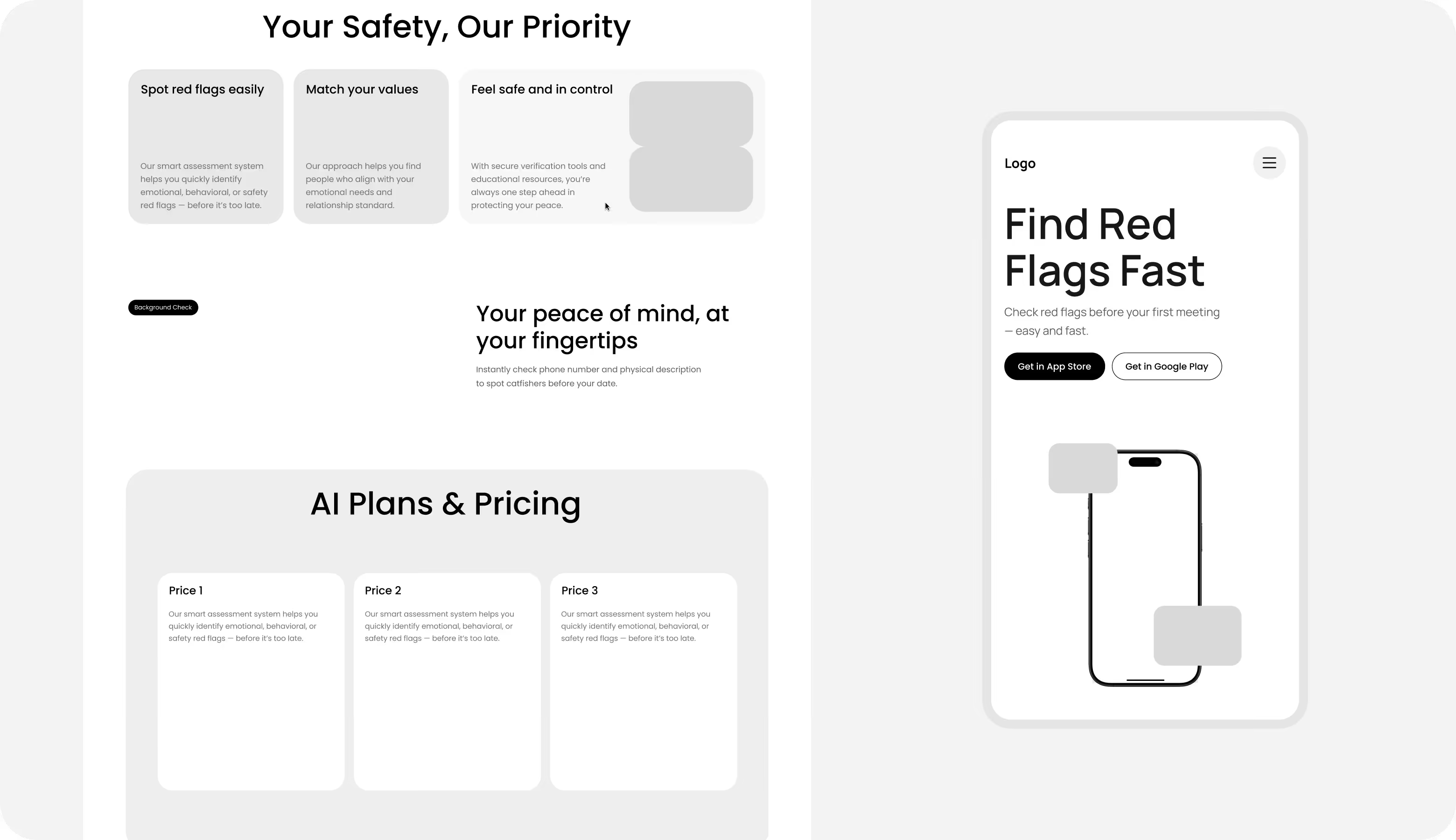
Using early wireframes, our experts structured the page with safety benefits, concrete use cases, pricing clarity, and a strong mobile preview that mirrors the app experience. The layout prioritizes fast scanning, progressive disclosure of value, and exact CTAs. We filtered out anything that could create cognitive or emotional overload because it’s important to show users what Cray does and why it matters within the first scroll.
.avif)
.avif)
UI Layouts
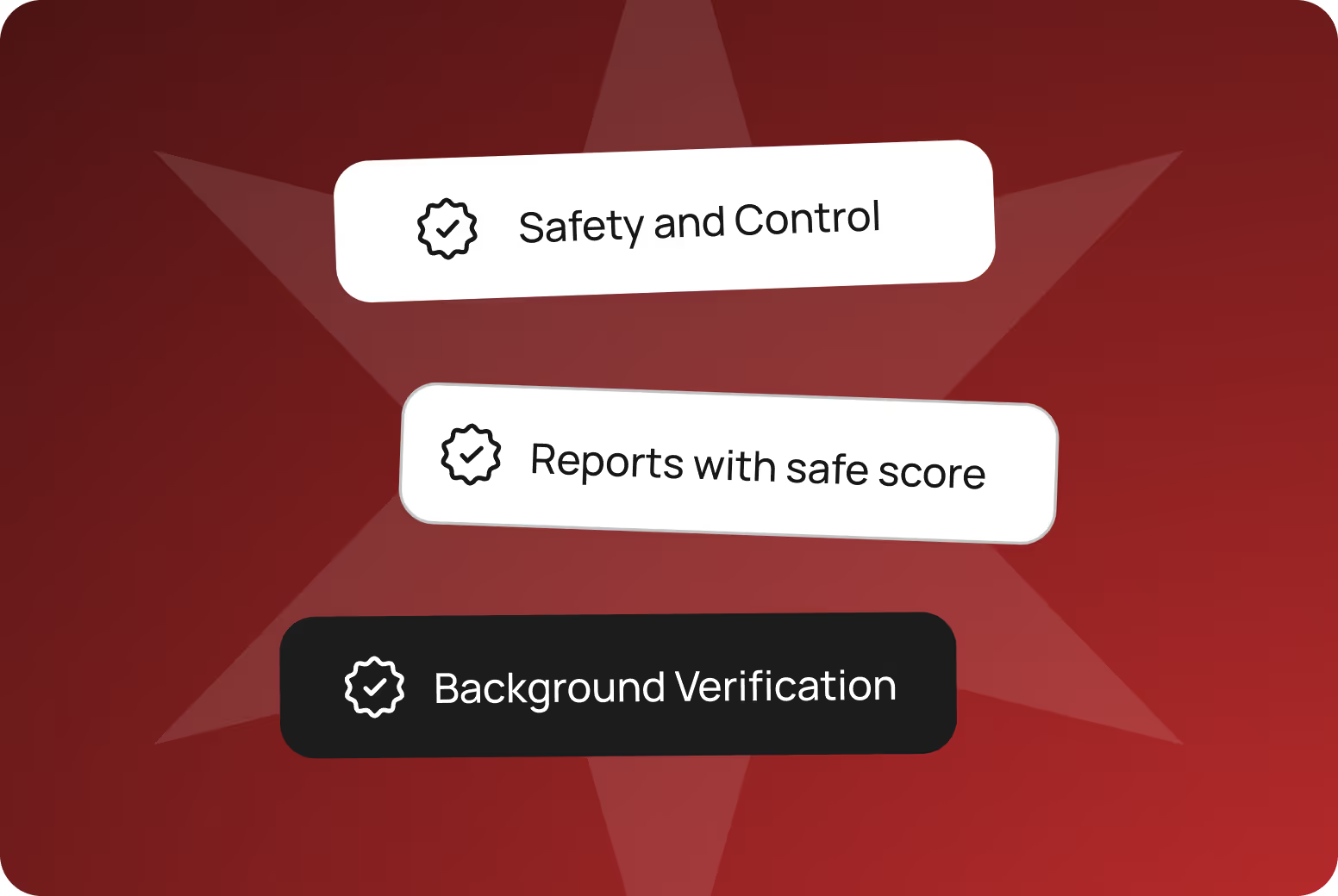
The UI layouts have to be calm, engaging, emotional, but structured. Our UI/UX designers used generous spacing, precise sectioning, and predictable patterns to help users process sensitive information without cognitive strain. Balanced grids, motions, soft gradients, and restrained visual accents guide attention across key blocks (product value, safety benefits, and pricing) with consistent logic.

Guide users from curiosity to action with Arounda strategic product design.
Mobile Version
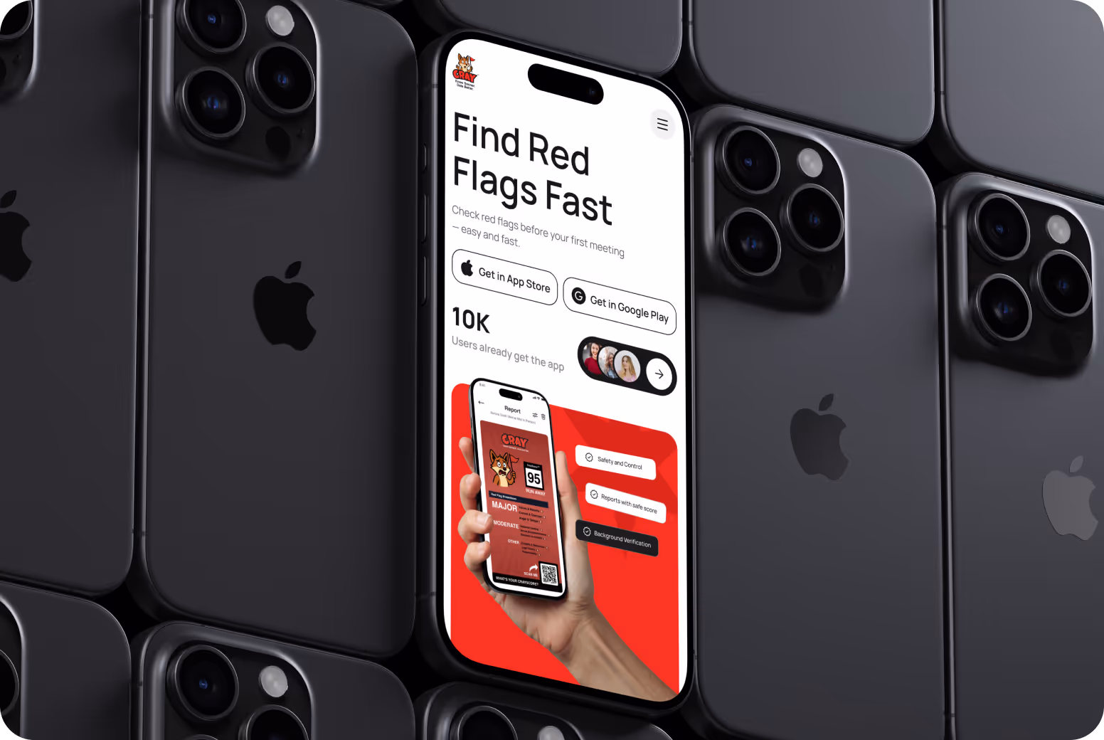
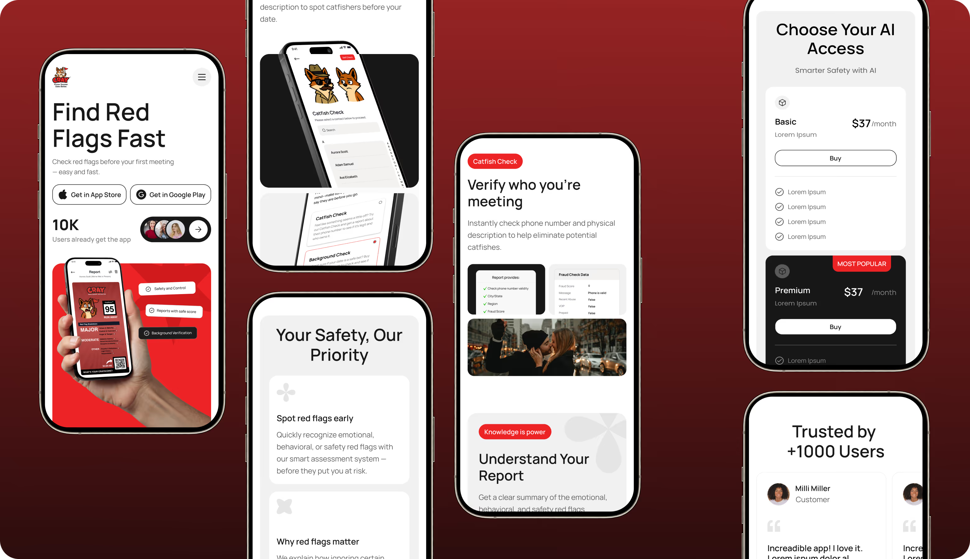
Our team had a mobile-first focus for this project because Cray’s users often have quick, on-the-go sessions. The interface is designed specifically for smaller screens with ergonomic touch zones, thumb-friendly navigation, and simplified interaction flows. A cohesive visual system, lightweight motion, and emotionally supportive micro-interactions guide without distraction and support confident decision-making.

.avif)
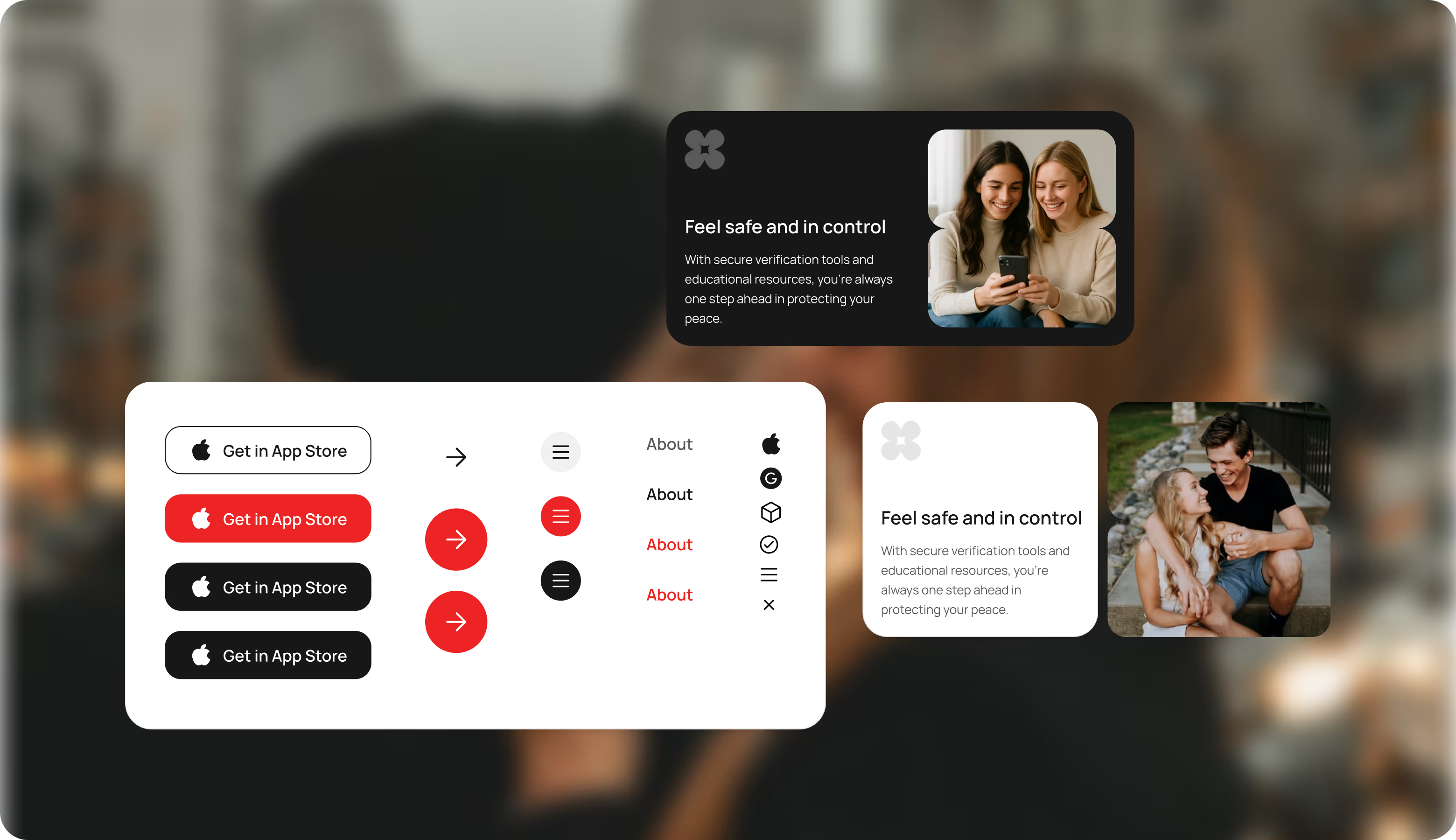
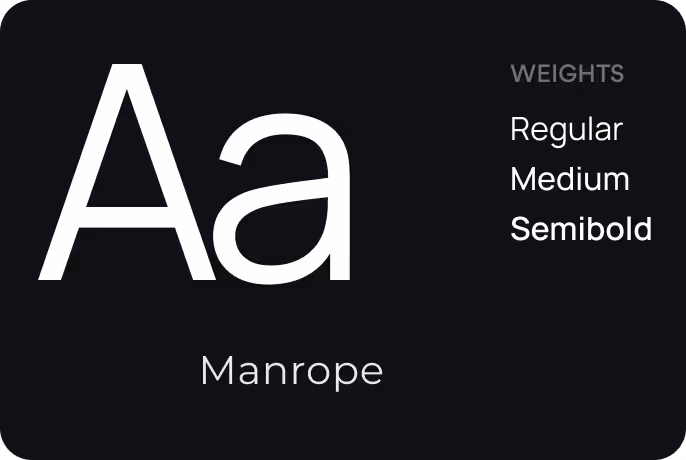
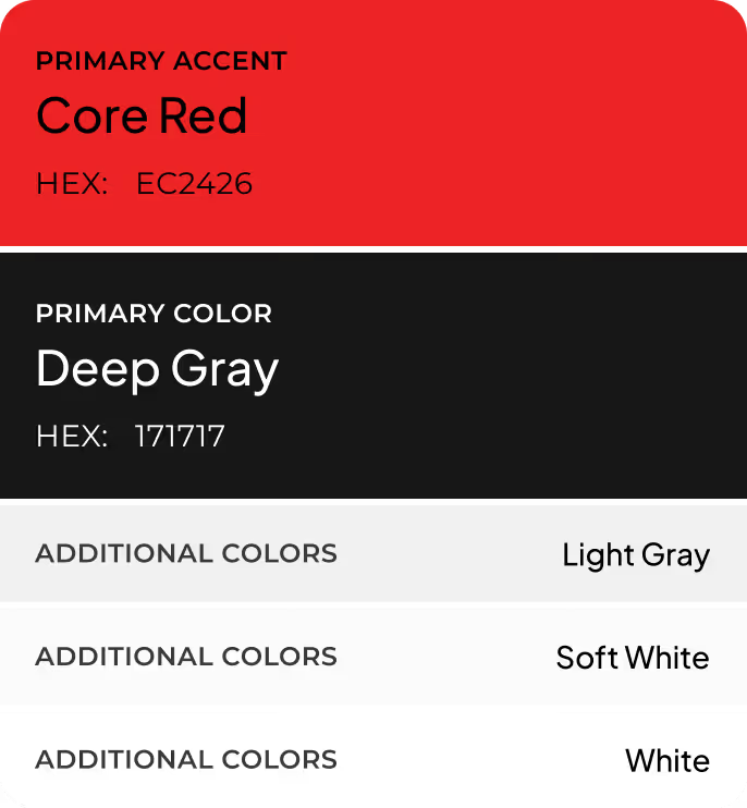
UI Kit
UI kit ensures visual and behavioral consistency across the web and mobile experience. Our team described and defined reusable components, color rules, typography styles, and interaction states. It preserves trust and clarity as the product scales across new screens and features.
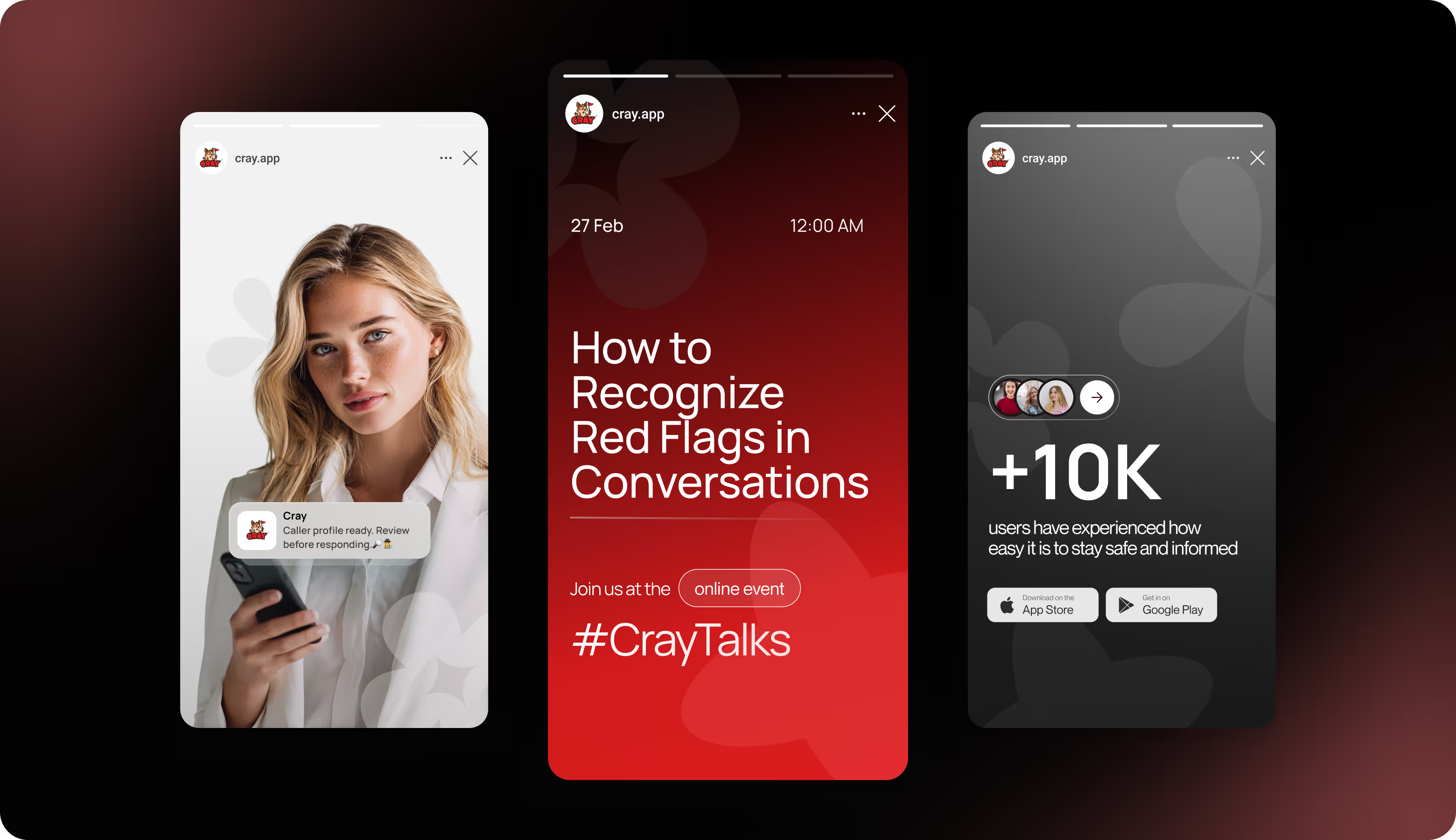
Social Media
We extended Cray's visual system to social media for consistent recognition and trust across all external touchpoints. The same typography, color logic, and component patterns across social channels convey safety, support awareness, build community, and help attract new customers.
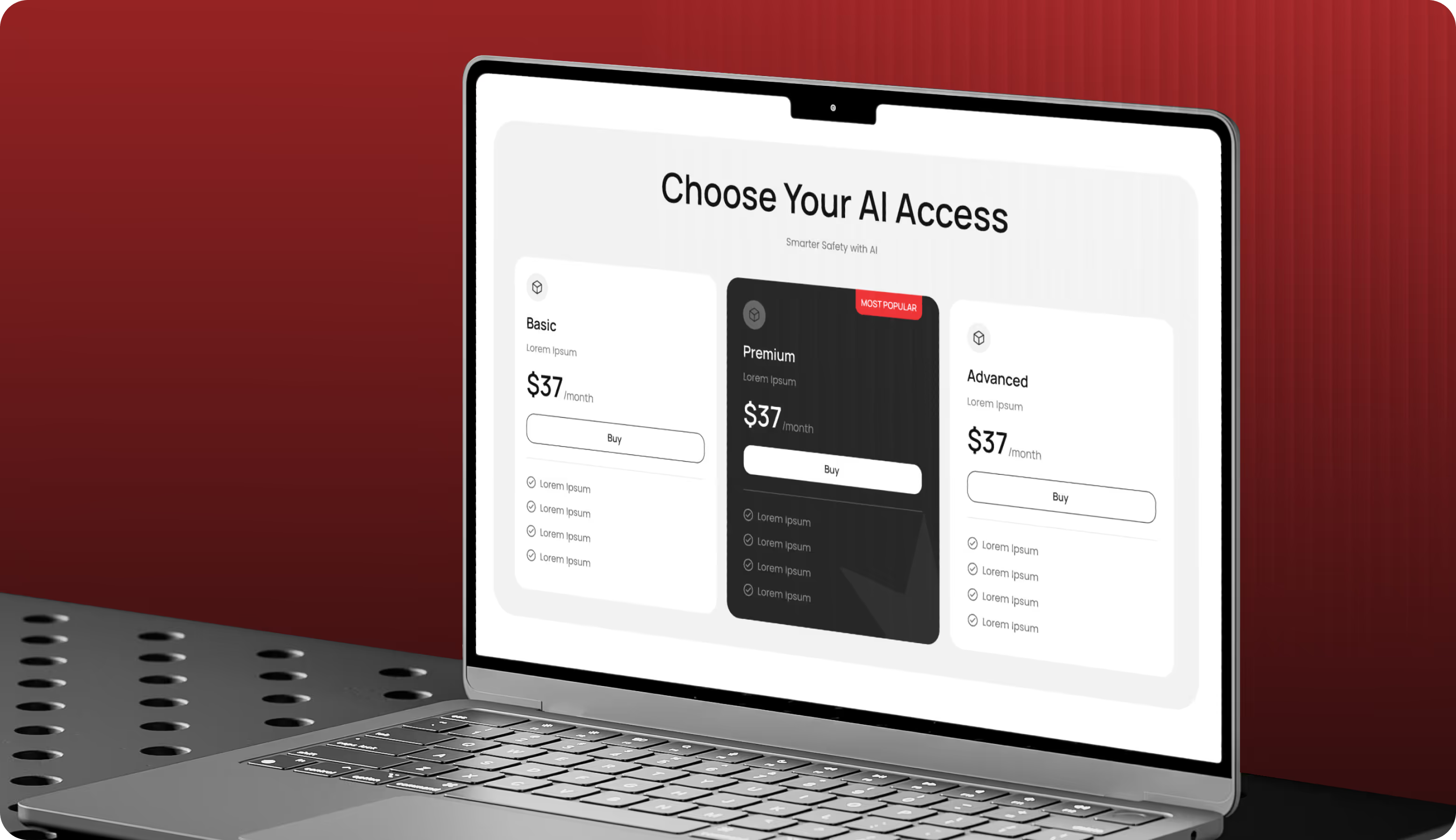
Design system
.avif)
.avif)
Results
39%
Higher conversion rate.
A conversion-focused flow and simplified value hierarchy guide users from curiosity to action.
91%
Content interaction depth.
Clear sectioning and visual prioritization increased meaningful interaction with key blocks.
+52%
Mobile session duration.
Mobile-first layouts and emotionally supportive feedback made content easier to explore on smaller screens.
-36%
Cognitive friction.
Simplified flows, progressive disclosure, and consistent patterns reduced hesitation points.
