
Branding design for AI System
Branding
Graphic Design
Visual identity for emotional AI

client
Hai Cora
industry
AI
headquarter
Ireland
Service
Branding
About project
Hai Cora is an AI platform that analyzes emotions and personalizes communication through intelligent responses. Our goal was to show how an AI system can understand emotions and talk to people in a way that doesn't seem cold or too technical.


.avif)
{/}
Challenges & Solutions
Problem
Hai Cora required a branding solution that radiated intelligence and empathy. The tough task was to show how an AI system can recognize feelings and communicate human-style without being too technical.
Solution
We worked to make Hai Cora's brand more approachable. Through research, sketches, and an iteration of the logo, our team developed a visual identity that expresses trust and the empathy-driven values of the brand.
Process
{/}
The work began with in-depth research to define Hai Cora's essence and communication tone. Moodboard and sketches helped shape direction, while several logo iterations led to a balanced identity that feels human, confident, and tech-driven.
Briefing & Onboarding
Competitors Research
Logo Moodboard
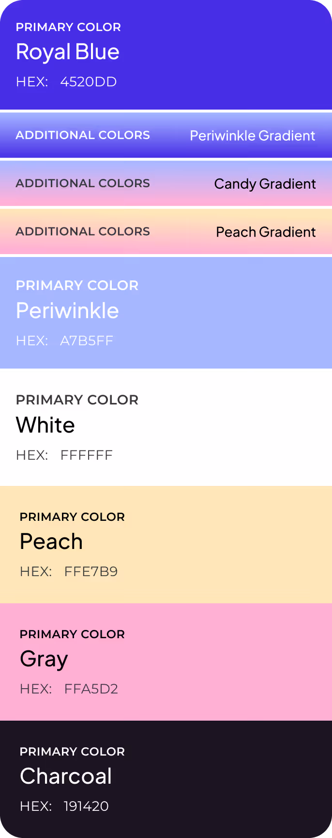
Color Palette Moodboard
Metaphors
Logo Concept Creation
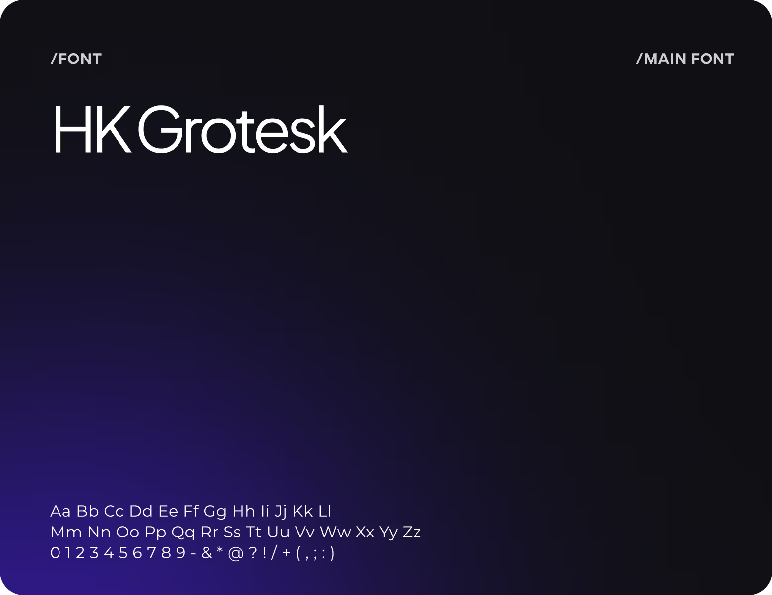
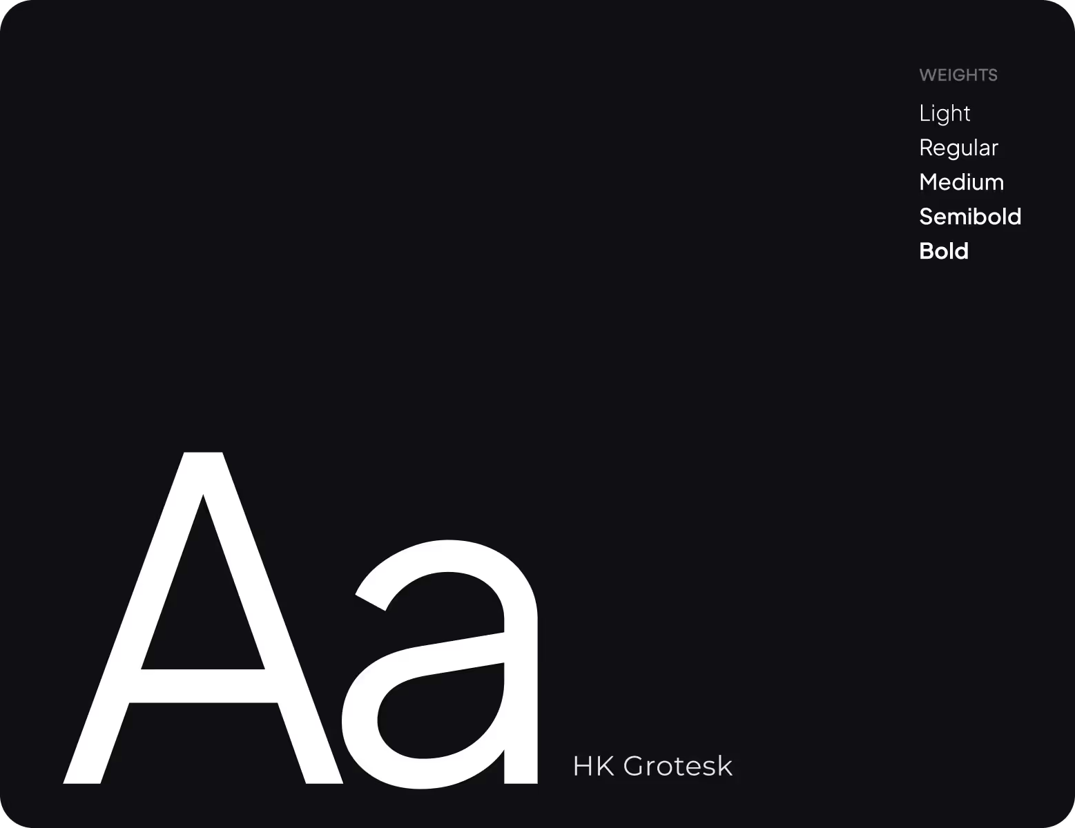
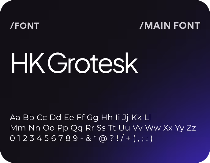
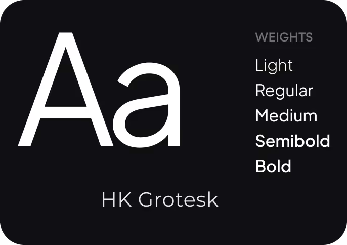
Typography
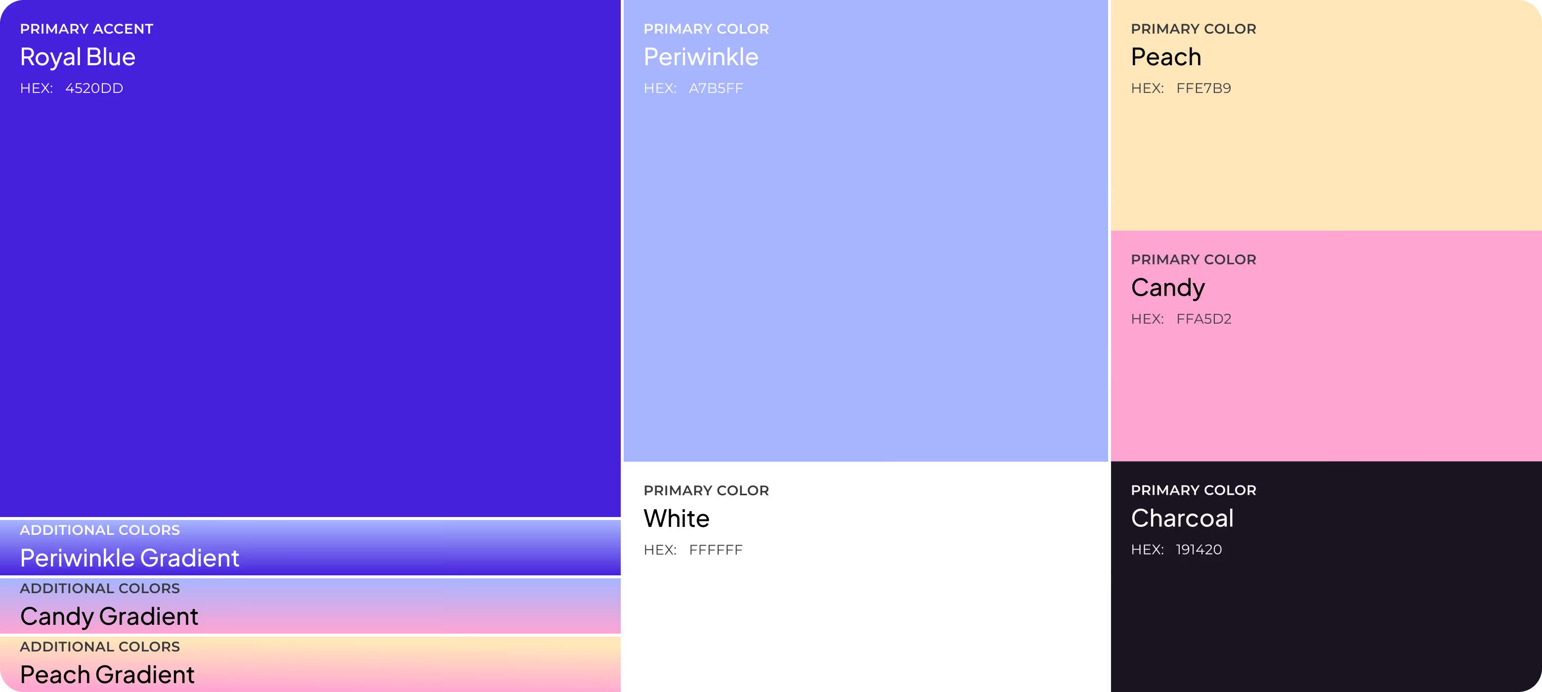
Work with color
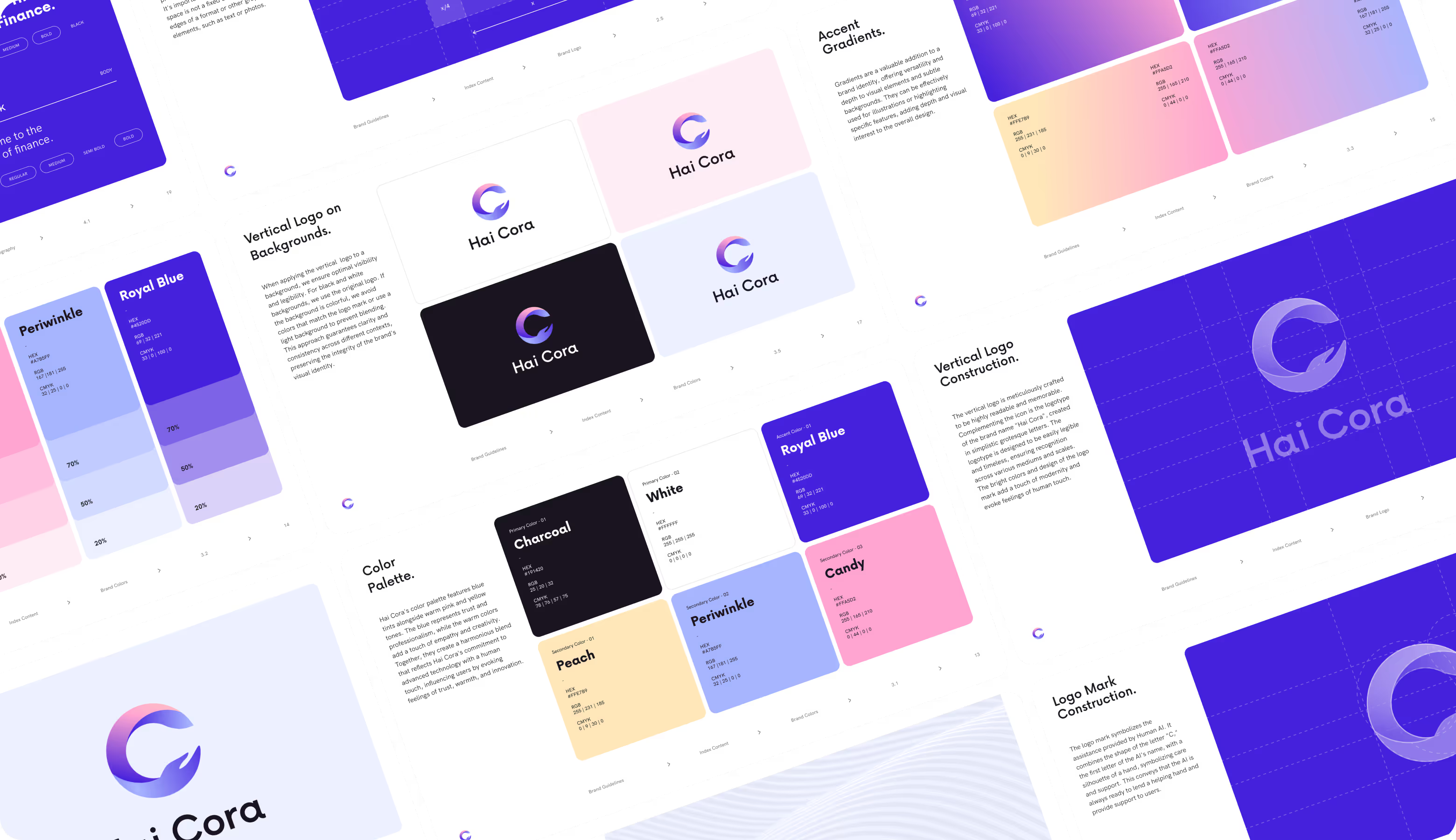
Lockup Logo
Color Palette (primary, secondary)
Typography rules
{/}
No items found.
{/}
{/}
No items found.
{/}
{/}
{/}
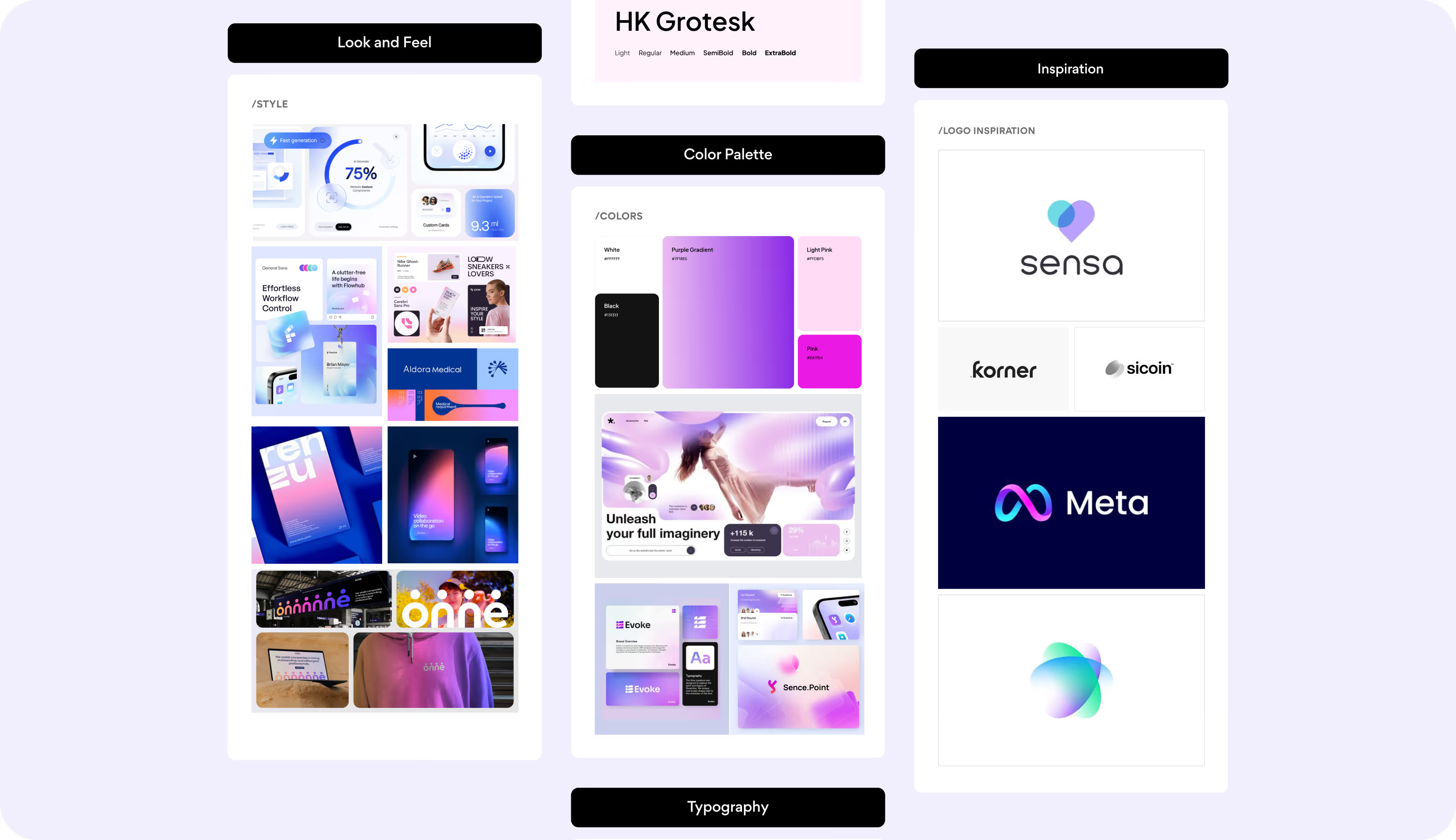
Moodboard
A competitor analysis and client preferences defined the foundation for Hai Cora's visual direction. The moodboard reflected favored fonts, colors, and overall mood, helping the team align on tone and style for the logo and future brand materials.
{/}

Turn your product into a brand with a clear identity, strong visuals, and a trusted story.
{/}
{/}
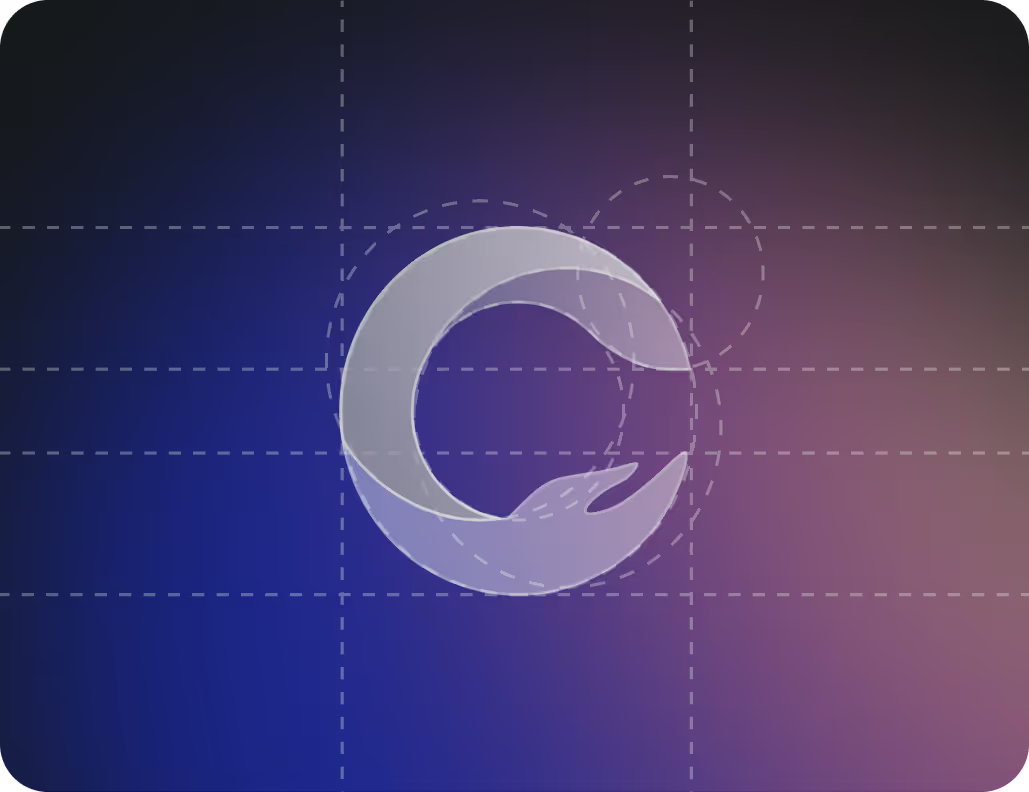
Logo Concept Design
The logo unites the letter C with a hand shape, making Hai Cora's human side instantly recognizable. The soft gradient adds depth and motion, reflecting a system that picks up emotions and gives context-aware responses.


No items found.
{/}
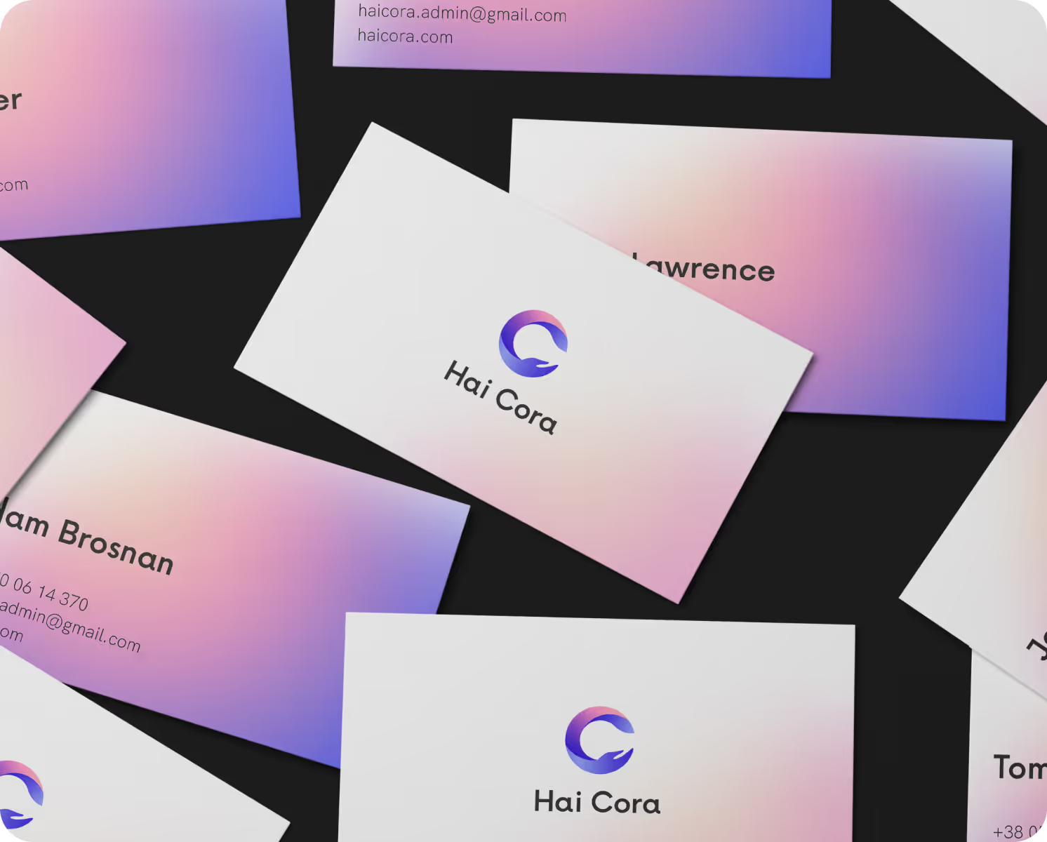
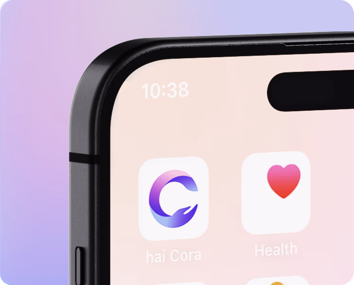
Brand Guidelines
The client needed clear rules for presenting Hai Cora across digital and printed media. The brand guidelines defined how gradients, colors, and typography express both the core emotional and technological sides of the tool, keeping its identity adaptive and consistent across all touchpoints.


{/}
No items found.
{/}
Design system
{/}
Results
47%
Stronger brand recognition - Hai Cora gained clearer visibility in the AI market thanks to a consistent and memorable identity.
35%
Higher customer trust - A cohesive visual language and human tone increased confidence among early adopters and partners.
28%
Engagement growth - Unified visuals and messaging improved interaction across digital channels and product touchpoints.
22%
Faster decision-making - A structured, easy-to-recognize identity helped users navigate the system and understand its purpose more quickly.
