
Website Redesign and Branding for Tech Consulting Company
UI/UX Design
Branding
Graphic Design
Designed to reflect 25 years of tech excellence and reliability
client
KESSOFT
industry
Consulting
headquarter
EU
service
UI/UX, Branding
About project
For over 25 years, kessoft has been helping businesses undergo digital transformation with expert consulting and custom software development. The company delivers secure, scalable, and efficient solutions for web, mobile, and desktop platforms.


{/}
Challenges & Solutions
Problem
kessoft’s website no longer reflected their expertise or credibility. They asked us to create a distinctive, high-performing platform that represents their brand. Our challenge was to replace the outdated, template-style site with a unique design and develop it.
Solution
We designed a custom system with original layouts, illustrations, and clear visual language. A clean structure, interactive elements, and balanced spacing made the website professional and attractive. We also cared for a smooth transition from design to dev, so now the website is scalable and easy to navigate.
Process
{/}
For us, this project was about a balance between creativity and professionalism. We began with branding, then designed the website with custom illustrations for warmth and character. Close collaboration with kessoft helped us translate their ideas into this excellent digital product.
Moodboard
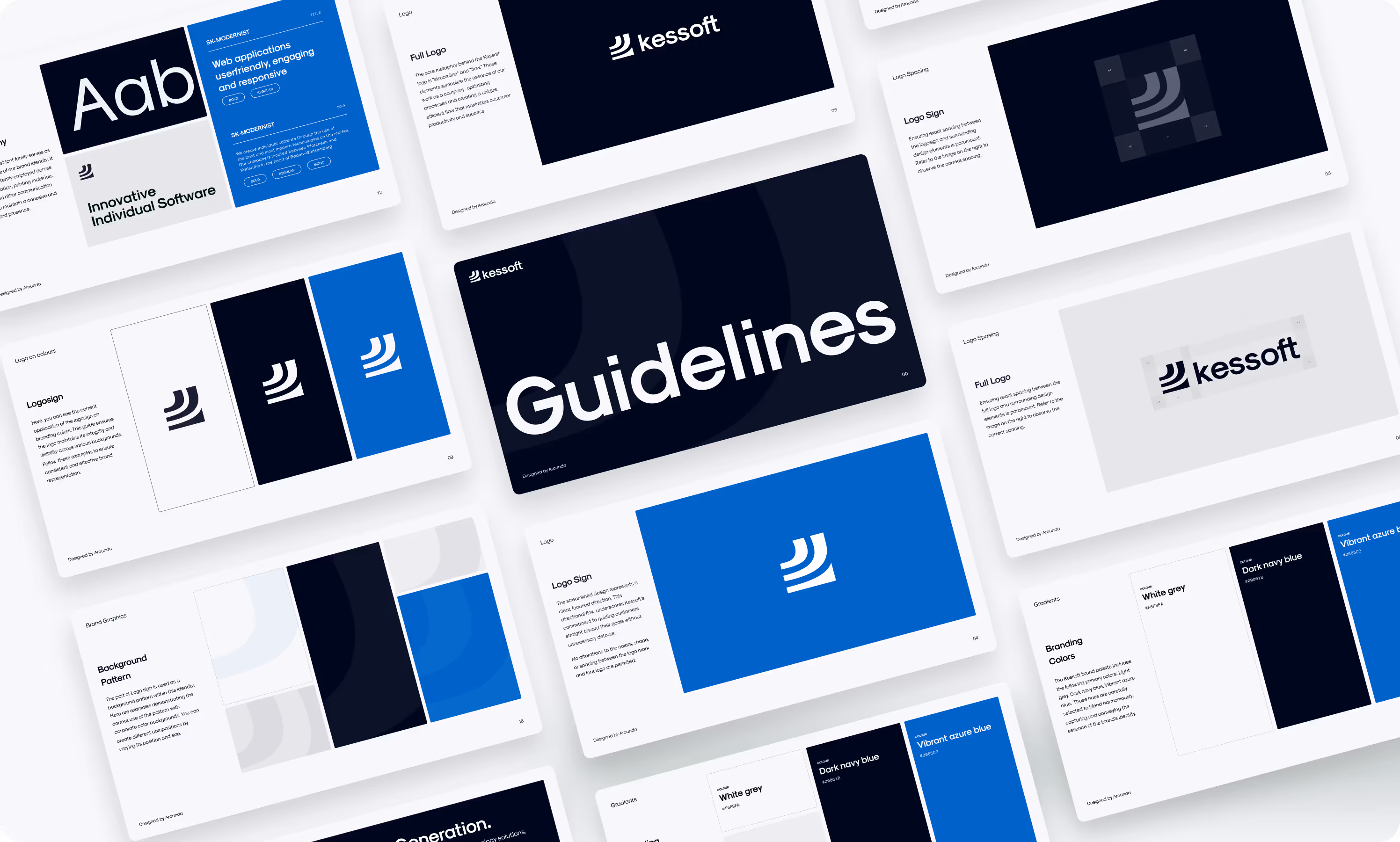
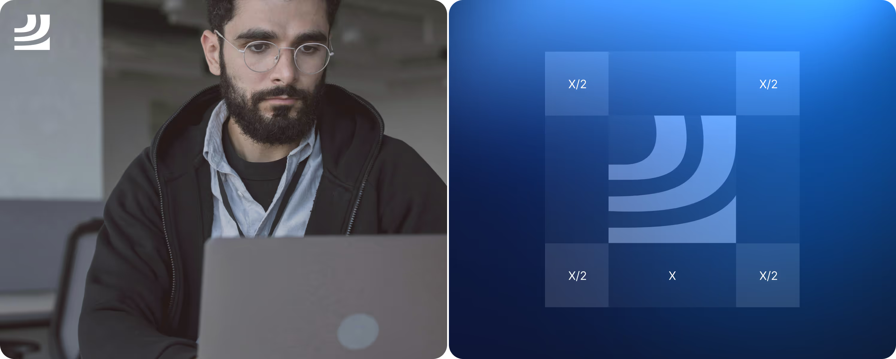
Logo Creation
Guidelines
Briefing & onboarding
Site Map
Wireframes
Moodboard + Concept design
UI Layouts
UI KIT & Graphic design
Responsive design
Development
Pitch Deck
{/}
No items found.
{/}
{/}
No items found.
Moodboard
{/}
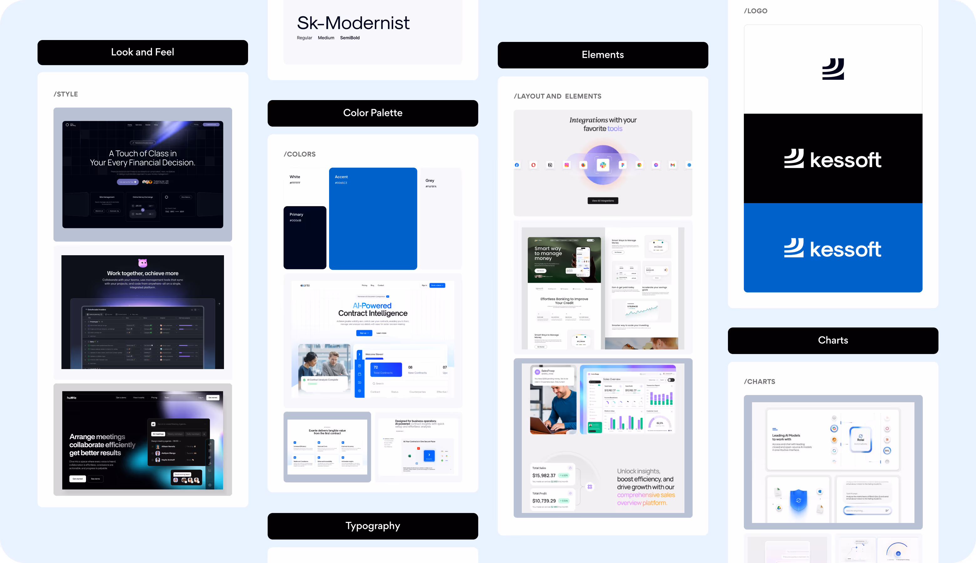
The client preferred a simple, clear, and user-centered design with a minimal aesthetic. That’s why we chose neutral tones, soft rounded shapes, subtle accent colors on CTAs, and hover effects. They created a calm, approachable, and visually balanced foundation for a new interface.
{/}
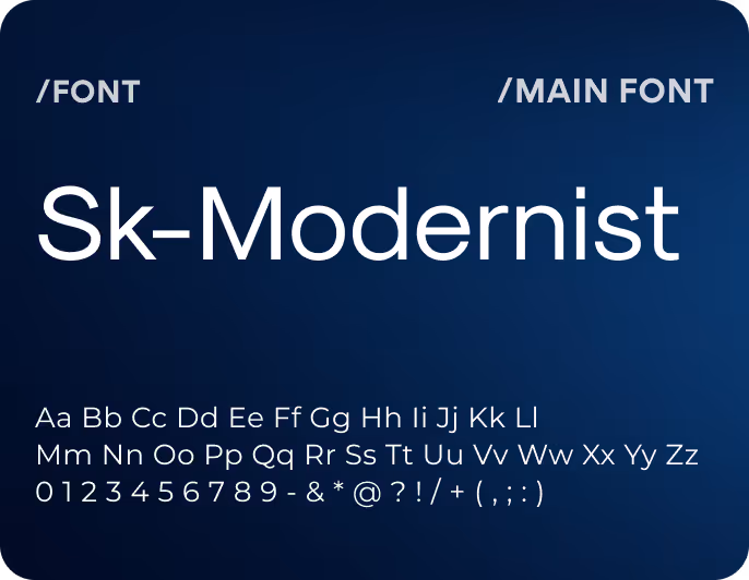
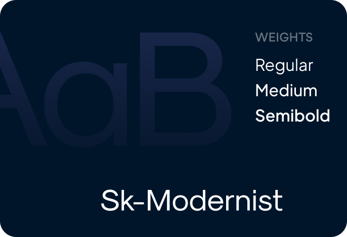
Branding
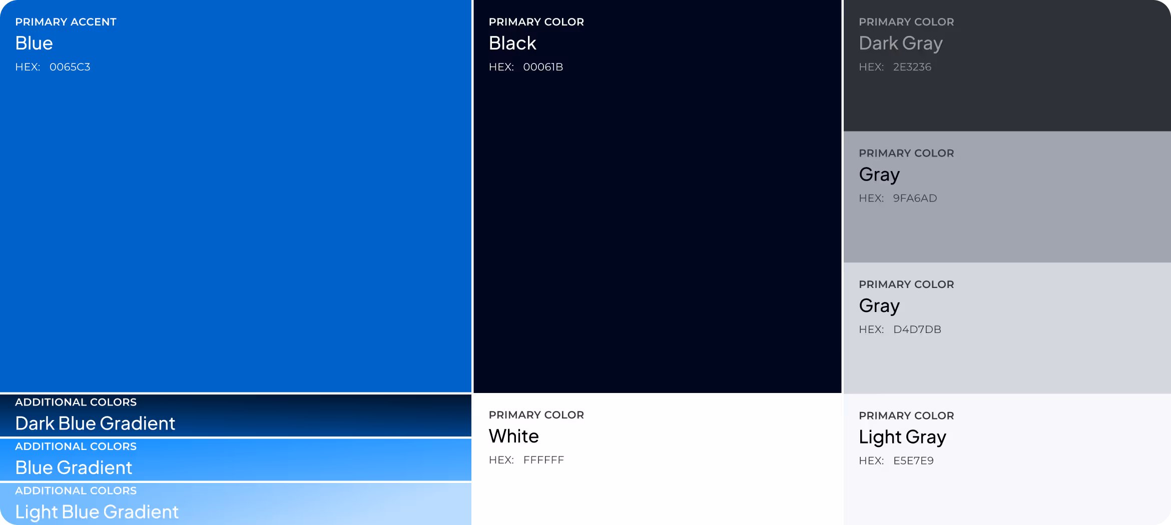
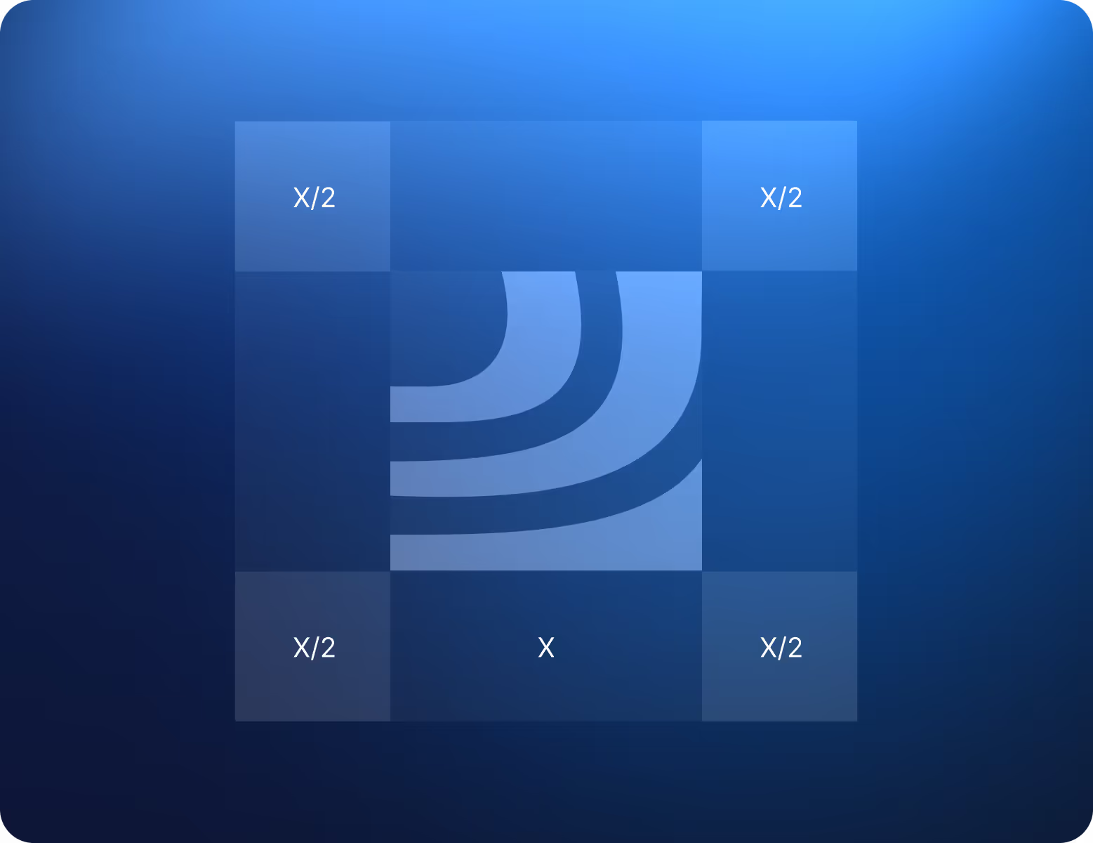
kessoft’s fresh brand identity captures the feeling of motion and ease. The logo’s flowing curves show progress and direction. The cool mix of grey, navy, and azure adds a modern and confident tone. It’s simple, flexible, and instantly recognizable across digital and print.
{/}
Wireframing
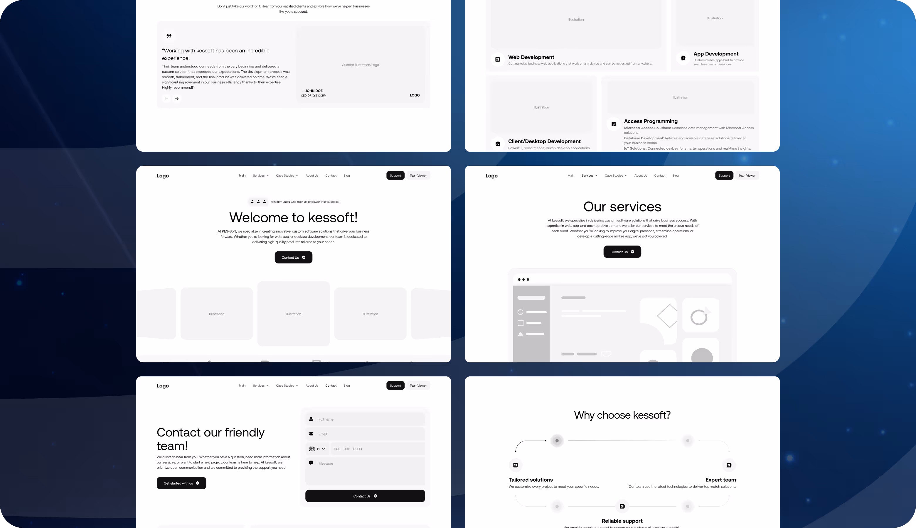
At the wireframing stage, we focused on making the website clear and easy to navigate. Each block must guide visitors naturally from learning about services to getting in touch. Simple layouts, a clean structure, readable content, and visible CTAs create a straightforward, user-friendly flow that helps increase conversions.
{/}
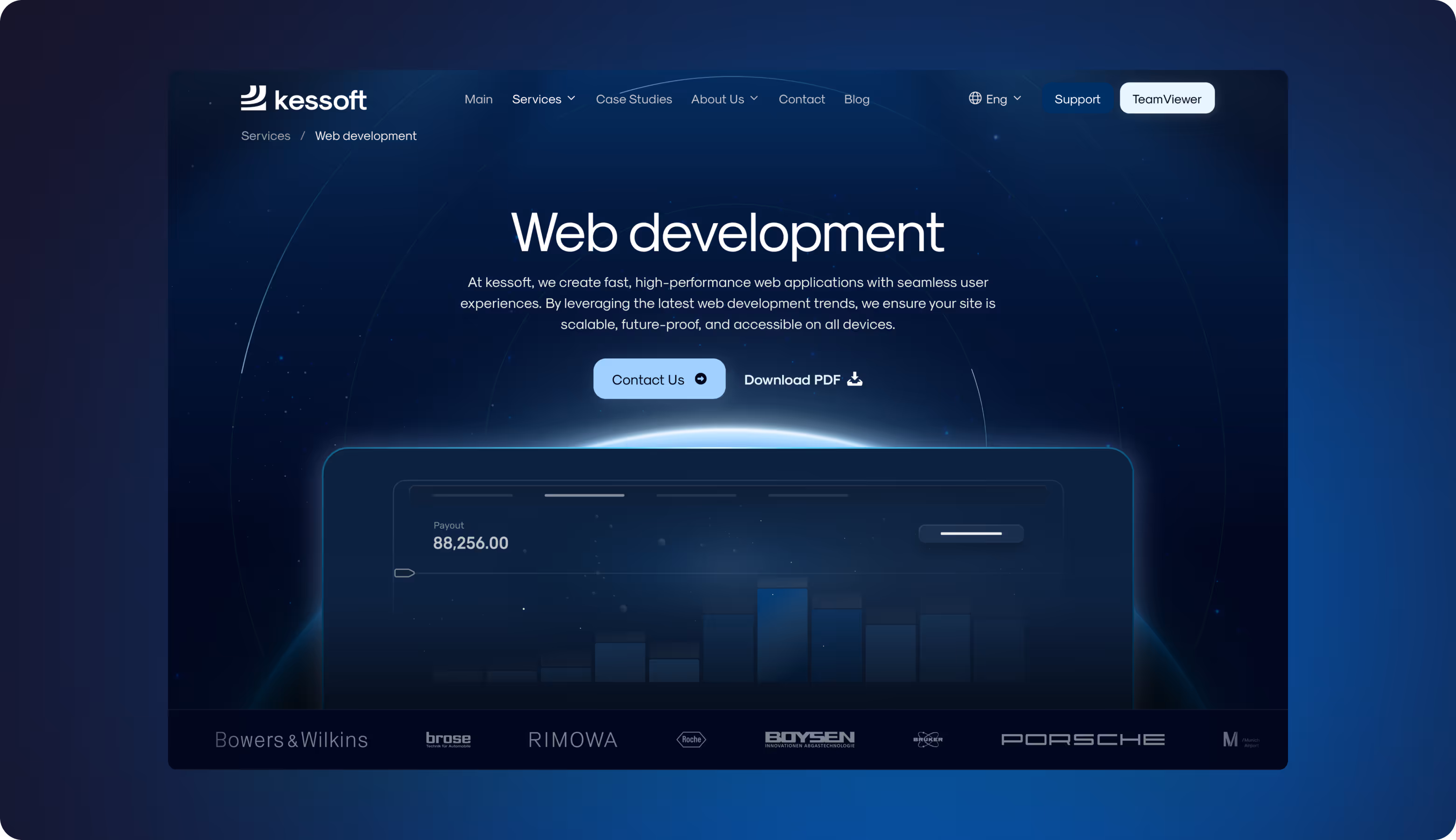
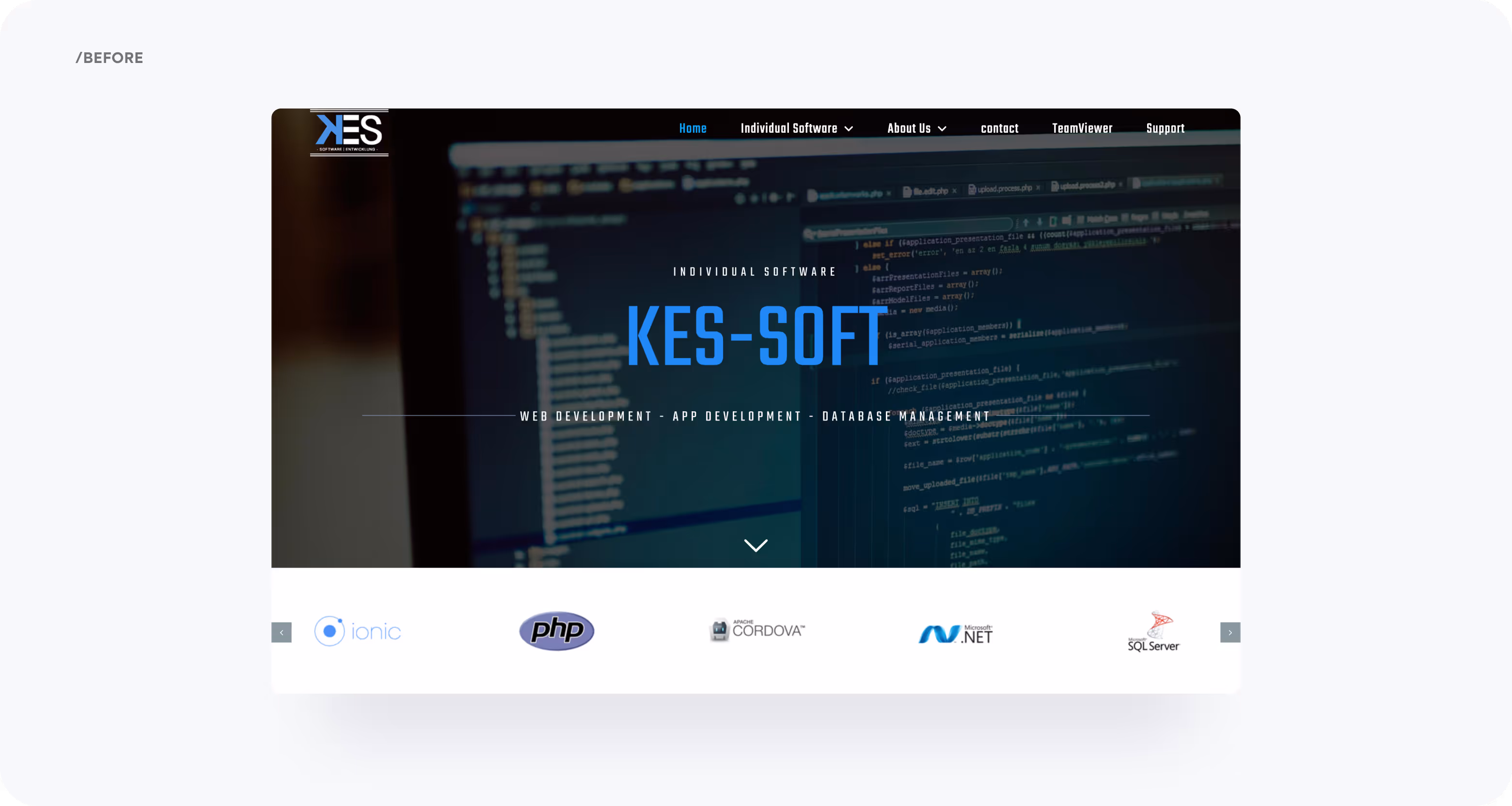
Redesign
The old website had a dark, heavy layout, dense text, and unclear structure. We offered more whitespace, organized content blocks, and 3D visuals on a deep blue gradient background. This improved readability and flow, added a dynamic and trustworthy look, and reflected expertise.


Build a modern, high-performing website that earns trust and converts with Arounda.
{/}
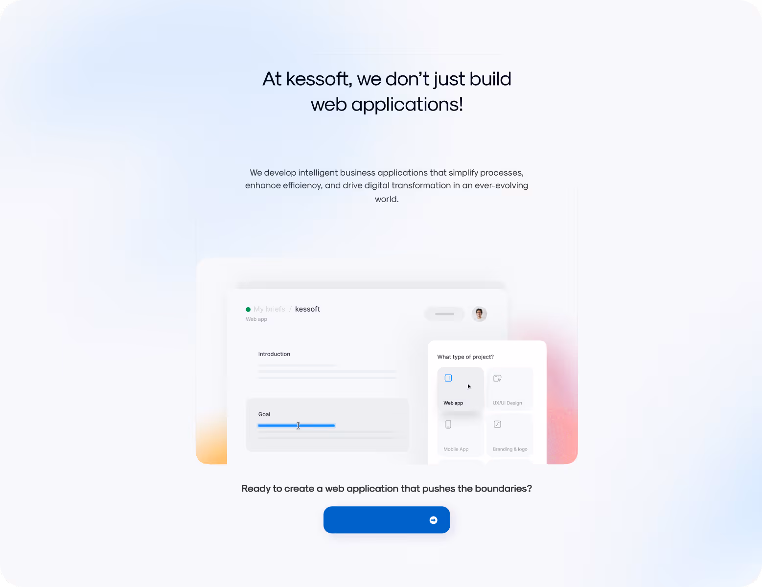
UI/UX design
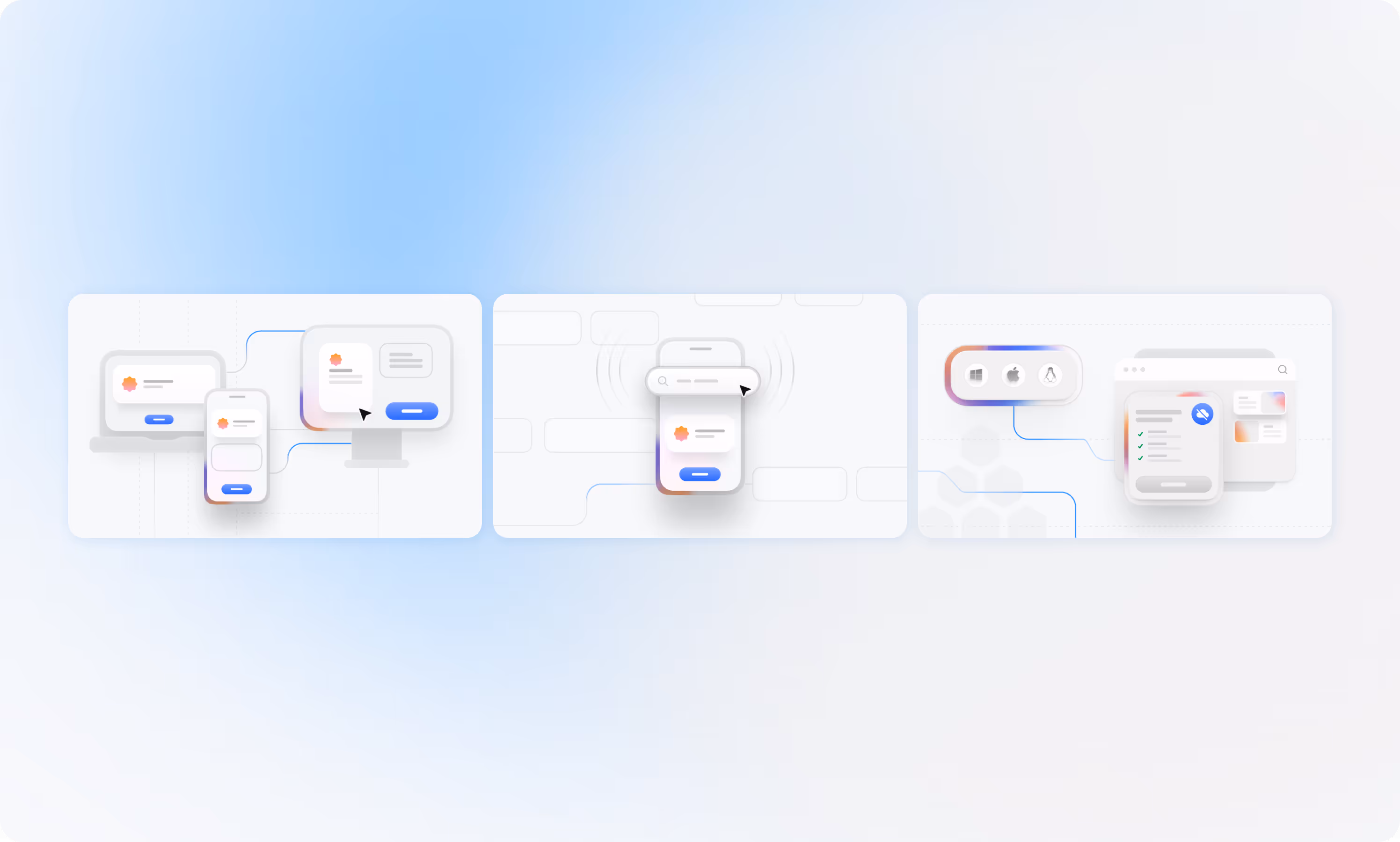
Our UI/UX designers focused on simplicity, ease of use, and clear visual flow. The new interface is intuitive, has a clear hierarchy, and fluid navigation. It makes every interaction effortless. Glassmorphism elements add depth and a modern feel. Subtle hover effects, animated transitions, and a sticky CTA keep users engaged. And soft gradients + linear illustrations bring clarity to complex information and give the design personality and function.

{/}
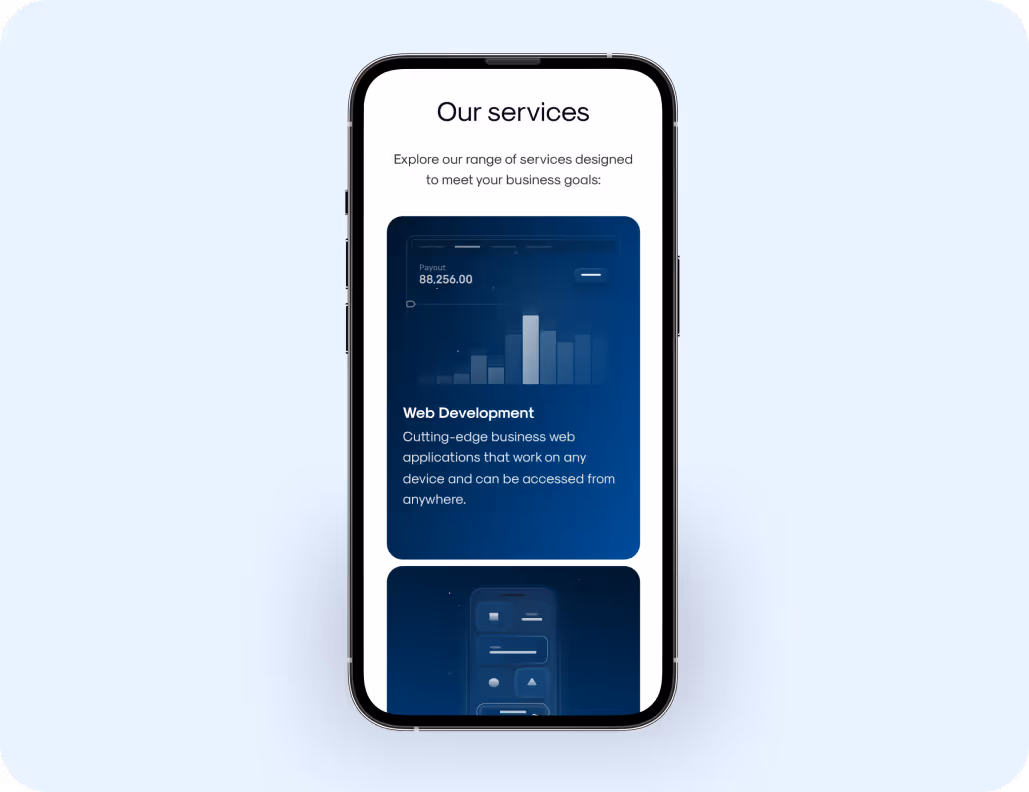
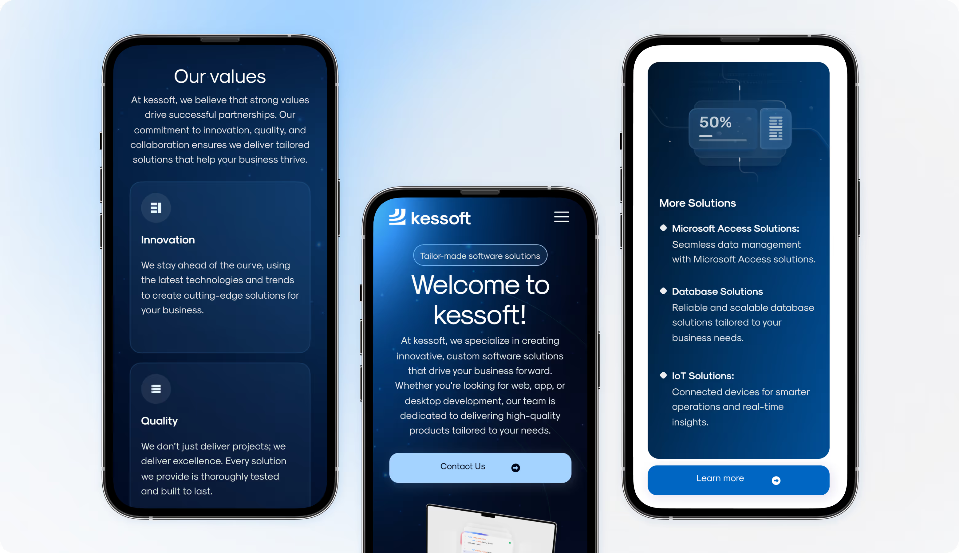
Responsive design
We made sure kessoft’s website looks and works perfectly on any device. Adaptive layouts, scalable visuals, and touch-friendly elements keep the experience consistent and intuitive.

.avif)
.avif)
.avif)
No items found.
{/}
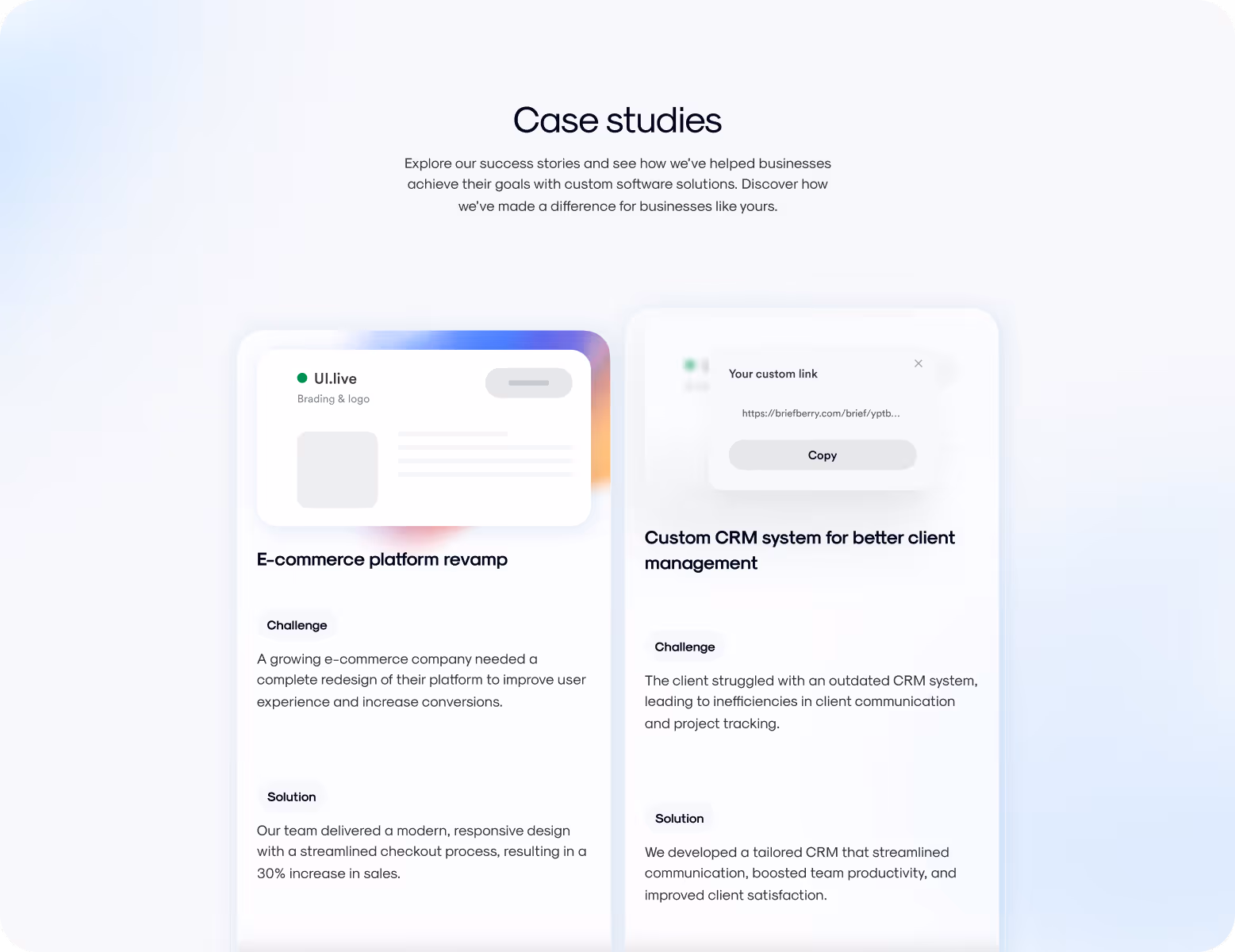
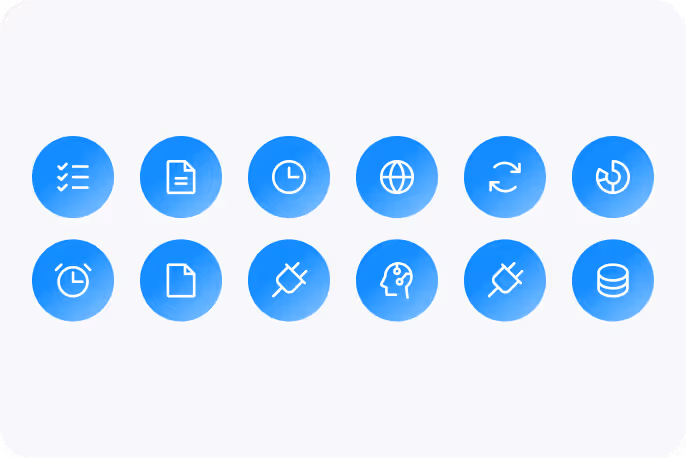
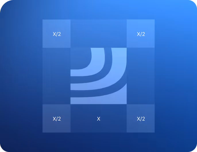
Graphic Design
The new website has clean, minimal 3D illustrations that highlight the company’s tech expertise engagingly. Soft gradients, smooth lighting, and floating UI elements bring depth and motion. Now, complex software concepts become clear, visually appealing stories.

{/}
No items found.
{/}
Design system
.avif)
.avif)

{/}
Results
+47%
Increase in user engagement. Visitors spend more time on the website because the navigation is clear and the interface is intuitive.
+38%
Faster task flow completion. Users can easily find what they need without extra clicks thanks to optimized layouts and an intuitive structure.
31%
Drop in bounce rate. A modern look and improved performance keep users interested from the first screen instead of leaving early.
+29%
Higher conversion rate. Stronger branding, clear CTAs, and better usability turned more visitors into high-quality leads and clients.
