
Strategic Website Redesign for a high-trust marketplace platform
UI/UX Design
Graphic Design
Scalable design with45% higher usability
About project
NetGet is a people-first marketplace that connects businesses and individuals for everyday buying and selling. The client faced low engagement and unclear product discovery. They requested a website redesign to improve usability and strengthen user interaction.


Challenges & Solutions
Problem
User engagement dropped due to interface inconsistency, weak hierarchy, and unclear product search. We had to audit and unify fragmented components and rebuild the structure without breaking the existing product logic.
Solution
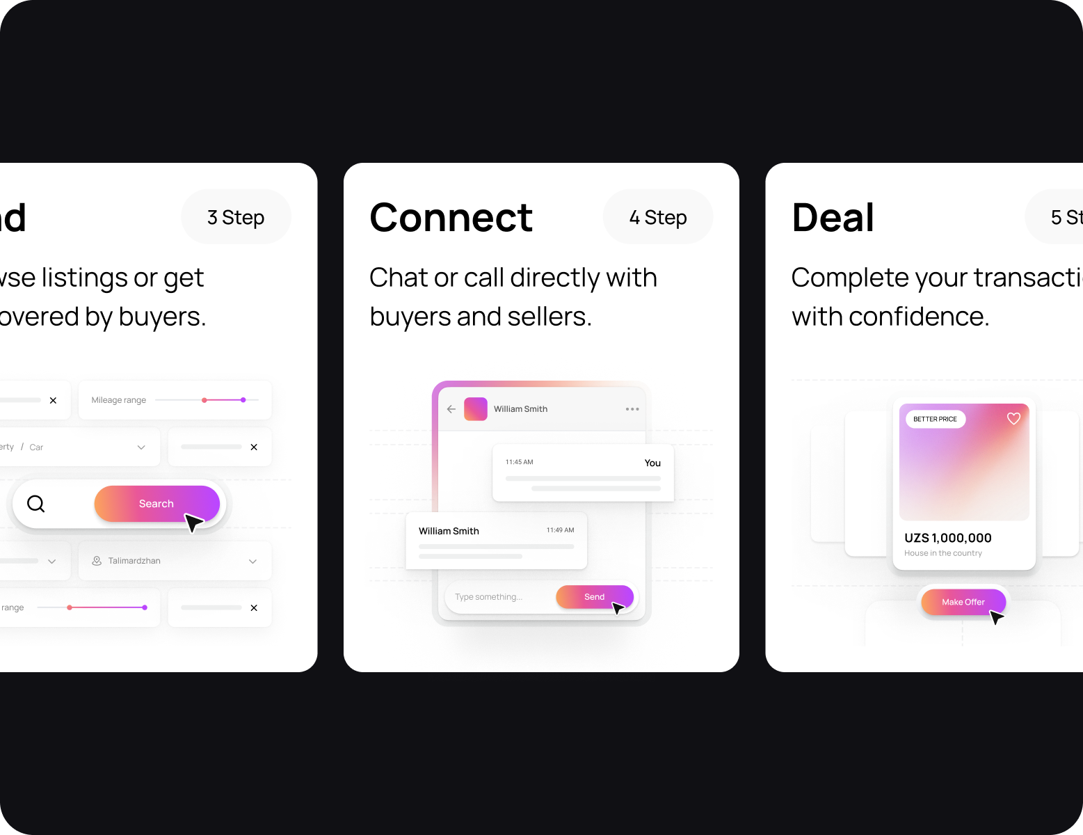
We standardized UI components and rebuilt the visual hierarchy to create a consistent and scalable design system. The team restructured product cards to make listings easier to scan. Our solutions improved product discovery speed and engagement, especially on mobile.
Process
Briefing & onboarding
Product/business goals
MVP Scope
Roadmap
App architecture
Flow creation
Wireframes
Moodboard
Concept design
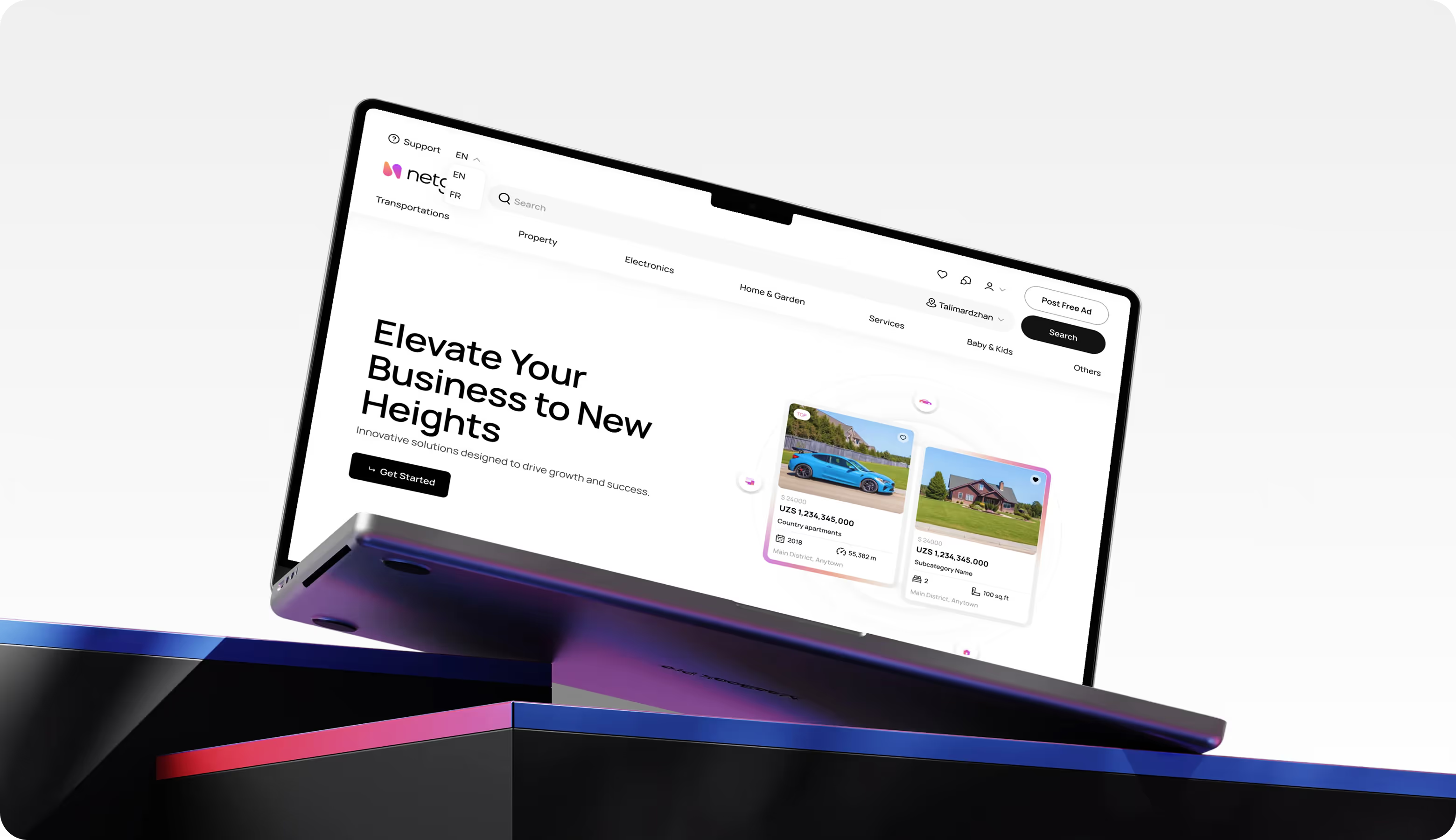
Layouts design
Design system
Mood board
Icons
Illustrations
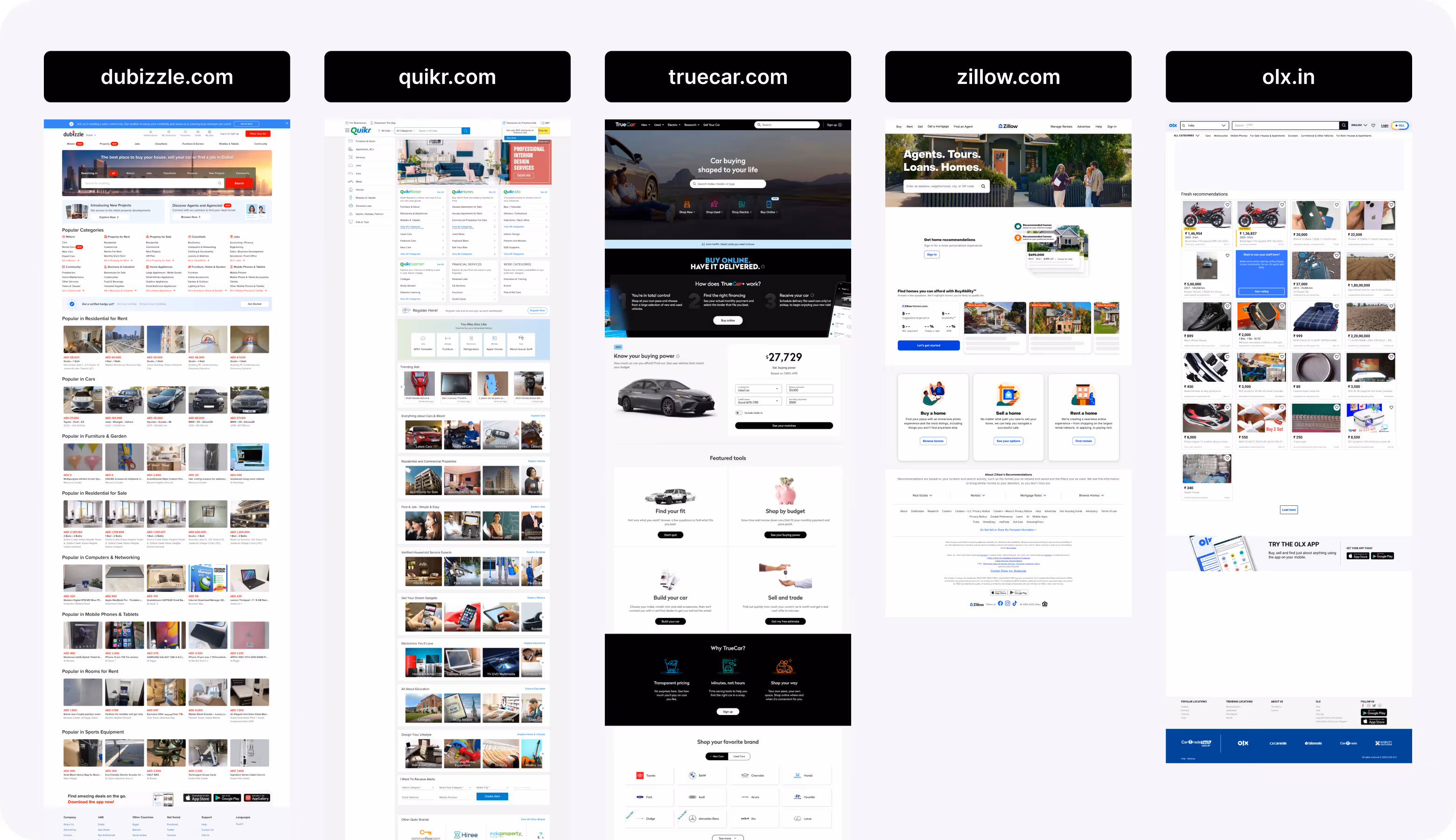
Competitor analysis
During our research, we analyzed leading marketplace platforms to evaluate their structure, navigation logic, and listing layouts. We identified common weaknesses: visual clutter, weak hierarchy, unclear CTAs, and hidden value propositions. These insights helped us design a cleaner NetGet architecture with explicit action paths and increase first-screen clarity.
Wireframing
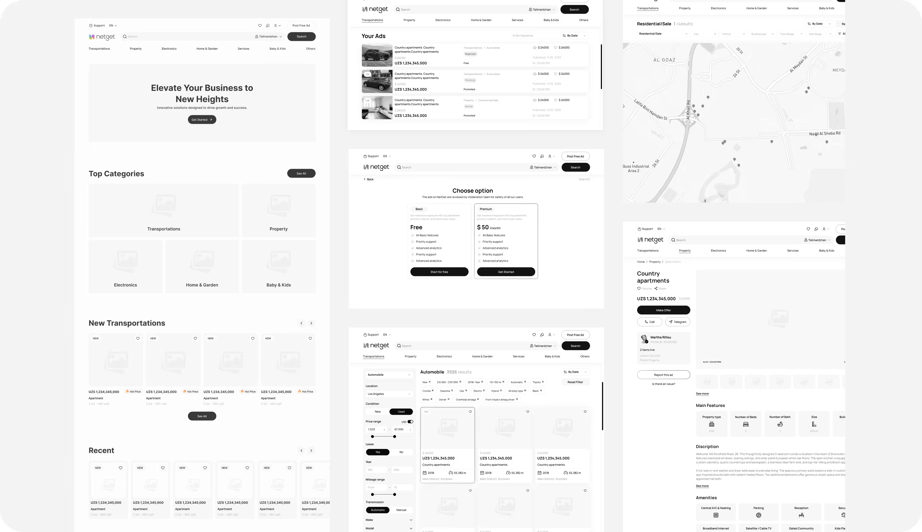
UI Layouts
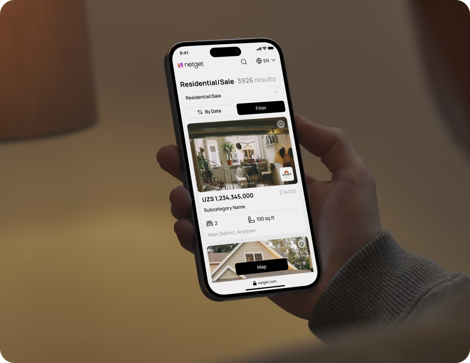
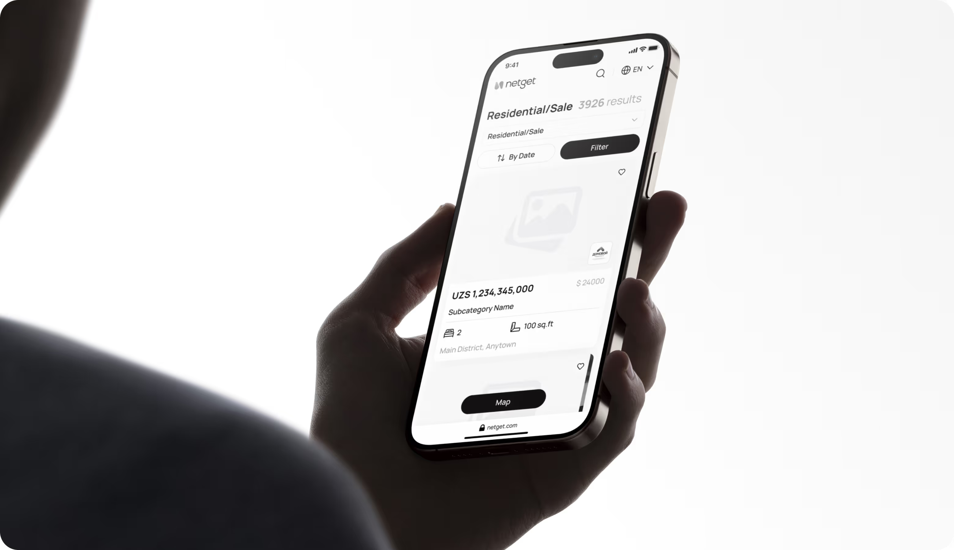
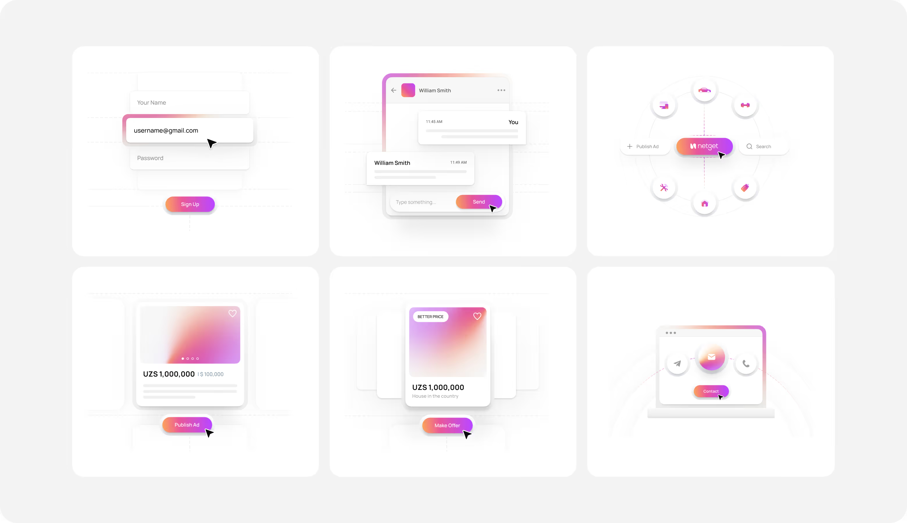
We strengthened the hierarchy with contrasting CTAs, organized messages, and easy-to-scan list cards that prioritized price and key features. Integrated trust signals and clear comparison charts improved decision-making speed and contributed to a 45% increase in usability and faster product search.

Convert your product friction into revenue growth with Arounda strategic redesign.
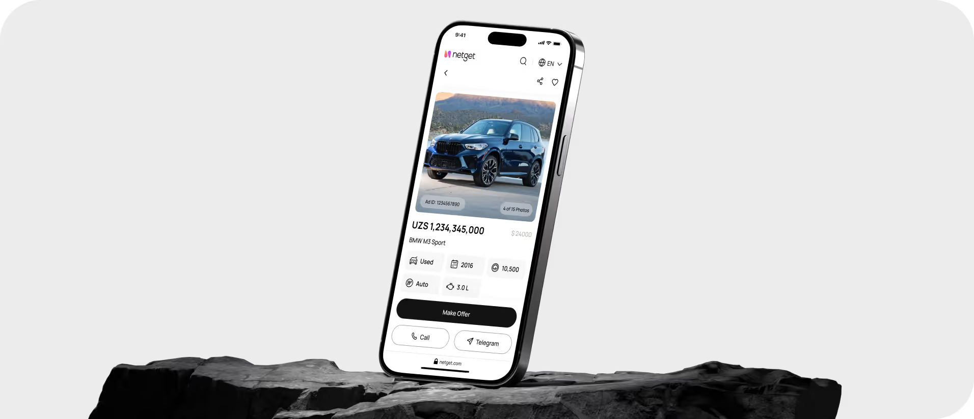
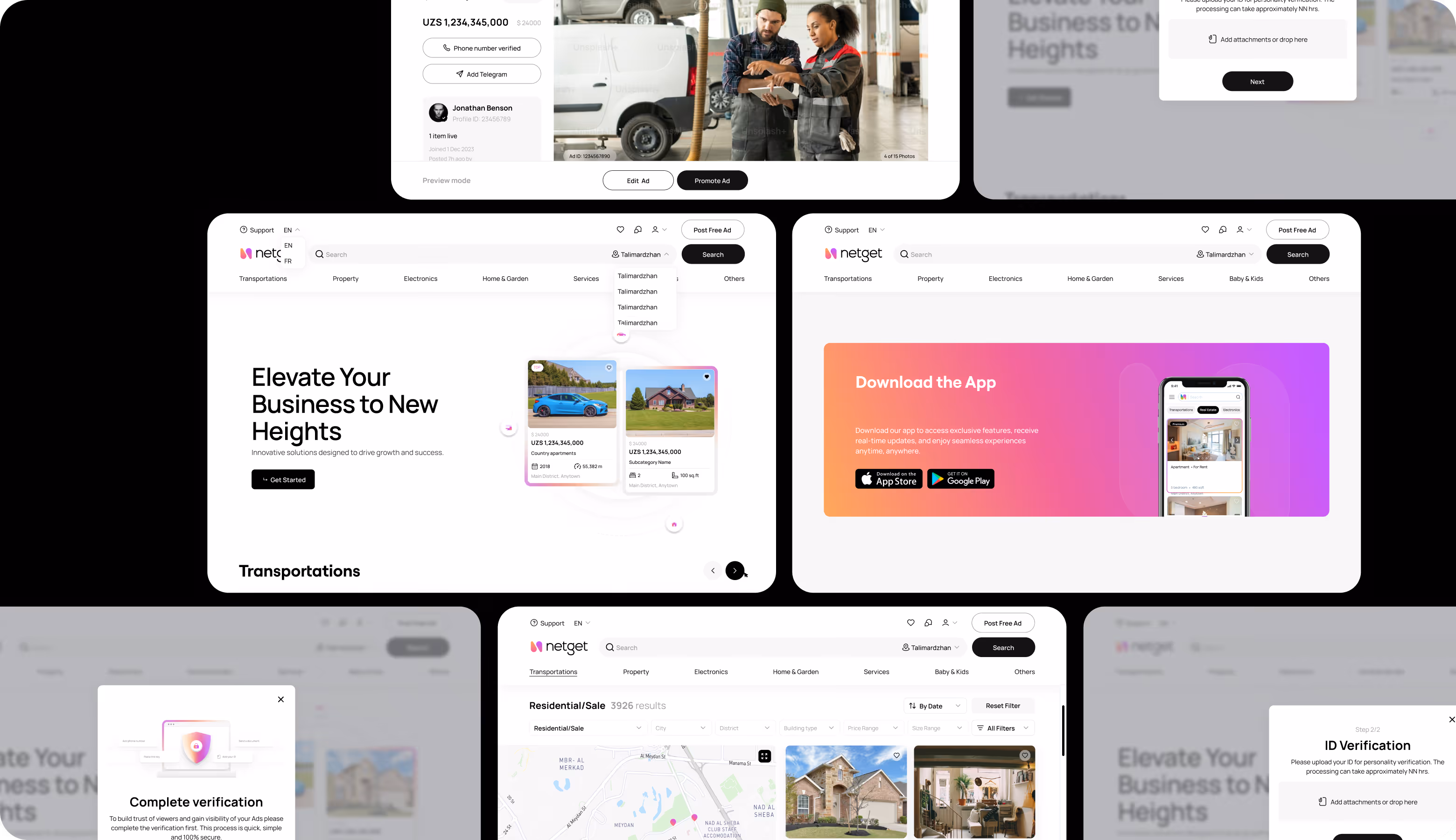
Mobile Version
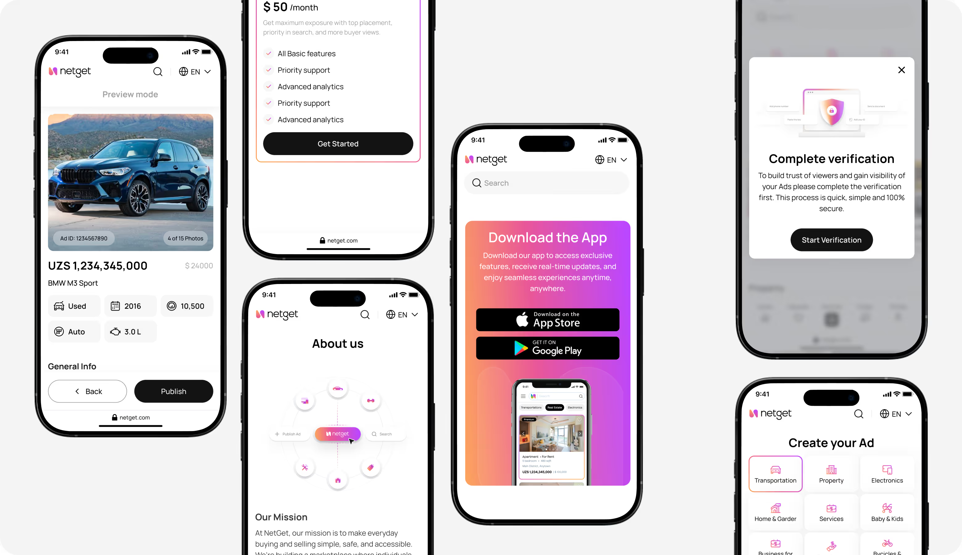
For marketplaces, the mobile experience should have vertical decision flow. It makes search, categories, and list cards a priority for quick thumb interaction. Our designers resized and repositioned touch targets, filters, and primary actions to reduce friction on smaller screens. This consistency across web and mobile contributed to stronger engagement in key journeys and faster navigation.

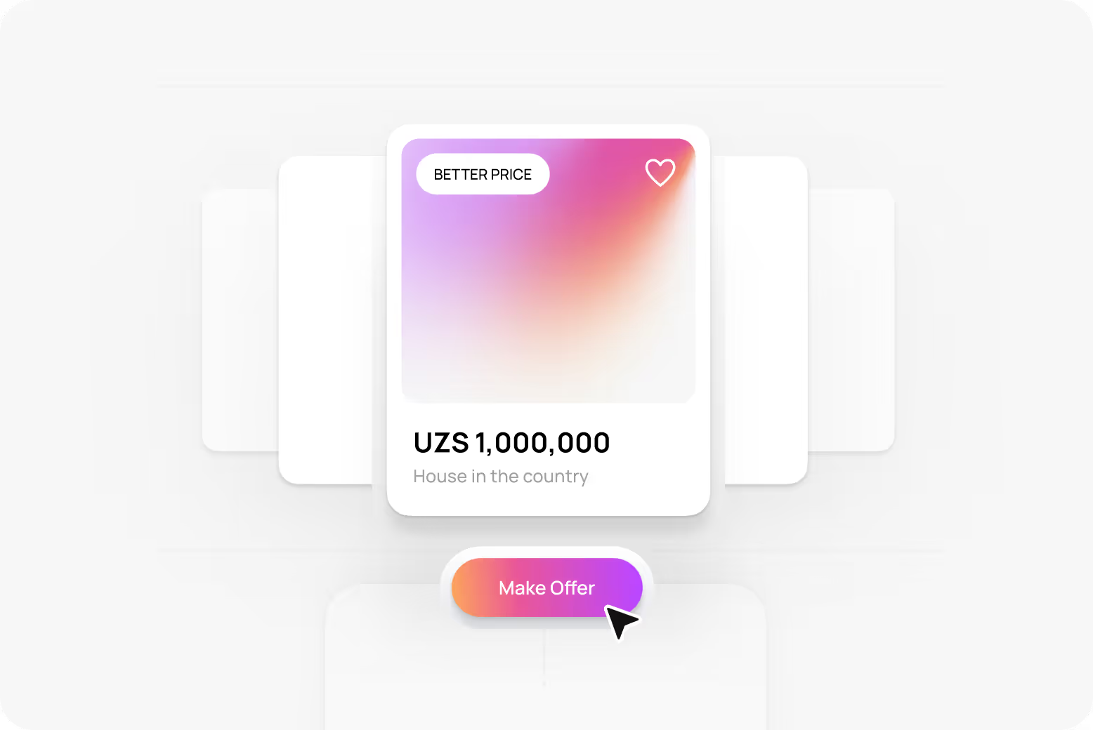
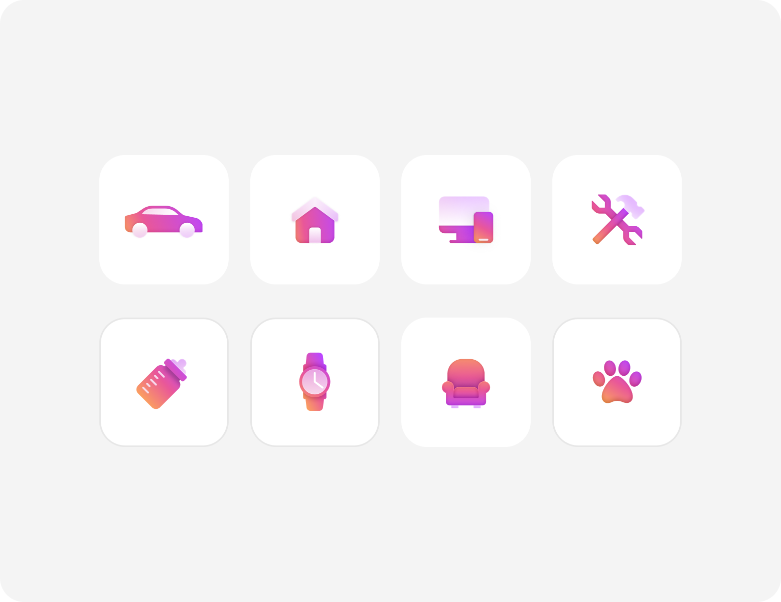
Illustration
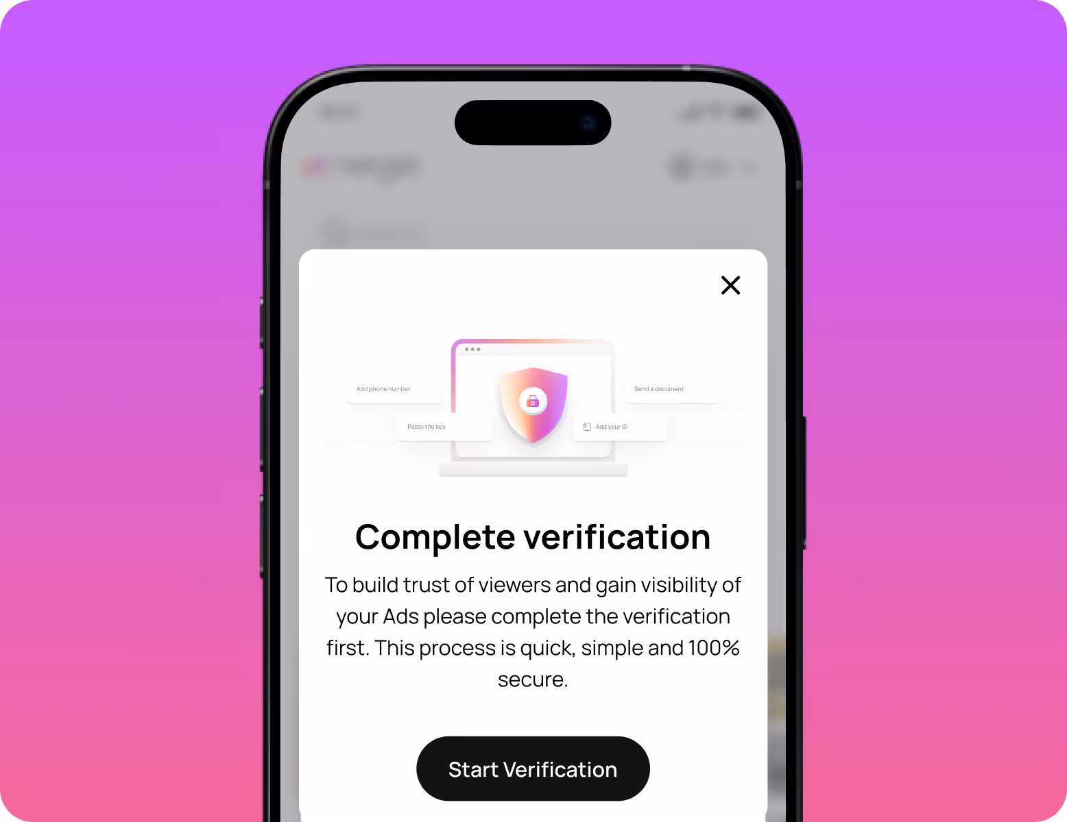
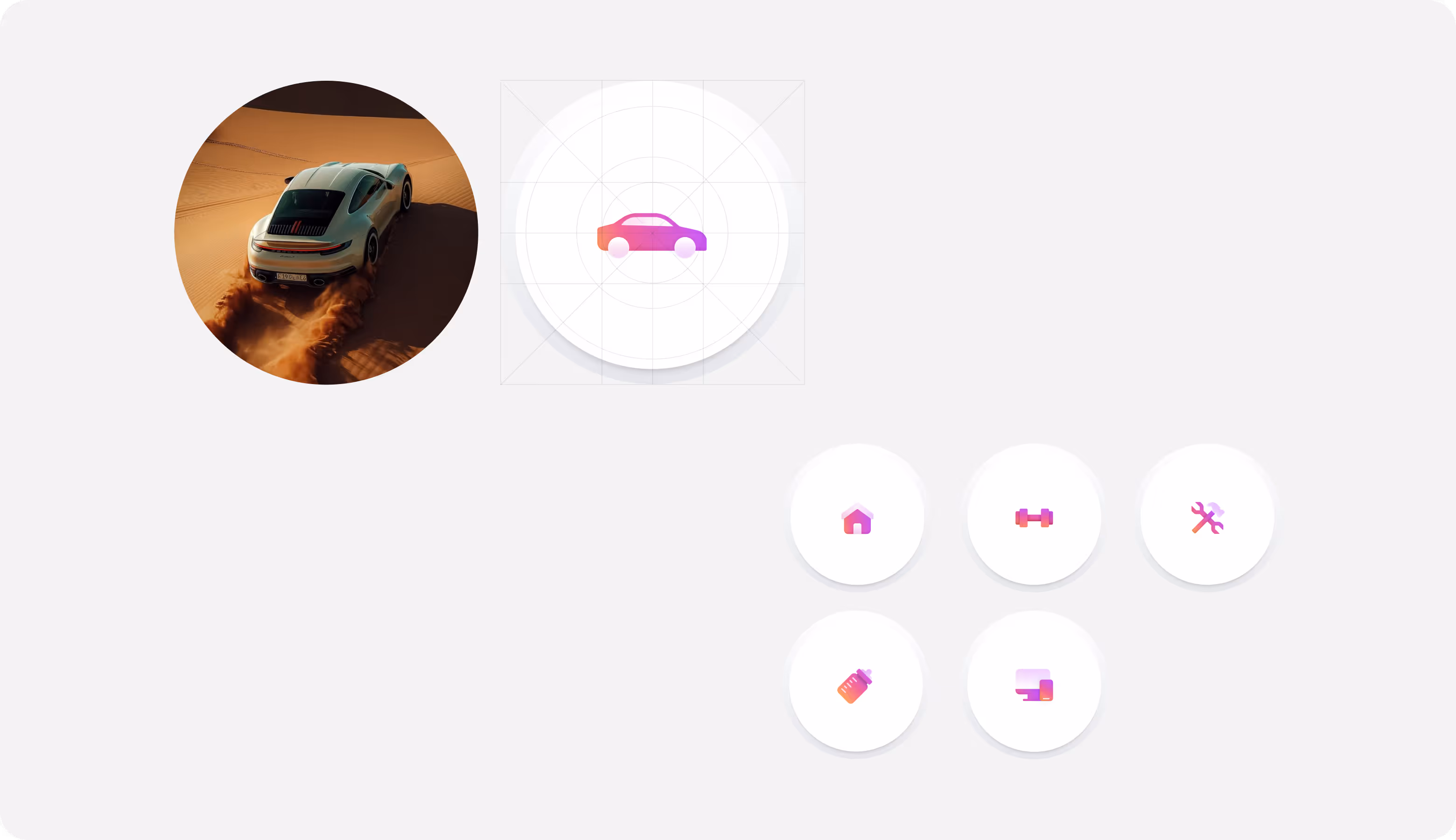
Our graphic designers introduced a consistent gradient-based illustration style to highlight key actions like sign-up, messaging, and publishing ads. They guide attention without adding visual noise, improve onboarding, strengthen brand recognition, and support higher user interaction across core flows.
Design system

Results
+55%
Faster navigation efficiency.
Clear hierarchy reduced time-to-orientation, helping users reach listings and key actions quicker.
+45%
Higher platform usability.
Improved interaction logic across web and mobile increased successful task completion rates.
+53%
Stronger brand recall and trust perception.
A unified visual system increased brand consistency across touchpoints.
+41%
Improved content readability.
New typography, spacing, and structured card layouts improved scanning and comparison speed.
