

Branding
Graphic Design

About project
Ping, an insurtech company, turns insurance data into practical insights for business teams. In this project, we focused on building a visual identity that reflects Ping's expertise, reliability, and structured approach. Our team created a brand system that helps present the product clearly and consistently in everyday use.


The challenge for the design team was to transform a highly complex insurtech product into a visually appealing, easy-to-understand brand that clearly demonstrates how Ping fits into the standard insurance workflow.
We turned the identity into a clear visual system where a central logo, structure, and rules help explain how Ping works, how data flows, and how the product supports daily insurance work.
Briefing & Onboarding
Competitors Research
Logo Moodboard
Color Palette Moodboard
Metaphors
Logo Concept Creation
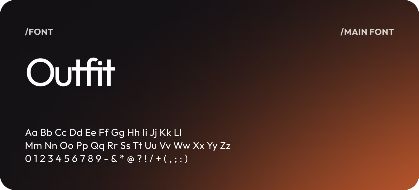
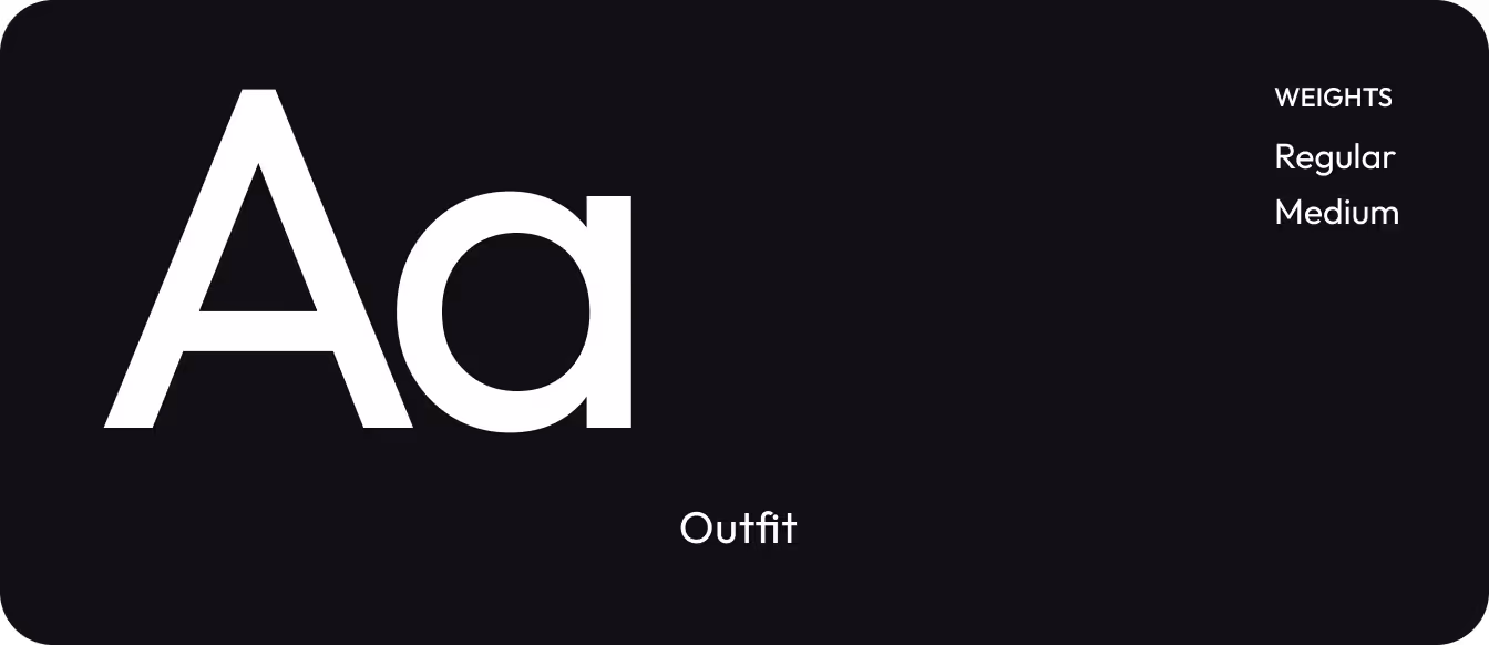
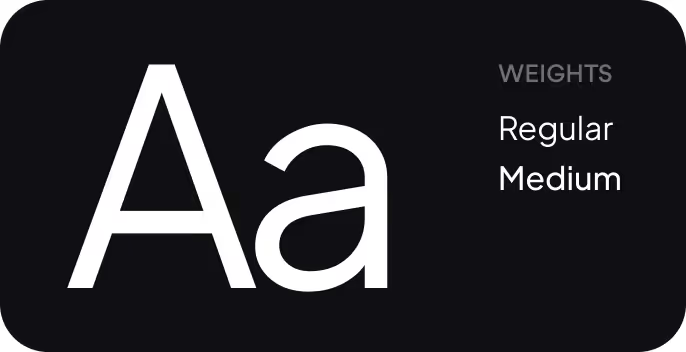
Typography
Work with color
Lockup Logo
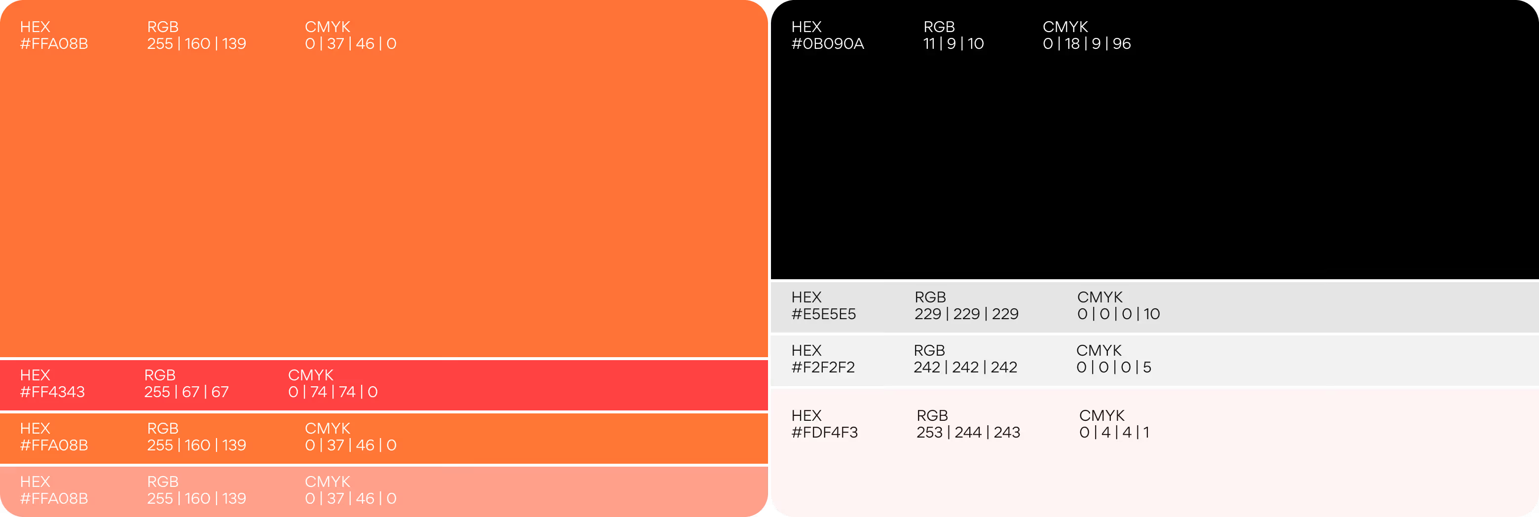
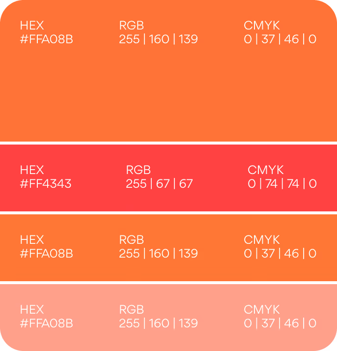
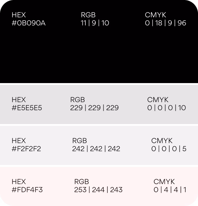
Color Palette (primary, secondary)
Typography rules

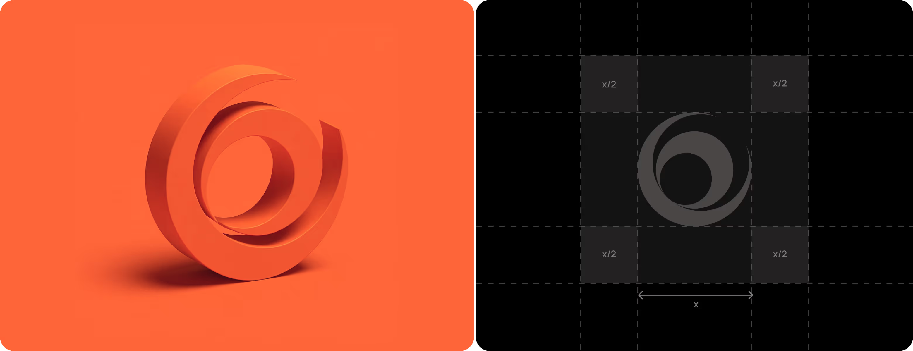
We created four logo directions to look at Ping from different perspectives. Each option focused on a different idea of how the brand could show its place in insurance workflows and support the “Powered by Ping” concept. This helped the client compare approaches and choose the most fitting direction.

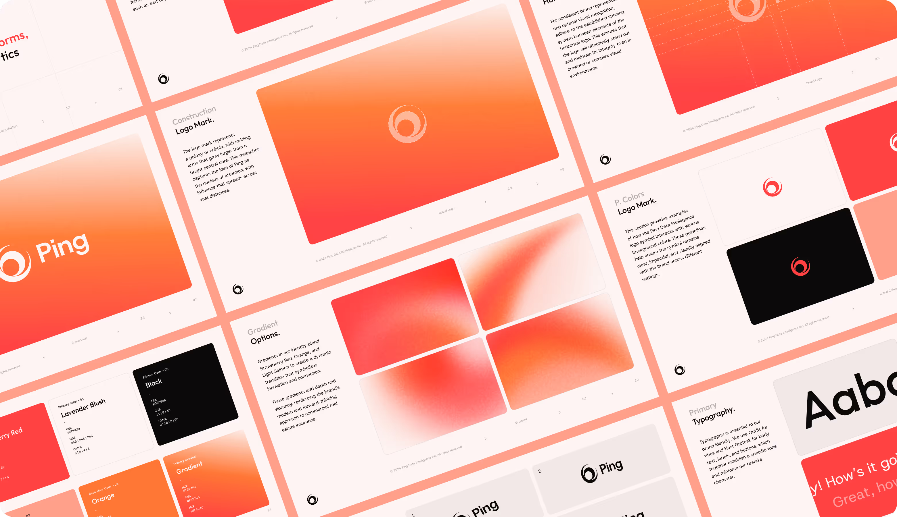
This logo concept is grounded in the idea of an expanding universe. The mark resembles a galaxy with a defined center and expanding layers around it to represent Ping as a pull of attention within chaotic insurance systems. You can visually see their focus, influence, and structured flow of data pushing out from a center.
Ping received a complete brand guideline system that helps the team work faster without losing consistency. It covers logo usage, colors, typography, spacing, and digital layouts, so every touchpoint stays clear, recognizable, and aligned as the product and brand grow.
Arounda designers created a set of Instagram layouts tailored to Ping’s communication needs. The templates cover product updates, features, testimonials, and announcements, using consistent colors, typography, and structure so the team can publish fast without losing brand clarity.
.avif)
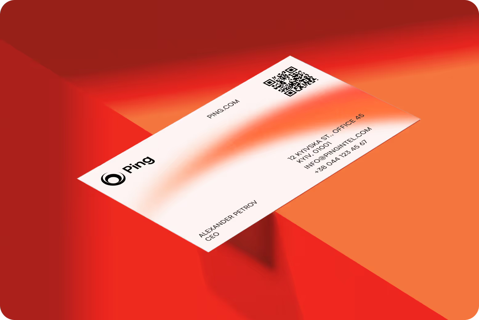
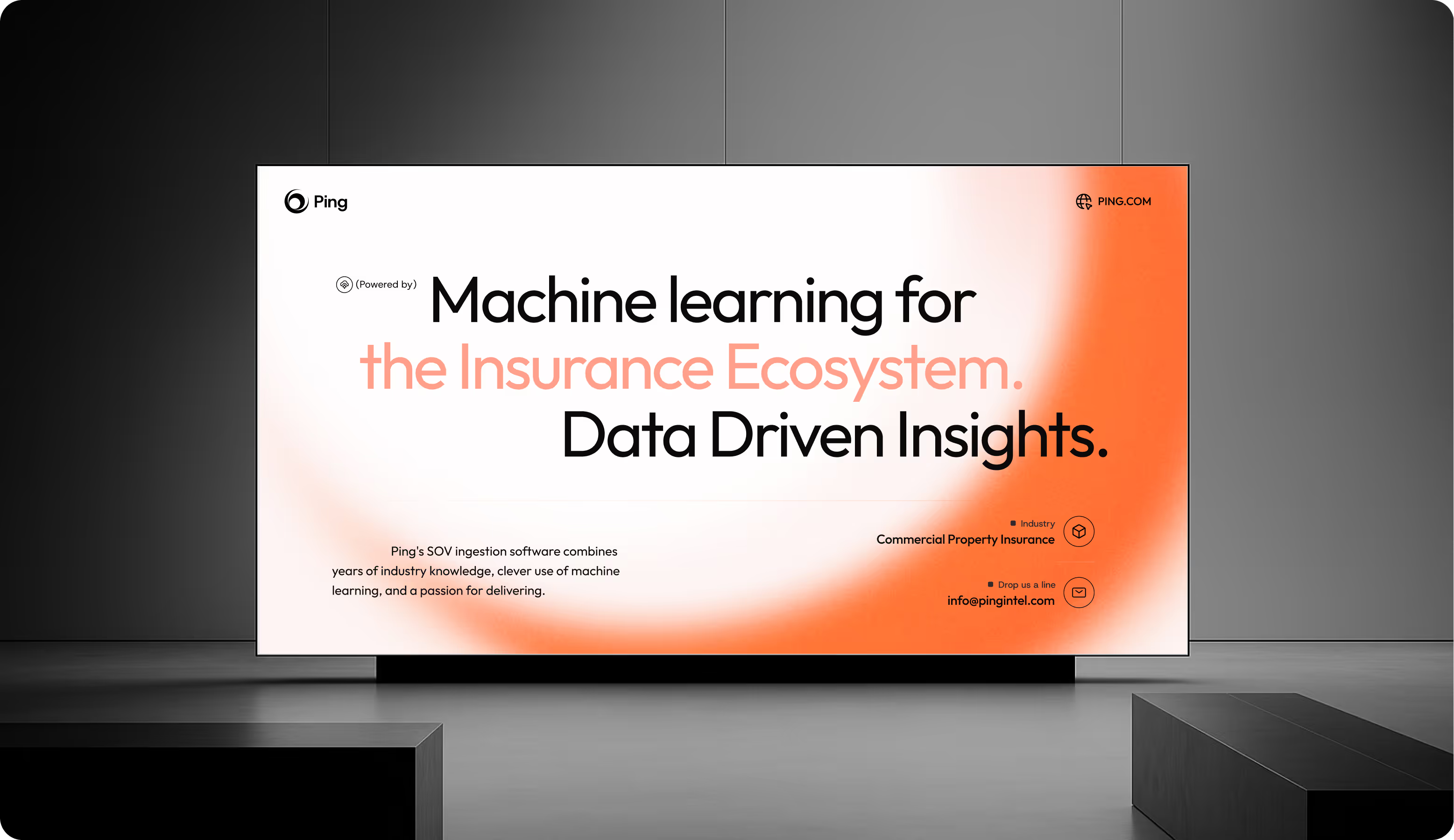
Our team extended Ping’s visual identity into print materials to keep the same level of clarity outside digital screens. Posters, event displays, and business cards follow the core design system, helping the brand stay recognizable and confident in offline spaces where first impressions matter most.


A unified logo system, strong color palette, and typography helped Ping differentiate in the insurtech space.
Branded templates and visual consistency drove more engagement for updates, testimonials, and product news.
Robust brand guidelines and professionally designed print and digital assets reinforced Ping’s credibility as a partner for B2B companies.
Custom email templates with better hierarchy and CTA design drove more responses and meeting requests.
