
Mobile App Design for a Cycling Activity Tracker
UI/UX Design
Reducing data complexity to keep users engaged and informed
About project
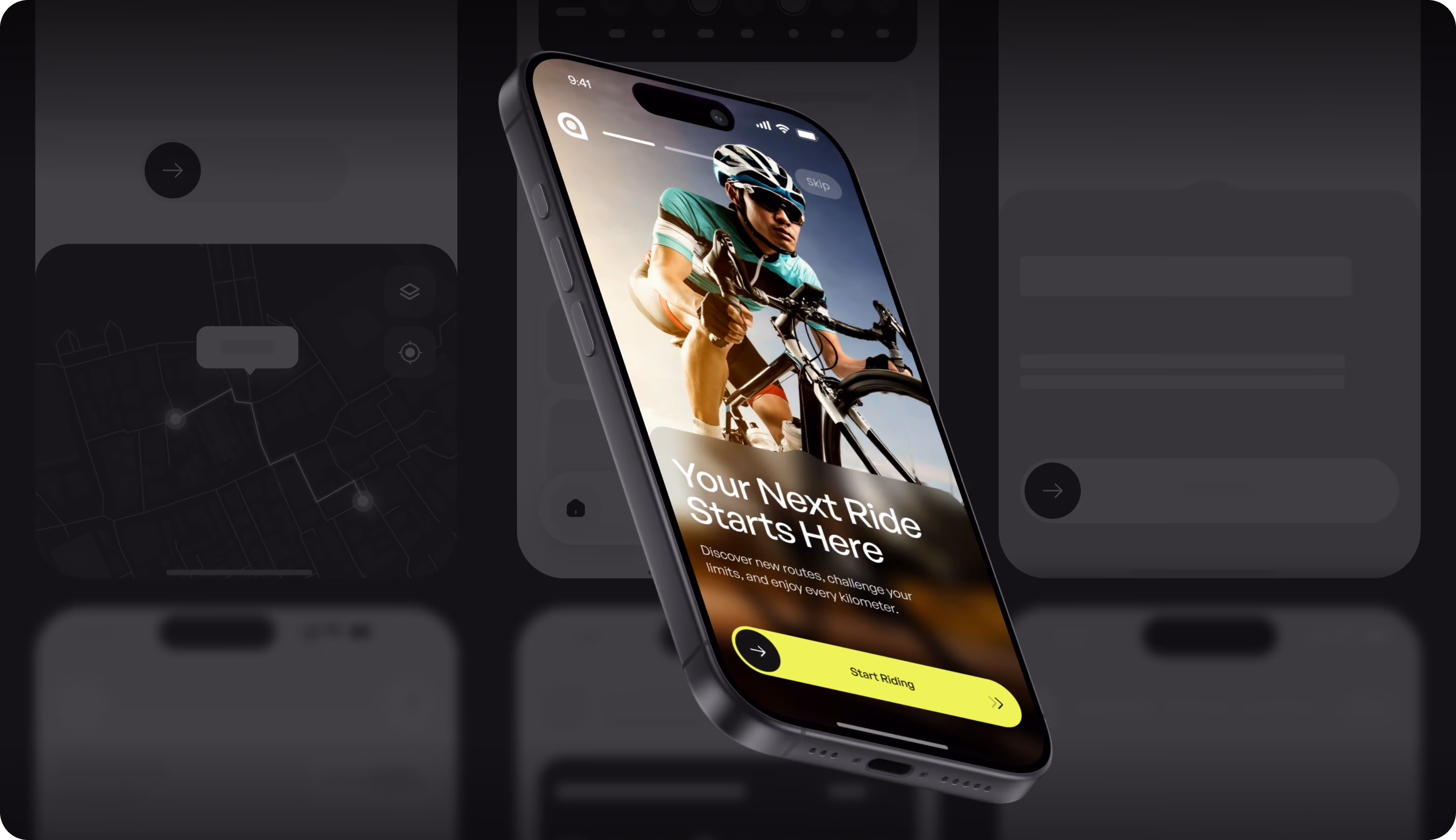
Rydeon is a fitness-focused digital product that helps cyclists track activity and monitor performance. Our Arounda team redesigned the mobile app for active users who need to understand their progress and stay motivated through an engaging and simple experience.


Challenges & Solutions
Problem
Rydeon's interface provided a large amount of cycling data without any obvious hierarchy. As a result, users disengage before beginning a ride or monitoring their progress. We had to restructure the experience. Complex performance data should be easily understandable and motivating, without losing the analytical depth that riders expect.
Solution
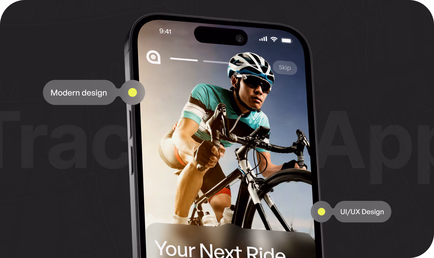
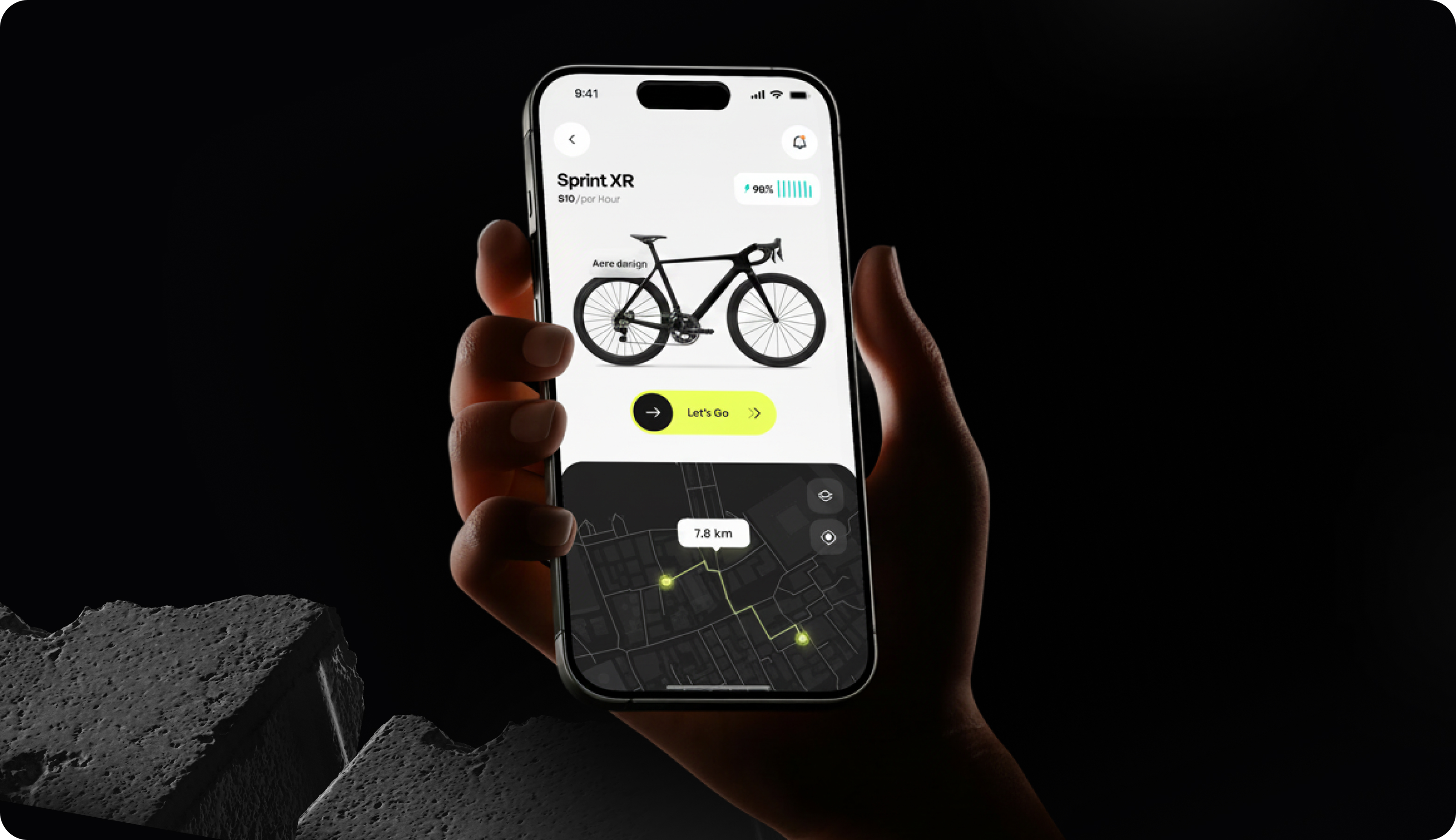
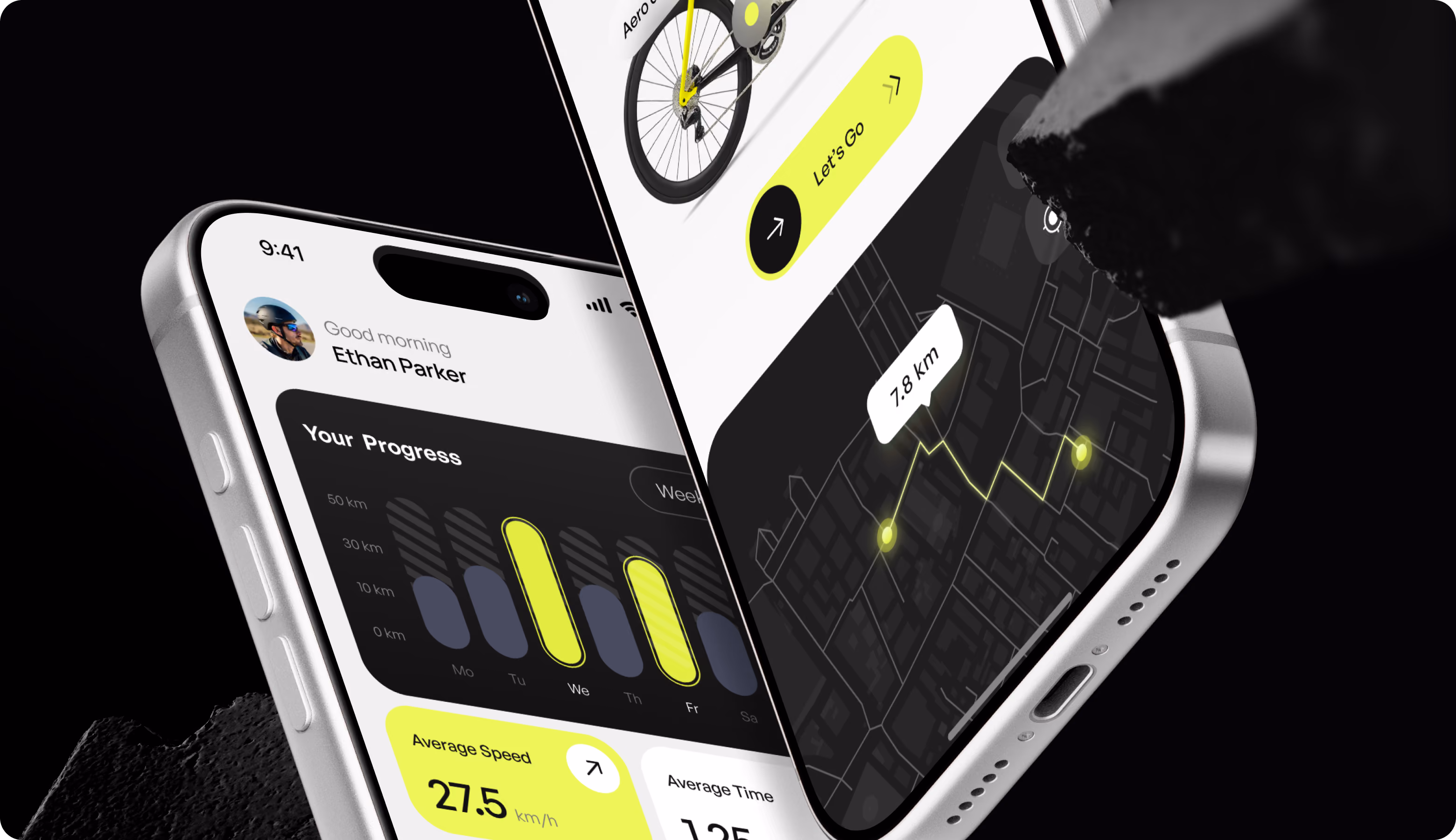
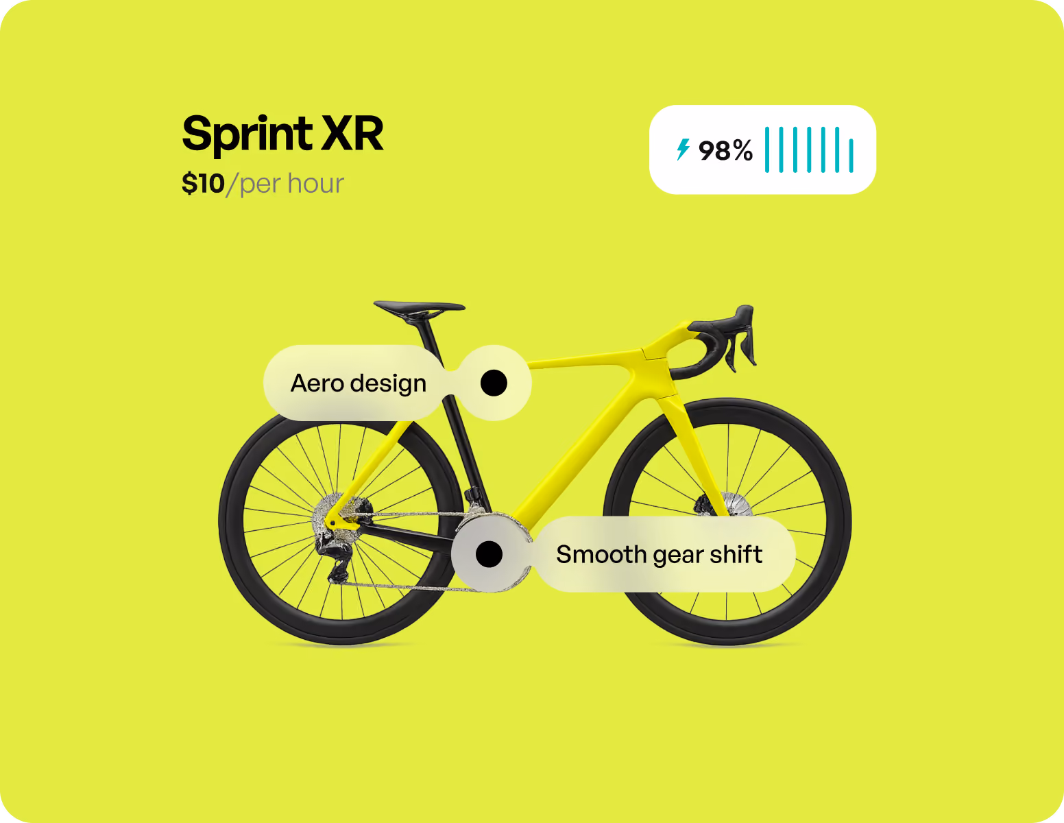
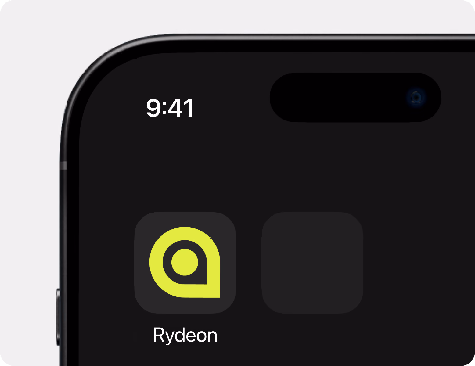
Our UI/UX designer rebuilt Rydeon's interface to follow a strict data structure. The top level includes key cycling metrics and progress charts. Secondary data moves to contextual levels. This strategy minimized cognitive load but maintained depth. High-contrast lime accents draw the user's attention to important tasks and performance highlights.
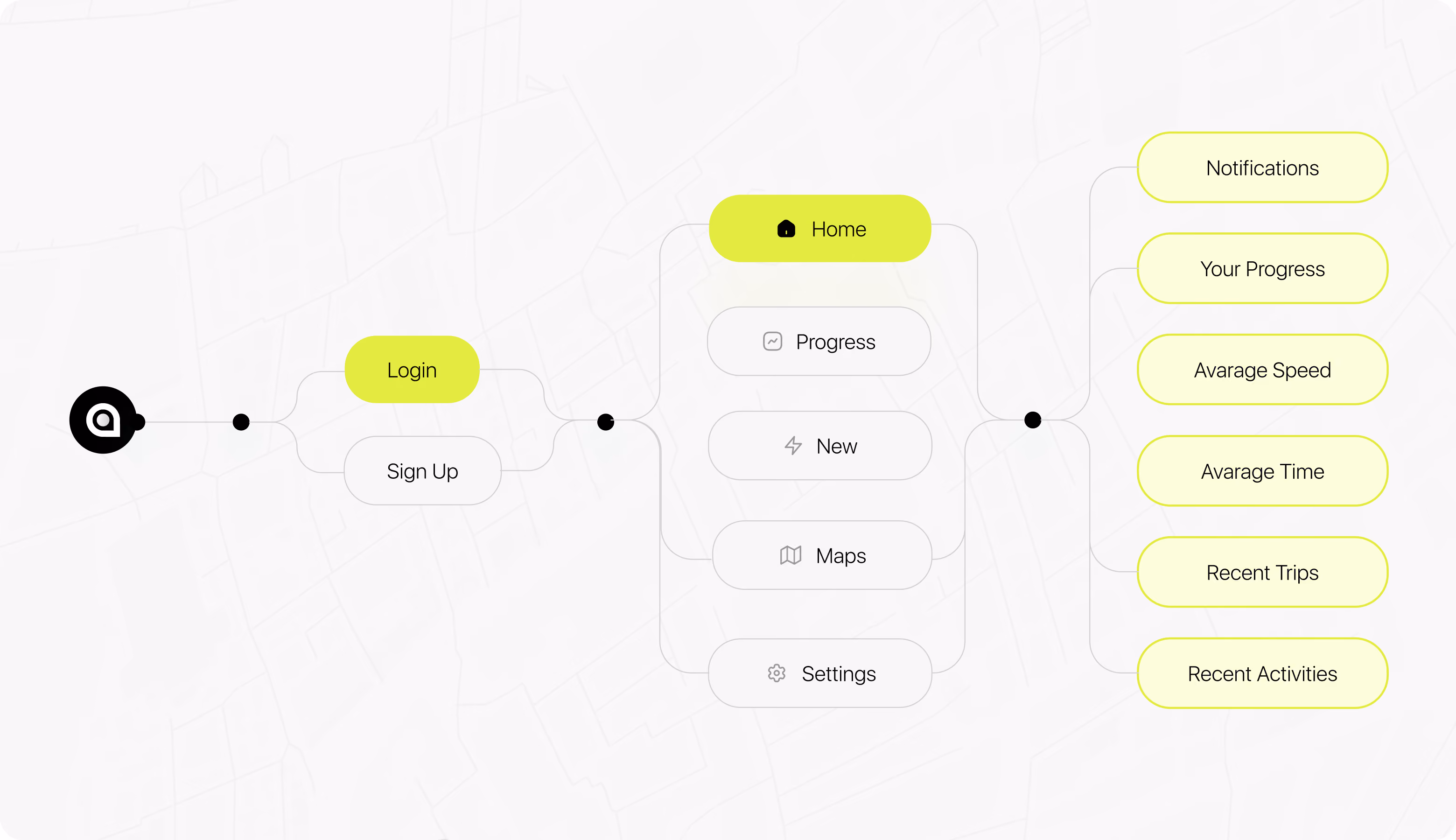
User Flow
Wireframes
During wireframing, our UI/UX designer experimented with five layout variations to see which metric grouping cyclists read first and how similar data blocks should cluster to decrease visual competition. The final wireframe layout restricts each screen to three to four content sections. The secondary element does not compete with the primary metric that the user came to see.

Arounda helps brands turn overloaded mobile interfaces into focused products that users open daily.
UI Layouts
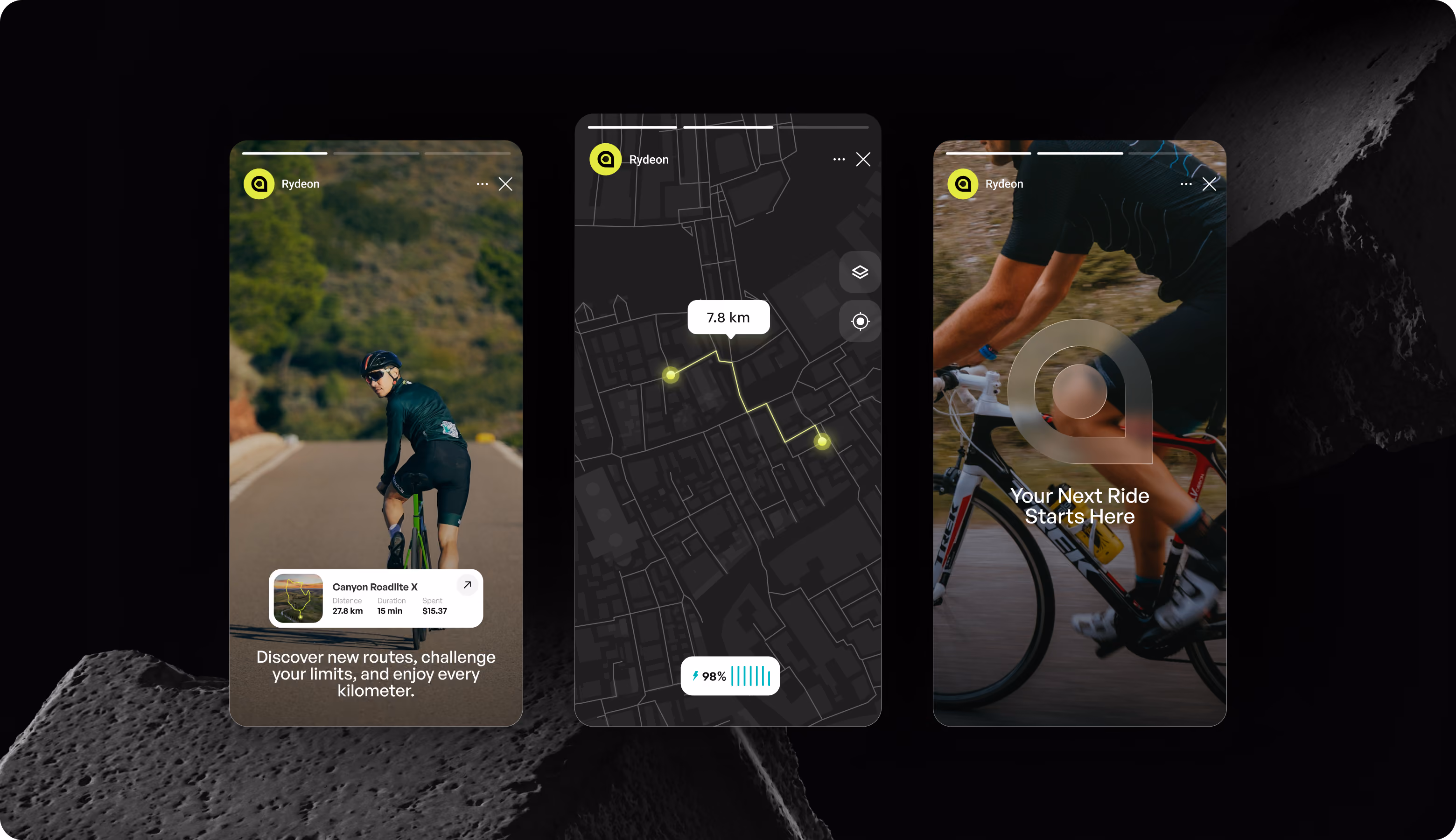
We applied a dark UI layout to alleviate eye fatigue and make lime accent features easily visible in any conditions. It is particularly important in bright sunlight. Card-based layouts divide each measure into self-contained pieces that have distinct active and inactive states. Users can now process performance data one group at a time instead of scanning the entire screen.

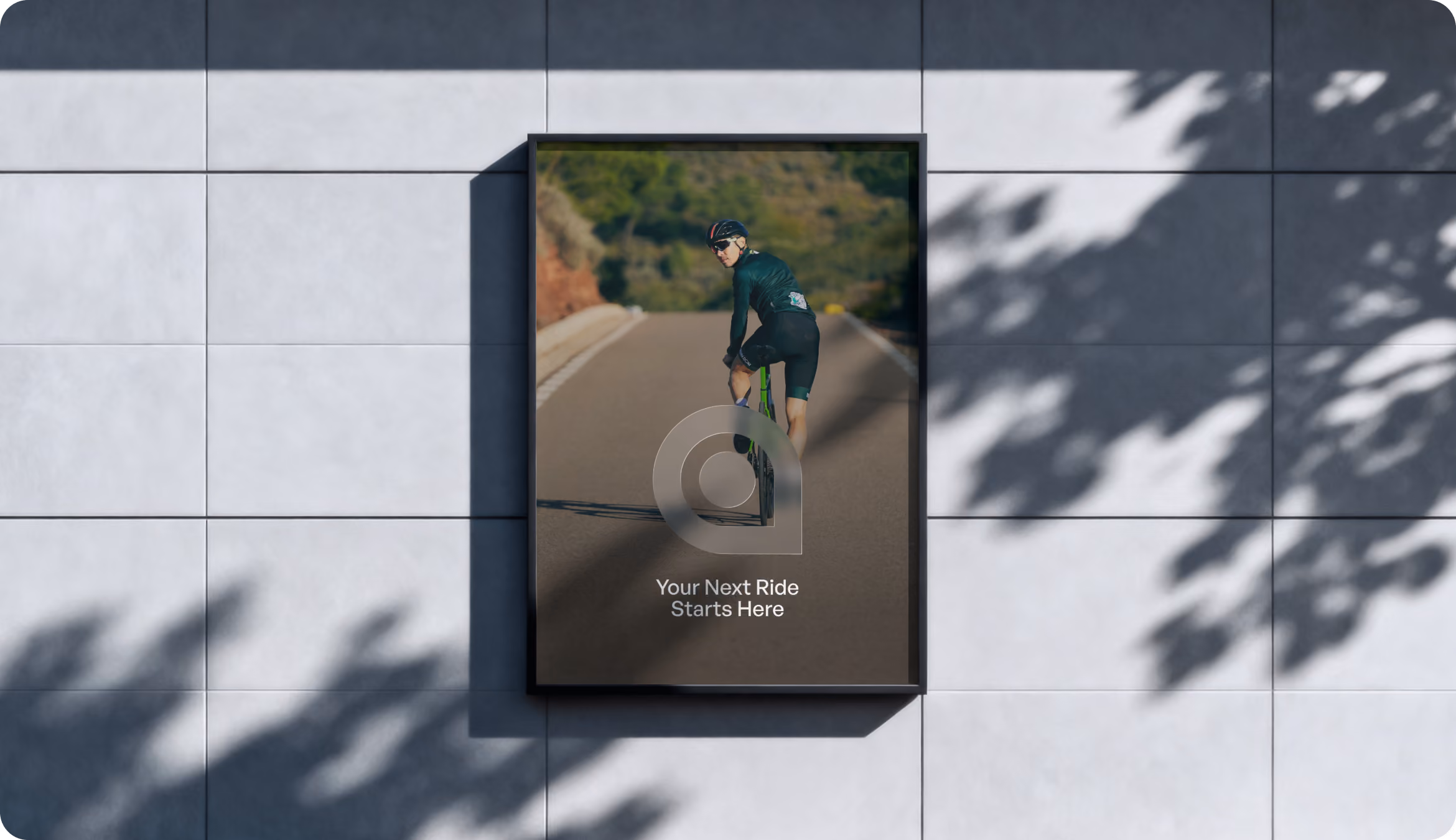
Social Media
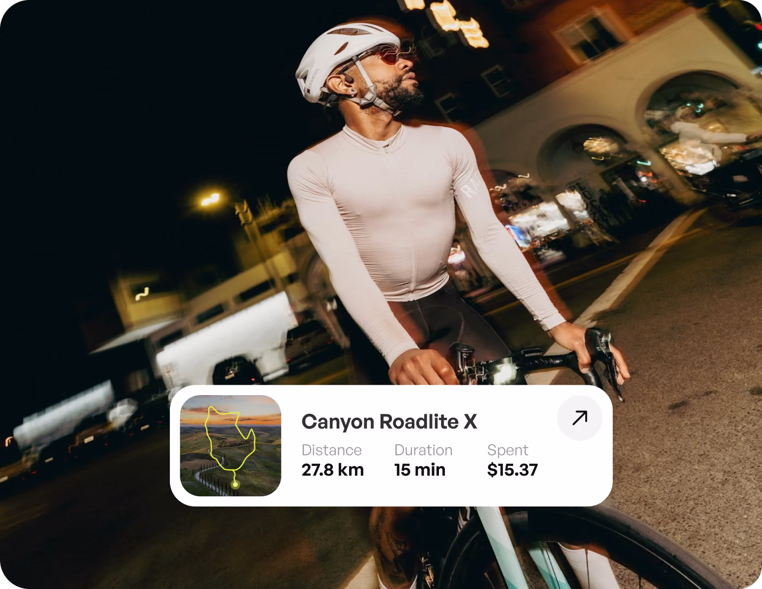
Our client received a modular social media template kit that used the same visual framework. Each post is readily identifiable as part of the product experience. Templates adhere to a rigid headline, graphic, and CTA structure. Real cycling scenarios and incorporated UI features link marketing material directly to the app interface, keeping users engaged with the brand in between rides.
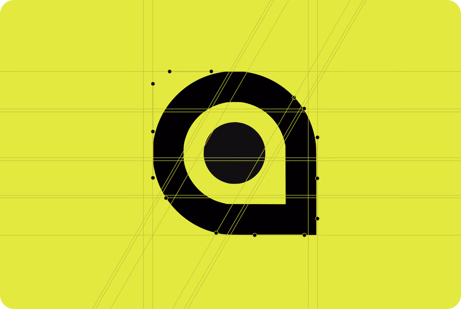
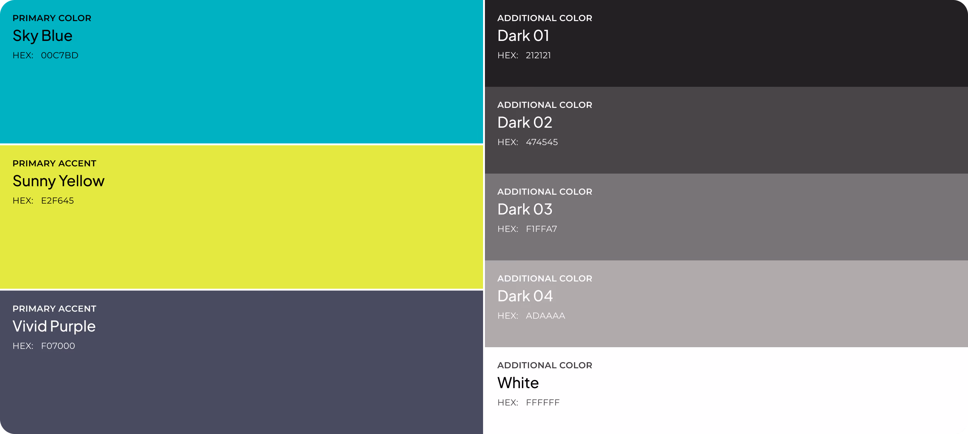
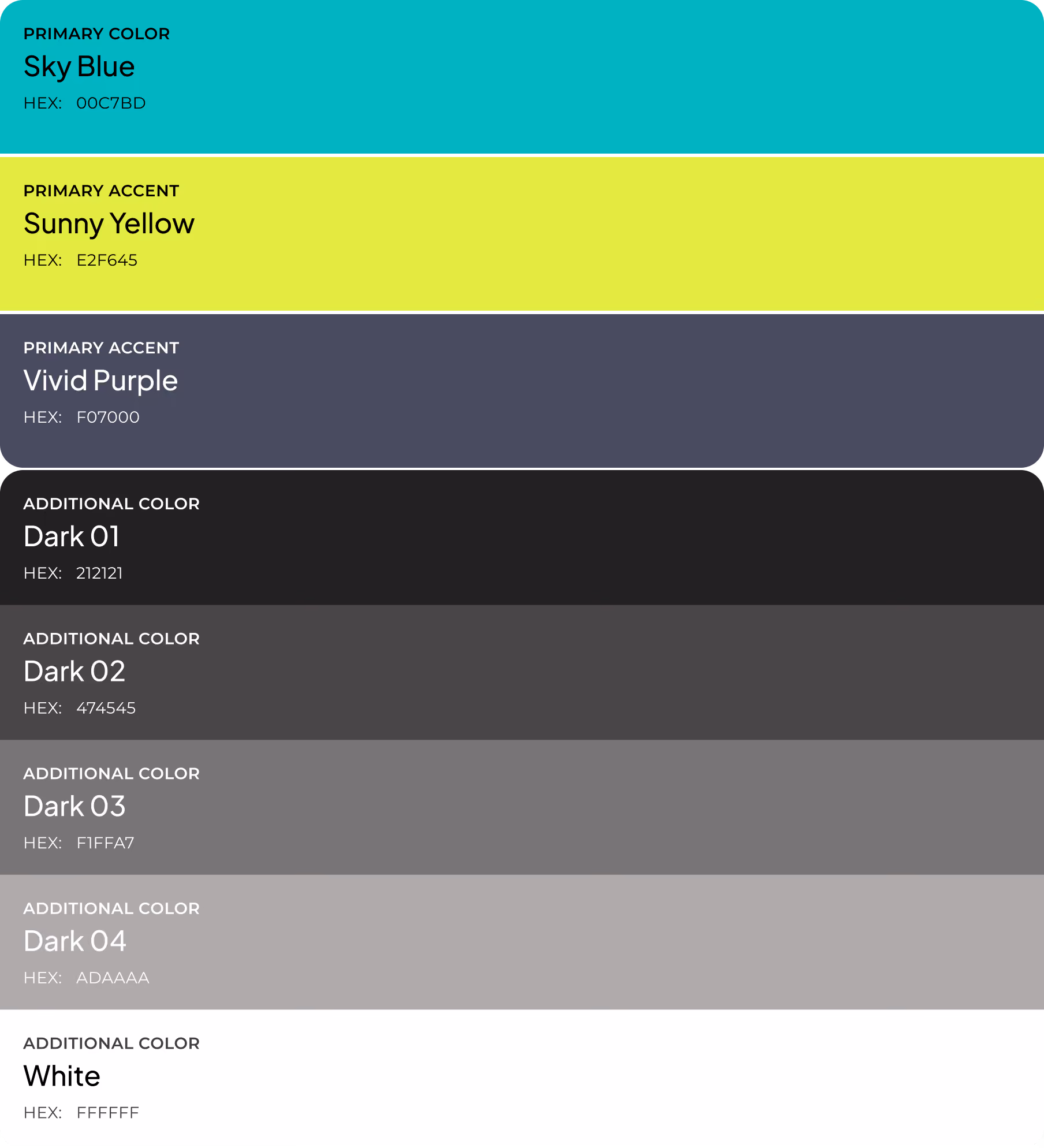
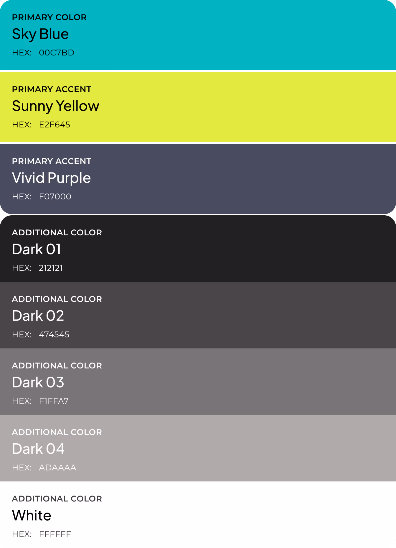
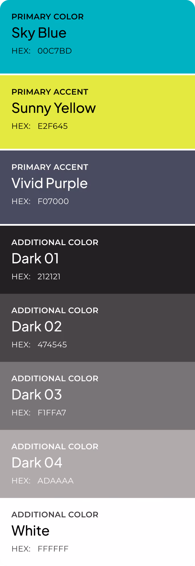
Design system


Results
68%
Fewer UI Elements Per Screen
Our team stripped each screen to essential components only. We removed decorative elements, redundant labels, and secondary controls that competed with core cycling data.
4 sec
Target Time to First Insight
We designed each screen so that a cyclist can open the app and read their primary metric (distance, speed, or weekly trend) within four seconds.
1 tap
To Start Any Key Action
Flat information architecture ensures that starting a ride, checking progress, or reviewing routes requires a single interaction from the Home screen.
44%
Reduction in Cognitive Load
Limiting each screen to 3-4 isolated data blocks reduced the number of decisions a user makes before reaching the information they came for.
