

.avif)

Branding
Graphic Design
.avif)
About project
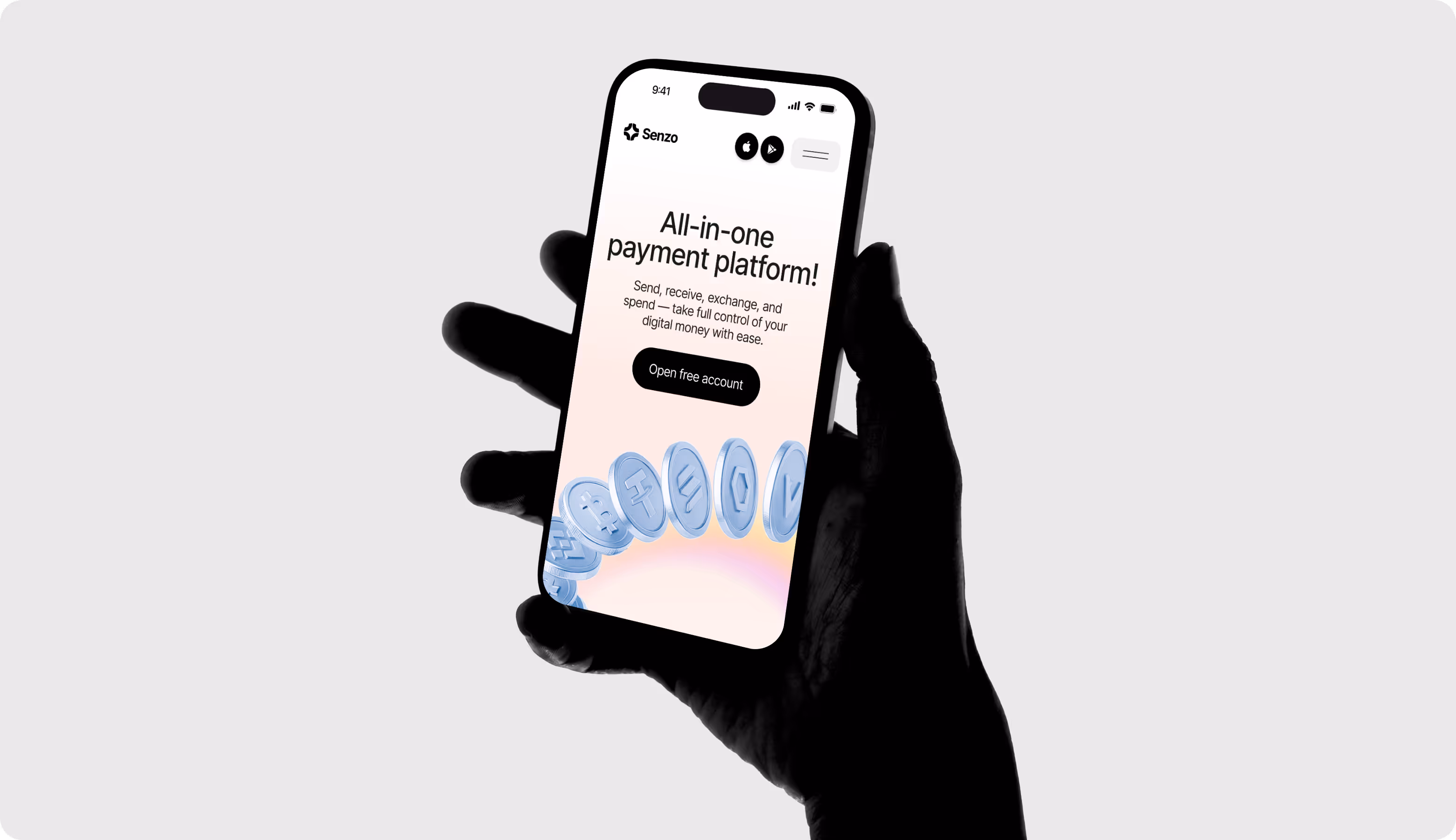
Senzo is a Web3 crypto neobank that makes everyday payments and management of your digital finances easier. The client turned to our Arounda team to build a trustworthy brand identity that positions them as a mature and scalable Web3 banking-on-the-go for consumer and retail partners.


Senzo needed a Web3 branding system that would appeal to both early adopters and regular users. The goal was to make sure that all of the product, marketing, and investor touchpoints had the same identity ready within 80 hours.
Our team delivered a full brand system with logo mark, app icon, brand guidelines, social layouts, and print assets. The identity works consistently across online and offline touchpoints to support trust-led growth.
Briefing & Onboarding
Competitors Research
Logo Moodboard
Color Palette Moodboard
Metaphors
Logo Concept Creation
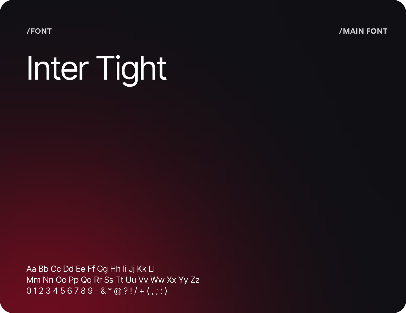
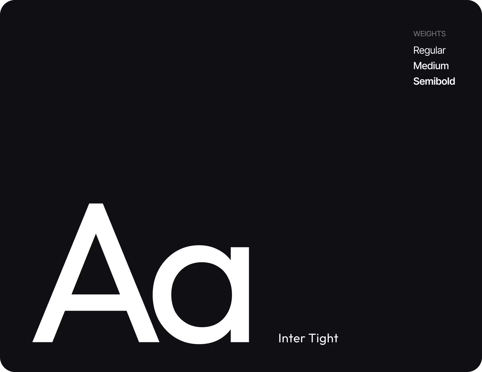
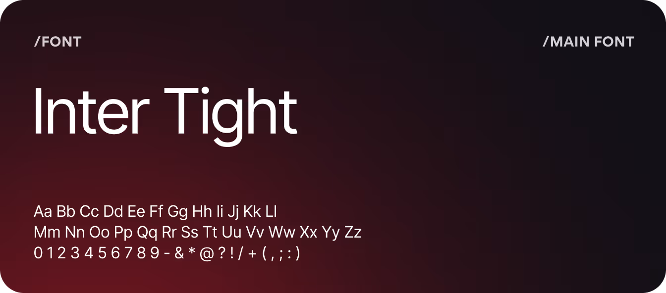
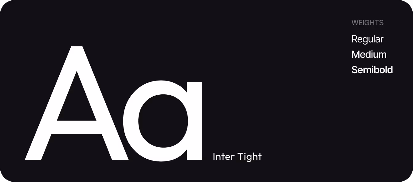
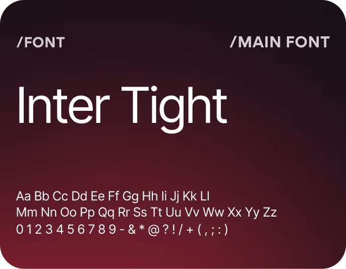
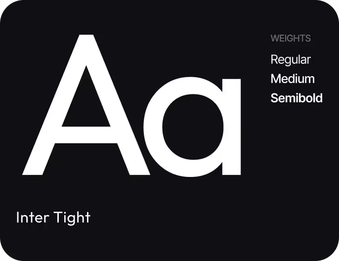
Typography
Work with color
Lockup Logo
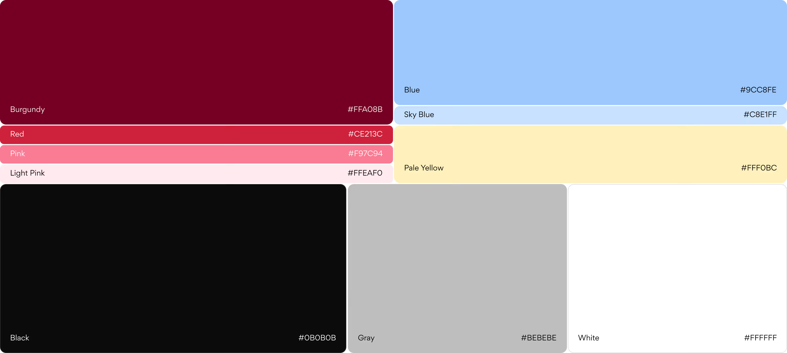
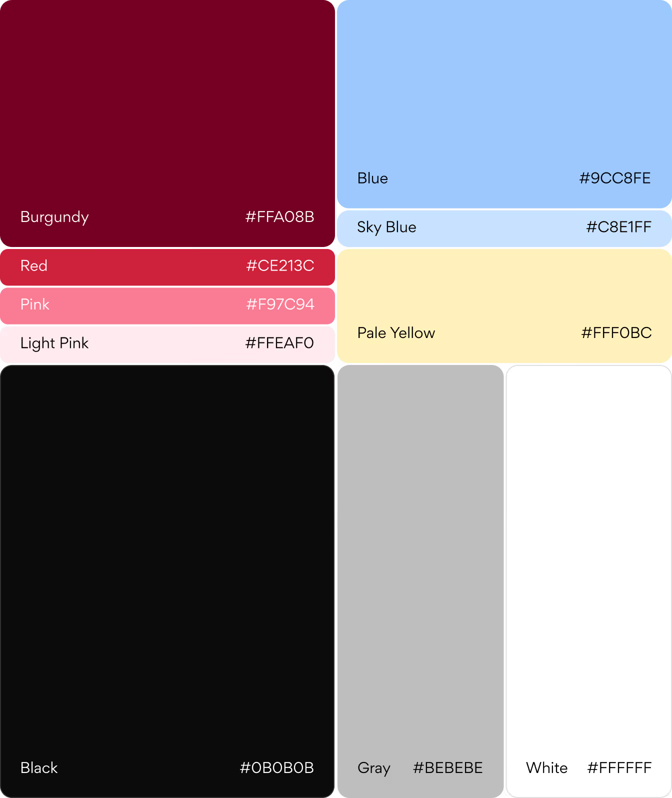
Color Palette (primary, secondary)
Typography rules
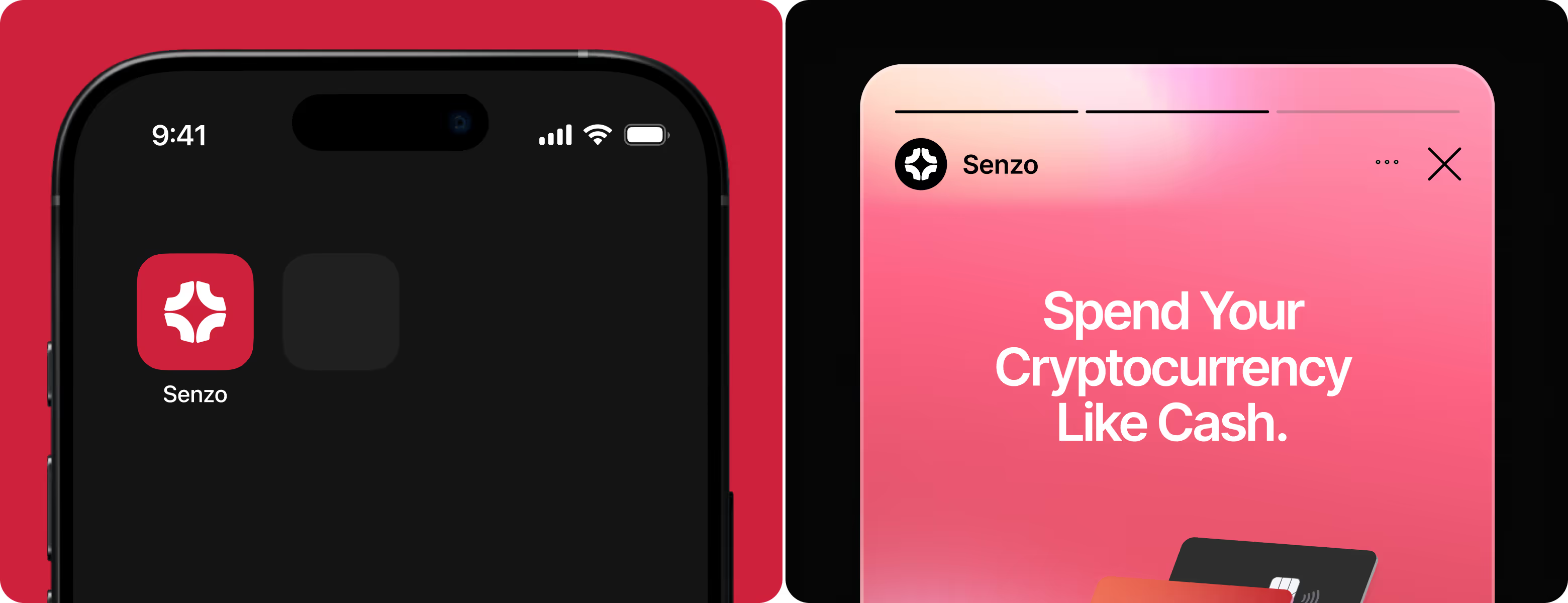
To ensure users easily recognize the Senzo app icon, we made it a clear, confident piece of brand signaling for daily use. Its geometric symbol is easily recognized on mobile screens, conveys security and trust, and works consistently within the core Web3 brand system across device sizes and contexts of use.
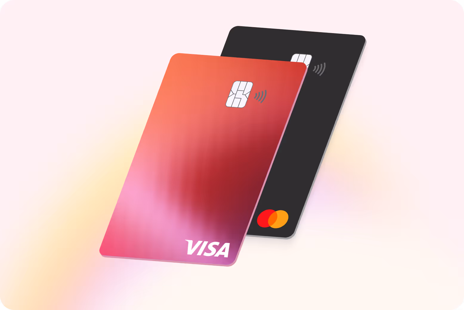
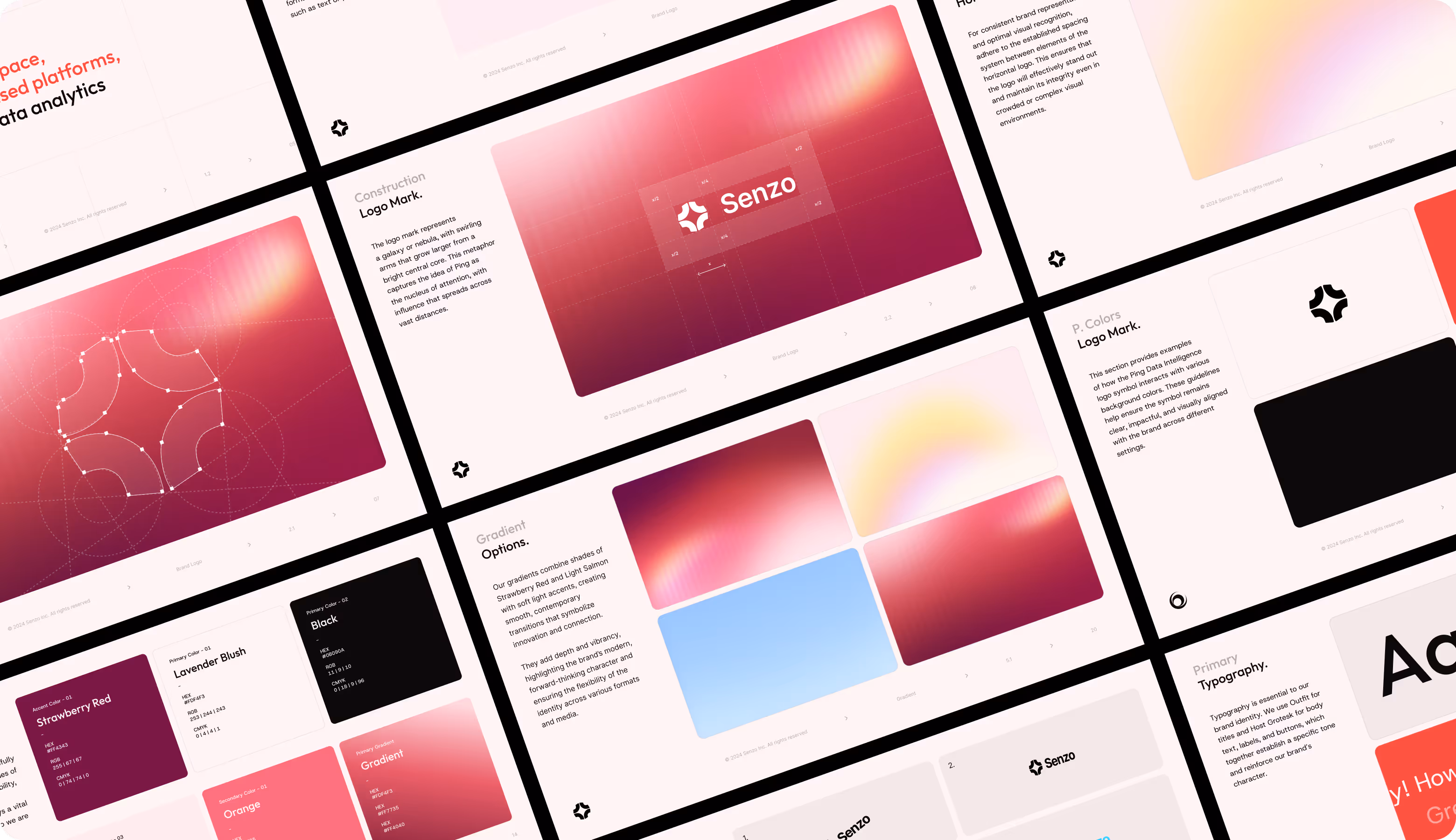
Senzo's logo was designed to be a structured and geometric mark that utilises curves to show connection, movement, and dependability of digital banking. The mark grows easily across apps, socials, and 3D use, creating a solid and flexible Web3 identity.
Our brand designers made a full set of brand guidelines for Senzo that cover how to use the logo, grids, how to space things out, and how to use colors. The guide gives teams a clear set of tools to use the brand consistently by covering palettes, gradients, HEX codes, and typography for both web and mobile.

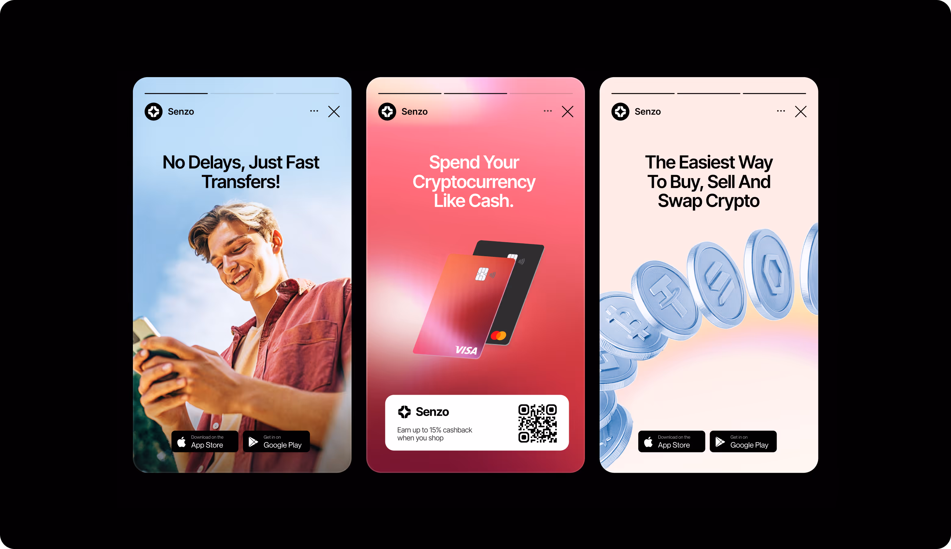
We made a set of Instagram posts and story templates for Senzo that used bold fonts and brand colors. The layouts show off the most important features of the product, help promote the app, and make sure that all of the social campaigns have a consistent, trustworthy look.
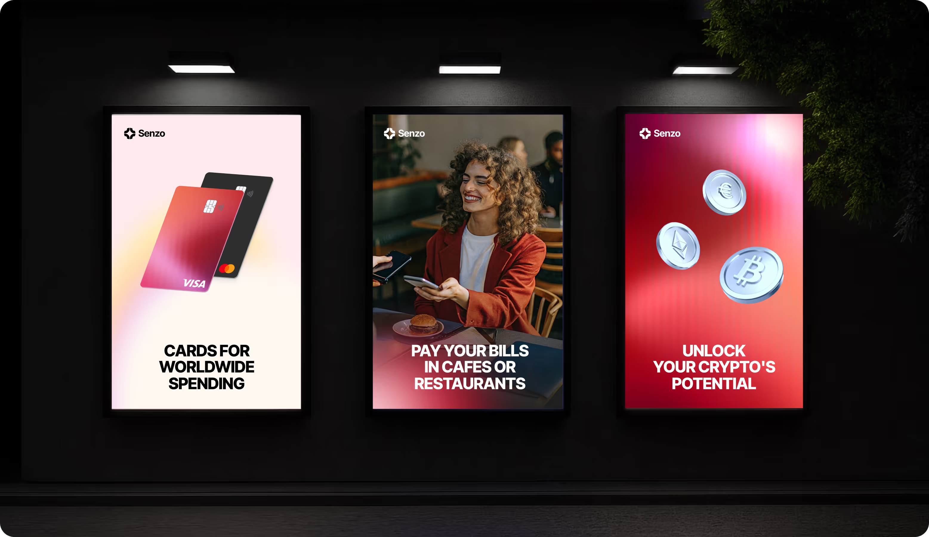
To infuse more offline presence, we created an entire line of branded products for Senzo. From event materials to large-format promotional products, each piece stuck to the brand system while keeping a consistent visual language. These assets helped elevate Senzo’s credibility and confidently present the product in the real world.
.avif)
.avif)
.avif)
.avif)

Senzo stood out from other crypto neobanks because of its unique logo, strong color scheme, and easy-to-read typeface.
Instagram layouts and branded templates made campaigns and product launches more popular.
Senzo's credibility in fundraising and partnerships grew when they had clear brand guidelines and professional print applications.
Clarity of messaging, visual consistency, and optimized digital assets drove higher response rates for acquisition campaigns.
