
Valeriia leads product design teams at Arounda, directing product UI/UX, websites, and landing pages. Her focus is on design decisions that change how users behave and the business outcomes: conversion, retention, adoption, and user satisfaction.
The clients’ results reflect this directly: lead-to-call conversions up 62%, bounce rates down 33%, user confidence up to 91%, and products that collectively raised over $1B for Arounda's clients.



Q&A with Valeriia Serohina
What does your creative direction process look like, and how do you set a visual language for a product from scratch?
My first job is to understand what this product needs to make users feel and do. Those two things are usually in tension, and resolving that tension is where the visual language comes from. In practice, the process consists of three parts.
The first step is to conduct a positioning audit. I consider the competitive landscape, the target audience's existing visual references, and the brand signals that the client currently holds. This tells me what the visual language needs to accomplish differently and what it needs to draw from context to appear credible.
The second stage is direction development. I define the core visual decisions. The typographic personality, spatial logic, color strategy, and motion principles should work as a system. A fintech dashboard that needs to project control and precision gets a completely different set of answers than a wellness app that needs to feel approachable and human.
The third stage is the most important and the most often skipped. Stress-testing the direction against the hardest design problems in the product before committing. I don't want to discover that the visual language breaks down on the data-heavy dashboard or the multi-step onboarding flow after we've already built out the design system. We find those failure points in the direction phase, when changing course is cheap.
How do you maintain design quality and visual consistency when multiple designers are working on the same product simultaneously?
My approach has three layers.
- A design system that resolves ambiguity before it reaches the designer. The system defines the rules for combining spacing logic, hierarchy conventions, state treatments, and responsive behavior. When a designer encounters a new UI problem, the system should give them 80% of the answer.
- Before beginning work on a new section or feature, I collaborate with the designer to determine the objective and strategy. Catching a directional mismatch during the wireframe stage takes 15 minutes. Catching it at the high-fidelity stage can take days.
- I create a space where the team explains their decisions and gets challenged on them. This builds the judgment that makes designers more autonomous over time.
When Arounda runs parallel workstreams across a large product, the output reads as one coherent product without individual interpretations.
How do you push back on a stakeholder who wants a design direction you know will hurt conversion?
The preference is a proxy for something: a fear, a brand instinct, a previous experience, or a misreading of what users need. My job is to find what's underneath it.
First, I ask what success looks like for them. What metric or user behavior would indicate that the decision was correct? This moves the debate from subjective choice to agreed criteria, which is a lot more productive environment to work in.
Second, I present evidence. If I know that a full-screen hero video reduces scroll depth on mobile by 40%, that is my argument. Arounda's portfolio of measurable outcomes facilitates these discussions. I can demonstrate what happened by referring to comparable product decisions.
Third, when I really can't agree and the stakes are enormous, I'll suggest testing. A/B testing a direction the stakeholder favors vs the one I offer costs nearly nothing and results in genuine evidence.
What I don't do is comply silently with a direction I believe will hurt the product and then blame the client when the metrics don't move. My responsibility as Art Director is to represent the user and the outcome.
How does designing for regulated industries like Fintech or Healthcare change your process compared to SaaS or Web3?
- Trust architecture becomes the primary design problem. In a Fintech product, every visual decision is a trust signal. Users are deciding whether to move money or disclose health data. The design has to earn that trust at every step.
- I involve compliance requirements in the information architecture phase, so they're designed into the experience. GDPR consent flows, HIPAA-compliant data handling UI, and regulatory disclosures are design constraints.
- Error and edge-case design receive more attention. In a B2C app, a confusing error message is a friction point. But in a healthcare platform, it's a potential safety issue. We spend more time on error states, confirmation flows, and undo mechanics in regulated products than we do in consumer SaaS.
- The user research scope is broader. In regulated industries, the user is often not the buyer. It can be a hospital administrator who chooses the platform that clinicians use daily, or a compliance officer who approves the fintech tool that traders depend on. Designing for both the decision-maker and the end user simultaneously, with different needs and different power in the system, requires a more complex research approach than a single-persona SaaS product.
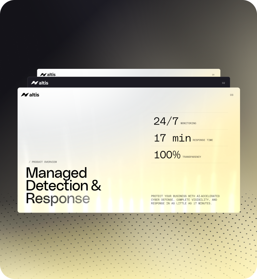

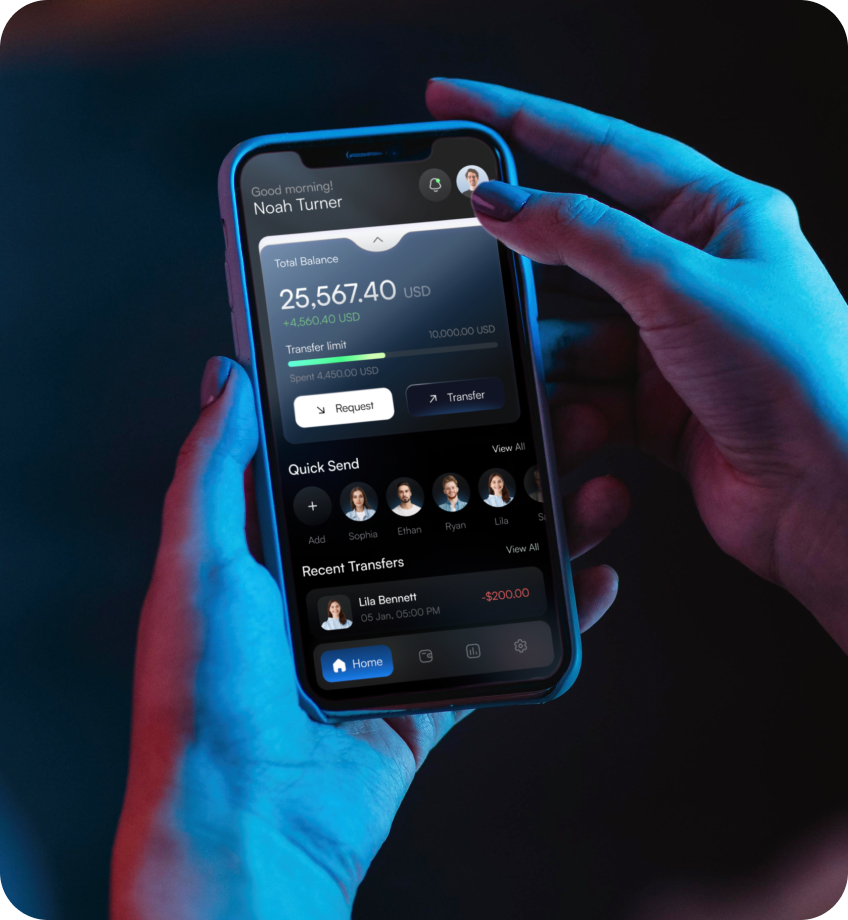



Popular articles by Valeriia


A free 3-day trial work
Wondering if we're your design match? Get a free 3-day trial with one of our designers. See the quality, communication, and pace before you commit to anything.


89+ Reviews
on Clutch

Top Rated Plus Agency
on Upwork

Top 50 Trending team
on Dribbble

Projects are Featured on Behance platform
