
How Alignment Design Principle Impacts Branding and Conversion Rates

Users rarely refer to a screen as misaligned. Instead, they hesitate, reread labels, press the wrong button, and wonder whether they really have control of the product. The alignment design principle gives every element its own place and purpose. In turn, users can navigate through a screen with less hesitation.
“Good alignment gives users a quiet sense of control. The screen feels planned, and the next action feels safer to take.”
Vlad Gavriluk, Founder & CEO at Arounda
This guide was created by our Arounda team to help product teams catch layout issues that erode trust, delay important actions, and make it harder to convert on your most valuable screens.
Article Key Takeaways
In this guide, you'll learn:
- How alignment in web design shapes first impressions, trust, and conversion paths
- Where layout issues appear across navigation, forms, CTAs, cards, and dashboards
- Why misalignment slows decisions and makes key actions harder to complete
- Expert thoughts from Vlad Gavriluk, CEO & Founder, and Yevhen Tykva, UI/UX Designer, on brand perception and layout execution
- Tips from the Arounda team based on real projects and market experience.
What Is the Alignment Design Principle?
The alignment design principle definition starts with structure: every visual element should have a specific place within the layout. Headings, blocks of text, buttons, cards, forms, and images all align to the same visual logic. The user quickly scans the screen and easily discovers the next action.
Graphic Design vs. Web Design
Graphic design uses alignment to achieve balance in logos, type, and the layout of the brand. According to a ResearchGate study, color gets the most visual eye-tracking attention within logo recognition, and structure helps keep seeing the whole composition clearly after the initial look.
Web design applies the same rules to interactive screens. What is alignment in web design, practically speaking? It’s the visual path that takes users from headings to navigation, input fields, CTAs, and blocks of content. Users scan faster and find the next step with less effort.
Principle, Not a Stylistic Choice
Using the alignment design principle, product teams can have one common guideline when deciding on how to arrange things in their layouts. The alignment also provides a hierarchy, reading order, and priority of the actions users will take.
Misalignment turns small layout gaps into reading friction. A CTA may lose its connection to the main message, a form may feel harder to follow, and a dashboard may make related metrics look scattered. Clear alignment keeps content, data, and actions visually connected across the product system.
Types of Alignment in Web Design
Companies aligning Brand Experience with Customer Experience can reach up to 3.5× higher revenue growth potential. Interface structure plays a direct role here because users meet the brand promise inside real screens. Alignment in web design helps product teams decide how users should read a page, compare content, and move toward the next action.
Edge Alignment vs. Center Alignment
The alignment principle of design allows teams to set a reading path before a page is covered in content.
- Edge alignment gives forms, tables, cards, dashboards, and pricing blocks one steady side to scan.
- Center alignment works better for hero sections, empty states, confirmation screens, and short CTA blocks with one message.
Arounda suggests:
Treat edge alignment vs center alignment in web design for product teams as a task decision. Use edge alignment for screens that contain data/options/multiple actions. Screens that hold a one-time message should be center-aligned because it reflects an important point in the user’s journey where they are focused on that one message.
When Asymmetric Alignment Works
The principle of alignment in design also supports controlled asymmetry, which product teams can use in campaign pages, product launches, storytelling sections, and those moments that visually crave energy. The layout would still need anchors for text, visuals, and CTAs.
Arounda suggests:
You can use asymmetric alignment on the components associated with visual identity and low-risk experimentation, as well as all launch pages requiring emotional connections, fast-moving trends, and brand recognition.
An example of controlled asymmetry is our work with Reforge: the gamified fitness platform with a mobile app for athletes and a desktop admin panel for coaches. The product needed “manga-inspired energy,” clear workout logic, and a progression system users could understand in the middle of their training.
Reforge turns workouts into XP, ranks, factions, badges, and achievements. Our biggest challenge became connecting the right game mechanics to the real-world training/fitness actions. Our designers built one cause-and-effect flow: onboarding quiz → workout → measurement input → XP → rank or badge.
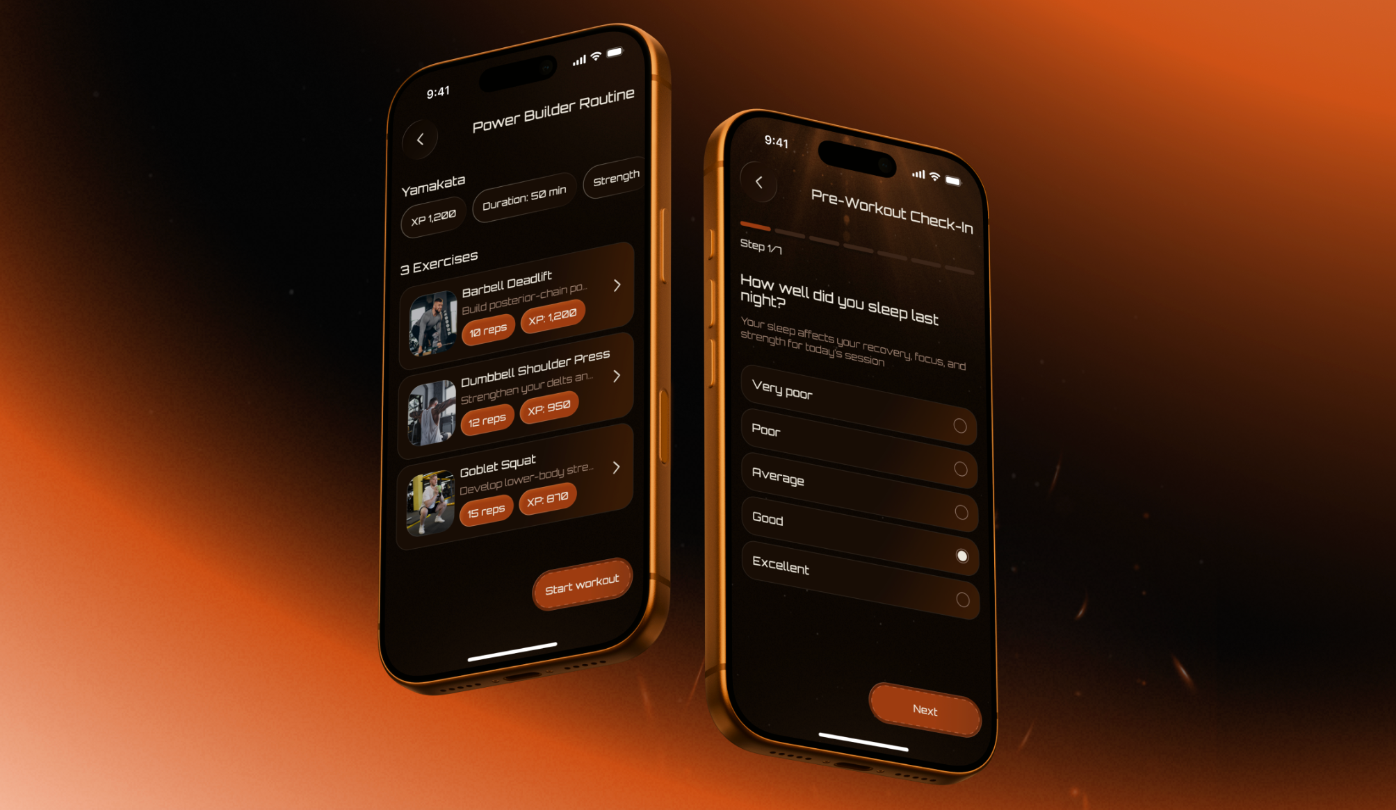
Mobile UI gamified the app with bright, contrasting colors, metallic hardware, layered visuals, and badge graphics. The admin panel made it easier for coaches to manage programs with step-by-step flows for certain tasks, filtered dropdowns, and more.
The results showed the value of a clear structure behind expressive visuals:
- +74% task completion rate
- 3x faster program creation
- +38% retention intent
- –41% cognitive load score
Alignment Design Principle Examples
Strong interfaces show alignment in everyday layout decisions. Navigation, forms, CTAs, cards, and dashboards become easier to scan when they follow one consistent visual logic.
Alignment in Navigation & Headers
The alignment principle of design is most apparent in a header. It’s something we depend upon even before we start reading the page. Logo, menu items, search, account controls, and main CTA all beckon for one obvious baseline, and if they’re not aligned just right, the whole product feels a little lopsided.
Arounda designers suggest:
Anchor the header to the page grid, then give the main CTA a fixed action zone. A menu can feel nice and balanced inside a header, but feel disconnected from the content that lives below it. Navigation and the first screen action can work together because of shared grid logic.
Alignment in Forms & CTAs
Form alignment should be designed for the state users actually see after they make a mistake. The principle of design alignment helps keep labels, fields, help text, errors, and the CTA visually connected after validation changes to the screen.
Arounda designers suggest:
Fill all available fields in your form and see how long each field's error message will be when the mobile keyboard comes up. This will give you a good idea if the user understands what they did wrong and what their next steps are.
Alignment in Cards & Dashboards
Readers scan cards and dashboards in a different way than regular pages. They compare price, status, metrics, progress, or action across several blocks at once. Repeated information should always be in the same place, so that the eye doesn’t hunt for the next stop on every card.
Dashboards add another layer of stress once they’re live. Live data brings with it long values, empty states, alerts, and permission limits. A clean mock-up will lose structure fast unless the layout was stress-tested with actual content.
Arounda designers suggest:
Select one comparison anchor before creating the card set. Locate the key decision detail in the same position in every card: price, status, risk level, next action, etc. And, for dashboards, only approve the layout once you’ve tested it with the hardest real dataset.
Good vs. Bad Alignment Breakdown
Most alignment problems get hidden in the first version of a design because demo content fills every block and makes them all feel balanced. It’s only when the product grows that the principle of design alignment begins to matter: how will the longer content, new states, and mobile behavior look without making the screen feel heavier?
Strong alignment usually shows up in details that users barely notice:
- The header keeps the CTA stable after new menu sections or longer labels appear
- Form errors stay close to the field and do not push the next action out of view
- Cards keep the main decision point in the same place from one card to another
- Dashboards preserve the relationship between metrics after live data changes
- Mobile flows keep the primary action in a familiar place from step to step.
Weak alignment installs small pauses within the experience:
- Users search for the button after every screen flip
- “Comparison” cards feel harder to read than they should
- Validation messages make forms feel broken
- Widgets on dashboards look unrelated after alerts or empty states show up
- Mobile screens force users to re-learn where to go next.
How Alignment Shapes Brand Perception
52% of customers never buy again after a product or service fails their expectations. It is in the small gaps in the interface that digital products create this mismatch. A user is seeking clarity, then encounters a CTA that seems out of place, a form that alters after validation, or a dashboard that structures data differently than the website. Alignment rules in design systems for scalable product development help the brand promise stay visible inside the actual product experience.
Consistency Across Brand Touchpoints
For brand touchpoints, the principle of alignment in design means keeping the same visual logic from the first visit to daily product use.
Strong alignment between touchpoints means:
- Main CTA maintains a familiar placement from the website to onboarding
- Product emails link to screens with similar action logic
- The dashboard actions are consistent when new roles, filters, or data states are added
- Mobile screens follow the same completion path that users have already learned on desktop.
Arounda designers suggest:
Select one primary-action rule for the entire journey before separate teams begin designing their sections. Choose where the primary action lives on the landing page, signup flow, dashboard, and lifecycle emails. Having one shared rule prevents the product from feeling fragmented after signup.
Real Brand Case Study
Alignment depends on the product context, user risk, and business goal. Our work with FundedIQ and Velox shows two different approaches: one focused on brand consistency across several touchpoints, the other on a dense booking dashboard. These alignment design principle examples show how clear layout rules support stronger user results.
FundedIQ
FundedIQ is a prop trading platform, rewarding traders for their skill, discipline, consistency, and performance. The product needed a brand and interface system that would feel precise, analytical, and trustworthy at every user touchpoint.
Our main challenge was to maintain the same visual logic across the landing page, platform UI, mobile flow, social templates, and print. The result is a dark-toned system matched with structured grids, strong hierarchy, glassmorphic elements, purple accents, and guidelines for scaling. Alignment enabled the product to carry the same values through from the first contact with the brand to the active trading experience.
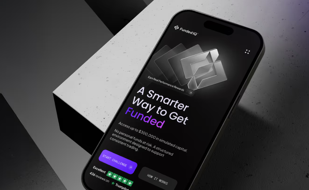
Results:
- 1.8 min average time to first action
- –37% drop in onboarding abandonment
- 3x content production speed
- 89% brand recall rate
Velox
Velox is an airline booking platform designed for frequent flyers and business travelers.
The key challenge was to keep the booking flow on one screen without drowning the user in information.
By utilizing distinct functional zones, stable panel arrangements, varied depth levels, and a left-to-right organizational layout, our design team has created an easy-to-understand user experience across all touch points.
The same logic of alignment continued on mobile. The interface was changed to a vertical card flow with a persistent bottom summary, showing price and booking status throughout the entire path.
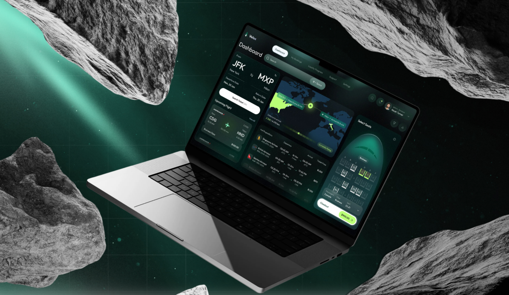
Results:
- 94% task completion rate
- 87/100 System Usability Scale Score
- 1.5 min average booking time
- <3% error rate
Alignment's Impact on Conversion Rates
Conversion depends on how quickly users understand the next safe action. Teams ask how alignment design principle affects branding and conversion rates after users stall in trust screens, CTA moments, or input-heavy flows.
Cognitive Load & User Trust
Users trust screens faster when important details stay in expected places. The alignment design principle impact on user trust and brand perception becomes clear on pricing pages, payment steps, healthcare forms, and financial dashboards.
To reduce mental effort:
- Keep risk details close to the related action
- Place repeated controls in the same zone on similar screens
- Keep warnings and confirmations tied to the action they explain
- Protect key actions during loading, filtering, and error states.
Button Placement & Conversion Data
Button placement turns the alignment design principle into a conversion factor. A CTA should appear at the point where the user already has enough context to act.
To make CTA alignment work:
- Place a pricing CTA after the user sees the core plan differences
- Align checkout buttons with the final cost and payment details
- Position onboarding CTAs near the last required field
- Separate secondary actions from the main completion path.
Input Layout & Drop-Off Reduction
Drop-off depends on the input layout after the real user data changes screen. Long labels, validation states, and mobile keyboards can push the next step out of the user’s path.
To keep forms easier to complete:
- Test forms with filled fields and a real error copy
- Keep each error message close to the field it explains
- Use one column for payment, signup, compliance, and healthcare forms
- Group fields by decision type, such as identity, payment, delivery, or verification
- Keep the primary CTA visible after validation.
Alignment Principles for Product Teams
Teams often discuss the alignment design principle in enterprise SaaS interface design, but the same layout logic matters in other industries. The interfaces ask users to make decisions with money, time, data, or progress at stake. Alignment helps the screen stay readable after real content, errors, roles, and user actions change the ideal layout.
- Start from the user's decision
Name the action the screen needs to support first. The layout should pull attention toward this moment and keep extra content quieter. - Test the layout under pressure
Use real copy, edge cases, and crowded mobile states before approval. Weak alignment appears once ideal content disappears. - Give repeated actions a familiar place
Similar actions need stable zones across related screens. Users move faster because each new step feels familiar. - Turn alignment into a team rule
Add layout rules for actions, forms, cards, and dashboards to the design system. Shared rules keep new screens connected as the product grows.

Conclusion
Alignment decides how clearly users read a product, trust its structure, and move toward action. A website or app can have a strong brand and still lose confidence through messy layouts, unstable CTAs, or unclear forms. With 10+ years of experience and 350+ completed projects, Arounda designs scalable websites and apps. Need a product that stays clear and trusted at scale? Contact us.


Table of contents


FAQ
Brand alignment has an impact on stability, maturity, and intentionality. A tidy structure helps users understand the product more quickly and makes it easier for them to compare it against competitors. This matters in crowded markets where trust is beginning to be built before users have read all the details.
When all of your new screens have an inconsistent alignment, constructing them will become progressively more difficult. There will be greater manual adjustment of the layout; a lack of conformity in the way that components are laid out; and subsequent updates to the product will take longer than before.
People look at health and fintech screens with less tolerance for visual “creativity.” A misplaced button or an error in a form feels like a threat. Left-alignment tends to be more readable for these screens, allowing users to check the information comfortably and move on through the screen without creating much tension in their minds. Center-alignment feels safer for short moment of confirmation, where the product needs to say one thing and say it clearly.
WCAG won’t flag a layout because it looks uneven. The risk comes when that uneven layout starts changing things at a functional level: a label is too far from its field, a shapeshifting button makes the mobile experience more cumbersome, etc. By the time it affects users with low vision or motor difficulties, it’s an access problem.
Mobile screens allow less room for oversight. A poorly aligned button can hide the next action. An overly long form can make users abandon the flow. Awkwardly arranged items break the reading path. This is where alignment inconsistency in UI design and its effect on conversion becomes clear: desktop users can scan a wider layout, while mobile users take in one piece at a time.
Before redesigns, major releases, design system updates, and conversion work, a product team should be auditing alignment. You also want to look at alignment when users drop off in forms, dashboards, pricing pages, onboarding, or checkout flows.


89+ Reviews
on Clutch

Top Rated Plus Agency
on Upwork

Top 50 Trending team
on Dribbble

Projects are Featured on Behance platform
