.avif)


.avif)


.avif)
Process
Our process began with strategy sessions and market research to define goals, users, and opportunities. From there, we crafted moodboards, wireframes, and a full UI design system with branding updates, prototypes, dev handoff, and ongoing design consulting after launch.

Competitor analysis
Competitor research revealed a key gap: most crypto platforms were either too complex or too basic. Many missed onboarding, AI support, and mobile consistency. These insights led us to focus on conversational AI flows, mobile-first design, progressive complexity, and a modular system that’s powerful but easy to use.

User Research
User analysis uncovered the main pain points of crypto newcomers and experienced investors: confusing interfaces, lack of support, and overwhelming data. These insights helped us create user personas and design a clear, transparent, and supportive platform.

App Flow
The app flow followed a step-by-step structure with a conversational AI assistant. It helps users easily move through onboarding, wallet setup, and investments with a more natural, helpful chatbot experience. We used progressive disclosure to keep things clear and simple. And user testing led to improved navigation and added visual cues to make switching between CeFi and DeFi effortless.

Wireframing
Our Web3 designers started with low-fidelity sketches to map out key flows like onboarding, AI interactions, and portfolio tracking. Through client feedback, they evolved into mid-fidelity wireframes with a clear hierarchy and modular UI blocks. Finally, we built high-fidelity clickable prototypes with brand visuals, real content, and motion.

Moodboard
Arounda design team blended futuristic AI, DeFi, and Web3 aesthetics with a focus on trust and simplicity. We used dark UI backgrounds, soft-glow gradients, clean typography, and conversational UI examples for a modern, accessible fintech look.
.avif)
Branding
GT Protocol’s branding reflects trust, innovation, and accessibility in the Web3 space. We refined the logo, introduced a bold dark color palette with glowing accents, and built a cohesive visual language across the UI, token and marketing assets.


PItch deck
The main goal of a pitch deck is to impress, so it must be clear, bold, and investor-ready. We highlighted product traction, AI features, top-tier partnerships, and growth potential with clean visuals and a confident Web3 tone. Every slide simplifies the complex and showcases trust, scale, and vision.
.avif)
Redesign
The old site felt generic with little context on value or traction. After product redesign, users can enjoy bold visual language, cleaner layout, and stronger hierarchy. The new hero section focuses on the core product and immediately communicates the solution and purpose. Improved navigation, call-to-action buttons, and partner logos now support trust and conversion from the first scroll.


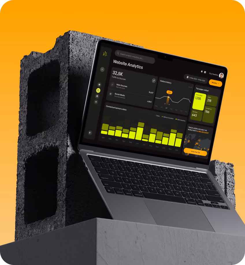
Website design
Web design focused on making Web3 actions feel simple and human. Our UI/UX designers built a modular, scalable system with a clear hierarchy, a dark trust-building aesthetic, and intuitive flows. AI chat assistant is a key feature for natural, actionable interactions, customizable dashboards, and real-time blockchain feedback.


Mobile design
Mobile design was a top priority from the start. A clean, responsive experience allows users to invest, manage assets, and chat with the AI assistant effortlessly. Modular cards, clear hierarchy, and real-time updates make complex Web3 actions feel simple even on the go.


Web app design
Our web app designers brought DeFi, NFTs, and staking into one clear, interactive space. With conversational AI, wallet connection, modular UI, and real-time data, users can invest and explore the app easily, fast, and confidently.
.avif)

.avif)
Styleguide / Design System

.avif)

Process
Our process began with strategy sessions and market research to define goals, users, and opportunities. From there, we crafted moodboards, wireframes, and a full UI design system with branding updates, prototypes, dev handoff, and ongoing design consulting after launch.

Competitor analysis
Competitor research revealed a key gap: most crypto platforms were either too complex or too basic. Many missed onboarding, AI support, and mobile consistency. These insights led us to focus on conversational AI flows, mobile-first design, progressive complexity, and a modular system that’s powerful but easy to use.

Core feature list

User Research
User analysis uncovered the main pain points of crypto newcomers and experienced investors: confusing interfaces, lack of support, and overwhelming data. These insights helped us create user personas and design a clear, transparent, and supportive platform.

App Flow
The app flow followed a step-by-step structure with a conversational AI assistant. It helps users easily move through onboarding, wallet setup, and investments with a more natural, helpful chatbot experience. We used progressive disclosure to keep things clear and simple. And user testing led to improved navigation and added visual cues to make switching between CeFi and DeFi effortless.

Wireframing
Our Web3 designers started with low-fidelity sketches to map out key flows like onboarding, AI interactions, and portfolio tracking. Through client feedback, they evolved into mid-fidelity wireframes with a clear hierarchy and modular UI blocks. Finally, we built high-fidelity clickable prototypes with brand visuals, real content, and motion.

Moodboard
Arounda design team blended futuristic AI, DeFi, and Web3 aesthetics with a focus on trust and simplicity. We used dark UI backgrounds, soft-glow gradients, clean typography, and conversational UI examples for a modern, accessible fintech look.


Branding
GT Protocol’s branding reflects trust, innovation, and accessibility in the Web3 space. We refined the logo, introduced a bold dark color palette with glowing accents, and built a cohesive visual language across the UI, token and marketing assets.


Responsive design


PItch deck
The main goal of a pitch deck is to impress, so it must be clear, bold, and investor-ready. We highlighted product traction, AI features, top-tier partnerships, and growth potential with clean visuals and a confident Web3 tone. Every slide simplifies the complex and showcases trust, scale, and vision.

Redesign
The old site felt generic with little context on value or traction. After product redesign, users can enjoy bold visual language, cleaner layout, and stronger hierarchy. The new hero section focuses on the core product and immediately communicates the solution and purpose. Improved navigation, call-to-action buttons, and partner logos now support trust and conversion from the first scroll.


Styleguide / Design System


Process
Our process began with strategy sessions and market research to define goals, users, and opportunities. From there, we crafted moodboards, wireframes, and a full UI design system with branding updates, prototypes, dev handoff, and ongoing design consulting after launch.

Competitor analysis
Competitor research revealed a key gap: most crypto platforms were either too complex or too basic. Many missed onboarding, AI support, and mobile consistency. These insights led us to focus on conversational AI flows, mobile-first design, progressive complexity, and a modular system that’s powerful but easy to use.

Core feature list
{{fs-competitors-mobile}}
User Research
User analysis uncovered the main pain points of crypto newcomers and experienced investors: confusing interfaces, lack of support, and overwhelming data. These insights helped us create user personas and design a clear, transparent, and supportive platform.


App Flow
The app flow followed a step-by-step structure with a conversational AI assistant. It helps users easily move through onboarding, wallet setup, and investments with a more natural, helpful chatbot experience. We used progressive disclosure to keep things clear and simple. And user testing led to improved navigation and added visual cues to make switching between CeFi and DeFi effortless.
{{fs-appflow-mobile}}
Wireframing
Our Web3 designers started with low-fidelity sketches to map out key flows like onboarding, AI interactions, and portfolio tracking. Through client feedback, they evolved into mid-fidelity wireframes with a clear hierarchy and modular UI blocks. Finally, we built high-fidelity clickable prototypes with brand visuals, real content, and motion.

Moodboard
Arounda design team blended futuristic AI, DeFi, and Web3 aesthetics with a focus on trust and simplicity. We used dark UI backgrounds, soft-glow gradients, clean typography, and conversational UI examples for a modern, accessible fintech look.


Branding
GT Protocol’s branding reflects trust, innovation, and accessibility in the Web3 space. We refined the logo, introduced a bold dark color palette with glowing accents, and built a cohesive visual language across the UI, token and marketing assets.


PItch deck
The main goal of a pitch deck is to impress, so it must be clear, bold, and investor-ready. We highlighted product traction, AI features, top-tier partnerships, and growth potential with clean visuals and a confident Web3 tone. Every slide simplifies the complex and showcases trust, scale, and vision.

Redesign
The old site felt generic with little context on value or traction. After product redesign, users can enjoy bold visual language, cleaner layout, and stronger hierarchy. The new hero section focuses on the core product and immediately communicates the solution and purpose. Improved navigation, call-to-action buttons, and partner logos now support trust and conversion from the first scroll.


Styleguide / Design System