
Healthcare Branding: How Visual Identity Shapes Patient Trust


If you ask your neighbors which hospital they go to, half of them will say the well-known name, many years after the sign out front changed. A new logo won’t change anything and won't erase what a community thinks about this place. Healthcare branding fails when it looks different but changes nothing: the color palette, the tone of voice, the way a nurse answers the phone all point to the same gap. Statistically, 74% of patients trust a healthcare organization only when they experience personalized brand touchpoints.
Arounda created this guide to get into what makes that work. We will look more closely at how color and layout can shape trust before a patient notices it.
Article Key Takeaways
This healthcare branding guide explains why visual updates fail to build patient trust and what closes that gap:
- Healthcare branding carries higher stakes than any other industry. 55% of patients say one bad experience damages their trust, and 4 out of 5 never return to that provider.
- Color, typography, and physical space form patient trust within seconds, and 74% of patients trust a healthcare organization only when they experience personalized brand touchpoints.
- B2B healthcare identity works with a different set of rules than branding that patients see. A hospital manager needs a strong case to make in a budget meeting, not an image that feels good.
- Position, align, communicate, and assess (PACE) is a four-step process that makes healthcare branding easier to operate.
- Strong healthcare branding leads to results that can be measured. This is what we've helped our clients achieve: Healium got 26% more trust than competitors that looked more clinical, MediFlow cut down on the booking process by 30%, and Lumera got 34% more people to sign up for trials.
- Brand image alone accounts for more than 80% of patient behavioral intent, but the majority of healthcare branding blunders stem from viewing a rebrand as a one-time visual refresh rather than a continuing discipline.
Why Branding Matters More in Healthcare Than Almost Any Other Industry
Every industry likes to claim its branding as uniquely important, but healthcare has the numbers to back that up.
The Trust Gap Is the Brand Gap
We know that a bad experience at a coffee shop usually costs just a coffee, but we can’t say the same about healthcare. In this case, it can cost someone their health, and patients feel that difference. That's why the emotional stakes of a medical visit change how people judge everything around it (including the font on a sign or the way a receptionist explains a bill).
Compassion carries more weight in that judgment than almost anything else. According to Deloitte’s 2024 Healthcare Survey, trust doctors only and consider them the most trusted source of information. A provider’s visual and verbal identity must amplify this human trust, and in this case, a single disconnect can undermine credibility. Here are some stats:
- 55% of patients said a negative experience damaged their trust.
- 4 out of 5 said nothing could bring them back to that same provider.
- 36% skipped or avoided care altogether because of how they were treated.
Physicians notice the same pattern. Poor communication is probably one of the main reasons why trust is ruined, and people go to a different healthcare provider.
Arounda team suggests: treat compassion as part of the design process. Small things build trust more than the logo ever will: a quick callback after a rescheduled appointment, a receptionist who explains a bill, a follow-up that shows someone heard the patient.
The Market Is No Longer Local or Captive
A few years ago, patients visited the nearest hospital or whatever their insurance told them to. Now, they first analyze reviews, ask their neighbors’ opinions, or compare several websites before they book the appointment. And this has made every clinic or hospital start learning more about branding strategies. A healthcare brand now has to win the comparison that happens long before anyone walks through any door at all.
B2B Healthcare Branding: A Different Game
Branding in healthcare industry for B2C and B2B markets varies. A lot depends on what you sell: healthcare services, medical devices, or health-tech platforms. When it comes to B2B, people don’t make the final decision based on how a logo makes them feel.
For instance, a hospital administrator isn't picking a supplier because the logo feels warm. They're choosing one they can stand behind in a budget meeting, in front of legal, and a year later when someone asks why this vendor got chosen over another. A strong B2B healthcare brand has almost nothing to do with bedside manner. Its job is to make everyone in that room, most of whom will never meet a single patient, confident enough in the decision to defend it long after it's made. And that's what good enterprise branding services are built to solve.
Arounda team suggests: B2B buyers need something to bring back to their team. A case study with numbers, a clear process, or a client they can call does more to win over a budget meeting than a nice logo ever will.
The Psychology of Visual Identity in Clinical Settings
Patients read a healthcare brand before they read a single word of copy. So, how does visual identity affect patient trust in healthcare? The color on the wall, the shape of the letters on a sign, the layout of a waiting room, all of it forms an impression in a few seconds, even before the administrator explains what kind of services the place offers.
Color Psychology in Healthcare Branding
The choice of color means a lot for any business, but it is different for medical establishments and retail or tech:
- Blue reads as calm and clinical without feeling cold, and that is the main reason why it is the primary color of health system branding.
- Green is related to health and renewal, and it is quite popular in wellness brands and pharmacies.
- White signals cleanliness, but on its own, with no other color, it starts to feel sterile.
- Warm accent colors (soft orange, terracotta, muted yellow) soften a palette for pediatric clinics, mental health platforms, and family practices. In these areas, comfort is the main goal.
A surgical center and a pediatric clinic should have different color palettes.
Typography and Perceived Competence
Font choice signals how much to trust what a patient is reading:
- Tight, geometric sans-serif fonts read as modern, and that is why diagnostic labs or surgical practices choose them.
- Rounder, softer typefaces feel more approachable, better suited to family clinics or pediatric brands.
- Heavier font weights carry more authority; therefore, they are a perfect fit for clinical or research-facing content.
Choosing a clever typeface that's hard to read is not a good solution because it works against the trust the brand is trying to build.
Environmental Branding and the Clinical Touchpoint
A brand is broader than you may think. It is the sign on the exam room door, the parking garage, the badge a nurse wears, etc. If the website looks polished but the building feels outdated, patients feel the disconnect, even if they can't explain what's wrong.
Wayfinding shows this the fastest. When your patient is lost in a confusing hallway, he or she won’t even remember what the company’s website looks like. At that moment, they are already nervous because they can’t find the right room or get the answer to their questions.
"The mistake I see most often is designing for the screen first. Patients meet a brand in a hallway, on a form, in a five-second phone call, long before they open a website. If the visual identity only holds up online, it was never finished."
Alyona Deieieva, Lead Brand Designer at Arounda
Arounda team suggests: before touching the color palette or the logo, walk through the building the way a patient would. You will see the confusing signage, the cold lighting, the gap between what the website promises and what the space delivers. If you don’t do this, the brand audit will fix half the problem.
Healthcare Branding Strategy: A Framework That Works
- Position — Define who the brand serves and what makes it different
- Align — Get every team, from nurses to administrators, on the same message
- Communicate — Build the tone, visuals, and signage around that positioning
- Evaluate — Track patient trust, retention, and staff alignment over time
So, how do we run healthcare branding projects? At Arounda, we run rebranding services for healthcare organizations through four stages we call PACE. Here’s how it works.
Position. Before defining the colors or fonts, we need to do one thing – to define who the brand is for: kids, doctors, adults, etc. Plus, we need to find out what makes it different from the hospital or health-tech platform. Simply put, we name a patient group, a specific specialty, faster access, more personal care, deeper clinical expertise, instead of trying to be everything to everyone. For example, a kids’ hospital and a cancer clinic have different branding positioning.
Align. A brand can hold its ground and stay ahead only if the people engaged in this business do believe in what they do. And this raises a question worth asking: what role does employee experience play in healthcare branding? We mean that nurses, physicians, administrators, everyone should be on the same page and understand what the company stands for.
Communicate. At this stage, we communicate how medical branding will be built: color palette, tone of voice, signage, etc. Everything must trace back to the positioning that was approved at stage one. Business owners must understand that if a brand promises compassionate care but has jargon-heavy website copy, it is communicating the opposite of what it set out to be.
Evaluate. A healthcare branding strategy needs a way to check if it's working. Track patient trust, retention, review sentiment, and staff alignment on a regular schedule (once a week/month, it depends). Look at whether reviews mention the same values the brand claims to stand for, whether staff can repeat the brand's core message without reading it off a poster.
Arounda suggests: If patients still can't say what makes the organization different six months after launch, then probably communication was the main problem. A good framework keeps checking if the brand people experience matches the one the organization set out to build.
Healthcare Branding Examples: What the Best Get Right
If you're wondering whether any of this works in practice, here are three healthcare and wellness case studies from our branding services that Arounda has worked on.
Healium
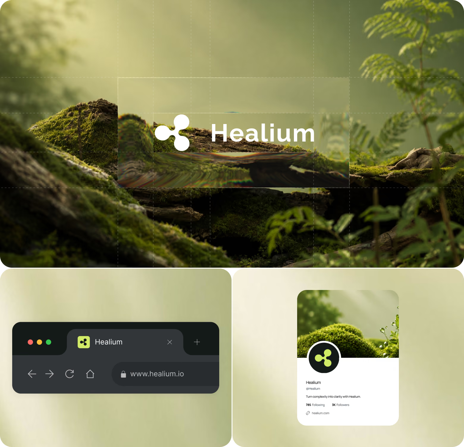
Problem: Healium needed patients to trust prescription decisions made through a screen, without leaning on the sterile, lab-coat look that most pharmacy platforms default to.
Solution: Arounda dropped the usual pharmaceutical clichés, cold lighting, generic medical stock photography, and built the brand around botanical textures, natural color, and soft gradients instead. The logo reads as both a flower and a stylized medical cross.
Results:
- 42% faster service understanding compared to similar pharmacy websites,
- 30% fewer navigation errors during product discovery,
- 26% higher perceived trust than more clinical-looking competitors,
- 39% fewer mobile interaction errors.
MediFlow

Problem: MediFlow needed a single design system to serve patients booking appointments and doctors reviewing dense clinical data, without weakening either experience.
Solution: The patient app uses soft tones and rounded shapes to keep things reassuring. The provider dashboard uses structured grids and data-first typography built for speed. Both sides share the same visual language, so the whole ecosystem still reads as one brand.
Results:
- 91% of test participants found the patient app clear and easy to follow,
- 84 out of 100 usability score for the patient app,
- 29% lower cognitive load for providers reviewing patient data,
- 30% fewer steps to book an appointment.
Lumera

Problem: Lumera's users were already overwhelmed by digital noise. A typical dashboard-heavy wellness app would have added to that, not fixed it.
Solution: Arounda built the product around a one screen, one thought principle, surfacing a single insight at a time instead of a crowded analytics dashboard, with a muted, editorial style that skipped the usual meditation-app clichés.
Results:
- 34% increase in trial signups,
- 27% higher CTA click rate,
- 22% drop in bounce rate,
- 36% higher feature discovery rate.
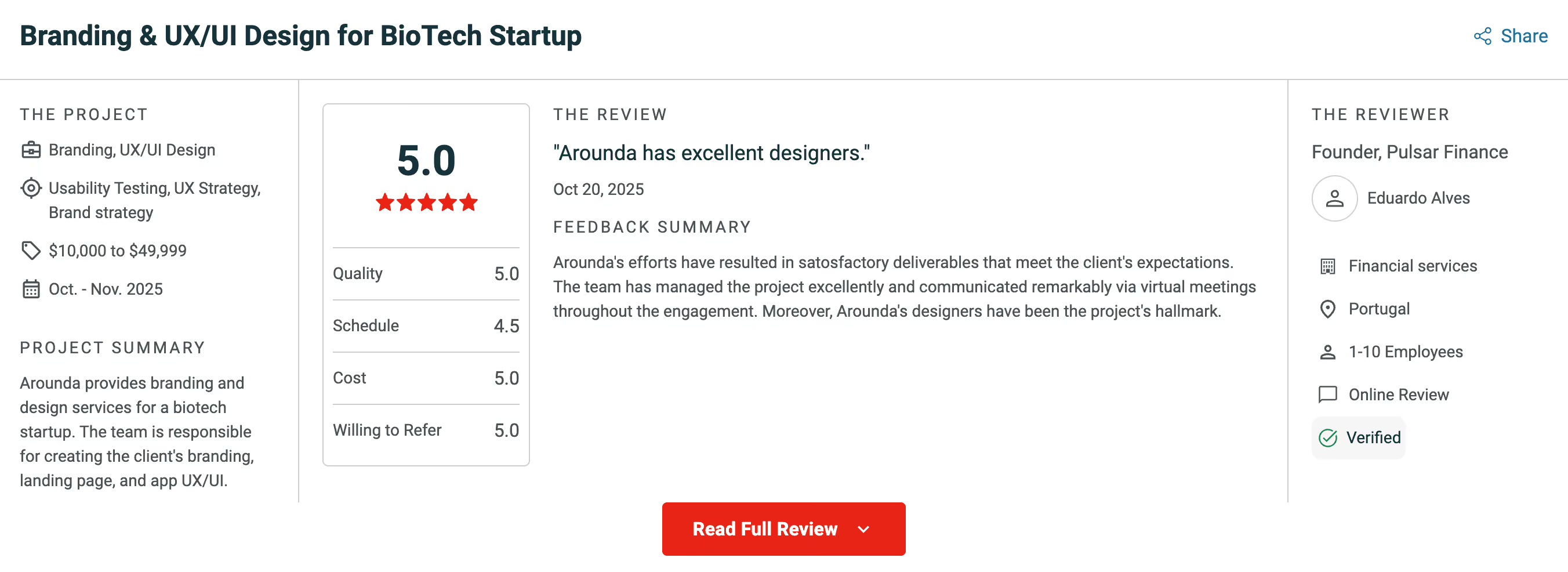
Healthcare teams say it better than we can. Arounda has completed 500+ projects over 10+ years, and clients rate the work 5.0 on Clutch, including teams that needed a brand patients could trust from the first visit.
What Not to Do: The Most Common Healthcare Branding Mistakes
So what are the biggest healthcare branding mistakes to avoid? Most of them come from treating branding in the healthcare industry like a one-time visual refresh. Businesses don’t understand that it is an ongoing discipline. Once you understand the value of branding in healthcare industry, these shortcuts start to look a lot more expensive than they seemed at the time. Here are the most typical mistakes of business owners in this niche.
Rebranding Without a Reason Patients Can Feel
For instance, a regional hospital system spends a year and a serious budget on a new logo, a new palette, and a refreshed website. However, the patient satisfaction scores don't move. The rebrand changed how the organization looks without changing anything patients feel: the same overbooked schedule, the same confusing intake forms, etc. The thing is that patients reward change they can experience (shorter wait times, clearer communication, an easier path to booking). If these changes are not implemented, then a rebrand reads as decoration.
Arounda team suggests: before the rebrand starts, ask what patients will be able to feel within the first month after launch. If the honest answer is nothing, the budget is going toward decoration.
Brand Guidelines That Live in a PDF, Not in Practice
Plenty of healthcare organizations have a polished brand book sitting on a shared drive somewhere, approved colors, typography rules, tone of voice examples, and almost nobody outside the marketing team has ever opened it. In this case, the gap will be noticed quickly:
- A nurse answers the phone using a script from three rebrands ago.
- A new service page gets written in a different tone than, for example, the homepage.
- A regional clinic keeps printing the old logo on materials because nobody told them it changed.
Remember that the guidelines work only if people use them every single day.
"No other industry asks a customer to trust it with their body. That fact changes every design decision, down to the tone of a reminder text. A healthcare brand that borrows conventions from tech or retail without accounting for that gap in stakes will always feel slightly wrong, even when nobody can say why."
Alyona Deieieva, Lead Brand Designer at Arounda
Mistaking Marketing for Branding
A clinic runs a discount promotion, boosts a few social posts, calls the whole thing "branding," and drops it once the campaign ends. However, that's marketing. A promotion can bring in a wave of new patients for a month. But branding is what makes those same patients recognize the same values and the same voice a year later, in a completely different campaign, with no discount attached. Confusing the two means the organization starts from zero every time a campaign wraps up.
"Notice the difference between how people think about a brand online and how they feel about it when they visit in person. Because of this lack of consistency, people don't trust healthcare companies as much. And this isn't shown in any of the products. It's not enough to just change the logo and a few pages in the brand book to make sure everything looks the same on social media and the website. You need to take a more in-depth approach.”
Vlad Gavriluk, CEO & Founder at Arounda
Ignoring the Digital-to-Physical Brand Gap
You look at the hospital’s website, and it looks calm and modern, has soft colors, very clean typography, and high-quality images. However, when a patient comes to this hospital, they see flickering lights, posters left from three branding eras ago, and wrong signage. These two experiences raise doubt. If the website was polished enough to hide the patients’ experience, what else got polished over?
A few common signs of this mistake are:
- Signage colors that no longer match the current logo.
- Staff uniforms carrying a tagline nobody uses in marketing anymore.
- A building layout designed around services the organization stopped offering years ago.
When the website itself is the outdated piece, our website redesign services can help close that gap from the digital side.
Healthcare Branding Trends
Those working in this area need to keep track of the latest trends. Although branding in healthcare moves more slowly than in most industries, a few changes are worth your attention. Learn more about them below.
AI-Generated Content and the Authenticity Premium
Most healthcare content online now sounds the same, because a lot of it comes from AI. This makes expert content even more important than ever before. For example, a blog post prepared by an experienced therapist carries more weight than AI-generated content. Patients (especially the younger generation) notice generic AI writing, and healthcare company branding built on named authors and verified credentials earns more trust because of it. The risk goes beyond reputation: the EU AI Act's transparency rules took effect in August 2026 and require AI-generated content to carry a clear label in many cases, and this raises the cost of passing off machine writing as your own.
It doesn’t mean you can’t use AI, but for photo or video content, the hospital should better invest in photo sessions with their staff. In this case, using stock photos is not the best solution.
Mental Health Destigmatization Reshaping Visual Language
Mental health brands used to borrow the same visual cues as physical medicine: clinical blues, sterile photography, distant language. The newer wave of mental health platforms relies on warmer color, casual photography, and everyday language. A visual identity that still looks like a hospital brochure works against a brand trying to convince someone therapy isn't something to hide.
Health Equity as Brand Positioning
Health equity used to live in a CSR footnote. Now it's showing up as differentiation, with providers building healthcare branding strategies around accessibility, sliding-scale pricing, multilingual staff, and culturally specific care. It's a direct answer to a question patients are asking: will this place work for someone like me?
The Rise of the Physician as Brand
What are the best examples of healthcare rebranding that worked recently? You'll notice a pattern: many of them center on one doctor, not the hospital name above the door. Doctor Mike (Mikhail Varshavski), a practicing family medicine physician, built an audience of over 30 million across platforms by explaining medicine clearly and treating patients like adults. Dr. Zubin Damania left a traditional hospital career entirely and built ZDoggMD into its own media brand around healthcare commentary and satire. Dr. Austin Chiang, a gastroenterologist, has spent years helping other physicians understand social media as part of their professional presence, not a distraction from it.
They are not hiding the institution they work for, but the trust patients place in them travels with the person. The organizations getting this right don't fight that. They give their doctors the tools and support to build a public presence, and let that presence carry the brand forward with them.
How to Measure Healthcare Brand Equity
So how do you measure brand equity in a healthcare organization? Brand equity shows up across several different signals, and each one tells you something the others miss. A peer-reviewed study on hospital brand equity found that brand image alone explained over 80% of the variance in patient behavioral intent, which is a strong argument for tracking it directly. See the table below for more details.
Final Words
A new logo is the sum of everything a patient sees, reads, and experiences (from the color on a sign to the way a nurse answers the phone), and whether all of that matches what the organization claims to stand for.
The organizations getting this right treat medical branding as an ongoing job. They know who they're speaking to and get their own teams aligned before launching anything visible. They also keep checking whether patients can feel the difference months after the rebrand wraps up. The ones that skip these steps end up with a brand that looks good in a pitch deck and does nothing for the people walking through the door. If patients can't say what makes your organization different, talk to Arounda about a brand built on what patients feel.



Table of contents






FAQ
Healthcare branding is how a hospital, clinic, or health-tech company shows up to patients (visual identity, tone of voice, physical space, and the experience behind all of it). It matters because trust is fragile in this industry. One bad experience can cost a provider a patient for good.
Patient-facing branding runs on emotion and comfort. B2B healthcare branding talks to hospital administrators, procurement teams, compliance officers (people who need to defend a decision to their own team long after it's made). Warmth matters far less here than clarity and proof that the choice will hold up under scrutiny.
The right palette depends on the target audience, what market research shows about how that audience reads color, and what the client is willing to commit to long-term. A pediatric clinic and a surgical center shouldn't land on the same choice. What we've noticed across projects this year and last is that clients are moving away from the traditional clinical palette, blue, white, or pharmacy green. They ask for something closer to live. Energetic color instead. Why so? Because those clinical colors were built to signal sterility, and sterility doesn't build warmth or connection with patients. A more energetic palette signals that the organization sees the patient as a person first. We use natural green, lime, orange, yellow, or purple more often now. The shift only works when it's backed by research into the specific audience
At Arounda, healthcare rebranding runs 3 to 5 weeks after the contract is signed. The exact timeline depends on the scope of work and the deliverables involved. A single-location practice needing a visual refresh moves faster than a multi-location system rebuilding brand guidelines, digital assets, and signage together.
The most typical mistakes we saw: - Rebranding without fixing anything patients feel, - Brand guidelines nobody on staff ever uses, - Treating a marketing campaign as if it were the whole brand, - Letting the physical space fall out of sync with a polished website.
Track patient trust scores, retention, review sentiment, brand recall, referral rates, and staff consistency together, on a regular schedule. No single number tells the whole story on its own.


89+ Reviews
on Clutch

Top Rated Plus Agency
on Upwork

Top 50 Trending team
on Dribbble

Projects are Featured on Behance platform
