
Mental Health App Design: Principles, Patterns, and What Works


Nearly 1.2 billion people worldwide had a mental disorder, almost double the number from 1990. Anxiety and depression were the main reasons for that growth. If you're building a wellness app right now, some of your users already carry one of these diagnoses.
Mental health app design carries a weight most software never has to carry. A confusing screen in a banking app costs a user a few minutes, but the same screen during a panic attack can cost someone the one moment they reached out for help.
Arounda has been designing mental health apps for over 10 years, and this guide comes from that experience. It covers the patterns that hold up under emotional strain and the mistakes that quietly push users away. In this article, our designers show case studies that demonstrate what changes when the interface gets it right.
Article Key Takeaways
- Mental health apps have much higher stakes than most software. Users download such apps with reduced capacity, and that is why an overloaded screen can cost someone their one shot at getting help that day.
- Trust, speed to the right action, and consistency are more important than the number of features added or a polished look.
- Fixed navigation, one clear action instead of a menu, an always-visible crisis button, and progress tracking that doesn't punish setbacks make the biggest difference.
- Our real cases like Lyynk, Cognify, and Lumera show these ideas in practice, with commentary from Arounda's design team on what holds up.
Why Mental Health App Design Is Different
A confusing checkout flow costs an e-commerce app a sale. A confusing mental health app costs a person their only attempt to get support that day. Here are the main criteria that differentiate mental health apps from other consumer software products:
- Users arrive with less capacity. Anxiety, depression, and stress make it harder to think clearly. People can't make decisions quickly. Someone in the middle of a panic attack isn't going to figure out a five-tab menu. Every extra step takes effort and makes them close the app and never open it again.
- The stakes of a bad interaction are higher. Poor usability is the top reason people stop using mental health apps, according to an analysis of over 13,000 App Store and Google Play reviews. A person who abandons one app after a bad experience often doesn't try another.
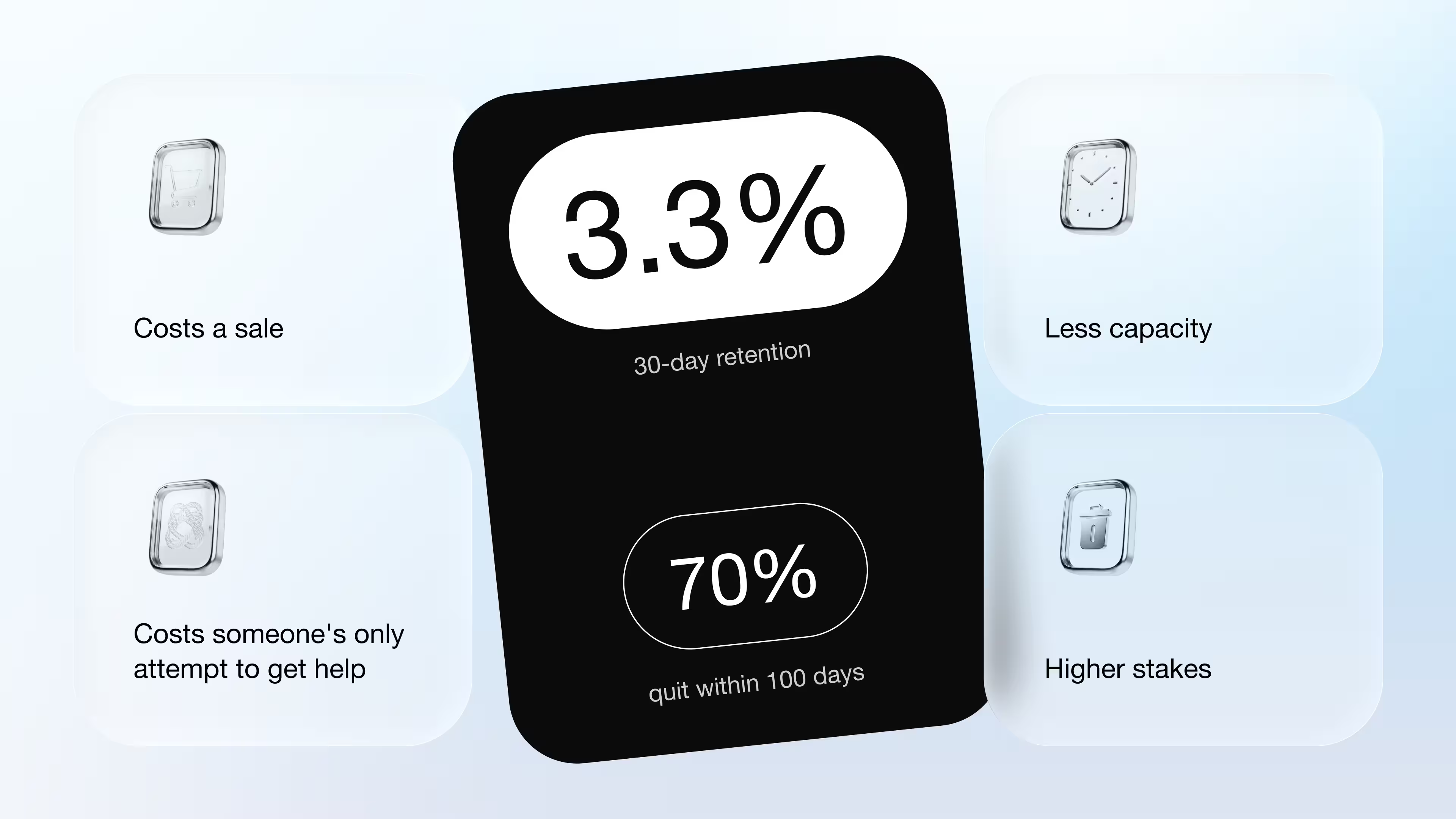
We have some retention numbers that prove this. Median 30-day retention for mental health apps is around 3.3%, and a scoping review found a median of 70% of users quit within 100 days. Most of that drop-off happens because of the friction in the interface.
Here's what this means for the design:
- Trust has to come before anything else. Someone opening a mental health app is often about to type things they haven't said out loud to anyone. If the first screen feels like a form at a doctor's office (all boxes and fine print), they hesitate or just close the app. Explaining why you need a mood check-in, or letting someone skip a question, builds more trust than any privacy badge.
- Speed to the thing that helps matters more than how many features you built. People suffering from mental health illnesses don't want to land on a dashboard with mood graphs and 3-4 suggested articles. They want the breathing exercise or crisis line right there.
- Consistency outweighs novelty. A layout that shifts between sessions adds cognitive load when the user has the least of it to spare.
Design here is of utmost importance, as it shows if the app was built for a user whose state determines whether the product works at all.
Case Study: Designing Lyynk
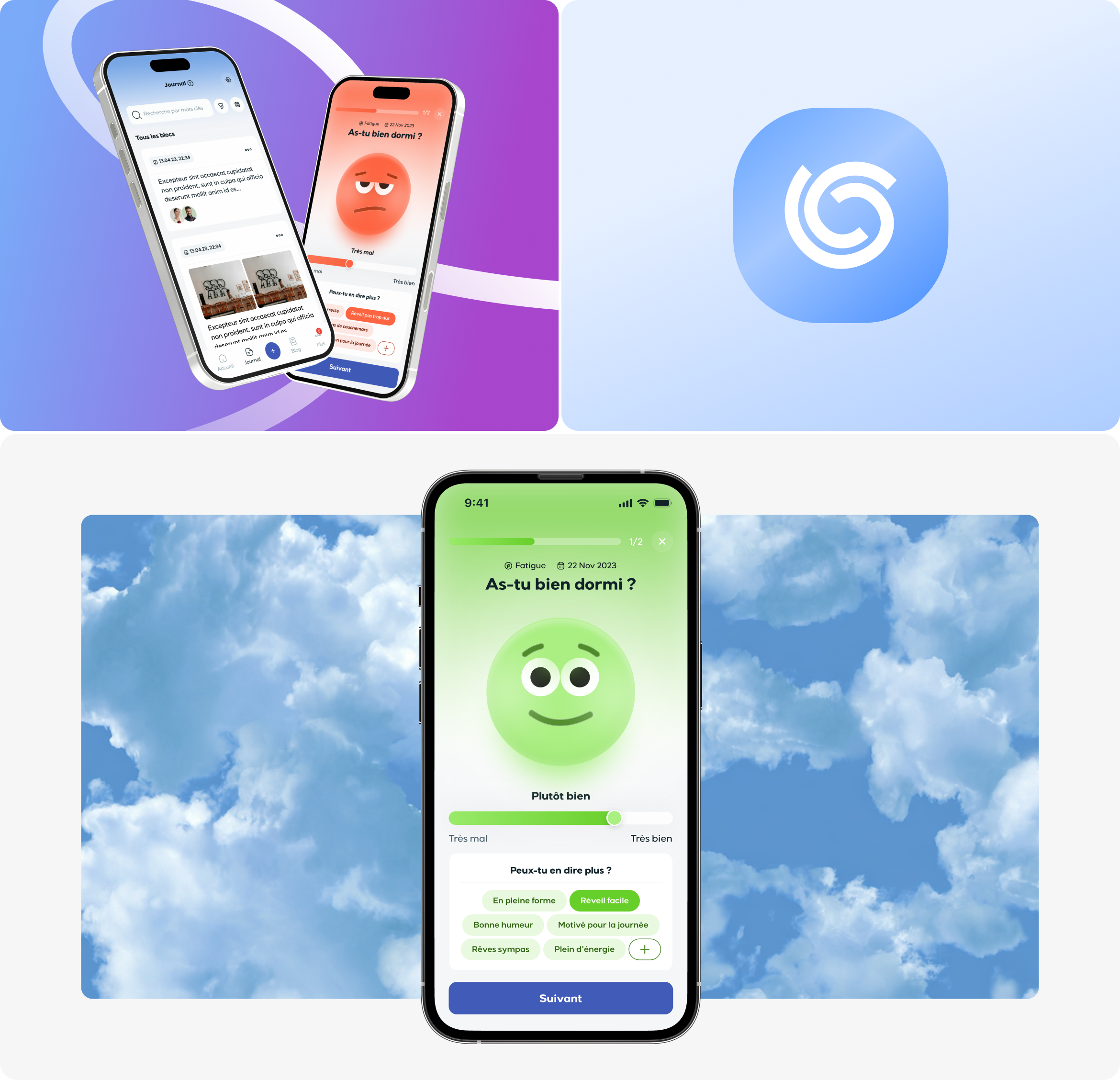
Lyynk is a French platform where young people can track their emotions and stay in touch with an adult they trust. The product was a bit messy; it had too many features stacked on top of each other, a maze of navigation, and an outdated look. However, teens needed something soft and much easier to use. The adults on the other side needed something they could rely on. GDPR rules for underage users added a third layer to design around. Arounda took it through a full UI/UX design process, starting with a UX audit of the existing app, then rebuilding the visual identity with graphic design work.
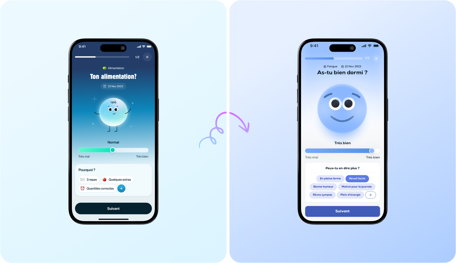
What was changed by our expert team:
- Stripped the app down to the features people use every single day
- Rebuilt mood tracking, journaling, and shared activities
- Fixed the crisis button in one place and made it more visible
- Shifted the visual system to muted colors and soft 3D icons that read as calm
Results after launch:
- 100k+ downloads
- 4.8★ app store rating
- +38% growth in engagement
- +42% increase in retention
That last figure matters most. Most mental health apps lose the majority of their users in the first 30 days (often before the app has a chance to help anyone). Lyynk moved 42% in the opposite direction after the redesign. So people who downloaded it kept coming back again and again.
Mistakes We Keep Seeing in Mental Health App Design
Most of these mistakes come from teams optimizing for the wrong thing. They chase a polished look, a longer feature list, or a friendlier onboarding flow, but as a result, they add more steps that a distressed user doesn't have the patience for. A simple UX audit can catch these issues quickly. See the table below that covers all typical mistakes and offers ways to solve them.
The pattern across all of these is the same. Every mistake in mental health app UI design adds a step between someone feeling bad and getting help, so fixing them means cutting those steps.
Core UI/UX Patterns for Mental Health Apps
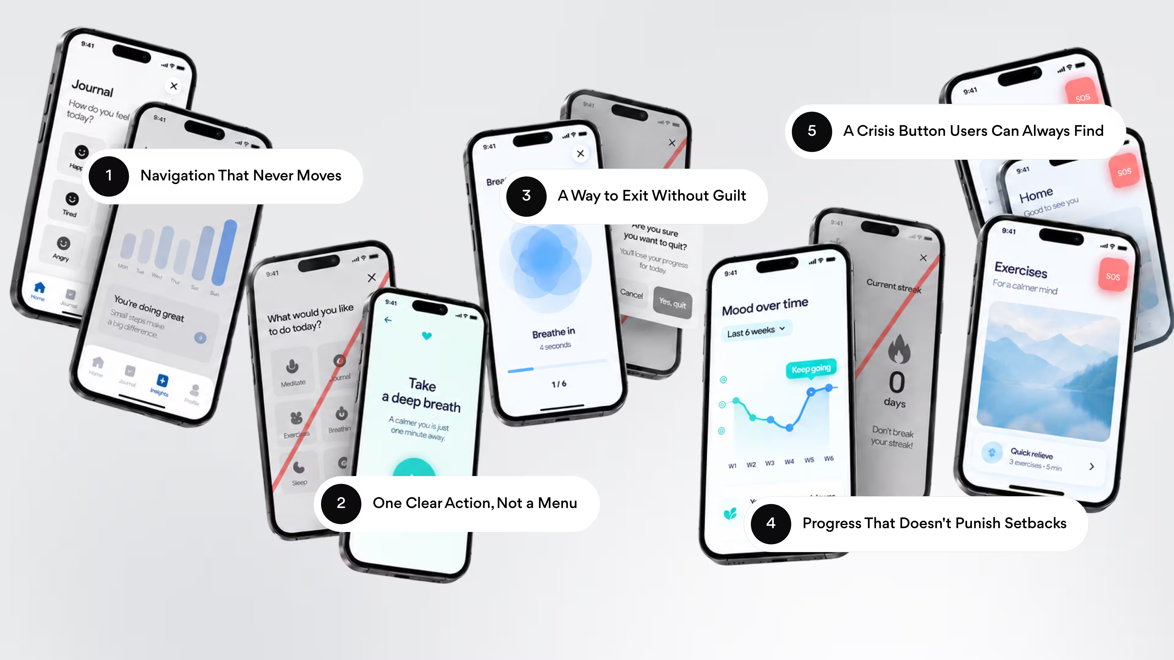
Look at almost any mental health app people stick with, and the same five mental wellness app design patterns show up. They all mean putting the user's state ahead of the usual design instincts, even when that goes against what looks impressive in a portfolio. Here are the main design patterns.
Navigation That Never Moves
Under stress conditions, people rely more on muscle memory. Therefore, the best solution is to keep the same menu in the same spots across every version and every update. Calm and Headspace both kept a fixed bottom tab bar for years for this reason. As a result, a returning user never has to relearn where anything lives.
Arounda suggests: don't redesign navigation during a rebrand. You can change colors or icons (if you want to), but it is better not to touch tab positions and the main structure.
One Clear Action, Not a Menu
A home screen with 5-7 buttons forces a decision nobody in crisis wants to make. There are basically two ways to design this:
- Menu-first: a grid of features, and the user has to guess which one helps right now
- Action-first: one clear prompt front and center, everything else just one tap away
People dealing with insomnia or depression need to take supplements or medication at the right time every day. Arounda ran into this while designing Luma, a healthcare app for supplement routines. The team pulled out the usual dashboard and replaced it with a single daily plan: one recommended action. Retention doubled after the change, and 7-day plan adherence climbed to 64%.
A Way to Exit Without Guilt
Avoid using too pushy pop-ups like this one – "Are you sure you want to give up?" If someone starts a breathing exercise or a journal entry and changes their mind halfway through, closing the application should take one tap only.
Arounda suggests: save confirmation dialogs for things that are hard to undo (deleting a journal entry or an account). For everything else, let people leave. No guilt trip on the way out.
Progress That Doesn't Punish Setbacks
Streaks are a powerful tool for fitness mobile apps, but here, they backfire. The thing is that in this context, a missed day can mean that a user was struggling (it is not a case of skipping out). That is why resetting a counter to zero can punish the person who needs the app the most.
When Arounda redesigned Lyynk, the team skipped the streak counter entirely. Mood tracking and journaling were built around each user's own rhythm, with a personalized review flow that adapts to how someone journals and doesn't punish gaps.
A Crisis Button Users Can Always Find
A crisis button is one of the key features here, and it must be placed in the same corner of every screen. Don't hide it in a hamburger menu or settings. Top crisis-line apps anchor this in the navigation bar itself, so it always stays visible for people under pressure.
For Lyynk, placing crisis support where teens could find it fast, without making the whole app feel like a clinical intervention tool, was one of the harder design problems the team solved. It had to stay visible enough to use in a real crisis.
Arounda suggests: treat the crisis button placement as a rule (it is not a design choice open for iteration). Every new screen must be tested against the question of “can people under stress find it within a few seconds or not?”
Visual and Interaction Design Principles
Colors and motion change how someone's nervous system reacts to the screen, sometimes within the first second of opening the app.
Color and Typography for Calm
Saturated colors and high contrast read as urgent, which is the opposite of what someone dealing with anxiety needs. Most digital therapeutics design choices rely on muted, low-saturation palettes: soft blues, sage greens, dusty lavender. For example, Calm's interface stays almost entirely desaturated, and Headspace pairs its brighter accents with large amounts of white space. As a result, nothing feels too loud.
"Honestly, most of what we do is take stuff away. A color here, an animation there. Someone opening this app might already be overwhelmed, so every extra thing on the screen is one more thing fighting for their attention."
Valeriia Serohina | Art Director at Arounda
A 2026 scoping review of 16 studies and over 4,000 participants found that people with depressive and anxiety-related disorders consistently gravitated toward blue, grey, and darker shades. Participants without a diagnosis almost never picked black, grey, or white as a favorite color. That shows what people in a low mood state prefer, which is still a reason to think twice before defaulting to the loud palettes that work fine for a shopping app.
Typography is also of utmost importance. Rounded sans-serif fonts read as friendlier than sharp, geometric ones, and text needs room to breathe since anxious readers scan faster and skip words when lines sit too tight.
Arounda suggests: here’s what needs to be avoided:
- Bright red for anything other than a genuine crisis alert
- Low-contrast gray text on white backgrounds
- All-caps buttons, which read as aggressive
Motion, Haptics, and Sensory Neutrality
Animation should confirm that something happened. So the best solution is to keep transitions short, under 300 milliseconds, and let them fade or slide.
Haptic feedback needs the same restraint. A single soft tap on completing an exercise feels supportive. A pattern of buzzes on every tap starts to feel like nagging.
This matters even more in a crisis intervention UI. Someone reaching for a panic button doesn't need an animated transition between their tap and the help on the other side. The best crisis flows skip decorative motion entirely: one tap, then the resource appears. Every extra half-second is too long.
Sounds should also be calm and relaxing. The thing is that an unexpected chime can be jarring for someone using the app in public or during a moment they'd rather keep private.
What Compliance Changes in the Interface
Compliance decides what shows up on screen, what stays hidden, and how fast certain things have to disappear. Every project Arounda takes on in this space gets designed around these rules from the first wireframe. A rule written in a legal document like GDPR or HIPAA turns into a consent screen, a lock timer, a permission setting, something a designer has to draw and place.
- Consent screens come first. Before a journal entry saves anything a user types, GDPR and HIPAA both say the app needs clear permission first. That can be a short screen that shows up right when someone opens a mood check-in for the first time. It must be easy to read and explain what's being saved and for what reasons.
- Sessions lock themselves. Auto-lock after inactivity and screens that clear sensitive text when the app goes to the background exist because someone else could pick up the phone at any moment.
- Access gets split by role. Apps built for kids or young people require separate permission levels. As a result, a parent can always stay involved. A good mental wellness app UI design makes that boundary visible to both sides.
- Crisis messages trigger a response. If someone types something like "I don't want to be here anymore," the interface has to respond in that moment, whether that's a hotline number or a direct line to a trusted contact.
- Deleting your data has to be easy to find. Users have a legal right to export or delete what they've shared. That means a button for it. In this case, a support email hidden in the FAQ won’t help.
All five of these are also cognitive accessibility design choices. Clear consent, predictable locking, visible boundaries, and an easy way out all reduce the mental effort it takes to use the app safely.
Why Good Design Work Pays Off in Retention and Funding
Design decisions can directly influence how many users will download the app and get the most out of it.
Retention comes down to one thing: does the app still work for someone on their worst day, three weeks in? A crisis button that's always in the same spot, adaptive UI mental health screens that don't shuffle around between visits, and a therapy app design that gets someone to a breathing exercise or a chat in one tap instead of hunting through five, all of that adds up to someone opening the app again next week instead of deleting it.
Lyynk is proof this isn't theoretical. This app was rebuilt around exactly these ideas, and retention went up 42%.
Funding follows a similar logic. Investors evaluating a mental health app always pay attention to how the app works. A 4.8★ rating and steady user growth carry more weight in a pitch deck than a polished mockup.
Weak design tends to surface during due diligence as low retention or unresolved compliance gaps, and that's a harder story to tell investors. That's why many early-stage teams get startup web design help before they start pitching, so the product backs up the story they're telling. Good design earns its place in both a growth chart and a term sheet.
"When my team designs, we keep an eye on the stuff a product owner watches: retention, drop-off, time to value, conversion. But we also think about risk, because that's what investors care about. Low churn, steady engagement, no compliance mess, that's what makes a product feel safer to put money into."
Vlad Gavriluk, Founder and CEO at Arounda
UI Design Examples Worth Studying
Here's how three products used Arounda's UI/UX design services to put these mental health app UI design patterns into practice, with the numbers to back it up.
Lumera: Mental Wellness Platform (UI/UX Design)
Lumera is an AI-powered mental wellness app. It was built for users already drowning in digital noise. The biggest challenge here was to turn too complex mood analytics into something that felt like a reflection. Arounda's team stripped the interface down to one idea per screen and dropped the typical dashboard grid. On top of that, designers built the UI around an editorial reading rhythm.
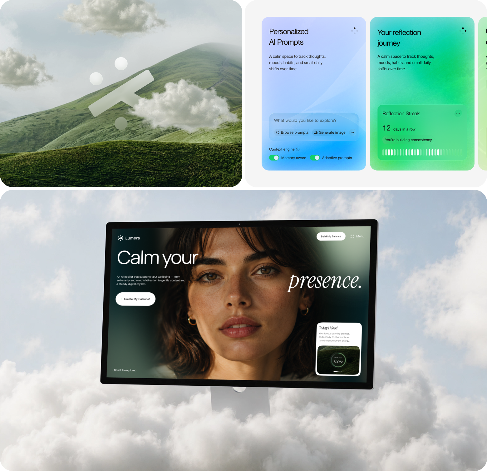
Here are the final results:
- Trial signups up 34%
- CTA click rate up 27%
- Bounce rate down 22%
- Feature discovery up 36%
Simplifying an information-heavy mental wellness app design makes people trust it enough to explore further.
Cognify: Cognitive Health Platform (Web App Design)
Cognify tracks biometric signals for knowledge workers and warns them when stress is building, before it turns into full-on burnout. The tricky part was the data itself. Raw biometric charts are full of numbers nobody wants to decode between meetings. Users needed to glance at the screen and just know what to do next.
Here's what the Arounda team did. Instead of throwing all the data at users right away, the dashboard leads with a clear answer: your status right now and what to do about it. If someone wants to find out more about stress trends, scan results, or biomarker details, that's all there too, just one layer down. It doesn't crowd the main screen.
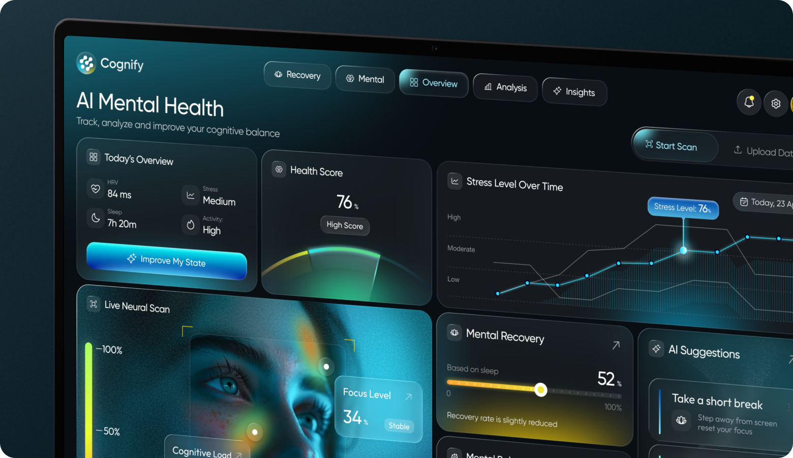
Our final results:
- Time to understand cognitive state dropped from 14 seconds to 2.4 seconds
- Week-4 active usage held at 71%
- Decision clarity hit 84%
- Break-prompt response rate rose 67%
Mine'd: Mental Health Platform (MVP Design)
Mine'd is a relationship and emotional wellness platform. It serves two separate audiences from one product: people seeking guidance and the experts providing it. Arounda built two distinct app experiences from the same design system, each shaped around what that specific user needs to do.
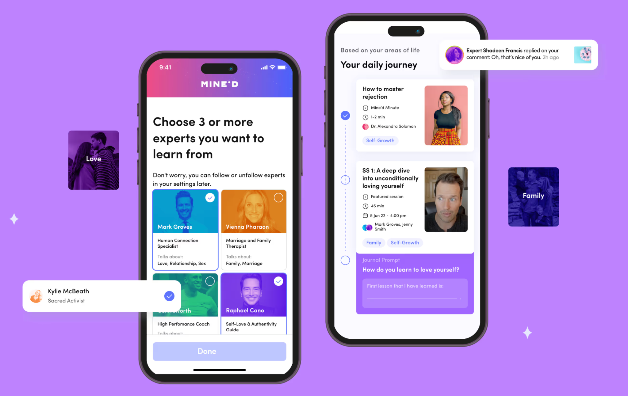
Results:
- 85% user satisfaction rate
- 87% retention rate
- 25% increase in mobile users
- 8% conversion rate
Building two separate flows, one for each audience, is what made both sides of the platform work well together.
How Arounda Approaches Mental Health App Design
Every project starts with the same question: what does this person need in the moment they're most likely to give up? A full redesign or MVP development – all other steps are organized around the answer to this question:
- Map emotions before screens. Before drawing a single wireframe, the team needs to map out the emotional states users go through. And this map becomes the backbone of the whole design flow. Simply put, the navigation follows how someone feels instead of a generic structure borrowed from a to-do list or a shopping app.
- Keeping one idea per screen. We avoid using a dashboard that stacks five things at once. Each screen must carry a single focus, so reflection doesn't turn into information overload, and Lumera is a good example.
- Leading with the answer. Show the status and the recommendation first, then let deeper data sit one layer down for anyone who wants to dig in. Cognify's dashboard works this way. It opens with a clear read on the user's state before any of the underlying numbers.
- Design for every role separately. Mine'd needed two distinct experiences for two different users: consumers and experts, so Arounda built separate flows that didn’t force one layout to serve both.
- Building compliance from day one. GDPR requirements for Lyynk's teenage users shaped permission levels and privacy controls from the first wireframe, not as a patch after launch.
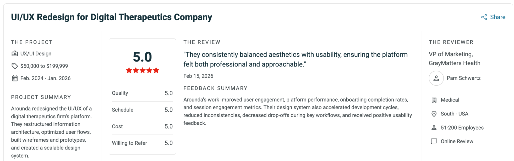
Arounda has over 10 years of field experience and has already completed over 180 successful design projects. Clients trust us, as reflected in our 5.0 rating on Clutch. We would be happy to add your project to that list!
Wrapping Up
Good mental health app design means the interface holds up on someone's most challenging day. Navigation that doesn't move, one clear action, a crisis button in the same spot, all these are must-have features of a good mental health mobile application. They decide if people will open the app tomorrow and get the most out of it or delete it today, after the first unsuccessful attempt to use it.
The stakes are higher here than in most software, but so is the upside. The right design shows up in retention, in trust, and in the numbers investors look for. Building a mental health or wellness app? Contact us and let's talk about what that looks like for your product.



Table of contents





FAQ
Users of mental health software products have reduced capacity to process information, and that is why mistakes can cost more. A confusing screen in a fitness app wastes a few minutes, but a confusing screen during a panic attack can cost someone the one moment they reached out for help. When we look at mental health app UI design examples like Lyynk or Cognify, we will see how much that difference shapes every screen.
The best solution is to locate and fix it in the same corner of every screen. Plus, use a neutral color that doesn't scream for attention until it's tapped, and skip decorative animation on the tap itself. It needs to be findable in under two seconds without dominating the interface during normal, everyday use.
Retention over weeks is one of the best signals you've got. Plus, you should analyze if people know what to do after looking at the screen once, how quickly they can find the crisis button when they need it, and if they return after they missed a day or two. Time spent in the app isn't a great measure on its own. Sometimes a high number just means someone couldn't find what they needed.
Yes. Investors look at retention, engagement, and app store ratings to see if the product works, not just how it looks in a demo. Lyynk's redesign is a good example: the 42% jump in retention after the redesign is the kind of number that carries weight in a pitch deck.
Crisis moments require one visible action, no confirmation dialogs, and zero friction between the tap and the resource. Everyday use can support more features, more exploration, and softer pacing because the person has more capacity to engage. The same app has to serve both states without switching interfaces entirely.


89+ Reviews
on Clutch

Top Rated Plus Agency
on Upwork

Top 50 Trending team
on Dribbble

Projects are Featured on Behance platform
