
Style Guide vs Brand Guide: Which One Does Your Business Need?


A recent Storyblok survey found that 73% of shoppers are less likely to buy from a brand that feels inconsistent. Yet ask ten agencies what separates a style guide from a brand guide, and you'll get ten different answers. And this confusion may cost founders a lot of time and money. Teams brief the wrong document, and all brand elements may ship inconsistently across different channels.
Arounda studied 15 public brand documents to map what style guide vs brand guide means. This guide breaks down the real difference, when you need one document or both, and a brief template you can hand to any design company.
Article Key Takeaways
- Style guides set the rules for voice, tone, and editorial standards and keep all written communication consistent.
- Brand guides are more about the visual identity because they lock down logos, color values, typography, and design assets.
- Arounda analyzed 15 public documents from companies like Apple, Slack, Adobe, and Mailchimp to highlight what industry leaders get right and where most guides fall short.
- Our experts break down the design framework for fintech, Web3, AI, and cybersecurity brands, complete with expert commentary, a brief template, and strategies for managing complex corporations with subsidiaries.
We Looked at 15 Public Brand Documents. Here's What We Found
Companies name these documents differently, and what's inside them differs even more. Before you build your own brand identity guidelines, it helps to see what well-known companies got right and wrong. Here's what we found.
Mailchimp
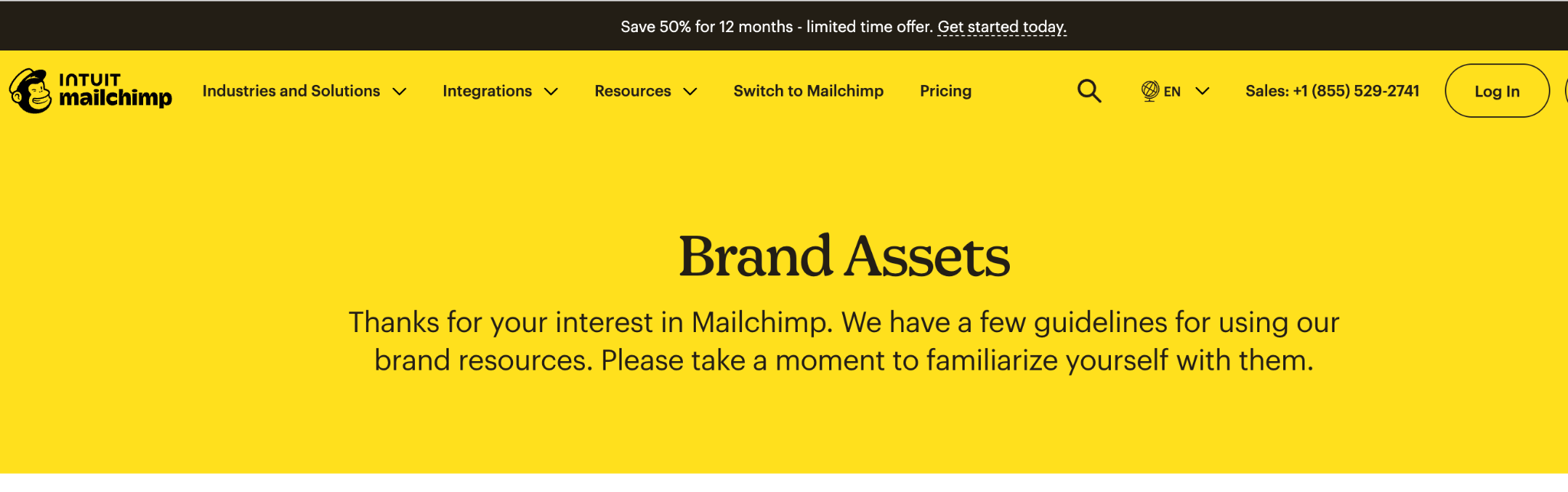
This company has a one-page brand book which includes logo spacing, mascot rules, and two brand colors. It reads more like a quick reference card than a document a design team would build a system around.
Gaps:
- Doesn't include typography guidance anywhere on the page
- Voice and tone live in a separate document most visitors never find
- The do/don't list is text only, no side-by-side example of correct vs incorrect use
The best thing is the FAQ section, as it answers all questions beginners typically have.
Arounda suggests: Connect visual rules and writing standards inside a single portal so your team can verify brand details without hunting across different documents.
Buffer
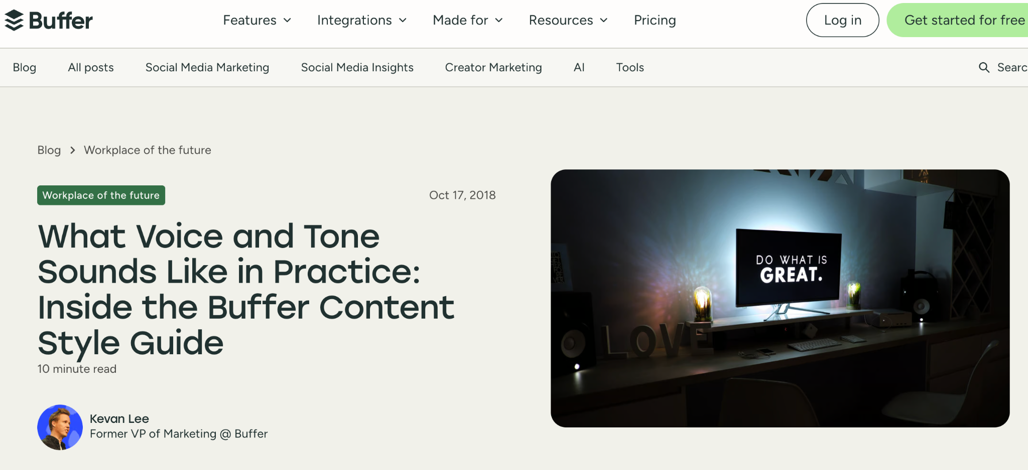
Buffer has a style guide which is built around voice and doesn't include visual content.
Gaps:
- No logo, color, or typography reference anywhere in the document
- Lives in a shared doc rather than a stable page, so old bookmarks can break
- No link back to a visual identity document, if one exists
One line does more work than most full pages elsewhere: "you have the same voice all the time, but your tone changes." That distinction alone would improve half the documents on this list.
Arounda suggests: We recommend adding or linking to visual assets (even if it is a lightweight style guide).
Slack
A 40+ page PDF covering mission, values, voice, and full visual identity in one file. Logo, color, and two named typefaces (Larsseit, Slack Circular) sit next to voice and tone, so nobody has to check two places for basic answers.
Gaps:
- No table of contents links or searchable index inside the PDF
- Five named values (empathy, courtesy, craftsmanship, playfulness, solidarity) include definitions, but there are no examples
- It is too long. A new hire is unlikely to read 40 pages before shipping a first deliverable
Arounda suggests: When working on long brand documents, put a 2-page cheat sheet on the first slide. New hires won't need to review 50 pages before they start working.
Apple
A 475-page editorial dictionary, kept entirely separate from visual identity. Look up "FaceTime," get one clear rule: don't use it as a verb. That entry format is fast for daily use, which is likely why writers keep coming back.
Gaps:
- New hires get no starting point (only an alphabetical list to search)
- No tone guidance anywhere
- Visual identity is in a separate PDF for resellers
Arounda suggests: Add a short "how to use this guide" page for new hires.
Adobe
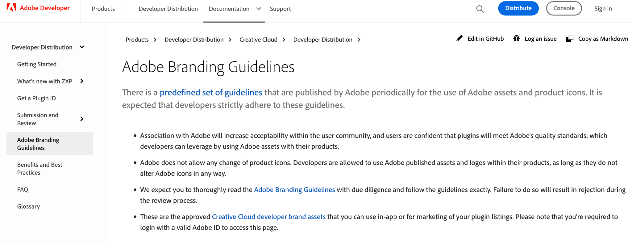
This brand guide (as Adobe calls it) looks more like a trademark license for outside developers. Unfortunately, it doesn't include voice or tone (only badges and logos).
Gaps:
- No help for anyone writing a blog post or a pitch deck
- Scope stays narrow on purpose: logos, names, approved badges only
The best part is that this guide doesn't overpromise. Any developer can open it and quickly find what they can and can't use.
Arounda suggests: Always create separate guides for external developers. This will help keep legal conditions clear without slowing down your marketing team.
Atlassian
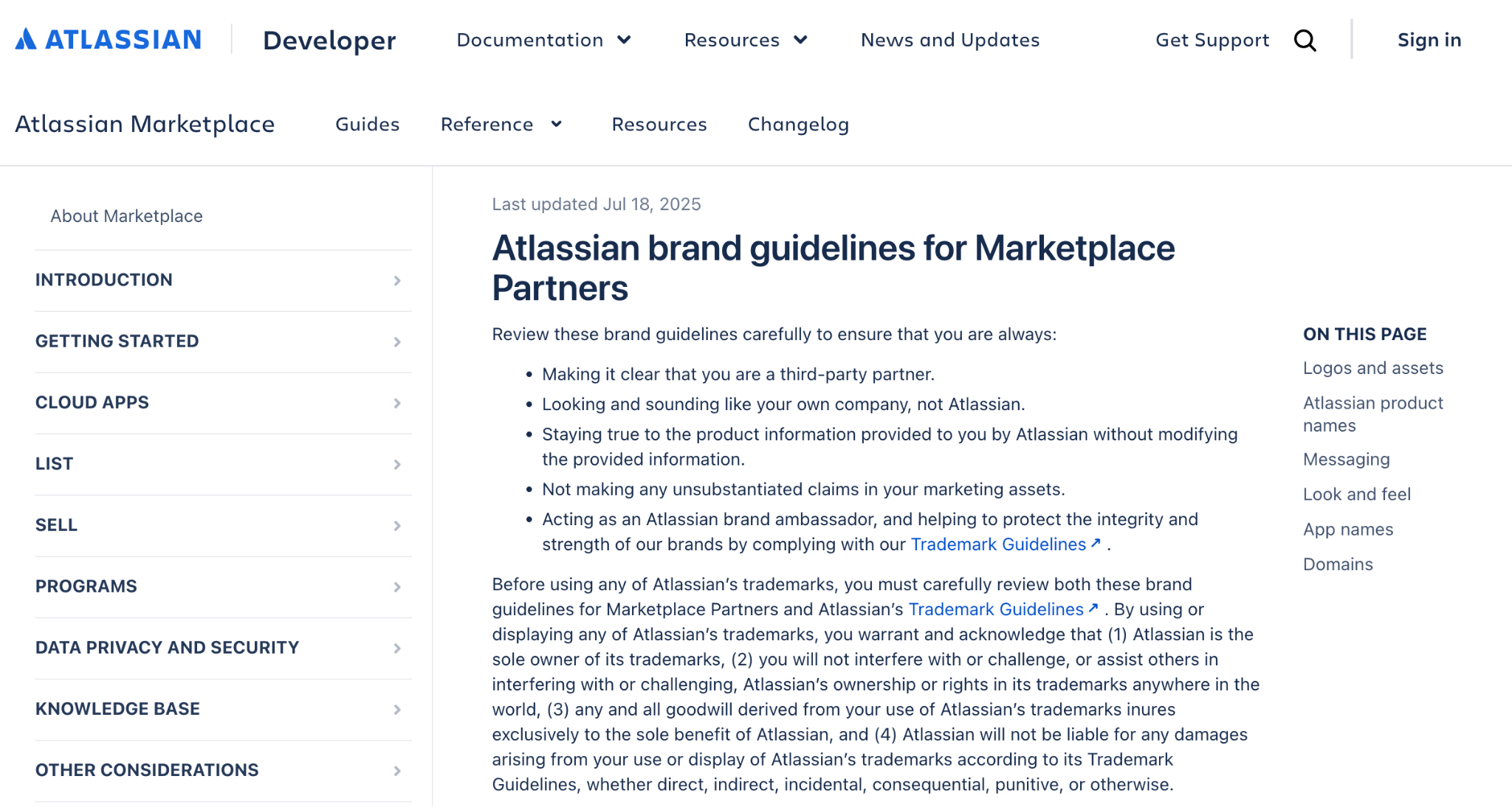
This document sets rules for Marketplace partners building apps on Jira and Confluence, but it looks like a legal checklist.
Gaps:
- Only logo restrictions, nothing on visual identity itself
- App naming rules feel like a compliance form to fill out
- Doesn't include information for writing about this product
Atlassian shows an approved sentence right next to a rejected one. You see the difference instead of reading about it.
Arounda suggests: Other companies should do the same. A rule written down as text gets ignored. A rule shown as two examples side by side gets remembered.
Asana
A logo kit built around one clever rule: partner logo spacing equals the width of Asana's three-dot symbol.
Gaps:
- Covers logo and color only, nothing on voice
- Trademark legal text is in the same scroll as the visual guide
- No typography guidance
Do/don't visuals are specific: six mistakes, six images, zero ambiguity.
Arounda suggests: Move legal trademark language to a separate linked document.
Notion
Notion built one hub with eight sections. One of them, Music, covers sound branding, something almost none of the other 14 documents mention.
Gaps:
- Needs JavaScript to load (invisible without it)
- Broad structure, but depth per section unclear from outside
- No table of contents before diving in
Voice & Tone is next to Key Messaging, so nobody needs to check two places for one answer.
Arounda suggests: Place core messaging pillars on the same screen as your tone of voice rules so creators see both what to write and how to say it.
Cloudflare
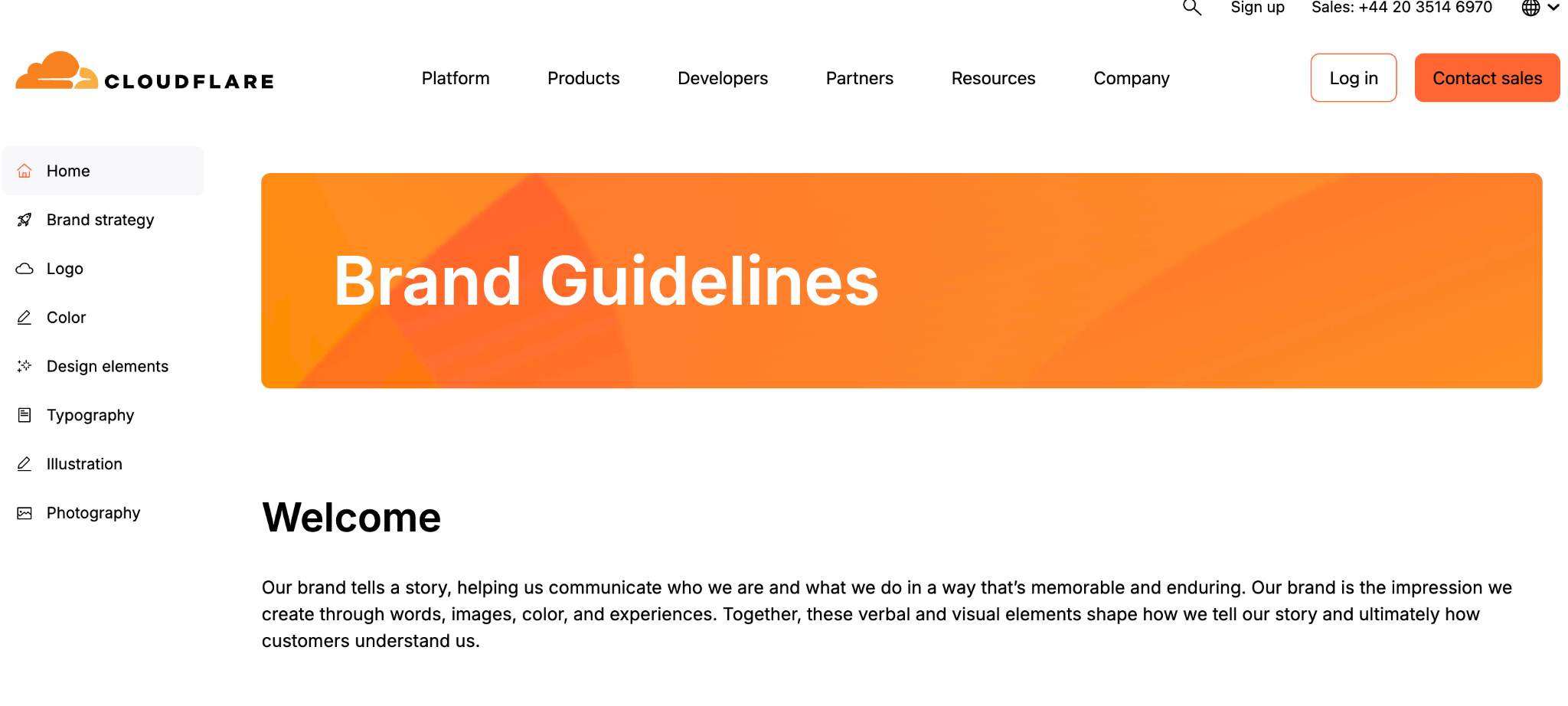
Cloudflare split its brand hub into seven pages, one for each topic: strategy, logo, color, design elements, typography, illustration, photography.
Gaps:
- Only one brand color named (no secondary or accent palette)
- There's no typography section at all
- No section about tone or voice
They state where each logo version belongs, like using icon marks for app buttons and monochrome versions over photo backgrounds.
Arounda suggests: Organize design standards under one main landing page, and your partners will be able to grasp your entire system in a single view.
Chatwoot
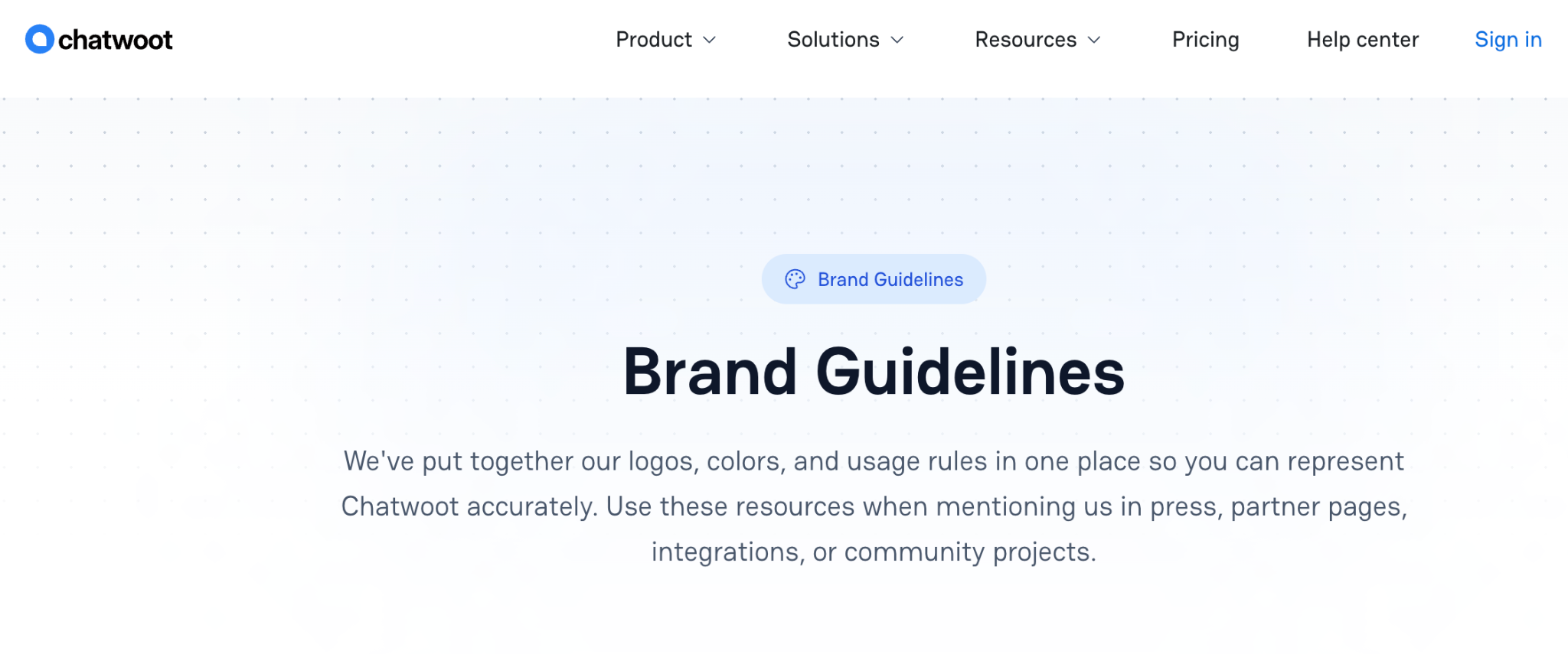
A single page: five logo variants, one brand color, and a short do/don't list.
Gaps:
- Only one brand color named, no secondary or accent palette
- No typography section
- No voice or tone guidance
Naming the exact use case for each logo variant (icon mark for app icons, monochrome for photo backgrounds) removes guesswork.
Arounda suggests: Add at least two accent colors. One color forces every future asset into the same visual note.
Zendesk
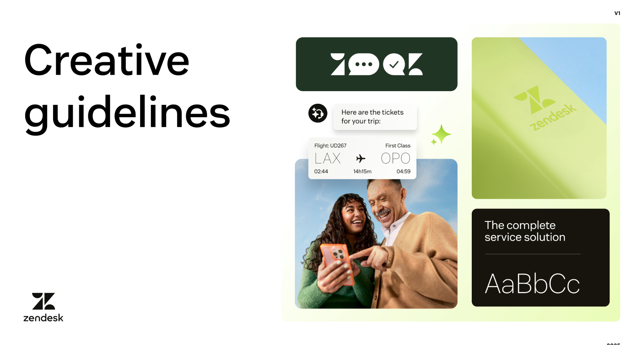
Zendesk organizes its brand guidelines inside a public Figma deck by logo type, covering the primary logo, wordmark, and the Z symbol.
Gaps:
- The Z symbol needs creative team approval to use alone, but the document never says how to request it
- Named colors like Licorice and Coconut show no hex codes anywhere
- Opening a full Figma file takes extra loading time for non-designers who just need a fast answer
Co-branding diagrams show exact clear space next to a partner logo, and publishing inside Figma lets designers copy vector assets straight into active files.
Arounda suggests: Show the hex code alongside color names, and publish a lightweight web summary for non-design partners.
Wero
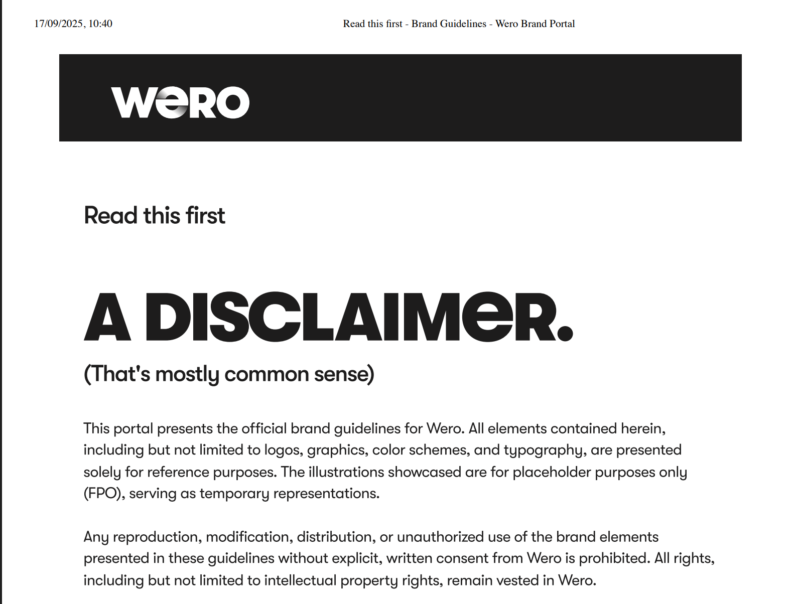
Wero provides a brand guide covering logo usage, color palettes, pixel-grid iconography, and checkout placement rules.
Gaps:
- Covers visual assets and payment UI without voice rules
- Requires manual brand team approval before using illustrations
- Places legal disclaimers on opening pages before core design rules
It includes exact 24px grid alignment, stroke widths, and color tint tables for UI icons.
Arounda suggests: Combine visual rules and writing guidance into one main portal.
PayPal
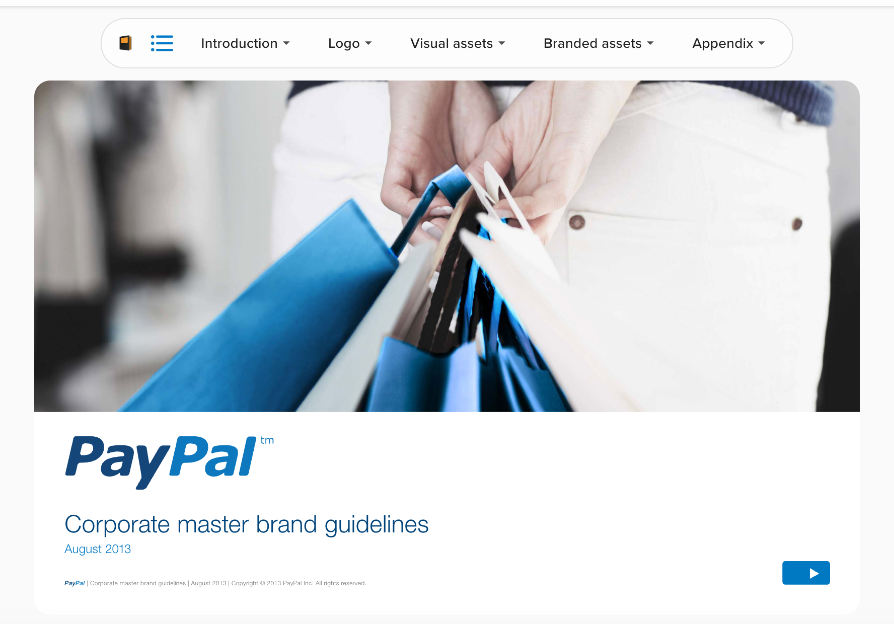
PayPal provides a 40-page corporate brand manual covering its logo standards, color system, typography, and verbal voice.
Gaps:
- Locks typography to a single font weight without specifying digital or web fallback fonts
- Splits merchant checkout buttons and co-branding rules into separate sub-documents
- Prioritizes print layouts over modern digital interfaces
The guide offers writing rules and visual assets in one document. Plus, it asks all creators to use clear human language and avoid technical jargon.
Arounda suggests: Build one web portal for all brand rules instead of scattering files across multiple PDFs. This prevents costly fixes when materials go into production.
OpenAI
OpenAI publishes a brand guide covering logo construction, color rules, typography, and company values.
Gaps:
- Restricts main colors to black and white with almost no secondary palette options
- Omits copywriting examples and specific voice guidance for content creators
- Explains logo safety margins but ignores digital product components
It sets exact minimum pixel dimensions for digital logos and requires left-aligned layouts.
Arounda suggests: Add UI component rules next to logo specifications so product designers do not have to guess layout spacing.
HIMSS
This company offers a detailed healthcare brand manual, which includes organizational mission, logo usage, color palettes, and global guidelines.
Gaps:
- Fills early pages with corporate vision statements before showing actual design assets
- You won't find downloadable assets that can be useful for developers
- Prioritizes print publications over interactive web components
Defines specific audience groups across healthcare sectors. This information helps writers change the tone of voice properly.
Arounda suggests: Turn static PDF manuals into an online portal with downloadable design tokens for product teams.
Why the Terminology Is So Inconsistent
There's no industry group responsible for regulating these terms, so this means that anyone can name a document whatever fits their process. Different teams built the vocabulary from different starting points, which is why the brand guidelines vs style guide question keeps coming up.
What Needs to Be in the Document, Whatever You Call It
Ask what is included in a style guide, and the honest answer is: it depends on who built it. But across the 15 documents we reviewed, two categories always show up somewhere.
The Visual Rules Every Document Needs
While every company builds its documentation differently, a solid visual foundation always relies on five core components.
- Logo specs covering primary and secondary variants, clear space rules, and minimum sizes
- Color palettes (they must be documented with exact HEX, RGB, and CMYK values)
- Typography rules (headline and body fonts, weights, line heights, and hierarchy)
- Do and don't visual examples that show correct and incorrect usage
- Clear layout rules for fitting your brand assets onto web screens, social media feeds, and physical print
To give you more specifics, here is how this looks in practice. In our Tunnelo case study, we prepared a complete visual guide outlining a hexagonal mark, neon-green accent palette, and pixel-inspired typeface across app UI, social templates, and print assets. For their team, the real value was speed and clarity; having clear rules reduced creative approval time by 39% because designers don’t need to spend time guessing which logo version or shade of green was correct.

The Strategic Rules Every Document Needs
Visual rules demonstrate how a brand looks and strategic rules explain the reasoning behind those choices. A solid document relies on four strategic elements to keep design work aligned with business goals.
- Audience profiles that define who you speak to and how you stand out
- Competitor breakdowns that help you avoid visual clichés
- Tone of voice rules, as their main goal is to keep your messaging consistent across all channels
- Layout standards as they connect digital screens with your print materials
For instance, in our Loca Travel project, we defined visual standards that cover mobile screens, social campaigns, and outdoor billboards. We know that we must align physical posters with the in-app experience, as this builds instant brand recognition and prevents trust loss between channels. This strategic approach improved brand recall by 60% and tripled marketing asset production speed.

"Clients come to us with a specific visual in mind. We always start by listening, but then we research the market, competitors, and brand history. Very often, after seeing data, concepts, and testing results, clients completely rethink their original ideas. Branding is a strategic process, and it shapes how people perceive you. Documenting those rules is what keeps your logo and assets identical on a phone screen and a printed billboard."
Alyona Deieieva, Lead Brand and Marketing Designer at Arounda
When It Makes Sense to Split Into Two Documents
The brand guide vs style guide question comes down to who owns each half and how often each one changes. Here's when a single document stops working and splitting makes sense.
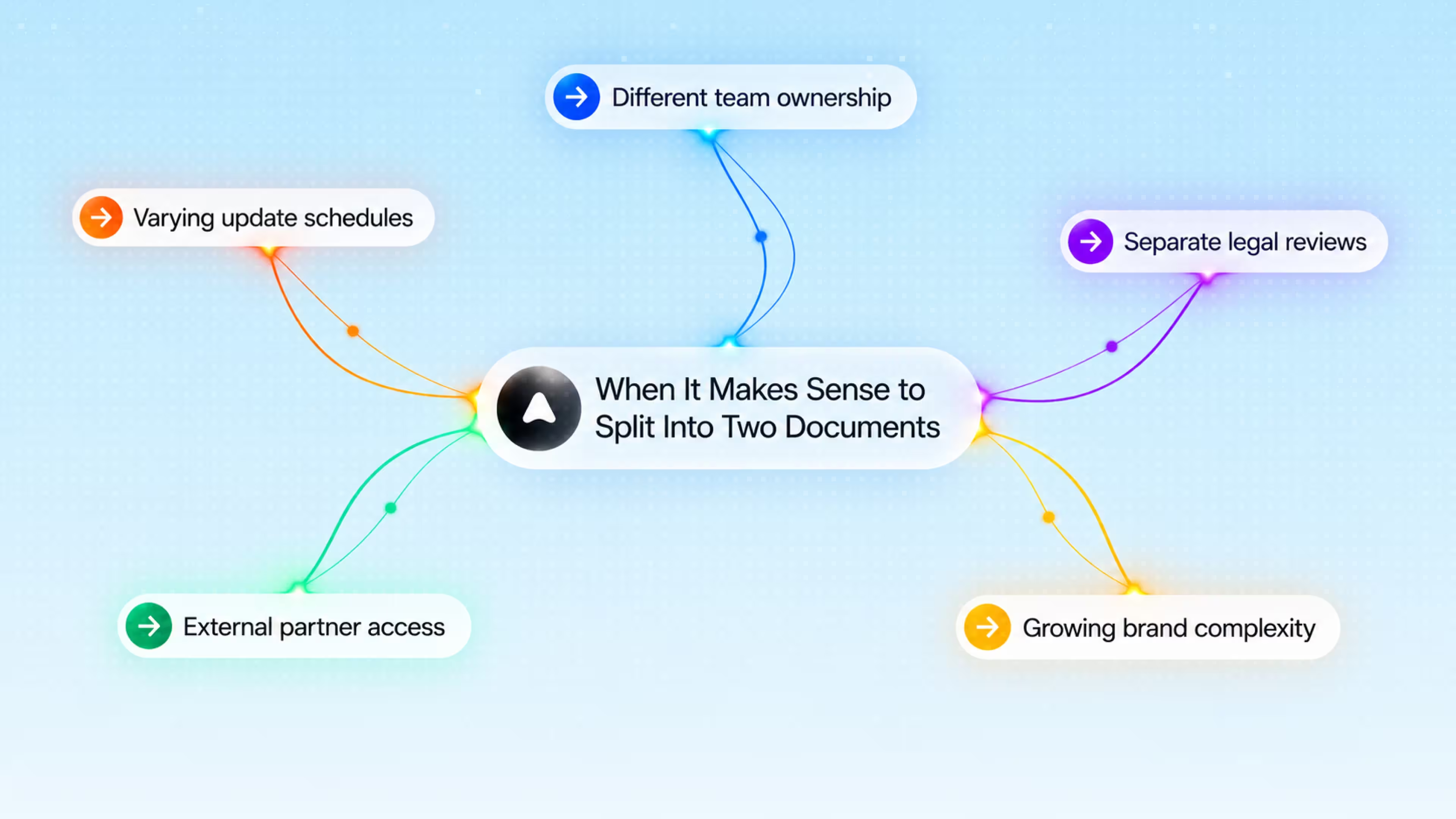
- Marketing and design report to different people. Marketing doesn't touch the design section, and design doesn't touch marketing's. One half gets updated. The other half sits untouched for months.
- Update speed doesn't match. Logos and colors are not changed often. However, messaging may change every quarter depending on how ad campaigns move. If you add both into one file, every small text edit bumps the "last updated" date on rules that didn't change. People stop trusting that date, and eventually stop checking it before using outdated assets.
- A developer needs the logo file and nothing else. Making them scroll past ten pages of tone of voice to find a PNG wastes their time and yours.
- Legal or trademark rules apply to one half. Logo and trademark usage may need legal approval. However, voice and tone rarely do. If you keep them in one document, a five-minute tone of voice edit will wait in the same queue as a trademark review.
- External partners only need one piece. If a reseller requires logo specs and a guest blogger needs tone guidance, it makes sense to split this into two documents. Sending both the full brand guide means they wade through content meant for someone else.
When One Combined Document Is the Smarter Choice
The main reasons why having one document is the best decision are as follows:
- Only one person is responsible for both parts
- Teams are small, under 10-15 people
- Brand rarely needs legal review
- Visual identity guide includes voice
- Updates happen together
- New employees need to learn the file quickly
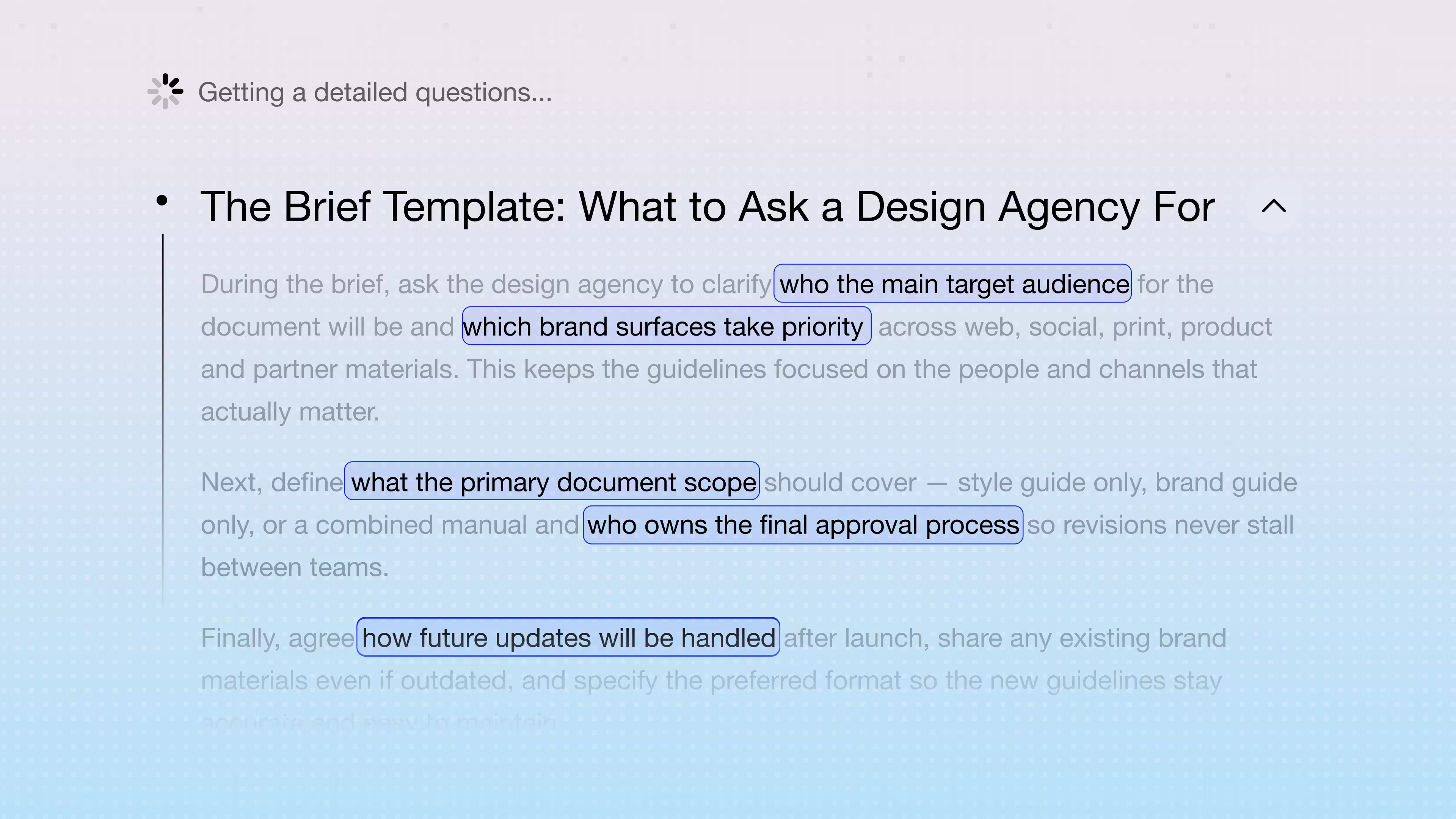
The Brief Template: What to Ask a Design Company For
Here's the brand guidelines checklist, so the company builds the right document on the first try:
- The exact document type. A one-page logo reference and a 50-page voice-and-visual manual both count as "brand guidelines" somewhere. Name which one. What does style guide mean for your team specifically? The design company can't guess that on its own.
- Every audience who’ll open it. Add internal designers, external partners, developers, freelance writers, etc. Slack's document works for all of them because it names each reader upfront.
- What changes often versus what doesn’t. Logo and color might stay fixed for five years. Messaging shifts every quarter. This detail decides whether you need one document or two.
- Old materials. An outdated PDF from 2019 can still tell a designer a lot about your company. So, if you have old materials that can be used for your new brand or style guide, show them.
- Who approves what. Legal signs off on trademark use. Marketing signs off on tone. Naming this upfront avoids a document with no clear owner for revisions.
- Where the format lives. Show your PDFs, Notion pages, Figma files, etc. Each one changes how often the document gets updated after launch.
- Every place the brand shows up. List every surface: web, social, print, partner co-branding, developer docs, app store listings, even pitch deck design for investors.
Mistakes We See When Companies Fixate on the Wrong Question
A 2025 report on Kenyan SMEs found poor branding costs businesses up to 60% of potential revenue. Companies spend weeks arguing about the name, then ship a document full of holes. Check out typical mistakes we keep running into:
- Fighting over "style guide" vs "brand guide" instead of just writing the thing
- Grabbing a template that fits a 200-person company when the team has 10
- Building something only the design team ever opens
- Stuffing it with legal language
- Forgetting partners or resellers need their own section
- Publishing it once and never touching it again
Case Study: Building StockGate Brand Documentation
StockGate turned to Arounda for branding services to create a visual identity for its crypto investment platform that would stand out against cold, dark competitor aesthetics and build user trust.

Our team conducted competitor research and built a human-centered brand system using warm orange, blue, black, and photos of real people. We engineered a geometric logo readable at app-icon scale, in monochrome, and across reversed backgrounds. To support institutional credibility, Arounda documented rules extending the identity across digital social traffic, outdoor ads, business cards, and branded merchandise.
Every branding project delivers a complete brand voice and tone guide covering essential execution rules:
- Logo specifications, including clear space, app scale, and monochrome variants
- Color standards defining primary, accent, and background palettes
- Typography hierarchy and visual asset guidelines for photography and 3D elements
- Cross-surface guidelines for digital UI, social banners, outdoor print, and physical merchandise
This documentation provides internal teams and external partners with a single source of truth. Post-launch testing showed 88% of users distinguished StockGate from typical crypto platforms, while 93% reported higher confidence in the platform.
How Arounda Approaches Brand and Style Documentation
The process remains the same for every company, but the level of detail varies by business scale. The thing is that startups need to launch fast, so they are looking for simple guardrails. Larger businesses with multiple products need clear visual rules so everything fits together smoothly.
For SMEs and MVPs
A lightweight starter kit is what startups and small businesses need. It must be a simple guide that outlines primary logo rules, exact color hexes, key fonts, and basic spacing.
For Ecosystems and Corporate Rebranding
Platforms with multiple sub-products deal with higher complexity. The documentation must show how each product keeps its distinct role while clearly fitting under one main brand.
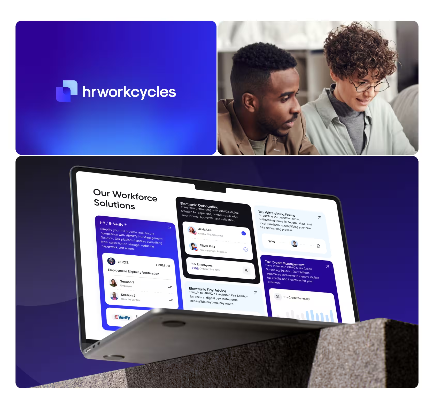
During our rebranding project for HRWorkCycles, the client managed three HR tools with conflicting visuals that hurt brand awareness. Arounda developed a scalable brand identity design around a single geometric framework. Each product received its own logo mark and pattern, while sharing the same color logic and typography. Setting these multi-product guidelines turned three separate tools into one unified system, raising brand recognition by 35% and conversions by 28%.
"Most brand guides look great at launch, but they break down a few months later. That happens when they only cover ideal scenarios. If you want a guide that lasts, map out everyday edge cases early. Think about dark mode, tiny app icons, or partner co-branding. That is what keeps your brand recognizable long after launch."
Mariia Lysenko, Brand/Marketing Designer at Arounda
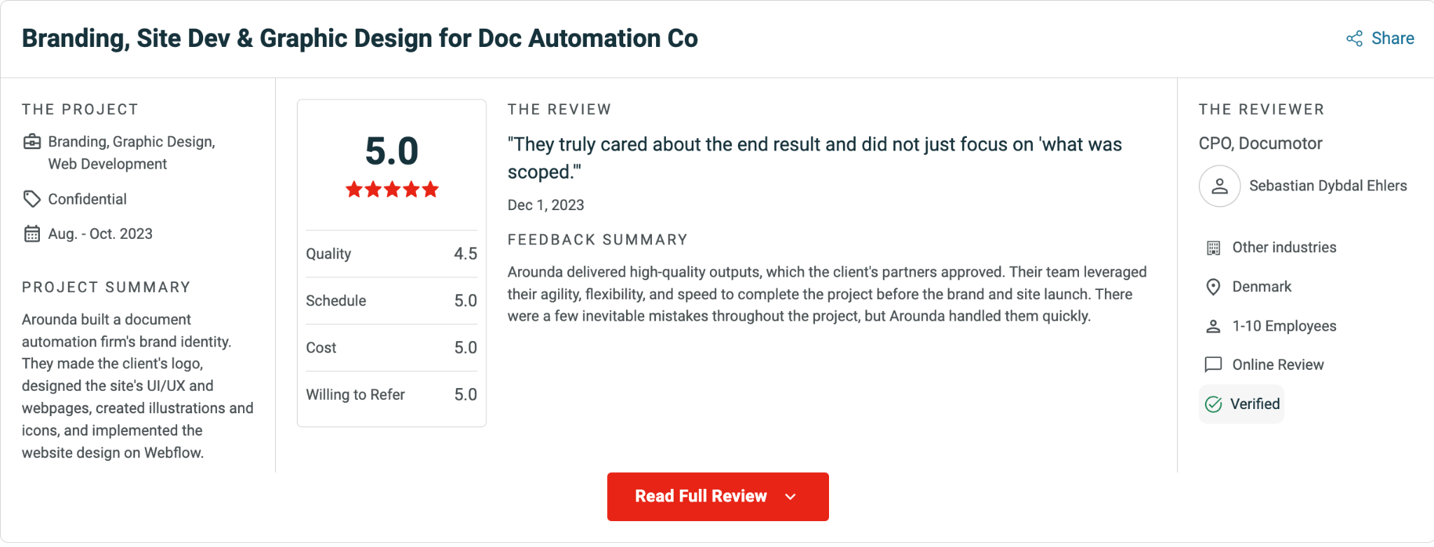
Arounda has spent over 10 years building brand systems across 180+ completed projects. That track record shows in a 5.0 rating on Clutch. Your brand documentation could be next on that list.
Wrapping Up
We analyzed 15 public brand documents, but the name on each one told us almost nothing about what was inside. Some companies prefer splitting logo rules from voice rules into two files, but others feel more comfortable when everything is kept in one document.
What matters most is whether the visual rules and the reasoning behind them lived in the same place, and whether one person clearly owned each part. However, when different teams are involved, splitting into two documents might be a solution.
If you need help building brand documentation, Arounda can step in. We offer brand identity, rebranding, and logo design services tailored to your team's workflow. Book a call with our team to discuss your project.



Table of contents







FAQ
Yes. A style guide focuses on specific rules, like app interfaces or web copy (it doesn't include high-level brand strategy). Startups and small companies begin with one document just to move quickly. But as the company evolves, the best solution is to add a full brand guide. This helps larger teams work toward the same standard.
Content teams use a style guide to learn more about the tone of voice, formatting, word choice, etc. Designers or other employees working on layout, color use, or logos need the brand guide. However, overlap may happen when a company decides to merge voice and brand guidance.
Update a brand guide every two to three years, and review a style guide every six to twelve months. Core visual elements stay fixed unless a company rebrands. Product UI components, design libraries, and writing rules need more frequent updates as team workflows, marketing channels, and product features change.
No, you don't need them if you have a small team. In this case, you can launch with one combined document that covers both. You can always split them later, when different employees own each part (or when the file gets too long to manage easily).
In such a scenario, writing stays consistent, but gradually your visuals will start drifting. For instance, one designer chooses a slightly different color and a freelancer uses last year's font; as a result, your website and social media posts won’t look like they belong to the same company. Even a one-page logo and color reference closes most of this gap.
On average, it takes 1-2 weeks to create one combined document. A brief that also covers strategy and the purpose of brand guidelines beyond visuals takes longer. Splitting into two separate documents from the start adds another week to the timeline.


89+ Reviews
on Clutch

Top Rated Plus Agency
on Upwork

Top 50 Trending team
on Dribbble

Projects are Featured on Behance platform
