
Split Complementary Color Scheme in UX Design


Split complementary colors offer a distinctive twist compared to traditional schemes. For starters, they provide enhanced customization potential. Yet, effectively leveraging them in design requires deliberate application to fully exploit their advantages.
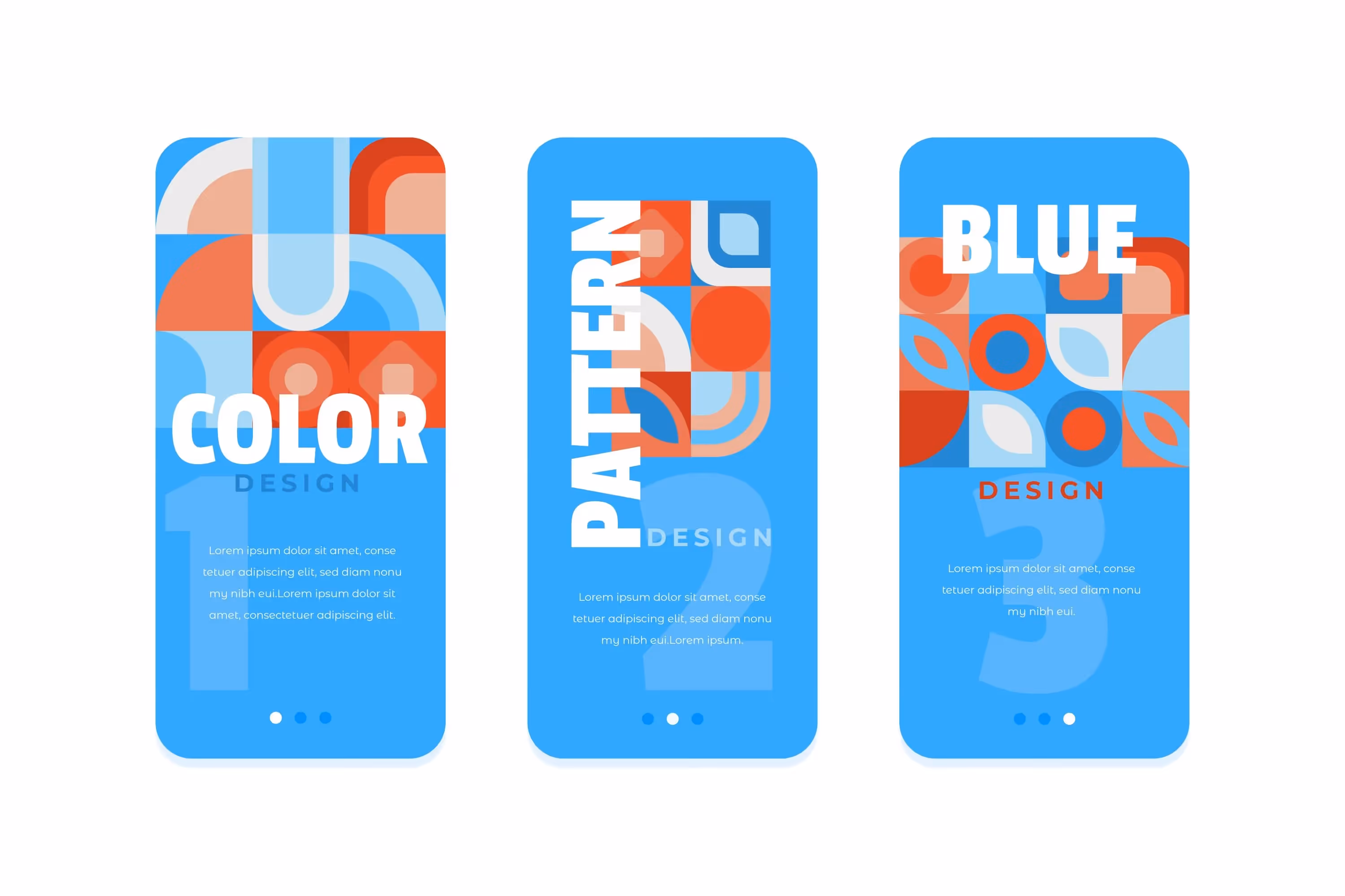
Today, we will talk about the meaning of split complementary colors, ways to define them for your project, and best practices for implementation. Also, you can explore our cases like Mine'd, Voxe, and Infinity to see these points in practice.
What Is Split Complementary Color?
Let's start with simple terms. Regular complementary colors consist of one color paired with its complement. And what are split complementary colors? In contrast, they expand on this concept by dividing the complement into two symmetrical hues. This results in three shades to work with, offering more versatility in design.
What makes split complementary colors particularly intriguing is their variability. While each color in a regular complementary scheme has one set complement, split complements offer more flexibility. The split shades can be virtually any color as long as they maintain an equal distance from the original complement.
Popular split complementary color scheme examples include:
- Yellow, purple, and orange is a bright combination that balances warmth and saturation. This lively and dynamic color scheme suits projects requiring a bold and expressive approach.
- Blue, yellow, and orange together have a strong visual impact. Blue conveys calmness and stability, complemented by the brightness of yellow and orange. It’s perfect for designs seeking a vibrant and cheerful atmosphere.
- Purple, orange, and green combine contrasting and complementary shades that create a visually stimulating palette. Use it to add depth and intrigue to the design, making it memorable and attractive.
You've definitely seen some split complementary color scheme room designs or website portfolios. These combinations offer specialists a broader palette to play with, allowing for more creativity and dynamic visual compositions.
{{fs-quote-block}}
How to Find Split Complementary Colors
Finding split complementary colors is easy with a color wheel. Start by identifying the base color you want to use, then locate its complement on the opposite side of the wheel. Finally, choose two evenly-spaced shades adjacent to the complement. This symmetrical arrangement guarantees balance in your color scheme.
For example, if you select purple as your primary color, its complement would be yellow. You then choose yellow-green and yellow-orange as additional shades. Experimentation is key to finding the right mix, but ensure the chosen shades are equally distanced from the base color.
The color wheel is a compass for making design decisions:
- It aids in crafting visually appealing color schemes, demonstrating how colors complement or contrast with each other.
- It provides insights into how different colors evoke specific emotional responses, guiding the selection of appropriate ones for diverse design requirements.
- It empowers designers to harness color effectively, enhancing the overall aesthetic and impact of their creations.
Mastering the color wheel empowers designers to create harmonious color schemes that resonate with viewers. Whether employing complementary, analogous, triadic, or tetradic color schemes, understanding color relationships is essential for achieving cohesive and visually appealing designs.
While the color wheel simplifies the process, you can also create a split complementary color scheme interior design without it. By adjusting the hue value of a color by 150 points, you'll obtain two complementary colors. This method is useful for companies seeking colors that match their logo or palette.
It's important to note that while you have flexibility in choosing symmetrical shades, they should not touch the base color on the color wheel. This distinction ensures the color scheme remains split complementary rather than analogous.
How to Use Split Complementary Color Scheme in UX Design
To begin, although no strict rules govern their usage, organizing split complementary colors can optimize their impact. Ensuring a sense of balance within the scheme is crucial for creating a visually appealing composition.
When incorporating split complementary color schemes into UX design, several considerations will enhance their effectiveness:
Choose a Base Color
Selecting a base color serves as the foundation of your color scheme. Choose one that aligns with your project's theme and should be the focal point of your design. This initial decision sets the tone for subsequent color choices.
Balance Each Color
While split complementary colors inherently complement each other, achieving balance within the scheme is essential. Adhering to the 60-30-10 rule — allocating 60% of the space to the primary color and distributing the remaining two shades as accents (30% and 10%) — ensures that the design remains visually harmonious and avoids overwhelming the viewer.
Consider Temperature
Split complementary color schemes inherently combine warm and cool tones. Designers must consider the dominance of warm or cool shades based on the desired emotional response. By strategically incorporating temperature accents, designers can further enhance the visual appeal and direct users' attention effectively.
Learn Color Values
Balance the lightness and darkness of your colors to create visual contrast and depth. Lighter shades impart an airy and cheerful feel, while darker shades add seriousness and depth. Check if the contrast between your base and split complementary colors enhances the visual impact of your design.
Draw Client Attention
Split complementary colors offer designers the opportunity to craft cohesive and visually striking color palettes. With three contrasting shades, designers strategically utilize these colors to draw attention to specific elements within the design. By adjusting the prominence of each shade or layering them strategically, designers establish a clear visual hierarchy that guides users' attention.
.avif)
Evoke Right Emotions
Each color within a split complementary scheme elicits distinct emotional responses. By leveraging the combination of colors thoughtfully, designers evoke nuanced emotions that resonate with users. Careful selection and blending of split complementary colors examples enable you to create immersive and emotionally resonant user experiences.
Ensure Readability
While high-contrast colors can be visually striking, excessive contrast hinders readability and strains users' eyes. Designers should aim for a balanced contrast ratio — ideally, an 80% difference between background and graphic elements. Additionally, it's essential to limit the use of split complementary colors in text-heavy designs to maintain readability and visual comfort for users.
Test Tints, Shades, and Tones
Explore various variations of your colors by adjusting tints (incorporating white), shades (incorporating black), and tones (incorporating gray). This experimentation adds complexity and dynamism to your color scheme, allowing you to achieve the desired aesthetic and style.
Use Color Tools
Leverage color tools such as Adobe Color CC or Coolers to streamline the process of finding and visualizing split complementary color schemes. They offer features to experiment with different color variations and suggest schemes based on trends or classic combinations. As a result, you ensure more efficient and accurate color selection.
Analyze Your Colors in Context
Evaluate your color choices in real-world environments to assess their appearance under various lighting conditions and alongside other elements. Make sure that your colors harmonize effectively and convey the intended effect in the intended context, whether digital or print.
Adjust Based on Feedback
Gather feedback from colleagues or target audiences to gain diverse perspectives on your color choices. Consider their insights regarding color harmony, suitability for the project's purpose, and overall appeal. Incorporate constructive feedback to refine your color palette and enhance the effectiveness of your design.
Final Word
A split complementary color scheme offers UX designers a versatile and visually appealing tool for creating compelling user experiences. By carefully selecting and balancing colors, drawing attention to key elements, and considering the emotional impact of color choices, designers increase the usability and aesthetic appeal of their UI/UX.
At Arounda, we create human-centric interfaces for various industries, from e-commerce to healthcare and fintech. Our team has considerable experience using a split-complementary color scheme and is ready to implement it in your project. Contact us to experience the power of colors and their combinations.

Table of contents


FAQ
A split-complementary color mood is a color scheme that consists of a base color and two colors adjacent to its complementary one on the color wheel. This scheme offers a harmonious yet dynamic contrast, evoking a balanced and visually engaging mood in design. By leveraging these colors effectively, designers create compelling compositions that draw attention and evoke specific emotions.
The split complementary color scheme of green consists of green as the base color paired with red-orange and red-violet. This scheme offers a vibrant yet balanced combination, with the warm tones of red-orange and red-violet complementing the coolness of green. When used together, these colors create visual interest and harmony in design projects.


89+ Reviews
on Clutch

Top Rated Plus Agency
on Upwork

Top 50 Trending team
on Dribbble

Projects are Featured on Behance platform
