
40 Chatbot UI Examples from Product Designers

What's on every growing business's mind right now? Conversions, smarter self-services, and chatbots! Now, why do companies keep sinking money into chatbots?
Let's be real: nobody wants to answer the same question 800 times a day! That's what bots are for. They provide a myriad of responses at once, they are consistent, and you do not need to triple your team to support growth.
AI chatbots are used by over 987 million people worldwide and for good reasons. They can save you time, money, and keep your users satisfied. That said, no matter how smart the bot is, without a good UI, it will fail.
Our Arounda Team created this article with 40 real chatbot UI examples to draw inspiration from, whether you're building your first chatbot or refining what you've already launched.
Article Key Takeaways
This guide reviews 40 chatbot UIs from popular products, including ChatGPT, Claude, Notion AI, Slackbot, PayPal, Sephora, and more. You'll see how each team approaches layout, tone of voice, conversation structure, and visual features to make bots feel clear, respectful, and human.
Whether you already have a chatbot or are just developing one, this article will provide you with real-life examples. It represents the best design choices, talks about what decisions matter, and the mistakes to avoid.
What is chatbot UI?
Chatbot UI is part of a chatbot that users actually see and interact with. It is the design of the chat window, the message bubbles, the send button, the little typing indicator, and the tone of the replies.
A chatbot that has a great backend but poor UI is not going to make it. But if the bot has proper UI with simple visuals, useful clues/indicators, and fast responses, then it will naturally feel more approachable and efficient.
A good web based chatbot UI design will guide users, answer questions before words are spoken, and feel intuitive.
Top 40 Most Impressive Chatbot UI Designs
Here's a selection of chatbot UI design examples to give you insight into technologies with thoughtful interfaces that help guide conversations, build trust, and generate results.
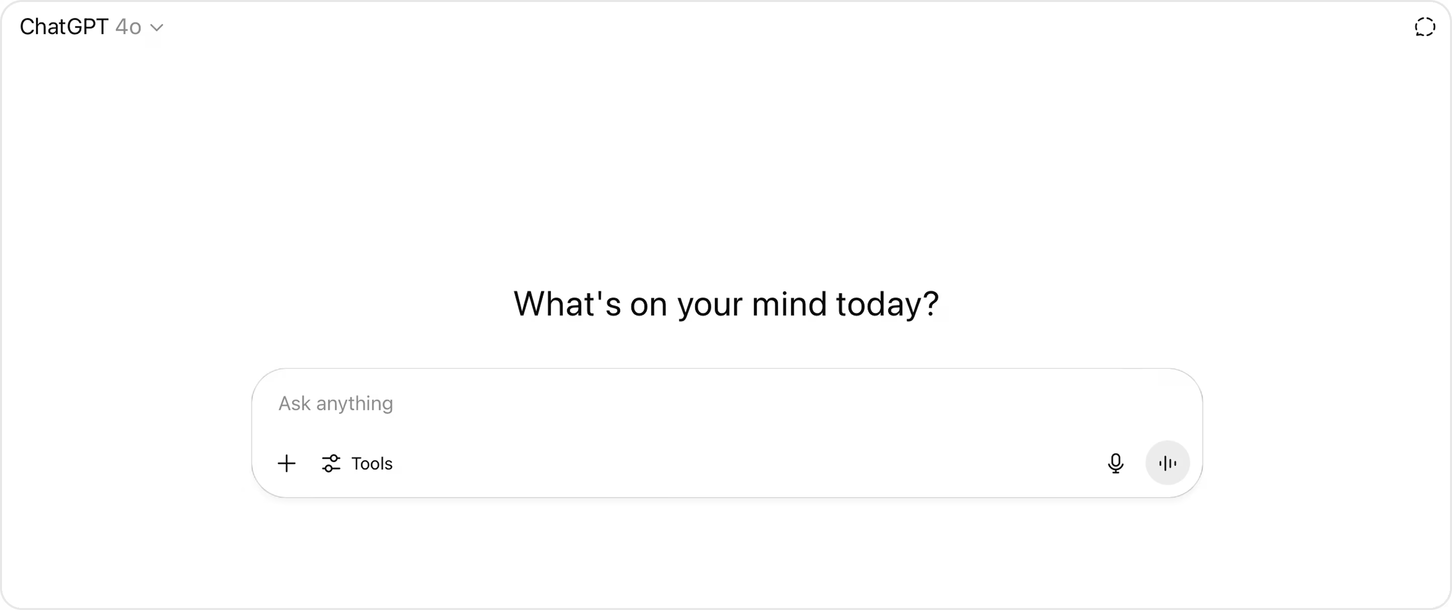
1. ChatGPT Chatbot
ChatGPT has over 300 million monthly active users. It's aimed at making advanced language models accessible and easy to use for both everyday users and professionals.
From a UI design perspective, ChatGPT illustrates clarity and restraint in an excellent way. The interface is single-columned, with a clear typographic hierarchy that helps the reader easily follow long conversations. The contrast between user and bot messages is subtle but effective, using spacing and alignment to guide your eye rather than heavy information processing.
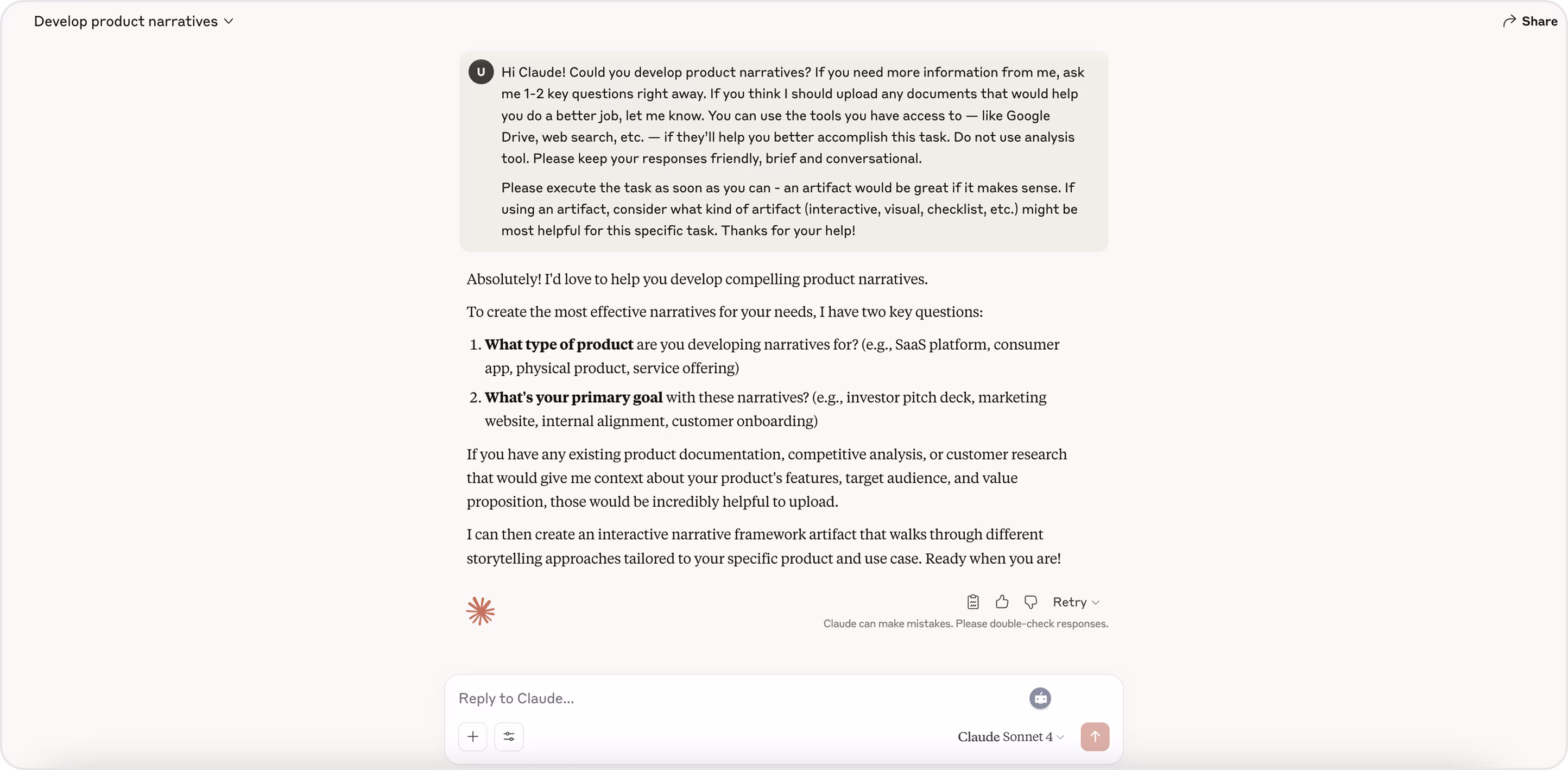
2. Claude Chatbot
Claude is an AI chatbot that aims to create a clear, thoughtful, and trustworthy experience for its users! Its user interface focuses on a comfortable experience. The messages are evenly spaced in a clear way, with a softer color palette that is easier on the eyes. There is a clear delineation between user responses, the AI response, and system messages. Everything is organized in a way that feels like it all flows together, along with the conversation.
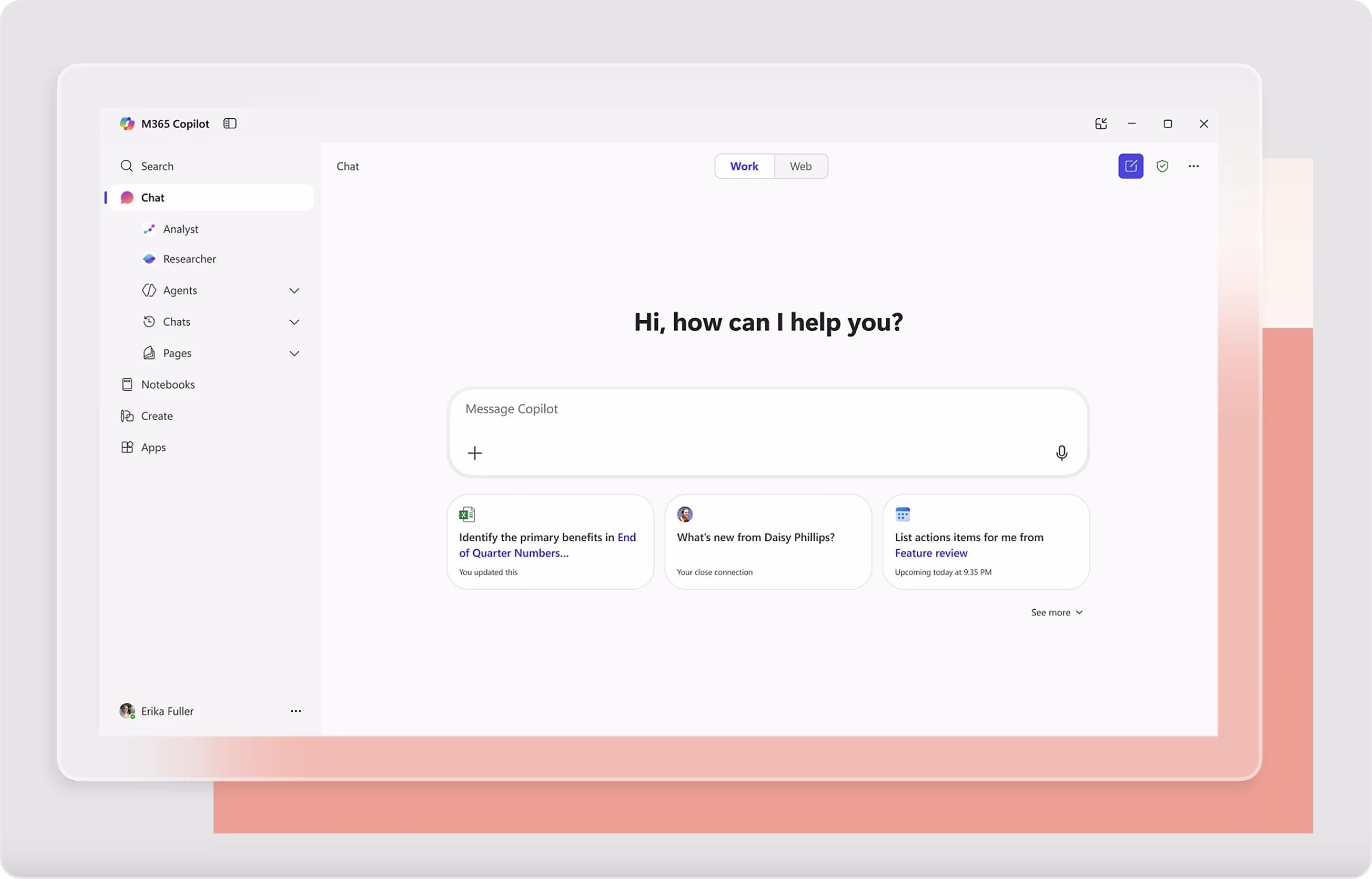
3. Microsoft Copilot Chatbot
Microsoft Copilot is an AI assistant integrated into Microsoft 365, Bing, Edge, and Windows. Copilot helps users to write, summarize, translate, and create content inside the platforms they are used to.
The UI fits conveniently into Microsoft's established design system. It has a clean structure, a calm palette, and provides the user with a clear distinction between user input and AI output. The sidebar has been designed to fit quick action and prompt suggestions into a well-defined structure without imposing limitations on the user.
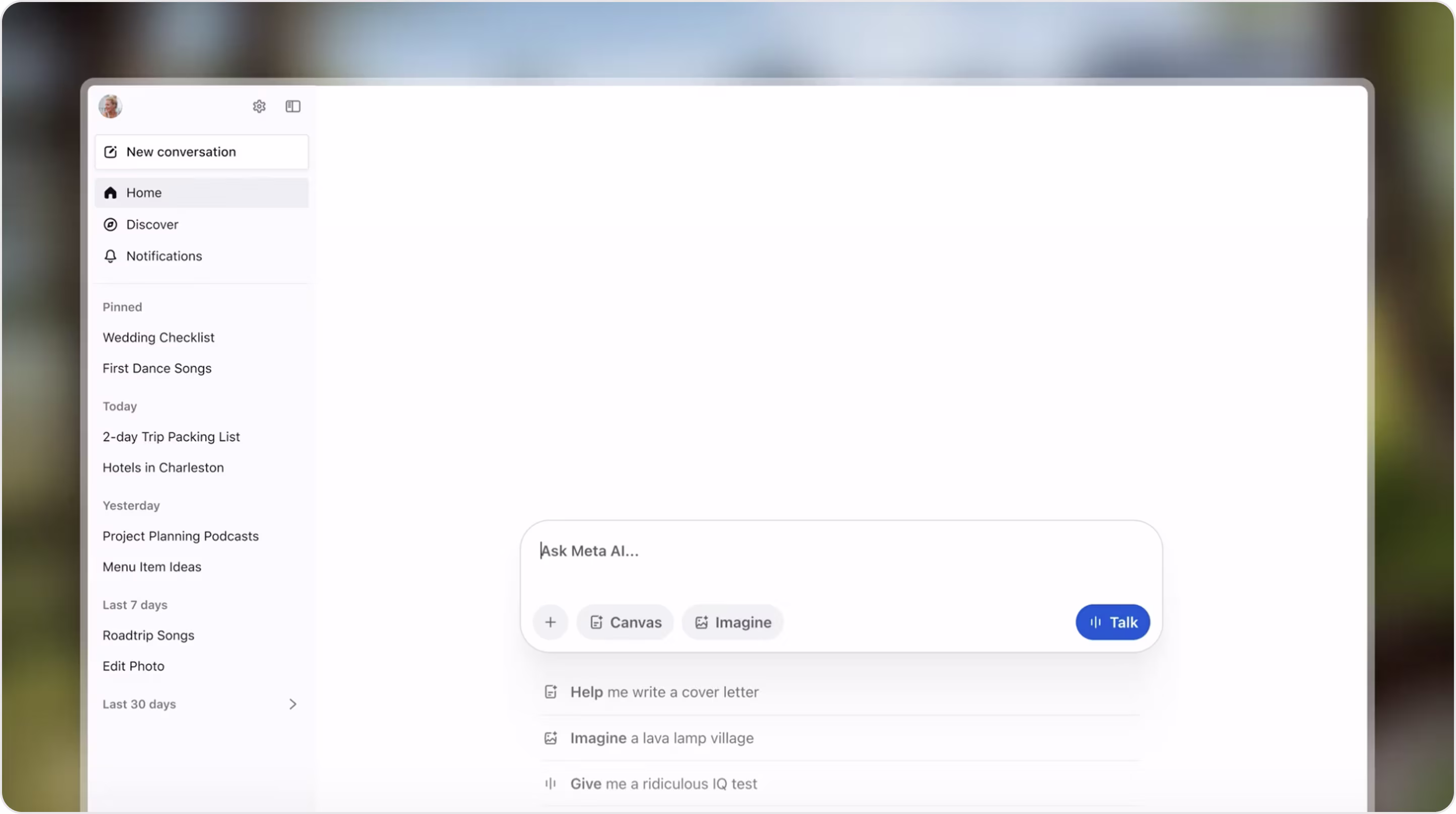
4. Meta AI Chatbot
Meta AI is an assistant service integrated into WhatsApp, Instagram, Messenger, and is also an app on its own. From a UI perspective, Meta AI focuses on context, user control, and consistency. The chat interface uses soft color accents and provides well-separated message blocks to help users distinguish between system responses, AI responses, and user input without confusion.
The UI is designed to accommodate voice input, proactive follow-ups, and embedded AI characters and multimodal responses without overwhelming the user. Designers accomplish this through visual hierarchy, consistent spacing, and context-awareness built into the chat layout.
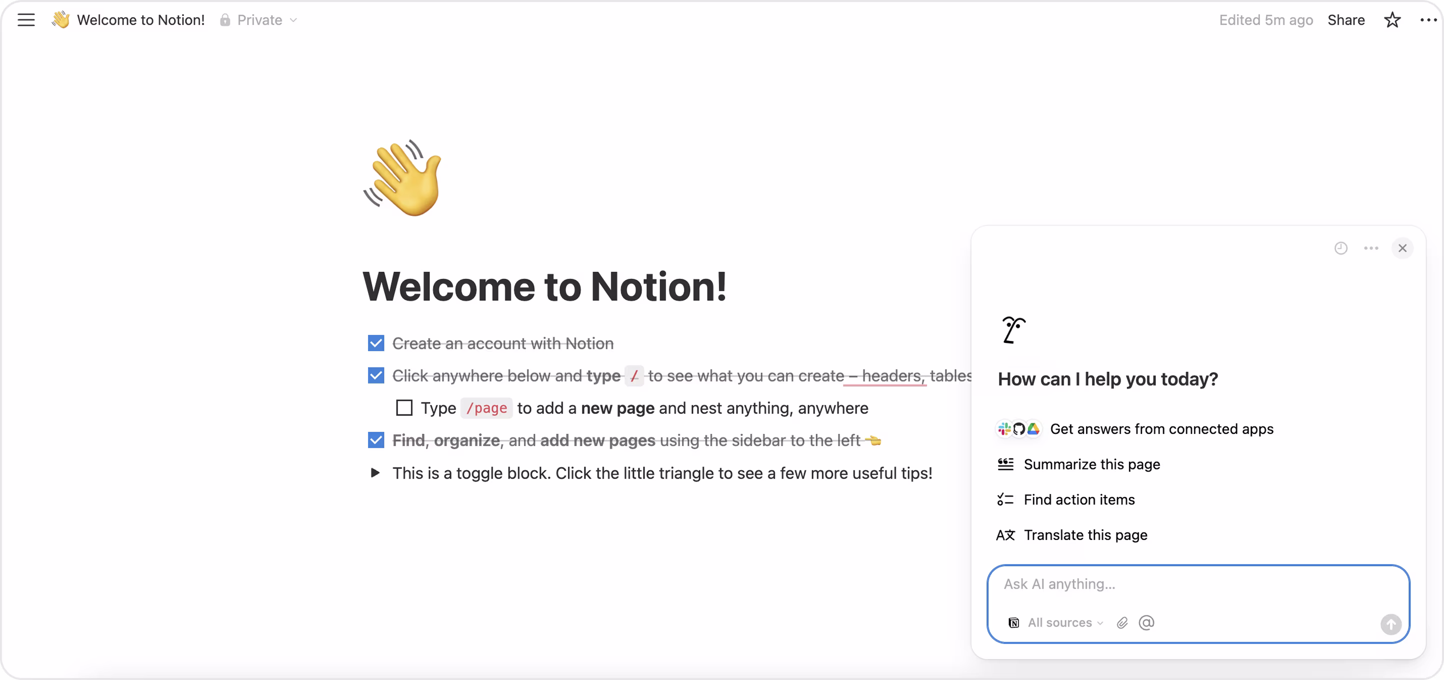
5. Notion AI Chatbot
Notion AI is embedded directly into the platform's workspace interface to assist users' drafting, summarizing, brainstorming, and revising content in existing documents. It is intended to feel integrated and familiar, as if you have an assistant directly in your notebook.
The chatbot is very adept at being powerful and invisible. The interface is contextual and appears as a sidebar or pop-up, often located inside the user's document. This feature allows the user to browse AI suggestions with their original content in sight.
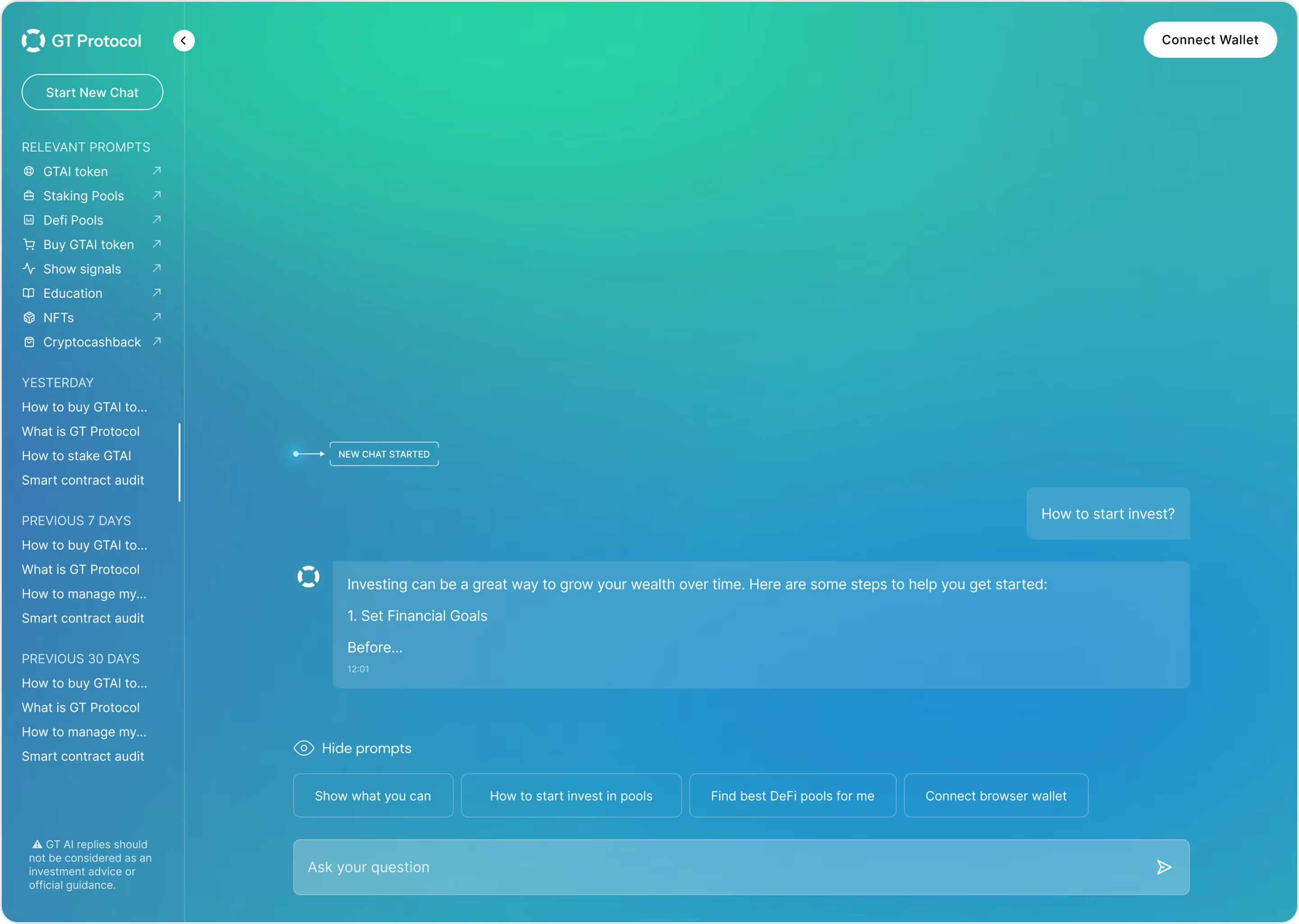
6. GT Protocol
GT Protocol's chatbot is within an entire DeFi ecosystem that allows users to stake pools and deposit tokens quickly with a simple interface.
Our Arounda team worked on the UI/UX design and development for GT Protocol's AI-powered assistant. The main focus was on simplifying Web3 interactions and making the staking experience intuitive to assist both technical and non-technical users.
We created a clean and clear layout with translucent gradients and a calm tone in the visual hierarchy to build trust and reduce friction. It's easy to scan, and every step of the process has conversational tips and prompts to educate users.
Are you looking for an AI chatbot that provides user guidance, simplifies complex flows, and keeps your users engaged from start to finish? We create chatbots that are clear, intuitive, and designed to actually solve user problems. And best of all, we also handle full web development, so you can have a packaged solution that not only looks great but works flawlessly.
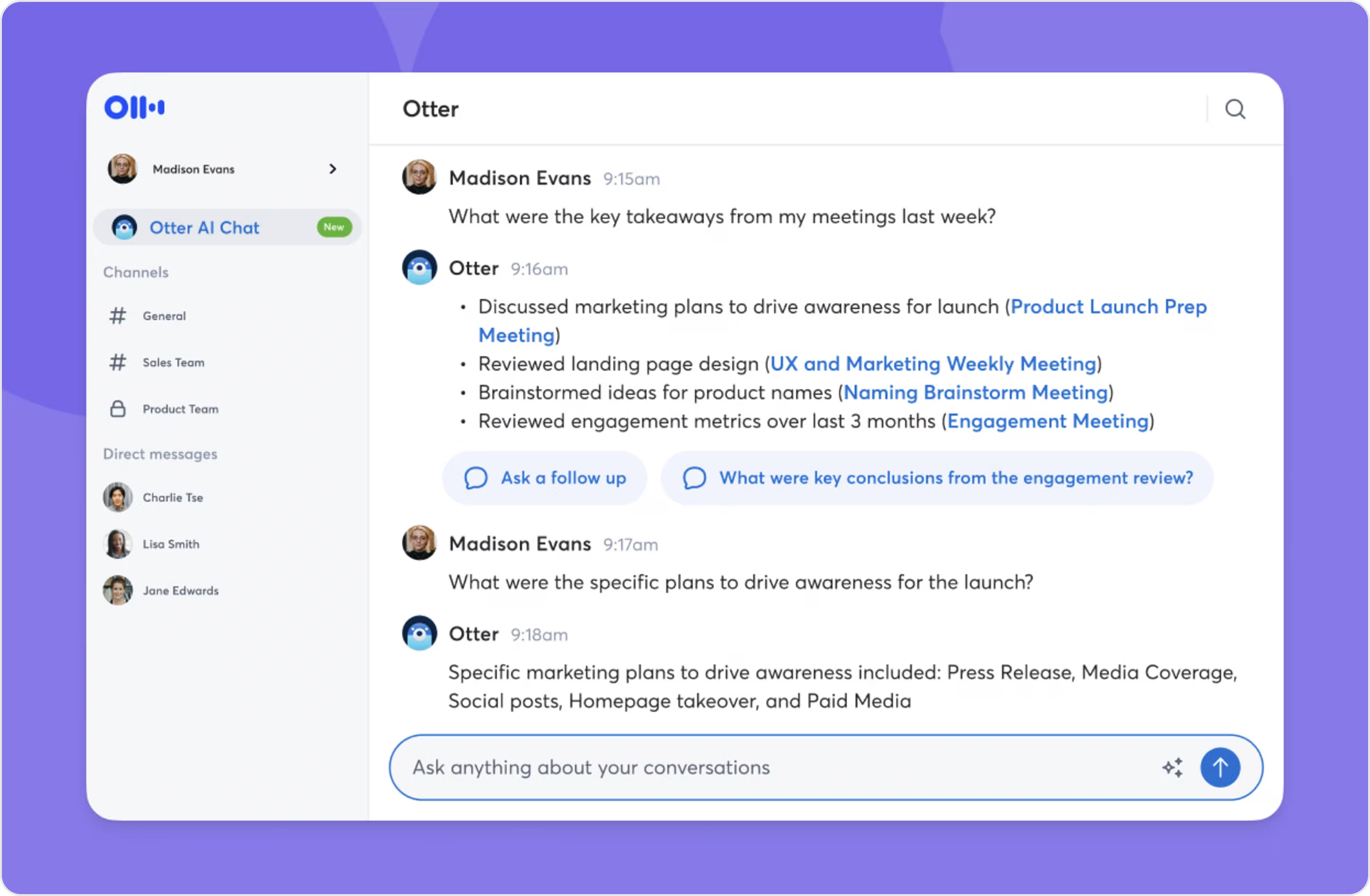
7. Otter.ai Chatbot
Otter.ai chatbot's mission is to transform long meetings into fast and searchable insights and actionable items.
Otter.ai is set up for clarity under time pressure. The core structure of the meeting minimizes distractions by placing the live transcript up front, with a tidy side panel for AI-generated summary, keywords, and action items. You can quickly see who said what with speaker labels and soft color contrasts.
8. Flair
Flair is an enterprise-level platform for building automated workflows with AI agents and integrated chatbots. The chatbot serves as the starting point to these workflows: users can request tasks, trigger agents, review outputs, and rework outcomes, all in a single conversation.
Working with Flair, we intended to take complex automation and make it feel simple and easy to use, with a conversation layer that encourages actual use.
The chat panel is alongside the structured workspace, so users do not lose context. We deliberately chose a calm, professional color palette and consistent void space to provide long session readability. Role labels and subtle color accents easily define user, bot, and agent outputs.
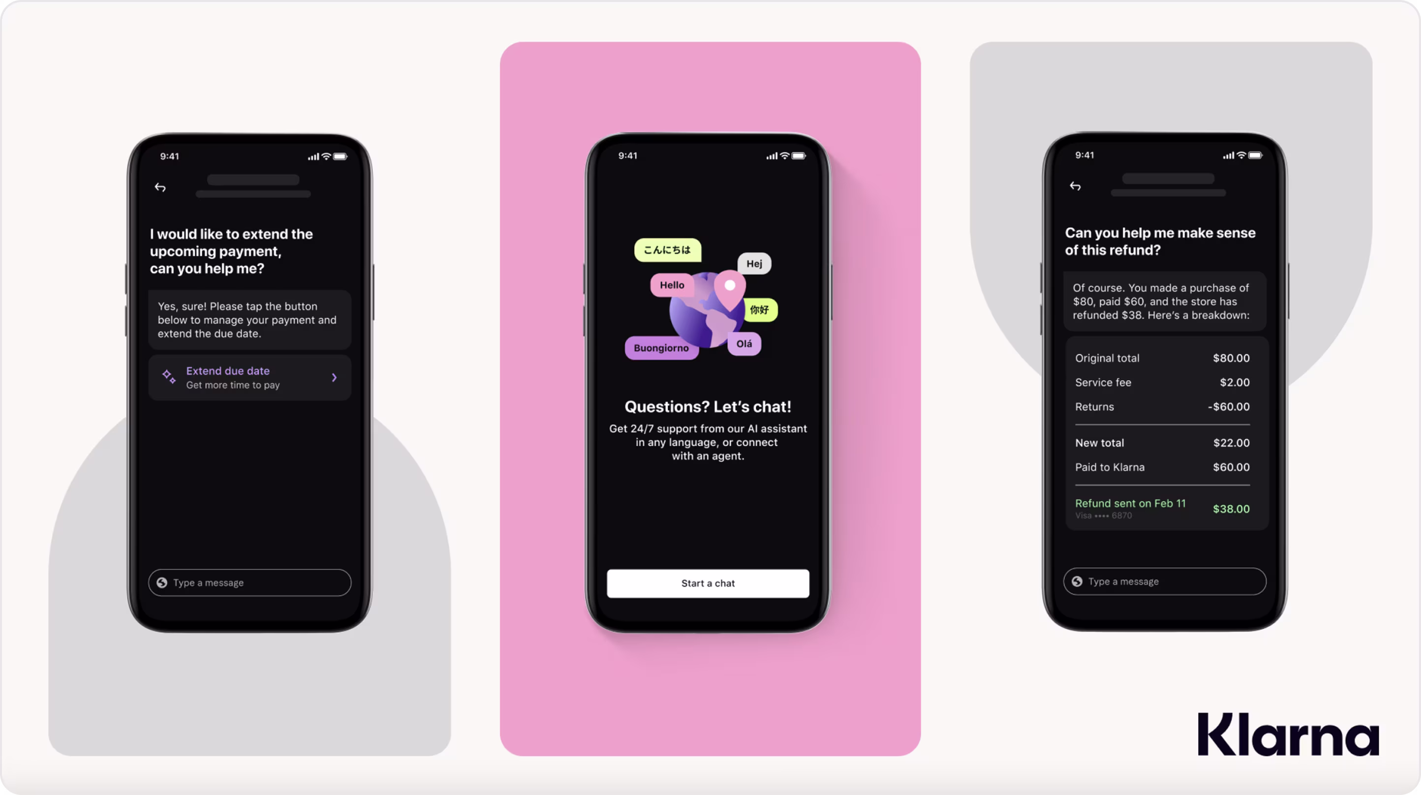
9. Klarna Chatbot
Klarna's chatbot is a customer service assistant designed to help users manage their payments, track orders, and solve shopping problems without having to wait for a human agent.
The chatbot is centered on clarity and efficiency. It has short, structured messages and quick-reply buttons. A clean layout keeps the chatbot and the user's conversation clearly separated so that it is easy to follow, and the soft color palette speaks to the Klarna brand and makes the conversation feel friendly.
10. Amazon Prime Video Messaging Assistant
The Amazon Prime Video Messaging Assistant is an AI–powered support chatbot that helps users solve account issues without waiting for an agent to respond.
The user interface is simple to understand, the messages are concise and easy to follow, and the flow is logically sequenced, which reduces friction and speeds users along to a solution.
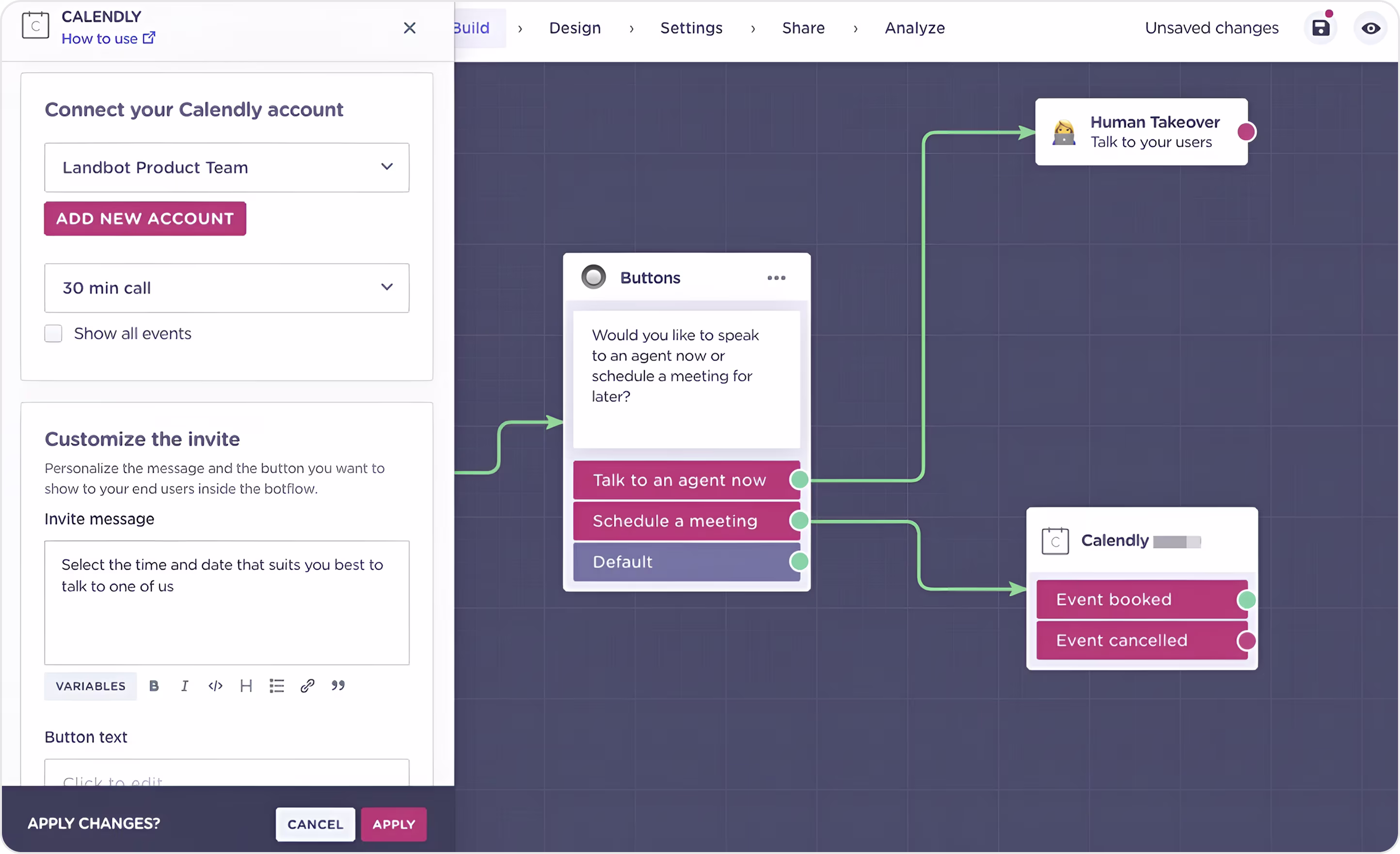
11. Calendly Chatbot
The Calendly chatbot makes scheduling an appointment super easy using an interactive button-based interface.
The modular interface is clean and can typically be implemented with tools like Landbot. It leads the user down pre-defined flows that you set: book a meeting, cancel a meeting, talk to an agent, etc. This type of format minimizes the user's necessary cognitive effort, reduces friction in their journey toward conversion, and creates faster conversions.
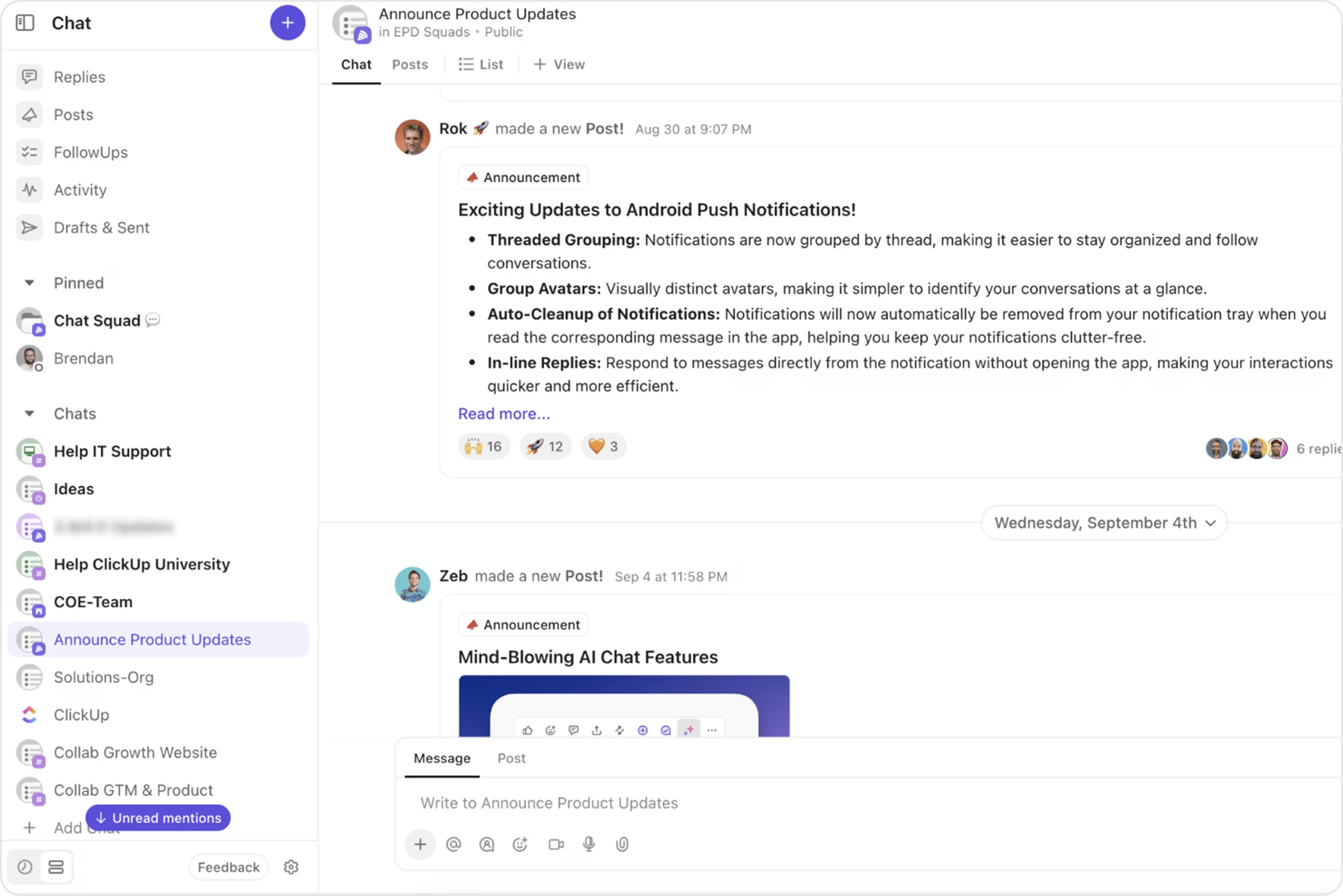
12. ClickUp Chatbot
ClickUp's chatbot helps users with onboarding, task setup, and quick assistance directly within the platform.
The chatbot serves as an added layer on top of ClickUp's clean design using soft colors, brief prompts, and getting out of the way when it needs to. So rather than bombard users, it breaks actions down into guided steps to help them maintain their focus. Wise button choices and contextual inline recommendations increase the speed of decision-making and allow constant productivity.
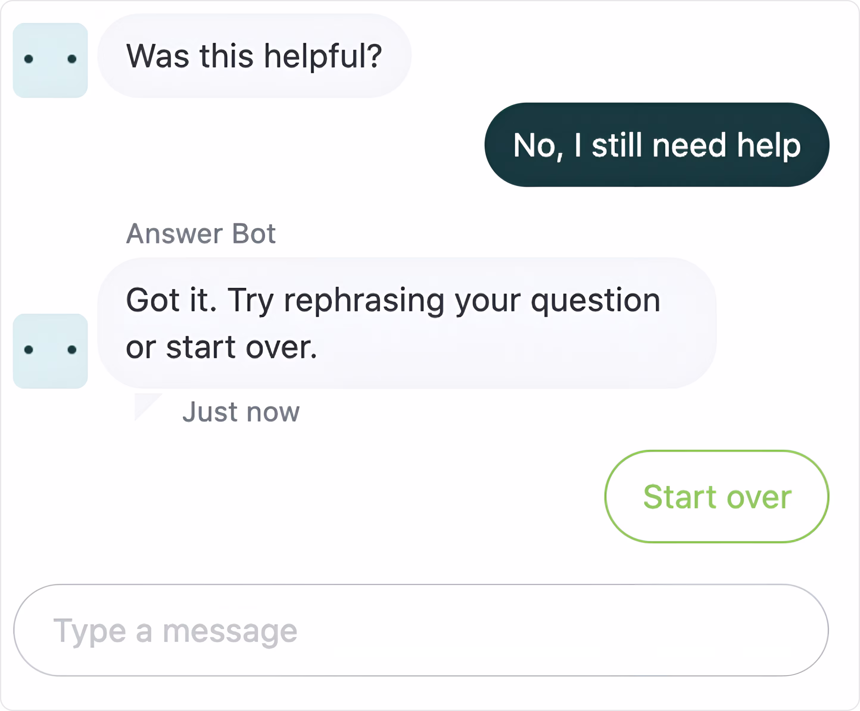
13. Zendesk Chatbot
Zendesk Answer Bot is an automated support chatbot meant to support customers' basic questions and limit ticket volume. It helps users by showing relevant help center articles, presenting quick replies, and helping with smart follow-ups (e.g., "Start Over", "Rephrase your Question", etc.) to make the experience more fluid.
The UI is minimalistic and clear with soft colors and a compact layout that provides a non-intrusive layer of support. This experience is well-suited for users who want fast self-serve solutions.
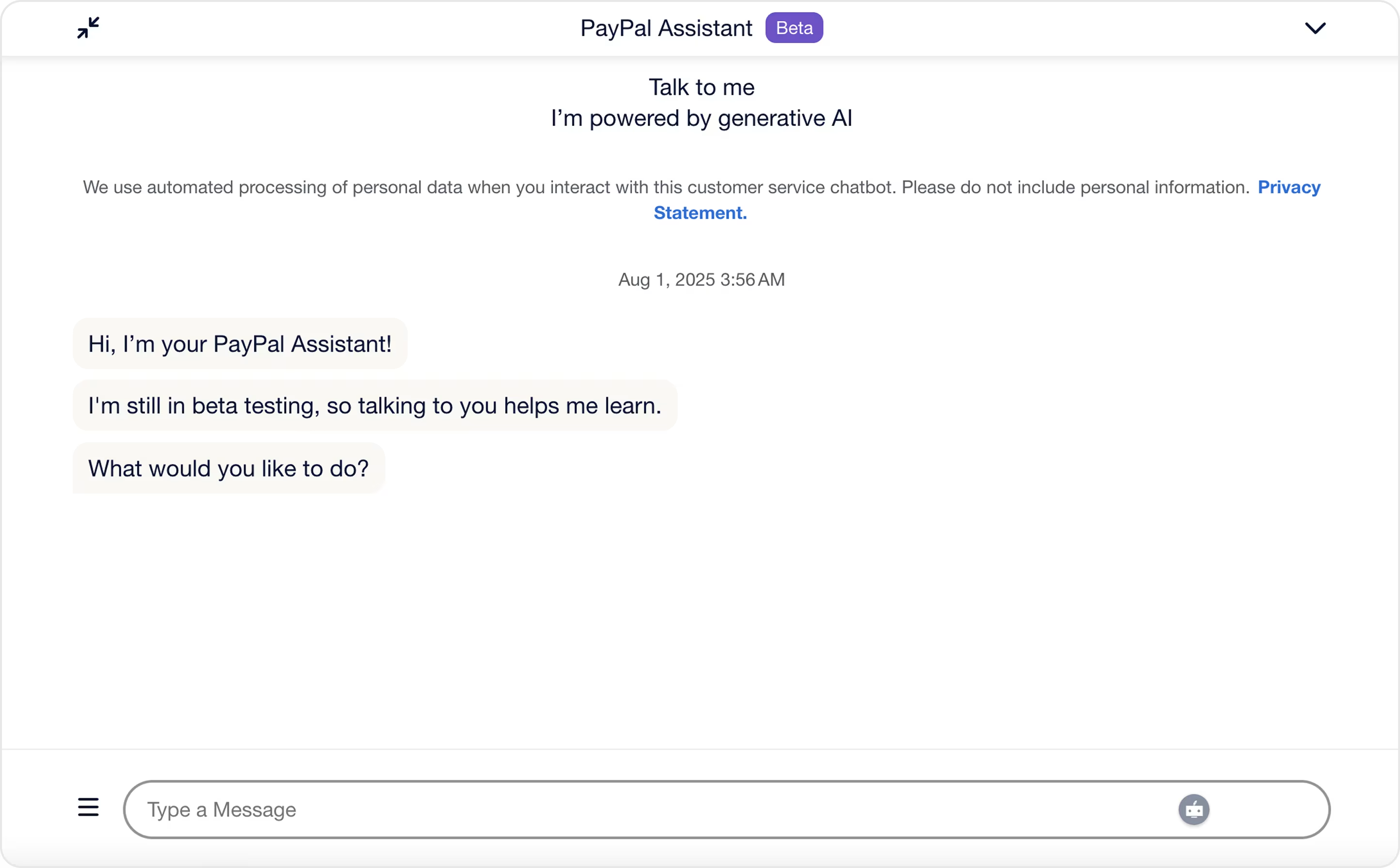
14. PayPal Customer Support Chat
The PayPal Customer Support Chat is a generative AI-powered assistant dedicated to helping users complete support tasks.
The design of the PayPal chatbot is minimalistic and straightforward, and it has a user-friendly interface. With soft message bubbles and enough spacing between the bubbles, the chat feels very natural. Clear questions and a large message field help users understand what to do next and make the whole experience intuitive.
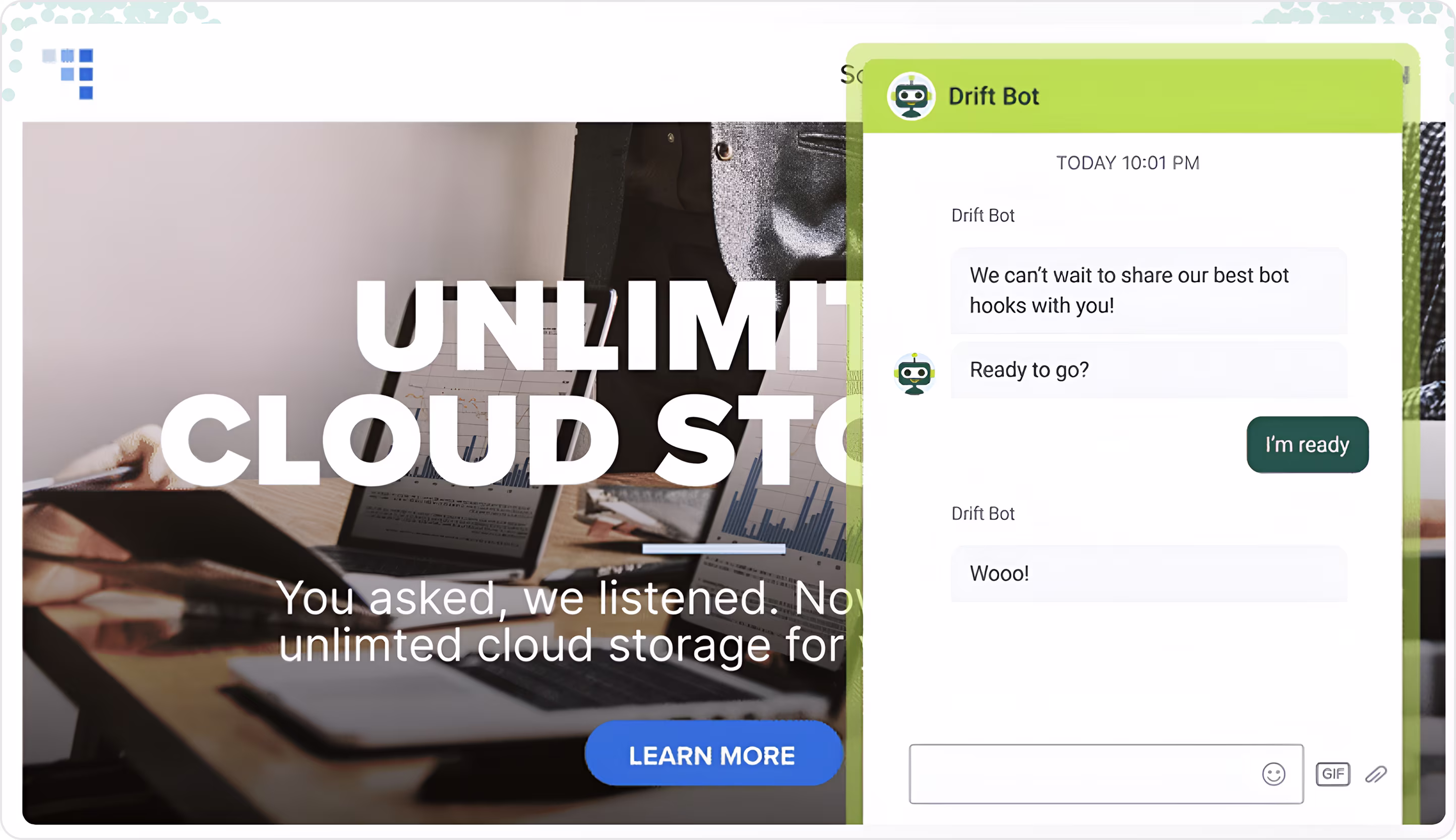
15. Drift
Drift's AI is built for B2B sales and support, and that's why it's so good; it helps businesses qualify leads, book meetings, and engage site visitors in real time. The experience feels more like a conversation than a form, guiding respondents through only relevant questions at a steady pace and not overwhelming them with too many questions all at once.
Drift chatbot UI design has one of the best widgets, clean fonts, and real-time animations, providing a sense of liveliness through interactions. Branded elements, limited distractions, and contextual nudges allow users to stay engaged while moving towards a conversion.
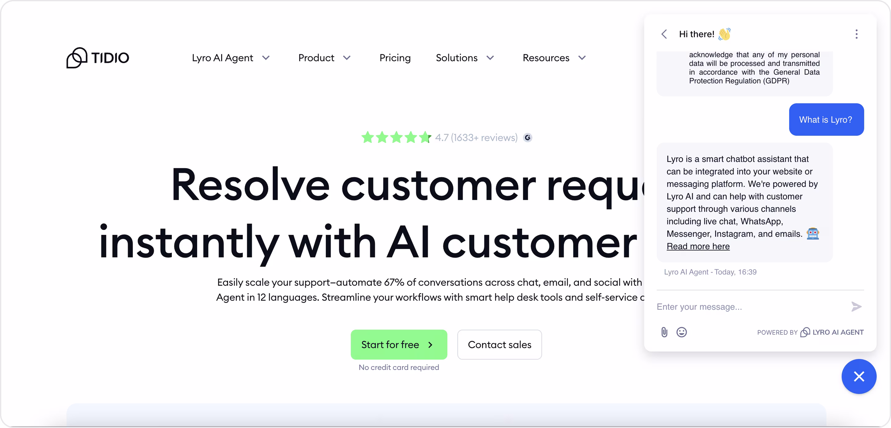
16. Tidio
Tidio's Lyro AI Agent is a smart customer support chatbot that helps automate up to 67% of incoming queries through live chat, emails, or messaging apps. The chatbot can be embedded in websites to provide fast, AI-powered customer support in 12 different languages.
The interface is clean, up-to-date, easy to navigate, and has room to breathe. The use of fun emojis establishes a friendly and warm tone, the branding is present but subtle, the chat window is easy to use and feels "natural," promotes flow, has clear CTAs, etc. Overall, this is an excellent example of accessible and effective chatbot UX.
17. Landbot
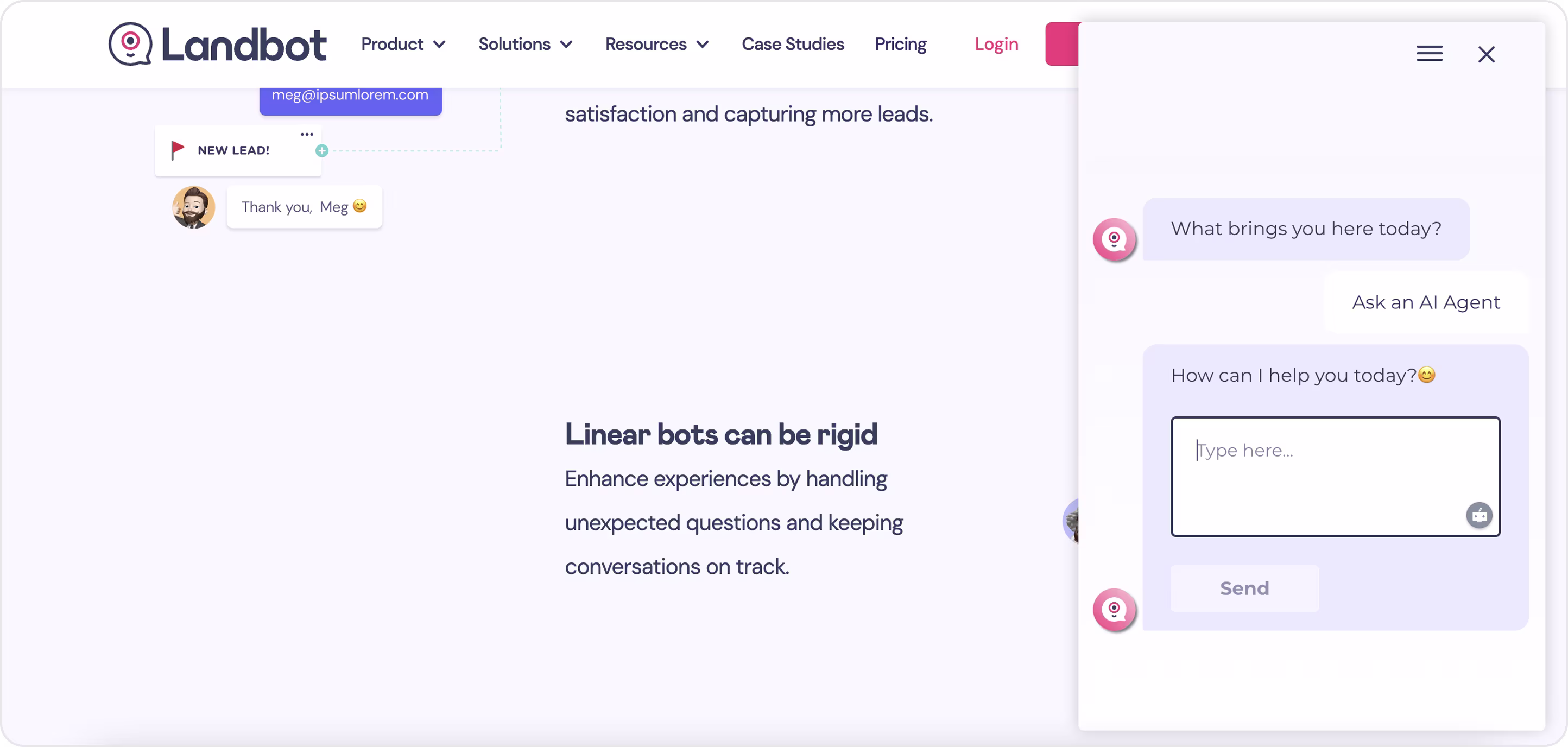
Landbot is a no-code development platform for chatbots with an emphasis on visual conversation design. It allows businesses to develop structured and interactive chats through a drag-and-drop builder without any coding knowledge.
Landbot's interface is fun, bright, and colorful with an engaging, clear, approachable design which uses ‘'soft'' colors, emoji accents, and small text prompts to help users move through the conversations seamlessly. Although in practice, these designs can include complex logic, the process using Landbot feels approachable because you have extreme control over how everything flows!
18. Replika
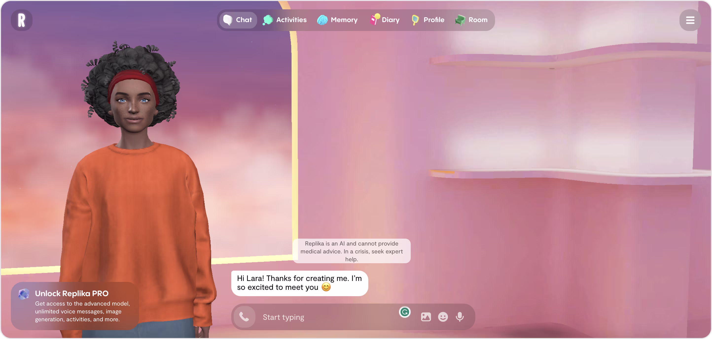
Replika is an AI chatbot designed for emotional support, companionship, and self-reflection. Replika's chatbot interface is unique because of its immersive emotional design.
One of the standout aspects of Replika's UX is the complete avatar customization - users get to select the AI companion's gender, skin color, hair style, and outfit, which lends a sense of ownership of the avatar and adds emotional connection. Plus, the background is serene and dreamy, with soft lighting and gradients to create a safe and calming environment that lends to the user feeling comfortable and easing into these emotionally charged conversations without any friction.
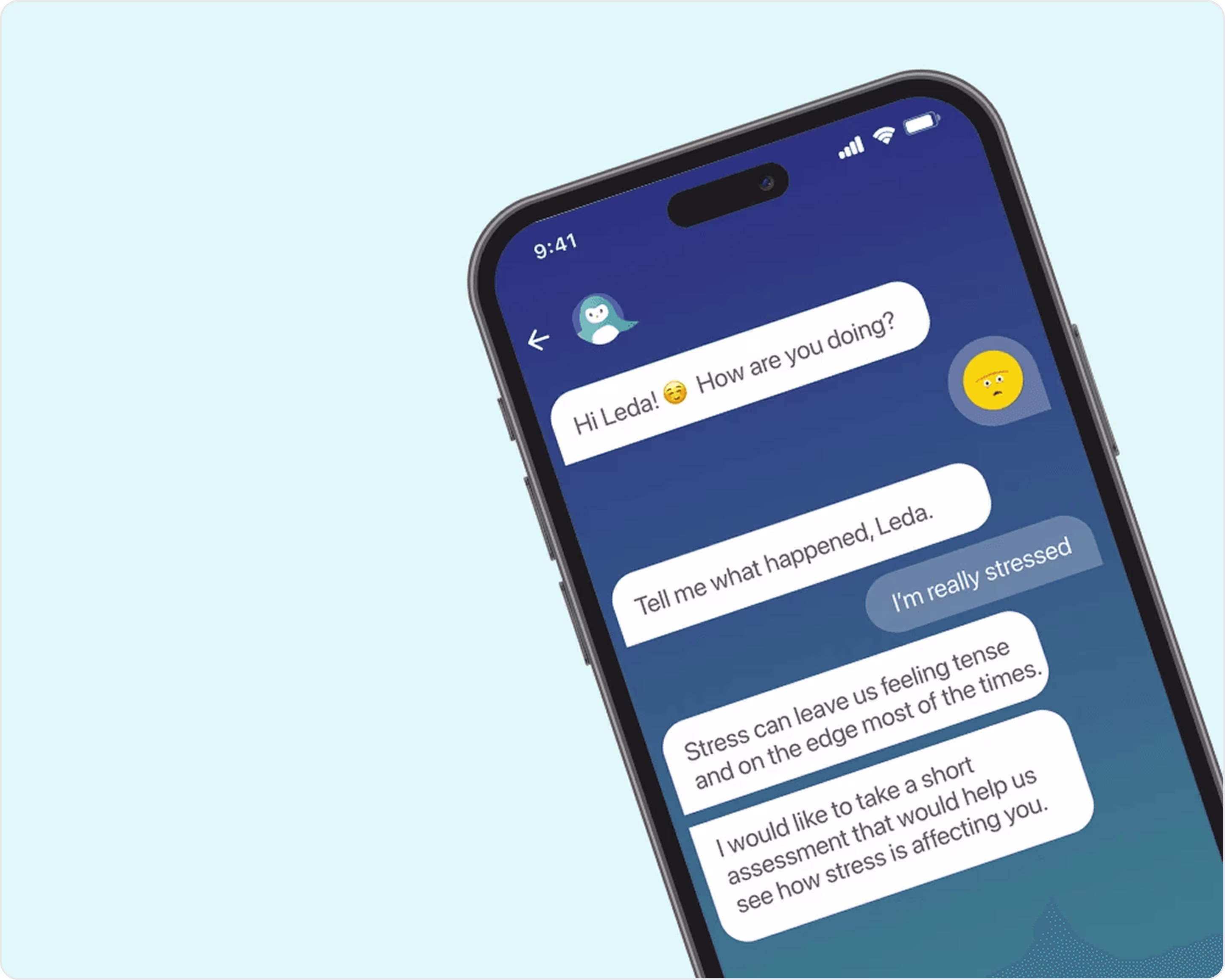
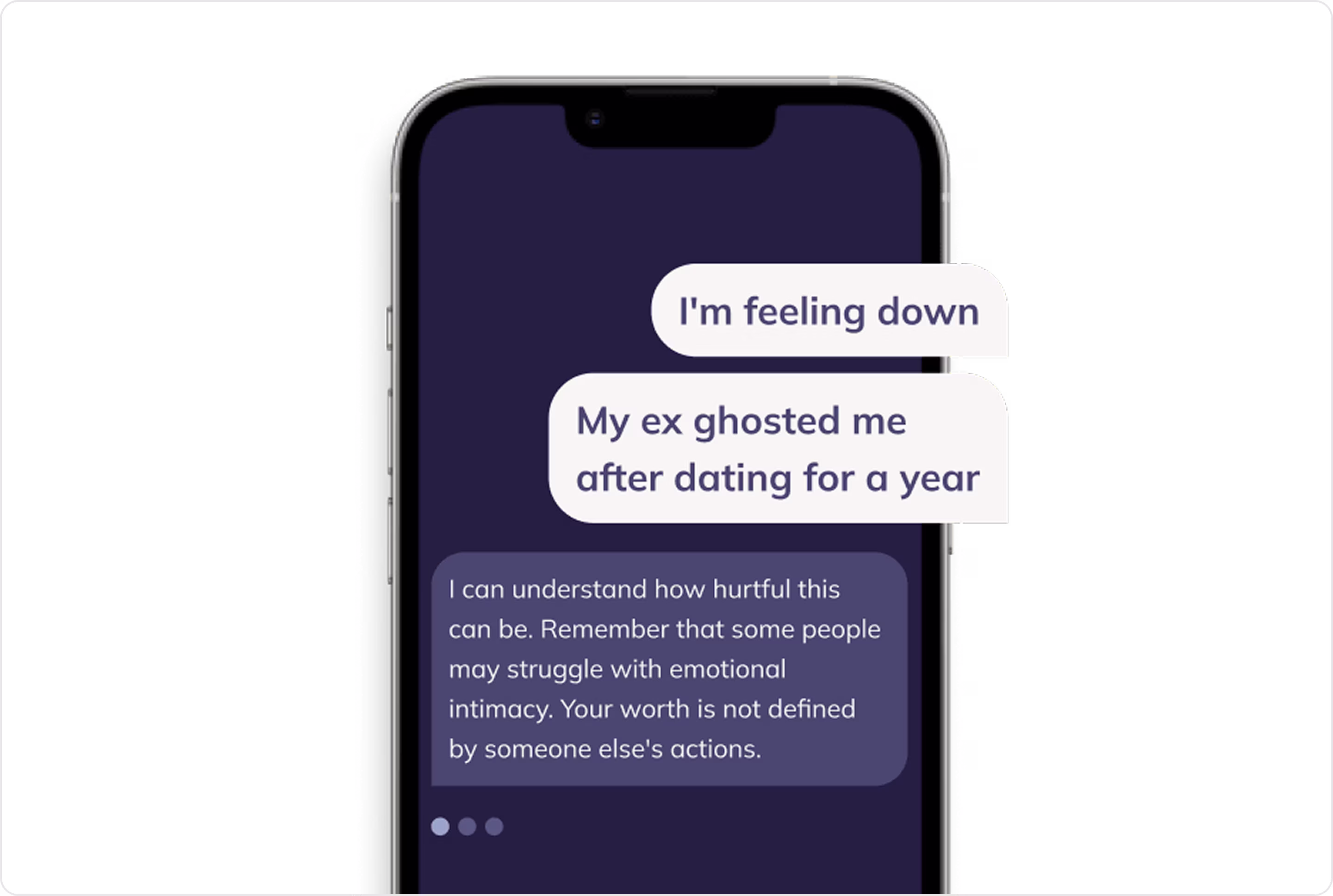
19. Wysa
Wysa is an AI chatbot developed to promote mental health.
The app has an inviting and calming style: the blue gradient background provides an inviting feeling, and the penguin icon makes it feel warm and personable. The dialogue bubbles are large, properly spaced, and easy to read; typographic and visual personal touches, like emojis and using the user's name, allow for a greater feeling of humanity. On the negative side, a few UI details here do feel a little dated - the message alignment feels vaguely odd, and the app can use a clearer visual polish with a modern interface.
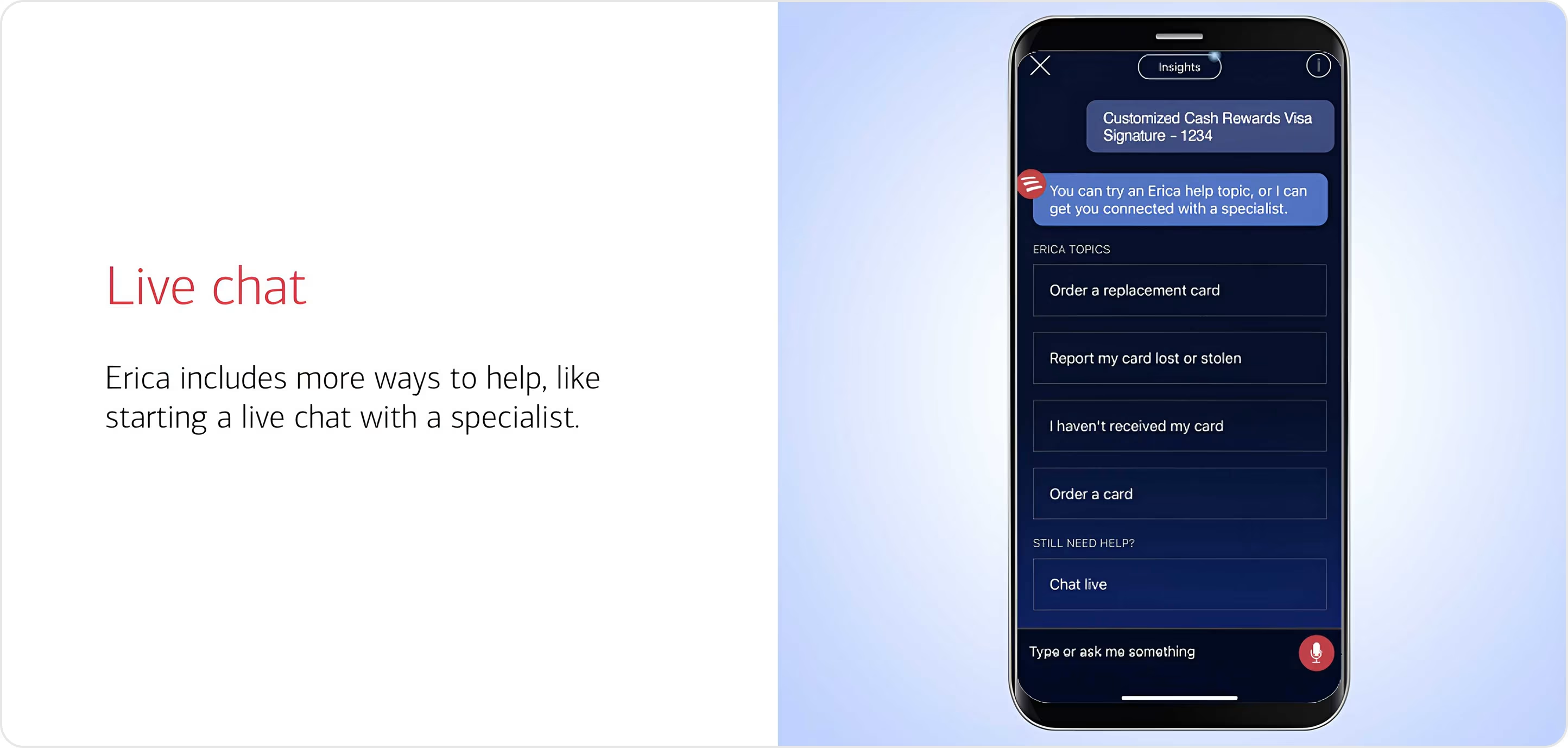
20. Erica
Erica is Bank of America's AI-powered virtual financial assistant integrated into its mobile application.
Erica fits naturally in the banking app. The chat interface's design is very much in line with the app's overall design language - uncomplicated and functional. The white space and minimalistic use of icons help define the appropriate path and feel intuitive. What makes Erica unique is how well the chatbot uses transaction data and user context to offer value to users with proactive insights. One small negative is that the chatbot interface can feel stiff at times.
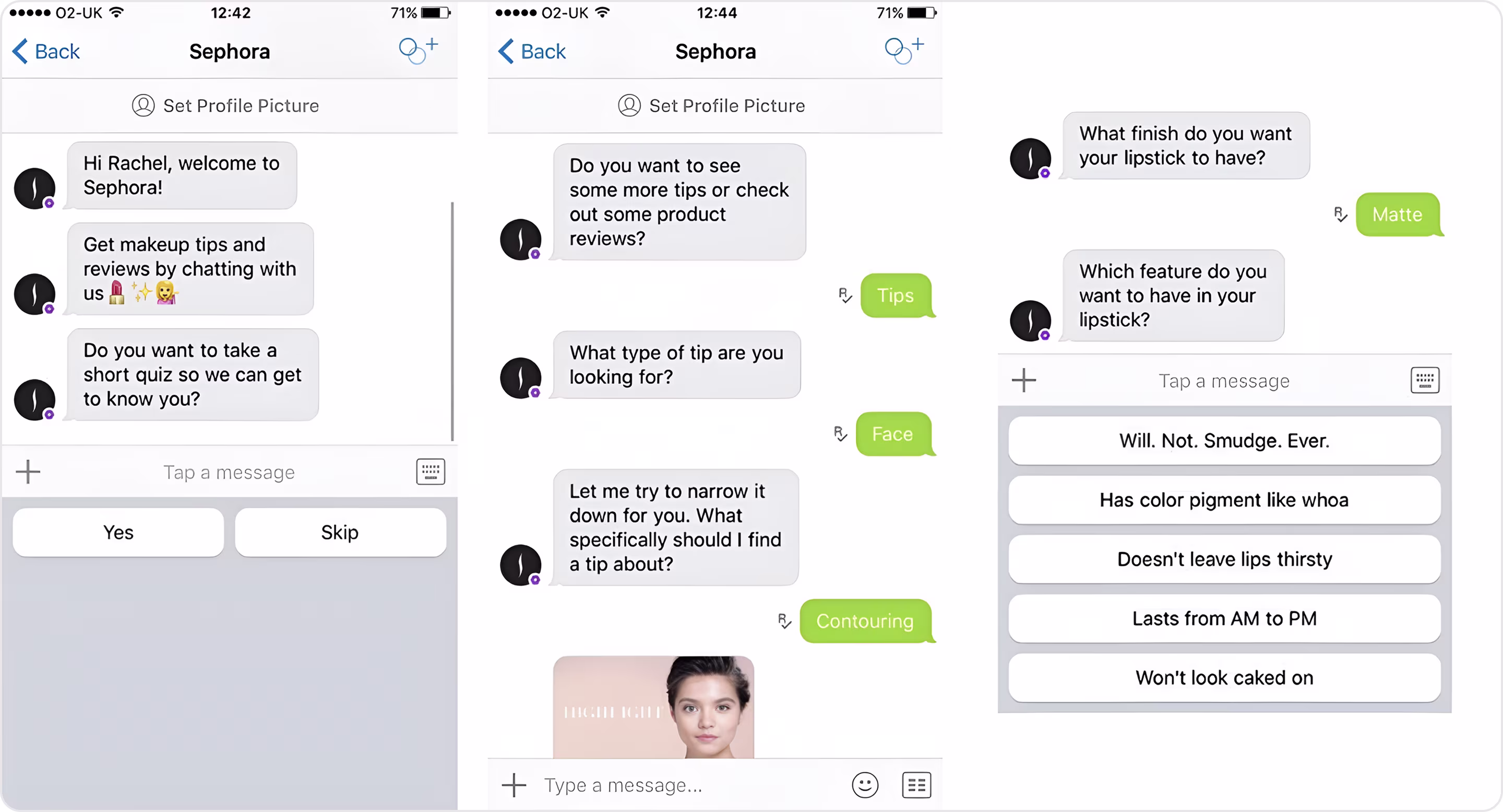
21. Sephora Chatbot
The Sephora chatbot is an intelligent virtual assistant that allows users to discover products, book services, and receive personalized recommendations.
The chatbot interface design is direct, efficient, and functional. It relies on buttons, image carousels, and product cards to make the site scannable and shoppable at the same time. The main design quality is how it takes a beauty consultation and enables it to be self-service, available 24/7 without waiting for a store associate. The only area for improvement is that it could benefit from a bit more personality or visual polish. Overall, it is a well-structured assistant, balancing its intention to be useful while still being on-brand.
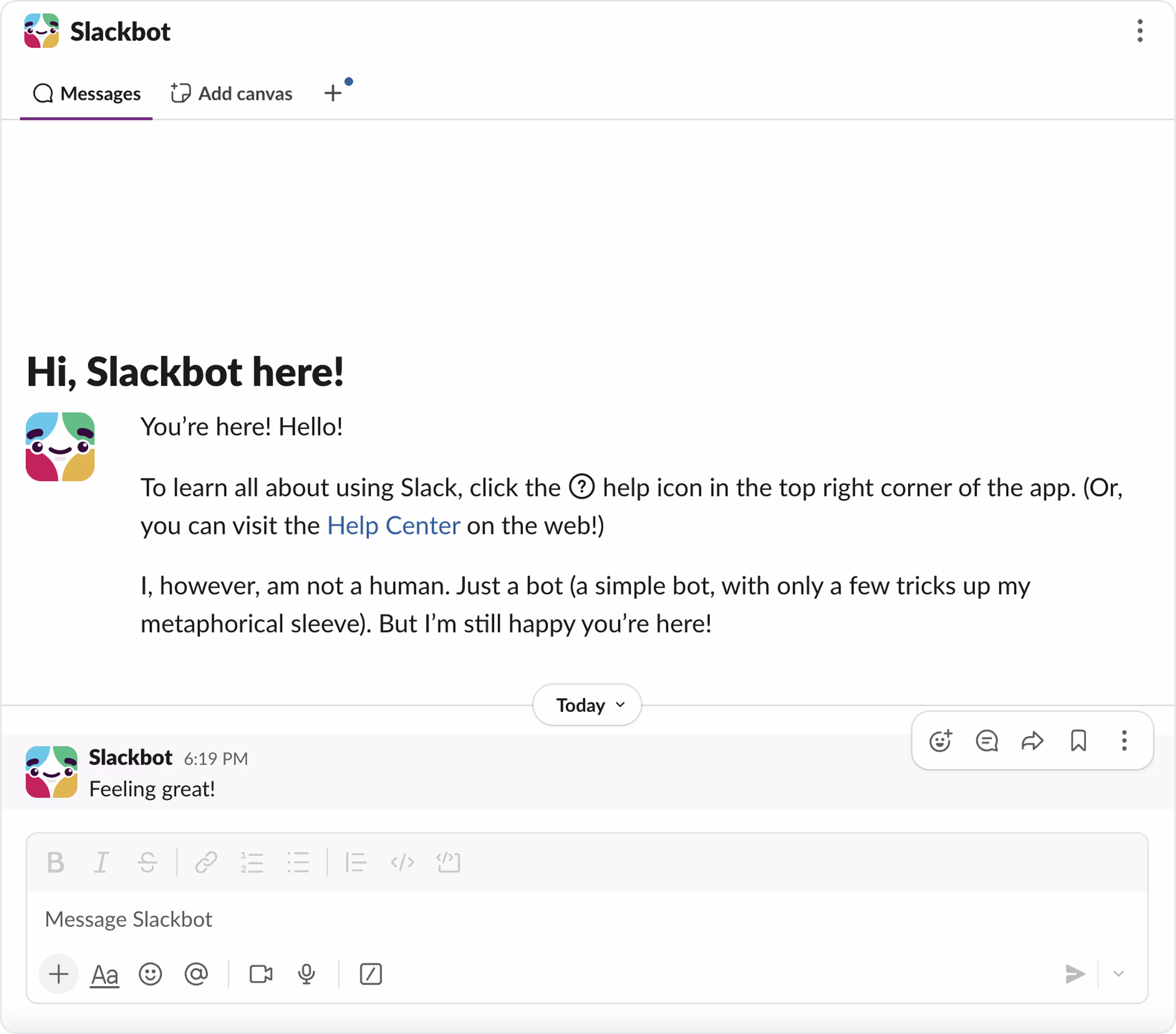
22. Slackbot
Slackbot is the assistant that is built into Slack and helps users with simple tasks like reminders, answering simple questions, or walking them through app features.
Slackbot has a casual and friendly tone that reflects the personality of the product. It provides messages that are clean and readable, while also maintaining Slack's intentional visual hierarchy. In addition, it uses buttons and suggested replies sparingly, yet effectively. Slackbot is a great example of utility-first design combined with a strong brand voice to create a chatbot that flows naturally and isn't intrusive.
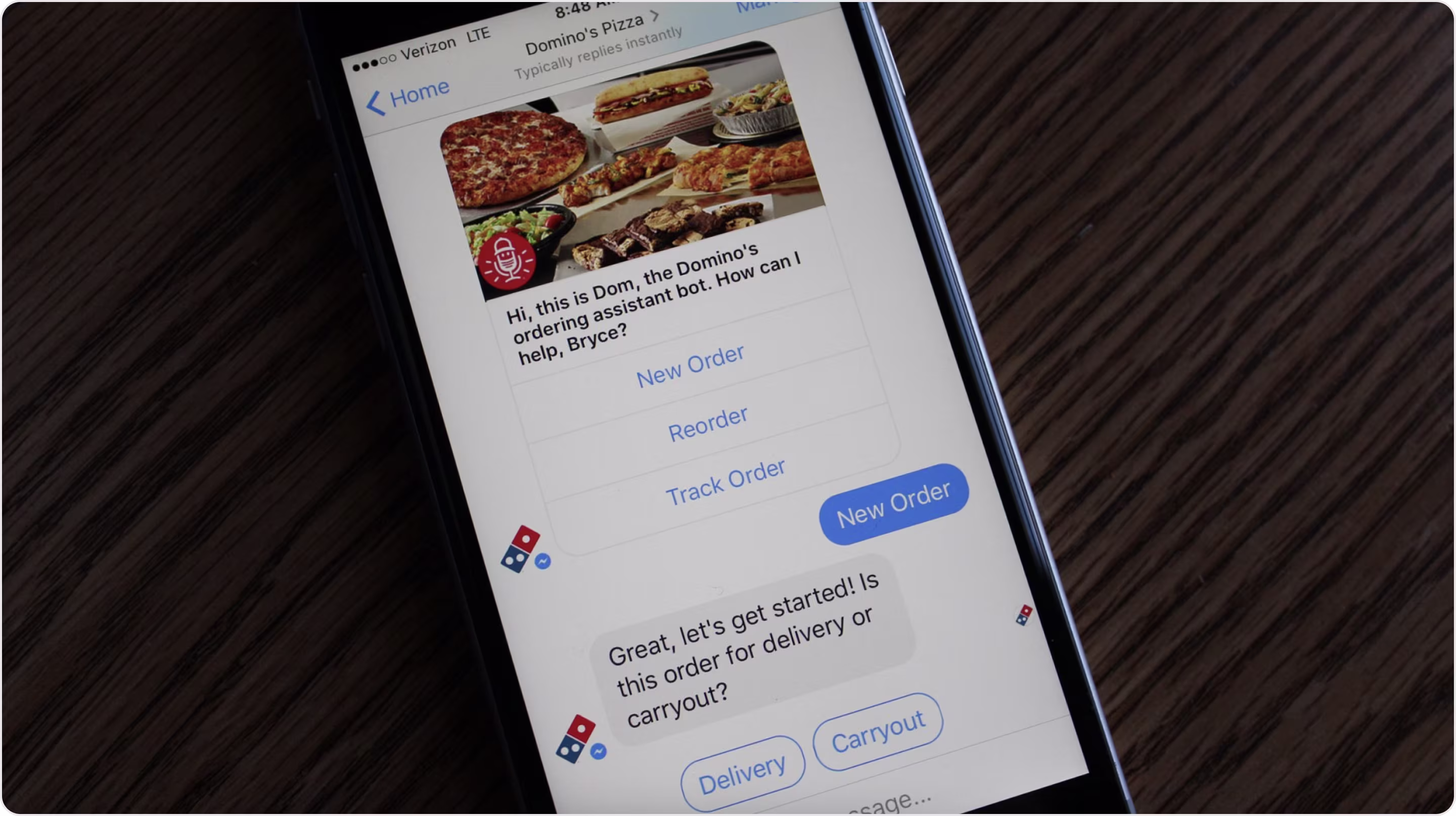
23. Domino's Chatbot
The chatbot for Domino's Pizza, named "Dom," simplifies pizza ordering by making it quicker and easier.
The visual design of Dom is very clean, with large "New Order" and "Track Order" buttons, removing the typing requirement. From a UX point of view, the minimalist approach is optimized for speedy decisions and great for returning customers. However, visually, it's highly dependent on Messenger's default UI, so the brand presence could have been stronger.
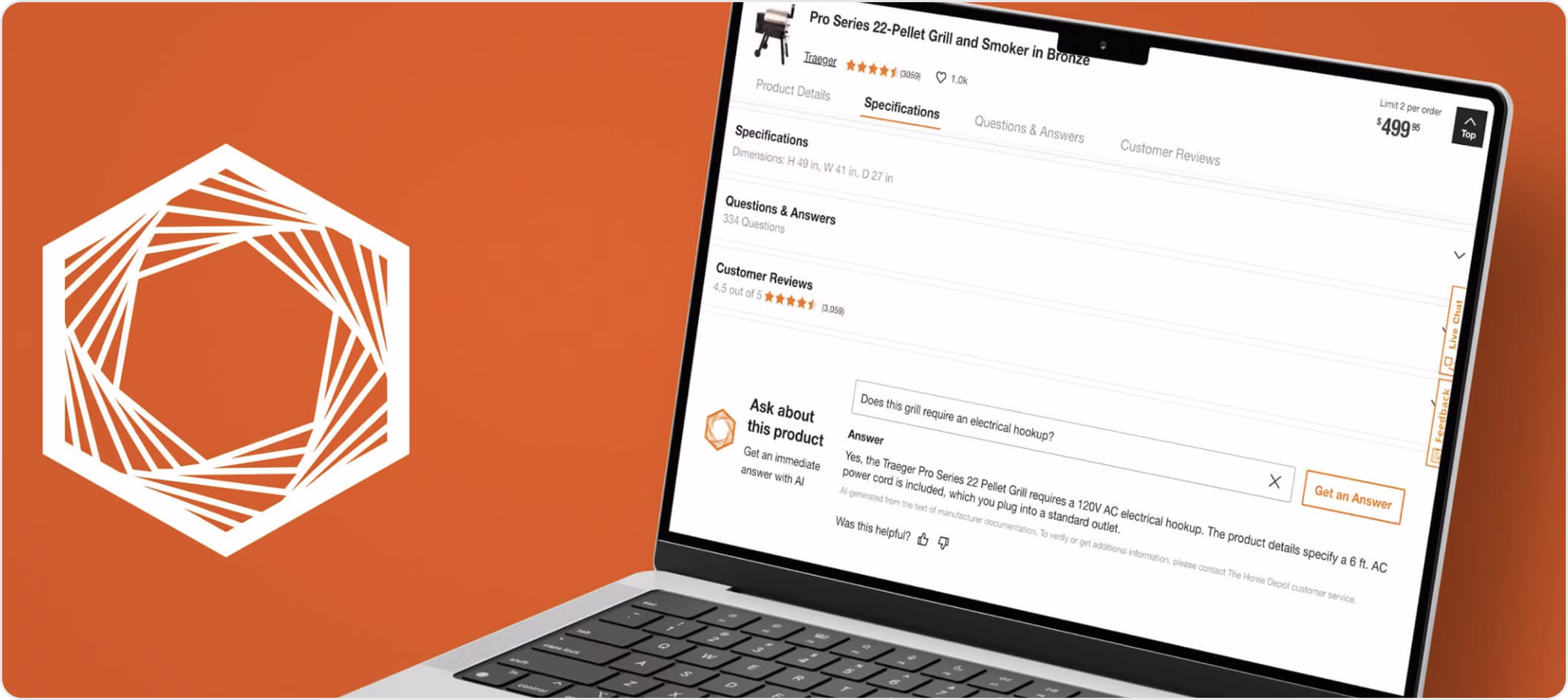
24. Home Depot Chatbot
Home Depot's AI-powered chatbot, "Magic Apron," lets users receive suggestions and provides product details on all of the product pages.
The interface is clean and unobtrusive, appearing when you need it. It has a condensed list of simple prompts and a logical organization that makes you feel like you are talking to an in-store expert.
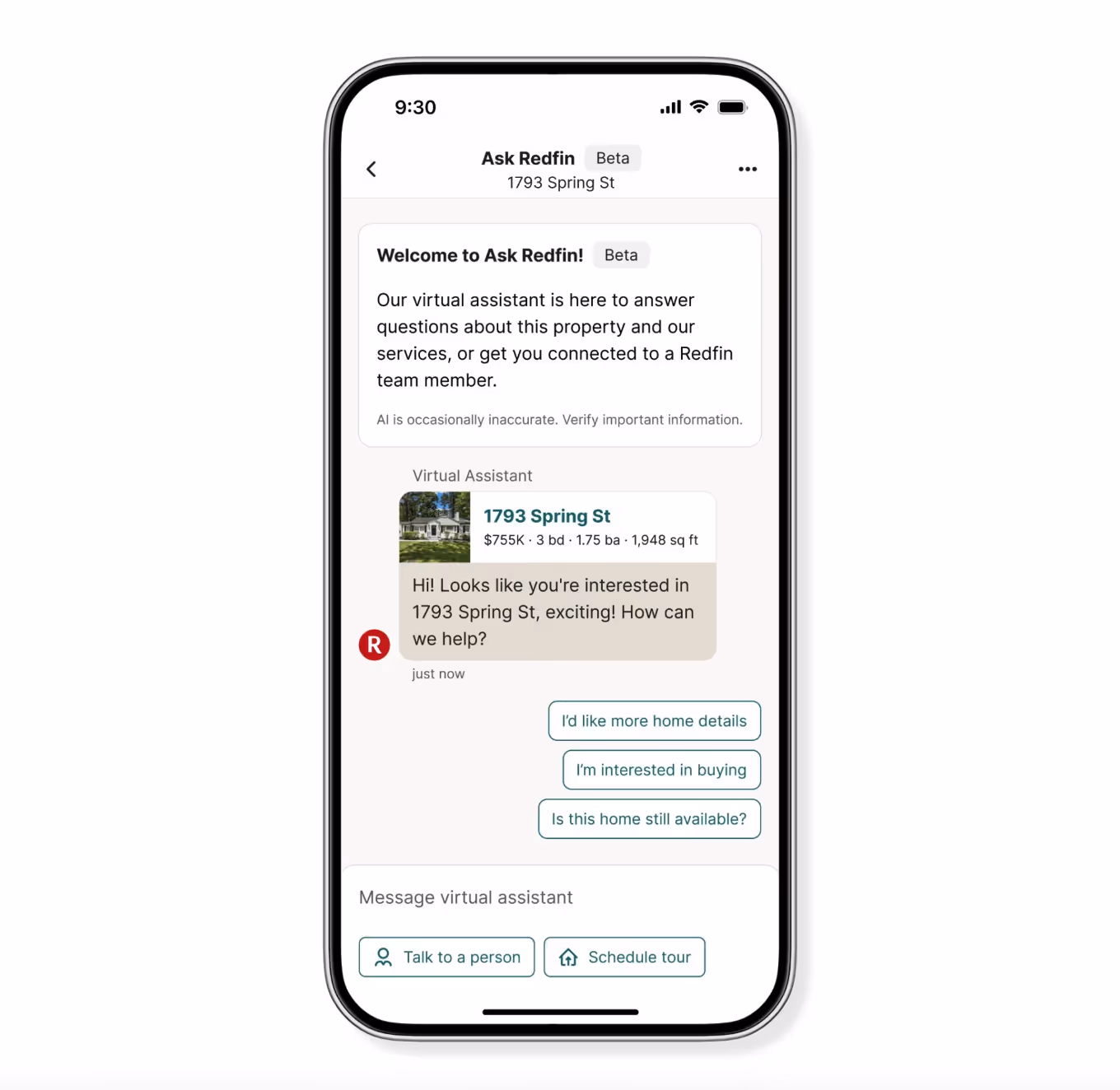
25. Redfin AI Chatbot
The Redfin AI chatbot allows users to find real estate listings, schedule tours, and get answers about the homes right from the listing pages.
Redfin's chatbot is straightforward, to-the-point, and well-embedded into the property page. The use of a property card with a photo, price, and key details instantly provides the user context, which reduces clicks and decision time. The action buttons are easily located, and with such a simple color palette, the user is focused on the content.
26. Youper
Youper is a mental health chatbot that uses CBT therapy.
The app's dark background combined with a light-colored graphic and type creates a calming and personal atmosphere. The overall layout is clean, keeping distractions to a minimum, and allows users to focus on the conversation.
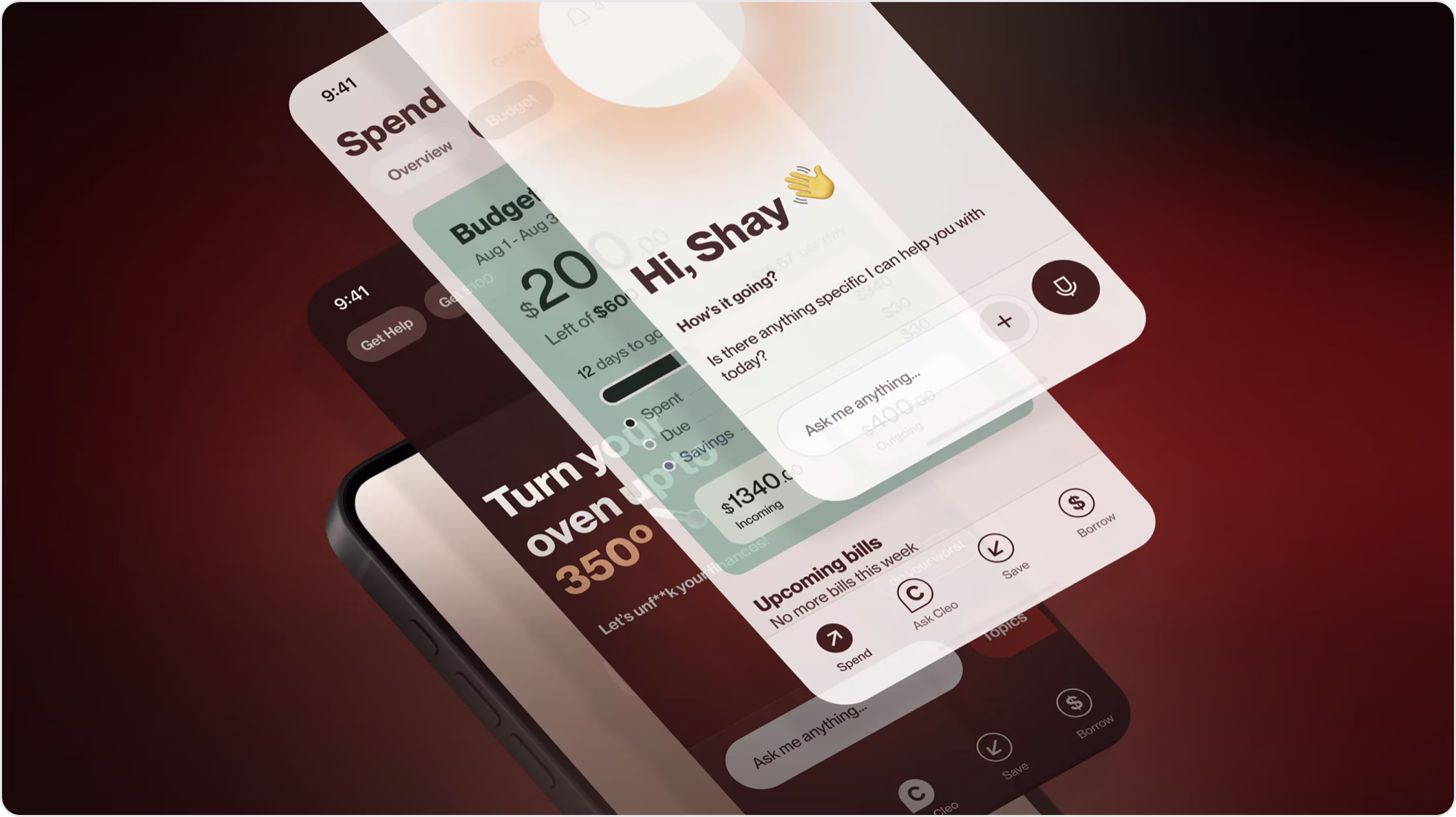
27. Cleo Chatbot
Cleo is a finance-focused chatbot that helps users manage spending, budgets, and develop better money habits via a fun and casual conversation.
Cleo's interface balances bold branding with practical usability. The design is bright, informal, colorful, and brimming with personality, taking the form of emojis, playful copy, etc. The interface is also functionally strong, providing clear buttons for spending, saving, and borrowing.
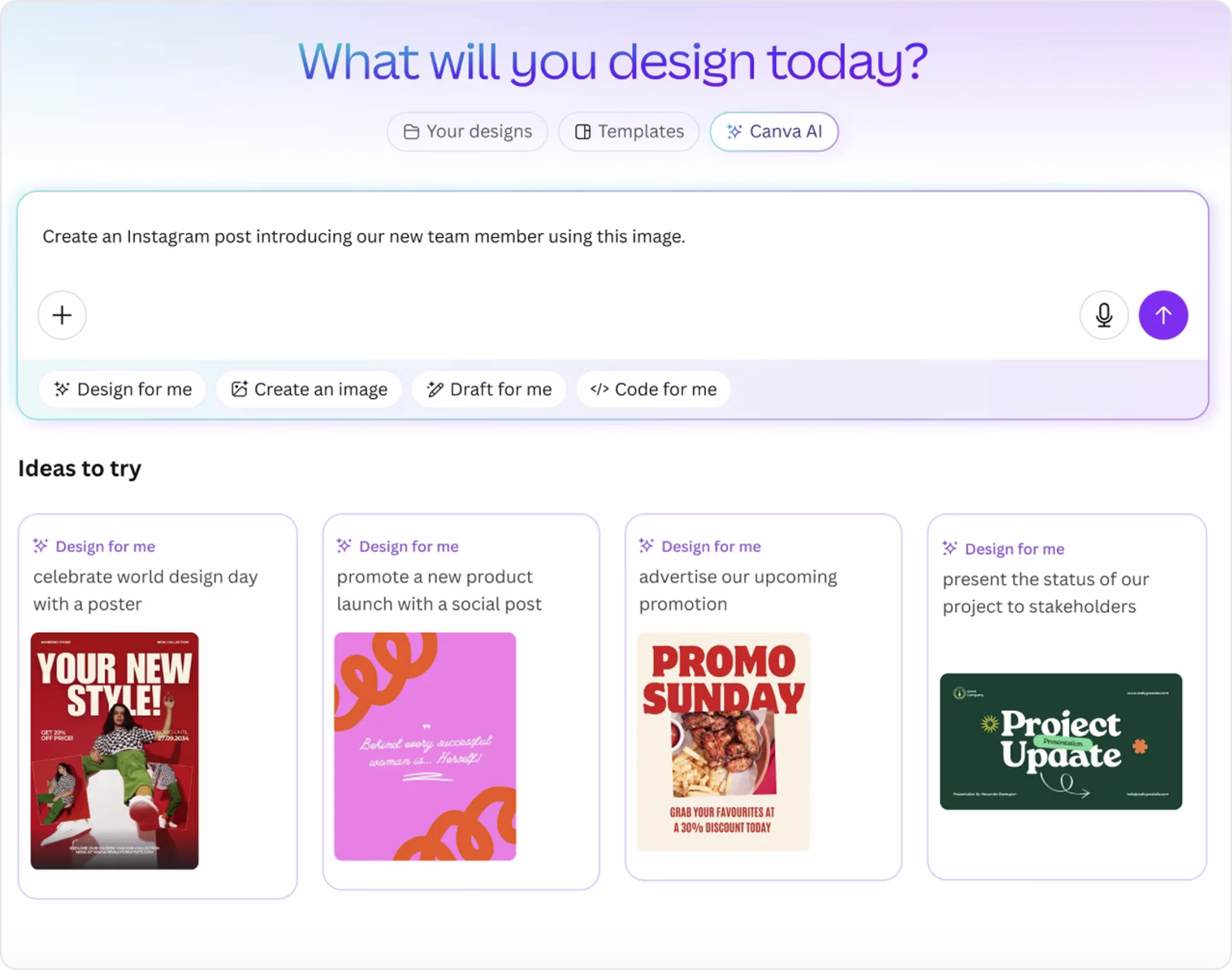
28. Canva Chatbot
The Canva chatbot is a central, intuitive starting point for the creative process, not a generic chat bubble.
This positioning showcases it as a co-creator rather than simply a bot. The microcopy highlights a clear and frictionless experience, and the UI looks light and friendly due to the pastel gradient and modular card layout that allows for flexibility.
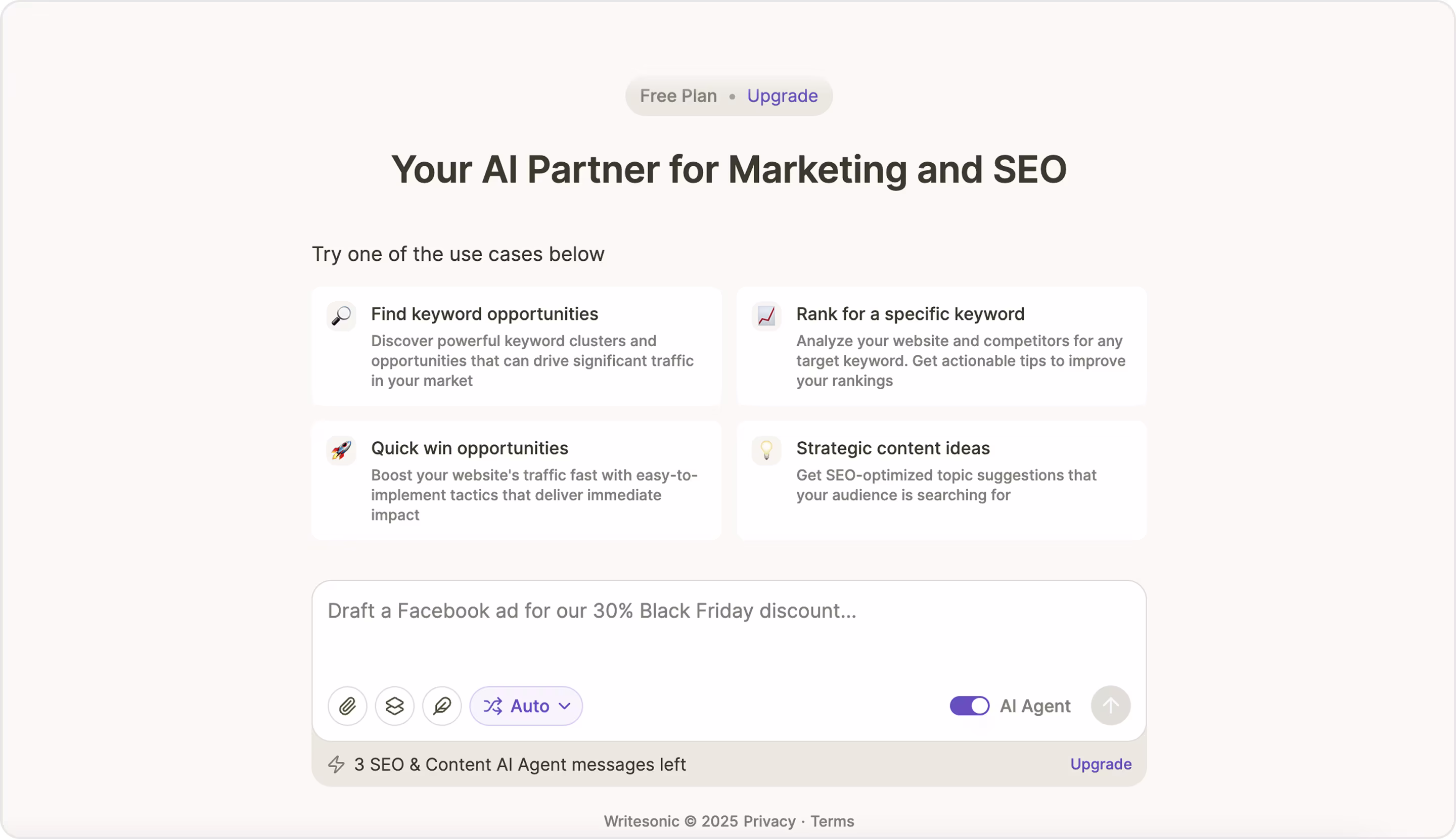
29. Chatsonic
Chatsonic is an AI chatbot by Writesonic built for users to generate text, answer questions, and more.
The interface combines a chat experience with productivity tools, and it provides a good overall structure and navigational experience. It's clean and distraction-free — plenty of space, light visuals, and consistent styling across elements, which helps the user feel in control. However, the chatbot entry point is too deep in the UI, creating unnecessary friction for new users looking for it and using it.
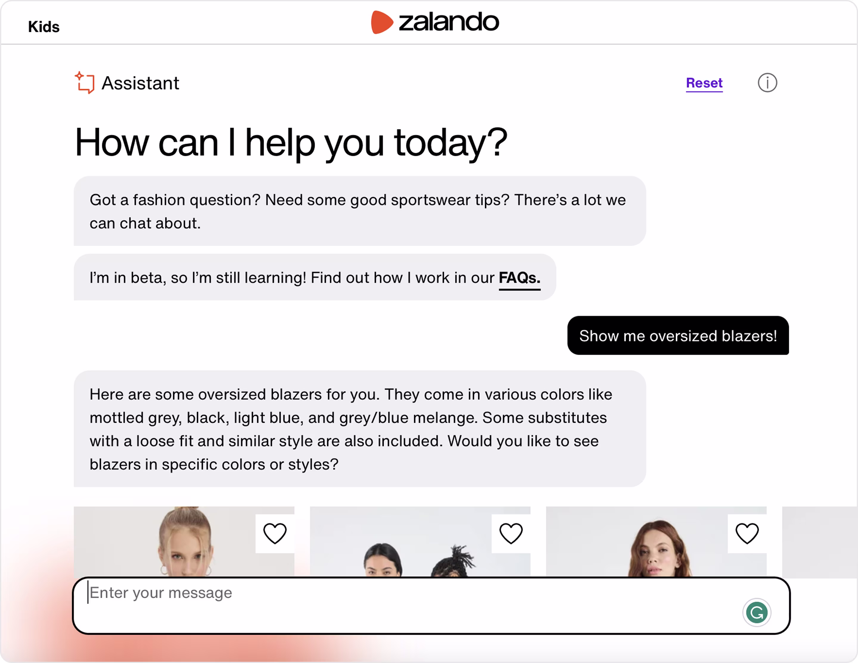
30. Zalando Chatbot
Zalando's chatbot was created to support fashion questions on their site.
It has a neat and very functional UI that seamlessly combines search support with product discovery. The simple layout, sufficient whitespace, and contrast of user and bot messages provide a readable and distraction-free experience. The bot feels like part of the shopping journey rather than an additive feature.
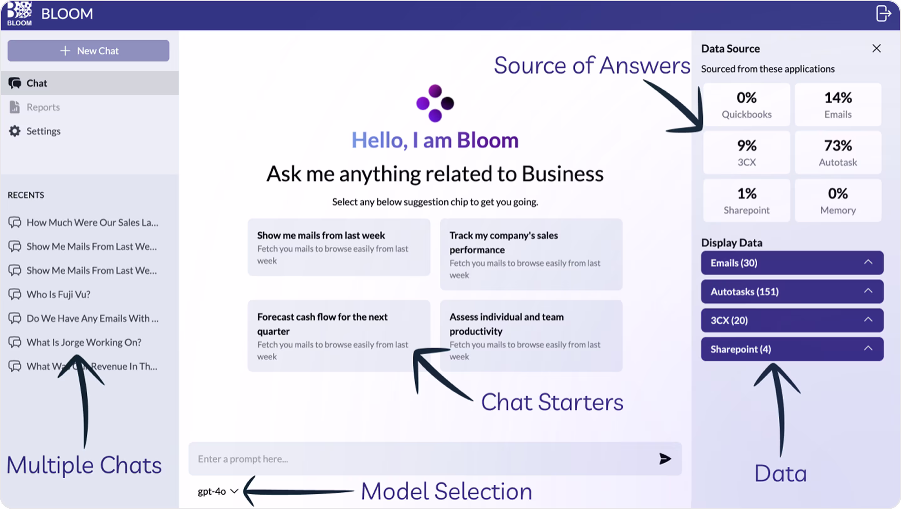
31. Bloom Chatbot
Bloom is an AI chatbot designed to analyze emails, data, and team performance.
Bloom's bot interface is a great example of enterprise UX. The interface clearly prioritizes business clarity and control through a well-structured design. Each area has a well-defined purpose, with visibility of the data sources and a clear structure of the chat starters.
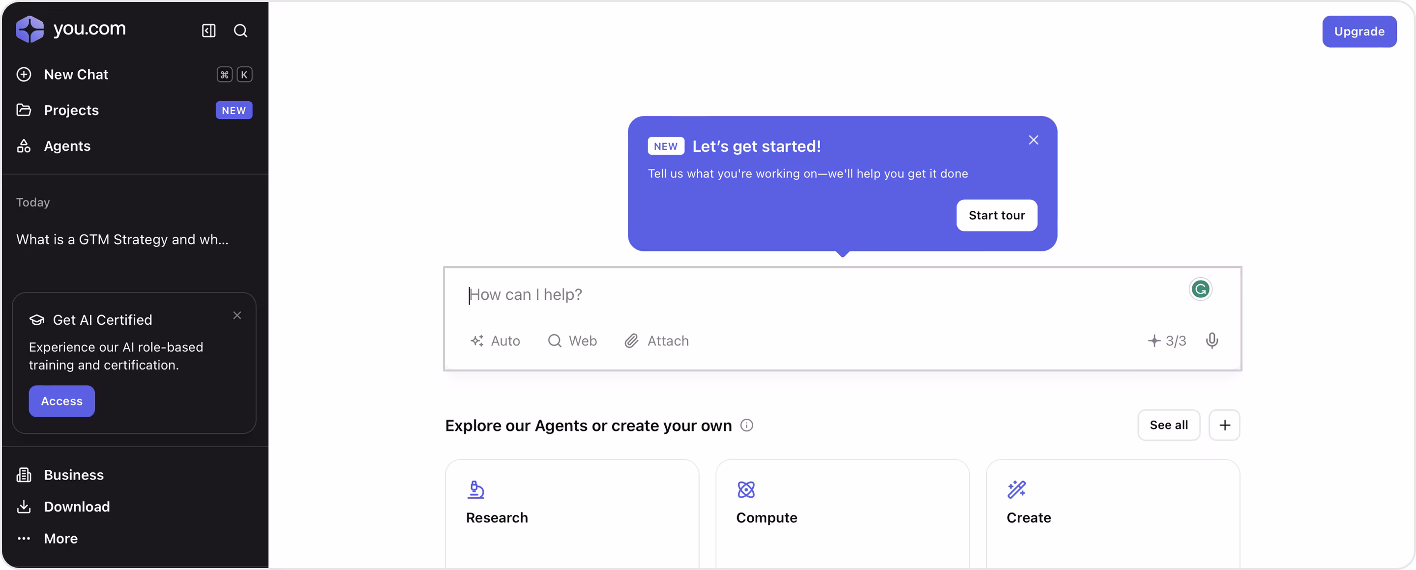
32. YouChat
YouChat is an AI-powered assistant that facilitates finding answers, generating content, and interacting with tools, all within the same environment.
The UI is clean and splits utility and conversation. A light input area is inviting for open-ended prompts, while the left sidebar acts as persistent navigation. The visual hierarchy is at its strongest, and the clear icons below the input keep the interface functional.
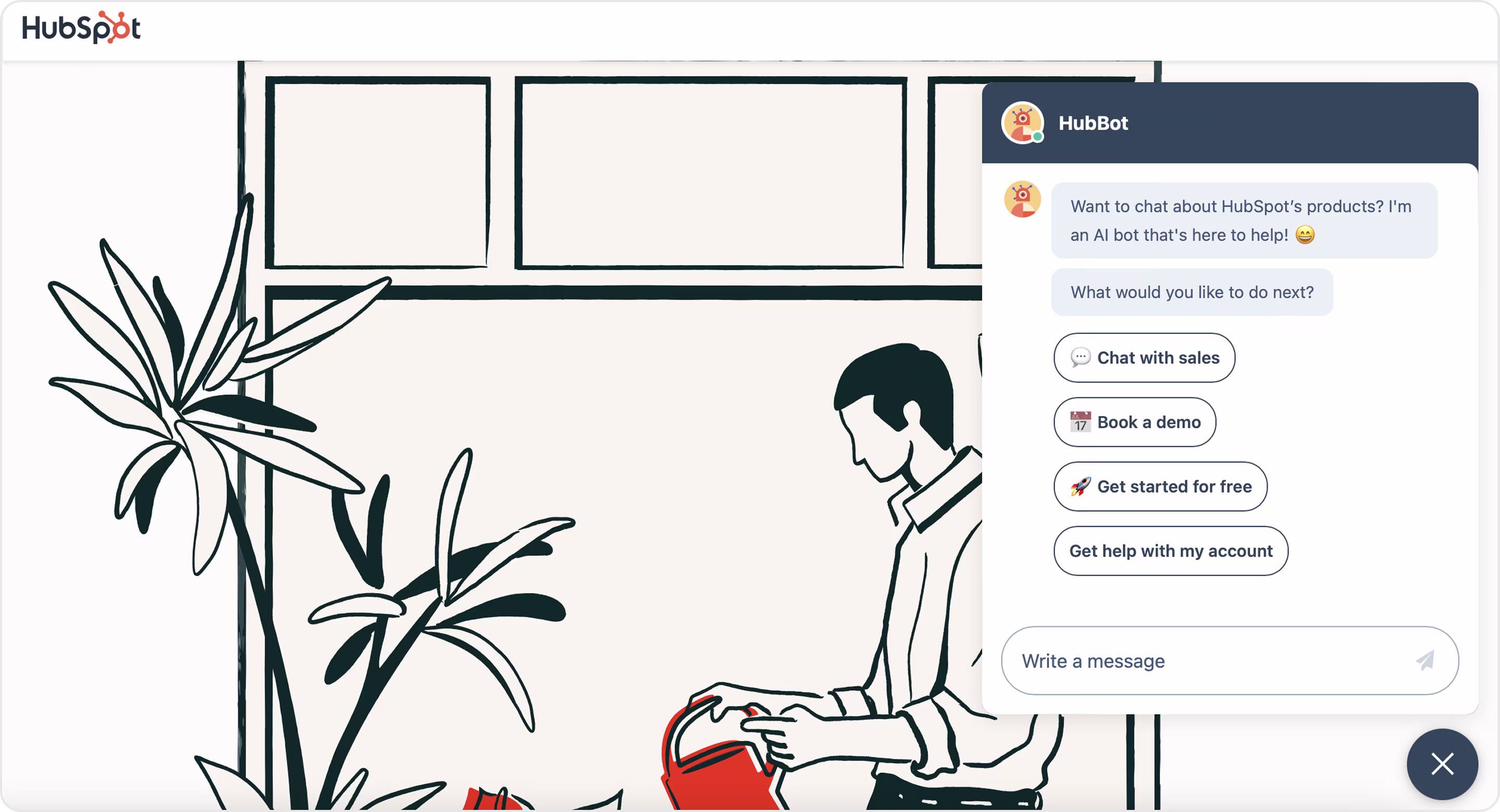
33. HubSpot Chatbot
The purpose of HubSpot's ChatBot is to help users make rapid decisions, whether that means requesting to talk to sales, booking a demo, or fixing an account issue.
This is a great example of a clean, conversion-oriented website chatbot design: all the elements are inviting visual cues, clear button-based replies, and a warm tone (used emojis!) to eliminate the robotic feel.
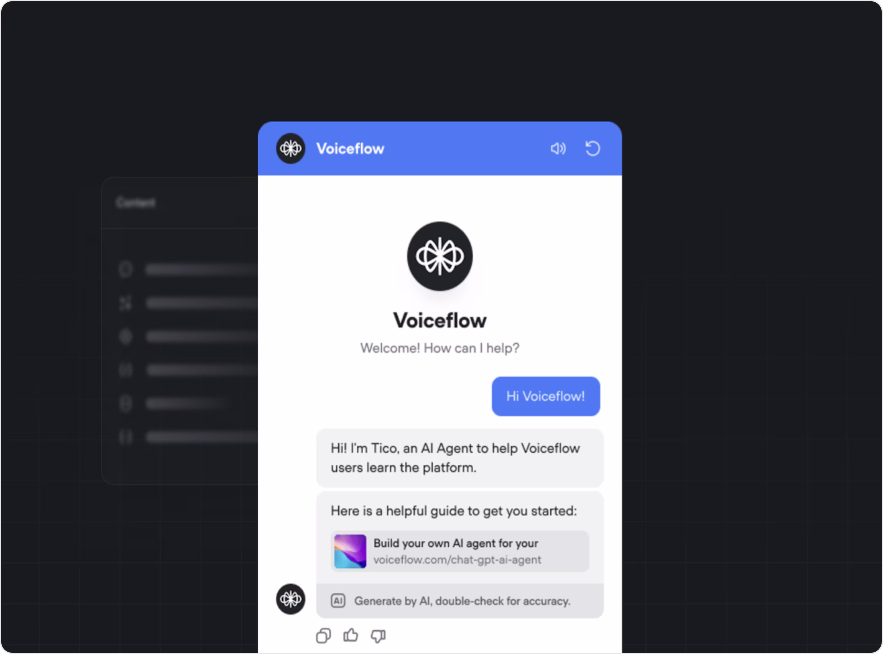
34. Voiceflow's Tico
Tico is an AI assistant designed to show how easy it is to prototype and launch a sophisticated voice or chat assistant with Voiceflow's platform.
Tico stands out with its minimalist UI, natural pace, and contextually aware logic. The bot values clarity: seamless transitions between messages, subtle loading indication, and ways to input data both textually and verbally.
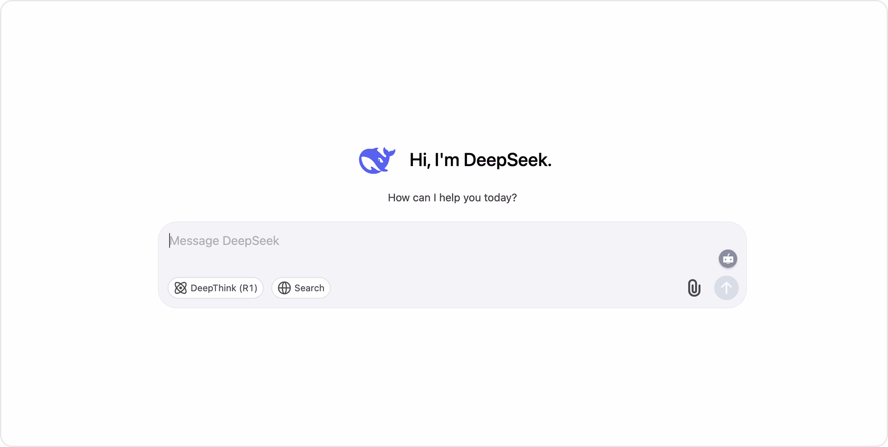
35. DeepSeek
DeepSeek is a multi-purpose conversation agent.
Its interface is simple and effective: a minimalist chat window with no distracting visuals, a fast and responsive interface, and clear reasoning for users. DeepSeek has no branding or personality, but this is balanced by transparency and accessibility, as users can immediately begin chatting with no paywall or login.
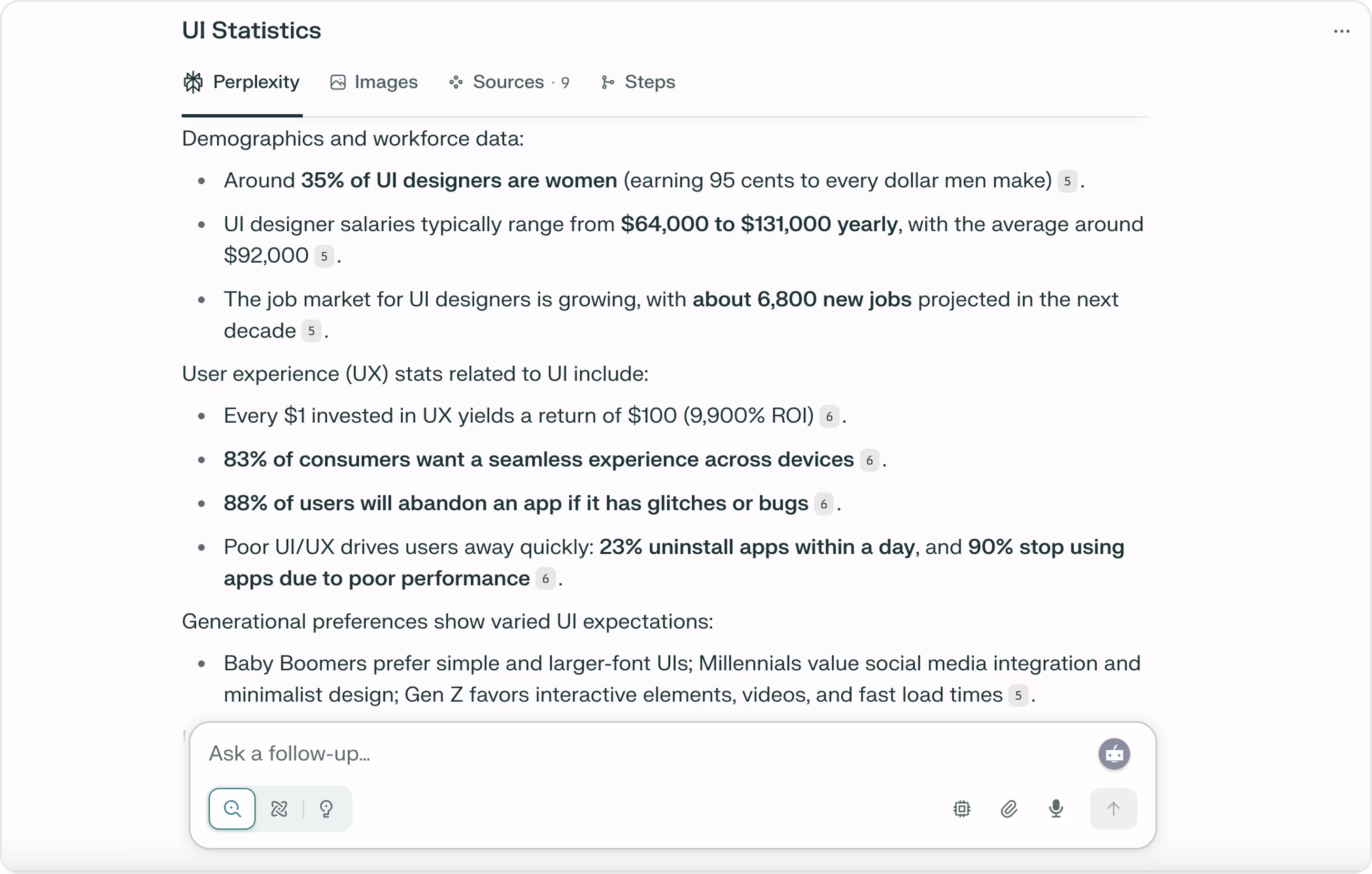
36. Perplexity
Perplexity is an AI chatbot that aims to provide users with a correct answer quickly and easily based on live web data.
Perplexity's approach to conversational search distinguishes it from the others because it has a simple search-centric look and few distractions to enhance the user experience. The interface gives the user clear and intuitive information; answers are displayed as cards with source links below to verify the answer.
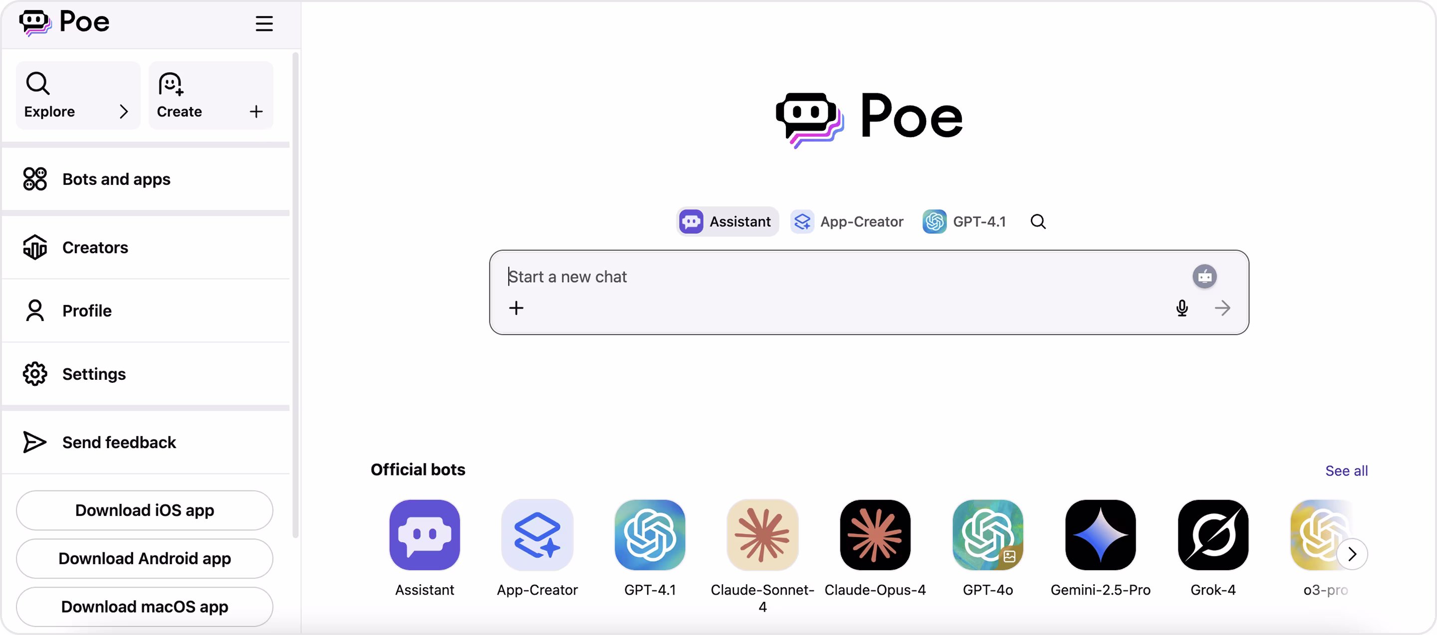
37. Poe
Poe functions as an all-in-one platform for users to ask questions, generate content, and more.
Its interface is intentionally simple and focused. The primary chat area is straightforward and clean. Above and alongside it are options for users to choose links to other bot personas, with icons and labels clearly visible. The sidebar shows all of the available bots, as well as recent chats for easy switching in terms of the context of the conversation.
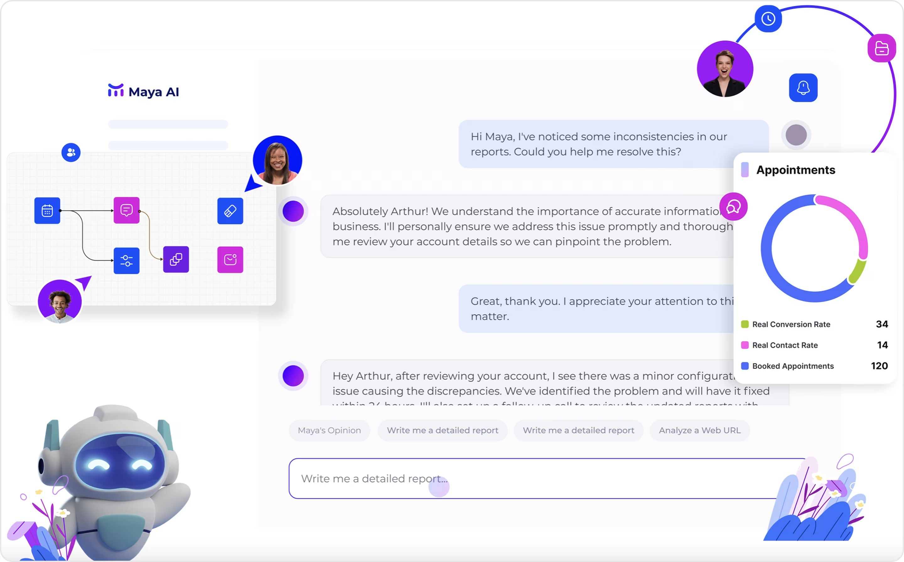
38. Maya Knows Chatbot
Maya provides a conversational interface for teams to get instant context-rich answers from their company's knowledge base and tools.
The Maya chatbot UI is a combination of a messenger and workplace tool. Rather than having pop-ups or sidebars, Maya keeps everything in one place and employs gradual animations and semi-transparent visuals to guide attention without distracting it from the content. There is a level of trust built by the depth of focus from the clean layout, leading to complex replies feeling intuitive and easy to follow.
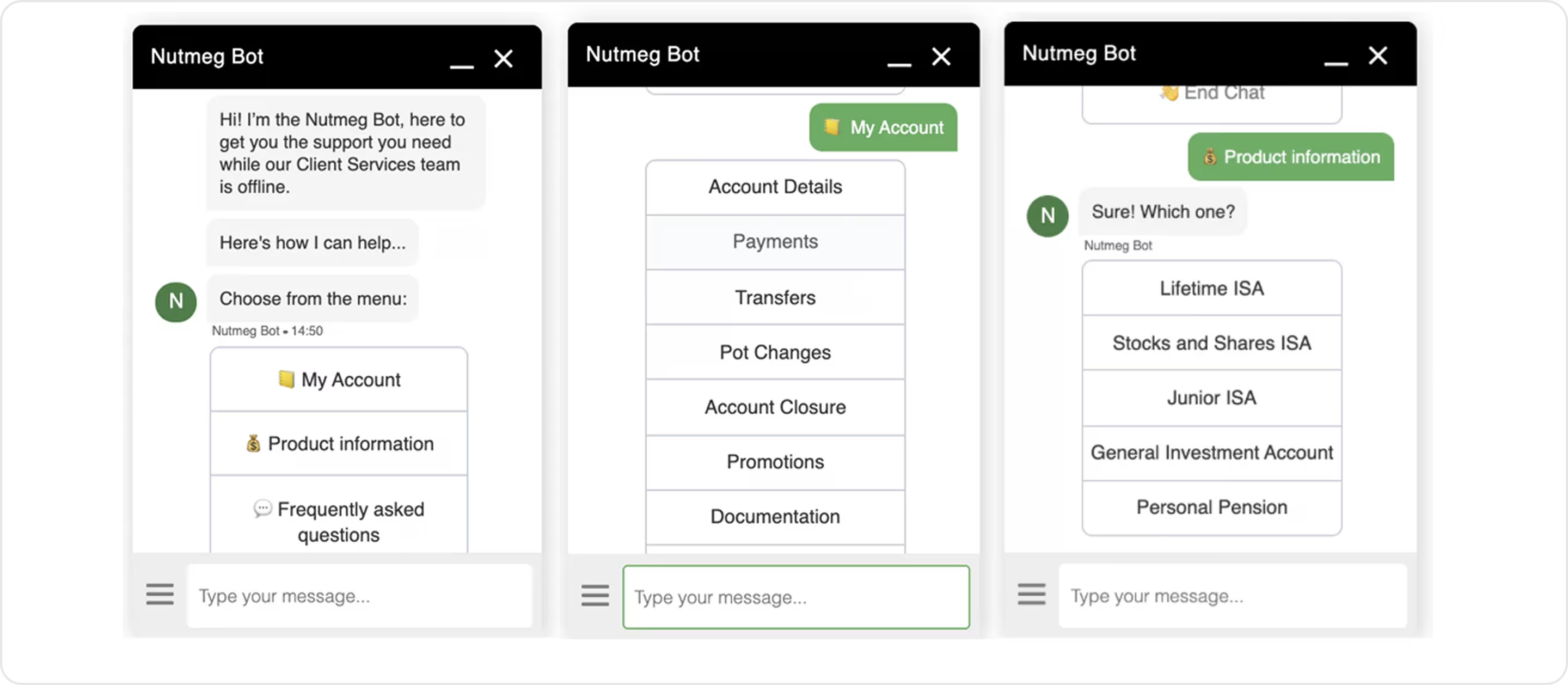
39. Nutmeg Bot
Nutmeg Bot is a support chatbot that helps users navigate investment products, answers questions from a FAQs database, and assists with any issues users have regarding their account.
The bot prioritizes clarity and containment. The UI works with soft grays and careful use of font hierarchy to create a developed sense of calm and structure within the experience; however, it lacks a stronger presentation of visual cues, which may leave users unsure whether their issue has been resolved fully.
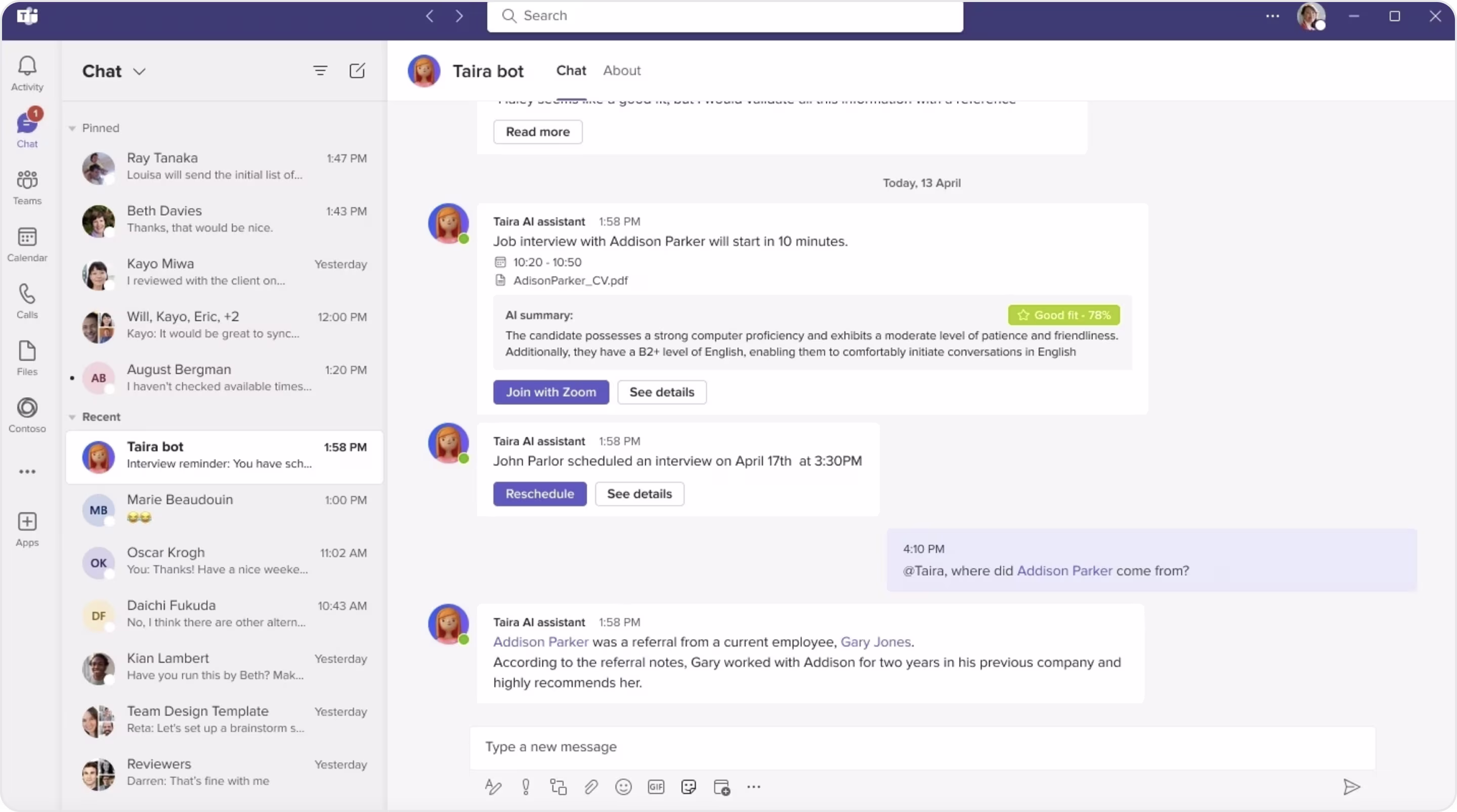
40. MyInterview Chatbot
Taira is the AI hiring assistant on MyInterview.
Its UI is designed to be clean, intuitive, and recruiter-oriented. The messaging-style layout uses clear, simple dialogues with a deliberate tone, as well as soft brand colors and organized button options to help the user navigate through every stage. All of this is done to support recruiters in a fast-paced, sometimes chaotic work environment. Suggested responses and rapid confirmations allow the user to continue to build momentum and reduce friction in a scheduling and feedback loop.
Essential Best Practices for Chatbot UI Design
To keep your chatbot from being confusing, slow, or even downright frustrating, here are principles to guide you in designing a chatbot that works.

Start with a Consistent Color Scheme and Background
Color affects how users feel about your chatbot. If your color scheme isn't even close to the UI of your product, users are likely to subconsciously think of the bot as less trustworthy. As you can see, there are so many considerations to take into account, even if you got the color part right. For instance, using an accent color from your brand for the background of the message bubble is on-brand, but if that accent color has low contrast, the readability will go down the tube.
Arounda suggests: Instead of using your one brand color everywhere, our chatbot UI designers suggest only using it for the main actions, like buttons or selected options. Choose softer colors for message bubbles that contrast with the text but will not dominate the app.
Design with the Use Case in Mind
A chatbot is not a floating widget; it is a part of a user journey. And this journey depends on the original purpose of the bot. Is it helping users with tracking orders? Guiding them through onboarding? Is it answering support questions?
Each one requires a different structure, tone, and logic for the UI. A bot that wants to do it all ends up doing nothing well.
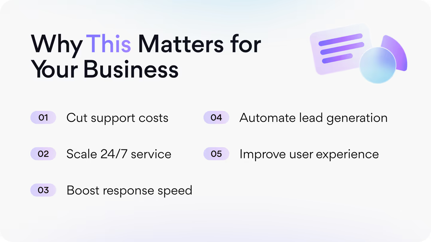
Arounda suggests: Prior to designing the chatbot UI, identify the user's intent, and decide what "success" looks like in that conversation. After that, limit each step to one specific, simple decision. Eliminate unnecessary questions, group similar replies together, and try to avoid adding open-ended inputs. The best UI is often invisible.
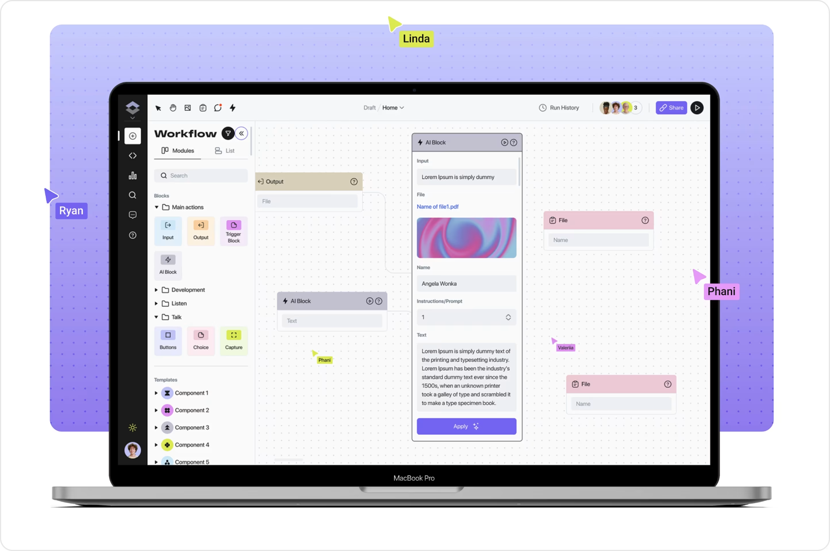
Here's one of the chatbot UI design templates we made for an AI productivity assistant. We wanted to keep the layout minimal, provide a clear hierarchy, and create single decision steps to reduce friction. It's clean, scalable, and feels intuitive, even in dark mode.
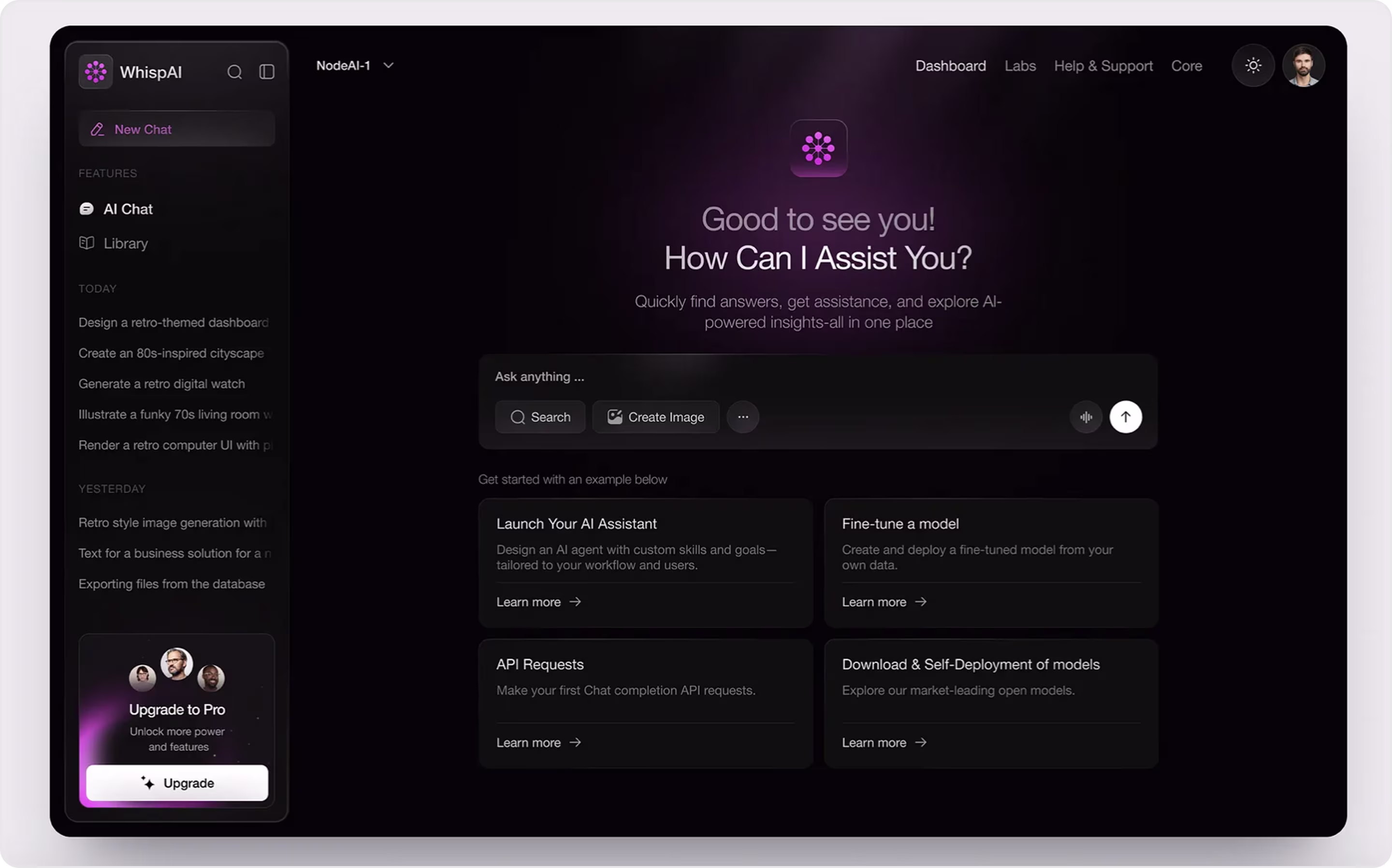
At Arounda, our Web design services are all about crafting product experiences with a purpose. When we build chatbots, we want them to feel like a natural experience, one that connects the user without real mental effort.
Organize the Layout and Visual Elements
It is all too easy to frustrate, confuse, or ruin your user's experience if your product has a cluttered layout, buttons all too close together, paragraphs that are too long, reply options that are hard to find, etc. A neat, clear visual layout can help a user get through to the pathway, without you creating barriers to focus on the message you are trying to transmit.
Spacing, alignment, and visual hierarchy all matter. Replies should always be located where the user expects them (in a messaging app that is usually directly below the last read message), and buttons should be of sufficient size for the user to tap on (specifically on mobile).
Arounda suggests: Be consistent using spacing and alignment in your chatbot! Keep buttons grouped under the right message, don't crowd your screens, and don't forget about usability (e.g., breaking up a lengthy reply with multiple replies).
At Arounda, we know that even the most beautiful layouts can fall flat if they are not designed with mobile users in mind. Here's one of the chatbot design examples we have created as a concept for a mobile AI assistant. We worked to maintain cleanliness of spacing, group buttons with the right messages, avoiding visual clutter, and generally develop a clean mobile-centric chatbot interface.
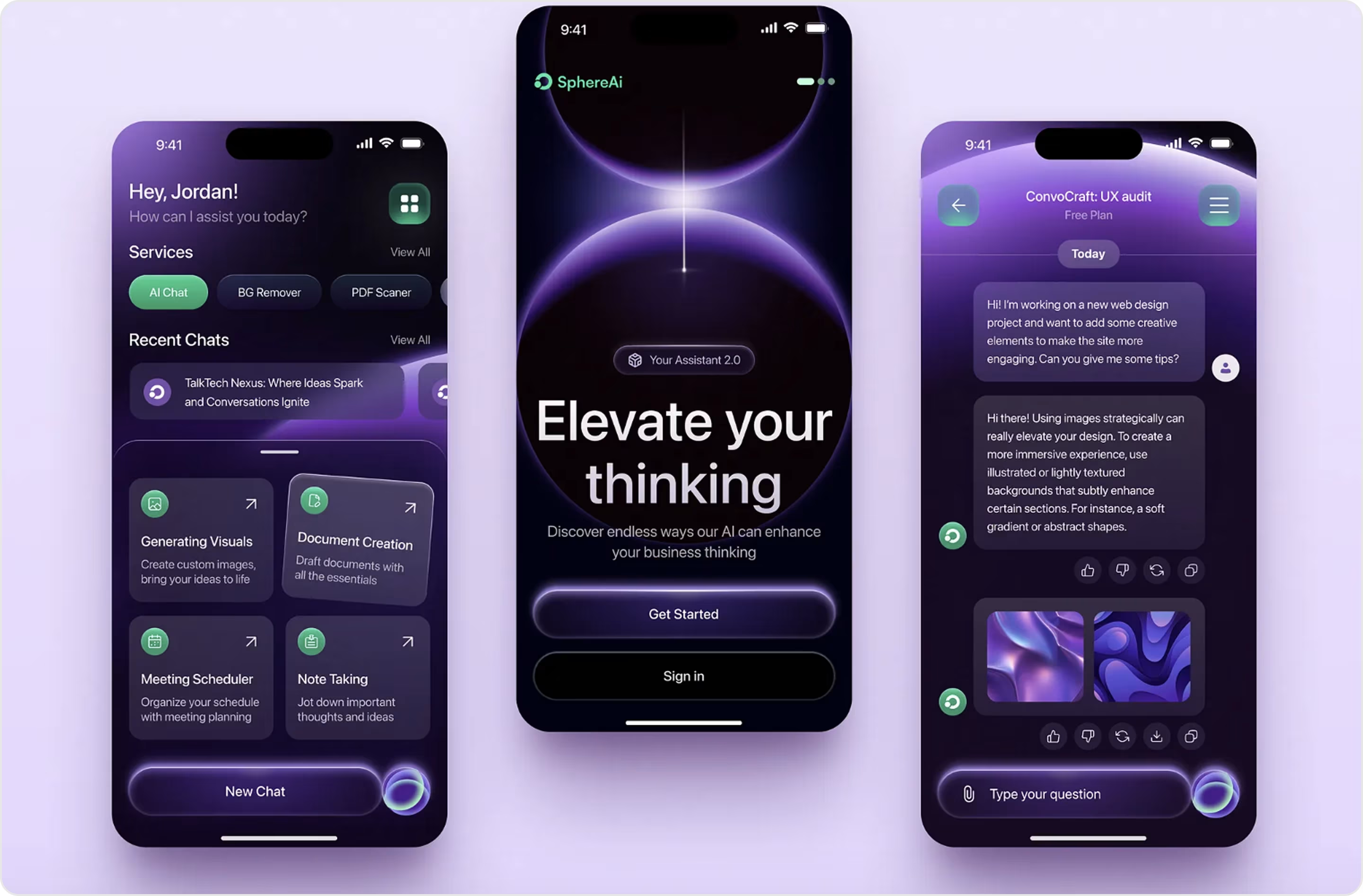
With our Mobile Design Services, we create mobile-first chatbot interfaces with clean layouts, appropriately scaled visuals, and logical conversational flows that feel natural on small screens.
Define the Chatbot's Tone and Personality
A chatbot is not just a tool; it is part of a brand voice. That is why tone and personality are equally as important as visuals. Too robotic or cold? Users won't feel engaged. Too casual or forced? Unprofessional! So, the key is in the balance; you want the chatbot to be human enough to feel warm while also being clear and purposeful.
Arounda suggests: Before you write the first line of dialog, it is helpful to identify 2-3 character traits that your chatbot will have. You can then use those traits to create a message style. Be consistent with your tone across every reply, from welcome messages to error messages.
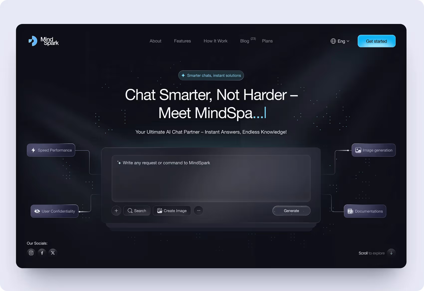
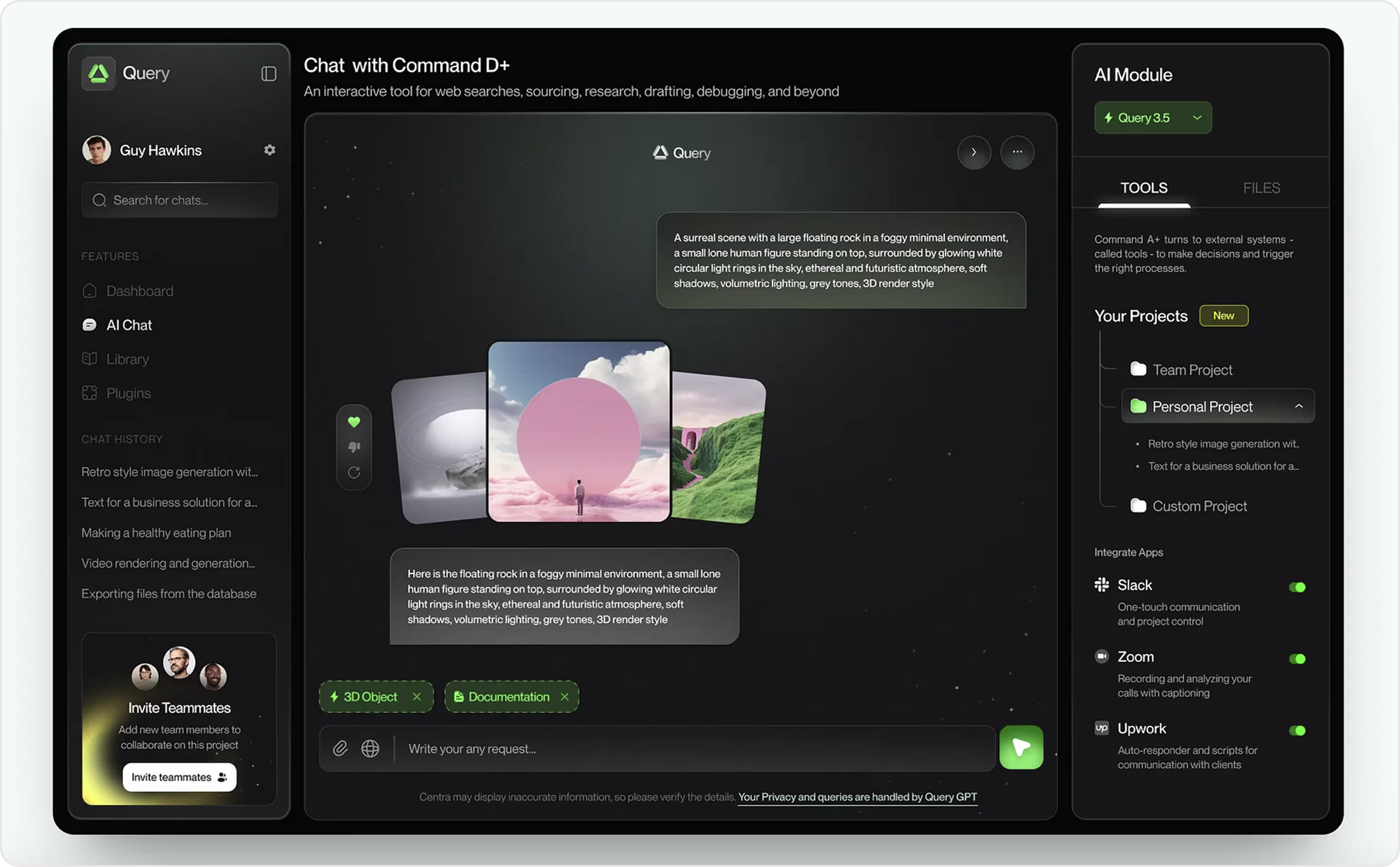
Below is a chatbot design concept we recently created for an AI assistant, whose resolute style embodies a confident, technology-inclined, and futuristic personality. The tone feels consistent and deliberate, from the hero text to the broader structure.
Ensure Readability and Flow of Conversation
Anything that hinders a user from quickly absorbing messages or makes the conversation flow seem disorganized will drive users away from your chatbot. One of the biggest missteps comes from writing long paragraphs. Density and length lead to a much harder-to-read conversation in chatbots, especially on a mobile device. When a chatbot fails in readability and flow, it invariably feels frustrating and unhelpful, even if there are serious technological chops behind it.
Arounda suggests: Send messages that are short, focused on a single idea. Help users identify what is most important through spacing and levels of visual hierarchy, and lead the user naturally from one action to the next.
Here is another chatbot UI design template created by our team. This concept stresses clean readability, each message is short and spaced properly, visual layers push the user's focus in phases, and it allows for an easy flow of conversation.
Use a Welcoming Greeting and Visual Identity (e.g., Avatar)
Regardless of the purpose of your chatbot, the greeting will be the first opportunity for the user to interact with the bot. The conversation's tone is set during the greeting. Users are not likely to trust a chatbot if it is cold and generic.
Your chatbot's visual identity is important too. Including simple things like an avatar, logo, or some other recognizable brand element helps users to quickly establish who they are interacting with, and helps them to visualize that the bot is part of your product, not simply an add-on.
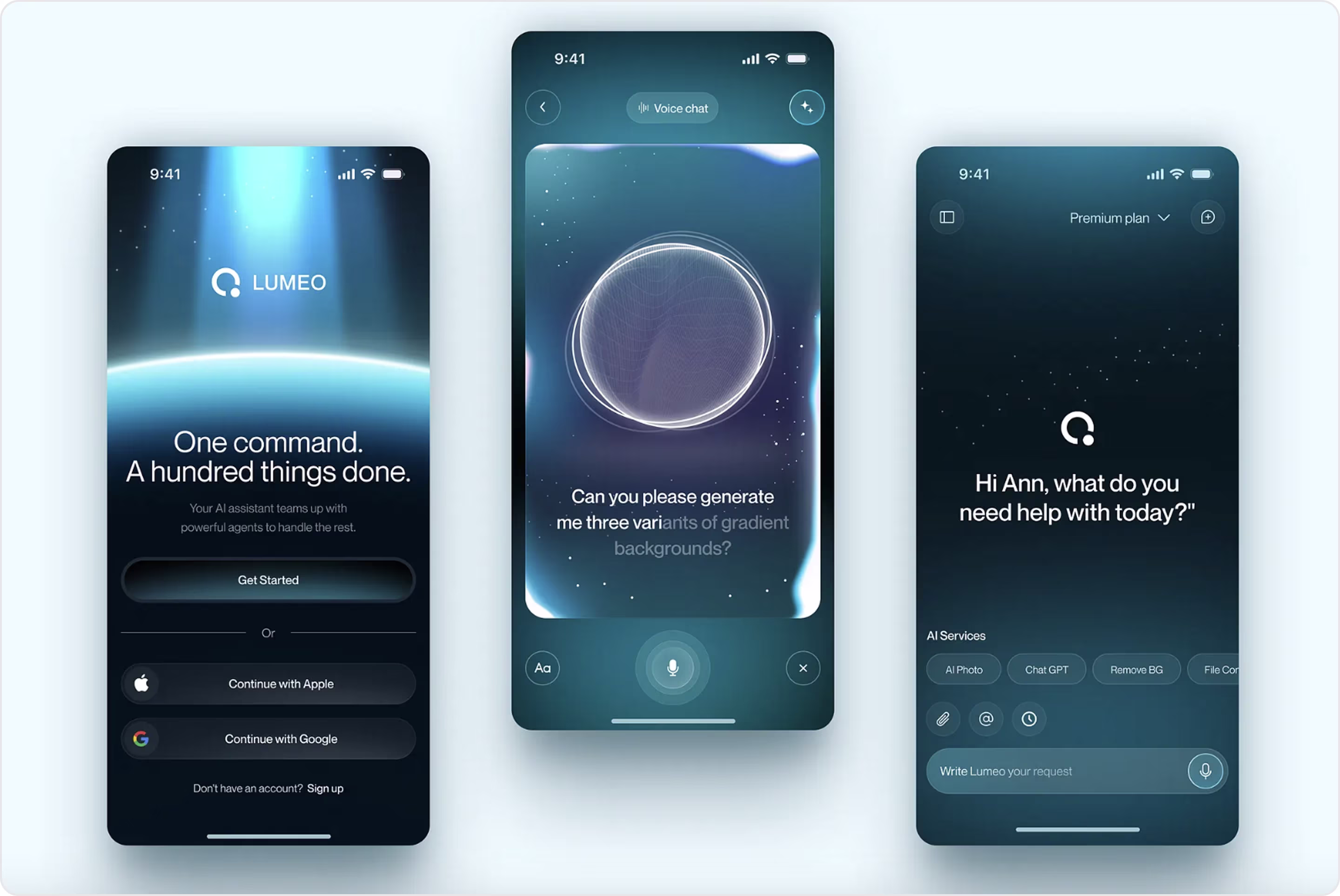
Arounda suggests: Keep your welcome message short and powerful; then include an avatar (or other visual that might represent your identity and your brand), but do not overload the user with too much content at the beginning. Here's our mobile chatbot concept, featuring a powerful welcome message, minimalist design, and bold visual identity.
Continuously Test and Improve
A chatbot is never "done." As user expectations, product goals, and the tech landscape are always evolving, permanent testing is critical! When a team does not test continuously, the little hiccups can become larger usability problems.
Arounda suggests: Get feedback from real users, and see where conversations break down or stop. Make small, precise improvements rather than significant infrequent changes - this allows you to quickly test out ideas and see what works. Test with different devices, screen sizes, and user scenarios to help ensure a consistent experience.
If you want to build a chatbot design that is naturally intuitive, solves real user problems, and avoids all major UX pitfalls, you will need experienced support. At Arounda, we know how to create chatbot interfaces that are clean, functional, and meet your business objectives. Our UI/UX Design Services are built to create a design that draws users in, reduces friction, and keeps solving user issues for years to come.
Wrapping Up
Most chatbots are easily forgettable. You've probably closed more than a couple after the first message. But the ones you remember? They were the ones who felt almost alive. Who guided you effortlessly, felt like they actually “understood” you, and made you think more positively about the brand behind them.
In this article, we have featured 40 excellent chatbot examples from popular products that you can use for inspiration. Look them over. Take what you need. Adapt it to fit your goals. If you know what you want to achieve and you need a chatbot that is truly built for solving user problems and differentiating your business in the marketplace, we can help you build your own!
Contact us and we'll create a chatbot people actually want to use.


Table of contents


FAQ
Design your chatbot to work well on small screens. Keep it simple and easy to scroll. Use large buttons so users can easily tap them with their fingers, and write short messages that don't require zooming in. Don't crowd the screen with too many options - show one screen at a time. Always leave the typing space visible when the keyboard is open. Most importantly, test your chatbot on real cell phones and get a feel for how it all looks, fits, and operates together.
Branding is where customization begins. Your chatbot should feel part of your product, not an added feature. Make the entire interface consistent with your brand colors, fonts, and style of voice. Instead of generic message bubbles, design custom ones. Pick an avatar that fits your brand personality. Write a welcome message.
Deliver fast responses, with a friendly tone, and short reply options that make the user feel directed and focused. Agent features like avatar, typing indicators, and message delays can all help humanize the bot, but should not feel slow. A well-designed chatbot user interface will respect the user, respect the time, feel frictionless, and give a continuous experience.
Begin testing with real users, not just your team. You will be able to observe the users interact with the bot without instructing them. Are they confused? Do they hesitate? Do they realize what the bot can assist with? When they drop or repeat actions, take notes. Test how the interface behaves on different screen sizes, particularly on mobile. Watch the pacing and clarity of replies from the bot, and if the tone feels like it should.
Absolutely! You can include images, videos, icons, or GIFs in your bot. A good visual can illustrate something faster than a long document of text. Just don't go too far: use the visual element to accent the conversation. Don't overwhelm it.


89+ Reviews
on Clutch

Top Rated Plus Agency
on Upwork

Top 50 Trending team
on Dribbble

Projects are Featured on Behance platform
