
How to Improve User Experience with Web Form Design

Have you ever experienced frustration while filling out a form online? Multiple inputs, forgetting a field and all your progress vanished or receiving a vague error message without any clear explanation. These scenarios are common in real-life situations.
As a result, you get confused users, lower conversions, and frustrate potential customers to the point of abandonment. They leave your page and go to your competitors.
Actually, good web form design isn’t rocket science. With the right UX principles, you can create intuitive and frustration-free forms. Our Arounda experts show practical ways to improve form usability, boost completion rates, and ensure users want to fill them out. Let’s start.
Why Web Form Design Matters For UX
Before exploring all nuances and examples, let’s answer the question: What is a web form?
It's an interactive element on a website that allows users to enter and submit data (names, emails, payment details, or inquiries). Web forms are everywhere! Sign-ups, checkouts, feedback surveys, and contact requests. They are a bridge between users and businesses that helps collect information and drive conversions. BUT! When forms are poorly designed, they don't just annoy users; they actively push them away.
Key point! No matter if it's a simple login field or a multi-step checkout process, a well-designed form should be easy, not like an obstacle course.
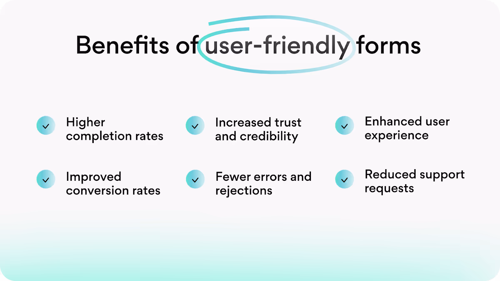
Abandoned forms mean lost leads, sales, and opportunities. Keep in mind that an intuitive user interface can increase website conversions by up to 200%, while an improved UX design can drive 400% growth.
Our golden rule: Great form UX = Higher conversions
Just take a look at the benefits of intuitive, user-friendly forms.
Your goal (as a business owner) and our goal (as designers) are the same - to get users from start to finish with zero frustration. And now, it’s time to discover how to create website forms. We will start with key principles.
Key Principles of Effective Web Form Design
The main goals of creating a high-performing web form are eliminating friction, guiding users intuitively, and optimizing for accessibility. These four principles form the foundation of conversion-driven web form experience.
Simplicity and Clarity
Your form is not a task! It should feel effortless.
Our Arounda experts recommend:
- Limit input fields and ask only essential information. Every extra field adds friction.
- Use clear and concise labels to avoid confusion. Instead of “Full Name,” specify “First Name” and “Last Name.”
- Implement inline validation to provide real-time feedback. This step prevents users from submitting incomplete or incorrect data.
- Avoid placeholder-only labels because they disappear upon typing. It reduces accessibility and usability.
Expert insight
Forms with fewer than 5 fields have the highest conversion rates.
Logical Flow and Structure
Imagine yourself as a user or remember when you enter info in any form. And only then create the form. It should follow a natural sequence that shows how users process information. Illogical order leads to frustration and drop-offs because users simply don’t understand why they input this or that data.
Our Arounda experts recommend:
- Place high-value inputs (like name and email) upfront. In other words, prioritize the fields.
- Use a single-column layout to keep a smooth scanning pattern. Multi-column forms disrupt reading flow.
- Group related fields logically (e.g., personal details before payment information) and never mix fields like billing and order details.
- Show progress indicators in multi-step forms so users know how much is left.
- Place the easiest fields first to reduce drop-offs.
Look at one of our examples of how to show progress indicators (simple and clear).
Visual Hierarchy and Design Consistency
Users should instantly recognize where to start and what actions to take. No hesitation at all!
Our Arounda experts recommend:
- Design a clear contrast between the background, input fields, and CTA buttons. This step improves visual clarity.
- Use size and color variations to emphasize required fields and primary call-to-action buttons.
- Make sure that form spacing and alignment are consistent across devices. It’s an important usability point.
- Pre-fill fields when possible (e.g., auto-detect country, prepopulate email in returning visits) to reduce typing effort. It will speed up users' actions as they might think that the process has already started.
Accessibility for All Users
An inclusive web form accommodates all users and meets all regulations. This is an essential and must-have point for all digital products.
Our Arounda experts recommend:
- Support keyboard navigation. Users should be able to navigate without a mouse.
- Provide descriptive error messages (e.g., "Invalid phone number. Use format: (123) 456-7890" or "Invalid input" change to "Please enter a valid email") instead of generic alerts. People often don't know what the problem is and if the error occurs from their side or the company. That's why, explain it clearly.
- Use ARIA attributes and label elements properly for screen readers to assist visually impaired users.
- Create adequate color contrast. Low-contrast designs alienate users with visual impairments.
Expert insight
1,3 billion people worldwide experience some form of disability, so accessibility is a business necessity, not an optional one.
When you are at the beginning of a web page form design, think about a good structure!

Structuring Your Web Form
A cluttered, poorly organized form can cause frustration and increase abandonment rates. People want to complete forms fast without unnecessary steps and try to understand what and where they have to input. To create such an enjoyable experience, focus on layout, grouping, prioritization, and length.
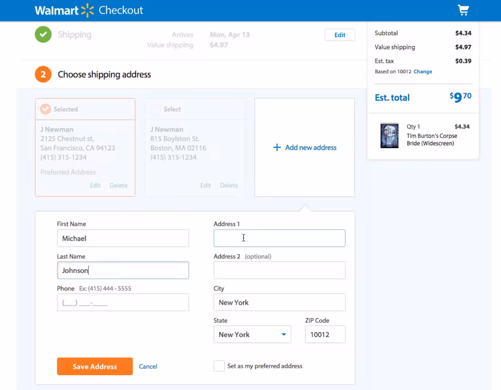
One-Column vs. Multi-Column Layouts
Users linearly process information. That is why a single-column form is a gold standard for usability.
One-column forms provide top-to-bottom flow, reduce cognitive load, and improve completion rates. They also outperform multi-column ones in speed and accuracy.
Instead, multi-column layouts disrupt the reading pattern, force users to navigate from one field to another, and, as a result, increase the number of errors. But if multiple fields must be placed side by side (e.g., first and last name), make sure they are logically related to each other to avoid confusion.
Let’s take a look at multi-column examples that we would definitely improve on!
Grouping Related Information
If your forms have many fields, then group them! Users shouldn’t have to search for the next logical step. Forms should feel intuitive from start to finish.
- Cluster related fields together (e.g., personal details - one group, shipping address - second group, and payment info - the third one).
- Use headings and spacing to separate sections visually.
- Reduce unnecessary inputs because each extra field increases friction.
Order Fields by Priority
Users expect a logical flow when filling out a form.
Our Arounda experts recommend:
- Start with easy fields (e.g., name, email).
- Place optional fields last because when you force users to think too much early on, it increases drop-offs.
- Make required fields obvious (with asterisk *, color, or clear label).
Keep the Form Length Short
Every additional field adds friction, so only ask for what’s necessary. Use progressive disclosure for complex forms. It’s a very good and common practice to break them into steps rather than presenting all fields simultaneously. If possible, use autofill and dropdowns to minimize typing.
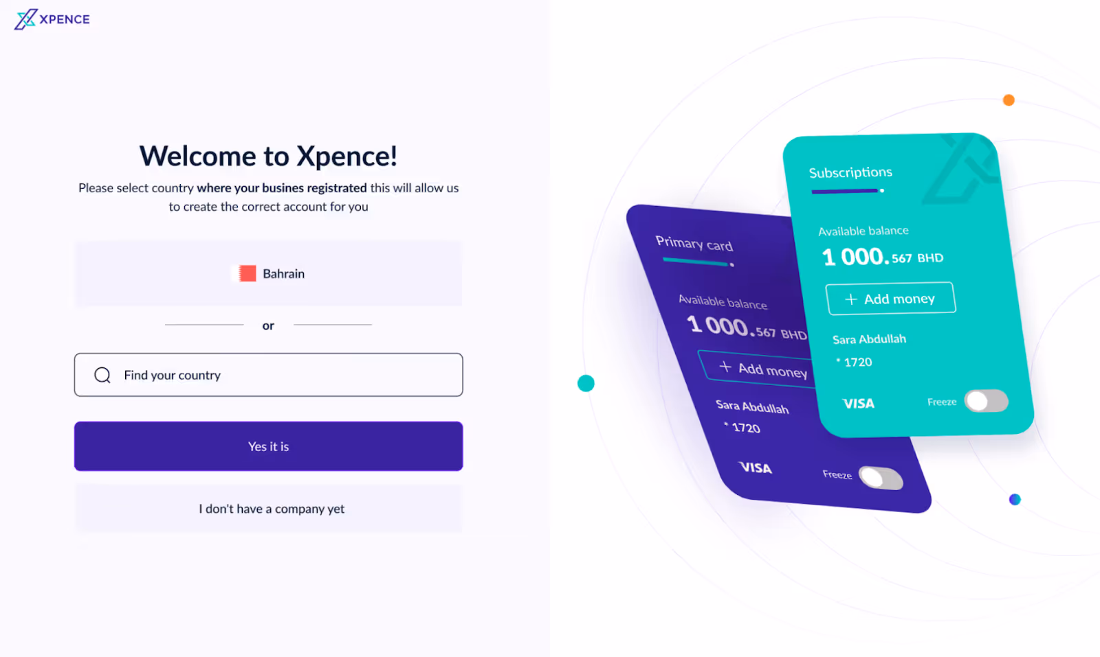
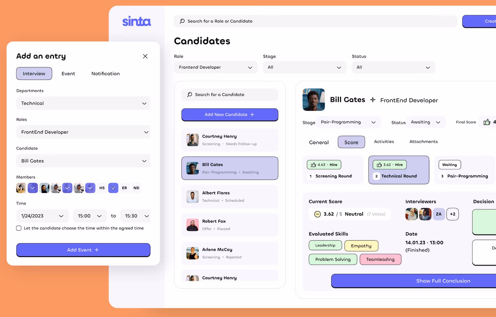
Here’s an example of an event scheduling form with dropdown fields from one of our SaaS projects - Sinta for HR.
Enhancing Input Fields
Input fields are the backbone of any web form, but they're also one of the most common sources of user confusion. Let's discuss how to make them look good.
Minimizing the Number of Fields
Removing non-essential fields can improve conversion rates by reducing decision fatigue and form closure. Only ask for critical information, consolidate data whenever possible, and use autocomplete and smart defaults to minimize manual entry efforts. Name, email, and credit card are often used by smart defaults.
Using Default Values and Input Masks
Users should never have to guess the correct format when entering data. Pre-filled values and input masks help guide them and reduce errors.
Our Arounda experts recommend:
- Auto-populate known information (e.g., detect user location for country selection).
- Implement input masks for proper formatting (e.g., automatically applying parentheses and dashes to phone numbers: (123) 456-7890).
- Use placeholder text wisely (instead of disappearing placeholders, provide persistent field labels to avoid confusion).
Inline Validation and Feedback
A well-designed form doesn't wait until submission to notify users of mistakes. Real-time validation improves accuracy, reduces frustration, and prevents unnecessary rework.
Our Arounda experts recommend:
- Instantly flag incorrect email formats, password strength, or missing required fields.
- Provide actionable, context-specific error messages (e.g., "Password must be at least 8 characters and include a number" instead of a generic "Invalid input").
- Use subtle visual cues (e.g., green checkmarks for correct inputs, red outlines for errors).
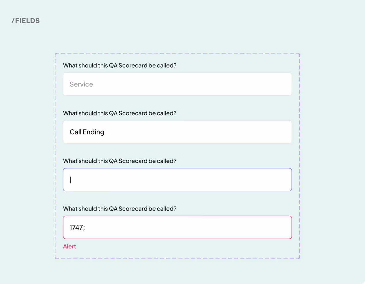
Here’s an example of a simple but effective visual prompt for incorrect field entry from our case, Mojo-CX.
Making Forms Keyboard and Mobile-Friendly
A web form must be optimized for seamless interaction across devices (particularly as mobile usage continues to dominate). Touch-friendly, keyboard-accessible forms improve usability and completion rates.
Our Arounda experts recommend:
- Enable full keyboard navigation.
- Use mobile-optimized input types. Display the numeric keypad for phone fields, the email keyboard for email fields, and date pickers where necessary.
- Target the button and field tap at least 48px to prevent accidental clicks on mobile devices.
You might think that’s it. All information is in. Probably, the form is ready…
Not exactly. Take care of your users and offer them instructions because all these fields are clear to you because you know your product very well, but first customers do not!
Optimizing Labels and Instructions
Clear labels and well-placed instructions reduce user errors and improve form completion rates. Users shouldn't have to guess what to enter or wonder why their input isn't accepted.
Avoiding Placeholder Text as Labels
We observe that many forms rely on placeholder text inside input fields instead of actual labels.
How and why it is a problem:
- Placeholders disappear when users start typing, so they can't review input.
- Users who navigate via keyboard or screen readers may miss the field's purpose.
- Low-contrast placeholders are hard to read, especially for users with visual impairments.
Our Arounda experts recommend:
- Use persistent, visible labels above or beside input fields.
- Provide additional context in subtext below the field rather than inside.
- Keep proper contrast and font size for readability.
Adding Helpful Hints or Tooltips
Tell your users what they should enter or even show examples. Providing contextual guidance improves accuracy and reduces frustration.
Our Arounda experts recommend:
- Offer guidance for email and password fields, phone numbers or addresses, and complex form fields.
- Provide inline hints beneath fields to clarify expectations (e.g., "Password must be at least 8 characters" or "Enter phone number without country code").
- Show validation messages dynamically (e.g., "Strong password" vs. "Weak password").
We have a question for you: “What is the most eye-catching element in the form?” Yeah, action button or call-to-action (CTA) button. So let’s make it wonderful!
Designing Action Buttons
We consider action buttons a driving key because they ensure a complete process. These buttons must be well-placed and clearly labeled.
Button Placement and Size
Where and how you position action buttons directly impacts usability and conversion rates. Just think about the fact that center-aligned CTAs attract 682% more clicks as compared to left-aligned CTAs! So…
Our Arounda experts recommend:
- Align buttons logically with the form flow. Users should not have to search for the submission button.
- Place the primary action button at the bottom of the form to maintain a natural reading order.
- Include a "Back" button for multi-step forms to let users navigate without losing progress.
- Avoid placing buttons too close together. This prevents accidental clicks (especially on mobile devices).
- Make CTA buttons large enough to be easily clickable (minimum recommended size: 44x44 pixels for mobile).
- Use adequate padding around the button to prevent misclicks.
- Remember about accessibility. Buttons should be easily clickable for users with motor impairments.
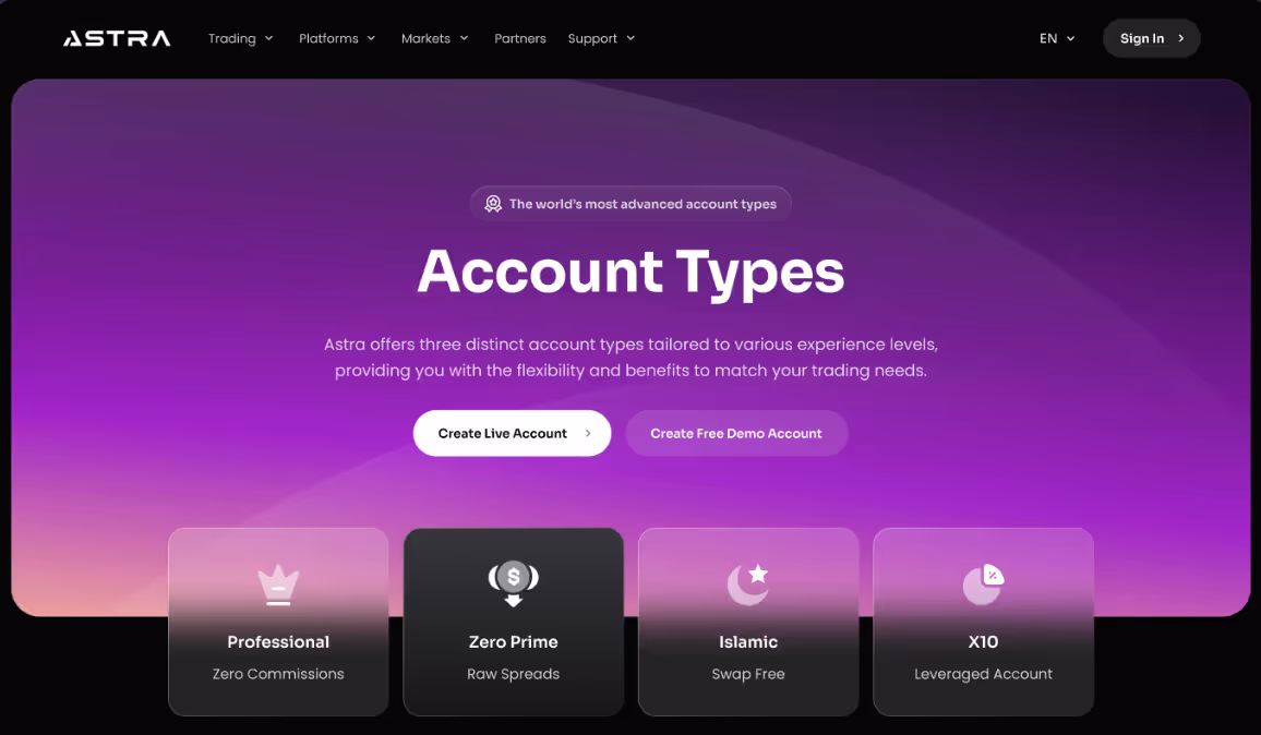
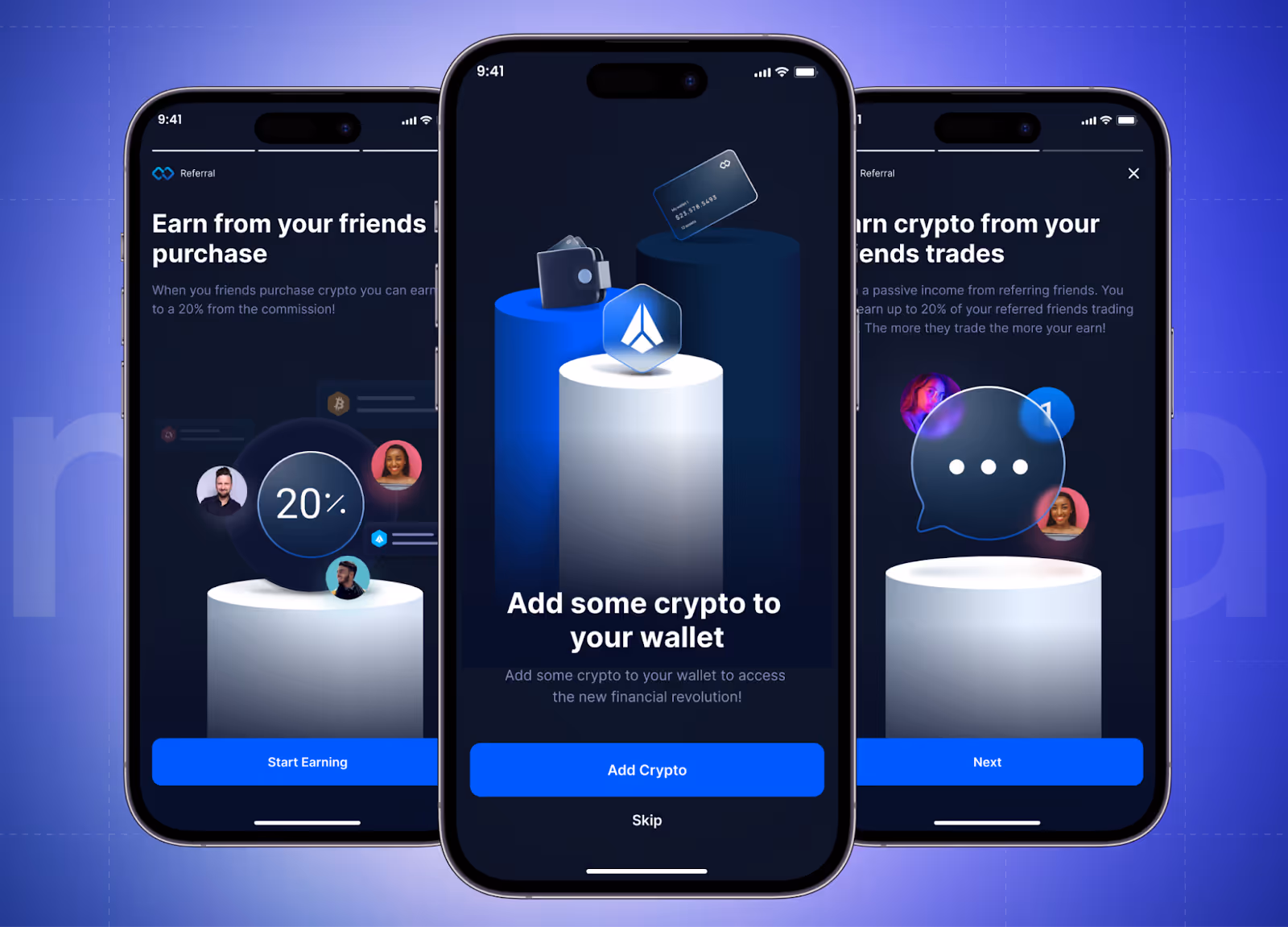
Well, let's see the web and mobile CTA button design from our Web3 case, Astra, and crypto wallet case, Infinity.
Clear Call-to-Action (CTA)
CTA buttons should clearly communicate the next step and eliminate any doubt about what will happen when clicked. We demonstrated examples higher, but here are some points we want to emphasize.
Our Arounda experts recommend:
- Contrast the buttons to make the primary action stand out.
- Use action-driven language (e.g., "Sign Up," "Get Started," "Submit Application," "Download") instead of vague terms like "Continue."
- If an action is irreversible (e.g., payments, deletions), provide conformational messaging next to the CTA.
- Avoid using multiple CTAs in the same form.
- Secondary buttons (e.g., "Cancel" or "Skip") should have a lower visual priority (lighter color or outlined design).
- Provide loading indicators or success messages to reassure users that their action is processed.
Depending on the industry, people prefer using smartphones for some fast operations (buying stuff, sending money to family members, downloading books during trips, or changing data in fitness apps, etc.). That's why mobile forms must be user-friendly and fully meet the requirements. Let's talk about it now.
Mobile-Friendly Form Design
Over 63% of global traffic comes from mobile devices, so optimizing forms for small screens is necessary. A poorly designed mobile form leads to frustration, high abandonment rates, and lost conversions. We always focus on responsive layouts, touch-friendly interactions, and device-specific enhancements.
Optimizing for Small Screens
Imagine such a day! You're on the go, hurrying up to a business meeting, when you remember your friend's birthday is Saturday, and you still need a gift. You find the perfect one on the app "Y," but the form is too small and unclear. You don't understand what to insert in those tiny fields. Frustrated, you close the app, thinking, "I'll do it later," but you forget.
Lost business opportunities for the "Y" product owner, right? It means that this app needs a redesign!
Our Arounda experts recommend:
- Use a single-column layout to prevent horizontal scrolling and maintain readability.
- Keep padding and margins consistent to avoid crowding and accidental clicks.
- Ensure that text remains legible without zooming (use a minimum font size of 16px).
- Use large, tap-friendly input fields with a minimum height of 44px for easy touch interaction.
- Auto-focus on the first input field when the form loads to guide users smoothly.
- Place CTA buttons within thumb reach to minimize hand strain.
- Use sticky CTA buttons (fixed at the bottom of the screen) for easy access to long forms.
- Provide instant feedback when a button is tapped (e.g., color change, loading animation).
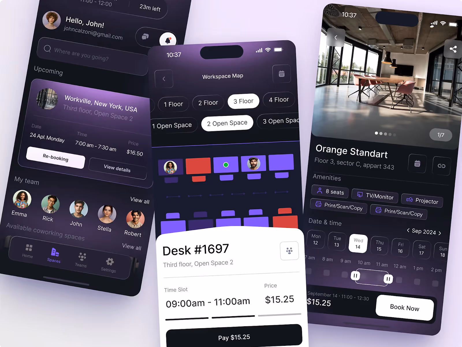
One more mobile app form design example from our case is Galaxy.
Using Device-Specific Features
You can make the form-filling experience even easier, more enjoyable, and faster.
This is how:
- Display the numeric keypad for phone number fields.
- Show the email keyboard (with the "@" symbol) for email or telegram (for crypto app) inputs.
- Use date pickers instead of manual text input for dates.
- Allow password managers to auto-fill login credentials.
- Use location services to auto-fill city and country fields.
- Support browser autofill for commonly entered details like name and email.
- Use tap-friendly checkboxes and radio buttons instead of small clickable areas.
- Enable swipe gestures where applicable (e.g., address selection).
- Offer a one-tap address lookup via Google Places API to save typing effort.
We have a great example of interactive information choices. You can choose the date, time, and location. No need to type all the information. And pay attention to clear CTA! Not just "Pay" but "Pay $15.25". It provides the exact info so users save extra seconds without checking the details (we've already taken care of this).
When everything is ready, time to drink a cup of coffee/tea/water/whatever? For a break - yes, because the next step is testing.
Testing and Improving Your Forms
A well-designed form boosts performance. But how can you be sure that your form is great? Analyzing user behavior, testing variations, and gathering direct feedback help understand users better and refine forms to avoid friction points.
A/B Testing for Layout and Fields
A/B testing allows you to compare different form designs to see which one performs best. From our experience, even small adjustments (changing the field order, button placement, or input type) can impact completion rates.
What to test:
- Single-column vs. multi-column layouts to determine which improves readability in your case.
- Field reductions (e.g., testing a short vs. long form) to measure the impact on abandonment rates.
- CTA button text and color to see what drives more conversions.
- Real-time validation vs. error messages on submission to reduce frustration.
Analyzing Completion Rates and Drop-Off Points
Tracking user interactions with your form helps identify where users drop off or struggle. Check heatmaps, analytics tools, and form tracking to reveal usability problems.
What metrics to monitor:
- Completion rate (how many users start and successfully submit the form).
- Field abandonment rate (which specific fields cause users to quit).
- Time to completion (how long it takes users to fill out the form).
- Error rates per field (identify problematic inputs that need clearer instructions).
We recommend different tools for analysis, choose what best suits your business needs: Google Analytics, Hotjar, Clarity, Zuko, Heap, etc.
Gathering User Feedback for Improvements
Direct user feedback provides valuable insights into pain points, confusing fields, and overall usability.
How we recommend to collect feedback:
- Post-submission surveys (ask users about their form experience).
- Live chat assistance (provide real-time help if users get stuck).
- Usability testing (observe real users filling out the form to identify issues).
Gathering qualitative insights from real users, not just analytics, often reveals usability issues that data alone won't capture.
Our team offered you different examples from our experience, but we want to show you even more and explain things in a little bit of detail. We care that you get a full understanding of the best website form design!
Examples of Great Web Form Design
Let's explore two contrasting industries, Fintech and SaaS, to understand how web forms work for different purposes.
Stripe
One of the good examples is Stripe, a financial technology platform that allows businesses of all sizes to accept payments, manage revenue, and automate financial operations.
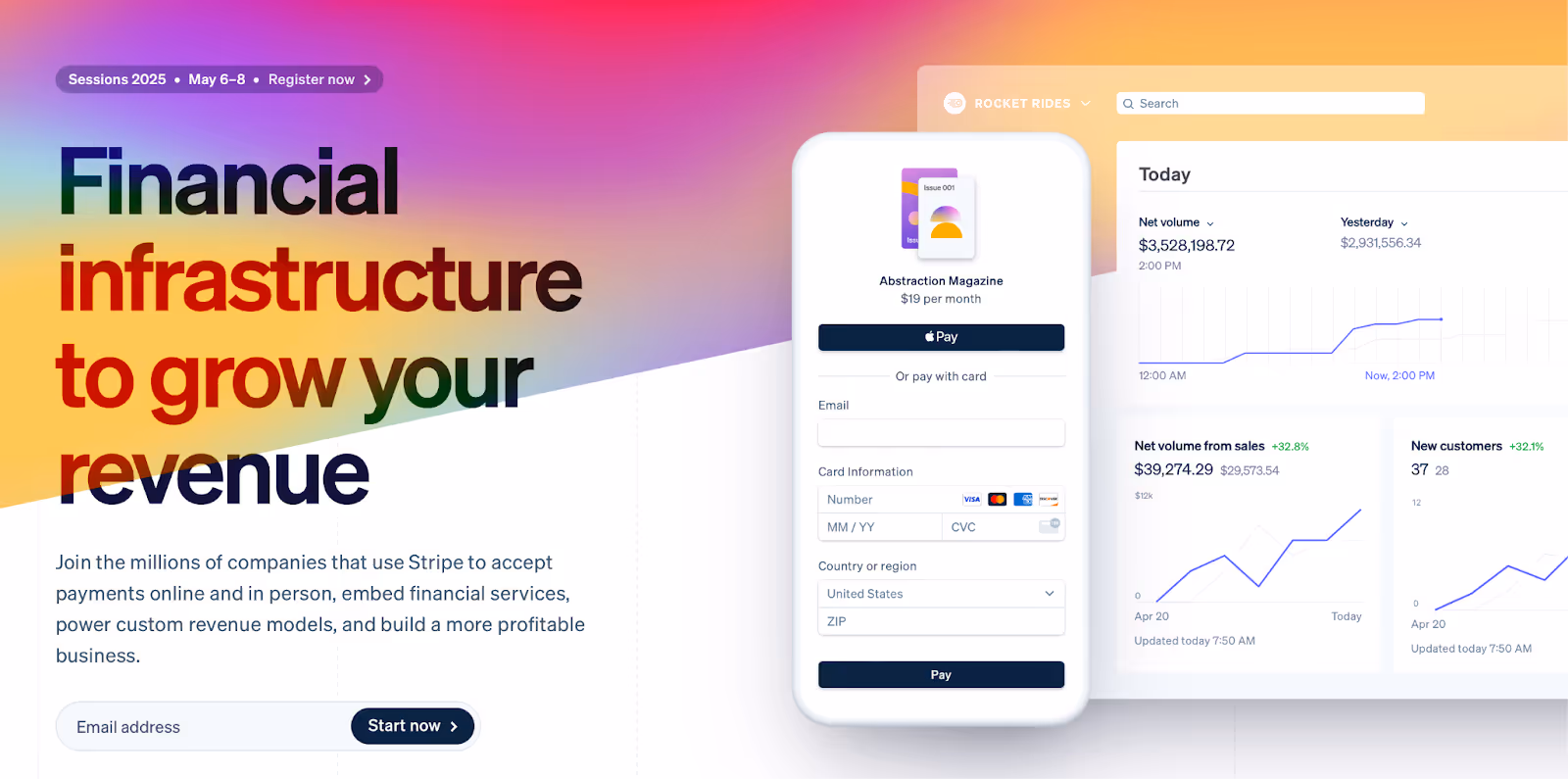
Stripe's web forms exemplify clarity, efficiency, and user-friendliness.
Design accent:
- Minimalist design.
- Single-column format.
- Clear and persistent labels.
- Pre-filled country field.
- Strong CTA button design.
- Mobile-optimized input fields.
- Real-time validation & feedback.
Why do stripe forms work well? They are intuitive and conversion-focused.
Now, let's jump into the SaaS example our Arounda team designed.
MOJO-CX
MOJO-CX is a SaaS B2B platform developed to improve contact center operations. It uses AI-driven real-time coaching and conversational prompts to help contact center leaders reduce costs, boost revenue, and improve service quality. The platform integrates functionalities from three existing products into a unified solution to offer a comprehensive suite of services tailored for contact centers.
Our designers created a long registration web form with all the necessary information, and we want to show and explain our solutions.
When users decide to register, they get a 4-step form divided by sections. By breaking the form into steps, users aren't overwhelmed with too many fields at once, which improves completion rates. The first one is "Introduction".
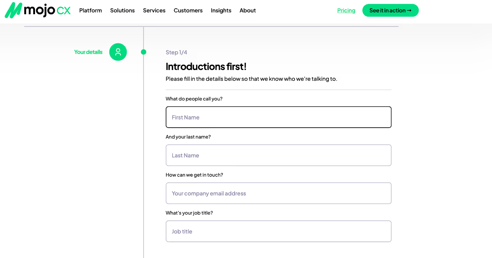
Design accent:
- A single-column format for easy readability and navigation.
- Fields are clearly labeled with visible placeholders for guidance.
- A progress indicator keeps users informed about the steps ahead to reduce uncertainty.
Then, people jump into the second step about business info. Grouping related information keeps the form structured and prevents cognitive overload.
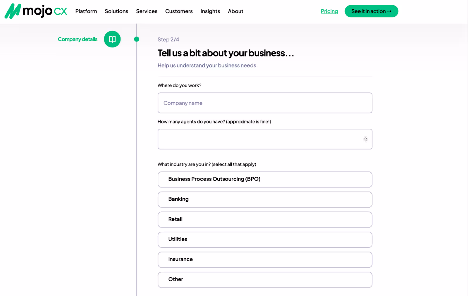
Design accent:
- Business-related questions help personalize the platform's features.
- Multi-select industry buttons make it easy for users to identify their sector.
- Concise language provides clarity in input expectations.
The next step is about user interest. The answers help offer the best-customized solutions. Replacing standard dropdowns with interactive selection cards creates a more engaging experience.
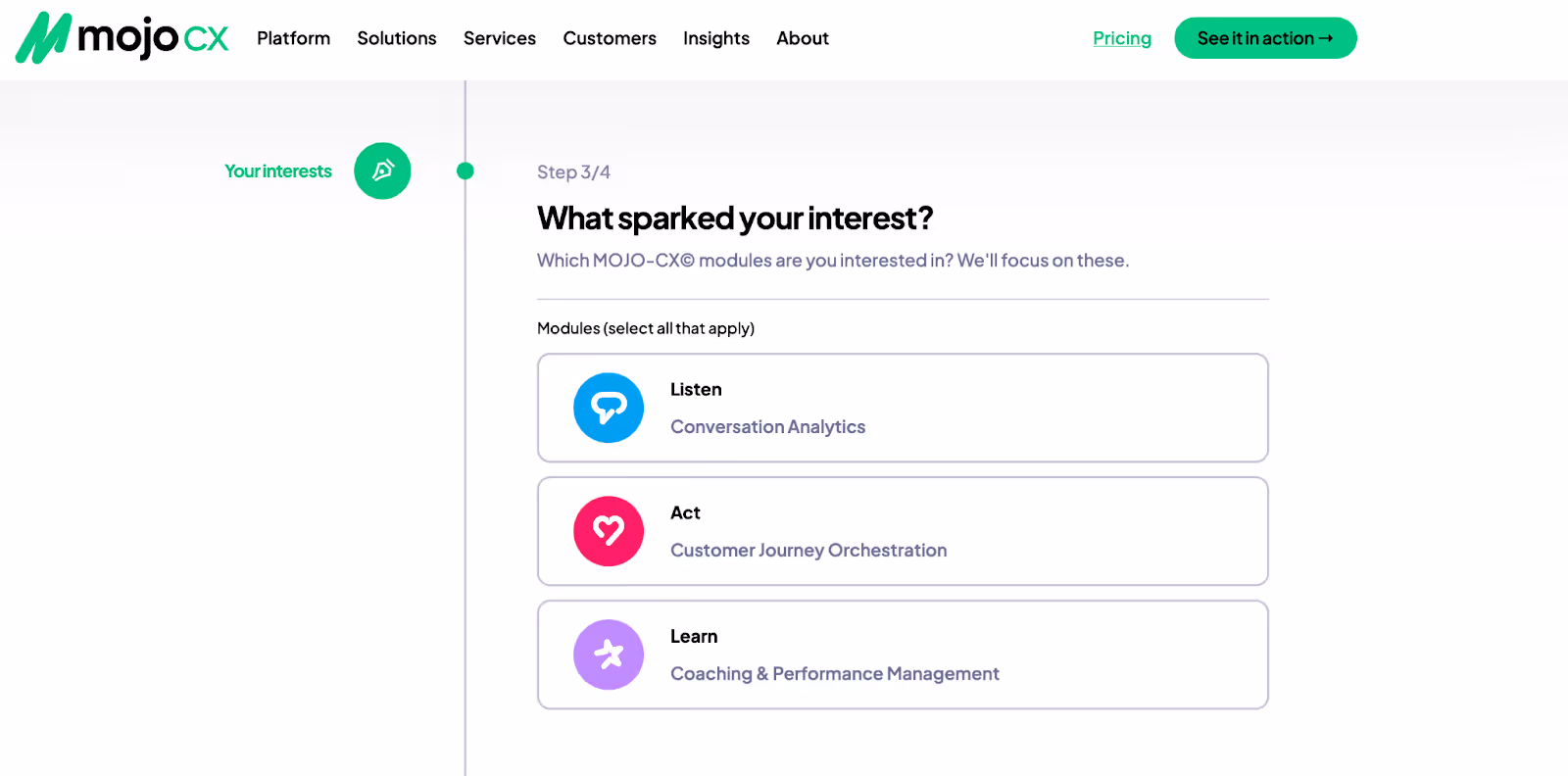
Design accent:
- Visually engaging selection cards for module preferences (e.g., Listen, Act, Learn).
- Icons and colors to make selections more intuitive and scannable.
- A consistent visual hierarchy ensures that users instantly recognize options.
And the final open-ended question adds a personalized touch. It shows users that their business needs are valued. We also recommend making it the shortest one.
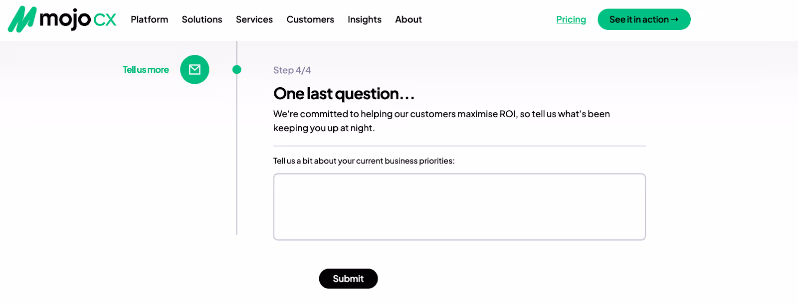
Design accent:
- An open-ended text box gathers unique insights from users.
- The submit button is prominent so users can complete the process effortlessly.
- Empathetic messaging ("We're committed to helping you maximize ROI...”) keeps users engaged.
These forms are an excellent example of progressive disclosure in UX design. The strategic use of visual hierarchy, progress indicators, and interactive elements ensures a frictionless onboarding experience.
And the most important!
Our design team fully met the MOJO-CX's business needs. But for us, success isn’t just about delivering great design; it’s about seeing our clients thrive. When our clients are happy, we’re even more motivated to create masterpieces.
Your product deserves the same level of care and expertise. Need to refine your platform’s UX, create high-converting web forms, or build a stunning digital experience? We’re here to help.
Final Thoughts
What is an ideal web form for users?
A smooth and intuitive one that guides them effortlessly. Each field makes sense. Input is easy. Errors? Instantly corrected. Within seconds, they complete the process. Confident and satisfied!
That’s the power of great and careful design.
Creating an experience that builds trust, drives action, and keeps users engaged? Not a problem! At Arounda, we don’t just design forms. We craft digital experiences that remove friction and maximize conversions, no matter if it’s onboarding, payments, or lead generation. Every detail, from button placement to real-time feedback, is fine-tuned to make interactions really useful, fast, and pleasant.
Is your web form helping or hurting your business? Let’s build one that works for you and your users.


Table of contents


FAQ
Inline validation is a real-time error detection system that provides immediate feedback as users fill out a form. It dynamically checks inputs and offers corrections, confirmations, or warnings at the moment of entry. No need to wait until submission to notify users of mistakes Why it is important: - Users don’t have to resubmit a form multiple times due to missed errors. - Speeds up web form completion and prevents abandonment. - Minimizes cognitive load as it removes guesswork and allows users to correct errors as they go. -Improves mobile usability with instant and clear feedback so users with small screens and virtual keyboards don’t need to scroll or re-enter information.
The golden rule is to only ask for what’s necessary. Long forms overwhelm users and lead to higher abandonment rates. Our Arounda experts recommend: - For sign-ups, keep it under 5 fields (e.g., name, email, password, and minimal extras). - For checkouts, ask for only essential payment and shipping details. Autofill can handle the rest. - For lead generation, limit to name and email to encourage more submissions (if possible).
Arounda team recommends: - Use a single-column layout to avoid horizontal scrolling. - Make buttons and input fields at least 44px for easy tapping. - Display the correct mobile keyboard (e.g., numeric for phone numbers, email keyboard for email fields). - Enable autofill and predictive text to speed up data entry. - Avoid tiny checkboxes.Use toggles or larger tap targets. - Remember about accessibility.
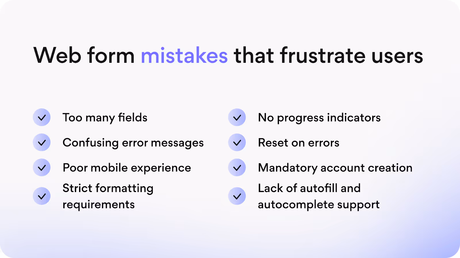
Many forms fail due to avoidable design mistakes that create friction, confuse users, and lead to high abandonment rates. Here are the most critical pitfalls to avoid: - Using placeholder text as labels. - Requesting too much information. - Poor error messaging and lack of inline validation. - Ignoring mobile usability. - No accessibility optimization. - Weak CTA buttons. Poor visual hierarchy. - Lack of progress indicators in multi-step forms. - No autofill and predictive text.
How the autofill and predictive text help: - Autofill retrieves saved details (e.g., name, email, or payment info) and reduces manual entry. - The predictive text helps users fill in expected values faster (especially in address and search fields). - Browser and device integration makes forms feel seamless. Google Chrome, iOS, and Android all support autofill functionality.


89+ Reviews
on Clutch

Top Rated Plus Agency
on Upwork

Top 50 Trending team
on Dribbble

Projects are Featured on Behance platform
