
20 Filter UI Examples for SaaS: Design Patterns & Best Practices

The user experience in SaaS products depends heavily on filters, as they either enhance or detract from the overall experience. A well-designed filtering system enables users to efficiently discover their needs, leading to higher customer satisfaction and retention rates. And since every $1 invested in UX design returns $100, selecting an appropriate filter UI and implementing it effectively remains a crucial yet challenging task for many users.
As a UI/UX design agency with extensive experience in SaaS, we've personally seen how effective filtering has transformed frustrated users into satisfied customers. Our team has designed, prototyped, user-tested, and audited many filtering systems, and we've learned what works, what almost works, and what doesn't work.
Arounda team has created this article to provide you with a visually simple overview of 20 established filter patterns. We will delve into some common design patterns, highlight common dilemmas you will encounter, and provide actionable best practices to help you develop usable and accessible filtering solutions.

Article Key Takeaways
SaaS product usability and speed depend heavily on filters as essential design elements. The right design of filters enables users to navigate through complex interfaces, locate their required information, and maintain their focus.
This article presents 20 effective filter UI patterns through real design examples and pros/cons analysis for each pattern, including dropdowns, checkboxes, chips, date pickers, and AI-assisted filters.
Here we address typical design challenges while providing testing advice and warning about placement errors and mobile UX issues. The filtering strategies presented in this guide will enhance the usability of SaaS products and improve user retention for developers who build or upgrade their software products.
What does filtering mean and where can we see it in action?
Filtering enables users to slice or narrow down information or results, allowing them to discover precisely what they need quickly and easily. We all use filters throughout our daily routines and often don't even recognize them as such.
For example, e-commerce websites allow you to filter items for sale to a specific price range, size, or brand. Travel apps use filters to specify/limit relevant information by airline, departure time, or prices. Music streaming apps use filters by artist, genre, or mood.
In the world of SaaS applications, filtering is a way for users to manage and work with large amounts of data. In project management tools, filtering can be used to sort tasks by deadlines or team members. In a CRM, you may want to filter contacts by company size or industry, and in analytical dashboards, you could filter for regions, timeframes, or metrics.
The primary reason for filtering is to save users' time and minimize their confusion. Well-developed filters help simplify complex information. Over the long run, this helps to create user satisfaction and overall efficiency within your application.
Types of Filter UI Design (With Examples)
Learning from others helps you create an excellent filter system for your SaaS product. Digital products, including apps, platforms, and websites, address comparable filtering requirements. Analyzing filter examples will help you identify effective patterns and prevent typical problems while discovering relevant concepts for your product.
This section examines the most frequently encountered filter UI design types with explanations of their effectiveness.
1. Dropdown filters
The most widely used element in filter design UI consists of dropdown filters. Users can select an option from a displayed list after clicking on the field. The interface remains clean and compact because of this feature, which benefits situations with numerous choices and restricted screen space.
The widespread adoption of dropdowns stems from their familiar operation to users. The interface benefits from dropdowns because they conceal less critical options until users require them. But the default hidden nature of dropdown choices makes users overlook available filtering options. Navigating extended dropdowns becomes more challenging for mobile users due to their length.
Here's an example from our work with TalentHive, a web platform that enables teams to manage, schedule, and support collaboration in the workplace.
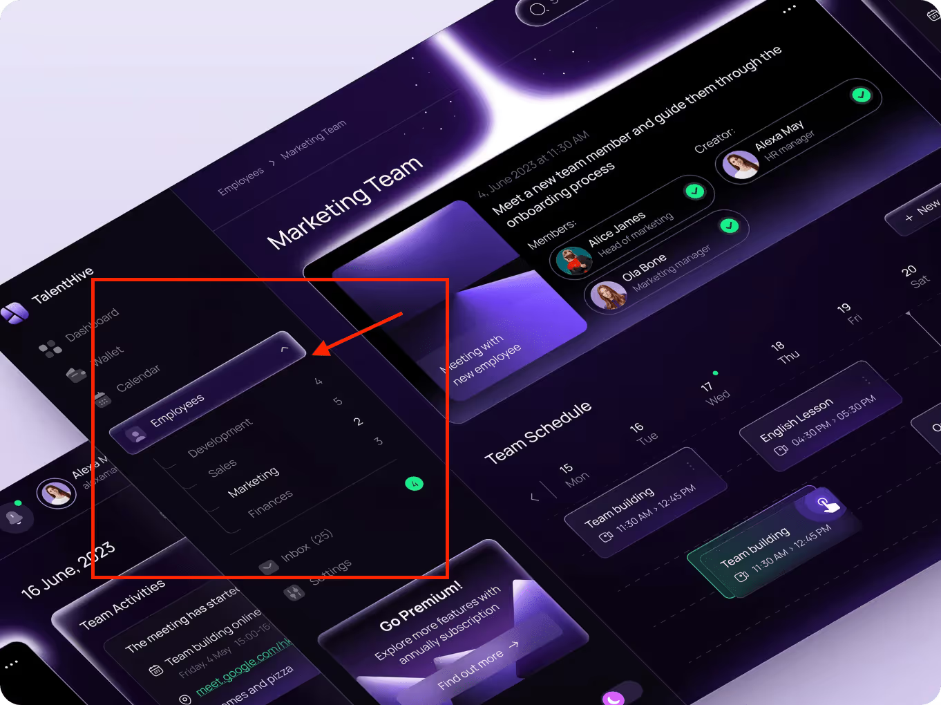
On the left column, you can see the dropdown titled "Employees". When clicked, it expands to show the different department options: Development, Sales, Marketing, and Finance. Dropdown filters help solve an issue: keeping the interface clean while still allowing quick access to company data by segmenting employee data. It is a straightforward solution to eliminating visual fatigue and having the user focus on what best serves them.
2. Radio buttons
Radio buttons enable users to select one choice in a short, and typically small, list of predefined choices. Unlike dropdowns, the available choices are all visible at once. Radio buttons are better than dropdowns when the list is small and the decision needs to be quick.
Their main advantage is visibility. Users can compare their options as soon as the component is rendered and select one with a click. This requires a tradeoff with space, as radio buttons usually have a larger footprint. Radio buttons are also not the best choice if you need to display a large number of screen options or if you will require selecting multiple options.
Take a look at this example from our work for Smoothline.
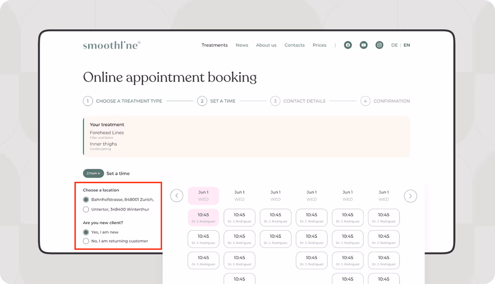
In this appointment booking interface, we used radio buttons to allow users to select a location and confirm whether they are a new or returning client. There are only a few options, and the selection needs to be quick, so radio buttons were the best choice.
3. Checkboxes
Checkboxes provide a mechanism for users to select multiple choices simultaneously. They differ from radio buttons since they allow multi-selection. Therefore, they are ideal for filters that have broad or overlapping conditions.
One of the main benefits of checkboxes is how visible they are. Since all options are on the screen all at once, users can immediately see their available selections.
These UI filters can become unwieldy when there are numerous long or poorly organized options. Users may forget items or feel lost and overwhelmed when faced with a large number of options to sort through.
Here is a clear and simple example of checkboxes, from our work with Mine’d.

We used checkboxes to allow users to select multiple experts at the same time. This functionality is clear, fast, and simple. All options are clearly visible, so the user instantly understands they can make a few choices.
4. Toggle switches
Toggle switches are essentially on/off controls that allow users to turn a particular filter on or off quickly. The most useful thing about toggle switches is that they are easy to use; there is no guesswork: if a switch is on, the setting is applied; if it is off, it isn't. When the user needs more context to be able to differentiate if a filter is on or if there are more than two options available, a toggle can seem overly ambiguous.
A clear example of toggle switches can be found in one of Arounda's projects, where we built a dashboard interface for NexChain.
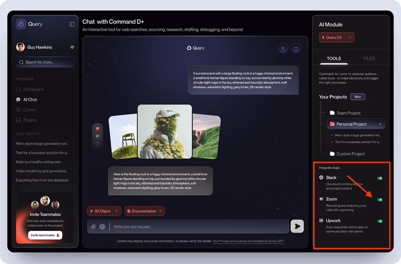
In the "Integrate Apps" section, users can turn on or off Slack, Zoom, and Upwork integrations with a single click of a toggle. This allowed the interface to stay nearly free of additional buttons while still allowing users to fully control which tools they want to use.
5. Range sliders
Range sliders allow users to select a value or range between two points, typically with representations of price, age, or rating. Instead of having to type, users can simply drag the handle, which feels faster and more visual from the user's perspective.
Range sliders are effective when users require flexibility and a quick overview of available values. However, they don't work as well on vast scales or precise inputs. Keep it easy for the users and show the min and max values, and the range the user picked while they were dragging.
Here's an example of a range slider in one of our projects.

We designed this mobile interface for a real estate platform that was intended to help users navigate property listings. When it comes to the price range, we decided on using a slider. It allows the user to set their budget without having to type it in or scroll through numerous options.
A slider works well for this approach since it addresses a key pain point: the limitation of irrelevant results that often occur when setting the parameters of a too broad search. The slider is supported by a histogram, providing the user with an instantaneous sense of the distribution of listings throughout the price range. It enhances the filtering process to give a smooth, speedy, and intuitive experience, especially on mobile devices.
6. Date picker
Date pickers are a convenient way for users to filter by a specific date or time range. They're common in dashboards, booking systems, health applications, and any applications where timing matters.
The main benefit of a date picker is that it's a way to gain control. You can show the user only the timeframe they're interested in without overwhelming them.
Arounda worked on a project for Sellution, a MedTech platform that focuses on heart health monitoring, which has a fantastic date picker filter.
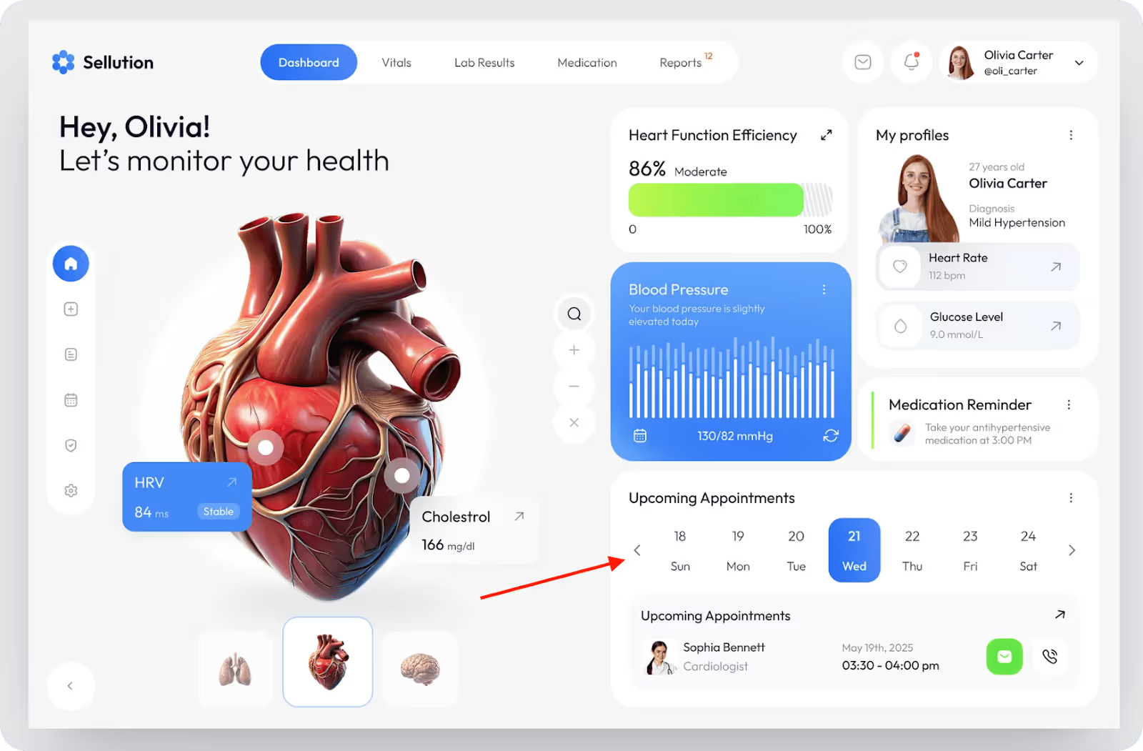
In the "Upcoming Appointments" section, users can tap through individual days of the week to see upcoming visits. Each date is an interactive component that changes the content instantly when a date is selected. Not only does this keep time-sensitive information easy for the user to find, but it also guarantees patients will never miss an important checkup.
7. Chips / Pills (Tags)
Chips or pills show selected filters as small, clickable elements. They are ideal for multi-select filters, especially when users need to choose multiple categories, topics, or labels simultaneously. The strong advantage of chips is that users will have visual feedback right away to know exactly what filters are currently on without taking up much screen space.
However, chips may not work well if the user has too many filter options at once, as filters can quickly become cluttered.
Here's an example from one of our projects at Arounda for UnlocksCalendar.

Here, we used chip filters to allow the user to quickly sift through a large amount of token data. Chips take up less space, clearly indicate which filters are being actively used, and allow users to focus on the important things without distractions. This filter has established itself equally as useful on mobile devices as it does on desktops.
8. Cards / Blocks
Cards or blocks are high-level visual filters. Instead of small checkboxes or dropdowns for the user to select from, they click on tiles or images. These filters are most effective when the choices can be visualized, such as product styles, templates, or categories of content.
Cards or blocks make the filtering process more enjoyable and clearer to understand. But they cover more screen space, so they are more appropriate for larger screens. In filter UI design examples, cards are a good option when users need to see what they are choosing, rather than just reading a label.
Here's an excellent example from our work with MintySwap.
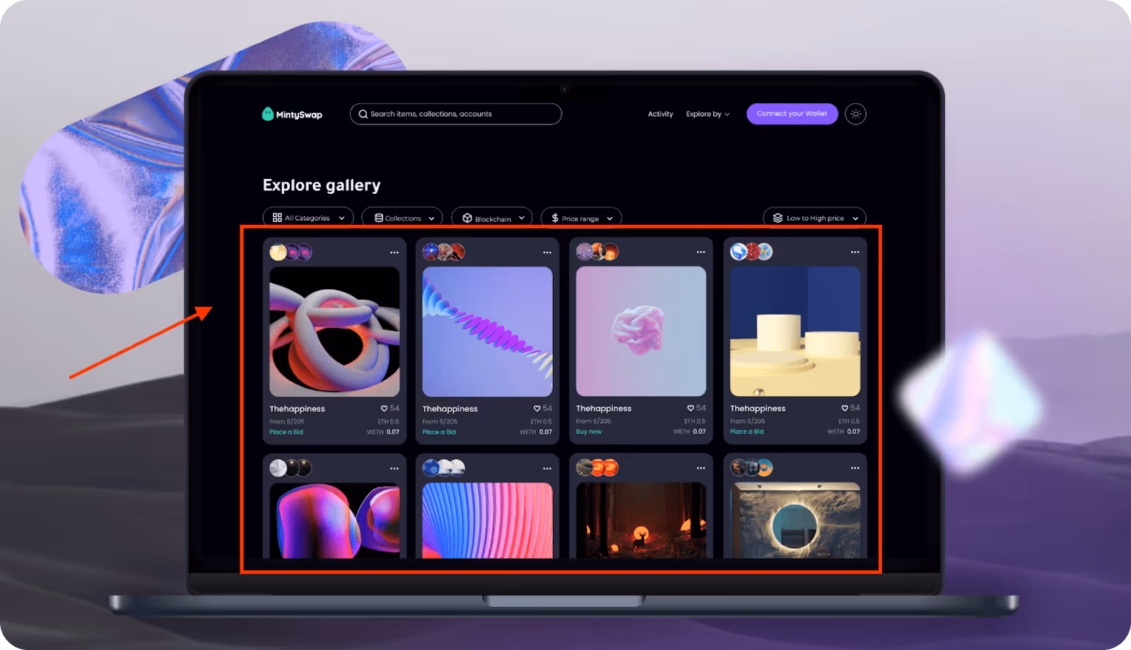
The card-based filters we created allow users to explore NFTs in a more visual and inspiring manner. Rather than combing through endless lists or dropdowns, users can quickly skim and pick what they enjoy from the card previews.
9. Search within filters
Search within filters helps users find exactly what they are looking for within 100 possible options (or many more!). Instead of having to scroll through dozens or many hundreds of options, they can use a method that narrows down their results by simply typing a few letters.
Search within filters can be useful, particularly with long lists or when the list is sorted alphabetically. It works well with checkboxes or dropdowns. It is a good choice when the user knows what they are looking for and just needs an easy way to locate it quickly.
LinkedIn Jobs provides a prime example of search within filters.

When using a company filter option, users can enter text into the search bar within the filters menu to quickly filter through companies. This real-time filtering feature allows the user to quickly find a company rather than just scrolling down the list.
10. Advanced filter panels
Advanced filter panels are collapsible areas that allow users to apply numerous filters all at once (often with more detail/customizations). Since the advanced filter panel typically does not occupy visible space on the main screen, users will only open it when needed. This is always useful when you have filters that are complex or when users want to combine multiple conditions into one filter, like filtering by category, date, price range, and status, for example.
Most importantly, the advanced filter panels enable users to customize filter options without cluttering the interface. Whenever a single filter cannot support the use case, advanced filter panels will be useful. Recommended in dashboards, B2B tools, and data-heavy sites.
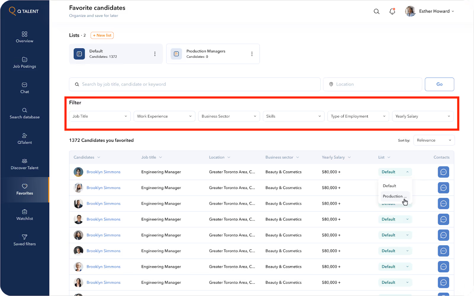
Here is an example of an advanced filter panel in our work with the SaaS platform QTalent. On this screen, we see an advanced filter panel for browsing saved candidates. The panel groups several filters into a single, clear, organized block. It is directly above the results and doesn't take away from the page. For SaaS platforms like QTalent, providing the user with an experience that allows them to find their way through information faster is critical to maintaining user engagement.
11. Persistent filters
This SaaS filter design remains active and visible for as long as the user navigates or refreshes the content within the site. They provide users with context for their view and allow them to continue filtering out what's not relevant to them without needing to apply the same filters over and over again. This is great for those using CRM systems, dashboard analytics, and recruiting tools. Persistent filters are ideally suited to SaaS platforms, where they help users become efficient and retain their context, especially in workflows that require similar data views repeatedly.
The Smart Spenders interface we developed presents a modern design that enables users to handle their expenses.
You can see an example of persistent filters, which function as a horizontal list of months. Users can easily navigate between periods because this feature remains visible at all times. The filter remains active even when the data changes. The placement of persistent filters enables users to decrease their click count while improving efficiency and maintaining essential controls in their expected positions.

12. Auto-apply filters
Auto-apply filters modify results as soon as the user alters a filter, without clicking an “Apply” button. This creates a smooth and fast experience, allowing users to see the results of their choices immediately. This is particularly helpful in environments that return results quickly and use simple filters.
However, auto-apply patterns are most appropriate when the performance is smooth; if the page loads slowly or there are complex filters, this can create a disjointed experience.
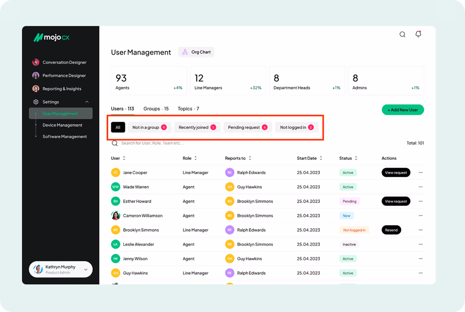
Here's an example of auto-apply filters from our project with Mojo.CX, a B2B SaaS platform. On the User Management screen, filters like "Recently joined" or "Not logged in" alter the results as soon as the user clicks on them. This type of setup is crucial for saving time and speeding up workflows, especially in busy admin-type environments of customer service platforms.
13. Modal filters
A modal filter works as a short-term interface that displays through a modal window or drawer. The interface works best when users need to apply multiple filters simultaneously without overwhelming the main interface, especially when screen space is limited or when using mobile devices.
The interface becomes less overwhelming because modal filters reduce the number of visible options. It works best for apps, small dashboards, and scenarios where filtering serves as a secondary function, yet requires simple access.
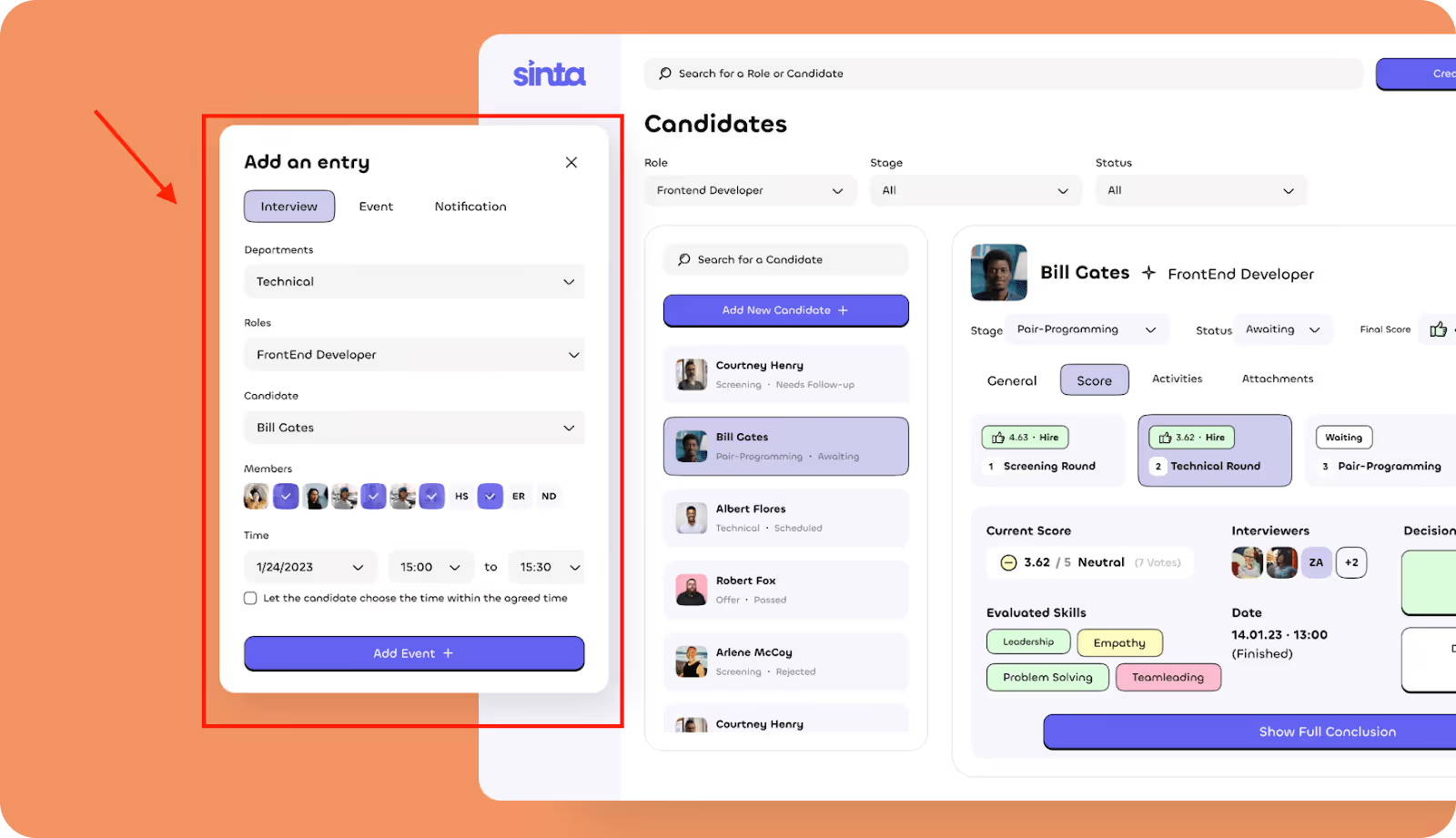
Here's a clear example of a modal filter in the MVP we designed for Sinta, a SaaS hiring platform that speeds up recruitment with AI tools and smart templates. The image shows a modal filter allowing users to set role, department, members, time, and not lose touch with context by navigating away from the current screen.
The interface works best for scheduling interviews and other quick task-based operations. The system enables recruiters to reduce their time spent on tasks while preventing them from making extra page transitions.
We know the SaaS industry inside and out, and were happy to help Sinta with Website Design. Need great design for your SaaS product? Our team excels at creating effective solutions.
14. Complex AND/OR conditions
Users can build complex filter logic through AND/OR conditions, which enable them to combine multiple rules. They can combine multiple filters into groups while defining their interaction rules. Users can use this flexible method to reduce data without needing to perform various manual searches.
Here’s an example of an AND condition filter on Booking.com. Users can check multiple filters using a checkbox. For instance: "Wonderful: 9+", "Breakfast included", and "Pet friendly." Those filters show at the top of the page as chips, and they all work together to narrow down the results presented. The listings must apply to all filter conditions checked. This form of filtering helps users to find the exact match by combining many requirements into a single search.

15. AI-assisted filters
The AI-assisted filters operate through machine learning algorithms, enabling users to quickly and precisely locate their desired content. Users receive intelligent filter recommendations through the system, which draws from their behavioral patterns, personal preferences, and past interactions.
Grammarly is a good example of an AI-filtered interface. Like most writing applications, when you write in Grammarly, it shows a pretty limited set of actions relevant to your needs, like "Improve it" or "Make it shorter."
Grammarly does not need you to configure filters manually. It examines your writing and surfaces the most relevant actions automatically, acting as a smart AI-powered filter for what you might need next.

16. Filter placement
Filter placement is about putting filters where users expect to find them and where it makes logical sense. When done correctly, a good placement can improve the speed of decision-making and provide focus for the user.
Typically, filters are situated to the left, above the content area, or behind an icon (if there are space constraints). The best position ultimately depends on the number of filters, their frequency of use, and their importance in accomplishing the task. If users use filters often, it's better when they don't have to look for them or click through multiple links.
Here's a good example of filter placement from our work with World Delete. The filters are located on the left side of the dashboard, beside the primary data visualization. This is an ideal location for the filters because they remain in the line of sight of users, enabling them to modify parameters without losing focus.
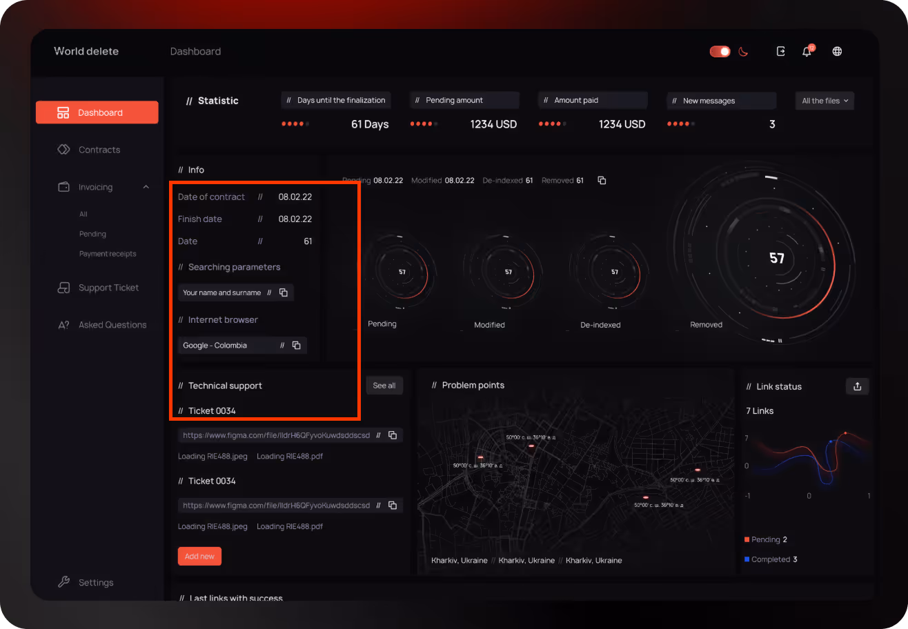
World Delete came to us for a Website Redesign Service, and we delivered a clean, functional interface with clever filter placement that improved usability. Need help with your UI? We know how to make it work.
17. Real-time feedback
A Real-Time Feedback filter updates results at the moment a user is interacting with the filter, like typing in a text search box or adjusting a price slider.
Sometimes people confuse this filter with auto-apply filters, but they are different. Auto-apply filters update results after the user is finished selecting or adjusting something, whereas real-time filters respond as users are physically completing the action. This slight difference can dramatically change the way an interface feels in terms of interactivity and fluidity.
Below is an example of real-time feedback filters. On Google Flights, when you adjust filters like departure time or price range, the flight results update instantly as you move the sliders.

18. Reset / Clear all filters
The "Reset" or "Clear all filters" UI control allows users to quickly clear all selected filters and return to the unfiltered state. The "Reset" option is especially useful in complicated interfaces when users have multiple filters active. This filter enhances usability by eliminating the need for users to manually untick each filter.
An example of a "Clear all" filter can be seen on Airbnb's filter panel. It gives users a way to reset all the selected options and start over.

19. Role-based filtering
When we refer to role-based filtering, we mean modifying the filters and data that users see based on their role. Role-based filtering also changes the available filters and the actions that the user can take within the context of the role. A recruiter may see hiring stages, while a developer sees tech scores.
Here's a good example of role-based filtering from our work with Players Health.

On this screen, we can find users with their roles, like Sub-account admin, Coach, and Board member. This allows the system to filter the users and group people based on their responsibilities. When you are managing a vast team where the names are the same and you are only looking at specific roles, this filter is essential to keep the view clean and useful. For example, the admin only has to see Coaches, while someone in finance would only look at Board members or payment roles.
20. Mobile-friendly filter design
A good mobile filter is typically a floating action button, bottom sheet, or collapsible menu. Upon tapping, it should open a full-screen or modal interaction that's touch-friendly and includes large tappable areas, clear labels, and simple toggles. Users should be able to scroll, select, or deselect an option by simply using their thumb.
Here's an example of a mobile-friendly filter design from our Infinity case, where we designed a mobile app interface with smooth and intuitive filters. The filters are easily accessible, immediately visible, and occupy very little space on the screen. This filter design is highly usable, visually clean, and designed to work seamlessly on both iOS and Android.

Need help with mobile filters or UI? Arounda’s Mobile App Design Service delivers world-class UX that works and looks just right.
Core Dilemmas in Filter Design
Designing filters is not just about the options that are displayed. It is about how users will interact with them - where filters are located, how they behave, and how much control they give. While these decisions may seem minor, a lot depends on them. Having said that, below are some of the major dilemmas we see product teams facing when designing the filters UI.
Place Search Filters on the Left or Right?
The placement within the user interface affects the scanning strategy and interaction pattern of the user when they are on the page.
Typically, filters are imported on the left side of the user interface because users read from left to right and tend to look for controls on the left. Filters, however, are sometimes placed on the right side of the UI, which can work well when the user is browsing, or it supports the idea of a visual-first approach.
Arounda Suggests: Determine how significant filtering is in the user journey. If it is essential, it should be placed on the left side and be visible at all times. If it's something the user only needs occasionally, consider providing a right-side panel or hiding the filters behind a toggle mechanism.
Auto-Apply Filters or Use an ‘Apply' Button?
Getting the right balance between speed and control is tough for teams. Auto-apply means the results can be updated instantly as the user adds filters. An 'Apply' button waits for the user to confirm their inputs.
Auto-apply is most useful when the filters are simple and lightweight, such as status, price, or categories. If a filter is complex, such as dashboards or CRMs, an 'Apply' button is the way to go.
Arounda Suggests: Auto-apply should be used for quick filters where the impact will vary minimally. 'Apply' should be used when filters are complex or performance is a top priority.
Sticky Filter Panel or Modal Overlay?
Sticky filter panels work well for data-heavy tools, such as dashboards or admin portals, where users constantly change the filtering and expect immediate results. Modal filtering works better on mobile or simpler filtering tools, where screen space is restrictive and filtering is a rare occurrence.
Arounda Suggests: Use sticky filters for desktop-heavy products and products that require frequent filtering. Pick modal overlays when screen space is limited and where filtering can be rare. Some mobile-responsive designs utilize both modal on mobile and sticky on desktop.
Allow Multiple Selections or Just One?
One selection is generally best when users are meant to select a single mutually exclusive category, like a subscription tier.
But most use cases (especially e-commerce, dashboards, or HR platforms) are better suited to multiple selections. Users often want to compare or combine categories (like selecting both "Remote" and "Hybrid" jobs) without having to reset the filtering.
Arounda Suggests: If your users are browsing, comparing, or filtering complex data, consider using multiple selections. Also, use radio buttons for single-choice filtering, but use checkboxes and chips for multi-choice filters to indicate multiple selections visually.
Show Filters Expanded or Keep Them Collapsed by Default?
This is an important decision about how much filtering UI to show the user initially. Showing expanded filters means the user immediately sees them and can begin interacting with them, which is beneficial when their usage is a primary part of the experience. Dashboards, marketplaces, and job boards immediately fit into this category.
Showing collapsed filters can keep the screen uncluttered (especially on mobile devices) and, in tools where filtering is less of a priority, keeps the user focused on the current task.
Arounda Suggests: Is filtering critical to execute the task? If so, expand the filtering. If there is limited screen space or filtering is optional, present it collapsed and make the toggle button clearly visible and easily accessible.
Test and Refine Your Filters
If you want to help your users quickly grasp the layout and find what they're looking for without excessive clicks or unwanted confusion, you must not only have a "nice-looking" filter design: you must test and validate it.
Even a thoughtful filter system can be confusing to real users, even if it seems logical. This is why you need to go beyond your team's assumptions and, before you do anything else, put your filters in front of real users. You will find out what works, what doesn't, and what you can do to get it just right.

Validate with Real User Feedback
Actual user feedback is one of the best ways to identify design issues before they become real challenges quickly. Let's say you have a filter panel with 10 dropdowns. It looks slick and clean to your team, but once you begin to test it, users freeze up, unsure of where to start, and others miss a critical filter because it's too deeply buried.
Without validation, these issues are live, and your users will drop off or blame the product for being "too complicated". However, by intentionally taking the time to conduct testing early, you'll see what needs to be improved, restructured, or removed. With that feedback, you can then create filter experiences that work for the humans that use it, not simply for the team designing it.
Compare Options with A/B Testing
Sometimes, your team can't make a decision. Should the filters be on the side or on top? Are the categories dropdowns or chips? Instead of debating, you can run an A/B test and let the data do the talking. Show one filter layout to one group of users and show another filter or interaction to the other group of users. This way, you can identify how both groups perform.
Without A/B testing, you are making a purely educated guess. One version may look great, but the other may help the user complete their tasks faster.
Keep Improving Through Iteration
Designing a filter is not something that always comes together perfectly on the first pass, nor will users always behave in ways you expect, even after the launch. For example, a user may be ignoring specific filters or constantly clearing them because they're too aggressive. The only way to fix this is through iteration. Watch what is happening, go through the insights, adjust the layout or logic, and publish small changes. Over time, this iteration will transform a "good enough" filter experience into a smooth and intuitive one, without requiring a total redesign.
Common Mistakes
These are all frequent errors that confuse users, slow down the process, and lead to poorly performing products.
- Filters are hard to find. If users need to scan the page for filters, they probably aren't going to use them. Poor placement disrupts flow and adds friction.
- Filters do not match user expectations. Many teams offer filters based on assumptions that don't match reality, so users see filter options that they either don't care about or, worse, miss the options that they were looking for!
- No visual confirmation after filtering. If users don't see a visual difference after they've selected a filter, they don't know if anything has changed or not. They become confused and usually try the action again later.
- Overcomplicated logic. Too many nested filters, unclear operators like AND/OR, and confusing toggles can be too much for people trying to take control over what they are seeing.
- Poor mobile usability. Sometimes filters look good on desktop, but then become unusable on mobile. Whether it's being unable to tap appropriately, hidden panels, or layouts that simply aren't built out, there are countless ways that the filter experience can lead to user drop-off or frustration.
We have witnessed many companies struggle with confusing layouts, untested ideas, and overlooked UI/UX details with filters. That's where we come in. Arounda has been designing digital products for over 10 years, and we have a good read on what makes the difference in fixing these problems, and more.
With our UI/UX design services, we will help you create filter experiences that are simple, smart, and easy to use, whether you're building a new project or enhancing an existing one.

Summary
A strong UI makes or breaks the user experience for SaaS products, especially with large amounts of data. Smartly designed, effective filters will organize each interface and help users quickly find what they need, leading to better engagement!
Contact us, and our experts will help you design intuitive, high-performing filters tailored to your product.


Table of contents


FAQ
Filtering a dataset hides items that don't match specified criteria; sorting reorders the dataset but shows all of the items. Filtering reduces the information that you see; sorting just changes how you see it.
Use both. Filtering reduces noise when users are searching for specifics, whereas sorting allows users to prioritize. The best SaaS platforms take advantage of both methods to offer users more flexibility in exploring their data.
Filters should be easy to locate, straightforward to understand, and quick to use. Use labels people can understand, logical groupings, and immediate feedback where possible. Always design for speed and clarity.
Checkboxes, sliders, dropdowns, search boxes, and tag-based filters are all easy components to use. To the users, they're familiar and easy to work with, and usable regardless of mobile or desktop view.
Through well-designed filters, users can find meaning in complex data. Well-designed filters result in less friction, better clarity, faster searching, and provide trust. In a SaaS world where users often view a complex dashboard or a database of thousands of options, filters are not an optional step but an integral part of the experience.


89+ Reviews
on Clutch

Top Rated Plus Agency
on Upwork

Top 50 Trending team
on Dribbble

Projects are Featured on Behance platform
