Ruler Brand Archetype in Fintech: A Guide to Power Branding
In fintech, people tend to trust platforms that feel stable, organized, and in control. That's why many successful financial brands adopt a Ruler-style identity: it helps signal reliability, reduce perceived risk, and give users confidence.
Recent UX data shows a 41% increase in user trust when a brand maintains a consistent design system and a clear visual hierarchy. This kind of structure makes the product feel reliable and governed by strong internal standards, which is exactly what users expect from financial platforms.
To help fintech teams apply this archetype correctly, our Arounda team prepared a practical guide on building a powerful Ruler-style brand through visual identity, tone, UX, and product positioning.

Article Key Takeaways
Fintech brands face the challenge of proving trust, authority, and stability from the first user interaction. This article explains how the Ruler archetype helps financial products communicate control, reduce perceived risk, and build long-term confidence. You'll learn the core traits of Ruler branding, how to apply them in visual identity, tone, and UX, and see ruler brand archetype examples of well-known fintech brands that use this archetype to secure stronger market positions.
Ruler Archetype in Branding
Most brands do not pick an archetype for aesthetics. They use it as a shortcut to shape how people read their behavior. This archetype matches situations where users expect strict rules, visible structure, and clear responsibility.
What Is the Ruler Archetype?
The Ruler represents a brand that owns the territory and sets the standards inside it. Users read it as “these people run a controlled environment, not an experiment”.
A ruler brand archetype reinforces this through consistency. When the experience remains stable across touchpoints, trust rises measurably; some datasets point to a 25% lift in user confidence and return behavior when the journey feels predictable. This is the core function of a Ruler identity: to create a controlled environment that feels reliable through thoughtful bank web design.
Core Traits of the Ruler Brand
This archetype in fintech comes from how real financial systems maintain order. Users trust products that behave predictably, communicate responsibility, and make the structure behind decisions visible.
“To establish, preserve, and enhance macro-financial stability, it is essential for the public to trust all of the key macro policy dimensions, individually and as a group.”
Agustín Carstens, General Manager of the Bank for International Settlements.
This translates naturally into branding: when every part of the product behaves like a governed system, users feel safer acting inside it. The Ruler reflects this through several concrete traits:
- Structured decision logic. Users understand the consequences of each action.
- Visible governance signals. Risk steps, confirmations, and identity checks follow one consistent pattern.
- Predictable information hierarchy. The interface reinforces that nothing is left to interpretation.
- Measured, calm tone of voice. Language reduces emotional noise and supports clarity.
- Consistency across touchpoints. The experience feels unified, which strengthens trust and repeat behavior.
The Psychology Behind the Ruler Persona
People trust what they can predict. If a system feels controlled, they relax. If the rules are unclear, they slow down or avoid acting. This is especially true in fintech, where every decision carries weight.
The Ruler persona works because it creates the sense that someone is in charge. When users see stable patterns, consistent wording, and clear steps, they assume the product is reliable.
Why the Ruler Archetype Works in Fintech
Handling money always introduces a layer of vulnerability, so brands must give users a sense that the environment they enter is structured and well-managed.
Trust, Control, and Stability in Finance
These three qualities form the backbone of any fintech brand built around Ruler archetype, because they shape how users interpret risk and competence.
- Trust matters when people make decisions they cannot fully verify on their own. Most users rely on the brand's behavior as a proxy for safety.
- Control matters because financial flows involve consequences. When each step sits in a clear, predictable structure, people sense that the company handles their decisions with discipline.
- Stability matters because financial relationships are continuous. Users need a product they can rely on over time.
Meeting User Needs in High-Stakes Environments
Fintech users act with caution because their decisions have real consequences. They expect the product to guide them with clarity. When the environment feels intentional, they trust it more.
People usually look for three things:
- Clarity about outcomes.
- A structured path forward.
- Protection against mistakes.
Projecting Authority Through Design and Tone
When a fintech product handles sensitive decisions, authority must be visible in the details.
Here are the elements that genuinely shape authority:
- Defined visual logic. A regulated feel comes from internal order. For example, margins repeat across components, alignment rules never change, and spacing ratios stay consistent across all screens.
- Purposeful typography. Authority often comes from micro-choices: using fewer type sizes, consistent line-height increments, and controlled contrast between weights.
- Predictable interaction patterns. High-stakes flows should behave the same every time. Confirmation steps, identity checks, and risk-related screens follow one template.
- A confident tone of voice. The strongest tone relies on verbs that indicate responsibility, not persuasion, and uses terminology that treats the user as an informed participant.

Characteristics of a Fintech Ruler Brand
A strong Ruler brand archetype in fintech is built on a set of characteristics that consistently reinforce authority, structure, and long-term reliability across every interaction.
Authoritative Visual Identity
A fintech brand needs authority because users judge expertise through the way information is organized. An authoritative identity starts with logo design and ends with consistent interface logic, which helps reduce doubt around complex actions and reinforces that the product is built for serious financial work.
Commanding Brand Voice
A commanding voice gives fintech brands the authority users expect from institutions handling sensitive decisions. It relies on clear terminology, confident verbs, and concise phrasing that communicates responsibility without sounding cold or bureaucratic.
Strategic Product Positioning
Strong positioning in fintech is built on defining exactly which decisions the product improves and why the company is qualified to guide them. When this focus is expressed consistently across marketing, onboarding, and UX, the brand feels intentional and aligned with Ruler-level clarity.
Security-First UX and Messaging
Security-first design shows users that their safety is built into the product, not added as an afterthought. Transparent explanations of verification steps, consistent risk cues, and calm, precise language reduce uncertainty and strengthen trust in high-stakes flows.
One of the examples of the ruler archetype in fintech in our work is AdvisorWorld, a B2B platform for financial advisors. Before collaborating with us, the product looked outdated, lacked clarity, and didn't reflect the seriousness of the decisions users made inside the platform.
We redesigned the platform across identity, voice, positioning, and security messaging. The new system introduced disciplined spacing, restrained typography, consistent components, and clear data-first layouts. The voice became more confident, the positioning emphasized expertise, and verification steps were simplified with calm, direct copy.

These changes gave the product the authority expected from a Ruler archetype, visible in its structured hierarchy, focused tone, and predictable user journey. The results included +62% elite conversion, +45% trust perception, and 35% faster onboarding.
Examples of Ruler Archetype Brands in Fintech
Here are several Ruler Archetype examples in fintech – companies whose branding shows discipline, clarity, and a strong sense of direction.
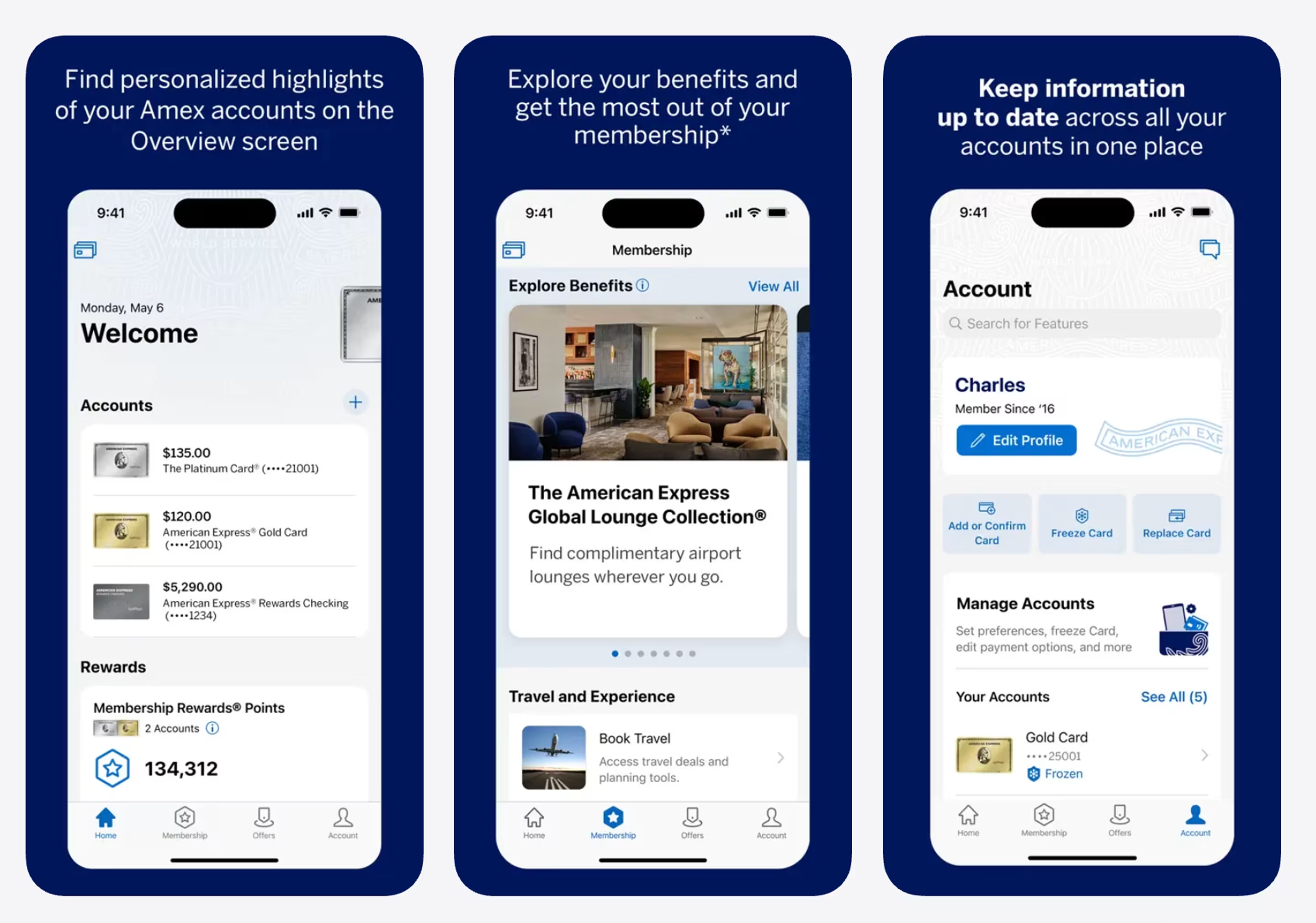
American Express: Prestige Meets Protection
American Express is a textbook example of a Ruler-archetype brand. Its identity signals discipline and high standards.
What makes AmEx a Ruler brand:
- Financial data is presented with strict prioritization.
- Typography feels measured, clean, and deliberately spaced.
- Deep blues and metallic accents create a strong institutional impression.
- Messaging positions users as members with defined status and privileges.

Goldman Sachs: The Legacy Leader
Goldman Sachs is a global investment bank known for its institution-first brand presence. Their digital identity reflects the archetype through its focus on expertise, analysis, and long-term perspective.
What makes Goldman Sachs a Ruler brand:
- Content is framed around authoritative research rather than marketing claims.
- Layouts prioritize analytical structure, mirroring how financial professionals evaluate data.
- Headlines and copy use firm, understated language that signals confidence without showmanship.

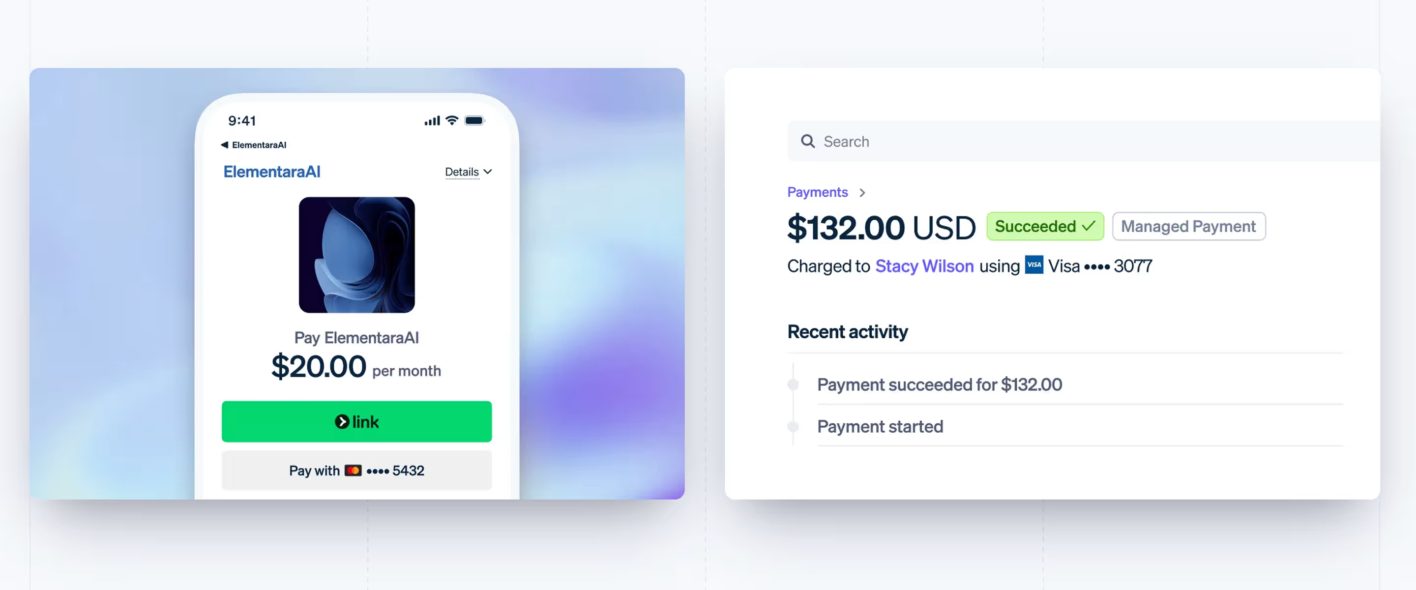
Stripe: Quiet Power and Control
Stripe isn't a bank, but its product design behaves like infrastructure.
What makes Stripe a Ruler brand?
- Transaction screens show only what matters, so users never guess what happened.
- Status labels are plain, calm, and unambiguous.
- Spacing and layout follow a strict rhythm across every surface.
- The tone treats payments as a controlled, high-standard operation, not a casual click.

PayPal: The Established Authority
PayPal is a global payments ecosystem that treats everyday transactions with the structure and discipline of a financial institution.
What makes PayPal a Ruler brand?
- Screens surface only the numbers that matter, so users never feel lost in their own finances.
- Every module follows the same spacing and card logic, giving the interface a “managed system” feel.
- Statuses and actions are stated plainly, reducing guesswork around money movement.

If you want your fintech product to gain the discipline and structure expected from a Ruler-aligned experience, you need UX that removes friction at every step. Our UI/UX Design service helps teams organize complex flows, reduce hesitation, and support conversion across the entire product journey.
How to Build a Ruler Brand in Fintech
To build a Ruler brand, your product needs a clear internal logic that shows users you take responsibility for the financial space you operate in.
Define Your Power Positioning
You define your power positioning to show clients exactly what part of their financial life you safeguard and how reliably you manage it.
Arounda's design team suggests:
- Identify the one financial process your product must execute flawlessly and build your positioning around it.
- Define the specific risks you remove for users and make these the core of your messaging.
- Review competitors to see where they create uncertainty and position your product as the one that handles that area with discipline.
Use Visual Elements That Signal Prestige
Prestige in fintech comes from visual discipline rather than decoration, so every element must support a sense of focus and confidence.
We asked our UI/UX designer which stylistic decisions create a premium feel in fintech, especially within Financial Services work, and here’s what she shared:
“Premium design starts with a clean, minimal layout that keeps the focus on key actions. Typography should be modern and easy to read, without decorative shapes that hurt clarity. Deep, saturated colors like midnight blue can work well when paired with a precise accent. And small details matter too. Subtle shadows, smooth motion, and consistent elements make users feel that the brand pays attention to everything and treats the product as truly high end.”
Mariam Kobaliia, UI/UX designer
Craft a Confident Brand Voice
A strong brand voice helps a fintech product sound composed under pressure, which reduces user hesitation and leads to higher completion rates across critical flows.
Arounda's design team suggests:
- Keep sentences concise and factual to support the user's focus in high-stakes steps.
- Use verbs that lead the user forward, so each message feels like part of a structured flow.
- Apply the same tone across UI, emails, and support chats to maintain a single, steady voice behind the product.
Align Product UX with Leadership Qualities
Your UX should behave like a system run by a capable operator. When flows feel deliberate, and every interaction has a clear purpose, users interpret the product as stable.
Arounda's design team suggests:
- Break complex actions into small checkpoints with short notes that explain what the user is approving and why it matters.
- Update critical data instantly so the interface feels active and under control.
- Use one predictable pattern for high-risk actions. Approvals should follow the same layout, button order, and confirmation flow to remove guesswork.
Tips for Expressing the Ruler Archetype
Now that the core structure of ruler archetypes is clear, here are several practical ways to show it inside a fintech product.
- Use one visual logic everywhere. Let spacing, colors, and typography follow the same internal rules across your entire product.
- Keep language steady. Avoid emotional swings and write in a calm, concise tone that reads the same in UI, emails, and support.
- Surface only essential data. Show the numbers users need for a decision and move all secondary information out of the main path.
- Make checkpoints visible. Verification, approvals, and risk-related actions should feel guided and transparent.
Common Challenges and How to Overcome Them
Fintech teams often try to express structure and leadership, yet a few issues repeatedly break the Ruler impression. Here's how to fix them quickly and effectively:
- The product looks inconsistent. Different spacing, colors, or typography make the interface feel improvised.
Fix it: Lock one spacing scale, one type scale, and one color system. Apply them everywhere so the product feels governed, not assembled. - The tone sounds emotional or promotional. Hype language makes users doubt the product's stability.
Fix it: Keep your voice calm and factual. Use short, directive sentences and keep the same tone across UI, emails, and support. - Critical steps feel unclear. Transfers, limits, or verification steps often confuse users.
Fix it: Split these actions into small, predictable micro-steps with short notes explaining what the user is approving.
Most fintech founders think the issue is visuals, but real improvement comes from system-level changes: structure, hierarchy, tone, and predictable patterns. This is where a strong design partner matters.
Arounda has delivered 250+ projects over 9+ years, including multiple fintech platforms. Clients report measurable gains after our work, like higher conversions, stronger trust signals, better engagement, and shorter onboarding.
If you want your fintech product to feel organized, mature, and ready for scale, our brand identity services can help you build a foundation that supports real business results. Our clients confirm this in practice, and our Clutch rating holds a steady 5.0 thanks to consistently strong project outcomes.

Conclusion
Ruler branding is not a theory for us; we see how disciplined identity and UX change fintech metrics every day. If you want your product to attract better clients, shorten decision time, and make key actions feel safe and straightforward, contact us. We'll be happy to help you build a brand identity that pushes your product to the next level.

Table of contents
FAQ
By creating a predictable, well-structured environment. When users see consistent hierarchy, disciplined visuals, and clear rules, they assume the system is professionally managed, which reduces hesitation in high-stakes actions.
Use one internal logic for hierarchy, components, tone, and messaging. If spacing, typography, and voice follow the same rules everywhere, the brand feels governed rather than fragmented.
Yes, but the Ruler traits must stay dominant. Hero adds confidence around outcomes, and Sage adds clarity in explanations, but both should support the perception of authority, not compete with it.
They focus on precision, transparency, and quick access to verified information. The goal is to make every interaction feel structured and reliable rather than friendly for the sake of friendliness.
It works in both, but B2B benefits the most because financial professionals expect controlled systems and expert guidance. In B2C, Ruler works best for products tied to security, long-term planning, or risk-heavy decisions.

89+ Reviews
on Clutch

Top Rated Plus Agency
on Upwork

Top 50 Trending team
on Dribbble

Projects are Featured on Behance platform


