Grid Layout Design: What is it and How Does it Work? A Guide with Examples
The definition of design implies that the elements are organized in a structure. A visually appealing design usually has a particular system for it. It relies on geometry and human eye perception. All the elements should be well-balanced, meaningful, and noticeable to work their best.
Experienced designers apply the rules intuitively in their works; however, there is a comprehensive and holistic approach named grid layout design aimed at helping in the designing process.
Grids simplify and structure the designers' works to reach the best results in less time. We devoted an entire article to present grid layout ideas and principles for your use.
Arounda is a multidisciplinary product design agency. We build top-notch products for startups, businesses, and Fortune 500 companies. Our team is happy to share their knowledge and offer their expertise to boost your products in the market.
Article Key Takeaways
Frequently, a site or an app comes across as chaotic. Not because the ideas are bad. Because the structure is lacking in the layout, when there’s no rhythm or alignment, confusion can develop easily, which creates a chaos of the hierarchy that shows the design is unprofessional.
Grid layouts address this issue through balanced, consistent, and responsive design with defined rows, columns, and consistent spacing. At Arounda, we’ve completed 250+ projects in SaaS, fintech, and AI, and we can tell you that the right grid makes a huge difference in areas of usability and aesthetics.
In this article, you will discover what grid layouts are, the types you can use, and how they work in real life. We will also provide examples and practical tips to show how grids transform confusing interfaces into clear and attractive designs.
What is a Grid Layout Design?
A grid is a structure made of columns and lines. It determines the general layout of all design elements like text blocks, illustrations, headings, etc.
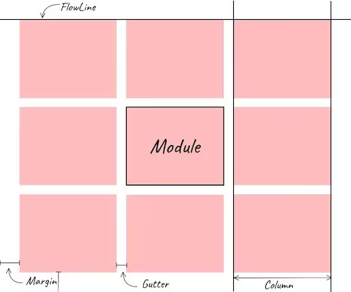
Every grid consists of three main components: columns, gutters (column spacing), and margins (framing space). The type of layout design that relies on grids is called a grid layout design.
Initially, graphic designers used grids to design handwritten or printed materials (like books, magazines, etc.). Now grid layouts are a popular tool for UX/UI designers as grid layout advantages in organizing interface designs (like web pages, mobile apps, and other digital interfaces).
Designers can use the same grid system throughout the entire design or build a new grid for each page to express their ideas. Moreover, they can create the grid themselves or save time and effort by applying pre-made grids.

Types of Grids
Since grids arrange objects inside a page or screen, all products, even the simplest Word documents, are marked with grids. For this purpose, special tools, like the "snap to grid," are present in the majority of layout editors.

Each type of grid serves a particular purpose. Let's consider how to use grid layout and the most effective grid layout design examples.
Manuscript Grid

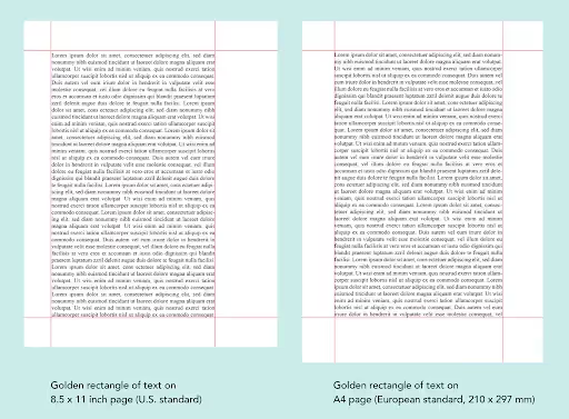
Generally, manuscript grids are large, page-size rectangles comprising text and images. They are the simplest and the most ancient ones.
Manuscript grids, being one-column grids, nowadays are used in numerous documents and books with lots of text, including documents, e-books, and PDF files.
For example, among other grid layout design examples, our blog has a manuscript grid layout.
Manuscript grid layout advantages compared to other grid types. This grid maintains a good balance for the whole piece, even if some elements, like a shape or a photo, bleed over the edge.
Column Grid
Column grid layout design is used in newspapers and magazines to organize content in columns. It makes long texts easier to read. The number of columns usually varies from two to six. Furthermore, the reader can skim the entire page instantly as elements are arranged into columns. Additionally, column grid layout ideas can be found on websites, such as blogs and online publications.
In column grids, vertical lines and flow lines position the text and images. Images can be placed within a single column or across two or more to create versatility and richness in the look. The gutter should be proportionate and constant throughout the entire document.
In the same time, there are asymmetric grids. An asymmetric grid layout design presents some columns proportionally broader or thinner than others, while a symmetric grid will have all columns the same width. This asymmetry makes the design more informal and is widely used in magazines as well.
Modular Grid

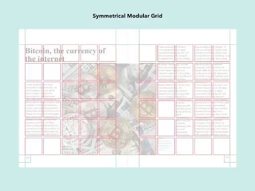
The modular grid layout design resembles checkerboards; it can display many things at once for easy access.
Modules in modular grids are all the same size and importance. For example, forms, charts, and schedules, among other grid layout ideas, can be laid out effectively using modular grids. That is why this grid is intensely used in e-commerce websites to present the goods for sale.
Moreover, a modular grid is applied in the layout of the phone's homepages with all the installed apps. Some social media apps also show the feed arranged with a modular grid.
Baseline Grid
Baseline grids are defined by the text lines, called baselines. This one creates a good reading rhythm for any design with lots of text. That is why one of the most frequent grid layout design examples is school notebook.
Any of the grid layout ideas above can be used as a baseline grid too, since they have the same text lines with a flowing rhythm. Nevertheless, baselines are applied in the typography design of posters, newspapers, and magazines, both digital and traditional.
Hierarchical Grids

What is a grid layout web design in most cases? It’s hierarchical.
Hierarchical grids are primarily used on websites, organizing content according to its importance. The bigger the element, the more important it is. A hierarchical grid layout design website allows the best user experience and, hence, conversions.
It takes years of experience to develop the knowledge necessary to set up a balanced hierarchical grid without a modular guiding grid. However, even experienced designers use pre-made templates to save time. For this reason, web designers make website templates that non-web designers can fill out with information.
Choosing the Right Grid for Layout Design
A web grid layout design uses hierarchy to ensure that the most crucial information is seen first. Special notices and calls to action are the first to catch attention.
In general, the choice of a grid type is determined by the environment where it is used. Whether it is an online magazine or blog, for instance, it might display articles in various sizes on its homepage using a hierarchical design.
The second thing to keep in mind is communication purposes. Usually, different font sizes for the headlines, a call to action, and images are used on e-commerce landing pages. All this information is overwhelming if relevant one is not marked for readers.
It makes hierarchical grids of all the grid layout ideas the least obvious for a viewer. They do the work without realizing what is happening and why they draw attention to particular elements. That is why a hierarchical layout is the best visual tool to increase conversions.
Content block
published
Searching for the best ways to aid your growth?
Let`s have a talk.
Tips for Working with Grids
There are several rules and practices to make the best of grid layout design for your projects.
- Follow the alignment. Grids' primary purpose is to align design components. The gutters must be the same size throughout the documents, and all the design elements must touch the flow lines.
- Leave the elements inside the grid field. The gutters should always be blank to divide the design components. The graphics and texts can span multiple columns, modules, or rows. They can't start and end in the gutter.
- Remember the screen size. It's crucial to adapt your grids to various screen sizes at the design stage. For instance, the number of the grid's columns varies depending on whether it is displayed on a desktop, tablet, or smartphone.
- Leave enough free space to visually demarcate elements like columns, rows, and gutters. Visual priorities are among grid layout advantages. At the same time, the gutters' size must be proportionate to the screen type, text size, and column width. On mobile screens, narrow gutters look better, and you can use more space between columns on web screens.
- Apply the Golden Ratio, Fibonacci, and other perfect proportion rules. Since they are applied everywhere, they are helpful in layout design too. Here, they coordinate the relationship of margins, gutters, uppercase, and lowercase letters, etc.
The Fibonacci Sequence is a row of numbers in which each number is the sum of the two preceding ones. For example, the inside margin is two, the top margin is three, the outside margin is five, and the bottom margin is eight. The same idea of interrelation concerns all elements.
- Go diagonal. To make a more active and contemporary look, add diagonal designs. Diagonals can be additionally supported in the illustration composition and sizes of the image in the web grid layout design.
- Create your own grid layout ideas if needed. Combine several types of grids simultaneously, such as hierarchical and modular ones. Your goal is to deliver a message to the viewer by prioritizing the elements and information with the gutter sizes and margins and the heights and widths of the columns.
- Break the rules if your goals require it. Grids are not a set of restrictions, but a pattern that manages the viewers' attention. Put logic ahead of the grid geometry when putting design elements in the proper order on the page.
Summary
In visual design, the grid is a system of columns and rows that organizes and prioritizes the elements on a page or a screen. The most important information gets the most considerable space.
With the implementation of screens in everyday life, the grid layout is taking on greater significance. With grid design, you can add visual hierarchy to the page layout, which gives your content a clear structure and improves readability.
Furthermore, grid layout design eases and aids the process. However, it should be used properly to guarantee a good outcome.
Contact the team if you need grid layout ideas. Our top-notch specialists will do their best to boost your products or website's visual and business characteristics.

Table of contents
FAQ
Grids structure the space within the page of a screen. They direct and mold the viewers' attention according to the required priorities. Moreover, grid layout advantages are numerous and multifunctional. Besides, they can be altered to fit the best with your communicative purposes. In general, they ease the whole design process.
Designers highlight five main grid layout design examples: Manuscript grid, as in books, Word documents, and simple blogs. Column grid, as in newspapers. Module grid, as in smartphone homepages or Instagram feeds. Baseline grid, as in the majority of magazines. Hierarchical grid, as in online media.
The four basic and common types of grids include Manuscript grids used in Word documents and PDFs. Column grids used in all newspapers. Module grids and baseline grids used in magazines and printed media.

89+ Reviews
on Clutch

Top Rated Plus Agency
on Upwork

Top 50 Trending team
on Dribbble

Projects are Featured on Behance platform


