
40 B2B Homepage Design Examples That Generate Leads

Your homepage is not only a branding asset; it’s a revenue risk. Gartner research says that 75%
When businesses come to Arounda for redesign, most B2B homepages fail because they explain what the product is, not why it matters.
So, if you are founders, CMOs, and product leaders responsible for pipeline quality, growth efficiency, and lead generation, then this article is for you. Let’s see the best homepage design, and then our Art Director shares tips for different businesses and points out the mistakes.
Article Key Takeaways
The best B2B homepages convert because they remove uncertainty fast. Within the first few seconds, high-performing homepages clearly identify who the product is intended for, what problem it solves, and why it is credible. Failures are typically caused by ambiguous placement, feature overload, or a lack of decision logic.
Strong homepages serve as decision interfaces. If users can’t understand relevance, trust, and next steps quickly, conversion drops long before pricing or sales conversations begin.
Arounda UI/UX experts gathered 40 examples of B2B homepages across different industries and explained their strongest conversion points. We also provide advice from our art director (an interview on the key elements of a home page to increase lead volume).
Signs of good homepage design
A strong homepage clearly communicates value, builds credibility, and guides visitors to the next step within the first 5 seconds. If a first-time visitor can’t explain your value proposition after scrolling once, the homepage design is working against your sales team. So, check these signs ↓
Homepages that meet these criteria reduce cognitive load, shorten decision time, filter out low-intent traffic, and attract higher-quality leads.
.avif)
If you need a grounded, product-specific decision on how your homepage should work as a sales tool (based on your audience, risk level, and buying process), our focused consultation will help you refine your solution and save you time and money from rework.
Now take a look at how this works in practice and check the website homepage design examples.
Website Homepage Design Examples
HRWorkCycles
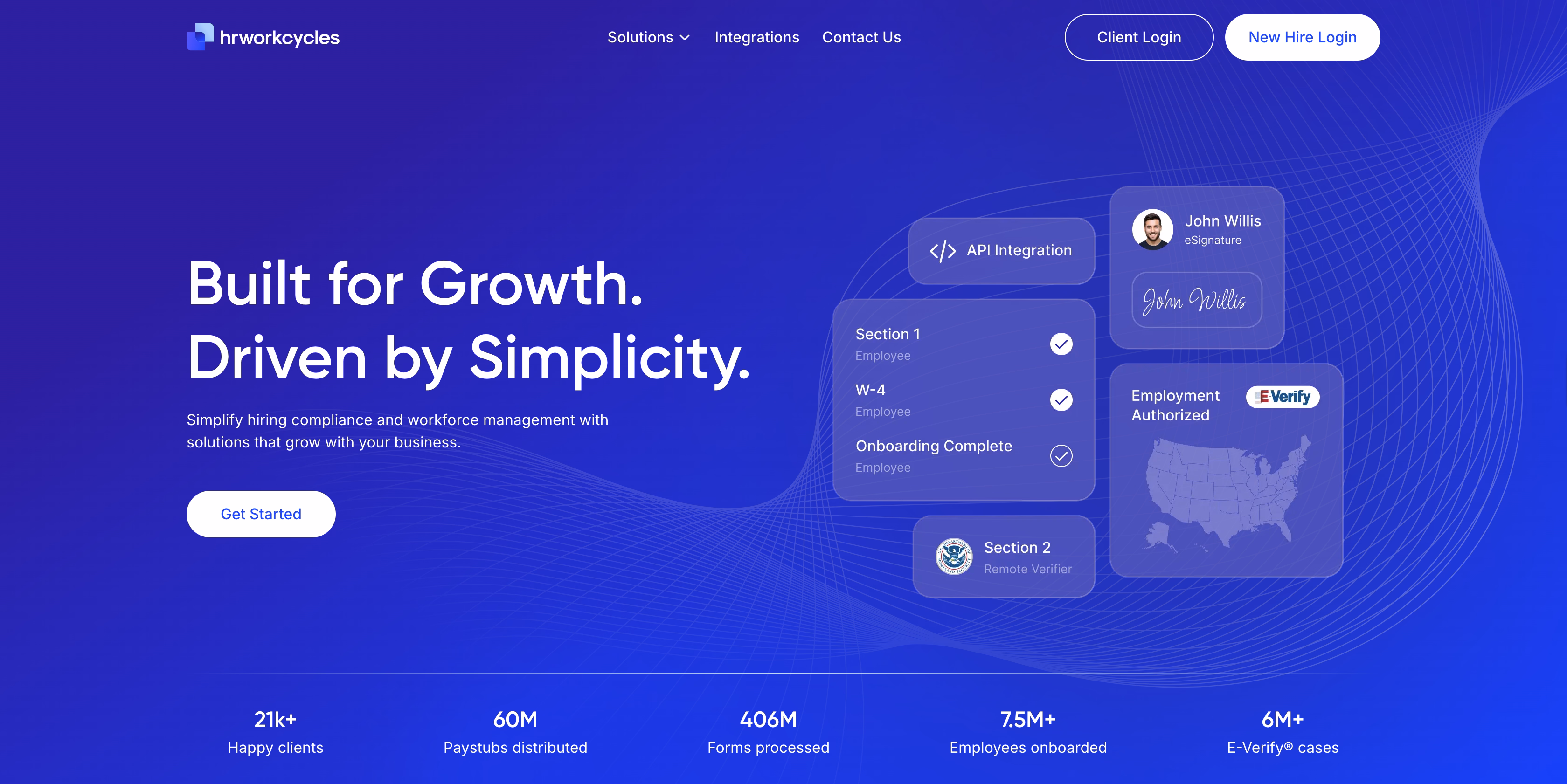
HRWorkCycles is a B2B SaaS platform (HR Tech) that enables firms to manage hiring compliance, onboarding, and workforce documentation at scale.
Why is this homepage a good lead generation example? Because it:
- Reduces the apparent compliance risk.
- Makes the product's value understandable in seconds.
- Has an outcome-driven headline.
- Frame the problem quickly.
- Gains early trust with scaling metrics.
- Separates the audience.
- Has focused primarily on CTA.
- The subheading clearly defines the domain without legal jargon or feature overload.
- Visuals explain the workflow.
This design won 2 awards (in user interface and experience design categories). If you want to see how our team validated and implemented UX structure, messaging hierarchy, and compliance signaling, explore the full HRWorkCycles case and the design decisions behind it.
PayPossible
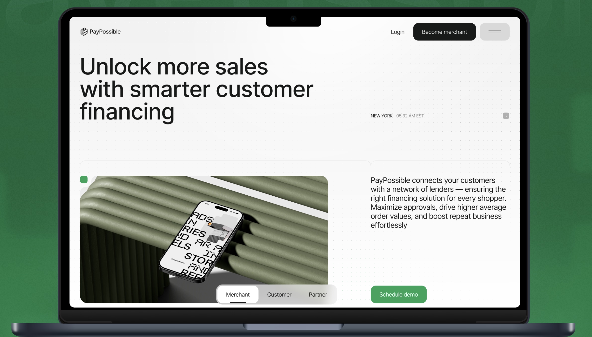
PayPossible is a B2B FinTech platform that connects merchants with a network of lenders to offer flexible customer financing.
Why is this homepage a good lead generation example?
- The homepage transforms complex financing logic into a clear revenue story for retailers.
- Revenue-first headline.
- The hero clearly segmented his audience.
- Visual representation of complex logic.
- Strong CTA matched with purchasing intent.
- Minimalist design promotes trust.
- Industry-acknowledged design (UI award).
Arounda design team turned complex multi-lender logic into an award-winning, conversion-focused homepage. Explore the full PayPossible case and the UX challenges and decisions.
GuestWise
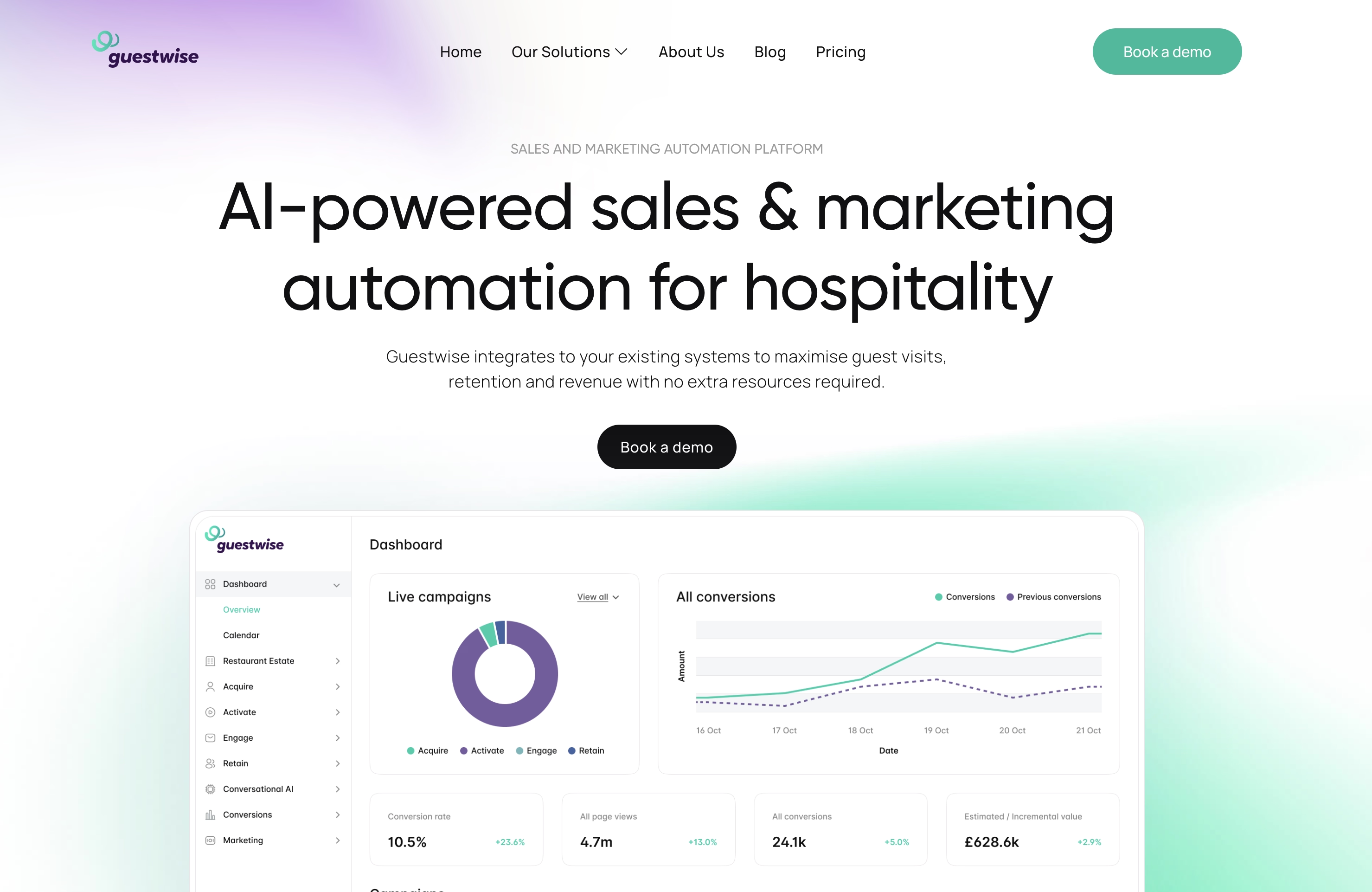
Guestwise is a B2B SaaS platform that helps hospitality brands automate sales and marketing with AI. This webpage is effective because it explicitly connects AI capabilities to revenue outcomes for a specific industry.
What does the homepage do correctly?
- The product's name and intended audience are clearly stated in the headline.
- The supporting content connects automation to measurable results.
- The dashboard preview displays live campaigns, conversions, and revenue numbers to demonstrate trust and authenticity.
- One specific CTA.
- A clean visual system that aids scanning.
- Solutions, price, and product context are easily accessible via the top menu.
- The homepage connects AI to specific workflows and visible indicators.
Explore our full Guestwise design case to learn how the messaging hierarchy and dashboard-driven proof increased conversions by 27% and feature engagement by 52%.
Kessoft
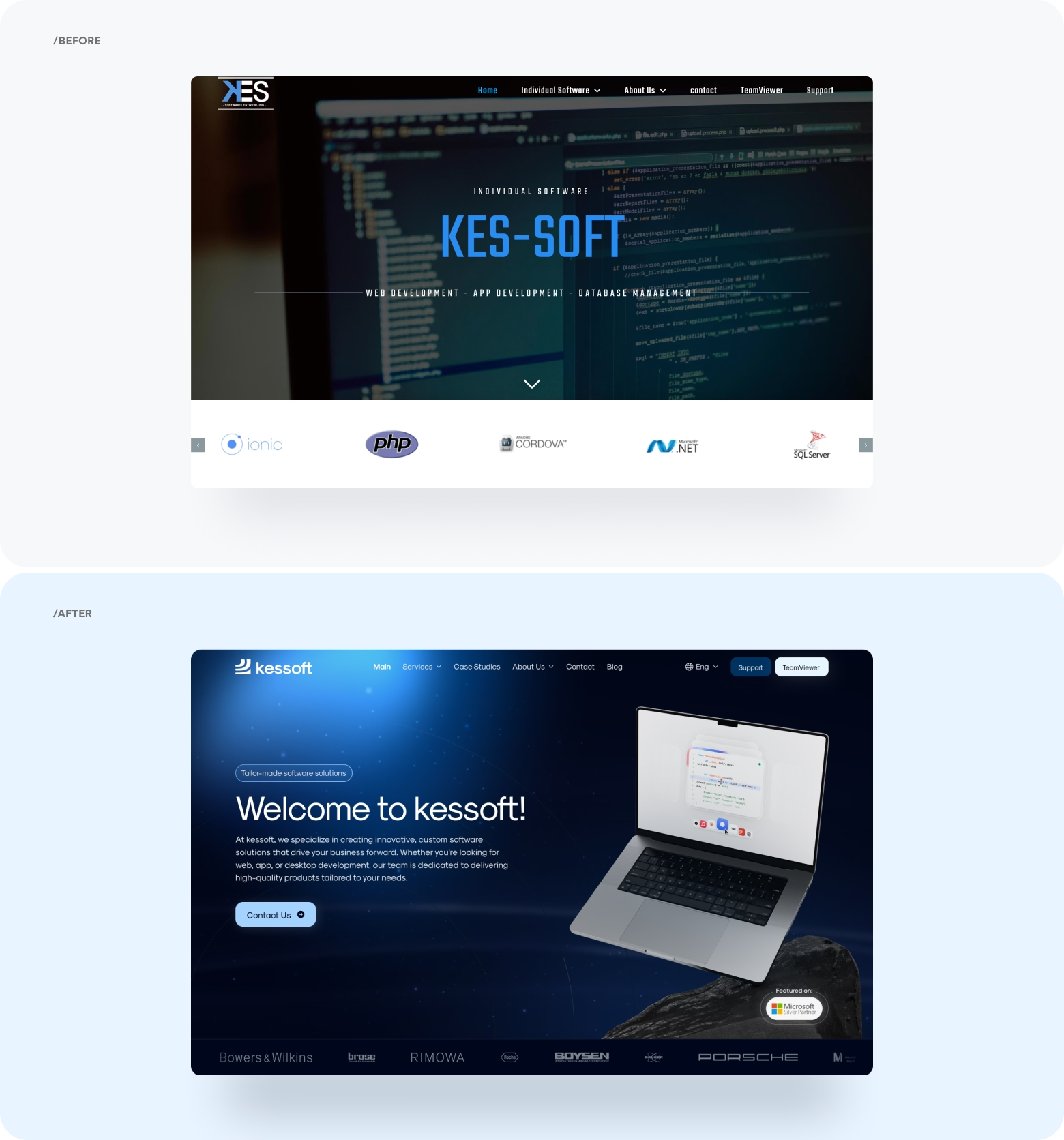
Kessoft is a business-to-business consultancy and software development company.
What makes this page effective?
- Precise positioning on the first screen (technical expertise is a commercial value).
- A balanced message hierarchy.
- The laptop with live code visualizations promotes the idea of hands-on programming without overwhelming the page with technical information.
- Language switching, support access, and organized navigation indicate maturity and operational readiness among international clients.
Our team redesigned the Kessoft website to achieve their business goals (increasing conversion rate by 29%, user engagement by 47%, and reducing bounce rate by 31%). Explore the before/after story in our full Kessoft case.
AdvisorWorld
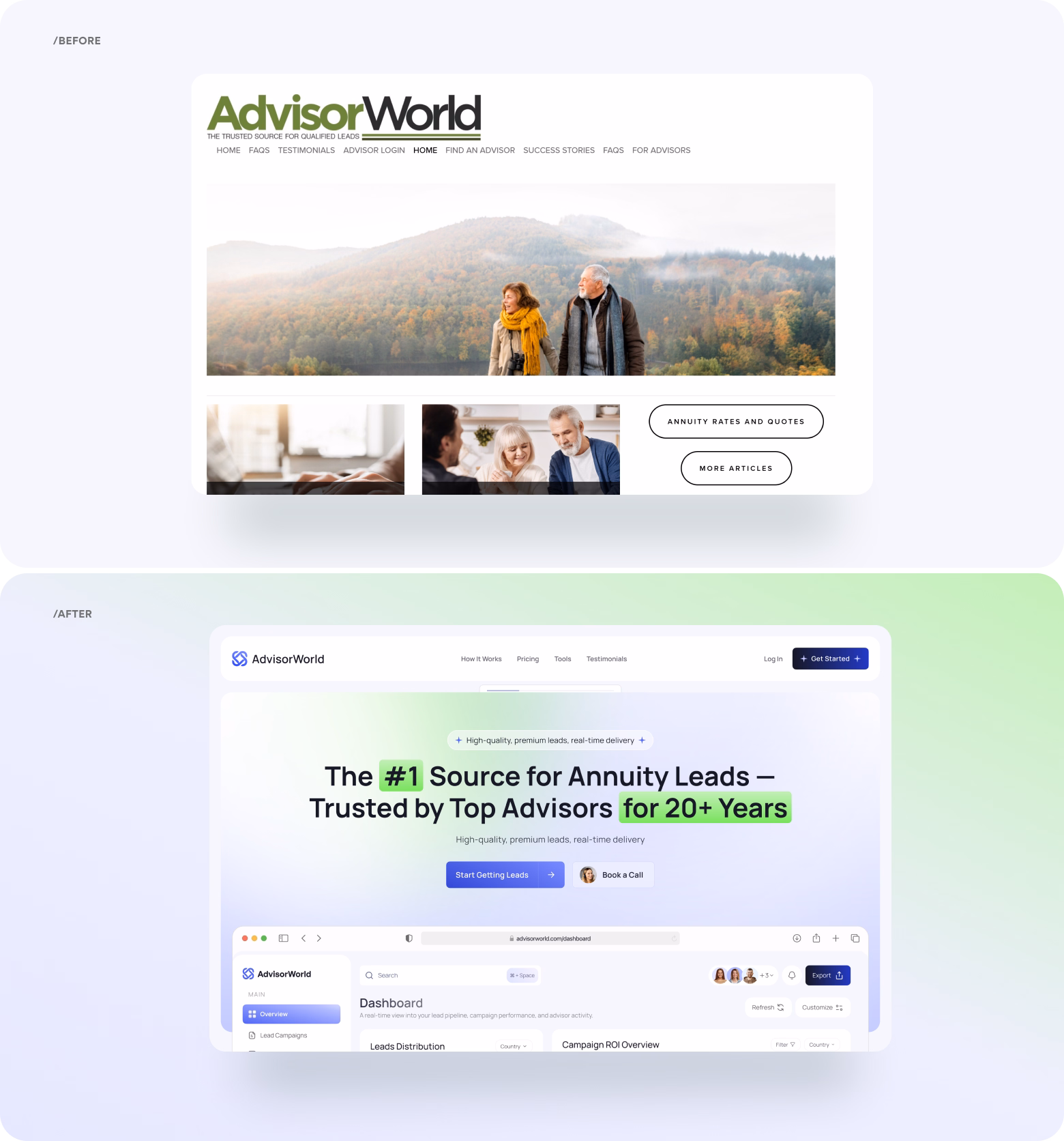
AdvisorWorld is a B2B platform that connects financial advisors with qualified annuity and insurance leads. Our team redesigned the website because it was outdated and didn’t convert. Why? Because financial buyers do not act on inspiration. They base their conversions on credibility, clarity, and control.
What makes a new page effective?
- Repositioning from emotional to transactional value.
- Authority signaled in the headline.
- Proof layered directly under the value proposition.
- Product visibility without abstract promises.
- Modern UI without losing trust.
How does AdvisorWorld convey trust and value? Review the full case with the before/after decisions and outcomes, repositioning nuances, UX audit insights, and homepage structure enhancements.
Documotor
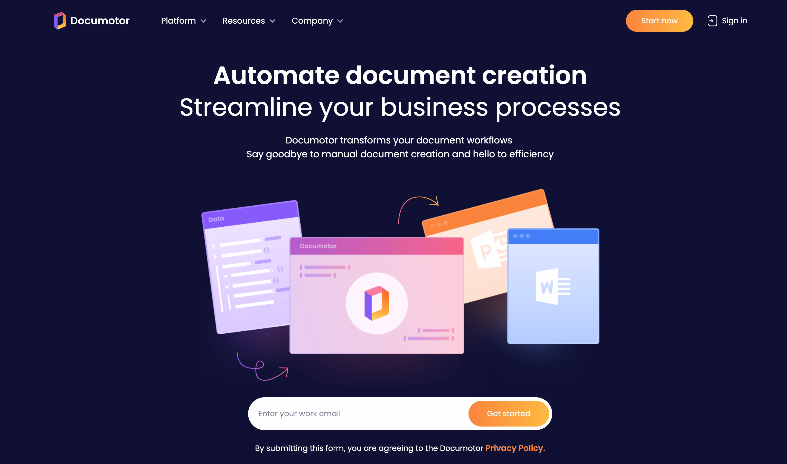
Documotor is a B2B SaaS platform that automates document creation, workflow, and data-driven document processes.
What makes it effective?
- Problem-first framing means that the messaging prioritizes avoiding human document effort, errors, and operational delays before outlining technical capabilities.
- A clear articulation of company value.
- Visuals that support understanding, with interface previews and flow-based visuals that show how documents move through the system.
- Low-friction conversion path.
- The design avoids heavy illustration or abstract visuals. It prioritizes clarity, predictability, and system logic.
- The homepage is not complex or “IT-heavy”, and this reduces that barrier and explains what changes operationally after adoption.
UX structure and message clarity help explain complex operational products. It balances technical depth with decision-ready communication. Explore our full case to gain insights, see solutions, and review results.
MOJO CX
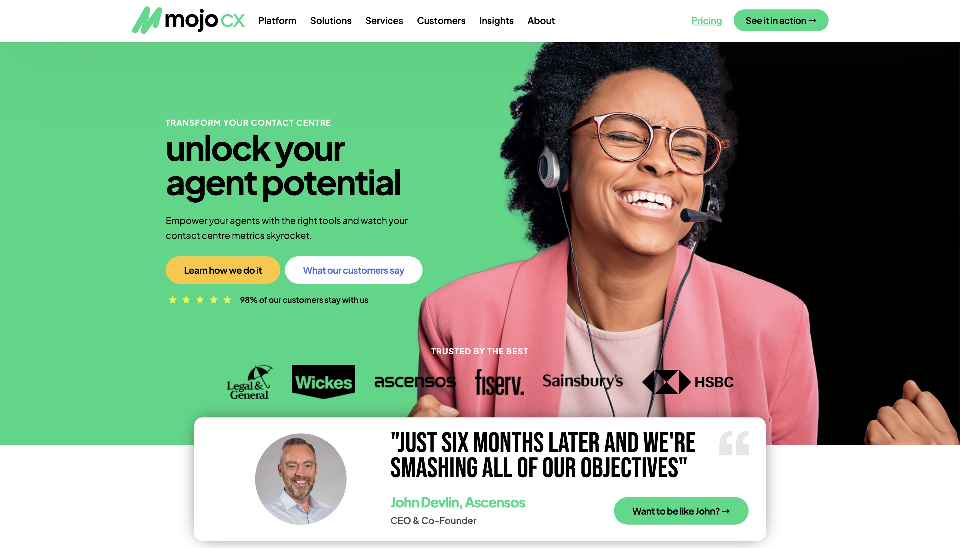
Mojo CX empowers contact center leaders to reduce costs, boost revenue, and improve quality by using AI-powered real-time coaching and conversational suggestions.
What makes it effective?
- Clearly defined categories (customer experience analytics platform).
- Outcome-driven positioning.
- Dashboard previews and data visualizations demonstrate how insights are collected, organized, and analyzed.
- Senior stakeholders can simply evaluate the tool by scanning its navigation, section structure, and content density.
- The homepage encourages exploratory behavior (understanding how things function), while clearly directing high-intent people to demos or conversations.
- The visual system avoids over-designed illustrations. Instead, it emphasizes real people's photos for trust, readability, structure, and data credibility.
MOJO CX was our client who needed to redesign their data-heavy CX platform. Review the case study where we explain our solutions for UX structure, message hierarchy, and product storytelling.
Metricly
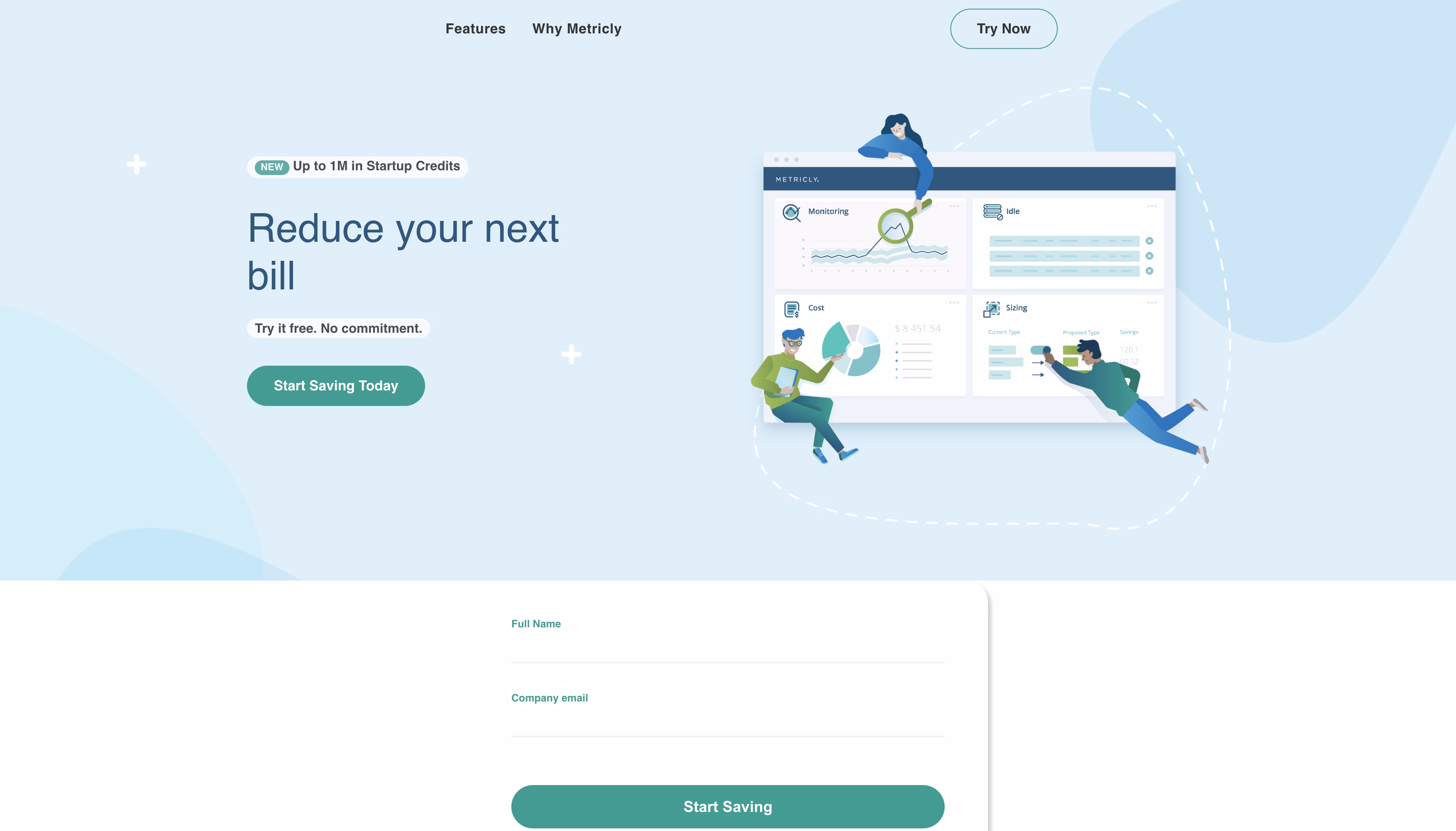
Metricly is a B2B platform that enables engineering, finance, and DevOps teams to track, optimize, and control cloud infrastructure expenditures.
What makes it effective?
- Immediate problem recognition.
- Clear audience alignment.
- Positioning with a focus on outcomes.
- Dashboards with UI previews provide product proof by displaying cost breakdowns, trends, and actionable data.
- The homepage avoids visual clutter and insignificant storytelling. It prioritizes clarity, hierarchy, and rapid scanning for busy decision-makers.
- It ties visibility to action, which boosts demo intent and lead quality.
How data-driven systems deliver value and don't overwhelm users? See our case study that explains what visually supports FinOps and cloud decision-making.
Players Health
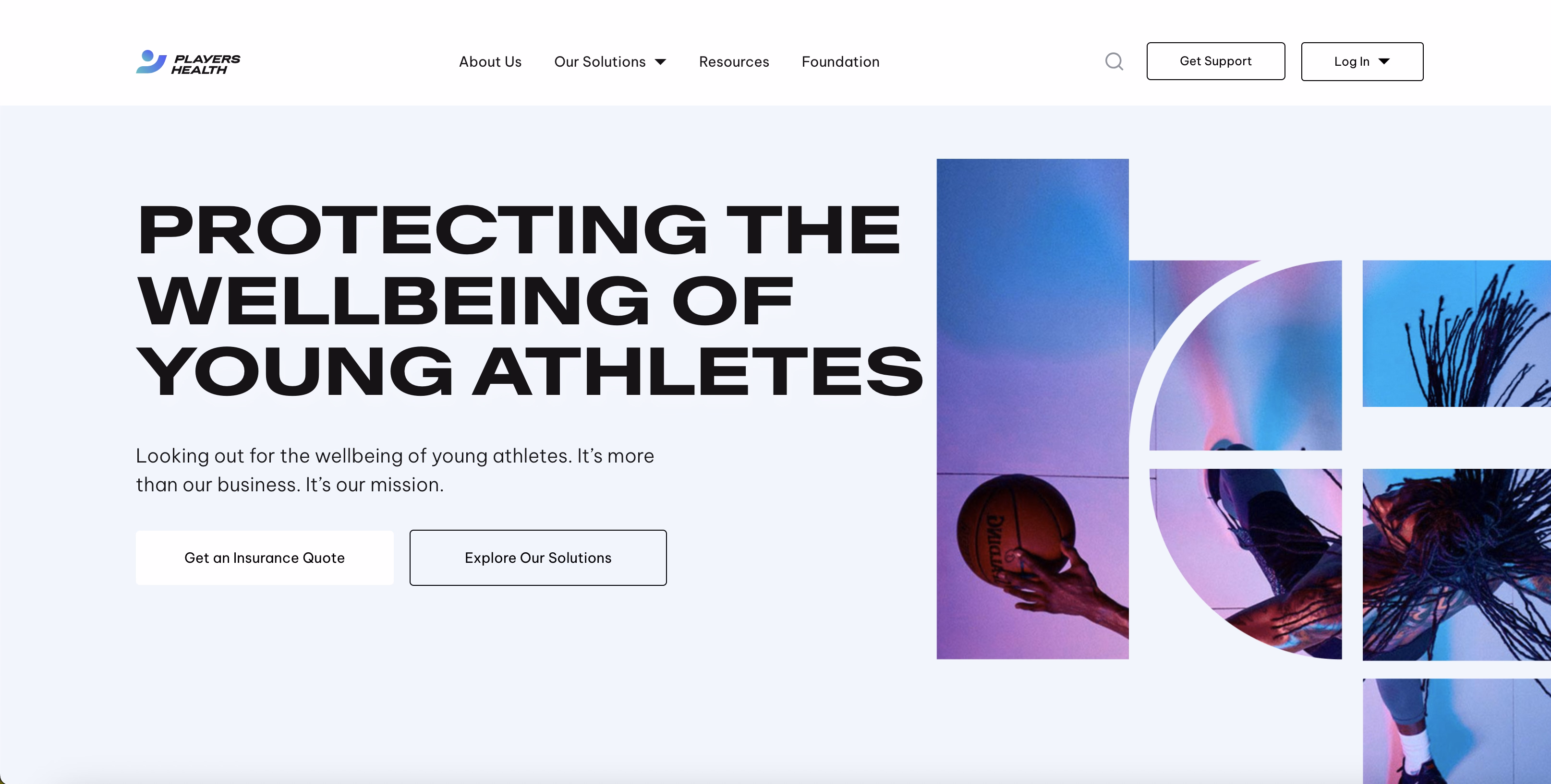
Players Health assists sports organizations in ensuring athlete safety, insurance, compliance, and risk exposure.
What makes it effective?
- Mission-driven but business-focused orientation (they emphasize athlete safety and protection, but show that this is a structured, professional platform).
- Certifications, collaborations, and institutional language emerge early.
- Instead of being divided into separate features, safety, insurance, compliance, and risk management are combined into a unified, intelligible story.
- The wording addresses decision-makers who have accountability and responsibility.
- The design avoids aggressive sales approaches and bright imagery. It's simple, but modern and cool.
In regulated and safety-critical businesses, focus on confidence and control rather than urgency. Players Health is an excellent illustration of how a webpage structure facilitates serious purchasing decisions.
WordPress
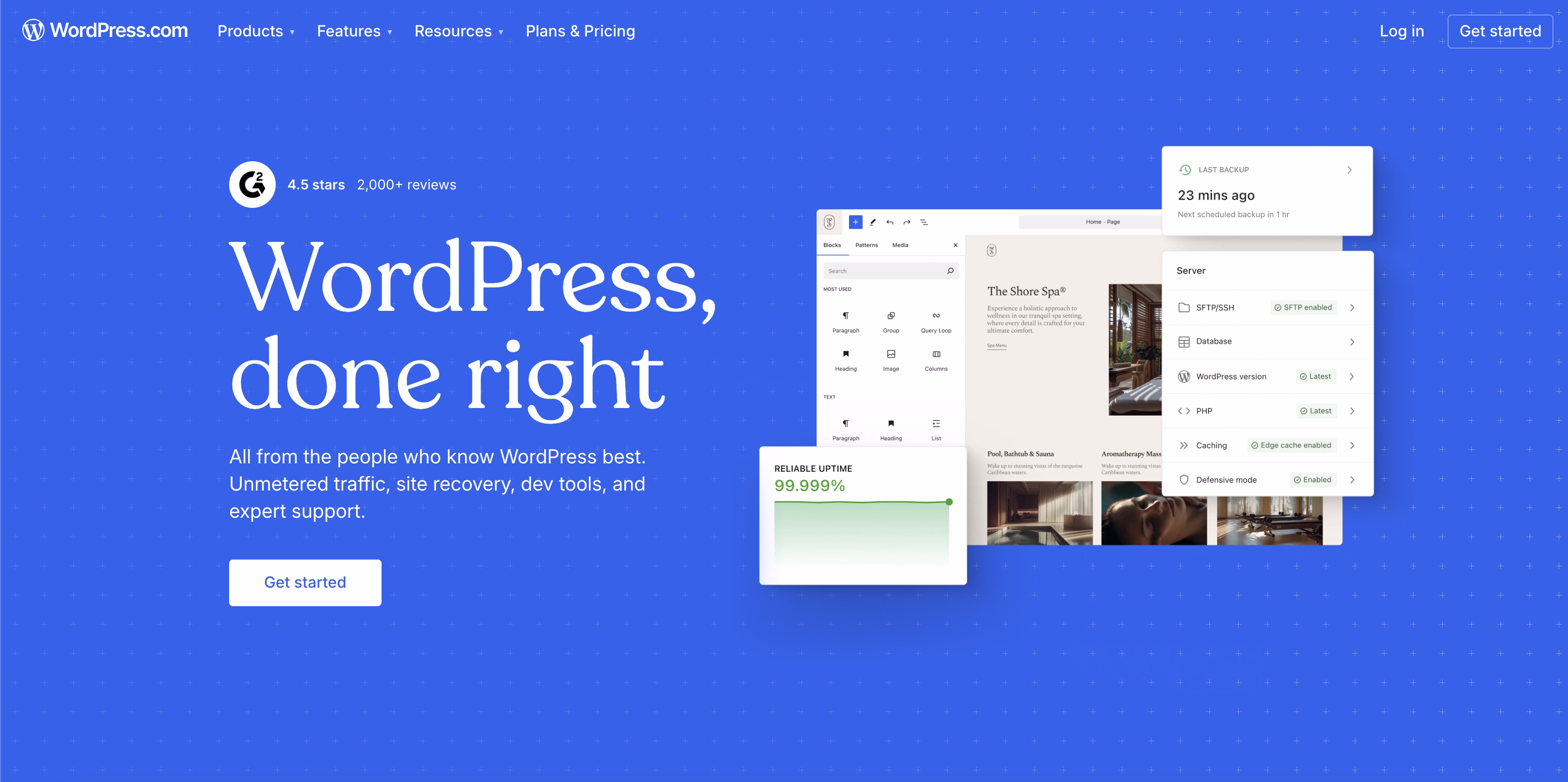
WordPress is a global website publishing and hosting platform. Businesses, media firms, and enterprises can create, manage, and expand their digital products there.
What makes it so effective in lead generation?
- Clear segmentation without confusion (creators, businesses, developers, and enterprises).
- Platform value before features (publishing freedom, scalability, performance, and ownership)
- Usage scale, global adoption, and brand recognition are implicit trust signals.
- The surface layer stays accessible, and only deeper pages provide technical and operational details.
- The design system supports clarity across a broad product offering, so users don’t feel lost despite the platform’s scope.
- Self-serve actions coexist with guided paths that allow users to progress at their own decision pace.
Arounda partnered with WordPress on the design of marketing materials. We supported how the platform communicates value, flexibility, and scale across different audiences. Explore our WordPress partnership case and the design decisions behind those materials.
Shopify
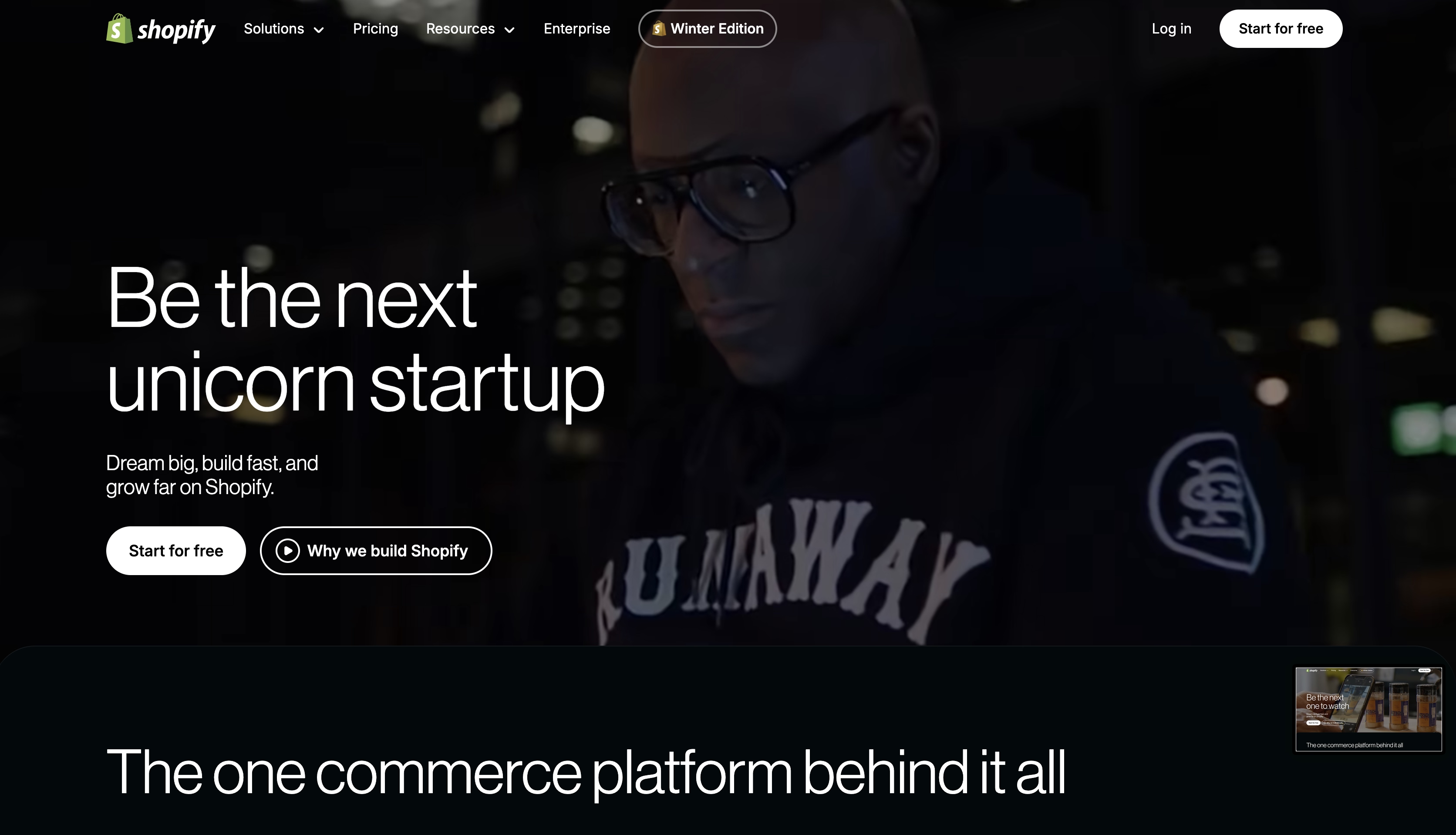
Shopify is a global commerce platform used by SMBs, fast-growing brands, and enterprise companies to build, run, and scale online commerce.
What is their main task for the homepage? Remove decision friction for a very broad audience and still guide users toward the right entry point.
What makes it a strong lead-generating example?
- Video in the hero section that shows the benefits for each audience.
- Instant value recognition because the headlines clearly communicate the core promise.
- Progressive disclosure of complexity.
- Shopify defines value as growth, efficiency, and business control.
- It has global brand awareness, scalability, and adoption as implicit evidence. Shopify does not require aggressive testimonials or stats to gain credibility.
- Low-risk primary CTA ("Start for free") reduces the entry hurdle.
- Users can rapidly find their way around thanks to clean layouts, solid structure, and minimal content.
Shopify has one of the best ecommerce homepage design examples because of fast understanding and easy next steps. This maximizes conversion across very different buyer maturity levels.
Diffusion
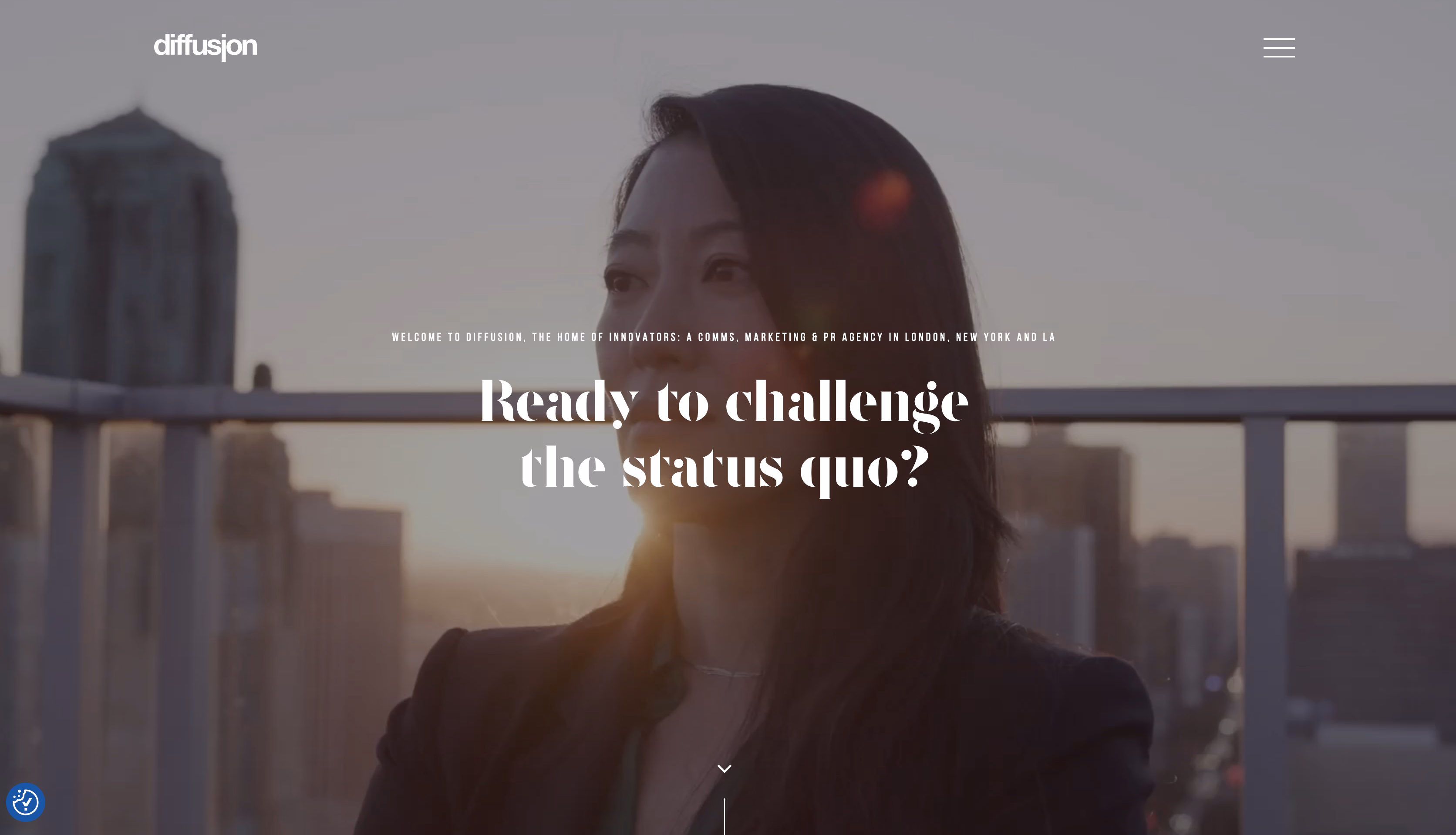
Diffusion PR is a B2B public relations agency focused on technology, cybersecurity, AI, and enterprise innovation.
What makes it a strong lead-generating example?
- The hero video immediately establishes the tone, competence level, and industry focus.
- Concise language that anchors meaning reinforces the motion content.
- Strong UX design homepage balance.
- Client types, sectors, and outcomes emerge early. This is an important trust indicator for customers who equate PR with reputation risk.
- The homepage does not hurry people to take action. It permits them to understand context first.
- Motion that supports positioning and trust.
Why is that important? Because in services like PR, buyers evaluate judgment and expertise before tactics.
Overpass
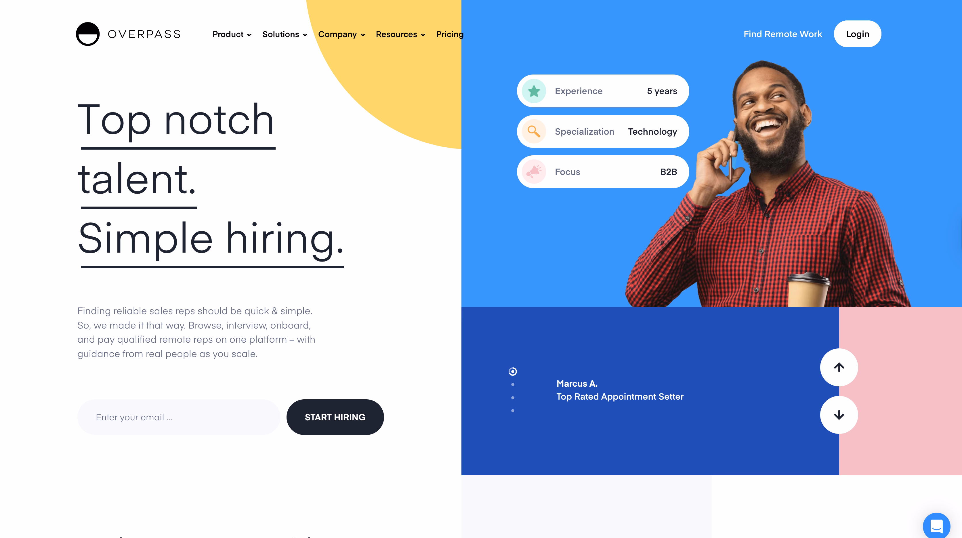
Overpass helps businesses find the best remote sales reps. So, its website should reduce hiring uncertainty and time-to-decision.
What makes it an effective lead-generation example?
- Immediate problem recognition.
- Overpass demonstrates how the hiring process works early on.
- Trust signs are put before the scroll.
- Simple structure.
- Balanced CTAs for various intent levels.
- Copy focuses on outcomes.
Modash
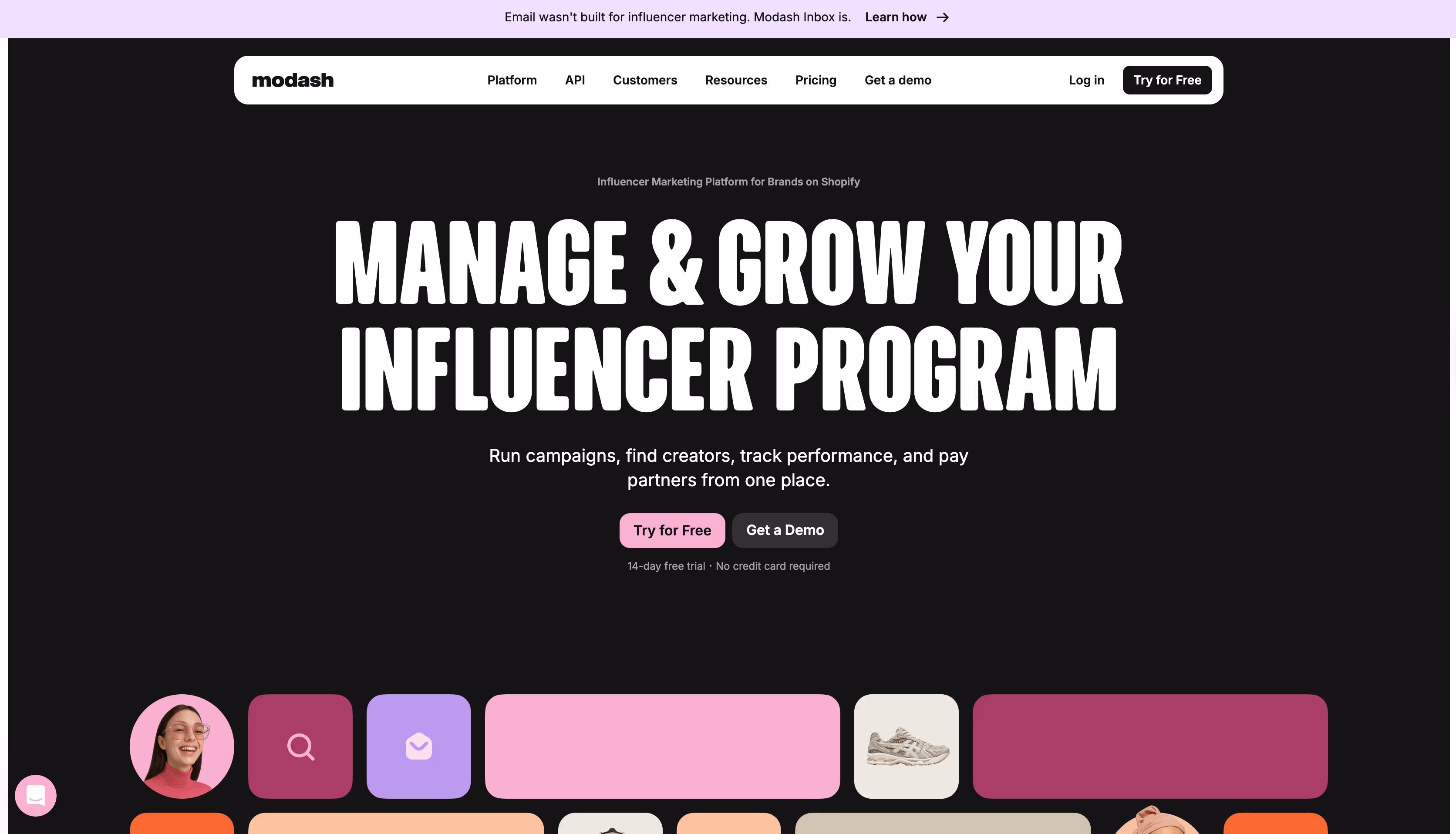
Modash is a SaaS tool that assists marketing organizations in identifying, analyzing, and managing influencers. Its customers include CMOs, growth leaders, and performance marketers who value ROI transparency, audience quality, and repeatable influencer campaigns.
What distinguishes it as a practical lead-generation example?
- Influencer marketing is repositioned as a data problem.
- High relevance for performance-driven teams. Messaging focuses on fake follower detection, audience analytics, and performance measurements.
- Dashboard previews include actual creator data, filters, and audience breakdowns to improve trust.
- The layout directs attention from value to proof, product, and CTA. It doesn't overwhelm visitors with feature lists.
- Logos, usage claims, and platform maturity indicators are shown in areas where purchasers demand validation.
If you are looking for homepage design inspiration examples in this sphere, Modash is a firm reference for data-first positioning.
Webflow
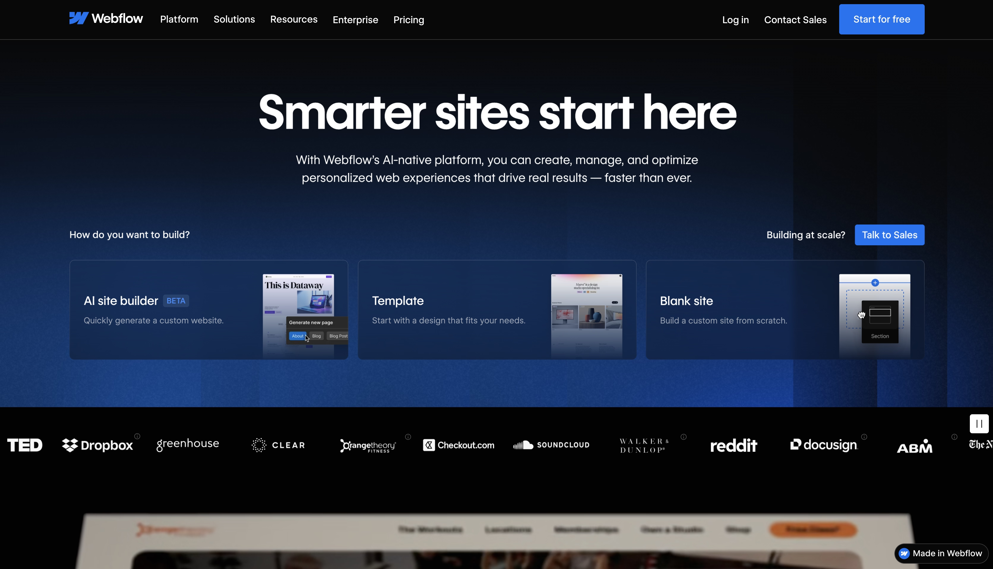
Webflow is a visual web development platform to build scalable websites without relying on traditional development workflows. It’s widely adopted by startups and businesses that need speed, control, and design precision.
Arounda is a Webflow Certified Partner. We offer design and development services and work with the platform to deliver production-ready websites.
What makes this an excellent lead generation example?
- Webflow rapidly distinguishes itself as more than just a website builder. The message conveys control, scalability, and professional-quality output.
- A progressive explanation of complexity. The webpage initially introduces the concept (visual development), then gradually shows CMS, integrations, and enterprise features.
- Designers, marketers, and developers all perceive a relevant value aspect without the page being divided into numerous tales.
- The interface becomes proof. Clean UI previews, interactions, and layout quality build trust via experience.
- Homepage as a live product demo.
If you’re searching for website homepage ideas for scalable product sites, Webflow is a reference for how structure, interaction, and messaging work together at platform scale.
Wrapbook
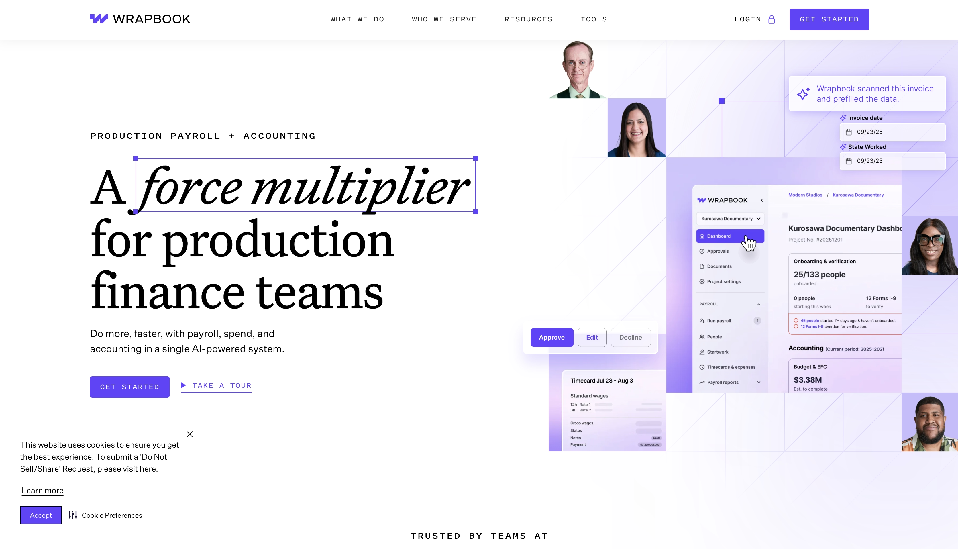
Wrapbook helps film, TV, and commercial production teams manage payroll, accounting, and compliance. Its customers value a premium accuracy, speed, and regulatory confidence while working within tight deadlines.
What makes this a great example of lead generation?
- The headline presents payroll as a production barrier. Buyers readily recognize the relation to real-world production pressures.
- Rather than describing tools, the page explains workflows.
- Language, pictures, and examples reflect production realities.
- Dashboard previews display approvals, timeframes, and payroll states. Clients can grasp control points before committing.
- The design avoids any funny or experimental elements. Layouts and limited color choices convey seriousness and reliability.
- Guided demos and conversations match the complexity and risk profile of payroll decisions in production environments.
Viedoc
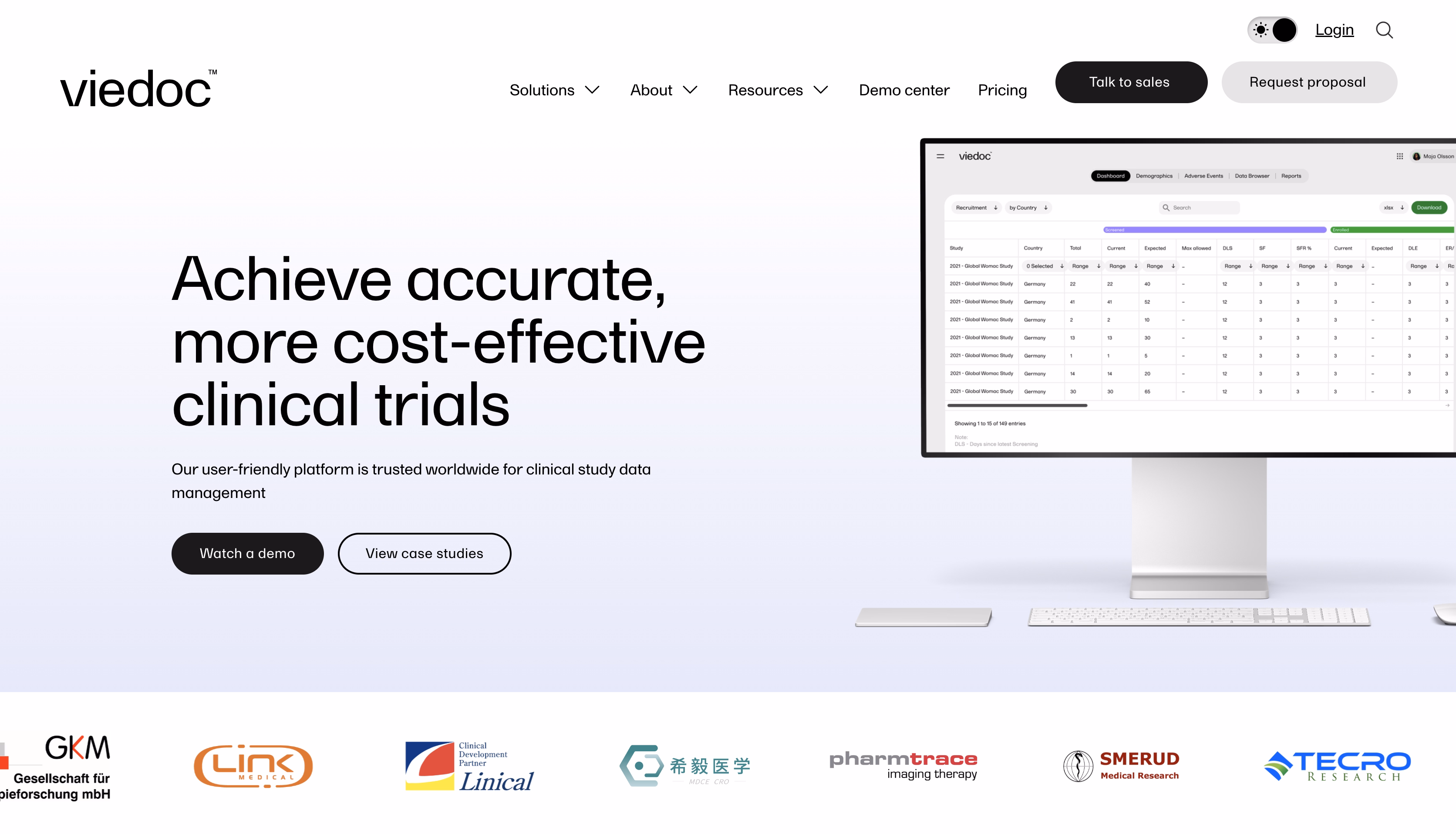
Viedoc is an eClinical platform used by life sciences companies to design, run, and manage clinical trials. Its buyers care about data integrity, compliance, and execution reliability.
What makes it effective?
- Calm and confident positioning.
- Viedoc does not use the broad "clinical trial software" label. It demonstrates where it fits into the trial lifecycle and what teams use it for.
- Certifications, compliance language, and platform maturity indicators emerge naturally.
- Interface previews demonstrate structured data views and workflows, assuring users that this is a legitimate operational system.
- The layout supports scanning.
Viedoc’s homepage earns trust by being transparent, calm, and precise, which filters for qualified leads and supports long evaluation cycles.
Yojji
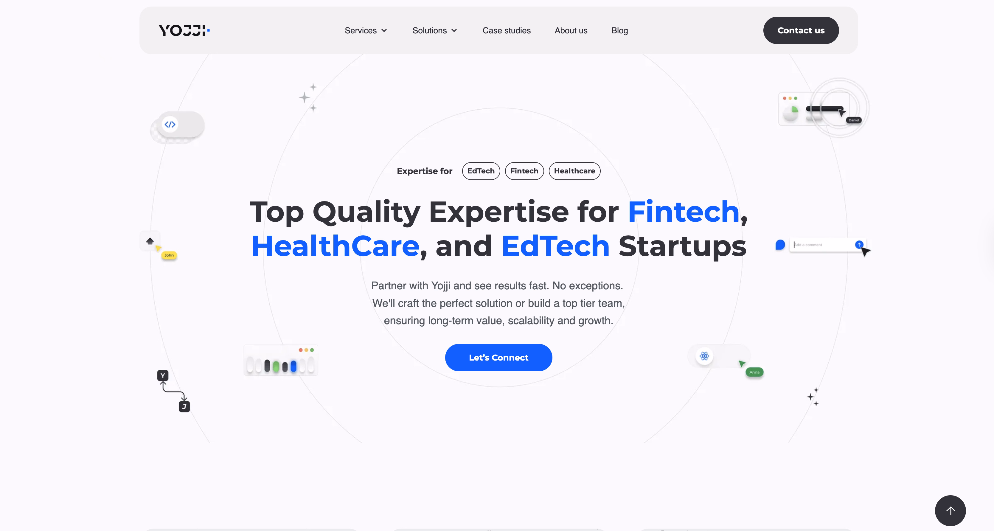
Yojji is a software development company that builds custom web and mobile products for startups and growing technology businesses.
Strongest homepage points
- Immediate value proposition with social proof in the hero section.
- Strategic CTA placement where multiple "Get a Free Estimate" buttons appear at natural decision points without feeling pushy.
- Real client stories with recognizable logos provide third-party validation.
- They break down their workflow visually. This reduces anxiety about the unknown.
- Clutch ratings, industry badges, and specific technology expertise position them as specialists and attract higher-quality leads.
- Instead of just listing services, they address pain points.
OnHand
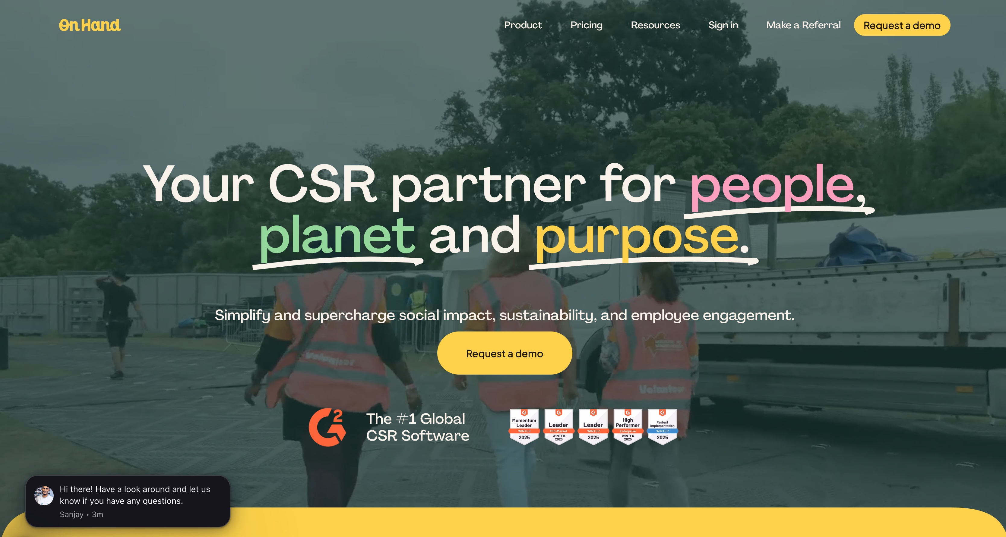
OnHand is a SaaS platform that lets companies manage CSR activities, employee volunteering, social impact, and sustainability projects in a single system.
Strongest homepage points
- The purpose-driven title "Your CSR partner for people, planet, and purpose" quickly identifies the category and OnHand's function. There is no question about why the platform exists or why it is cool.
- Emotional influence. The backdrop video and visuals evoke empathy and meaning.
- Awards, rankings, and "#1 Global CSR Software" claims to build trust.
- A clear articulation of company value. CSR is shown as a concept that can be simplified, assessed, and scaled.
- The message structure is intact (from value, to proof, and to the action).
- Awards and validation have a strategic placement. Recognition comes when people expect reassurance.
WaveNet
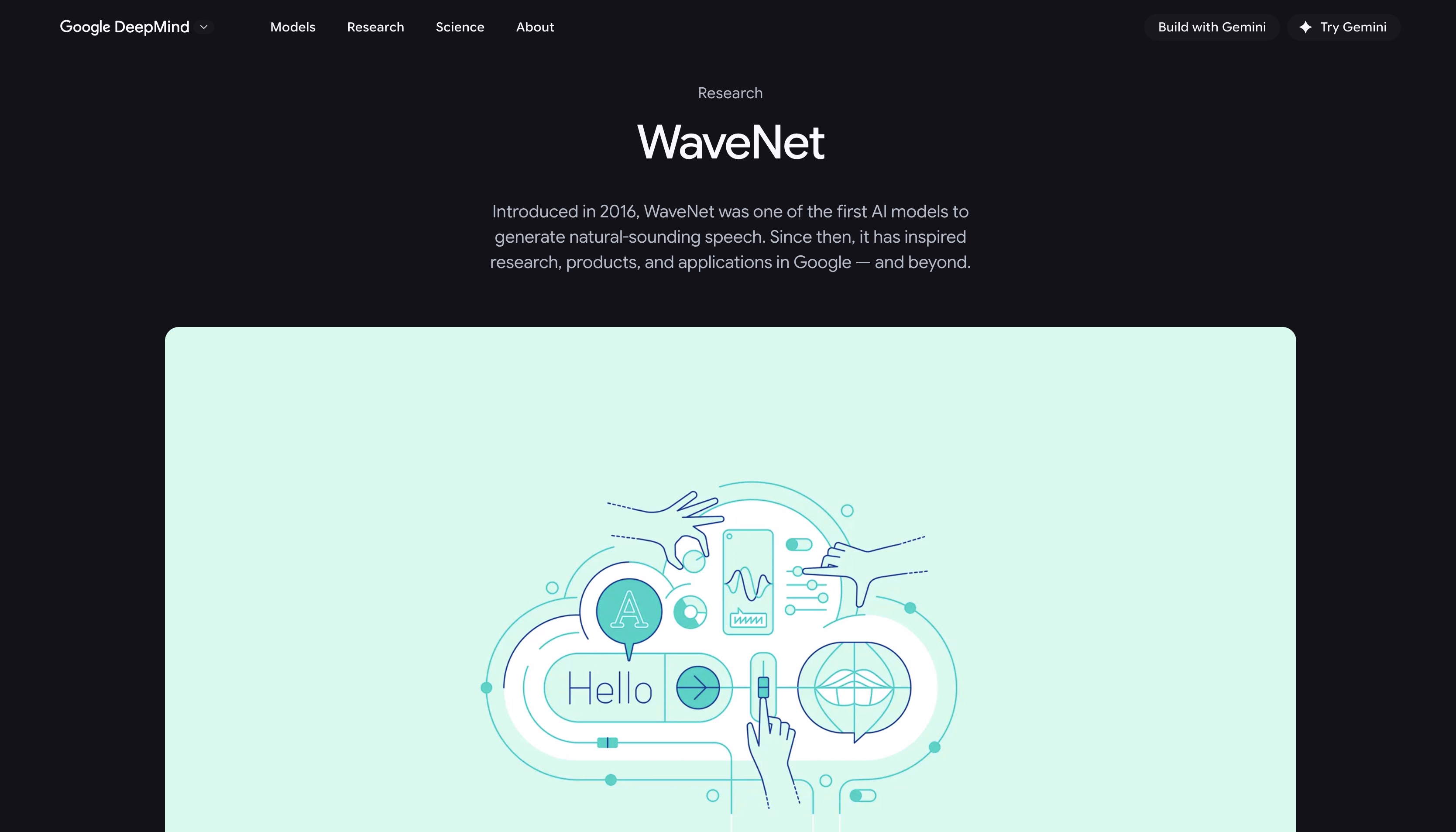
WaveNet is a foundational deep learning model developed by Google DeepMind for generating raw audio waveforms. It’s a research-first homepage designed for scientists, engineers, and technically fluent decision-makers evaluating AI credibility and depth.
Strongest homepage points
- The page let the technology speak for itself. Instead of claiming "our AI sounds natural," they embed before/after audio comparisons where you can hear the dramatic quality leap from previous TTS systems to WaveNet.
- There is a balance between detailed descriptions of the architecture (dilated convolutions, autoregressive models) and clear graphical representations.
- Wave visualization animations make abstract notions (neural networks processing audio) comprehensible.
- The DeepMind-Google collaboration indicates resources, stability, and real-world application at scale.
- The "conversion" here is reputation and relationship-building in the AI ecosystem.
Tavus
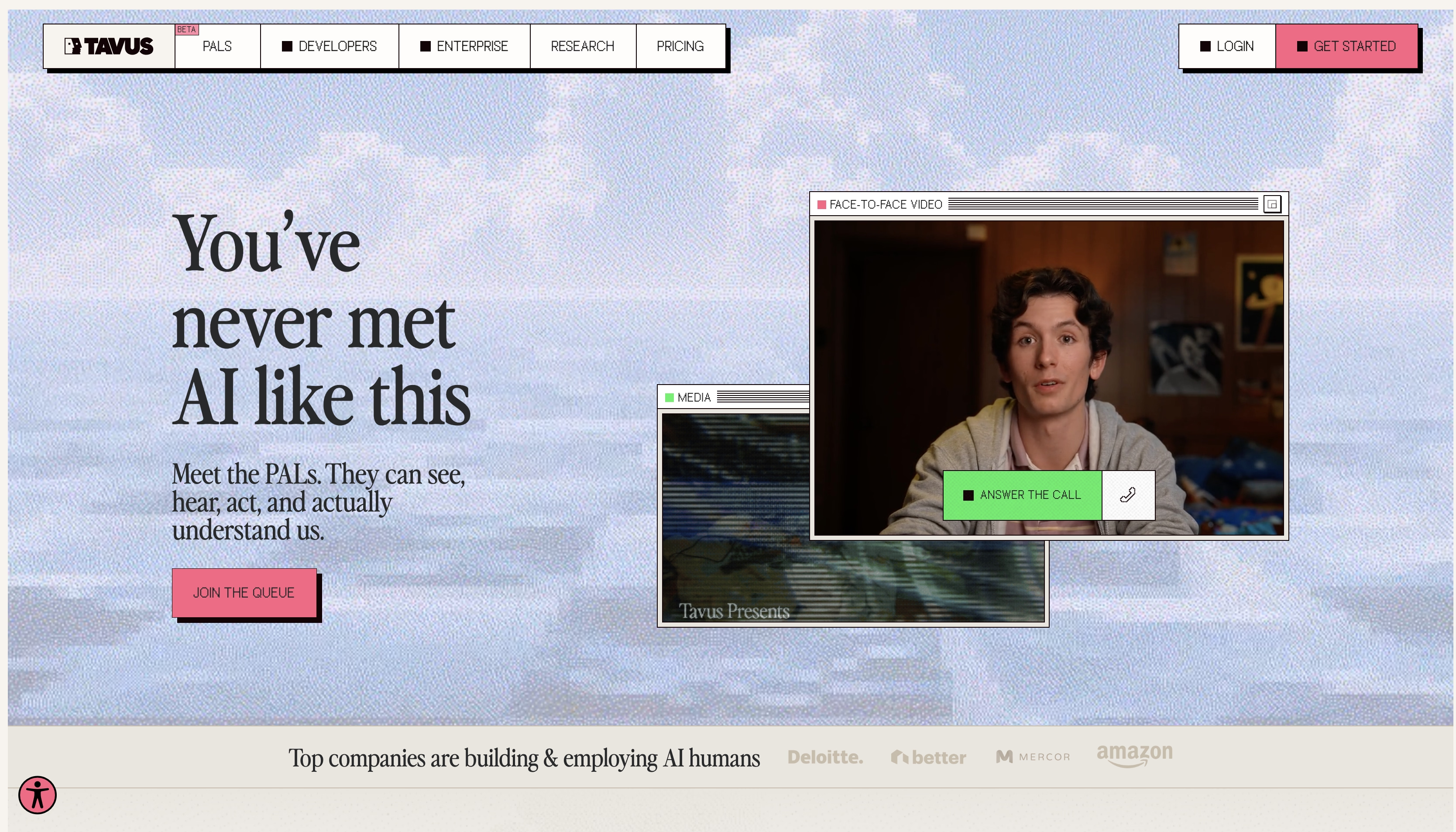
Tavus is an AI platform that allows companies to generate personalized videos at scale using AI avatars and voice cloning. It’s for growth teams, sales leaders, and marketing teams looking to increase response rates and engagement without manual video production.
Strongest homepage points
- Instant "wow factor" with embedded video proof.
- Strong positioning and a straightforward value equation.
- Separate sections for Sales, Marketing, Recruiting, and Customer Success with role-specific examples.
- Logos from recognizable brands plus metrics provide third-party validation.
- Low-friction trial path.
- Ethical transparency. It explains consent mechanisms and authentic use cases.
- Rather than drowning in AI jargon, it emphasizes business outcomes (ROI).
- The page works because it transforms a "sci-fi concept" into a practical business tool in under 30 seconds. Then, it systematically removes every reason not to try it.
Legitify
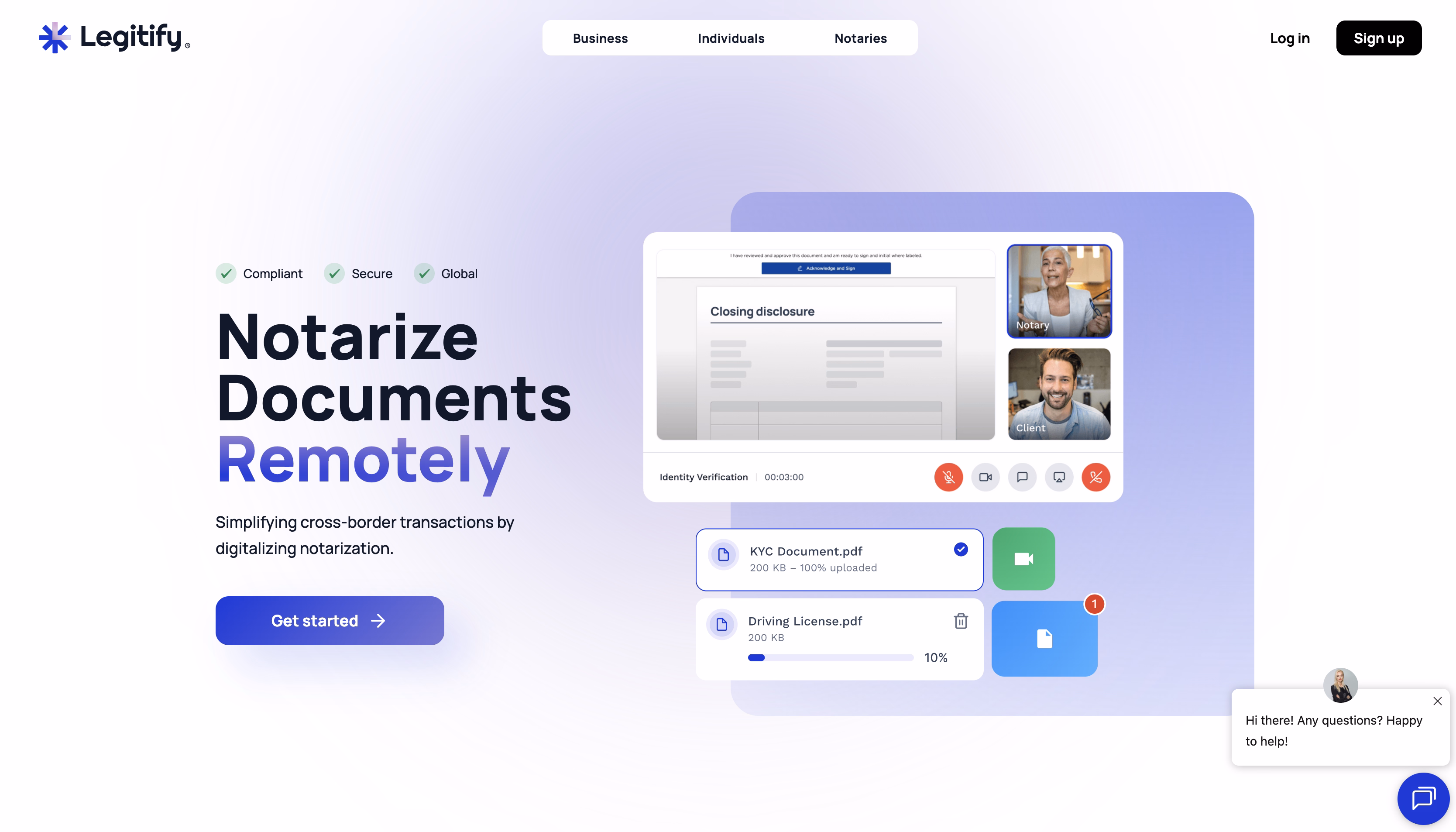
Legitify is a company that offers legal, compliance, and security assurance.
Strongest homepage points
- It instantly communicates the entire value proposition. You see the document on screen, participant video feeds, and the digital workflow.
- "Notarize Documents Remotely" directly tackles the issues (travel to offices, schedule problems, and wasted time). The implied promise is, "Stay wherever you are."
- Compliance messaging promotes trust.
- Speed and efficiency represent time savings and modernization. This appeals to tech-savvy legal teams who are bored with traditional workflows.
- The sleek, trustworthy design subconsciously fosters dependability.
- Different lead funnels across professional groups allow easy navigation.
Triple Whale
Triple Whale is an analytics platform that helps e-commerce brands understand attribution, performance, and profitability across channels.
Strongest homepage points
- Relatable pain. Users instantly recognize the pain without needing industry context.
- Personality-first approach makes them memorable and creates an instant "they get me" connection with stressed-out brand operators.
- The homepage focuses on decision-making: knowing what actually drives revenue and profit.
- Real dashboard previews and data views show how teams interact with the platform.
- Each section answers a different decision-stage question.
- Social proof, ecosystem references, and a confident tone signal maturity.
INSHUR
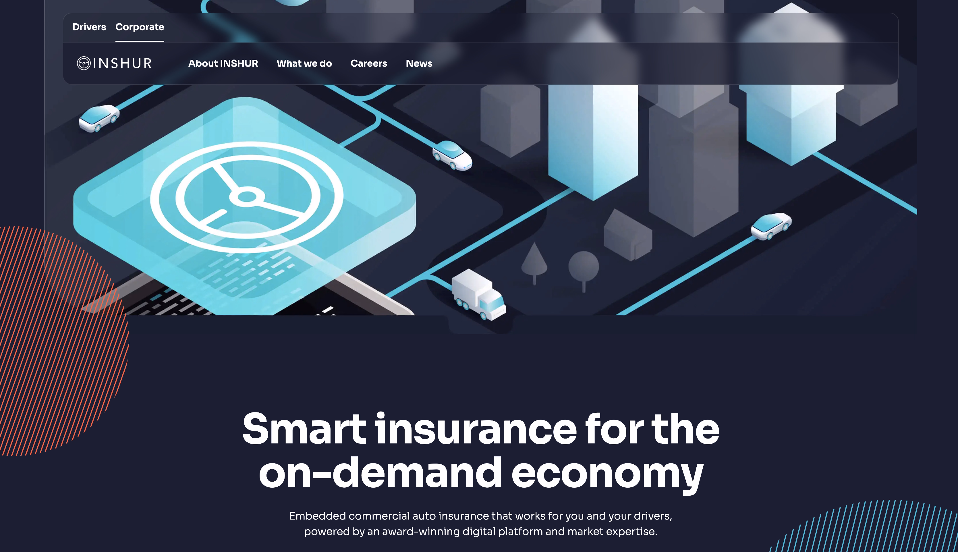
INSHUR is an insurance platform that offers commercial auto insurance to mobility-focused businesses.
Strongest homepage points
- Storytelling decreases risk by explaining who INSHUR is, how it works, and why you should trust it. This is frequently more significant than feature descriptions.
- A clear definition of mission and market role.
- Leadership experience, regulatory context, relationships, and market presence all help with procurement and compliance checks.
- UX design is calm and professional, with no forceful call-to-actions or marketing language.
- Humanized enterprise narrative.
- The goal here isn’t instant action. It’s internal validation, stakeholder alignment, and long-term confidence.
Proof
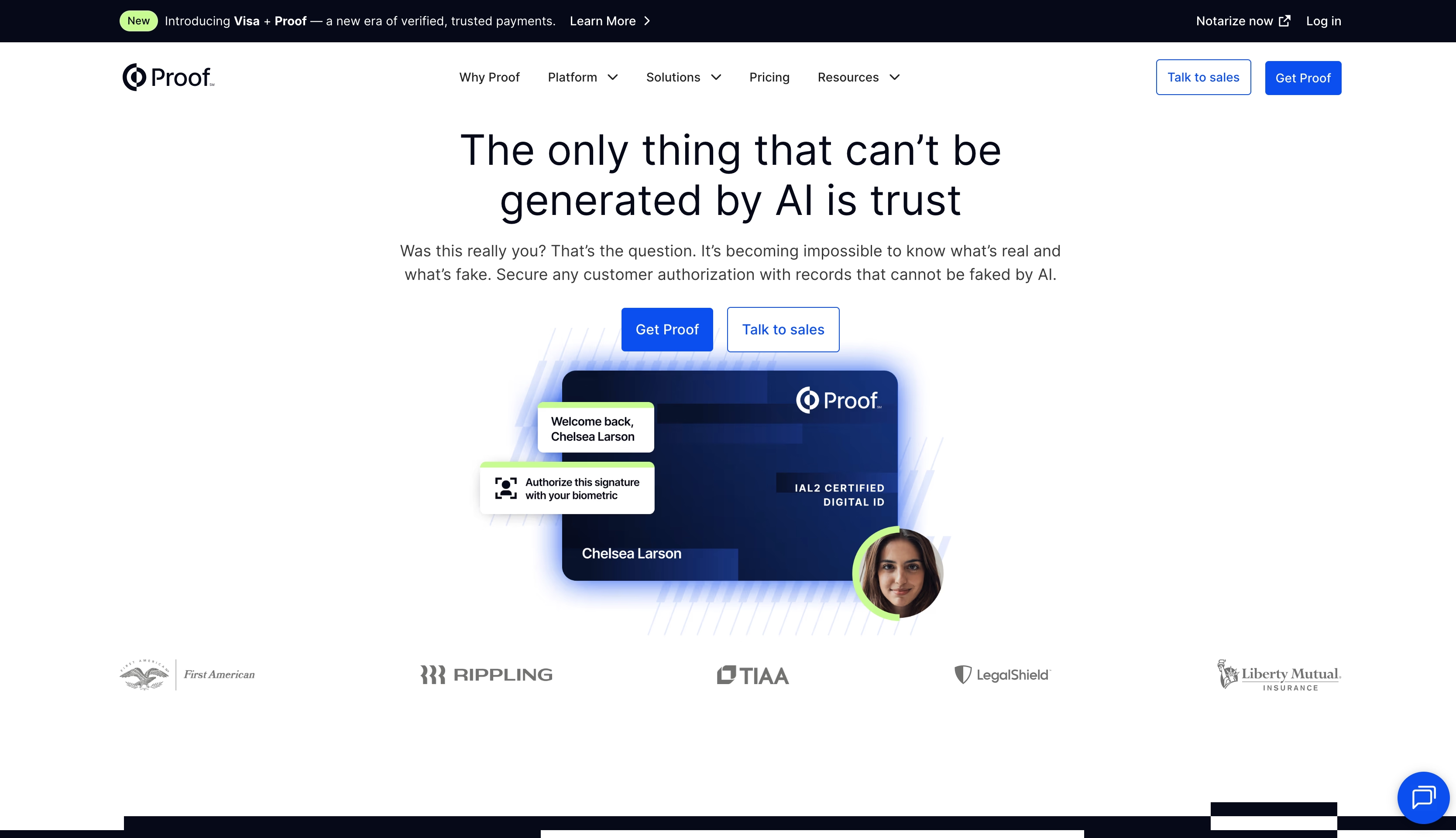
Proof provides secure online notarization and identity verification for legal, financial, and enterprise workflows.
Strongest homepage points
- The webpage establishes immediate credibility with the smart use of security badges, compliance certifications, and bank-grade encryption messaging.
- Dual value propositions address efficiency ("go digital, save time") and compliance ("remain legally compliant") and attract numerous decision-makers.
- Explicitly addressing "Is this legally binding?" concerns upfront removes the biggest objection before prospects even ask.
- The professional aesthetic and emphasis on security/compliance positions them for high-value contracts.
- Providing easily accessible information about state regulations, audit trails, and record retention demonstrates that they understand the legal complexities better than competitors.
Labguru
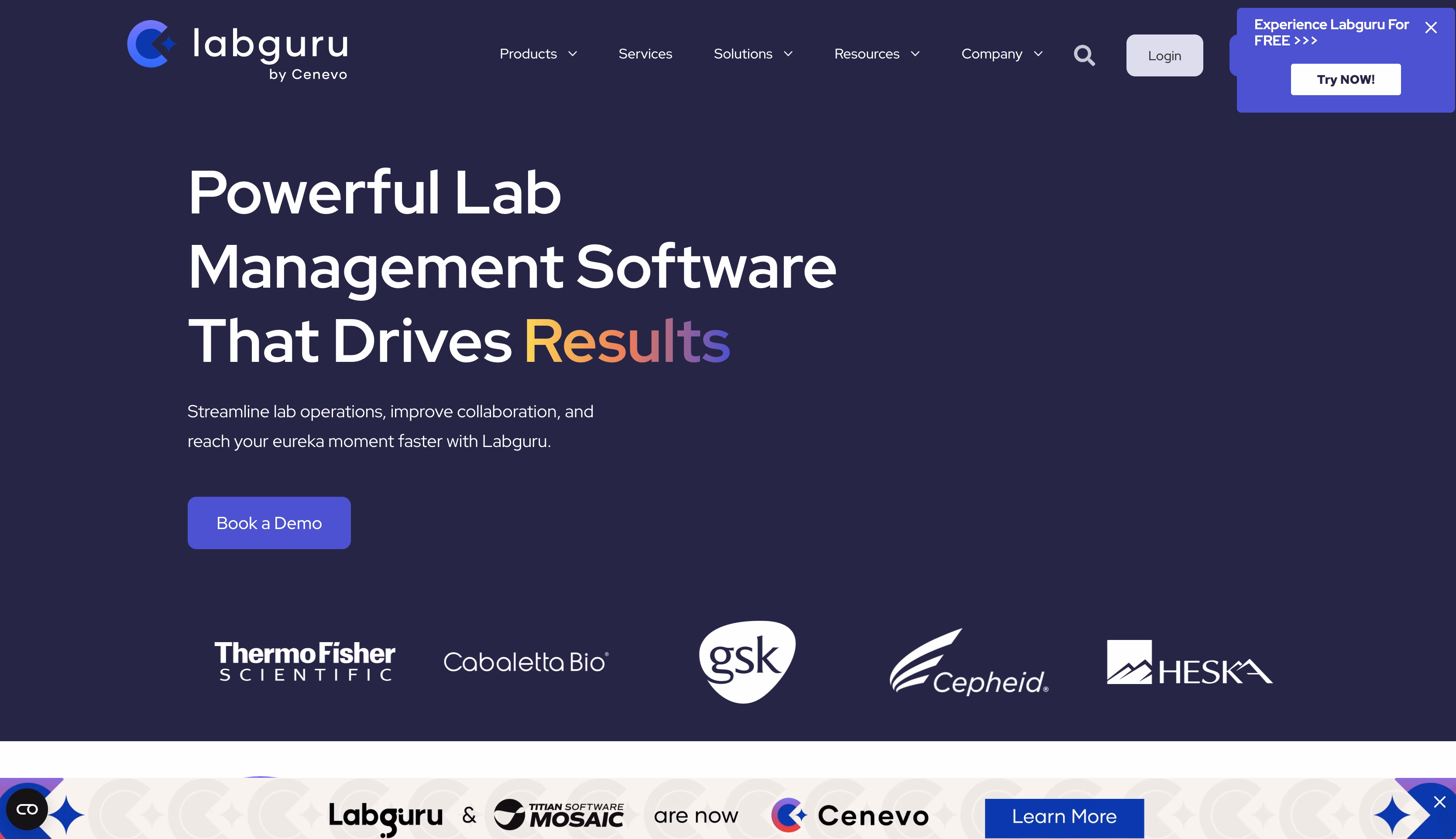
Labguru is a Laboratory Information Management System (LIMS) for life sciences teams that want to manage experiments, samples, data, inventory, and compliance in one platform.
Strongest homepage points
- Labguru's webpage expressly mentions that it is an end-to-end lab management platform.
- Interface previews feature structured experiment records, sample management, and data organization. It demonstrates that the platform can handle true lab-scale complexity.
- The terminology is exact but understandable for scientists and budget approvers.
- Early indications of regulatory readiness.
Advice Guide
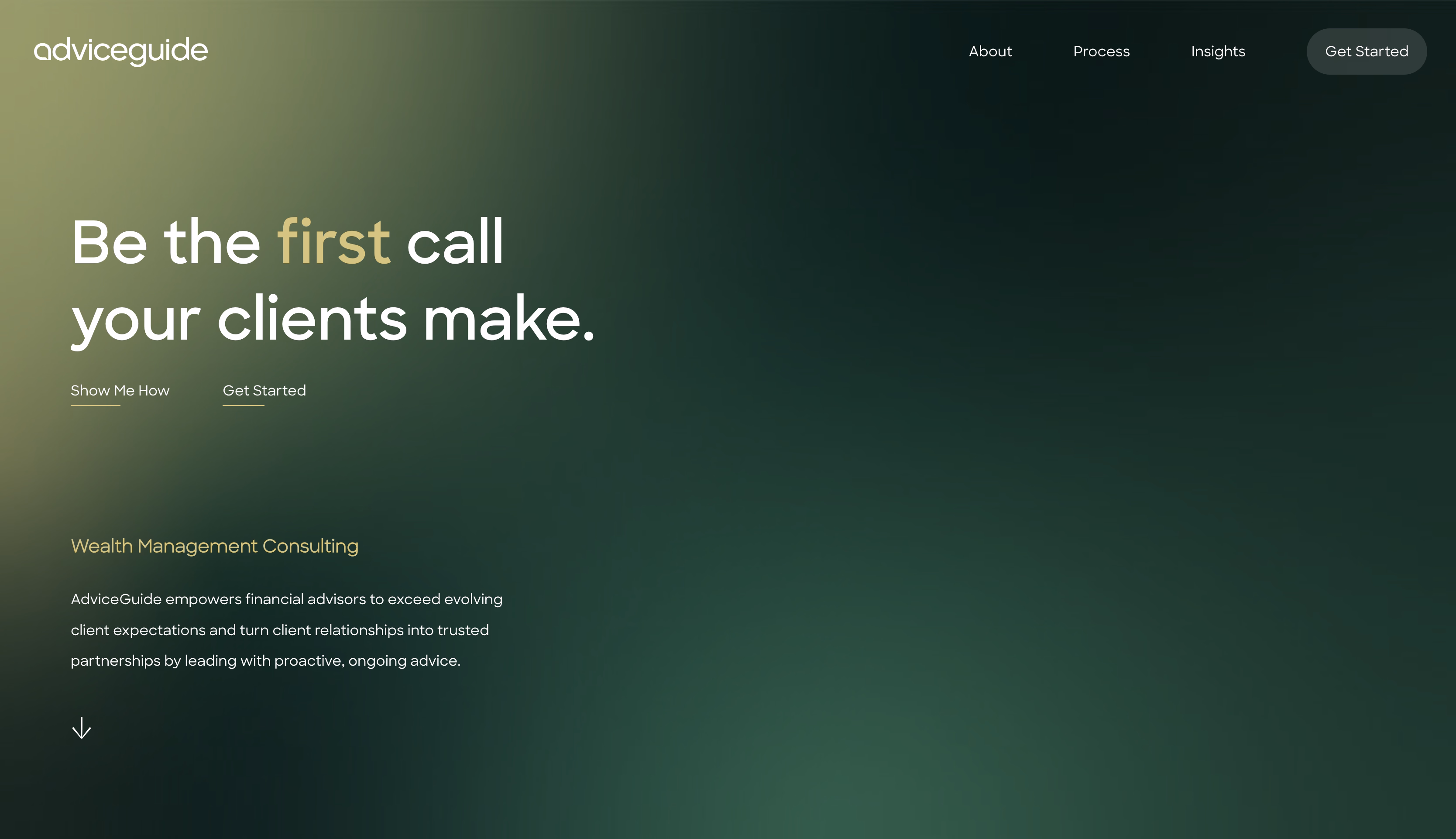
AdviceGuide Financial Planning is an independent financial planning firm providing long-term wealth and business investment advice.
Strongest homepage points
- Human-first positioning, as it focuses on guidance rather than products.
- Jargon-free communication. Financial services sites often drown in technical terminology. This webpage doesn't; it explains concepts clearly and signals accessibility.
- Sections are easy to scan and gradually increase confidence.
- Regulatory background, professional positioning, and service explanations are easy to find.
Dotidot
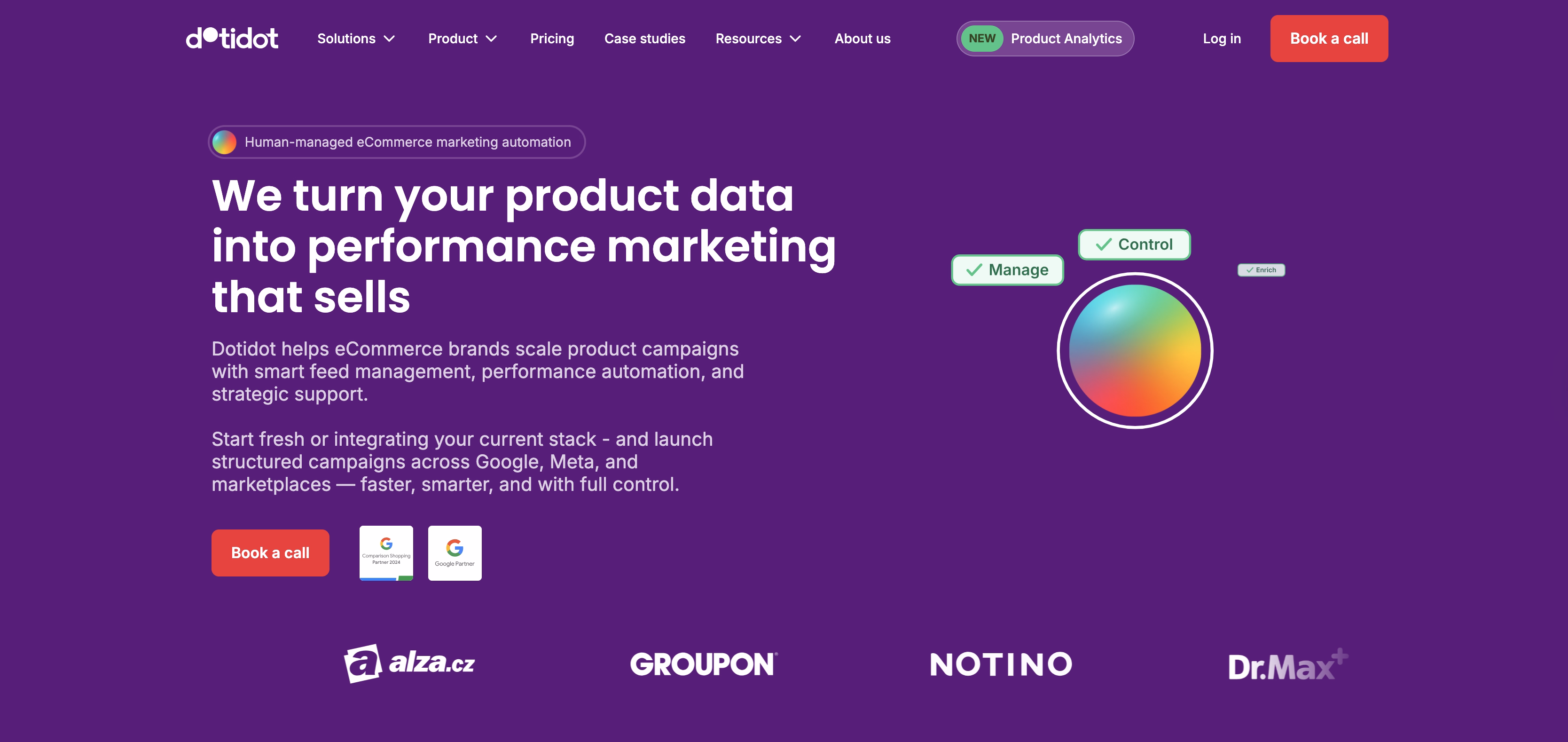
Dotidot is an artificial intelligence platform that assists e-commerce businesses in analyzing trends, forecasting demand, and understanding consumer behavior. It gathers data from social, e-commerce, and market signals to provide early insight and build decision confidence.
Strongest homepage points
- The message clarifies what the AI examines and how it applies insights. It avoids ambiguous assertions like "intelligence" or "innovation."
- Visuals, language, and examples reflect how e-commerce teams think and operate.
- Dashboard previews display trends, signals, and data outputs, helping customers understand what they will receive.
- The layout facilitates scanning and gradually increasing depth.
- References to data sources and analytical rationale alleviate uncertainty about AI-powered forecasting.
Monday
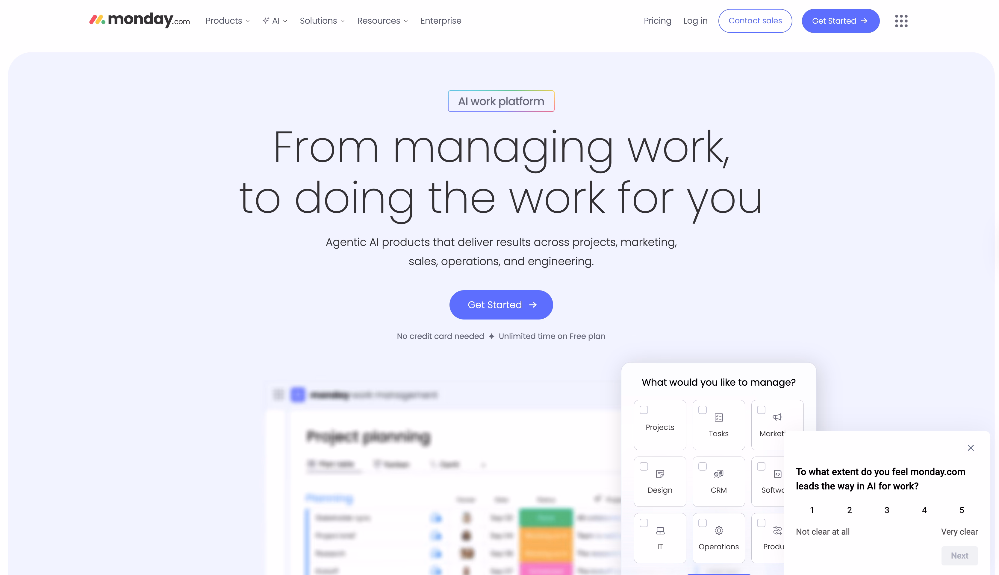
Monday.com is a work management platform that helps teams plan, track, and execute work across departments. Teams need flexibility without losing visibility or control, and they get it with this platform.
Strongest homepage points
- Immediate visual demonstration of the platform in action. Animated product screenshots, colorful boards, and drag-and-drop interactions show how intuitive and visually appealing work management can be.
- Universal appeal through use-case diversity. Every visitor sees themselves in some use case.
- The messaging balances "flexible enough for anything" with "plain enough for anyone".
- The vibrant colors, playful animations, and upbeat tone make emotional differentiation among competitors.
- Displaying impressive customer numbers and recognizable brand logos creates a bandwagon effect.
- It offers role-specific landing pages, industry templates, and use cases to give personalized pathways that increase relevance and conversion likelihood.
- Prominently displaying integrations with Slack, Zoom, Google, Microsoft, etc. removes the "Will this work with our stack?" objection that kills many SaaS sales.
- Highlighting workflow automation capabilities speaks to efficiency-obsessed buyers looking to eliminate repetitive tasks.
- Featuring diverse companies demonstrates versatility and helps prospects find relatable success stories.
- Offering pre-built templates for common workflows reduces implementation anxiety.
- Showing mobile app functionality addresses the reality of distributed teams needing to work from anywhere.
Airmeet
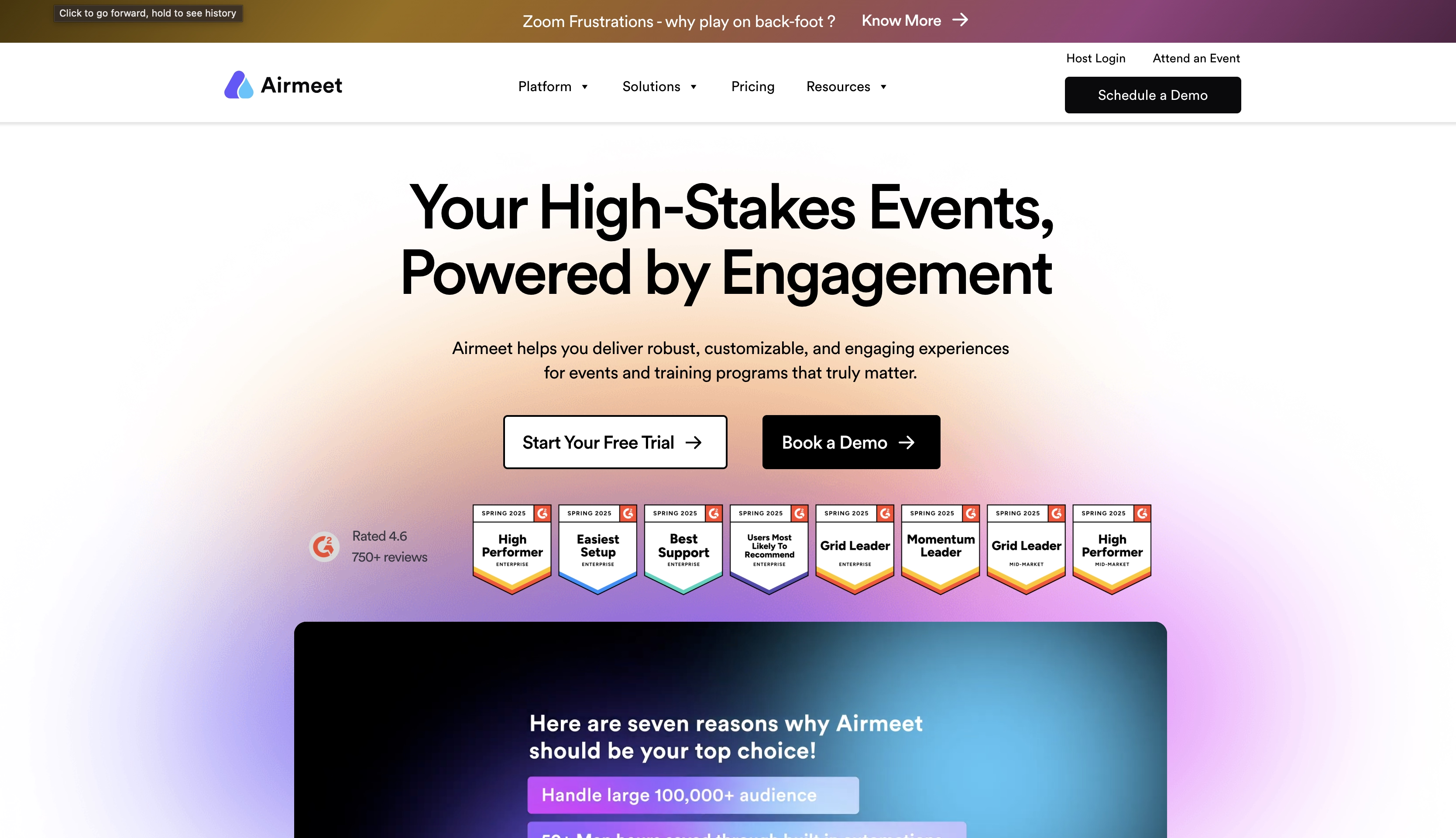
Airmeet is a platform for hosting online conferences, webinars, meetups, workshops, and community gatherings. Teams evaluate platforms based on engagement quality, reliability, and audience scale.
Strongest homepage points
- Positioning as the antidote to "Zoom fatigue" and passive webinar experiences. It’s about community and engagement over broadcast mentality.
- Networking is a key differentiator.
- They discuss the importance of creating long-lasting communities, which is relevant to associations, creator communities, and retention-focused businesses.
- Segmenting by event type allows visitors to immediately realize "this addresses my specific need."
- The homepage features both the attendee and the organizer perspectives..
- Highlighting sponsor expo booths, ticketing, and monetization tools speaks to event organizers who need ROI.
- Engagement metrics, attendee behavior tracking, and reporting address the data-driven marketer's need to prove event ROI to leadership.
- Connections to CRM, marketing automation, and calendar tools address the "does this fit our tech stack?" concern immediately.
- Testimonials or logos from recognizable event organizers, communities, or brands provide peer validation.
Userpilot
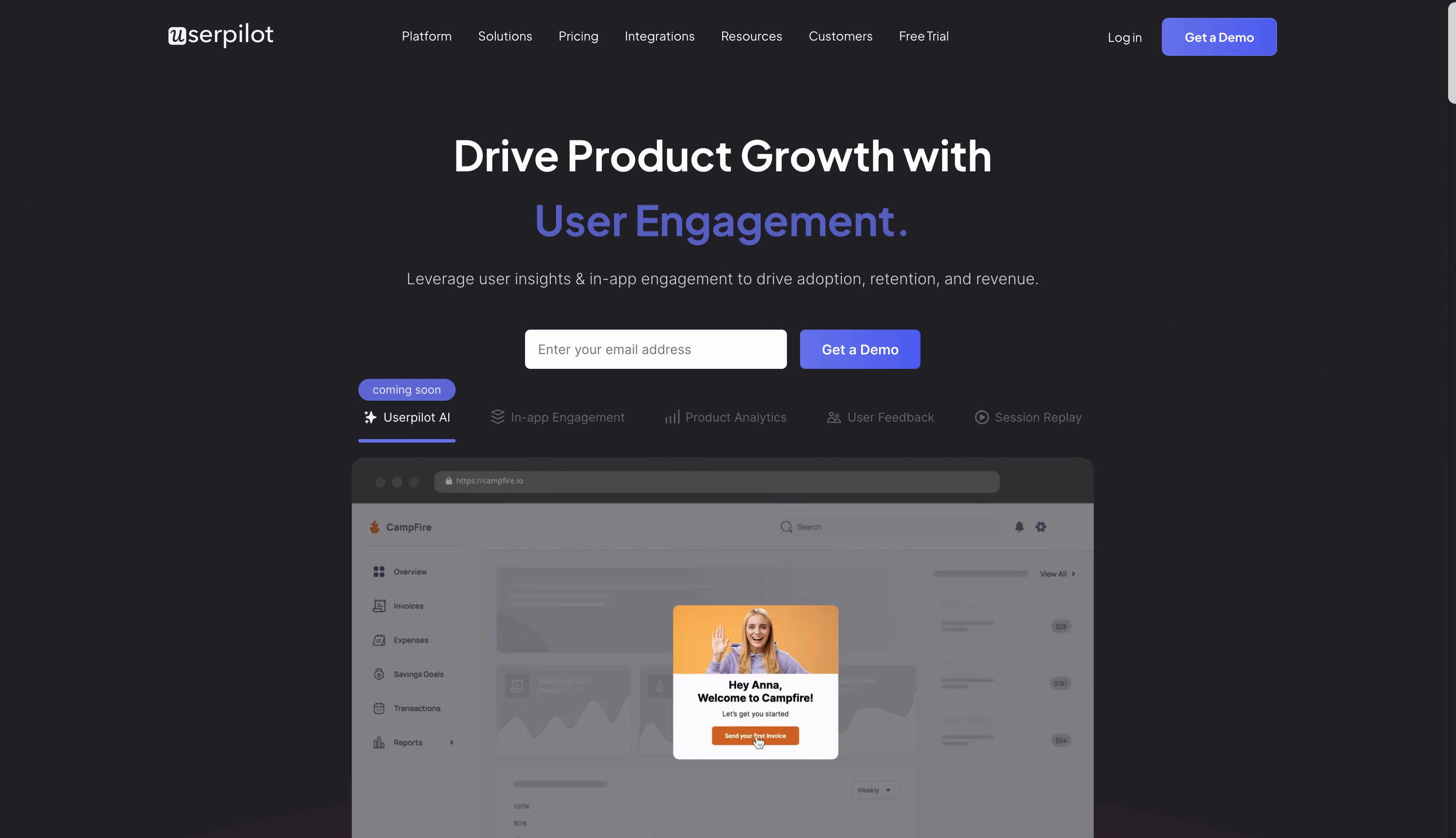
Userpilot is a SaaS platform that helps product and growth teams drive user activation, onboarding, and feature adoption through in-app experiences without relying on engineering for every change.
Strongest homepage points
- SaaS-specific positioning explains that the product doesn’t serve all industries, and this becomes the obvious choice for their niche.
- The homepage speaks directly to the core anxiety of every SaaS product team: users aren't activating.
- It emphasizes that product teams can create and iterate on onboarding experiences without waiting for developer sprints, and this is massively compelling.
- Showing actual in-app experience examples helps prospects immediately visualize how Userpilot would look inside their product.
- It frames everything around business outcomes and speaks the language of metrics-driven product leaders.
- Segmentation and personalization address the sophisticated need to move beyond one-size-fits-all approaches.
- Positioning as both an execution tool and analytics platform means product teams don't need separate tools to build experiences and measure effectiveness.
- Logos and testimonials from recognizable SaaS companies provide peer validation.
Framer
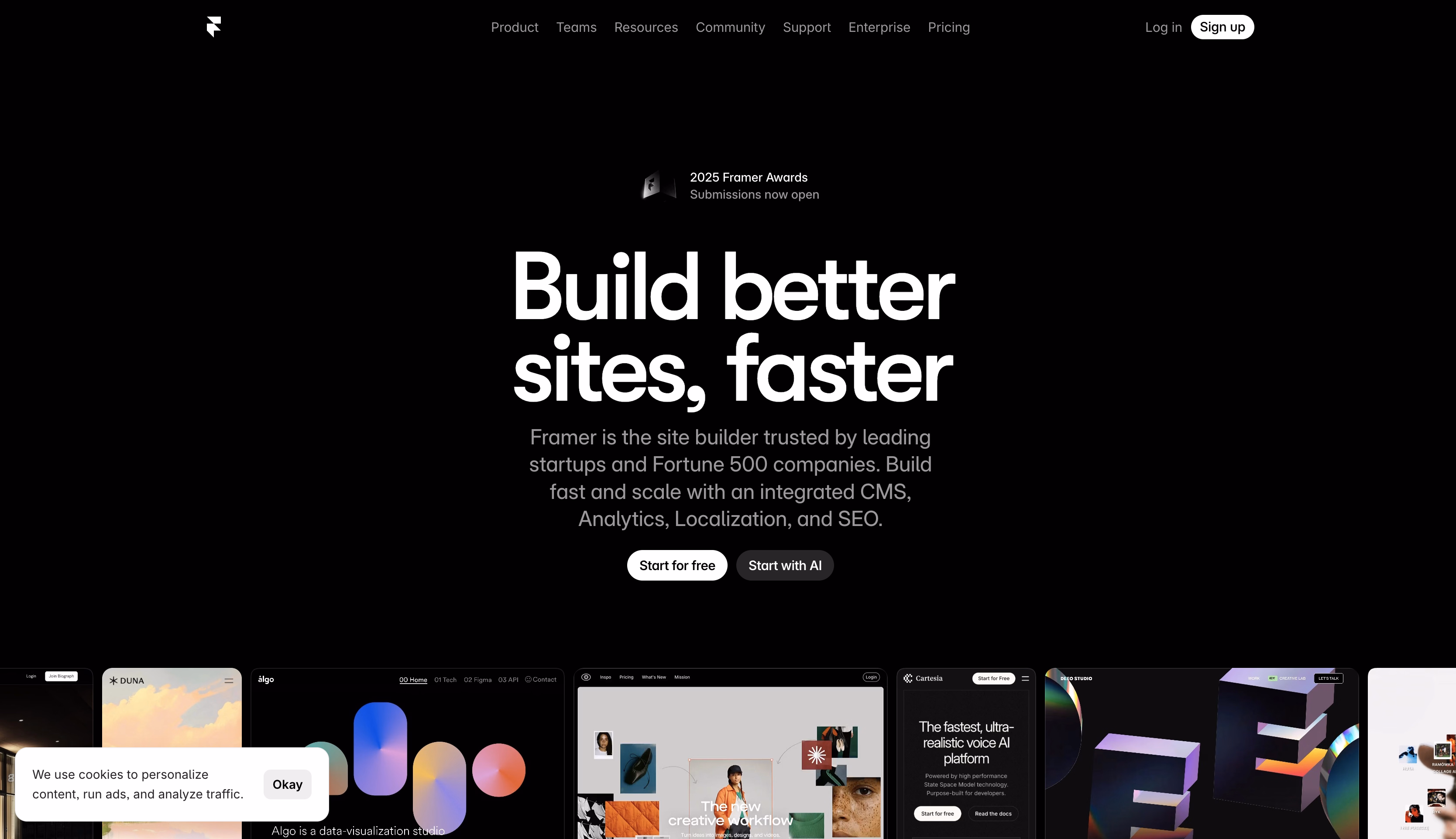
Framer is a visual website builder for designers, startups, and product teams to design and publish high-performance websites without traditional development handoff.
Strongest homepage points
- This sample home page is a live demo with motion, transitions, and responsiveness. Visitors may immediately comprehend what Framer can do without having to read lengthy descriptions.
- The language targets designers and product teams. Non-ICP users filter themselves naturally.
- A collection of amazing Framer-built websites provides both social evidence and inspiration.
- Visual impact first, then supporting explanation, then proof and action. The flow matches how creative teams evaluate tools.
- Highlighting content management capabilities addresses the practical need for clients to update their own content.
Transpoco
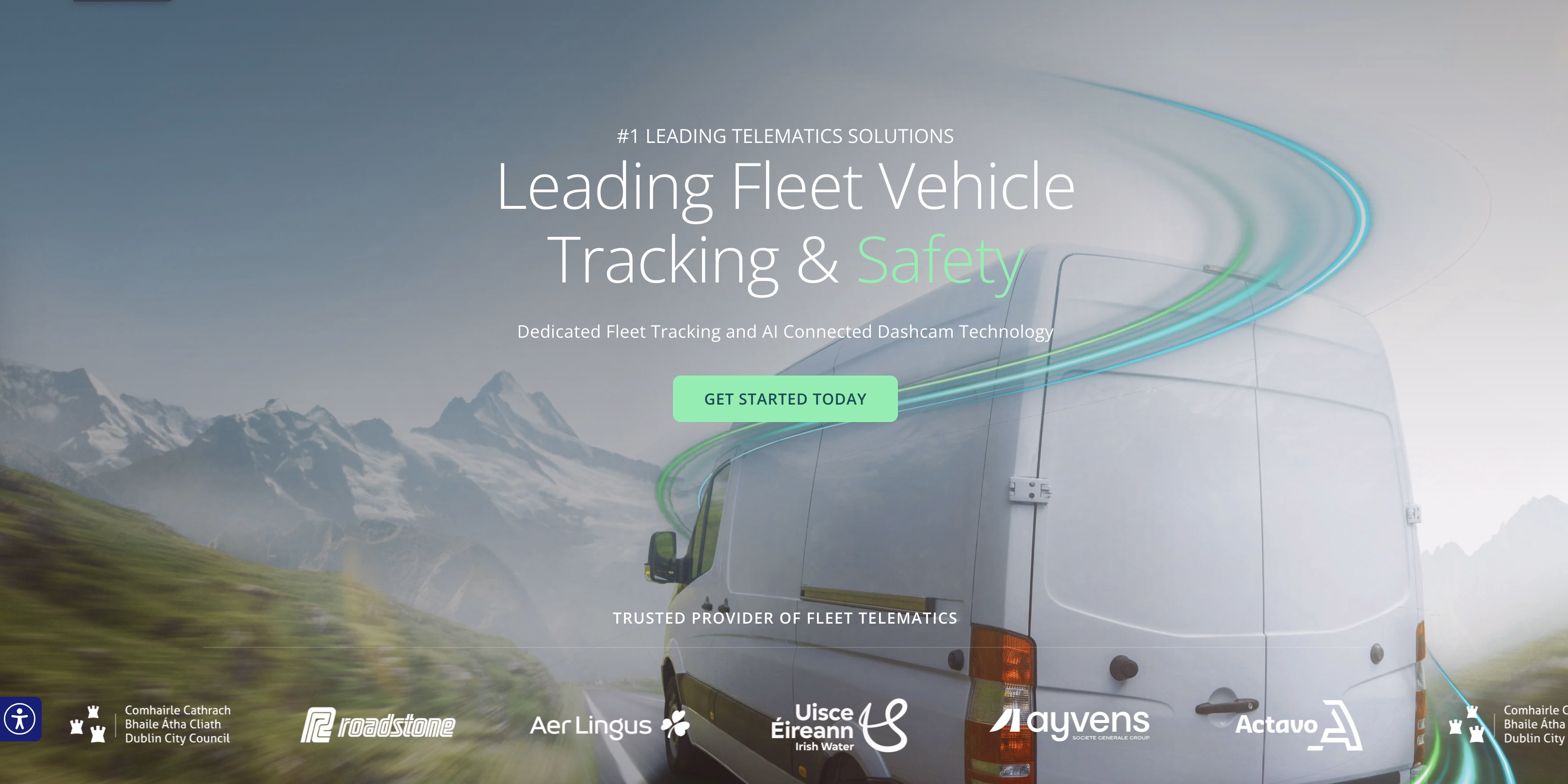
Transpoco is a fleet management and vehicle tracking software platform for businesses with commercial vehicle fleets.
Strongest homepage points
- The homepage emphasizes tangible financial benefit over technological features (ROI clarity via cost-saving transparency).
- Compliance is a core value, and thus addresses a concern: noncompliance can result in fines, license revocation, or insurance invalidation.
- Driver safety positioning helps to overcome driver resistance.
- Local market authority promotes trust.
- Showcasing straightforward installation, driver app usability, and minimal-disruption message addresses fleet managers' concerns about operational problems during technological rollouts.
- Case studies from well-known Irish/UK businesses give peer validation.
- Demonstrating that driver-facing interfaces are mobile-optimized and clear resolves the implementation resistance.
Otterly AI
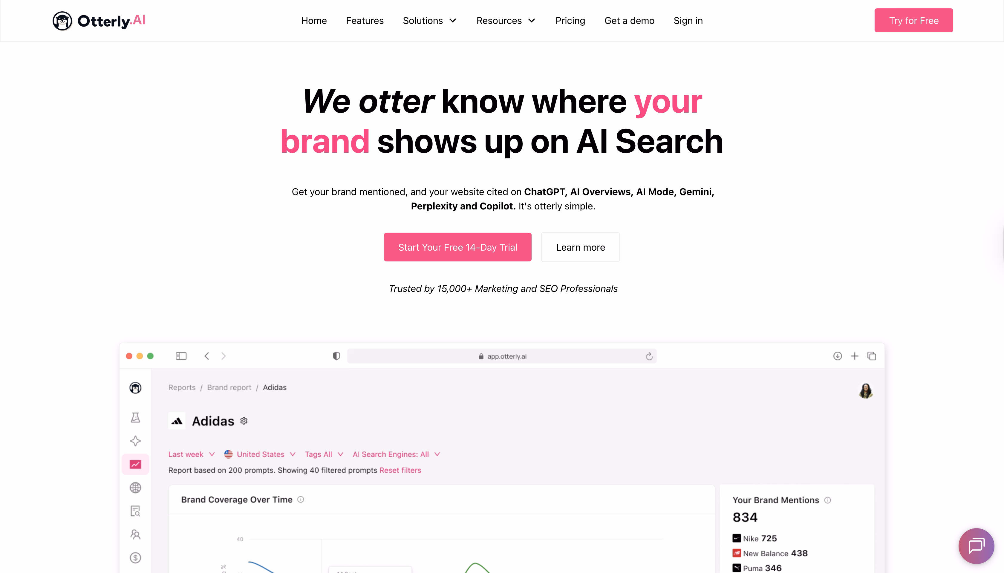
Otterly AI helps marketing and SEO teams monitor how brands appear in AI-generated search results across tools like AI assistants and conversational search engines.
Strongest homepage points
- It shows actual competitive data examples immediately.
- Pain point precision resonates with marketers who waste hours on manual competitive research or learn about competitor moves too late.
- Highlighting multi-channel coverage increases perceived value.
- Rather than being jargon, the AI feels practical. This increases confidence among skeptical, data-driven marketers.
- Seeing insights about your actual competition (or similar organizations) makes the benefit apparent rather than abstract.
- Displaying applications for various roles allows each visitor to quickly identify personal relevance without having to search.
- Using trend graphs, market share visualizations, or campaign timelines transforms competition information into strategic storytelling rather than spreadsheet drudgery.
Zapier
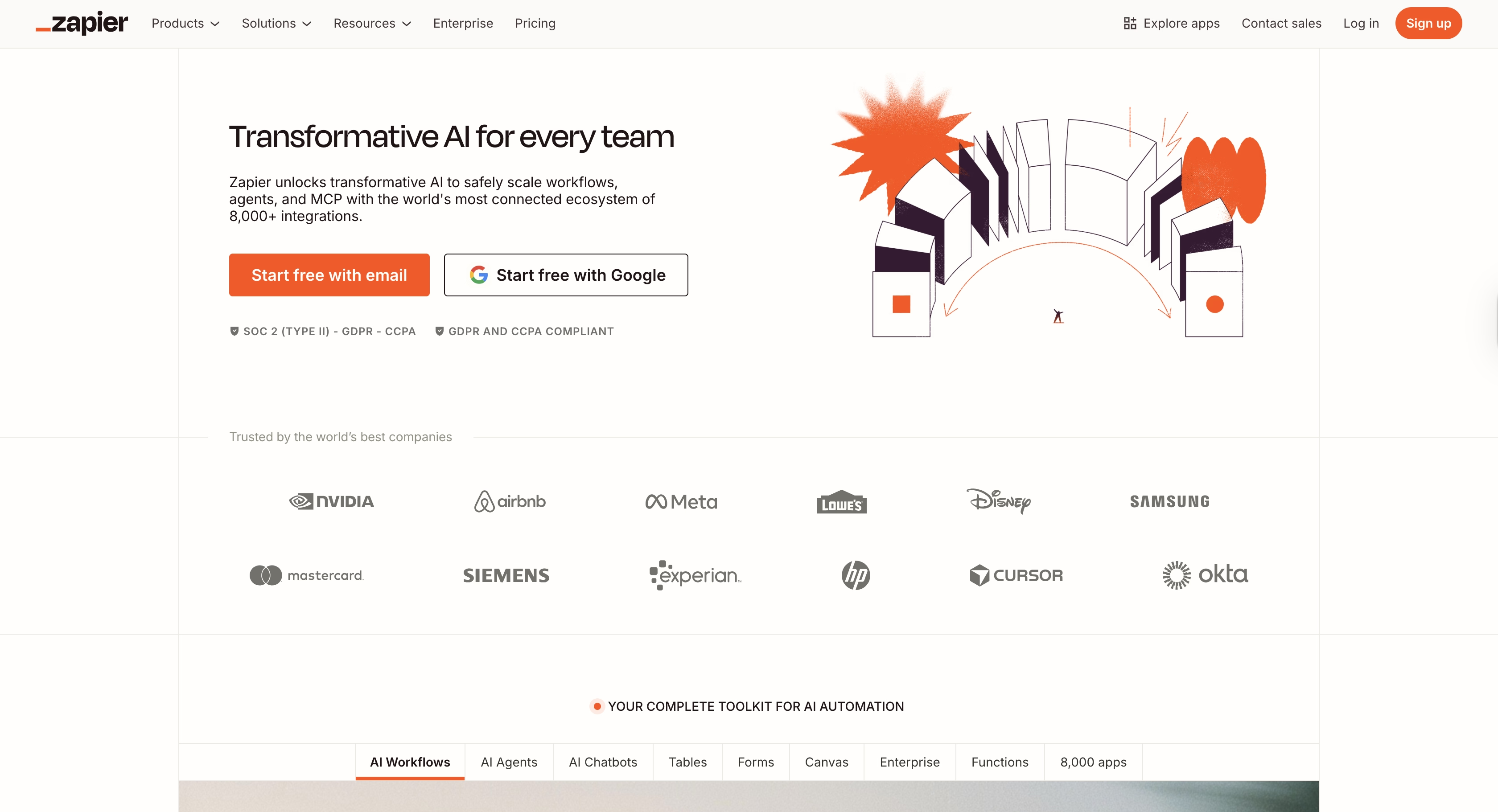
Zapier is an automation platform that connects over 8,000+ web applications and enables users to create automated workflows without coding.
Strongest homepage points
- The homepage makes automation feel personally relevant to virtually everyone by emphasizing the vast app ecosystem.
- It uses plain language that avoids intimidating technical jargon.
- Emphasizing "no coding required" immediately expands the addressable market from technical users to literally anyone frustrated by repetitive tasks.
- Visualizing genuine Zap examples helps to make abstract automation more concrete.
- Applications in various roles and industries ensure that each visitor finds relevant examples.
- Highlighting "8,000+ app integrations" serves two purposes: it exhibits comprehensiveness and indicates market leadership.
- Displaying millions of users or automation counts leads to a bandwagon effect.
- Uptime statistics, security badges, and enterprise customer logos are all subtle trust indications.
- Prominent access to tutorials, webinars, community, or academic information demonstrates a commitment to user success beyond software.
Circle
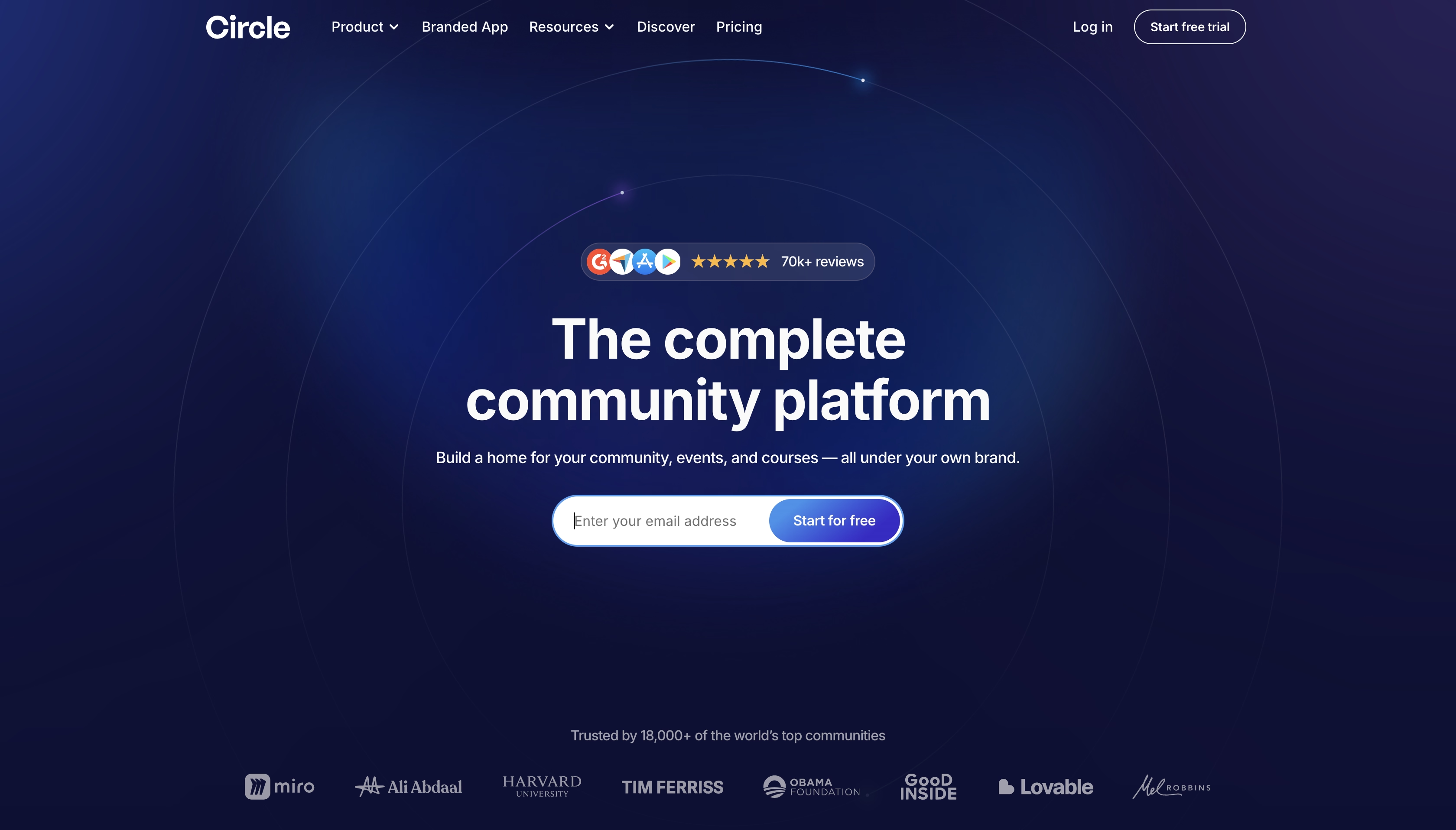
Circle.so is a community platform for creators, brands, educators, and businesses to build, manage, and monetize online communities.
Strongest homepage points
- The messaging defines Circle as a dedicated community platform, distinct from forums, chat tools, or social networks. This prevents misqualification.
- Community is tied to retention, customer lifetime value, and owned audience. They are the outcomes that decision-makers comprehend and plan for.
- UI previews depict feeds, events, member areas, and moderating tools to demonstrate how involvement occurs.
- Each segment responds to a separate evaluation question without repetition.
- Cues for creator adoption, brand usage, and platform maturity confirm Circle's commitment to long-term communities.
Voiceflow
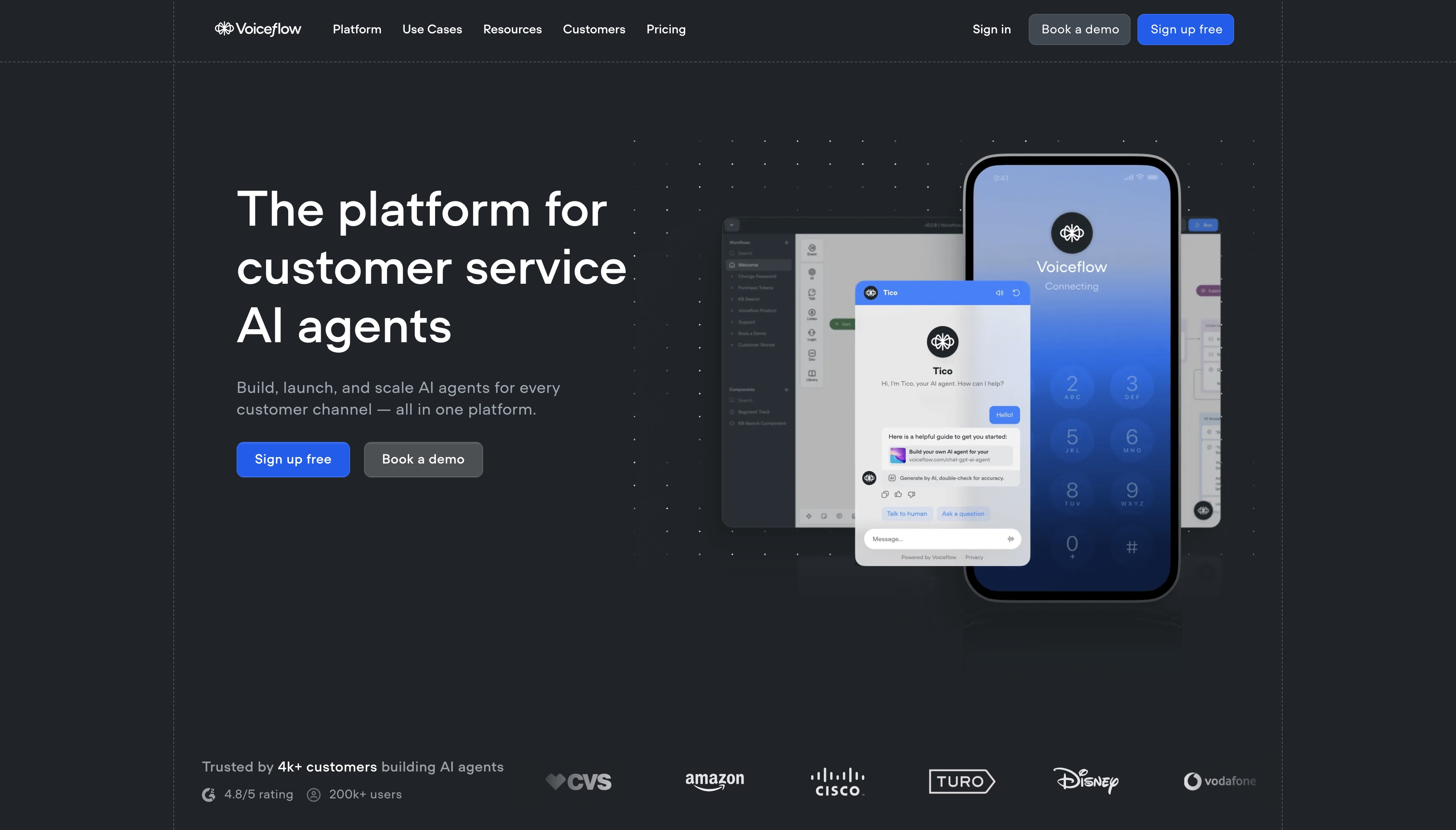
Voiceflow is a collaborative platform for designing, prototyping, and developing conversational AI experiences.
Strongest homepage points
- Voiceflow positions itself as a design and orchestration layer for conversational AI, rather than just a chatbot builder. This rapidly increases perceived maturity.
- Flow diagrams and interface previews show how interactions are structured, tested, and versioned. This method alleviates anxiety about AI unpredictability.
- There's no hype. Instead, the homepage emphasizes control and cooperation.
- The layout facilitates exploration and comprehension prior to conversion.
KeyNest
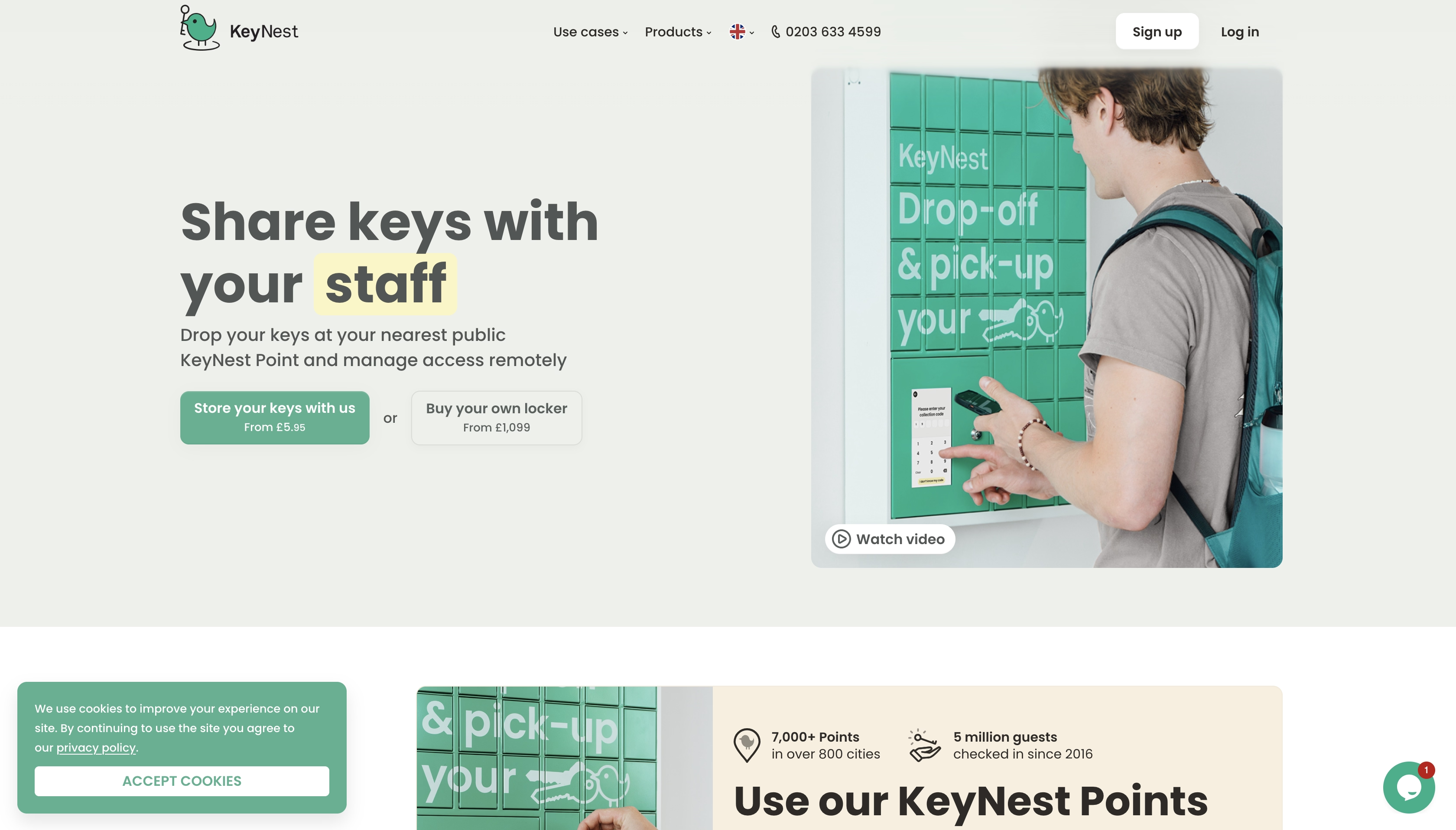
KeyNest is a key exchange and storage network that provides secure and convenient key handover services for short-term rental hosts, estate agents, property managers, and service providers.
Strongest homepage points
- Immediate pain-point visualization resonates with hosts' lived daily frustrations.
- It demonstrates how their services solve the security and convenience paradox.
- Local network density is a trust indicator.
- Key protection insurance reduces the imagined threat to controllable risk. It also removes an important psychological barrier to trusting third-party key storage.
- Transparency benefits everyone.
Justuno
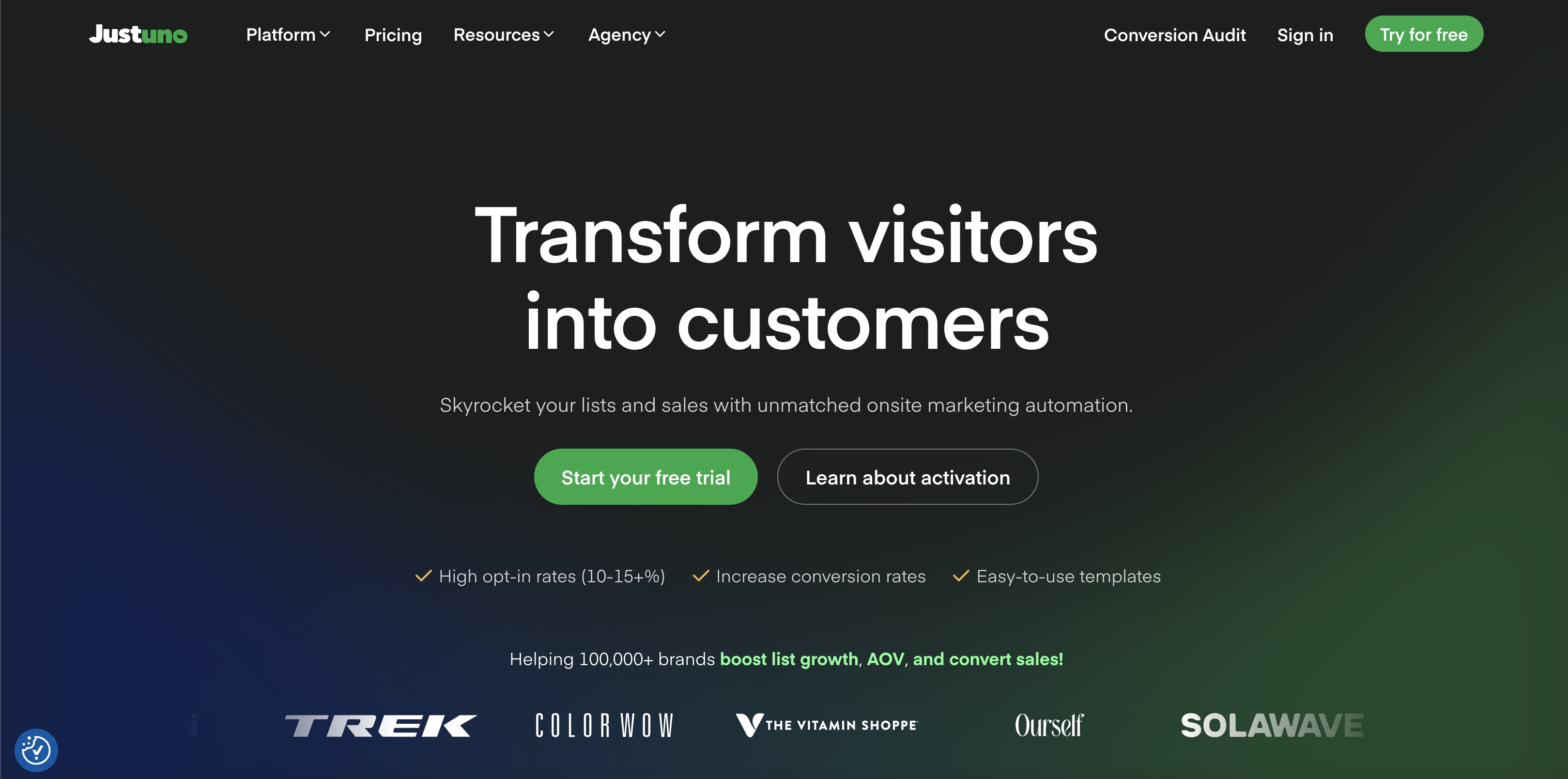
Justuno is a conversion optimization platform that helps ecommerce and marketing teams increase leads, capture emails, and personalize on-site experiences without heavy engineering involvement.
Strongest homepage points
- Immediate clarity on business value.
- Instead of generic CRO promises, the homepage emphasizes targeting, personalization, and behavioral logic.
- Actual pop-up designs, interactive games, and before/after conversion numbers from real stores elicit an immediate "I want that on my site" response.
- UI previews depict real-world use cases such as offers, segmentation, and triggers. Buyers may instantly see how the technology integrates with live websites.
Swan
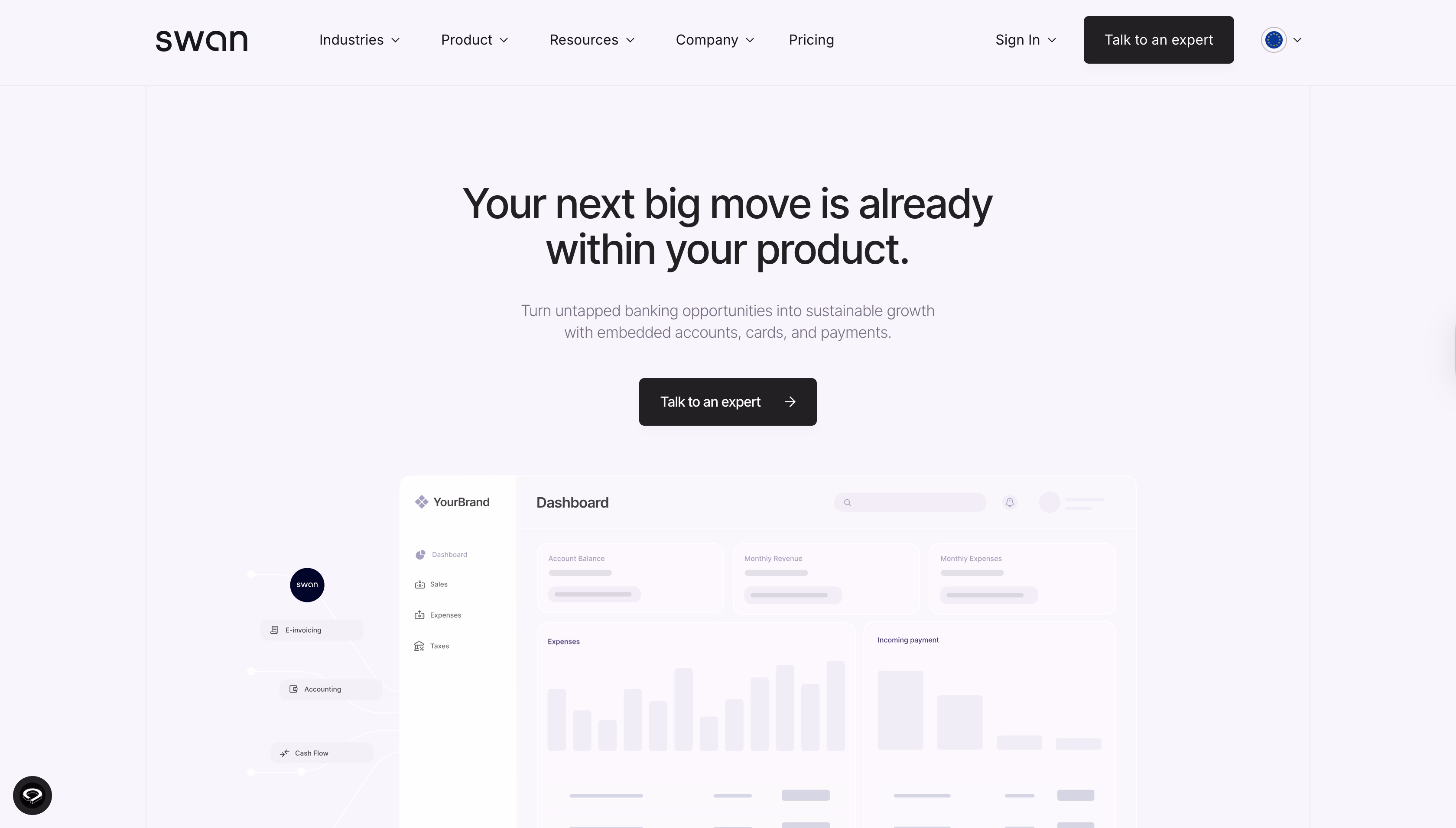
Swan.io is a Banking-as-a-Service (BaaS) platform that allows companies to embed banking features directly into their products without becoming a bank themselves.
Strongest homepage points
- The homepage brilliantly positions Swan as removing the impossible barrier of a bank without being a bank. An impossible goal becomes a realizable product feature, unlocking tremendous market possibilities for previously locked-out businesses.
- Clear API documentation, code snippets, and developer-friendly interfaces quickly instill confidence in technical decision-makers.
- Emphasizing their regulated banking partner status and European compliance goes from a feature to a core trust pillar.
- Interchange fees, transaction revenue, and monetization potential add transparency to the revenue model.
- Displaying applications across markets, SaaS, HR tech, and platforms enables prospects to quickly pattern-match.
Next, we’ll break down the most common homepage mistakes and what they will cost for your business.
But if you want to see more homepage design ideas and how our experts solve issues in real products, explore our case studies and explore the results.
Typical Homepage Mistakes
Typical Failure Scenarios We Prevent
B2B homepages often fail structurally. The design looks “clean,” but it doesn’t support how buyers evaluate risk, value, and next steps.
What are common failure scenarios our team sees in audits?
- Hero without specifics
- Universal phrases “for everyone”
- One CTA for the entire site or conflicting CTAs
- Homepage as an “about the company” page
- Redesign without changing the structure
- Value proposition dilution
- Feature-first storytelling
- Trust signals placed too late
- Unvalidated assumptions about user intent
- Design decisions made without behavioral evidence
This is why we don’t redesign first. We start by auditing message hierarchy, navigation logic, and conversion paths.
In one SaaS case, our structured UX audit uncovered 15 critical usability and clarity issues. Our team fixed those issues during the redesign, and it led to a 35% increase in conversion. And this is without increasing traffic!
.avif)
The Cost of Incorrect Homepage Decisions
- Higher customer acquisition cost (CAC)
- Longer sales cycles
- Lower lead quality
- Misaligned internal decisions
- Risk exposure in enterprise deals
These costs don’t appear as a single metric. They surface as slower growth, inconsistent pipeline performance, and constant pressure to “fix marketing” when the real issue sits on the homepage.
Homepage Design Tips from Arounda experts
We asked our Art Director, Valeriia, for homepage tips and insights based on her experience. So, here is a part of our dialogue.
Q: What are the main design principles of the SaaS homepage?
Valeriia: Maximum clarity and specifics instead of abstract formulations. Structure is more important than creativity. Often, I see a beautiful hero, but it is unclear what the product is and who it is for. This is a mistake!
Q: What about service companies?
Valeriia: They should sell people, not services. Their case studies must be proof of thinking, not a gallery. And design = a sense of maturity and taste. Their typical mistake is lots of stories about the process and little about the business result.
Q: What do you recommend for enterprise and complex B2B?
Valeriia: Show logic, detail, predictability. Stability is more important than emotion for these businesses. Their clients are looking for reliability, so don’t look like a startup. Restrained design works very well here.
Q: How to decide what to show on the homepage?
Valeriia: Think not in blocks, but in user questions:
- What is this company, and what do they do?
- Does it suit my needs?/ Will it solve my problem?
- Do you really know what you're doing? /Are you an expert?
- Can I trust you?
- What should I do next?
If there is no answer to a question, the lead is lost.
Then, we also asked our UI/UX designers for their tips; what they apply and how website design principles vary based on company size and industry.
Tips for early-stage and SMB B2B companies
- You need to show fast clarity and qualification.
- Avoid multi-industry positioning. Define one clear ICP and one clear use case.
- Provide an outcome-led hero section and visible proof.
- Put a single primary CTA.
Tips for mid-market B2B companies
- Think about a clear differentiation block (why you over competitors, not just what you do).
- Show short case summaries with metrics.
- Write role-aware messaging.
- You can add secondary CTAs for education.
- Don’t overload the homepage with features.
Tips for enterprise B2B companies
- Define a clear positioning and category ownership because enterprises need to understand where you fit in their ecosystem.
- Security, certifications, governance, and scale indicators should appear early.
- Offer decision-support content (architecture overviews, integration logic, and use-case depth).
- Provide multiple but structured entry points (different CTAs for different stakeholders).
- Avoid a “marketing-style” homepage that doesn’t answer procurement and risk questions.
Signals you need to rethink your homepage
- High traffic, low demo or contact conversion.
- Sales repeatedly re-explain what the product does.
- Leads misunderstand pricing, scope, or use cases.
- Stakeholders disagree internally on positioning.
- Product updates don’t translate into better pipeline results.
- The homepage hasn’t changed, while the business has.
What increases lead generation from the homepage?
Come back to our interview with Valeriia.
Q: What really increases leads (from your practice and projects at Arounda)?
Valeriia: There are different factors for different industries, but I can define 5 approaches that always work no matter what:
- Clear audience segmentation right on the homepage
- Social proof NOT at the bottom of the page
- Simple visual explanations of complex things
- Several logical CTAs for different intentions
- Focus on the user, not your product or service
Summary
These homepages examples demonstrate that effective lead generation:
- Comes from strategic empathy.
- When you understand your audience deeply enough to address their spoken and unspoken concerns through every design choice, copy element, and interaction pattern.
- When homepages help decision-makers understand, assess risk, and move forward with confidence.
The homepages that convert best aren't necessarily from the biggest brands or funded by the largest budgets. They're from companies that have clarity about their unique value, their ideal customers' needs, and the most frictionless path between awareness and action.
“A homepage fails because it doesn’t help the right person understand why they should care fast enough. How to make it right? Combine user psychology research, conversion-focused design, A/B testing frameworks, and industry-specific best practices. This approach my team at Arounda always uses when we start a new project.”
Vlad Gavriluk, CEO and Founder of Arounda.
Explore our UI/UX Services to see how we turn websites into strategic business assets, or contact us for a personalized consultation in which we will assess your present homepage and recommend specific areas for improvement.


Table of contents


FAQ
The most critical elements include: Authentic social proof (real customer testimonials with photos and company names, not generic quotes). Professional visual design that signals legitimacy. Security badges for regulated industries. transparent information and demonstration of the workflow. Clear call to actions. Up-to-date content that shows active business operations. Natural and proof-based structure with straightforward navigation.
Homepages serve multiple audiences and journeys. They're the front door to your entire brand, accommodating first-time visitors, returning customers, different buyer personas, and various informational needs through navigation and multiple conversion paths. Homepages balance breadth (showcasing product range, company story, resources) with conversion. Landing pages are single-purpose conversion tools for specific campaigns, traffic sources, or offers with one focused call-to-action and minimal navigation to prevent distraction. They sacrifice comprehensiveness for conversion intensity. The design of the homepage requires information architecture for diverse needs; landing page design requires persuasive linear storytelling toward one action.
Effective homepage testing combines quantitative analytics with qualitative user feedback. Start with baseline metrics: Bounce rate Time on page Scroll depth Conversion rates Additionally, you can implement heatmapping tools to see where users actually click and how far they scroll.
It depends on your competitive positioning, business complexity, and growth stage. Templates work when you're validating a business concept, operating in non-crowded markets, or have straightforward offerings that fit common patterns. Custom design becomes essential when: Differentiation matters competitively. Your value proposition doesn't fit standard structures. When you're targeting enterprise clients expecting sophistication. When conversion optimization could significantly impact revenue. If your business model, user journey, or brand identity has unique requirements that templates constrain, custom design is your strategic investment.
Poor design creates immediate friction: Slow-loading images trigger users to abandon sites within 3 seconds. Cluttered layouts overwhelm visitors, causing instant exits. Unclear value propositions leave visitors confused about relevance. Broken mobile experiences frustrate the 60%+ of traffic from phones.
Absolutely. Our approach begins with a deep discovery of your specific business model, target audience, competitive landscape, industry, and conversion goals. We analyze your industry's best-performing homepage patterns, research your customers' decision-making psychology, audit your current site's performance data, and identify opportunities competitors are missing. From there, we develop custom concepts that balance your brand identity with conversion optimization. Every homepage we design is custom because every business faces distinct challenges requiring tailored solutions. Schedule a consultation to discuss your specific needs and see how strategic design can transform your conversion rates.


89+ Reviews
on Clutch

Top Rated Plus Agency
on Upwork

Top 50 Trending team
on Dribbble

Projects are Featured on Behance platform
