
55 Best Form Design Examples For Fintech & Web3 Projects

Did you know that almost 50% of marketers consider web forms their most effective way to generate leads?
Forms turn curious visitors into users. It’s where interest becomes action (signups, wallet connections, KYC verifications, or investments). That’s why good designed forms are your conversion strategy.
With 9+ years of experience and over 250 digital products under our belt, the Arounda team has helped SMEs and enterprises build forms seamlessly, securely, and strategically.
In this article, our experts rounded up 55 form designs – examples across Fintech and Web3. We’ll also provide insights and best practices to design smart, modern, user-friendly forms that reduce friction and increase conversions. Let’s get into it.
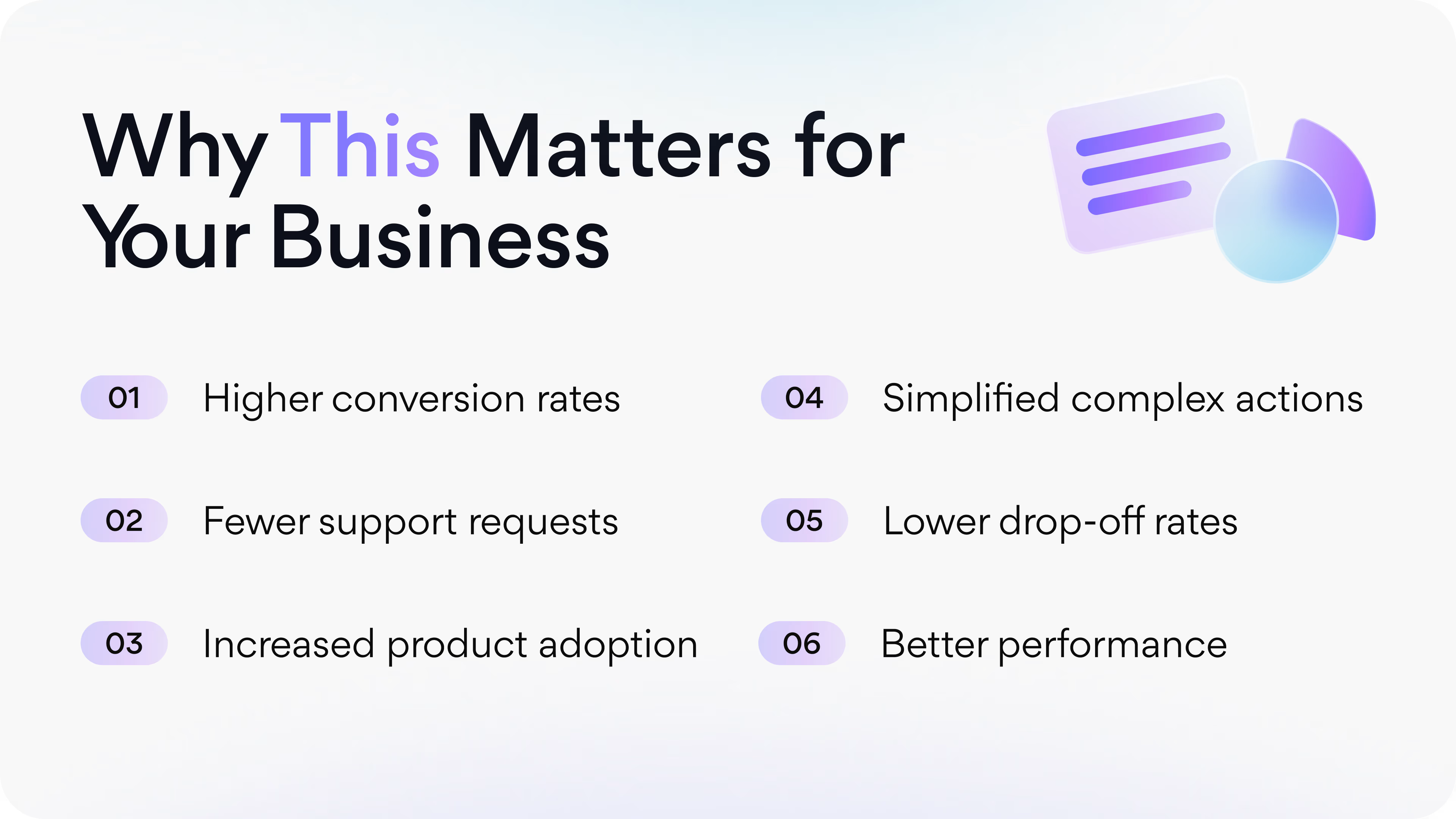
Article Key Takeaways
This guide reviews 55 form design examples from famous Fintech and Web3 products: Coinbase, Stripe, Revolut, MetaMask, PayPal, Kraken, Polygon, OpenSea, and more (including several we designed and developed at Arounda).
You’ll see how each team handles form layout, field order, data entry, validation, microcopy, style, and trust signals to make complex flows fast, clear, and high-converting.
This article gives you real examples, expert insights, and tips to create or redesign forms correctly. It highlights the choices that move conversion, the patterns that build trust, and the mistakes to avoid.
Forms we’ve analyzed for you: registration, authentication, KYC / KYB / AML compliance, payment, checkout, account management, support and contact, search, filter, subscription, and other complex forms.
What Makes a Good Form?
We’ve all seen bad forms (long, messy, frustrating). But the best form design doesn’t make you think. It just works. So, what separates a high-converting form from a forgettable one?
- Clean, logical form layout
Great UX forms follow a clear visual structure with group-related fields, simple actions and steps, and whitespaces. Users should know exactly where to start and what to do next.
- Smart field order
Start with easy wins (name or email) before moving into more sensitive data. It increases the chance of form completion and reduces drop-offs.
- Minimal distractions
The best forms don’t overload users. Limit unnecessary text, avoid pop-ups, and keep only essential elements on the screen.
- Clear labels and instructions
Never make users guess. Every field should have a clear label, placeholder, or helper text. It’s especially important for tricky data entry, such as wallet addresses or ID uploads.
- Visible progress
For big form, show a progress bar or stepper. It helps users stay calm and know how far they’ve come.
- Smart validation
Use real-time error handling. Tell users what’s wrong and how to fix it before they hit submit.
- Accessible style
Use readable fonts, high contrast, and big enough fields. Form UI should work for everyone and on every screen size.
- Mobile-first thinking
People live at a very fast pace, so often they input info on the go. That’s why tap-friendly fields, one-column layout, and easy scrolling are must-have features.

These principles are the basics when we conduct a UX audit and help our clients understand user problems. To avoid web form mistakes, our team prepared the best form design solutions that offer a smooth, trusted, and scalable user experience. Take a look ↓
Types of Forms and Form Design Examples
Each form has its job to do and its own best practice. In the next sections, we’ll walk you through different designs of forms used in Fintech and Web3 niches, where each one solves a specific user task. You’ll see real 55 form examples that get it right: clean layouts, effective UX, and seamless experiences. Your exploration and inspiration start in 3. 2. 1.
Registration Forms
Registration forms begin your user journey. It’s the first real interaction between your product and your potential user, so make it count.
What is it? A registration form is used to create a new account. This includes setting up an email/password combo, connecting a wallet, or even starting KYC.
Arounda suggests for a high-converting registration form:
- Ask only for what you truly need at this stage (email, password, username).
- If more steps are required later, let users register first and complete those after.
- Use a single, visible call-to-action.
- For Web3 and Fintech products, offer the option to connect a wallet right away.
- Show logos, security badges, or microcopy that reassures users their data is safe.
Example 1. Coinbase
Industry: Crypto | Fintech
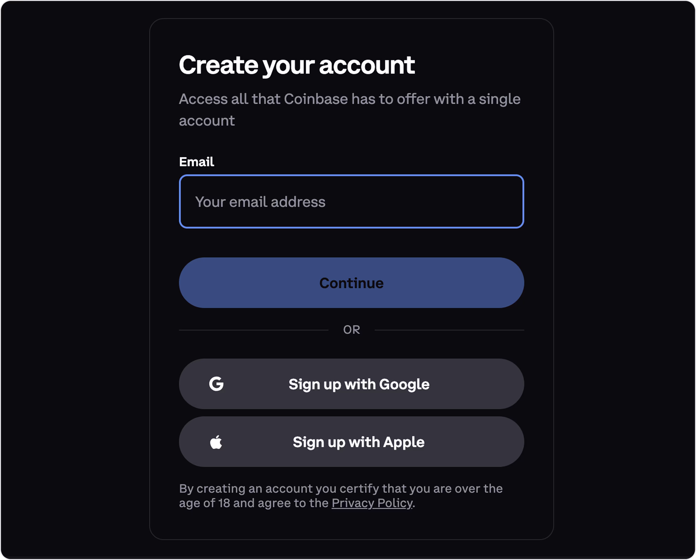
Form characteristics:
- Focused and minimal (a smart way to lower friction for first-time users).
- Strong visual hierarchy that makes the next step obvious.
- Social signup options for flexibility and speed.
- Secure and trustworthy design.
- Compliance and clarity.
- Reduced cognitive load with one field at a time.
- Accessible styling, large buttons, strong contrast.
Example 2. Klasha
Industry: Fintech | Cross-border Payments
Klasha is a payment infrastructure for businesses expanding into Africa. With its help, global companies accept payments in local African currencies, and African consumers shop internationally.
Arounda partnered with Klasha to redesign their digital experience. Our designers simplified the product, modernized the UI, and improved UX with a strong focus on onboarding and form design.
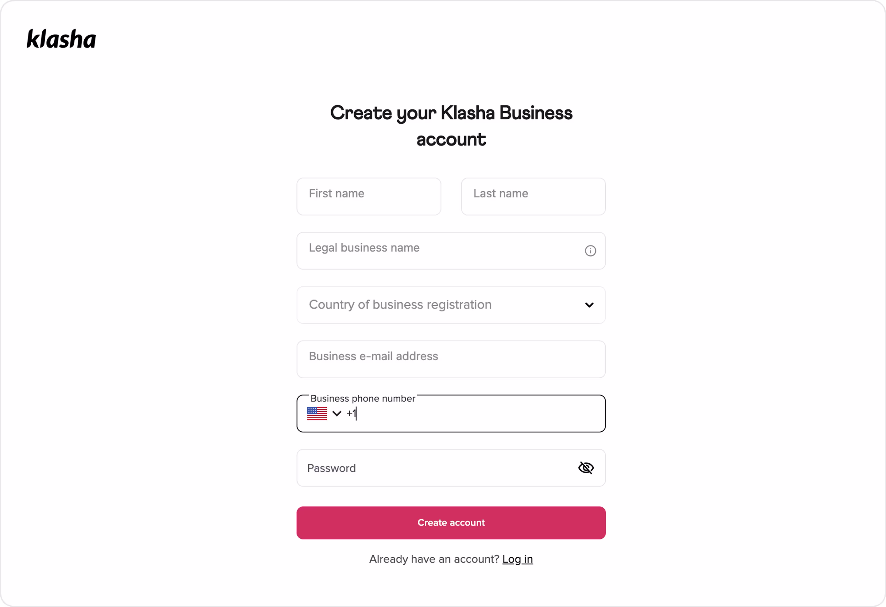
Form characteristics:
- Business-focused field set.
- Logical field order.
- Minimal distractions (no unnecessary links or fields).
- Well-spaced and structured layout for easy scanning and high readability.
- Mobile-ready inputs with phone dropdown.
- Smart data entry choices with a country dropdown and phone field for accuracy and speeding up completion.
This is one of our form examples for a fintech platform onboarding business users across continents. Our redesign aimed to improve clarity, conversion, speed, trust, and user confidence. And we’re happy that now millions of people use and enjoy it.
Example 3. Stripe
Industry: Fintech | Payments Infrastructure
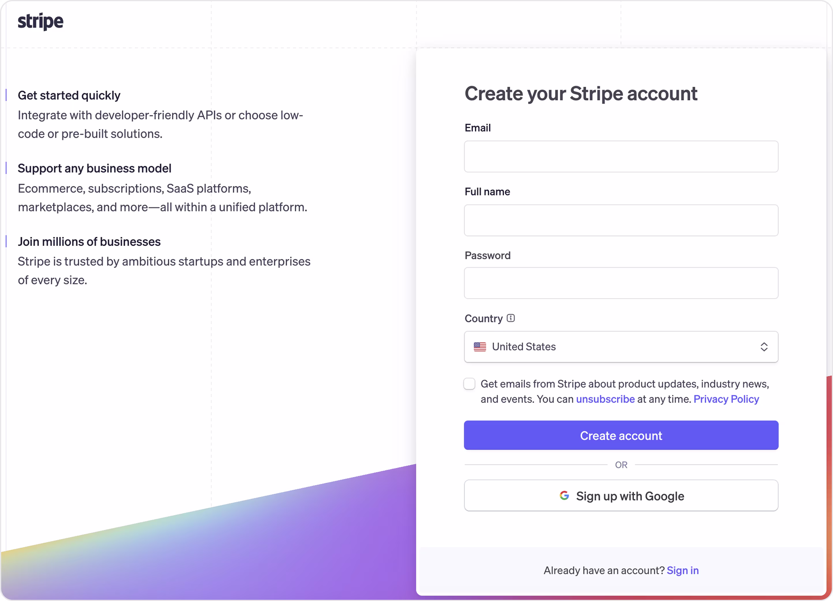
Form characteristics:
- Form meets product promise “Get started quickly. Support any business model.”
- Compact and clean layout.
- Friendly micro-interactions.
- Brand-aligned CTA “Create account” in Stripe’s signature purple.
- Smart microcopy (optional checkbox, legal clarity).
Stripe’s approach is one of the best examples of form in design because it’s straightforward, fast, and on-brand. There’s nothing flashy here, and that’s the point.
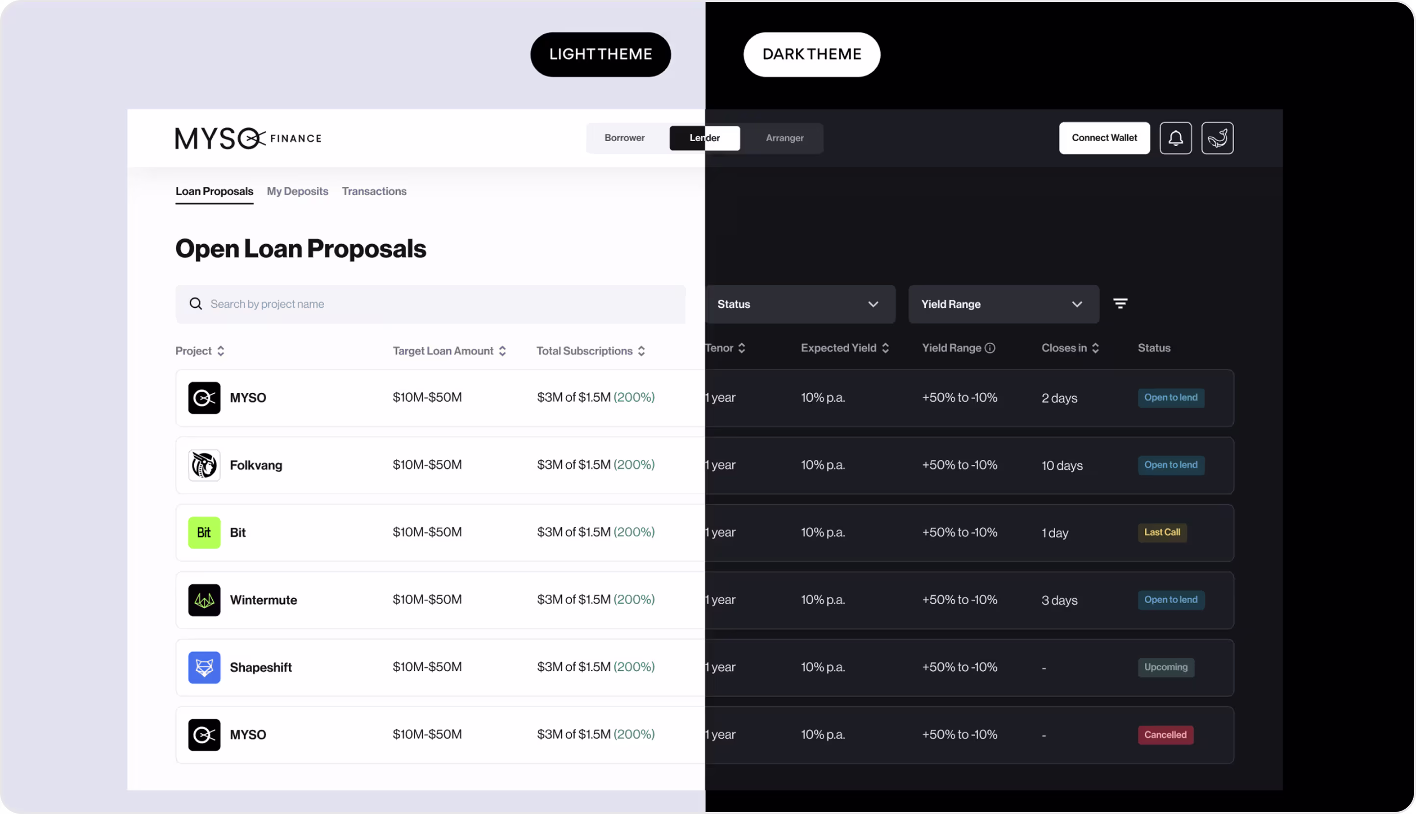
Example 4. MYSO Finance
Industry: Web3 | DeFi MYSO Finance is a decentralized platform that helps people borrow and lend cryptocurrency at fixed interest rates without the risk of suddenly losing their assets due to market drops. Our team partnered with MYSO Finance to upgrade their product UX, build a cleaner interface, and guide users through complex DeFi interactions with greater confidence and clarity. And we designed different types of form, but now we want to showcase the registration one via wallet connection.
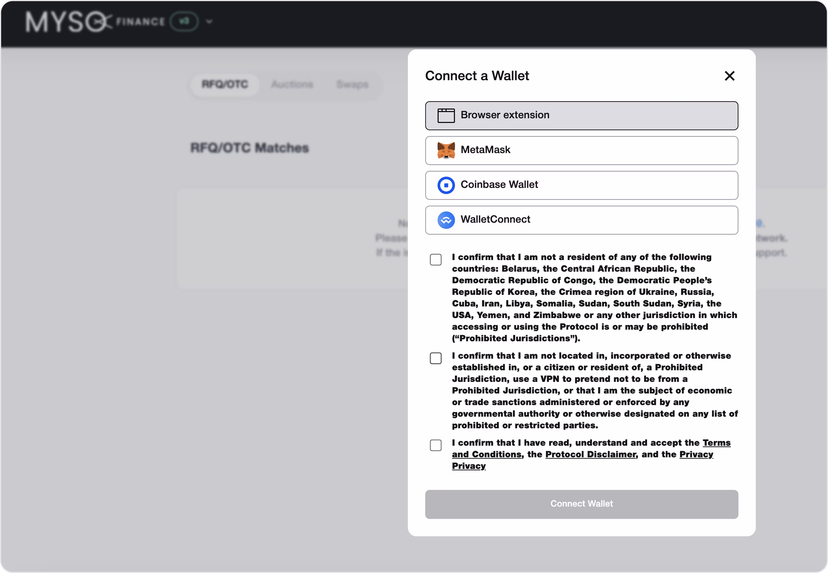
Form characteristics:
- Web3-first form structure (no login fatigue).
- Wallet-only signup reduces user drop-off and increases trust.
- Clear user state (connect → approve → continue flow).
- Minimal interface with just one smart CTA.
- Developer-friendly and scalable.
- Great for crypto-native users who value speed and control.
Arounda team is very happy to get our client’s feedback. It drives and motivates us to create more and more best designed solutions.
Example 5. Wise
Industry: Fintech | International Payments
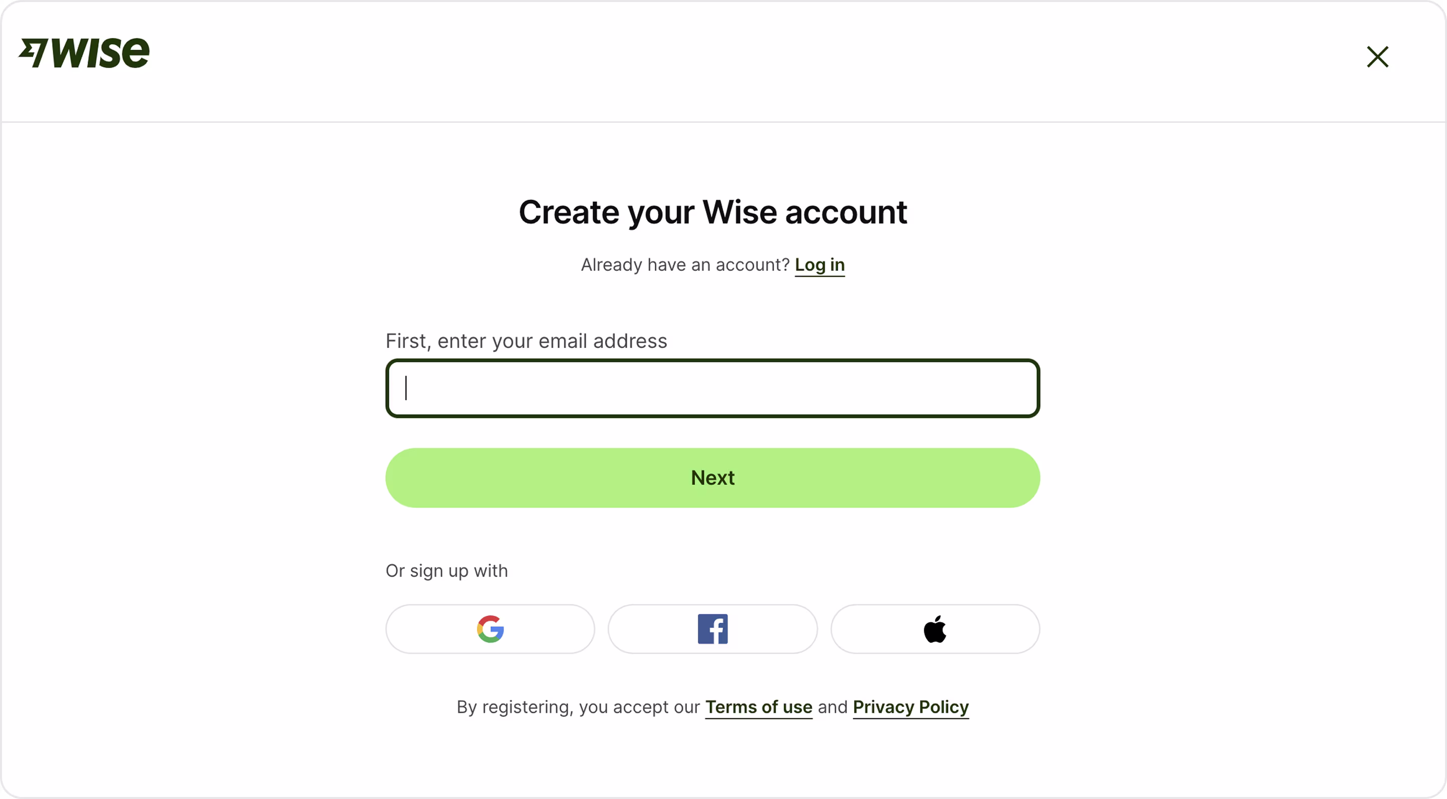
Form characteristics:
- Frictionless starts with a single field.
- Simple form layout that is a great form sample for desktop and mobile.
- Brand-aligned design.
- Legal clarity, subtlety done right.
- SSO options (flexible signup paths).
You’ve got the user in. Congratulations! But it’s only the first step. Now, how do you make sure they come back without frustration? Our next task is to design authentication forms well.
Authentication Forms
An authentication form is how users log in to your platform. If your authentication form is slow, confusing, or looks suspicious, they won’t come back. That’s why it must protect user data, reinforce trust, and still feel effortless.
We define 4 main options for login.
- Email + password login
- Social sign-in
- Magic link or OTP
- Wallet connection (for Web3 products)
If you need a modern form UI, Arounda suggests for a high-converting authentication form:
- Don’t overload users. Just give them input, CTA, and recovery options.
- Use smart placeholders and always show which field is active.
- Offer multiple login options.
- Make input fields tap-friendly.
- Show feedback instantly. If login fails, say why.
- Avoid scary error messages, red overload, or outdated design.
- Use wallet connection as the primary login for Web3 products, but always offer alternatives for new or less tech-savvy users.
- Visually highlight the connected wallet address or user status.
Now, time to see authentication forms.
Example 1. Revolut
Industry: Fintech | Digital Banking
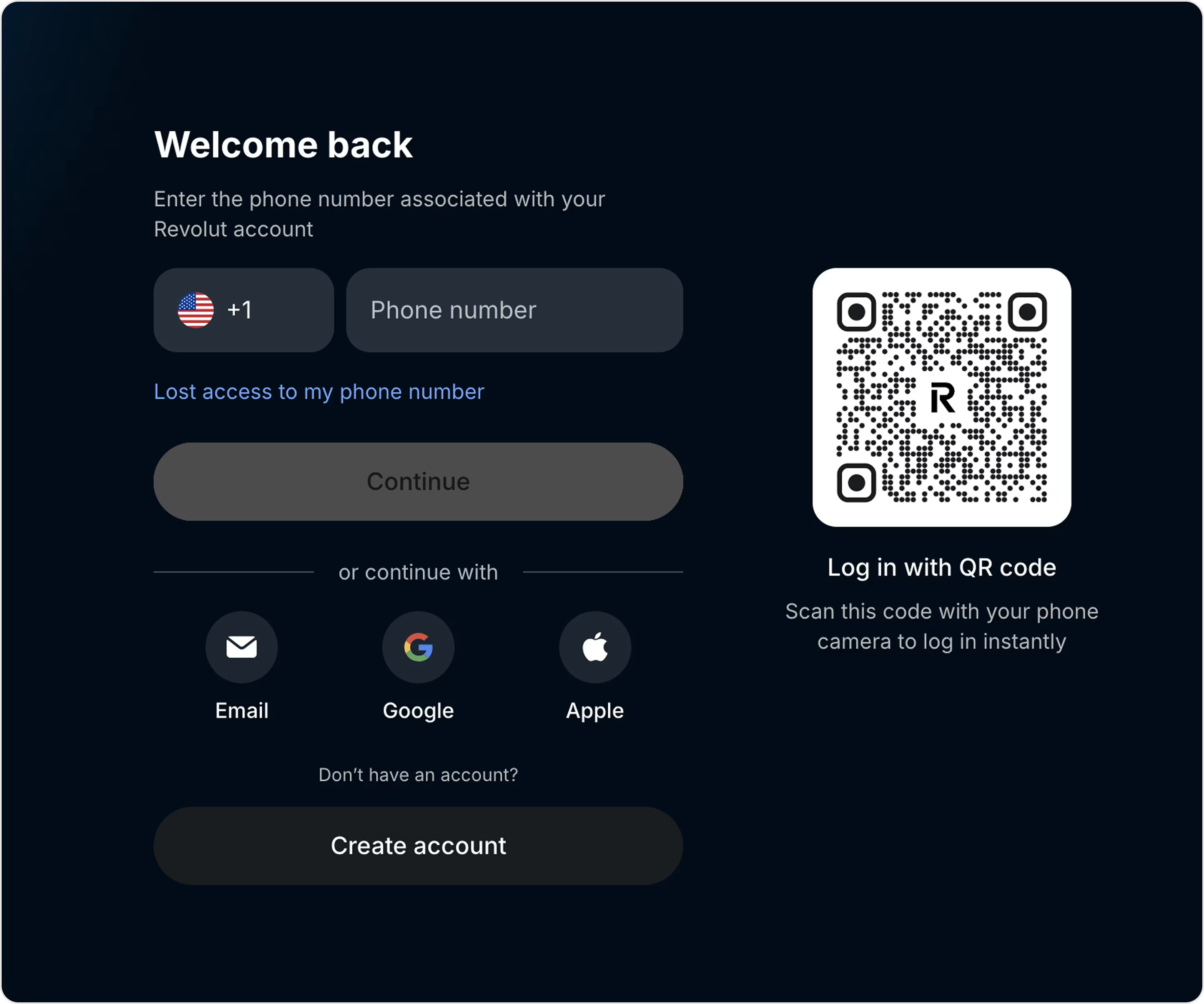
Form characteristics:
- Phone login + OTP for quick access without password fatigue.
- Multiple login paths that are flexible for different user types.
- QR code login is a nice option for cross-device continuity.
- Clear CTA buttons that are easy to scan and tap.
- High accessibility with good looking contrast and readable typography.
Example 2. MetaMask
Industry: Web3 | Crypto Wallet
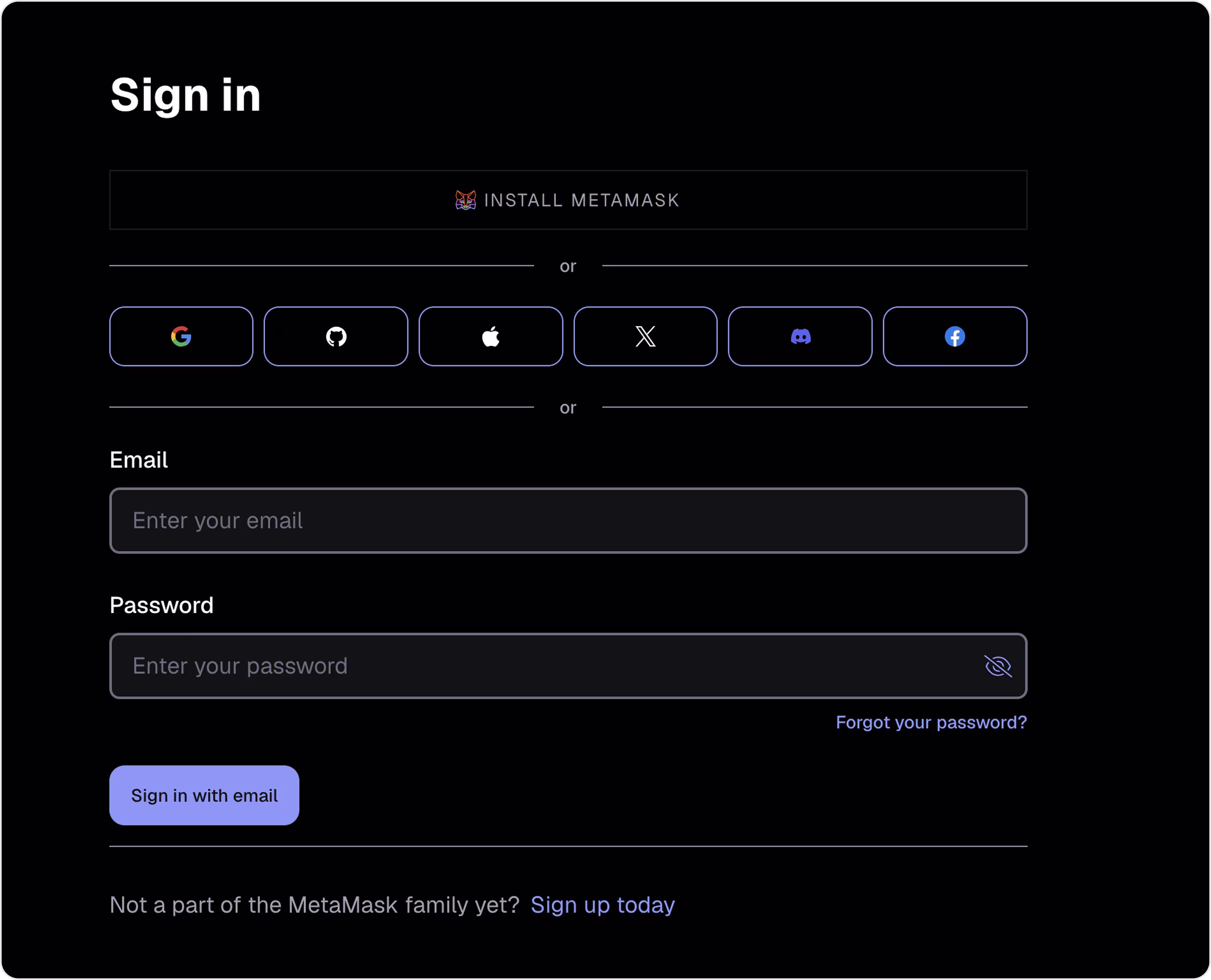
Form characteristics:
- Different types of authentication for full user control and comfort.
- Clean hierarchy and visual separation to guide users step-by-step.
- Black background, neon-accented borders, and cool, low-contrast inputs provide a modern, beautiful Web3 style.
- Branded microinteractions with subtle styling cues.
- Security-focused design language.
Example 3. Player’s Health
Industry: Fintech | Insurance | Health & Safety
Player’s Health is an insurance platform that helps sports organizations protect their athletes and staff with injury management, insurance services, and risk mitigation tools.
Our Arounda team designed the Player’s Health product and delivered an inclusive, user-friendly, and trustworthy environment for all users. And, of course, designed different website forms.
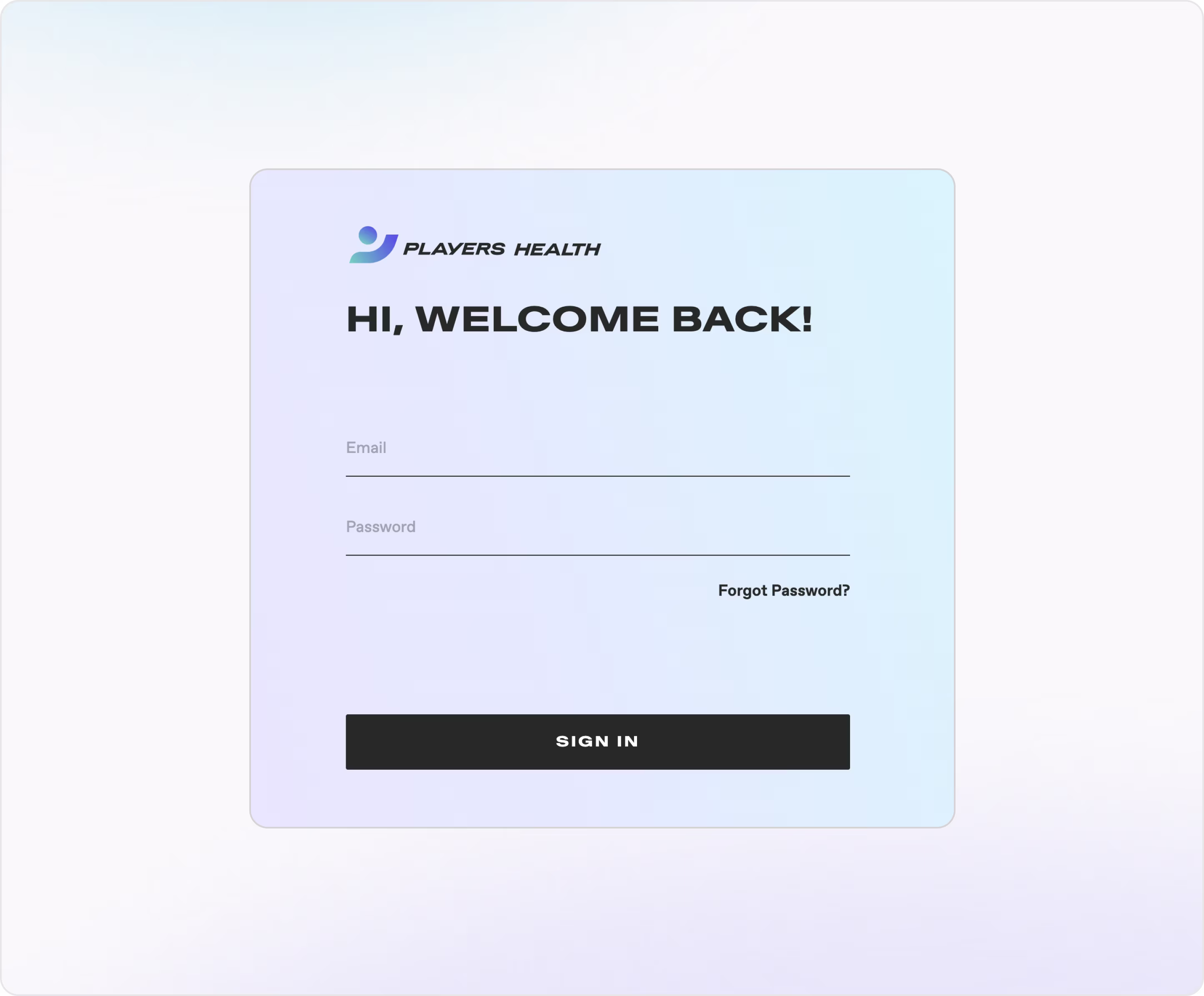
Form characteristics:
- Emotionally thoughtful design with calm and trust-driven visual tone.
- Simple form layout with two fields and one button (no fluff).
- Mobile-ready spacing with large tap targets and good vertical rhythm.
- Easy recovery path with clear "Forgot Password?"
- Clear hierarchy with strong title → fields → CTA flow.
- On-brand styling that matches the brand’s focus on health, safety, and care.
For all projects, it is very important to create forms that fully comply with the brand's corporate identity, so we also pay great attention to branding services.
Example 4. Robinhood
Industry: Fintech | Investing & Trading
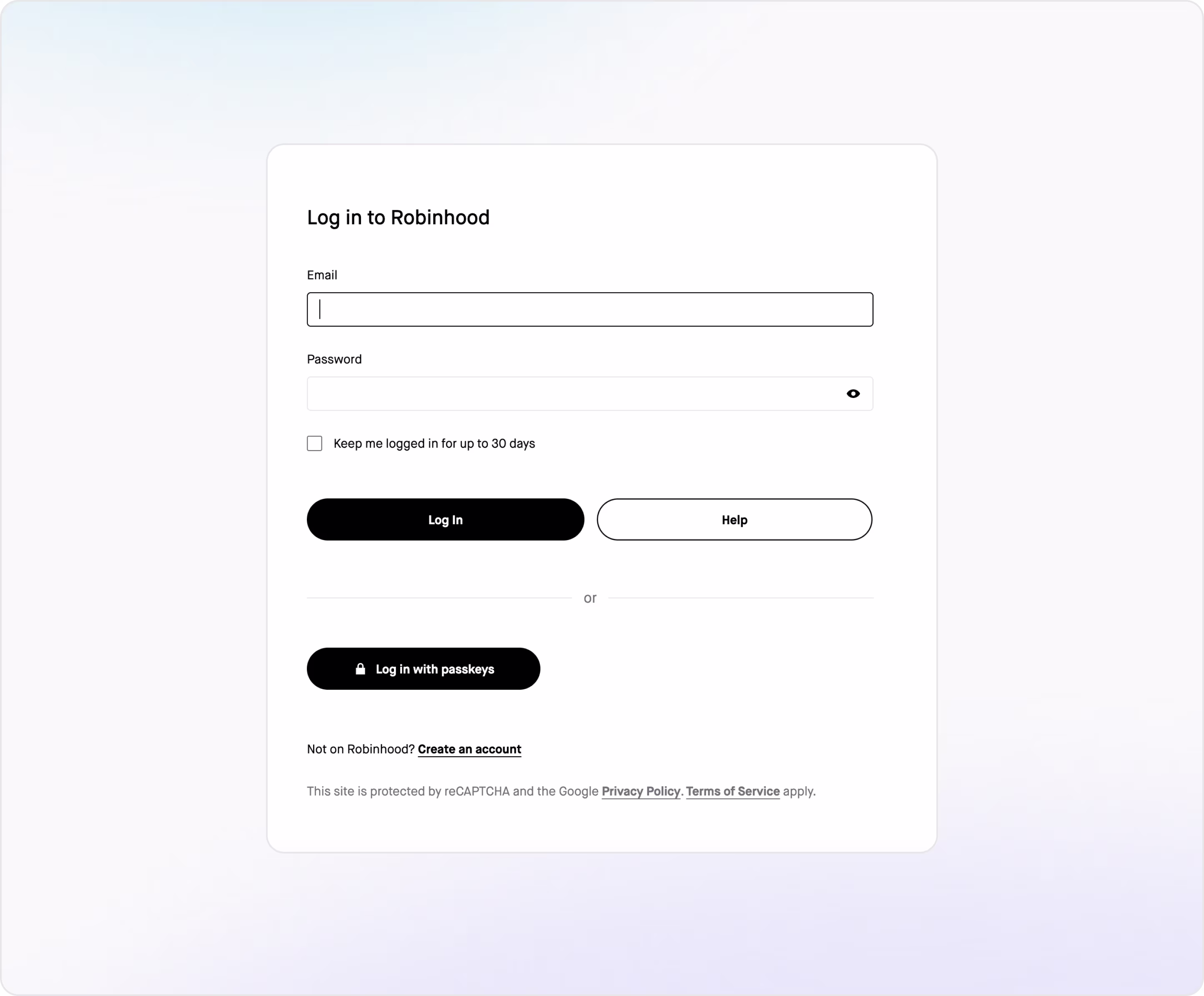
Form characteristics:
- Minimalist design for faster login and fewer distractions.
- Clear CTA buttons with black-and-white contrast that grab attention.
- Modern security with passkeys for smoother login and less risk.
- Support CTA that prioritizes user confidence.
- Accessible layout.
- Visible legal links.
Example 5. Xpence
Industry: Fintech | Business BankingXpence is a smart digital business banking platform for entrepreneurs and startups across the MENA region. Arounda worked with Xpence to design a user-centered interface that simplifies business banking for small companies. We focused on building a clear, fast, and trustworthy product experience + professional and secure onboarding and login flows.
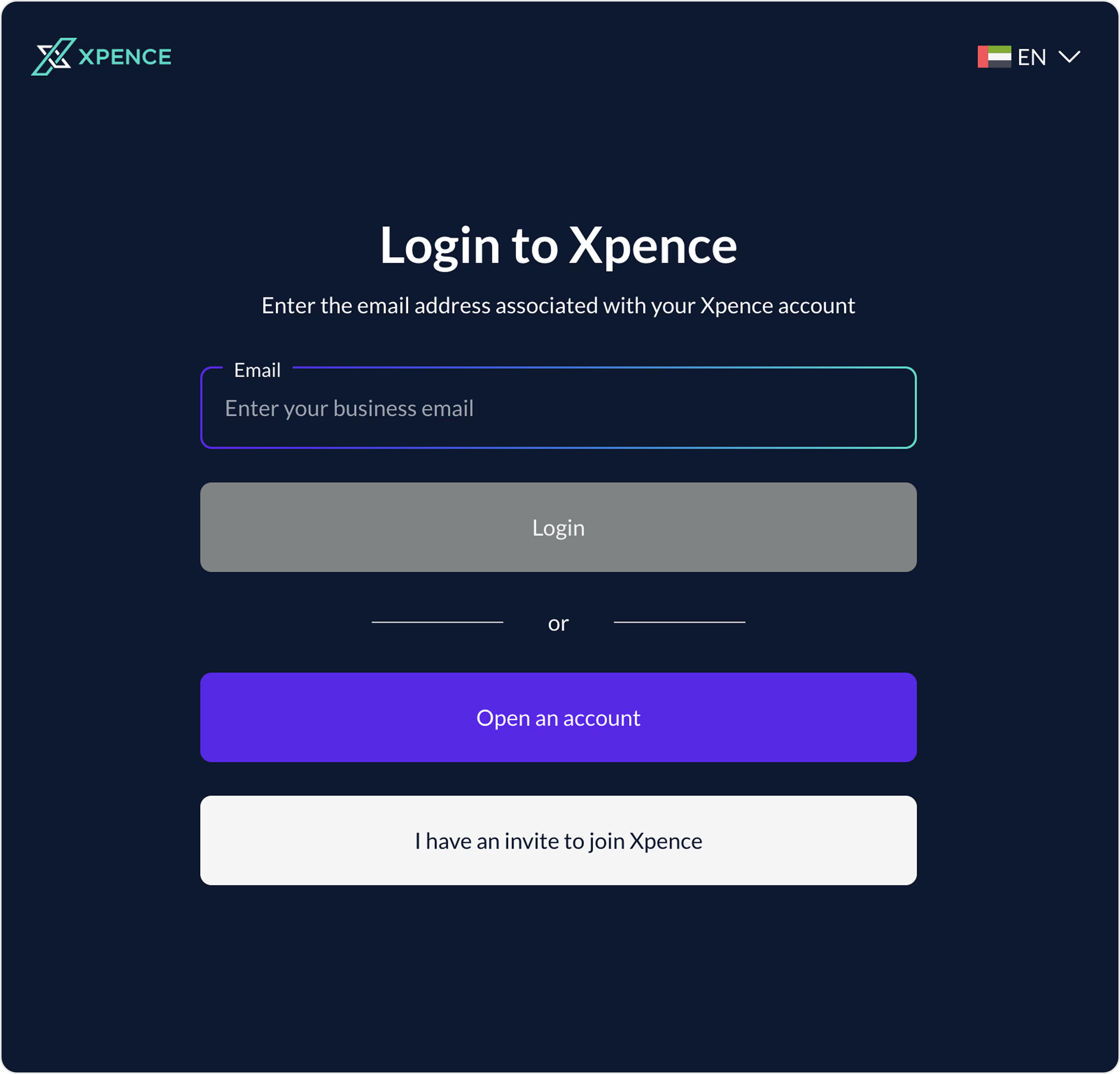
Form characteristics:
- Minimalist form layout for low entry barrier.
- Clean color contrast with strong branding + accessibility.
- Progressive disclosure to guide the user step-by-step.
- Localized interface with language control in a global-ready UI.
- Great mobile usability with clear tap targets and vertical spacing.
- The form respects the user’s time and clearly understands the audience's pain points.
The next stop is identity checks. Let’s explore how to design effective, compliant, user-friendly, and good-looking KYC, KYB, and AML forms.
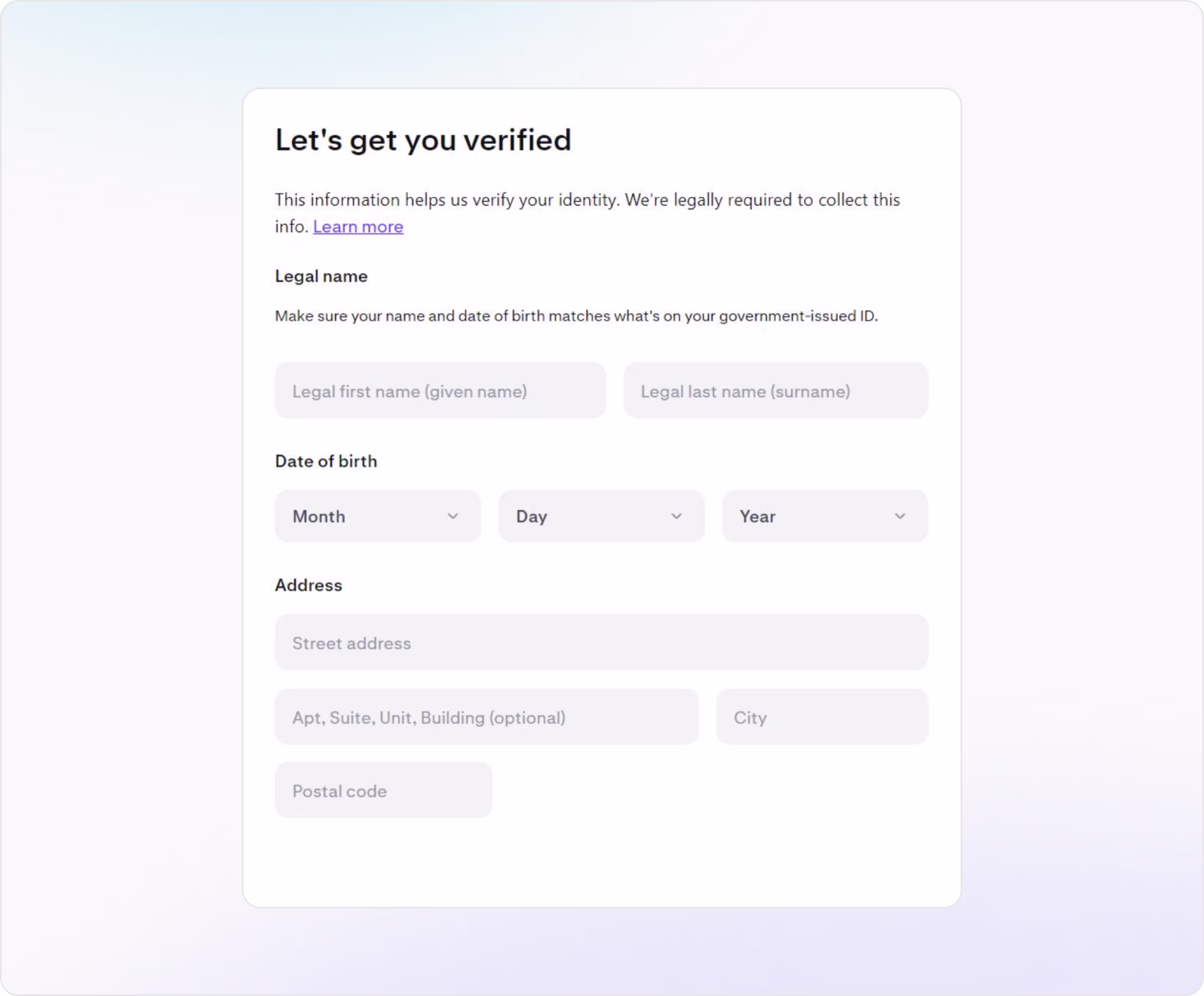
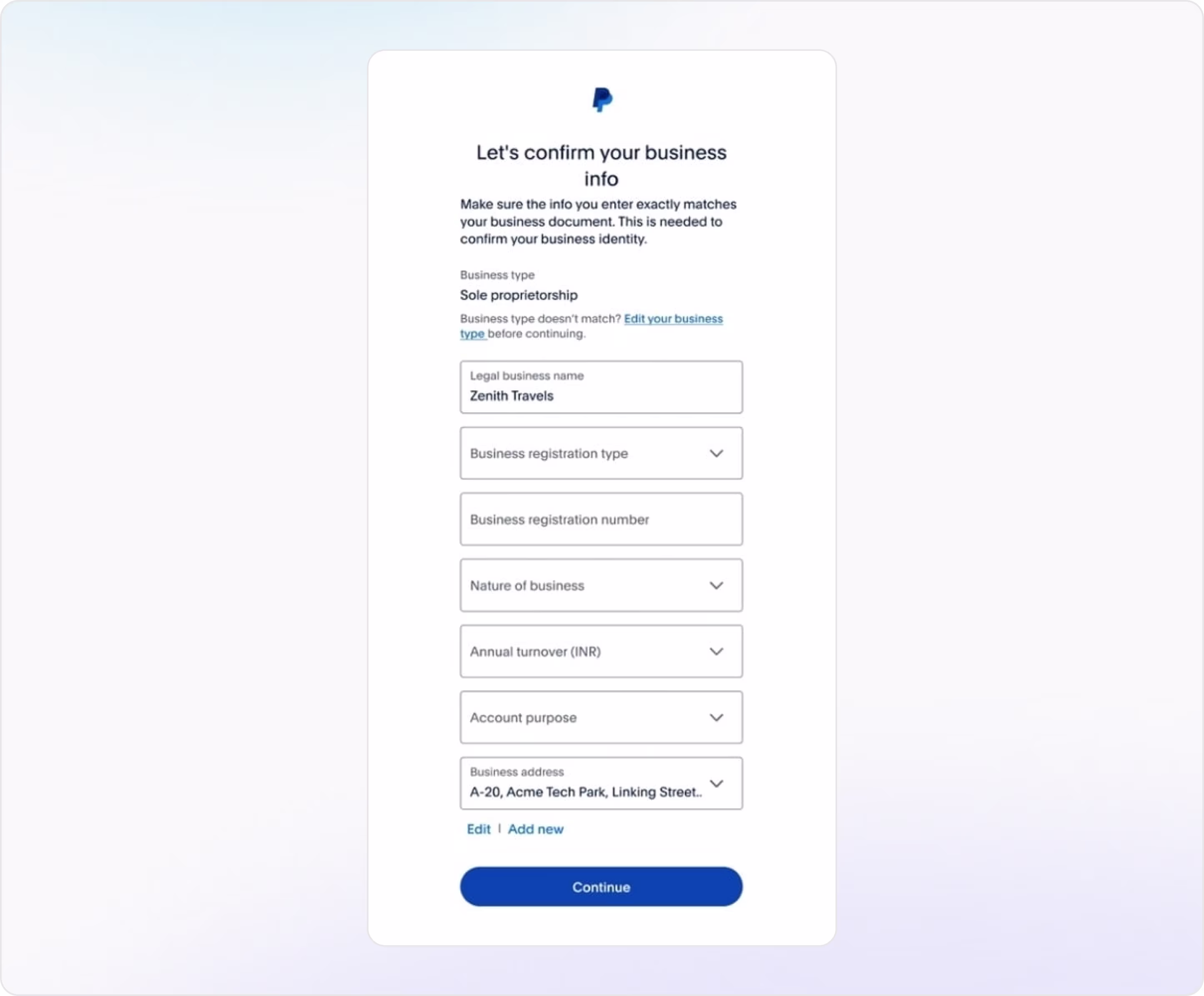
KYC / KYB / AML Compliance Forms
When your product handles money, security, and trust become non-negotiable, so users need to fill in one of these forms:
- KYC (Know Your Customer). It verifies individual identity (passport, selfie, address).
- KYB (Know Your Business). It confirms business legitimacy (registration documents, UBO info).
- AML (Anti-Money Laundering). It ensures no one’s using your platform for illegal transactions.
These processes are often required at onboarding before unlocking features or when hitting certain usage thresholds.
Arounda suggests for a high-converting KYC / KYB / AML form:
- Use a step-by-step approach instead of one long form.
- Pre-fill known data (name or country) and use dropdowns for structured fields (business type or document type).
- Use large buttons, drag-and-drop areas, or illustrations to make document uploads feel less technical. Show accepted formats and real-time progress indicators.
- Write a microcopy to explain why this matters and build trust. For example, “We’re required to verify your identity to keep your account secure and compliant.”
- Design progress bars or checklists to help users stay calm and committed (especially in complex web forms).
- Make sure users can upload docs, take photos, or fill forms easily from their phone.
- Provide security messaging and add visual trust signals if possible.
- Allow users to save and come back later.
UI/UX expert designs forms to make the verification process smooth, secure, and user-friendly. Now, time to see examples and ideas.
Example 1. Coinbase
Industry: Web3 | Crypto
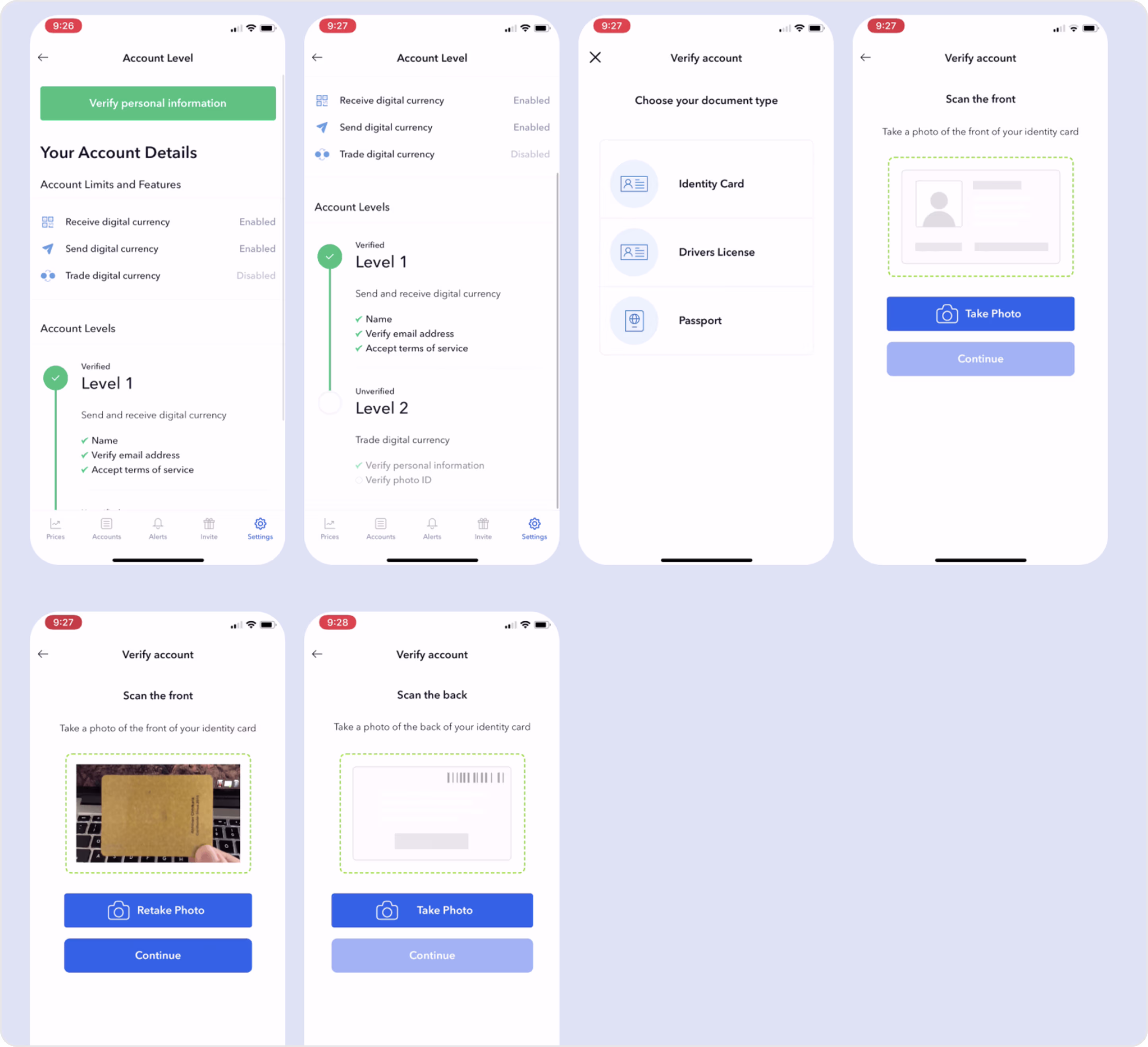
Form characteristics:
- Progressive disclosure doesn’t overwhelm users. Each step leads into the next.
- Strong visual hierarchy.
- Error handling is built in like a photo retake.
- International accessibility with clear iconography + language support for non-native users.
- Structured layout and clean design reinforce security.
Example 2: Kraken
Industry: Web3 | Crypto Exchange
Form characteristics:
- Clear headline and purpose.
- Well-grouped sections with a logical flow of user data.
- Helpful microcopy that prevents form abandonment
- Dropdowns for sensitive fields.
- Simple, accessible design.
Example 3. PayPal
Industry: Fintech | Payments
Form characteristics:
- Structured data flow where each field builds logically on the last.
- Plenty of space and breathing room.
- Contextual microcopy, so users understand why they’re entering each field.
- Pre-filled inputs.
- Clean white layout + PayPal’s blue brand cues.
- Flexible address management, so users can edit or add new ones instantly.
Example 4. Trust Wallet
Industry: Web3 | Crypto Wallet
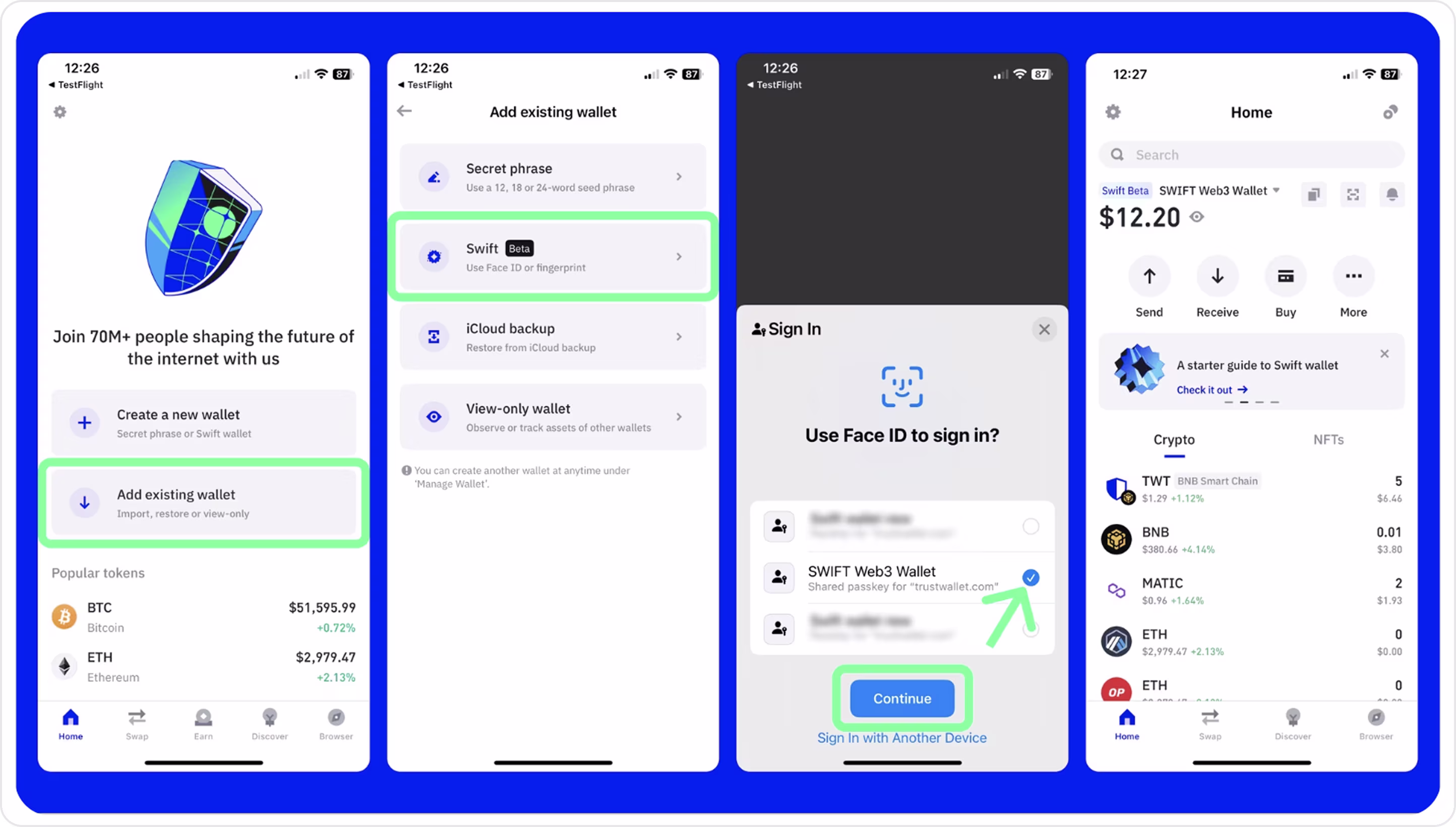
Form characteristics:
- No registration or KYC friction.
- Biometric login replaces clunky recovery flows.
- Multiple entry points (advanced users can import, restore, or observe wallets).
- Clear visual cues with icons, spacing, and checkmarks that guide users.
- Strong mobile-first design.
- Secure and simple (passkey integration + native device biometrics).
Example 5. Plaid
Industry: Fintech | Financial API Infrastructure
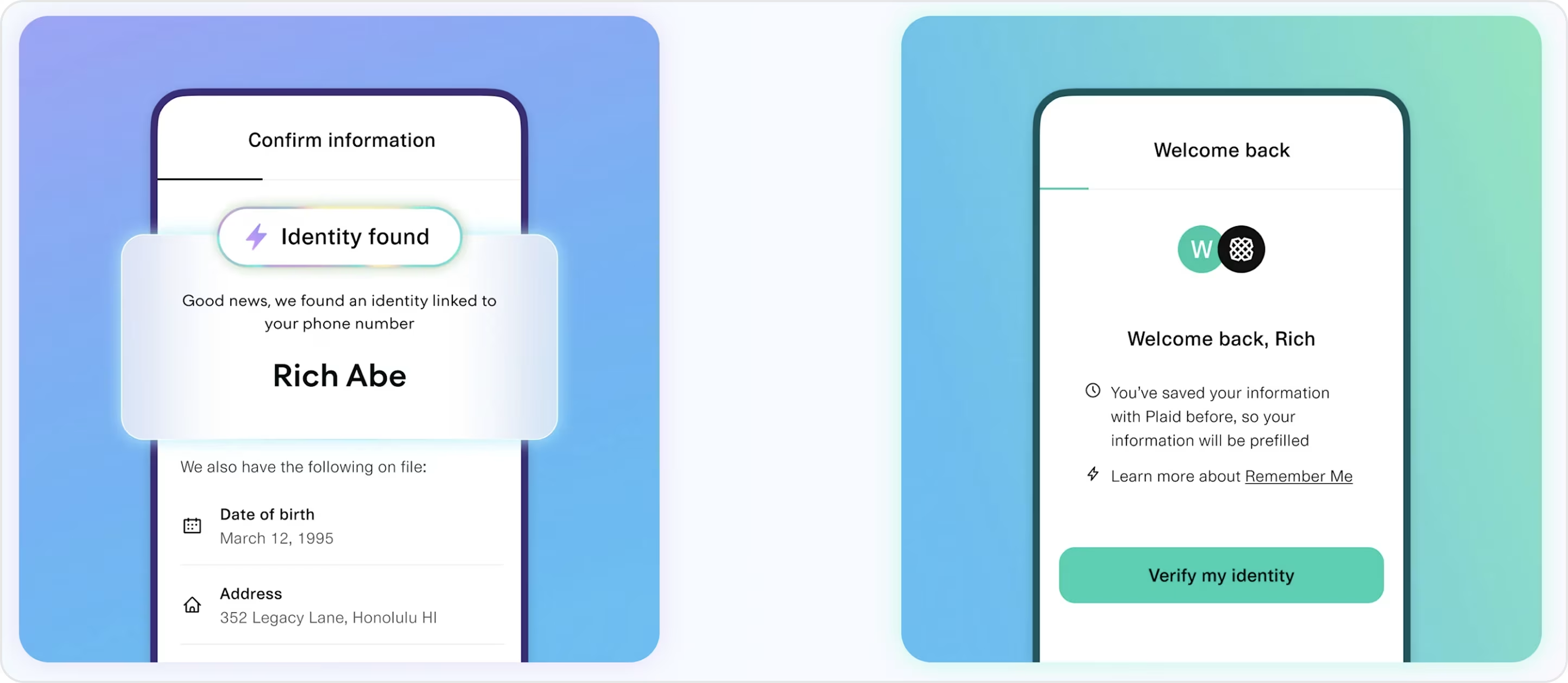
Form characteristics:
- Pre-filled information for instant trust and less user effort.
- Minimal design with full clarity.
- Personalized microcopy that turns a cold compliance task into a warm interaction.
- Plaid auto-detects identity before asking for more.
- Compliant yet invisible, so the user feels like it’s onboarding, not KYC.
You’ve guided users through security and verification. Now it’s time to deliver on convenience. Let’s look at how top products design payment forms.
Payment Forms
A payment form is any online form that allows users to send money, complete a transaction, or authorize a financial operation.
If you want to create a really helpful, clean, and beautiful payment form, Arounda experts suggest for a high-converting payment form:
- Reduce visible complexity, so limit fields to what’s essential, use smart defaults, and group related inputs clearly.
- Clarify amounts and fees.
- Stick to formats users trust.
- Validate wallet addresses or card numbers in real time.
- Use color and microcopy to guide people through errors.
- Show security badges, SSL/encryption notices, and confirmation screens.
- Use Face ID, passkeys, or saved payment methods to speed things up.
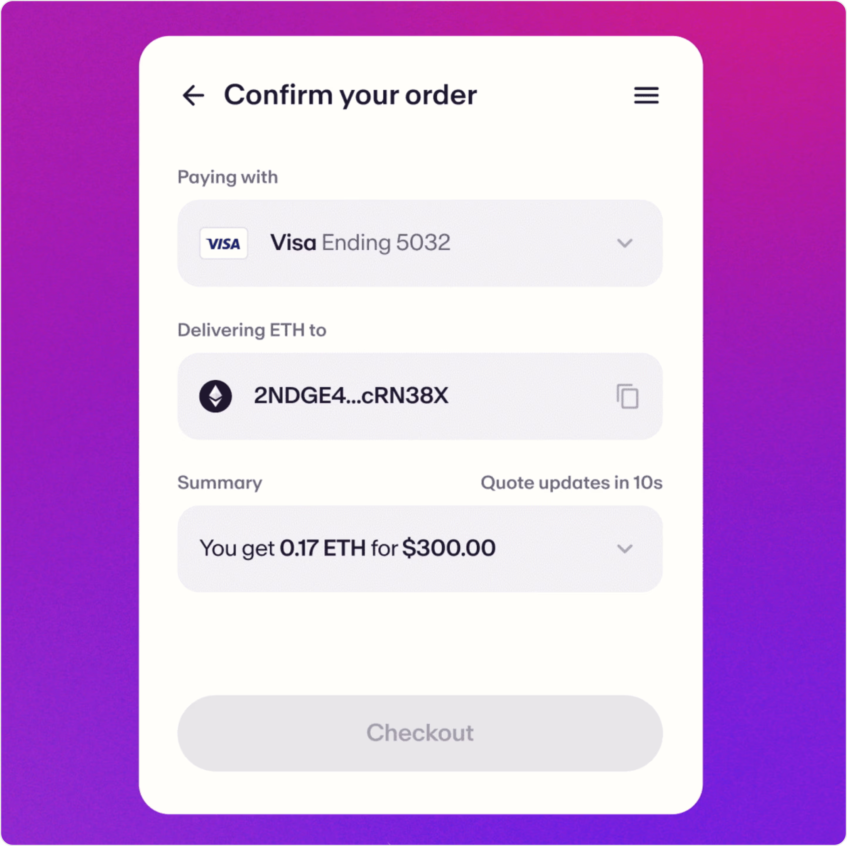
Example 1. Infinity Wallet
Industry: Web3 | DeFi Wallet
We partnered with Infinity to create their product’s entire interface: onboarding, crypto payments, DeFi, and Web3 integrations. Our goal was to create a dark-mode-native, intuitive UI that blends security, usability, and flexibility.
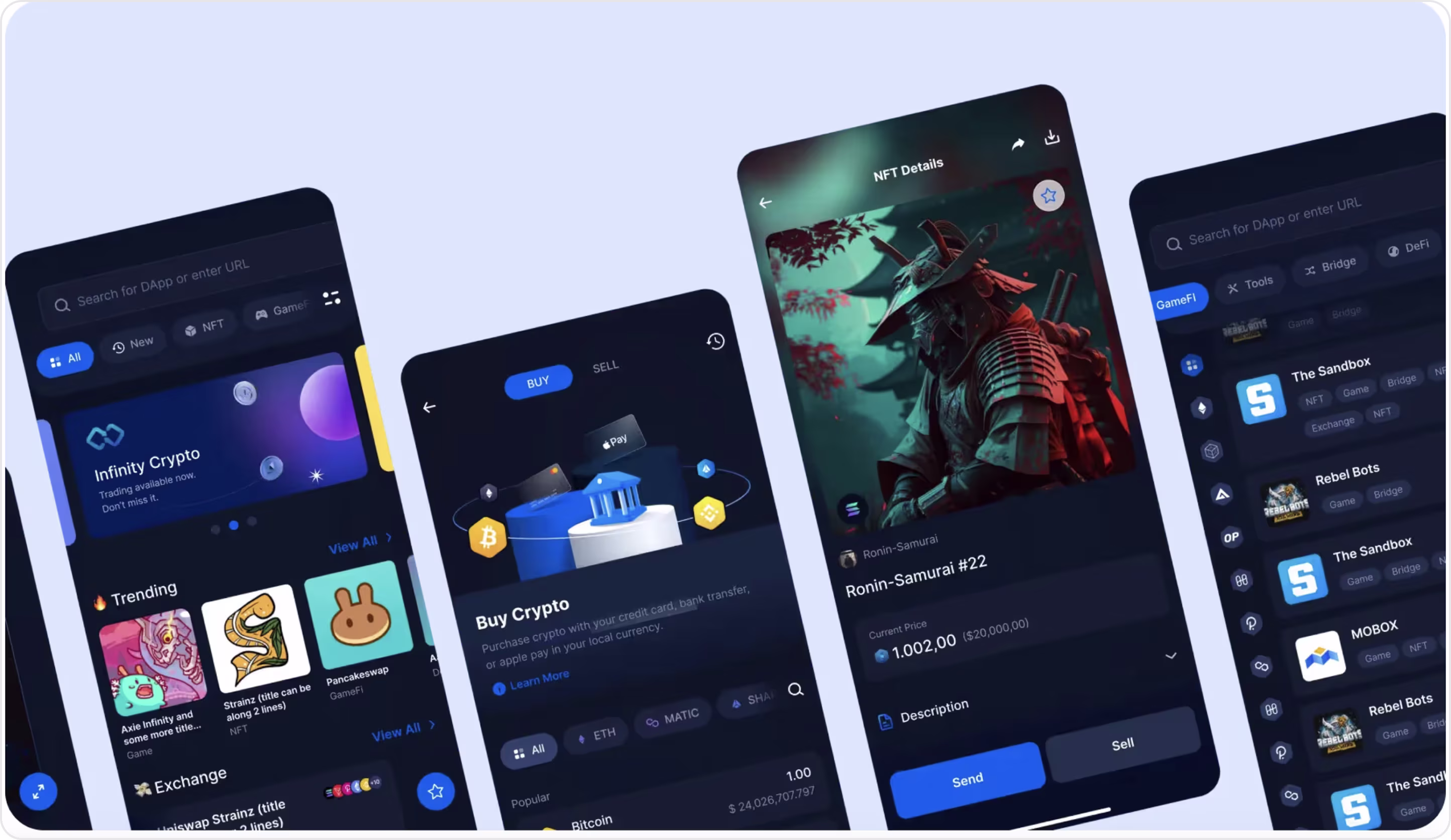
Form characteristics:
- Dark mode UX that fits Web3 aesthetic.
- Each screen is focused on one job (buy, send, sell).
- Smooth discovery-to-transaction flow.
- Clean form inputs.
- Consistent CTA styling.
- Full token visibility builds trust before confirming amounts.
Example 2. N26
Industry: Fintech | Digital Banking
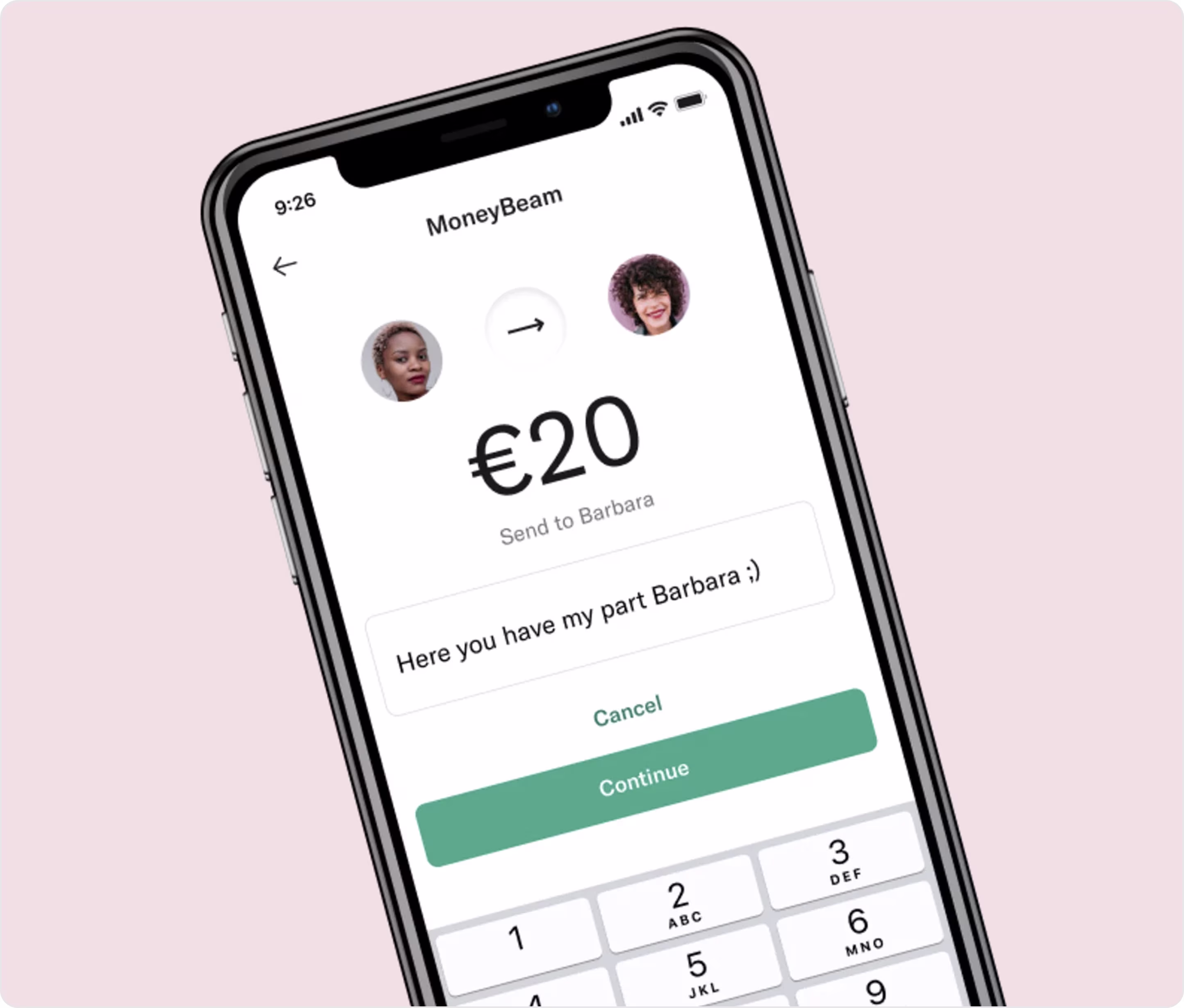
Form characteristics:
- Clean visual hierarchy, so users know what to do.
- Mobile-native layout with large input, large buttons, and minimal effort.
- Friendly microcopy feels casual.
- Inline personalization adds warmth to peer-to-peer payments.
- Trust via visuals as profile photos confirm identity.
Example 3. Galaxy
Industry: Web3 | DeFi | Token Sales
Arounda crafted the Galaxy’s branding to make this product elegant, trustworthy, and friction-free across devices.
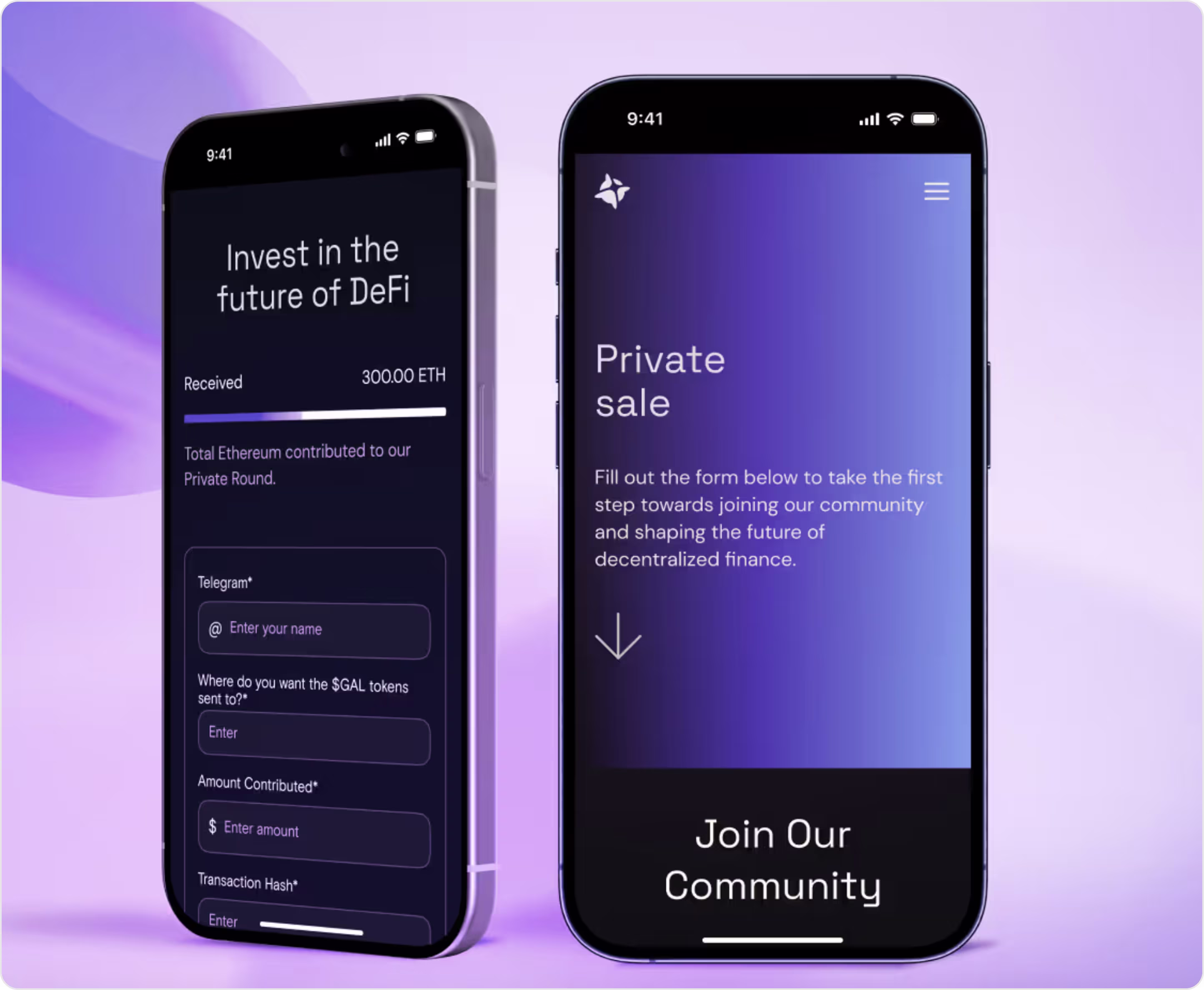
Form characteristics:
- Crypto-native inputs with wallet address, transaction hash, and token delivery.
- Mobile-optimized spacing and text fields.
- Live contribution tracker creates urgency and social proof.
- Fast completion for crypto-savvy users.
- Strong branding (dark UI + futuristic vibe matches Galaxy's DeFi vision).
Example 4. WP Simple Pay
Industry: Fintech | No-Code Payments | Stripe payment plugin for WordPress
Form characteristics:
- Pre-filled labels and intuitive layout.
- Live amount confirmation reduces uncertainty before payment.
- Dropdown support field allows campaign tagging or segmentation.
- Security assurance (card brand icons and Stripe infrastructure).
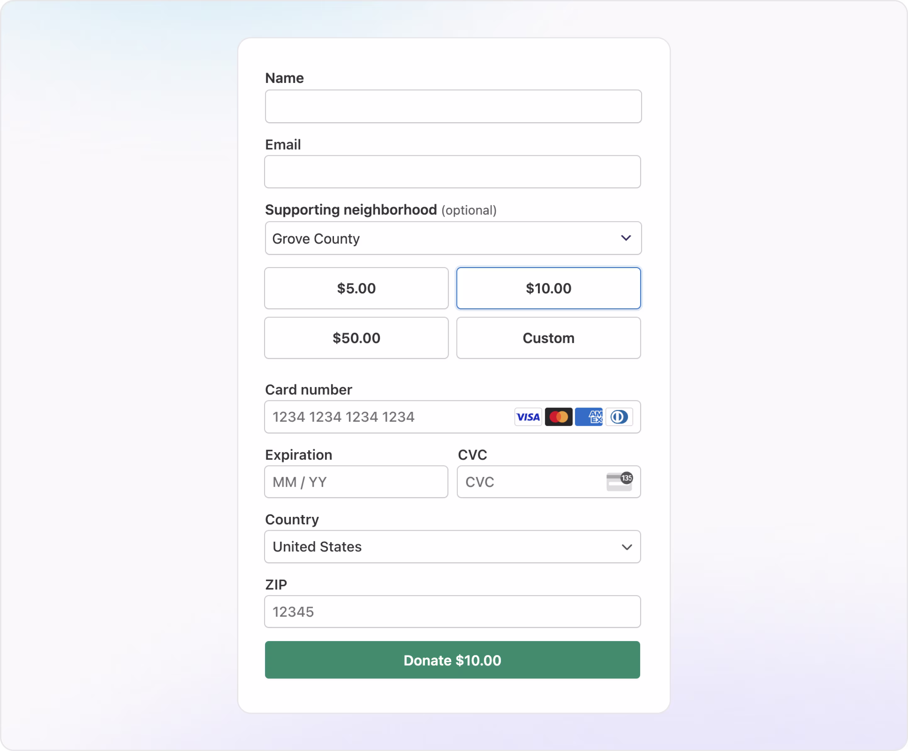
Example 5. SoFi
Industry: Fintech | Digital Banking
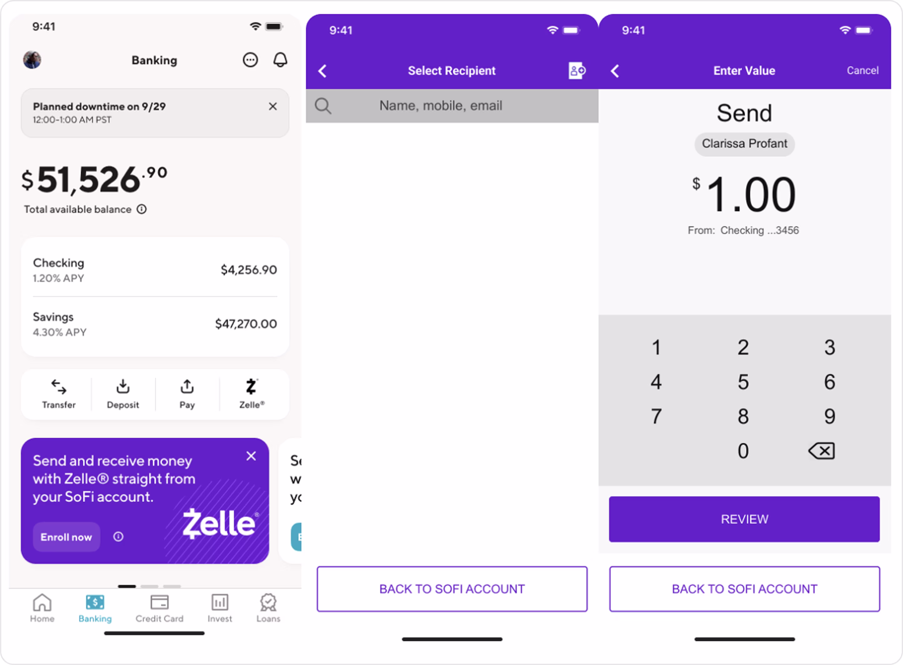
Form characteristics:
- Each screen has one focus: choose → enter → confirm.
- Streamlined mobile UX with large touch targets.
- Built-in trust displays the recipient and account preview before sending.
- Consistent branding.
Payment forms handle the transaction, but the full buying experience handles the checkout forms. And creative UX helps increase conversion in this case.
Checkout form
A checkout form collects everything a user needs to complete a purchase or transaction. It includes:
- Name and contact info
- Shipping and billing addresses
- Payment method
- Promo codes or reward options
- Final order summary
- Consent or terms checkbox
Checkout flows are multi-step or multi-field, so structure, flow, and clarity matter a lot.
Arounda suggests for a high-converting checkout form:
- Auto-fill everything you can: saved cards, user profiles, addresses.
- Break the process into steps. Use 2–3 simple screens instead of one long scroll.
- Your fields, buttons, and error messages need to be tap-perfect.
- Show payment provider logos, security icons, and copy like “Encrypted via Stripe” or “No fees added.”
- Keep the “Continue” or “Pay Now” button visible as users scroll.
Example 1. Moonpay
Industry: Web3 | Crypto Payments
Form characteristics:
- One-step checkout reduces abandonment.
- Every element is spaced and styled for focus
- Mobile-native layout with large buttons and clean interactions.
- The user knows exactly what they’re buying, where it’s going, and how much they’ll pay.
Example 2. Klasha
Industry: Fintech | Cross-Border Payments
Our Arounda team partnered with Klasha to create a modern, intuitive, and scalable UI/UX for its payment ecosystem. The platform has a branded checkout form that supports diverse currencies and use cases.
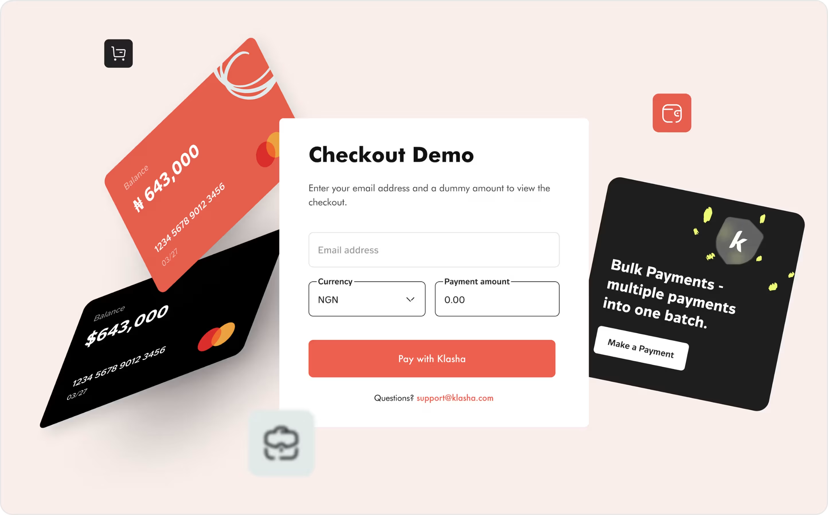
Form characteristics:
- Zero-login and fast entry are great for guest checkout.
- Currency dropdown (fully localized UX).
- Responsive and mobile-first with large fields and buttons.
- Action-first structure with short flow and big CTA.
- Visual trust with card icons, clean design, subtle security cues.
Example 3. Neopay
Industry: Fintech | Open Banking | Payment Infrastructure
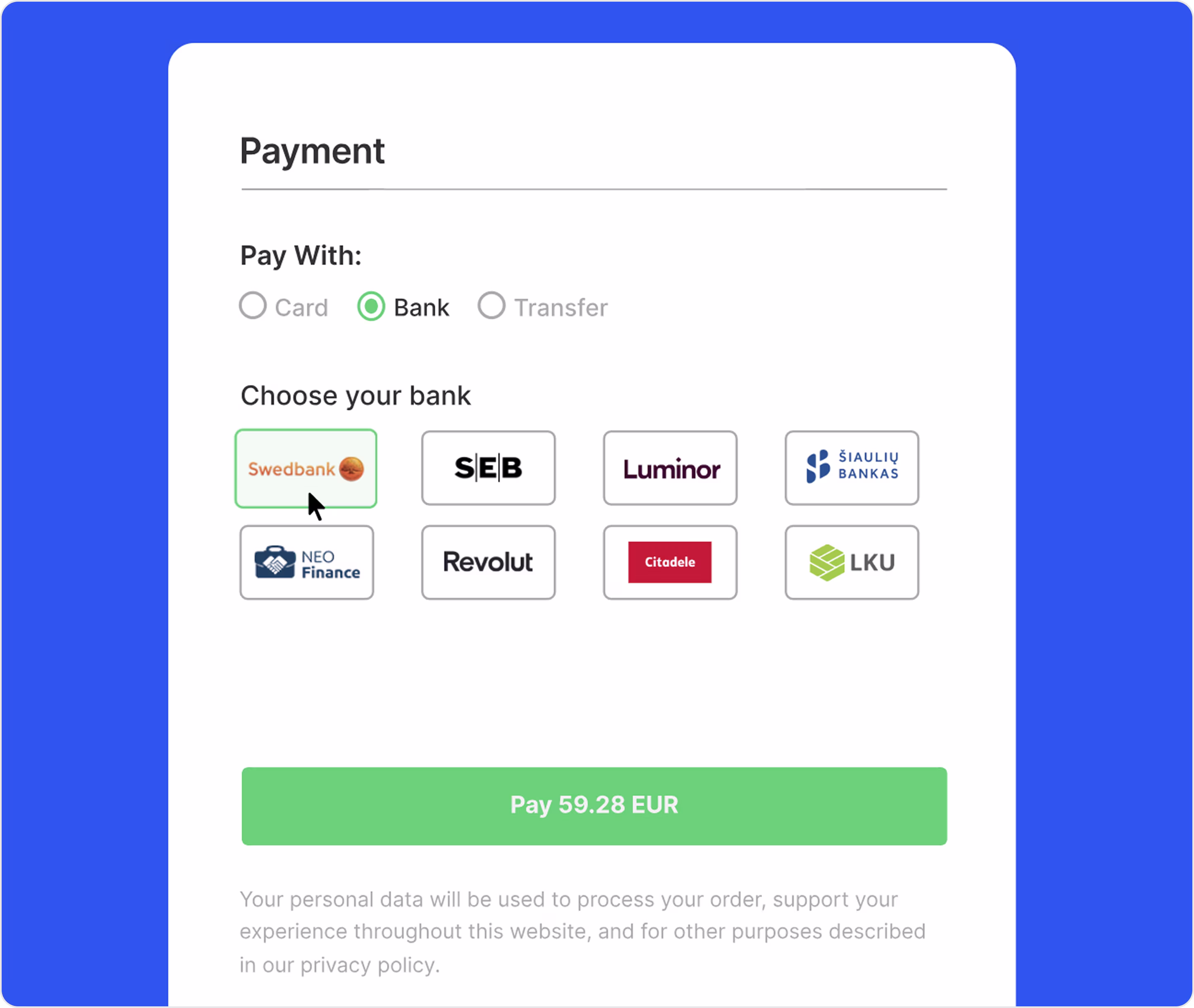
Form characteristics:
- Visual selection grid. It's a fast, friendly, frictionless solution.
- Multi-option flexibility of card, transfer, or bank.
- Total amount confirmation.
- Clean visual hierarchy where everything has its place.
- Simple tap targets and responsive structure.
Example 4. MintySwap
Industry: Web3 | NFT Marketplace
Arounda delivered a full reimagining of MintySwap’s platform, from branding to web design. One of our key objectives was to create a trustworthy, conversion-optimized checkout experience for NFT collectors.
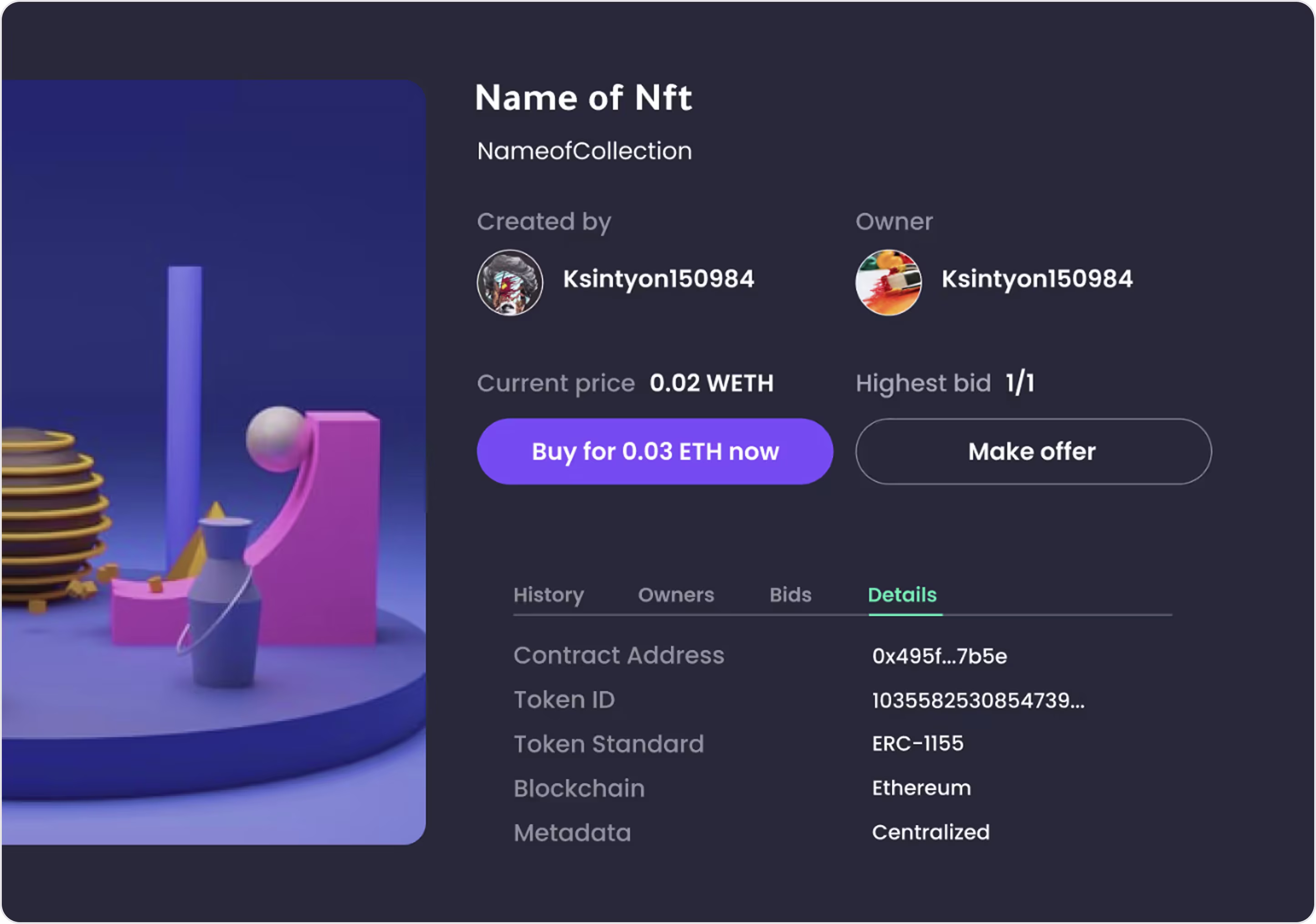
Form characteristics:
- Focused checkout with only the essentials.
- Shows creator, owner, contract, and token type for instant trust.
- Crypto-native styling matches Web3 expectations.
- Two CTA paths of immediate purchase or custom offer.
- Accessible hierarchy.
- Large tap zone for checkout.
Example 5. Adyen
Industry: Fintech | Global Payments
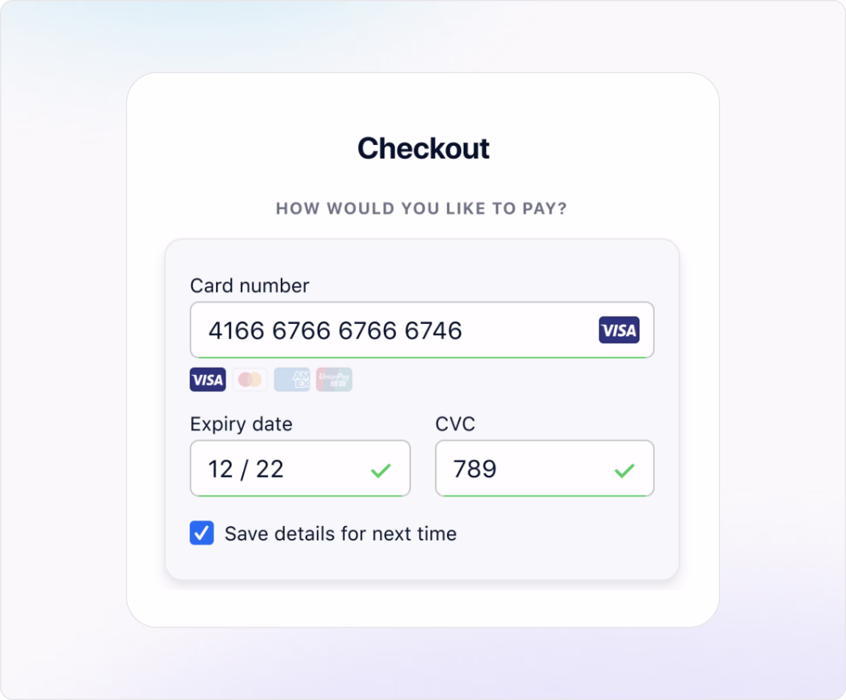
Form characteristics:
- Inline validation.
- Smart card detection.
- Clear field layout.
- Save card option.
- No unnecessary distractions or clutter.
- Scalable for enterprise-level volume.
All users want control over their profile, privacy, and preferences. Let’s explore how account management forms help create that experience with web form examples.
Account Management Forms
Account management forms allow users to take control over their profile, updating personal information, changing passwords, managing settings (preferences, notifications, connected accounts, wallets, language, and interface theme), and modifying security settings. They are essential for user trust, data integrity, and long-term engagement.
Arounda suggests for a high-converting account management form:
- Let users see their saved data before making changes.
- Group similar settings together and follow a logical layout to avoid cognitive overload.
- Use subtle microcopy (“This won’t be shared”), validation states, and modals for sensitive actions like password or 2FA changes.
- Enable partial saves or autosave.
- Mobile responsiveness is a must-have.
Example 1. Binance
Industry: Crypto Exchange | Trading Platform
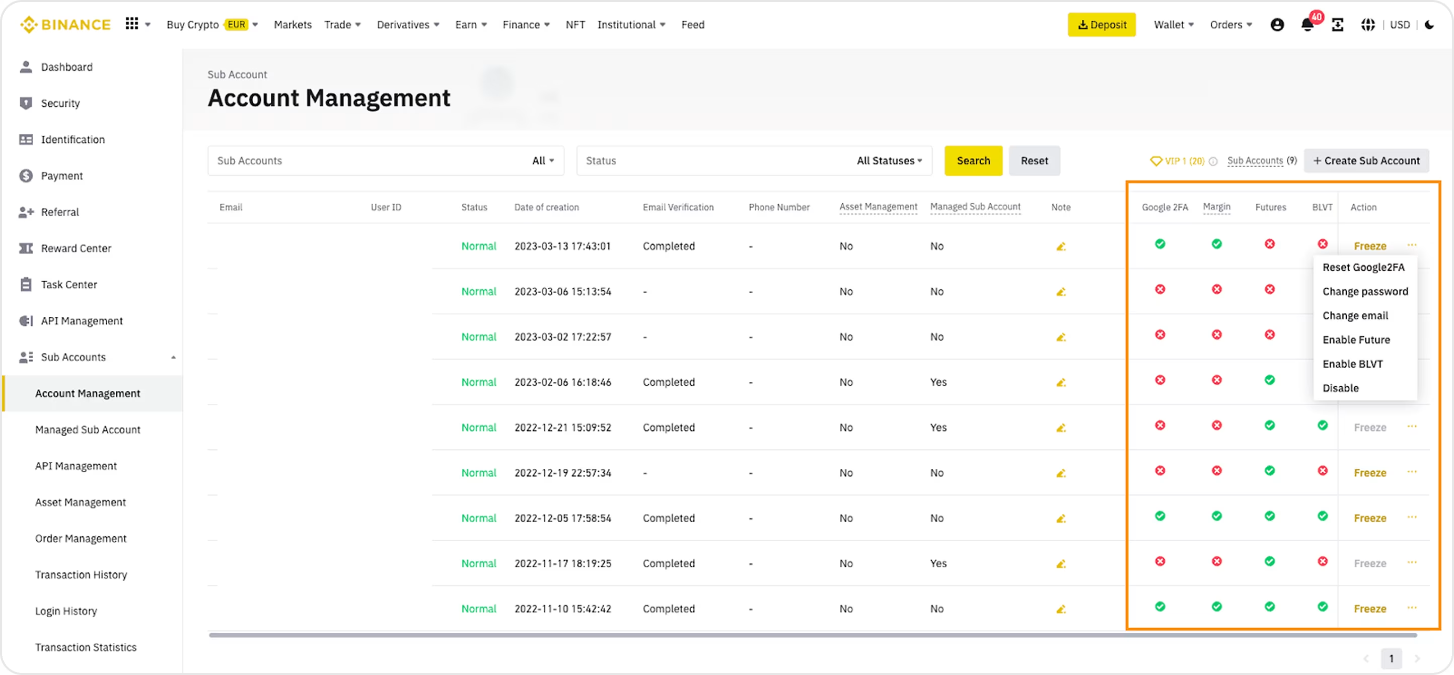
Form characteristics:
- Multi-account visibility.
- Dropdown filters and status search make it easy to find specific accounts quickly.
- Clear status indicators.
- Bulk action access.
- Enterprise-grade control.
Example 2. MYSO Finance
Industry: Web3 | DeFi Lending | Crypto Infrastructure
MYSO Finance partnered with our Arounda team to get custom UI/UX design, web design, and development. During this project, we focus on making the platform clear, helpful, and intuitive for users.
Form characteristics:
- Dual-mode layout accommodates user preference and accessibility.
- Role-based interaction for tailored account views and actions.
- Well-organized lists with sortable parameters.
- Project-based account visibility.
- Status tagging.
- Clear CTA for connecting Web3 wallets keeps users engaged and ready to act.
Example 3. Payoneer
Industry: Fintech | Digital Payments

Form characteristics:
- Clear messaging immediately informs the user of the task.
- The visual strength meter provides feedback on password robustness in real time.
- Users can instantly see requirements (numbers, letters, minimum length).
- Only three input fields avoid unnecessary complexity.
- Modern visual style.
- Hidden input toggles to enhance usability and control.
Example 4. OpenSea
Industry: Web3 | NFT
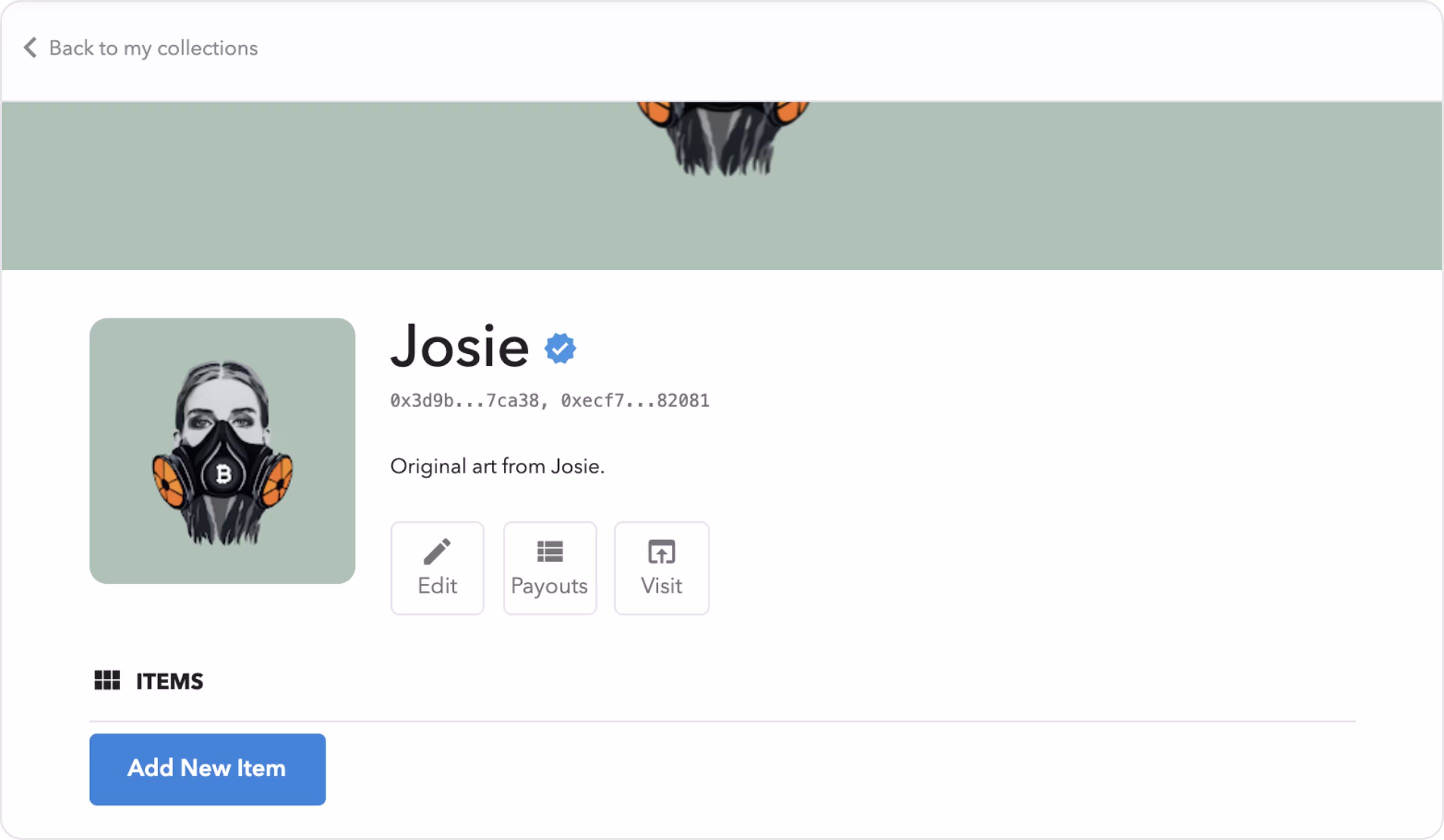
Form characteristics:
- Verified profile visuals.
- Quick actions.
- Encourages contribution.
- Simple structure.
- Emphasizes decentralized ownership with public wallet IDs visible under the profile name.
Example 5. Brex
Industry: Fintech | B2B Banking
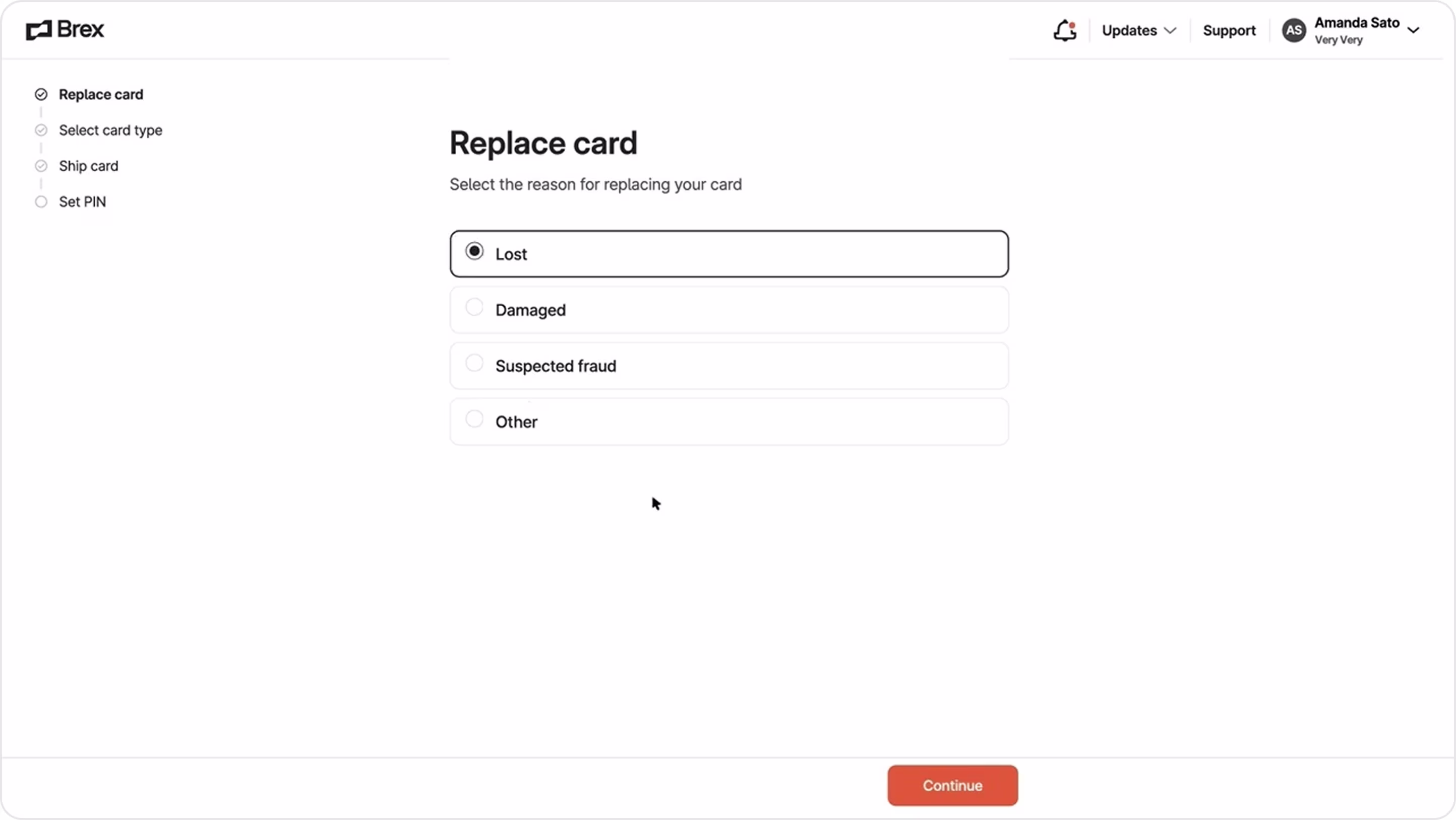
Form characteristics:
- Linear stepper navigation.
- Headline and subtext explain intent in plain language.
- The bright orange CTA stays anchored and guides users through the flow.
- Accessibility-first form.
- Whitespace and grid structure create a distraction-free interface for critical account tasks.
Even with the best onboarding, payment, and account flows, questions and issues can still arise. That’s why you should create trustworthy and helpful contact and support forms. Let’s see some examples.
Support and Contact Forms
Contact and support forms are often the last line of defense between user frustration and brand loyalty. Users need help resolving a payment issue, reporting a bug, or asking a question, so the design of these forms directly impacts how supported (or abandoned) they feel. The formats vary, but the purpose remains the same – create a bridge between user needs and business response.
Arounda suggests for a high-converting support or contact form:
- Use dropdowns or buttons to guide users to the right team or issue category.
- Suggest articles or FAQs to reduce tickets and empower self-service.
- Clearly state response times, hours of operation, and next steps to manage anxiety and avoid repeat messages.
- Avoid overwhelming users with too many required fields.
- Make sure every input, label, and CTA is mobile-friendly, readable, and usable for all types of users.
Example 1. Infinity
Industry: Web3 | Crypto Wallet
Arounda designed the Infinity Wallet with human-centered and the best accessibility approaches.
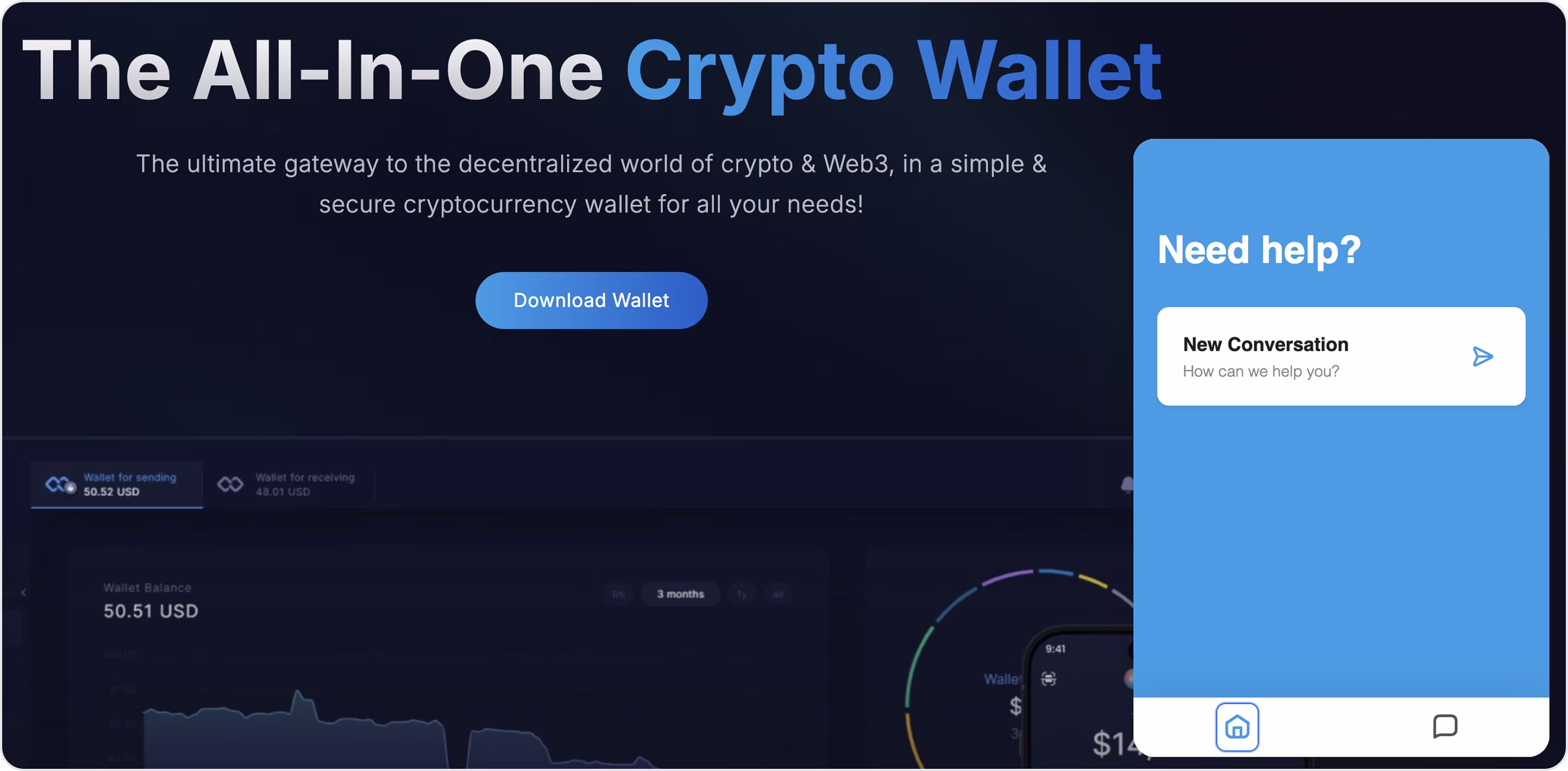
Form characteristics:
- A floating widget is immediately visible in the lower corner for quick user support.
- Start a new conversation intuitively, using natural language prompts.
- Persistent UI element that doesn’t interrupt navigation or wallet actions.
- Requires zero clicks to locate support as it’s embedded directly in the homepage.
- Designed for users who expect real-time, frictionless help in a decentralized product.
Example 2. dYdX
Industry: DeFi | Crypto Trading
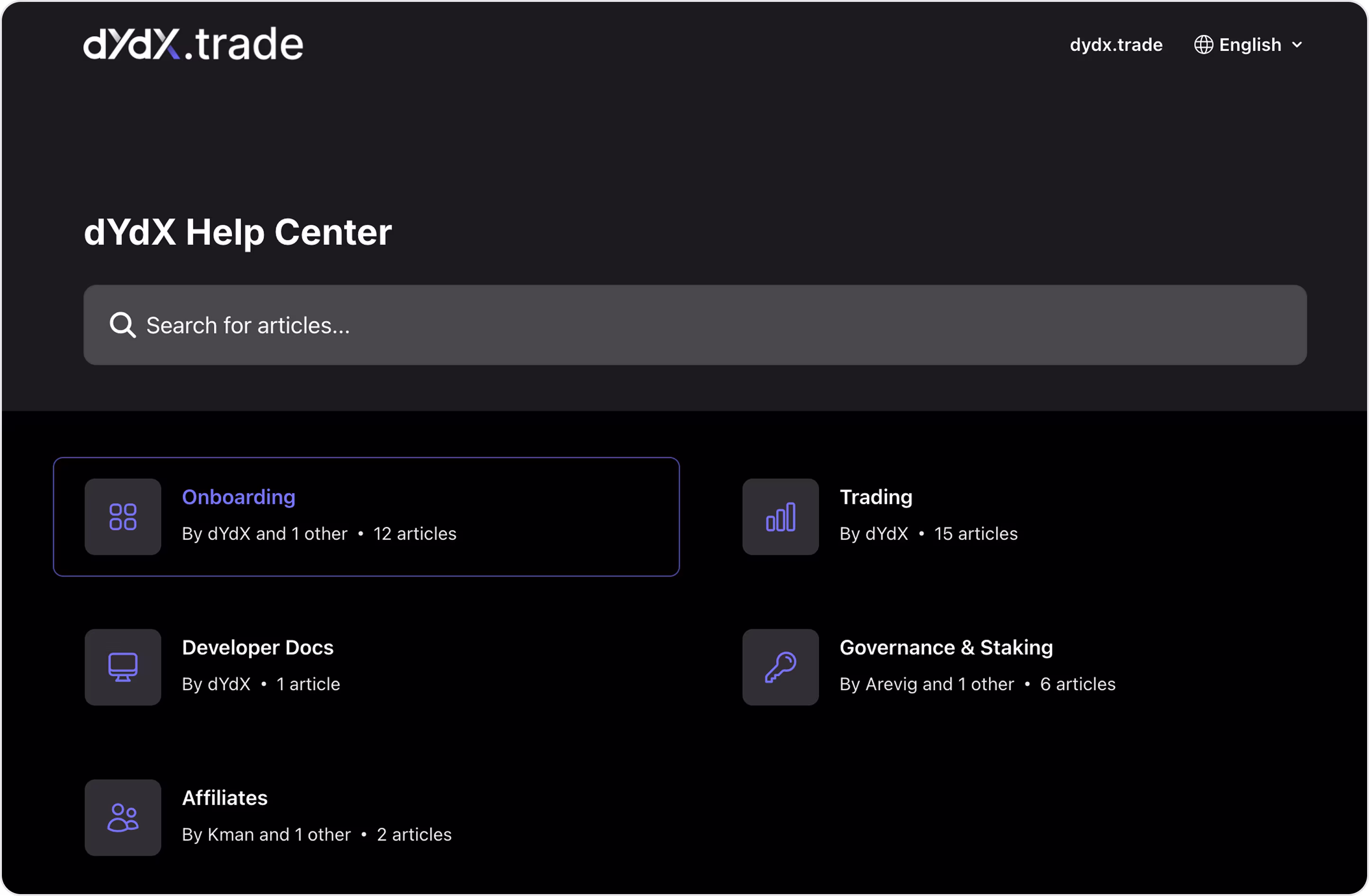
Form characteristics:
- A prominent search bar guides users to self-service content before starting a ticket.
- Structured by topic with an educational focus.
- Dark mode tailored for the crypto-native audience.
- Accessible in multiple languages with contributions from different team members.
Example 3. Klarna
Industry: Fintech | eCommerce
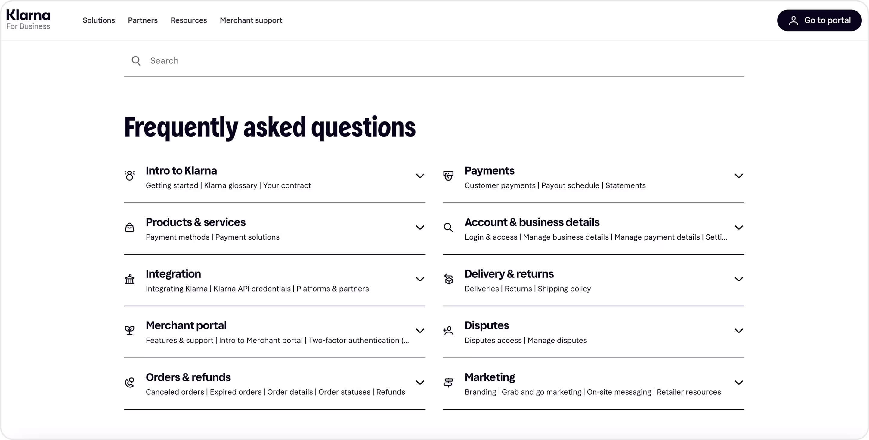
Form characteristics:
- Segmented FAQ categories.
- Search-focused design.
- Accordion layout (keeps the interface clean and offers drill-down detail only when needed).
- Every label and flow focuses on merchant operations.
- Search field to find information faster.
Example 4. Saltedge
Industry: Fintech | Open Banking
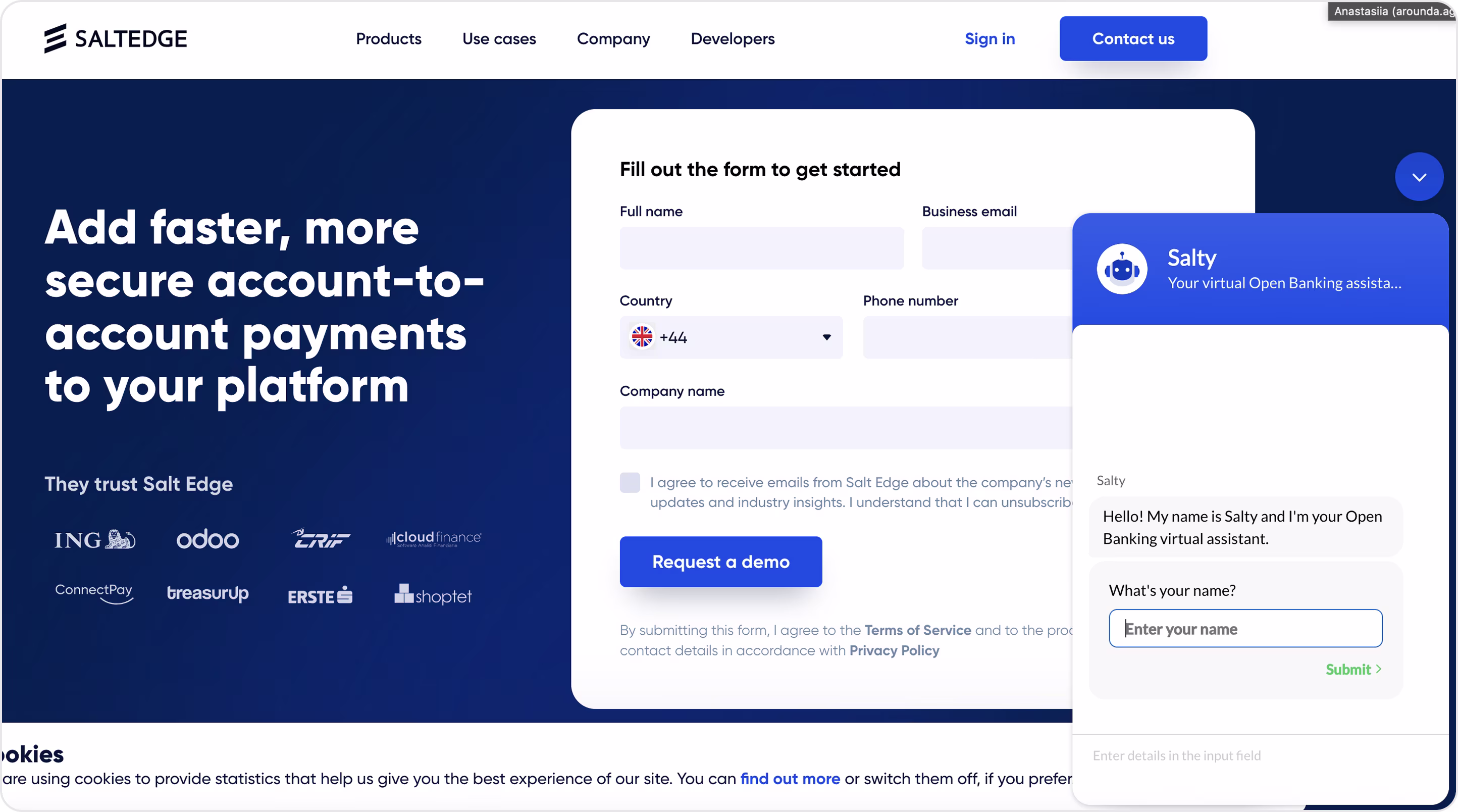
Form characteristics:
- Multi-functional contact form that gathers marketing-qualified leads and support inquiries in one place.
- Integrated AI assistant that offers immediate onboarding via chat.
- Country code dropdown (localization-ready and tailored for international users).
- The chatbot opens a dialogue in natural language to reduce form friction.
- Opt-in transparency.
Example 5. GT Protocol
Industry: Web3 | AI-Powered Investment
GT Protocol is one of Arounda’s projects, where we delivered a full scope of services: MVP design, branding, UI/UX, website design, and web development.
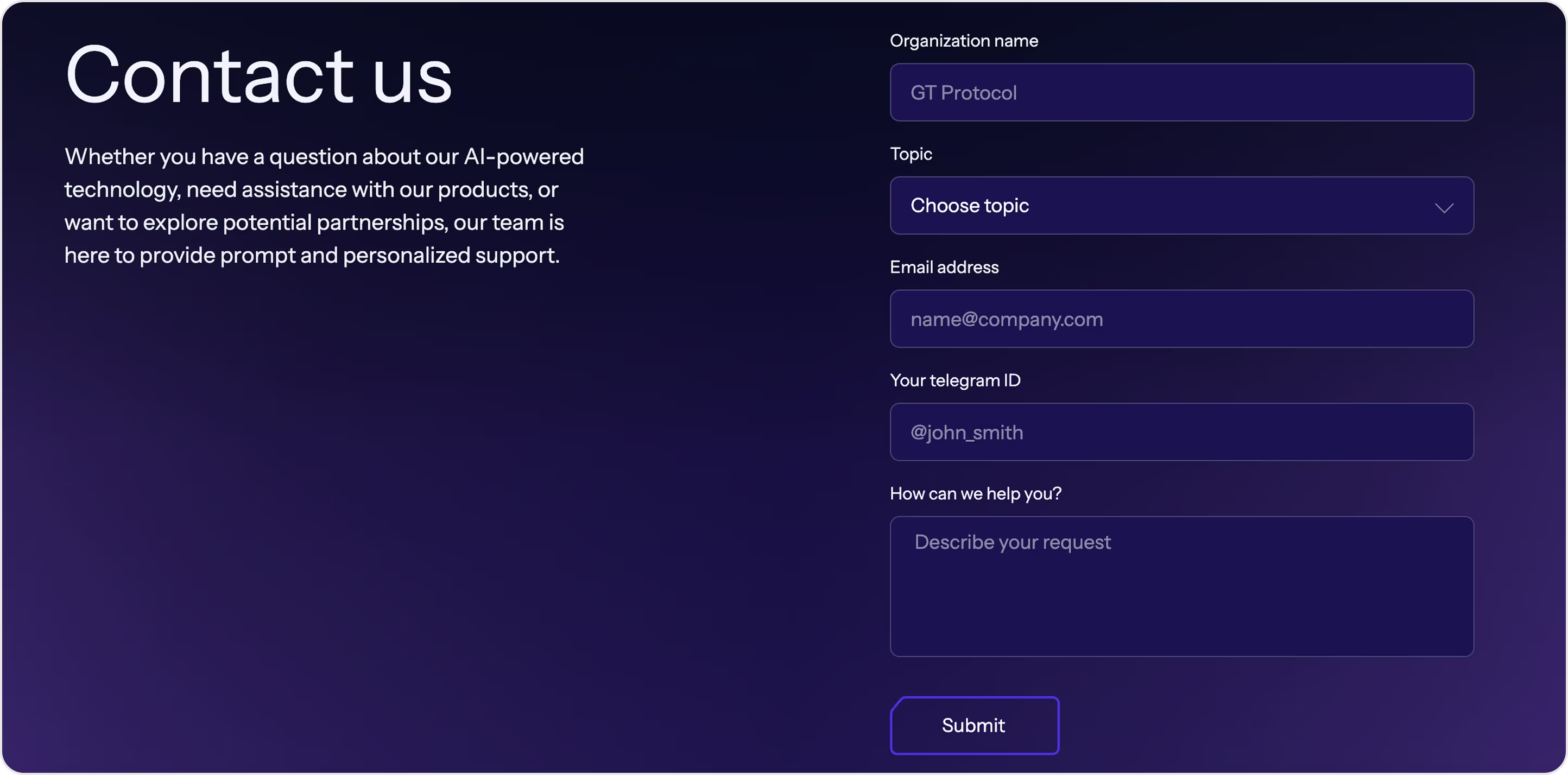
Form characteristics:
- AI branding consistency.
- Telegram ID field aligns with how many crypto-native users prefer to communicate.
- A dropdown for selecting the topic helps route inquiries faster and reduce response time.
- An open-ended query box gives users the freedom to explain issues or partnership ideas in detail.
If your product has complex interfaces (exchanges, wallets, marketplaces, or dashboards), people need not only support, but also well-thought-out search forms. They act as the user's shortcut to specific content, tools, or data.
Search form
Search forms are interactive fields where users enter keywords or filters to quickly find what they need. They can:
- Search for a specific token, NFT, or collection.
- Look up wallet addresses or transaction IDs.
- Filter activity logs or payment records.
- Brows help center articles or FAQs.
- Find user profiles, offers, or documentation.
It’s a functional layer that improves speed, clarity, and user flow across an app, so it needs a great UX.
Arounda suggests for a high-converting search form:
- Make the field visible and immediately accessible.
- Support auto-complete and suggestions
- Highlight keyword matches in results.
- Allow deep filtering and sorting.
- If no results are found, explain why and suggest next steps or alternative keywords.
- Design for mobile behavior.
Now, let’s see and analyze the examples.
Example 1. Brex
Industry: Fintech | Spend management
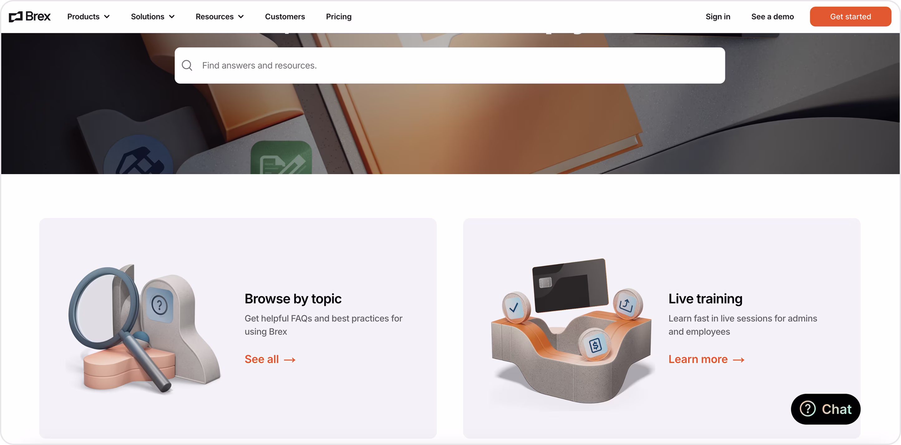
Form characteristics:
- Oversized hero search bar as the primary entry to be obvious and clear.
- Big cards for browsing by topic.
- Generous spacing, strong contrast, and simple copy keep the experience calm and scannable.
- Brand consistency.
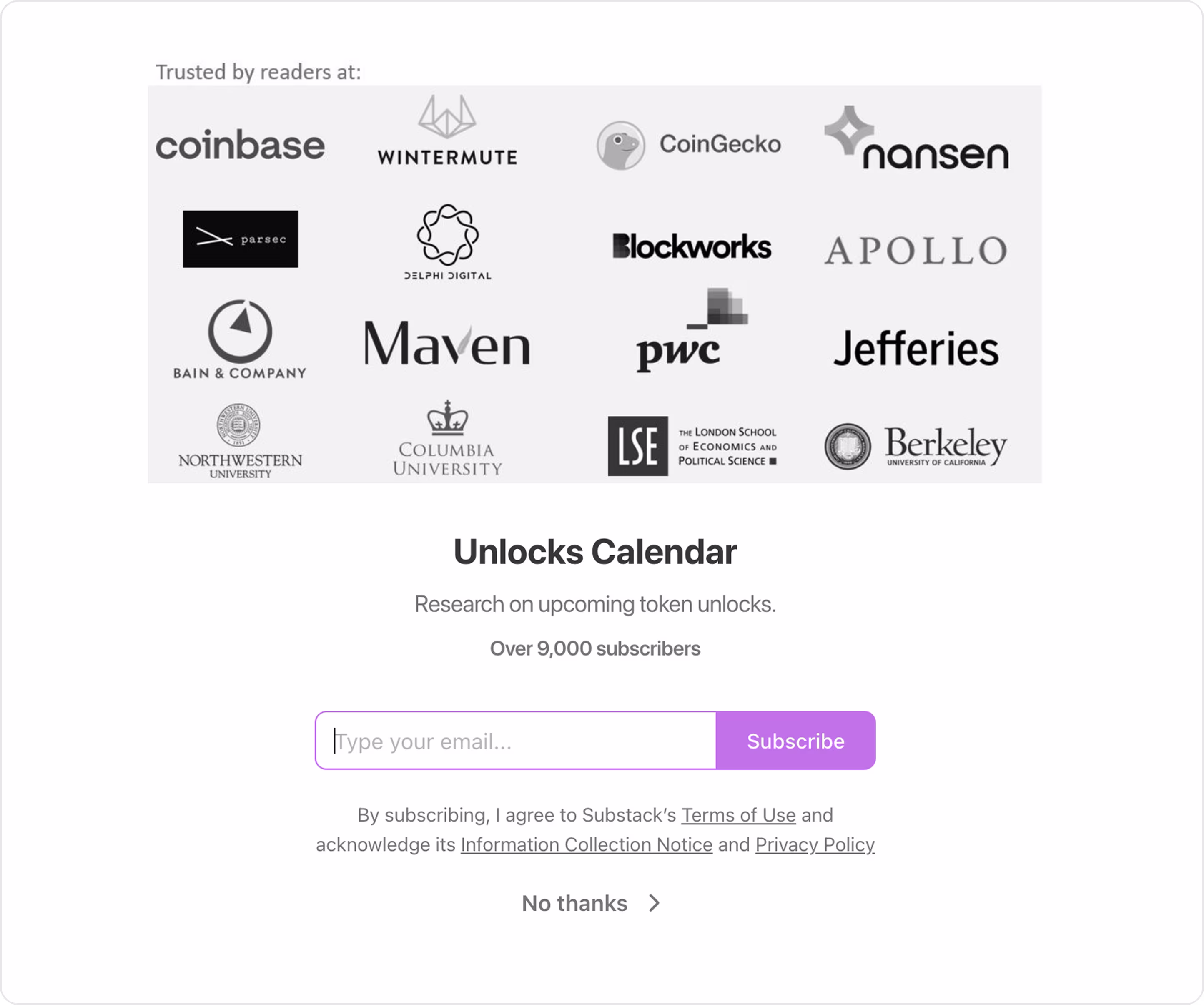
Example 2. Unlocks Calendar
Industry: Web3 | Tokenomics | Market data
Arounda designed the Unlocks Calendar website (UI/UX design and web design). This platform provides investors with insights into future events related to unlocking crypto coins/tokens. So, our task was to make this journey clear and useful.
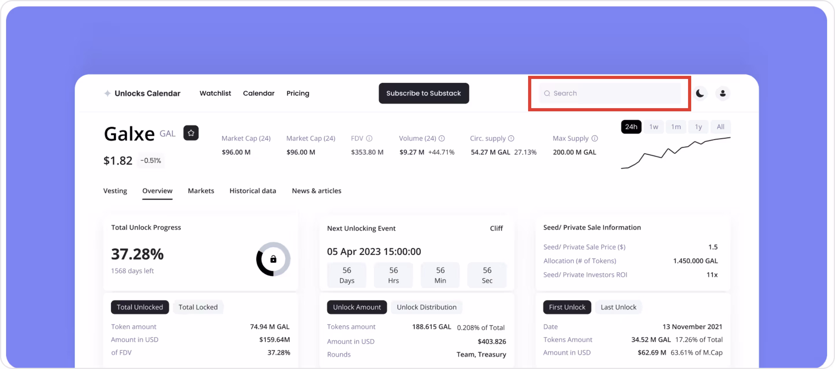
Form characteristics:
- Persistent top-bar search.
- Data-first results.
- Smart suggestions.
- Contextual filters.
- Helpful prompts and popular searches when no match is found.
- Light/Dark theme parity.
Example 3. Current
Industry: Fintech | Neobank
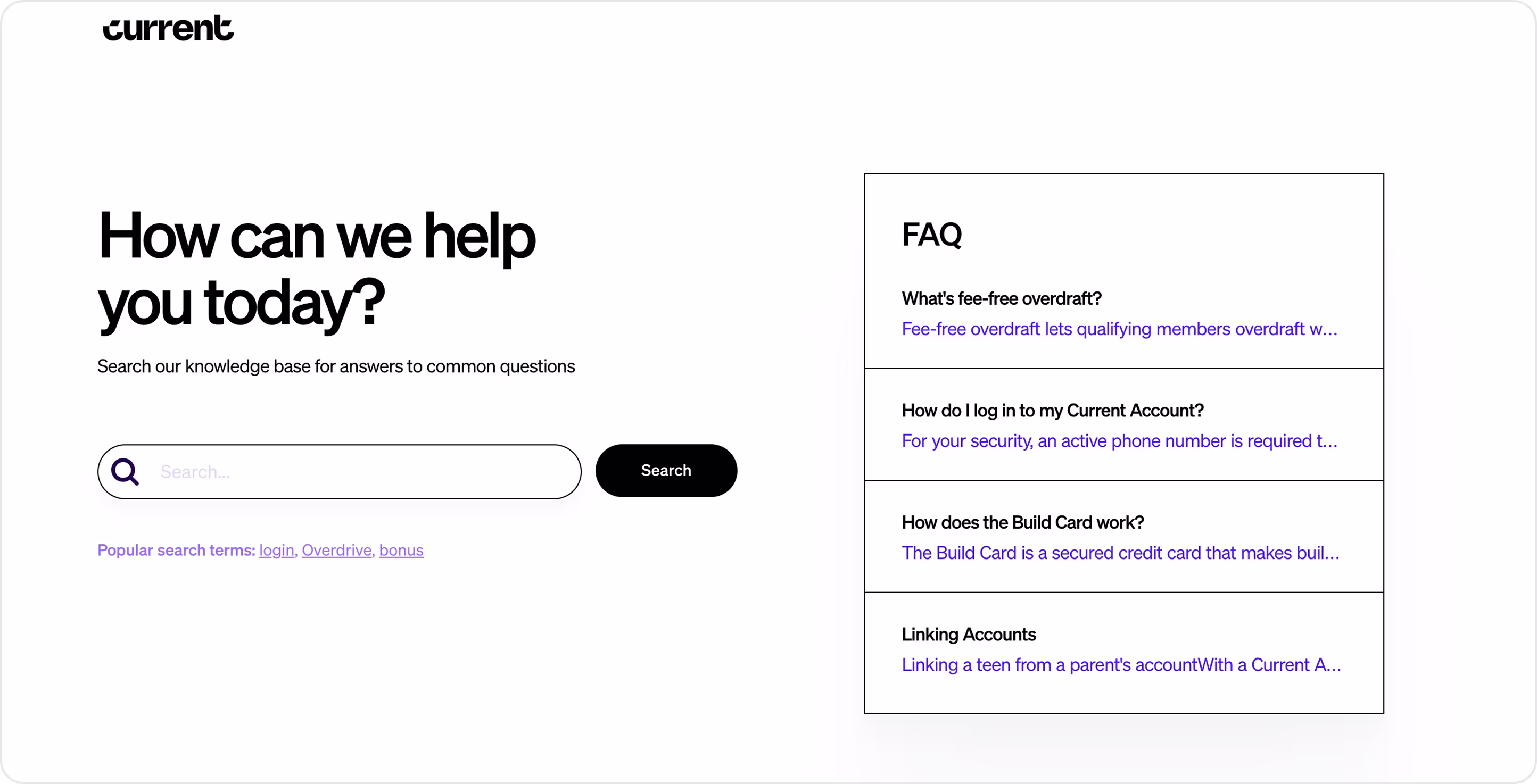
Form characteristics:
- Hero, help-first copy sets intent and calms users.
- Oversized search bar.
- Popular terms shortcuts.
- High-contrast headings and roomy spacing for readability.
- Self-serve bias.
Example 4. Xblock
Industry: Web3 | Blockchain explorer
Arounda team provided UI/UX and web design services for Xblock, where analytics tools and a dashboard deliver real value for their users.
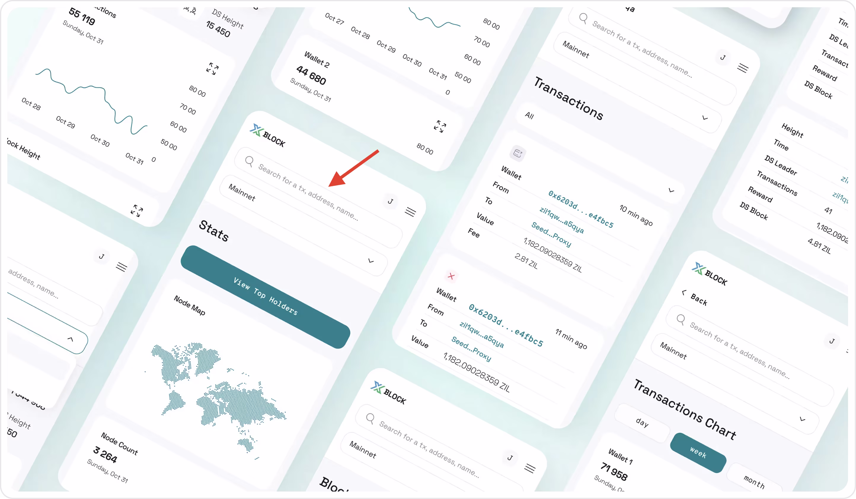
Form characteristics:
- A prominent field with a clear placeholder supports multiple entity types in one place.
- Search stays at the top across views for fast repeat queries.
- Key info surfaced without drilling in.
- Hashes and addresses are styled as tappable links for quick deep-dives.
- Mobile-native layout with large inputs and clean spacing.
- Context filters.
Example 5. Blur
Industry: Web3 | NFT marketplace
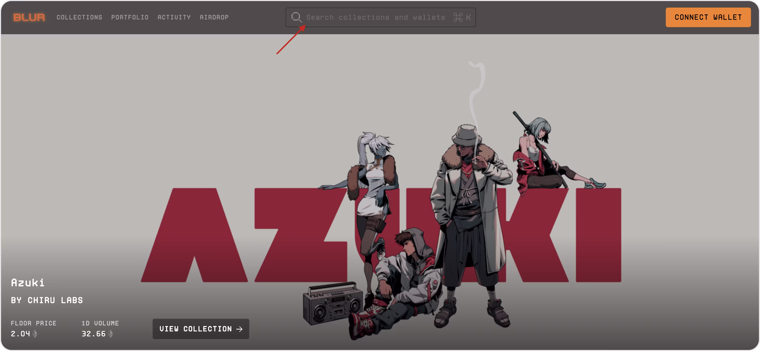
Form characteristics:
- Persistent field in the top bar so users can query from any section.
- Multi-entity hinting.
- ⌘K in the field advertises a command-palette style quick search for speed.
- Magnifier icon, rounded input, and high contrast header make the control easy to spot.
When results appear, a great filter form becomes the control panel. It lets users slice by chain, price, status, and time to get exactly what they need in seconds.
Filter form
Filter forms help users find what they need in seconds, not minutes! They can sort:
- Bank statements by date, amount, merchant, and status.
- Crypto assets by chain, token type, price range, market cap.
- NFT listings by collection, traits, rarity, buy now vs. auction.
- Compliance queues by risk level, KYC/KYB state, and region.
- Payments by method, currency, fee, and settlement time.
Your filters must work well! That’s why, Arounda suggests for a high-converting filter form:
- Offer “quick filters” and show the top 3–6 chips.
- Use faceted controls that match the data. Checkboxes for multi-select, radios for single-select, sliders for ranges, pills for traits/tags.
- Show active filters as chips above the results and include “Clear all” with one-tap remove.
- Apply on change for light queries. For heavy queries, use an Apply button and show a result count.
- Keep Sort by (time, price, yield) distinct from filters. Different jobs, different controls.
- If results hit zero, show why, suggest relaxations, or offer a Reset.
- Be mobile-smart with sticky “Apply”, a live result count, large tap targets, and simple groups.
- Show counts where helpful.
- Support keyboard, screen readers, and high contrast.
Example 1. Zapper
Industry: Web3
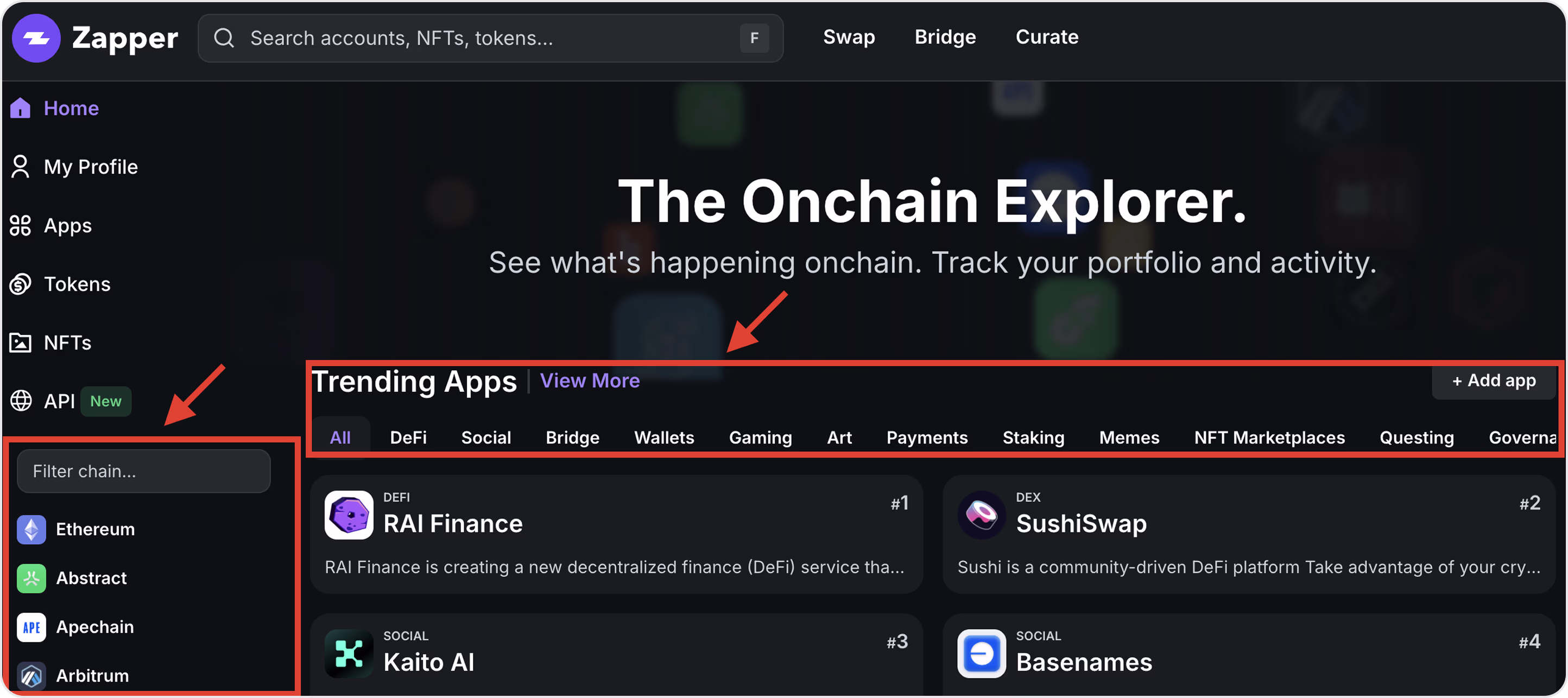
Form characteristics:
- Two-layer filtering with left sidebar filters by chain and top chips filter by category.
- Recognizable chain logos and names for fast scanning.
- Results in “Trending Apps” update immediately as you select chains/categories.
- Filters are visible on page load (not hidden in a modal).
- Clear reset path.
Example 2. V3 Vaults
Industry: Web3 | DeFi yield | Portfolio analytics
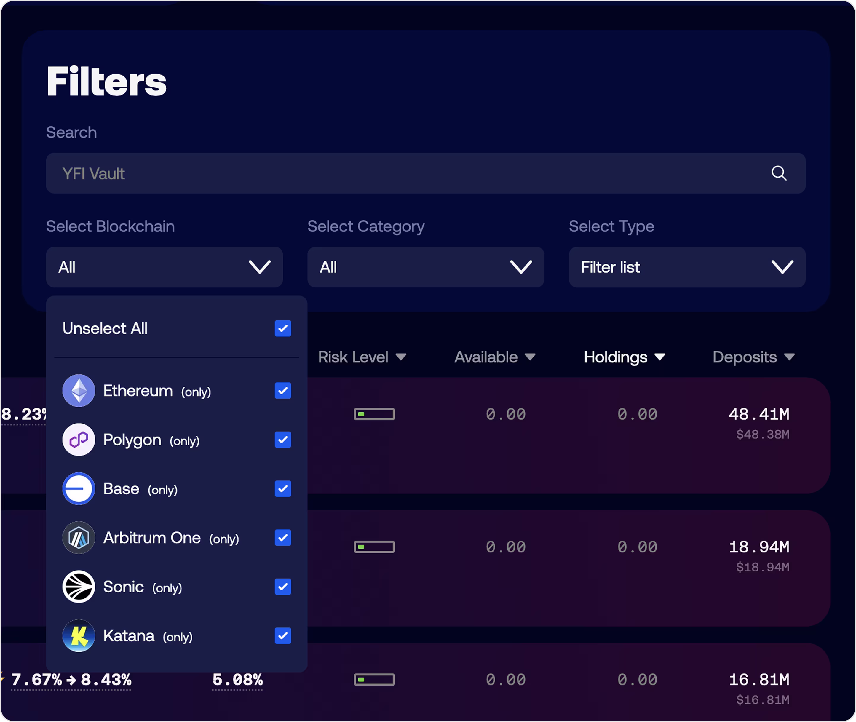
Form characteristics:
- The filter hub header keeps controls in one predictable place.
- Multi-select chains and an “Unselect all action” for quick resets.
- Icon + label clarity.
- Filters narrow and sorting ranks - nice separation of duties.
- High-contrast inputs and large hit areas.
Example 3. Sablier
Industry: Web3 | Streaming payments
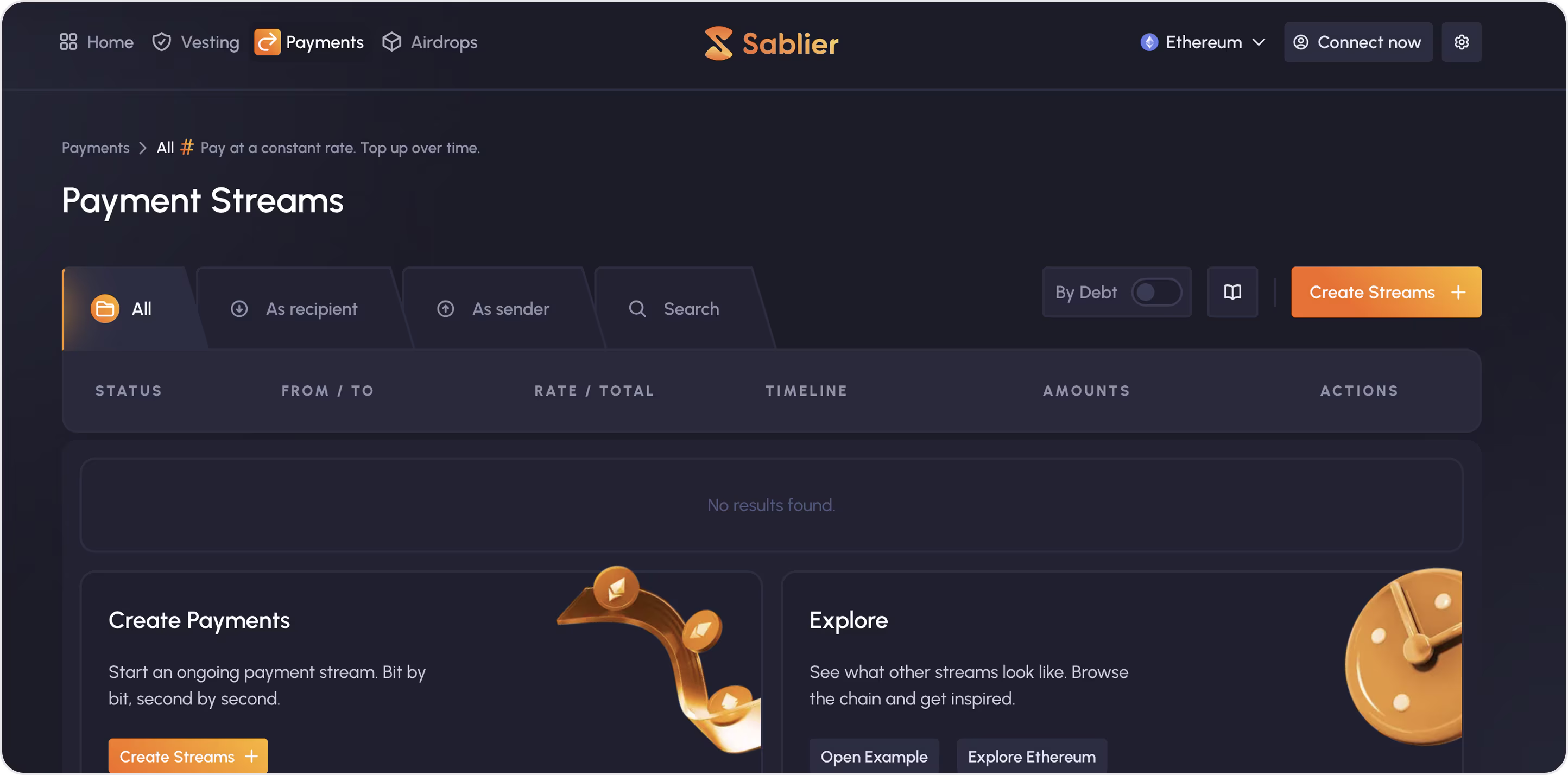
Form characteristics:
- Role-based filters.
- Inline search to find specific streams without leaving the table.
- Clear columns make scanning and comparisons easy.
- Search option to find faster.
- High contrast, roomy spacing, and recognizable icons.
Example 4. Xpence
Industry: Fintech | Expense management
Arounda worked with Xpence to provide an intuitive UI/UX design for their spending management platform, focusing on online payments.
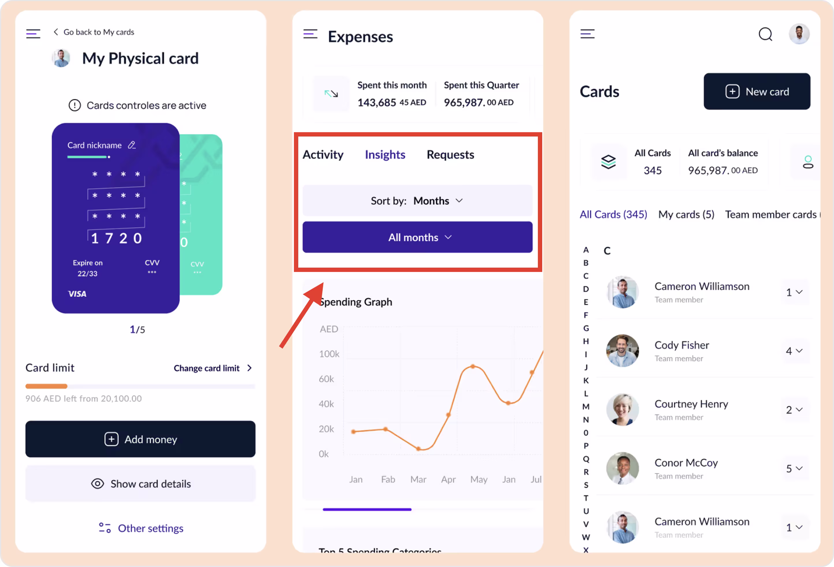
Form characteristics:
- Mobile-first filtering with time filters right above charts and a quick chip for one-tap resets.
- Activity / Insights / Requests switch data scopes without leaving the flow.
- People and card scoping with an A-Z index for speedy jumps.
- Calm hierarchy, soft cards, clear labels, and generous spacing keep complex data readable on small screens.
- The same filter patterns repeat on card details, expenses, and team screens to reduce relearning.
Example 5. Stripe
Industry: Fintech | Payments
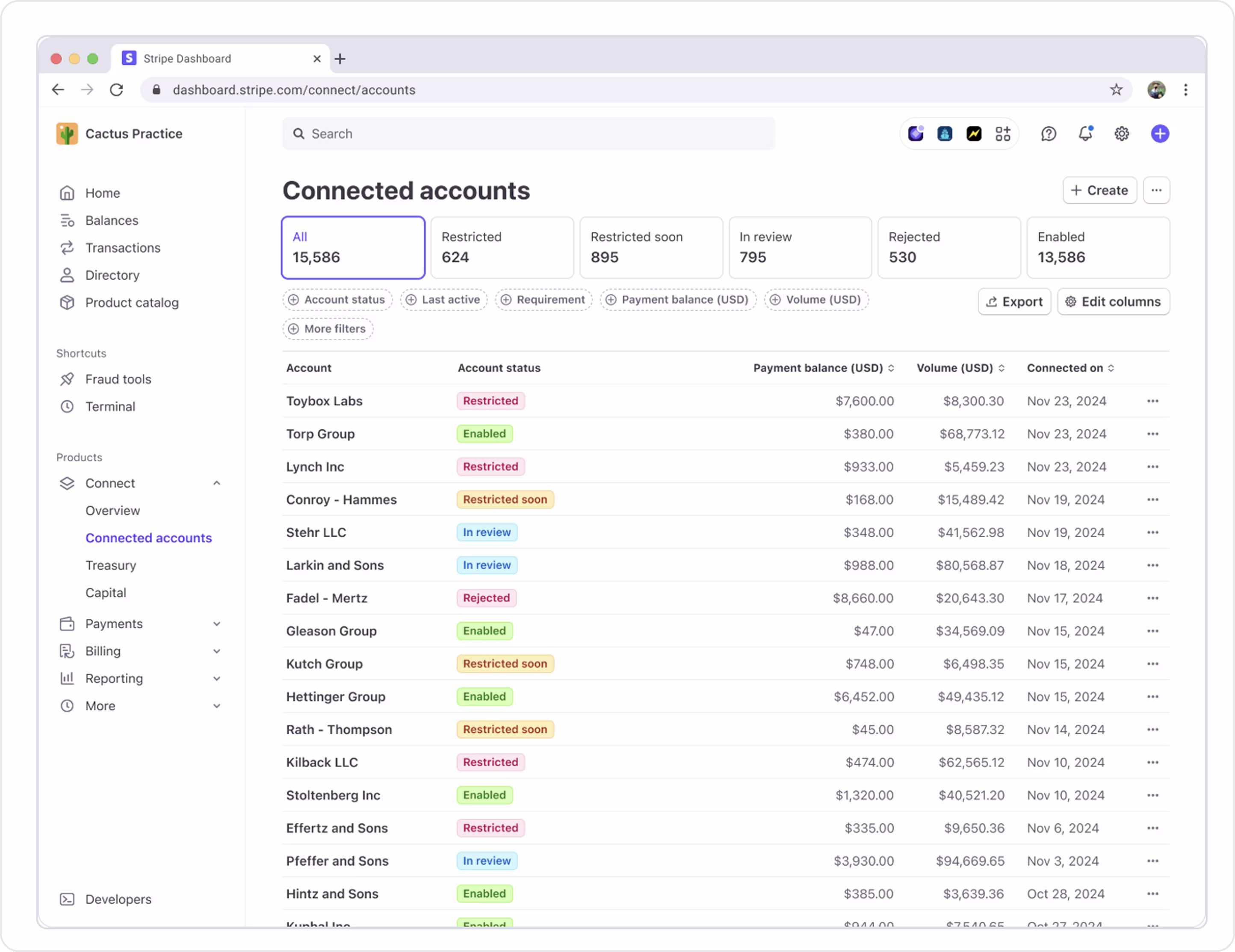
Form characteristics:
- Global search bar, preset status tabs with counts, and chip filters for detailed info.
- Filters reveal advanced criteria without overwhelming first-time users.
- Live feedback.
- Operational clarity with color-coded status badges.
- Scalable table UI.
After your users discover the product, token, or feature, a simple, low-friction subscribe form turns that moment into an ongoing relationship. Let’s see how to do this.
Subscription form
Subscription forms have two goals: turn curiosity into a relationship and get permission to talk to users again. It's a simple but very important step to a long-term relationship. You can share newsletters and product updates, token or price alerts, feature beta/waitlists, or announcements and updates.
What Arounda suggests for a high-converting subscription form:
- Ask for email first, and add name/company later because every extra field costs signups.
- Say what you’ll send and how often.
- Let users choose topics to provide helpful info and avoid unsubscribes.
- Show value (“Be first to new features,” “Get price alerts,” “Early access to beta.”)
- Use clean, inline validation.
- Tell users they can unsubscribe anytime.
- Make the CTA specific.
- Put it where intent is high (blog posts, dashboards, pricing pages, empty states, and after successful actions.)
- Show a success state and send a short welcome email with what happens next.
Example 1. Unlocks Calendar
Industry: Web3 | Tokenomics research
For Unlocks Calendar, Arounda designed the website with various forms, including a subscription one. We aimed to make it clear, simple, visible, and engaging (and meet all requirements).
Form characteristics:
- Trusted-by logo wall + “Over 9,000 subscribers” builds credibility fast.
- Single email input with a bold Subscribe CTA keeps friction near zero.
- “Research on upcoming token unlocks” sets expectations in one line.
- Respectful opt-out with a visible “No thanks” link reduces annoyance and preserves goodwill.
- Terms and Privacy links under the field signal trust and readiness for regulated audiences.
- Strong visual hierarchy (headline → benefit → count → input → CTA) is easy to scan and easy to act on.
Example 2. Yearn Finance
Industry: Web3 | DeFi yield
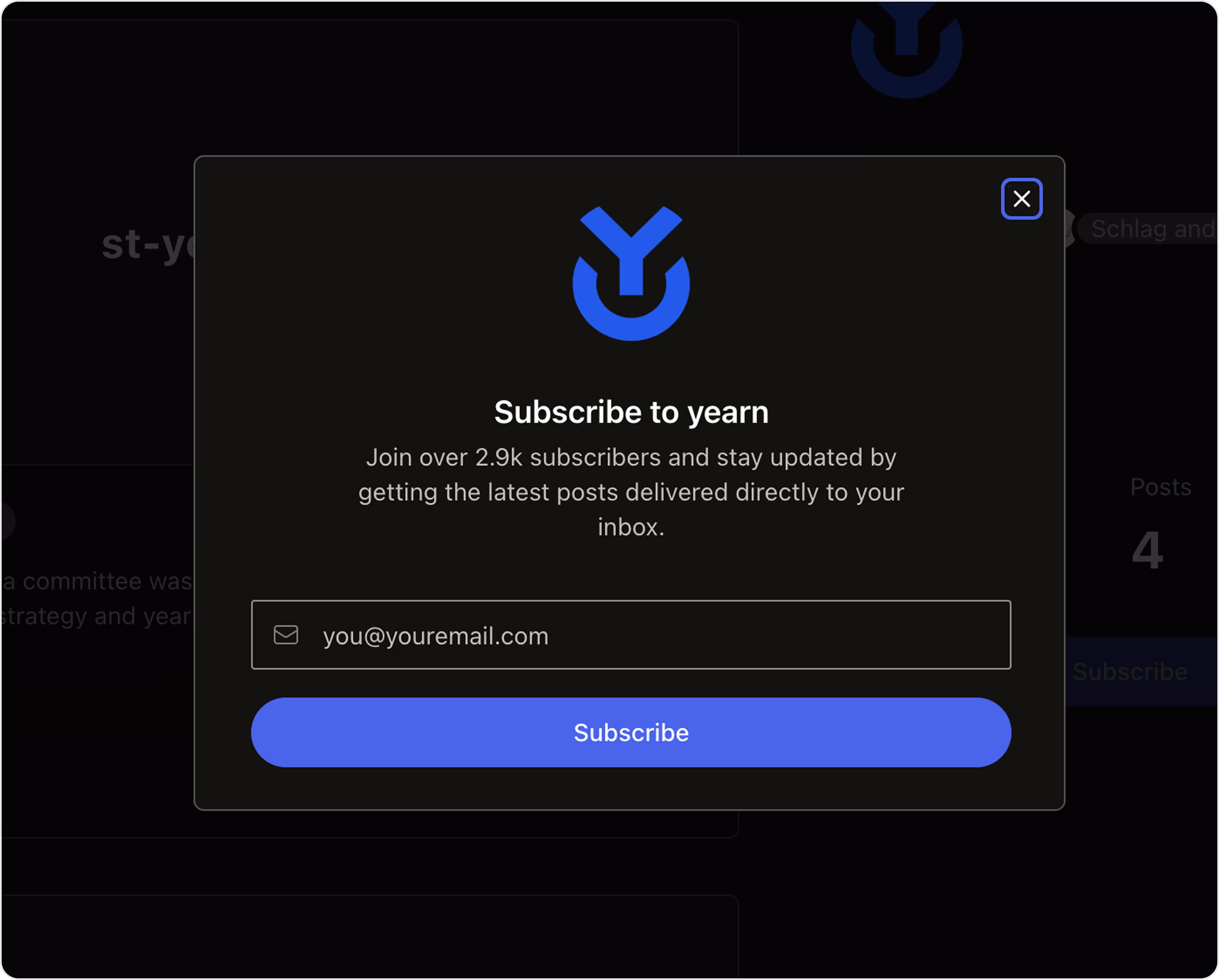
Form characteristics:
- Brand-forward modal.
- One-field simplicity (nothing extra to slow users down).
- Social proof line “Join over 2.9k subscribers”.
- High-contrast CTA.
- Good for dark UIs.
Example 3. Lens
Industry: Web3 | SocialFi
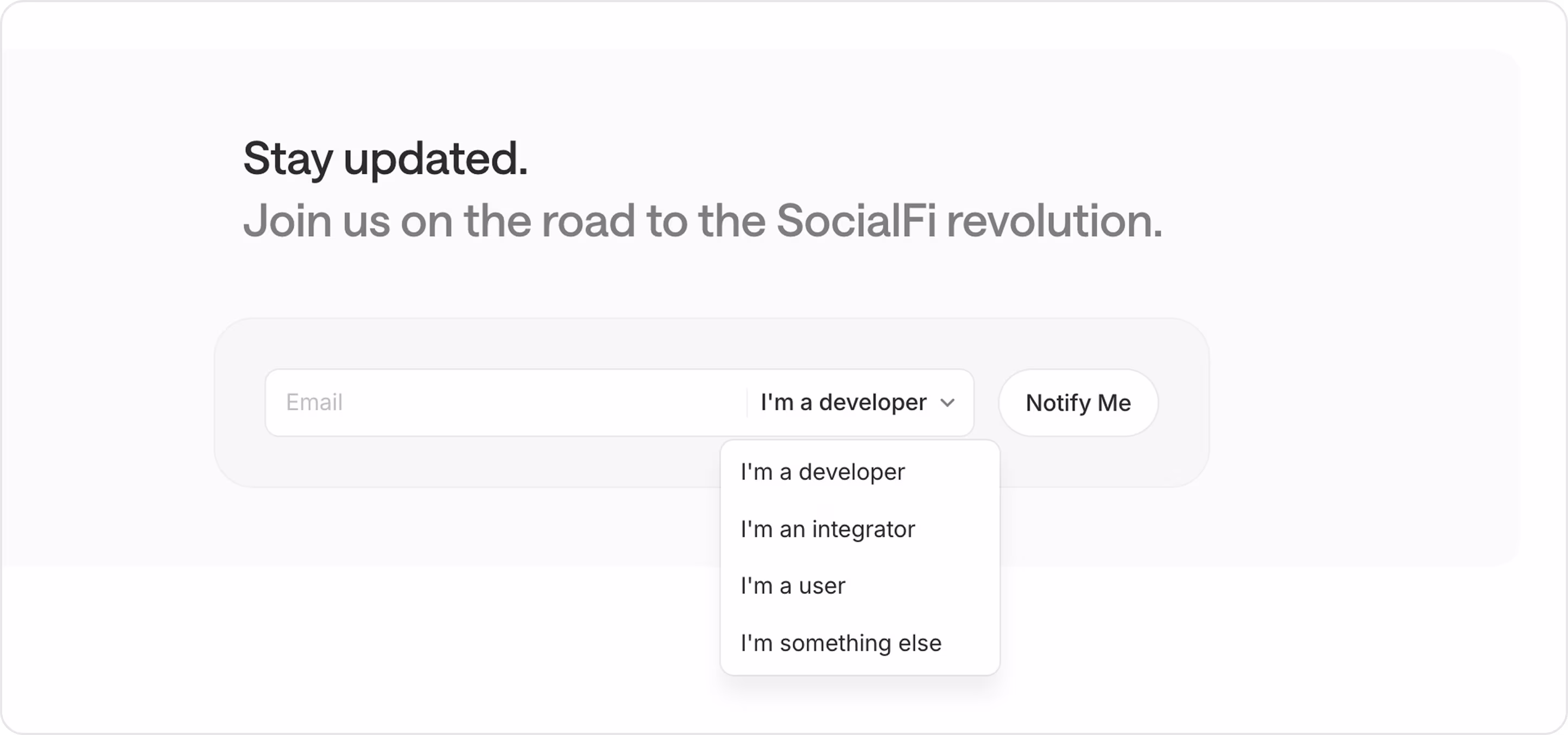
Form characteristics:
- Segment at signup lets Lens personalize updates.
- Role choice can route users to the right nurture track and improve deliverability.
- Compact input group with a clear CTA.
- A rounded container, generous padding, and soft contrast feel modern and trustworthy.
- One-line form works well on small screens.
Example 4. Safe (Gnosis Safe)
Industry: Web3 | Smart contract wallets
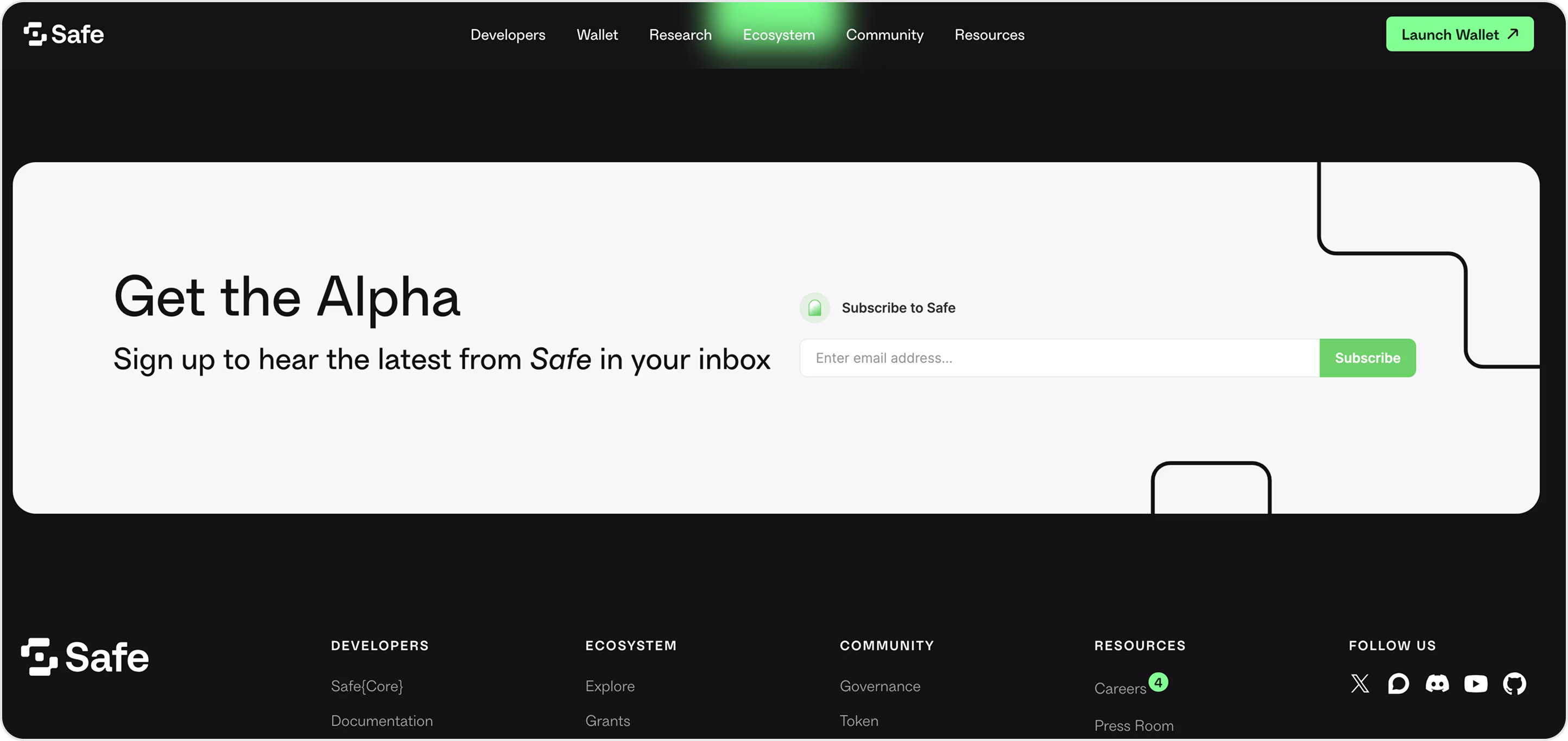
Form characteristics:
- Wide email input + Subscribe button are perfect for quick signups.
- Strong brand moments with Safe’s green CTA and clean black-and-white layout.
- Right place - in a large footer/hero band on ecosystem pages (users opt in after browsing, when intent is highest).
- Responsive and accessible.
Example 5. Polygon
Industry: Web3 | L2 blockchain
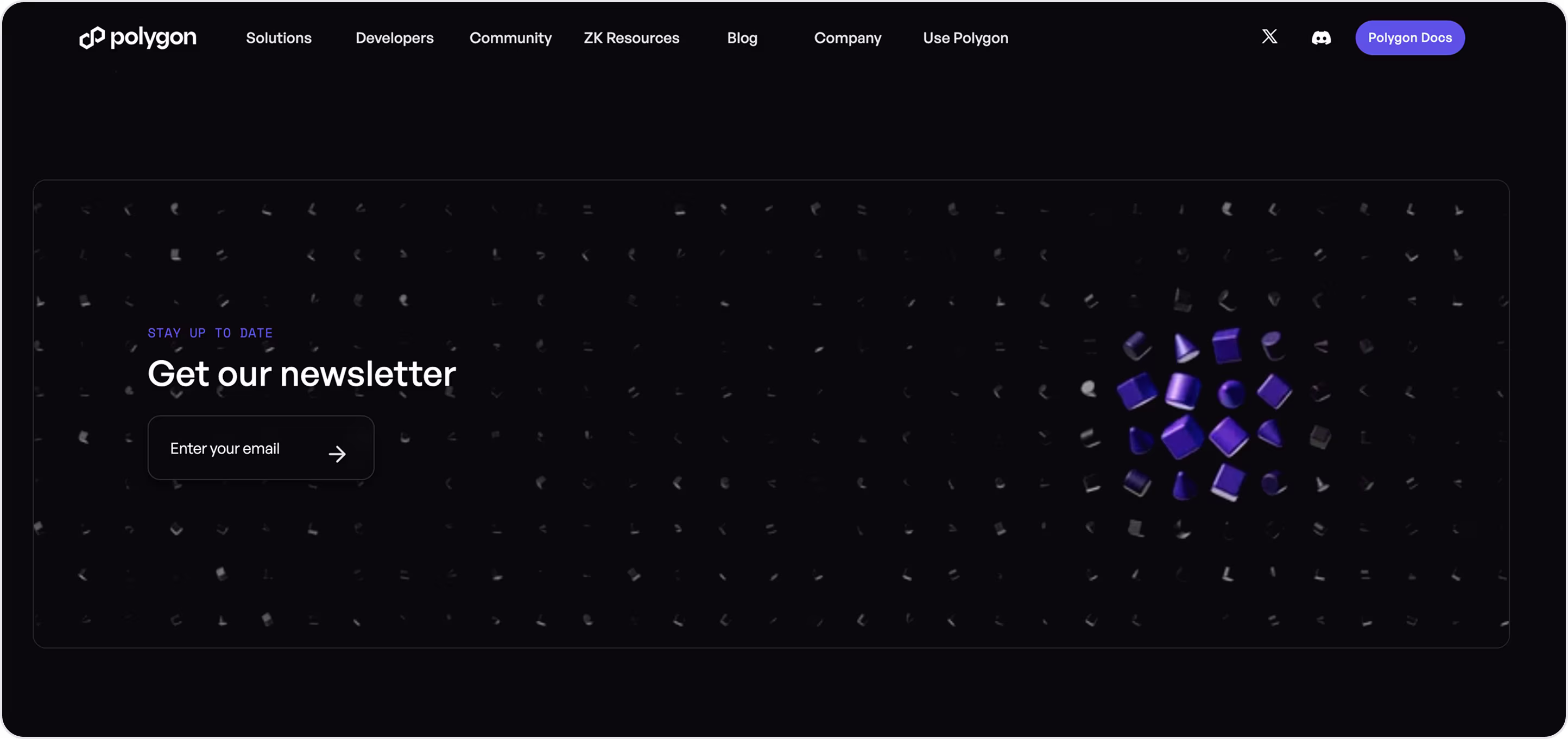
Form characteristics:
- The subscribe block sits in a full-width banner (hard to miss).
- Minimal inputs.
- Clear intent copy.
- High-contrast, on-brand.
- Mobile-friendly.
- Accessible focus states.
We’ve covered the quick wins. Now let’s look at the long, complex forms.
Other long and complex forms
Some forms aren’t “sign up and go.” They’re clients’ big decisions with lots of fields, lines, and info.
Arounda suggests for a high-converting long and complex form:
- Break it into steps with one job per screen and a clear progress bar.
- Only ask what you need now and use conditional logic.
- Prefill everything you can, but let users edit.
- Autosave, always!
- Inline validation right next to the field. Green checks are tiny dopamine hits.
- Mobile-first upload, camera scan, auto-crop, glare detection. Accept PDF, PNG, HEIC. Show a tiny preview and a “Replace” option.
- Before submitting, show a clean summary and let users edit in place.
- Use microcopy under labels and tooltips for edge cases. A “Need help?” side panel with FAQ snippets and live chat/Calendly if things get hairy.
- If you must reject, say why and what to do next.
Let’s check different examples.
Wallet connect form. NuFi
Industry: Web3 | Non-custodial wallets
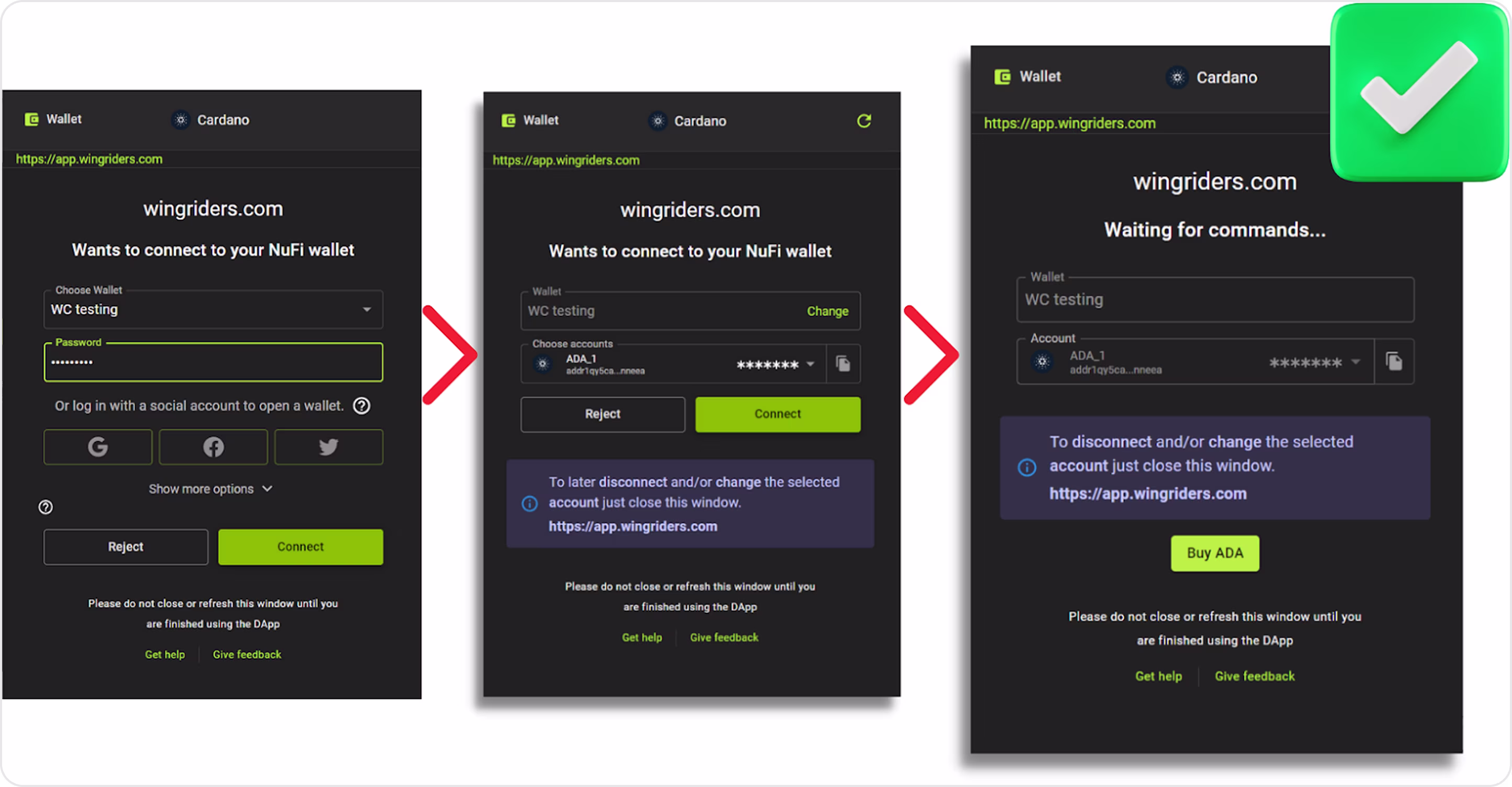
Form characteristics:
- Strong origin signals and the network are pinned at the top (good anti-phishing hygiene).
- Primary/secondary actions are visually distinct.
- Account dropdown with masked address and copy-to-clipboard supports multi-account use without clutter.
- The post-connect screen avoids a dead-end and explains how to disconnect.
- Safety microcopy: “Do not close or refresh until you’re finished” + quick links (“Get help”, “Give feedback”) reduce anxiety.
- Lean final step.
Bank linking form. Plaid
Industry: Fintech | Open banking
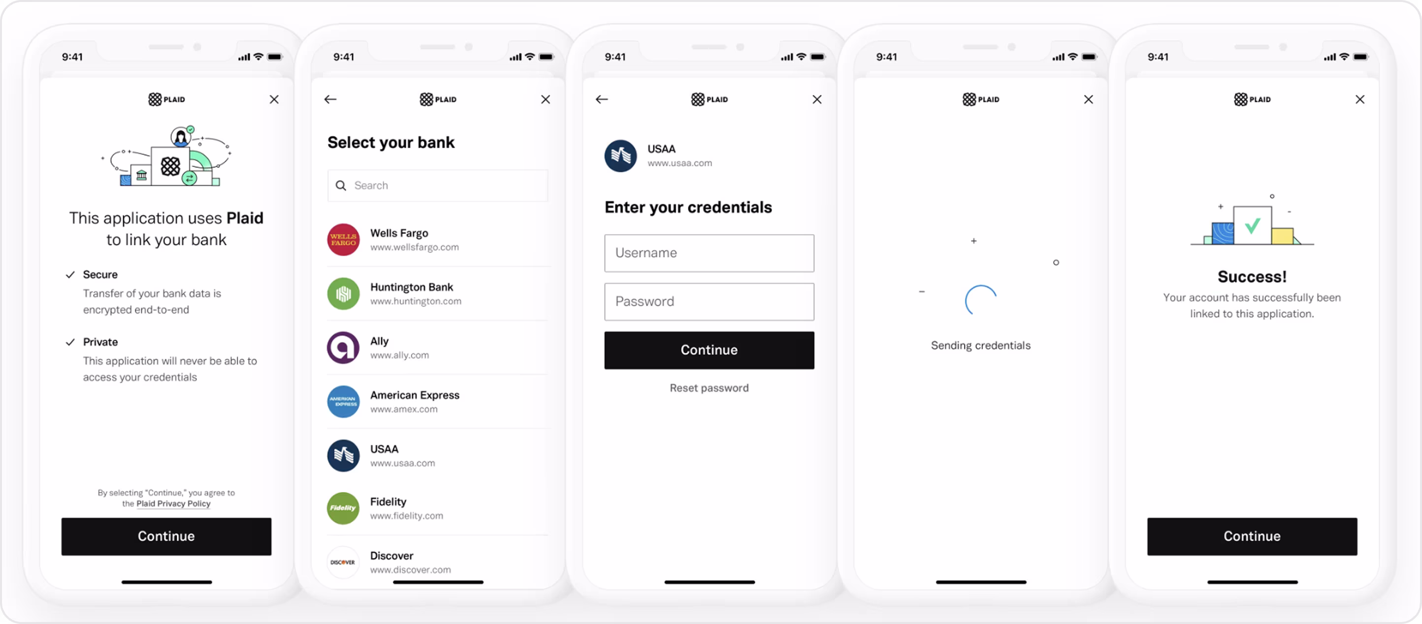
Form characteristics:
- Clear “Secure / Private” bullets and a visible Plaid brand build credibility before asking for credentials.
- Fast bank selection.
- One task per screen and primary CTA placement is consistent and thumb-reachable.
- Loading state prevents double-taps and sets expectations.
- Consistent close behavior.
Convert form. PayPal
Industry: Fintech
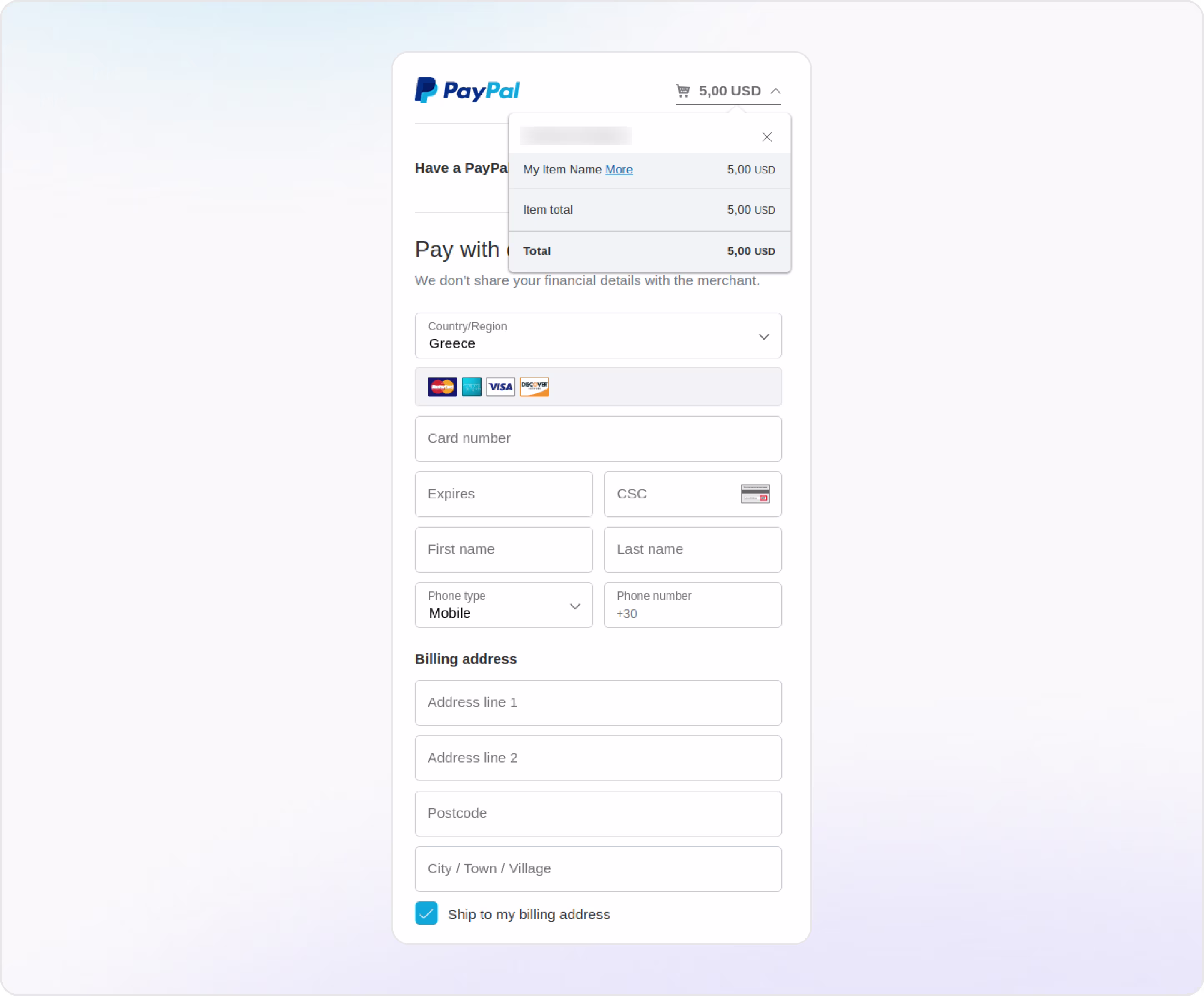
Form characteristics:
- Large touch targets and predictable focus order.
- The inline icon on CVC reinforces which code to use.
- “Ship to my billing address” simplifies for most buyers.
- Copy emphasizes privacy rather than features (better for persuasion).
Invite form. GX Bank
Industry: Fintech | Banking
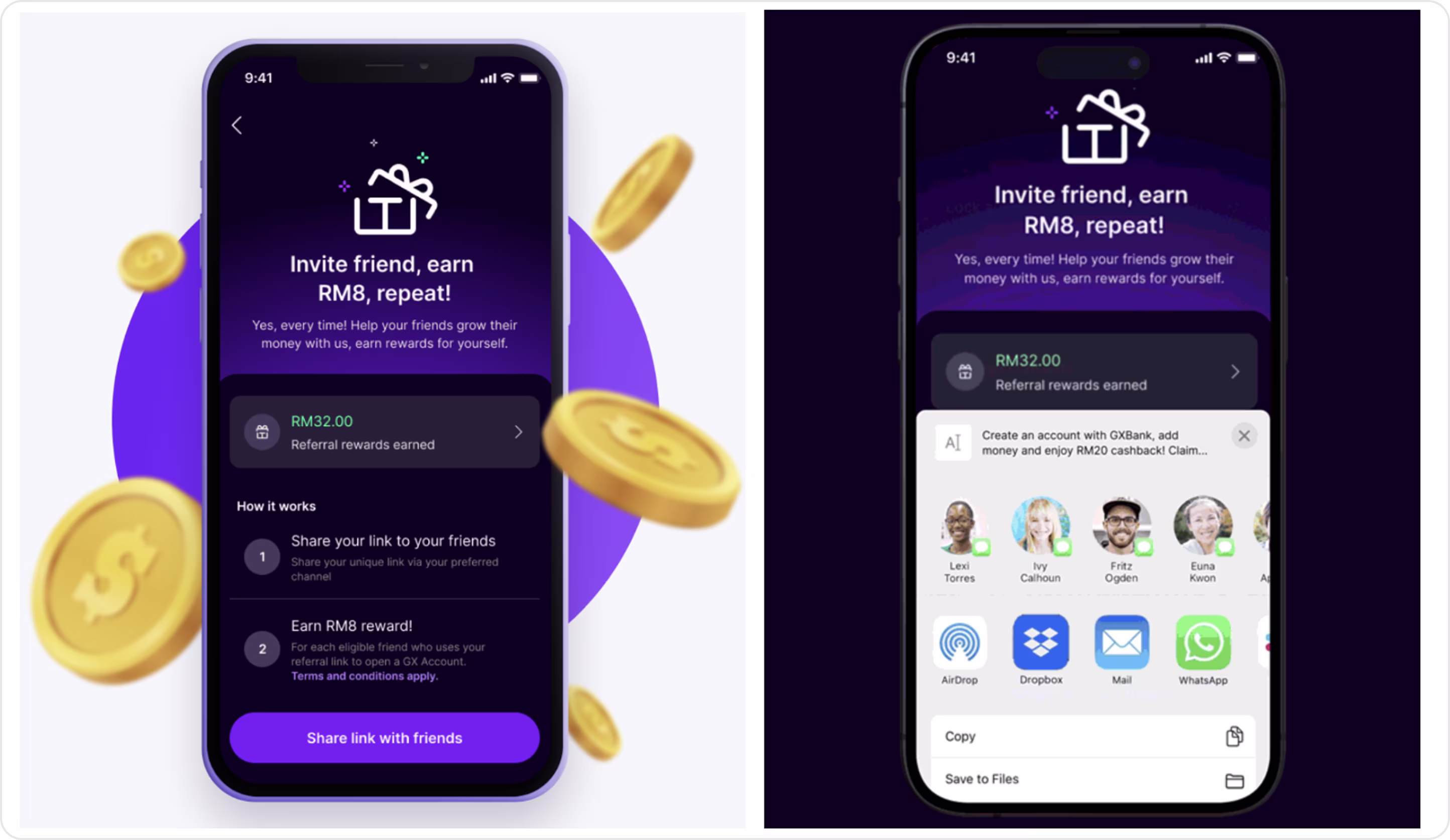
Form characteristics:
- Clear incentive headline and primary CTA.
- One screen to understand and act.
- Shows reward balance.
- Simple how-it-works steps.
- Native share sheet opens for easy distribution.
- The progress module motivates repeat invites.
Home-loan discharge authority form. Ubank
Industry: Fintech | Banking
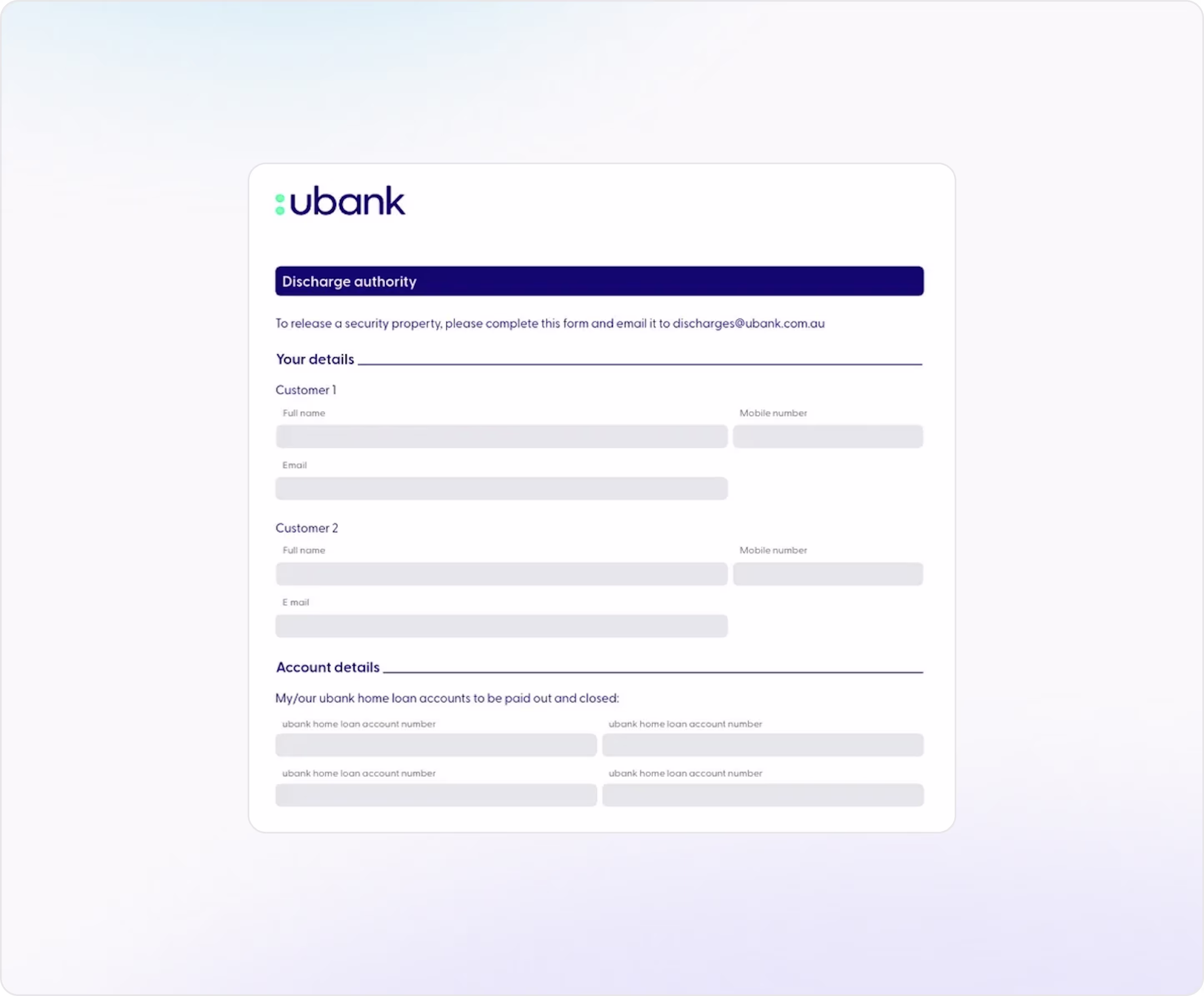
Form characteristics:
- Clear, plain language.
- Logical sections.
- Supports joint borrowers.
- Wide, single-column fields and generous whitespace.
- Simple structure and headings.
- Multiple fields for several loan accounts.
We’ve toured 55 fancy, effective, helpful, simple, and complex forms. Now let’s turn those patterns into a practical general instruction with clear rules that help you boost completion rates and trust.
Form Design Best Practices for High Conversion and Better UX
- Use simple and intuitive form fields.
- Provide single columns on forms.
- Display form errors clearly and helpfully.
- Enable inline form field validation.
- Arrange fields from easy to difficult.
- Enable autofill and smart form features.
- Clearly mark required vs optional fields.
- Limit the use of dropdown menus.
- Avoid unnecessary password masking.
- Support keyboard navigation and tabbing.
- Use smart defaults to save time.
Arounda experts have 10+ years of experience and know exactly how to make your forms work excellently and convert more users. We’ve designed and redesigned Fintech and Web3 flows and brought measurable lift, regulatory sense, and production-ready design. Our UI/UX design services will help you increase revenue and reduce drop-offs.
Final Thought
In Fintech and Web3, forms earn trust, move money, and climb or crater your metrics. Across sign-ins, KYC/KYB/AML, payments, checkout, search, filters, support, wallet connect, and the long enterprise stuff, there is one pattern that always wins → Clarity, Context, Control, Confidence.
Instrument every field, test with real users, and ship improvements in tight loops. And after this, your forms will become conversion and retention engines.
And if you need a partner who knows all the nuances in design for your niche, we’re here. Let’s make your forms the screens users finish first.


Table of contents


FAQ
A single-column layout keeps the user’s eyes moving in one straight line from top to bottom and makes the form faster and easier to complete. Benefits of single-column forms: 1. Reduce cognitive load by guiding users in a predictable reading path. 2. Work better on mobile and adapt naturally to narrow screens. 3. Improve completion rates because it’s easier for users to follow the sequence of questions without confusion. 4. People don’t have to jump their gaze left and right, so it reduces the risk of missed fields and errors.
Arounda team suggests: 1. Ask only for information you absolutely need at that stage. 2. Use a clear step indicator so users know how far they’ve come and what’s left. 3. Briefly tell users why you need each sensitive field. 4. Offer autofill and smart defaults. 5. Highlight issues in real-time and explain how to correct them without forcing a full redo. 6. Display security badges, privacy statements, or blockchain verification so users feel safe completing the form.
Arounda experts recommend: 1. Show errors instantly, so users can fix mistakes before moving on. 2. Be specific. Instead of “Invalid input,” say “Wallet address must be 42 characters long.” 3. Put error text right next to the problematic field. 4. Use clear visual cues (red text, highlighted borders, or icons). 5. Offer suggestions or examples, so users know exactly how to correct it. 6. Keep the tone friendly and solution-oriented to reduce frustration.
Hiding passwords with asterisks is standard practice for security, but it can hurt usability if done without options. Here’s the better approach: 1. Hide by default, but offer a “show” toggle. 2. Make the toggle obvious. Use a familiar icon and clear tap/click area to work well on mobile. 3. If the form is sensitive, add a quick confirmation step before showing it. 4. Briefly explain why you hide passwords.
A "Clear All" button, as a mis-click, eliminates minutes of work. It results in frustration, drop-offs, and loss of trust. If you need a “clear all” option, Arounda designers recommend: 1. Put it in a menu or at least away from primary actions such as “Submit” 2. Confirm this step (“Are you sure you want to clear all fields?”) 3. Use per-field “clear” icons rather than a "nuke button."
Some of the most effective options the Arounda team uses and recommends: 1. Google Analytics, Mixpanel, Amplitude. Analytics tools to track form completion rates, field drop-off points, and time spent per step. 2. Hotjar, FullStory, Smartlook. Session recording and heatmaps to watch how users move through your form, where they hesitate, and what they skip. 3. Optimizely, VWO, Google Optimize. A/B testing platforms to test changes and see what improves conversions. 4. Formisimo, Zuko Analytics. Form analytics tools that give deep insights into field-level performance and abandonment causes. 5. UserTesting, Maze, PlaybookUX. User testing services where real people complete your form and share feedback on clarity, trust, and ease of use.


89+ Reviews
on Clutch

Top Rated Plus Agency
on Upwork

Top 50 Trending team
on Dribbble

Projects are Featured on Behance platform
