
Top 5 Usability Metrics for Products Nobody Leaves Because They Want To

When users cannot simply leave a product, poor usability rarely shows up in obvious ways. The system may still look successful in reports, while teams lose time in everyday flows, depend on training, and turn interface friction into recurring support demand.
To evaluate products like these, teams need usability metrics such as task completion rate, time on task, error rate and recovery time, feature adoption rate after the first month, and support ticket origin rate. They help expose friction across real workflows, roles, and tasks.
In this article, the Arounda team shares five software usability metrics that help assess product health more accurately, spot hidden friction earlier, and guide stronger product decisions in complex environments.
Article Key Takeaways
In this piece, our Arounda team covers:
- Which usability metrics matter most for complex multi-role digital products, and how to read them in real workflows.
- Why mandatory-use products need a different approach to reading usability metrics for user experience.
- How usability metrics work together and the best ways to read metric combinations to identify real workflow problems.
- Practical ways to spot training dependency, hidden workflow friction, and weak feature adoption.
- Expert recommendations for identifying stronger redesign priorities through usability metrics.
- How to recognize real improvement in the data and turn these signals into sharper product decisions.
Why Standard Usability Metrics Fail Mandatory-Use Products
Standard usability metrics such as retention, engagement, and top-line satisfaction often fail in mandatory-use products. Usage continues whether the experience is smooth or frustrating, so these metrics do not give teams a reliable view of day-to-day usability.
In choice-based products, users have options. They try the product, decide whether the experience feels clear and worth the effort, and then stay, use it less, or switch.
In Mandatory-use products, users do not have that freedom. They keep working in the system because approvals, reporting, or daily operations still depend on it. Even when the interface slows them down, they still have to finish the task. That shifts attention away from simple usage signals and toward execution quality, speed, effort, and day-to-day efficiency.
Once friction starts slowing routine work, it shapes the whole business performance. 38% of IT specialists cite tech complexity as a barrier, and difficult systems slow everyday work while digital friction compounds productivity loss across organizations. For that reason, teams need usability metrics that connect to business outcomes, not just user satisfaction.
What These 5 Metrics Have in Common
These five metrics all measure the product’s effect on daily execution, team efficiency, and the operational cost of friction. Together, they serve as usability metrics that predict retention in mandatory-use software and give teams a stronger basis for design decisions.
Task Completion Rate Under Real Conditions
Task Completion Rate is one of the core software usability metrics in mandatory-use products. It measures the percentage of task attempts that end in successful completion under real working conditions. This metric serves as a direct indicator of whether users can actually complete the job the system is meant to support.
How to measure usability through this metric:
- Choose 3 to 5 business-critical tasks
- Track started tasks against completed tasks
- Review results by role, workflow, and release
A 100% completion rate is not the goal in every flow. What matters more is whether critical tasks stay consistently completable over time. If completion starts to drop, the workflow needs attention.
Why workarounds make this metric lie to you
Workarounds make task completion rate unreliable by hiding friction behind a completed outcome. Users still finish the task, but they do it through spreadsheets, chat instructions, extra tools, or help from colleagues, which makes product performance look stronger than it really is.
Teams run into this problem often when they treat raw completion as one of the core usability test metrics without checking what happened between start and finish.
What do we recommend?
Use UX research to observe the path behind the result. Track outside tools, repeated actions, long pauses, and requests for help. Then separate clean completion from completion with workarounds. That gives product teams a sharper read on whether the system truly supports the task or whether users keep compensating for workflow gaps themselves.
Time on Task Across Different User Roles
Time on task is one of the most useful usability evaluation criteria for products used across large organizations. This metric measures the time a user needs to complete a task from start to finish and shows how efficiently the interface supports real work across different user roles.
In practice, it shows whether the design keeps work moving smoothly or slows it down.
Use it to spot:
- Routine flows that take longer than the process should require
- Role-to-role time gaps inside the same workflow
- Changes after releases, policy updates, or new workflow steps
This metric is especially useful when teams compare task time across roles. In shared systems, one workflow often serves several users with different goals, permissions, and levels of complexity. The same task can move quickly for one role and slow down for another, even inside the same process. That makes role-based timing data far more informative than one average number.
When speed is the wrong thing to optimize for
Speed becomes a poor usability target when a task requires review, validation, or careful input. In flows tied to approvals, finance, compliance, or customer records, pushing tasks through faster can hurt accuracy, increase rework, and create issues for the next step in the process.
Do not optimize for speed when a task includes:
- Irreversible actions
- Financial or compliance risk
- Sensitive records
- Handoffs to another role
In flows like these, time on task should not stand alone. It works best within a broader set of software usability metrics that assess whether the product keeps work accurate, controlled, and ready for the next step.
Arounda recommends: set a healthy time range for critical tasks, then inspect what drives delays inside that range. Remove extra steps, but keep the time users need to check, confirm, and finish the task correctly.
How role gaps expose hidden UX debt
Role gaps expose hidden UX debt when the same workflow creates different levels of effort, clarity, or delay for different user groups. One role may move through the flow without friction, while another has to stop, interpret steps, fill gaps, or add manual checks. That mismatch often disappears inside aggregate reporting until teams examine usability testing metrics by roles.
Hidden debt usually shows up in places like:
- Extra checks or manual steps for only one role
- Missing context at handoff points
- Task steps that make one role stop and interpret
- Workflow logic that stays clear for one user group but breaks down for another
Clear role logic keeps that debt from growing. Strong UI/UX design helps align one process across roles without forcing one side to absorb the complexity, which the product should handle itself.
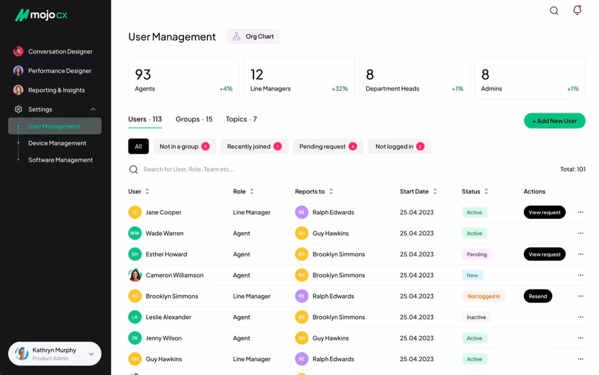
Our work with MOJO.CX, a contact center platform, shows this clearly. The challenge was to combine three existing products into one universal platform without creating uneven friction for different user types.
Arounda rebuilt the app flow from scratch, unified the platform structure, and shaped the experience around the needs of each role. The new product gave agents faster access to call tools, AI guidance, and post-call summaries, while managers could move through performance metrics, task management, training planning, and reviews in a much clearer way.
As a result, the company achieved 32% improved customer reach, 5% user engagement, 4% conversion, and 80% user satisfaction.
Error Rate and Recovery Time
Among software usability metrics, these two metrics give product teams a clearer view of workflow stability inside a mandatory-use system. They help identify how often, where the interface triggers friction during a task, and how long it takes to fix it and return to the flow.
Error rate measures how often users make errors while completing a task. These errors usually fall into two common groups:
- Slips: happen when users understand the task but take the wrong action.
For example, they click the wrong control, choose the wrong value, or enter data into the wrong field. - Mistakes: happen when users misunderstand the interface, the step, or the expected outcome.
For example, a label feels misleading, a confirmation looks final when the process still continues, or an error message gives too little direction.
This metric helps spot design flaws that task completion can hide. A user may still reach the end of the flow, yet frequent errors often point to weak hierarchy, unclear labels, poor feedback, or fragile form logic. A thoughtful UI concept helps bring more clarity to these interface patterns before they turn into repeated user errors.
Errors will always appear, and that is normal. Users misread, rush, skip details, and click too fast. The value of this metric comes from revealing repeated error patterns, where they start, and how much friction they add to the workflow.
Arounda experts suggest: structure error tracking from the start. When every issue includes a short note, a severity score, and a category, the results become much easier to review and more useful for product decisions.
Recovery time measures how long users need to recover after an error. It includes:
- Noticing the problem
- Understanding what went wrong
- Correcting it
- Returning to the intended flow
During usability testing, researchers track recovery time from the error itself to the moment the user gets back on track. Together with the error rate, it often highlights friction points that a structured UX/UI audit can explain in more detail.
What recovery time tells you that error count never will
Recovery time gives error analysis more value because it shows what happens after the wrong action. Error count tells you where users fail, while recovery time shows how much uncertainty, effort, and workflow disruption the product creates before users regain control.
It reveals:
- Visibility of the problem after the mistake
- Clarity of system feedback and next-step guidance
- Extra attempts, hesitation, and rework
- Reliance on training, support, or colleagues
- Risk that one issue will spread into later steps or handoffs
These patterns help explain whether the workflow stays stable after an error or starts absorbing confusion step by step. That is what makes recovery time so useful within usability test metrics for large-scale products.
Long recovery often points to weak system feedback, vague validation, poor error states, and flows that push users forward without enough guidance.

Feature Adoption Rate After the First Month
Feature adoption rate after the first month shows whether a feature became part of real work after the initial attention faded. This makes it one of the more telling usability metrics at that stage, since early interest alone can give teams a distorted view of value.
When teams use this metric for measuring usability, they usually track whether the feature:
- Holds a natural place in the workflow
- Feels relevant to the role it was designed for
- Appears when the task actually requires it
- Makes its value clear without extra explanation
- Earns repeat use in day-to-day work
At Arounda, we read post-launch adoption in context, through role, scenario, and repeat behavior over time. This helps us separate a feature that drew attention during rollout from one that genuinely changed how work gets done.
That distinction gives the metric more diagnostic value. It helps decide what needs attention next: stronger in-flow visibility, a clearer entry point, a tighter fit with the workflow, or a deeper rethink of the feature’s place in the product. It can also reveal when a newly introduced capability came into the product too broadly and needs a tighter MVP design scope before it earns repeat use in everyday work.
Low adoption as a symptom of training dependency
When low adoption starts showing up alongside other usability testing metrics, that can be a sign of training dependency. If a feature needs repeated explanation to stay in use, the product does not communicate its purpose clearly enough on its own. That pattern says a lot about usability.
You can usually spot it through signs like these:
- Weak return usage after onboarding ends
- Low trust in real tasks
- Unclear timing of use
- Poor fit with everyday workflow
- Fast drop-off once reminders disappear
How to improve adoption without more training?
Focus on the moment of use. The feature should appear where the task creates demand for it, feel relevant in context, and make its value obvious without outside explanation. Adoption will improve when the product relies more on visibility, timing, and workflow fit than on memory and training.
The features nobody uses and what that means for your roadmap
Unused features often expose where the roadmap moved ahead of the evidence, and where product discovery needs to reconnect feature plans with real tasks. When product teams review usability testing metrics, unused features often point to patterns like these:
- Weak fit with recurring tasks
- Poor timing inside the workflow
- Too much effort before the value becomes visible
- Overlap with a simpler or more familiar path
When a feature stays outside everyday work, investment and real usage start drifting apart. It keeps consuming design, development, and product attention without strengthening the core experience. At that stage, roadmap decisions need more discipline.
The most useful next step is to find the point where the feature drops out of real work. That gives the team a stronger basis for deciding whether to refine it, fold it into another flow, or stop pushing it further.
A good example is our work with Altflow, an AI content creation tool. The challenge was to design a product with a wide range of features while keeping the experience clear and user-friendly. Our team solved this with a clearer navigation model, stronger visual hierarchy, custom templates, and a workflow built around core copywriting tasks.
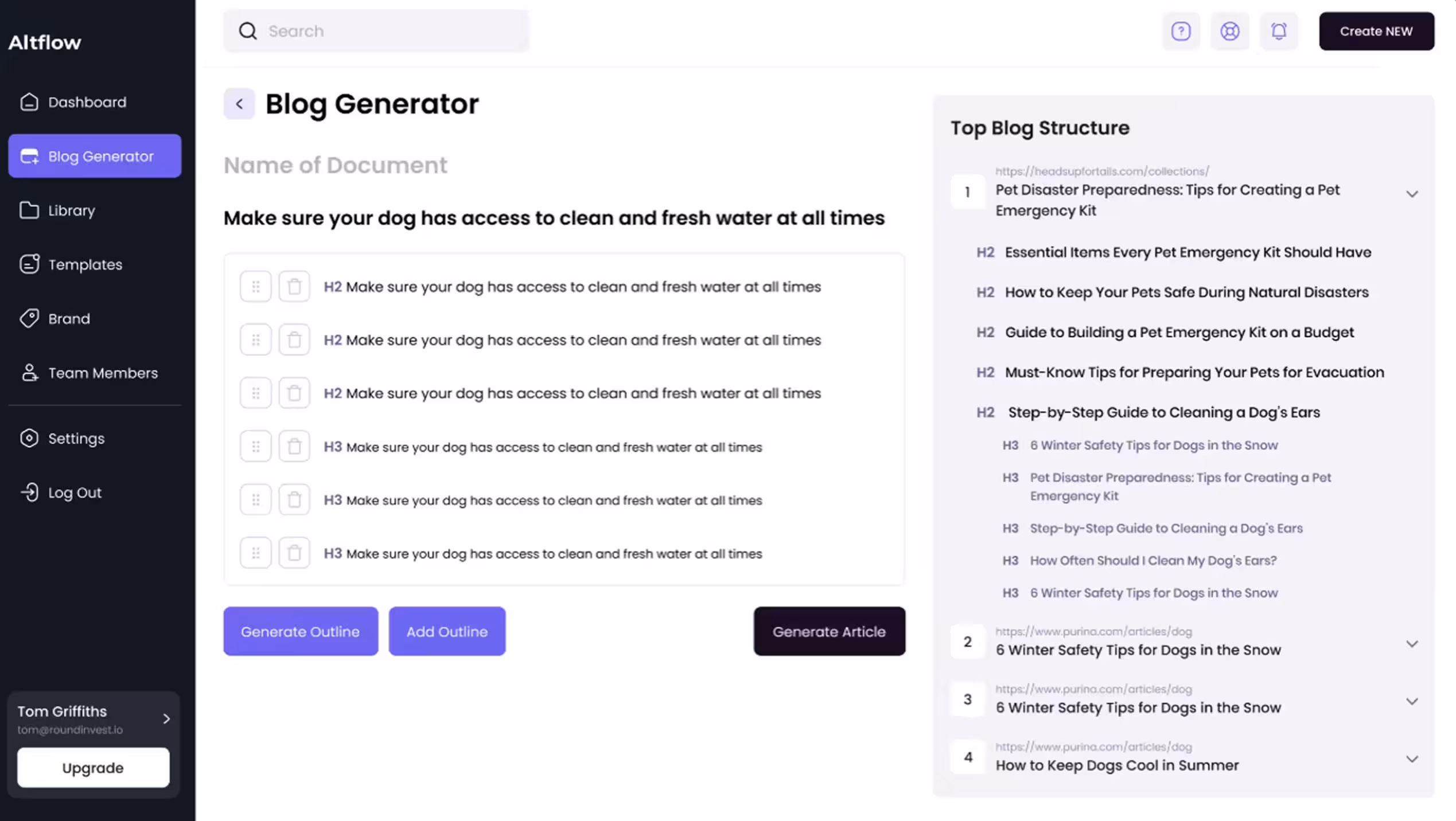
As a result, Altflow gained stronger functional clarity, improved accessibility, an optimized user experience, and a more distinctive market position.
Support Ticket Origin Rate
Support ticket origin rate works as a usability metric which reveal interface problems before support tickets spike. This metric shows which screens, flows, actions, or roles generate repeated requests for help.
It helps product teams see whether support issues come from:
- Unclear navigation
- Weak system feedback
- Confusing permissions
- Poor error states
- Steps that ask users to guess instead of proceeding with confidence
This matters even more in mandatory-use products, where people can not simply leave when the interface slows them down. They keep going, find workarounds, ask colleagues, or open support tickets. Origin rate makes it easier to spot interface friction while it still sits inside specific tasks, before it grows into a broader support problem.
Help desk volume as a usability signal most teams ignore
When support requests cluster around the same action, help desk volume becomes a usability signal that teams often overlook. Read alongside usability metrics for user experience, it starts showing where the interface leaves users unsure how to proceed.
This points to:
- Unclear system status after an action
- A next step that does not feel obvious
- Permissions or handoffs that interrupt the workflow
- Recovery paths that feel risky to handle alone
Left unaddressed, these requests increase support dependence, slow routine work, and weaken customer experience over time.
Our recommendation: start with the highest-repeated ticket and map the exact step that triggers it. Then redesign three things in that moment: system status, next safe action, and recovery path. This removes the need for reassurance faster than adding more help content.
How These Metrics Work Together and When One Is Enough
While measuring usability in a product people rely on every day, the strongest insight appears when several signals line up around the same workflow, role, or task. The value of usability metrics grows when they explain the same problem from different angles.
For example:
- Low task time with a high error rate means that users move through the task fast, but the interface pushes rushed or premature actions
- Low support volume with long recovery time often means users recover alone through guesswork, habit, or workarounds instead of clear guidance from the product
- Stable feature adoption with long task time often suggests that the feature is valuable enough to keep using, but still adds too much friction inside the workflow
- High error activity with low support demand can signal a hidden risk: users keep making mistakes without asking for help or even noticing the problem fully
Together, these patterns give teams a much sharper basis for product decisions. They help separate surface symptoms from the actual workflow problem behind them.
“We usually pay close attention to the moment when several metrics start pointing to the same place. That is where the product stops giving mixed signals and starts showing a clear pattern. It helps separate a weak feature from a weak workflow, or a local friction point from a broader clarity problem. One metric can still be enough, but only when it repeats around an important step and already visibly changes user behavior, through hesitation, repeated recovery, support dependence, or drop-off in use.”
Alexey Kovalchuk, COO at Arounda
What Improvement Actually Looks Like in the Data
When people keep using the system because the job still depends on it, churn stops telling the full story. The real question becomes how to track usability improvement when users cannot simply stop using the product, and the answer usually sits in behavioral signals across the same tasks over time.
In the data, improvements look like:
- Fewer repeated errors around the same step
- Shorter recovery after confusion or failed actions
- Lower support dependence in the same workflows
- Steadier return to the use of the features that matter
- Faster orientation on data-heavy screens
When these shifts start appearing together, the product gets easier to use in ways that teams can verify. In complex, data-heavy tools, that kind of progress often comes from product redesign that improves structure, readability, and flow clarity across the experience.
One example that reflects this well is our work with XBlock, a blockchain explorer. The challenge was to improve usability in a data-heavy product with more than 500k users, without disrupting an interface the audience already knew. We redesigned the experience around clearer data display, stronger content readability, and a more intuitive flow for interacting with numbers and analytics.
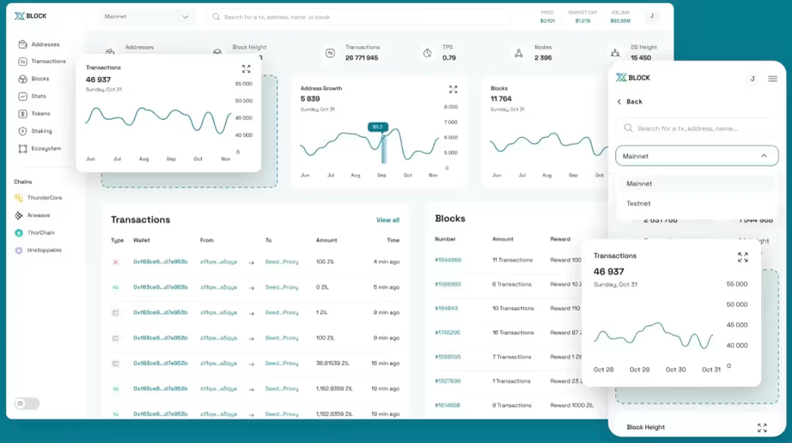
As a result, XBlock achieved a 2x higher usability, 30% boost in user satisfaction, a 17% traffic increase, and 3x better information readability.
Final Thoughts
Strong usability metrics give teams a clearer view of how people move through a mandatory-use product every day. They show where the experience creates drag, where features lose relevance, and where support starts filling gaps the interface should handle on its own. That visibility helps teams make better product decisions and improve the parts of the experience that shape speed, confidence, and routine use.
At Arounda, we help improve complex products when usability issues start affecting adoption, workflow clarity, or product performance. If you need to redesign key flows, strengthen the user experience, or turn product signals into clear next steps, contact us.


Table of contents


FAQ
A usability metric is worth tracking when it shows friction in a critical workflow and helps the team decide what to improve next. In complex products, the best metrics reveal where users slow down, hesitate, make repeated mistakes, or depend on support. If a metric does not connect clearly to user behavior and product decisions, it is not worth tracking.
The most important criteria are workflow clarity, role fit, task efficiency, recovery after errors, and consistency across common scenarios. In large-scale deployments, usability also depends on how well the product supports handoffs, permissions, and repeated tasks under everyday pressure. The strongest evaluation criteria show whether people can complete work confidently and at scale, without relying too heavily on training, support, or workarounds.
The most useful methods are task-based sessions with existing users and analysis of product behavior through support patterns, recovery points, and feature usage. In mandatory-use environments, teams often get better insight from observing real work than from trying to recruit fresh volunteers.
ISO standards give teams a clear framework for evaluating usability through effectiveness, efficiency, and satisfaction in a defined context of use. In enterprise product development, that framework helps assess roles, tasks, environments, and the conditions in which people use the product every day. In practice, teams use ISO standards to structure research, test critical workflows, and connect design decisions to real business use.
A usability metric points to redesign when the same friction keeps appearing in the same part of the interface across users, roles, or workflows. It points to training when the flow itself stays clear, yet people still miss the right moment to use a feature or rely too much on prior explanation.
Present usability data through business impact. Show how slower tasks, repeated support requests, weak feature adoption, or long recovery affect workflow efficiency, support cost, and product value. Stakeholders who track revenue respond better when usability explains where the product loses time, trust, or growth potential.


89+ Reviews
on Clutch

Top Rated Plus Agency
on Upwork

Top 50 Trending team
on Dribbble

Projects are Featured on Behance platform
