
Top Mobile Menu Design Inspirations for 2026


Do you know how to impress your users? Create a super cool mobile menu design so they can scroll through a sleek new app and instantly find that one feature they need. No frustration! Only the menu that just gets them. Effortless, intuitive, even a little delightful.
That’s not the magic, there are no secret keys, it’s just well-thought-out work.
Our Arounda team scoured famous apps to bring you 10 outstanding mobile menu design examples. But that’s not all! We will also tell you some insights from our design cases to inspire you or explain how it all works. Let’s drive engagement, boost retention, and delight your users!
Article Key Takeaways
In mobile apps, a menu is one of the first things to set the user experience. If it’s messy and hard to follow, people will leave out of frustration. With the amount of design patterns today, from bottom bars to gestures, you can’t always get it correct.
The secret sauce is to keep menus simple, clear, and aligned with how people actually use their phones. At Arounda, we have 9+ years of product design experience, and we have witnessed how the correct UX choices drive engagement and retention.
In this article, we compiled ten mobile menu design examples and described why each one is effective. We also offer our expert opinion on how those same principles apply in actual projects, and why good menu design is important for usability and business success.
The Importance of Mobile Menu Design in 2026
No matter what it is - a futuristic bottom navigation, a smart AI-driven menu, or a gesture-based UI, they must feel like second nature!
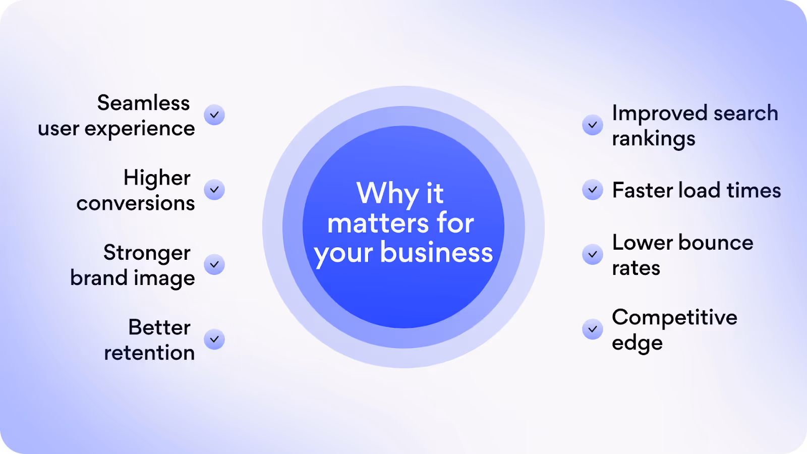
Mobile UX today is a strategic driver of engagement, conversions, and retention. And the opposite: a poorly structured menu leads to frustration, drop-offs, and lost revenue.
Why we consider the design of mobile menu so important
- It is the gateway to your product, a first touch.
- It impacts conversion rates and retention because navigation complexity is a conversion killer.
- It adapts to user behaviors - mobile-first audience. Traditional hamburger menus are now being replaced or supplemented by bottom navigation bars, gesture-based interactions, floating action buttons (FABs), and AI-powered predictive menus.
- It must meet SEO, core web vitals, and accessibility compliance. Google’s ranking factors emphasize mobile usability and accessibility, and compliance with WCAG (Web Content Accessibility Guidelines) is also essential to accommodate users with different abilities.
- It provides seamless omnichannel integration. The mobile menu should provide a fluid, frictionless journey that aligns with omnichannel UX strategies.
Well, if you care about your business - invest in user-centered mobile design. But to make the right decisions, let’s see what works and why (to analyze, inspire, and get ready).
Top 10 Mobile Menu Design Examples
Carry about how not to lose customers? A frictionless menu can help. We have 10 famous examples that set new standards for usability and innovation.
1. Stripe: A Simple yet Powerful Sliding Menu
Stripe is an online payment processing platform that allows businesses to accept payments, manage subscriptions, and handle financial operations with ease. Despite its complex functionality, Stripe's mobile UX prioritizes clarity, ease of navigation, and quick access to key tools.

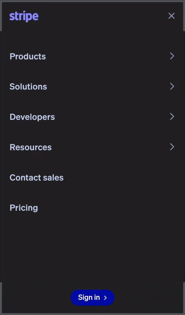
Key features of Stripe’s mobile menu:
- Sliding sidebar navigation that appears on demand and keeps key options easily accessible.
- Well-structured categories (clearly labeled sections) for quick access.
- Minimalist yet informative design (clean aesthetic, monochrome color scheme, clear typography, and every option is logical and concise).
- Seamless multi-level navigation (users can tap into different sections, and the interface smoothly transitions between categories).
Arounda point!
Stripe proves that even complex platforms can achieve a frictionless and intuitive UX through smart menu design.
2. Spotify: Minimalist Menu with Focused Search
Spotify's design is a masterclass in simplicity and engagement. The interface prioritizes quick access to content and offers a clutter-free experience.
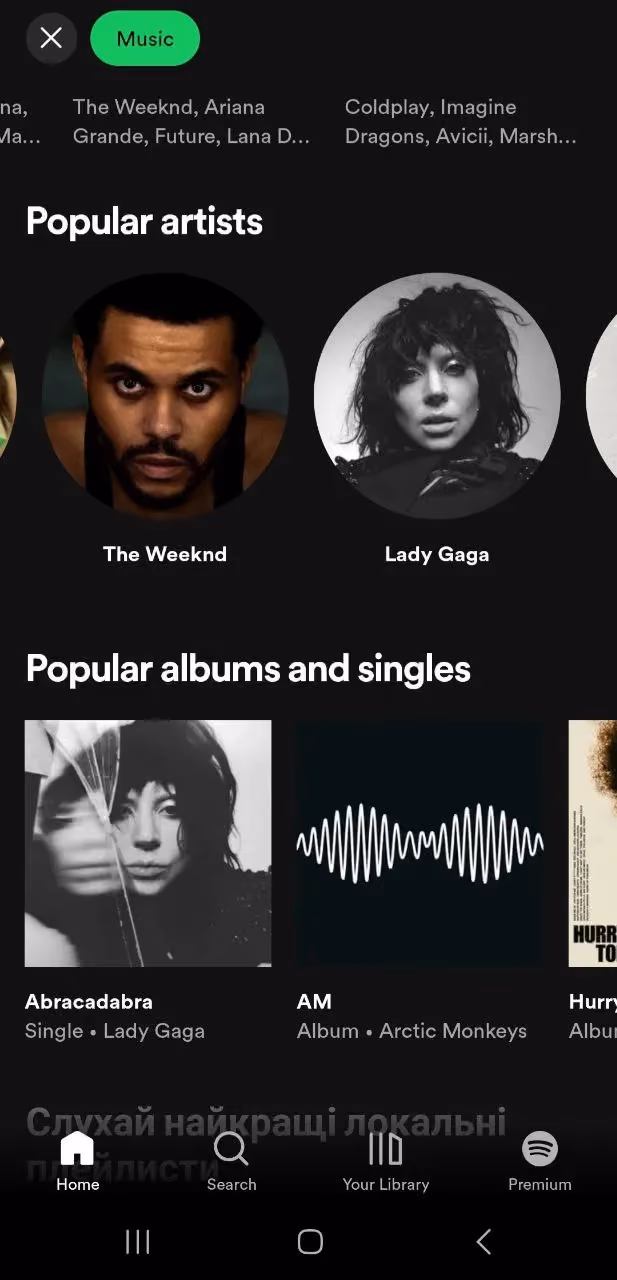

Key features of Spotify’s mobile menu:
- Bottom navigation bar for core functions (no cognitive overload!).
- The categorized browse sections enhance user experience by providing visual hierarchy and organization.
- Consistent dark mode UI for readability and reducing eye strain.
- Clean and engaging look with bold typography and vibrant category cards.
- Intuitive gesture-based interaction or swipe-friendly navigation.
- Quick access to search and music categories.
Arounda point!
Spotify’s mobile menu perfectly balances minimalism and usability, making it a benchmark for seamless mobile UX.
3. Airbnb: Sleek and Intuitive Dropdowns
Airbnb’s design is a prime example of intuitive navigation combined with a visually appealing interface. It’s a platform for travelers worldwide, so it must be seamless, clear for everyone, and guide users effortlessly from exploration to booking.
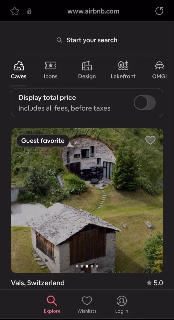
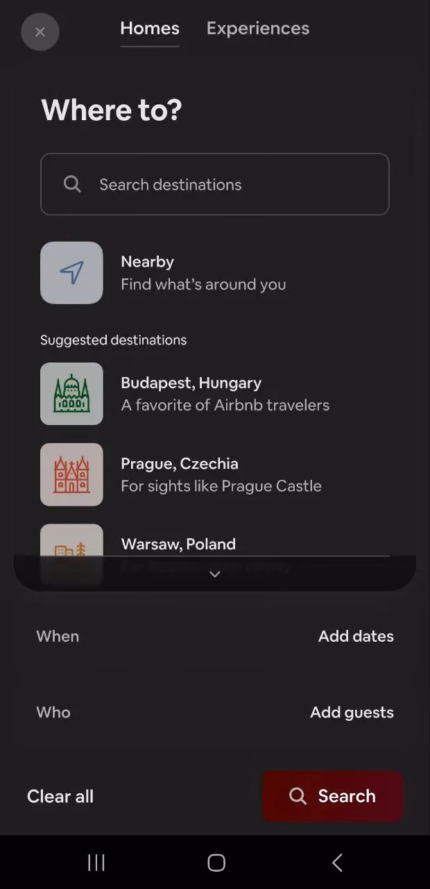
Key features of Airbnb’s mobile menu:
- Minimalist top navigation with smart dropdowns (clean and highly functional).
- Progressive disclosure (users only see what’s necessary at each step).
- Context-aware menu for personalized UX (the menu dynamically adjusts based on user intent).
- Persistent bottom navigation for quick access (hybrid approach combines the best of dropdowns and fixed navigation bars).
- Visual hierarchy and readability (ample spacing, clear typography, and well-structured sections).
Arounda point!
Airbnb demonstrates how thoughtful design can simplify complex interactions and make travel planning smooth and enjoyable.
4. Amazon: Multi-Level Navigation for Complex Menus
Amazon is the world’s largest e-commerce platform, offering everything from consumer goods to cloud services (AWS). It has millions of products across thousands of categories, so Amazon’s mobile UX must handle vast amounts of information and allow users to quickly find what they need.
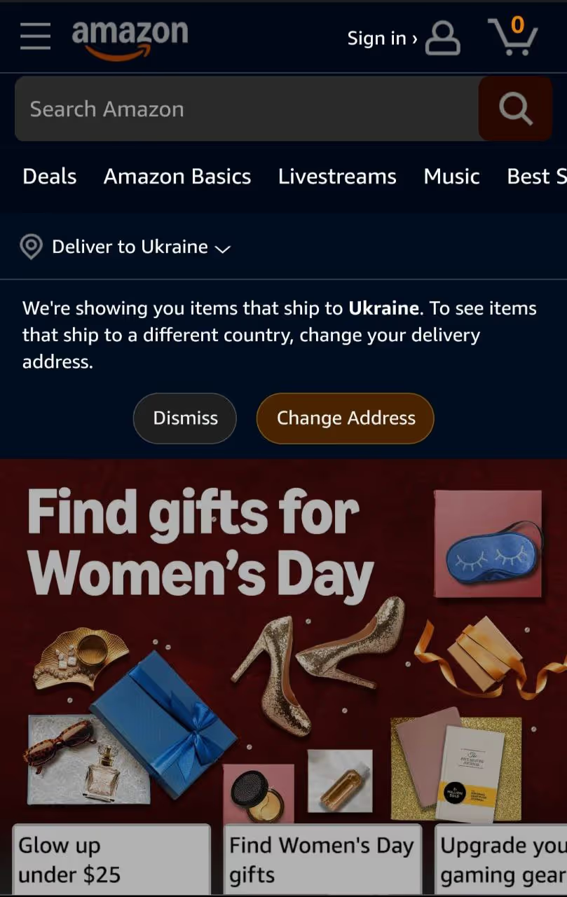
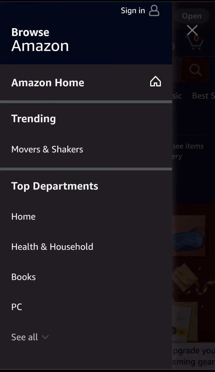

Key features of Amazon’s mobile menu:
- Expandable multi-level sidebar navigation.
- Customized shopping experience.
- Sticky search and cart icons for quick access.
- Visual hierarchy and clear categorization.
- Integration of account and order management (it’s a one-stop navigation hub for both purchasing and account management).
- High-contrast text and large touch areas make navigation easy for all audiences.
Arounda point!
Amazon is a great example of a platform dealing with extensive content. It shows that even complex navigation can be user-friendly, scalable, and efficient.
5. TikTok: Icon-Driven Bottom Navigation
TikTok design is built for speed, efficiency, and minimal friction. Unlike traditional text-heavy menus, TikTok has icon-driven bottom navigation. This design choice simplifies usability and keeps a strong focus on content engagement.


Key features of TikTok’s mobile menu:
- Minimalist bottom navigation bar (a five-icon layout, placed at the bottom of the screen for thumb-friendly accessibility).
- Swipe gestures instead of taps. Users can swipe up/down to explore videos, right/left to navigate creator profiles and tap to engage with content.
- Strong visual hierarchy with high-contrast icons for immediate recognition without labels.
- The central "+" button stands out with its bold color and larger sizing, showing its primary function.
- Quick access to content discovery, creation, and interactions fuels TikTok’s addictiveness.
- Thumb-friendly design (every essential action is within easy reach of the user’s thumb).
Arounda point!
No deep menus, no confusion. Just pure content-driven navigation. TikTok shows that a well-structured, minimalist design can enhance user experience and provide high engagement and accessibility.
6. Duolingo: Fun and Engaging Navigation Elements
What do we like in Duolingo? It gamifies education and makes language acquisition interactive, engaging, and accessible. Its mobile UX motivates users, using playful visuals, progress tracking, and reward-based interactions.

Key features of Duolingo’s mobile menu:
- Duolingo follows a five-icon bottom navigation layout, so users can easily switch between core sections of the app.
- The bottom menu keeps all essential features within easy reach.
- UI design ensures users keep returning daily for lessons.
- It uses vibrant colors, fun illustrations, and micro-animations to make navigation lively and engaging.
- Icons often have subtle movements to reinforce actions and reward user progress.
- The app keeps a visible progress bar at the top, showing how far users have advanced in their lessons (it motivates people and gives them a clear sense of achievement).
- The mobile menu integrates daily streaks, leaderboards, rewards, and goal-setting. This approach turns boring language learning into an interactive challenge.
Arounda point!
Duolingo shows that user experience can be fun, delightful, and habit-forming with the right design.
7. Notion: Adaptive Mobile Menus for Productivity Apps
Individuals and teams use Notion to organize tasks, manage documents, and create structured workflows. It has complex functionality, but the design focuses on adaptability and ease of navigation.
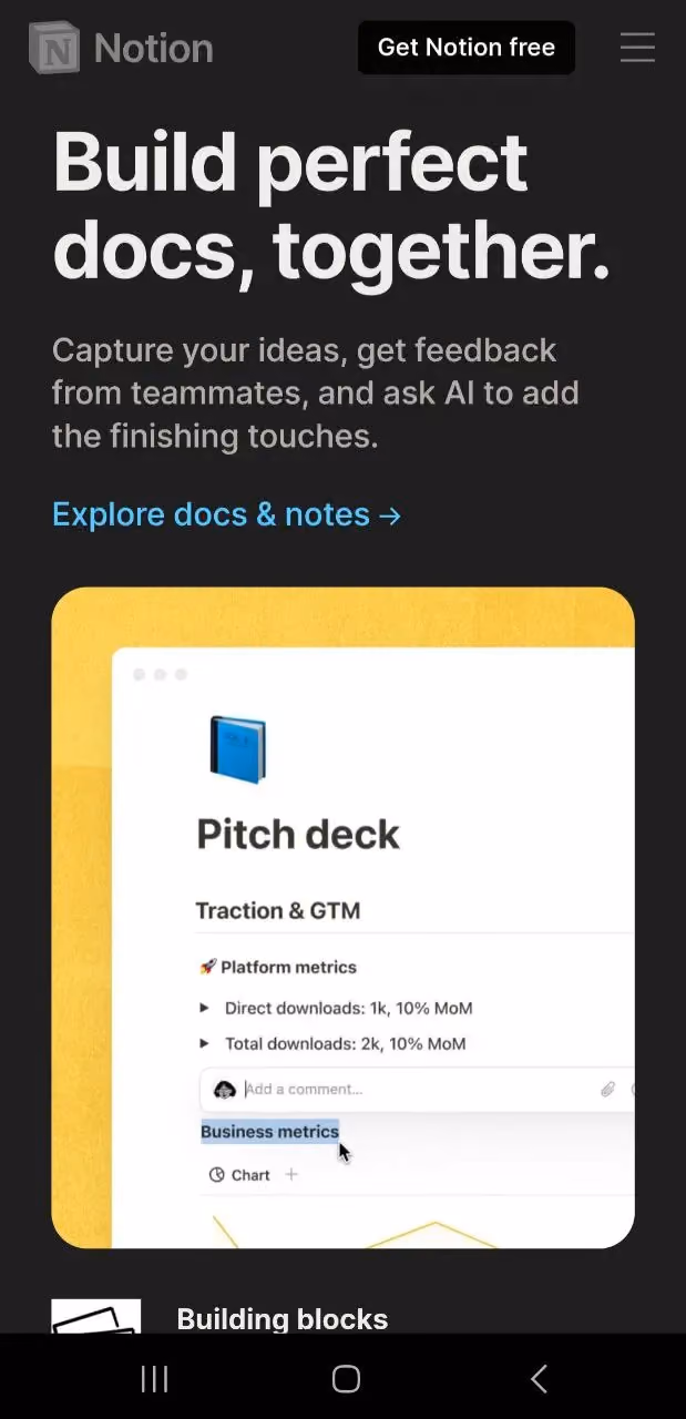

Key features of Notion’s mobile menu:
- Adaptive sidebar for multi-level navigation
- Swipe gestures to expand, collapse, and switch between pages (a very useful feature for users handling multiple projects at once).
- Universal search for instant access.
- Quick access toolbar for core actions (users can work efficiently on a small mobile screen).
- Dark mode, customizable workspaces, and floating action buttons improve the overall user experience.
Arounda point!
Notion balances flexibility with simplicity. Even feature-rich productivity apps can have a user-friendly interface and support complex workflows at the same time.
8. Netflix: Personalized Content-Driven Navigation
Netflix’s success relies on personalized recommendations and a seamless user experience. It allows viewers to find and enjoy content without friction quickly. The mobile app menu design is content-first, personalized, and highly intuitive, with a focus on effortless content discovery.

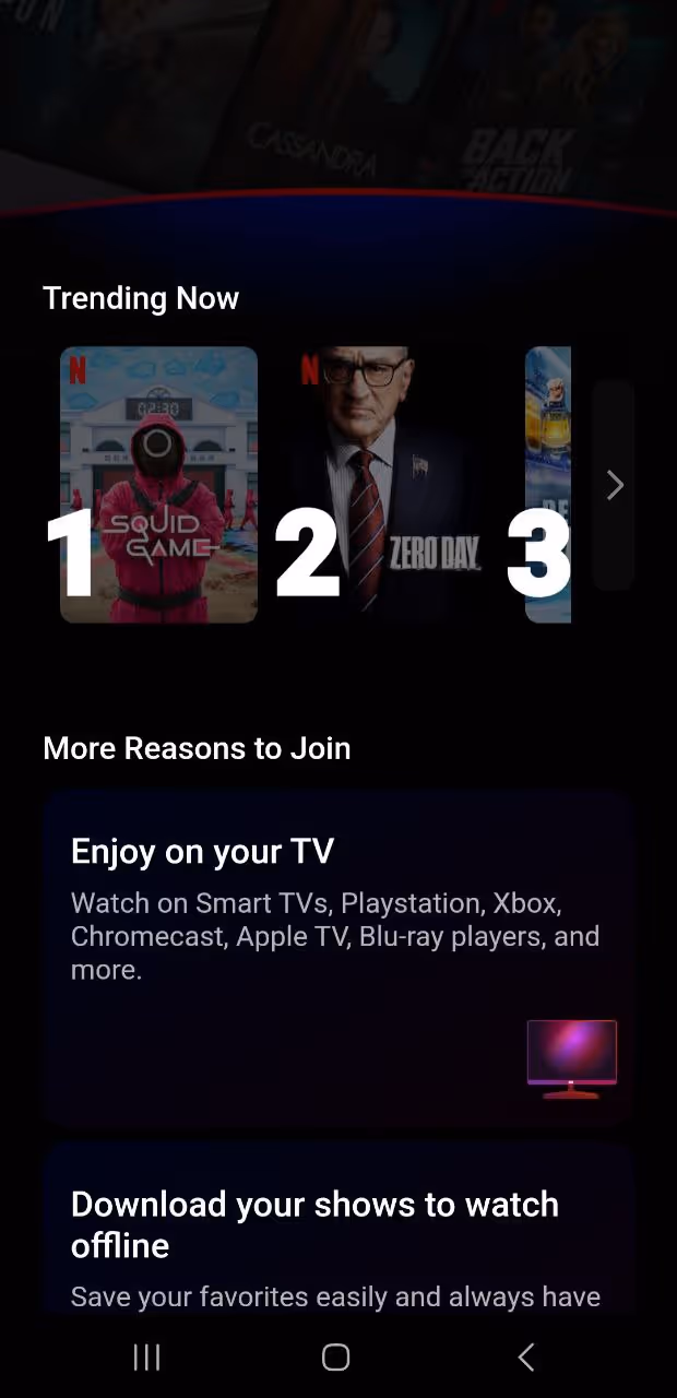

Key features of Netflix’s mobile menu:
- Netflix keeps things simple with a three-to-four icon at the bottom navigation bar.
- AI-driven personalized content navigation.
- Persistent mini-player for multitasking.
- Gesture-based UI for quick interaction.
- Strong visual hierarchy with auto-play previews
Arounda point!
With a content-first approach, highly personalized experience, and effortless discovery, users spend less time searching and more time watching.
9. Etsy: Category-Based Menus with a Creative Edge
Etsy is a global marketplace for handmade, vintage, and unique goods. Its mobile UX focuses on inspiring shopping experiences to help users find the perfect item.
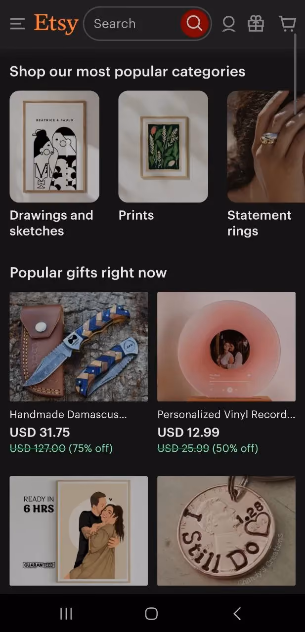
Key features of Etsy’s mobile menu:
- A five-icon bottom navigation system for quick access to the most important sections.
- A well-structured category-based navigation.
- Search functionality with image previews, trending collections, and AI-generated suggestions.
- The "Sell on Etsy" section makes it easy for shop owners to manage listings, view analytics, and process orders.
- Quick access to discounts and personalized recommendations.
- Aesthetic UI with rich imagery makes shopping enjoyable.
- Quick access to wishlists, deals, and favorites increases engagement.
Arounda point!
Shopping must be a delightful experience. Etsy has a creative and category-driven menu that proves that e-commerce navigation can be both functional and inspiring.
10. Uber: Simplified Menus for Quick Navigation
Uber is a ride-hailing and mobility service that offers everything from standard rides to food delivery (Uber Eats) and micro-mobility options. People often use the app on the go, so speed, clarity, and frictionless interaction are very important here.
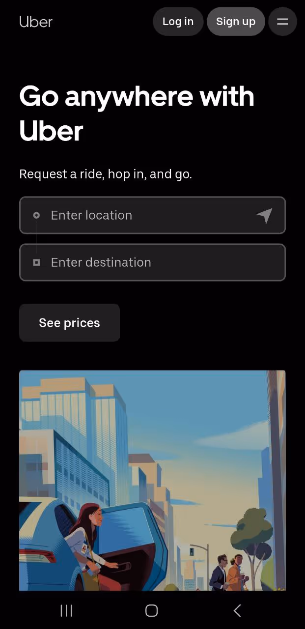

Key features of Uber’s mobile menu:
- The bottom menu is lean and intuitive, with only essential options.
- One-tap actions for speed.
- Default options (like saved locations and preferred payment methods) streamline the process.
- A live map view integration allows users to monitor trip progress, change destinations, and see driver details without digging into multiple menu layers.
- The "Wallet" section is easily accessible, so users can manage payments, apply discounts, or split fares without confusion at checkout.
- The black-and-white color scheme ensures clarity in bright and low-light conditions (especially useful for nighttime riders).
- Users can book a ride, track their trip, or manage payments in just a few taps.
Arounda point!
Uber understands its audience, so the design is optimized for use in fast-paced environments where speed is critical.
We’ve explored 10 famous examples where each brand has its unique approach. But! They all follow a set of universal UX principles. In the next section, we’ll break down the best practices to help you craft a high-performing navigation experience that keeps users coming back.
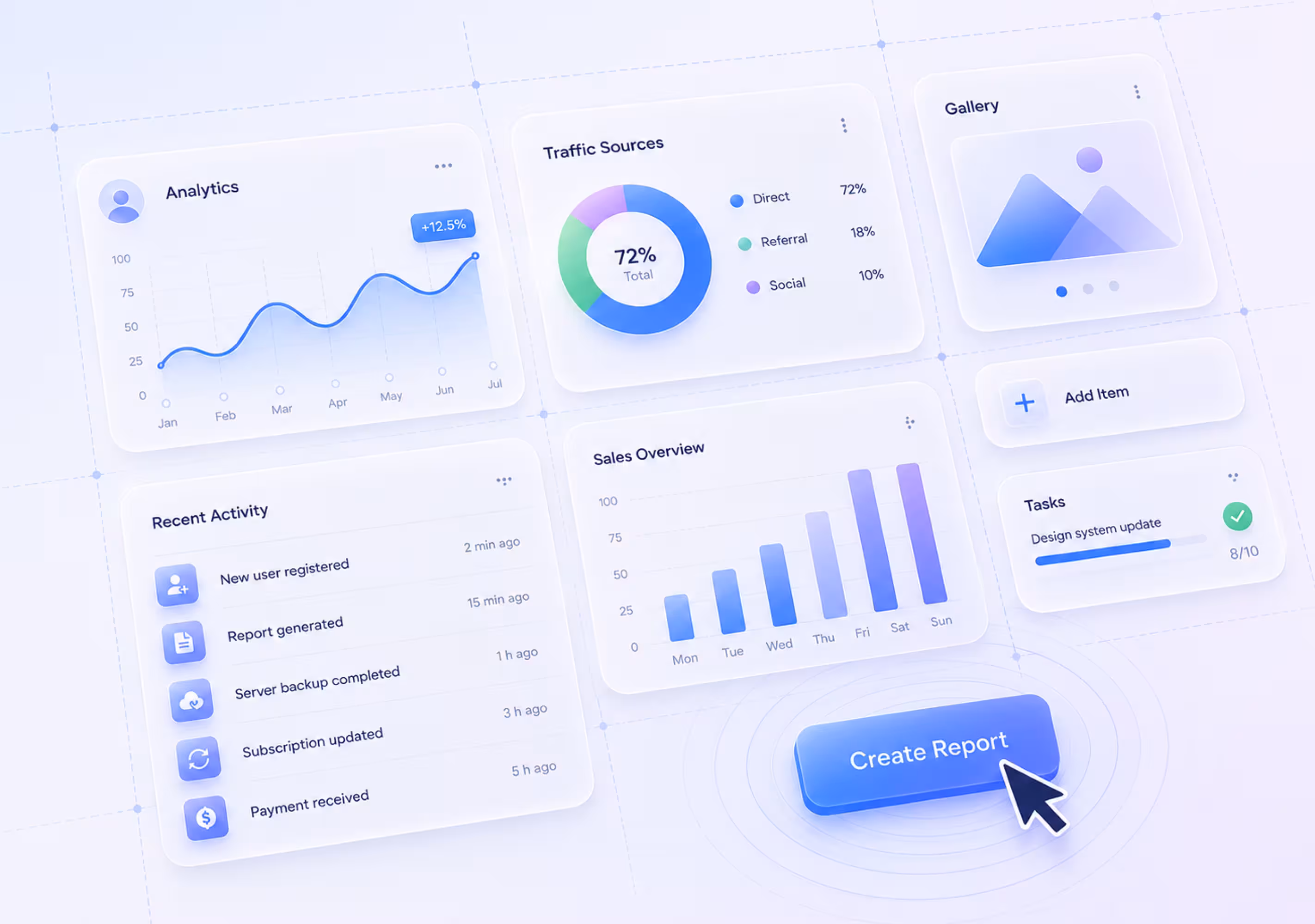
Best Practices for Mobile Menu Design
Users never have to think too hard about where to go next! Great mobile UX is about function, speed, and accessibility. Follow key principles and make the user journey really enjoyable.
Maintain Simplicity
How will you react when the menu hits you with too many options, nested categories, and overwhelming clutter? You hesitate. You scroll. You tap. You get lost. You leave. Right?
Remember that a complicated menu is the fastest way to lose users.
How to achieve simplicity without compromising usability?
- Prioritize primary actions.
- Use progressive disclosure.
- Group related features.
- Think mobile-first, not desktop-shrunken.
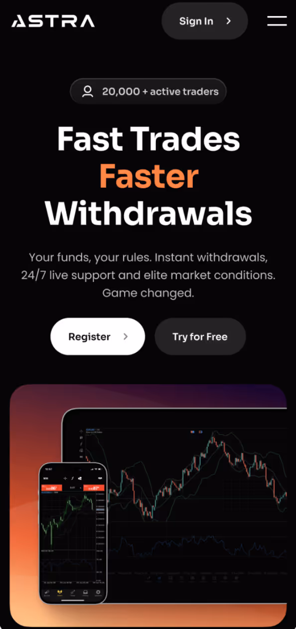
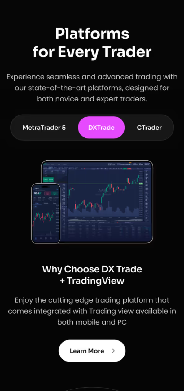
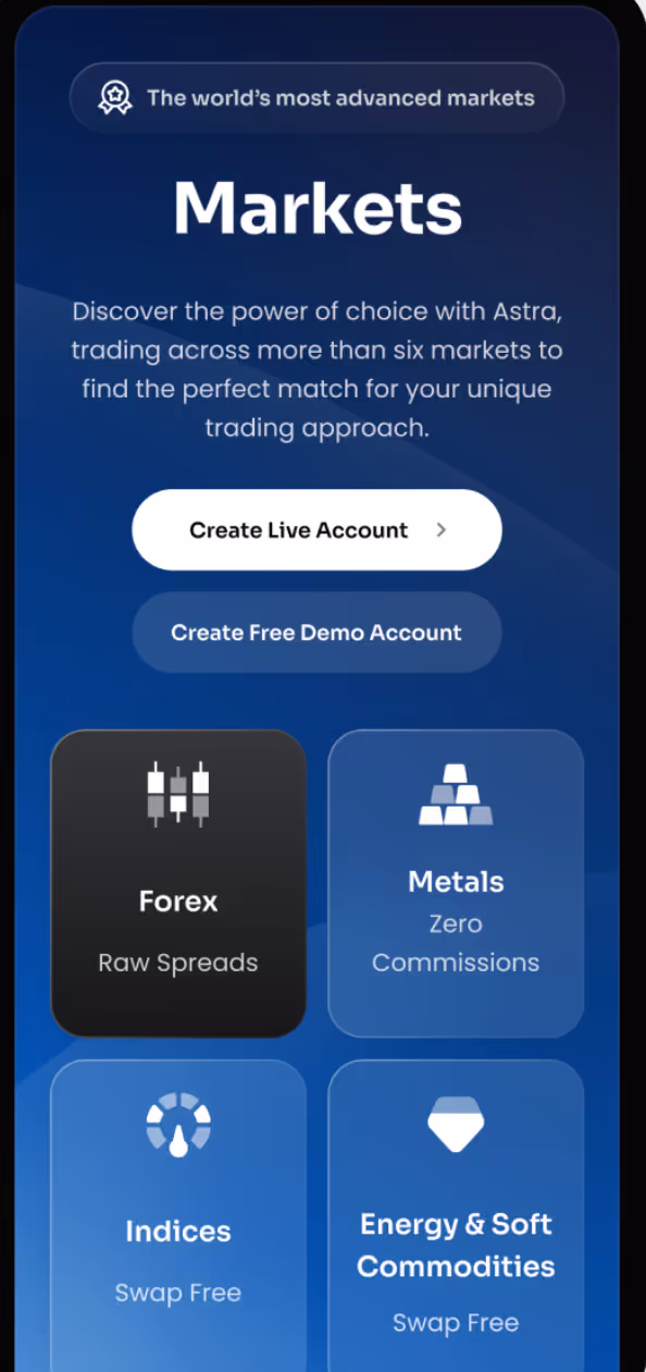
Our Arounda team designed an elegant and functional design for the Web3 trading product - Astra. It has rich functionality, but we aim to make it simple, clean, and clear. Discover it in our Astra case study.
Use Intuitive Icons
Icons are powerful because they save space and create instant recognition (but only if they’re universally understood). A confusing or unconventional icon forces users to decipher the meaning and disrupts the flow.
How to make icons work for users, not against them?
- Stick to widely recognized symbols.
- Pair icons with labels (only when necessary).
- Make icons responsive.
- Test for comprehension (if you understand them, it doesn't mean everyone will).
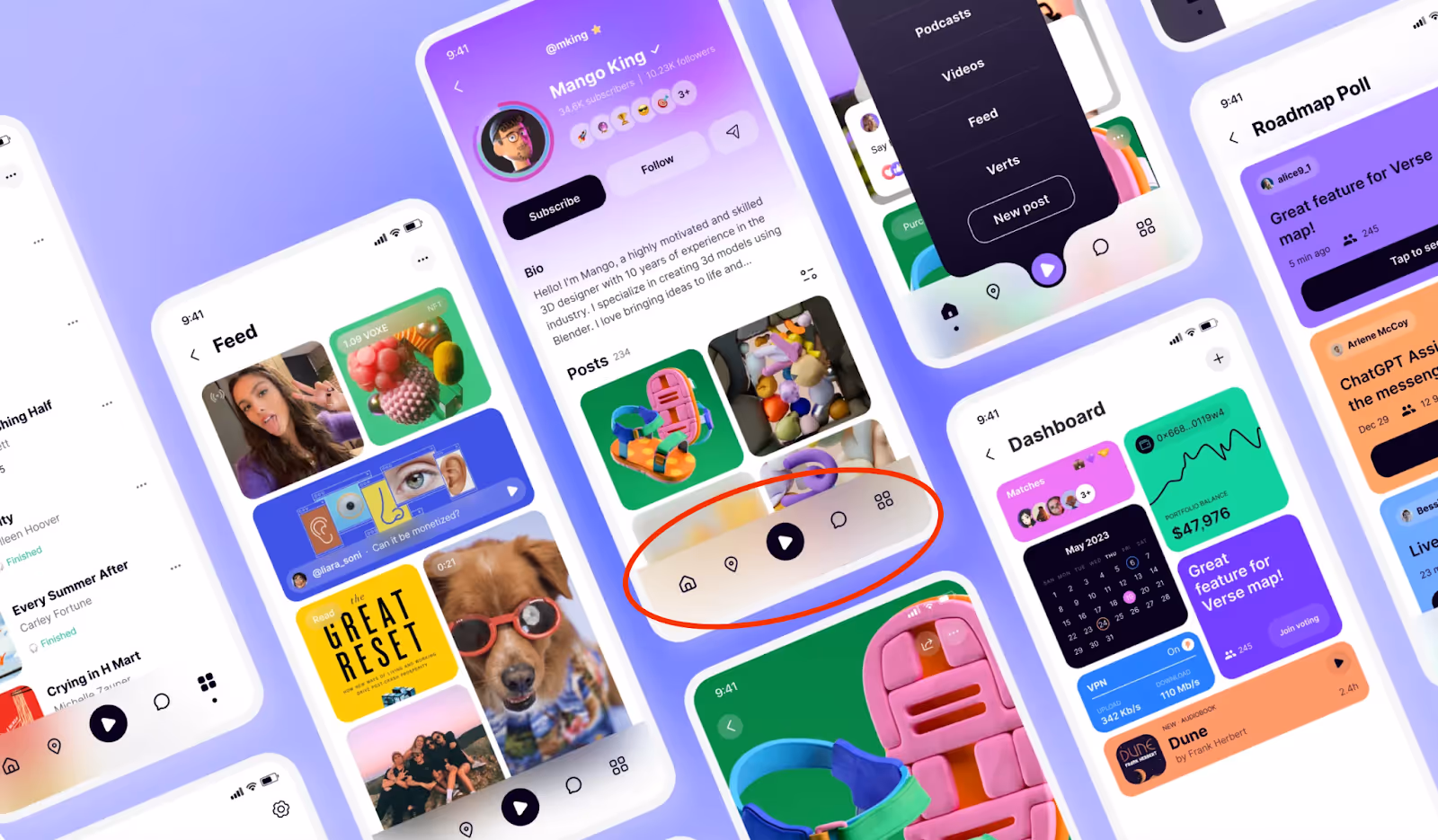
Look at our case, Voxe, a social media Web3 ecosystem. We created an appealing, lively, entertaining design with intuitive, familiar, and consistent symbols. Learn more in our Voxe case study.
Make Menus Accessible with Minimal Taps
Imagine yourself at the cafe with 20 pages of menu and hundreds of options. How will you feel? Frustrating, right? That's exactly how users feel when an app buries essential actions under too many taps.
Our main rule is simple: The fewer taps it takes to reach a destination, the better the experience.
How to design for minimal friction?
- Keep primary actions within two taps.
- Use sticky navigation (keep critical menu items visible, so users don’t have to scroll endlessly).
- Allow gesture-based shortcuts (swipes and long-press actions can make interactions effortless).
- Remember thumb reach zones (place essential menu elements where users can tap comfortably).
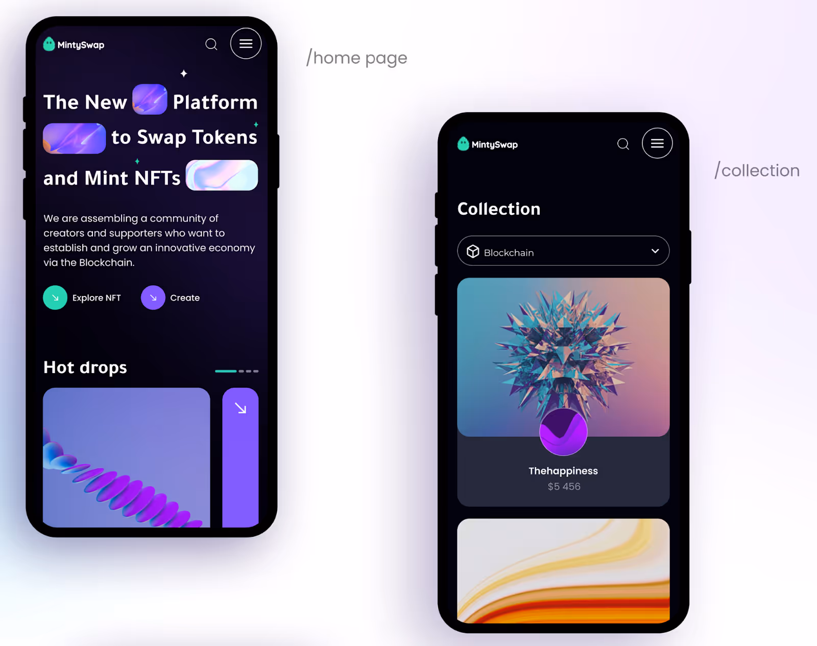
We designed a digital marketplace for crypto collectibles and non-fungible tokens. Our task was to create a clean and clear user experience so people could buy, sell, and discover exclusive digital assets and create their own NFTs without any problems. Look at our MintySwap case to explore more.
Implement Clear Visual Hierarchies
When a mobile menu lacks visual structure, users don’t know where to look or what to do next. In a good design, elements guide user attention, not confuse.
How to create a strong visual hierarchy in menus?
- Prioritize top-level navigation.
- Use contrast wisely. Primary actions stand out (bold fonts, distinct colors), but secondary actions fade into the background (smaller fonts, lighter shades).
- Create whitespace (spacing and grouping create a sense of order). Give room to breathe!
- Use animation with intent. Subtle animations (like menu expansions) signal movement and progression without feeling gimmicky.
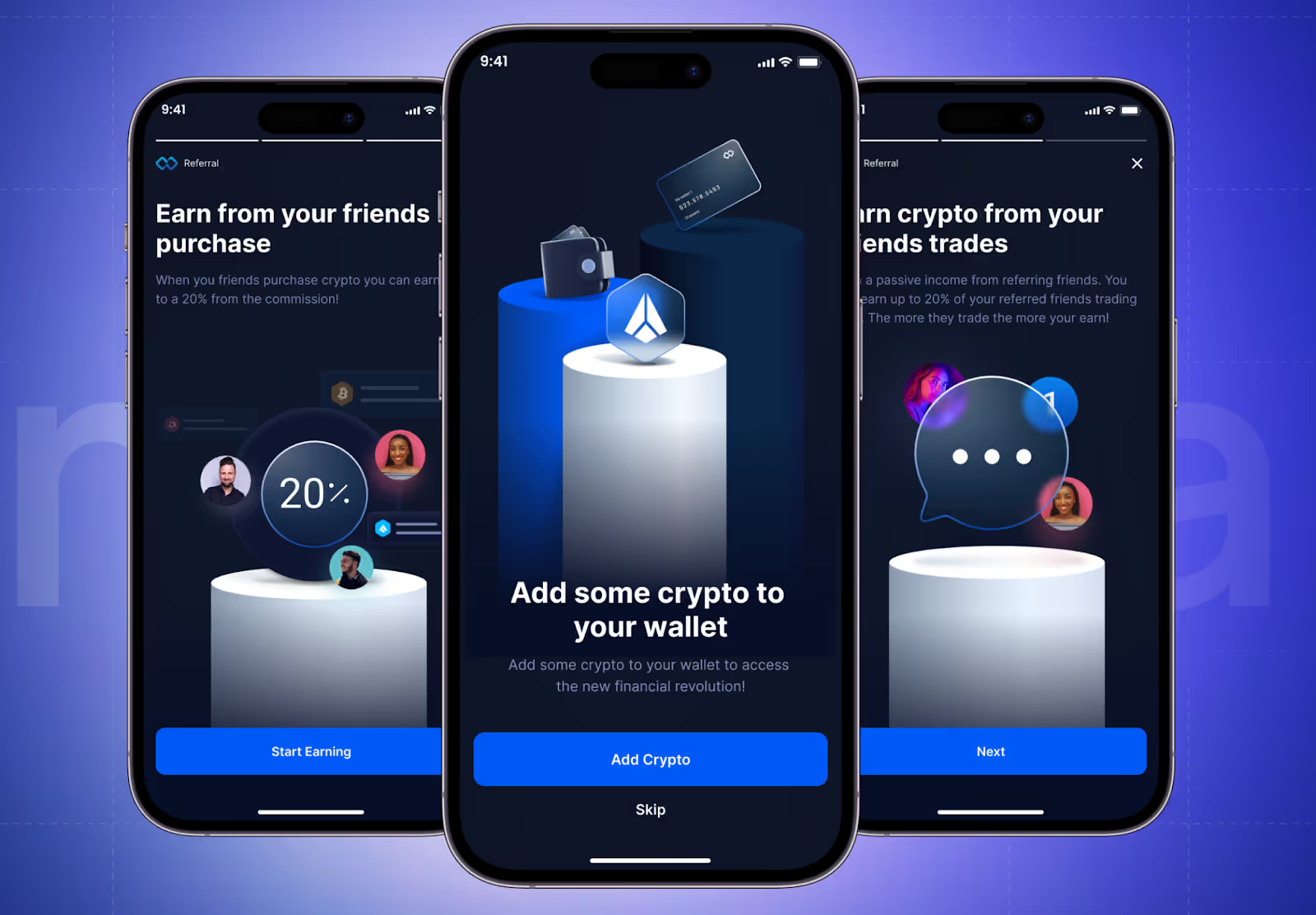
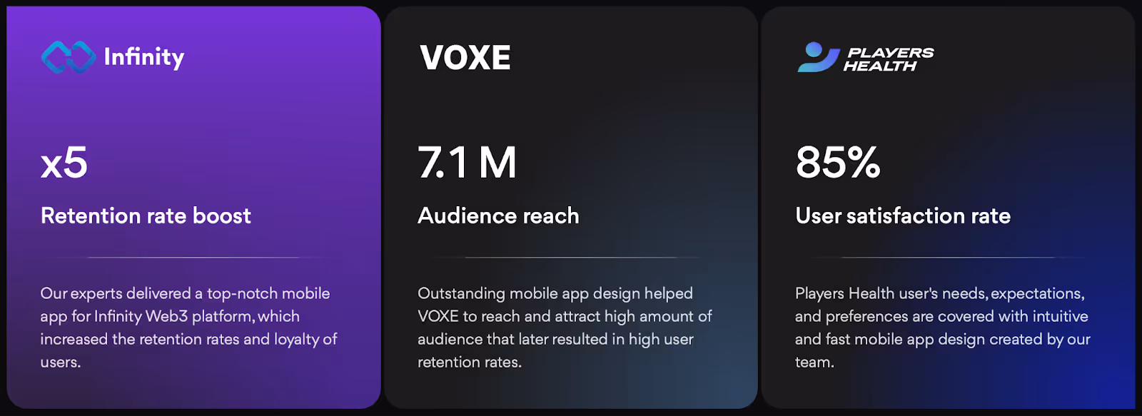
We have many examples of visual hierarchies, but we want to show you our Web3 project - Infinity Wallet. Our designers focused primarily on the main message, created a clear CTA, added 3D elements for depth and emphasis, balanced color and contrast, and avoided too much info on each screen. These are the main rules for a strong visual hierarchy.
Prioritize Responsive and Adaptive Layouts
A menu that isn’t responsive creates usability nightmares! Buttons shrink, elements overlap, and users end up rage-quitting.
How to ensure menus work across all devices?
- Menus should adapt to different screen sizes without breaking the layout.
- Buttons should be at least 44px in size to ensure easy tapping.
- Never assume what works on one screen works everywhere (test on multiple devices).
- Consider how menus adapt to tablets, foldables, and wearable interfaces.
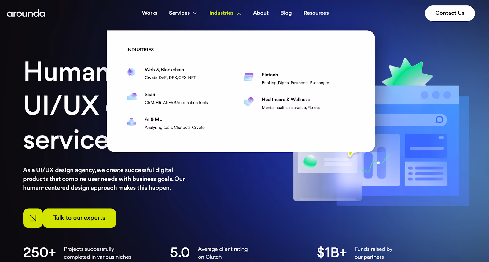
Let’s take a look at our Arounda example and how the same section (in our case “Industries”) looks in web and mobile versions.

A cluttered, unintuitive interface drives users away. Slow navigation, confusing layouts, and hidden actions can destroy engagement and conversions. Your users deserve a frictionless experience!
Arounda team specializes in UI/UX design that transforms complexity into clarity. If you need a sleek mobile menu, an intuitive app layout, or a full product redesign, we will craft digital experiences that delight users and drive results.
How to Choose the Right Mobile Menu
The right menu structure ensures that users find what they need quickly, effortlessly, and intuitively. But how do you decide which menu style is best for your app or website?
You have to understand your users, align design choices with your business goals, and rigorously test for usability. Let’s break it down.
Understand Your Target Audience
Will a ride-hailing app and an e-commerce marketplace have the same menu? No. Each app has different purposes and audiences with diverse behaviors, expectations, and needs. And your menu should reflect that!
Our team recommends to answer the following questions:
- Who are your users? Are they tech-savvy or beginners? Are they browsing for leisure or completing tasks fast?
- How do they interact with your app? Do they often switch between sections?
- What frustrates them?
Arounda tip!
Conduct user research, surveys, heatmaps, and UX audits to see where users struggle and succeed with current navigation.
Match the Menu Style to Your Purpose
Not all menus are created equal. The right menu type depends on how users interact with your platform.
Our experts have created a list of popular mobile menu styles and where they work best.
- Bottom navigation bars are the best for apps with core actions that users access frequently. Ideal for social media, entertainment, or e-commerce apps (e.g., Spotify, Instagram, TikTok).
- The hamburger menu (☰) with expanding layers hides secondary options but requires extra taps. Ideal for travel apps, productivity tools, and dashboards (e.g., Airbnb, Stripe).
- A tab-based menu with swipes lets users quickly switch between sections. Ideal for streaming services, media platforms, or news apps (e.g., YouTube, Netflix).
- Gesture-based and floating menus are used in innovative, AI-driven, or mobile-first apps. They work well when traditional menus feel restrictive. Ideal for fintech, AI-powered tools, and next-gen digital experiences.
Test Across Devices and Screen Sizes
You’ve designed a sleek menu that looks perfect (to your mind and on your phone). But have you tested it on smaller devices, large-screen tablets, or foldable phones?
Our point: A menu that isn’t responsive is a usability disaster waiting to happen.
What we recommend to do and what questions to answer:
- Test for different devices
- Does your menu adapt seamlessly to various screen sizes?
- Are buttons large enough to tap without frustration?
- Does the layout adjust for both portrait and landscape modes?
- Optimize for touch and gestures
- Are interactive elements too small or too close together?
- Can users swipe, tap, or long-press without accidental clicks?
- Is there enough spacing between icons for smooth usability?
- Check load speed and performance
- Is the menu smooth and responsive, or does it lag?
- Do animations slow down lower-end devices?
- Are fonts and icons legible on all resolutions?
Arounda tip!
Use Google’s Mobile-Friendly Test, device emulators, and real-world testing to ensure a flawless experience across all platforms.
A poorly designed mobile menu can lead to frustrated users, high bounce rates, and lost conversions. Your mobile UX should feel effortless, intuitive, and engaging. If you build an app from scratch or refine an existing product and need help, our team can help you do things right and create mobile experiences that fit seamlessly into your users’ daily lives.
Final Thoughts
Confusing menus, too many taps, hidden actions… It doesn’t take much to lose a user’s trust. And nowadays, people don’t have the patience to deal with bad designs anymore!
Create an enjoyable experience for your product because your users deserve it! Focus on clarity, usability, and smart design choices. And don’t worry if you need assistance!
We’re here to help you craft a mobile menu (and an entire experience) that your users will love. Just contact us, and let's make your product their favorite place to stay.

Table of contents


FAQ
Visual hierarchy is the backbone of effective mobile application menu design. If it’s done right, then users can quickly identify primary actions, navigate effortlessly, and avoid confusion. You should strategically use size, contrast, color, and spacing to guide the user’s eye to the most important elements. For example, a bold CTA button at the bottom of a mobile menu ensures users instinctively know where to go next. Meanwhile, subtle typography and spacing de-prioritize secondary actions. So the interface is clean and intuitive.
The mobile web menu should balance between icons and text. Icons save space and create a minimalist look. But! Not all symbols are universally understood. So pairing them with short labels removes ambiguity and ensures clarity.
The sweet spot for mobile menus is typically 3 to 5 primary options, so users can navigate with minimal cognitive load. But if your app requires more categories, then we recommend the following: - Use nested menus or dropdowns to keep the UI clean. - Prioritize the most-used actions in the primary menu and hide secondary options under an expandable section. - Use progressive disclosure, where additional options appear contextually when needed.
Well-designed animations provide feedback, soft transitions, and a sense of responsiveness. But excessive or slow animations can frustrate users. What Arounda team recommends: - Subtle fade-ins and slide effects that indicate movement between screens. - Microinteractions that confirm actions. - Speed-optimized transitions that make navigation feel fluid. - Every motion should serve a purpose. What Arounda team doesn't recommend: - Laggy, over-the-top effects that slow down interactions. - Unnecessary delays that make the menu feel unresponsive. - Animations that don’t provide meaning.
To optimize your mobile menu: - Test across different devices and resolutions. It must be responsive. - Use heatmaps and user testing to identify where users struggle and refine accordingly. - Keep tap targets user-friendly. Buttons should be at least 44px for easy tapping. - Minimize the number of steps. The fewer taps it takes to reach a destination, the better. - Ensure accessibility. High-contrast text, proper spacing, and voice navigation support improve usability for all users.


89+ Reviews
on Clutch

Top Rated Plus Agency
on Upwork

Top 50 Trending team
on Dribbble

Projects are Featured on Behance platform
