
How to Redesign an App in 2025

The world of UI/UX design is constantly evolving. Do you want to keep your app attractive? Then, you must stay up-to-date with design trends and user preferences and make the necessary updates.
In this guide, we explore when a redesign is needed and when it isn't, important steps, and the latest tendencies you might be interested in. You can see the design work of our agency in such cases as minimalistic Myso, dark-mode MintySwap, and Player's Health with futuristic colors.
Should You Redesign Your App
Determining whether to redesign your app depends on factors like user feedback, changing market trends, and the app's performance metrics. Let's discuss all indications and contraindications.
Reasons for the App Redesign
Numerous convincing factors can lead you to consider updating the program's look and functionality. So, when is it appropriate to start thinking about a redesign?
- Outdated aesthetics. Trends evolve, and what was once stylish may now seem obsolete. Periodically updating the design ensures visual appeal and alignment with contemporary standards.
- Negative customer reviews. Feedback, especially negative reviews, offers valuable insights into areas needing improvement. Addressing design issues highlighted in customer feedback can enhance user satisfaction and retention.
- Complex interface. As features are added, the interface may become cluttered and challenging to navigate. Simplifying the user experience ensures easy access to functionality, which is particularly important for SaaS apps.
- Rebranding. Refreshing visual elements like logos and color schemes can communicate a renewed identity and appeal to existing and potential customers.
- Low conversion rates. Poor UX design can frustrate users and affect conversion rates. Keeping up with UX trends and periodically refreshing the design enhances user experience and boosts conversions.
- Backdated technology. Remaining current with technological advancements is essential for competitiveness. Regularly updating the app ensures relevance and effective market competition.
- Changing services or products. Introducing new features may necessitate a redesign to effectively reflect updates. Refreshing the design shows that your app is evolving to meet users' needs, which helps build loyalty and keep users engaged.
When the Redesign Is Not a Solution
Is redesign a panacea? Absolutely not. In the following cases, redesign might not be the best solution:
- Design isn't the problem. A redesign may not fix deeper issues like performance problems. It could be just a surface-level solution, not addressing the core problems affecting user satisfaction and retention.
- Limited resources. Redesigning an app demands significant time, effort, and resources. If the costs outweigh the benefits, prioritize other initiatives or optimize existing features.
- Short-term focus. A redesign that does nothing for usability or functionality will not bring lasting benefits. Avoid prioritizing trendy design over usability improvements, as it leads to short-lived gains.
- Market shifts. If the app's decline is due to broader market changes or competitors offering better features, a redesign alone may not be enough. You may need a strategic reassessment to address the root causes.
How to Redesign an App: A Step-by-Step Guide
How to redesign a app? This process involves more than just changing its looks. Follow these steps to ensure your efforts are fruitful and avoid common pitfalls.
Step 1: Define the Goals of Redesign
Define the objectives and goals you aim to achieve through the redesign process. Consider metrics such as Net Promoter Score (NPS), time spent interacting with the app, conversion rates, and retention rates to measure the impact on user satisfaction and engagement.
Step 2: Conduct User Research
Conduct thorough research, utilizing quantitative (in-app usage statistics) and qualitative (user reviews, interviews) data to gain insights into user behavior and preferences. Monitor app reviews on platforms like Play Store and App Store, as well as social media channels.
Then, create user personas and empathy maps to visualize user demographics, behaviors, and pain points.
Step 3: Review the Competitors
Study competitor UI/UX designs to identify areas for improvement and innovation. Look beyond direct competitors for inspiration, studying similar products in different contexts for additional insights.
Step 4: Clarify the Improvements
Compile feedback and insights from user research and competitor analysis, categorizing them into actionable improvements. Develop a clear list of changes, prioritizing tasks based on their impact on user experience and the value they add to the client.
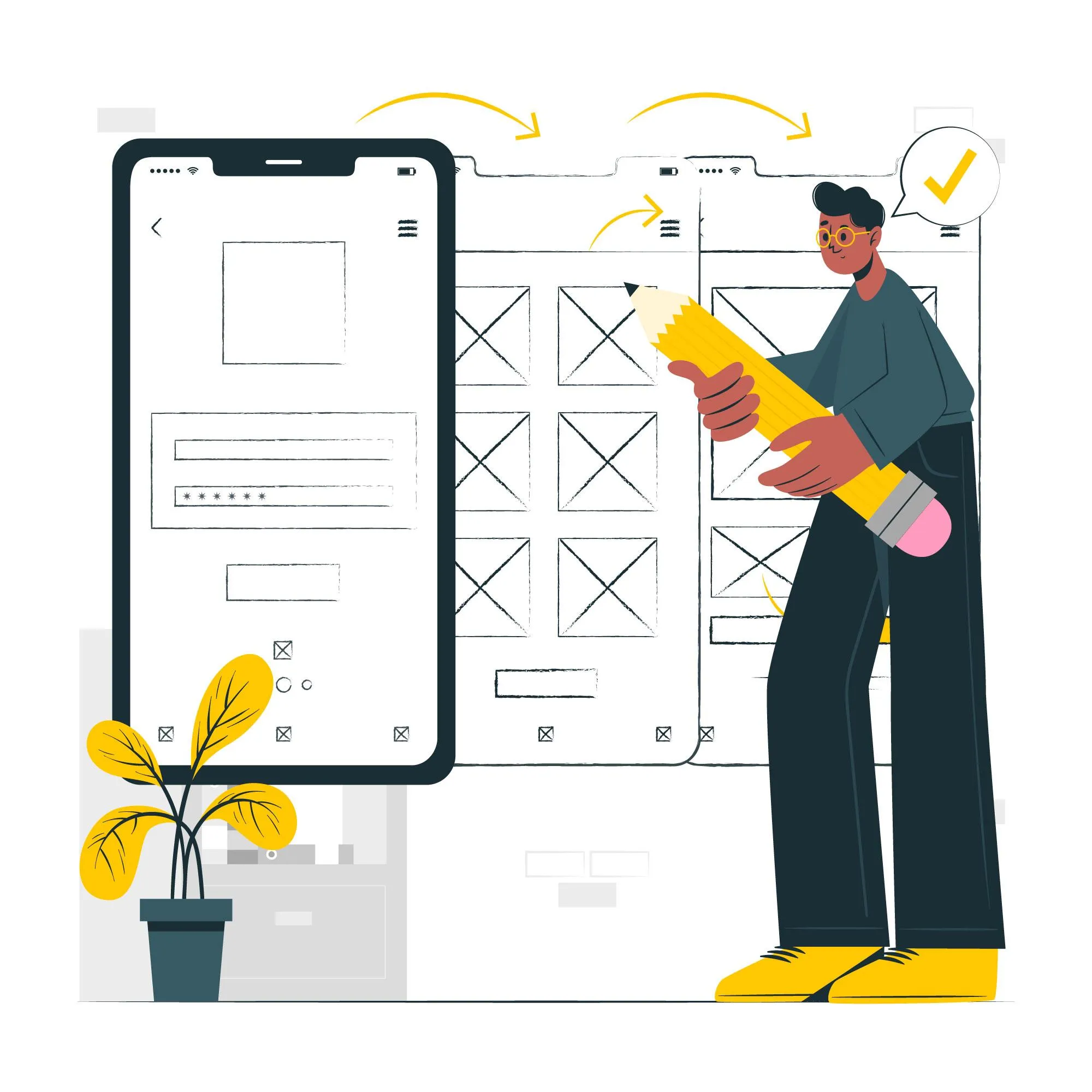
Step 5: Build Lasting UX/UI
Craft low-fidelity wireframes to outline layout and flow, then advance to high-fidelity for detail. Test user behavior to ensure the design aligns with expectations and develop a dynamic prototype for stakeholder visualization.
Step 6: Test Your Redesign with Users
Utilize beta or A/B testing to gauge user response, collecting feedback for evaluation. Continuously test the prototype, refining based on user feedback, and collaborate with specialists for seamless implementation.
Step 7: Monitor User Response Upon Launch
Analyze post-launch analytics to gauge redesign impact on engagement and satisfaction metrics. At the same time, offer support resources for user transition. Continuously monitor long-term sentiment and response for ongoing adjustments to the app.
Hot Trends in App Redesign
To make a lasting impact, ongoing alignment with market trends is vital. Here are the latest mobile app design trends, focusing on user-centric, innovative, and inclusive approaches.
Augmented Reality (AR)
AR offers immersive interactions by overlaying virtual elements onto the physical world, providing users with unique and engaging experiences. Companies employ AR in mobile apps across various fields, such as gaming, retail, education, and more.
For example, Snapchat offers various augmented reality filters that overlay digital effects onto users' faces in real time, providing entertaining experiences.
Voice Commands and Assistants
Thanks to natural language processing and AI advancements, voice commands and assistants become increasingly prevalent in our daily lives. Improved accuracy and dependability make this technology a convenient and efficient way to interact with devices and apps, offering a hands-free and intuitive experience.
Biometric Authentication
Biometric authentication utilizes unique biological traits of individuals, such as fingerprints, retina, or facial features, to confirm identity. Methods like Face ID and Touch ID have become standard in mobile devices, providing secure and user-friendly authentication.
In addition to increased security, your customers get better convenience by eliminating the need for traditional passwords.
Chatbots
Of course, we can’t forget chatbots. Powered by AI, these tools automate conversations with users, providing instant assistance and performing tasks within the app. Chatbots simulate human conversation through text or voice, offering a more interactive and responsive experience.
You can use them for various purposes, including customer support, information retrieval, and transactional interactions.
Design for People with Disabilities
This approach involves designing apps with features that cater to users with disabilities. They may include screen readers, larger text options, color contrast adjustments, and alternative input methods, ensuring inclusivity and usability for all customers.
Dark Mode
Haven't turned the app to the dark side yet? This trend has become a user-friendly design choice, reducing eye strain and improving readability in low-light conditions. It also extends battery life, which is especially useful when browsing apps late at night or in dimly lit environments.
Minimalism
Minimalist design focuses on simplicity, removing unnecessary elements to create clean and intuitive interfaces. Emphasizing clarity, readability, and efficient use of space, you allow users to focus on essential content and actions within the app.
Futuristic Colors
Futuristic color schemes utilize vibrant, gradient-based, or unconventional color combinations for modern interfaces. These colors evoke a sense of innovation and technological advancement, contributing to a visually appealing user experience.
Summary
Strategic app redesign is key to enhancing your presence in a competitive market or maintaining prominence with your audience. Prioritizing user feedback not only makes customers feel valued but also fosters a sense of ownership and collaboration. If you're seeking assistance in revitalizing your mobile app and addressing its weaknesses, consider reaching out to seasoned professionals from Arounda.
As a UI/UX design agency, we blend user needs with business objectives to create successful digital products through our human-centered design approach. With 250+ projects completed, our designs have proven effective for startups and enterprises from healthcare, fintech, retail, SaaS, Web3, and blockchain.
Are you ready for qualitative changes? Contact us to discuss your project.


Table of contents


FAQ
The cost of redesigning an app can vary significantly based on its complexity, size, and the expertise of the design team. Generally, a basic redesign can start from a few thousand dollars for small projects, while more complex redesigns or those requiring extensive UI/UX improvements can range from tens of thousands to hundreds of thousands of dollars. Contact Arounda to get accurate estimates tailored to your specific project needs.


89+ Reviews
on Clutch

Top Rated Plus Agency
on Upwork

Top 50 Trending team
on Dribbble

Projects are Featured on Behance platform
