
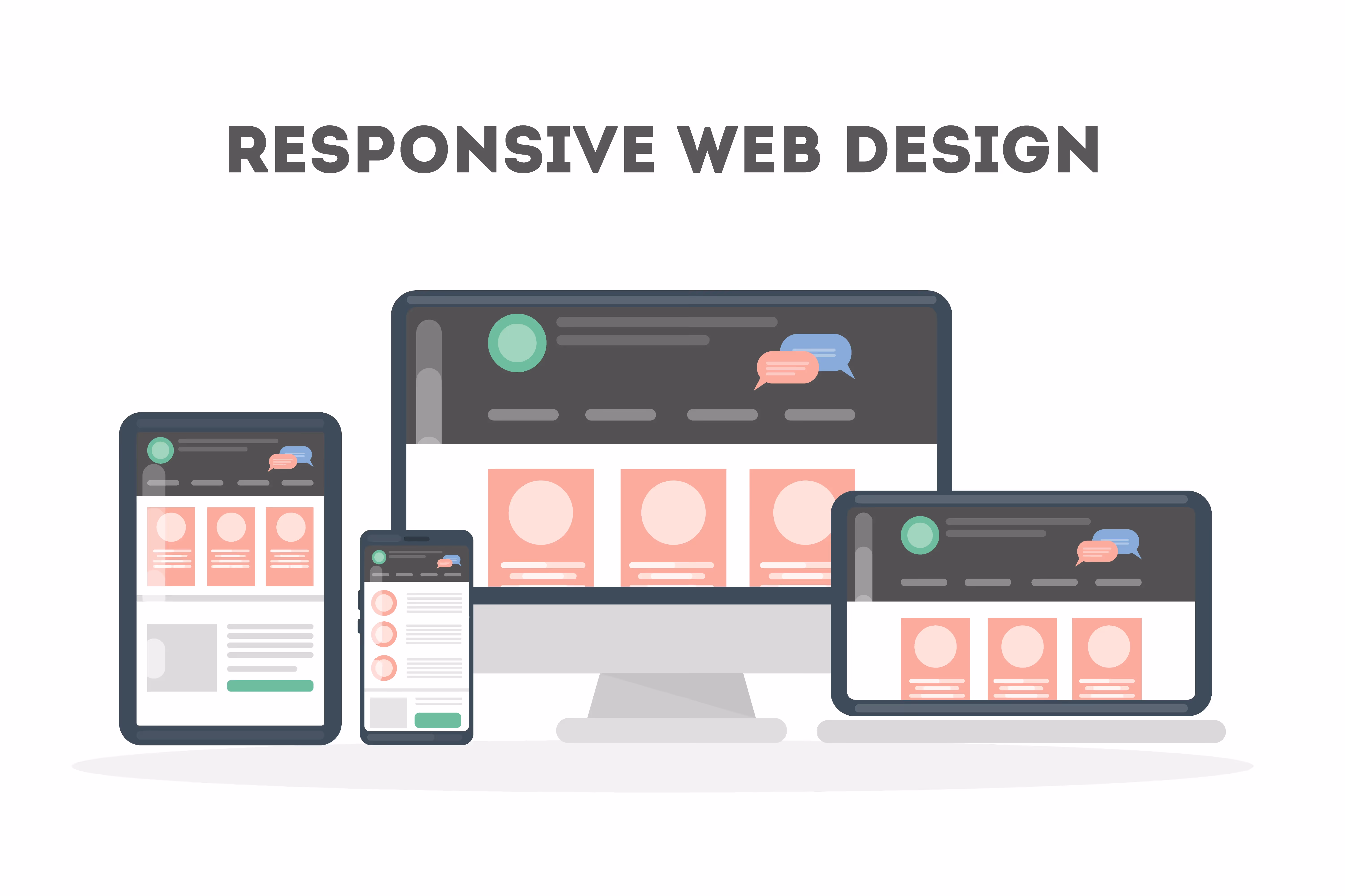
What Is Responsive Design?

In today's world, where people access the internet on various devices with different screen sizes and resolutions, websites should have a responsive design. It ensures you can reach a bigger audience and provide a seamless, consistent user experience.
As a software agency, Arounda develops advanced solutions with responsive design. And in this article, we want to explore the key elements of responsive design, including flexible layouts, responsive images and typography, and the viewport meta tag.
Responsive Design Definition
Responsive design and adaptive design are two approaches to making a website work well across different screen sizes and devices.
- The adaptive design provides a more targeted user experience for each device type but requires more effort to create and maintain multiple layouts.
- However, responsive websites are designed and developed to automatically adjust its layout and content to display properly on devices, regardless of screen size or orientation.
The benefits of a responsive website include improved user experience and search engine rankings, increased mobile traffic, and reduced maintenance costs.
How does responsive web design work?
Designers often use popular options like Adobe XD, Sketch, or Figma responsive design with flexible grids, fluid layouts, and media queries. It adjusts the website layout and content to fit the device's screen size and resolution.
Here's how it works:
- Flexible grid system. The website layout is structured, dividing the page into columns and rows, using percentage-based measurements instead of fixed ones. It allows the website to adjust its layout to fit the screen size of the used device.
- Fluid layouts. A fluid layout ensures the website's content resizes and reflows to fit the screen size. It involves using relative measurements, such as em or rem units, instead of fixed ones for font sizes, margins, and padding.
- Media queries. They allow detection of the device's screen size and resolution and apply specific styles using breakpoints for responsive design and CSS. For example, at a certain breakpoint, the navigation menu may change from a horizontal bar to a dropdown menu, or the font size may increase to improve readability on smaller screens.
The next step after implementing the responsive design is testing. For this, use tools such as browser emulators, responsive design checkers, and actual devices to evaluate the website's responsiveness and functionality.
Responsive Layout Technologies
These responsive layout technologies allow designers and developers to create flexible, dynamic, and visually appealing layouts that adapt to different screen sizes and resolutions.
Multicol
With Multicol, you can build multi-column layouts in CSS by dividing content into equal or varying widths columns. The columns can be resized based on the screen size, and their number is set manually or automatically. This technology is helpful for creating simple, text-heavy layouts with dynamic content, easily read on different devices.
Flexbox
Flexbox is primarily designed for creating flexible and dynamic layouts in one dimension, either horizontally or vertically. It works by dividing the available space into flexible containers and distributing items within them. Flexbox is best suited for creating layouts with a single row or column of items.
CSS Grid
CSS Grid allows the creation of complex, two-dimensional layouts that can be easily manipulated. Designers can build a grid of columns and rows and place items anywhere within that grid, precisely controlling their placement and alignment. CSS Grid is good for layouts with multiple rows and columns of items.
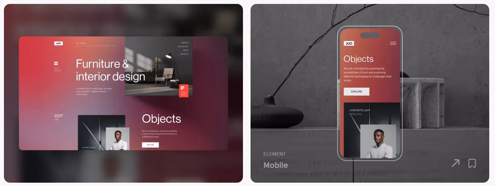
Responsive Images
Responsive images adapt to different screen sizes and resolutions. They allow websites to improve page load times and reduce bandwidth usage.
Here are some details to consider:
- Resolution and Density. These factors affect the image quality on different devices. High-density displays like Retina have more pixels per inch (PPI) than traditional ones, meaning images with a higher resolution are needed to ensure they look crisp and clear.
- Srcset. The srcset attribute defines image versions with different resolutions or sizes — for desktops, tablets, and mobile devices. Most modern browsers, including Chrome, Safari, Firefox, and Edge, support it
- Sizes. This attribute specifies the size of the image container on different devices and helps the browser to determine the appropriate one. It defines a set of media queries, restricting the range of screen sizes for each image version.
- Art direction. Art direction provides different images based on the website content and context, such as the device's orientation or website section. It allows designers to create custom image layouts, improving the user experience.
Responsive Typography
Responsive typography adjusts the website typography based on the screen size and resolution of the device used.
Here are the elements it covers to optimize for readability and legibility:
- Font size. As screen size decreases, the font size should decrease as well. It ensures text remains legible on small screens without requiring users to zoom in. Designers can use relative units like em or rem to adjust font size based on the device's screen size.
- Line length. Shorter line lengths are better for readability, making scanning from one line to the next easier for the eye. On smaller screens, designers may need to reduce line length by increasing the font size or decreasing the amount of text displayed.
- Font weight. Font weight is the text thickness or darkness. Designers can increase the font weight on smaller screens to ensure the text is readable. Smaller screens have a lower pixel density, making text appear lighter or thinner than larger ones.
- Hierarchy. Designers achieve content hierarchy using different font sizes, styles, and weights for different content types, such as headings, subheadings, and body text. It helps users scan and navigate the website, regardless of their device.
- Device-specific styles. Designers use larger font sizes for tablets and smaller ones for smartphones. They may also adjust other typography properties like line height and letter spacing to optimize the reading experience on each device.
The Viewport Meta Tag
The viewport meta tag is an HTML tag that tells the browser how to scale and size the content of a web page to fit the device's screen size.
You can find it in the head section of the HTML document, including a set of elements that define the behavior of the viewport:
- Width. By default, mobile browsers render pages at a width of 980 pixels, resulting in a poor user experience on small screens. The viewport meta tag allows designers to set a custom width optimized for mobile devices, ensuring the content fits the screen and remains readable.
- Initial scale. By default, mobile browsers zoom out to fit the entire page on the screen, making text and other elements appear small and difficult to read. The initial-scale property allows designers to set a custom zoom level optimized for the screen size and resolution.
- Minimum and maximum scale. It can prevent users from zooming in or out too much, resulting in a poor user experience.
- User-scalable. By default, mobile browsers allow users to zoom in and out, but designers can set the user-scalable property to "no" to prevent this behavior. It can be helpful in cases where the page layout is optimized for a specific screen size, and zooming in or out could disrupt the design.
Conclusion
Responsive web design ensures websites adapt to different screen sizes, reaching more customers and improving user experience. Providing responsive websites for startups and mid-sized companies in various industries, we confirm the effectiveness of this approach.
We’ve summarized our experience to overview the importance and key elements of responsive design, including layout technologies, images, typography, and the viewport meta tag. Also, we share responsive design best practices to visualize our insights and help you make a smart choice.
Contact us to discuss your project.


Table of contents


FAQ
Responsive design allows websites to adapt to different screen sizes and resolutions, providing a consistent UX across all devices. It ensures the content is readable and accessible to all users, regardless of their device, improving user engagement and conversion rates.
Responsive design can be seen in websites like Amazon, CNN, and Facebook, which are optimized for different devices and provide a consistent user experience.
The main concepts of responsive design include flexible layouts, responsive images and typography, and the viewport meta tag.


89+ Reviews
on Clutch

Top Rated Plus Agency
on Upwork

Top 50 Trending team
on Dribbble

Projects are Featured on Behance platform
