
SaaS Brand Identity: 15 Best Examples in 2026


When you open any SaaS app, the first thing you experience isn't the features. It's the feeling. The hue of blue on the login screen, the way a dashboard breathes, or the fun little joke hidden inside a 404 page. Before you can determine whether the product is valuable, you already know if it feels credible, convenient, or forgettable. This is brand identity in action; it's subtly influencing how we trust and purchase software before a sales pitch is even on the table.
In 2026, roughly 70% of businesses in the United States are using at least one SaaS solution, due to the scalability, efficiency, integrations, and the evolution of remote work. With many products competing in the same space, identity has become the primary way to differentiate a product. With a unique and bold brand, we can inspire curiosity, build trust, and keep users coming back long after the initial click.
To show you what works best, our Arounda team compiled 15 game-changing SaaS branding examples in 2026. Each serves as an example of how factual design decisions, tone, and personality can turn an abstract idea into something people want to own and incorporate into their lives.
Article Key Takeaways
Branding in SaaS is the unsung decision-maker. The moment a user consumes a product, they have formed an opinion about it long before they start comparing features or pricing. A color choice, a landing page rhythm, or even a witty microcopy could sway decisions.
Strong SaaS companies by 2026 know this and will build identity into their product core. Visuals, voice, and personality transform complex tools into something familiar and memorable. Branding isn't just decoration; it is the reason why one platform is chosen over another.
This article presents 15 SaaS brand identity design examples that do exactly that. Each example illustrates how design and identity create user trust and recognition, providing you with real-life ideas to consider when creating your own brand marks.
What is Brand Identity Design?
Brand identity design is the complete set of factors that affect how your SaaS brand represents itself to the world. The brand identity design process considers everything that the user sees and feels when they are interacting with your brand - from the color scheme of your dashboard, to the voice in your copy, to the design of your images and illustrations. When you put all of these choices together, you create a consistent impression for people, to communicate what type of product you are building and why they should care.
This is especially crucial in SaaS, considering most tools are competing on similar features. Potential users will swipe away quickly if your app looks generic, communicates poorly, or is just completely off base. A brand identity that resonates with a user becomes a signal that a platform is reliable, unique, and invested.
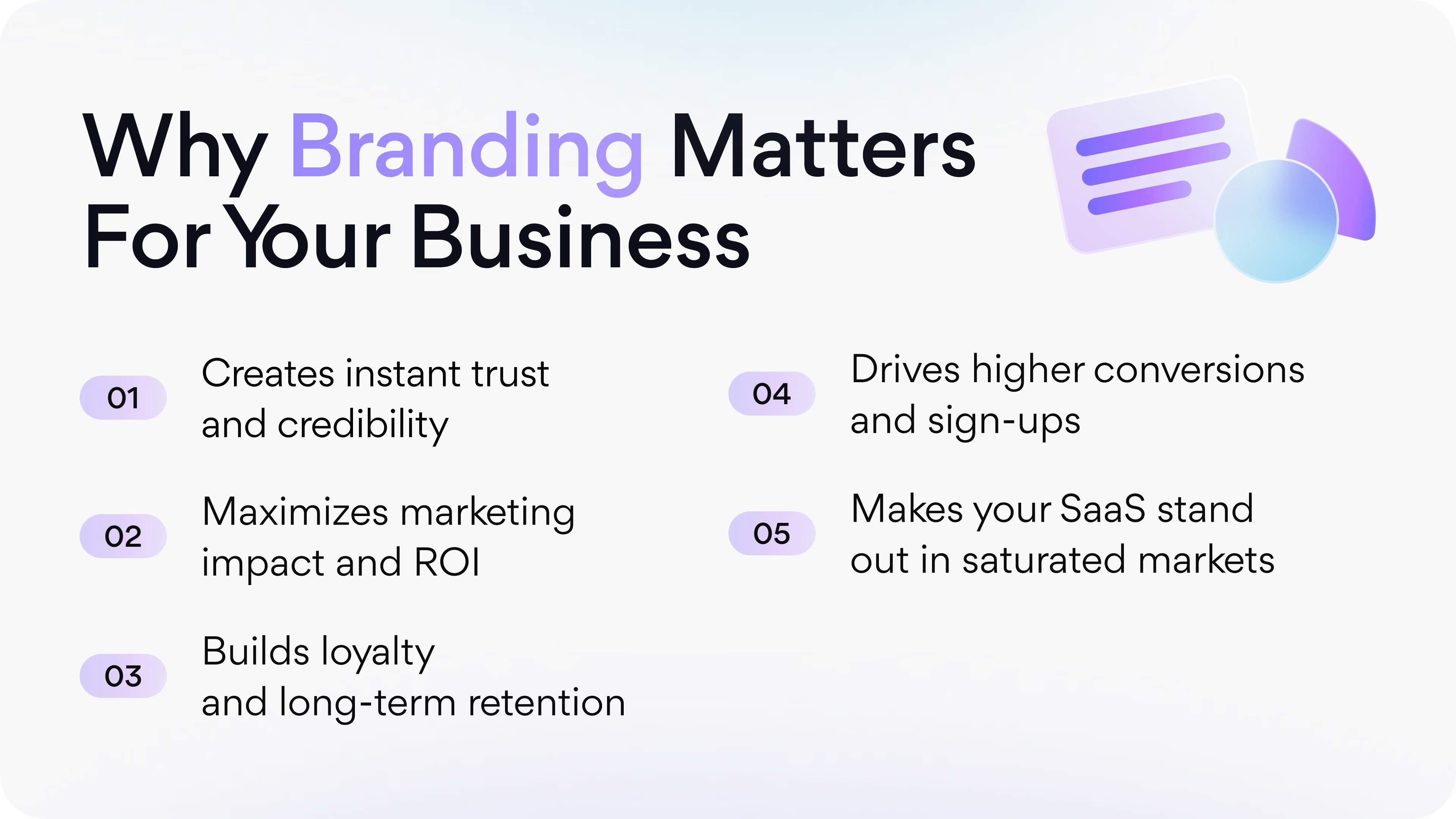
And when it's done right, it delivers results such as:
- Instant credibility when a user arrives at your website or opens your application.
- Clear differentiation in a crowded market full of look-alike products.
- Stronger customer loyalty, because people connect not only to the product but also to the brand personality.
- Greater marketing effectiveness, because campaigns feel cohesive and recognizable.
- Shorter sales cycles, with design itself helping prospects feel more comfortable with the product.
- Better product adoption, because a consistent look and feel also makes the software feel approachable.
Arounda Suggests:
There's a lot more to building brand identity for SaaS products than surface visuals. You have to start with the product experience. What do you want the user to feel? Confident? Curious? Playful? Safe? Arrange your design for that.
If your tool is based on simplifying the complexity of data, you'll want to go more minimalistic, use open space with straightforward typography; If, on the other hand, it's a collaboration tool, you'll want to go with a lot of colors and a more dynamic layout, etc. The key is to develop identity from the foundation of the product's central purpose, rather than from passing trends, so that it feels organic and authentic.
Key Pillars of Effective SaaS Branding
To create effective branding for your SaaS, you should focus on three core pillars: brand identity, brand messaging, and customer experience. Let’s explore each of them.
Brand Identity
A strong brand identity is a visual and design element that makes a SaaS product recognizable, including the logo, color palette, typography, and overall design style. This differentiates the product from competitors and evokes specific feelings in the target audience.
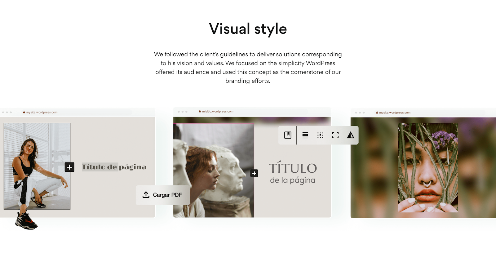
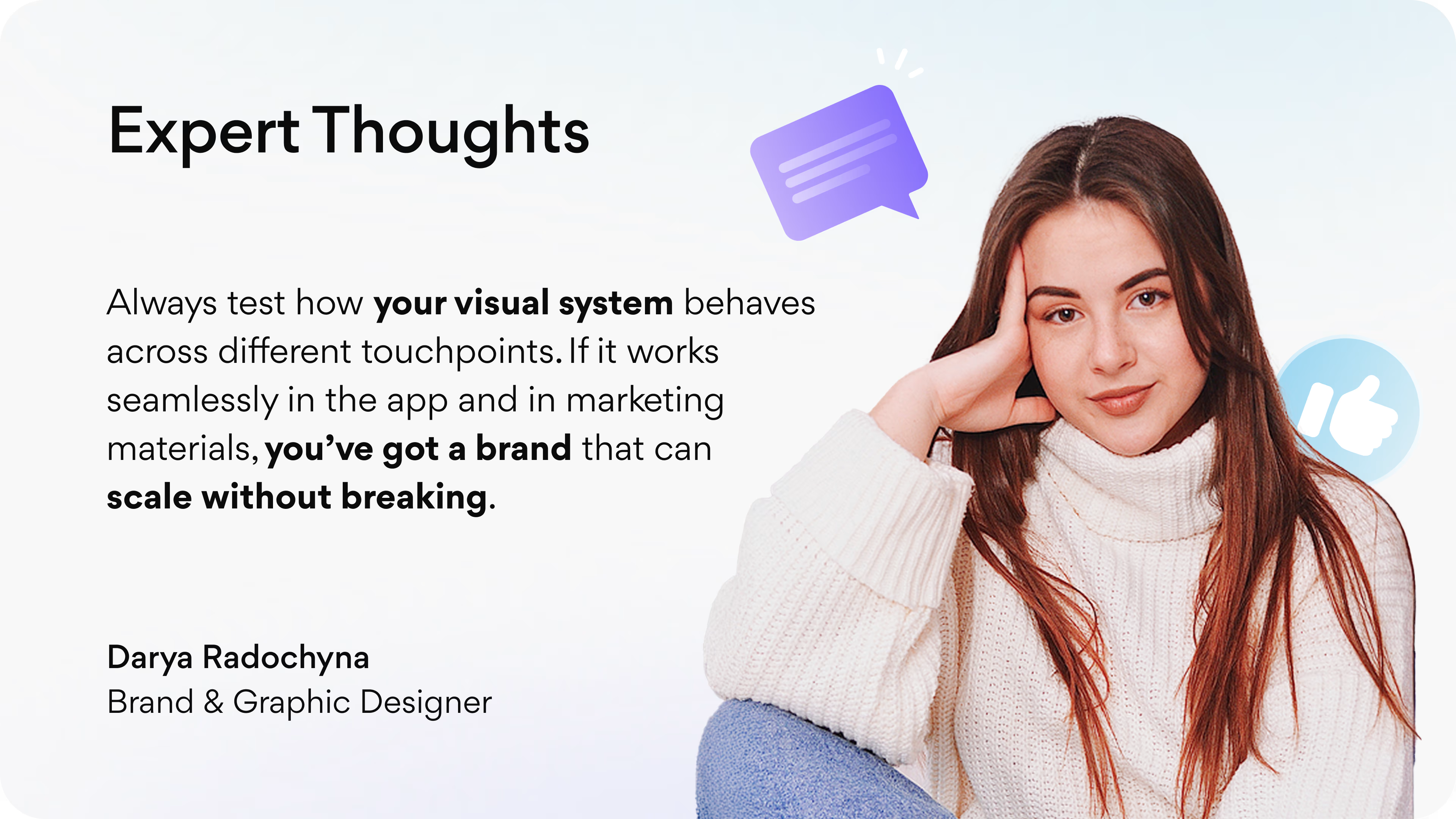
Here’s how our Arounda team did it for one of our projects - WordPress.
Our tip: Keep visuals consistent across all touchpoints, and use unique color schemes and artwork across all products, including all products, the website, app interface, marketing materials, and social media profiles. Create a detailed brand style guide that outlines your brand's appearance in various contexts, including logo usage, color codes, typography, and visual tone, to ensure that every aspect of your identity aligns with your brand's core values and goals.
Brand Messaging
Brand messaging is the language, tone, and key messages used to communicate with your SaaS brand. It defines your unique value proposition, distinguishes you from competitors, and directly addresses customer needs and pain points. It’s about effective communication with your audience.
Customer Experience
Customer experience (CX) involves every interaction a user has with the product (from the initial website visit to ongoing support and updates). What’s the most important at this stage? User onboarding! If users find your product clear and easy, they will continue using it. Make onboarding smooth and delightful, simplify steps, and use personalized messages to make users feel valued. Don’t forget to gather feedback (NPS surveys, user reviews, and customer support interactions) to improve the CX.
Crucial Traits of Successful SaaS Brand Identities
SaaS brand identity is not based on luck. There are specific characteristics that typically differentiate the better products from the lesser ones. These traits help users define their feelings, gauge trustworthiness, and retain. Strong identity is not just evident in visuals, but also in understanding how typography addresses complexity, how color conveys emotion, or how proof points make promises credible.
The table below highlights the key features of successful SaaS brand identities, explains why they are important, and showcases the best brand identities from real companies.
{{three-columns-table}}
What are the goals of creating a brand identity design?
SaaS features get you onto the playing field, but branding will determine if you remain there. An impressive product with a bad identity feels kind of like an invisibility cloak. Good brand identity examples embed recognition, trust, and a sense of membership around the software; it tells users what a company stands for before they even register it.
Here's what a strong identity is built to achieve:
- Recognition. Your brand gets noticed and remembered in a crowded market.
- Credibility. Professional design shapes your product's reliability from the first click.
- Distinction. A unique look and feel separates you from the competition that provides the same products.
- Consistency. Every point of interaction, your application UI, your social posts, conveys one brand voice.
- Simplicity. Complicated features appear simple and approachable when guided by good design.
- Connection. Users develop more than just a functional relationship with your product; they also form an emotional bond.
- Stronger marketing. Campaigns hit harder when visuals and messaging line up.
- Faster growth. Memorable brands convert more users and keep them around longer.
Brand identity is the personality of your SaaS. It's not a fancy layer on top of the product; instead, it defines how people will make decisions about trusting you, remembering you, and continuing to choose you vs. someone else.
SaaS Brand Identity Examples
These are branding examples for companies in SaaS that highlight how businesses can make a product feel bigger than its features through design.
Wordpress
WordPress is the most popular website-building platform and CMS in the world. It helps all businesses of all sizes launch and grow their online presence. Our team at Arounda worked with WordPress to do their branding and web design, sharpening and making hub consistency across products.
Why It Works
During our work on WordPress branding, our goal was to create one identity for all its products. Here's what we did:
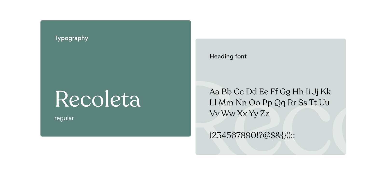
- The Recoleta typeface established a warm and professional tone for the brand.
- A blue, white, and black colour palette created an effective balance of trust and energy.
- Marketing campaigns were specific to each product, but all related to a single system.
- Branded touch points from social posts and landing pages to email templates have the same rhythm.
This was successful because everything in the communication realm, including visuals, content, and marketing materials, felt like one unified, connected identity. The users perceived WordPress as a credible and relatable service each time they came across a WordPress communication.
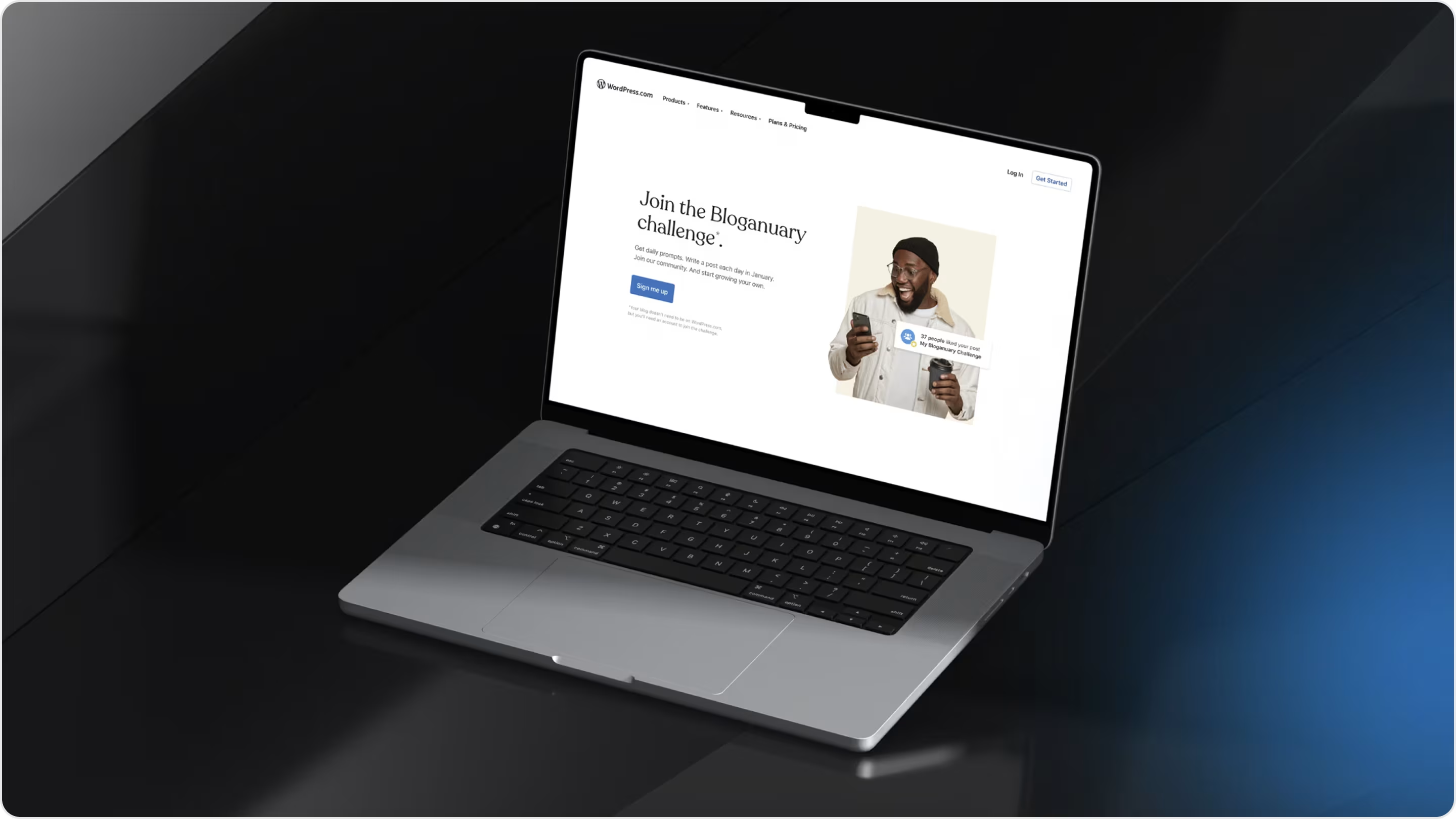
Actionable Insights
Our work had clear business outcomes:
- +5% engagement rate.
- +22% traffic.
- ×2 customer retention.
- -20% bounce rate.
The redesign showed that branding drives numbers, not just visuals. For SaaS founders out there, the simple lesson here is this: if your product has multiple audiences, you should invest in a brand system that can evolve without losing cognitive recognition.
Documotor
Documotor, which runs on Omnidocs technology, is a SaaS tool that automates your document workflows and makes complicated content a little easier to manage through better collaboration. Our team at Arounda designed its brand, UI/UX, and did website development to make it look and feel more visually engaging and consistent across all platforms.
Why It Works
When designing the brand for Documotor, our objective was to cut through the noise of the SaaS marketplace and clearly articulate its value and originality.
- A distinct logo sequence gave the product instant identity.
- The new color scheme conveyed a sense of innovation and trust.
- Professional typography creates clarity in content.
- The tone for marketing assets remains consistent across contact points.
These branding decisions transformed a technical product into a relatable and recognizable one, establishing trust before the user even uses any of its features.
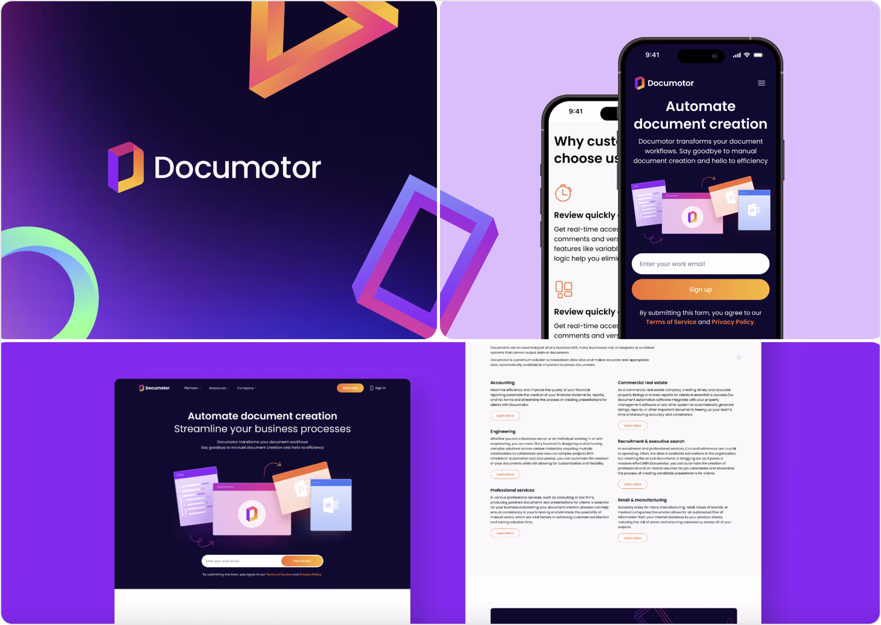
Actionable Insights
After our work, Documotor's new branding brought real results:
- Better brand recognition in campaigns and product pages.
- Enhanced clarity in presentations and emails.
- Stronger first impressions with new leads.
If you want your SaaS product to stand out, make sure your visuals and content measure up. A consistent branded system allows users to see the value from the very start and maintains clarity across channels.
SageExpress
SageExpress is an AI-driven data discovery tool used by companies to easily pull information and improve productivity. Our Arounda team did a branding project, UI/UX design, and MVP development project to get the product launched with a strong, cohesive identity.
Why It Works
When we were designing the SageExpress brand, we wanted to create a complex AI tool that feels approachable but is progressive and cutting-edge.
- Geometric sans-serif typography clarified and authenticated data-heavy charts.
- A blue and green palette is associated with reliability, growth, and innovation.
- A cohesive style guide connected web, mobile, and marketing communications.
- Branded campaigns and event materials developed a single confident voice.
Altogether, these branding decisions reduced complexity and created immediate trust.
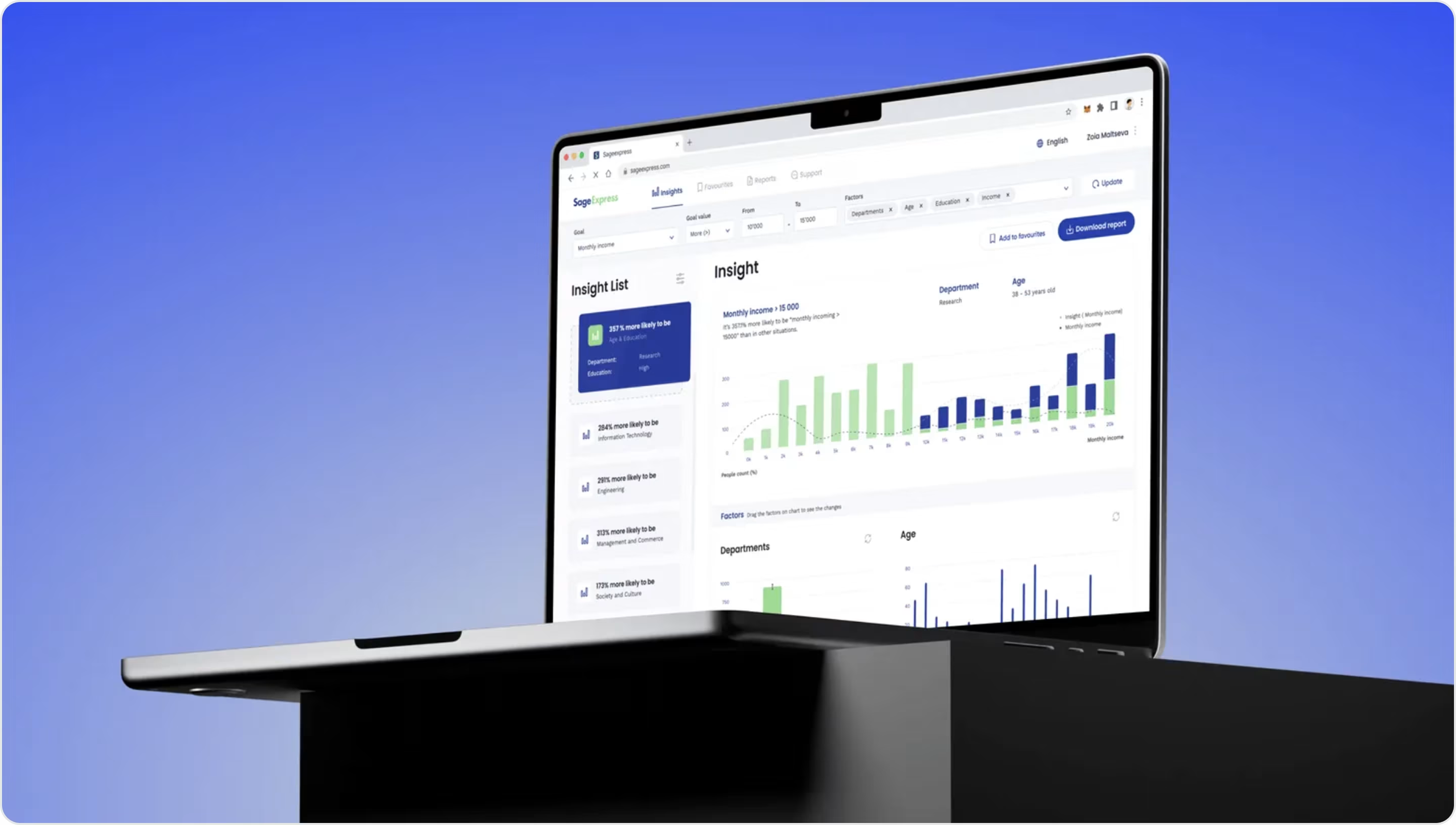
Actionable Insights
The results of our labor were quantifiable:
- $700 million in funding raised
- 34% improvement in customer satisfaction
- 2× increase in traffic
- Participation in the CES event
If your SaaS works with complex AI or data, then focus your branding on clarity and trust. Use color to convey your innovation; however, readability and consistency should continue to be first. Finding this combination is what will attract both users and investors.
Fiscal.ai
Fiscal.ai is a SaaS product for financial research and analysis of market data.
Why It Works
The branding effectively communicates a clear professional tone for finance:
- A dark UI palette emphasizes focus and trust, reducing visual noise.
- Green and red signals help performance stand out at a glance.
- Clean typography creates readability for data.
- Minimal layouts use whitespace to simplify complex multi-layered dashboards with a modern feel.
This branding is effective because it strikes a balance between the seriousness of finance and the clarity of advanced SaaS, enabling users to feel confident and in control.
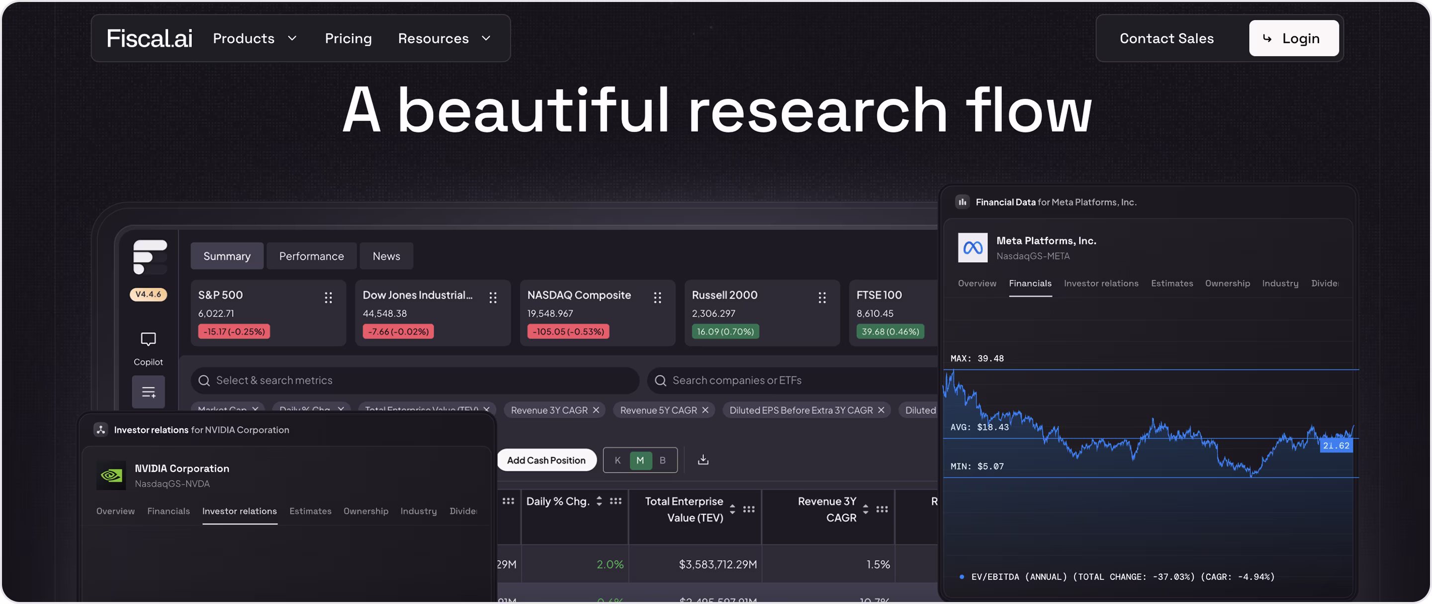
Actionable Insights
If your SaaS handles sensitive or complex data, leverage branding to establish clarity and trust. A dark base, bold accent colors, and a clean type can help ease perception and see important information more quickly.
PandaDoc
PandaDoc is a SaaS platform that lets you easily streamline your document workflows, e-signatures, automation, and analytics.
Why It Works
The brand identity is built to make paperwork seem easier and more professional:
- A calm green palette signals stability and trust associated with legal work.
- Minimal geometric typography makes for legible and clear decision or action.
- Simple icons and illustrations make contracts approachable.
- Consistent block design ties the web and product to form one identity.
These aspects form a brand that takes the intimidation out of paperwork and keeps the user-friendly image of PandaDoc as credible.
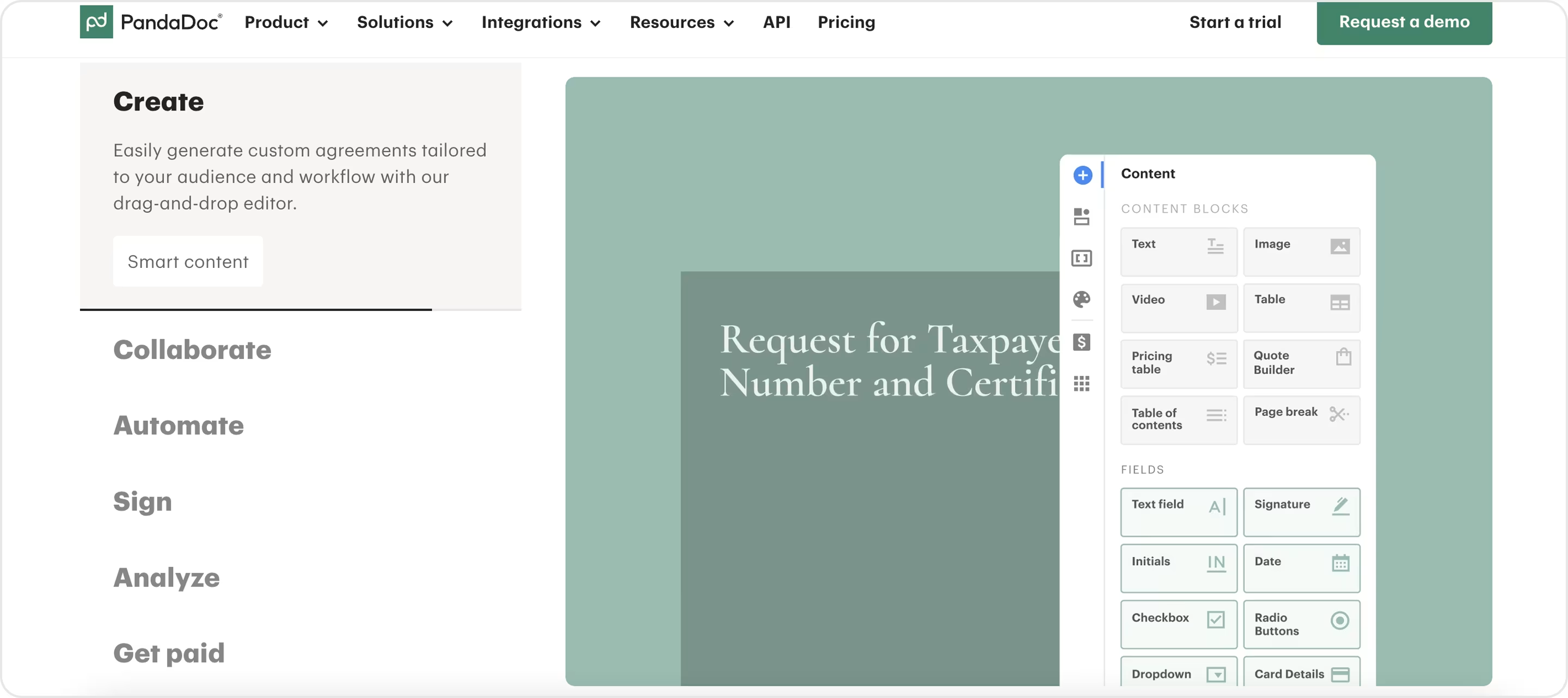
Actionable Insights
Suppose your SaaS product addresses processes that users may find stressful. Build your brand identity on calm colors, simple type, and graphics that reduce stress. More than anything else, this will make your platform seem both trustworthy and fresh among all your competitors.
Vendry
Vendry is a SaaS platform that helps organizations find and connect with a wide variety of creative agencies around the world.
Why It Works
Vendry's branding makes an effective first impression with a unique mix of professionalism and approachability:
- Fresh logo with the clean sans text adds authority and clarity.
- Minimal layout and bold headlines make searching easy.
- Consistent colors and icons for CTA's give the user familiarity and essentially build recognition.
Overall, this successful blend of modern design and confident tone makes Vendry's brand feel approachable to users while offering strength within a competitive SaaS space.
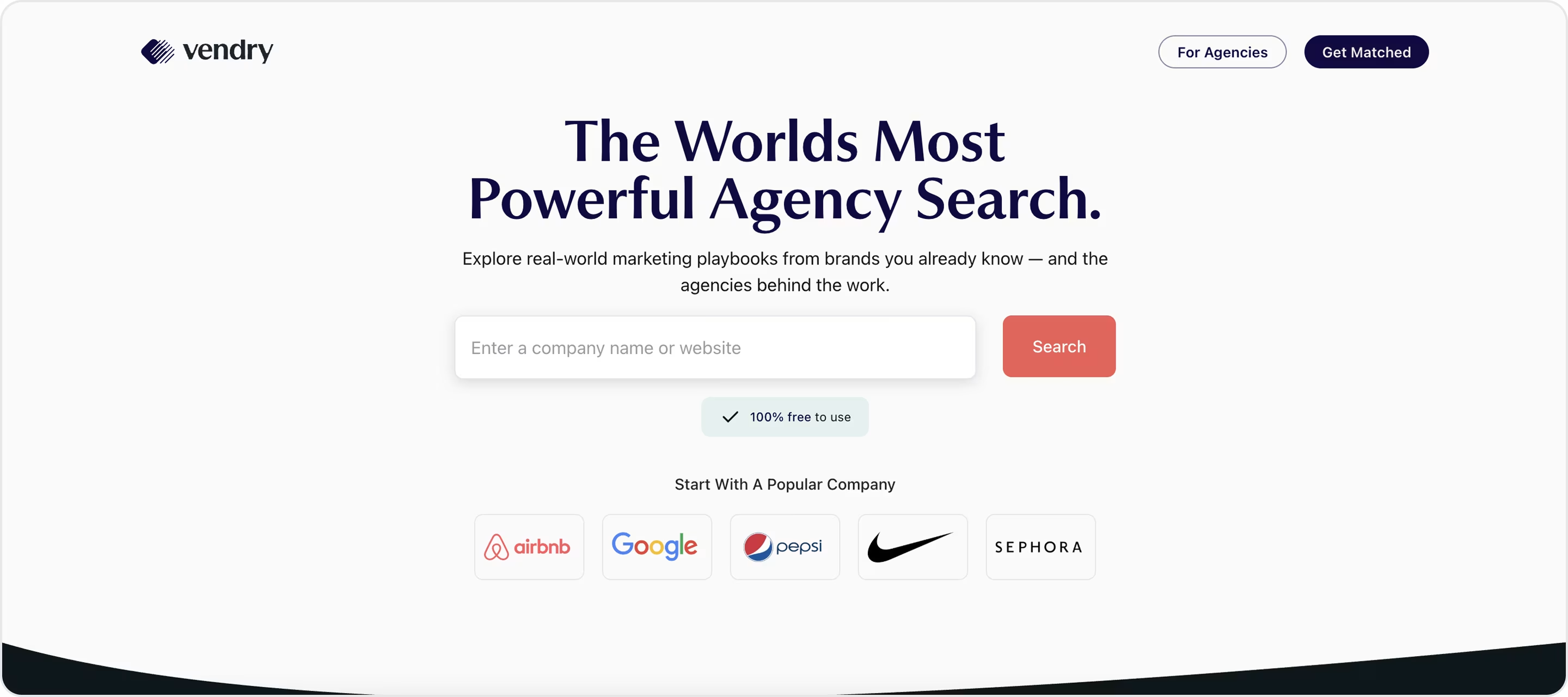
Actionable Insights
If your SaaS audience is primarily made up of professionals, then bold typography and color pairings that express both energy and trust are your best bet. A coherent and creative identity can help your product be seen as both cutting-edge and trustworthy.
Alpha Ledger
Alpha Ledger is a fintech SaaS software that uses blockchain to bring transparency and ease of access to trading.
Why It Works
Alpha Ledger's branding stands for professionalism and clarity with a commitment to fintech innovation:
- The monochrome stylized palette with accents gives it a sense of trust, sophistication,
- Clean, minimal typography conveys authority and clarity, which allows the included content to be taken seriously.
- Simple visualisations and icons make technical content feel less complex and more approachable, less intimidating.
- The smooth scroll storytelling navigates complex features seamlessly and with clarity.
With precise and restrained positioning of blockchain innovation, the brand made complicated tools feel safe, providing a sophisticated platform that professionals and practitioners could use freely.
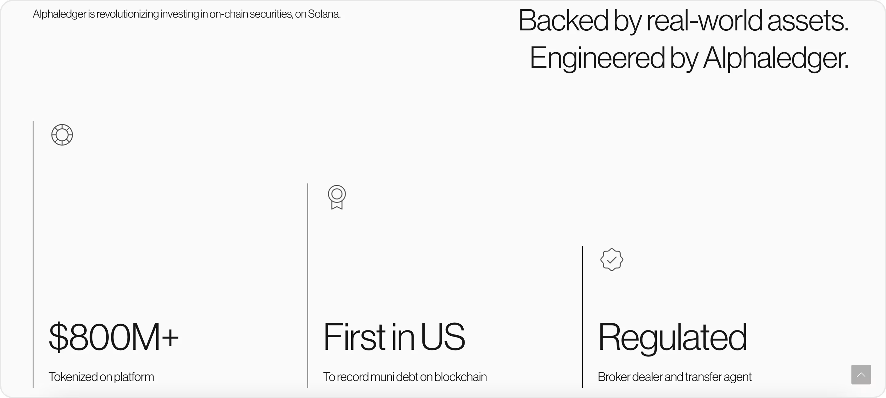
Actionable Insights
If your SaaS has professional users, keep the brand precise and elegant. Your brand can simplify complexity and invite trust by employing refined colors and type, and soft visual storytelling.
Aha!
Aha! is a cloud-based SaaS system for product teams to come together to strategize, plan, and launch new features.
Why It Works
Aha!'s brand stands out by combining clarity with a subtle spark:
- The exclamation mark on the logo gives the brand a sense of energy as a backbone without sacrificing professionalism.
- The use of a vibrant teal-blue colour palette feels fresh and trustworthy at the same time.
- The rounded sans-serif type has warmth and provides focus.
- The modular UI patterns give the brand visual structural cohesion that scales across dashboards and roadmaps.
These components create a calm but confident brand, dynamic enough to inspire but structured enough to stay dependable.
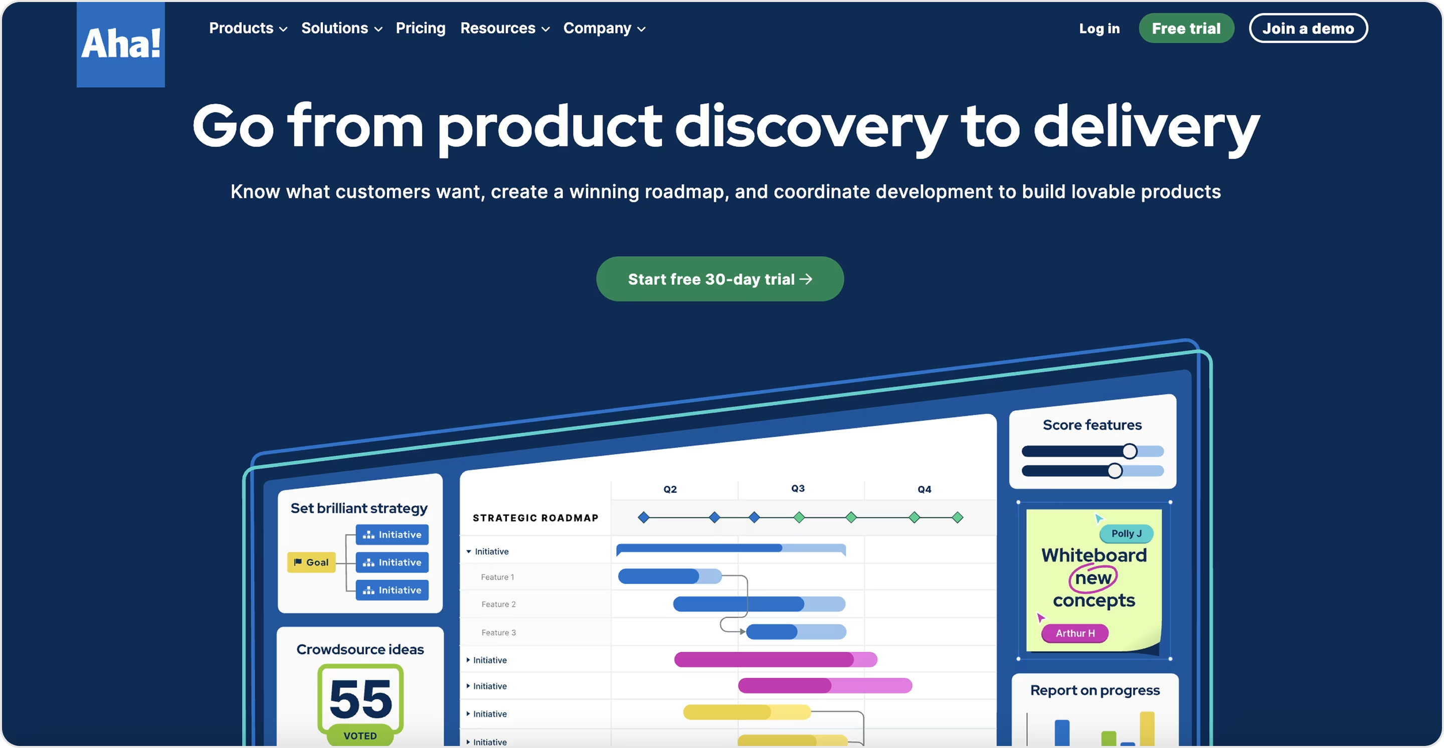
Actionable Insights
If your SaaS is used for teams that make serious decisions, you can use a visual accent (like Aha!'s “!”) to bring in personality. Pair that with a clean color palette and softer type to keep interfaces approachable yet still authoritative.
Velvet
Velvet is a SaaS Platform that acts as the operating system for live events, helping event organizers manage bookings, proposals, and payments all in one application.
Why It Works
Velvet's branding uniquely balances creativity and structure, which matches the energy of live events while remaining true to the professionalism of the application.
- The bold purple palette conveys creativity and a unique approach, whilst also establishing a visually loud identity in a cluttered SaaS atmosphere.
- The sans serif typography is easy to read, identifies branding, and focuses users on speed and navigation.
- Gradient accents convey a feeling of dynamic energy associated with live performance.
- Using consistent icons and layout styles ensures that the user experience is identified consistently across touch points.
Coupling these components together gives Velvet a tangible brand identity that feels both dynamic and innovative - appealing to event professionals who want both efficiency and style.
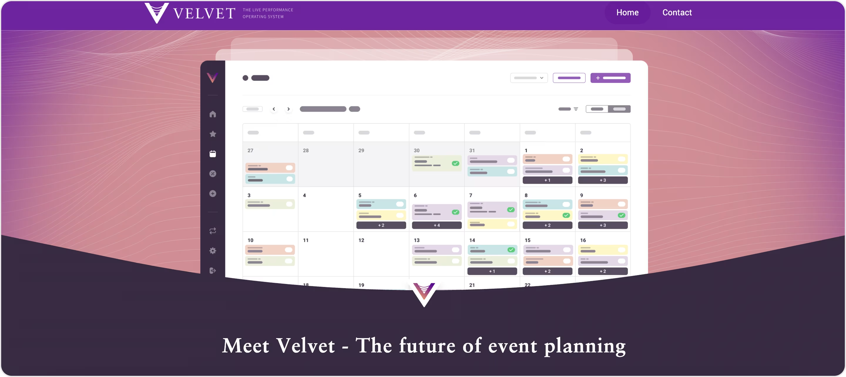
Actionable Insights
If your SaaS is in a creative industry, use branding to suggest both trustworthiness and energy. An active color base, tone, and clear type can get your product to stand out yet still feel credible.
Regulatis
Regulatis is a SaaS solution that leverages AI to help organizations manage ESG and regulatory compliance across frameworks.
Why It Works
As one of the best branding design examples in compliance SaaS, Regulatis shows how effective branding can establish trust and clarity:
- User-friendly UI with a dark interface to decrease noise and create focus on compliance information.
- A geometric sans-serif typeface that makes complex terminology legible and precise.
- Clear iconography is employed to translate abstract regulations into quick visual reference points.
- Consistent visual language throughout the site and dashboard ultimately reinforces reliability.
Thanks to this terrific mix of branding decisions, Regulatis represents how design can distill complex legal systems and convey authority.
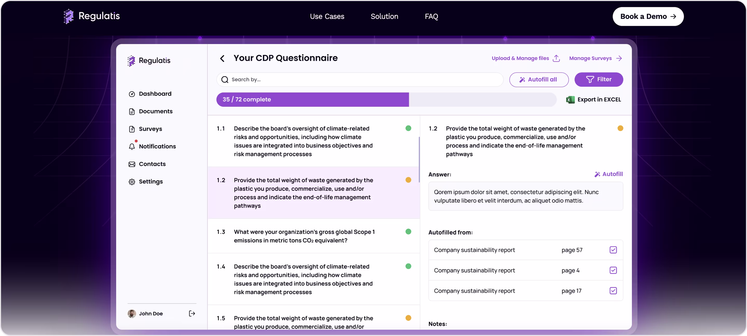
Actionable Insights
If your SaaS is dealing with complicated information types, leverage dark UI for focus, strong typography for trust, and consistent visuals for reliability.
Dibbel
Dibbel is a SaaS platform designed for the construction industry in which all documentation, reporting, and workflows are centralized for both field teams and office teams.
Why It Works
Dibbel is one of the best examples of brand identity design for a SaaS because its platform represents structure and reliability:
- Sturdy geometric logo represents architectural accuracy and stability.
- Grounded colour palette provides a professional and trustworthy tone.
- Typography supports fast reading when under pressure.
- Modular icons represent construction workflows while being clean and modern.
These branding choices position Dibbel as trustworthy and useful. They give meaning to what could be an overwhelming operation and provide clean, simple access to a manageable system.
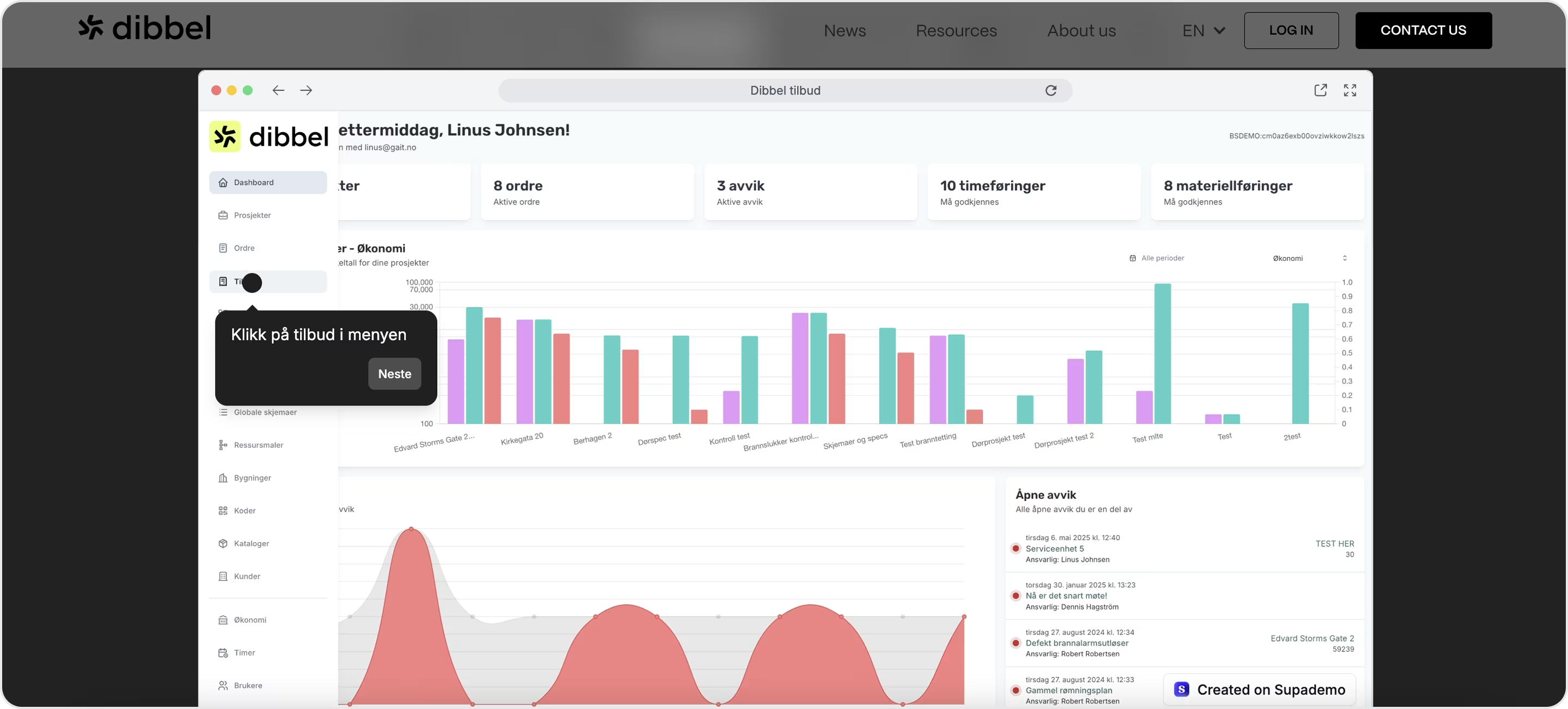
Actionable Insights
If you're in a SaaS space where sectors depend on precision and trust, focus your branding on geometric shapes, stable colors, and typography that is readable. This balance signifies strength while keeping your product approachable.
Nexus AI
Nexus AI is a SaaS platform that combines generative AI tools for text, images, code, and voice into a single workspace.
Why It Works
Nexus AI is one of the great platforms with a strong brand identity, mixing futuristic visuals and a straightforward and easy-going brand personality:
- A significant dark gradient palette conveys a sense of focus and innovation.
- Bright accent colors induce actions and help to keep AI tasks of a complex nature intuitive.
- Inventive typography adds clarity and modernity.
- Minimal iconography balances simplicity with sophistication and eases access to advanced and complex features.
This mixed but consistent brand identity helps Nexus AI look powerful while remaining easy to use, giving users confidence to explore new AI workflows.
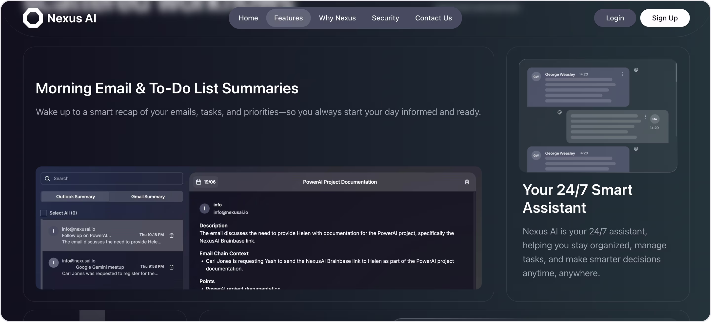
Actionable Insights
For SaaS products in the case of Nexus AI, the greatest brand connect comes not from more visuals as a brand impact, but from restraint. The combination of one dominant dark theme with just the right punch of bright colors builds psychological focus, which is essential for users when faced with overwhelming technology.
Slack
Slack is a SaaS platform for workplace communication that makes collaborating with your team faster and their experience easier.
Why It Works
Slack is an extraordinary example of Brand Identity, because its branding blends a professional tone with creative vibes that feel both strong and approachable.
- Their colorful logo system suggests openness and creates an instantly recognizable brand.
- The typeface is soft, rounded, and has strong readability, with a friendly and approachable tone.
- Inside the product, bright accent colors add energy to daily communication.
- Playful and consistent microcopy and visuals humanize the platform and lessen the rigidity of corporate software.
With these choices, Slack has established itself as more than a utility brand. The brand has turned communication into something enjoyable, approachable, and original - that's why it's one of the most successful SaaS brands on the market.
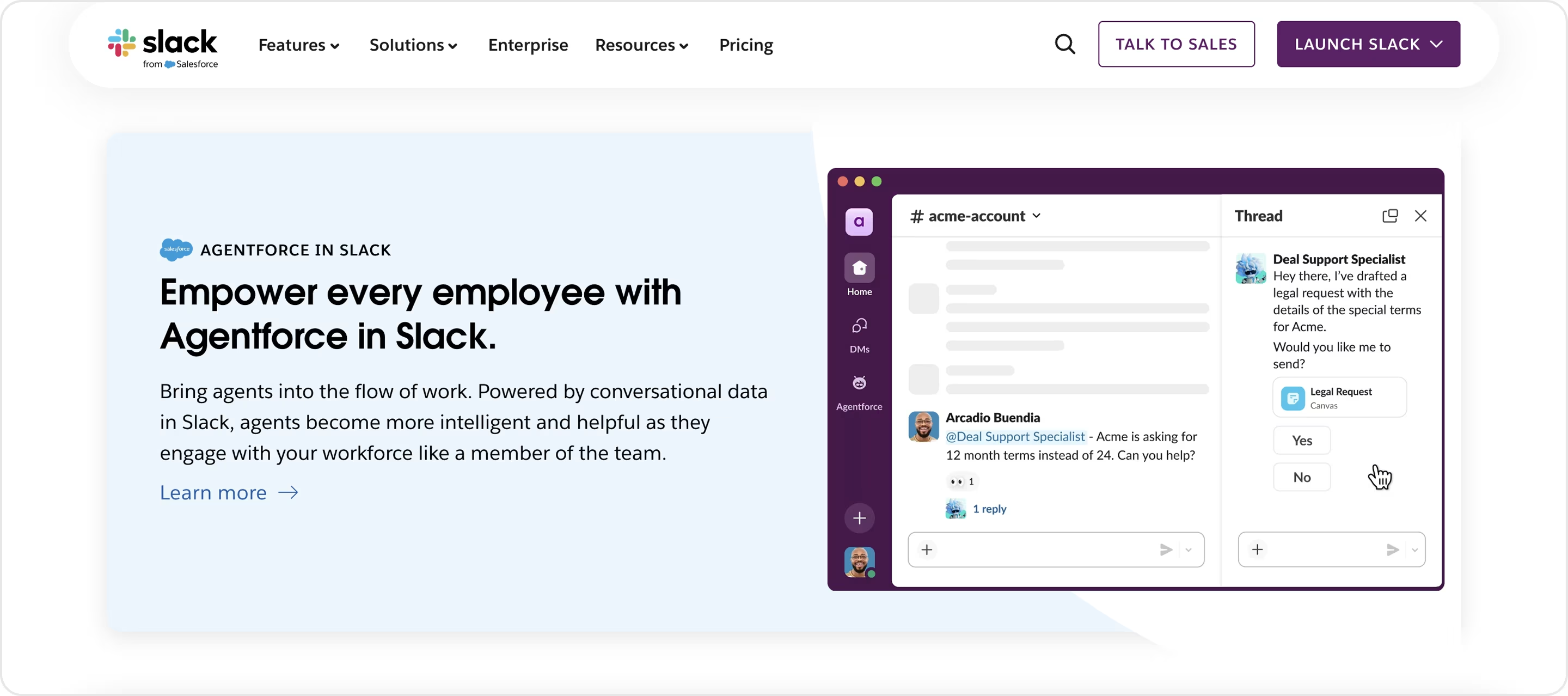
Actionable Insights
If your SaaS is about collaboration, consider friendly empty-state copy to reward advancement, humane onboarding prompts, low-anxiety CTA labels, branded emoji using guided imagery to fulfill the voice element, reactions, etc.
Talkspirit
Talkspirit is a SaaS product for enterprise communication and collaboration. It creates a unified space for many tools within a corporate digital workplace.
Why It Works
Talkspirit is an outstanding brand identity example in SaaS because the branding balances authority and creative energy.
- The handwritten style for the logo brings warmth and human-ness, contrasting the linear structure of the layout.
- The combination of warm orange and open bold magenta tones provides a sense of energy, while the light neutral tones exude professionalism.
- The use of clean sans-serif type allows team content, which can be pretty dense, to be read easily and without a struggle.
- The colorful modular blocks look familiar to real workflows and provide a sense of an organized, cutting-edge system.
This strong identity allows Talkspirit to be credible to executives and engaging to employees, therefore establishing a bridge between the trust of leadership and the adoption level of the team.
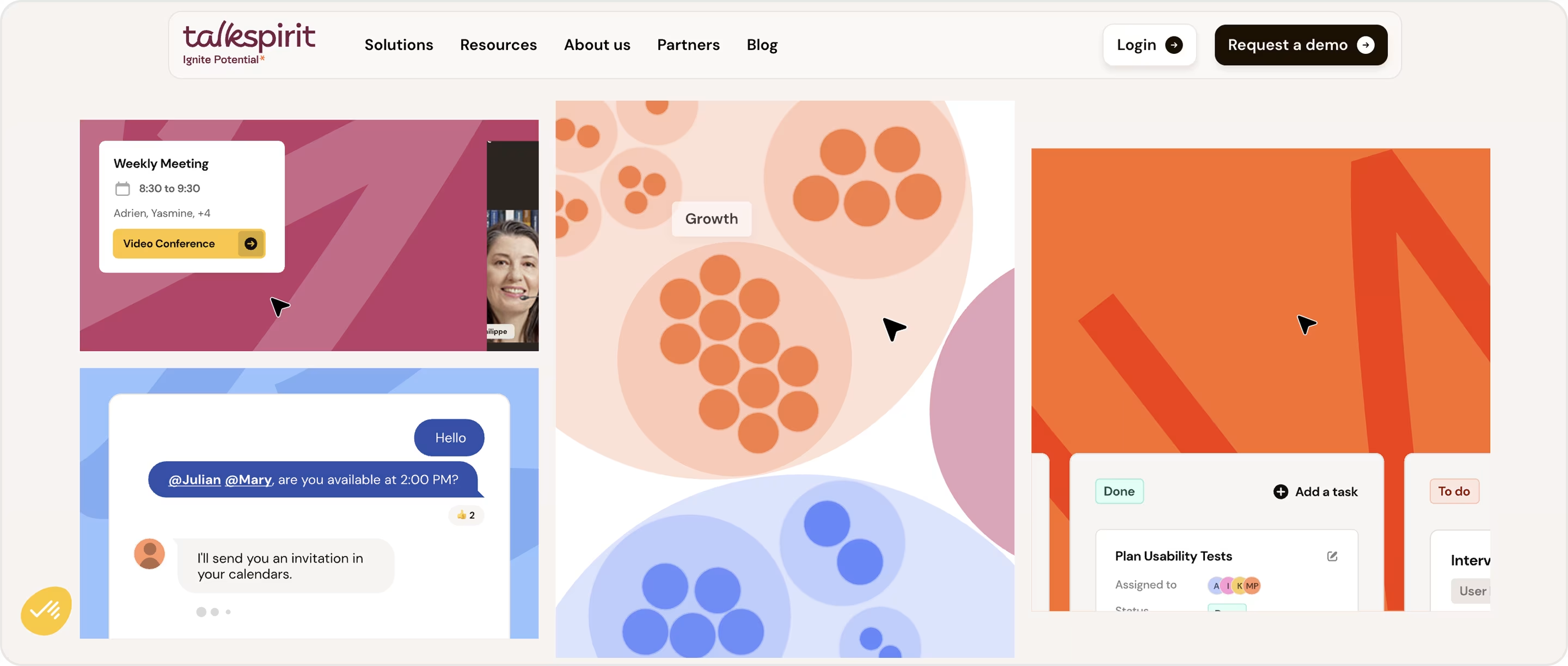
Actionable Insights
If your SaaS needs to reach both decision makers and end users, make sure your branding is structured and warm and friendly. Combining bright, active colours with approachable type will get you maximum authority while keeping the experience active and human.
Stockifi
Stockifi is a SaaS solution for hospitality, allowing users to bring together their inventory, invoice parsing, and COGS reporting in one place.
Why It Works
Stockifi is among the good examples of branding in SaaS because it translates complexity into trust and action.
- A dramatic headline promise sets a measurable value on cost reduction.
- Role-based experience - shows value to owners, finance, operations, and chefs.
- Proof points such as integrations, testimonials, and rapid onboarding create trust.
This successful combination creates a strong brand presence that appeals to both operators and decision makers, while also making Stockifi feel credible and straightforward to adopt.

Actionable Insights
When using SaaS in operational areas, brand around hard promises and verifiable proof. Consider role-based messaging and quick onboarding promises to make adoption easier and create a stronger trust proposition.
SaaS Branding Roadmap
Building a powerful SaaS brand is a strategic process! And this is not an easy task. That’s why Arounda developed and shared a roadmap to guide you step-by-step. We offer essential strategies, tools, and expert tips for creating a lasting brand presence. We hope you like it 😉
Develop a High-Quality Product
A strong brand starts with a great product, which must solve real problems, provide value, and offer an exceptional user experience.
What Arounda team recommends:
- Prioritize product-market fit by conducting user research and gathering feedback during early development stages.
- Regularly update the product with new features based on customer input.
- Invest in a robust Quality Assurance process to ensure a bug-free user experience.
Build a Strong Brand Identity
Your brand identity sets your product apart in the SaaS market by reflecting your mission, values, and personality.
What Arounda team recommends:
- Use customer personas to understand how your ideal customers perceive and interact with brands (brand identity must meet their expectations).
If you need help building a strong brand identity, we will be happy to assist!
Design a Visual Identity Aligned with Your Brand
A visual identity comprises a logo, color palette, fonts, and imagery, creating a recognizable presence. It should reflect the product's value proposition.
Create Marketing Materials
What can effectively communicate a brand's value? Marketing materials (pitch decks, case studies, whitepapers, email templates, and social media)!
What Arounda team recommends:
- Customize marketing materials for different buyer stages.
- Use educational content for lead generation and build trust with decision-makers.
Train Your Team
Your staff is more than just people who do their job. Your team is the face of your brand across channels! Invest in brand training for employees to understand mission, tone, and visual identity.
What Arounda team recommends:
- Develop a brand playbook with guidelines for communication.
- Conduct regular workshops to keep team alignment.
Choose the Right Distribution Channels
To reach your target audience effectively, use the right distribution channels and apply a multi-channel strategy that mixes organic and paid efforts.
Ensure Brand Consistency
Inconsistent branding can weaken your credibility and confuse your audience. Every touchpoint (from your website to email newsletters) should reflect your brand identity! How do we keep consistency?
What Arounda team recommends:
- Use a brand style guide describing the visuals, tone of voice, and messaging across all platforms.
- Assign a brand manager or team members to oversee branding across different channels.
Stay Updated on Industry Trends
Staying updated is the most important thing in every digital business!
What Arounda team recommends:
- Regularly evaluate branding strategies to incorporate emerging trends like AI integration, sustainability messaging, and community-driven marketing.
- Monitor competitors and industry benchmarks to stay informed about customer preferences and technologies.
- Use Google Alerts, G2 or Capterra, and BuzzSumo to keep track of SaaS trends/news/customer sentiment.
If you're still not sure whether your SaaS needs really awesome branding, let's discover its benefits.
Challenges in SaaS Branding
A strong SaaS brand requires continuous customer engagement and adaptability to market needs, unlike traditional products. We’ve gathered challenges in branding for SaaS products and offered expert tips to overcome them.
#1. Highly competitive market
How to deal with this challenge?
- Focus on your unique value proposition (UVP) in your SaaS product, using storytelling to highlight its impact.
- Invest in competitor research to identify gaps and opportunities, and align your branding strategy to highlight these differentiators.
#2. Evolving customer expectations
How to deal with this challenge?
- Regularly gather feedback to stay in tune with your audience's needs.
- Use the Survey tool to collect user feedback through in-app surveys and Typeform to track customer changing preferences.
#3. Aligning product experience with brand promise
How to deal with this challenge?
- Make sure product design and user experience (UX) match your brand messaging.
- Conduct UX audits regularly to identify and resolve pain points that could negatively impact customer perception.
- Use a brand-UX alignment framework that connects branding goals with UX priorities.
#4. Maintaining brand consistency across channels
How to deal with this challenge?
- Create a detailed brand style guide that outlines your brand’s tone of voice, visual elements, and messaging guidelines.
- Make sure every team member follows these guidelines to stay on track.
#5. Adapting to rapid industry changes
How to deal with this challenge?
- Follow industry leaders, attend SaaS conferences, and read thought leadership content to stay updated on industry trends.
- Use Google Trends to monitor trending topics in your industry and BuzzSumo to identify popular content to guide your thought leadership strategy.
#6. Building long-term customer relationships
How to deal with this challenge?
- Provide proactive support, personalized content, and regular updates.
- Use Intercom to manage internal messaging and customer engagement and ChurnZero to monitor churn risk and improve customer retention strategies.
When you overcome challenges and create your best SaaS branding, it’s important to measure success. How can you do this? Know key metrics, have a passion for improvements, and take action!
Key Metrics and KPIs to Measure Branding Success
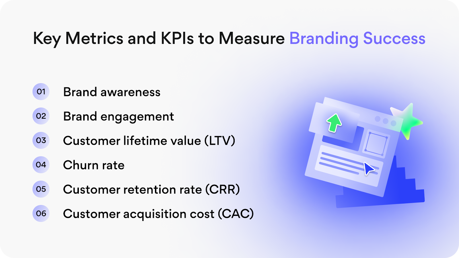
- Brand awareness
It means how well your target audience recognizes and remembers your SaaS brand. You should monitor direct traffic, search volume, and social media mentions. Google Analytics, Ahrefs/SEMrush, and Brand 24 can help you with this task.
- Brand engagement
It measures the level of interaction your audience has with your brand across various platforms, indicating their active participation and investment in the brand, which can lead to increased brand loyalty. Google Analytics, Hootsuite, and Mailchimp will help you with this task.
- Customer lifetime value (LTV)
It calculates the total revenue a customer generates during their interaction with your brand. Calculate LTV by multiplying the average customer value (revenue per customer) by the average customer lifetime. You can use Barametrics or Stripe to monitor LTV.
- Churn rate
It shows the percentage of customers who cancel their subscriptions within a given period. High churn rates mean customers are unsatisfied with your product or brand. What tools you can use to monitor and analyze this metric - ChurnZero, HubSpot, ProfitWell.
Churn rate = number of customers lost during a period / total number of customers at the beginning of that period.
- Customer retention rate (CRR)
It measures the percentage of customers you retain over a specific period. Baremetrics can help you track retention.
CRR = ((customers at the end of the period - new customers acquired during the period) / customers at the start of the period) x 100
Learn how to increase customer retention and get more profit from your SaaS in our article.
- Customer acquisition cost (CAC)
It shows the total cost of acquiring a new customer with marketing, sales, and branding efforts. Google Analytics, Salesforce, and HubSpot will help you track CAC.
CAC = total acquisition costs / number of new customers acquired during a specific period.
How can Arounda help with your SaaS brand identity design?
At Arounda, we see brand identity in SaaS as strategy in motion, not just surface styling. Brand identity is how products build trust, stay remembered, and break through busy markets. With over 9 years of experience and 250+ projects completed, we have helped companies all over the world take complex products and make them feel easy, credible, and worthy of choosing.
Our Brand Identity service is built around results. We develop systems that:
- Help your SaaS product become visible with a unique and distinctive visual language.
- Increase trust and recognition at every single customer interaction, whether they are engaging with your website, email, or in-app design.
- Give you the flexibility to remain relevant in a constantly evolving market.
The impact of our work is always measurable. Companies we've worked with have raised millions, doubled retention, and entered markets with poise and confidence because their brand expressed clarity and authority from day one.
When you partner with Arounda, you don't get just a logo or a color palette. Your branding will reflect your product's purpose, translate its value to users, and differentiate you from most of your competitors. In SaaS businesses where features overlap, identity is your competitive advantage, and we know how to build it.

Wrapping Up
In this article, we reviewed 15 great examples of SaaS branding and shared some of the traits that made them work. Each successful example illustrated how identity decisions, from type to layout to brand voice, impact the users' trust, engagement, and adoption.
Branding is essential in SaaS because there is a lot of overlap in features, but it's the identity that differentiates products. A powerful brand can increase traffic, retention, funding, and turn complicated tools into something people actually want to use.
So here's our advice: Think of branding like a growth driver instead of a surface layer - they are not the same thing! When growing your brand, focus on consistency, clarity, and emotion; these are the three factors that determine if a user sticks around or not.
And if you want a SaaS brand identity that does more than look pretty, contact us. Our team will work closely with you to build a brand that cuts through the noise, positioning your product as one of the best in the market.

Table of contents


FAQ
The good showcase is when every touchpoint is cohesive - from the website and product UI to emails and social posts. Visuals, tones, and voices that are continuous build trust while details like colour, typography, and microcopy show personality. The idea is for a user to recognize your brand regardless of where it is perceived.
Identifying your values and desired user emotional response is a great start to developing the visual system and brand voice. Examine the competitive landscape, generate ideas and concepts with users, and iterate upon the ideas until the brand identity feels authentic and genuinely unique. However, the real work begins when you apply the identity through product, marketing, and customer experiences.
Pricing is primarily based on the scope: freelancers may create a basic visual for a few thousand dollars, and the agency's price may range from $10,000 - $100,000+ in more complex research-driven systems. There is a considerable price variation based on the extent to which strategy, testing, and deliverables are included in the final product. For SaaS businesses, the return on investment is typically recovered quickly, based on improved conversion rates and increased trust from compliant customers.
A clear and consistent identity strengthens conversion rates and speeds up adoption and customer loyalty. It increases the effectiveness of marketing campaigns by being both more recognizable and credible. Well-thought-out branding ultimately leads to higher revenue, lower churn, and establishes leadership in the market.


89+ Reviews
on Clutch

Top Rated Plus Agency
on Upwork

Top 50 Trending team
on Dribbble

Projects are Featured on Behance platform
